


At some point, every growing product runs into the same problem: the interface stops feeling like one system.
What starts as a few reusable components turns into duplicated patterns, mismatched styles, and UI decisions that no longer align. Without structure, both design and development slow down, and consistency becomes harder to maintain.
That’s exactly the problem design systems solve. A well-crafted design system helps teams create scalable, consistent digital experiences by aligning design and development around shared foundations and reusable components.
At Eleken, we’ve worked with SaaS teams at different stages of growth, helping them move from scattered UI decisions to structured, maintainable systems. And one thing becomes clear quickly: building a Figma design system isn’t just about collecting components — it’s about organizing them in a way that supports product teams.
That’s where examples become useful.
In this article, we’ll look at widely used design system examples — not just to showcase them, but to break down how they’re structured and what makes them work. More importantly, we’ll highlight what you can learn when building or improving your own system.
What a design system example can actually teach you
Looking at design system examples is useful — but only if you know what to look for.
It’s easy to get distracted by polished components or visual style. But what actually matters is how the system is structured underneath and how it supports real product work.
A strong design system example can help you understand:
- Structure: How foundations, components, and patterns are organized — and how they connect.
- Documentation: How decisions are explained, not just shown, so teams can apply them consistently.
- Foundations and tokens: How colors, typography, spacing, and design tokens create a consistent base across the product.
- Component logic: How reusable components are defined, named, and extended across different use cases.
- Governance: How the system evolves — who contributes, how changes are made, and how consistency is maintained over time.
The goal isn’t to copy what others have built. It’s to understand how their UI design systems are structured — and what makes them usable for real teams.
Why a design system is more than a UI kit
Many teams treat design systems as collections of components — but that’s only part of the picture. So it’s important to clarify what we mean by a design system — because the term is often used loosely.
- A UI kit is a collection of screens or components.
- A component library is a set of coded, reusable UI elements.
- A design system goes further.
At their core, design systems act as a shared language that helps designers and developers make consistent decisions across products and teams.
It includes foundations, components, patterns, documentation, and rules — all working together to ensure consistency and scalability across the product.
In other words, it’s not just what you design — it’s how those decisions are structured, shared, and maintained.
15+ Best UI design system examples and what you can learn from them
The best design systems do more than keep interfaces visually consistent—they help teams scale design decisions, improve collaboration, and build products faster. But what makes the best design system stand out? By looking at some of the most popular design systems, you can discover proven approaches to scalability, consistency, and collaboration.
1. Google Material Design
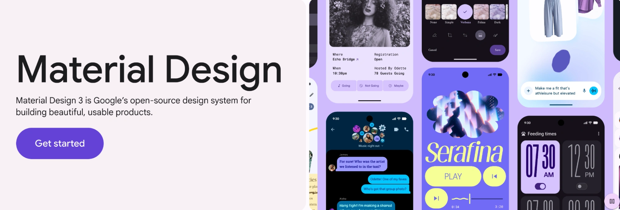
Material Design is Google’s design system for building digital products across Android, web, and other platforms. Google describes it as an adaptable system of guidelines, components, and tools, backed by open-source code, that helps teams build high-quality digital experiences. Its current structure puts heavy emphasis on foundations, components, and design tokens, which can be customized and carried across both design and development workflows.
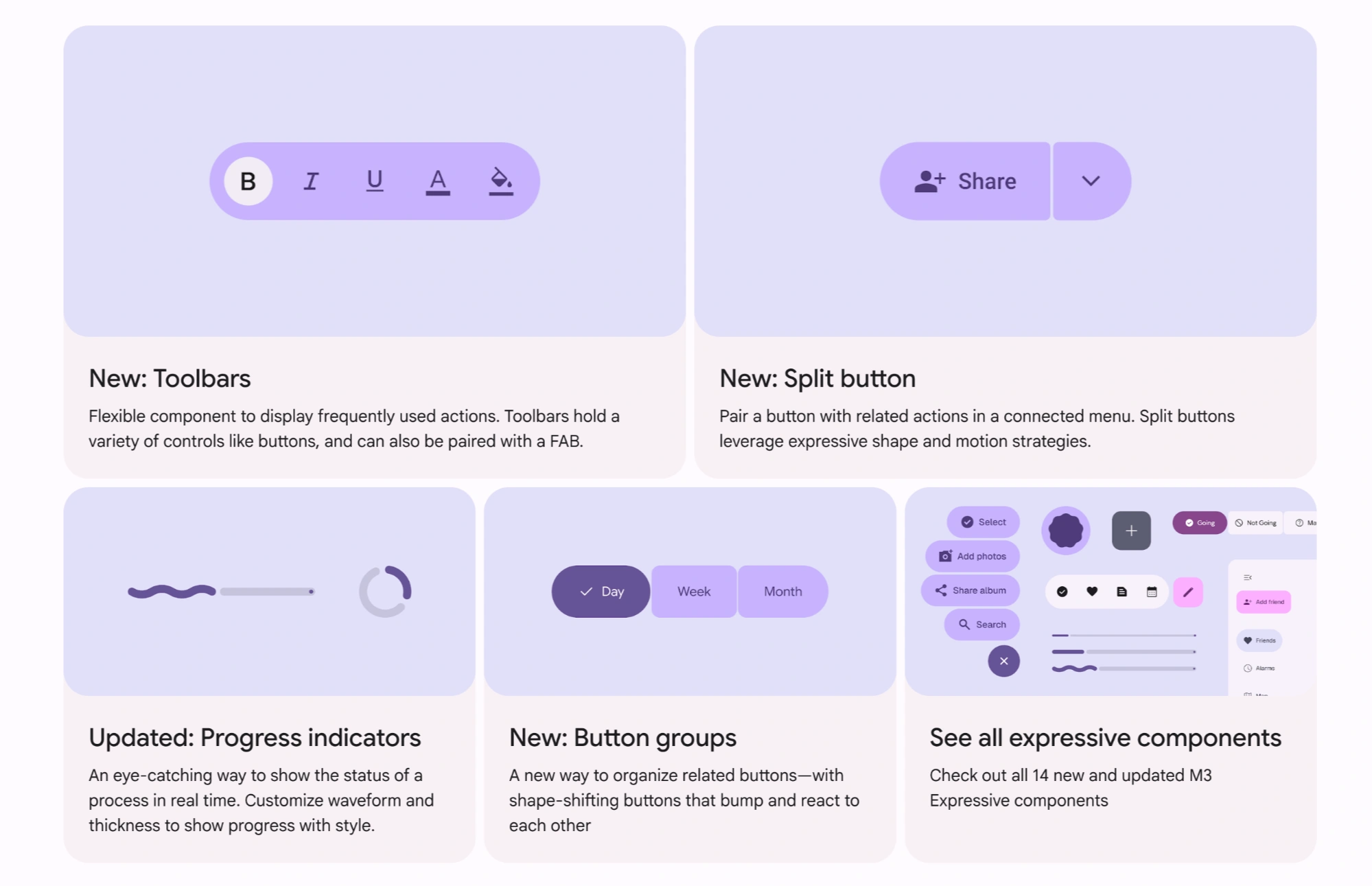
What it does especially well
- It builds from strong foundations: color, type, motion, elevation, and layout all work as a coherent base.
- It treats tokens as a practical bridge between design and code, making system decisions easier to apply and maintain across products.
- It documents components in a way that connects purpose, behavior, and implementation, not just appearance.
What teams can learn from it
Material Design is a strong example of how much a design system depends on foundations being clear before components multiply. It also shows that tokens are most useful when they support collaboration, not just naming. For teams building their own design system, the main lesson is simple: if your foundations and token logic are well organized, scaling reusable components becomes much easier.
2. IBM Carbon Design System
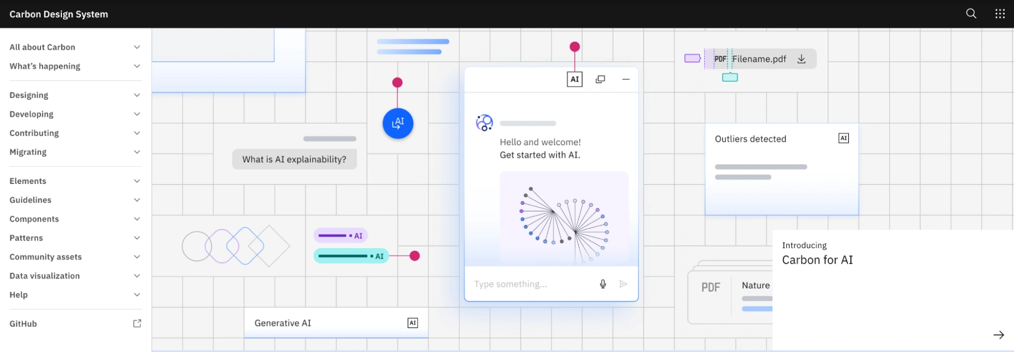
Carbon is IBM’s open-source design system built to support enterprise products, especially those with complex workflows, data-heavy interfaces, and large-scale applications. It combines design guidelines, reusable components, and code resources to create a unified system used across IBM’s ecosystem.
What it does especially well
- Documentation as a core part of the system.
Carbon provides detailed guidance on when and how to use components, including behavior, states, and real product scenarios — not just visuals. - Designed for complex, data-heavy interfaces.
Components like tables, forms, and dashboards are built to handle dense information while maintaining clarity. - Accessibility built into the foundation.
Accessibility guidelines are integrated into components, color usage, and interaction patterns from the start. - Strong design–development alignment.
Carbon offers matching design assets and coded components, making implementation more predictable and consistent.
What teams can learn from it
Carbon shows that a design system becomes truly useful when it reflects real product complexity — not just ideal UI states.
Instead of focusing only on visual consistency, it emphasizes structure, clarity, and usability in environments where users deal with large amounts of data. This makes it especially relevant for SaaS and enterprise products.
Another key takeaway is documentation. Carbon treats documentation as part of the system itself, ensuring teams understand not just what components exist, but how to use them correctly in context.
3. Atlassian Design System
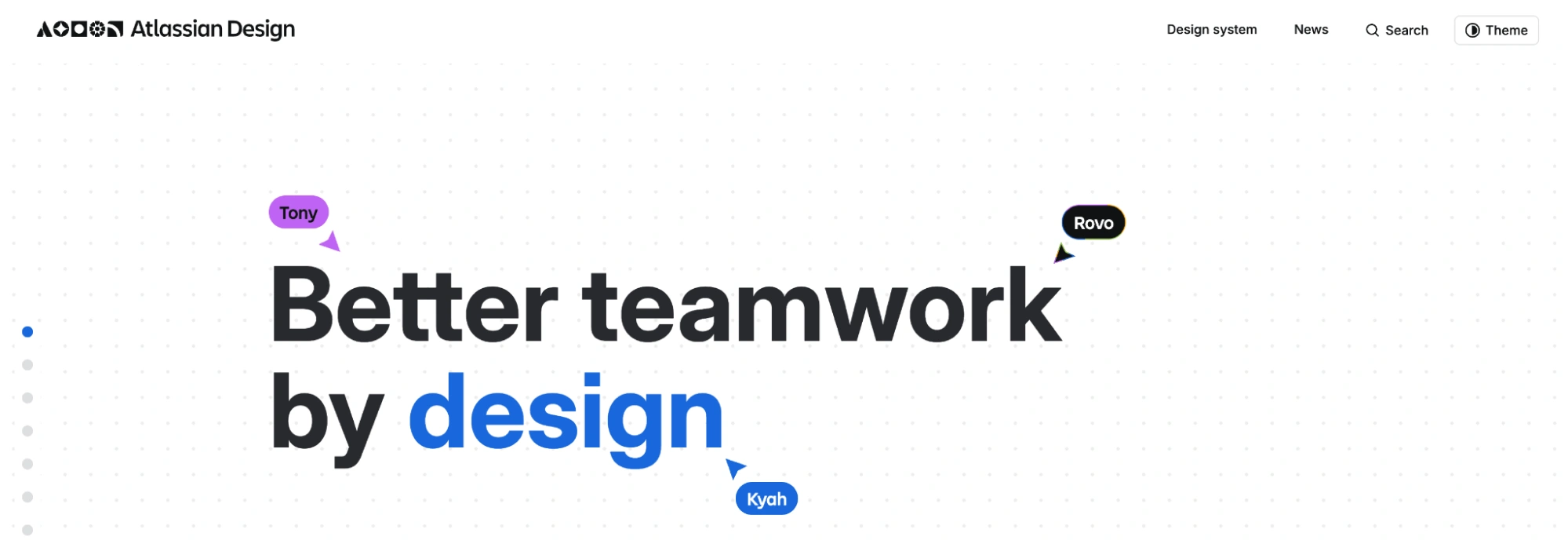
Atlassian’s design system supports products like Jira, Confluence, and Trello, helping distributed teams build consistent, collaborative tools at scale. It combines design guidelines, components, and content standards into a shared system used across multiple product teams.
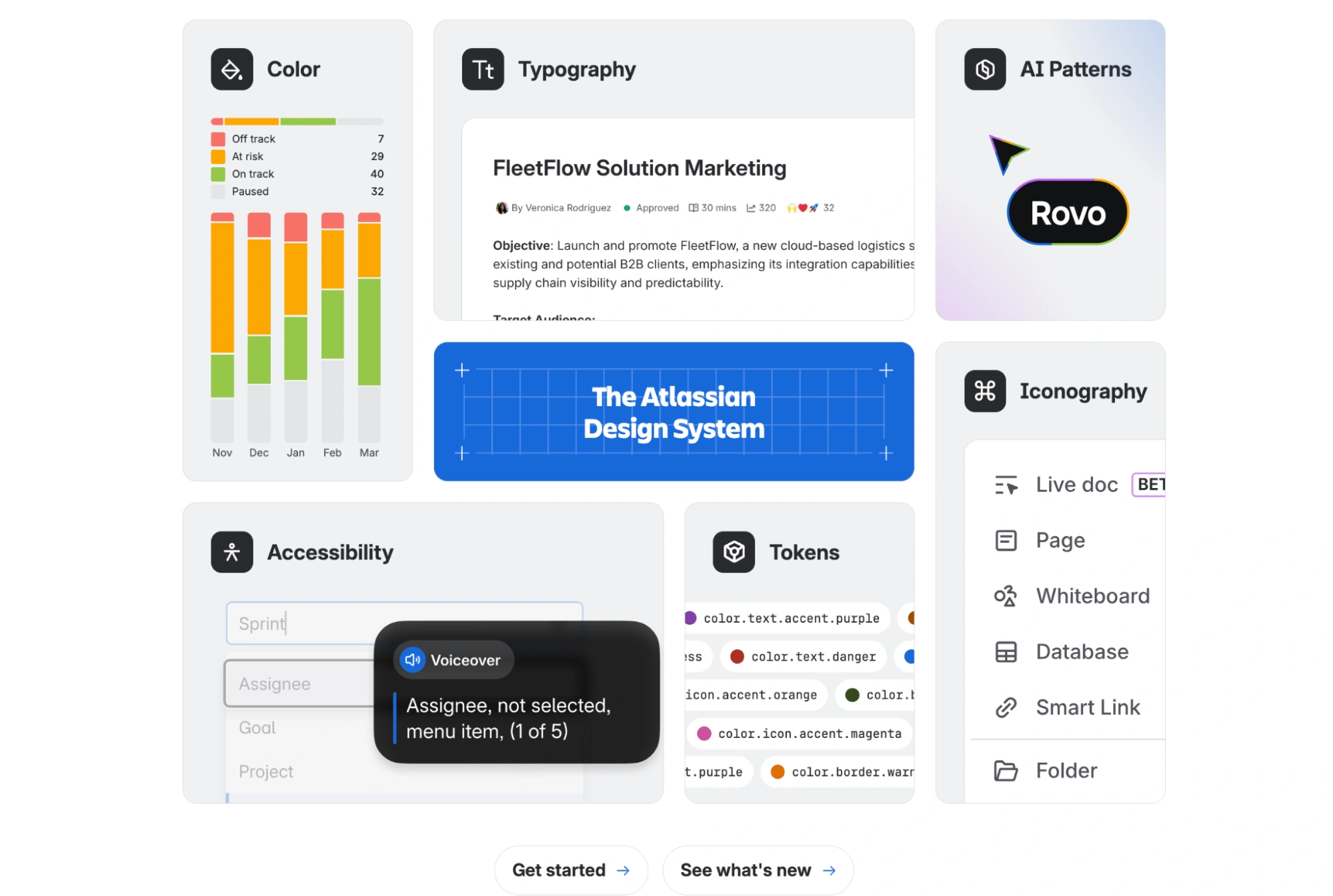
What it does especially well
- Content design as part of the system.
Atlassian treats writing as a core design element, with clear guidelines for tone, labels, and UX copy — not just UI components. - Strong governance and contribution model.
The system defines how teams can contribute, update, and extend components, making it sustainable as more teams adopt it. - Practical, structured documentation.
Documentation focuses on real usage — when to use components, how they behave, and how they fit into workflows. - Built for multi-team environments.
The system is designed to scale across many teams working in parallel without losing consistency.
What teams can learn from it
Atlassian shows that a design system is as much about collaboration as it is about components.
By including content guidelines and clear contribution rules, the system becomes something teams actively use and evolve — not just reference occasionally. This is critical in larger organizations where multiple teams contribute to the product experience.
Another key takeaway is governance. Without defined ownership and contribution processes, systems tend to fragment over time. Atlassian treats its design system as a shared product, with structure that supports long-term consistency.
4. Apple Human Interface Guidelines
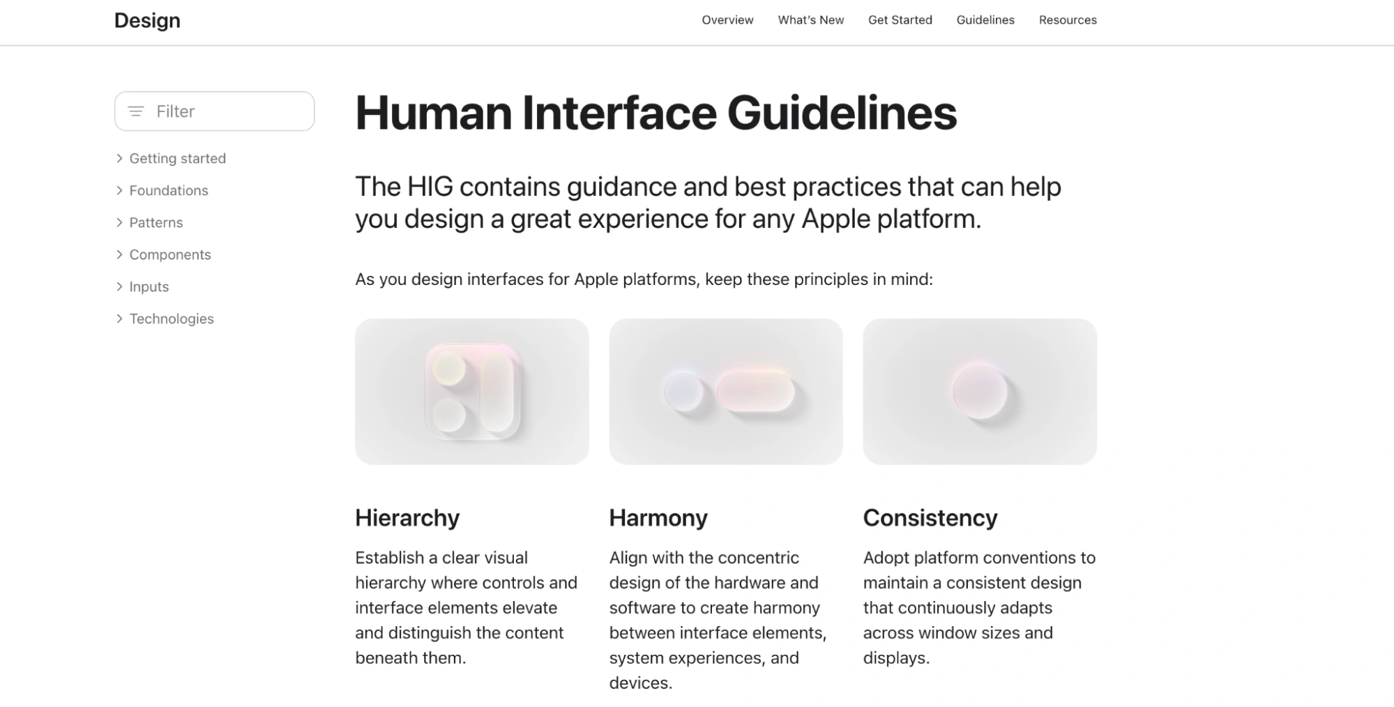
Apple’s Human Interface Guidelines (HIG) define how apps should be designed across iOS, macOS, watchOS, and other platforms within the Apple ecosystem. Rather than focusing primarily on components, the system emphasizes interaction patterns, behaviors, and principles that ensure a consistent user experience across devices.
What it does especially well
- Strong focus on interaction and behavior.
HIG defines how interfaces should feel and respond — not just how they look. - Platform-specific guidance.
Each platform (iOS, macOS, etc.) has tailored recommendations, ensuring designs feel native rather than generic. - Clear design principles driving decisions.
Concepts like clarity, depth, and deference guide how interfaces are structured and prioritized. - Consistency across the ecosystem.
Apps built with HIG follow familiar patterns, making them easier for users to understand and navigate.
What teams can learn from it
Apple shows that a design system is not only about components — it’s about defining how a product behaves.
Instead of over-specifying UI elements, HIG focuses on principles and interaction patterns. This makes the system flexible while still maintaining a consistent experience across products.
Another key takeaway is platform awareness. A strong system doesn’t force the same solution everywhere — it adapts to context while preserving familiarity.
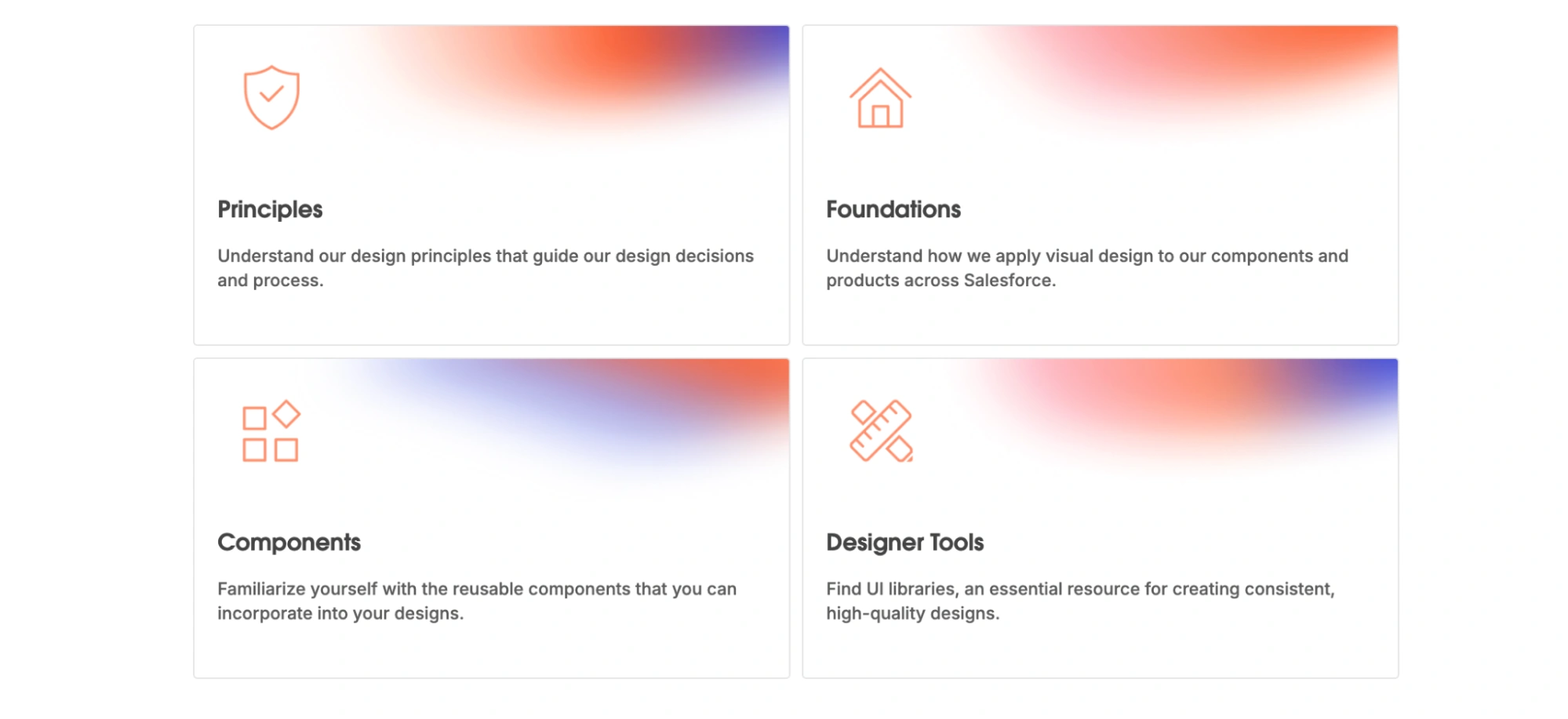
5. Salesforce Lightning Design System
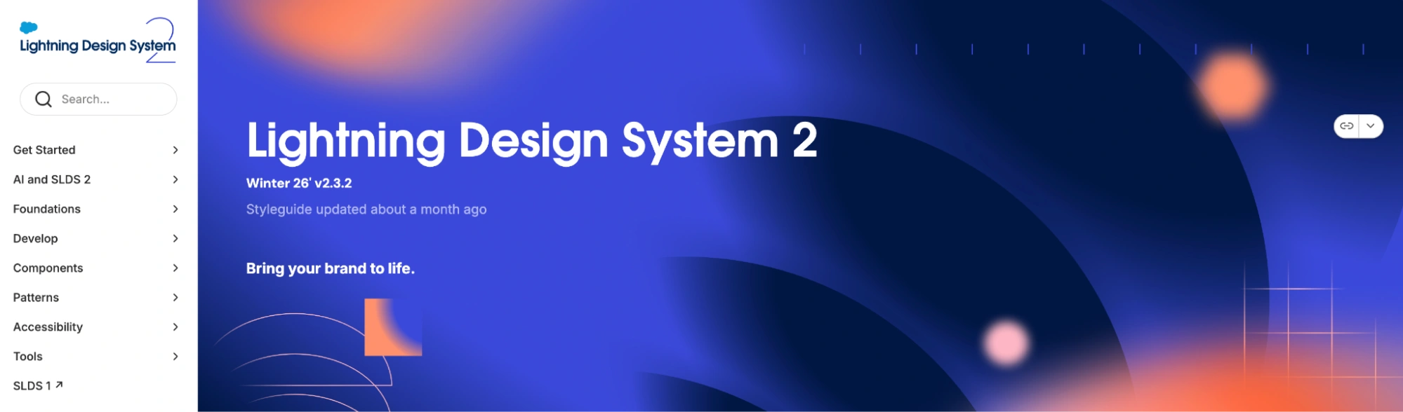
The Salesforce Lightning Design System (SLDS) is built to support Salesforce’s ecosystem of enterprise applications. It provides UI components, design tokens, and guidelines that help teams build consistent, accessible interfaces across complex, data-heavy products.
What it does especially well
- Structured token system for scalability.
SLDS uses design tokens to manage color, spacing, and typography, making it easier to maintain consistency across large applications. - Designed for enterprise complexity.
Components are built to handle dense interfaces — forms, tables, dashboards — without losing clarity. - Strong accessibility foundation.
Accessibility is integrated into components and guidelines, not treated as an afterthought. - Clear implementation guidance.
The system includes practical resources for developers, helping bridge the gap between design and code.
What teams can learn from it
Salesforce shows how design systems need to adapt when products become complex.
In enterprise environments, it’s not enough to have a clean UI — systems must support large amounts of data, multiple workflows, and different user roles. SLDS handles this by relying on structured tokens and well-defined components that scale without becoming inconsistent.
Another key takeaway is balance. Even in complex systems, clarity remains critical. A design system should help simplify decision-making, not add more layers of confusion.
6. Adobe Spectrum
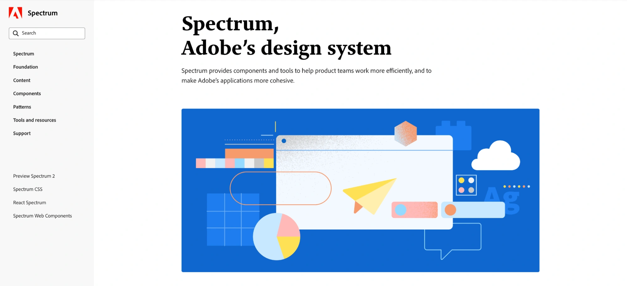
Adobe Spectrum is Adobe’s design system used across its wide range of products, from creative tools like Photoshop and Illustrator to web-based applications. It’s built to ensure consistency across a diverse ecosystem while supporting different platforms, themes, and interaction contexts.
What it does especially well
- Consistency across a diverse product ecosystem.
Spectrum maintains a unified design language across products with very different purposes and complexity levels. - Flexible and adaptive components.
Components are designed to work across multiple contexts, including desktop apps, web interfaces, and different visual themes. - Strong foundation and token system.
Color, typography, spacing, and theming are structured in a way that supports scalability without forcing rigid design decisions. - Support for theming and different environments.
The system accounts for light/dark modes and varying UI densities, adapting to different usage scenarios.
What teams can learn from it
Adobe Spectrum shows how a design system can stay consistent without becoming restrictive.
Instead of enforcing one rigid structure, it allows components and foundations to adapt to different products and contexts. This is especially important for teams working across multiple platforms or product types.
Another key takeaway is flexibility. A design system should provide enough structure to maintain consistency, but not so much that it limits how products evolve.
7. Uber Base Design System
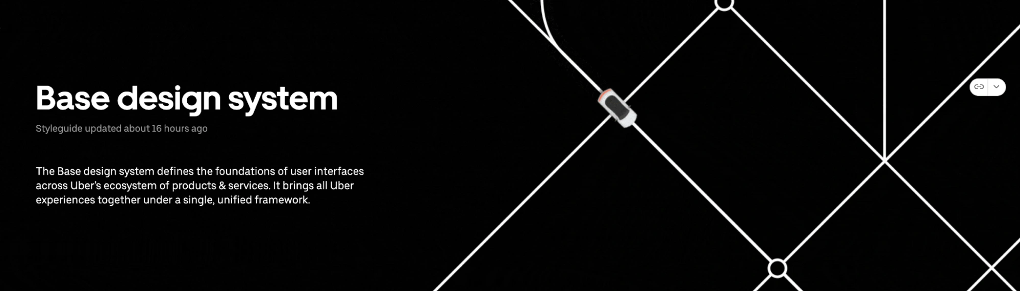
Base is Uber’s design system built to support a wide range of products across its ecosystem — from rider and driver apps to internal tools. It provides shared foundations, components, and guidelines that help teams design consistently while working across different use cases and platforms.
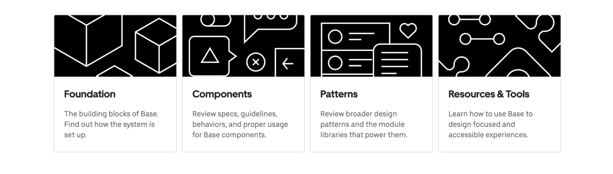
What it does especially well
- Scalable foundations across multiple products.
Base is designed to support a growing ecosystem, ensuring consistency even as new products and features are added. - System discipline over visua
- Uber Base shows that design systems are most valuable when they support scale.
- As products expand, consistency becomes harder to maintain — especially when multiple teams are involved. Base addresses this by focusing on shared foundations and system discipline, rather than overcomplicating components.
- Another key takeaway is restraint. A strong system doesn’t try to cover every possible variation upfront. Instead, it evolves alongside the product while maintaining a consistent core.
- l variety.
The focus is on maintaining structure and alignment rather than introducing unnecessary visual differences between products. - Cross-team alignment.
The system helps multiple teams work in parallel while still producing a cohesive experience. - Practical, product-driven components.
Components are built based on real use cases, not abstract patterns.
What teams can learn from it
Uber Base shows that design systems are most valuable when they support scale.
As products expand, consistency becomes harder to maintain — especially when multiple teams are involved. Base addresses this by focusing on shared foundations and system discipline, rather than overcomplicating components.
Another key takeaway is restraint. A strong system doesn’t try to cover every possible variation upfront. Instead, it evolves alongside the product while maintaining a consistent core.
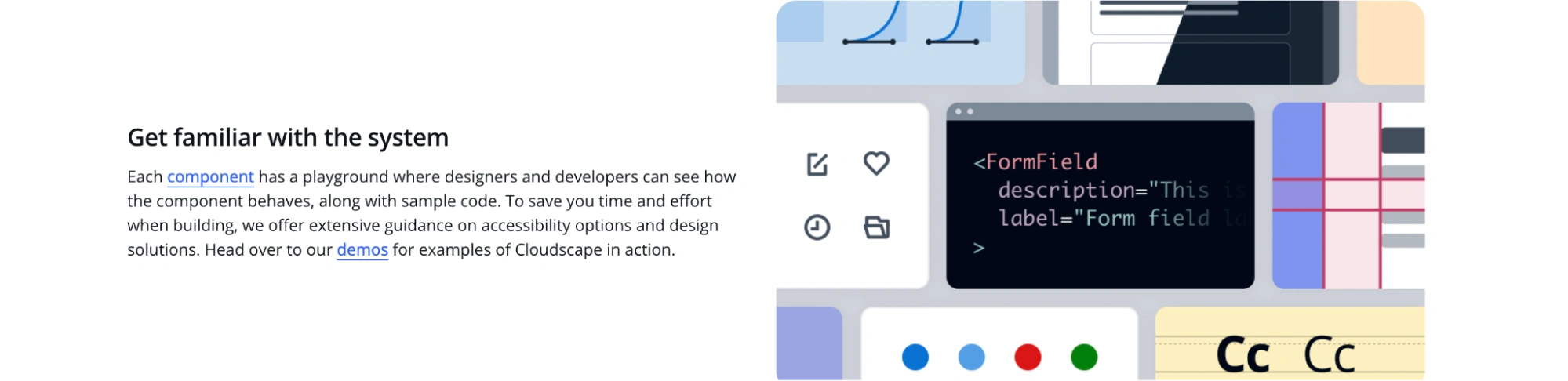
8. AWS Cloudscape Design System
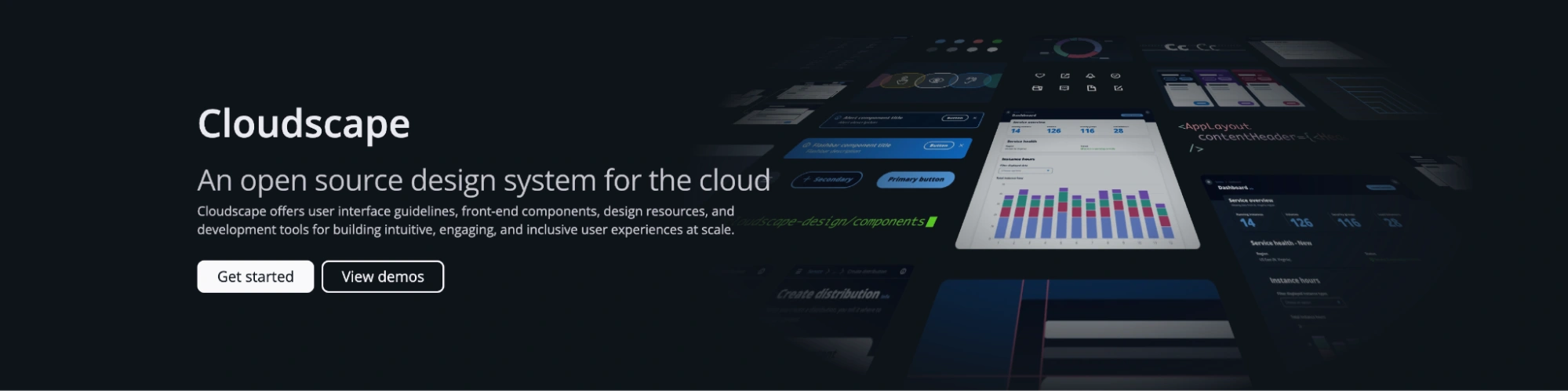
Cloudscape is Amazon Web Services’ design system built to support cloud-based applications and complex management interfaces. It provides components, patterns, and guidelines specifically designed for data-heavy, task-oriented products used by developers, engineers, and enterprise users.
What it does especially well
- Focus on real product patterns.
Cloudscape goes beyond basic components and provides patterns for common workflows like tables, forms, filtering, and data management. - Strong alignment with development.
The system is tightly connected to implementation, with clear guidance that helps developers translate design into working interfaces. - Designed for complex, task-driven interfaces.
Components are built for efficiency and clarity in environments where users manage large amounts of data. - Practical, no-frills documentation.
The documentation focuses on usability and application, rather than visual presentation.
What teams can learn from it
Cloudscape shows that design systems become more valuable when they reflect real user tasks — not just UI structure.
Instead of focusing only on reusable components, it emphasizes patterns that support actual workflows. This makes it especially useful for SaaS products where users interact with data, dashboards, and complex controls.
Another key takeaway is developer alignment. A design system is only effective if it translates cleanly into implementation. Cloudscape keeps that connection tight, making it easier for teams to move from design to production without friction.
9. Microsoft Fluent 2
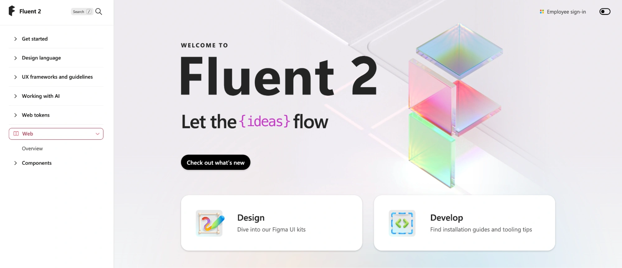
Fluent 2 is Microsoft’s design system used across products like Teams, Office, and Windows. It builds on the original Fluent system with a stronger focus on clarity, accessibility, and consistency across a large ecosystem of productivity tools.
What it does especially well
- Consistency across a massive product ecosystem.
Fluent ensures that products with very different use cases still feel connected and familiar. - Clear, modern foundations.
Color, typography, spacing, and motion are structured to support both simplicity and scalability. - Accessibility and inclusivity by design.
The system incorporates accessibility principles directly into components and interaction patterns. - Balanced flexibility.
Teams can adapt components to different contexts without breaking overall consistency.
What teams can learn from it
Fluent 2 shows how to maintain consistency across products that evolve independently.
Instead of enforcing rigid rules, it provides a shared structure that allows teams to design for their specific use cases while still staying aligned with the broader system.
Another key takeaway is clarity. Fluent prioritizes legibility, spacing, and hierarchy in a way that supports productivity-focused interfaces — especially in tools where users spend long periods of time.
10. HubSpot Canvas

Canvas is HubSpot’s design system used across its suite of marketing, sales, and customer platform tools. It supports a wide range of interfaces — from dashboards and CRM views to content creation tools — all within a unified product experience.
What it does especially well
- Designed around real user workflows.
Canvas focuses on how users actually work inside the product — managing data, building campaigns, and navigating complex tools. - Clear and practical component structure.
Components are built to support common SaaS patterns like tables, forms, filters, and dashboards. - Strong emphasis on usability and clarity.
The system prioritizes readability, spacing, and hierarchy to keep complex interfaces approachable. - Consistency across a growing product suite.
Canvas helps unify multiple tools under one experience, even as the platform expands.
What teams can learn from it
HubSpot Canvas shows that a design system should be grounded in how users interact with the product — not just how the interface looks.
Instead of focusing only on visual consistency, it emphasizes usability in real workflows, which is especially important for SaaS products with complex functionality.
Another key takeaway is practicality. A design system doesn’t need to be overly complex to be effective. When components and patterns are aligned with real use cases, teams can move faster without sacrificing consistency.
11. Zendesk Design System (Garden)
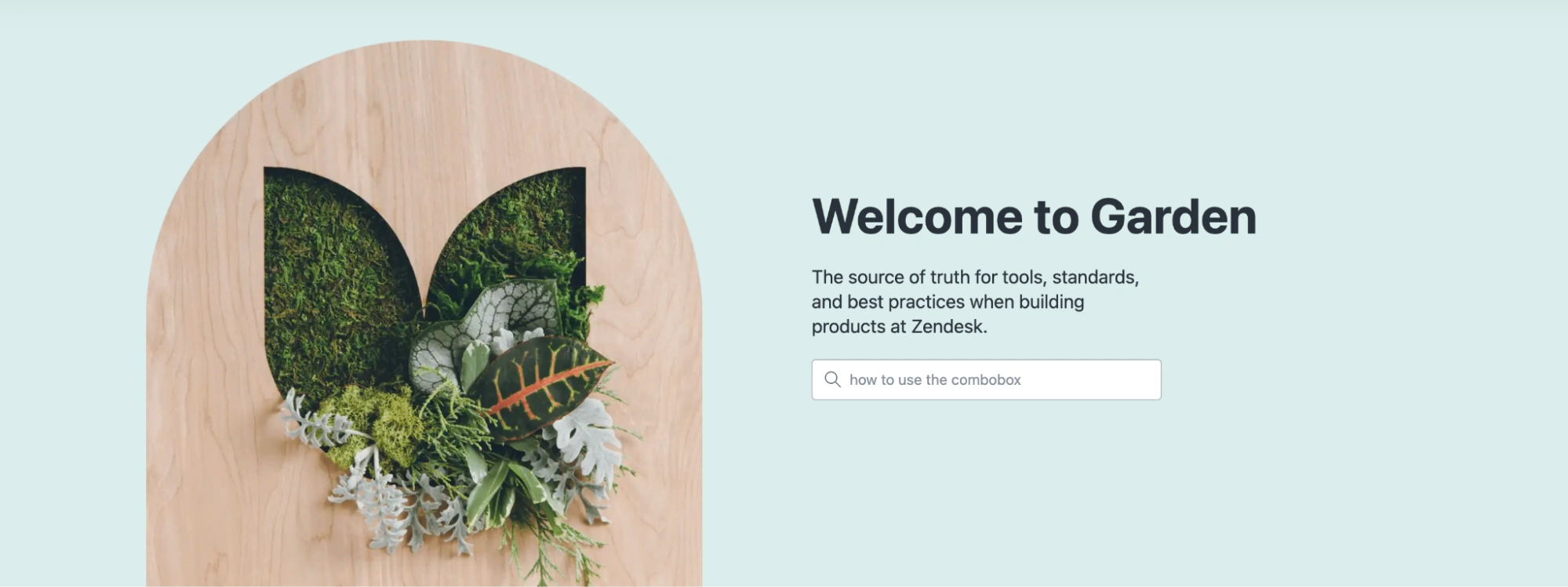
Zendesk Garden is Zendesk’s design system used across its customer support and service products. It provides components, patterns, and guidelines that help teams build consistent interfaces for agents handling tickets, conversations, and workflows at scale.
What it does especially well
- Designed for high-frequency workflows.
Garden supports interfaces where users perform repetitive tasks, such as managing tickets, replying to customers, and navigating queues. - Clarity in dense, information-heavy UI.
The system prioritizes readable layouts, clear hierarchy, and predictable interactions in complex environments. - Consistent component patterns across tools.
Shared components help unify multiple Zendesk products into a cohesive experience. - Strong alignment with real product use cases.
Components and patterns reflect actual support workflows, not abstract UI structures.
What teams can learn from it
Zendesk shows how design systems should adapt to how users actually work — especially in tools where speed and efficiency matter.
In high-frequency environments, even small inconsistencies can slow users down. Garden addresses this by focusing on predictable patterns and clear structure, helping users move quickly without friction.
Another key takeaway is usability under pressure. A design system should support real usage conditions — not just ideal scenarios. Zendesk prioritizes clarity and consistency in situations where users need to act quickly and repeatedly.
12. SAP Design System (Fiori)
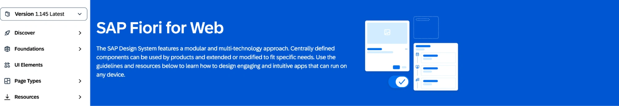
SAP Fiori is SAP’s design system used across its enterprise software ecosystem. It’s designed to simplify complex business applications by providing a consistent set of UI components, interaction patterns, and guidelines that support data-heavy workflows and role-based experiences.
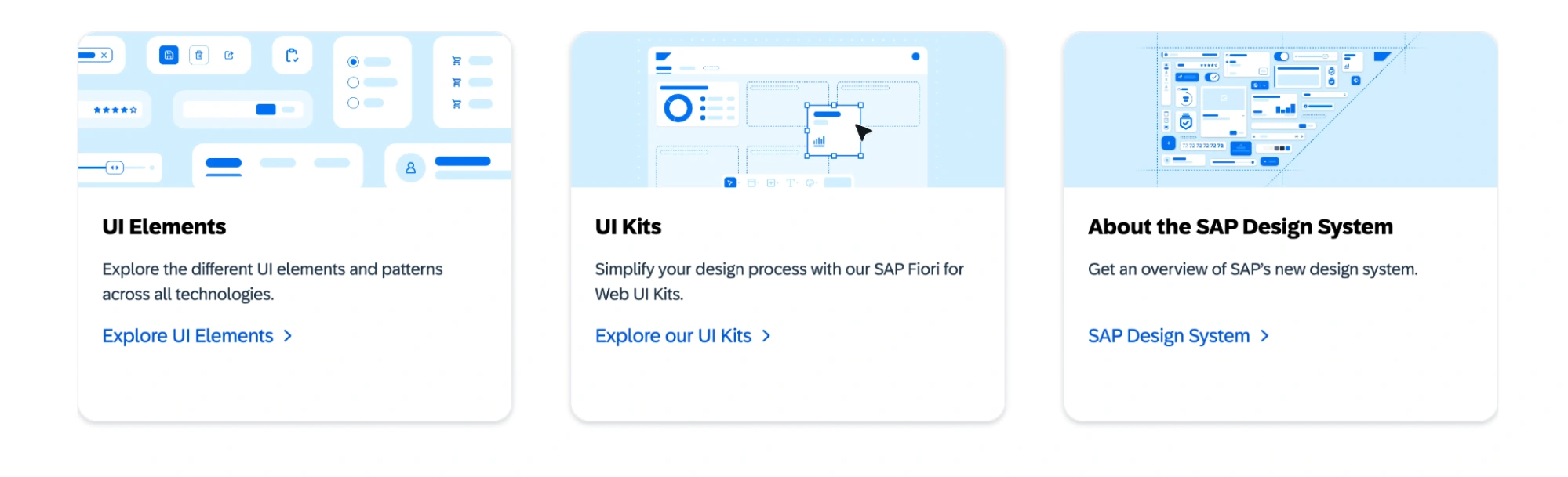
What it does especially well
- Designed for role-based enterprise workflows.
Fiori structures interfaces around user roles and tasks, helping users focus on what’s relevant to their responsibilities. - Strong pattern-level guidance.
Beyond components, the system defines how common business scenarios — approvals, forms, dashboards — should work. - Consistency across complex applications.
It unifies a wide range of enterprise tools under a shared interaction and visual model. - Tight integration with development frameworks.
Fiori is closely aligned with SAP’s frontend technologies, ensuring smooth implementation.
What teams can learn from it
SAP Fiori shows that in enterprise products, structure matters more than visual polish.
By organizing experiences around roles and workflows, the system helps reduce complexity and guide users through tasks more efficiently. This is especially relevant for SaaS products with different user types and permissions.
Another key takeaway is pattern thinking. Instead of focusing only on individual components, Fiori defines how entire workflows should function — making the system more useful in real product scenarios.
13. Skyscanner Design System (Backpack)
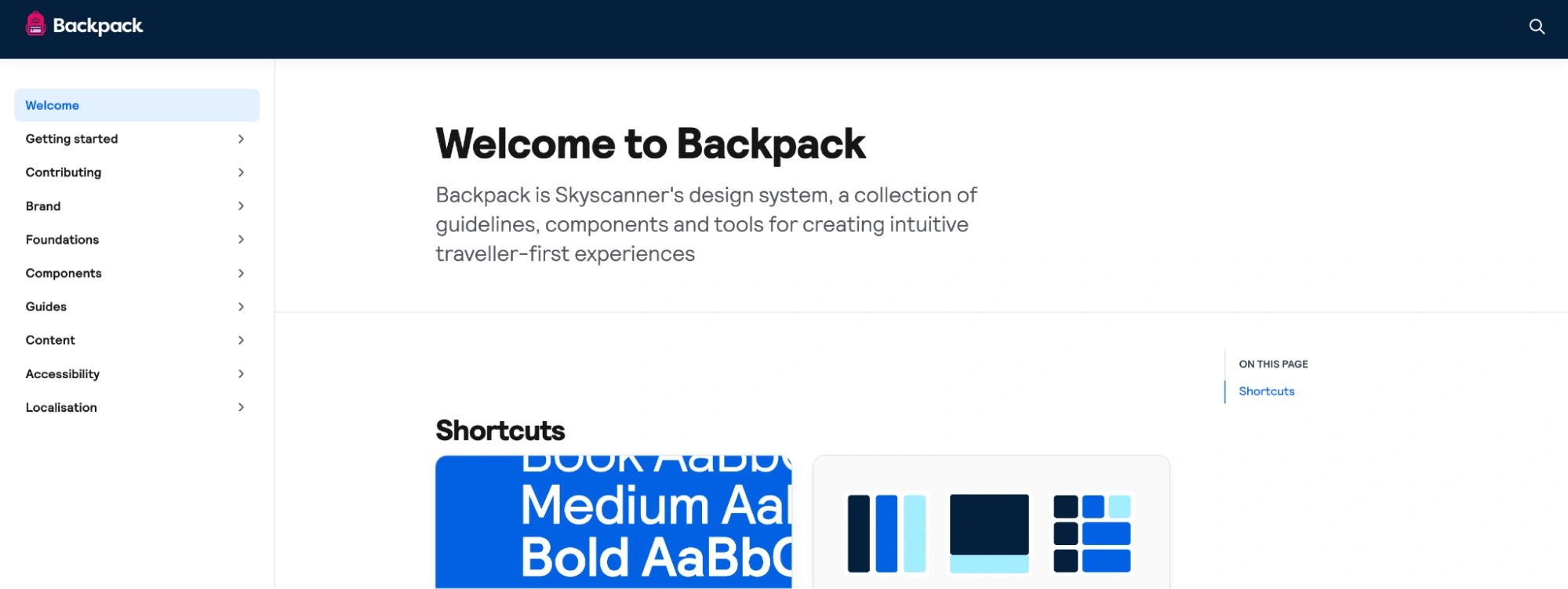
Backpack is Skyscanner’s design system used across its travel products, including flight search, booking flows, and supporting tools. It combines design guidelines, components, and code to help teams build consistent, user-friendly experiences across web and mobile platforms.
What it does especially well
- Clear and approachable visual language.
Backpack focuses on simplicity, friendly UI elements, and strong hierarchy, making complex travel information easier to navigate. - Consistency across platforms.
The system ensures that experiences feel aligned across web and mobile, even as features evolve. - Well-structured component library.
Components are practical and built around real use cases like search, filters, and results — not abstract UI patterns. - Strong design–development connection.
Backpack includes both design assets and coded components, helping teams move smoothly from design to implementation.
What teams can learn from it
Backpack shows that design systems don’t have to be heavy to be effective.
Instead of overcomplicating structure, it focuses on clarity, usability, and consistency in real product scenarios. This makes it especially relevant for consumer-facing products where users need to move quickly and understand information at a glance.
Another key takeaway is tone and experience. A design system should reflect the product’s personality — not just enforce consistency. Backpack maintains a friendly, accessible feel while still being structured and scalable.
14. Westpac Design System (GEL)
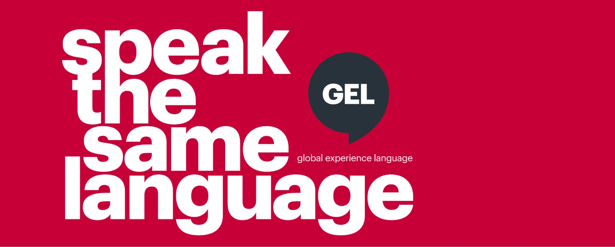
GEL (Global Experience Language) is Westpac Group’s design system used across its banking products and sub-brands. It provides guidelines, components, and patterns that help teams create consistent, accessible, and trustworthy digital experiences across a wide range of financial services.
What it does especially well
- Consistency across multiple brands.
GEL aligns experiences across Westpac’s different sub-brands while allowing each to maintain its own identity. - Clarity and accessibility as core principles.
The system emphasizes readability, clear hierarchy, and inclusive design — critical for financial interfaces. - Strong integration of design and content.
GEL includes guidance on tone, language, and communication, ensuring that messaging stays consistent alongside UI. - Practical, well-structured components.
Components are designed for real banking workflows, such as transactions, account management, and forms.
What teams can learn from it
GEL shows that design systems are essential for maintaining consistency across large organizations — especially when multiple brands and teams are involved.
One key takeaway is how it balances consistency with flexibility. Instead of enforcing a single rigid style, it allows variation where needed while keeping the overall experience aligned.
Another important lesson is the role of clarity. In financial products, users need to trust what they see and understand it quickly. GEL supports this by prioritizing simplicity, accessibility, and consistent communication.
15. Firefox Design System (Acorn)
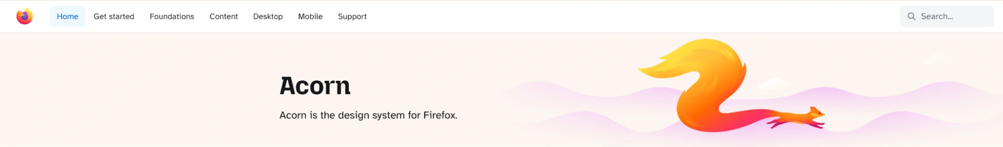
Acorn is Mozilla’s design system used across Firefox and related products. It provides a shared set of foundations, components, and guidelines that help teams build consistent, accessible, and privacy-focused digital experiences across Mozilla’s ecosystem.
What it does especially well
- Strong emphasis on accessibility and inclusivity.
Accessibility is built into components, color usage, and interaction patterns from the start, not added later. - Clear and structured foundations.
Typography, color, spacing, and layout are defined in a way that supports consistency without overcomplicating the system. - Designed for distributed teams.
Acorn is built to support collaboration across teams and contributors, with documentation that is easy to navigate and apply. - Alignment with product values.
The system reflects Mozilla’s focus on privacy, transparency, and user trust through both design decisions and communication.
What teams can learn from it
Acorn shows that a design system should reflect not just how a product looks, but what it stands for.
By embedding accessibility and user trust into the system itself, it ensures that these principles scale naturally across products — rather than being enforced separately.
Another key takeaway is clarity. Acorn avoids unnecessary complexity, making it easier for teams to adopt and use consistently, even in distributed environments.
16. Benevity Design System (Skyline)
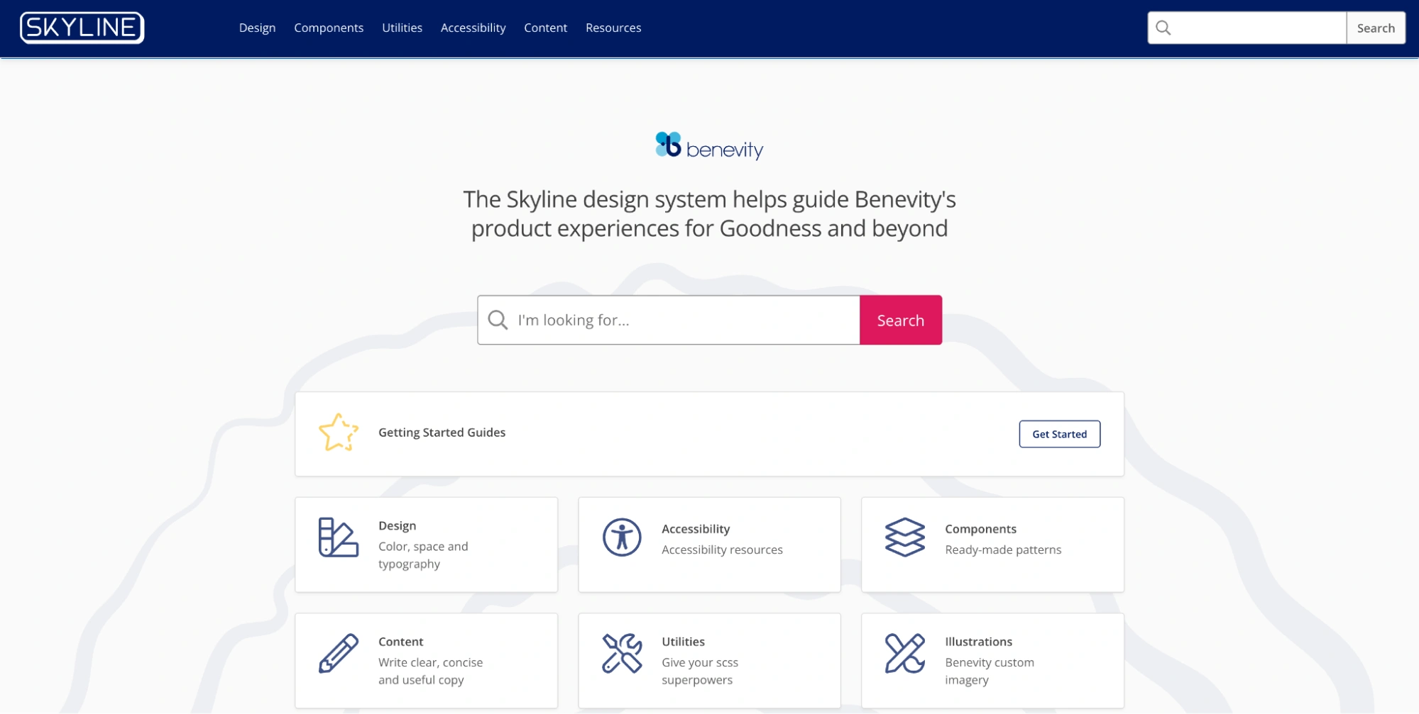
Skyline is Benevity’s design system used across its corporate giving and social impact platform. It provides foundations, components, and guidelines that help teams build consistent, accessible experiences for workflows like donations, volunteering, and employee engagement.
What it does especially well
- Designed for action-driven experiences.
Skyline supports flows where users need to complete meaningful actions — donating, joining initiatives, or tracking impact — without friction. - Clear and approachable design language.
The system emphasizes readability, friendly visuals, and straightforward interactions, making complex actions feel simple. - Consistency across a growing product ecosystem.
It aligns multiple features and tools under a shared structure while allowing flexibility where needed. - Practical, product-focused components.
Components are built around real use cases, not abstract UI patterns, which makes them easier to apply in everyday product work.
What teams can learn from it
Skyline shows that a design system should actively support user intent — not just standardize UI.
In products where users are making decisions or taking action, clarity and trust become critical. Skyline addresses this by reducing friction at key moments and making interactions easy to understand.
Another key takeaway is tone. A design system should reflect how a product feels to use. Skyline maintains a balance between structure and approachability, showing that systems can be consistent without feeling rigid or impersonal.
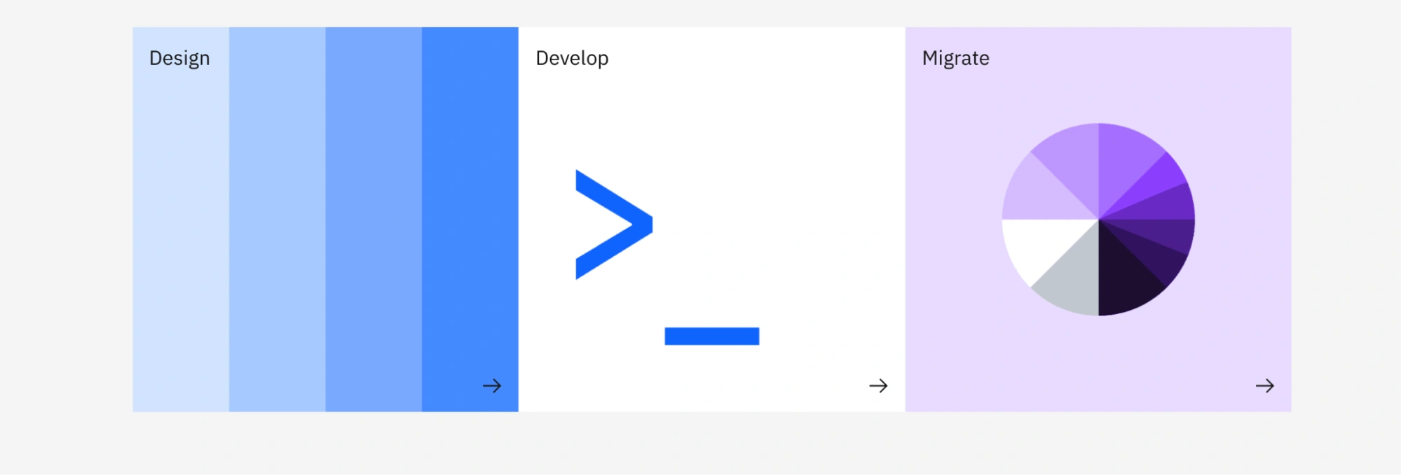
How strong design systems are usually organized
If you look across different design system examples — from Material to Carbon to Fluent — several common patterns starts to emerge.
Strong systems aren’t just collections of components. They’re structured in layers, where each level builds on the previous one. This structure is what makes them scalable, maintainable, and usable across teams.
Here’s how most mature design systems are organized:
Foundations
This is the base layer of the system — the elements everything else depends on. It typically includes:
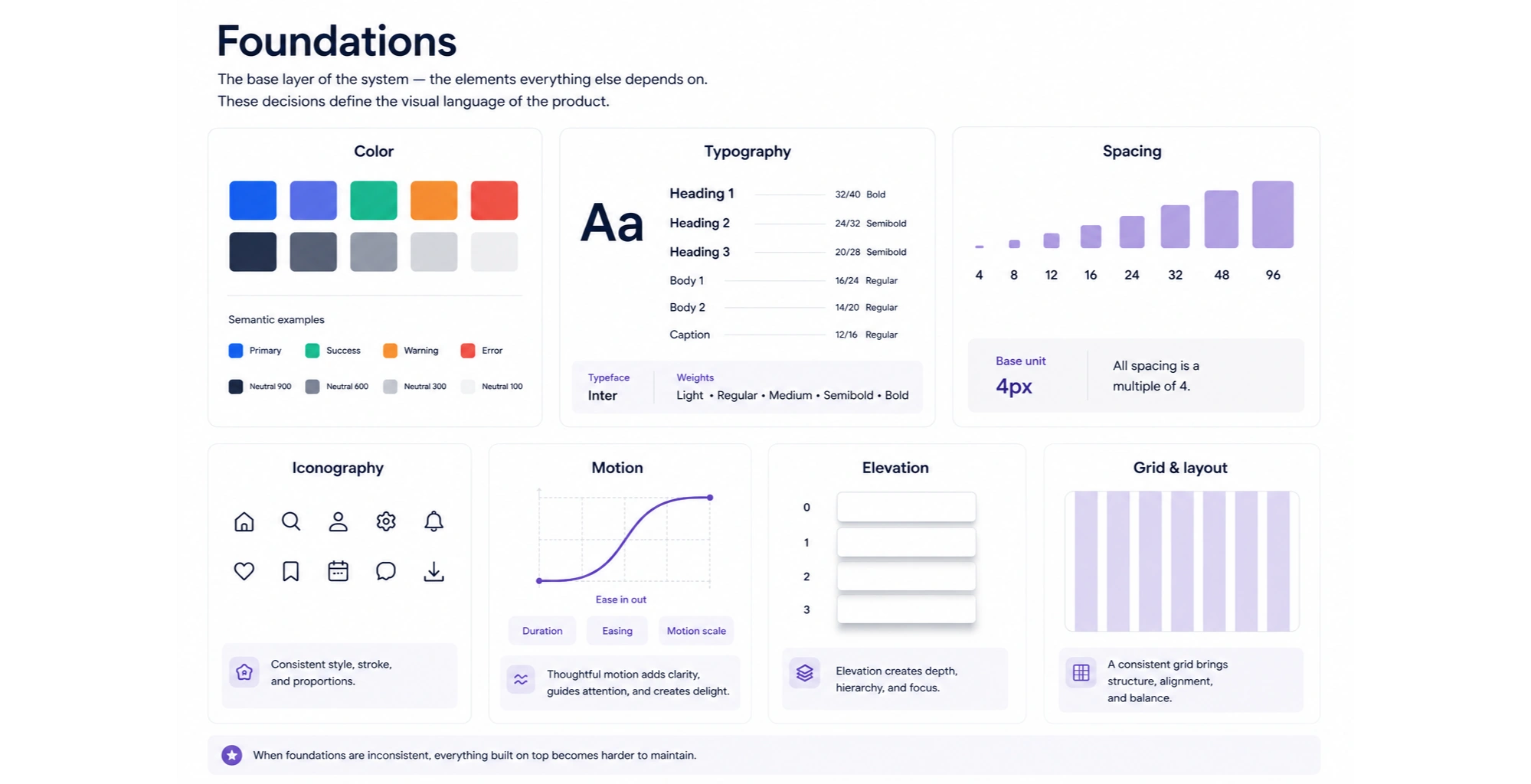
- Color
- Typography
- Spacing
- Iconography
- Motion
- Elevation
- Grid and layout
These decisions define the visual language of the product. When foundations are inconsistent, everything built on top becomes harder to maintain.
Tokens
Tokens translate design decisions into reusable variables that work across design and code.
Most systems organize them into levels:
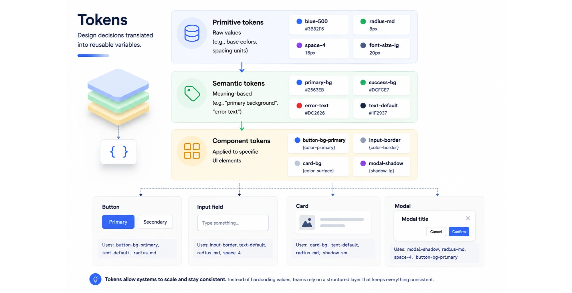
- Primitive tokens — raw values (e.g., base colors, spacing units)
- Semantic tokens — meaning-based (e.g., “primary background,” “error text”)
- Component tokens — applied to specific UI elements
Tokens are what allow systems to scale. Instead of hardcoding values, teams rely on a structured layer that keeps everything consistent.
Components
Design system components are the building blocks of the interface — buttons, inputs, modals, cards, and more.
In strong systems, components include:
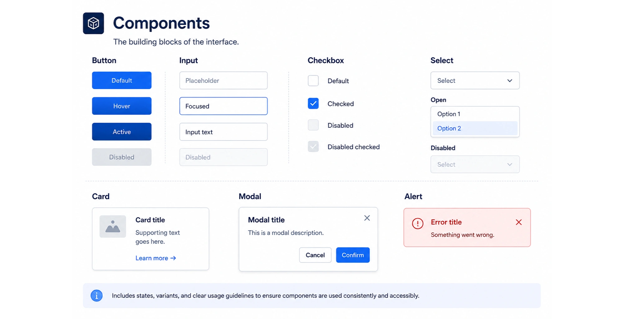
- Defined states (hover, active, disabled)
- Variants (sizes, styles, hierarchy)
- Clear usage guidelines
This is where design systems become visible in the product — but their effectiveness depends on how well foundations and tokens are defined.
Patterns
Patterns go beyond individual components and define how they work together. Examples include:
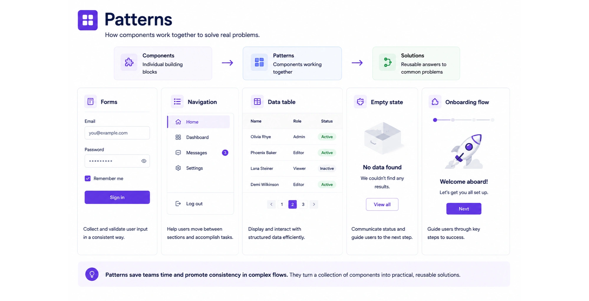
- Forms
- Navigation systems
- Tables and data views
- Empty states
- Onboarding flows
- Checkout or task flows
Patterns make systems practical. They help teams solve real product problems instead of assembling interfaces from scratch.
Documentation
Documentation connects everything. It explains:
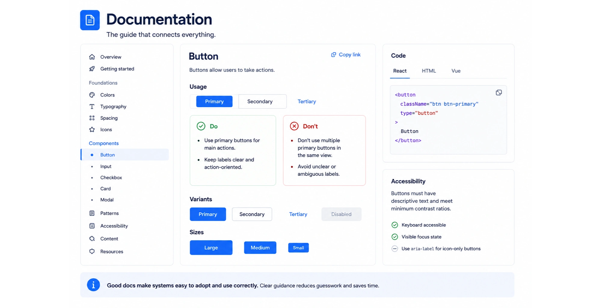
- When and how to use components
- Do’s and don’ts
- Accessibility considerations
- Code references
Without documentation, even the best-designed system becomes hard to use consistently.
Governance
This is what keeps the system alive over time. It includes:
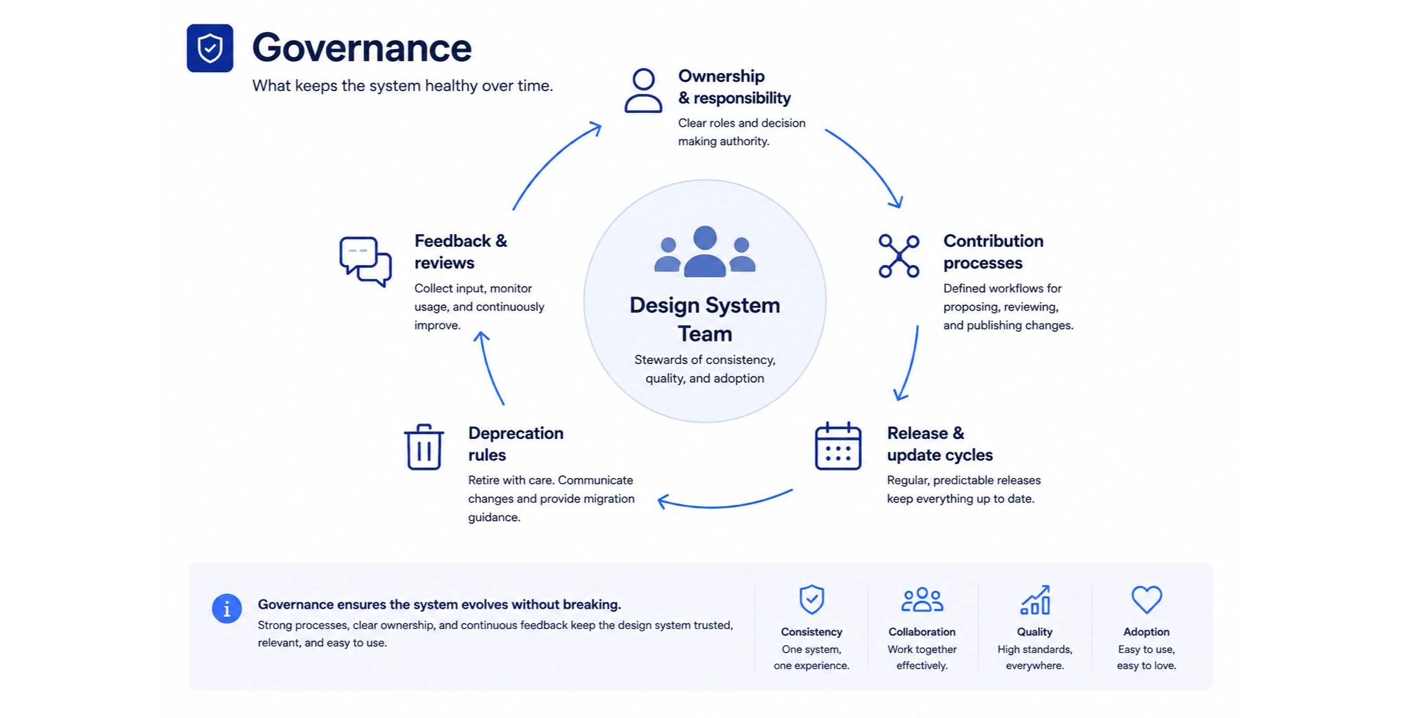
- Ownership and responsibility
- Contribution processes
- Release and update cycles
- Deprecation rules
Without governance, systems tend to fragment as products evolve and teams grow.
A simple way to think about it
At a high level, most systems follow this structure:
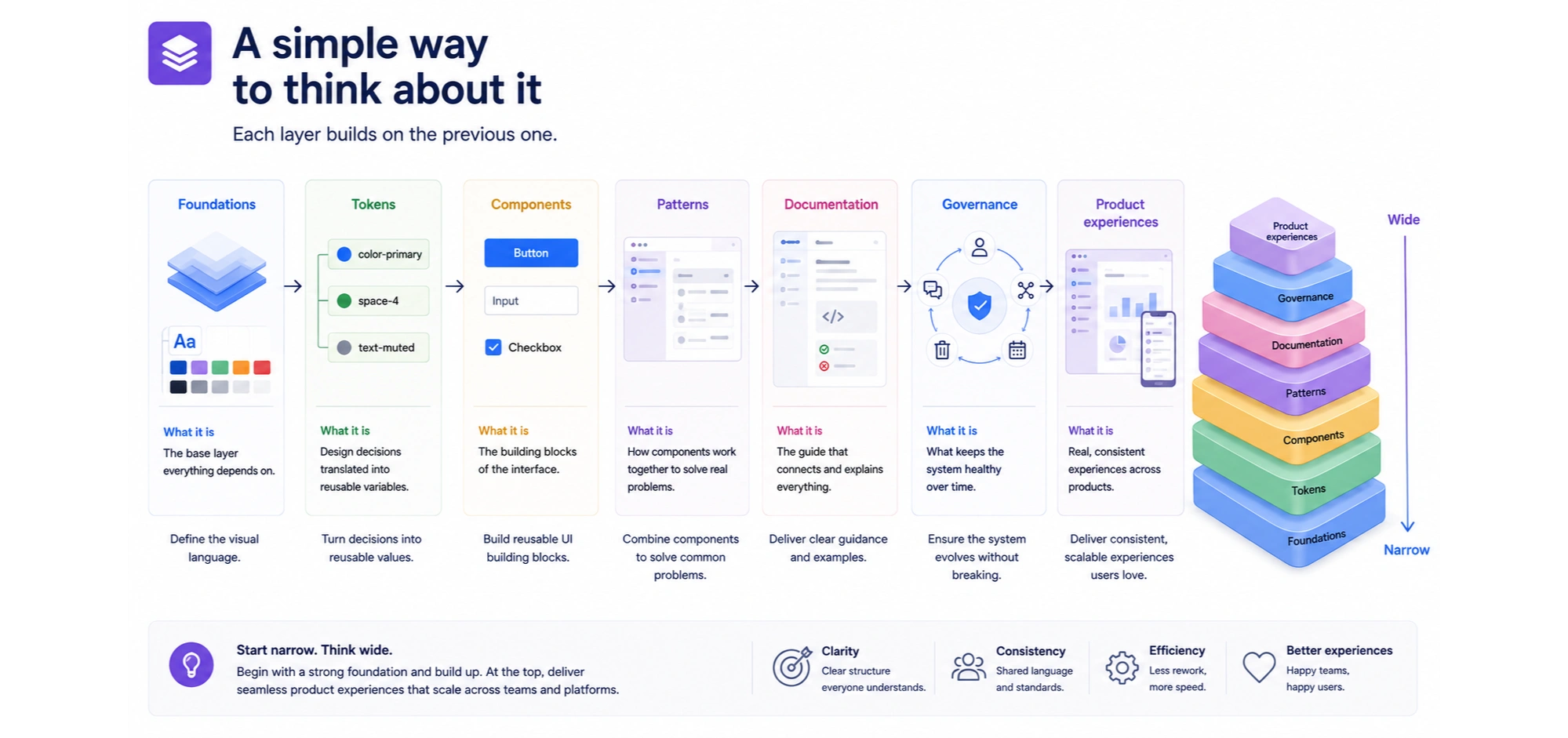
Foundations → Tokens → Components → Patterns → Product experiences
Each layer builds on the previous one. When the structure is clear, the system becomes easier to scale, maintain, and apply across different products and teams.
What to borrow from these design systems — and what not to copy
Looking at strong design system examples can be inspiring. But copying them blindly is where most teams go wrong.
The goal isn’t to recreate Material or Carbon. It’s to understand what actually makes these systems work — and apply that in a way that fits your product.
What’s worth borrowing
These patterns show up across almost every strong design system — and for a reason.
- Clear foundations
Systems like Material and Fluent invest heavily in color, typography, and spacing. This creates consistency before components even come into play. - Thoughtful naming and structure
Well-organized tokens, components, and patterns make systems easier to understand and scale. - Documentation that explains decisions
Carbon and Atlassian don’t just show components — they explain when and why to use them. - Pattern-level thinking
Systems like Cloudscape and Fiori go beyond UI elements and define how real workflows should function. - Accessibility built in from the start
In systems like Acorn or GEL, accessibility is part of the foundation — not an afterthought. - Clear contribution and governance models
Atlassian and Salesforce show how systems stay consistent as teams grow and contribute.
What not to copy blindly
This is where many teams overcomplicate things.
- Enterprise-level complexity
Systems like Carbon or Salesforce are designed for large organizations. Smaller teams often don’t need that level of structure. - Overengineered token systems
Not every product needs multiple layers of abstraction. Start simple and evolve as needed. - Too many components too early
Trying to cover every possible use case upfront usually leads to clutter and confusion. - Documentation you can’t maintain
A half-updated system is worse than a simple one. Keep documentation realistic. - Rigid systems that block product evolution
Systems should support product growth — not slow it down with unnecessary constraints.
A practical way to think about it
The best design systems aren’t the most complex — they’re the most usable. They reflect:
- the size of the team
- the maturity of the product
- the complexity of the workflows
Start with what your product actually needs. Then evolve the system as those needs grow.
This section:
- Adds real authority
- Avoids generic advice
- Balances inspiration with realism
- Sets up Eleken’s perspective perfectly
Eleken’s approach to design systems
Across different products, one thing becomes clear: design systems should support teams — not slow them down.
In practice, the right system isn’t the most comprehensive one. It’s the one that fits the product, the team, and the stage of growth.
At Eleken, we approach design systems as something that evolves with the product.
That means avoiding one-size-fits-all solutions and focusing instead on what the team actually needs at a given moment.
1. Design systems should support product teams, not add overhead. If a system makes everyday work harder, it’s not doing its job.
2. System maturity depends on the product stage. Early-stage products don’t need the same level of structure as large-scale platforms. Trying to build everything upfront often leads to unnecessary complexity.
3. Balance matters more than completeness. Strong systems find the balance between consistency, flexibility, and maintainability — without overengineering any one layer.
Rather than starting with a full system, we focus on creating structure where it’s needed most — aligning foundations, defining key components, and supporting real workflows.
From there, the system grows alongside the product.
When a product starts moving from scattered UI toward a more scalable and consistent experience, design systems become essential.
That’s where thoughtful, experience-driven design work makes the difference.
If your team is at that stage, Eleken designers can step in and help you structure a system that supports growth — without unnecessary complexity.


.png)