Your pricing page is the final destination your clients will find in their customer journey. If your potential customer has gone the whole way down the funnel and is now considering making the final decision, you just can't fail to get users to click that "buy" button.
A well-designed pricing page encourages and directs your prospects to make their choice and subscribe. But what should a good SaaS pricing page design be like?
As a pragmatic SaaS design agency, we identified essential components that most pricing pages possess and picked nine best practices that popular SaaS companies use to optimize each element and create a pricing page that works. Most of them have a simple layout, clearly show the product's value, and create trust between a company and user. Without further ado let's dive into the details of how to create an evocative and effective pricing page.
Key pricing page elements
*Small intro* Before designing your pricing page, you should develop a strategy that matches your company's value and your customers' needs. If you've already done this, good job, and let's move on. If not, read about the most efficient SaaS pricing models, choose the one that suits you, and come back here.
Now, let's get back to our main topic.
Having analyzed different SaaS websites, we have identified five key components of a pricing page that promotes higher conversions.
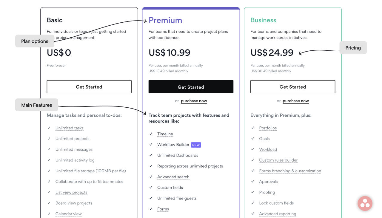
- Plan options. Consider your customers and how they can benefit from your service to develop appropriate pricing offers.
- Prices. Make clear pricing that explains to the customer what they pay for and receive for the money paid.
- Main features. People don't want to read loads of text; they need to understand each plan by quickly looking through the list of main features.
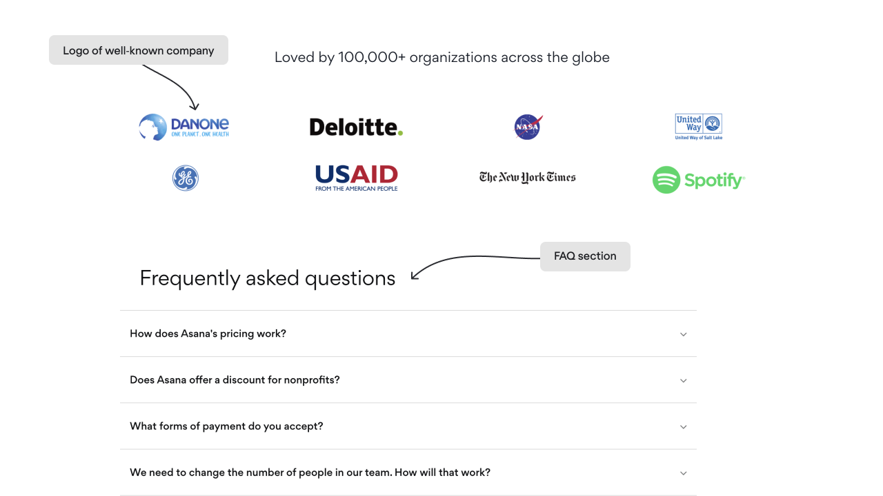
- Testimonials or popular companies' logos. Add credibility with the help of your user's success stories and recognizable companies' logos.
- Frequently asked questions. Provide the user with all the information they may need to make a buying decision, leaving no room for hesitation.
Let’s take Asana’s pricing page as an example.
Seems like it’s quite easy to complete an effective pricing page. Unfortunately, simply putting all the elements from the above list on your page won’t work. Designing a converting pricing page requires good knowledge of human psychology in general and the needs/preferences/pain points of your target audience in particular.
Combining thorough user research with best design practices will help create a pricing page that speaks to the product's value and encourages prospects to click the "subscribe" button.
Regardless of what you're selling, a simple time-tracking app or a complicated all-in-one sales & marketing solution, start your pricing by knowing who your buyers are. In other words, create buyer (or customer) personas. If you think I'm talking about fancy slides with vague concepts, you may have already prepared for one of the C-team meetings, that's not the case. You need buyer personas created based on thorough quantitative sales and customer survey data analysis. As a result of this exercise, you should understand what price certain groups of customers are ready to pay for your product, and these insights will underlie a value-based pricing strategy.
Did you get the point? Great, going further into the best practices.
#1. One buyer persona – one price plan
A pricing page is where all your efforts spent on user and market research pay off. As soon as you define your target audience, the next step will be to offer them the best-match product. It should be a no-brainer for your customers to understand which of your products is specifically tailored to solve their problem.
The smart way is to name the price plans after the customers’ group. For example, it can be a “Bootstrapper – Startup – Professional – Enterprise” plan.
You can also tie the pricing package names and the jobs to be done. It can be something like “Launch – Power Up – Scale.”
Each plan's price should consider the target group's price sensitivity and the value they're willing to pay for.
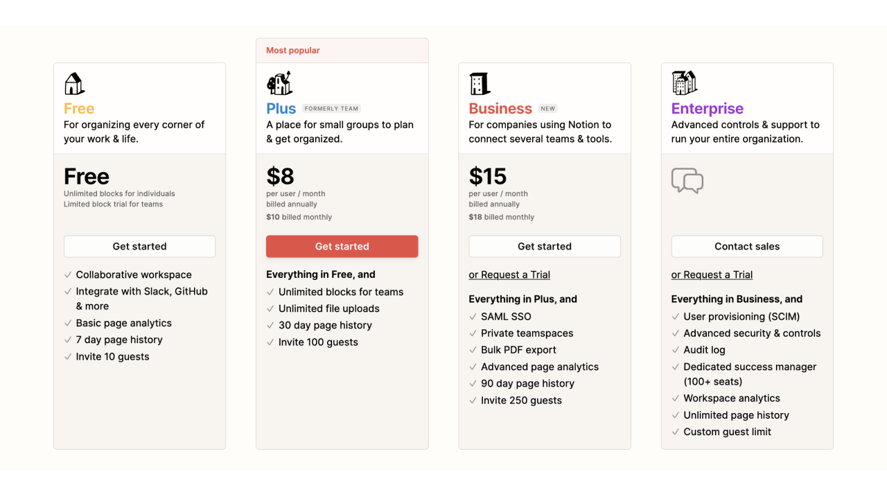
Notion's designers have done a great job presenting small illustrations to characterize each buyer persona, starting from a girl in the headphones that stands for a plan for personal use and ending with the orchestra conductor that represents the solution for an enterprise. Besides illustrations, each plan has a short, clear description. For example, the personal pro plan has the following: "For power users who want to do even more."
#2. Build pricing that scales
The scalable pricing concept is based on a value metric, which presents what the customer pays for - per seat, per user, the number of minutes, etc.
Whereas buyer personas, which we discussed above, are crucial for the sales funnel and adequate price plan packing, the value metric allows to differentiate prices and expand revenue along with the increasing value customers get from your product. Put another way, you can also grasp a part if a customer gets more value.
The graph below will help explain this thought.
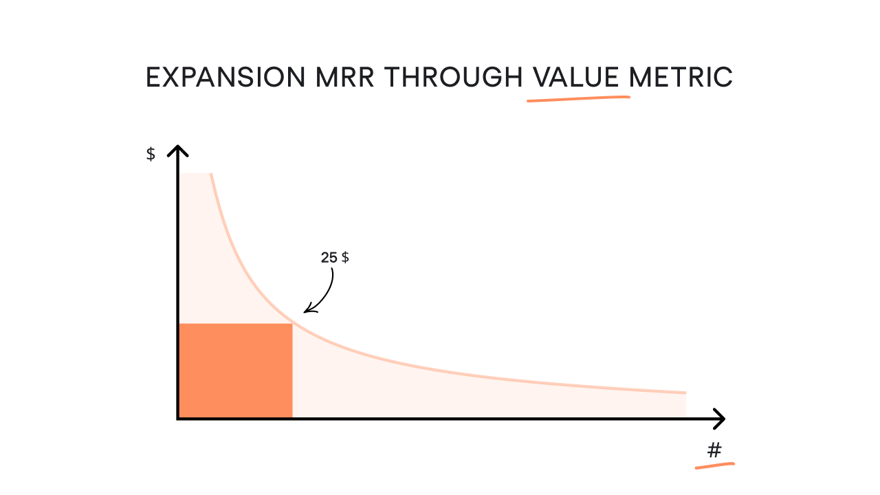
Look at the blue rectangle. It shows the market you cover with your fixed price. You give a specific value and get paid for that value. But actually, you can embrace all that striped area, setting different prices and being price-flexible. To make this simple yet brilliant scheme work, you should flawlessly determine where your customers gain value from your product without tangling them with pricing that is too diverse and complicated.
#3. Three is the optimal amount of pricing tiers
If your pricing page offers just one plan, the main task of those who visit your website will be to decide whether to subscribe to your service or not. However, if you have two or more pricing tiers, potential customers will think about which plan is better to choose.
Yet, more than four plans can confuse the prospect with too much information, while your task is to make each offer easy and quick to scan. That’s why the best practice is to create three plans for different buyer personas.
A good example here is Dropbox. The clean and minimalistic design, which is common for the whole Dropbox website, lets the reader quickly scan each offer and understand the main features of each plan. Two buttons at the top of the page also help the visitor easily check the price difference between monthly and annual subscriptions. Finally, each tier has a noticeable call-to-action button that informs the user about a free trial period.
#4. Improve page design and user experience
SaaS products are usually complex and have broad functionality, so explaining everything to a customer and keeping the page clean and clear is difficult.
All the hard work will be in vain if your pricing page doesn't look right. It should have a neat and user-friendly design and be easy to read and comprehend. Ask our designers how to build a beautiful pricing page, and they will brainstorm a bunch of options to choose from. We also have some hints for the SaaS pricing page design you can check.
What you should pay attention to when building your pricing page is the following:
- People don’t read; they scan
- People don’t like complicated things they can’t get by a quick look
- And finally, people hate cumbersome wordings and giant feature lists
Regarding the last point, when your future customers land on your pricing page, they expect to see a concise feature comparison facilitating them to make a purchase decision. They don't need a dozen functionalities on your list, as they care about 2-3 main features and probably a few more specific ones.
Focus on having these three price strategy pillars on your pricing page:
- Positioning based on buyers' personas you created before;
- Packages that contain features crucial for a particular customer group;
- Price plans aligned with values and customers’ willingness to pay for them.
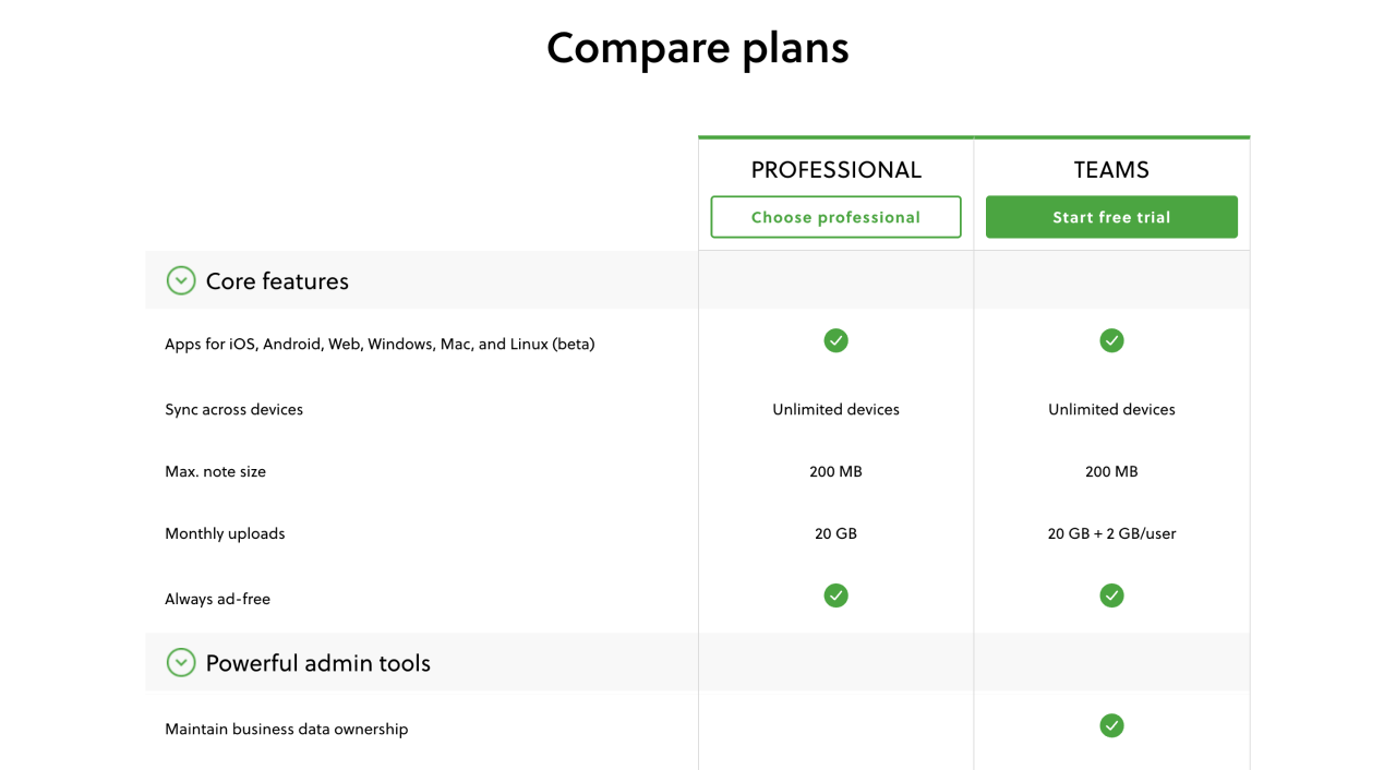
For example, take a look at Evernote's pricing page.
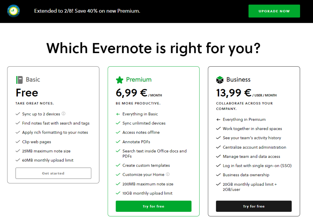
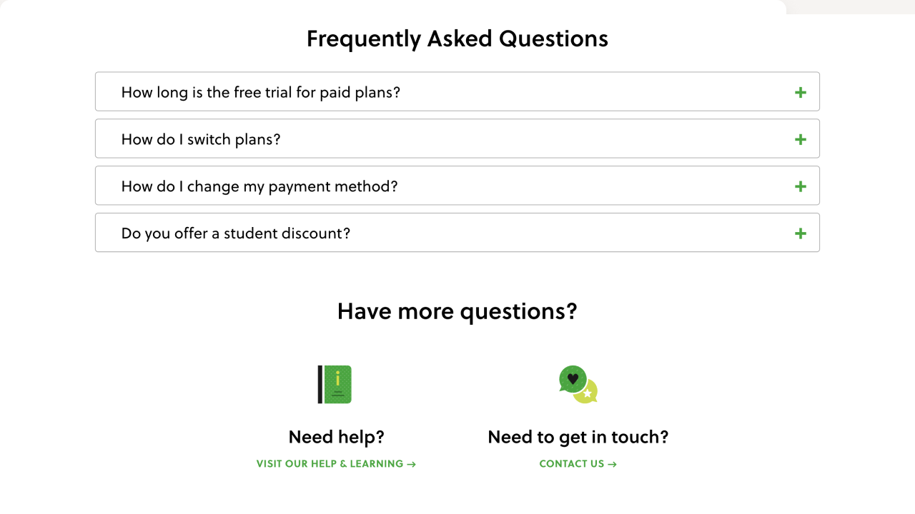
The plans' structure is clear and comprehensive. The prices adjust dynamically depending on the customer's IP address. The concise feature comparison is easy to understand. The extended features list is available for those who need more details.
The FAQ is organized in a drop-down list. Below the FAQ section, Help Center and Contact Us icons invite users to connect in case they have additional questions.
#5. Eliminate uncertainties
It's natural for those who make a purchase decision to doubt. Luckily, there are several common ways, which we've highlighted before that can help you reduce clients' uncertainty (FAQ, testimonials, recognizable company logos).
You may want to consider implementing more details on your pricing page.
FAQ and support
In the “Anatomy of a SaaS Marketing Site it is stated that:
- 76% of companies enable the “Contact Sales” option on their pricing pages
- 66% of pricing pages have an FAQ section
- 13% embed a live chat functionality
Among the points above, we would emphasize the FAQ as these three letters will assist you in beating another three – FUD, which stands for fears, uncertainties, and doubts.
People find it hard to part with money, so your task here is to mitigate discomfort.
Firstly, identify the reasons hindering potential clients from buying your product. You can do this by surveying your leads and customers. Once you uncover the objections, list the most common ones and handle them with your answers.
Currency converter
Showing the product price in customers’ local currency is good but not enough. You will do a great job adjusting the price based on the value the product may have for the different markets.
According to the survey ProfitWell conducted, those SaaS companies that implemented currency and pricing localization grew much faster than their competitors, who didn't bother to execute such adjustments.
Your pricing page is a point where the hours of your hard work bring customers. Treat it accordingly.
#6. Start with the most expensive plan
According to CXL research, people tend to read the first two plans on the left side more precisely, and there is a higher chance that the visitor will choose the most expensive offer if it is listed on the left.
Take a look at Mailchimp’s pricing tiers order:
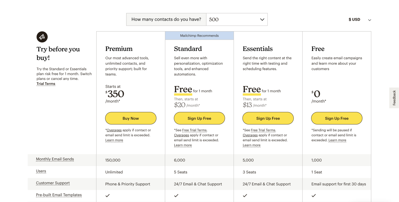
The most expensive plan goes first. So that when the customer sees $299 for the premium plan, $14 for the standard plan seems a beneficial and fair price for this offer. Additionally, Mailchimp highlights the “Standard” plan with a yellow stripe that adds value and perfectly matches the general website design style.
#7. Highlight your recommendation
When the user hesitates about which plan to pick, featuring the "most popular" or "recommended" plan helps to eliminate the buyer's confusion.
When deciding which plan to highlight, always choose the one that you know would bring the most value to the majority of your customers.
Check the pricing page of ActiveCampaign.
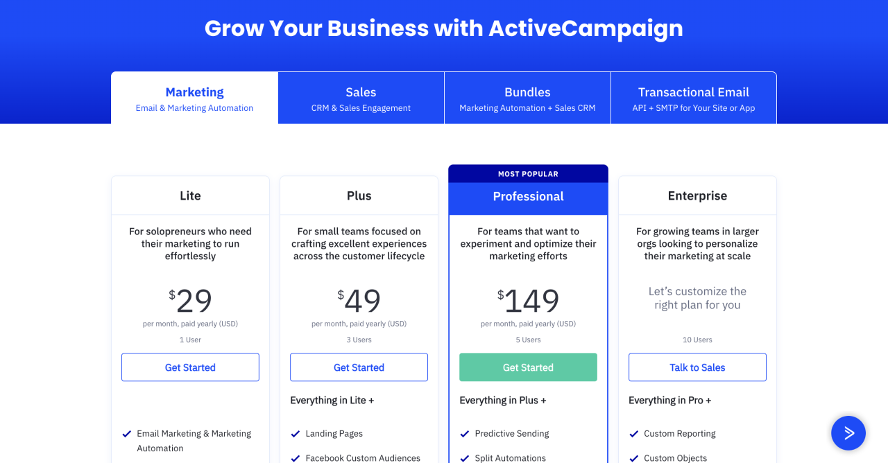
The "Professional" plan is highlighted both with the "Most popular" label and a bright blue color. This way, ActiveCampaign promotes more clicks for this option.
#8. Show your value proposition
The visitor doesn't have to scroll down the whole page and read everything you put there to understand the message your SaaS company wants to communicate. They should understand the value of your service after the first glance at the pricing page.
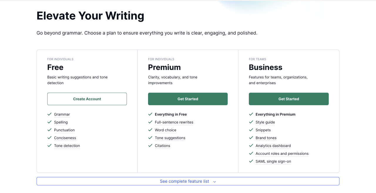
For example, Grammarly (writing assistance service) provides a simple, yet efficient pricing table clearly listing the features of each plan. As well, pay attention to the bold black title on the white background “Elevate Your Writing.” One short sentence reveals the value of pricing on this SaaS platform.
#9. Foster upfront and annual payment
Whereas monthly bills can be more attractive to your customers, upfront and annual payments are what you have to focus on as a business. Upfront will secure a healthy cash flow, and yearly contracts ensure long-term customer relationships.
Also, be careful with the discounts. If you offer price cuts too often, you won't be able to sell at the regular price. Frequent deals create the expectation in customers' minds that they should wait for the next promotion.
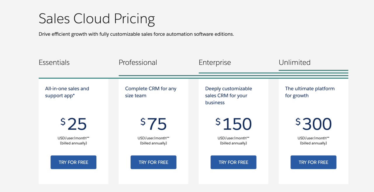
Take a look at Sales Cloud (by Salesforce) pricing page. All price plans encourage annual payment. CTAs are clear with an explicit hint to take a free trial.
How to understand if my pricing page is effective?
The above practices, together with examples of popular SaaS companies, will give you useful ideas for designing your own pricing page. But you should remember that your product is unique: what works for Dropbox or Mailchimp may not work for your SaaS.
And that's OK. Your SaaS pricing page doesn't have to be perfect on the same day you release it. To understand that you are doing everything the right way, you have to keep testing the page until you find the right combination of each element, starting from page layout and ending with the correct CTA color.
In case you need proficient help in designing an effective and beautiful pricing page for your SaaS Eleken is ready to be your design partner. Take a look at our recent SaaS projects or drop us a line to have all your questions answered.

Top Stories