Highpoint
Transforming a PeopleSoft campus solution to deliver better user experience to students with a flexible design team

Universities are now not only huge organizations with hundreds of thousands of students and workers, but also business units that strive to make education work smoothly.
Highpoint is a white-label solution for higher education management. The basic design of the solution can be customized to fit the visual style of each university that uses the system.
The product has been on market for quite some time, but with the market demands increasing fast, the company had to grow as well to stay afloat. That’s why Highpoint decided to build all-in-one ecosystem which would be able to expand with new products while providing consistent high-quality user experience.
Of course, designing such a solution is no easy feat at all. The Highpoint team knew that and that’s why they were looking for a team flexible enough to adapt to the changing volume of work and speed and experienced enough to deal with complex white-label products. And Eleken matched that description perfectly.

That’s how Highpoint used to look before. It’s built on a product from Oracle – PeopleSoft
The first month was the most challenging, as we had to invent a visual style from scratch. But we were lucky to work with the client who understood well the need for numerous iterations to get the best result.
The bricks of all-in-one edtech powerhouse
Highpoint contained different tools, each responsible for different parts of high ed management: enrolment system, internal messenger, degree planner, and so on. All these modules can be combined in a custom scheme on request.
Clients can build their own management system like a Lego constructor.
Modules:


This is just a part of the tools that we have been working on.
After redesigning some of the existing products, our designers got familiar enough with the system to work on new product's design from scratch. Given a brief technical task, we suggested the logic and features based on previous experience.

Different people – different needs. Using card design to design customizable modular system
Working on complex SaaS products often means having to fit lots of information on screens. For this particular case, we used a few tricks:
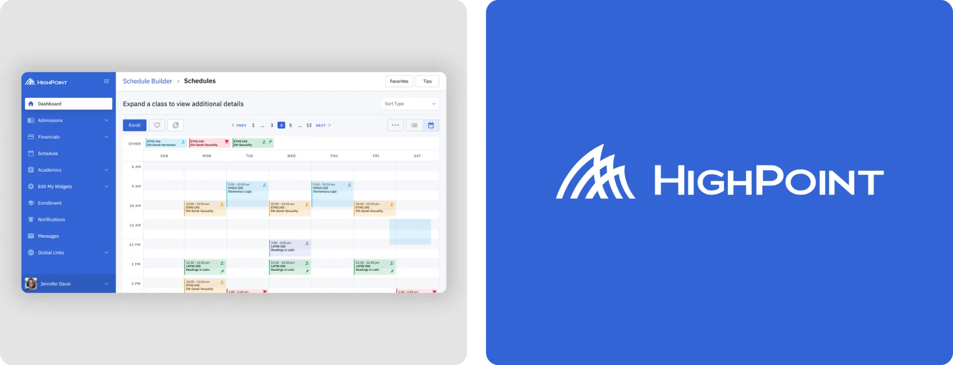
Card design: different parts of the dashboard, such as exams, class schedule, grades are placed on separate cards. That way, all the separate products can be constructed into one dashboard and the user doesn’t have to open them separately.
Shades of grey create separation between blocks of information and text.
Customization. In settings, each user can select which widgets they want to see on the dashboard.

The card design makes design work in all app versions: desktop, tablet, and mobile without cutting off the necessary information.

However, not all Highpoint products are adapted to mobile devices: some of them that are for administration use have desktop versions only. In our design, we go from users’ real needs: as employees don’t need to read analytics from their phones, we didn’t spend time on that.
To-do’s
To bring users' focus to the most important information, we made a “To-do’s”. These are the cards on the dashboard that contain the latest notifications. For example, notifications related to the latest updates on the request for financial aid.
To-do’s contain direct buttons that encourage users to take action right away. When they can respond to a request just by choosing one of the options on the side screen, it is more likely that they give feedback faster than if they had to write an email or so.

Complex product doesn’t mean there is no space for a little fun touch
Prevailing classic blue color with shades of grey did not stop us from adding a bit of illustrations. Have you noticed a waving emoji at the top of the dashboard? On some pages that were free from loads of information, we left fun illustrations.

Universal and flexible design for white-label system
Apart from working on the design of separate products, we also had to work on changing one of the modules to fit specific requirements of the client university.
As it often happens with SaaS products, the units were subject to constant changes. With white label products, customization adds up to that. When a university wanted to change something in the product, or add a small element or feature, we had to make the changes rapidly on demand.
During our work, we were talking to the managers from PeopleSoft, and in some cases, with the representatives from the universities to better address their needs.
Design vs government regulations
The product is quite complex by itself, but on top of that, it had to comply with the governmental standards, as the solution is used by state universities. And these standards influence many aspects of the software, including the interface colors.
When you have to deal with governmental restrictions, even picking colors is not that easy. This is where Itten’s color circle was of little use.
The shade of “warning” yellow that looked harmonic with the overall palette turned out not to be contrasting enough to comply with the state standards. So, we had to change shades. We ended up with this darker shade, which became a compromise between contrast restrictions and visual harmony.

The regulations didn’t make us refuse bright colors: in the end, the color palette had many bright and pastel shades.

Universal font
For all the interfaces we used IBM Plex Sans font, the winner of the 2018 Typeface Design Competition. This is the official font of IBM, and it is very universal, which is necessary for such a huge product as the university management system.
Due to the
very open
and quite large white spaces between stems and shoulders, the entire Plex family is very
readable
in small sizes and at a distance.
New design — new logo
As UX designers, we don’t get to make logos often, but when we do, we make it with all the rigorousness.
For Highpoint’s new logo, we used IBM Plex Sans as well, and created text and graphic logo, which can be used without text as well. We started with a grid and then created dozens of options until they evolved into the final version.

Tweaking the design, tweaking the design team.
Team size changed from 1 to 5 designers and back to adjust to the client's demand
We worked with Highpoint for over two years. At first, only one designer was working on the project. The size of the design team on our side was changing: sometimes, up to five designers were involved. In some cases, the team had to switch back to one designer due to the changing number of tasks.
This is when our retainer pricing model works best compared with hiring in-house designers. Such flexibility is important for optimizing the work on SaaS products.
From caterpillar to butterfly: a customizable design for an advanced system
What’s more, the software has evolved and we got to work on the new Highpoint products, suggesting our own ideas. And for all the designers who will work with Highpoint in the future, we have prepared a handy UI kit with guidelines.
The ecosystem was launched and Highpoint became the leader in student success solutions for PeopleSoft institutions.
Let's design something special
If it feels like our UI/UX design company is a good match, but you still have questions about our work process, we can give you a free 3-day trial working with one of our designers.
