


If you look closer at the apps on your smartphone, you’ll notice that most of the apps’ UI consists of the fonts used. That’s why the typography design can make or break your interface. Simply by choosing a certain typeface you can enhance or reduce the usability, readability, clarity, accessibility, and hierarchy of your application.
The stakes are high. But how do you make the right choice when you look at the fonts, and all of them look the same to you?
To solve the puzzle, you need to know what exactly to look for in a good UI typeface.
How to choose fonts for your project
Picking the right typeface for your project isn’t just about aesthetics—it’s about finding the perfect balance between form and function. Here are four things to keep in mind:
- Project specifics
What are you designing? A website, a logo, a brochure, a book, a poster, or an animation? Each project type has its own needs. A modern website might call for a clean sans-serif, while a vintage-inspired poster could benefit from a decorative serif. Different projects need different styles—simple as that. - Target audience
Who is your design for? Fonts that work for one group might feel out of place for another. A professional audience might prefer something clean and formal. A younger crowd? They’ll respond better to something fun and playful. Keep your users in mind when making your font choice. - Style and mood
Fonts set the tone. Whether you’re going for a classic vibe, a modern edge, or a touch of playfulness, pick a typeface that matches the mood you want to create. A sleek sans-serif feels right for tech startups, while a bold slab serif could bring character to a creative project. - Readability
This one’s non-negotiable. Your text needs to be readable, even at small sizes or on tricky backgrounds. Some typefaces, especially scripts or decorative ones, look great but are hard to read in body text. Use them sparingly for accents or headings if necessary.
The secret to great typography is testing. Try out a few options, see how they look in your design, and choose the one that fits both the project and the people it’s meant for.
How to choose font combinations
Choosing a suitable text style for a body copy is not enough. A designer should also create an effective typographic hierarchy that would show clearly what information is most important on the screen.
The contrast can be reached by using different styles and sizes of one typeface, or by choosing different fonts for headlines and for body text. If you want to know what font goes with what, here we have a few simple principles to follow:
1. Stick to two or three fonts
The golden rule of font pairing is simplicity. Too many fonts can make your design feel chaotic. Use:
- One font for headings: Choose a bold or distinctive typeface that grabs attention.
- One font for body text: Prioritize clarity with a font designed for readability.
- Optional accent font: If needed, add a decorative or script font for special elements like buttons or quotes.

2. Create contrast
Pairing fonts with different characteristics adds structure and clarity. Here’s how to introduce contrast:
- Weight: Combine bold fonts with lighter ones to create balance.
- Size: Use larger fonts for headlines and smaller ones for text to define importance.
- Style: Mix font categories, like a classic serif for headings and a clean sans-serif for body text, to create harmony with variety.
3. Focus on complementarity
Fonts don’t have to match — they just need to work well together. Look for combinations where one typeface emphasizes the other’s strengths. For instance:
- Pair a decorative font (e.g., Pacifico) with a minimalist sans-serif (e.g., Josefin Sans) for a playful yet clean design.
- Combine a traditional serif (e.g., Georgia) with a modern sans-serif (e.g., Open Sans) for a balance of timelessness and simplicity.
Practical tools for font pairing
Not sure where to start? These resources can help you explore combinations and visualize them in action:
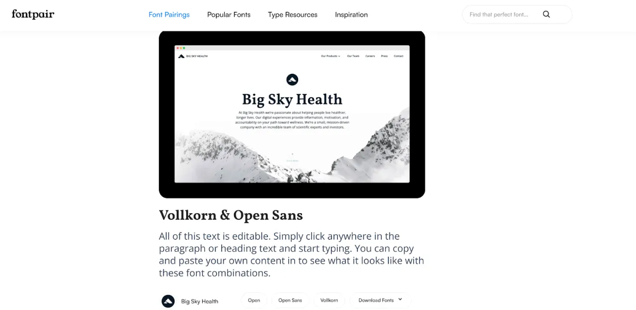
- Fontpair: A curated collection of Google Fonts combinations categorized by use cases like headlines and body text.
- Google Web Fonts Typographic Project: Discover hundreds of free, web-safe fonts with pairing suggestions for each.
- Typ.io: Explore real-world font pairings with examples from popular websites.
How to choose font proportions
When you have typography combination chosen, it’s time to think about the font proportions in sizes of paragraphs and various headers. There are a lot of resources that help to find the best fonts ratio. For example:
To start with, pick your basic font size for body text (15 pixels, let's say) and use one of the scaling services to calculate letters' dimensions, which you may use for the various header, paragraphs, and so on. In general, it is suggested to use a 1,5 ratio, but you may fine-tune it in the service, and see what other options would look like.
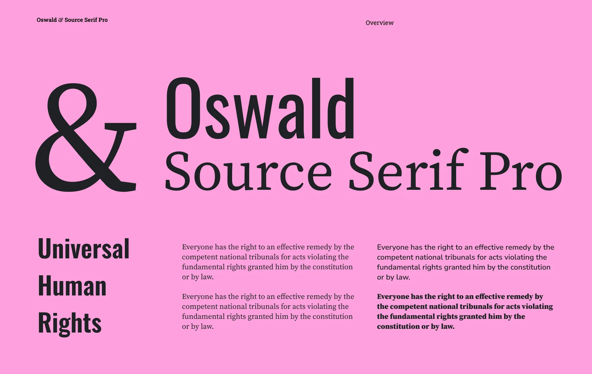
Let’s see how the choice of fonts works on the real-life example
Photobooth Supply Co is the company that likes Sofia Pro for its “friendly” look and was using this font everywhere in its app and website. Right now, Eleken designers are working on its app redesign and question its typography choices.

Sofia Pro is a geometric sans serif font. It means that the type is shaped mainly out of very clean geometric forms, like almost-perfect circles and straight lines. Yes, it looks friendly, but doesn’t work in favor of the website’s credibility.
Moreover, the font’s geometric nature limits the distinct features that each character may have. If you look closely at individual letters like "a" and "o" on the screenshot above, you’ll notice that there are not so many differences between them. That makes Sofia Pro not the best choice for long-form content.
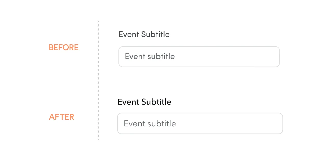
Last, but not least, the Sofia Pro typeface family turned out to be not enough for establishing hierarchy between headlines and body text. For example, the hierarchy is almost invisible in the picture below, since both titles should be in the 16 px size. They differed only by their shades, but for the visually impaired person, the difference would be totally invisible.
To improve the situation, our designers redesigned one screen with alternative fonts and combinations:
- Sofia Pro + Avenir Next
- Sofia Pro + Inter
- Inter
- SF Pro
- Open Sans
The client chose the first option, and now it’s easier to build a visual hierarchy, even for titles of the same size.
What elements of typography design to look for?
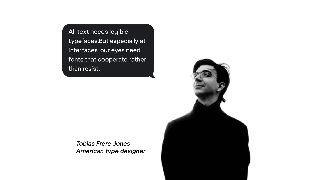
Interface fonts should meet the very strict requirements for clarity. Tobias Frere-Jones, a famous American type designer, once said:
Now, how can you make sure you found a “cooperative” typeface? Look for one that meets the following four criteria:
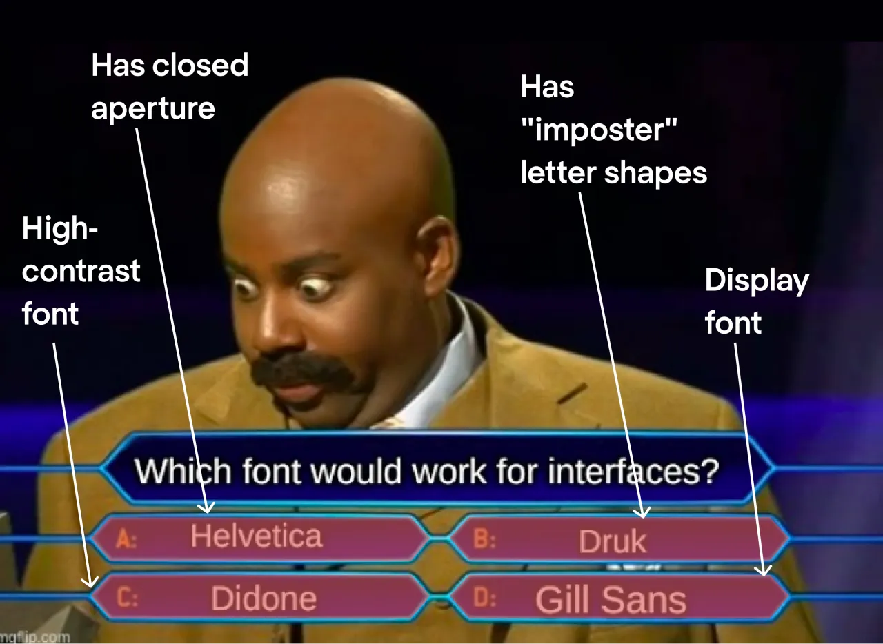
1. Choose fonts with low contrast
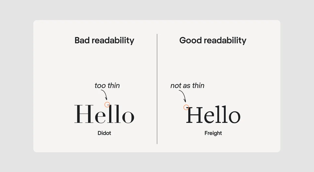
Contrast is the difference in weight between the thickest and the thinnest strokes in a typeface. If all strokes are the same, there is no contrast. If some strokes are significantly thinner than others, it is a high contrast font.
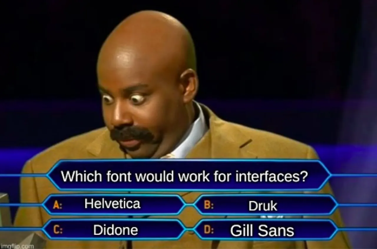
Look at the Didot font in the image above — it’s a text design with extreme contrast. It looks impressive and elegant in headlines and posters, but in small sizes, the thin strokes become hardly visible. Don’t use typefaces like Didot in interfaces if you want your copy to be readable. Better choose grotesque fonts or, at least, low-contrast serifs.
2. Choose fonts with open aperture
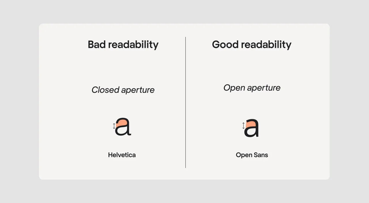
An aperture is the opening between the counter and the outside of the letter. To evaluate the aperture, look at the letters that form an open shape. Take the letter "a", for instance. If the counter of the letter looks more like an open circle, the aperture is closed, and if it looks like a semicircle, the aperture is open.
Due to its closed aperture, Helvetica Neue is not the best font selection for UI. The typeface was originally developed for big headlines. Due to its closed letterforms, it performs badly in body text in terms of legibility and readability.
3. Choose fonts with distinct features on each character
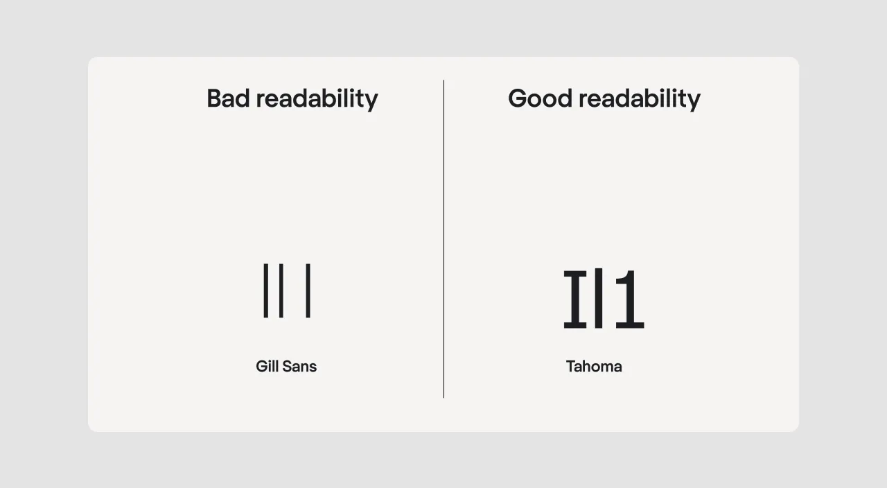
Gill Sans illustrates the point perfectly. It's a great design, but it's just unsuitable for interface design. An uppercase letter i, a lowercase letter l, and the number 1 look the same. This can make it very difficult for users to differentiate between the characters in a text.
Look for options with more distinctive letterforms, they would be much easier to read. Make sure to check for these three imposter letters at a minimum (I, l, 1) when choosing fonts for a design.
4. Choose body text fonts
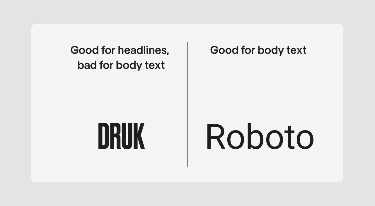
There are different types of typography, and we should take those types into account when evaluating a typeface for UI. Body copy fonts are the only category suitable for interfaces. Decorative, display, and especially script typefaces should be left for graphic design and landing pages.
Druk, for instance, is an expressive font that is super-popular in web design. But if you use Druck in an app design, your app would become unusable.
As you can see, all four of our candidates are unsuitable for interfaces.
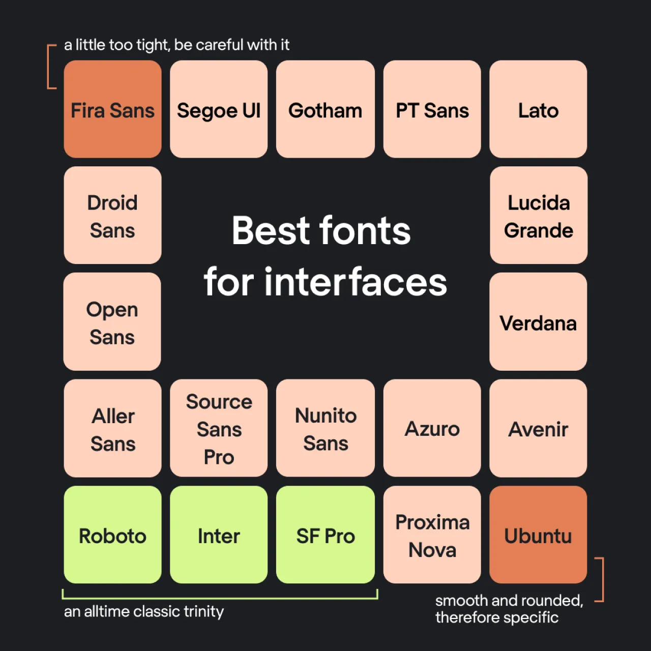
Okay, then what fonts are a safe choice for interface design?
The Eleken team has been designing SaaS apps since 2015, and during this time we have formed an ultimate font list. The first three types are an all-time classic that won’t spoil any interface. The rest are their fancier alternatives:
- Roboto
- Inter
- SF Pro
- Segoe UI
- Droid Sans
- Open Sans
- Aller Sans
- Source Sans Pro
- Nunito Sans
- Proxima Nova
- Azuro
- Avenir
- Gotham
- PT Sans
- Lato
- Lucida Grande
- Verdana
- Fira Sans (a little too tight sans serif typeface, be careful with it)
- Ubuntu (smooth and rounded, therefore specific)
Where to look for fonts?
Whether you’re looking for free options or ready to invest in premium fonts, there are plenty of resources available. But be careful: choosing fonts can cause addiction.

Free font resources:
- Google Fonts: A comprehensive library of fonts that are free for personal and commercial use. Google Fonts is especially popular among designers for its web-safe options.
- FontSpace: Offers a vast selection of creative fonts, many of which are free to use.
- 1001 Free Fonts: As the name suggests, it’s a treasure trove of free fonts for all design needs.
- Font Squirrel: Specializes in high-quality fonts that are free for commercial use.
- FontStruct: A unique platform where you can create your own fonts or download free fonts made by other users.
- DaFont: A popular site featuring thousands of fonts, many of which are available for free or on a donation basis.
- Urban Fonts: A great resource for modern and stylish font collections.
- Abstract Fonts: Offers unique and artistic fonts for various creative projects.
Paid font resources:
- Fontspring: Known for its licensed, professional-grade fonts ideal for commercial use.
- Behance: Often features premium fonts designed by professionals. You’ll also find occasional free options from creators promoting their work.
Font studios:
For exclusive and high-quality font designs, consider exploring the websites of renowned font studios such as Monotype, Hoefler & Co., or Klim Type Foundry. These sources often offer unique designs tailored for advanced typographic needs.
Paid or free: Understanding font choice rules and usage guidelines
Type designs are protected by copyright, and their creators decide who can use them, where, and for what purpose. Whether you’re using free or paid options, following these rules is essential to avoid issues.
What is a license for typefaces?
A license is like a user guide that explains how you’re allowed to use a type design and what’s not permitted. Here are the key points to consider:
- Where you can use it:
Some typefaces are free for personal projects, like schoolwork or personal artwork. However, for professional use—such as a company logo or a product you’re selling—you’ll often need to buy a commercial license. - How many users or devices:
Licenses can limit the number of users or devices that can access the type design. For example, a large team may need an extended license. - Sharing files:
Most licenses do not allow you to share typeface files with others, even teammates or clients. Instead, they must download or purchase their own copy. - Making changes:
Some licenses allow you to edit or customize the type design, while others strictly prohibit any modifications. - How long it can be used:
Some agreements provide lifetime usage rights, while others are temporary and require renewal after a set period. - Cost:
Free typefaces are more widely available but often come with limitations. Paid options usually offer unique designs, better usability, and fewer restrictions.
When should you use free or paid type designs?
- Free options: These work well for small, personal projects, especially when you’re on a budget. Just ensure the license matches your intended use.
- Paid typefaces: Investing in commercial options is better for professional work. These designs are often more polished, offer better compatibility, and come with clear rules that protect your projects from copyright concerns.
How to stay compliant
- Always review the license agreement: It clearly outlines what is allowed and what isn’t.
- Use free designs only when the rules allow it: For example, avoid using a "personal use only" design for commercial purposes.
- Purchase a license for professional work: If you’re working on a client project, creating a product to sell, or launching a large campaign, it’s worth investing in a licensed option.
Struggling with typography is part of the process
Let’s face it — choosing great typography isn’t easy, especially when you’re just starting out. But here’s the good news: it’s absolutely normal to make mistakes in the beginning. Typography is both an art and a science, and like any craft, it takes time, patience, and practice to master.
So, if your early attempts don’t turn out as expected, don’t worry. Even the pros didn’t get it right on their first try. Here’s why beginners often find typography challenging:
- You’re still learning the basics
Typography has its own set of rules and principles. Things like choosing the right typeface, adjusting font sizes, managing letter-spacing, and aligning text are foundational skills. If you’re not familiar with them yet, that’s okay—it takes time to build this knowledge. - You don’t have enough experience yet
With experience comes intuition. Over time, you’ll develop a feel for which fonts, sizes, and layouts work best for different projects. That kind of expertise doesn’t appear overnight—it grows with every project you work on. - Typography is about more than just picking fonts
Great typography also involves creativity and style. It’s about making design choices that match the concept and mood of your project. Developing your own unique style takes effort and experimentation. - Mistakes are your best teacher
Trial and error are essential for learning typography. By experimenting with different fonts, layouts, and settings, you’ll not only see what works—you’ll also learn why something doesn’t. - You’re not learning in isolation
One of the best ways to improve your typography skills is by studying the work of others. Look at designs you admire and analyze the choices those designers made. You’ll gain insights that you can apply to your own projects.
In the end, remember this: even the most experienced designers didn’t start out as typography masters. They learned, practiced, and refined their craft over years. So, don’t be discouraged if your typography isn’t perfect right away. Every project is a step forward, and that’s how you’ll get better.
Summarizing the typography graphic design in UI/UX
Typography can seem an obscure part of the design, but 90% of the information on the web is text. That’s why a UI/UX design is impossible without understanding some basic typography rules. To make your app legible and clear,
- Choose fonts with low contrast;
- Choose letters with open aperture;
- Choose fonts with distinct features on each character;
- Choose body text options.
- Don’t forget about hierarchy and proportions.
In the end, you want your app's typography design layout to be clear, readable, and accessible. The more understandable your texts are, the better is the app’s usability.
Besides, rumor has it, the app’s usability increases if the app is designed by UI/UX professionals. So, if you are looking for experienced designers to fine-tune your app’s typefaces and everything else, check out Eleken’s UI/UX services.


