Aampe
How our design helped the AI marketing platform to raise $18M funding
Aampe is a startup whose goal is to provide an effective solution for companies to generate multiple versions of marketing messages and distribute them. They use AI to offer a scalable approach that allows marketing teams to send thousands of personalized messages to the right audience at the right time, leading to better response rates and engagement.
To maintain the leading position in the market, Aampe always works on making the product better by improving what's already there and adding new features. That's why having a UI/UX designer on the team is a must for them.

Since 2020, they've been in the market but recently encountered challenges with their in-house designer, which made them seek a new full-time team member. Aampe needed someone who
- Is great at attention to detail to think through different use-cases, providing a smooth UX.
- Doesn’t wait to be told exactly what needs to be done but can work collaboratively and iteratively with the team.
- Is able to work quickly in sprints, cooperating with engineers to ensure timely and feasible designs.
Still, hiring an in-house designer is time-consuming and resource-intensive. Besides, as data scientists, Aampe founders lacked expertise in evaluating designer skills. Luckily, Eleken work model made hiring process fast and virtually risk-free for Aampe.
- We consider clients’ specific cases to assign a UI/UX designer with the expertise that best matches project requirements.
- We believe that success in design is possible when working iteratively and in close collaboration with the team.
- We provide three days of work with our designer on your project free of charge to decide if you want to proceed or leave.
It was game-changing for us to be able to get a full-time, fully-dedicated designer on our team without having to worry about qualifying (or even searching for) the candidate. Eleken did all the quality control so we didn't have to.
Becoming a full-fledged part of the team to fuel platform redesign
Aampe was looking for a complete platform redesign, done incrementally in 3-week sprints. The goals of each sprint depended on current business needs and changed frequently.
Given this dynamic environment, the ability to quickly adapt to the changing needs is paramount. The designer has to quickly create wireframes and iterate until the team achieves results that meet business objectives, user requirements, and technical constraints.
The designer Eleken provided proved to be an ideal match for these requirements.
Since our collaboration began in September 2023, we've had the opportunity to tackle a diverse range of tasks, implementing both minor adjustments and significant improvements. Here are a few most significant design changes that we’ve made so far.
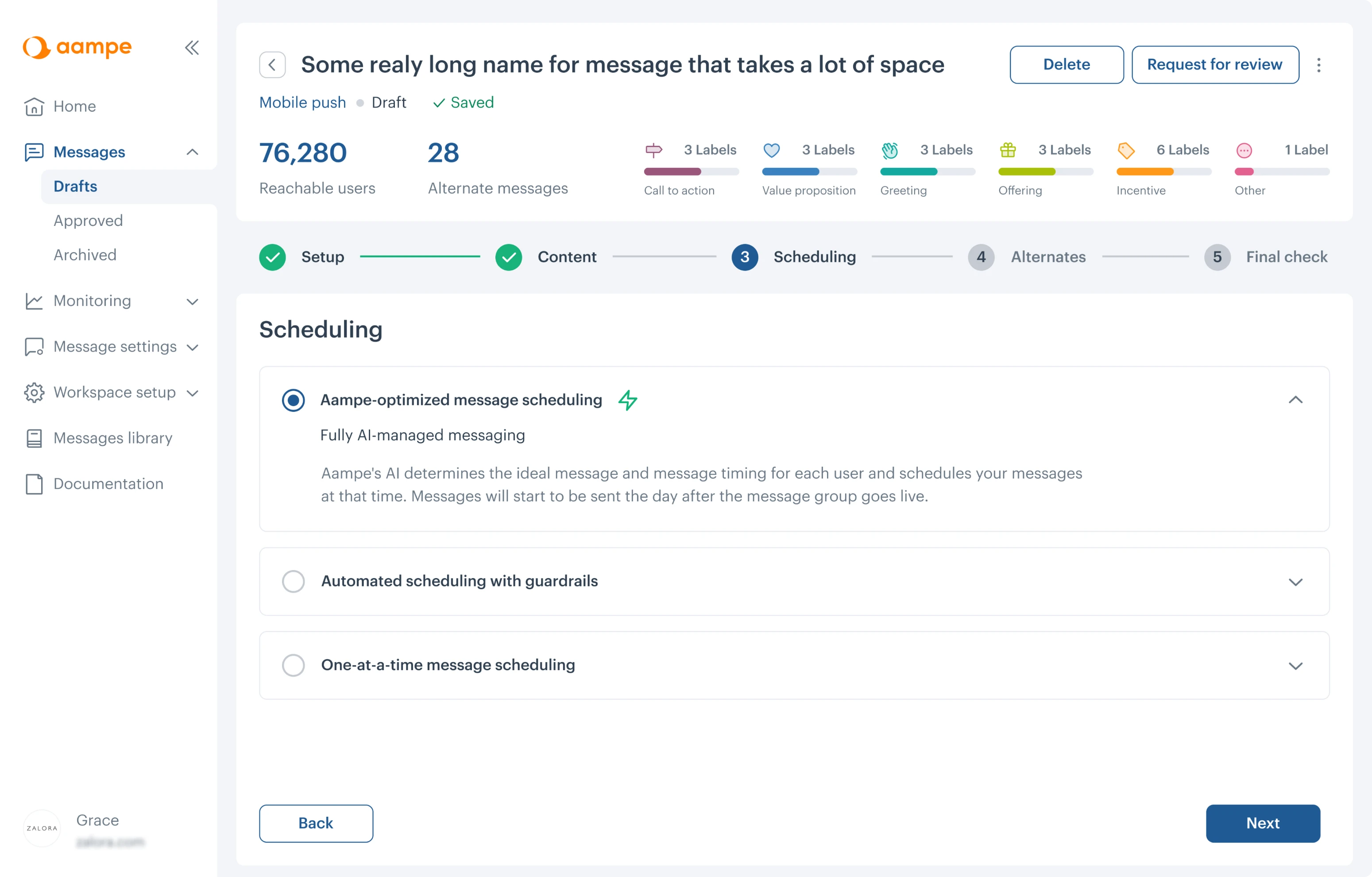
Reconstructing the main menu to help users feel more comfortable and confident while using the platform
The main menu is supposed to provide users with a clear and organized way to navigate through the different sections and features of the product. The Aampe menu had several design issues that made it difficult for users to navigate:
- Some sections unfolded in long dropdown lists, so users had to scroll through them to find what they needed.
- Certain menu item names didn't accurately reflect their content, leading to confusion.
- Icons presented in a menu had inconsistent styles, affecting the overall look.
Our goal was to help users quickly locate the functionality they need by enhancing the menu's usability and efficiency.
Here’s what we did
- Changed the menu hierarchy by uniting some sections in one and splitting some features together. For example, the Configure section, previously lengthy, is now divided into Message Settings and System Setup.
- Renamed sections to enhance clarity. For instance, Snippets GPT3 is now called GenAI Assistant.
- Introduced a collapsible sidebar to make it easier and more convenient to work with tables and other data.
- Implemented a uniform icon pack across the entire platform.
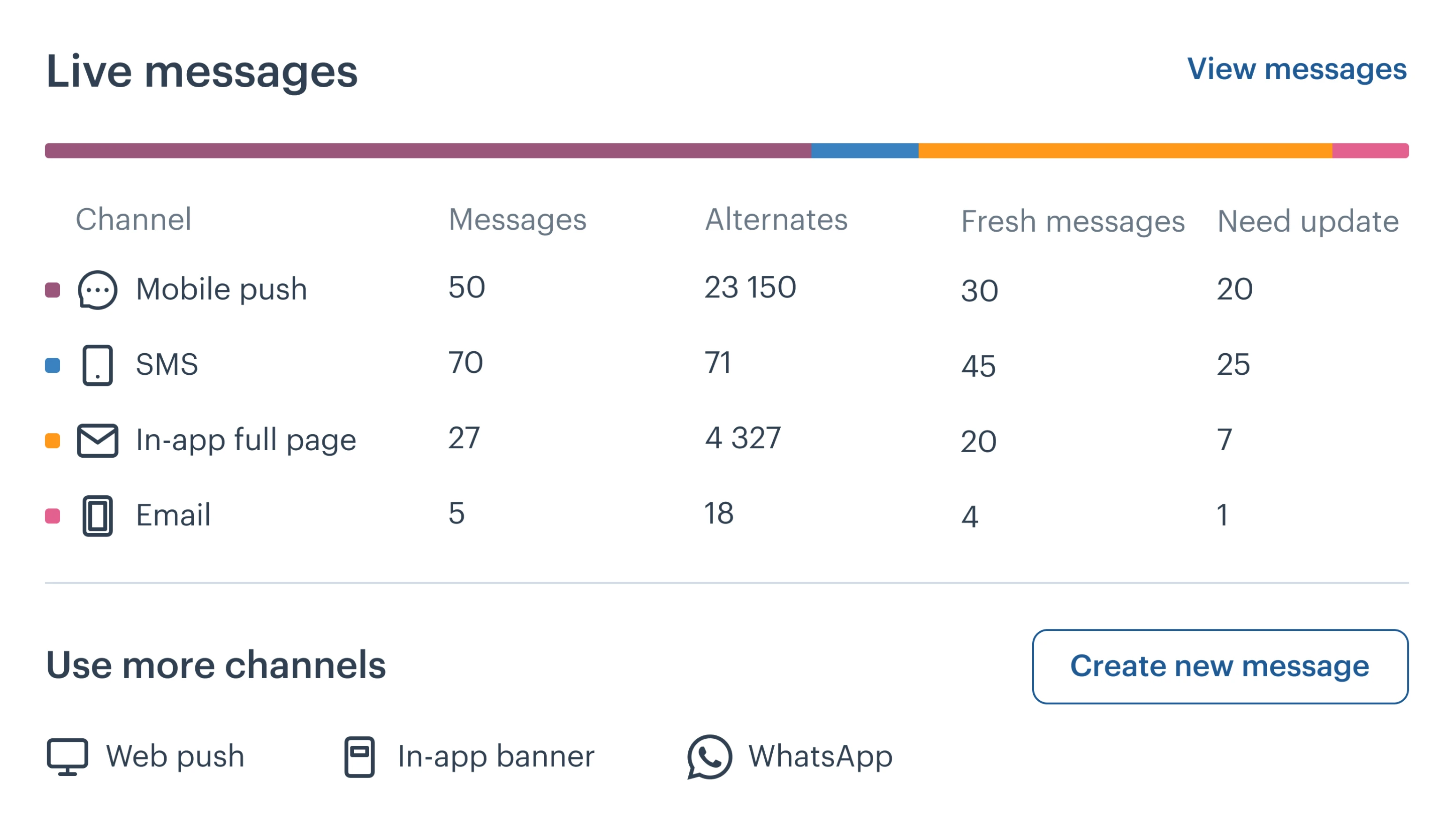
By the way, when we designed the System Setup feature, we built its main screen from scratch, resembling a dashboard. Our goal was to make it easy for users to understand the key indicators in a matter of seconds.

Ensuring our design overcomes accessibility barriers for all users
We've assisted many clients in making their products accessible for various reasons: to enhance user satisfaction, as with Involi, or to ensure compliance with legal requirements, like in the case of Spoonfed. For Aampe, accessibility was particularly significant, they always pay special attention to fostering a positive brand image of inclusivity and social responsibility.
Aampe's design had two main problems: the text didn't stand out enough from the background, and sometimes color was the only way to show important information. This made it hard for people with poor vision or colorblindness to understand the content.
Here’s how the page appears for individuals with vision impairments:
Our designer analyzed every screen and chose new colors to make sure the redesigned platform met the highest UX accessibility standards and guidelines.
In cases where selecting easily distinguishable colors was impossible, our designers ensured that color wasn't the only means to convey information. She supplemented it with numbers, hints, icons, and other visual cues.
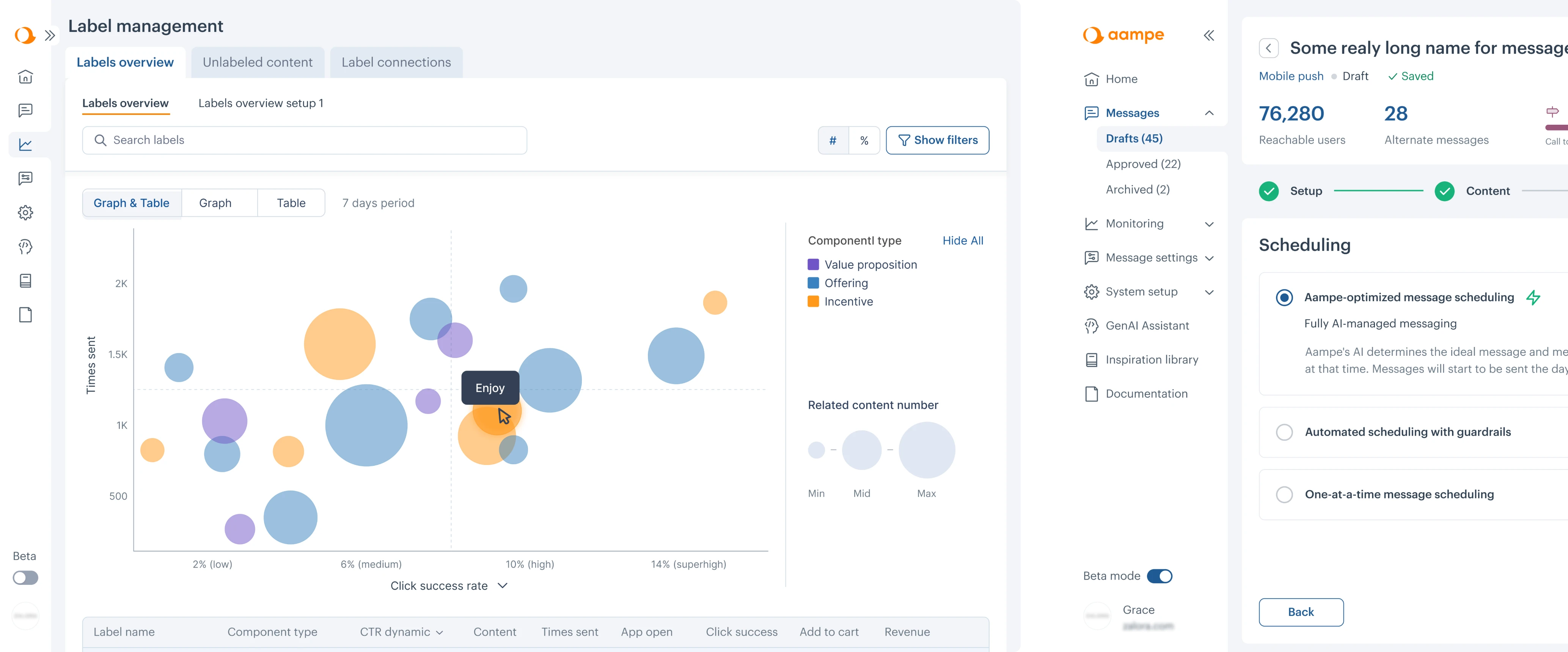
Coming up with a new way of data visualization for label performance feature
When writing a message, Aampe helps its users break it down into components and mark them with labels. The AI algorithms then analyze users' activity and responses to the labeled content to reveal their desires and motivations.
However, having access to data about label performance itself may not be enough. To make effective strategic decisions, this data has to be easy to understand and work with. The previous solution presented all the information on label performance in the form of a table; we needed to develop a better data visualization approach for this feature.
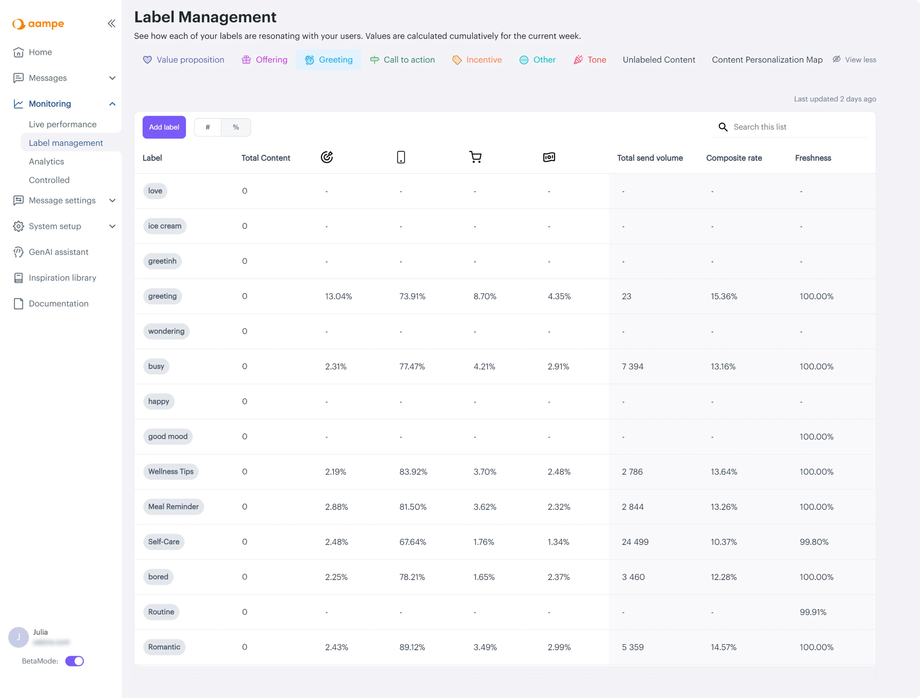
In redesigning the label performance feature, our approach was all about teamwork. We started by talking to the customer success team and data scientists to understand how users interact with labels.
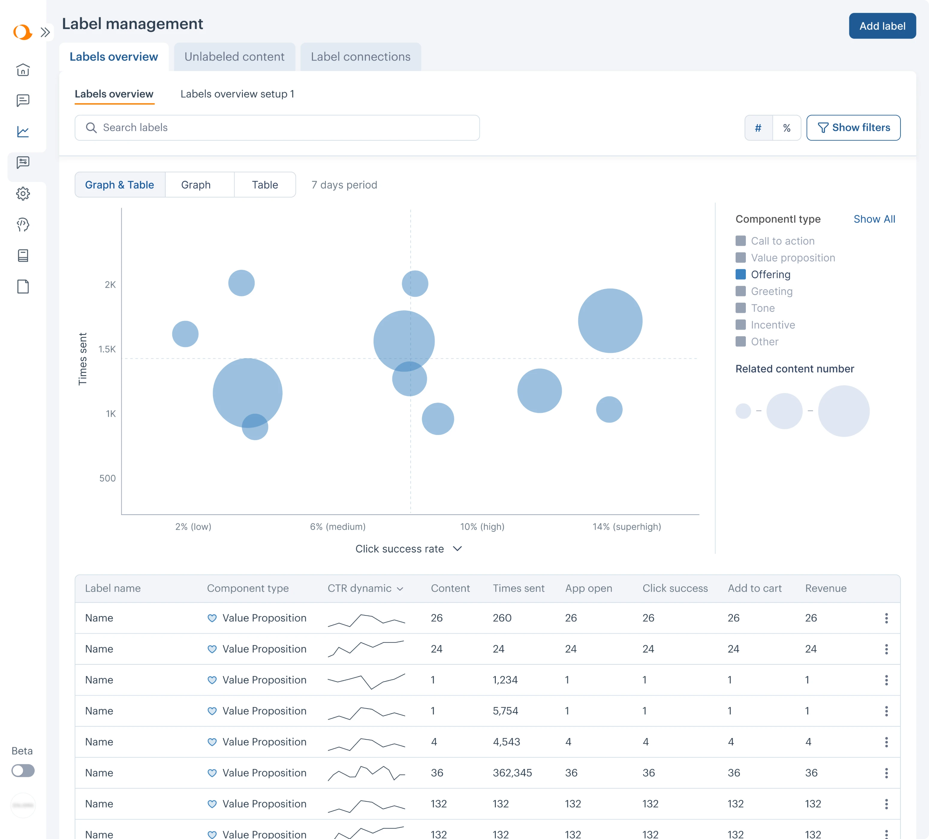
We learned that they want to compare label performance, so they need all the information in one place. With potentially up to eight labels, that's a lot of data for one dashboard. That's why we chose to use a bubble chart.
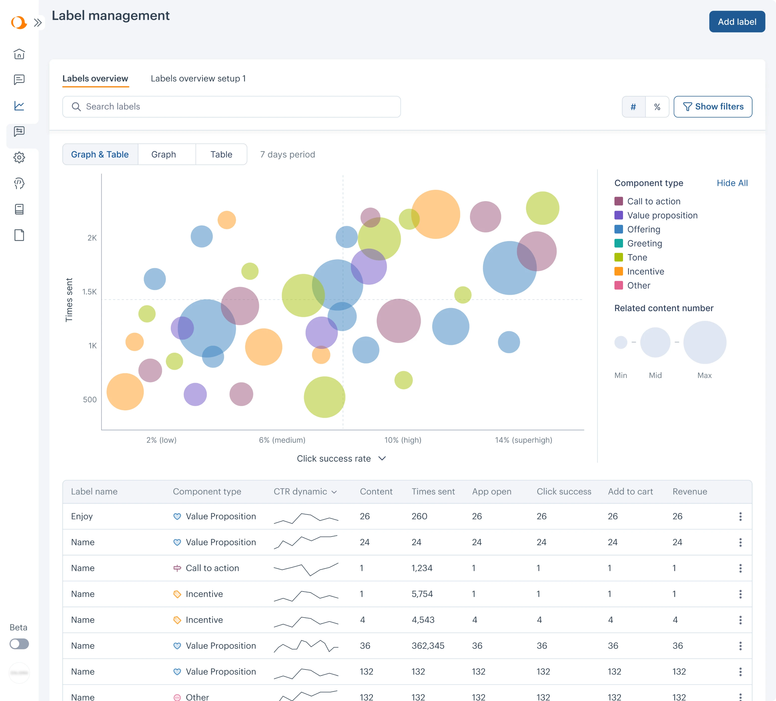
Why bubble chart? It's perfect for showing data with many variables.
- Colors represent different types of labels.
- Bubble size indicates the amount of associated content.
- Bubble position from top to bottom shows how often content of a certain type is sent.
- Horizontal placement reflects label success rates based on various parameters, like click success rate.
With a bubble chart, users can quickly perceive and analyze label performance: bubbles in the upper right corner indicate good performance, while those in the lower left signal areas needing improvement.
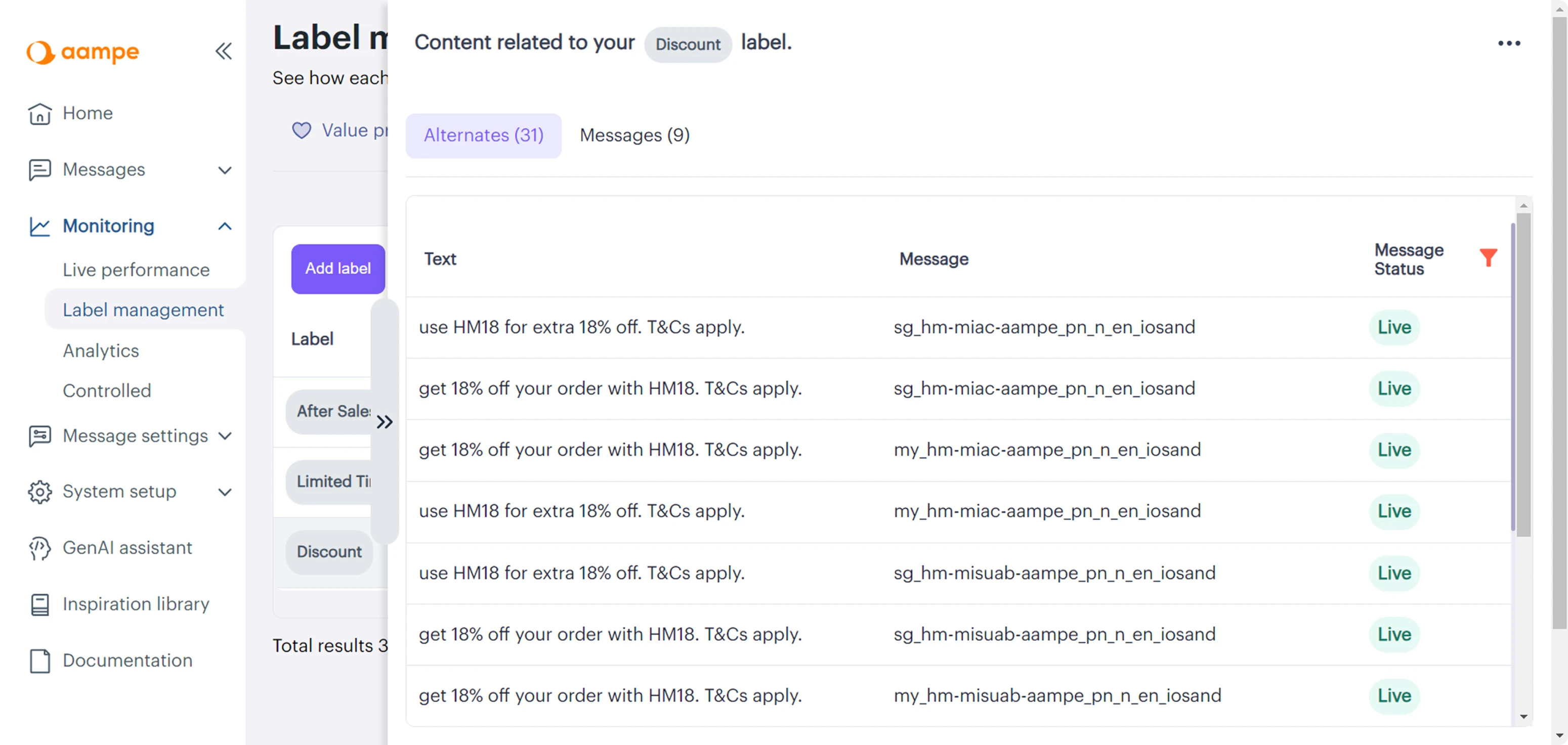
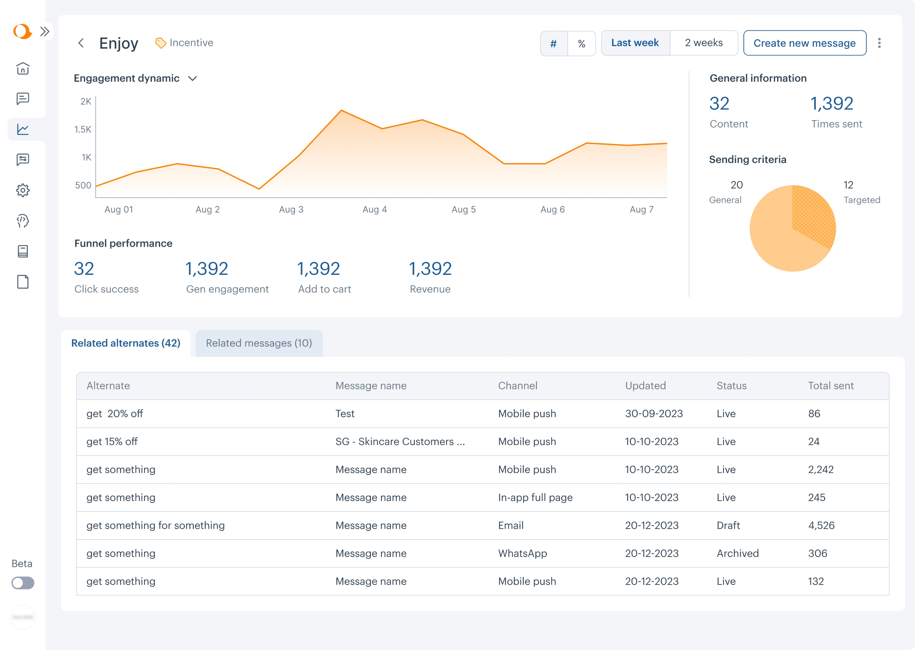
If a user wants to track label performance trends over time, they can easily do so by observing the dynamic click-through rate visualized with a sparkline chart – a simple and convenient way to present data progress.
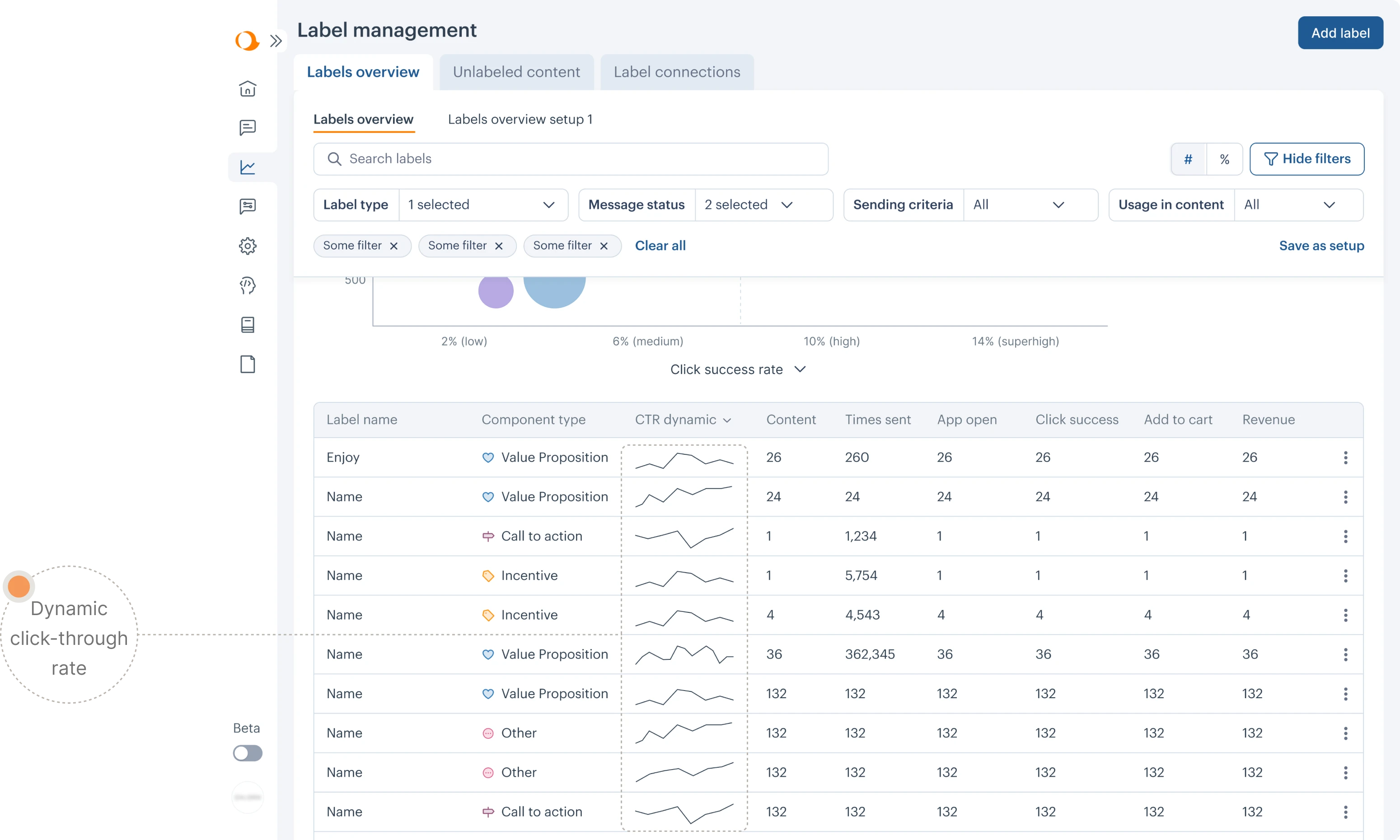
They can also view more detailed information on a specific label's progress on a separate dashboard.
After finalizing the new designs, Aampe presented the screens to its major client. Their feedback was invaluable — we discovered that implementing a bubble chart visualization allowed customers to see insights at first glance.
Additionally, their feedback confirmed our assumptions about key metrics and gave us valuable insights into unlabeled content, which will guide our future redesigns.
100% fit into our client's needs and values led to Aampe keeping Eleken designer on indefinitely
As data scientists, Aampe’s founders understand perfectly well what features would be the most useful to their customers. However, when it comes to implementing their innovative ideas in a convenient, understandable, and consistent way, they just can’t do without a professional designer on their team.
The Eleken designer managed to not only understand their data-heavy SaaS product with all its processes and create new usable designs but also became a true team member for Aampe. She shares their values and is gradually moving towards common goals with the team.
The UI is much cleaner and more intuitive than it was before. Our design planning and prioritization is also much smoother. Everything was on time, and they're extremely responsive. We're extremely happy with everything so far.