b.well
Providing a healthcare company with quick design support not to let them fall behind their plans
Founded in 2015, b.well is a white-label healthcare platform that helps people monitor their health by connecting all their medical records in one place.

As an established company, b.well recognizes the crucial role of design in staying competitive and meeting customer needs. That’s why they recently conducted a redesign with further plans to introduce new functionalities.
A long list of features awaited their turn for design, so the design director of b.well developed a plan to effectively cope with the backlog in the next couple of months. But an unexpected challenge emerged when one in-house designer went on maternity leave, and the other resigned, leaving a critical gap in the plan.
All of a sudden I’m the design director without the team

Ben understood it would take a lot of time to hire good people in-house, so he decided to find a reliable design agency to support him. b.well needed 1-2 senior-level UI/UX designers working full-time and able to start the work in a week.
Getting full-time designers without going through the long hiring process
One of the main advantages of choosing Eleken is that we can start literally the next day after our first conversation. When most design agencies just sign the contract, we already have two weeks of completed work.
So, we provided b.well with two experienced UI/UX designers working like remote members of their product team in just a week. Our client had direct access and full control over the designers, with no project managers acting as intermediaries.
Working with a product team to keep the company on schedule with the new features design
Once our UI/UX designers got to know the product team and the product itself, they started working under the guidance of the design director, assisting in implementing his plan.
Health Information Network: designing a clear and safe authorization process
Health Information Network (HIN) is a feature we designed from scratch. It allows customers to find and connect their medical records from different providers. Yet, to collect this sensitive data, users have to be authorized, while the process requires entering private information. Therefore, our primary goal was to install a sense of security in users when sharing their private data and help them understand why the platform needs this data.
The difficulty with this feature design was that there were three different flows of authorization:
- Pre-verified users – those who have already verified their identity. In this case, the user has to permit data processing and wait until the platform finds the needed information. We ensured that each screen provides clear information to help users understand the process as the platform searches for records.
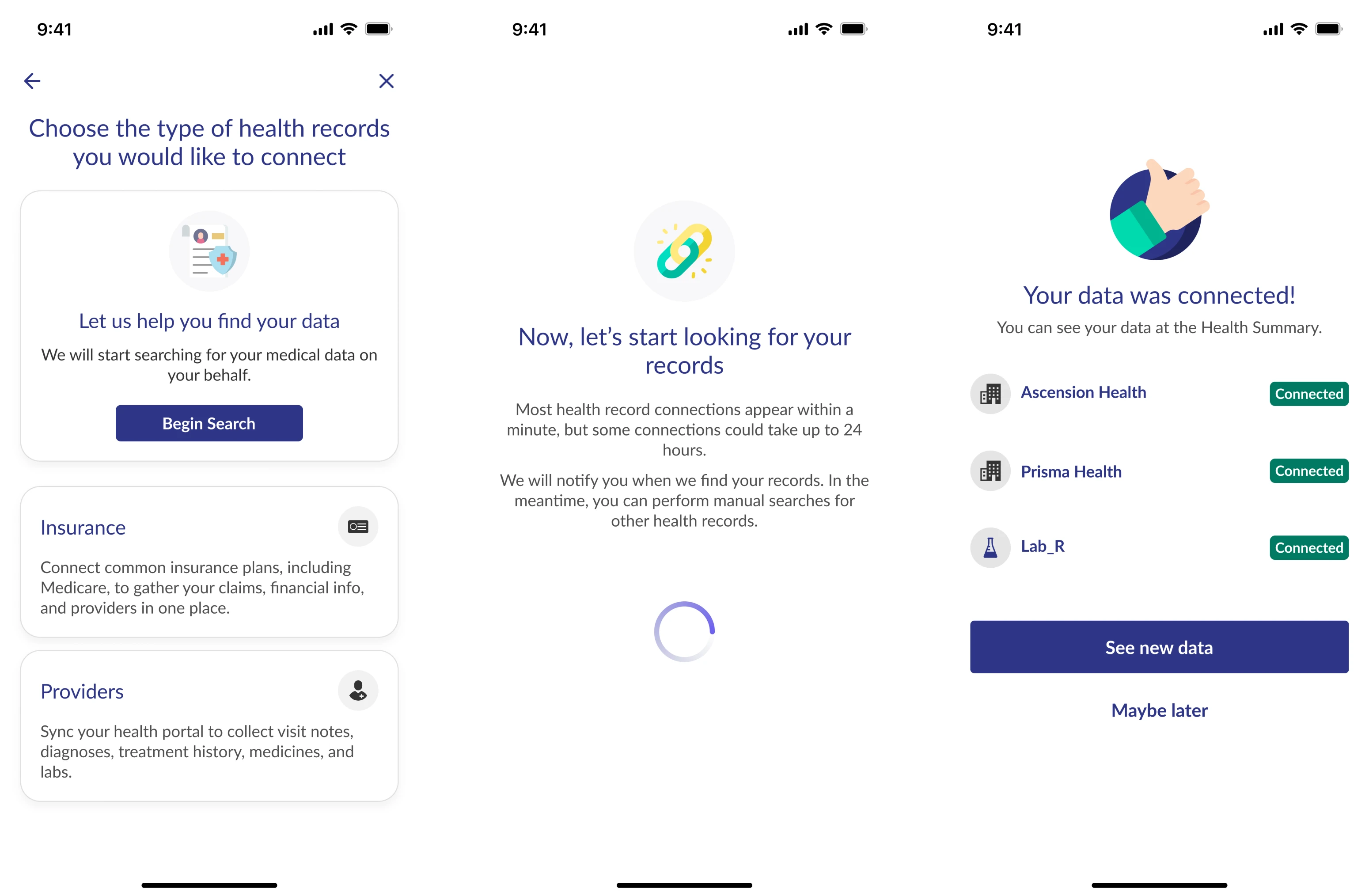
- Users who are protected under HIPAA – for these customers the data is automatically pulled up: they have to confirm it’s correct and verify their mobile.
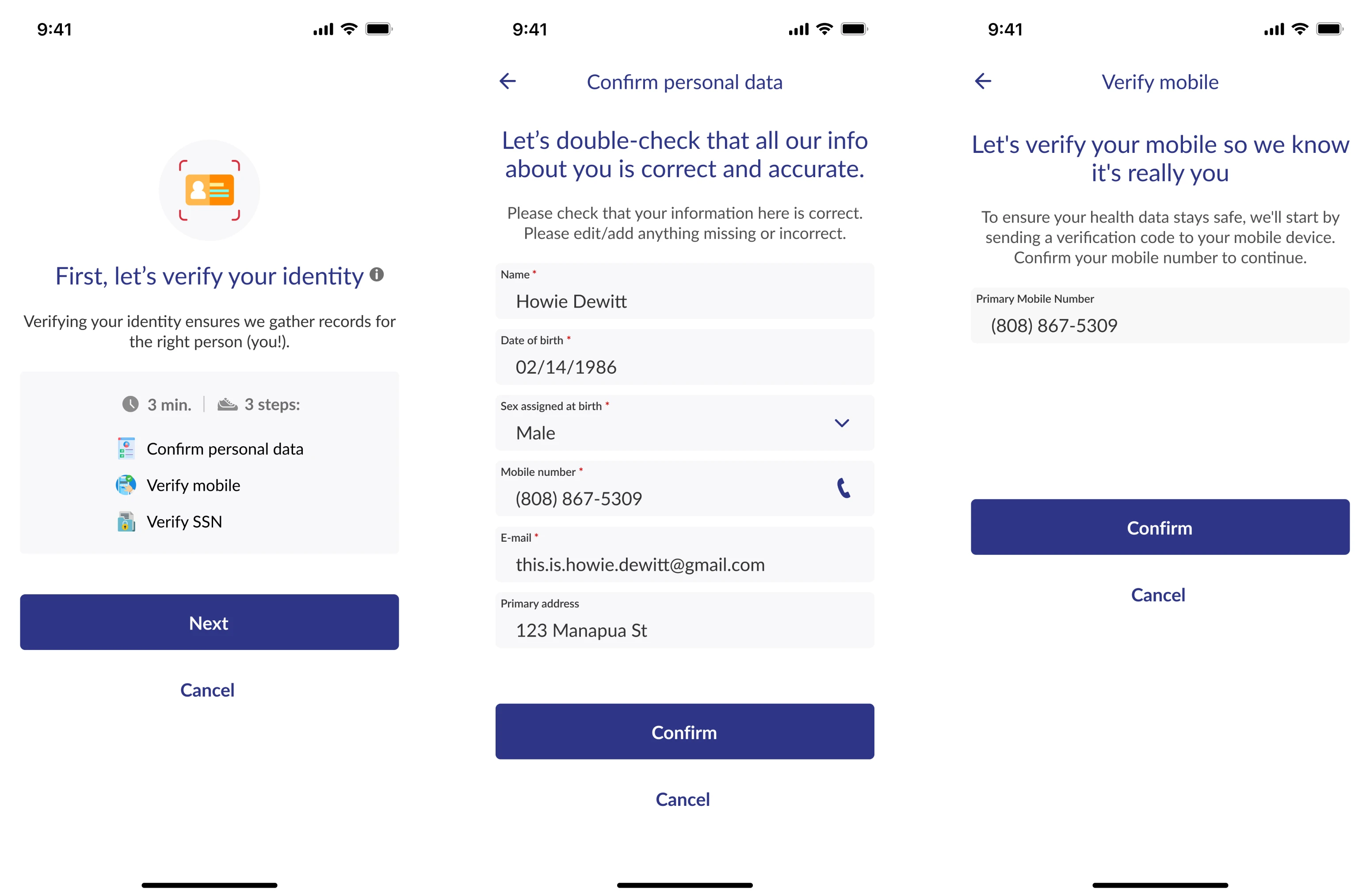
- Unauthorized users – those who have to go through two factors of authentication: scan their ID and do a facial match.
We weren’t sure how people would react to such complex verification. So we decided to design an interactive prototype and do user testing to understand how users feel about scanning their IDs and the like.

As a result of testing, few users dropped off during authorization, indicating the effectiveness of our design. So, we made minor improvements based on user feedback and continued working on b.well's extension.
Health Summary: design that makes it possible for developers to implement the feature gradually
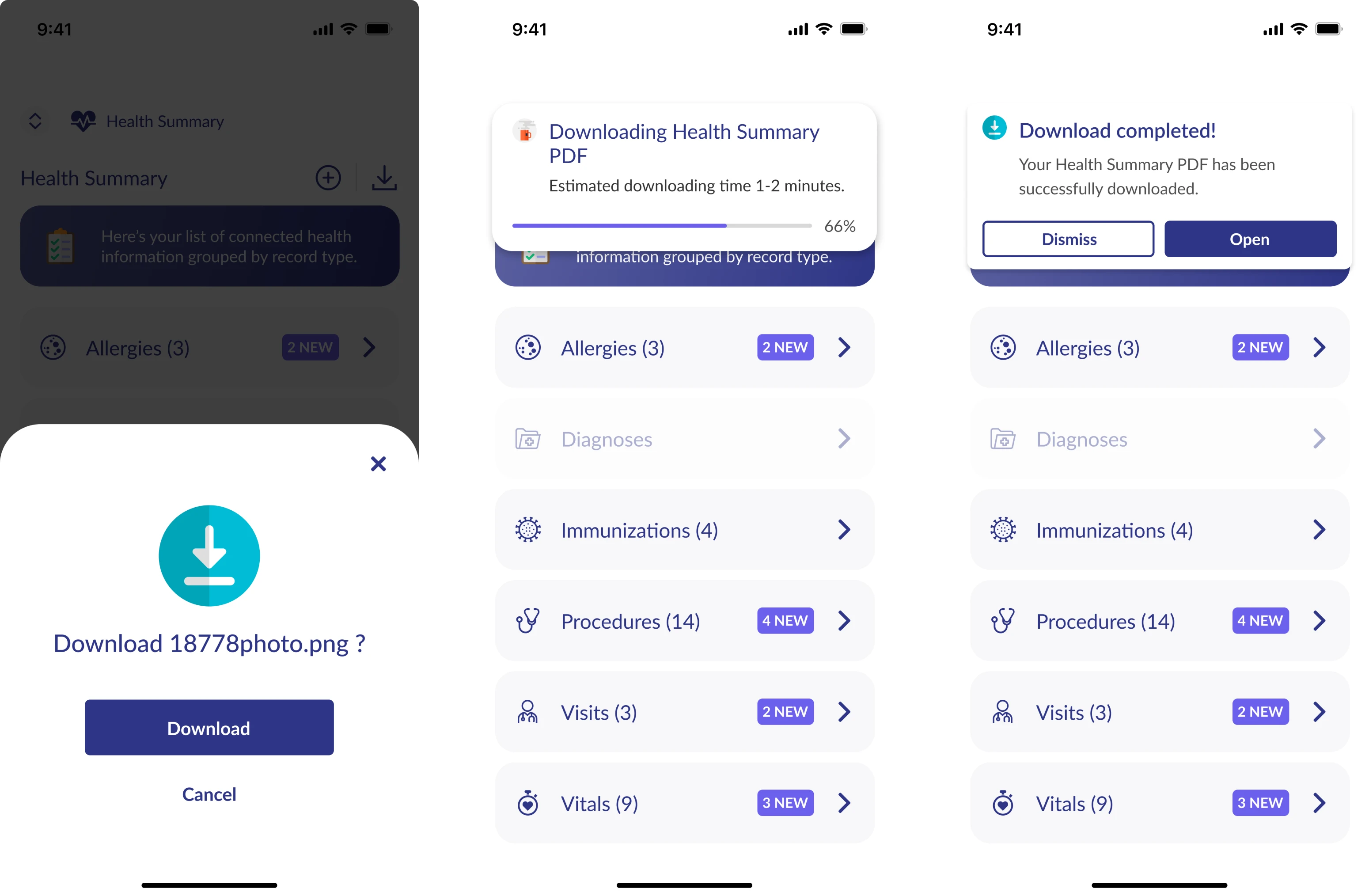
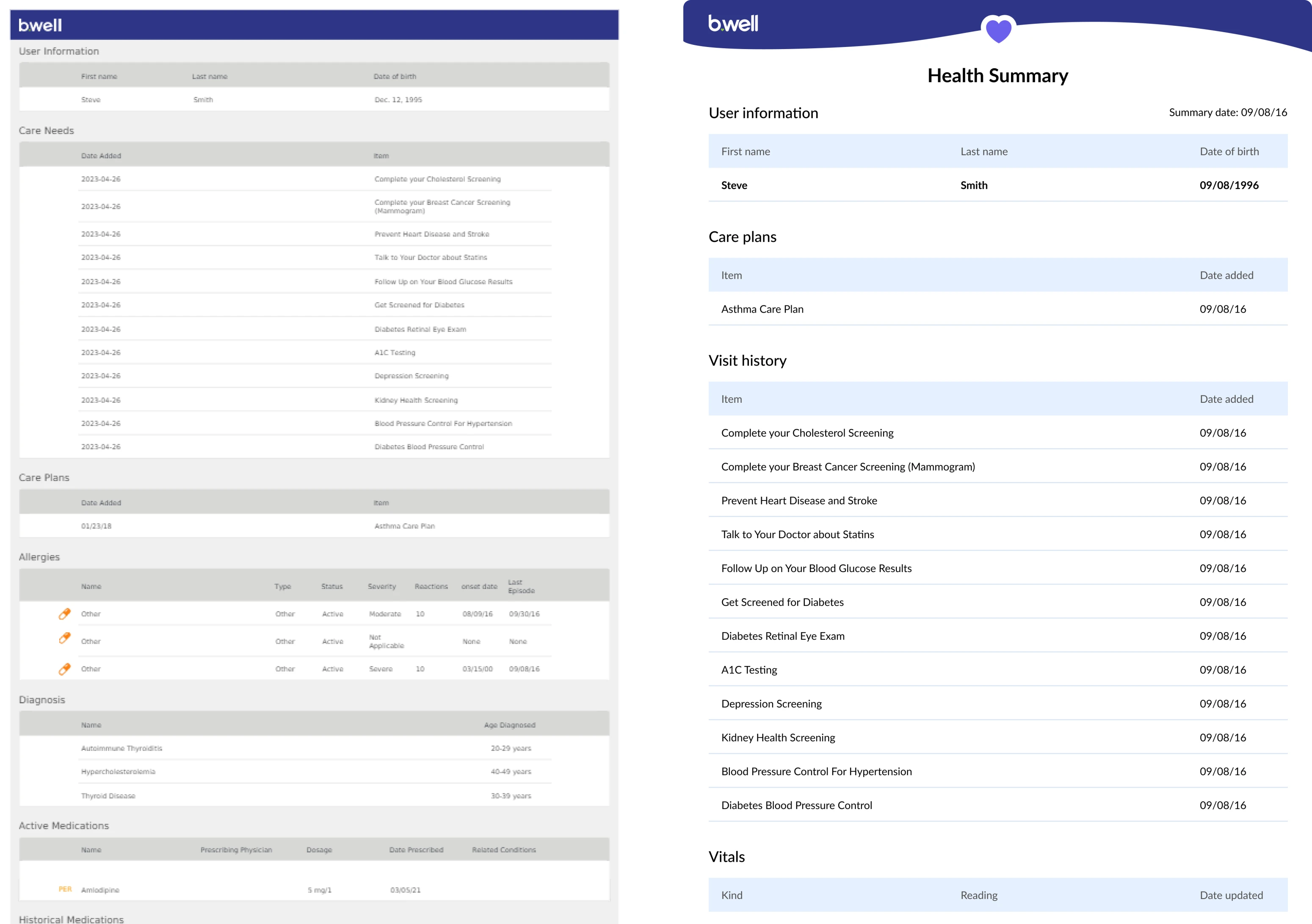
The Health Summary feature allows users to create a PDF file containing all their medical information, including visit history, diagnoses, lab test results, and more. Recognizing the importance of this feature to customers, b.well wanted to implement it promptly.

To ensure developers will be able to release Health Summary quickly, our client decided to start with the basics: a flow that allows downloading the file only. b.well then planned to progressively add on more advanced functionality, such as sharing and filtering, step by step.
So, our task was to design nine phases of the Health Summary, starting with the download function, and making it more complex with each iteration.
We started with the download-only flow:
And continued extending this flow with more advanced functionality until we ended up with a flow that allows to select categories, share the file, filter sensitive data, select timeframe, view history, upload docs, and finally download the summary.
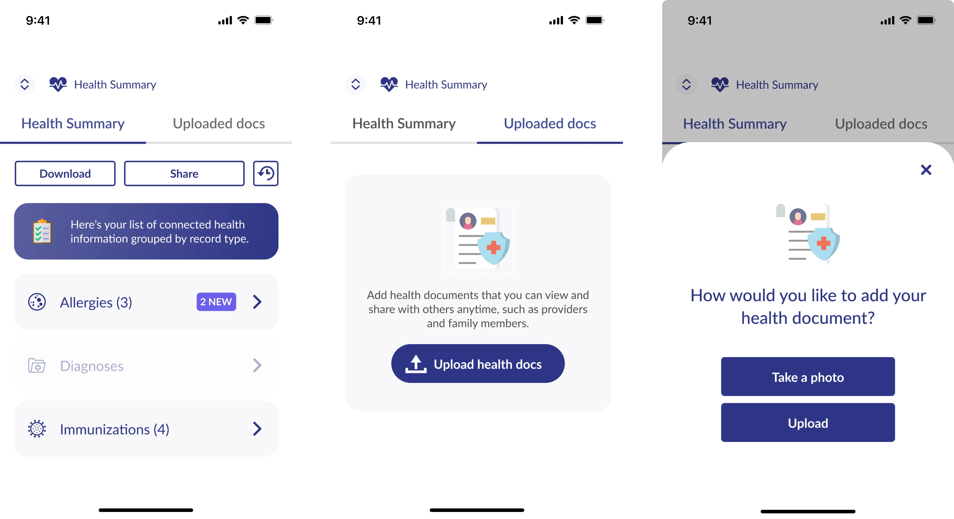
We also revamped the look of the client's Health Summary PDF file to ensure it is easily readable and understandable.
There were only some parts of our work for b.well. Soon after we joined the project, b.well’s designer returned from maternity leave and we were successfully working together on product extension. Thanks to close collaboration, constant communication, and feedback exchange we were able to move methodically and according to plan.
Three months in, they hired one more in-house designer, so our role on the project came to an end. But that’s not the end of the story.
Supporting b.well’s product team on the platform's extension until their new in-house designer can join the project
Life is unpredictable, and anything can happen to your employees. The newly hired designer wasn’t able to start the work on time, so b.well asked Eleken to come back and support them until their new hire was available.
Once again, our swift hiring and onboarding allowed us to promptly supply b.well with two UI/UX designers. Overall, our work involved implementing numerous small tweaks to improve and extend the platform.

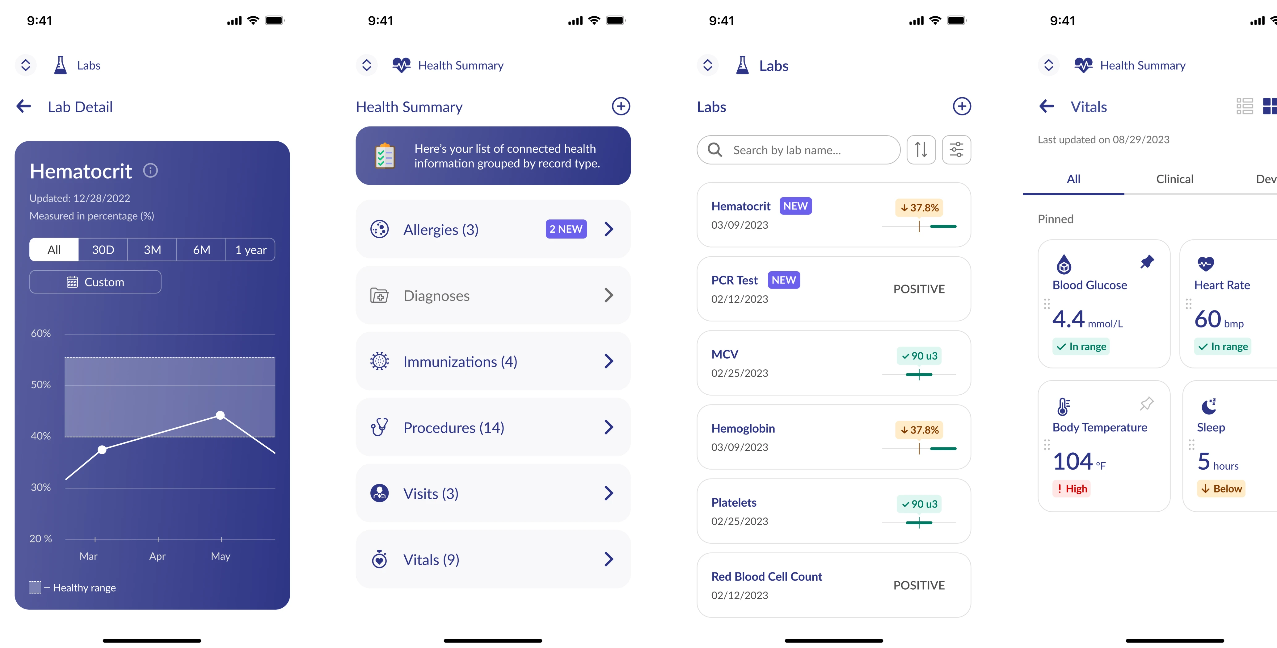
Using size, color, and white space to create intuitiveness and a modern look for the Vitals section
Vitals is a section where users can track vital signs such as blood pressure, heart rate, oxygen levels, and so on. The platform had this feature before the redesign, so our task was to rethink the data visualization and make it more intuitive, understandable, and catchy.
Here are the design problems we found:
- Information located in grey blocks made it difficult to perceive the content
- There was no good structure and hierarchy in the text and the titles
- There weren’t clear indicators for the values of vital signs which prevented users from the correct and quick interpretation.
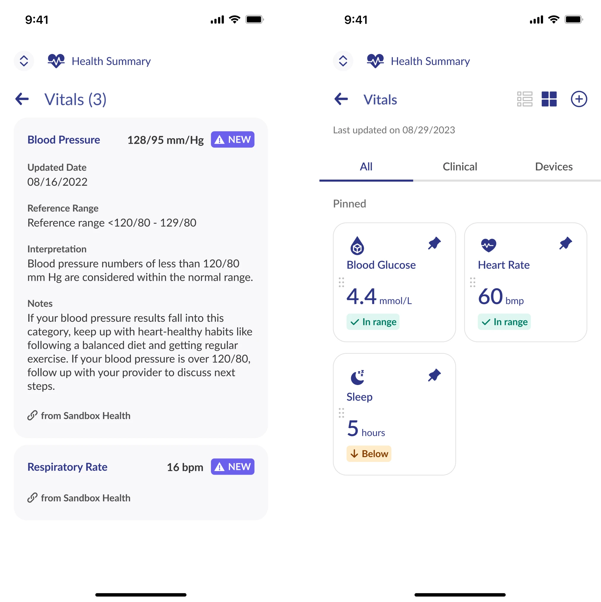
Together with the design lead, we’ve made our most important decision – eliminated the use of gray text containers and incorporated additional white space. We also developed a font system and improved the text hierarchy. These simple modifications made the platform more airy, stylish, and most importantly, easy to comprehend.
To capture users' focus on their vital signs, we implemented a system featuring five distinct levels of indicators, each distinguished by unique colors and icons: Low, Below Range, In Range, Above Range, and High (see the picture below).
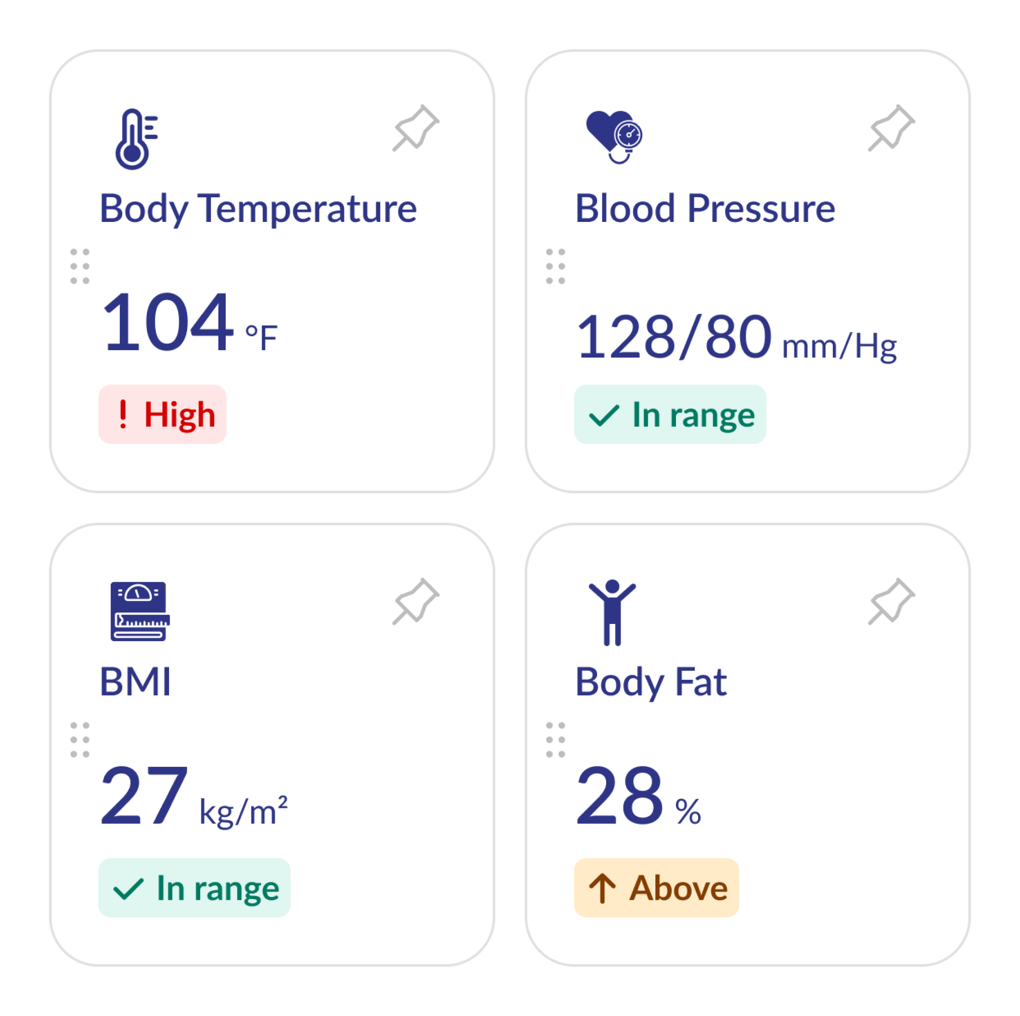
This approach provides immediate clarity to users, helping them to easily determine if their vital indicators fall within the normal range and whether they should have any concerns.
b.well’s executives were impressed at how the strategic use of size, color, and white space transformed the Vital section into a modern and user-friendly interface. This positive impression led them to express a desire for the entire platform to adopt this style.
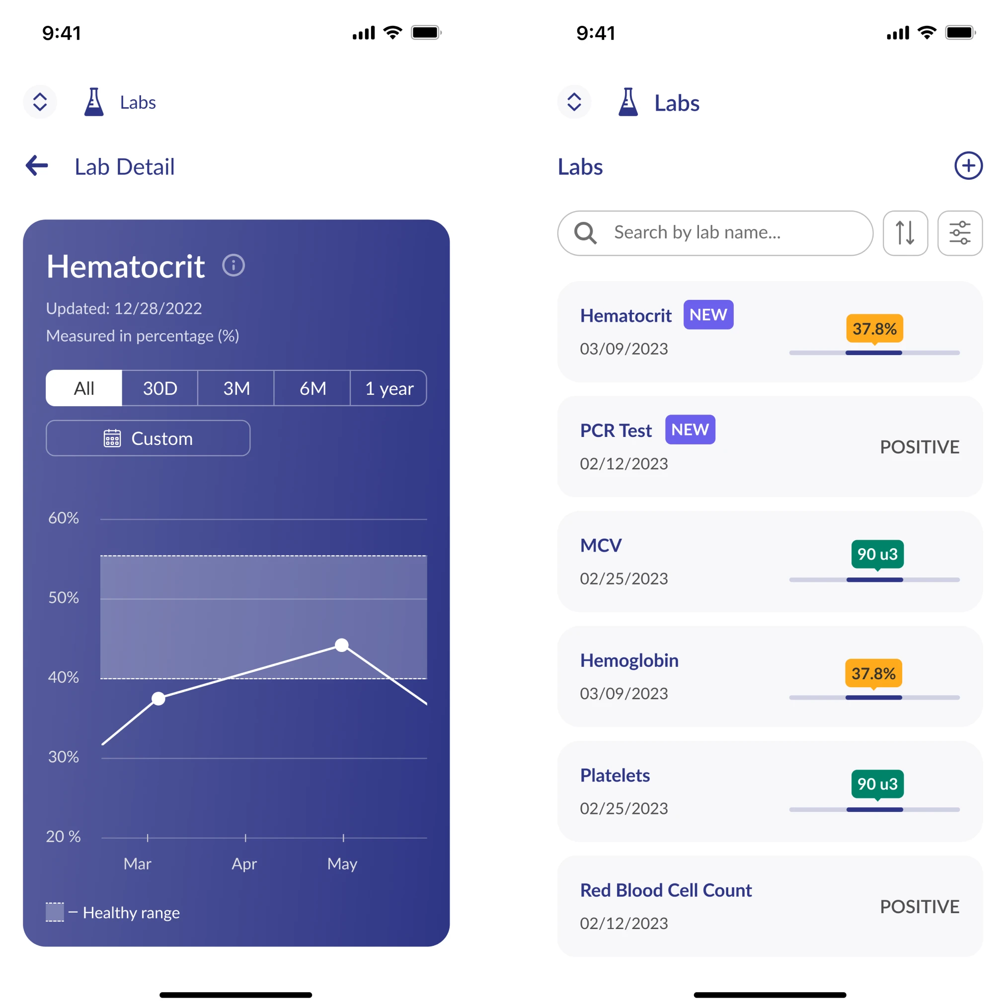
Iterating on the Labs feature to make it clear and more valuable for users
The Labs page contains all user’s lab test results, providing updates on new results and keeping a history of previous ones. This was the redesign task and our goal was to improve Labs’ effectiveness for health monitoring.
In the earlier version, all the test results were grouped by date and didn’t have any search or filter option. So, it really took time for the user to navigate through the page.
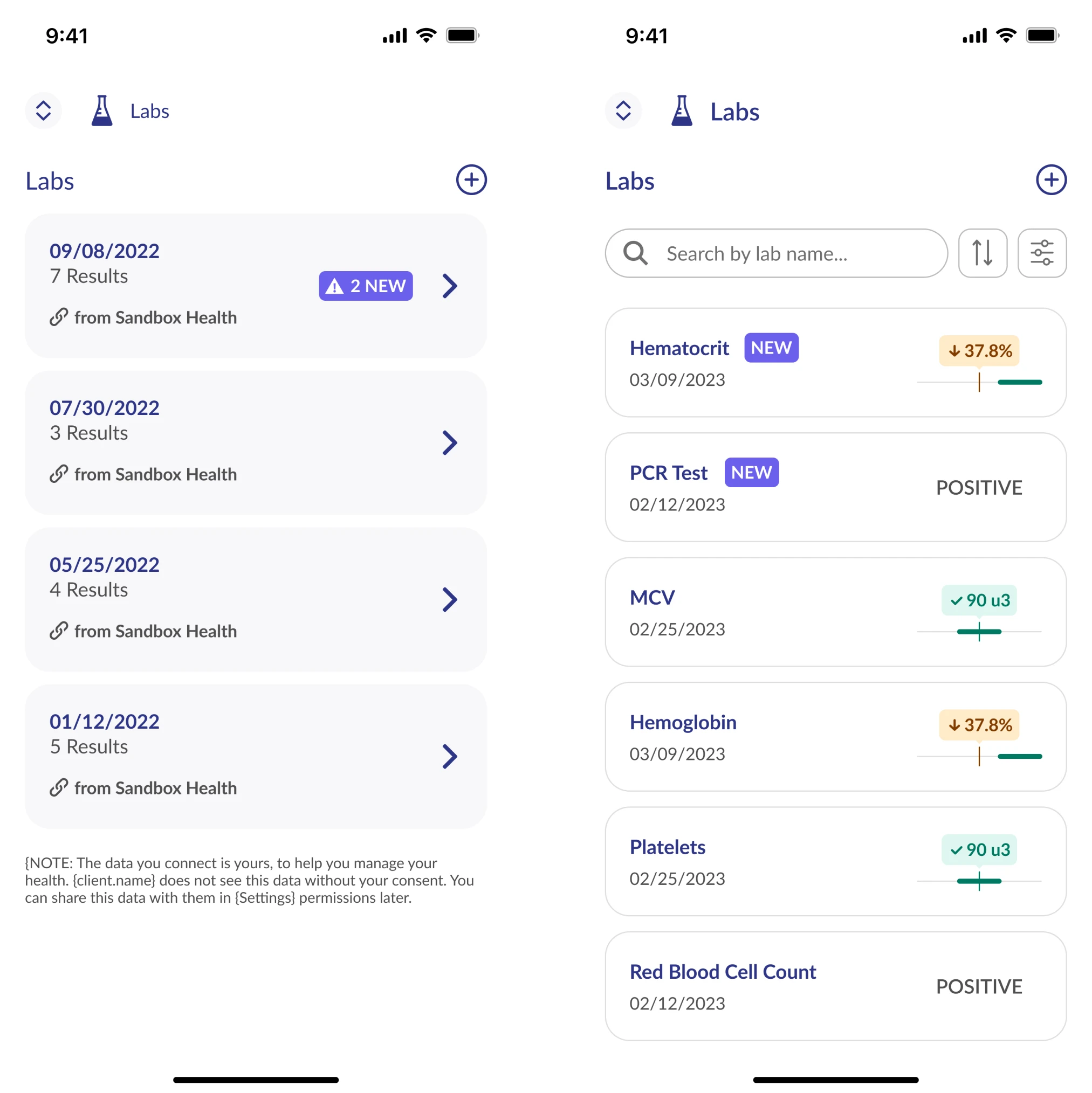
Over several iterations we’ve made the following improvements:
- Made each test result a separate item in the list
- Got rid of grey blocks (the same as with the Vitals feature)
- Added an indicator for quick result preview
- Introduced search and filter functionality
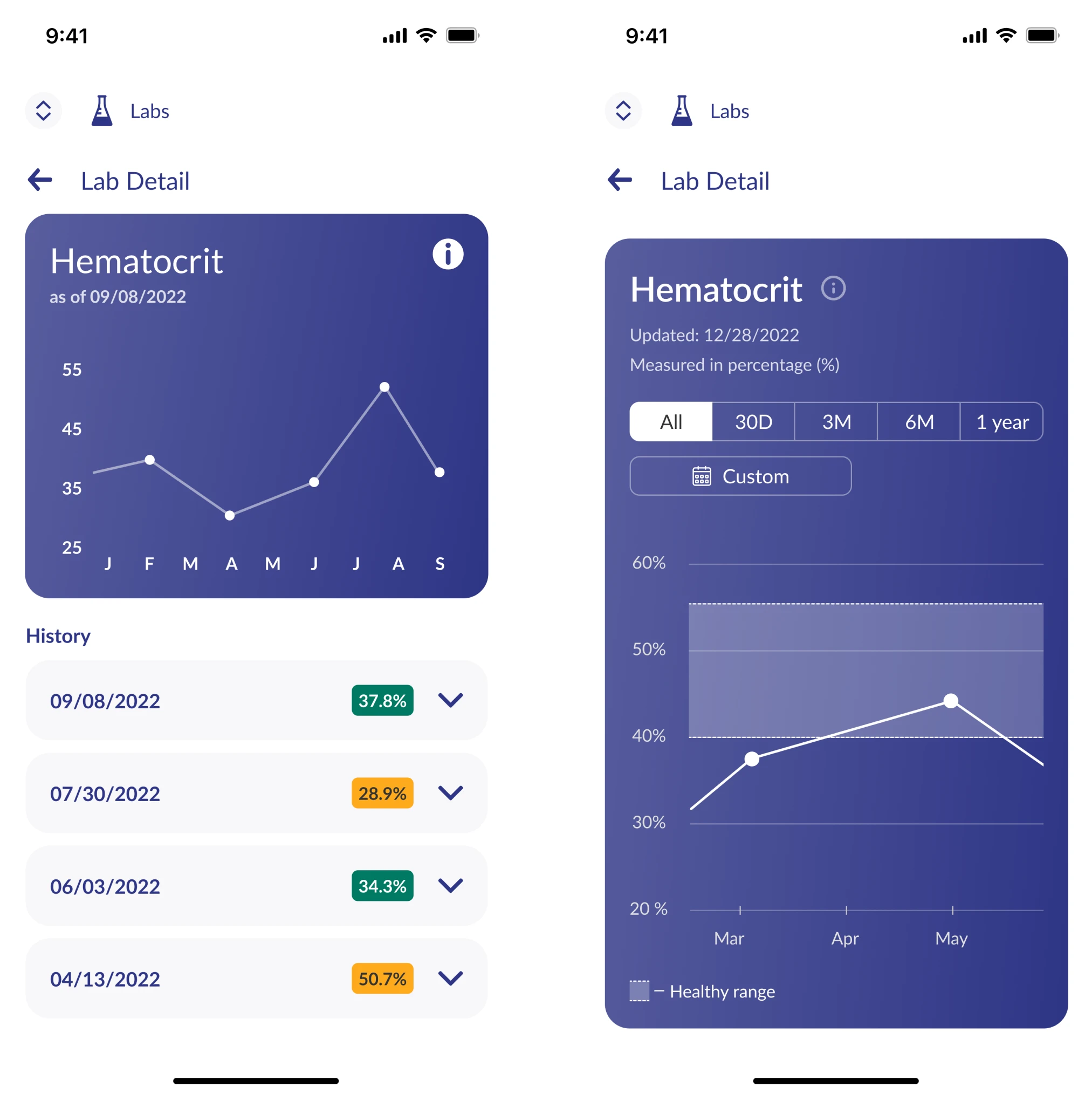
Additionally, we enhanced the chart on the Lab Detail page, enabling users to track changes in specific lab test results over time. We introduced the option to select the time period for analysis and added a healthy range, making it easy to assess how the results compare to the norm.
Preventing users from making mistakes when searching for their medical providers
Provider database is really huge, and chances are high that when you search for the doctor there will be more than one person with the same name. We had to make a design that would prevent users from choosing not their provider by mistake.
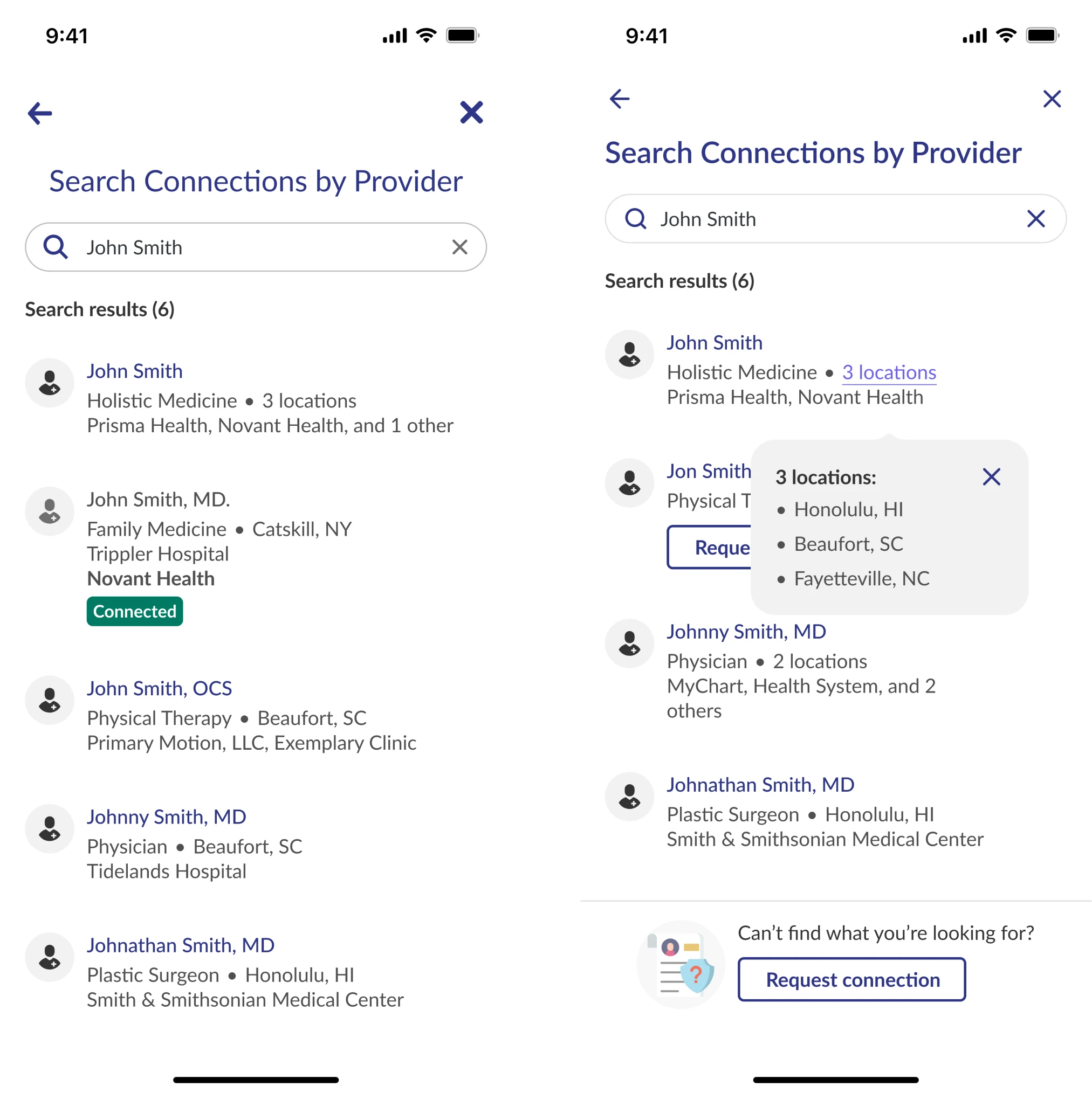
In the Search Connections by Provider card, we made the doctor's office locations more visible and clickable, so users can be sure they've picked the right doctor. We also added a “Request Connection” button, which lets users ask to be added to their doctor's Health system if they're not already in it. This way, users won’t choose the wrong doctor by mistake.
b.well is now back on track with their plan and we are always ready to cover their back in terms of design
Thanks to Eleken's designers, who seamlessly integrated into the company's in-house team, b.well successfully kept pace with their plan. Quickly providing them with experienced UI/UX designers, we were like insurance from unpredictable events for b.well. The design director, product managers, and developers express high satisfaction with this seamless collaboration.
They always delivered on time and were extremely responsive to our needs. And they were patient when project requirements were not clear.