Gridle
UI/UX redesign for a client experience platform
The era of managing customer database through hundreds of spreadsheets and scribbles on Post-it notes is gone. Now every business – large and small – needs a client relationship management software that helps them store client information and manage sales.
CRM systems automate a great number of client lifecycle management tasks. But you still need other tools to make proposals and issue invoices.
Gridle is a client management platform that allows business owners to go from lead to offer, from offer to quotation, and from quotation to invoice quickly and easily.


Unlike most CRM systems that look over-complicated for small business owners, Gridle is built for small agencies and freelancers. Its simplicity of use and full client lifecycle management automation are two characteristics that set Gridle apart.
The SaaS platform was brought to the market in 2013. When our designers joined the Gridle's product team, it was already 2020 and the app's user interface needed dramatic improvements.
We were hired to not only refresh the look and feel of the platform but make it more valuable from the user experience standpoint.
Redesign the app to make small business more efficient
The Gridle's team had an inspiring product vision – they wanted to make small businesses more efficient at managing clients. That's why the platform was built to automate the entire client lifecycle management process.
We needed to redesign Gridle in a way that supports the product vision but does even more than that. We wanted to help users to not only be efficient but also to improve the way they interact with their clients. To make the right design decisions we needed to get to know their users.
Data research
Gridle uses Inspectlet to register everything its users do in the app. We spent a lot of time watching the recordings to understand which features get used more, and which are completely ignored. This helped us arrive at the conclusion of how to build a user interface.
User interviews
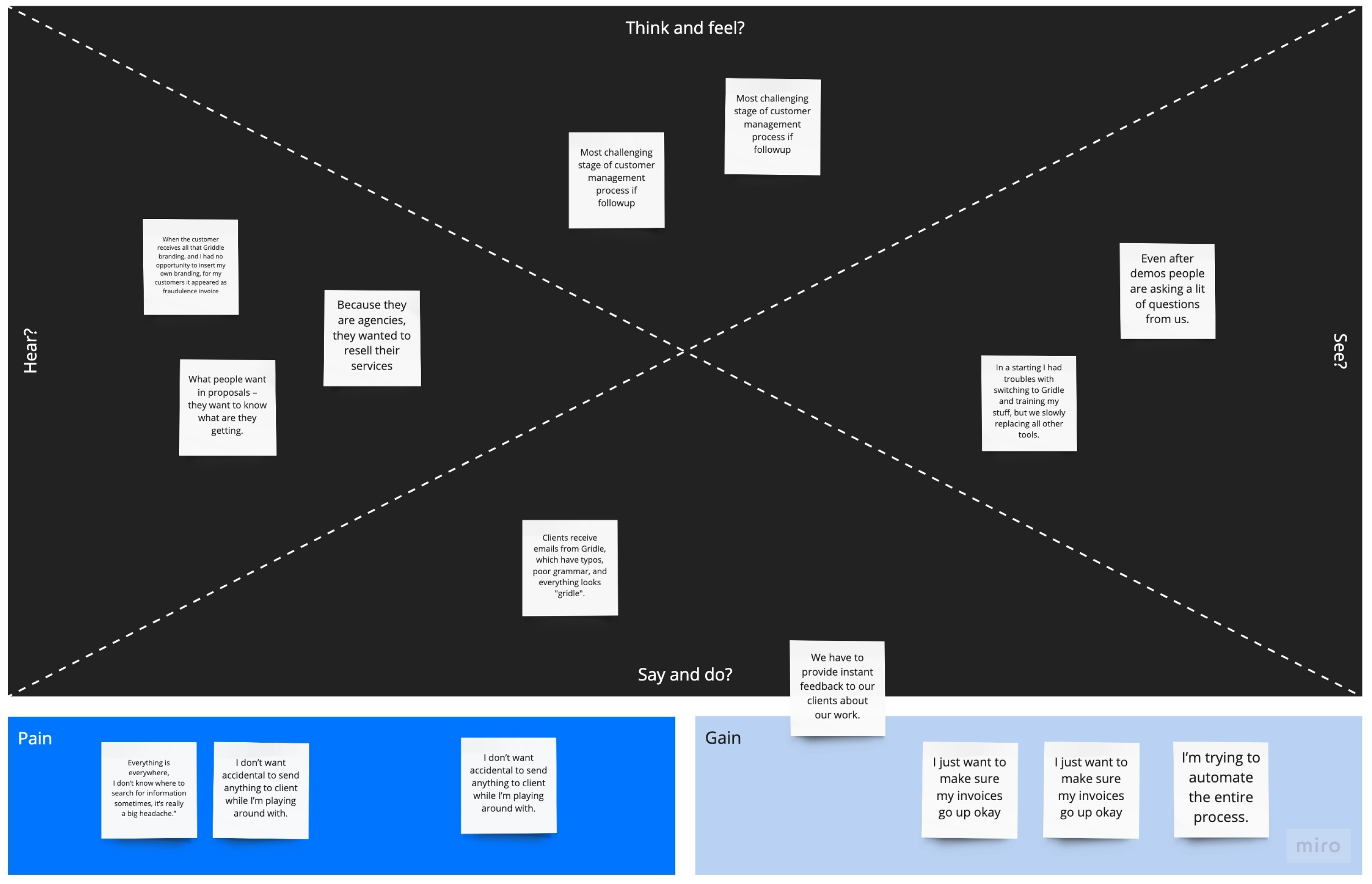
Since Gridle has been on the market for a few years already, they had a pretty large user base easily accessible through their Facebook group. We conducted six one-hour interviews with the users to understand and prioritize their needs. We used empathy mapping to gain a deeper insight into their customers.
User research insights
At the end of our research phase, we pooled together all our insights and discovered what users wanted most from the new version of Gridle:
- Customization
With custom fields and some other customization we could give our customers a good experience with our company.
- Ease of use
Before jumping in any tool my first priority is how much time I’m saving with this tool.
- Unobtrusive reminders
Sending a reminder is a delicate process, but we use a very professional language like it’s a humble reminder, a kind reminder, something like that. So the client doesn’t feel pushed.
- Intuitive product guide
I would like to see more tutorials on how best to use Gridle, ‘cause there’s a lot of features I know available, but I just don’t know how to use them yet.
- A place to store the documents
Most challenging in client management is getting data in the same place. Now something is in Google Drive, Dropbox, email account. Everything is everywhere, I don’t know where to search for information sometimes, it’s really a big headache.

Design requirements
After analyzing the user needs, we translated them into the following design requirements:
- The app must make it easy for new users to get started and should give them immediate confidence that they can succeed
- While using the app users should feel professional and confident – this will help them get better at managing their clients
- The product needs to help users perform their tasks in just a few clicks so that they could see the real benefits from automating their work processes
- The product must provide an optimal workflow for client management that doesn't disrupt the user's current workflow but at the same time offers a way to improve it
- Every detail on the screen needs to make sense to users, but it shouldn't restrict them from performing a certain action
How we designed Gridle
Using the Gridle app, users can add leads, keep track of sales funnels, craft proposals, send proposals, generate invoices, and get paid. Here is how we redesigned it:
Onboarding
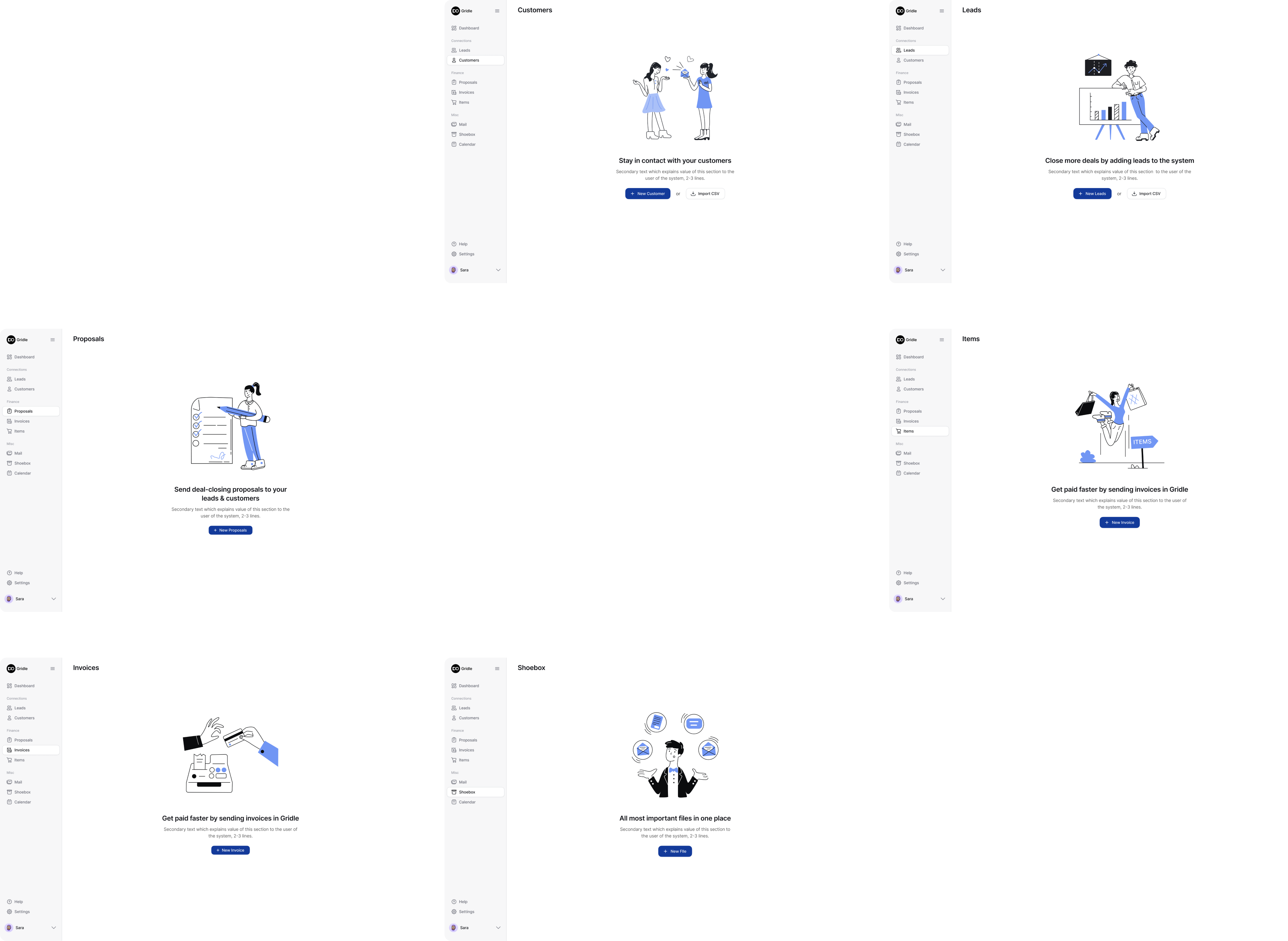
User onboarding in Gridle starts right from the signup process and flows naturally into a guided first-run experience. Instead of showing users an empty dashboard, we introduce each module step by step, giving them a clear sense of what the platform can do and what to do next.
The onboarding screens combine illustrations, concise copy, and one main call-to-action per view. Each screen focuses on a key task: adding customers, managing leads, sending proposals, or setting up invoices. This helps users build confidence as they explore the system.
Each screen maintains the same layout: a clean white background, a left-hand sidebar with navigation, a minimal illustration, and one prominent action button. This visual consistency helps users feel oriented while learning a new tool.
On the screen series below, you can see how each module welcomes users with a friendly visual and a clear next step:
Also, Gridle used Intercom's Product Tours to create interactive guides that walk new users through the app's 'interface helping them to get started. This tool saves hundreds of development hours compared to a custom-built onboarding solution.
Dashboard
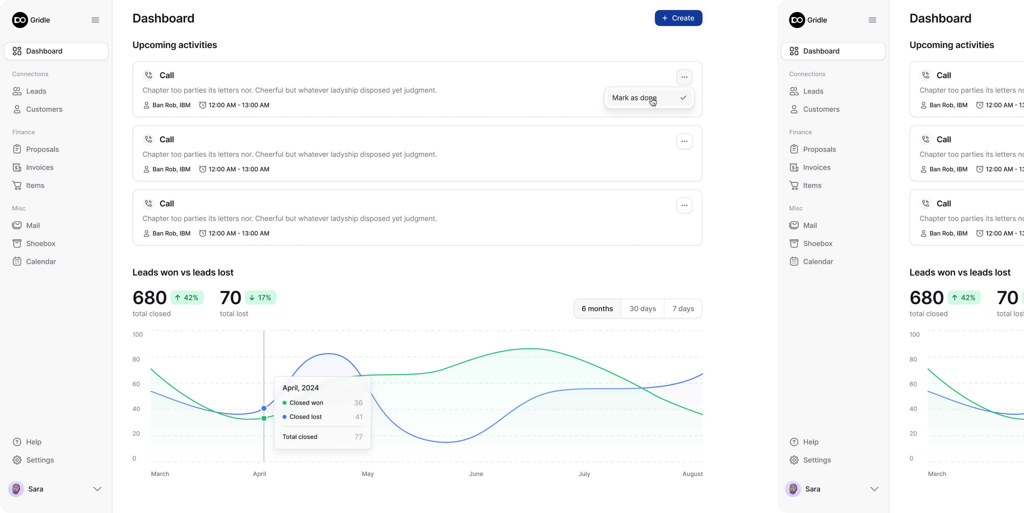
The dashboard is the first screen a user sees after signing in. For new users, we created a short tour that helps them set up their workplace on Gridle.
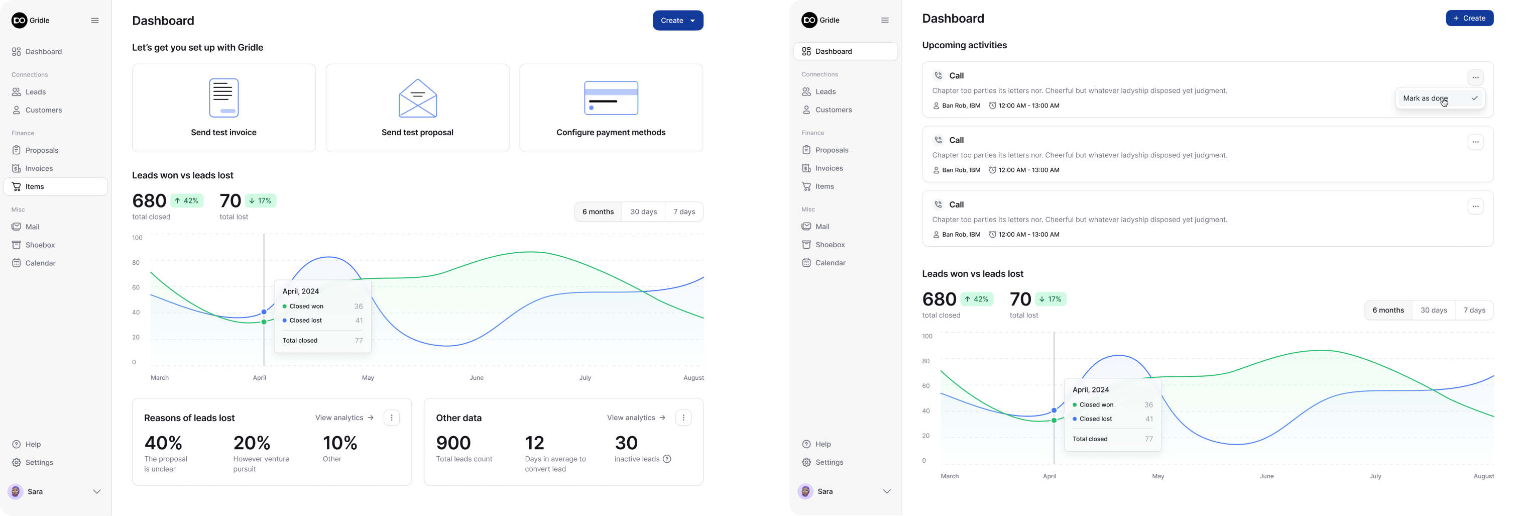
For existing users, the same place on the screen turns into a reminder of upcoming activities. A little down the page users can get an overview of their sales and lead generation process.
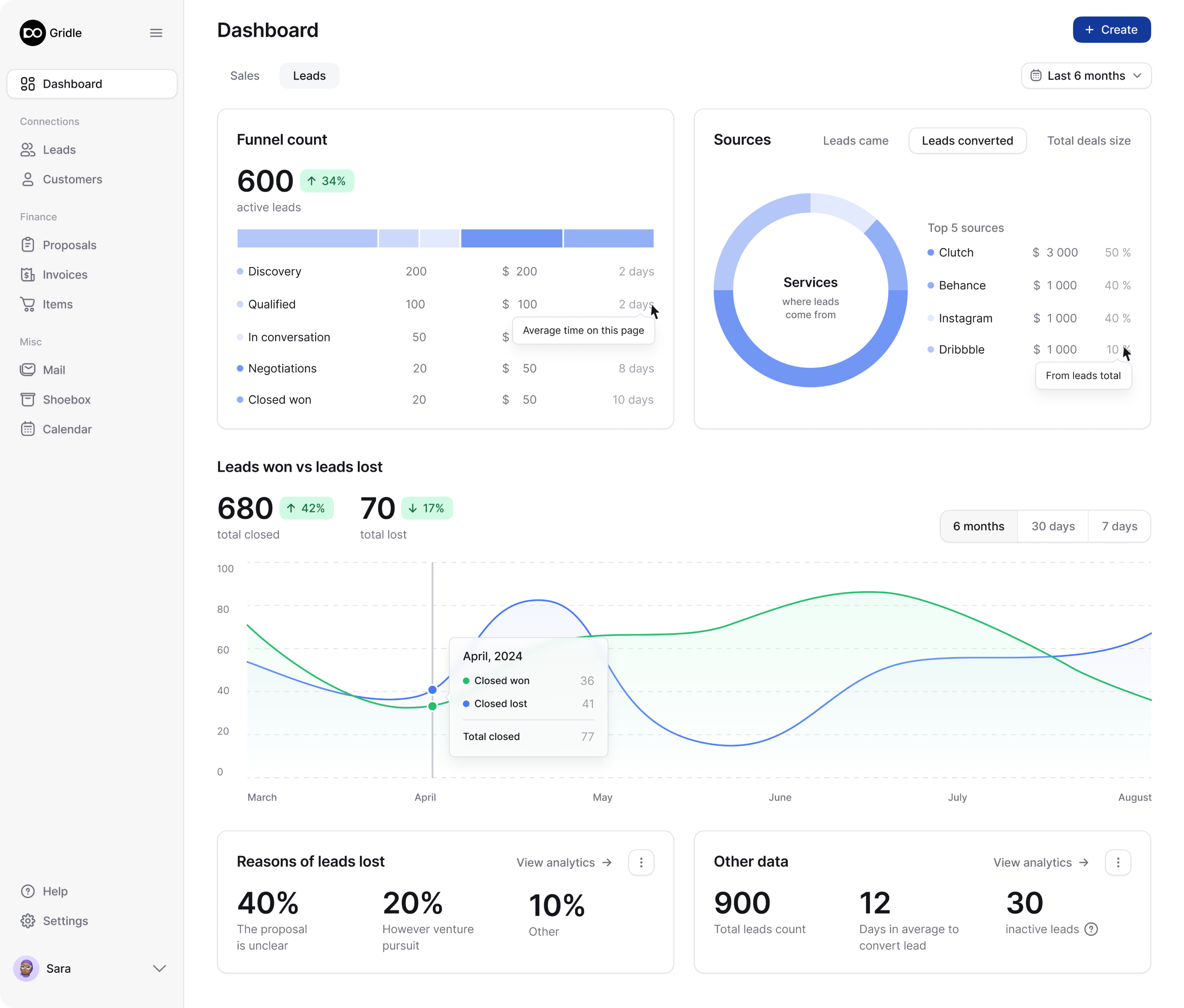
The dashboard displays the number of leads in the funnel and the number of closed customers and shows other important numbers that help users understand their current progress.
Leads
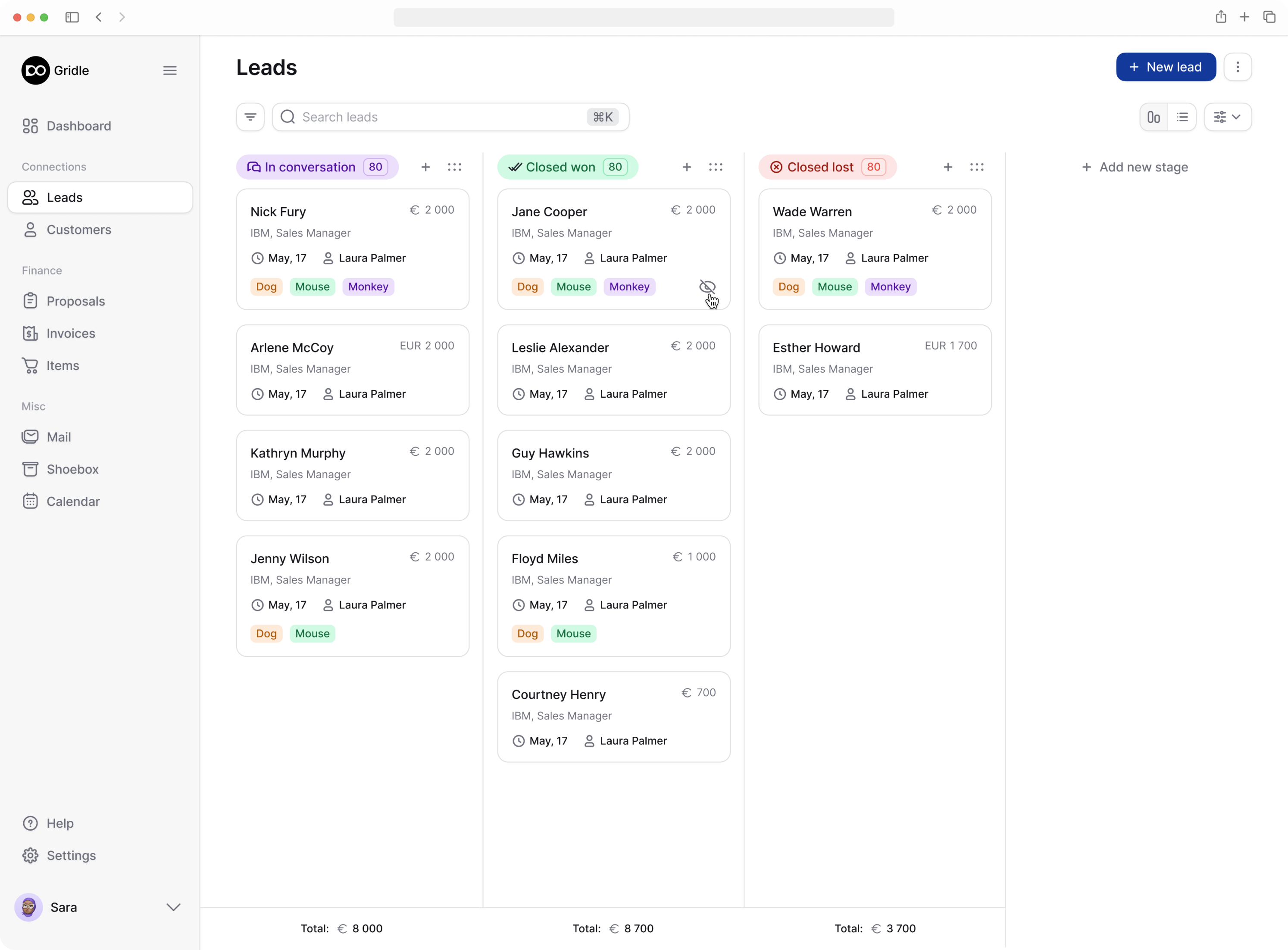
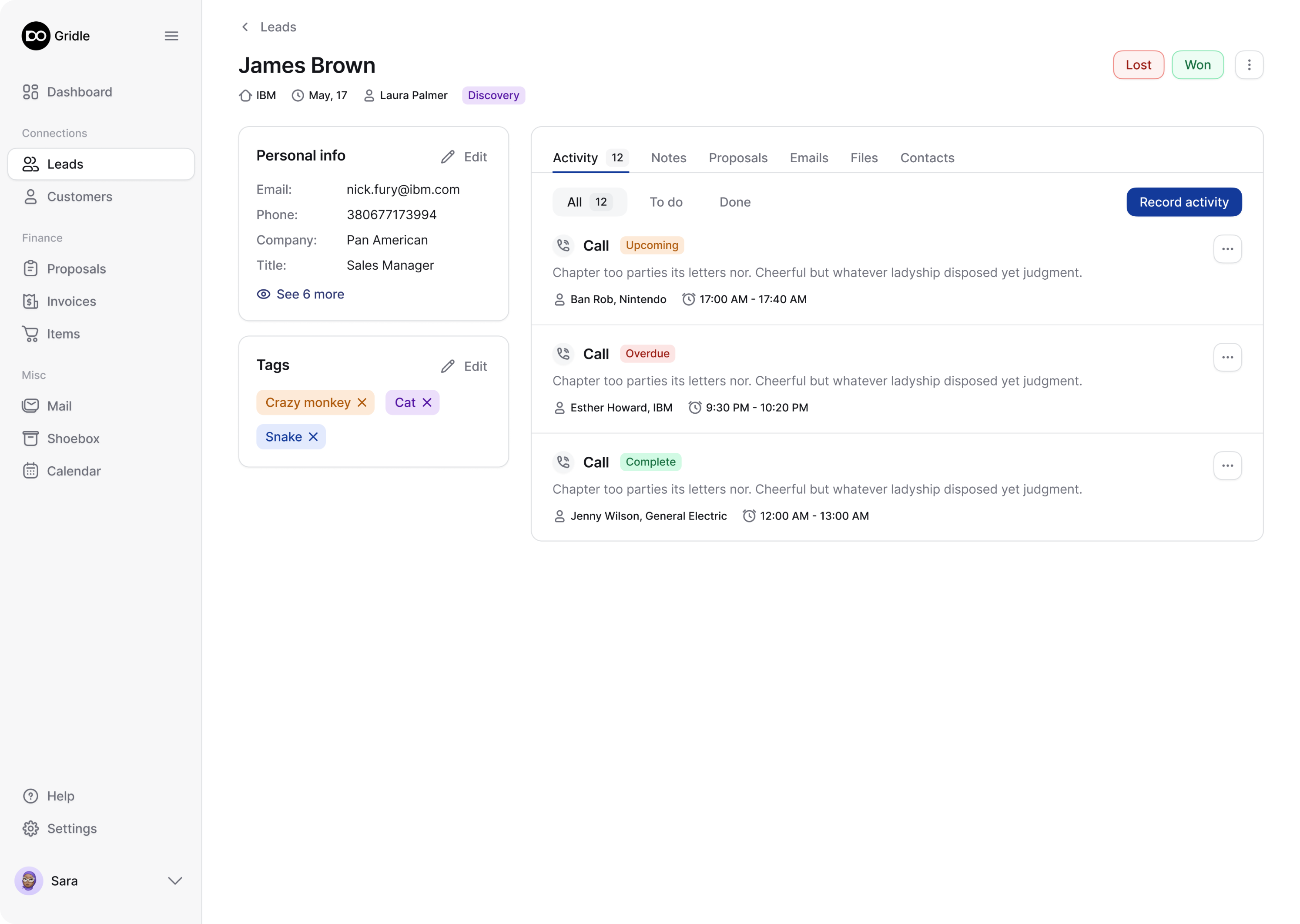
Using Gridle, sales managers can build and manage sales funnels. We designed two ways of how these funnels can be displayed: using Kanban columns and lists.
The main information about every lead is visible on this page so users don't need to click anywhere else.


Customers
By clicking on the Customers tab users go to a database that contains all information about their clients. They can choose what attributes they want to see there, apply filters to find needed information, use bulk actions to update the customer list, and even invite their clients to a client portal.

Proposals
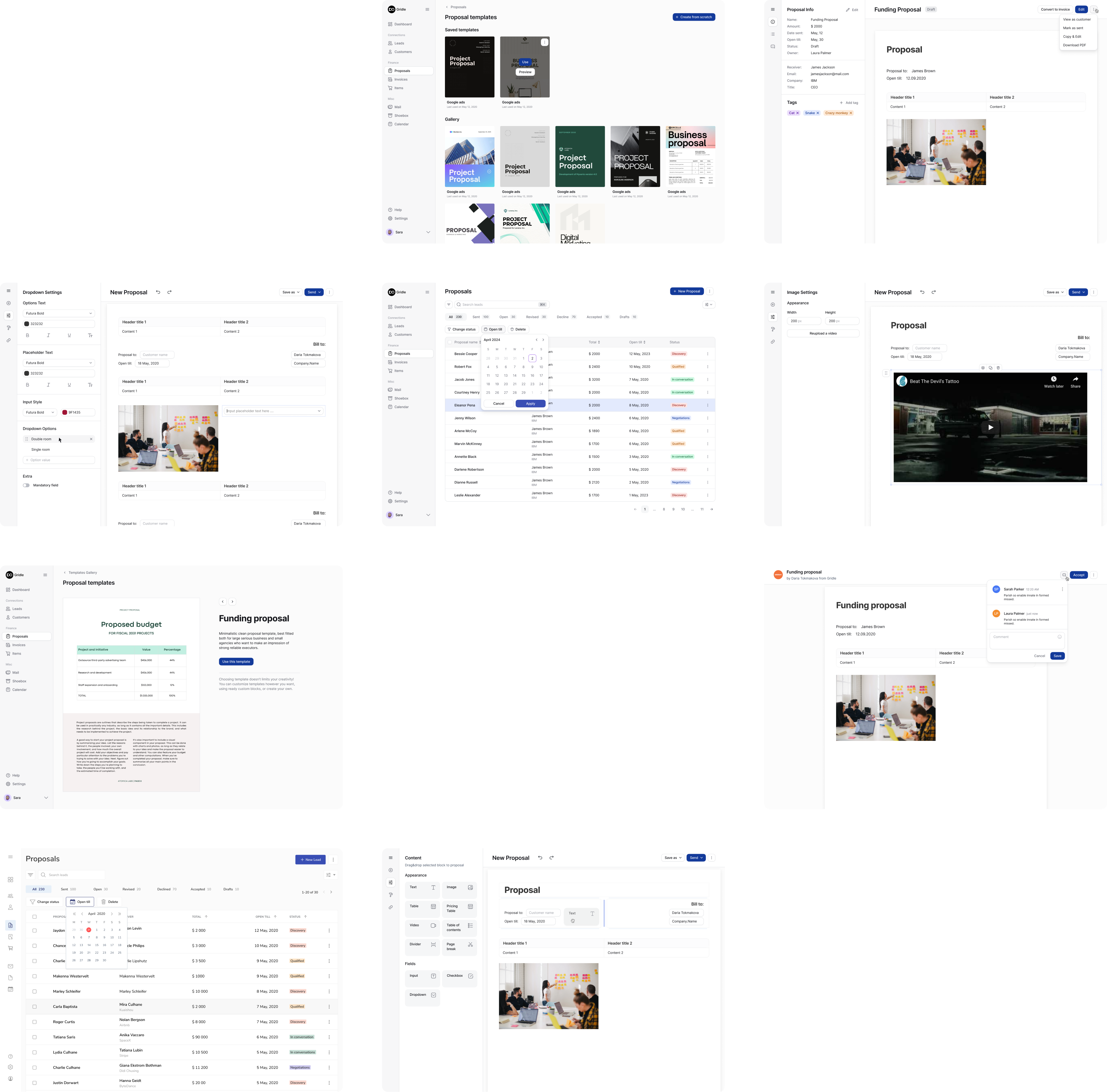
On the proposal screen, users can see the status of their proposals – sent, opened, declined, accepted – and define their next steps.
To make it faster and easier for users to compose proposals, we created a list of templates they can choose from. Editing and sending proposals can be done through the same user interface.
Invoices
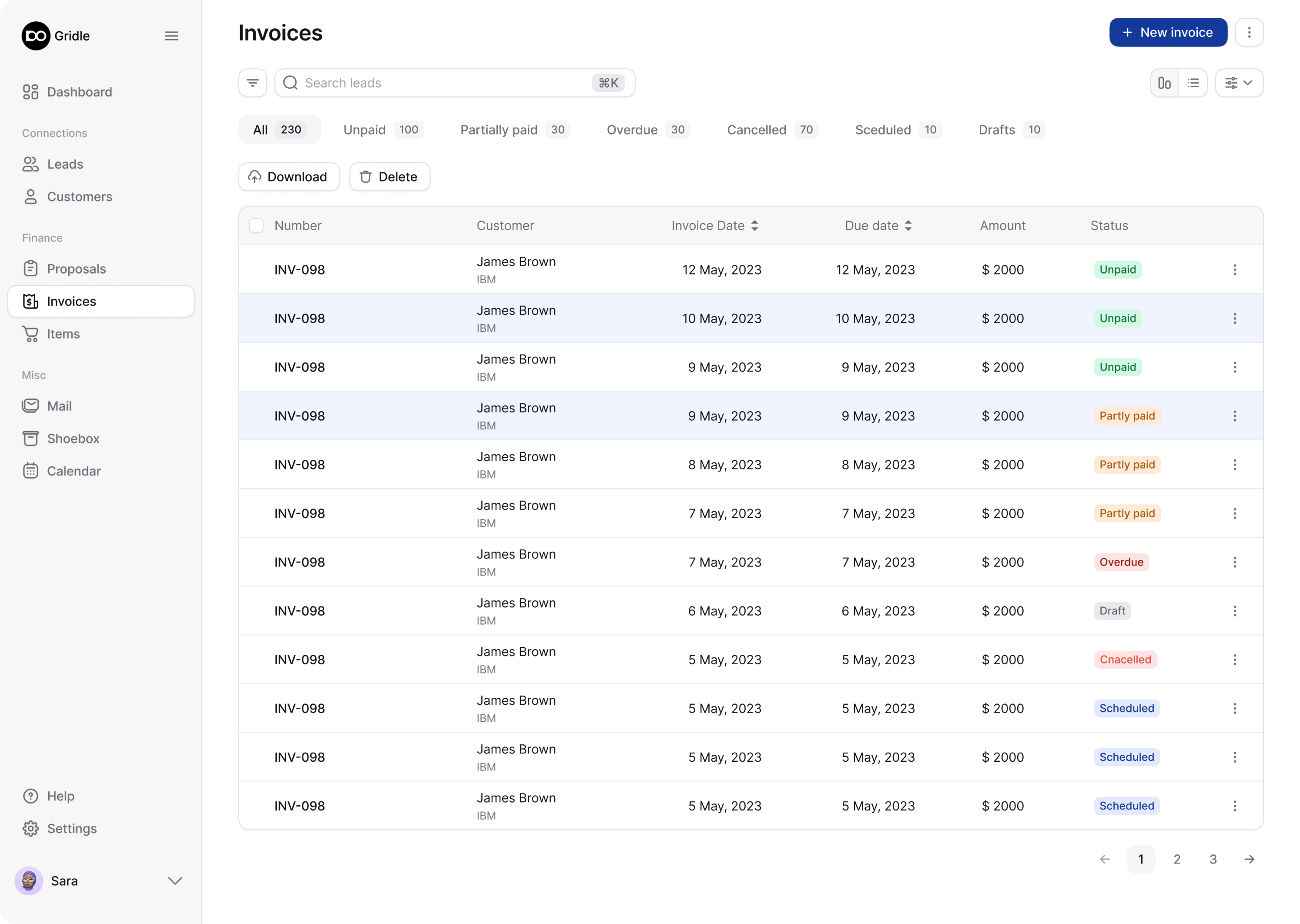
Preparing and sending invoices requires only a few clicks. We created customizable invoice templates that allow users to insert the needed customer data in seconds.


Users can't wait to start working with it
It took us about three months to redesign Gridle. During this time we recreated the entire platform and made it look more professional, modern, and usable.
When our client, Gridle's CTO, showed the design to some of their users, they were excited and said that they couldn't wait to start using the new revamped version.
Gridle has recently changed its name into Clientjoy. You can check out the product.


