MegaStep
Design from scratch in action or how we helped quality control app to jump into SaaS market
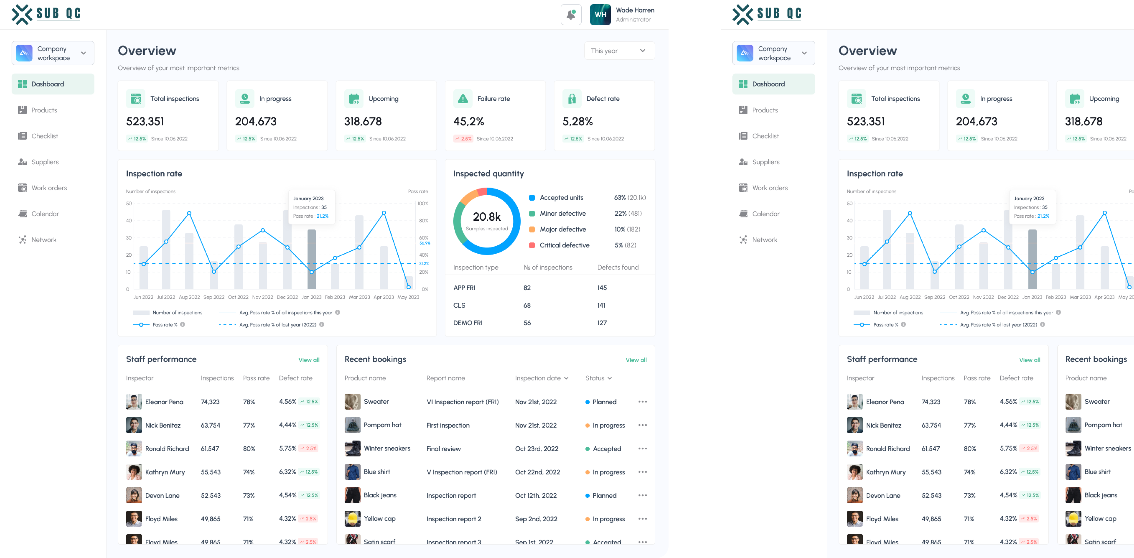
MegaStep is a company working in quality control. Their inspectors travel to big warehouses and fill in detailed reports on every item in supply so that buyers can make informed decisions. The reports were lengthy and hard to fill manually, so the company decided to build their own SaaS software to streamline the process.
Despite existing successful solutions, MegaStep aimed to stand out of the competition by introducing unique features, and a quality UX design, of course.
MegaStep manager was a true expert in his domain and had a clear product vision, but he had never worked on digital product development before. So, he needed an autonomous product designer who could help him with different aspects of the design process and come up with their own ideas. And that’s what Eleken is good at.


Guiding the client through the entire design process, from feature selection to user flow optimization and screen building
We started with a thorough competitor analysis. The client had compiled insights on competitors, including product features, strengths, and weaknesses. Our designer then analyzed them from a UX perspective to identify potential unique additions to the product.
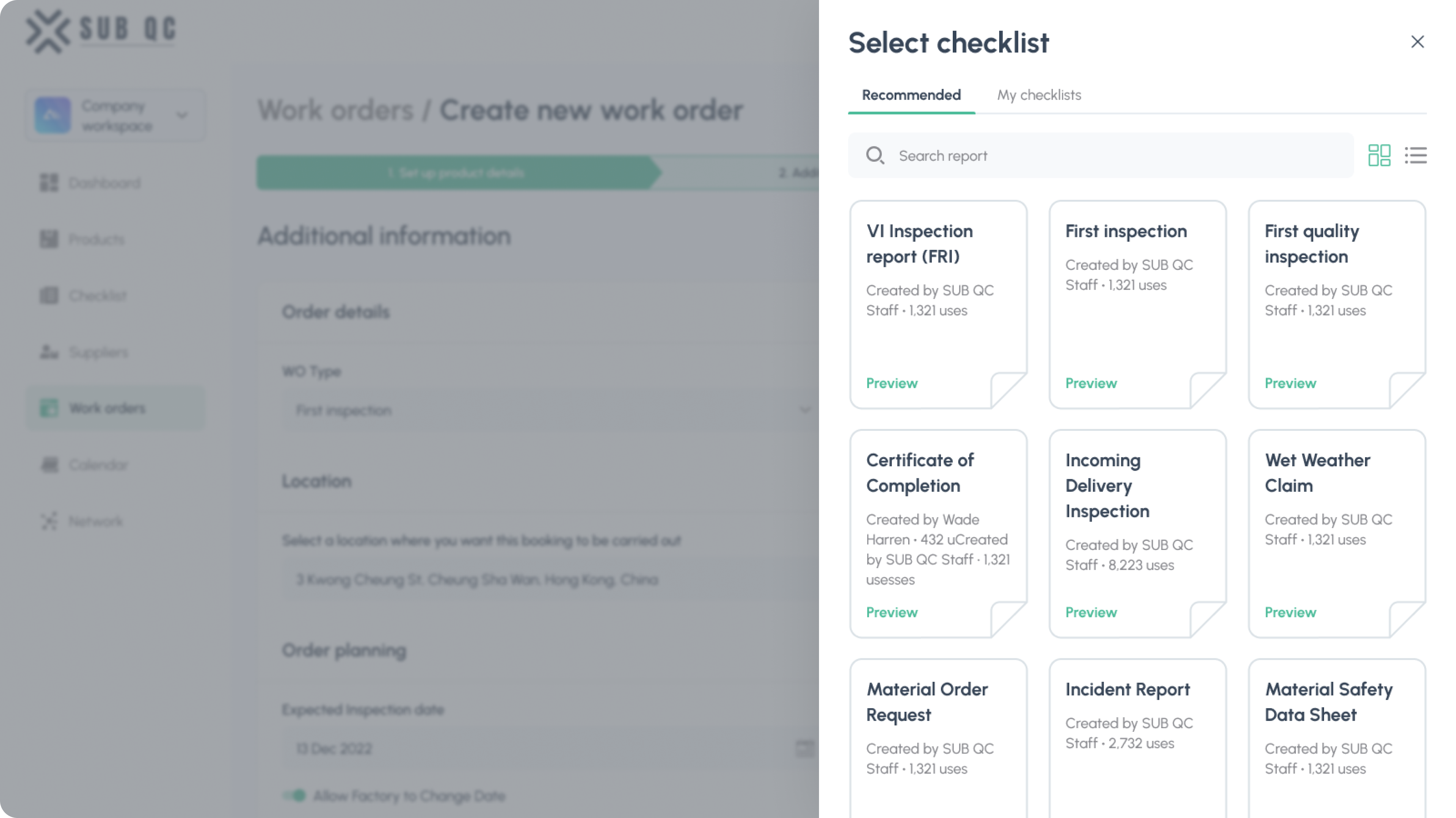
One such feature was templates. Templates are a magic wand that helps to save users’ time. When users create a new form, they don’t have to start from scratch every time but choose a pre-made form instead.
Before coming to us, the client already had a detailed product plan, but once we started working on it together, it turned out that the actual user flow was longer than they imagined. A clear scheme on the screen helped get a more realistic view of the product and prepare a base for the design.

Given the limited time frame, we skipped low-fidelity wireframes and went on with screen design. Here are some design solutions that helped us fit into tight deadlines.
Saving time by applying proven patterns of top products instead of creating everything from scratch
Our key challenge was time restraints. Faster route comes with many pitfalls, but a good UX professional always knows how to cut the path without affecting the product quality.
One safe way to save time is to find products with similar elements and use patterns that have proved to work. Not competitors but top products with strong design practices that can be relied upon.
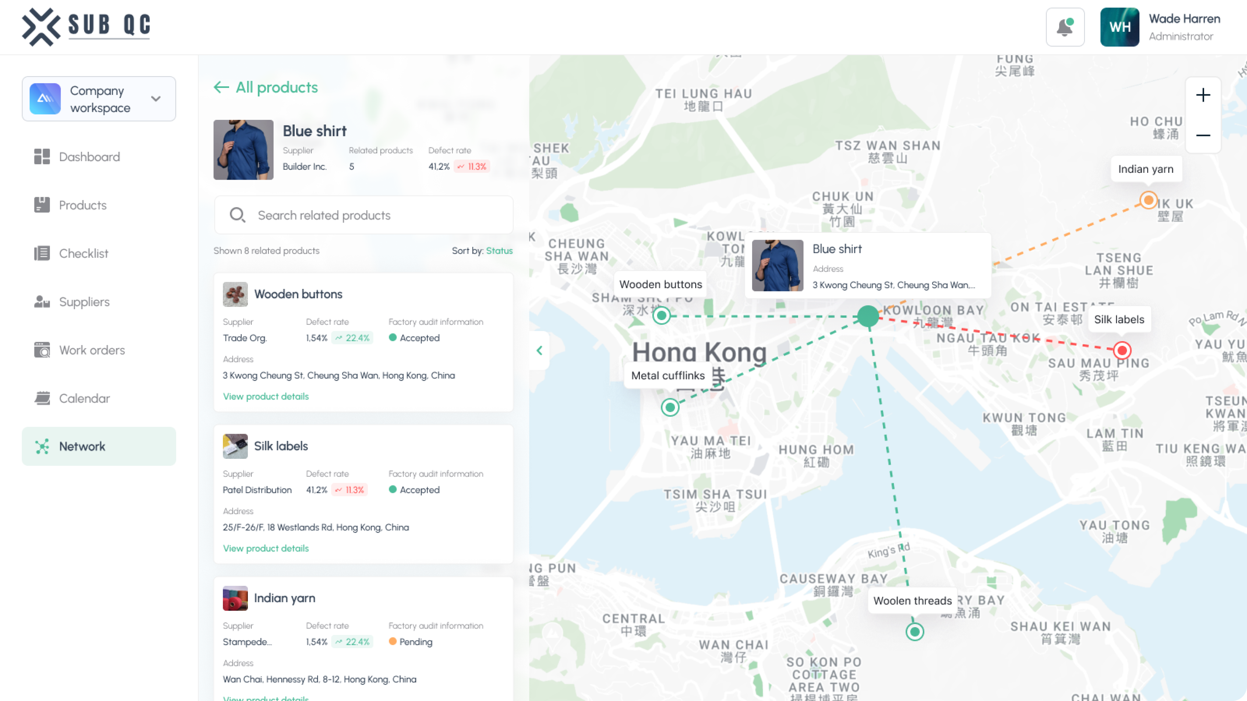
For example, our designer looked at Google Maps and Flightradar to create the map interaction. It saved us a lengthy process of creating different solutions, testing, and choosing the best one.
Agile working process: Adapting to constant changes in a startup-like manner
Our subscription model fosters project flexibility for both us and our clients. Since MegaStep was a brand new thing for the company, the ideas constantly changed. That’s how startups work, and we are used to this workflow. Continuous trial and error is fundamental to successful new product development.
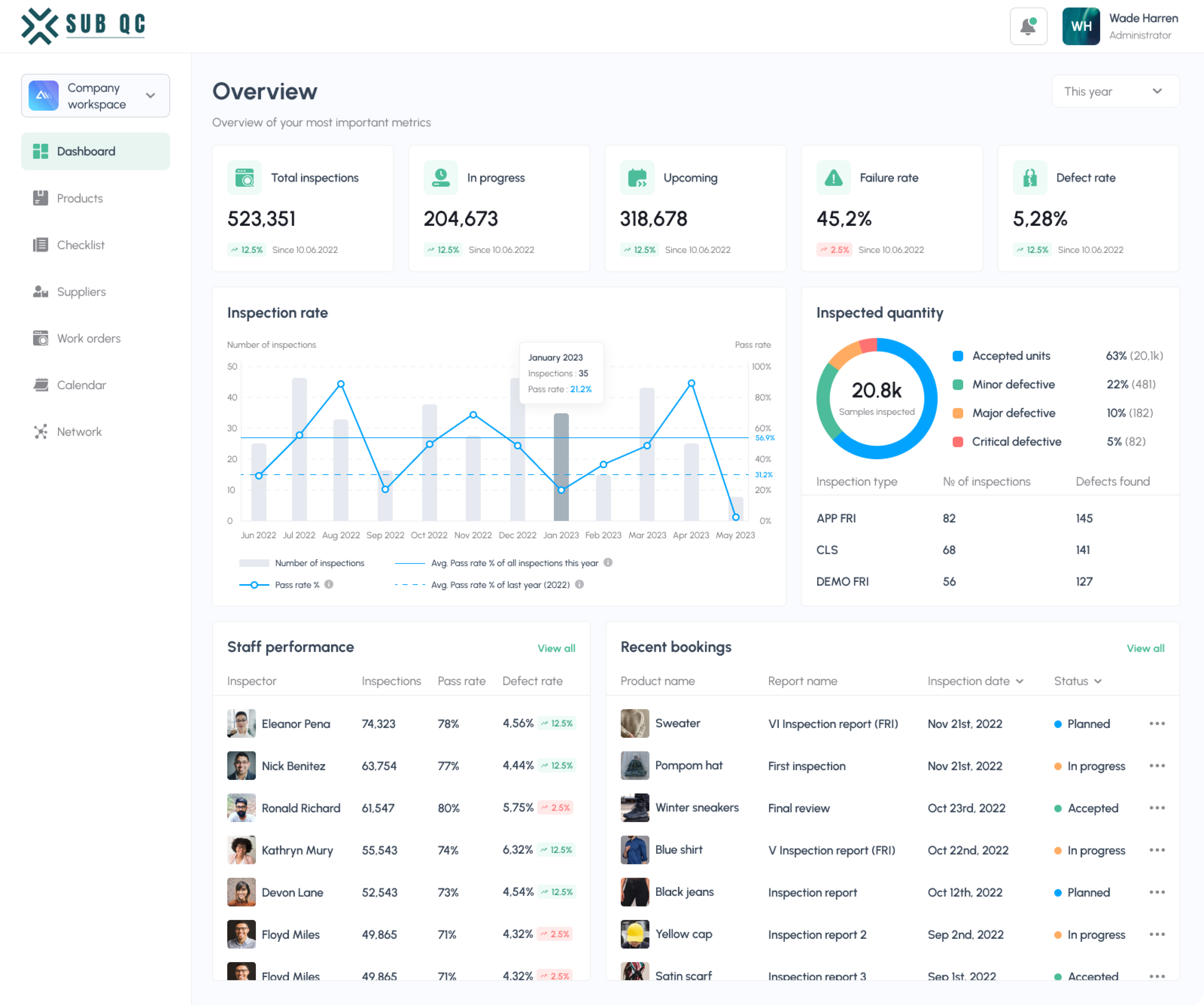
Our collaborative process involved integrating new features into the product, with contributions from the client, their team, and our designer. In the end, the product evolved into an all-in-one quality control tool, with a comprehensive database of information needed for warehouse inspectors: supplier statistics, product quality reports, and data on goods' storage across various warehouses.
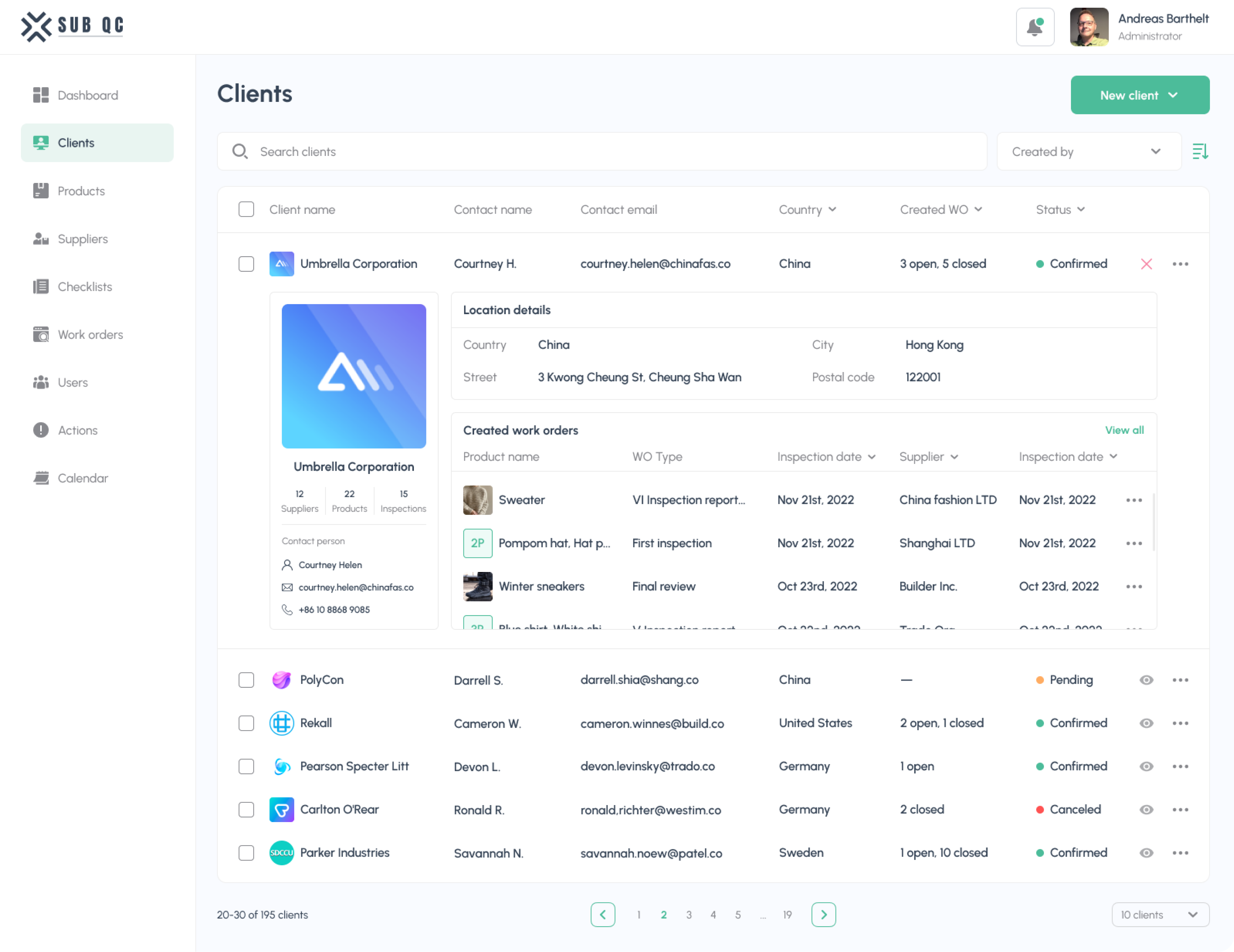
Big amounts of data require smart design solutions to ease dealing with it. For example, in the Suppliers block, you can see a short preview of each item in the table without opening it on a new screen. The same pattern was used in other tables – products, staff, and so on.

The result exceeded client's expectations: We fit into the tight deadline and delivered a mobile app as a bonus
We finished all the design a couple of days before the end of the second month. As there was extra time left, we created a mobile version of the app for the inspector. The client didn’t plan it initially, but having a mobile version is always good. Especially when it gets done in just two days!
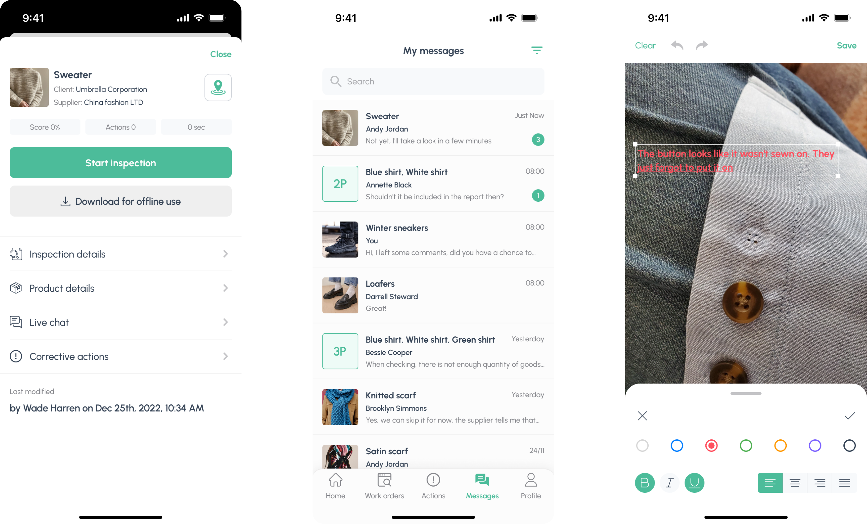
If you take the product vision the client showed us initially and compare it to the final result, you’ll see that the product grew twice. That’s how the iterative process works: we don’t limit ourselves by once-defined tasks. Instead, we research, try, learn, and change things whenever needed.
