PayUp
How Eleken partnered with a financial startup to help scale their product quickly with a consistent design system
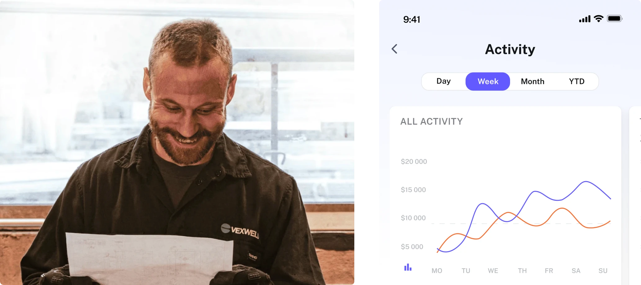
In the US, service industry workers, such as those in property maintenance, construction, or trucking, typically operate on net 30 payment terms, meaning they receive payment 30 days after completing a job. It puts a lot of burden on vendors as they often lose out on new business opportunities due to cashflow issues.
Our client believes that allowing businesses and workers to get paid on their own timelines will let them stop worrying about cashflow problems. So they developed PayUp – a financial platform that helps vendors get paid early on unpaid invoices.



The app expedites payment via invoice factoring allowing vendors to choose which date and net terms they would like to get paid on.
PayUp started its way to the market with a mobile-first design for iOS and Android. They launched an MVP to validate the idea and quickly gained their first customers. This was a sign for PayUP to scale their product:
- Their primary focus was to develop a web app based on PayUp’s mobile version and extend it with new features.
- Their another aim was to establish a consistent design system that would let them grow easily in the future.
As a small startup, PayUp was trying to grow fast. But because of such ambitious plans, it became a real challenge to cope with the workload.
The designers PayUp had at the earlier stages of product development moved to other projects causing a significant challenge to their scaling success
PayUp was left with only one experienced designer on its team, so they were looking to partner up with an agency that knows how to work with complex financial products and will be able to
- Support their speed of scaling and work in fast iterations
- Evaluate current designs, and give suggestions on how to improve them
- Help build a well-structured design system
Our client had one more requirement in mind while selecting a design agency. Being a small team, they valued the opportunity to directly interview the designer assigned to their project, rather than solely communicating with a sales manager.
With Eleken they received more than an interview.
A three-day free trial to show we can take ownership of design responsibility over a complex financial app
At Eleken, we offer our clients a three-day trial before starting the subscription, so they can experience our services firsthand and determine if we align with their needs. All that's required is to give us a task that yields tangible results within three days and to be available to communicate with our dedicated designer.
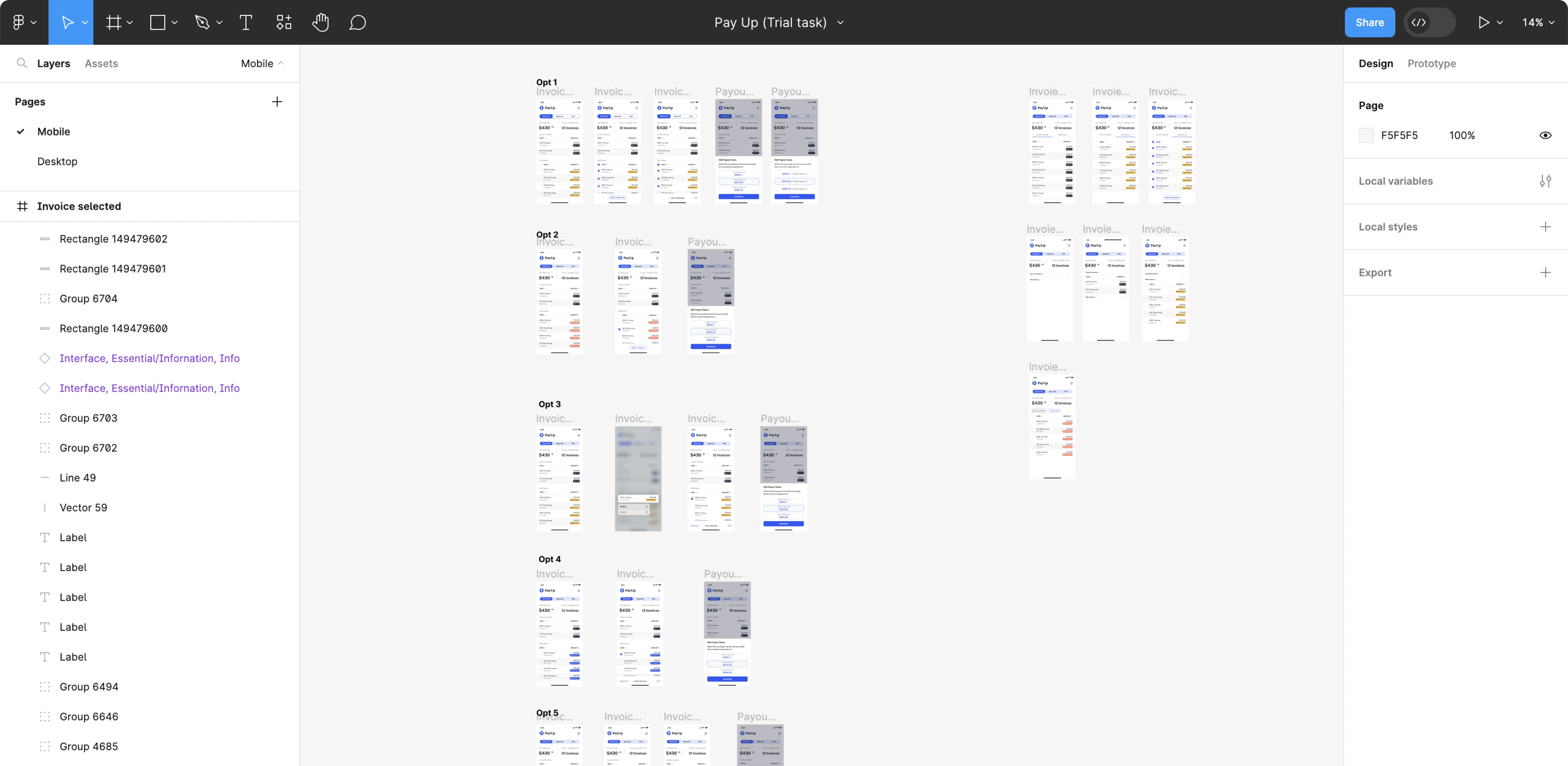
PayUp chose a feature extension task and asked us to design a flow that would allow workers to change the payout terms for each specific invoice.
Leveraging our expertise in working with financial products and insights from our communication with the client, we provided the PayUp team with five versions of the flow!
By the way, here’s the final design of the Change Payment Terms option we came to during our further collaboration.
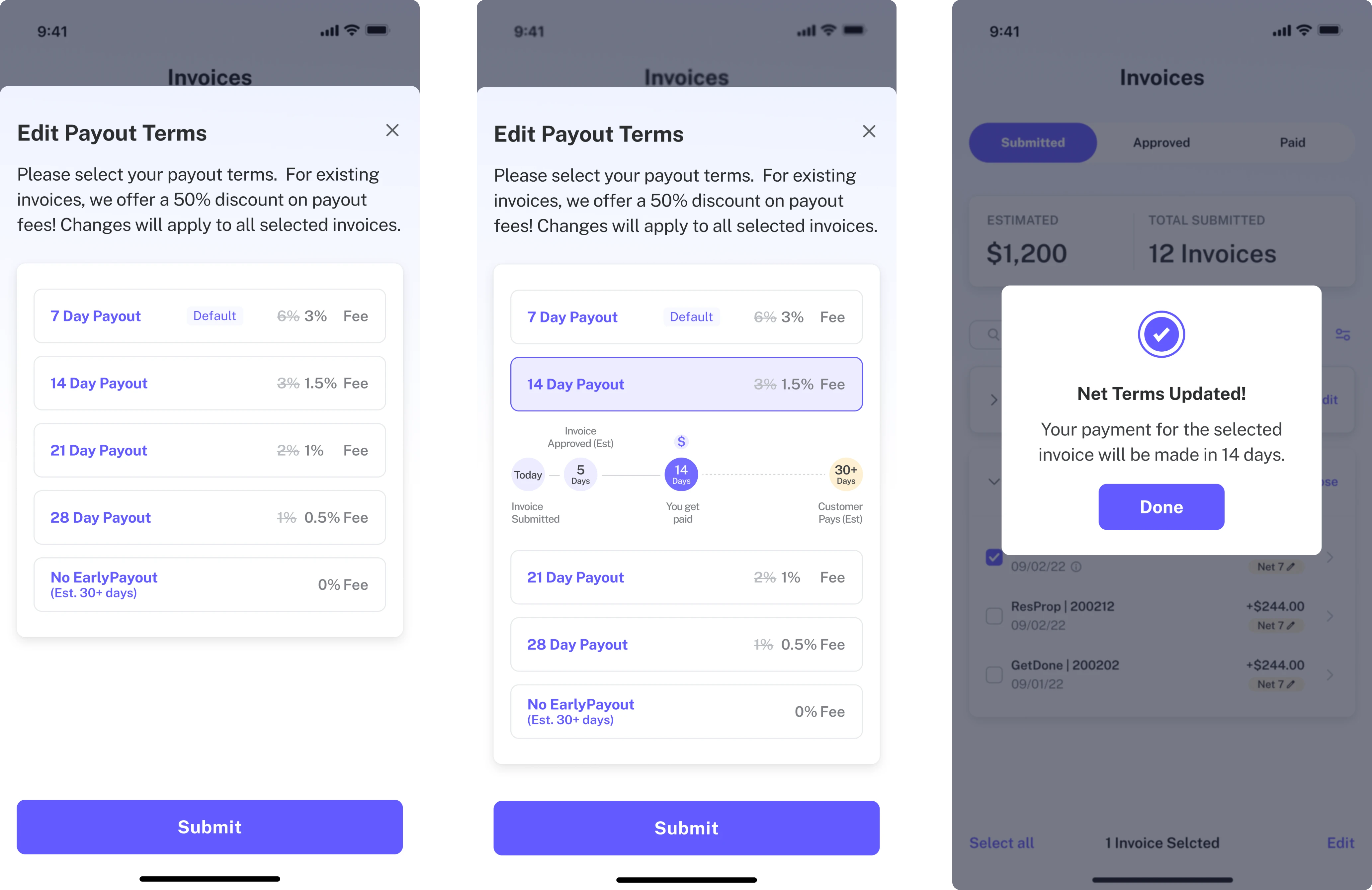
The client was fully satisfied with the results we achieved in just three days. So, they decided to continue our collaboration to redesign PayUp and bring it to the next level with new functionality.
Improving existing designs and adding new features using a design thinking process
As the PayUp’s user base consists of busy, non-tech-savvy individuals who want to complete their financial operations with ease within several clicks, our goal was to create a design that ensures effortless interaction and maximum clarity.
For achieving this goal fast, we decided to work in quick iterations using design thinking – the iterative process that prioritizes user insights, fostering collaboration, and driving the development of user-focused and effective solutions.
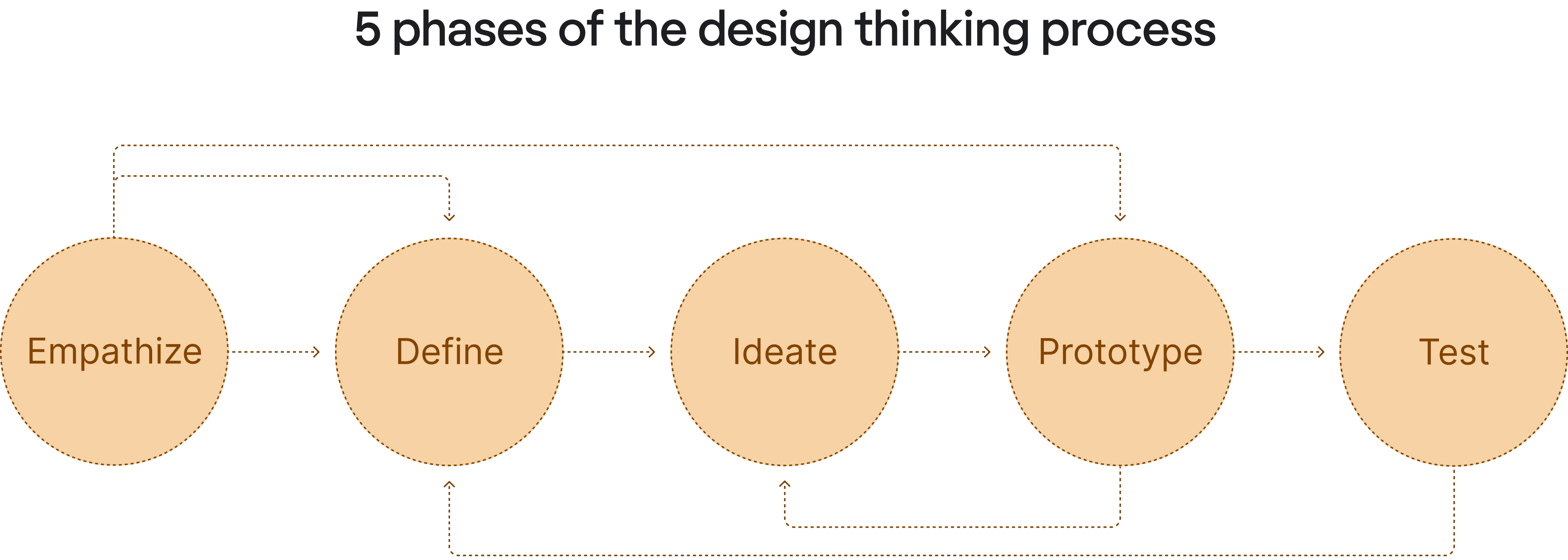
Each iteration consisted of five stages:
- Explore
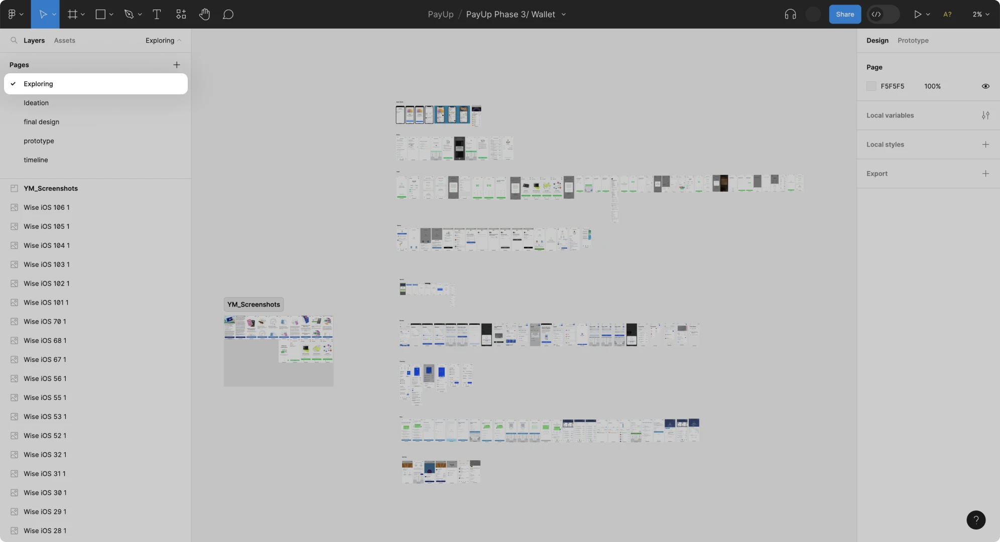
During this stage, we reviewed about a dozen of different financial apps, like Come On, Chime, Apple Wallet, Revolut, Chase, Robinhood, Stripe, and more. This helped us better understand user expectations, choose best design practices and common design patterns to deliver a superior user experience.
- Define
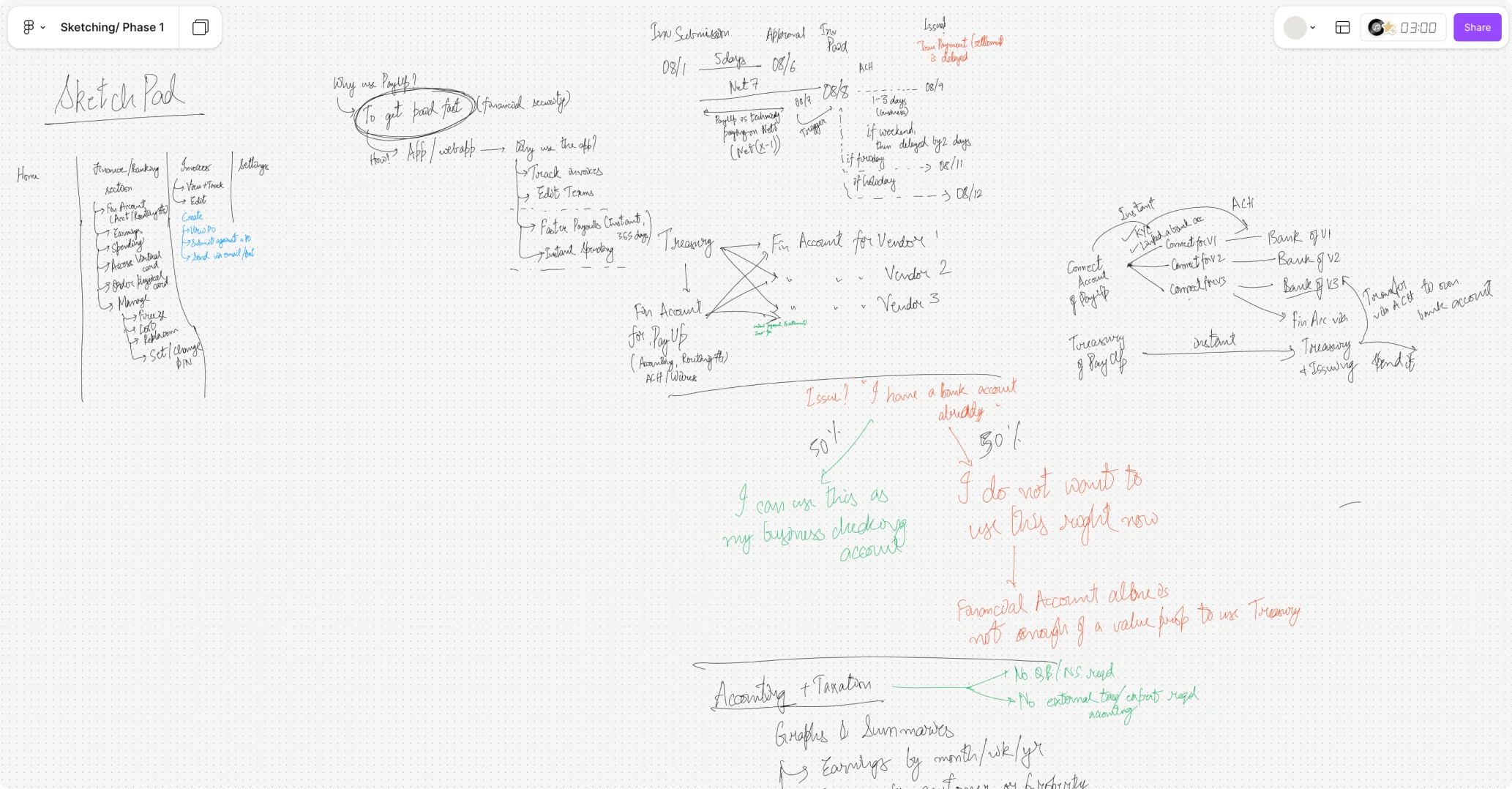
We had sketch sessions with our client’s team where we shared our insights from the exploration phase. Together, we brainstormed to define, prioritize, and approve essential features and functionality.
- Ideate
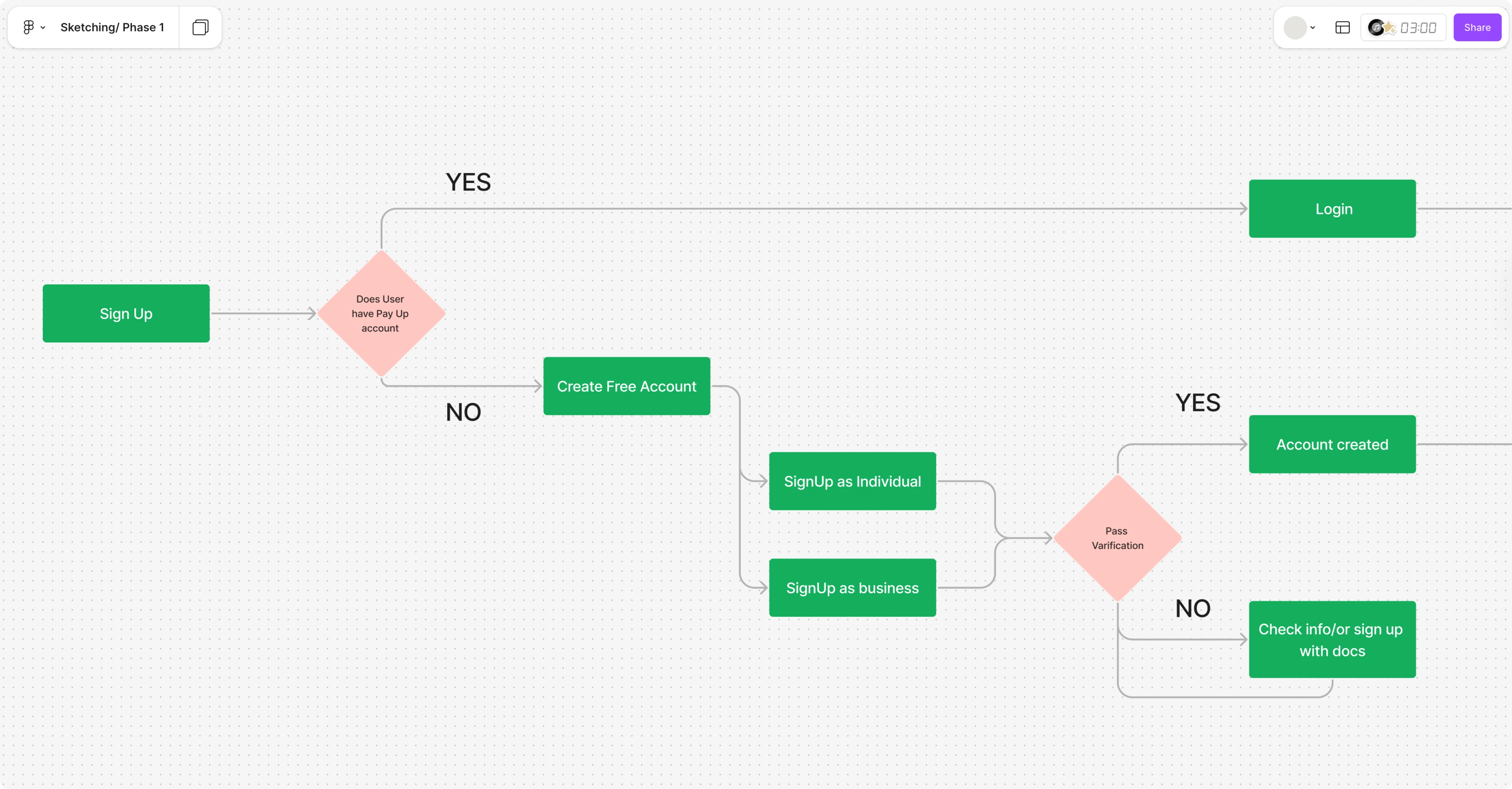
With a well-defined plan in place, we strategized optimal visualization through the creation of user flows, journeys, and wireframes. Our client particularly appreciated our approach of presenting multiple versions of a feature, allowing the team to test diverse approaches in further stages.

- Create high-fidelity mockups
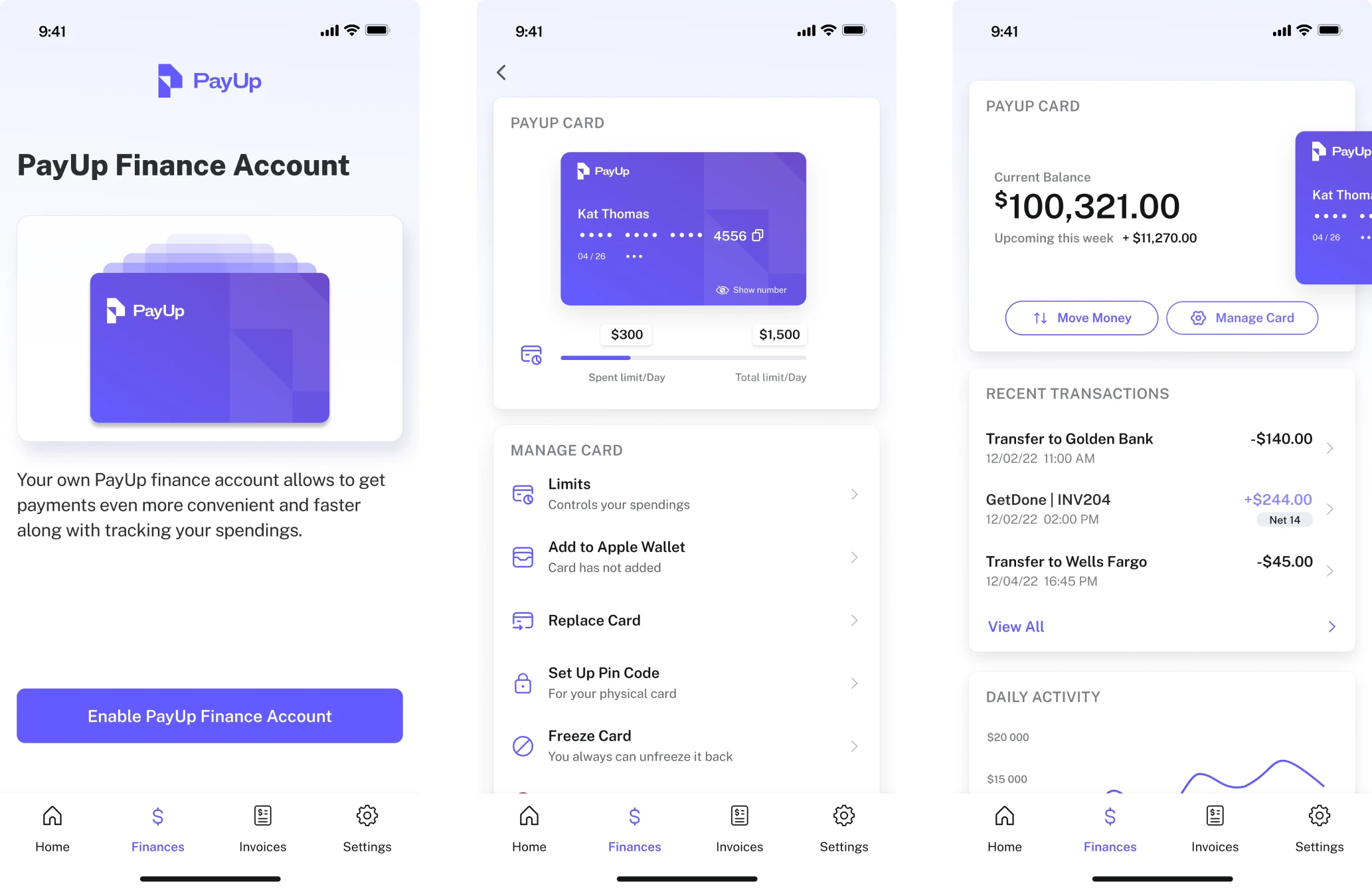
This stage was about turning wireframes into fully-fledged designs – mockups with thought-out UI and UX.
- Prototype and test
Finally, based on the approved mockups we created interactive prototypes in Figma. The PayUp team tested them on the existing user base to gather valuable insights. These insights enabled us to swiftly implement necessary adjustments and start the new iteration.
Thanks to design thinking, we were able to move quickly from iteration to iteration delivering designs that meet both user and business needs. Now, let’s take a closer look at what exactly we did.
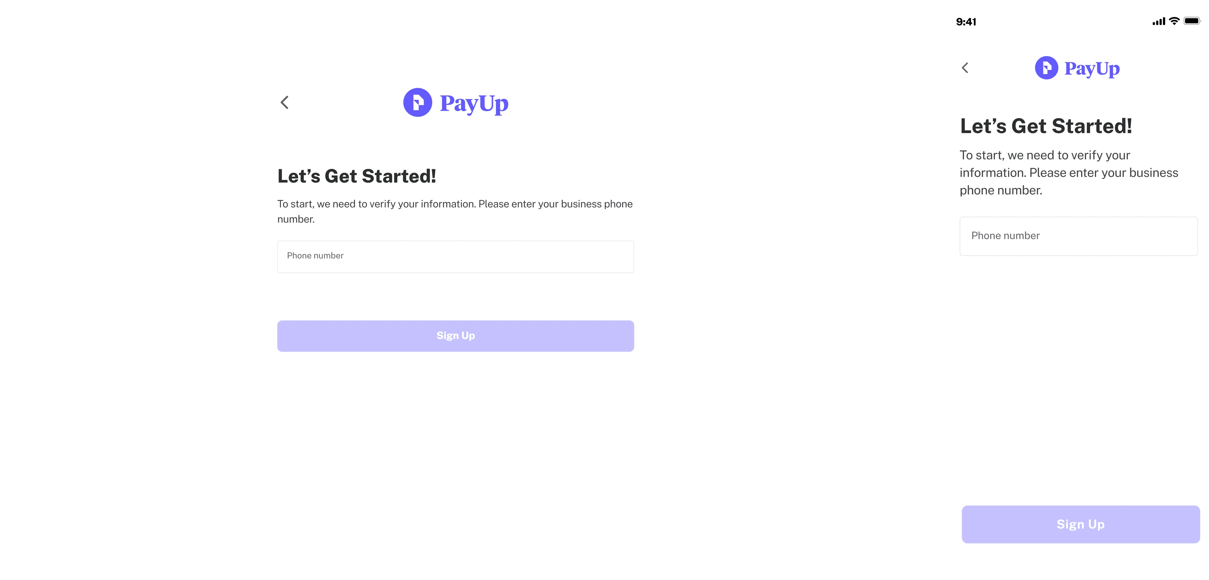
Optimizing the flow of the sign-up process by reducing user interactions to a minimum
For a user, the sign-up process is often their first interaction with your product. It sets the initial tone and impression, influencing whether they continue or abandon the process. For businesses, it’s often the time to collect important user data.
As PayUp is a financial app, designing a sign-up process was quite challenging for us:
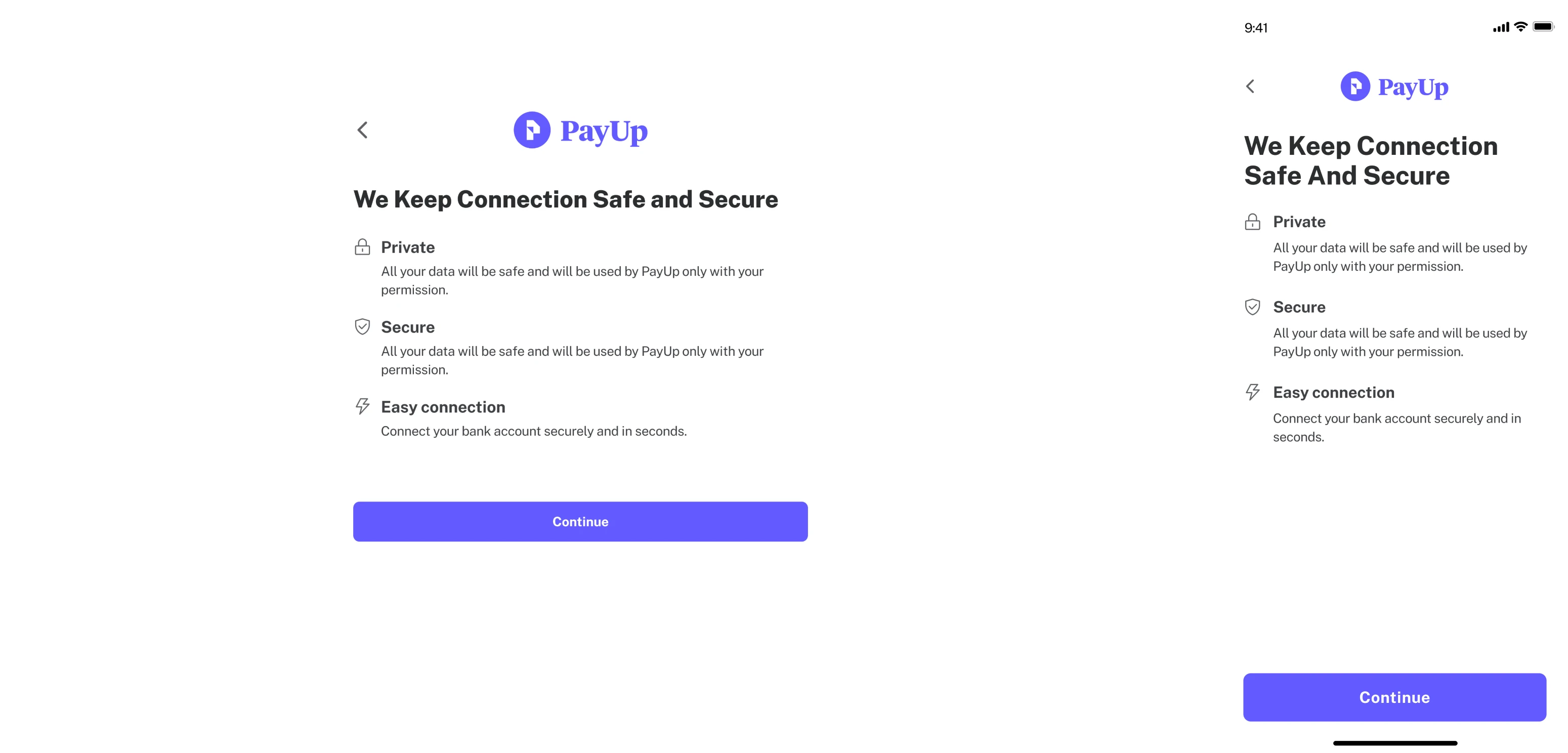
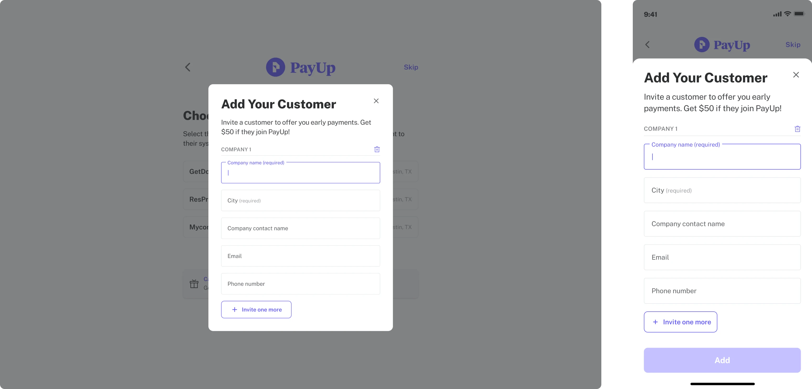
- On the one hand, we had to clarify the need for sensitive information such as account numbers, addresses, and social security numbers while assuring users of their data's security.
- On the other hand, we aimed to streamline the process by minimizing user clicks, actions, and screens to prevent overwhelming the user.
Our final decision was to divide the information into small chunks, resulting in a higher number of screens, but giving users a better explanation so they don’t feel uncomfortable while sharing private data.
Introducing in-app invoice creation: a new PayUp feature
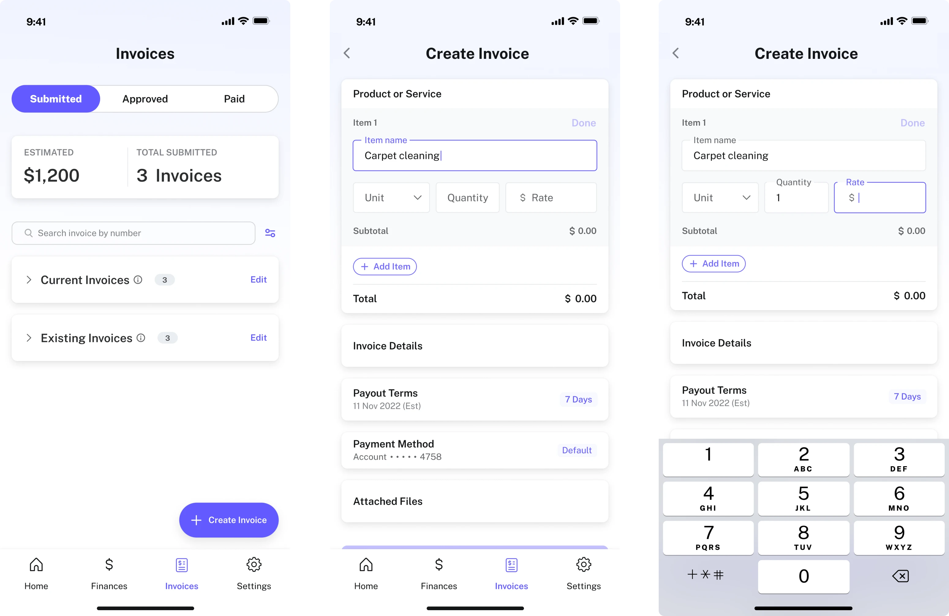
Previously users relied on an external service partnered with PayUp. But this method was time-consuming and required filling in a lot of unnecessary and pointless information. So our client decided to introduce a new feature and make it possible to create invoices within the app.
PayUp wanted to streamline this process, minimizing fields and placing everything onto a single screen. To reach this goal we had to go through many iterations. As a result, we adopted a solution of discrete blocks on a single screen — cards that users can unveil to quickly input required details, preventing information overload and allowing step-by-step progress through one screen.
Our work also included:
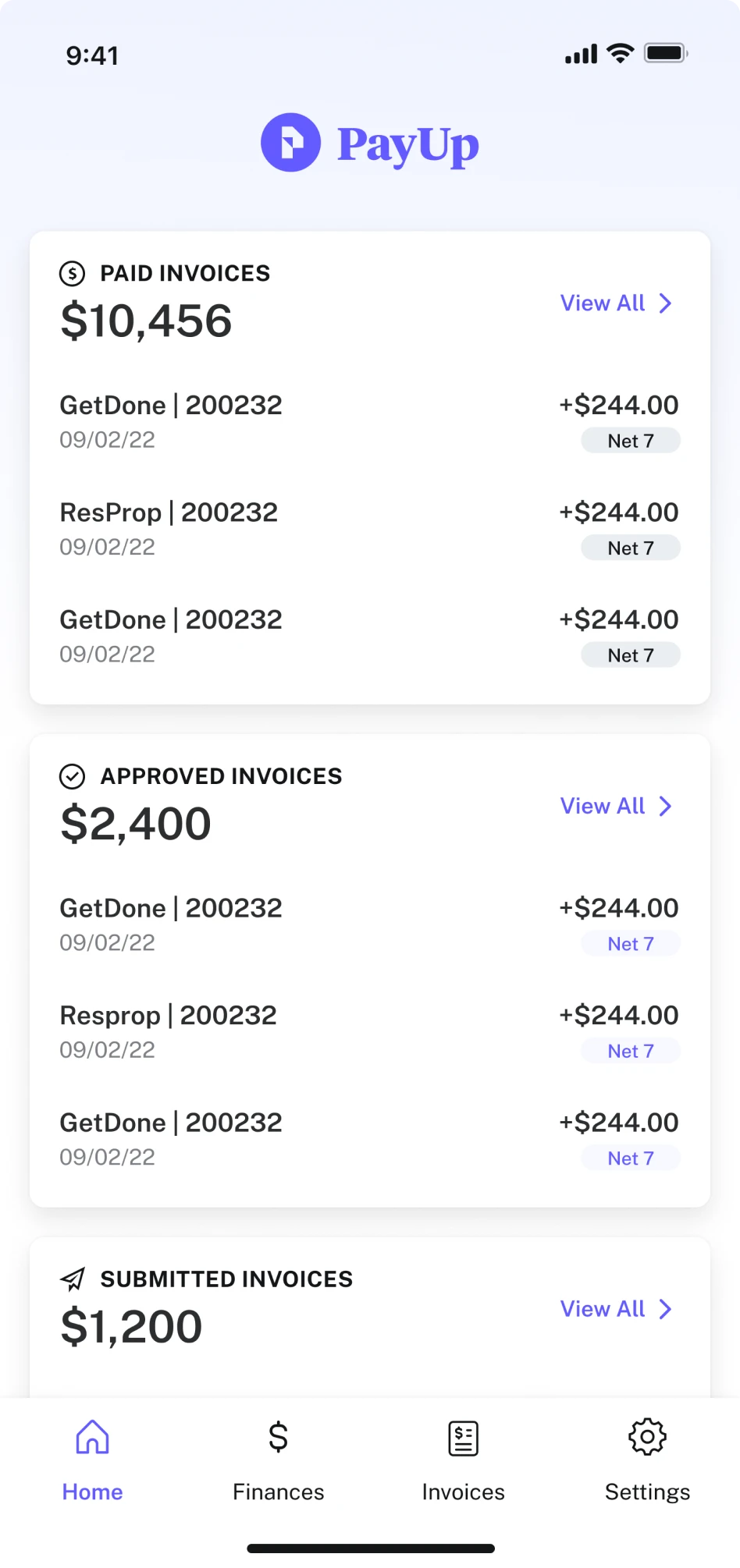
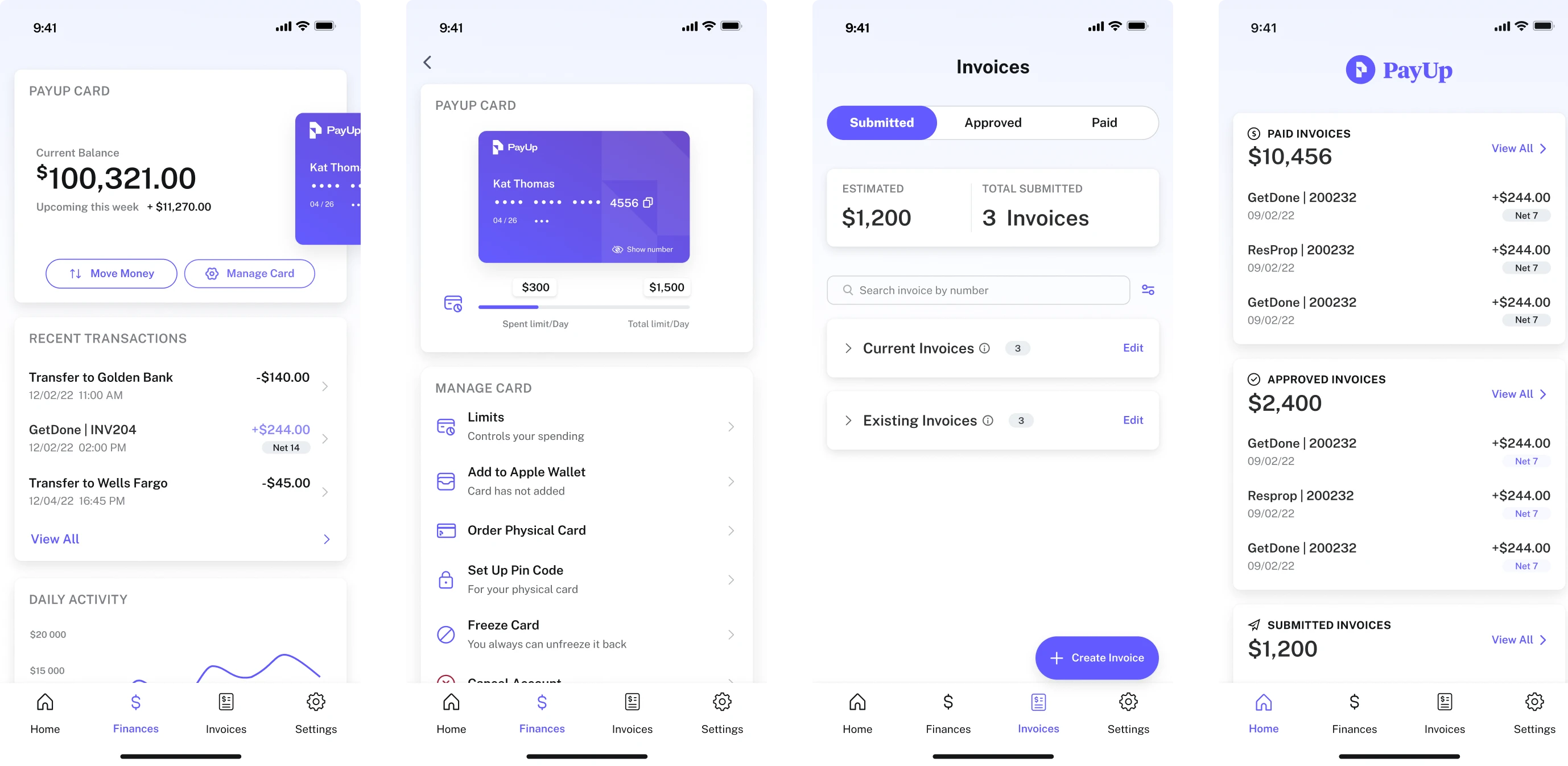
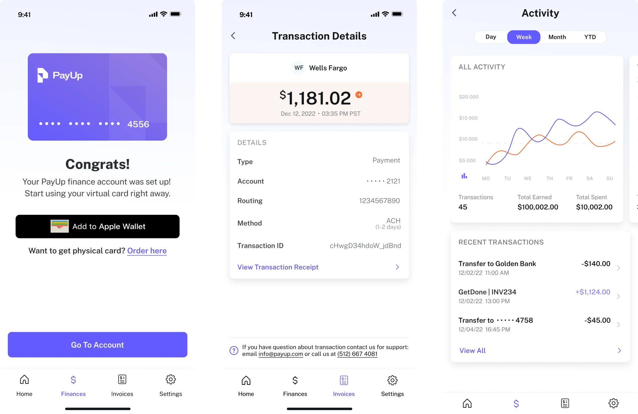
- Redesigning the app’s UI taking into account the new brand identity and thinking out intuitive product navigation
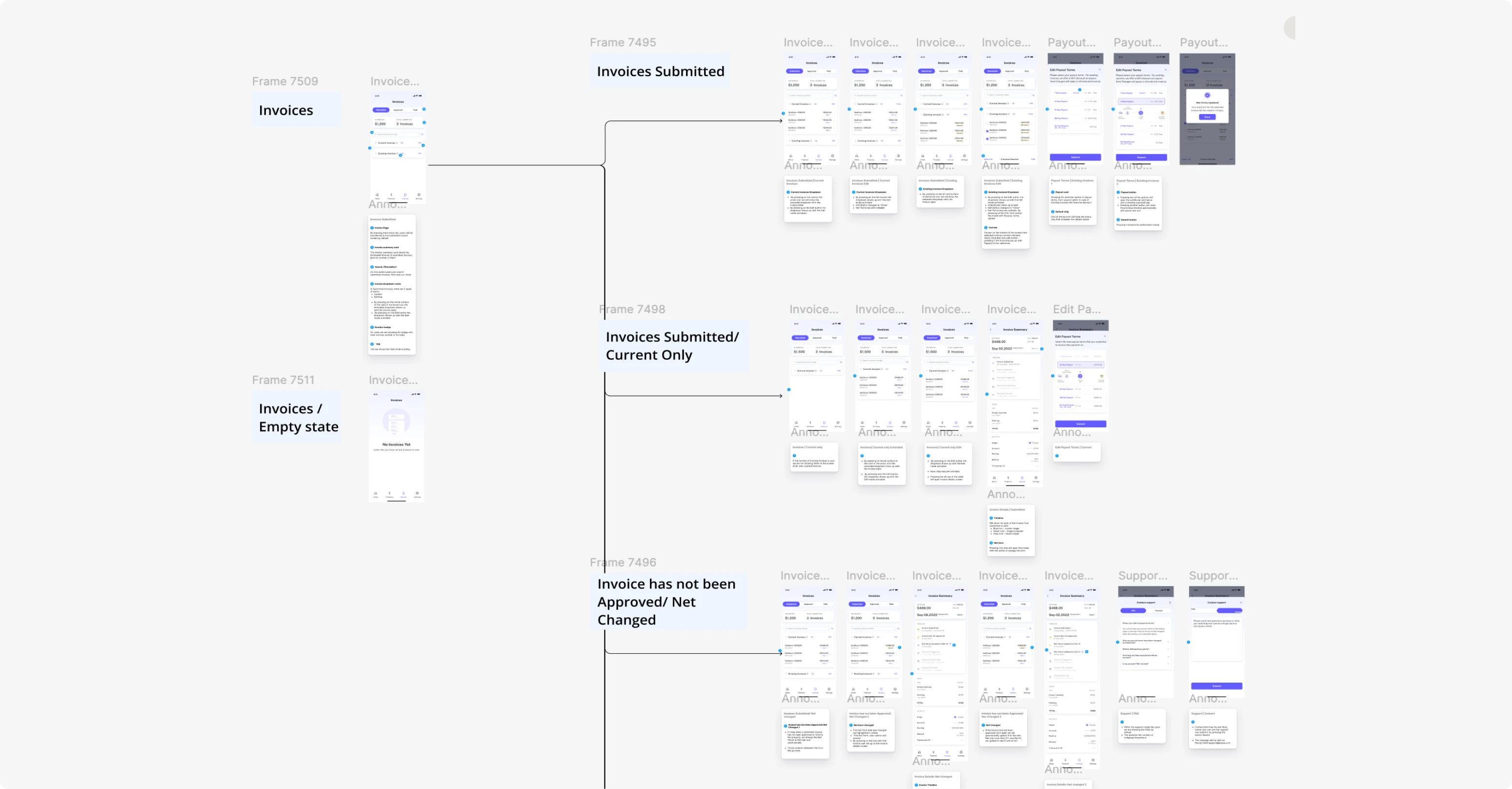
- Creating a new design for a Home Page
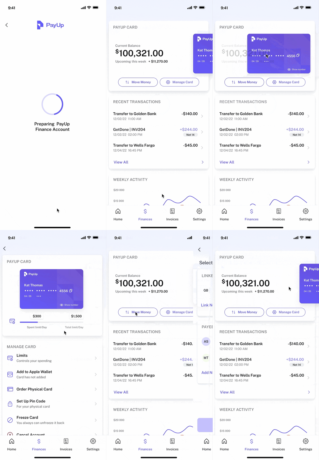
- Adding a PayUp Wallet feature that would allow users to have their own financial account, make payments, transfer money, monitor income and expenses, and track taxes.
Building a consistent design system to enable easy scaling in the future
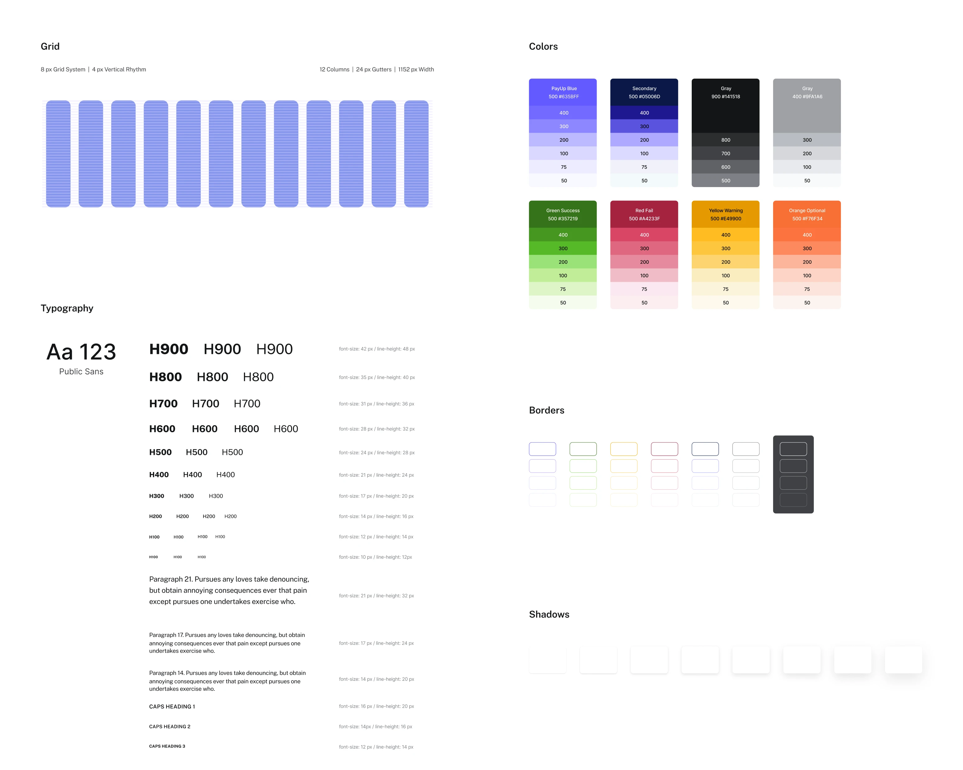
A well-established design system facilitates easy scalability – the main goal of PayUp. So our last task was to organize a design system to make updates, improvements, or changes faster and with no errors, enabling agile iteration and quicker development.
We were continually updating the UI kit with new components driving efficiency in the development process throughout our whole design journey.
With a fully redesigned product and a well-organized design system in place, our client was able to scale their product quickly and is now ready to grow further
PayUp’s team was very satisfied with our work. Because of our deep understanding of their product’s specifics, and ability to work efficiently in quick iterations, they could quickly scale their app and test various ideas with users.
Initially launching their product in Austin, Texas, with a robust design system in hand, PayUp is now ready to strategically expand across Texas and Florida, and soon hopefully around the US!
