Populate
Eleken teams up with a healthcare startup to help build the most customer-centric app in the world

It all began with one doctor’s burnout. Rachel started working as a therapist just before the first wave of the pandemic. She had exhausting daily shifts that sometimes left no time to sit down and catch her breath. But even after getting back home, Rachel couldn’t rest either. She had to spend hours finishing her documentation within an extremely archaic clinical software.
Rachel’s husband happened to be a business consultant at McKinsey. So he went further than just wondering how inefficient the hospital documentation system can be and found the shocking truth. The problem was not about one specific hospital.


All clinical software in the US are extremely archaic
- 74% of electronic health record (EHR) system users believe it increases total hours worked.
- 69% believe their EHR takes time away from their patients.
- 71% think that their clinical software contributes to burnout.
Chance Rodriguez decided to help his wife as well as her colleagues.
So the idea of Populate, the app that fights burnout at the point of care, was born
The only problem was that the Populate team didn’t have an experienced designer to meet this challenge. So they turned to Eleken to bring their customer-centric idea to life.
And when we say “the most customer-centric app”, we mean it:
Constant communication with potential customers allowed Eleken designers to get real-life user feedback on each of our ideas or iterations.
The same communication allowed Populate founders to formulate the app’s goal:
We aimed to maximize time savings relative to status-quo clinical software
By cutting down the time required for documentation, Populate helps clinicians spend more time engaging with patients, improving care, and maximizing practice profitability.
Time-saving became possible thanks to a bunch of technical innovations, such as:
- Speech-to-text dictation
- AI-powered templates
- Natural language processing
- Auto-populate functions
But it also required a very special user experience design. We had to reconsider the need for every single click:
Let’s look at our working process
When we design apps from scratch, we usually work iteratively, developing one user flow after another. So let’s examine Eleken’s working process on the example of one of the user paths.
Step one: Modeling a user flow
To start designing, we needed some input from a client. And the input was a flow that starts with a patient making an appointment and ends with a doctor's prescription.
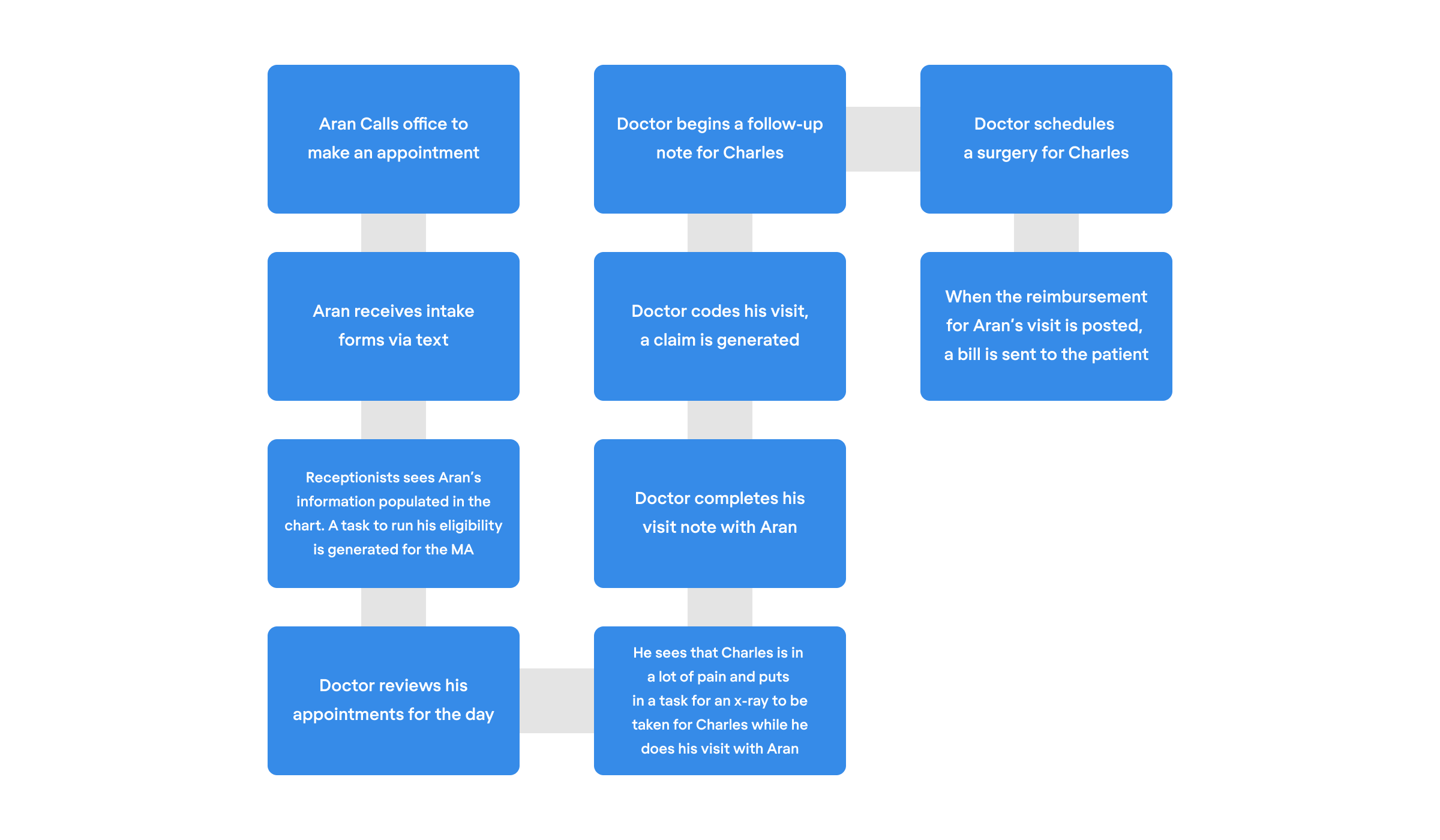
We turned the flow into an algorithm that helped us understand the logic behind all the steps users can take within the app. Now we were ready to start designing separate screens.

Step two: Creating the interface
Eleken’s Design director Maksym likes to say that “a successful design process is like a ping-pong game between an agency and a client”. And that’s exactly what our communication with Populate looked like.
To deliver their vision, our client prepared numerous references and handwritten wireframes for each screen.
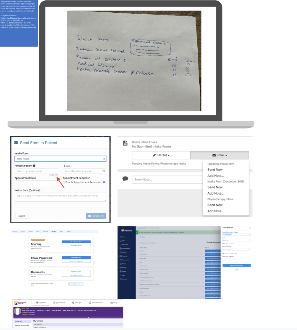
Then our designer created sketches of screens structure and got some comments from the client.

Step three: Testing and improving
Finally, the first Figma mockups were ready. They got commented heavily by clients based on the feedback they got from actual doctors.
Sometimes, we had to make some design compromises for the sake of time saving.
Take a look at the screen below. It might look a bit overwhelming due to those bright blue dropdown lists.
This screen is not likely to be found among elegant pixel-perfect designs on Dribbble. But it allows doctors to fill in a visit note without ever touching their keyboards and saves them a few minutes every day.

We also helped the Populate team to refine some of their ideas.
Our clients wanted to see a daily appointments page filled with all necessary information AND have them squeezed into a single screen.
On the one hand, that approach would allow a doctor to see all the patients without scrolling. But on the other hand, an unstructured overloaded screen would create a problem with information perception.
To find a better solution, our designers created two screens to pick from:
- The first option included all the information needed, but users had to scroll to see all the patients.
- The second option required no scrolling because we hid some information.
Doctors and the Populate team opted for the second variant.


Finally, the flow design is ready
Now doctors can see all the upcoming appointments in a calendar, or a compact list.

Clicking on a patient, the doctor can open their card with all the information needed for a visit — the information is automatically uploaded from the patient’s intake form.

Finally, a doctor's appointment starts, along with the need to fill in a visit note. That’s the most time-consuming part of documentation, where Populate’s innovations shine the brightest.
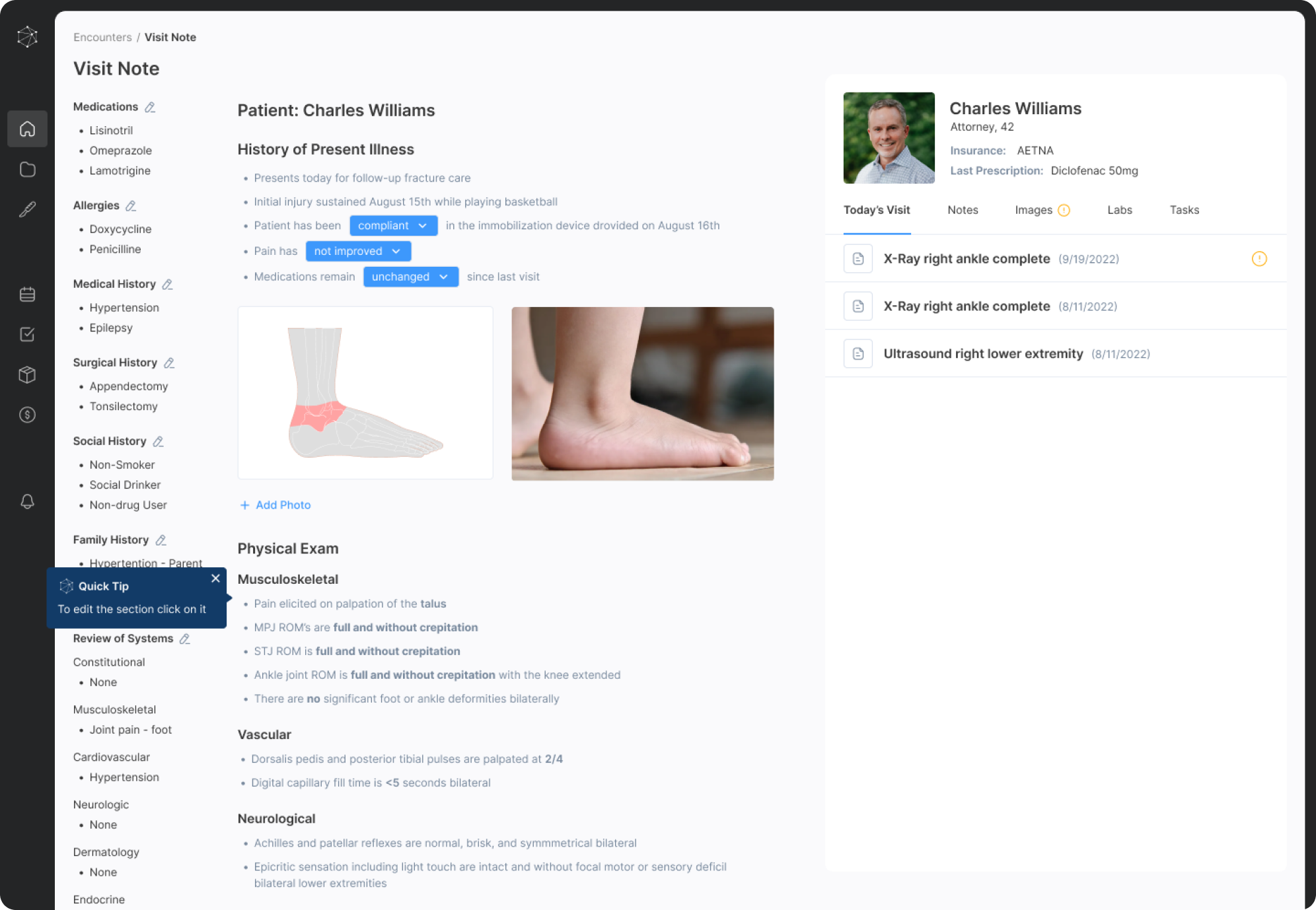
The app creates a note template according to a patient's complaint. The template can be filled in a matter of seconds with no extra typing thanks to auto-populate dropdown lists.

Even in the situation where you can’t do without a detailed doctor’s comment, Populate helps to avoid tedious typing thanks to speech-to-text dictation.

The only problem with such innovative features is that people are not used to them.
That’s why, we offered Populate to add some onboarding hints for new users.

UI/UX design for Populate is done. We did our best, and all that's left now is writing case studies and rooting for this highly useful startup to launch and excel in the US clinical software market.
Want to read more Eleken case studies in the healthcare industry? Here are some more.
And if you liked what we did for Populate and want to translate your product ideas into ready-to-code mockups, let’s talk.


