Prift
MVP design for a personal finance platform

Being overwhelmed by money worries is a common problem for people all around the globe. Financial stress causes lower productivity in workforces, impacts negatively on personal life, and overall seems like a taboo subject. Thinking of how to help people, businesses forecast their finances, so why shouldn't individuals?
Currently, individuals use spreadsheets, personal finance apps, or address a financial adviser to cope with money issues.
However, managing finances with Google Spreadsheets is not convenient and requires additional knowledge, the personal finance apps focus more on short-term financial goals and don’t provide long-term savings objectives, pension platforms forecast the long-term goals, but don’t cover all personal financial assets, and hiring a financial advisor isn’t affordable for everyone.
Therefore, for individuals, it’s much better to have a single platform to view and manage their finances. That’s how the idea to create an easy-to-use platform that would provide help and guidance to people that want to take care of their financial situation appeared.



Prift is a personal financial assistant that provides tailored tips and hints to help individuals achieve financial goals quicker
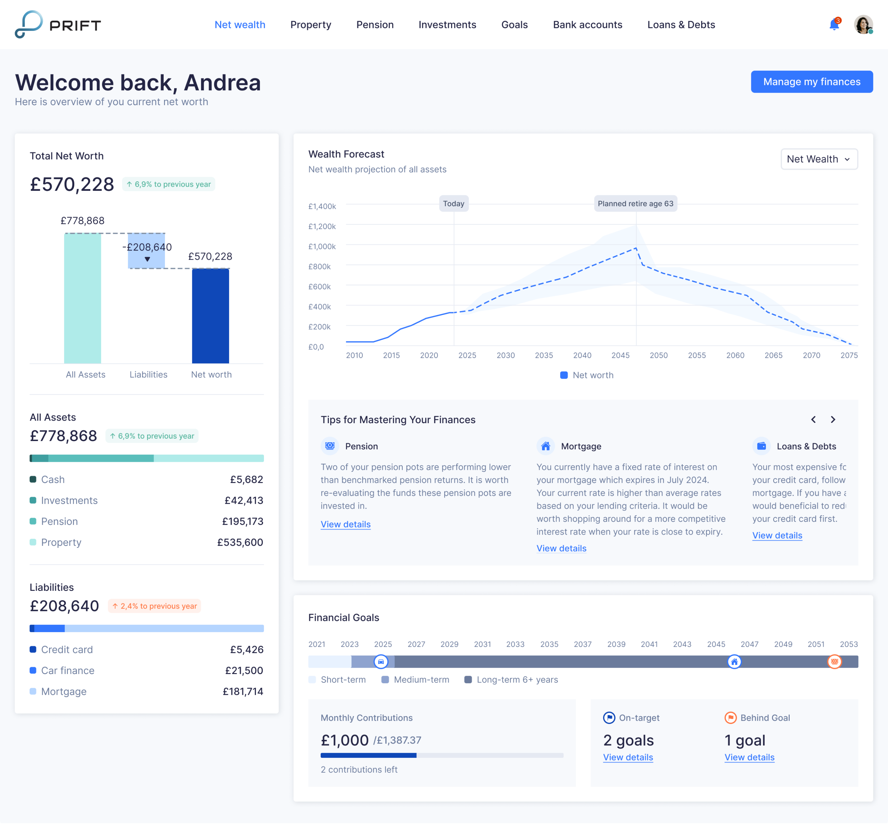
The main idea of Prift is to help people manage long-term financial goals, which include mortgages, investments in children’s education, buying a new car, saving for retirement, paying off debts, and so on. The application aims to unite users' finances in one place in order to predict their financial condition for 10, 20, or even 30 years ahead.
For example, by adding your current pension savings to Prift, you can predict what size of pension investments you’ll get by the time of retirement: add the desired level of income in retirement and use the software to calculate how much you need to save today.
Designing a simple and minimalist MVP with Eleken
When the client came to us, they had an idea and initial concept but needed professional help with UI/UX design. As well, Prift’s team completed detailed user research on their own, which showed that the main wishes of the target audience are:
- Put ‘money to good use’
- Become closer to ‘financial freedom’
- Looking for advice or guidance
Therefore, at the discovery phase, we focused mainly on competitor analysis and benchmark research.
Taking into account all the drawbacks of the existing solutions for money management, our task was to make the financial planning process simple, accessible, and clear for everyone. And since the target audience of the application are people aged 30 and over, we decided to avoid excessive gamification and focus on a restrained minimalist design.
Competitive analysis and benchmark research
First of all, we analyzed the work of money managing apps and budgeting apps to understand the nuances of working with online banking. We wanted to automate the finance management process in Prift as much as possible, so it was important to understand what information we can get through online banking, and what kind of information users should enter on their own.
Here are some insights we got from the research:
- Most available budgeting and money management apps, like Mint, Simplifi by Quicken, Emma, Money Dashboard focus on short-term financial planning (not further than a year)
- Those apps that allow calculating long-term objectives specialize only in one area. For example, Pension Bee focuses on pension savings, Personal Capital and Wealthfront focus on investments. RetireEasy unites all areas of personal finance, but there is no possibility to set goals.
Also, during benchmark research, we dived into the nuances of the financial sector. For example, for an accurate mortgage forecast, it was necessary to take into account all available options for lending and refinancing real estate, existing options for loan rates on the market, and the nuances of their calculation.
Feature prioritization
The main purpose of the MVP is to create such a product that brings customers real value, and allows product owners to learn the needed information to manage risks and adjust their further steps to produce a better solution, while saving time and money. Therefore, it’s vital for future success to correctly define that minimum set of workable features.
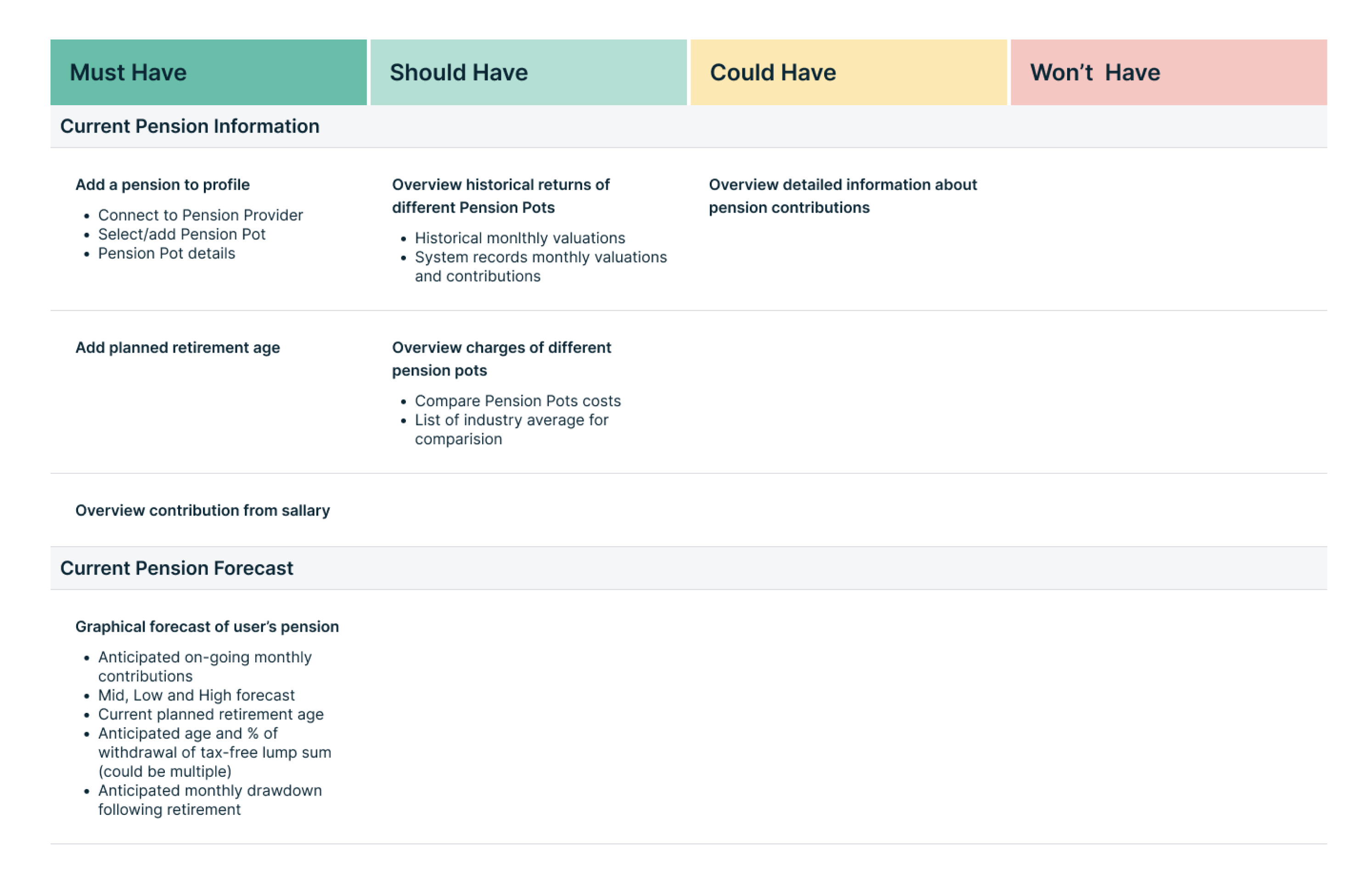
To prioritize features, we used MoSCoW analysis. We defined the full list of functions that could be included in Prift and divided them into four groups: must-have, should-have, could-have, and won’t-have. Since we were working on the MVP, we decided to focus on the functionality that fell into the “must-have” and “should-have” categories, namely, forecasting personal finances in the long term.
Wireframing
Next, our task was to create the structure of the application with the help of wireframes.
At the wireframing stage, before moving on to the visual part, we conducted A/B testing to determine which option meets users' expectations and needs the most. In fact, we created several screens that differed slightly in navigation and visual display of information, and, based on user feedback, we defined which of them will form future MVP.
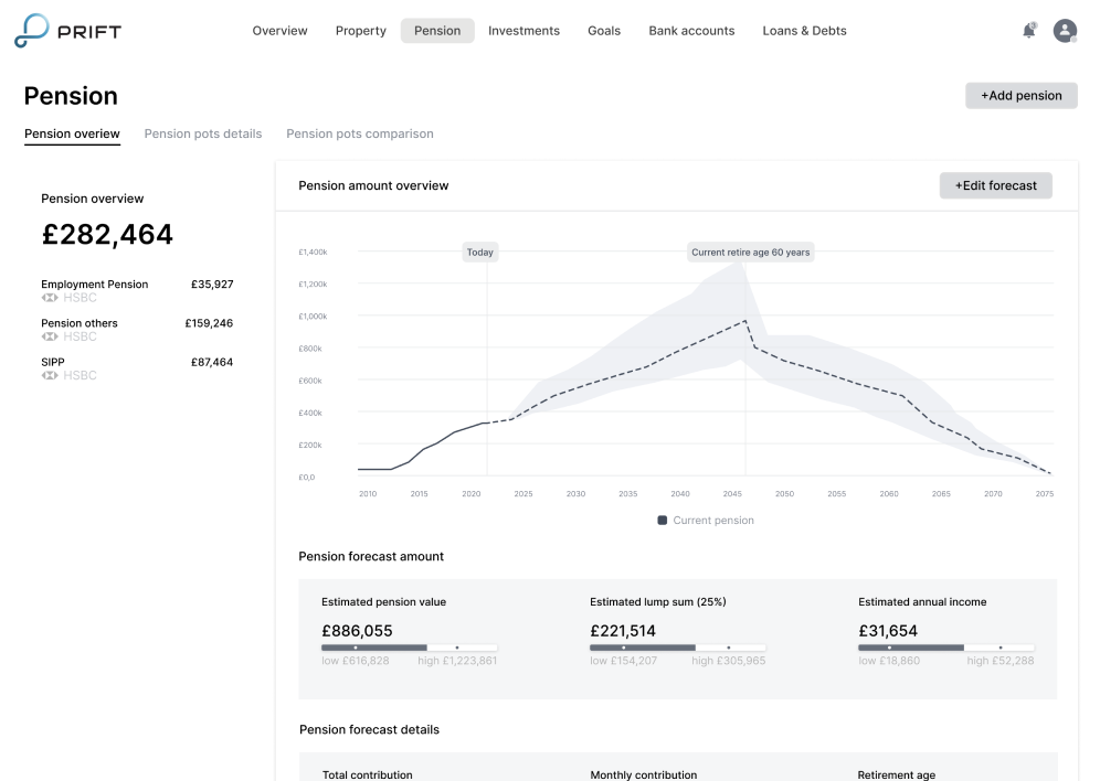
For example, below are two versions of the pension screen: with and without a diagram in the “portfolio breakdown section”. In terms of A/B testing, users chose the second screen.
.webp)
Prift core features
As the result we created a working prototype with the following features:
- Personalized financial advice. Based on the information the user contributes to the app, Prift forms personalized advice about possible options for increasing investment income, faster achievement of financial goals, such as mortgage payments, or increase in pension savings.

- Evaluation of the savings efficiency. Prift allows users to compare the efficiency of savings (both among each other and with the industry benchmark).

- Tracking the achievement of savings goals. Thanks to the application, users can set the desired savings goal, set the deadline for achieving the goal, and calculate how much to save every month.

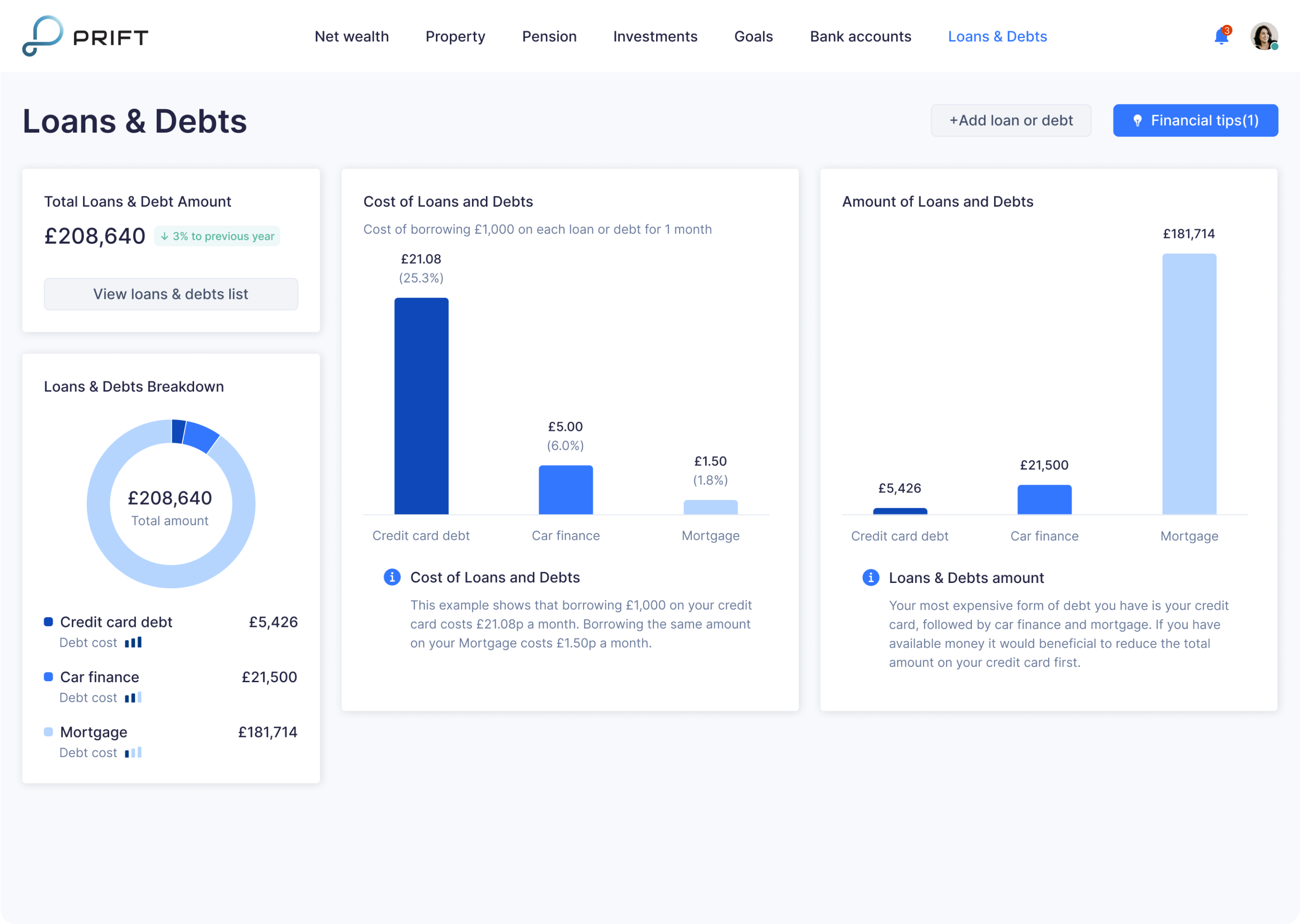
- Assistance in debt and loan management. Prift helps to determine the cost of debt and helps users decide which one to pay off first. Also, with the help of the calculator, users can define the number of payments needed to repay the debt/loan as quickly as possible.
Making improvements to Prift
In the course of MVP design, Eleken designer offered several improvements to the platform.
Adjusting the app to its unique selling point
Initially, Prift defined its main unique selling point as providing long-term financial forecasting and financial advice. And during user research, it was identified that one of the target audience’s requests was to ‘put money to good use’ and ‘be closer to financial freedom’. So, we wanted to help Prift meet this users’ wish too.
The process of effective financial management is based on three steps:
- First, you pay off debts or loan payments
- Next, you pay pension payments or payments for certain specific financial purposes
- Finally, you invest the surplus funds
Taking these steps into account, we developed a user flow that would facilitate this process.
After viewing the main dashboard, users can go to the "Make the most of your finance" screen and decide how to distribute the available funds: pay off debts/loans, spend them for current financial purposes or invest.
Within the same screen, they can find out the amount of their current savings or determine which of their loan commitments cost the most, which objectives are on-track, which are behind the goal and require additional attention.

Ability to compare savings and investments accounts
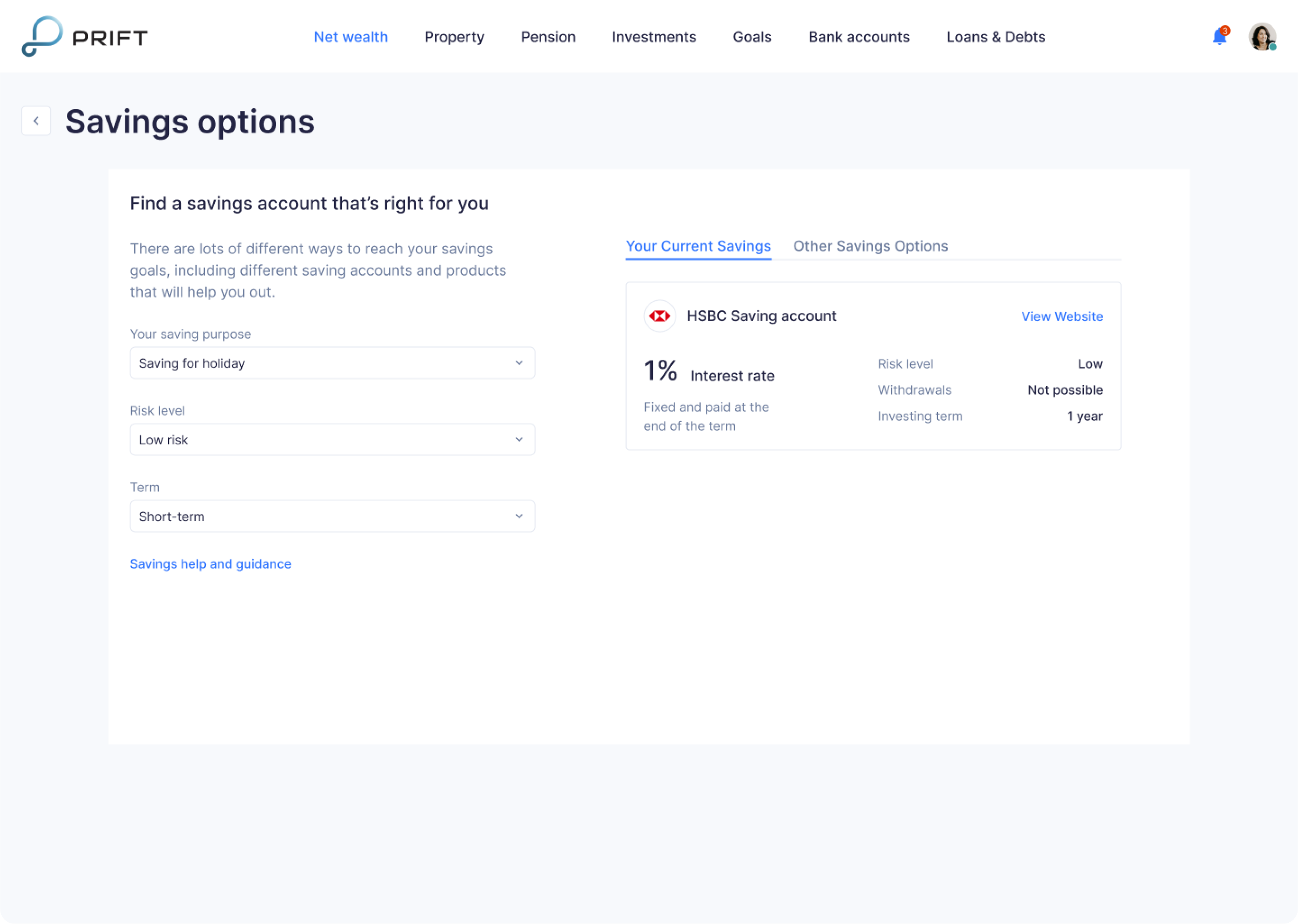
We've added the ability to compare accounts to meet one of the key user requests - efficient management of personal finances. We've also created a flow that allows users to choose which account suits them best, based on the purpose of their savings, the desired term of investment, and risk appetite. As a result, Prift users don’t have to dive into the intricacies of investing, the application itself selects the most appropriate option for their needs.
Enabling an additional way to monetize Prift
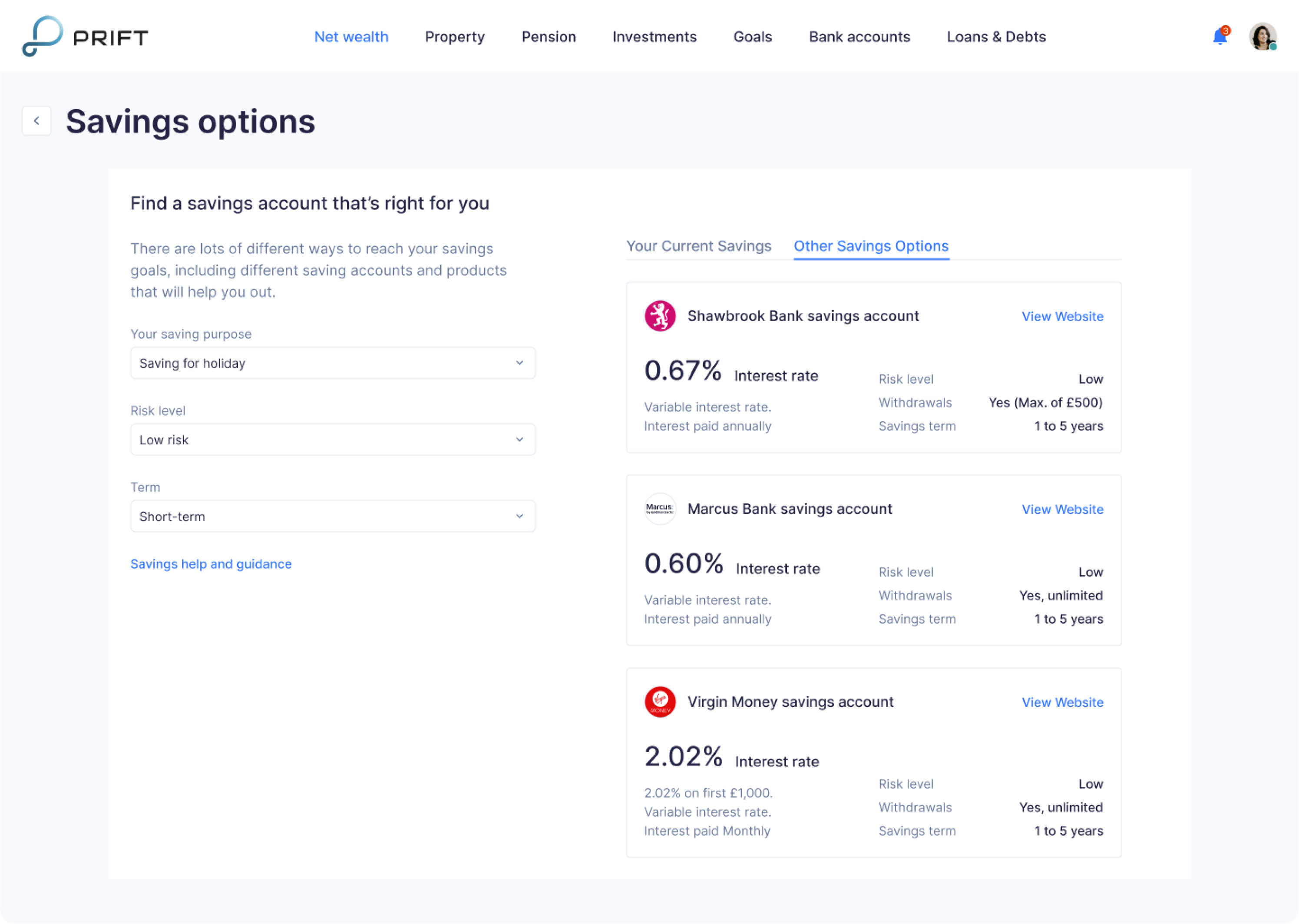
As part of the flow "Make the most of your finance", our designer offered an additional opportunity to monetize the product. By choosing investment channels, users will not only be able to compare their existing savings and investments accounts, but also compare them with selected offers from Prift partners.
Overcoming challenges with providing financial advice
Prift is an English startup, and according to UK legislation, providing financial advice should have a form of recommendation, it should be clear that this is not a direct call to action. That's why, we had to adjust Prift to this rule.
For this reason, the flow "Make the most of your finance" is designed so that the user always has a choice. The app explains the benefits of an offered option (Prift provide information about the number of debts and loans and their relative value, as well, the app has information about goals, which of them are achievable, and which are at risk of failure), but it’s always the user who makes the final decision.

As well, when developing forecasting functionality, we carefully thought out each expression we use in Prift. For instance, all forecast results sound like “estimated results”.

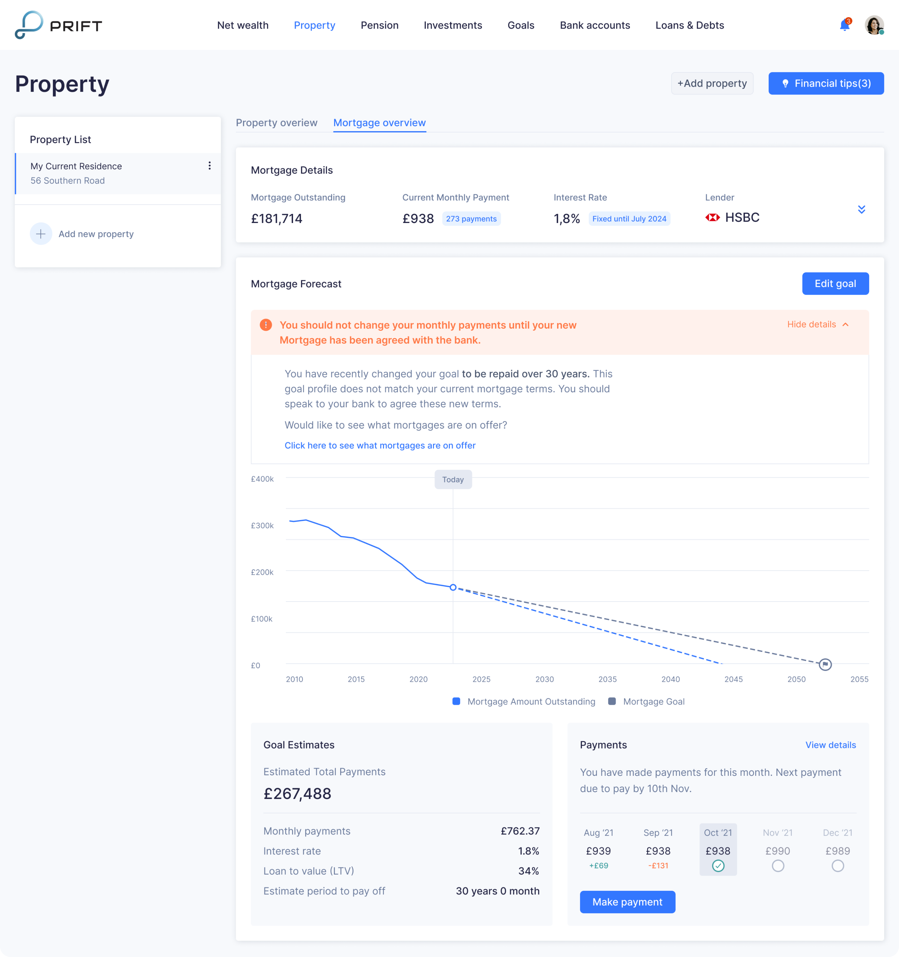
Additionally, on the “property” page, after making changes to the current mortgage, we pay user’s attention specifically to the information window with the warning that the current changes have informational purpose only, and before changing the number of monthly payments, the user must agree on this operation directly with their bank.
Landing page design
As a part of our cooperation with Prift, we also created a landing page that represents the minimalist design of the platform.

Collaboration with the client
To ensure effective communication with the Prift team and discuss the design process progress and results, we maintained regular video calls twice a week. Also, we were constantly in touch via Slack to quickly clarify ongoing questions.
During our cooperation on the project, there were periods when the client could not get in touch because of a business trip or vacation. Not to interrupt the design process, we discussed the list of tasks in advance so that our designer could continue working on the project during the client's absence. Also, during a client's business trip to the USA, we previously agreed on a call schedule in order to stay in touch, despite the 10-hour time difference.
The result
We had a goal to design a platform that makes the complex process of controlling personal finances simple and understandable for a regular user. And we did our best to help people quickly and easily achieve their financial goals with the help of consistent, and minimalist Prift’s design.


