Privado Dining
Transforming event management platform with modern UI and an AI co-pilot for faster workflows
Privado Dining is a SaaS platform for private dining event management for restaurants and related businesses. Specifically, they were trying to build enterprise software that allows restaurant owners and event directors to manage large party events with ease.
After launching their first product version, Privado started working with customers to improve it based on feedback. That’s how they realized their product's appearance didn't match industry standards and recognized the need for some additional workflows.


To address these challenges and grow their business, Privado Dining sought a design partner to help them:
- Generate a continued “modern” and “sleek” look for the product with minimal engineering lift.
- Build out new feature sets based on the existing user experience.
After considering Eleken's work model and our numerous positive reviews, Privado Dining decided to improve and scale their product with us.
Working on cosmetic improvements with minimum engineer overhead
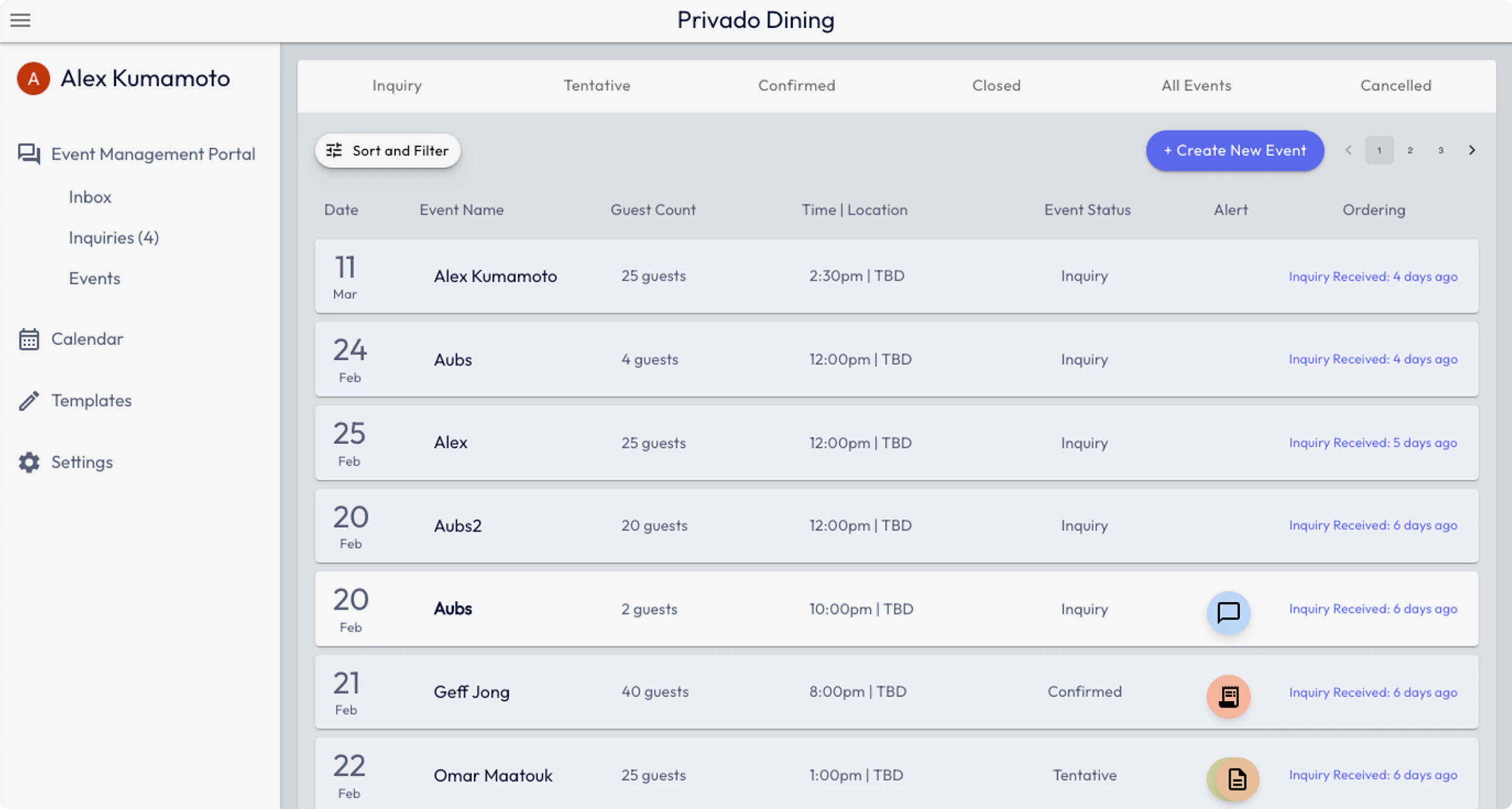
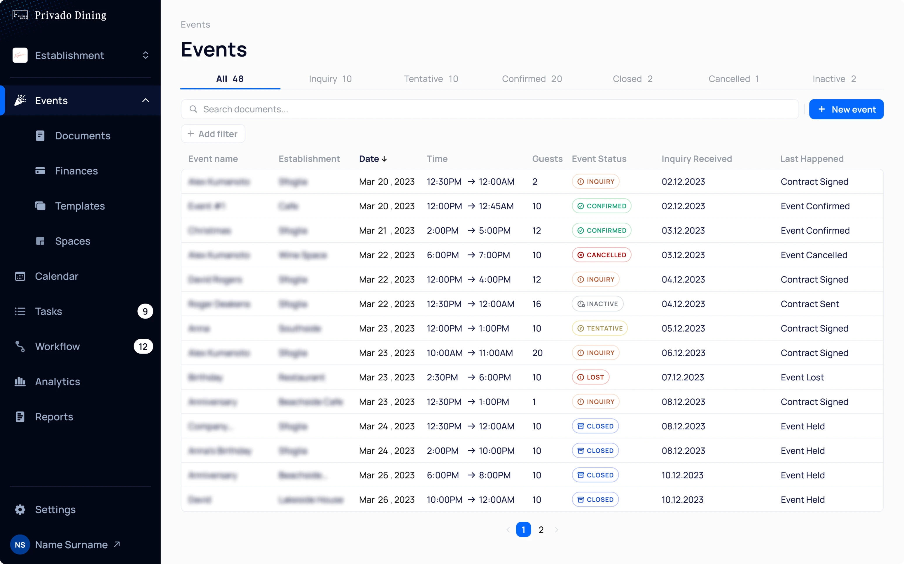
Our client's initial request was to redesign the existing UI without doing a complete rebuild. They wanted to achieve a professional and modern look for their product without involving extensive engineering resources.
Taking this into account, we developed a new visual style while keeping the fundamental elements and core business logic of Privado Dining the same.
Restructuring Event pages to reduce navigation difficulty around the app
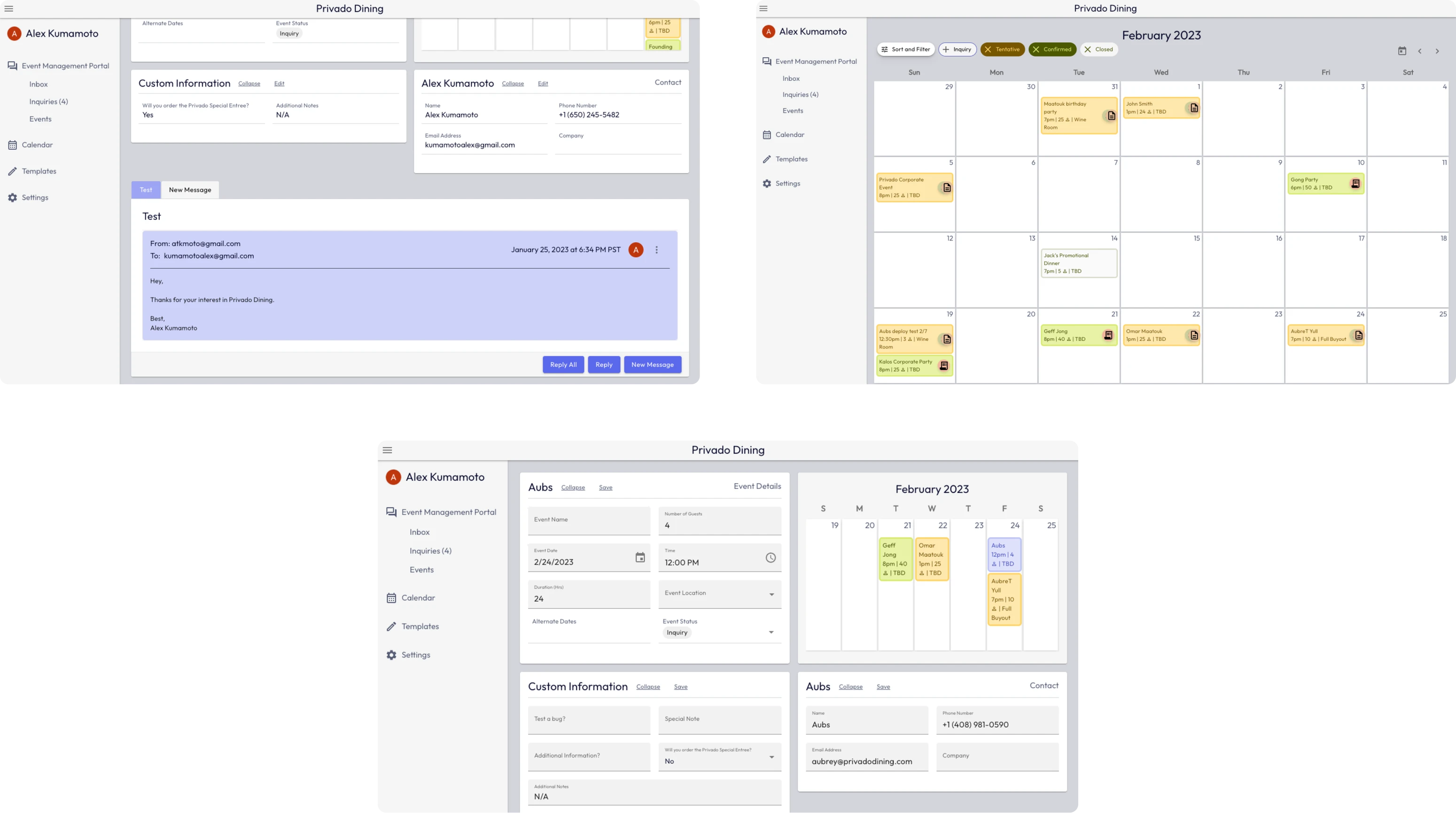
While our clients did not want a major UX overhaul, they highlighted the need for some improvements. Specifically, they wanted to minimize user transitions between Event pages to complete tasks efficiently.
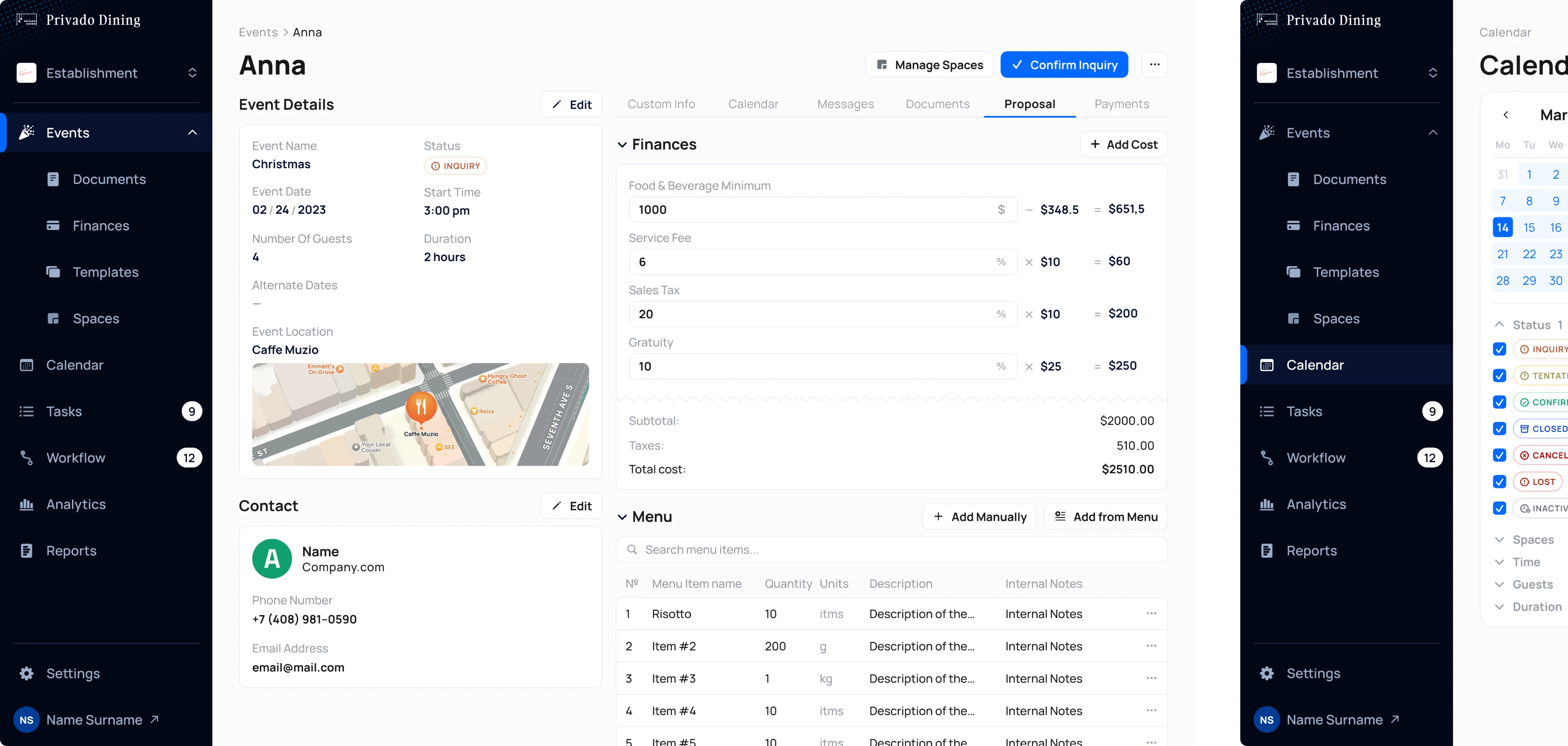
Each Event page contains various details, such as contact information, event details, documents, and more, which managers need quick access to. Previously, this data was scattered across different pages, causing users to navigate excessively. So, our task was to fit as much information as possible on a single page.
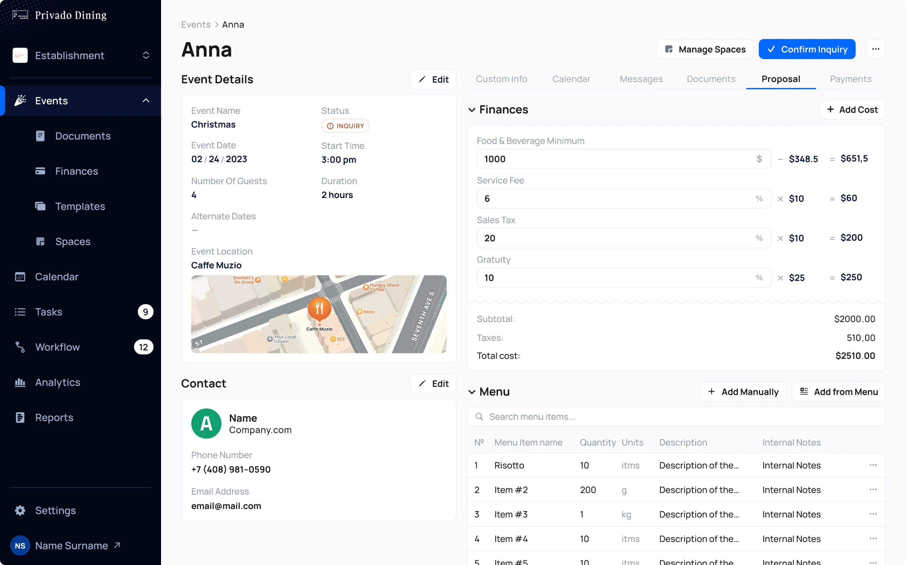
Here’s what we did:
- Sections that previously spanned three pages are now condensed onto one page.
- Key data such as contact info and event details are always visible on the left side of the screen, while additional info is organized into tabs on the right (calendar, messages, menu, documents, finances, and payments).
- Each tab's sections can be expanded or collapsed for easier viewing.
Building out AI co-pilot to ensure faster and easier workflow management
Booking and managing large party events involves more planning than a standard restaurant reservation, including contract management, payment processing, and scheduling. However, this process follows a common sequence of actions that the manager has to do through the event’s lifecycle. So, to simplify managers’ lives, Privado Dining introduced an AI assistant.
The agentic AI co-pilot helps managers work faster and think less about repetitive tasks:
- It analyzes all event details — schedules, payments, menus, and more
- Then suggests ready-to-use solutions.
Instead of handling every step manually, managers just review the options and pick the best one. That way, the AI co-pilot does the heavy thinking, and humans stay in control.
We designed this feature from scratch based on flow descriptions, so it was super important for us to ensure the smoothest user experience possible. Here’s how we did it:
- The AI summary is positioned at the top right corner of the screen, making it visible without interfering with the manager's work.
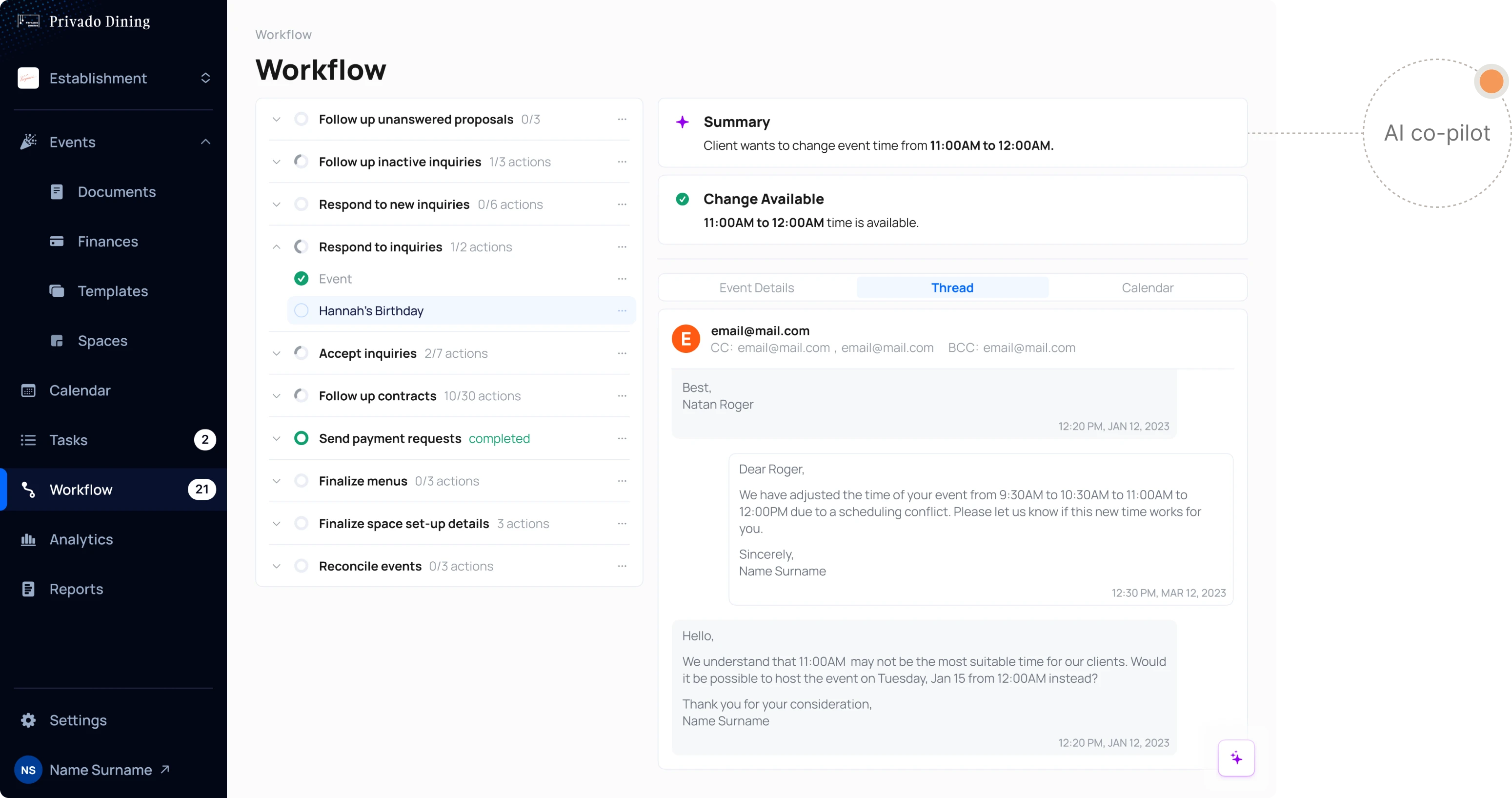
- All AI suggestions are highlighted in purple, allowing users to quickly identify and evaluate recommendations.
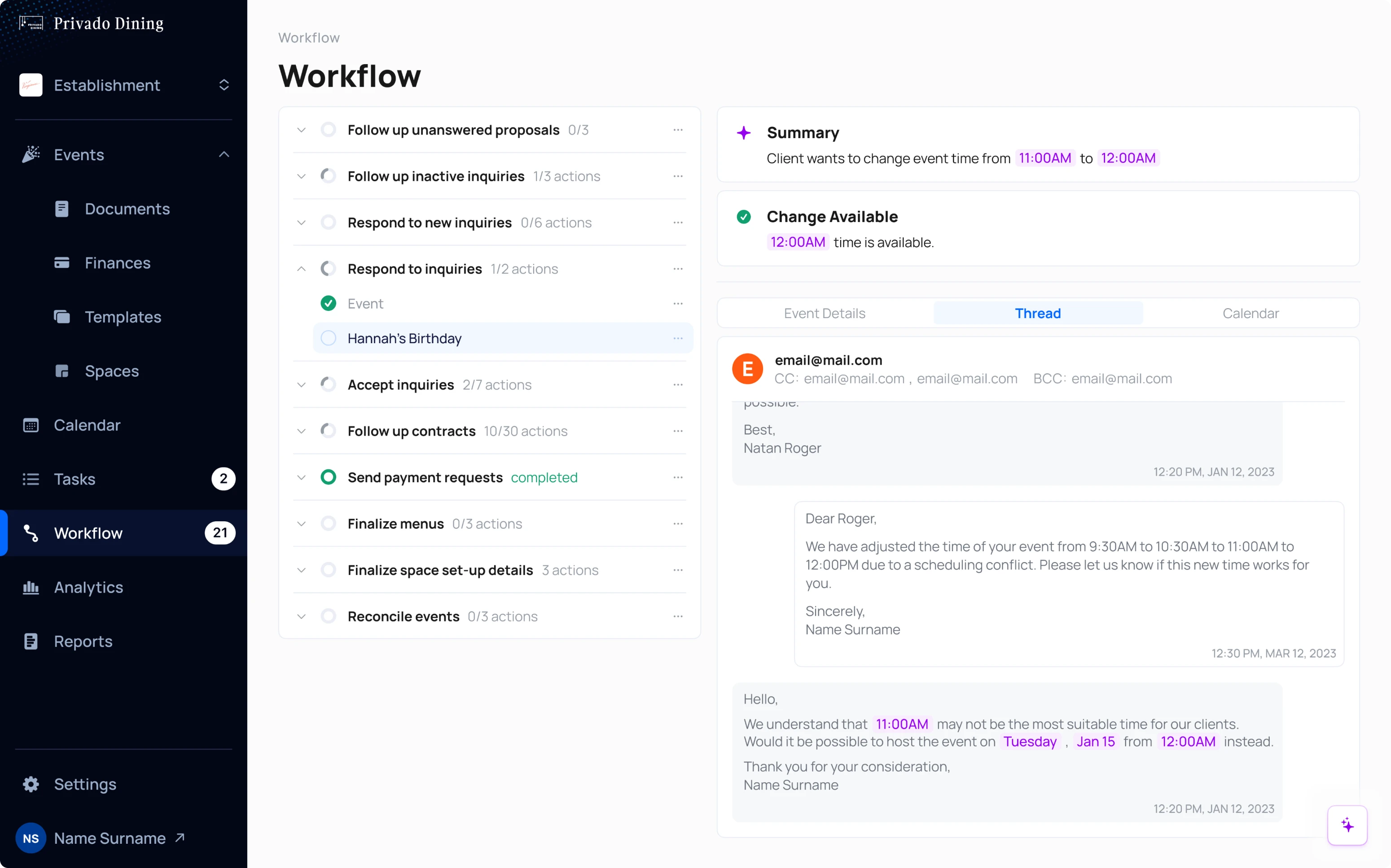
- If there is a scheduling conflict, the AI co-pilot displays a warning icon and explains the reason for the conflict.
- Users can choose to follow AI's advice or dismiss it with one click and make their own decisions.
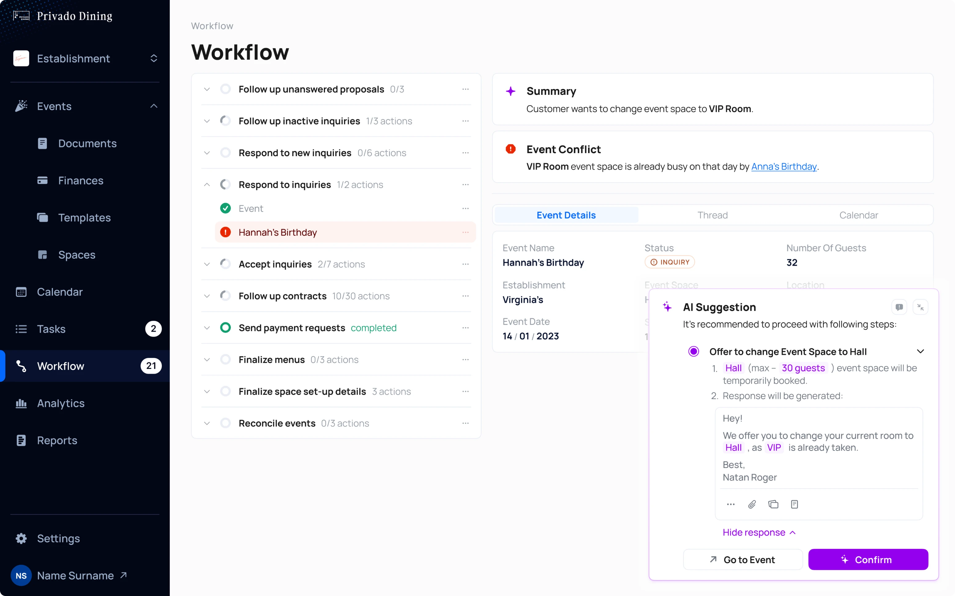
Our design ensures the AI agent is always accessible but not intrusive, helping users find assistance when needed and hide it when not.
Compromising visual appeal to ensure highly customizable document creation process
Creating and managing documents is crucial in the Privado Dining app. It supports a variety of document types, such as BEOs (banquet event orders), contracts, and confirmations, each tailored to different users' needs.
To ensure effectiveness, this feature is designed for maximum customization. For instance, in menu creation, we kept all sections despite the complexity, as each is important to users.
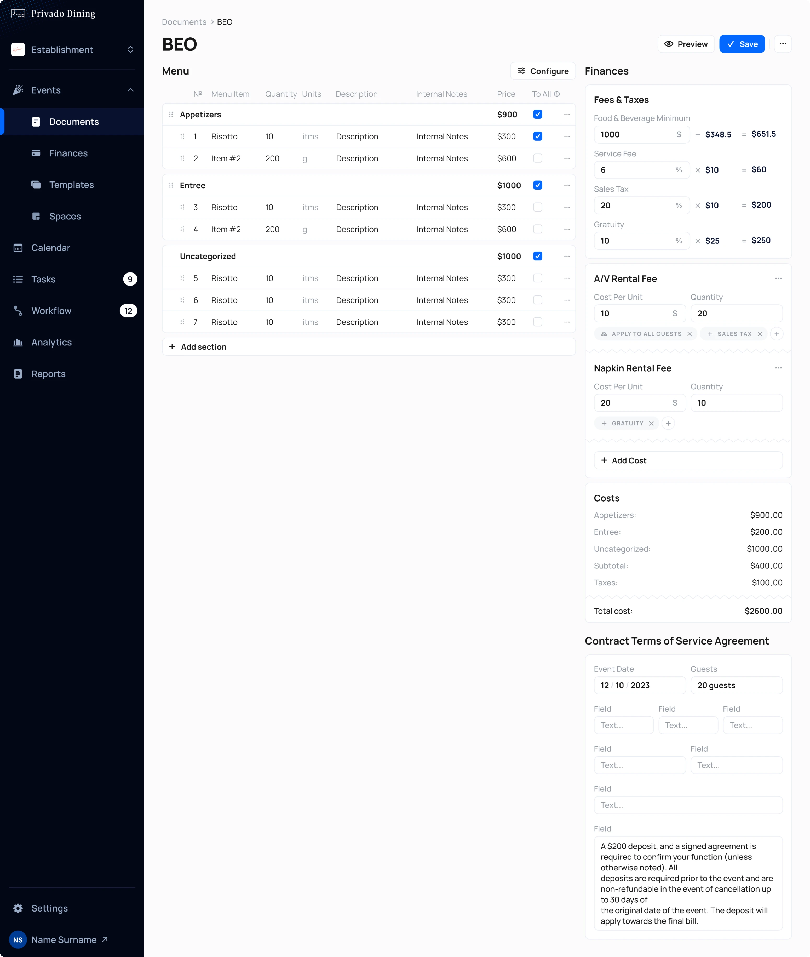
Users can adjust each section using a slider and create fees or tags as needed, with the app automatically updating the final price. Custom fields are also available, allowing restaurant managers to modify them according to their specific requirements.
In addition to major design tasks, we worked on several smaller but essential design features:
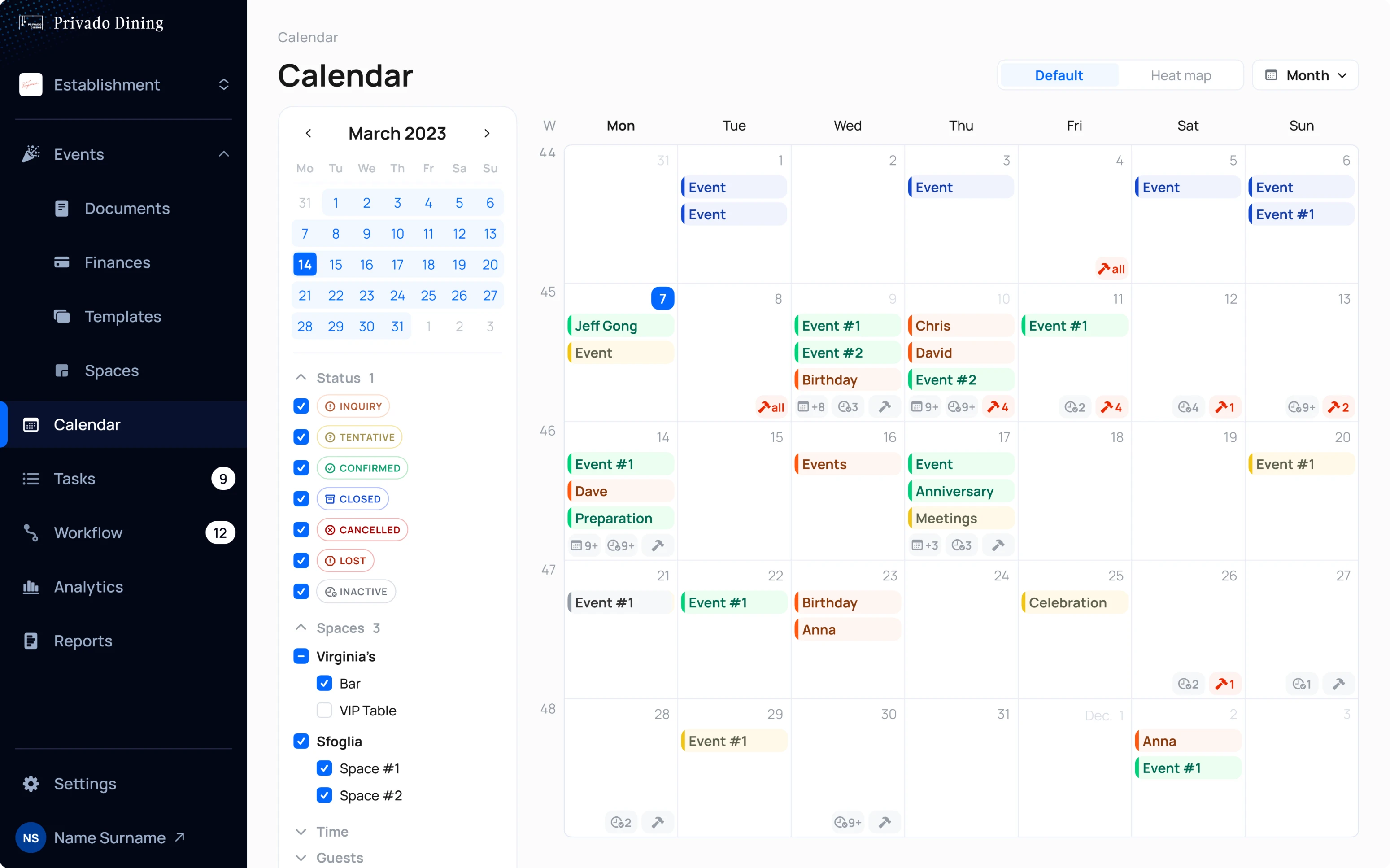
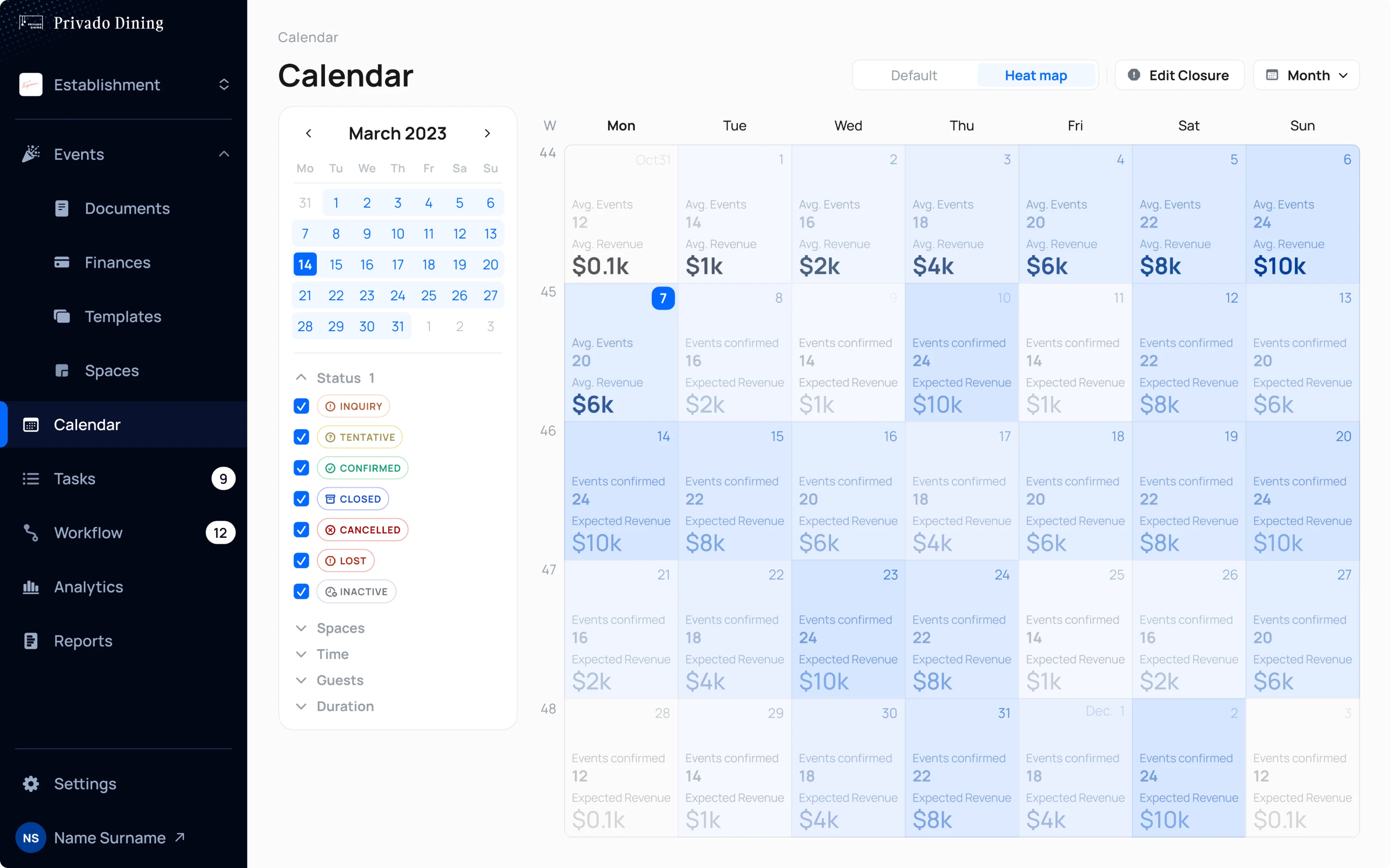
- In addition to a standart calendar view that was designed to conveniently display a large number of events and their status, we’ve also designed Heatmap calendar that shows user’s existing and expected profit.
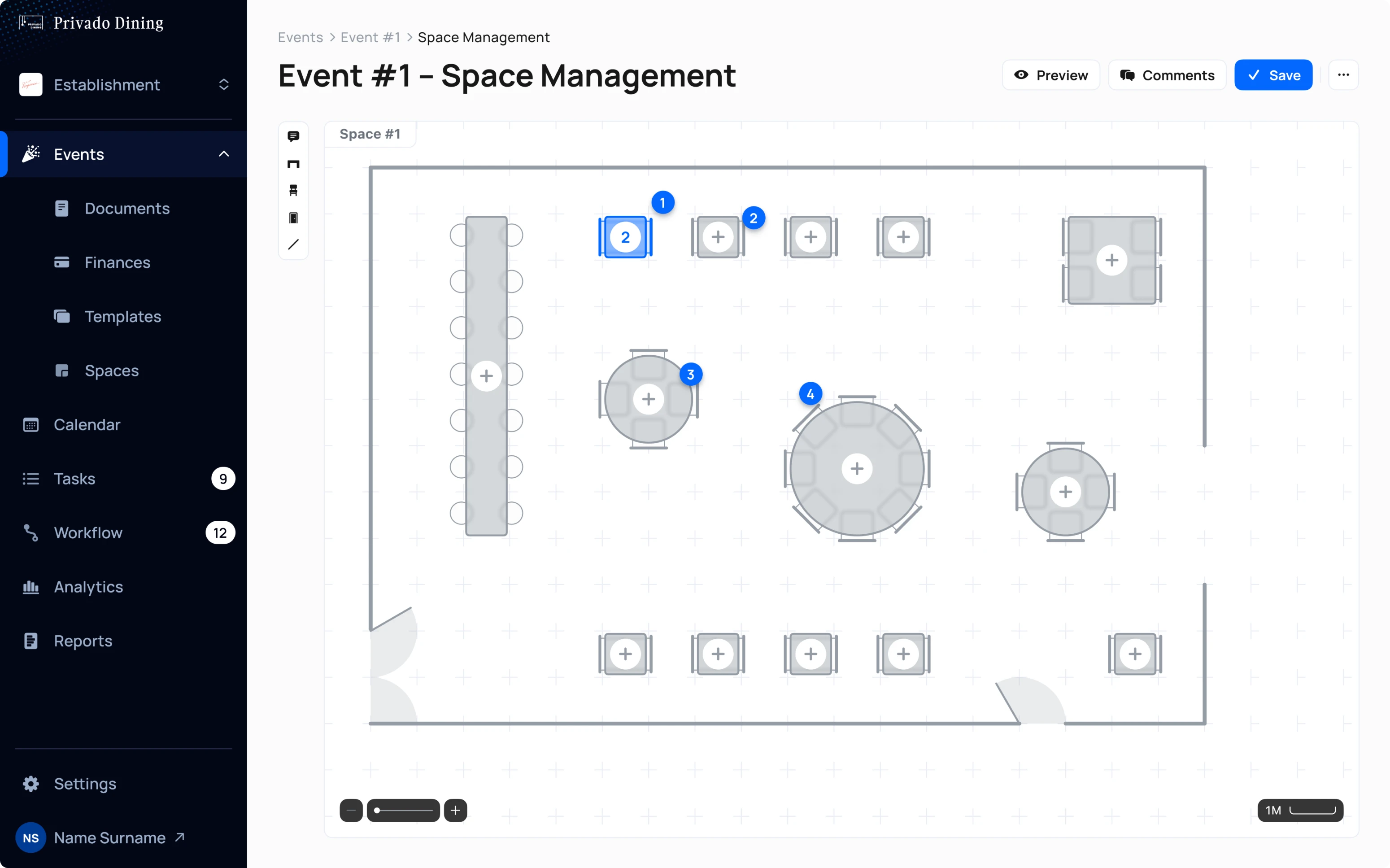
- The space management tool allows managers to visualize table placements for specific events. This makes it easy for managers to share the layout with the responsible person.
Clients and investors were impressed with the lift in product quality
As a result of our cooperation, we’ve managed to accomplish two main goals:
- Redesign the entire existing UI, giving the platform modern look and feel.
- Build out AI co-pilot for Privado, which ensured better workflow management
After showcasing the new designs to users and investors, Privado Dining received overwhelmingly positive feedback. That was our shared dedication and teamwork that brought about positive change. Here's what the client had to say:


