Refera
Landing page and product redesign for a dentist referral solution
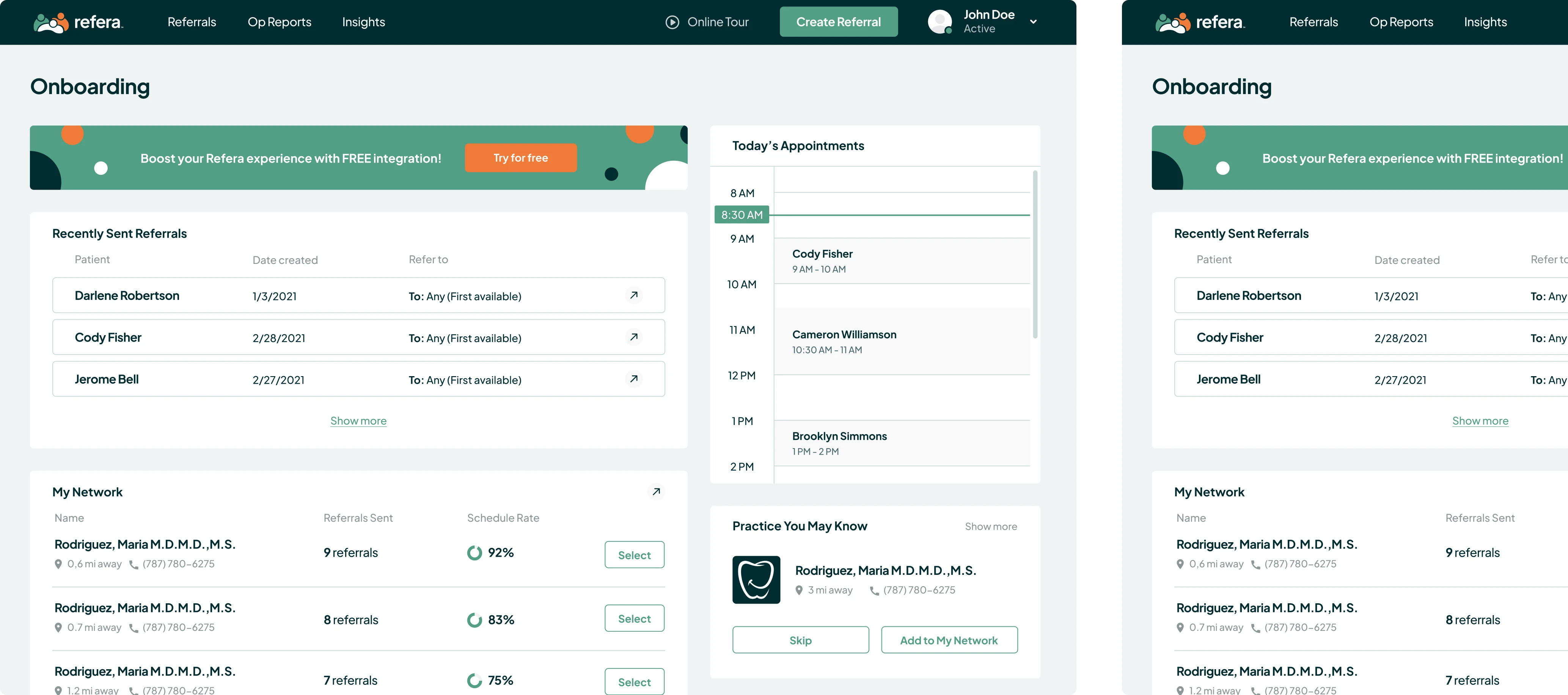
If you ask a doctor what part of a daily routine they dislike the most, more likely a paper mess would be among the leaders. It’s half the trouble to be lost in the piles of forms and referrals on the doctor’s desk. The worst thing is when you lose a patient’s information or send the patient to another specialist for a particular treatment and can’t track whether it is properly accomplished.


The solution to this burning problem is paperless referrals
Refera is a free web platform designed to help dentists regulate, facilitate, and speed up the referring process. This application allows doctors to create and send referrals, view appointments status, and communicate with patients via HIPAA compliant SMS chat.
Here is how the app works:
- The dentist creates and sends a referral; the patient receives the specialist information in SMS and email.
- Once the referral is received, the specialist schedules an appointment.
- When treatment is completed, the patient is referred back to the general dentist for follow-up (back referrals are needed in less than 5% of cases, so that’s an optional step).
Initially, in terms of a trial, we were asked to redesign a product’s landing page.
Eleken’s task was to update the UI, preserving the page structure
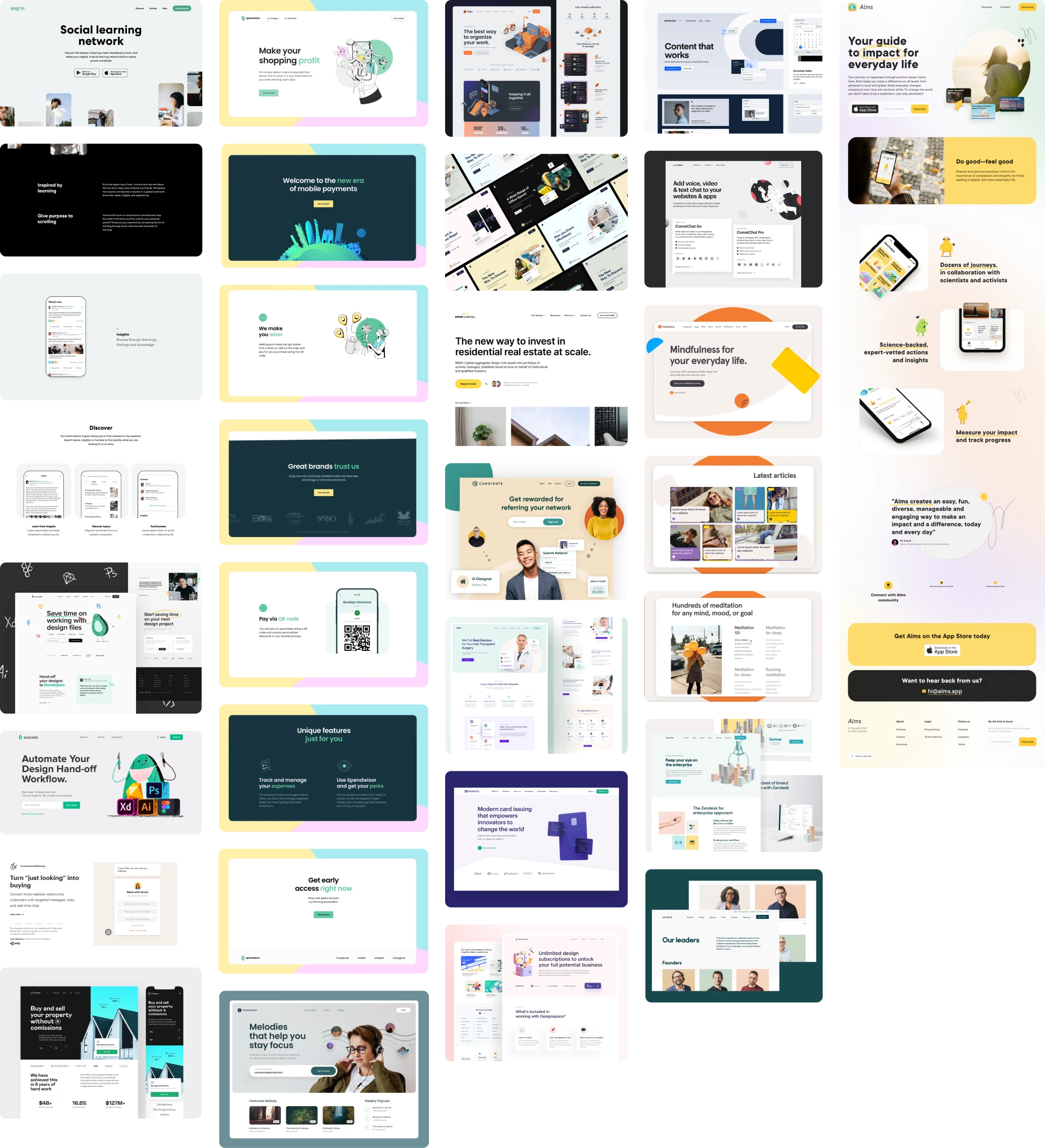
We started the landing page redesign process by collecting the references that we believed were close to the Refera concept.
The main redesign goal was to convey the feeling of trust and confidence that would urge leads to leave an email address and book a demo.
The design decisions we made working on the redesign
As Refera’s platform potential customers are general dentists and narrow-specialization professionals, the visuals should resonate with these specialists.
To achieve this purpose, we offered to replace a bit outdated flat-style illustrations with more classical 3D images.
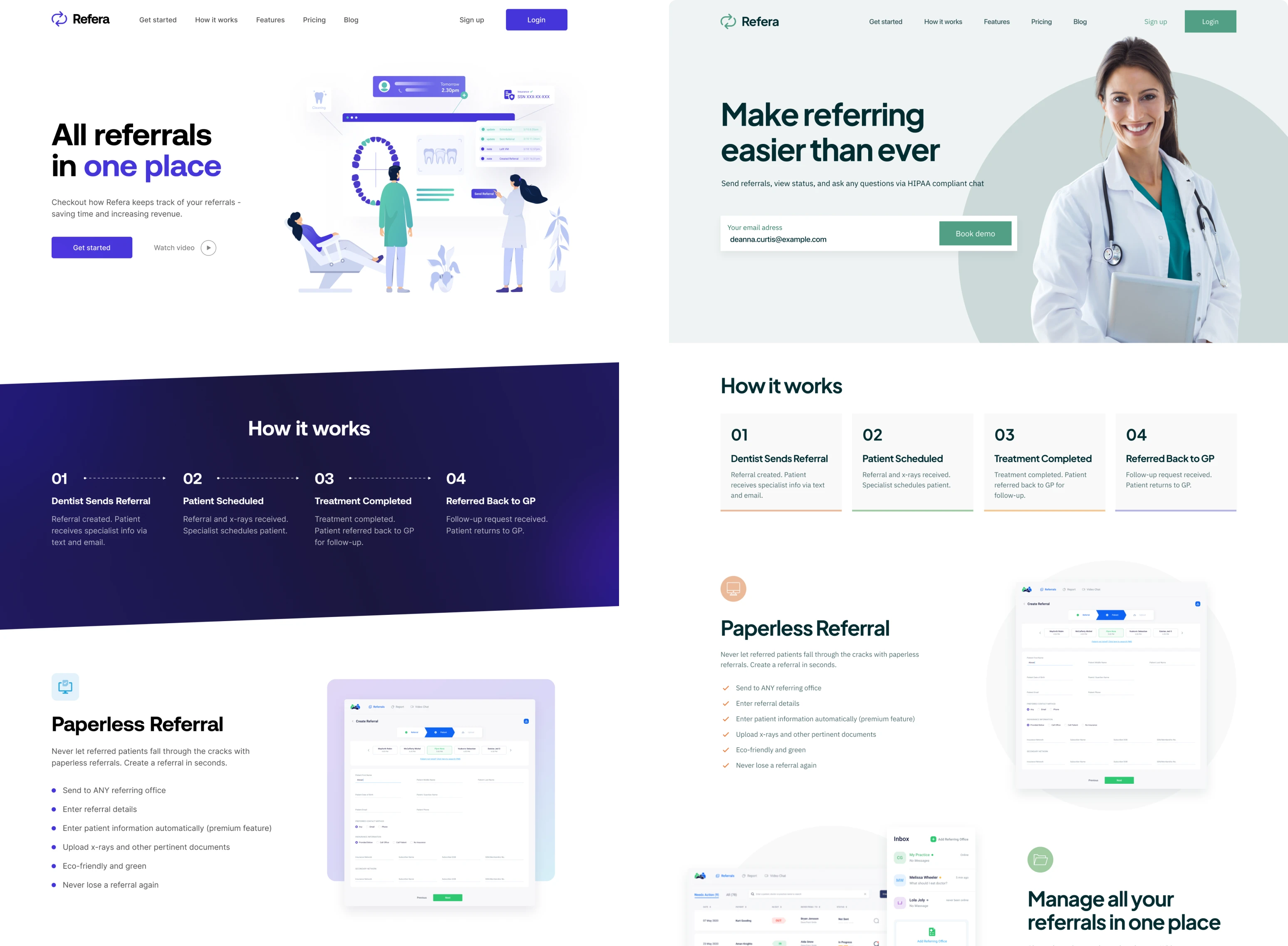
Besides the flat style is an outgoing trend, it doesn’t help to convey the serious medical concept of the Refera app through the UI. To evoke more trust, we also suggested placing a real doctor’s picture instead of illustrations. As human beings, we have more trust when we see people with whom we’re going to interact.
Also, we applied the best design practices when working on a color palette. Instead of bright felt-pen colors, we suggested shifting to a calm green palette. Whereas blue color, widely employed in medical design, is often overused, thus, becoming trivial, the primary green color may serve as a decent alternative. And to dilute the green palette, the accent orange color was added.
We created separate user interface versions for general dentists and specialists to highlight custom-tailored value propositions for both segments of Refera’s target audience.
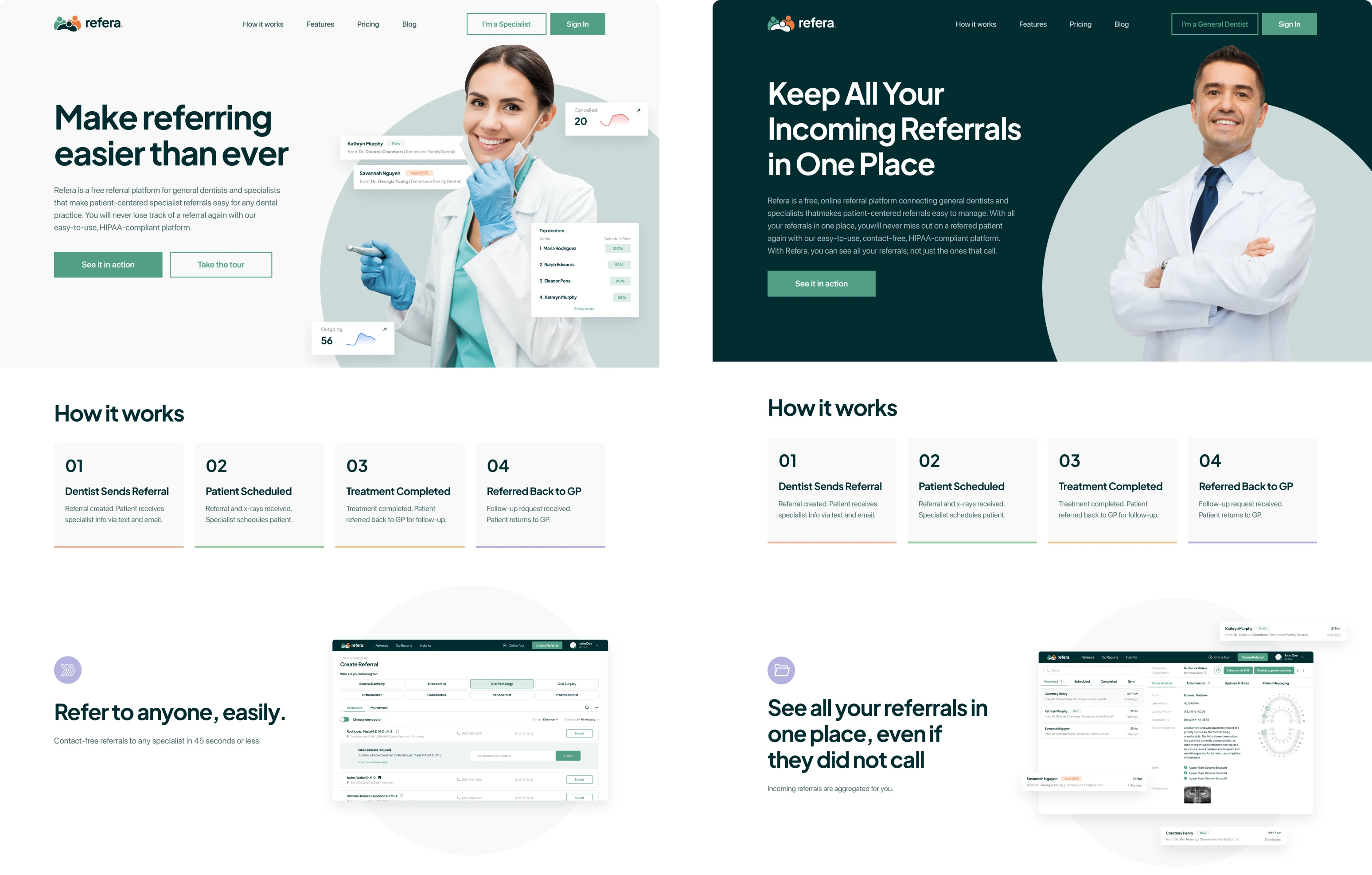
While working on UI updates and adding more screens and elements, we also provided some changes to the user flow, making it easier to navigate the landing page.
Once we successfully finished the landing page UI refresh, the client decided to involve us in a product redesign.
We continued our collaboration with Refera and tackled down to a web platform UI update
The client was pretty happy with the product logic and structure and didn’t request any changes in the UX. Thus, our primary task was to update the platform’s UI, adjust the user flow where it’s necessary, and make the product and its landing page look consistent.
How the platform redesign went on
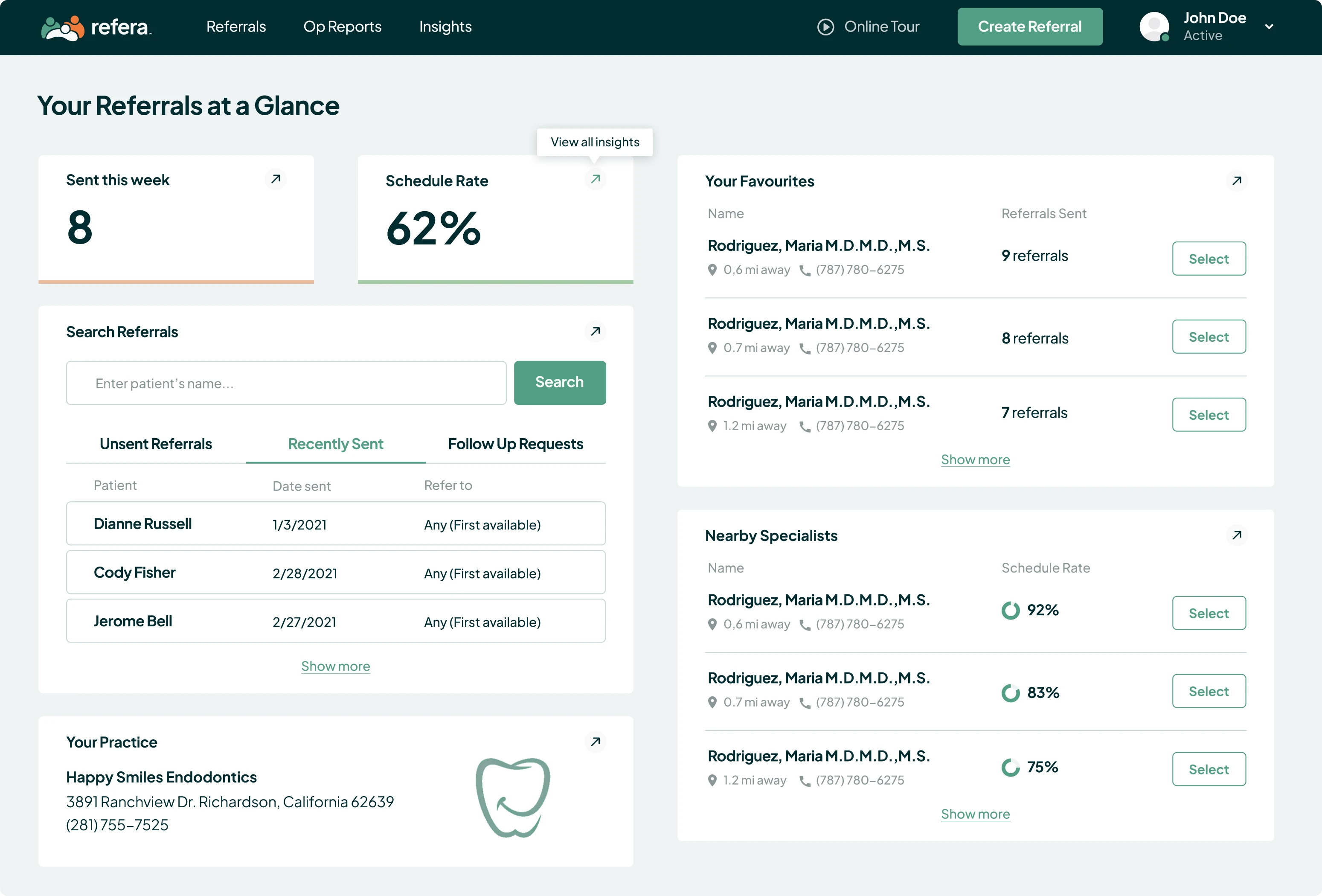
The main sections the application includes are Referrals, OpReports, and Insights.
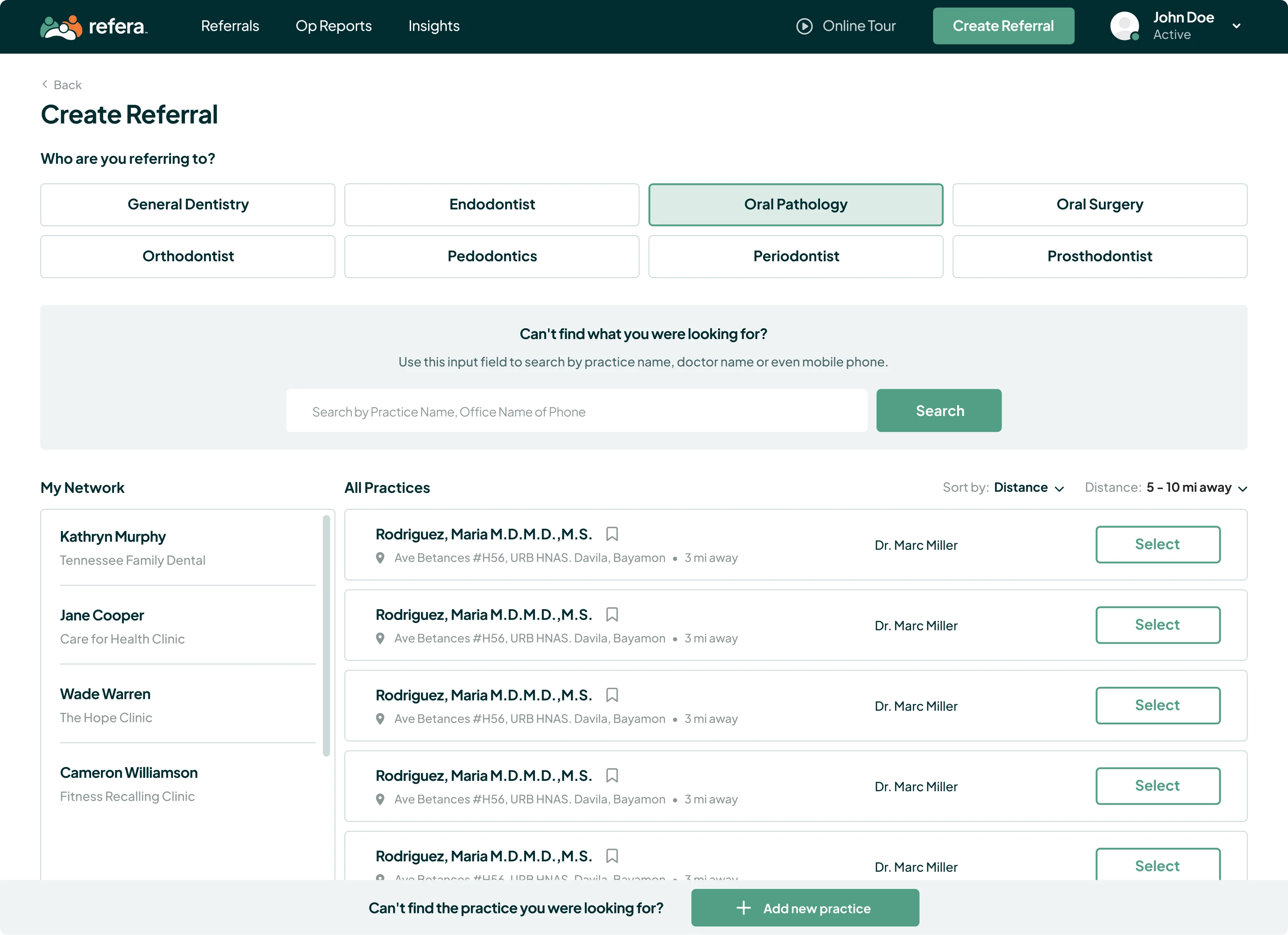
We started with the Create Referral screen. Our goal was to allocate the list of doctors and practices a general dentist can refer to, and their specializations.
The application has a “Select doctors” database the general dentist can choose from. If a preferred doctor isn’t on the list, it’s pretty easy to add a new practice and immediately create a referral.
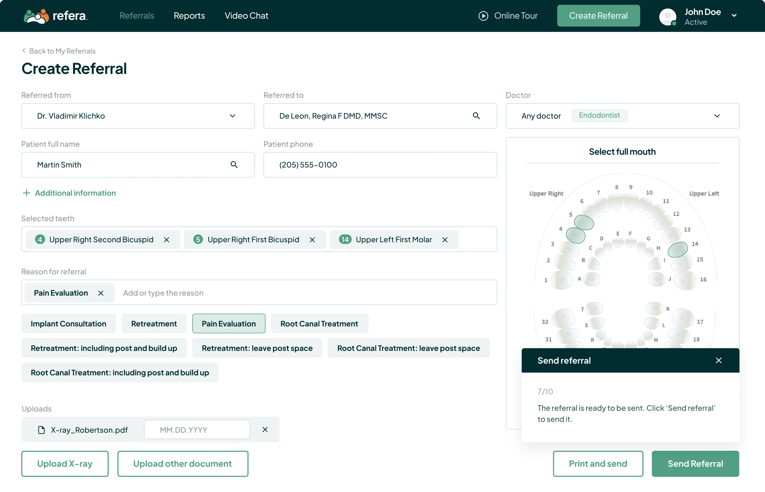
Then we moved to the screen where the referral is being created.
We did our best to design it in an intuitive way, keeping only necessary information that helps easily create and send the referral. To select the teeth that need treatment, you just have to click on a corresponding tooth to highlight it on the image of the oral cavity and choose an appropriate reason for referral. And there you have it! Just upload supporting docs, and the referral is ready to be sent.
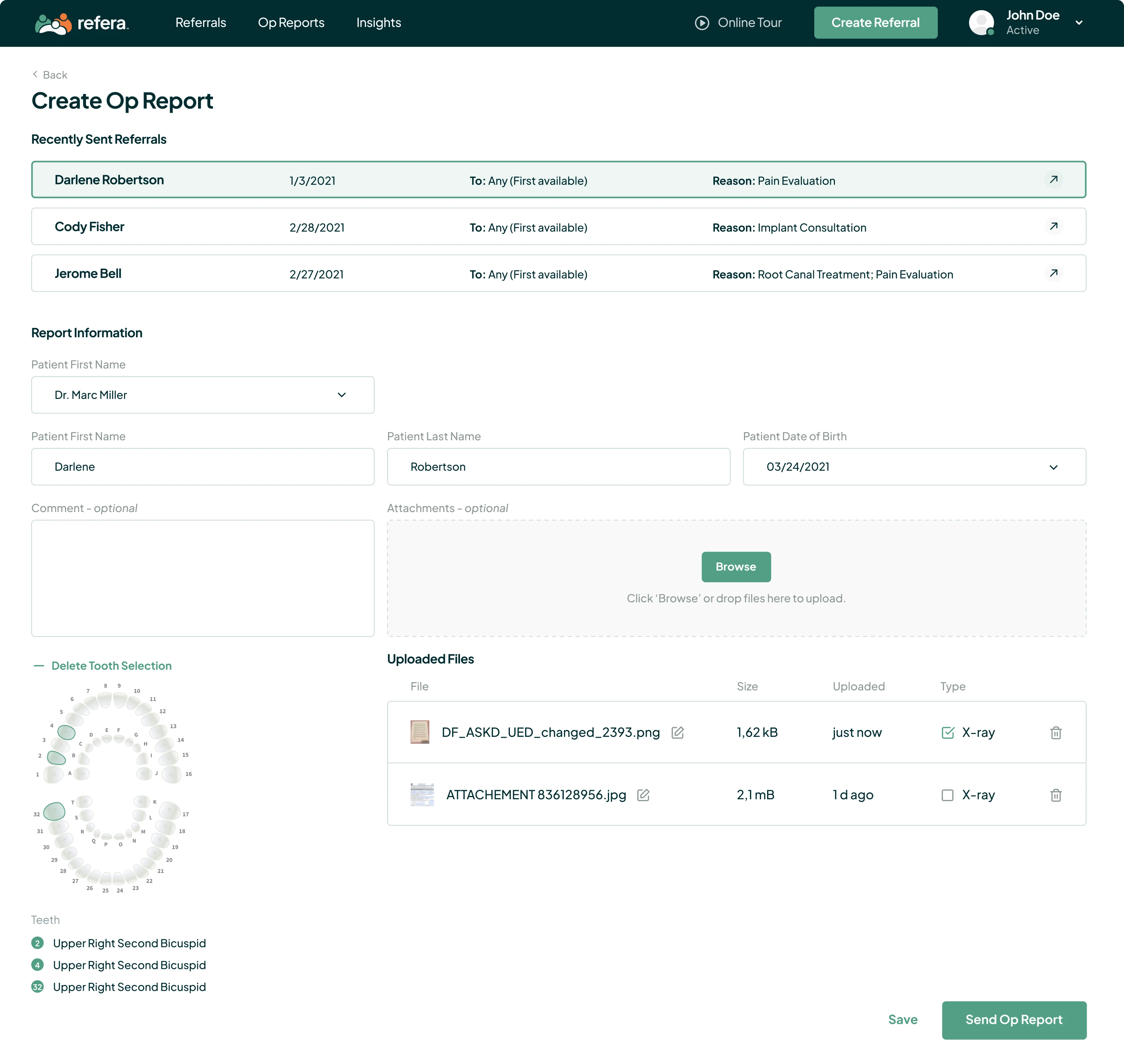
The OpReports section allows a specialist to input the information about executed treatment and send the report back to the general dentist for follow-up.
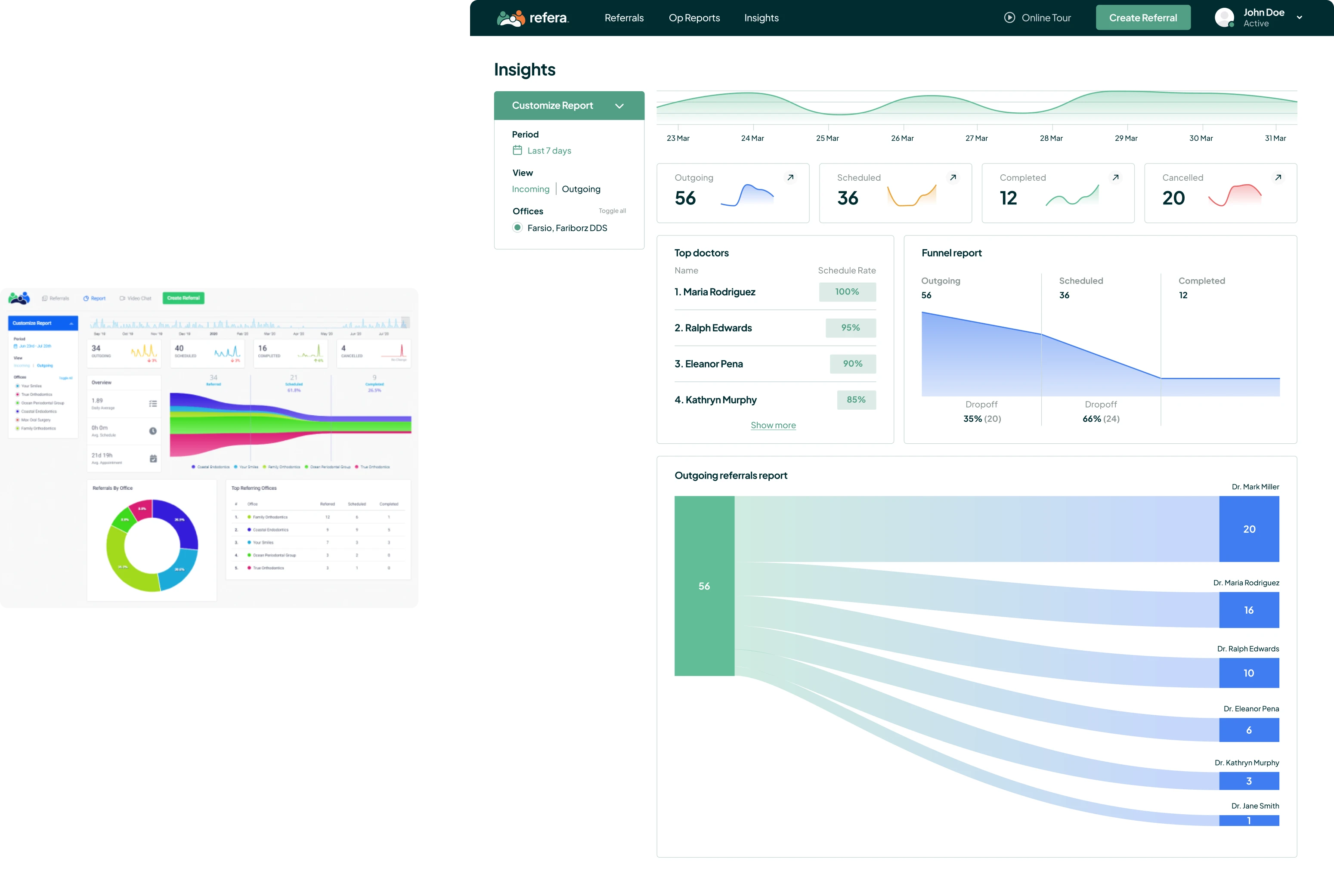
The Insights provide customized reports to check referral statistics. This section shows outgoing referrals, scheduled, completed, and canceled appointments for a certain period.
Another helpful thing is “Dashboards” that help understand what doctors and practices perform the best.
What our workflow looked like
Eleken designers are result-driven seasoned professionals who work with minimum supervision and don’t bother our clients over every little thing.
We had sync-up calls one-two times per week with the company’s CTO, who created layouts based on our design. We also communicated with him via comments directly in Figma. Two dedicated experts, the UI designer and the UX consultant, were engaged in Refera redesign, and this collaboration proved to achieve great results.
The ongoing projects with the clients are the best indicator of our work quality. For Refera, our designers keep creating various marketing materials from printables to email signatures and social media ads.
