Reform
Designing a data preparation solution: from HTML prototype to market-ready product
We live in a world where data is the new gold. But just like gold, it must be processed to become valuable.
Precog is a US-based company that provides software for letting you access any API data and turn it into analytics-ready tables in minutes. They already had a product on the market when they came up with an idea of how to make the process of work with data easier.
Their solution was called Reform and it would let anyone upload data from any source to any destination without having to write a single line of code. Precog’s engineers have developed the code, but one thing they lacked was design.
The product was based on new technologies and thus there were no references. That’s why Precog needed quality designers that would know how to wrap it up. In three months, we created the basis of the Reform’s design and then fine-tuned all the details until it was ready to launch.
Want to find out more about this case? Read on!



Our task was to create the design for a one-of-a-kind product from a simple HTML file
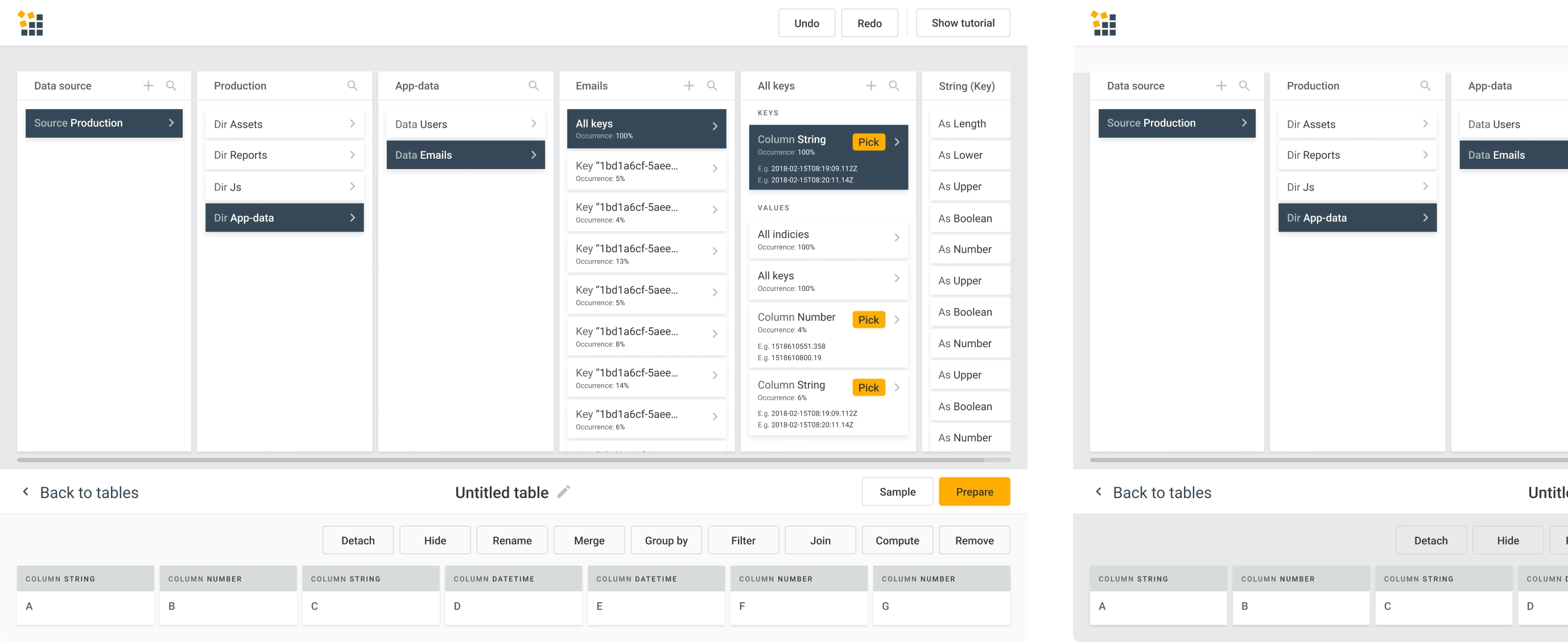
Despite being incredibly easy for users, Reform is a very complex product from the design standpoint. What’s more, we couldn't even get some inspiration from similar solutions, as there were none.
We had one designer dedicated exclusively to this project, so they dove deep into the topic of data products design and became part of the client’s team. To get the best result, we used our superpower:
Iterative design process to deliver the best solution for an innovative product
We were lucky to have a client who understands the importance of iterations for good design: there was no pressure to finish the work ASAP.
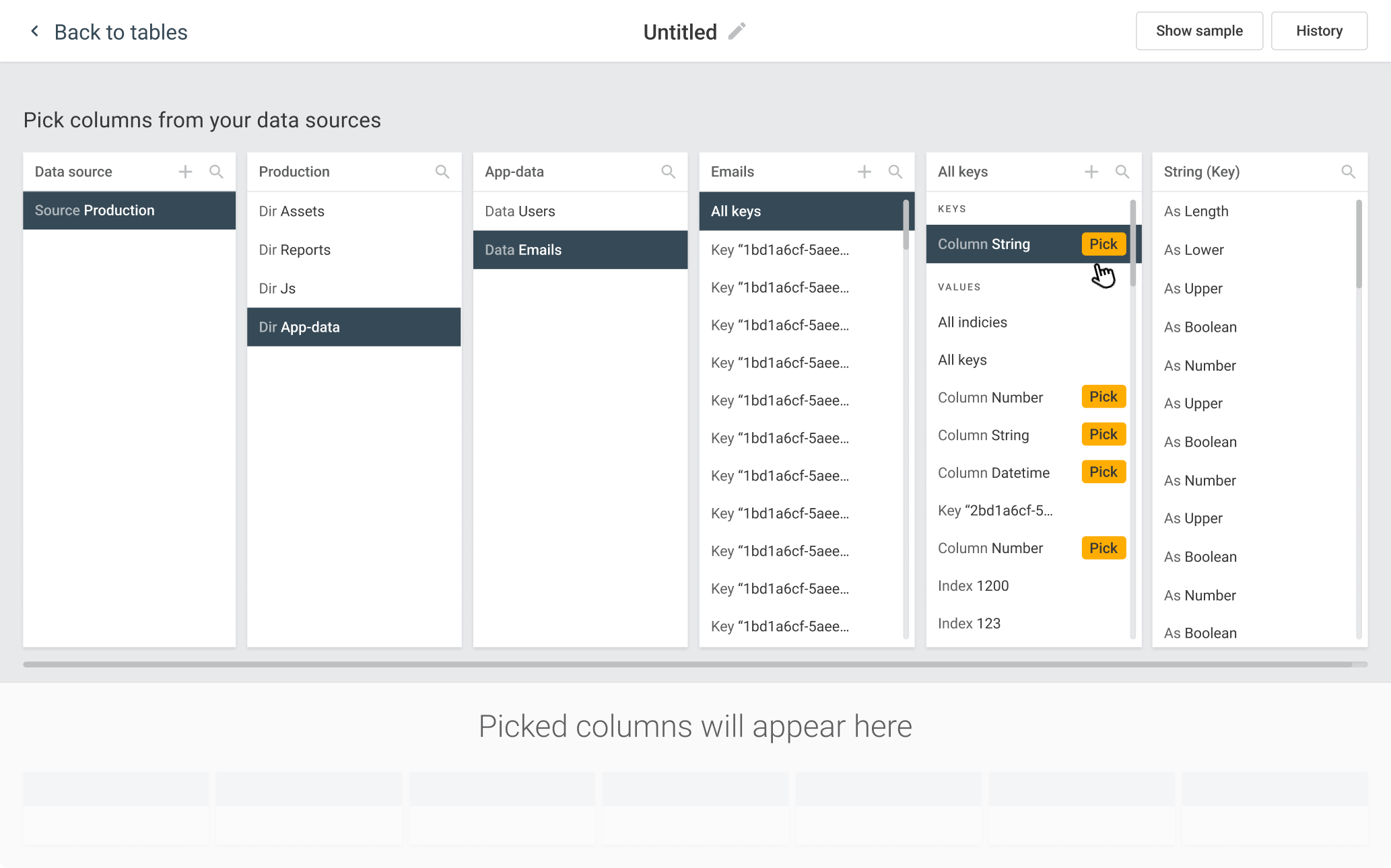
To find the right solution, our designer worked in close collaboration with the client’s team. We were brainstorming with the client to discover which design patterns would work best. It was a big step forward when we found a way of organizing the interface:
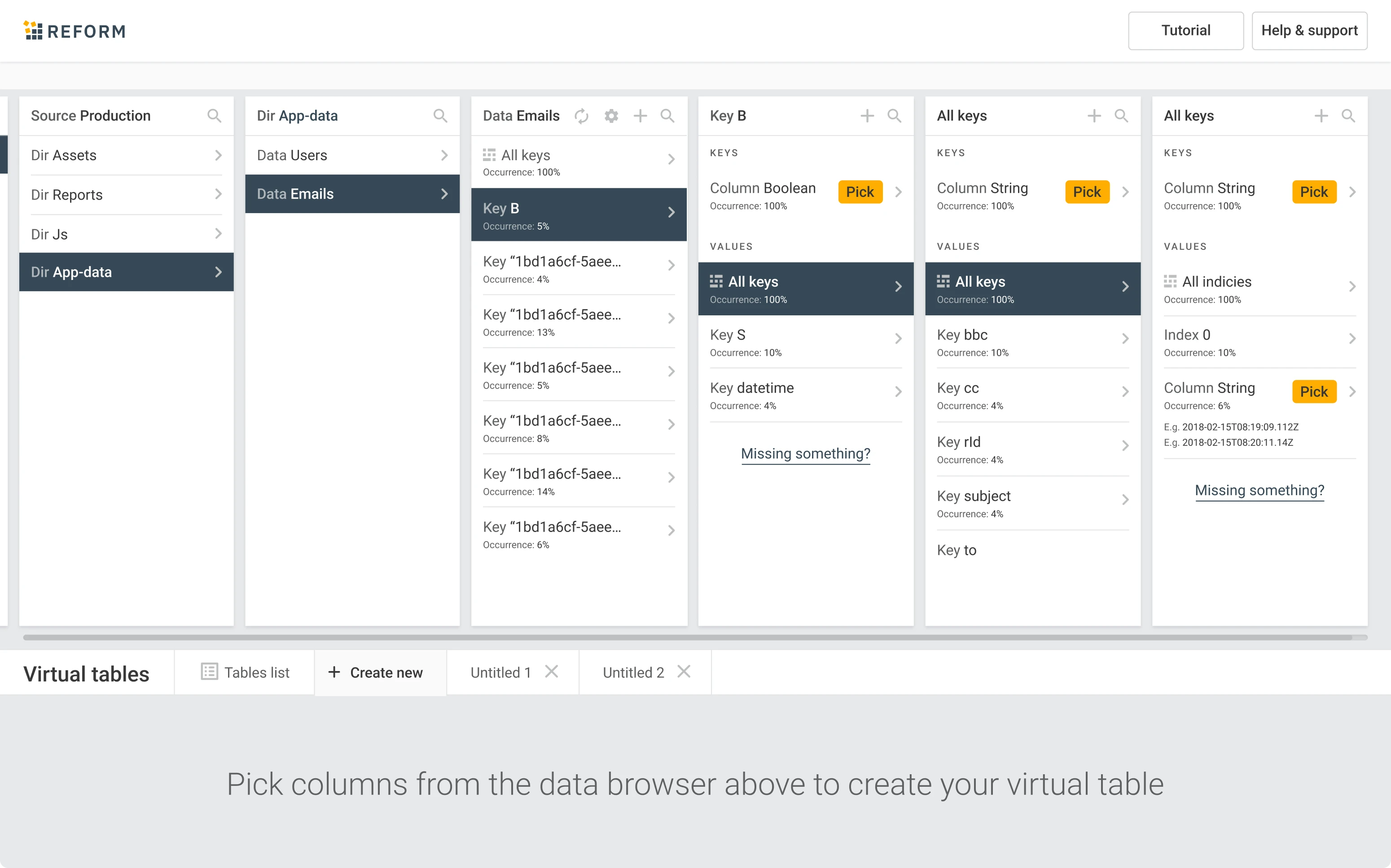
"Explorer" table view with a linear flow that allows seeing all on one screen
We started designing wireframes to build the structure and describe how the functionality is going to work. As a result, we managed to create a linear flow that lets the user perform everything within one page, and without having to move to other pages during their journey.
It’s similar to how Finder on Mac works: it splits the window into columns and when you choose the folder in the left one, the right one shows the content. That way you can navigate through folders without going back and forth.
For Reform, the folders start with choosing the source and then finding the categories of data that a user wants to transfer. Instead of making it a series of screens, we fit all of it into one.
The user flow is a bit similar to making a purchase in the online store. You choose a product you need, and when it's time to buy, you go to the shopping cart where you see a summary of the products you are going to purchase.
Reform: a complex app with intuitive UX
The best way to explain how Reform works is by showing you a common use case. Let's imagine you have to analyze customer data for your ecommerce business. Reform makes this very easy.
Connect the data source
Your first step is to feed the data from your CRM or marketing platform directly into the tool, either using a direct web link or a raw JSON file.
Transform the data
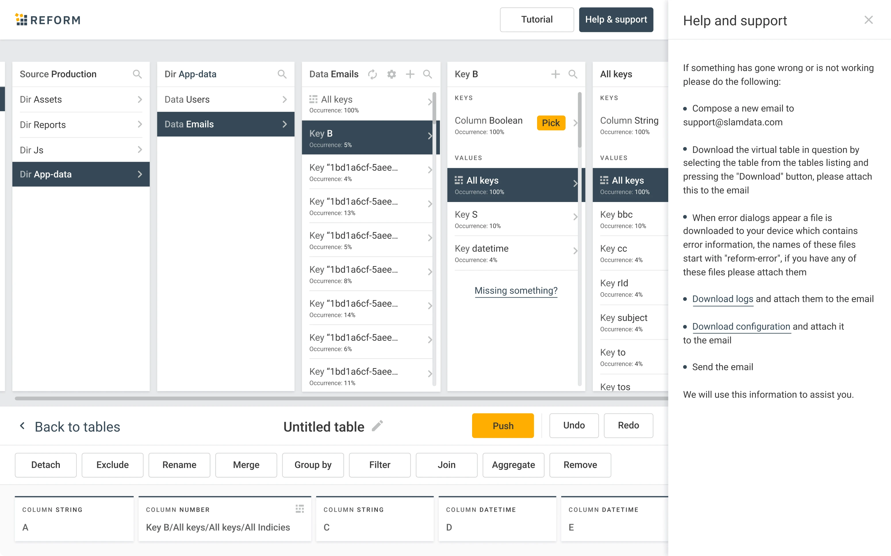
Reform will convert your data into the appropriate format. We presented it via a clear point-and-click card-based user interface.
You can pick out the keys you need and the system will prepare analytics-ready tables with all the information related to these keys.
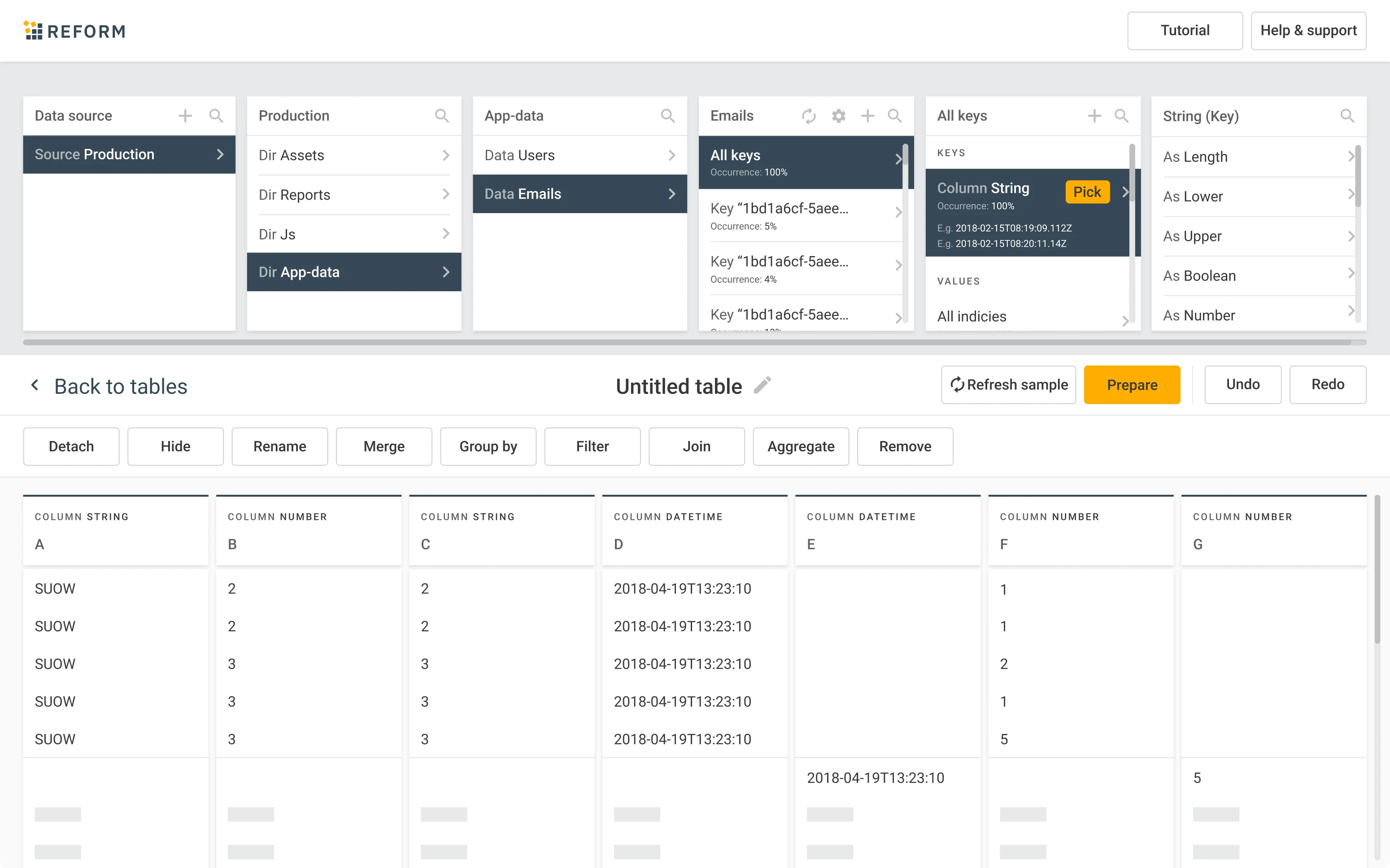
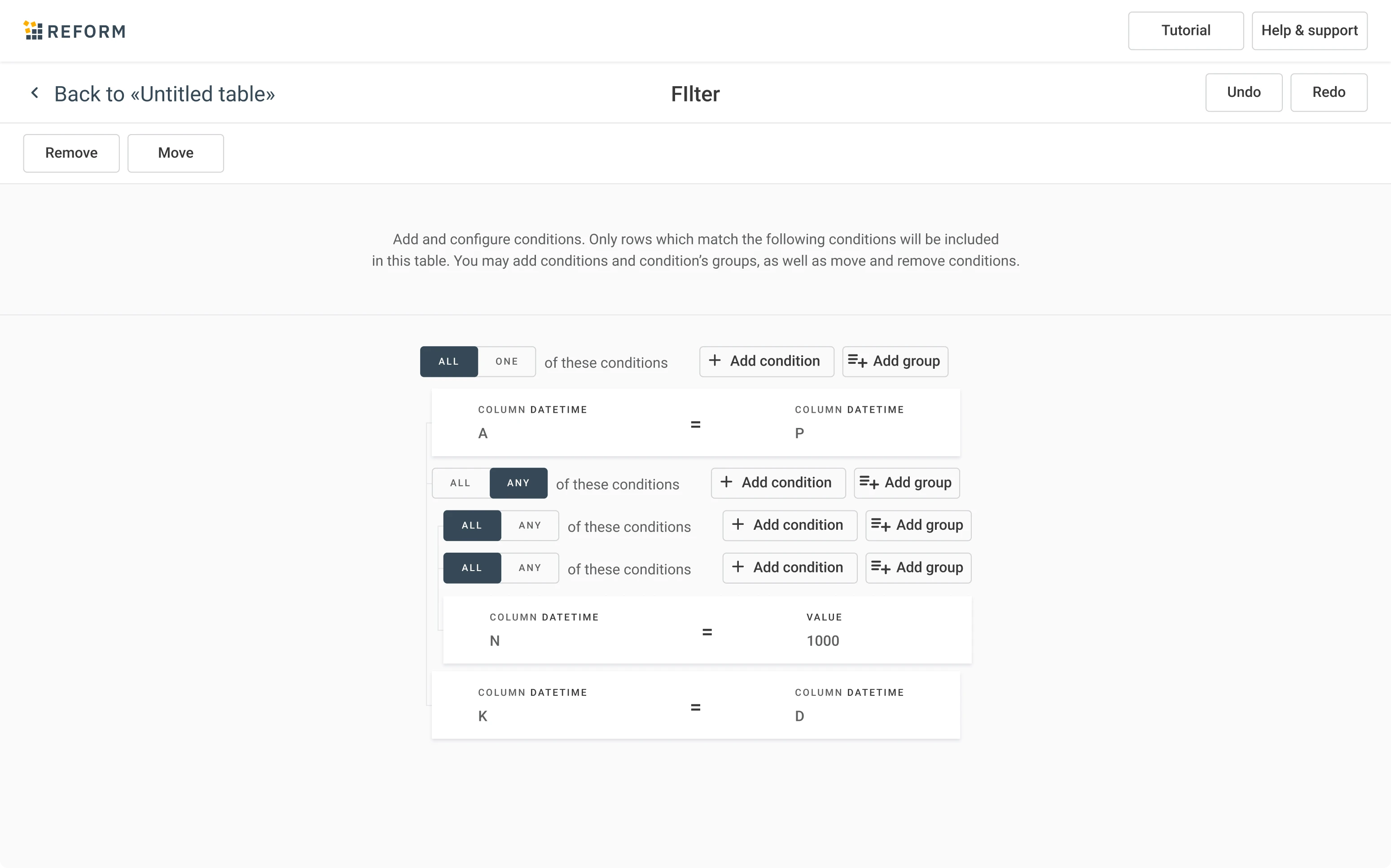
You can apply different functions to manage data in the table. Merge, rename, group, filter – we designed multiple micro-interactions to make the process of data modification easy and intuitive.
Visualize the data
Users can share their processed data with anybody using a web link.
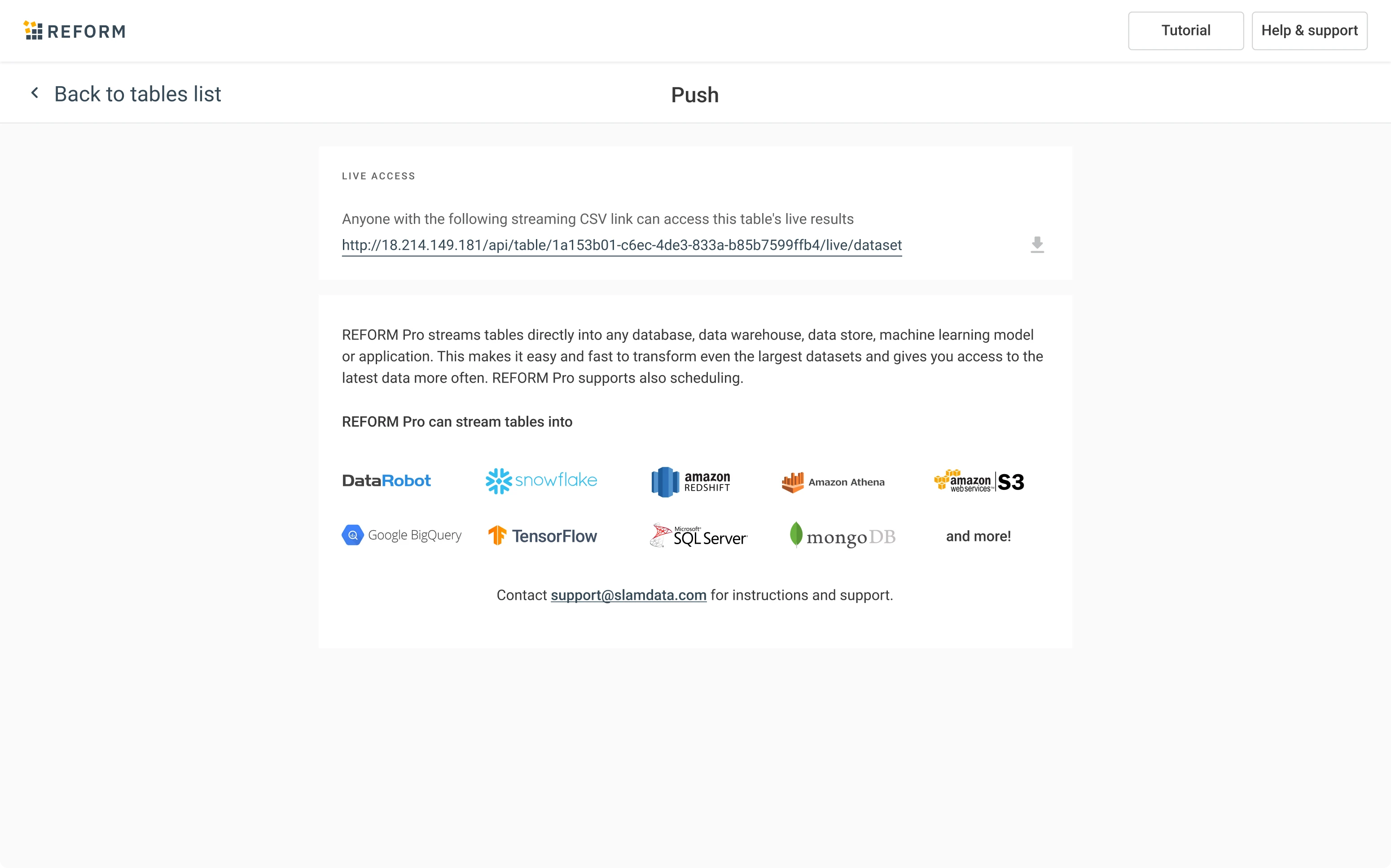
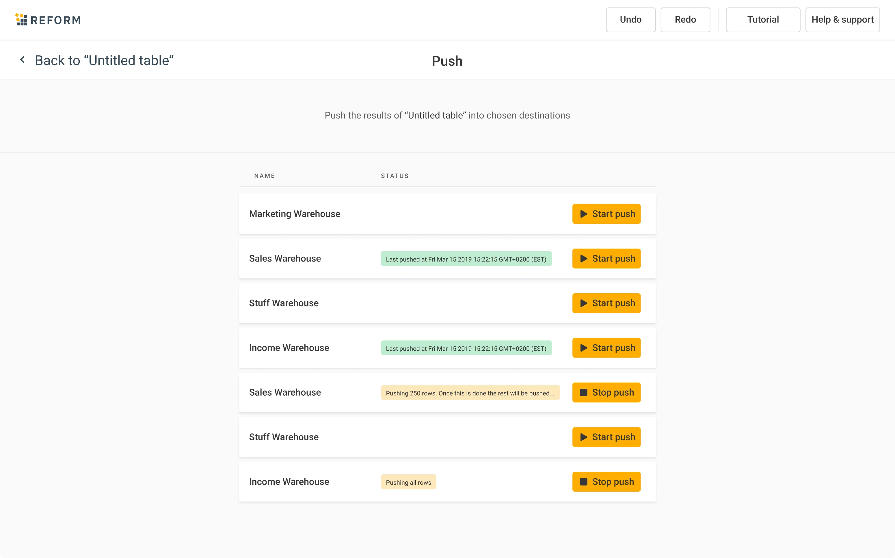
As the last step, you can feed the data into Tableau, Power BI, Data Studio, or your favorite other data visualization tool to gain new insights into your customers.
4 years later, Reform continues to strive
Time has passed, many things have changed, but the product we designed is still there helping them to succeed. When you’re curious to learn about their product, you can check it out here.
We had one designer working on this project for about a year and communicated mainly with Becky Conning, their VP of Product. The overall product look was ready in a few months, but we spent a great deal of time designing micro-features, details and states that are almost invisible on the user interface, but are paramount for creating an intuitive and pleasant user experience.
The client continues improving the product, and our design serves well for this cause. Our initial solutions laid the basis for future designers to improve the product further. And that’s what good design is all about: setting the ground for many other features and updates that are yet to come.
