TextMagic
Designing a CX platform to support Textmagic’s product expansion strategy
Founded in 2001, TextMagic is the UK-based all-in-one text messaging service that has been successfully helping small businesses around the world do mobile marketing.
In 2019, after gaining success in their niche, TextMagic were looking to expand their product line. We joined their team to help them design the products for their new Marketing Suite with SMS and email marketing campaigns and live chats. But as their requirements evolved over time, we ended up designing an entire platform. Read on to learn the details.


One platform that unites all products in a consistent way to not confuse the users
Most SaaS companies in the space of sales and marketing usually start small and grow very complex as they add up new features and additional products. More features equal better capabilities. But at the same time, they equal worse customer experience.
TextMagic wanted to avoid that. They were looking to become a new version of Zendesk, only simple from the user perspective. This product vision aligned with what users love about the company, as shown in many TextMagic reviews. Simplicity and functionality are core strengths they didn’t want to lose.
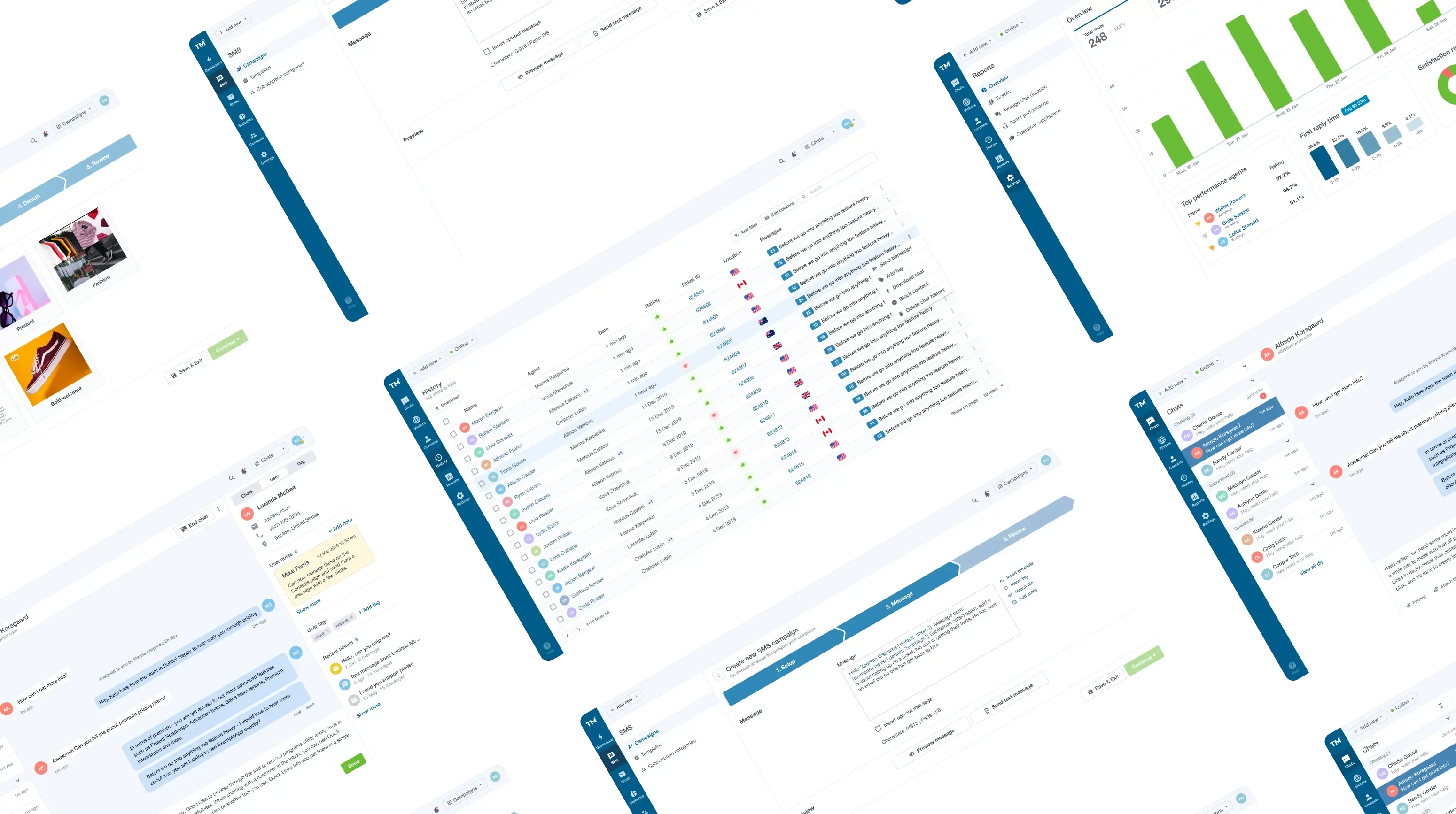
By combining marketing campaigns, CRM and help desk functionality on one platform, we wanted to reduce the complexity and improve the productivity of the TextMagic customers' teams.
Live Chats
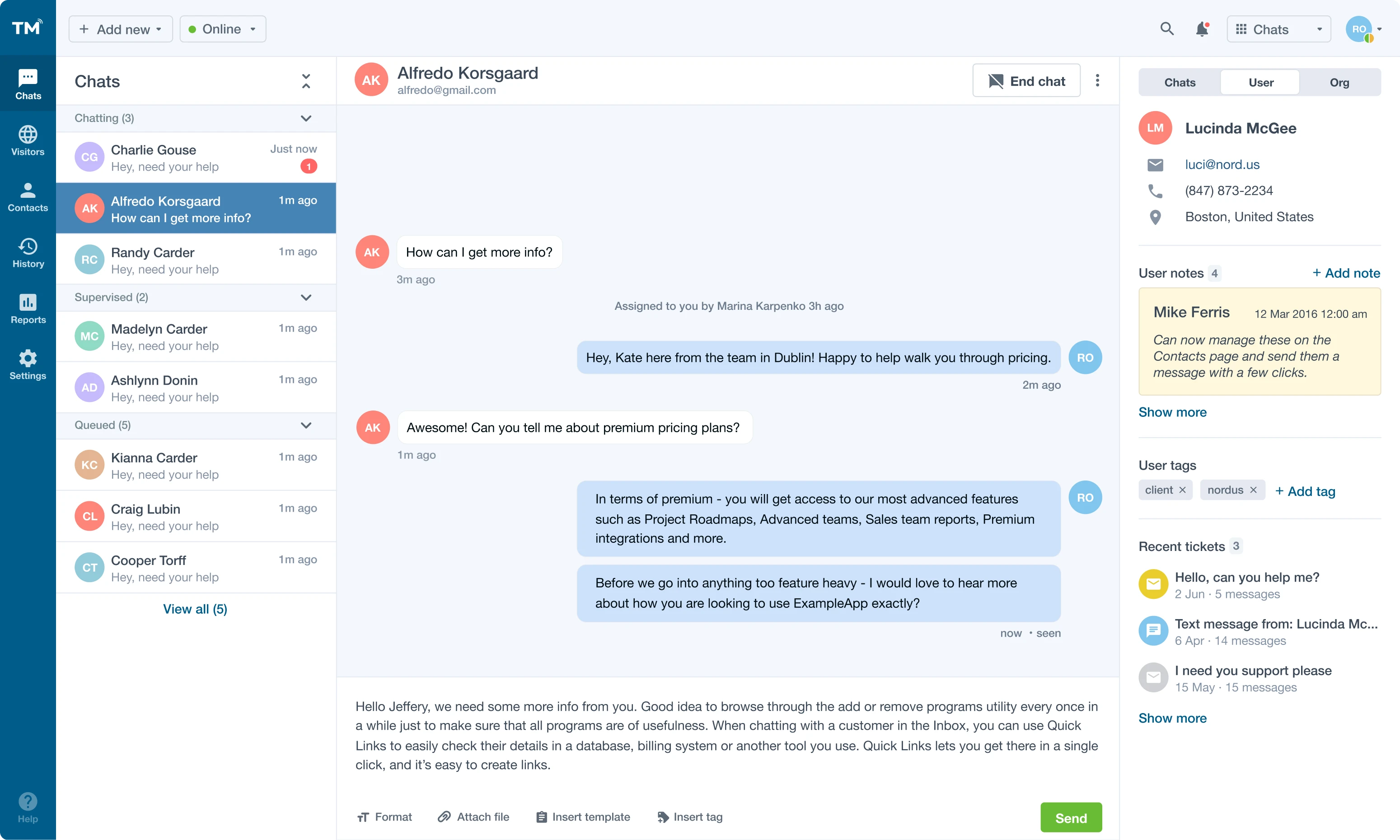
When we joined the TextMagic team, they already had a customer support platform. Our job was to create a customer-facing chat widget and the user interface for a support manager who operates live chats.
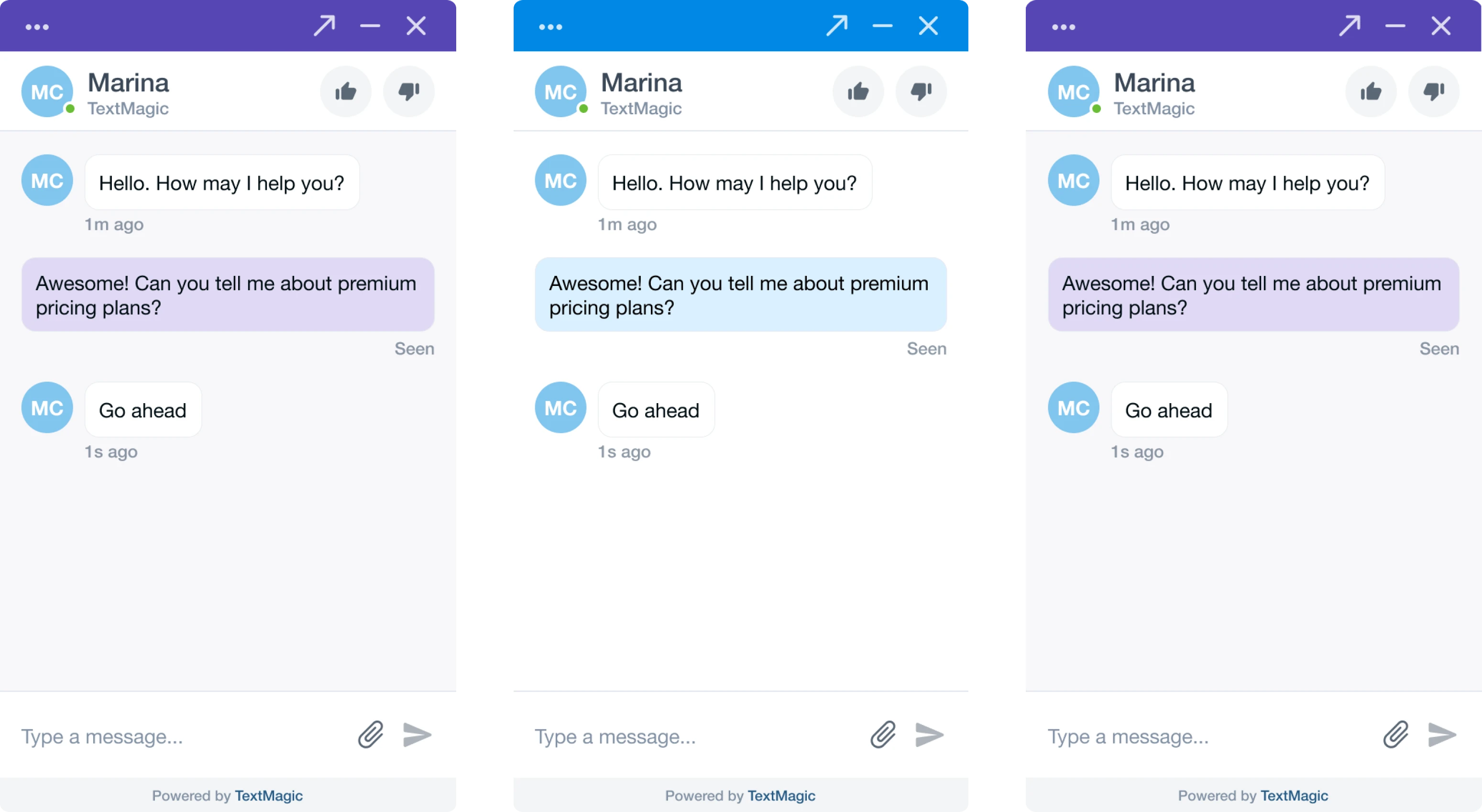
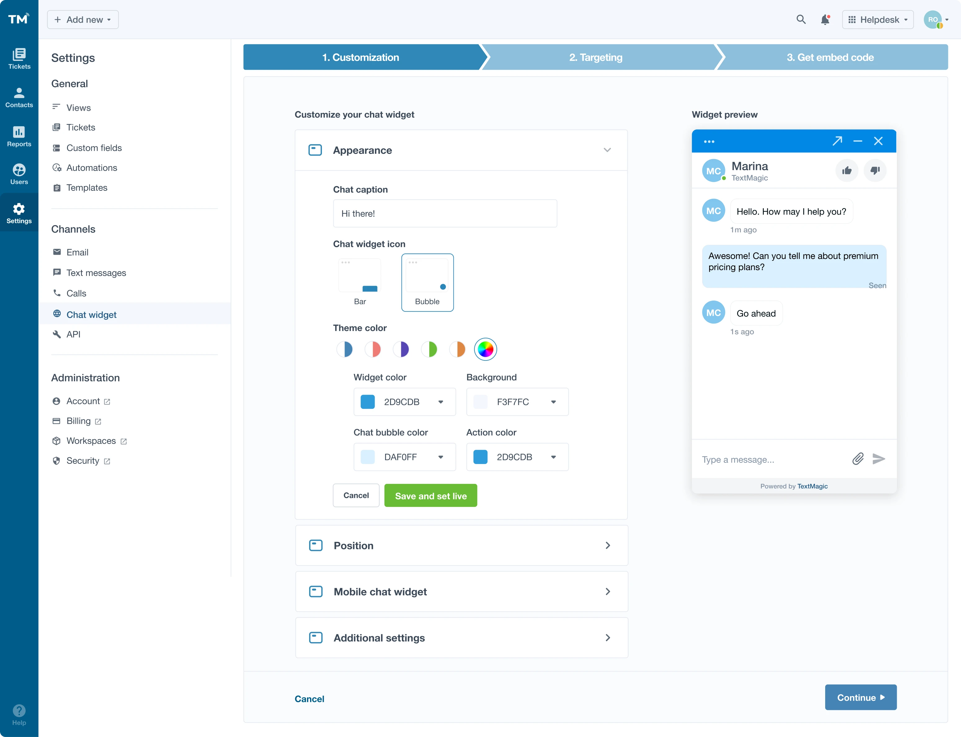
Support managers can customize the appearance of the widget so it remains consistent with the brand.
The user interface for a support agent who operates chats provides all the information they need about the clients, such as their contact details, recent tickets, and recent page views (available in the chats tab).

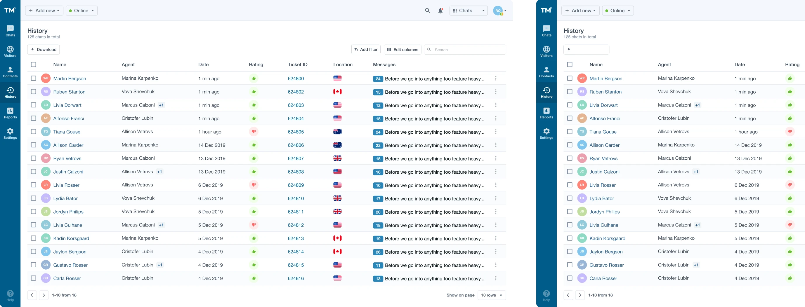
The visitor’s page shows the user's current status, their path on the website, when they were last seen, what country they come from, how many visits and chats they had previously, and what browser and device they used.
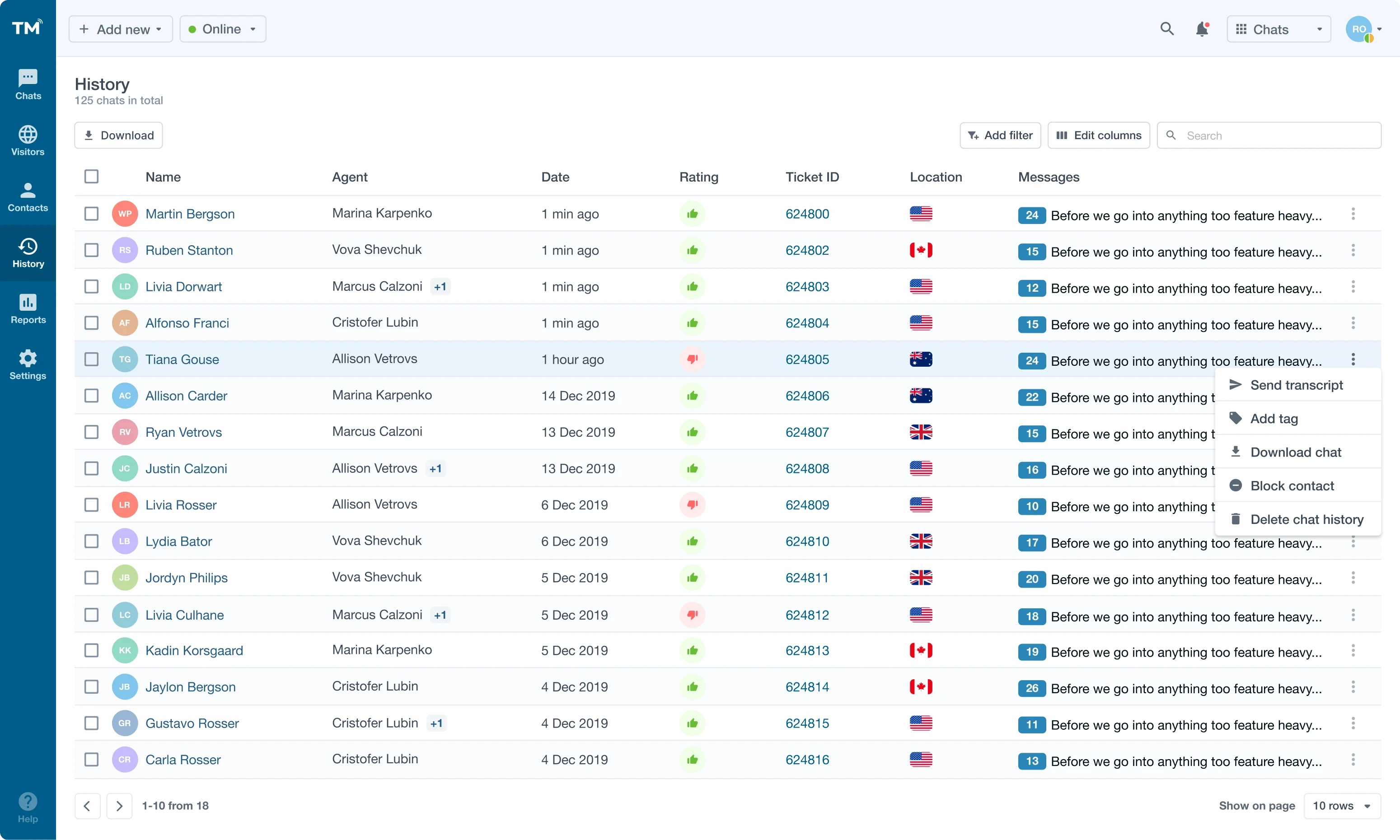
The chat history contains the records of all conversations that happened in the live chats.
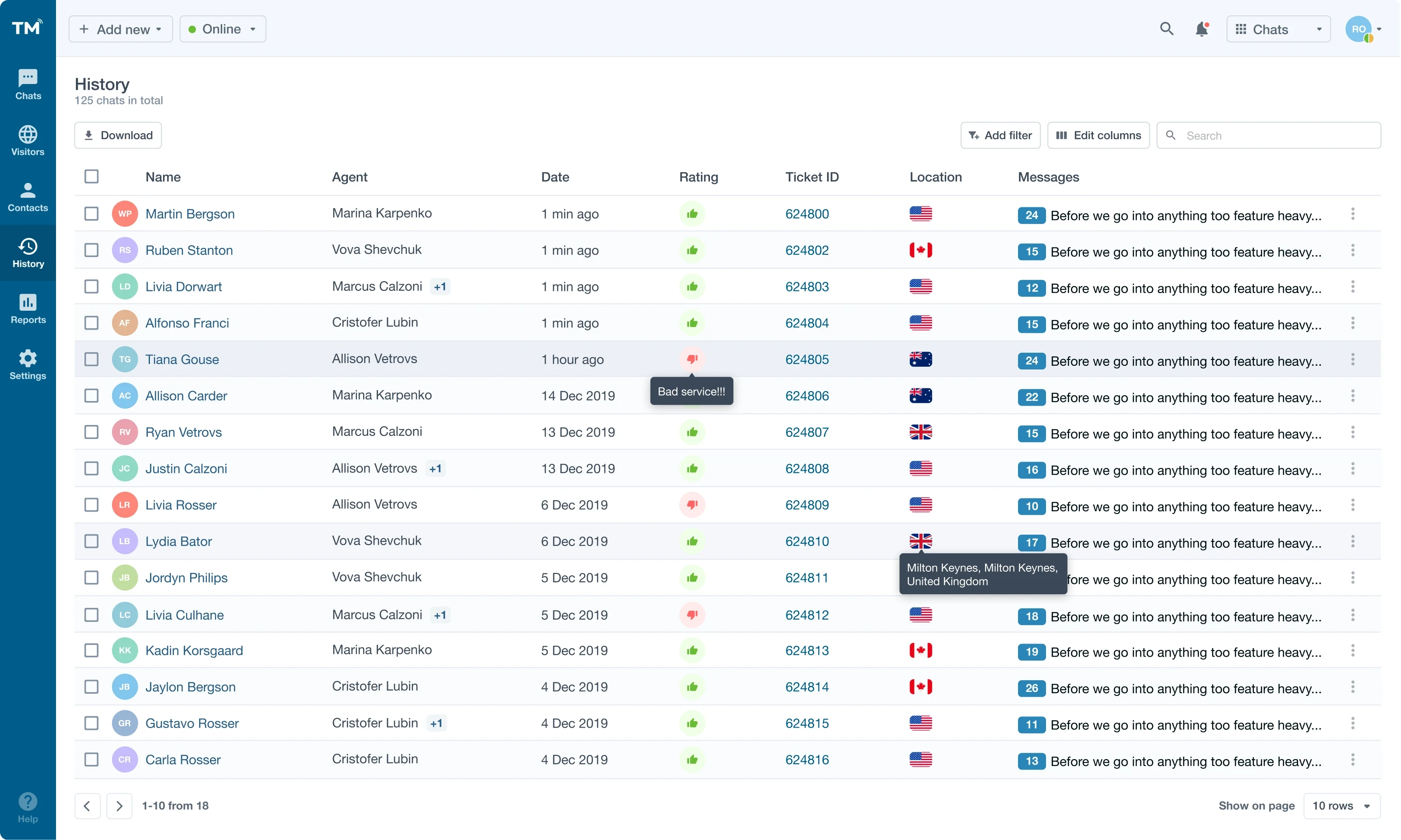
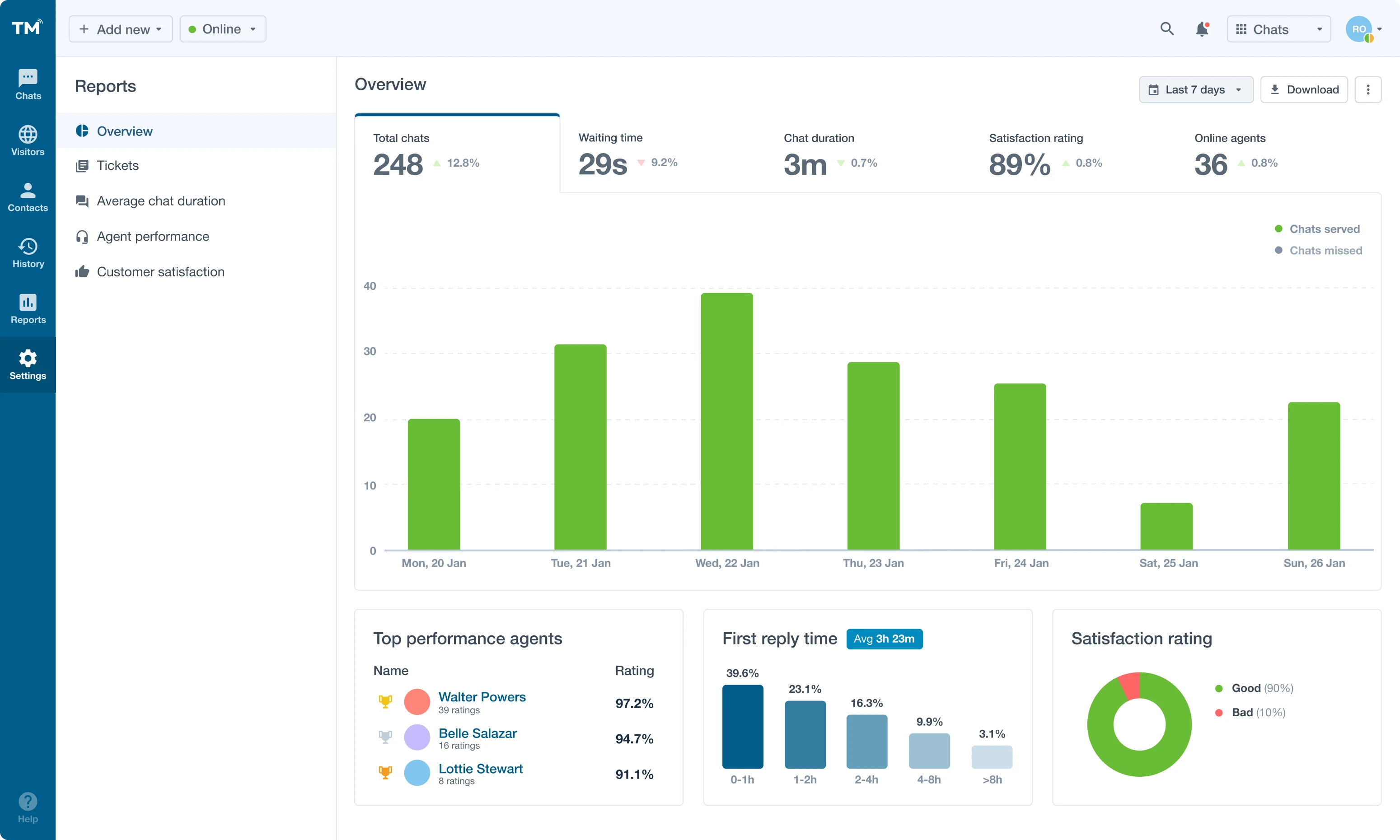
In the settings, customers can get an overview of their chat performance via comprehensive dashboards. Performance reports and real-time dashboards help teams monitor engagement and satisfaction metrics, another aspect praised in more than one TextMagic review.
Email Campaigns
If you’re still wondering what is TextMagic beyond SMS, here’s your answer: it’s also a full-featured email marketing tool. We designed the entire functionality for setting up and configuring email campaigns including audience segmentation, ready-made templates, drag-and-drop editor for email design, and A/B testing.
We created an intuitive email configuration flow that takes a user from an email campaign set up to review.

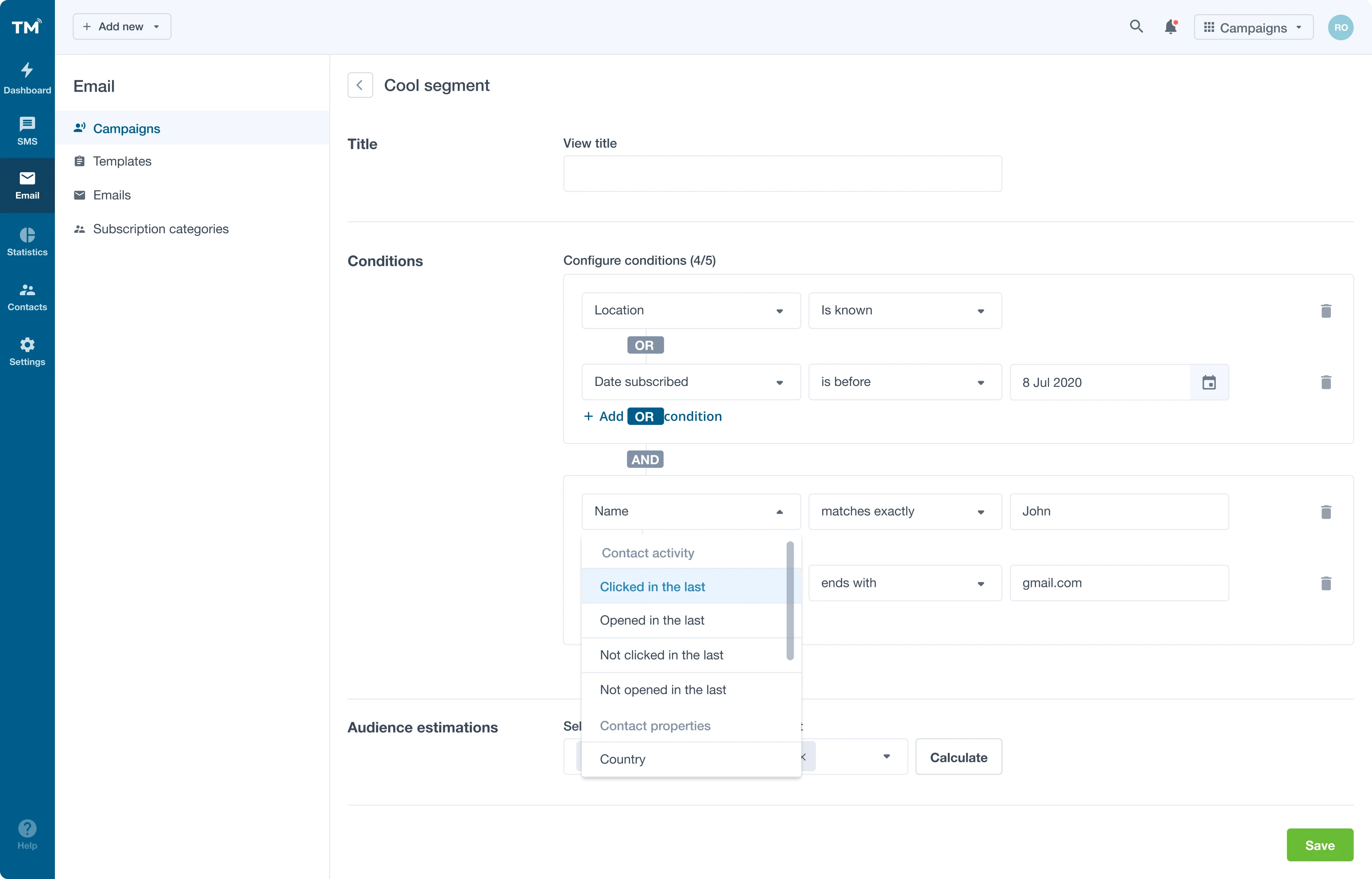
We designed easy-to-define conditions to help TextMagic app's users segment their audience to create more personalized and targeted email campaigns.
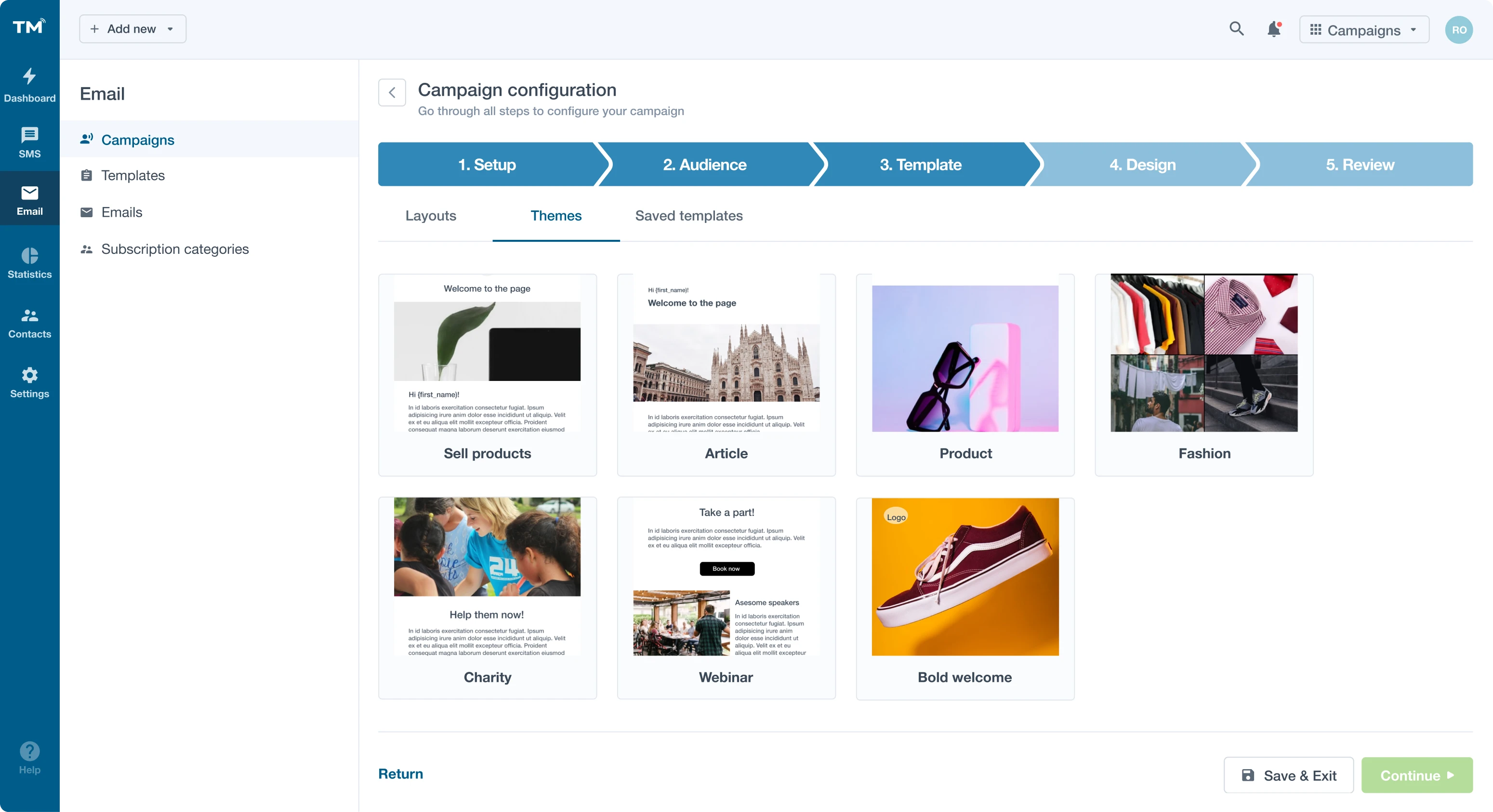
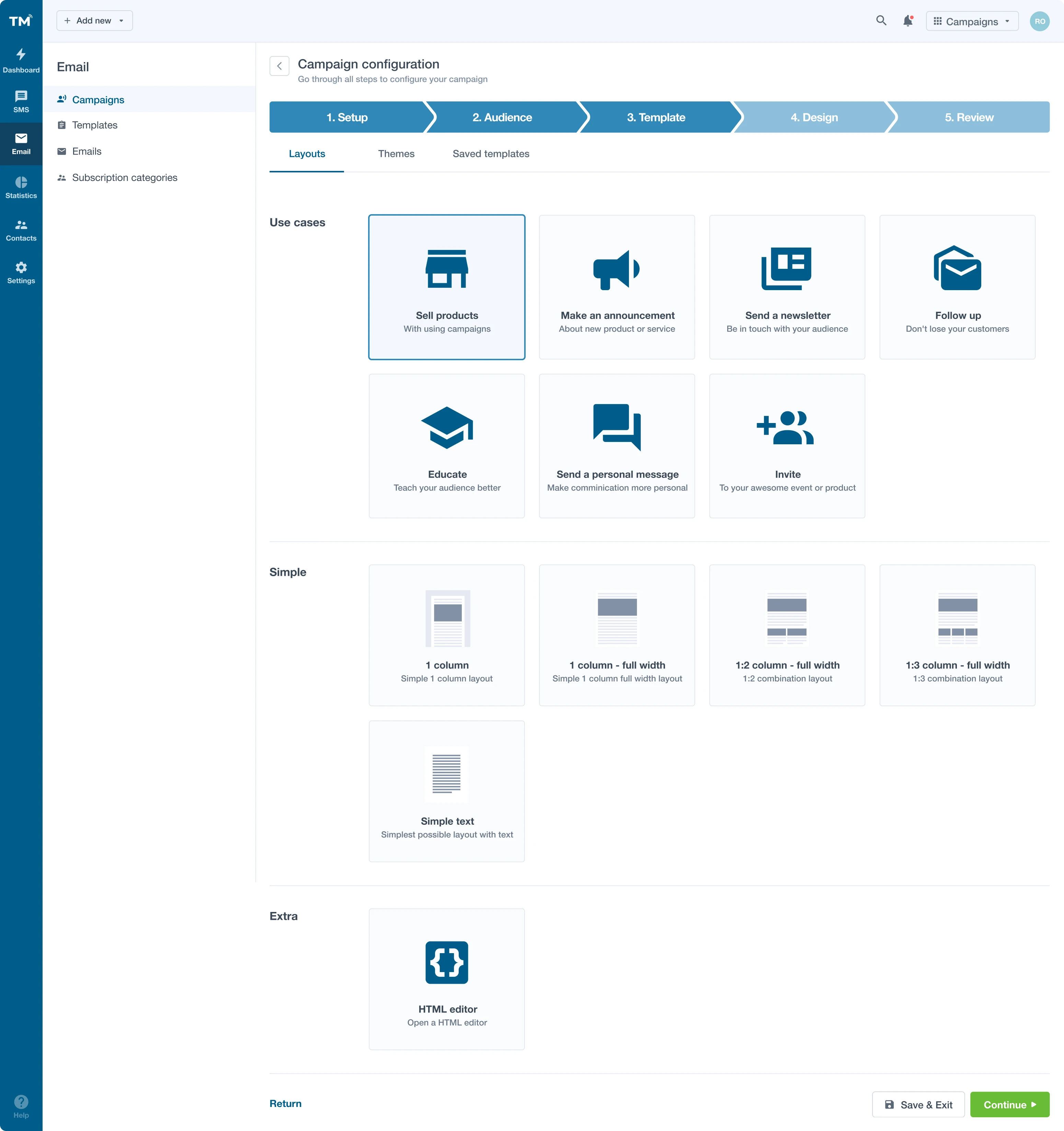
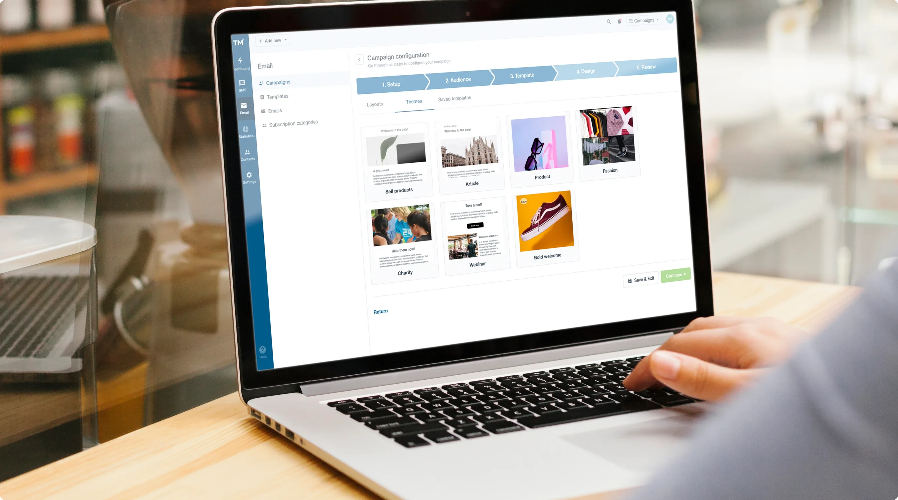
In the Templates users can select the layout for their campaigns from a number of common use cases such as sell products, make an announcement, send a newsletter, and so on.
With ready-made themes that we designed, users can create a great look for their email campaigns.

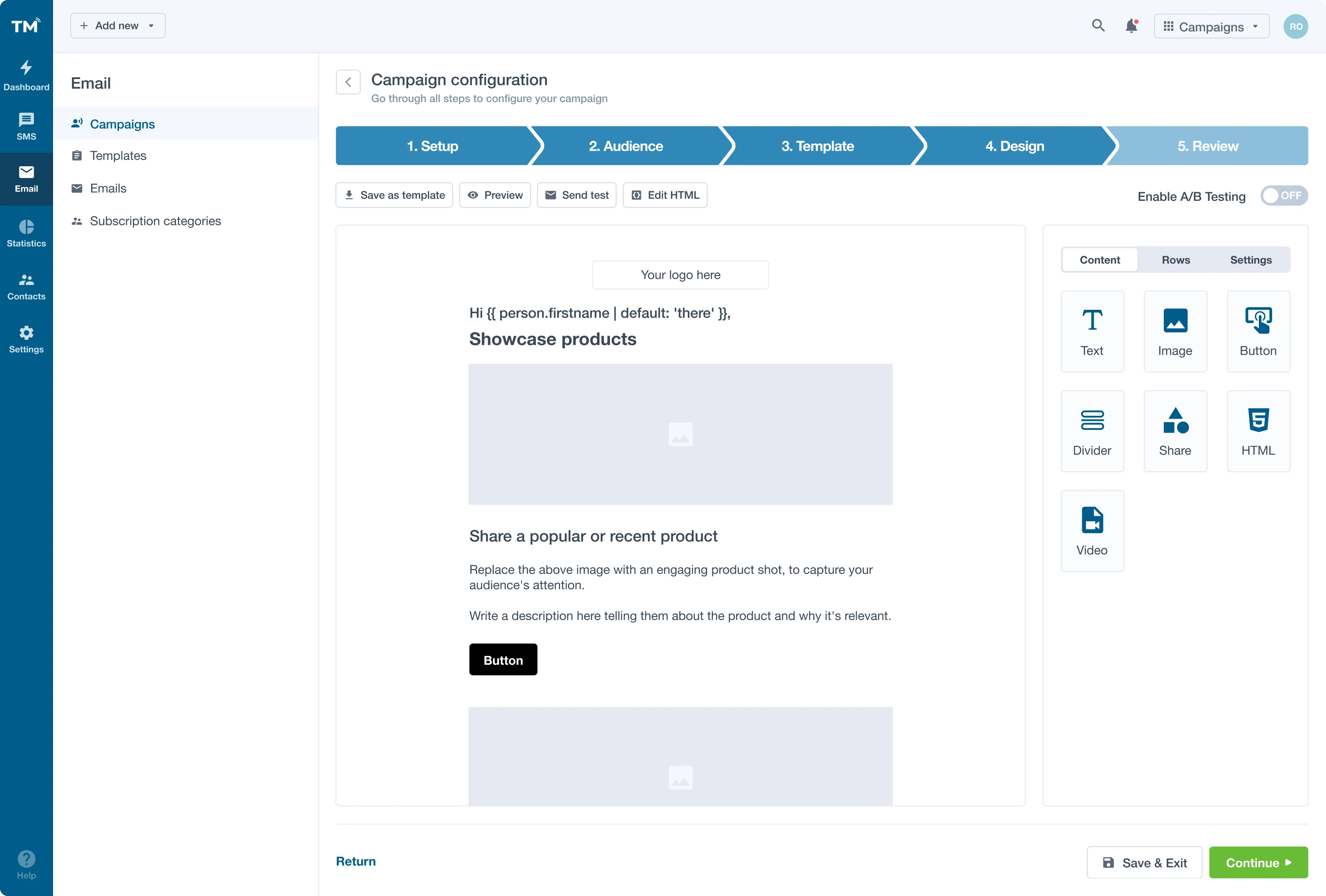
A simple drag-and-drop editor helps users create custom emails. We also added the possibility to edit the HTML so users could customize their emails even more.
SMS Campaigns
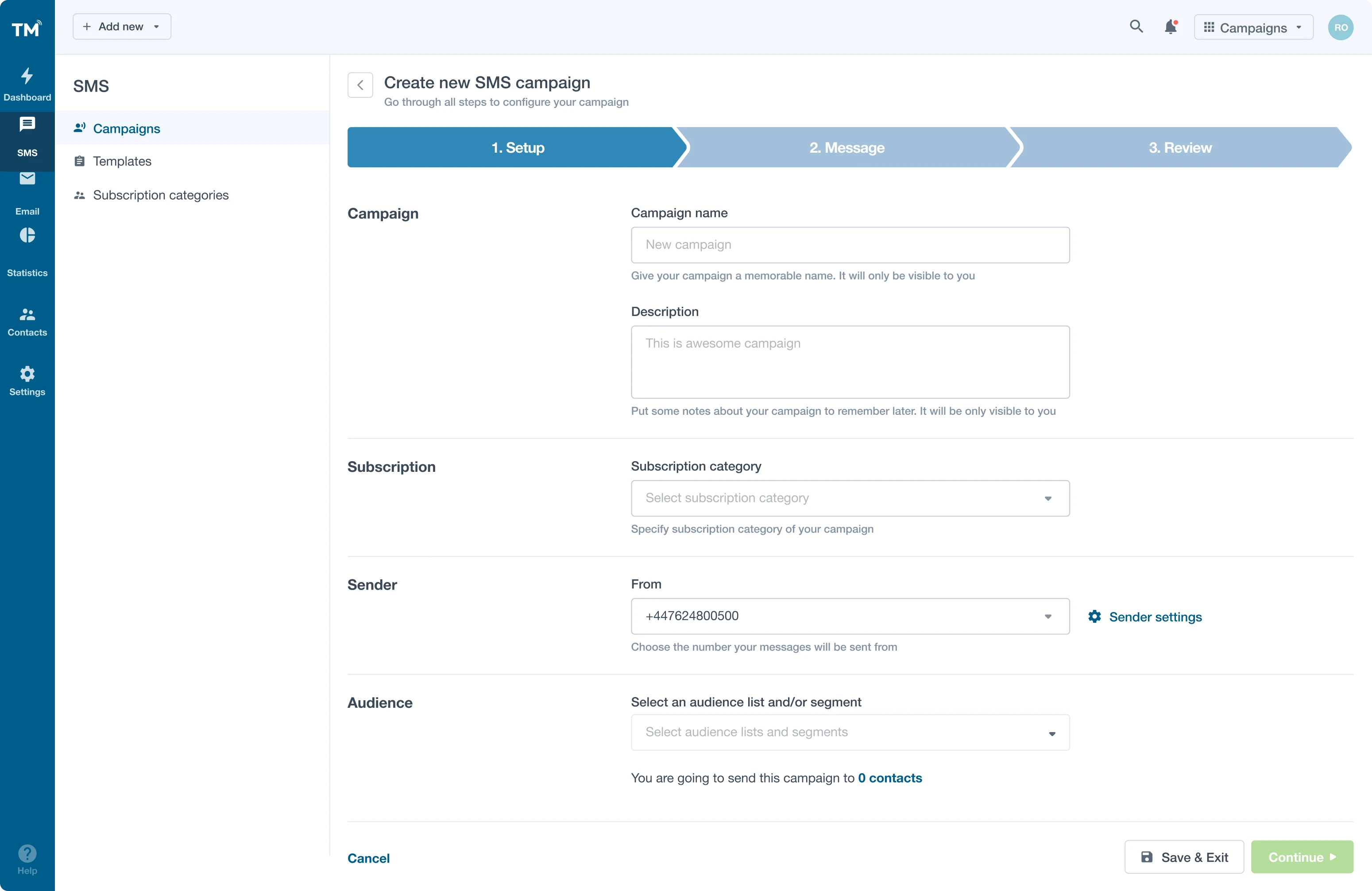
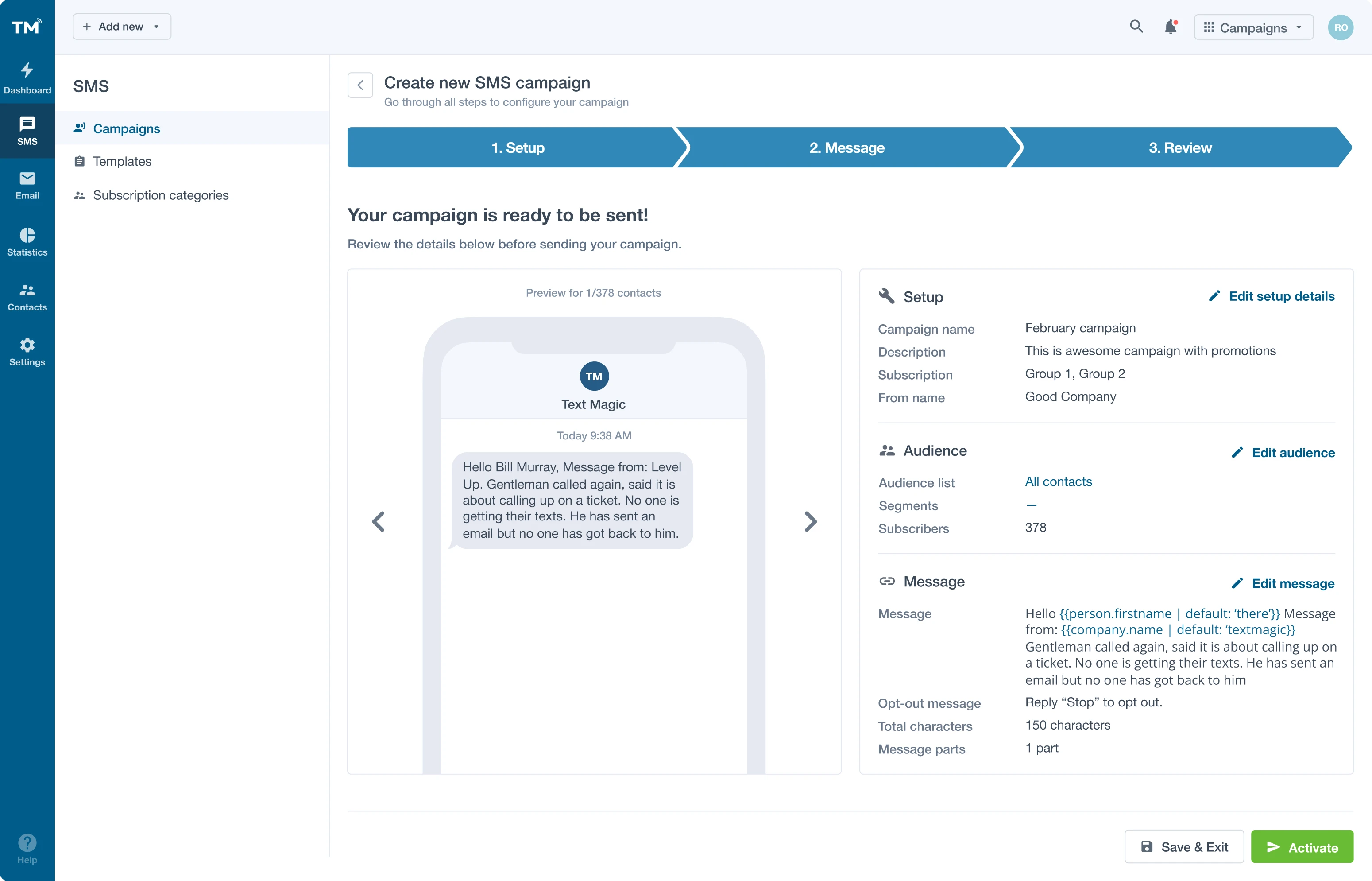
We improved the SMS campaign configuration design making it consistent with the email campaigns.
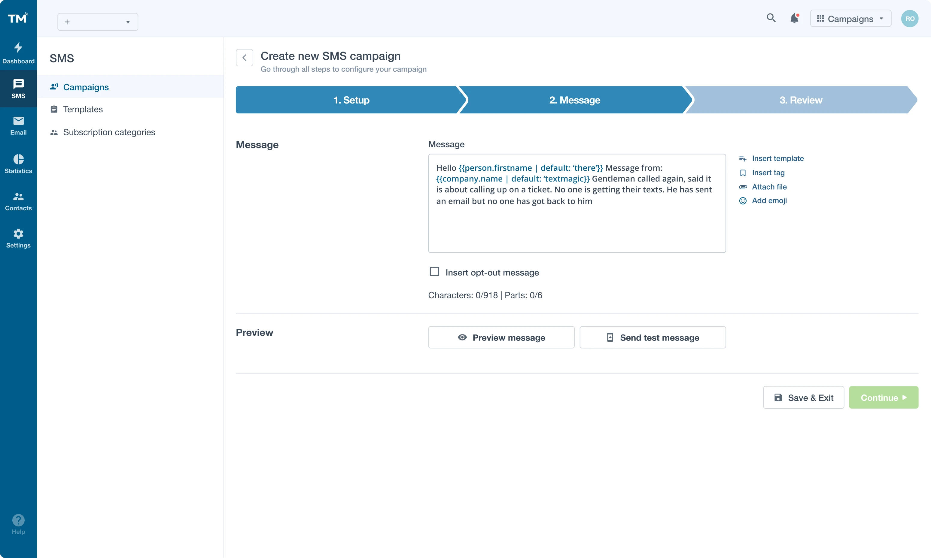
Despite the variety of features such as templates, tags, opt-out messages, file attachments, email previews, we made TextMagic app look simple and minimalistic so the interface doesn't overwhelm the user and helps them get the job done quickly. We created an intuitive three-steps SMS configuration flow similar to how it works with email campaigns. These enhancements are part of what make the TextMagic pricing plans such a good value, powerful features without the need for a steep learning curve.
Drag-and-drop tags help to personalize every message.
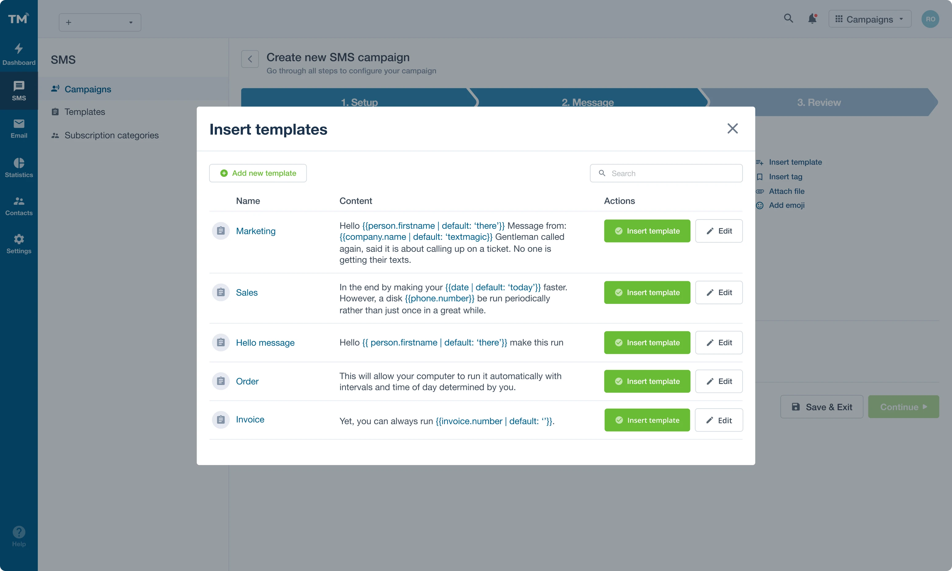
Ready-made templates for various use cases that users create themselves speed up the process of launching SMS campaigns.
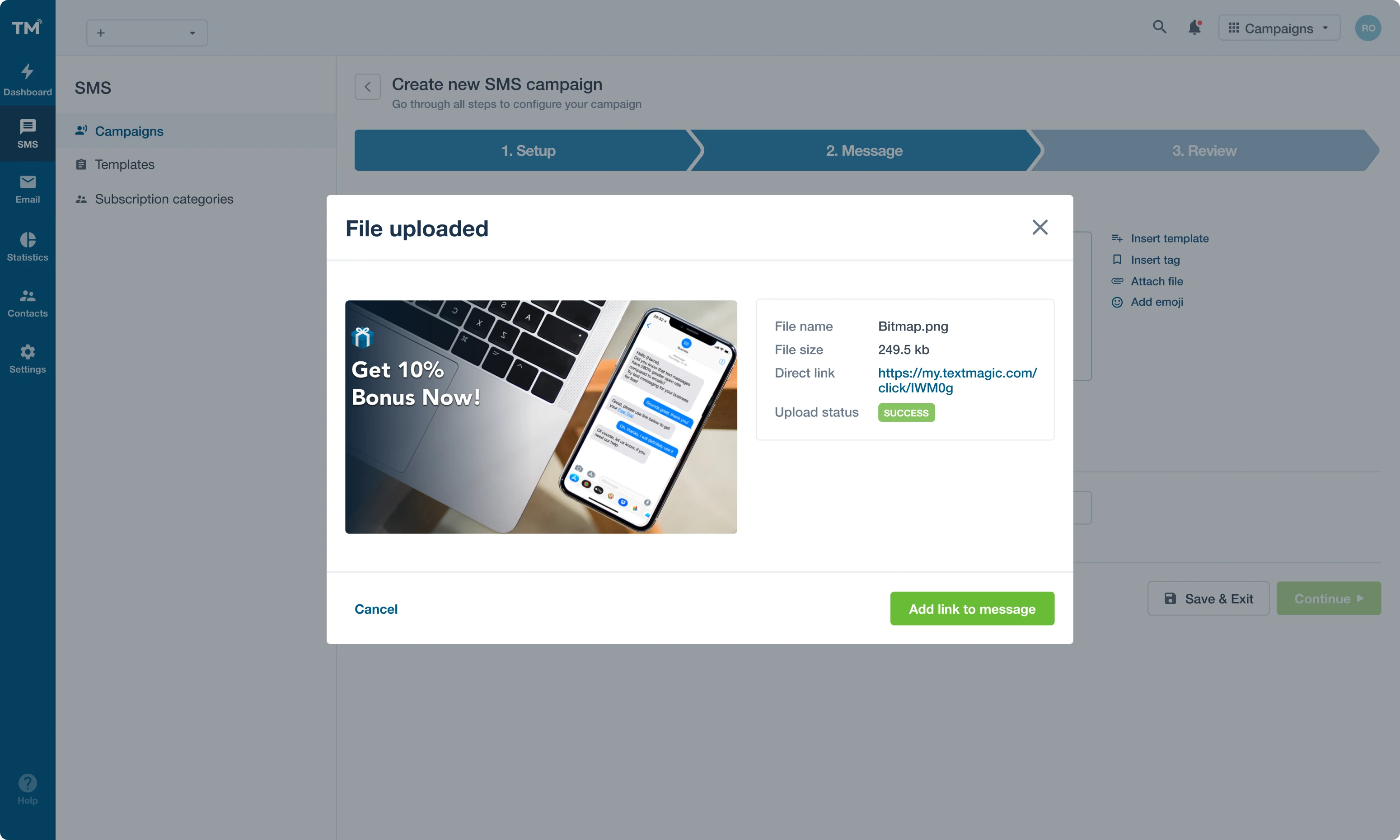
If users want to include a file to their SMS, we made it possible for them to preview how it will look in the message.
As the last step in the SMS configuration, we created a message preview using a smartphone mockup to give a more realistic impression of the soon-to-be-launched campaign.
Admin Dashboard
The Admin dashboard brings together all the platform's features under one user interface. We made it convenient so users could manage payments, agents, customers, products, and notifications with only a few clicks. When evaluating the Text Magic cost, this ease of use paired with robust functionality makes the pricing feel especially justified.
Using design system to make new products consistent with the existing ones
In TextMagic, they already had a well-developed design system. We followed its rules when crafting user interface elements. Putting the design system in practice allowed us to speed up the process, and it turned out to be very productive.
For example, to help users configure email marketing campaigns, we used Wizard, a powerful design pattern that simplifies a complex process. We broke down campaign configuration into five steps with each step showing less information at a time. It allows users to focus better on the content relevant to each step and decrease the chance of errors. We created a wireframe for every step and designed every page using elements from the design system. Once approved with the product owner, we started adding details gradually building up micro-interactions and smaller features.

A team that can adapt to any changes in work volume
The flexibility of the Eleken’s team extension model allows us to change the team size depending on the client’s needs. When talking about TextMagic, in the beginning, there were three designers working on different parts of their product, then two, and during the last three months, when the main work has already been done, it was just one designer responsible for polishing the final result.
Always in touch
We were always in touch with the TextMagic's team to agree on the steps, wireframes, and user flows. We had video calls with the product manager every other day and arranged demos to present the results of our work every one or two weeks. Their feedback was always valuable and we decided upon the next sprint together.
Tools we used
We maintained regular communication via Slack and designed our prototypes in Figma.
User-centered design process
The design process at TextMagic was user-centered. We would design the prototypes, and their team would show them to users, get their feedback during live interviews, and return to us with new ideas and improvements suggestions. They also had a third-party consultant whose feedback was also important in defining the direction for product design.


