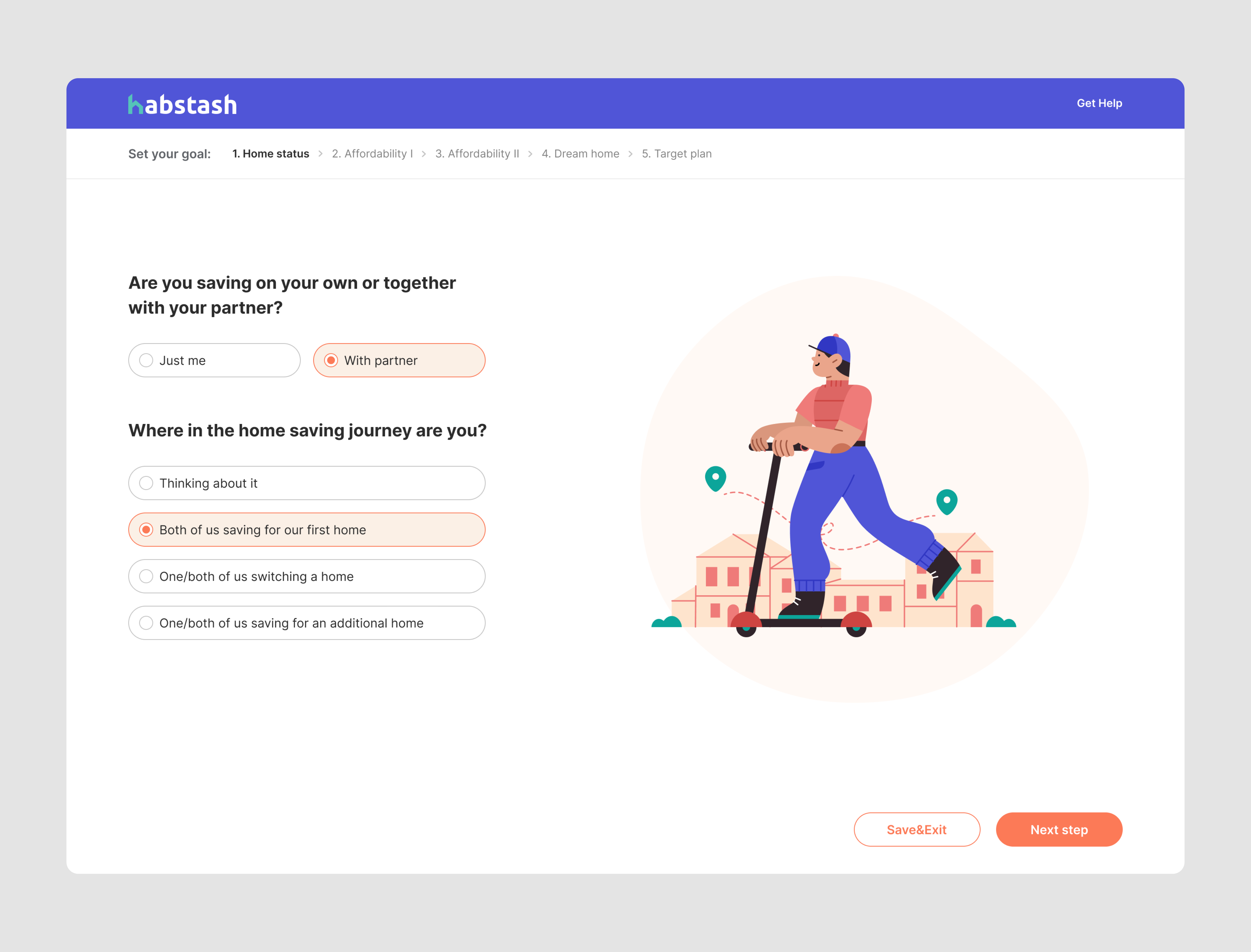
Many designers struggle with identifying and fixing common UX mistakes, leading to apps like Workday, Microsoft Teams, and Facebook being the most criticized apps for poor user experiences.
These UX flaws annoy users and slow them down. They end up making everything more of a hassle than it needs to be, which leaves people pretty annoyed with the product overall.
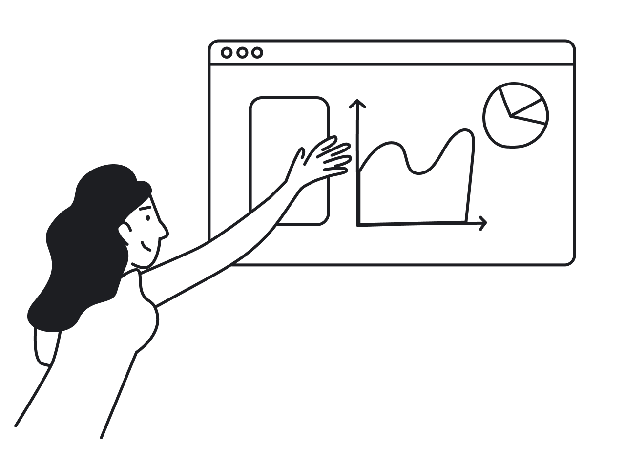
Being a UI/UX design agency with over nine years of experience, we’ve solved all UX mistakes possible. So, we decided to analyze popular user complaints on bad UX examples and provide expert insights on common design fails.
We hope, our suggestions help you avoid these pitfalls and create a seamless experience in your own designs. So, let’s start straight from real-life bad UX examples.
Workday – job application
- Quote: "It’s beyond terrible using it job searching and having to enter an already pdf’d resume in job by job for Every. Single. Application"
- General complaint: complex navigation, lengthy process of handling job applications, the need to create a new account every time you apply for a job.
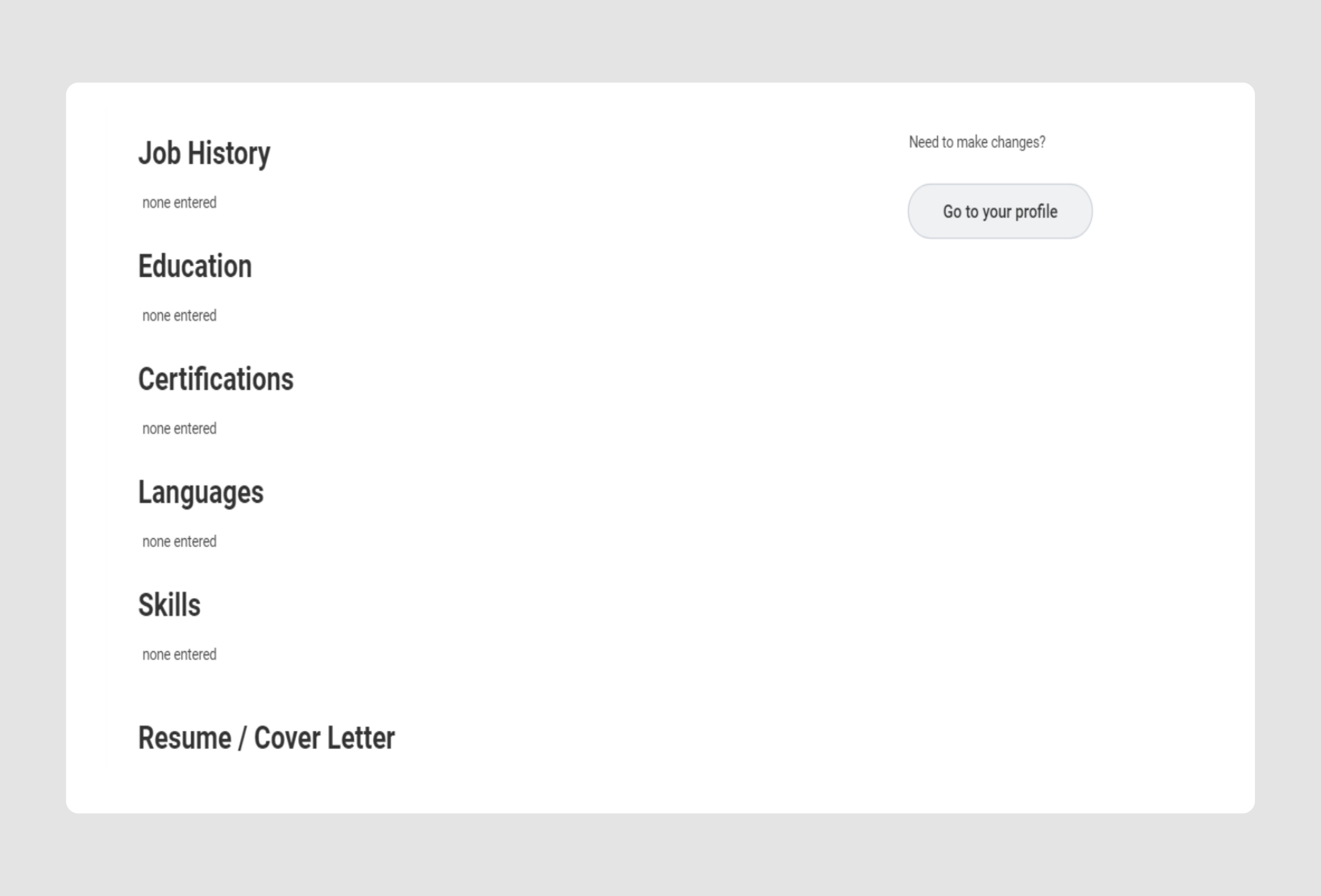
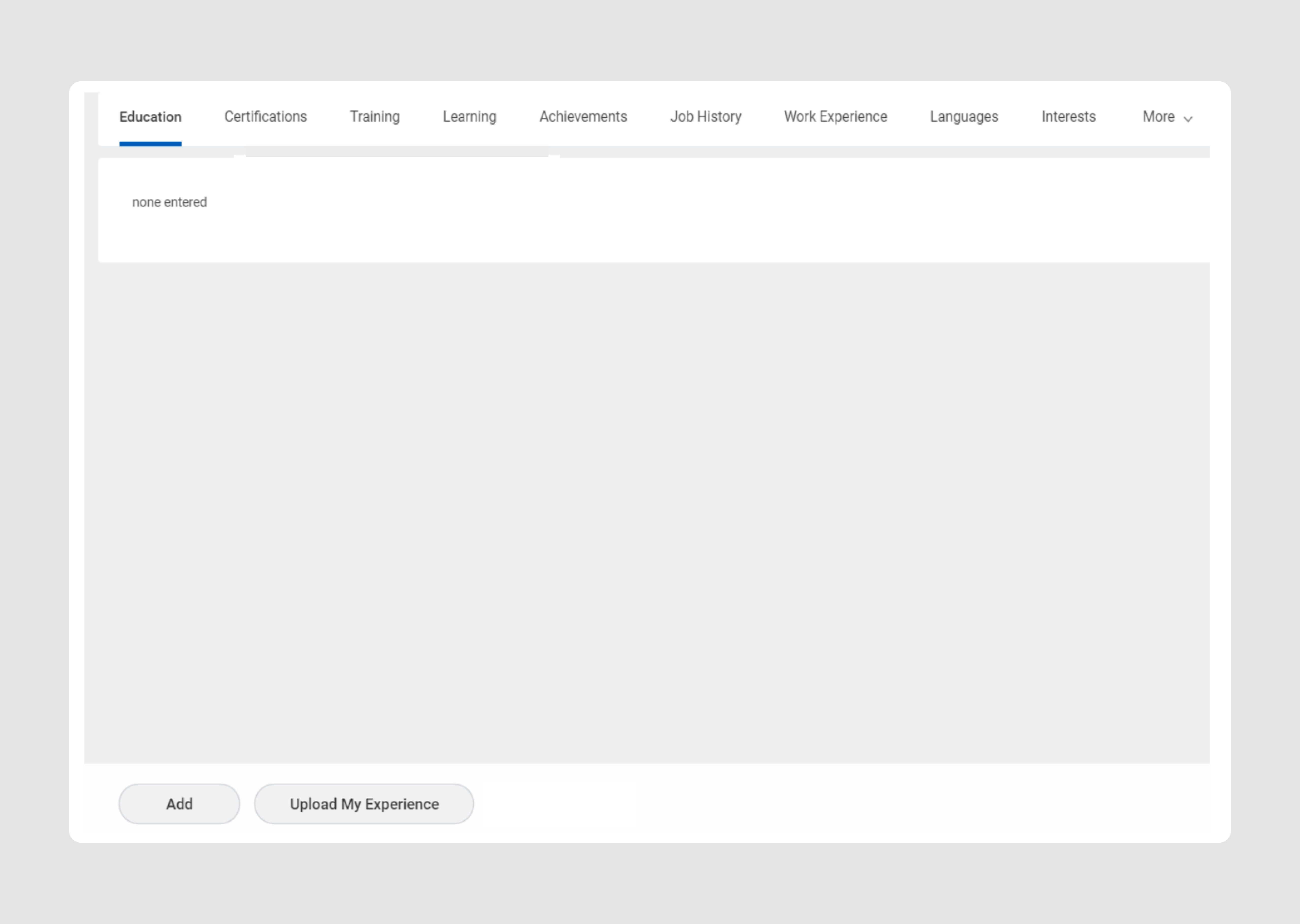
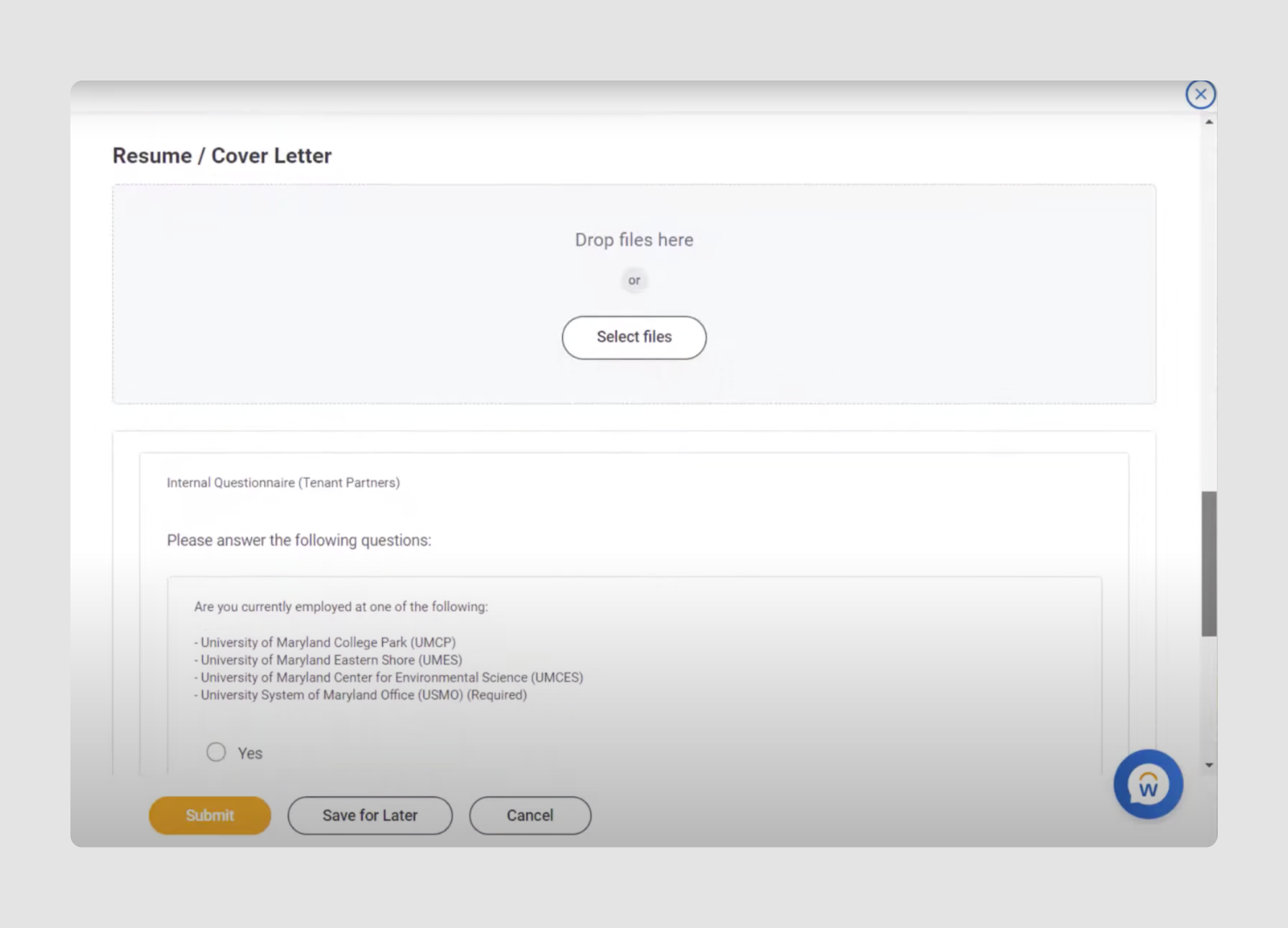
Workday, a platform offering enterprise solutions for finance, HR, and payroll, gets a lot of criticism online. Users complain about its outdated 2010s UI and how it's anything but user-friendly. The biggest UX fail, though? Dealing with job applications through this software.
You start by creating an account with a strong password. Workday then asks you to fill in tons of info - education, experience, interests, and more (see screenshots above). After completing all these account settings, you're prompted to upload your resume, which ironically contains the same information. The kicker? You have to repeat this entire process, including creating a new account, every time you apply to a different organization.
Our suggestion: besides obvious upgrades like modernizing the UI and allowing sign-ups via Google or Facebook, we recommend using a Wizard design pattern. This approach is great for collecting lots of user info by breaking the process into simple, manageable steps.
Check out how we simplified a lengthy sign-up for a financial SaaS app using a Wizard. We even made sure it saves progress at each step so users can pick up right where they left off if they need to pause.
Microsoft Teams – chat rooms
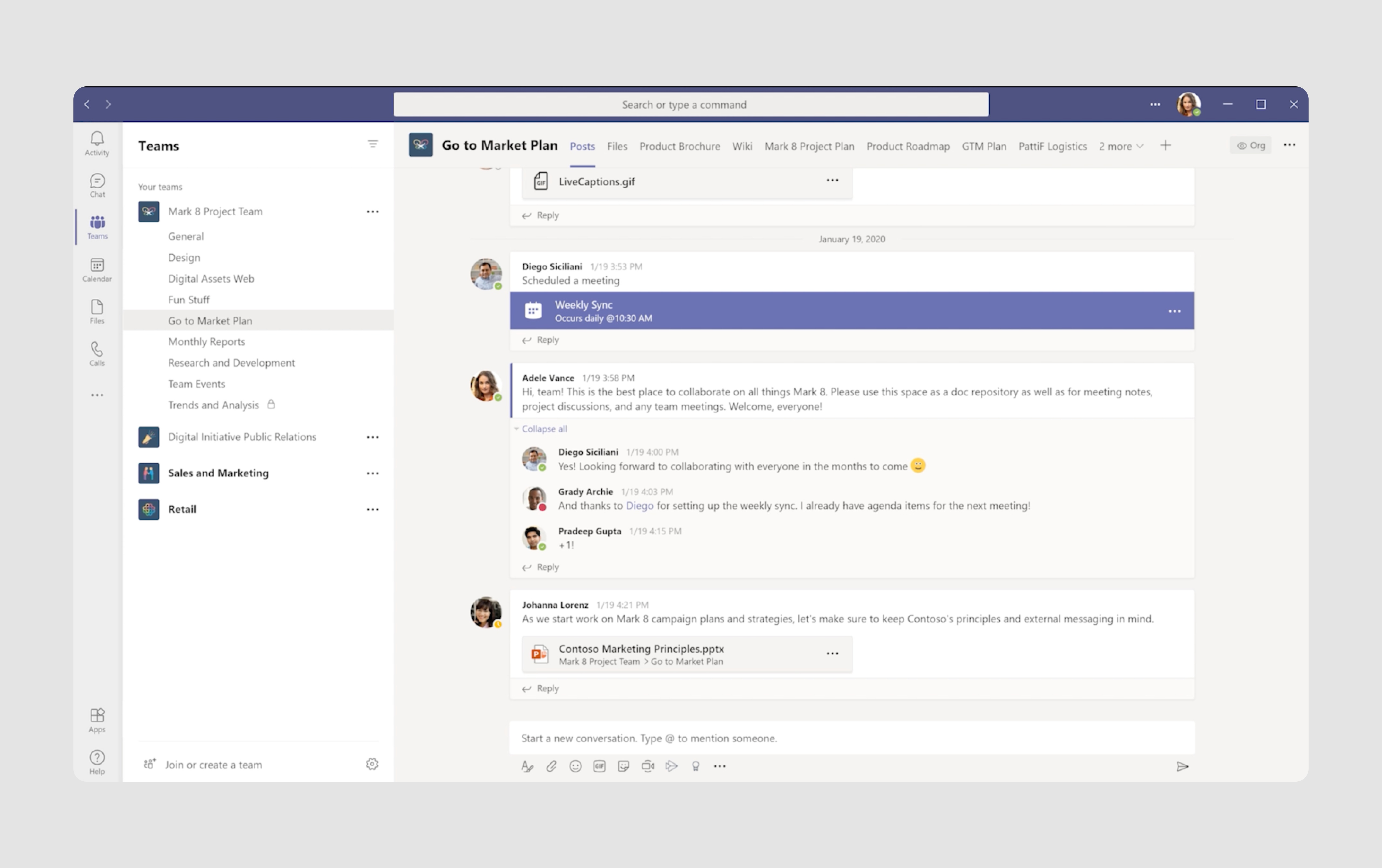
- Quote: "I’ve never seen communication software that simultaneously misses the mark on chat room experiences and discourages communication. It just doesn’t feel welcoming."
- General complaint: Poor chat room user experience, confusing interface, and nomenclature.
This real-time collaboration and communication app is also often cited among bad design examples, particularly in how it handles team interactions. Ironically, it seems to fall short of its main goal. Here are its biggest UX fails:
- The sidebar navigation (see screenshot above) includes both "Teams" and "Chat" options, which is confusing since both are used for chatting. Their distinct purposes aren't clear.
- Within "Teams", there's no clear hierarchy between headers and the channels they contain, making the navigation experience poor.
- Too much information is packed into the sidebars and interface, making it hard for users to focus.
- Users have limited control over customizing their workspace layout or prioritizing the most frequently used sections. For example, they can’t tag or rename the channel names.
Our suggestion: As we divided the main UX problems into bullet points, let’s do the same with suggestions from our design professionals.
- Teams" vs "Chat"? It would be better to rename them or use tooltips to explain the difference. For example, "Group Chat" and "Private Chats" can make better work.
- A clear hierarchy in “Teams” would make the interface more intuitive. Using different font sizes or colors will show what's a main team and what's a sub-channel.
- Providing users with more customization features such as pinning favorite teams or chats, tagging them, or hiding unused sections. Personalization will help users feel more in control of their workspace.
- Simplifying the UI by combining similar features and removing unnecessary elements. It would be nice to focus on commonly used functions and tuck away less important ones into menus or collapsible sections.
Facebook – Ads Manager
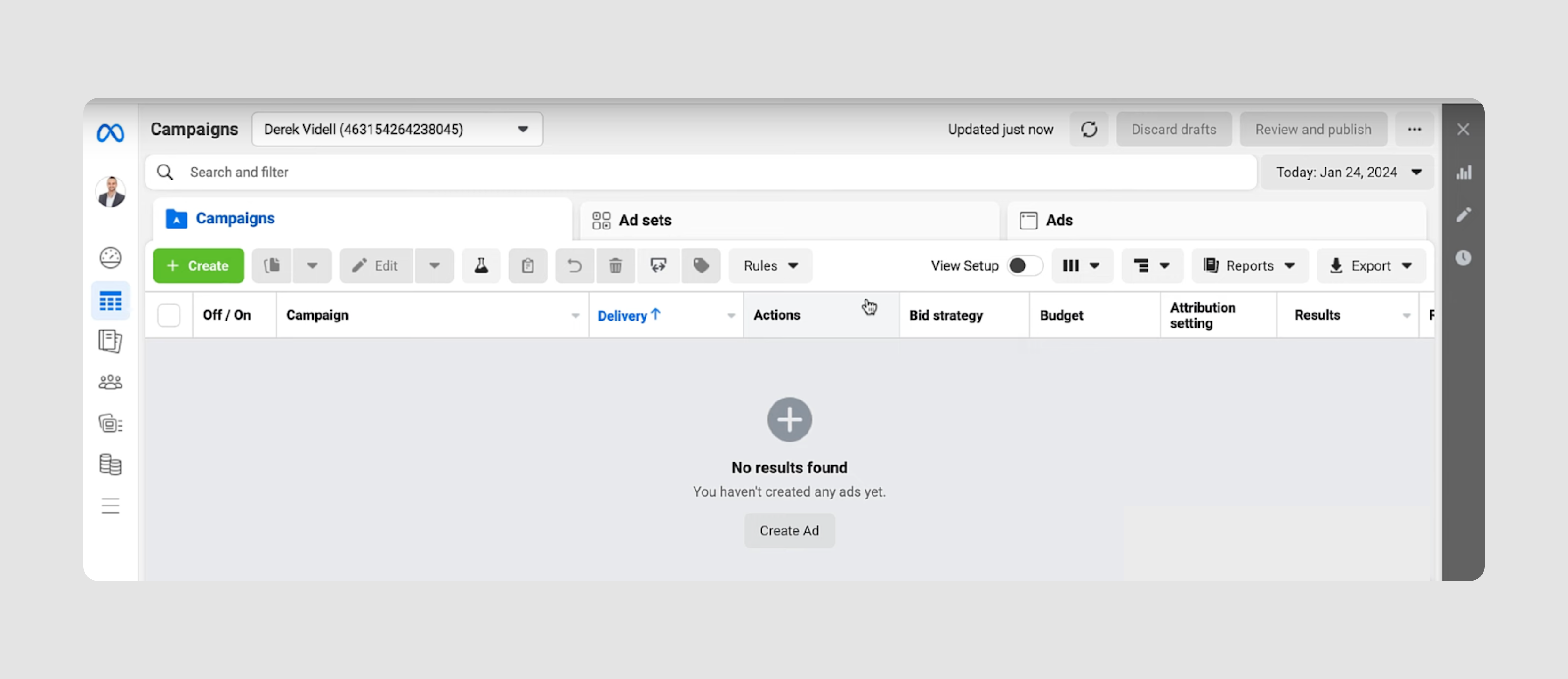
- Quote: "Will my Ad be approved in an hour, a day or a week? Who knows? Is there anyone I can talk to or even email or text? Of course not."
- General complaint: heavy and unintuitive interface.
Facebook is an obvious mention here. The platform is known for being cluttered with too many options and features, and its Ads Manager is no exception. New users often struggle to understand where to start, while experienced users find it difficult to navigate through the layers of options to find the tools they need.
Just take a look at the top menu bar in the Ads Manager screenshot. It’s so overloaded, plus the terms such as “Campaign”, “Ad Set”, and “Ad” are confusing, especially for beginners. While they are foundational to Facebook Ads, the way they’re presented isn’t intuitive for users without prior experience in advertising.
The reporting section is powerful, but its complexity makes it hard for users to easily extract and understand insights. Non-expert users find the data presentation overwhelming, with too many metrics and a lack of clarity on which ones matter most, which seriously damages the brand’s reputation.
Our suggestion: Create a cleaner, task-based layout focusing on common tools and provide inline explanations or tooltips for better understanding of certain features. They could also try to introduce pre-configured reports for different user types, like beginners and advanced users where they could emphasize important metrics with visual aids like color-coded indicators.
For more details on how to tailor design to specific user needs, check out our article on personalization vs customization.
HBO Max – accessibility issue


- Quote: "How about the fact you can’t see what thing you’re currently highlighting because the contrast and color palette is an accessibility nightmare, for everyone!"
- General complaint: poor accessibility.
Imagine a colorblind person looking at the second screenshot we put here. Do you think they would understand what menu tab is currently chosen? No, and it means we got to bad accessibility examples.
Though there were some other complaints on HBO’s streaming service, we decided to talk about accessibility in UX. The design lacks proper visual cues, making it hard for users to know what’s currently selected. The low contrast and poor color palette present accessibility challenges for all users, not just those with visual impairments.
Our suggestion: revise the color palette and improve contrast ratios to ensure that highlighted elements are easily distinguishable.
Outlook – features overload
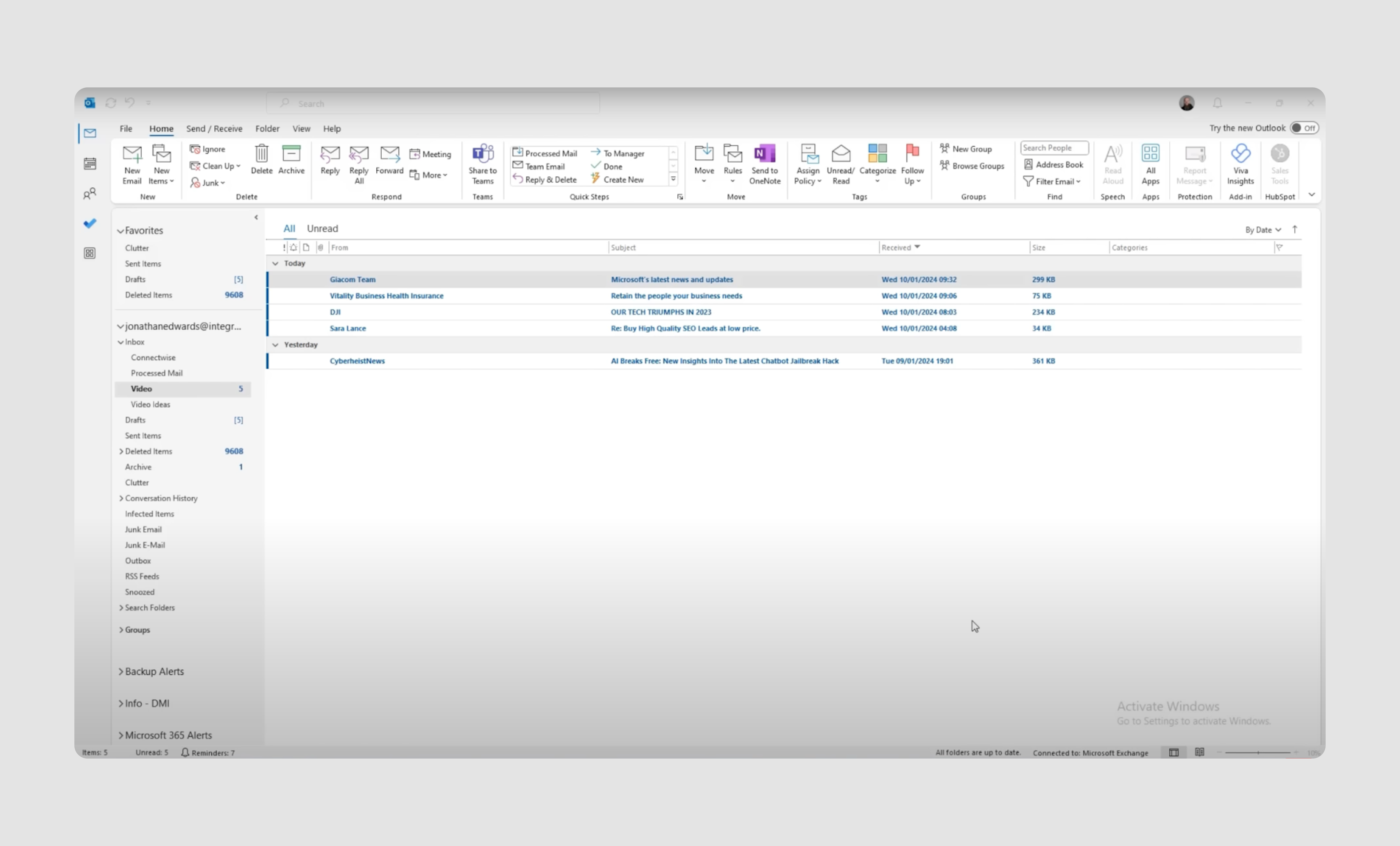
- Quote: "I can't find anything and everything looks the same."
- General complaint: Cluttered interface and difficult to navigate.
The Outlook email app screenshot speaks volumes in terms of negative user experience. It tries to pack too many features onto the screen at once, overwhelming users, especially those new to the platform. The mix of emails, calendars, tasks, and contacts is not always intuitive, making navigation more complicated than necessary.
The navigation between different sections (e.g., Inbox, Calendar, Contacts) doesn’t deliver a smooth user experience. Some actions are hidden behind menus or icons that aren't immediately clear. The top-level tabs aren't consistent in their behavior across sections.
Our suggestion: In short, this design needs simplification. Reducing unnecessary elements and focusing on core user needs is key. A more minimalist approach that organizes essential features without overwhelming users could significantly reduce the cognitive load when using Outlook.
Salesforce – outdated look and lack of consistency
- Quote: "Have you ever used it? It's just so unintuitive, its a mish mash of acquired functionality."
- General complaint: overcomplicated features and frustrating user experience.
The UI and UX of this CRM platform look and feel like they are still in the 90s. Though Salesforce is a powerful tool, its complexity fails to align with modern user expectations, particularly for new ones. The interface is cluttered with an abundance of features, buttons, and fields, making it difficult to navigate and use effectively without extensive training.
Besides, the UI is often inconsistent across different modules, which can confuse users. For example, switching between Sales Cloud, Service Cloud, and other tools requires learning slightly different interfaces and workflows.
Our solution: designing complex data products is not an easy task, and of course, we can’t simplify everything; sometimes, design doesn’t have to be simple. However, streamlining the interface by reducing the number of visible features on the main screens and standardizing the user interface across different modules ((Sales Cloud, Service Cloud, etc.) would make the lives of Salesforce users much easier.
Amazon – product detail page
.gif)
- Quote: "Amazon is pretty horrible UI. The product detail page is a mess and they force you to infinite scroll through a bunch of crap just to get to the content you want."
- General сomplaint: Poor UI design across various products.
Amazon's app and website design feel stuck in the early 2000s. The product detail page is a major point of user frustration. It's crammed with too much content, including promotions, related products, and ads. Critical information like reviews or product specifications gets buried, and the infinite scrolling makes it difficult to locate important details efficiently.
While search is the main navigation tool, it often yields irrelevant results. Poor filtering options make it hard to find specific products without knowing exact names.
Our suggestion: to make the interface cleaner and easier to navigate, Amazon could reorganize product pages to prioritize key info like title, price, description, reviews, and specs. Use collapsible sections for detailed information. Finally, place a navigation menu with main product sections at the top of the screen, instead of revealing it only on scroll.
Gmail – mobile experience

- Quote: "Both the web and app versions feel old and lack a lot of the ease of use functionality that I want."
- General complaint: Limited drag-and-select functionality.
In general, it feels like since Gmail dominates the email market, there's little incentive for it to innovate or improve its mobile app interface and functionality. While the platform is functional, the interface remains cluttered, with little visual separation between content, making it hard to navigate.
But let's talk about a specific issue here: mobile users can't easily drag to select multiple emails for batch actions, which is a basic function. As you can see from the GIF, you have to manually select each email one by one.
Our suggestion: Add a drag-and-select feature for easier bulk actions.
Discord – navigation
- Quote: "Its main issue is that they both use non-standardized symbols for everything and also have a ton of different menus spaced all over the interface. It's not any better in mobile vs desktop IMO."
- General complaint: overwhelming and cumbersome.
Discord's interface suffers from illogical feature placement. For instance, the direct messages tab includes unrelated Nitro and Shop icons, which are profile-specific. The search bar in this section serves for global Discord searches, not just DMs. Additionally, the main navigation bar gives equal visual prominence to infrequently used options like "Add a Server" and "Discover Server" alongside more essential features. This inconsistent organization can confuse users and hinder efficient navigation.
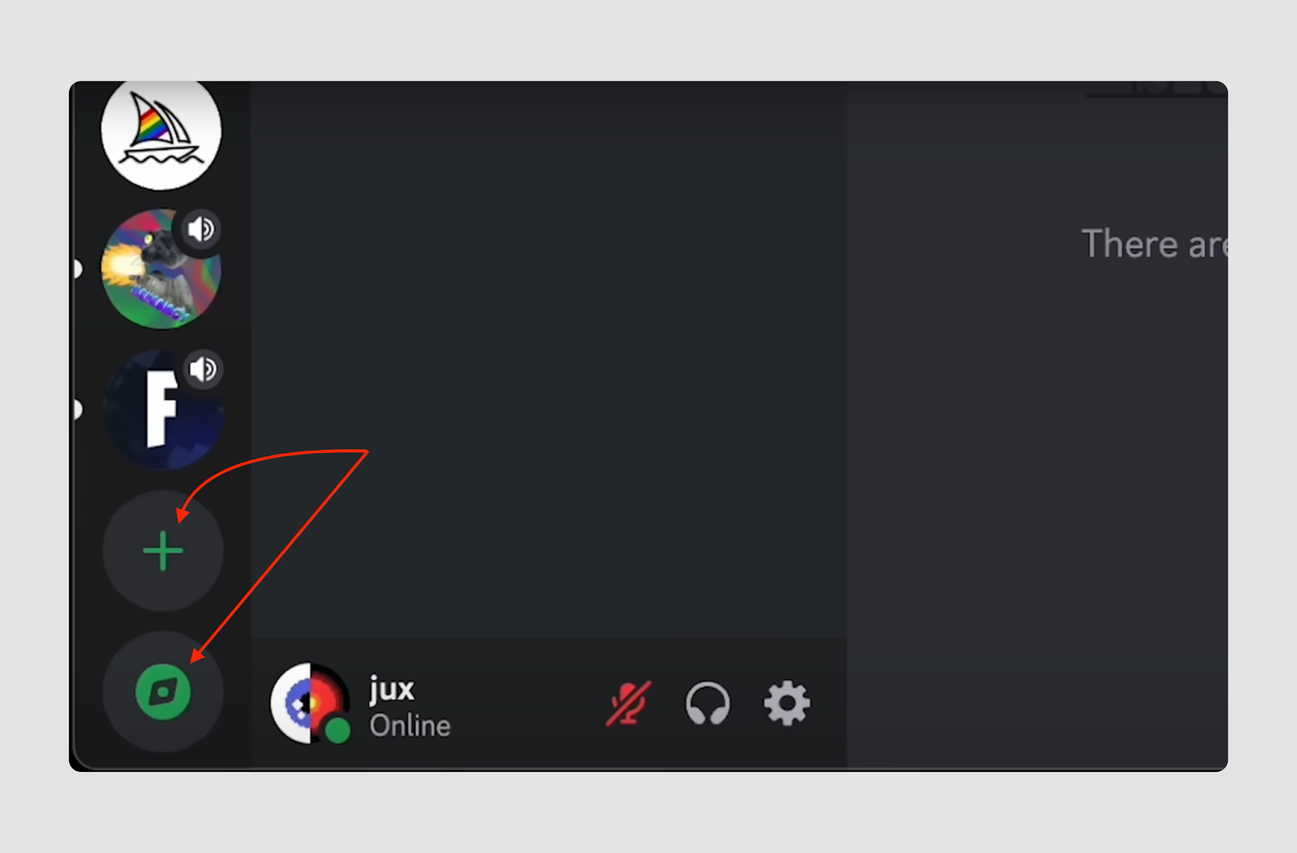
Our suggestion: Move Nitro and Shop features to your account preferences and the global search bar to the main menu bar instead of the DM section. Finally, Discord can create one button for different actions users can do with the server and hide the Add and Discover features there.
Jira – excessive amount of features

- Quote: “The features are good but the UI is cluttered and unintuitive. I hate using it"
- General complaint: overly complex and cluttered interface.
A lot of users on the Internet report that Jira’s interface is cluttered with too many features, making it difficult to find the information they need. Just take a look at the screenshot and try to count the number of menus they’ve got on one screen, and we don’t even take into account other elements. This overwhelms users, particularly those who don’t need all the functionalities in day-to-day operations.
Our suggestion: streamline the bad UI by reducing clutter and focusing on core functionality. Remove or hide secondary features by default and allow users to toggle advanced tools on or off based on their specific needs. Introducing a minimalist mode with only essential project management tools would significantly reduce cognitive overload for users.
Government portals – common issues
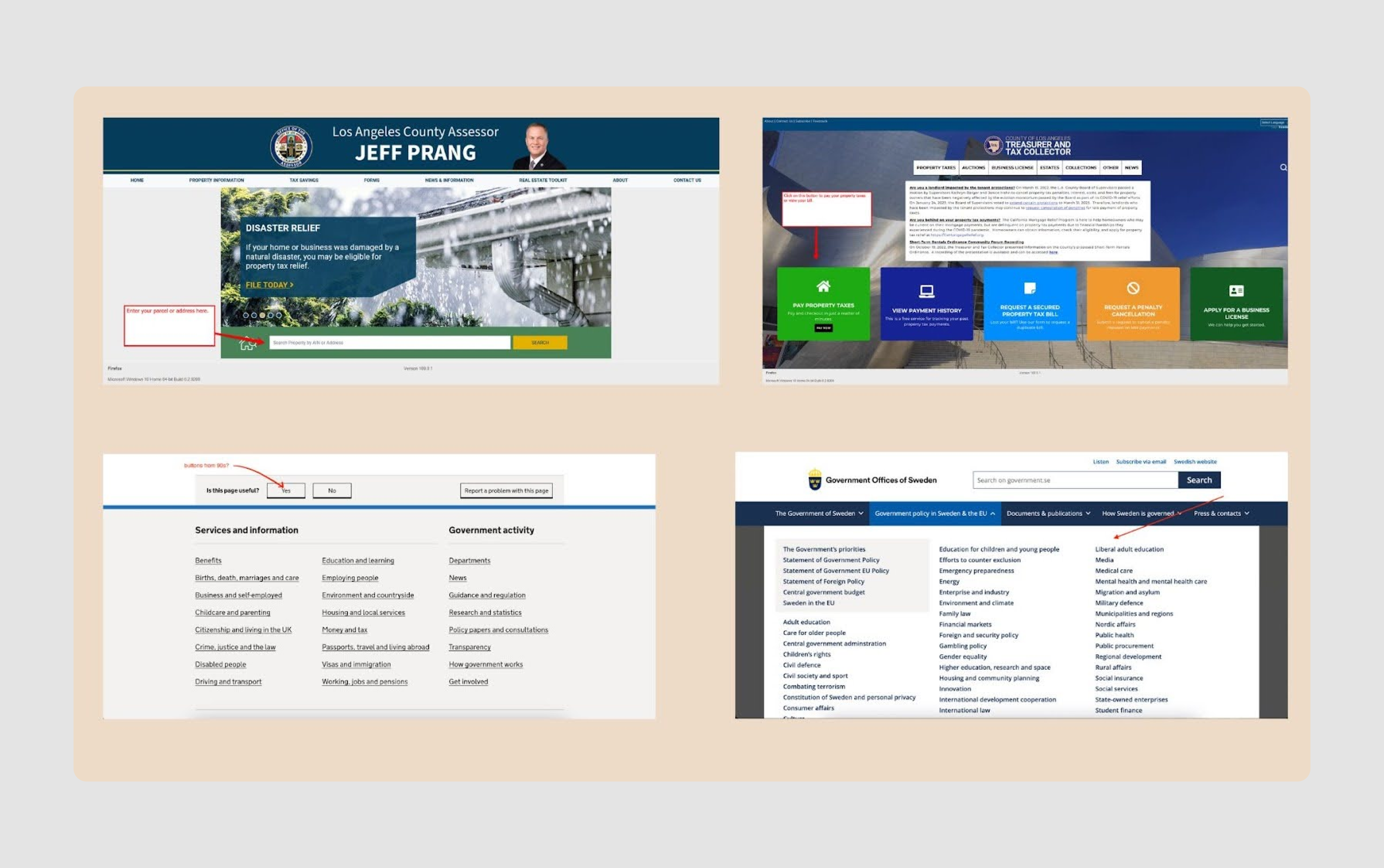
- Quote: "It's got that 90's 3d-button design look and gaudy primary colors, endless user agreements that must be scrolled all the way before going to the next steps, warnings all over even when you use the product correctly."
- General complaint: Outdated design and poor usability.
Whether it's a US tax payment site or a Swedish vehicle registration system, these portals often share similar UX design fails. Here are the main problems users frequently encounter:
- Many governmental portals look like they haven’t been updated in decades, with clunky, 90s-era design elements like 3D buttons and gaudy primary colors.
- Forms on government websites often feature confusing or overly complicated language, such as ambiguous profession choices or asking for unclear codes (e.g., E-892343).
- Many users experience issues with form submission errors, tiny input fields, and input validation, or broken workflows (e.g., transit visa issues due to incorrect character limits). Because of these issues, people may abandon forms or start over, increasing the user's time spent on relatively simple tasks.
- Government websites often rely on outdated or broken customer support systems. Live chat bots have limited understanding of the subject matter, and queues are unclear, leaving users uncertain if they will ever get help.
- Many government websites are not mobile-friendly, making them difficult to use on smartphones or tablets. The forms and content often require zooming and excessive scrolling, which further frustrates users on smaller devices.
Our suggestion: obviously, bad UX design examples like these require a lot of changes, so basically, our expert recommendation would be first to learn basic design principles like hierarchy, contrast, and balance, and secondly, run a UX audit with professional designers to identify all the issues properly.
Zoom – bad menu design
- Quote: "Why does it take me 5 mins to figure out where the link to invite another person in mid-meeting is every time?"
- General complaint: hidden menu features and shortcut struggle.
Zoom is often found among great UX design examples; however, user feedback on the internet shows that some aspects require improvement.
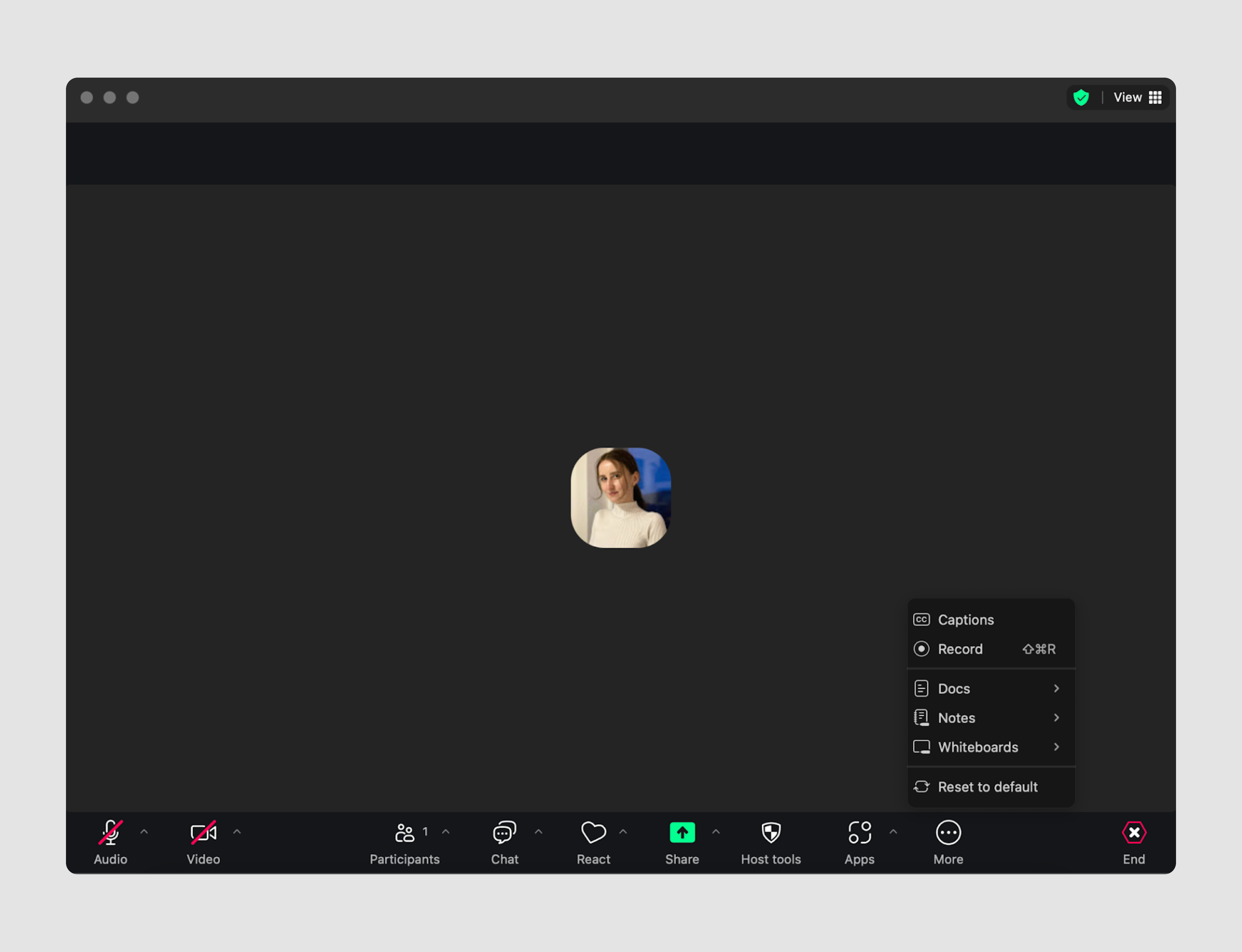
- Many users struggle to find basic mid-meeting options, such as inviting participants or starting the record, which is buried among too many controls. At the same time, we’ve got React, Apps, and Host tools options right on the screen. Most users don’t need it during meetings.
- Popups and “helpful hints” frequently overlay key areas like the chat window, requiring users to dismiss them manually, which disrupts the meeting experience.
- Do you know the shortcut for such an important feature for online meetings as mute/unmute? Its ⌘-Shift-A. Definitely unintuitive and difficult to remember.
Our suggestion: Reorganize buttons and options on the main conference screen to keep it short. For more information, you can read our Whoosh case study, in which Eleken designers were actually working on creating a better Zoom version.
Common UX mistakes and how to avoid them
As we can see, when it comes to good UX, even well-established companies fall victim to common design errors that frustrate users and hinder overall product success. Let's summarise some of the most common pitfalls and how to prevent them:
- Overcomplicating user flows
Long-winded, complex processes — like Workday’s job application flow— create unnecessary friction. To fix this, break tasks into smaller steps using a Wizard pattern, ensuring users can save progress and pick up where they left off. - Confusing navigation and layout
Poorly structured interfaces, such as Microsoft Teams' confusing "Teams" vs "Chat" layout, leave users lost. Put clarity first and simplify navigation, use clear labels, and create distinct hierarchies with visual cues like different font sizes or colors. - Cluttered and overloaded interfaces
Platforms like Facebook Ads Manager overwhelm users with too many features and options. Avoid this by focusing on the most essential tools, decluttering the screen, grouping related objects together and using visual aids to highlight key elements. - Ignoring accessibility
Failing to consider accessibility, as seen in HBO Max’s low-contrast design, alienates users with visual impairments and not only. Improve accessibility by enhancing contrast ratios, ensuring clear visual indicators, and adhering to accessibility standards. - Lack of consistency
Inconsistent UI across different sections, like Salesforce's varied modules, disrupts user workflows. Strive for a consistent visual design language across all areas of the platform to create a seamless user experience. - Hidden or hard-to-find features
Apps like Zoom bury essential mid-meeting options behind too many controls, making it hard for users to access key features. Simplify feature placement and prioritize visibility for commonly used tools to reduce frustration and improve overall user flow.
For more UX mistakes to avoid in your SaaS design, check out our video.
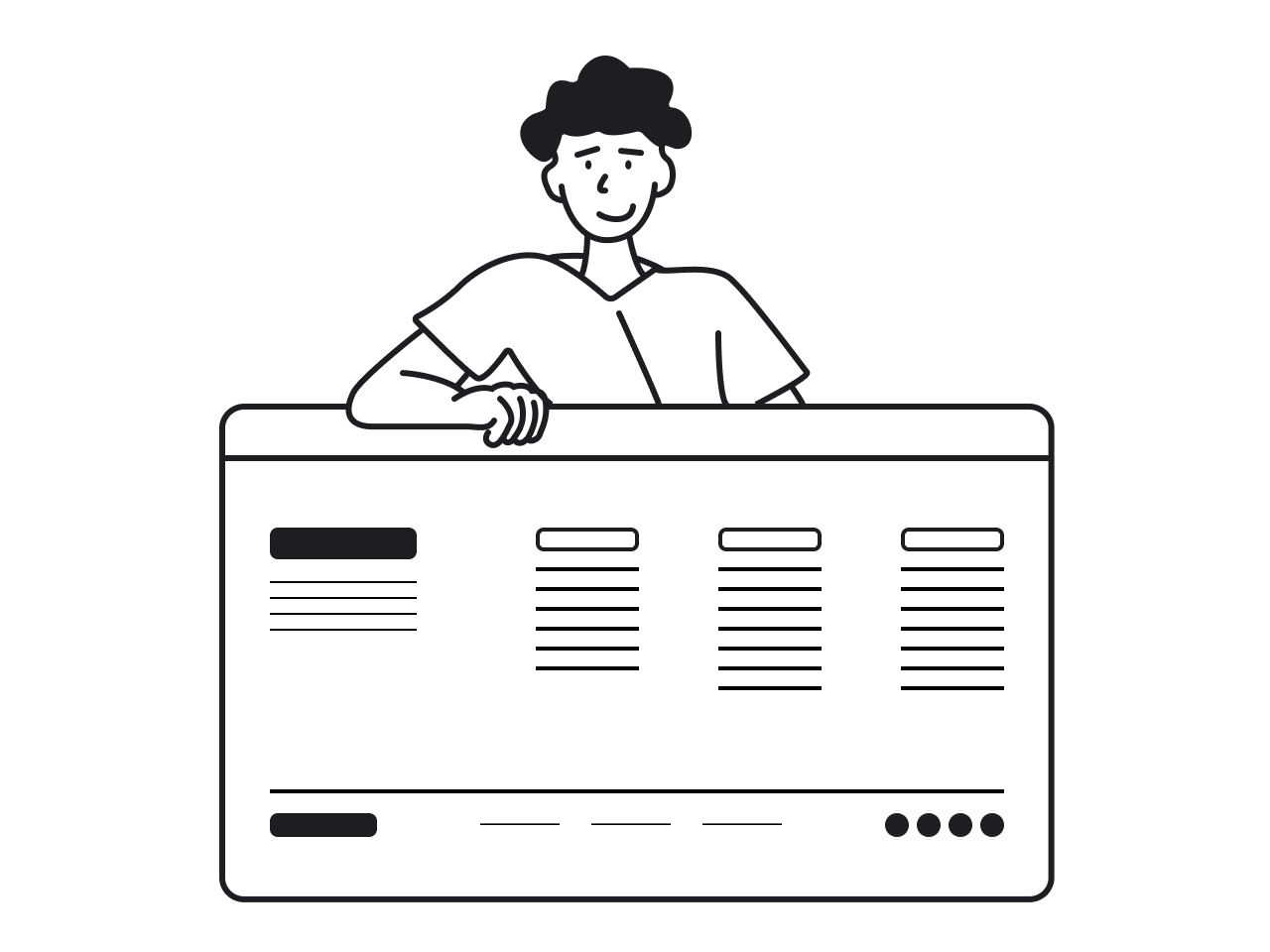
While our analysis provides a general overview of common UX issues, each app has its unique challenges. Improving user experience requires a tailored approach and in-depth examination. So, if you feel like you need professional help in identifying existing or preventing possible UX mistakes, Eleken can become your reliable design partner. Let's talk – schedule a call with us today.


