In design, creating intuitive and user-friendly interfaces based on established design principles is a must. To achieve this, we need to understand how users perceive and process visual information – the psychology in design. Enter Gestalt principles, a set of psychological laws that explain how people naturally organize visual elements. Developed by German psychologists in the early 20th century, the term 'Gestalt' comes from the German word meaning 'shape' or 'form'. Gestalt psychologists laid the foundation for understanding how people perceive visual information as unified wholes rather than just individual parts. These principles have been widely adopted in UI/UX design to improve clarity, create hierarchy, and provide users with seamless experiences.
In this article, Eleken’s UI/UX designer Nazar Neshcheret breaks down key principles of these laws and walks you through applying them in your day-to-day practice.
What Are the Gestalt Principles in Visual Perception?

There are various psychology laws in design. Gestalt psychology, founded in the early 20th century, revolves around the idea that “the whole is greater than the sum of its parts.” Our brains, influenced by human perception, naturally organize and interpret visual information in a way that allows us to perceive meaningful patterns. Several key principles explain how this process works:

Emergence states that we identify the whole before recognizing its individual parts. For example, when we see a dotted outline of an object, we immediately recognize the entire shape before noticing the individual dots. What may appear to be just a collection of separate elements is often perceived as a unified whole.

Reification: our minds tend to “fill in the gaps” in incomplete visual information, a process known as reification. For instance, when presented with a fragmented or incomplete shape, our brains automatically complete the image, allowing us to perceive the entire shape even when only fragments are present.

Multi-Stability: the mind seeks to avoid uncertainty, so when presented with ambiguous visual data, it will toggle between multiple stable interpretations. A classic example is the image of a vase that can also be perceived as two faces in profile.
These foundational concepts are crucial to understanding how users interpret designs at a glance through the principles of visual perception and pave the way for the more specific Gestalt laws, each of which plays a role in how we perceive visual structures. What are those? This understanding of mental processing is a fundamental part of psychology in UX, as it helps designers predict how users will react to visual stimuli.
- Law of Prägnanz states that we perceive ambiguous or complex images as the simplest, most organized forms possible.
- Principle of Closure: our minds fill in missing information to complete shapes or forms.
- Law of Symmetry: we perceive symmetrical elements as part of a cohesive group.
- Law of Proximity: elements that are close to each other are perceived as related.
- Law of Similarity: items that are visually similar are grouped together.
- Law of Contrast: differences between elements help distinguish their significance.
- Law of Continuity suggests our minds tend to perceive unbroken lines or patterns – even if they are in fact interrupted.
Mastering these visual rules is essential for anyone following UX psychology laws, as they provide a scientific basis for creating interfaces that feel intuitive and easy to navigate.
Each of these aspects of Gestalt theory is essential for creating designs that feel natural and easy to navigate. So, let’s talk about each of these in more detail.
Law of Prägnanz

The Law of Prägnanz (the German word meaning "good figure" or "conciseness," also known as the "good figure" principle), also known as the Law of Simplicity, is a fundamental principle in Gestalt psychology. It suggests that when presented with complex or ambiguous stimuli, our brains tend to interpret and reduce them to their simplest, most stable forms.
For example, when looking at an intricate arrangement of shapes, the human mind will attempt to see a recognizable pattern rather than focus on the complexity of individual elements. This is why, when viewing the Olympic logo, human beings perceive the overlapping circles as simple, recognizable shapes, illustrating how the law of prägnanz guides us to see order and symmetry in visual information. This tendency to seek out recognizable patterns is a fundamental aspect of human beings' perception, as studied by Gestalt psychologists. It helps us process visual information more efficiently.
In design, the Law of Prägnanz is crucial because users prefer clean, simple layouts that are easy to understand at a glance. Overly complicated designs can lead to cognitive overload, making it difficult for users to navigate or find important information. This is why following core UI UX principles is vital for creating a balanced and user-friendly interface.
Three pillars of this law are:
- simplicity
- organization
- coherence.
How to apply in UI/UX design:
- Simplify your layouts: Use clean, straightforward designs with minimal clutter to avoid overwhelming users. This is one of the most effective principles of design to ensure the core message isn't lost.
- Focus on key elements and highlight important features while minimizing decorative or unnecessary elements. Apply the focal point principle to direct users' attention to key content, such as calls to action or essential information, by creating a clear point of interest within the layout.
- Use clear groupings. Organize related content logically, making it easy for users to digest information at a glance.
- Eliminate visual noise, avoid excessive patterns, textures, or colors that complicate the overall visual structure.
- Test for usability to ensure users can easily navigate and understand the design without extensive explanation.
Designers should prioritize minimalism, reducing unnecessary elements and focusing on clear, straightforward visuals. The ultimate goal is to create interfaces that are both visually appealing and easy to comprehend, encouraging seamless interaction.
Principle of Closure

The closure principle, a key Gestalt concept, describes how our minds fill in missing pieces of an incomplete visual stimulus to form a whole, complete image. When elements are arranged in a complex arrangement that suggests a larger form, our brains naturally complete the missing parts, allowing us to recognize the entire pattern or subject even when visual information is incomplete.
The closure principle is commonly applied in logo design, where incomplete shapes or outlines are perceived as whole objects due to the mind’s tendency to fill in the gaps. A prominent example is the World Wildlife Fund logo, where the incomplete outline of the panda allows the brain to perceive a complete image. For instance, the IBM logo is one of the famous Gestalt principles examples in action as it uses a series of horizontal lines that our brains interpret as letters despite the spaces in between.
How to apply in UI/UX design:
- Use implied shapes. Suggest complete forms with partial outlines or borders, encouraging users to mentally fill in the gaps. What may look like just a collection of separate elements can be perceived as a recognizable pattern by users, thanks to the closure principle.
- Create minimalist icons that use negative space to imply completeness, reducing visual clutter while maintaining clarity.
- Simplify complex forms into simpler, suggestive forms that users can easily recognize and complete in their minds.
- Use in loading animations. Create loading indicators or progress bars where incomplete circles or bars can imply continuity and completion.
- Engage users’ imagination and let them interpret and complete visual elements rather than explicitly showing everything.
The Gestalt principle of Closure is especially useful in UI/UX design for creating clean, minimalist designs without sacrificing comprehension. Designers can imply elements rather than explicitly show every detail, allowing users to engage with the design on a more intuitive level.
Law of Symmetry

Next on our list of Gestalt principles of perception, the Law of Symmetry posits that people tend to perceive symmetrical elements as part of a cohesive group. Symmetry provides balance and order, making designs more visually pleasing and easier to process. In nature and everyday life, symmetry is often associated with stability and harmony, and this translates to design by creating an organized and comfortable experience for users. When elements on either side of an axis mirror each other, our brains interpret the whole arrangement as stable and unified.
Symmetry also helps users distinguish distinct groups within a layout, as similar elements are visually segmented and grouped together. Additionally, symmetry allows the mind to perceive the entire shape as a unified whole, even when some information is ambiguous or incomplete. In UX design, symmetry is often used to create balanced layouts, such as when menu items or buttons are arranged symmetrically along a centerline. However, while symmetry is useful for establishing order, overuse can make a design feel static or boring. Therefore, designers sometimes introduce asymmetry to create dynamic tension and draw attention to key elements, all while maintaining an overall sense of balance.
How to apply in UI/UX design:
- Align elements symmetrically: place navigation bars, buttons, or form fields in symmetrical layouts to create balance and harmony.
- Mirror design across screens. Ensure consistency in layouts between different pages or app screens using symmetrical patterns.
- Maintain visual balance: avoid placing too much weight (large elements, bold colors) on one side of the screen; distribute them evenly.
- Use symmetrical icons or buttons to create a balanced and professional look.
- Introduce asymmetry with caution. If you want to introduce visual tension or dynamism, use asymmetry in small doses, keeping the overall design balanced.

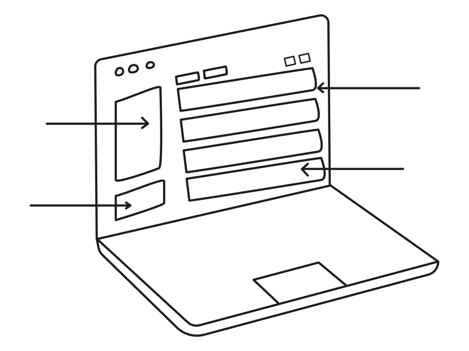
Law of Common Regions

The Law of Common Regions, also known as the common region principle, refers to the tendency of our brains to group elements together when they are located within the same closed region or enclosure. According to this principle, elements placed inside the same closed region, such as a box, border, or defined area, are perceived as related, even if they differ in color or shape.
Using a closed region, like a border or box, helps organize content by visually separating and grouping items. Common region elements, such as borders or background colors, are often used in web and interface design to visually group related items and create clear sections. Think of cards on a dashboard or tiles in a grid; despite containing different information, these elements are grouped visually by being contained within the same region.
How to apply in UI/UX design:
- Use containers or boxes: group related elements, such as form fields or products, in clearly defined containers or regions on a web page.
- Leverage background colors to visually group content and separate it from other sections. You can also use a black background or a background image to create strong visual separation and highlight important content on a web page.
- Apply borders and shadows to indicate that certain elements belong together.
- Create distinct sections: separate different categories of information with whitespace or visual dividers to improve scannability.
- Organize information visually: apply the principle when laying out dashboards, lists, or forms to help users process content more quickly.
By applying the Law of Common Regions, designers can help users distinguish between different sections of a page or interface without needing extra explanation. The use of borders, background colors, or even whitespace to create distinct regions makes it easier for users to navigate and process information. This principle is particularly valuable when organizing large amounts of data, such as forms, product listings, or dashboard content.
Law of Proximity

Gestalt Principle of Proximity states that objects that are close to each other tend to be perceived as related. This principle plays a crucial role in organizing visual information efficiently. For example, in a list or menu, items that are grouped closely together are seen as part of the same category, while those spaced further apart are understood to be distinct.
How to apply in UI/UX design:
- Group related elements closely. Place buttons, icons, or text fields that belong together near each other to indicate their relationship.
- Maintain consistent spacing between related elements and increase space between unrelated groups to show separation.
- Avoid clutter and ensure there’s enough space between different groups for clarity.
- In long forms, group fields by related categories (e.g., personal details, payment info) to make the form easier to follow.
- Use proximity to create hierarchy in navigation menus, product listings, or informational layouts.
The Proximity gestalt principle is one of the most straightforward but powerful tools in a designer’s toolkit. It allows for the creation of relationships between different elements without the need for additional visual cues like lines or boxes. In UI design, proximity helps users navigate content intuitively. For example, grouping form fields together based on their function (e.g., contact information, payment details) makes the form easier to complete. In more complex interfaces, proximity helps users focus on the most relevant information, reducing cognitive load and enhancing usability. It’s a subtle but effective way to guide user interaction and behavior.
Law of Similarity

The similarity law, also known as the similarity principle, states that similar elements — such as those sharing color, shape, size, or texture — are perceived as belonging to the same group. This principle is rooted in the idea that similarity states objects or elements that appear alike are visually grouped together, influencing how we interpret their function or category in design. For example, in a navigation menu, buttons that have the same color and style are intuitively understood to have the same function, even if they lead to different parts of the site.
The similarity law is particularly powerful in visual design because it helps organize complex arrangements by allowing users to quickly recognize related items through consistent visual cues. The Gestalt principle of similarity is also useful for creating a cohesive visual hierarchy.
How to apply in UI/UX design:
A web designer applies the similarity principle to create cohesive and user-friendly interfaces.
- Style all buttons or links that perform similar functions the same way (e.g., same color, size, and shape).
- Use the same typography (font, size, and style) for related text elements (e.g., all headings, subheadings) to create a cohesive look.
- Repeat visual styles: apply similar colors, shapes, and patterns to related elements across different sections of the UI.
- Highlight differences: to make specific actions stand out, use contrasting styles (e.g., a unique color for a CTA button among similarly styled buttons).
- Use visual cues: in complex interfaces, use icons, colors, or shapes consistently to indicate similar actions or functions.
By using similar visual treatments for related elements, such as headlines and subheadings, web designers can make content easier to scan and understand. The similarity gestalt principle is a fundamental concept in branding as well, where consistent use of colors, fonts, and shapes helps to reinforce brand identity. In web design, similarity can be used to create visual flow, guiding users through a sequence of actions or information in a logical and aesthetically pleasing way.
Law of Contrast

The Law of Contrast emphasizes that objects that are visually distinct from their surroundings are more likely to grab attention. The focal point principle is often used in design to draw attention to key content by creating a clear point of interest. This principle is essential in creating focal points in a design. For example, a bright red “Buy Now” button on an otherwise monochromatic page will naturally stand out and draw the user’s eye, prompting action. By creating a focal point, designers can guide the user's attention to important elements or calls to action, reinforcing the visual hierarchy. Contrast can be achieved through differences in color, size, shape, or even texture.
In UI design, contrast is often used to highlight key interactive elements, such as buttons, links, or error messages, ensuring that users can easily identify and engage with them. However, contrast must be used carefully — too much contrast can overwhelm users, while too little can make the design feel monotonous or difficult to navigate. Striking the perfect balance here is the secret sauce to maintaining simplicity in UI UX, as it ensures the interface remains bold yet breathable.
How to apply in UI/UX design:
- Highlight key elements. Use contrasting colors, sizes, or fonts to make important elements like CTA buttons or warnings stand out.
- Create visual hierarchy to differentiate headings, subheadings, and body text, guiding the user's eye through the content.
- Focus on usability: ensure text contrast (light text on dark background or vice versa) is high enough to improve readability, especially for accessibility.
- Use contrast to guide the user's attention to specific elements, such as notification messages, offers, or navigation prompts.
- Test contrast ratios. Ensure that there's enough visual distinction between interactive elements and the background to avoid confusion.
A well-balanced application of the Law of Contrast can significantly enhance both the aesthetic appeal and functionality of a design, making it more engaging and easier to use.
Law of Continuity
The Gestalt principle of continuity suggests that our minds prefer to perceive continuous, unbroken lines or patterns, even when they are interrupted. When elements are arranged along a line or curve, especially a curved line, the eye naturally follows that path, creating a sense of flow and making those elements appear more related. This principle is widely used in design to guide users’ attention through a layout in a smooth, uninterrupted manner. For example, in web or app design, elements like arrows, lines, or visual cues that align along a curve or trajectory can direct users’ focus from one section to another, enhancing navigation and storytelling. This strategic alignment is a masterclass in design for simplicity, as it allows the eye to glide through complex data without friction.
Additionally, the Gestalt principle of common fate states that elements moving in the same direction are perceived as grouped together. In UI design, this can be seen in elements moving together, such as animated progress bars or synchronized transitions, which help users understand relationships and workflow steps by visually grouping related components. Integrating these motion-based cues often puts an end to the simplicity in UX debate, proving that movement can actually clarify a design rather than clutter it.
How to Apply UI/UX Design:
- Use visual cues: incorporate lines, arrows, or curves to direct users' attention and guide them through a specific flow or process in your interface.
- Align elements along a path: arrange text, buttons, or images in a linear or curved sequence that encourages users to follow the path naturally.
- Create seamless navigation: design menus or navigation bars that visually lead users from one section to another without abrupt changes or distractions.
- Use gradients or fading effects: apply subtle visual transitions, such as gradients or fading, to create a smooth flow between different sections or states in the interface.
- Maintain visual hierarchy to ensure that important elements, like CTAs or important content, are positioned along the natural flow of the design, guiding users' eyes to them effortlessly.
The Continuity gestalt principle is particularly effective in creating a visual hierarchy, ensuring that users move through content in the intended order without feeling lost or distracted. It also helps to establish a cohesive and organized experience, as users can easily follow the visual flow of the design, making it feel intuitive and well-structured. By leveraging this principle, designers can lead users through actions or processes in a more seamless and engaging way.
Conclusion
Mastering the Gestalt principles is often 101 for UI/UX designers. And for a reason – they matter a lot. They help to create designs that will meet psychological needs of the users. After all, we create designs for people to use, and ignoring their psychology goes against the idea of what a good interface should do.
If you're looking for experienced SaaS designers to ensure your interfaces are created with best practices in mind, drop us a line.


