People say that knowledge is power, but how can businesses use knowledge for their benefit when it comes in a form of data (loads of data)?
The answer is data visualization. With its help, you’ll be able to transform large volumes of complex information into graphs, charts, and diagrams to make it understandable, informative, and memorable.
But data visualization is challenging, that's why you may need to work with those who have masted it.
Our designers at Eleken, a UI/UX design agency for SaaS, had a chance to work with several data-intensive products that required data visualization design. And today we want to share this experience with you as well as give answers to the following questions:
- Why is data visualization important?
- What makes good data visualization?
- What are the best practices for visualizing data?
Without further ado, let’s explore the first question.
Why is data visualization important?
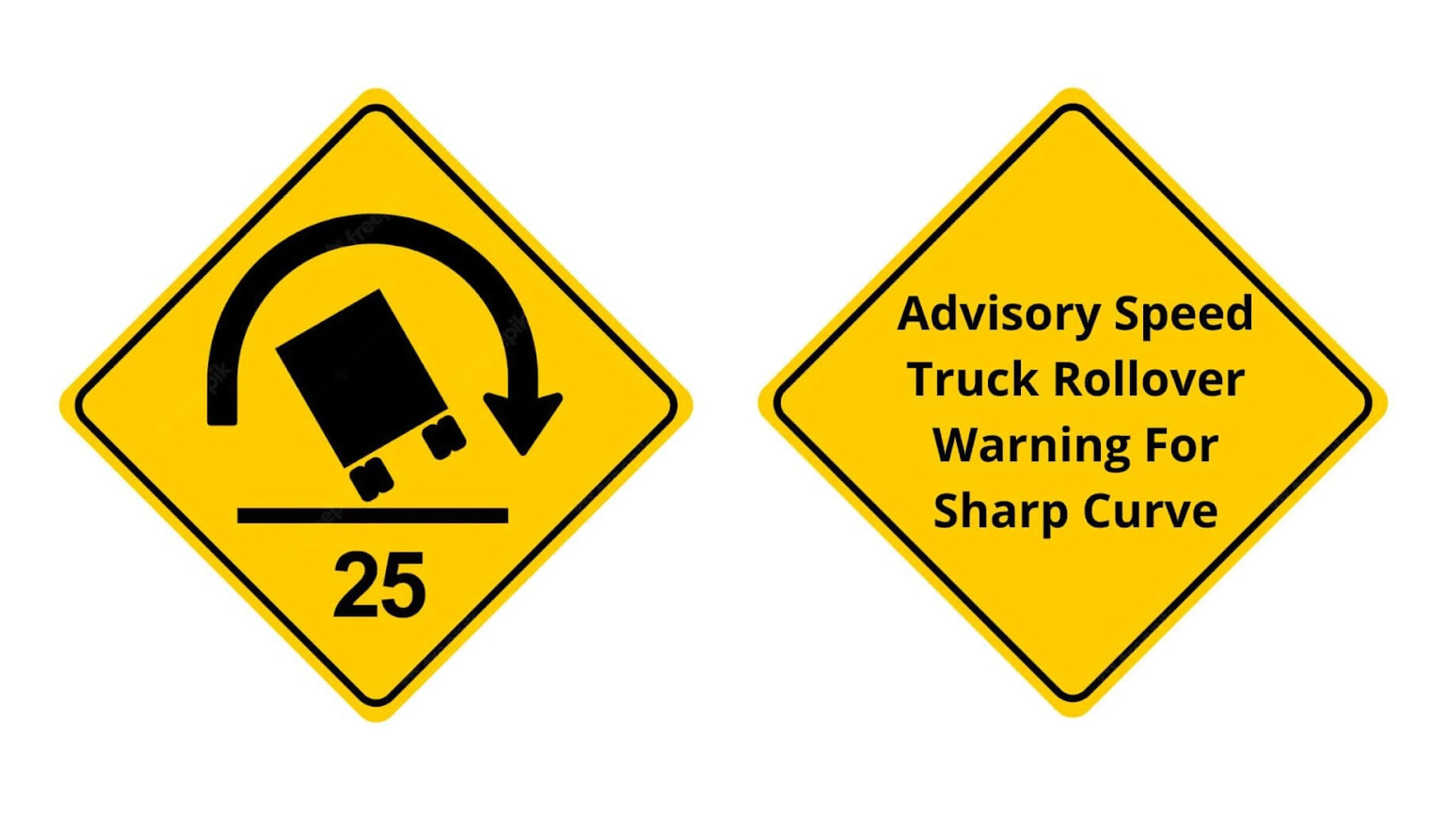
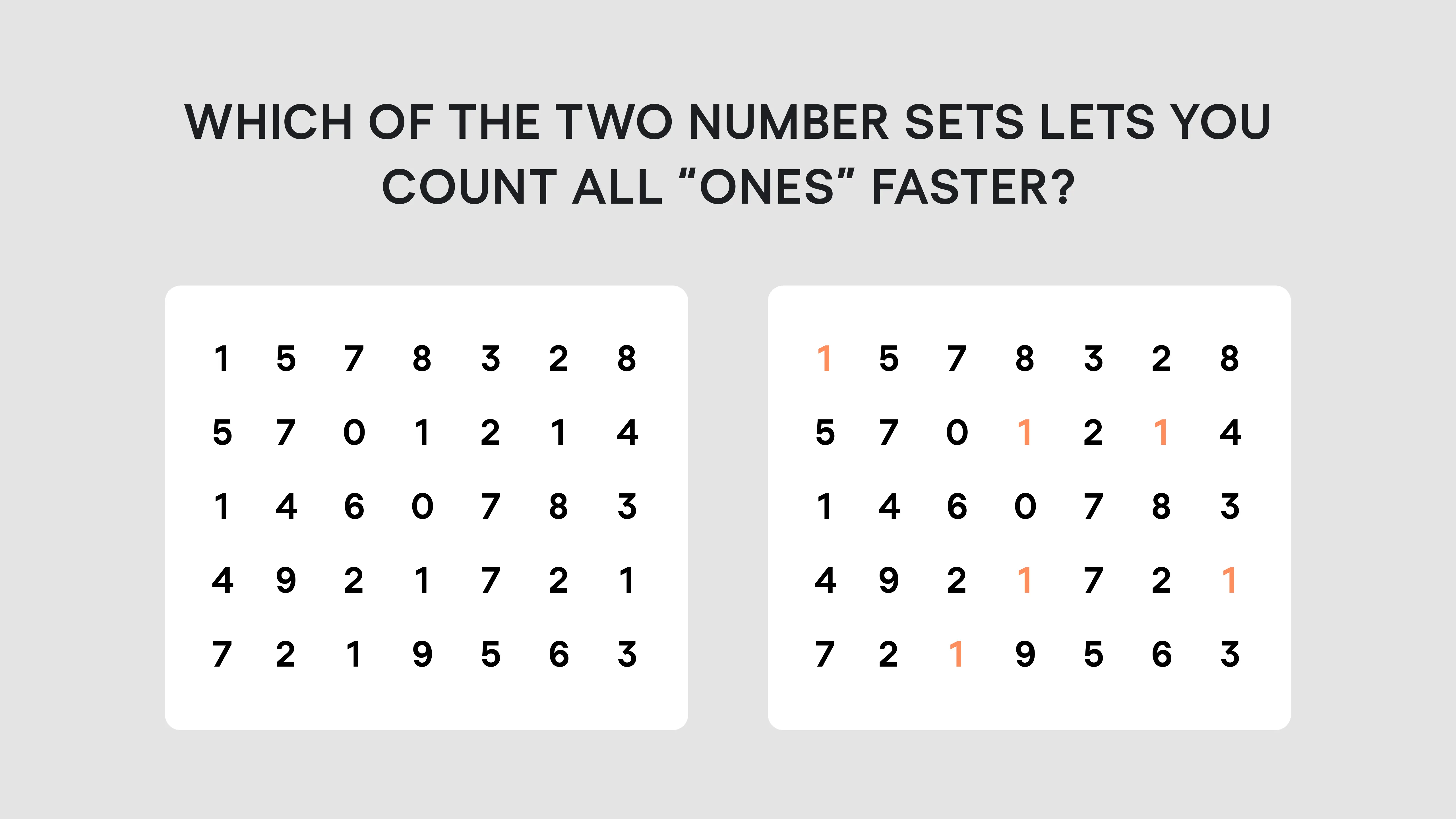
It takes about 13 milliseconds for our brain to process an image, which is 60,000 times faster than it takes to process the text.
Check it yourself. Which of the two signs is easier to comprehend?
So, visual representation of data is powerful because it provides the kind of communication that our brains need. Humans are biologically programmed to interpret everything around them visually, that’s why visualizing data increases the content’s impact and efficiency by making it easier to perceive, process, and retain the information.
Additionally, tailoring your data visualization and information design can help businesses
- make data-driven decisions faster
- quickly detect errors or inaccuracies in data
- effectively process massive amounts of information
- discover the latest industry trends
- quickly analyze critical metrics
- access information in real-time and assist in management functions.
But it’s so easy to get lost in all those charts and tables, shapes and colors when trying to find the most optimal form of visualization for your particular case. So, let’s define what’s essential to creating quality data visualizations.
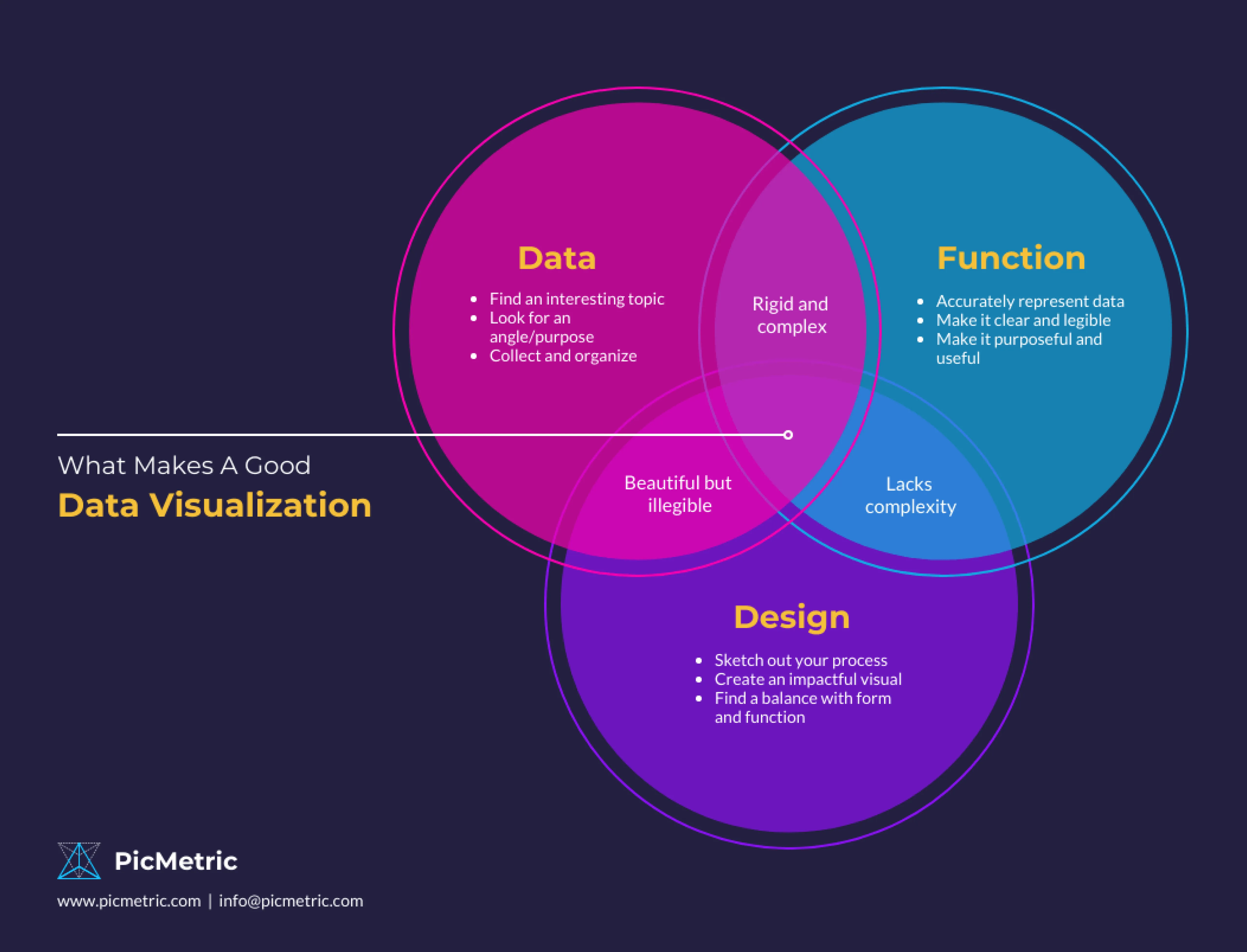
What makes good data visualization?
Accuracy. Prioritize data integrity, consistency, and clarity while visualizing information in a way that doesn’t mislead the viewer.
Accessibility. Take care of those who don’t see color differences - think about alternative methods to visualize data, like shape, texture, and high contrast.
Scalability. Visualizations should be adjusted for various device sizes while taking user demands for data complexity, depth, and modality into account.
Beauty. The data you visualize should be well-structured, appealing, and harmonious so that users could better perceive it.
What are the best practices for visualizing data?
To help you avoid common data design mistakes and in general improve the way you deal with data visualization, we've collated the list of data visualization design best practices and ordered them by categories: color, comparison, relationship, ordering, and dashboards.
Color
Color is a powerful data visualization design tool that helps you to
- indicate quantity
- differentiate categories
- highlight some specific pieces of information
- communicate meaning
Here are several data visualization design tips for the right color usage.
- Don’t distract customer focus by using too many colors. Apply no more than six colors in one layout. Use color accents (for data you want to highlight) and neutral colors (for the rest of the data) to create contrast and emphasis.
- To indicate amounts or numbers of continuous data, be sure to use a single color in varied saturations. Applying a single color will make it easier for readers to understand if they are observing changes in a specific metric.
- Mind color associations. Data visualization designers employ colors to facilitate comprehension and trigger associations. For instance, when showing some Facebook statistics, people often use blue color, while pink-purple is mostly used for Instagram (such use of colors would be especially useful if we had to compare the two companies). At the same time, beware when using colors with strong associations (like red and green) as they may flip the meaning in users' minds.
- Use contrast wisely. It might be challenging to distinguish between tones that are too close to one another and contrast comes in handy in such situations. Contrarily, avoid using color combinations with a lot of contrast like red/green or blue/yellow.
Comparison
You may compare two data sets to discover how they differ across a wide range of various categories. Data comparison may be used to show changes over time, or see how several groups differ from one another.
Most often, to visualize comparison designers would use
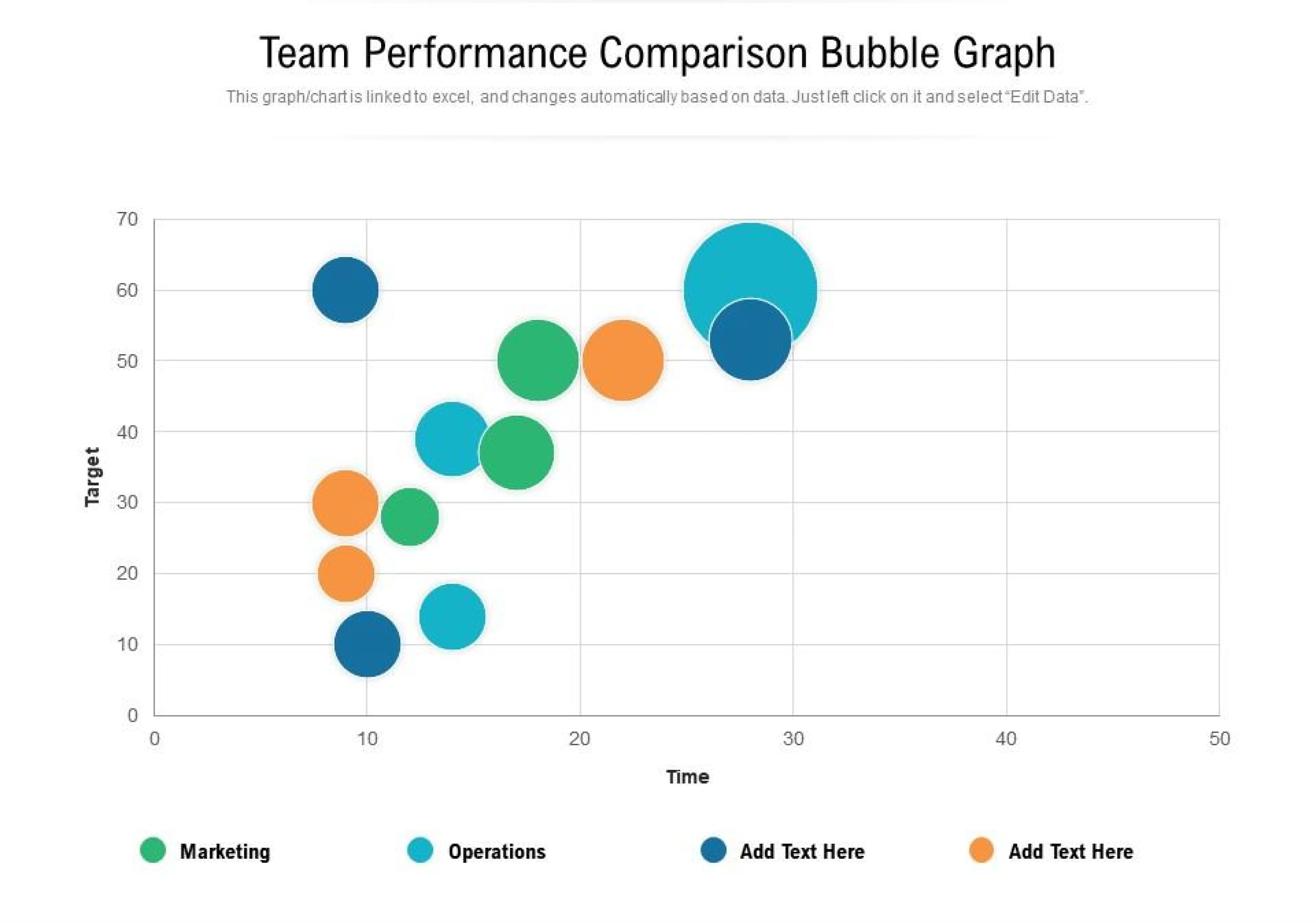
- bar charts (or grouped bar charts) to convey proportion, which expresses a partial value in comparison to a total value
- bubble charts to compare a large value with other smaller value items
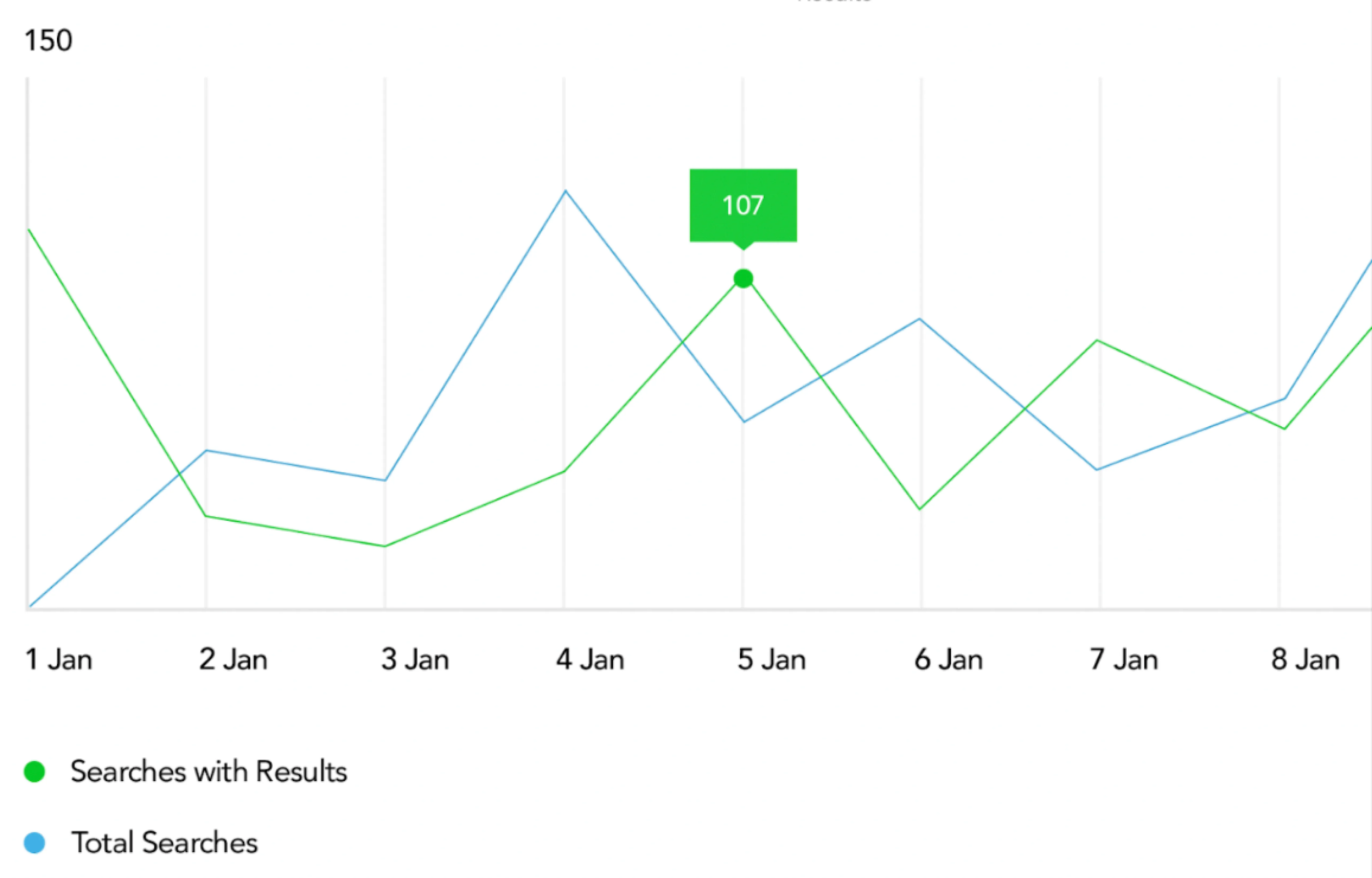
- multi-line charts to describe subtle variations in data
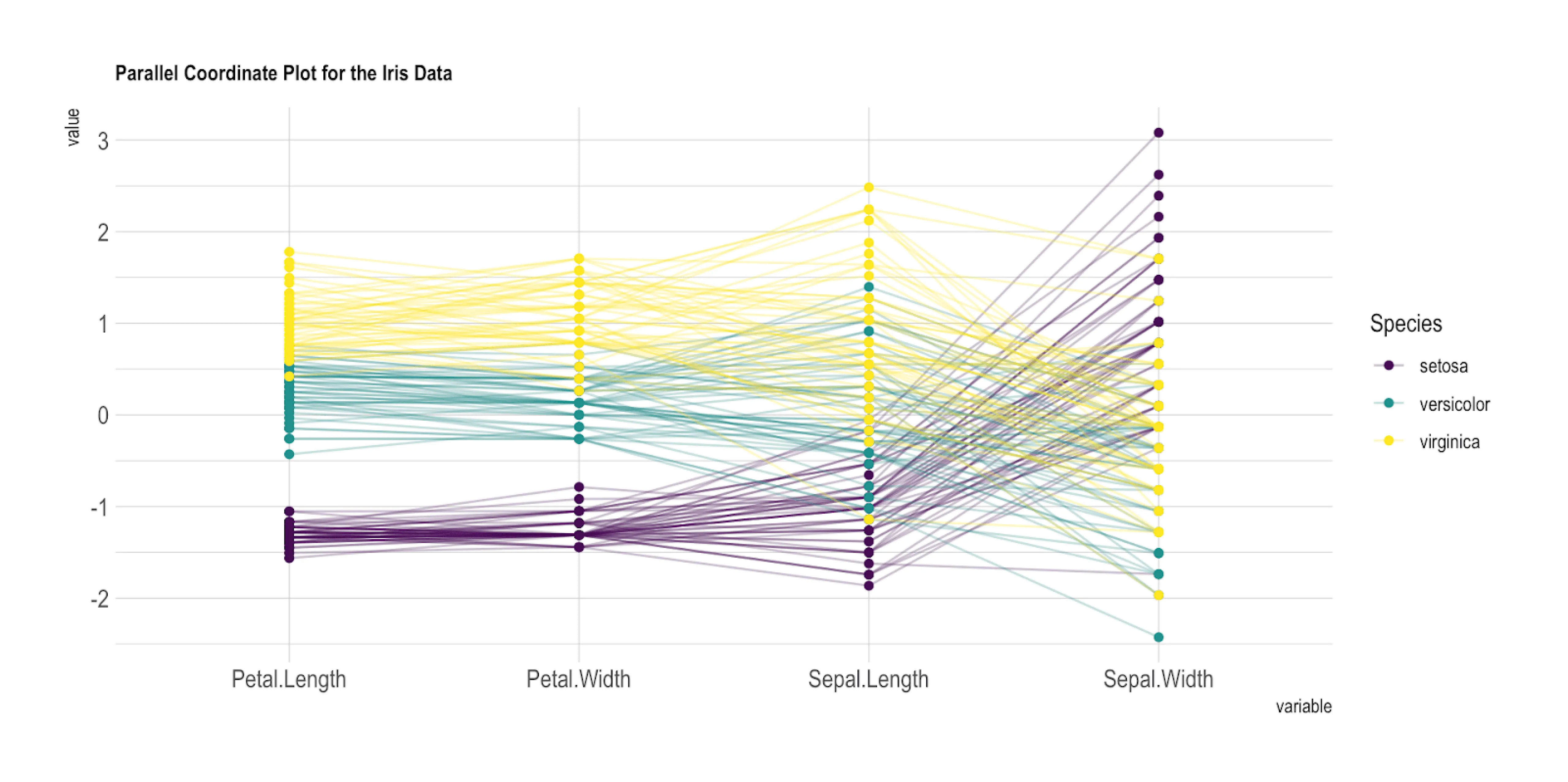
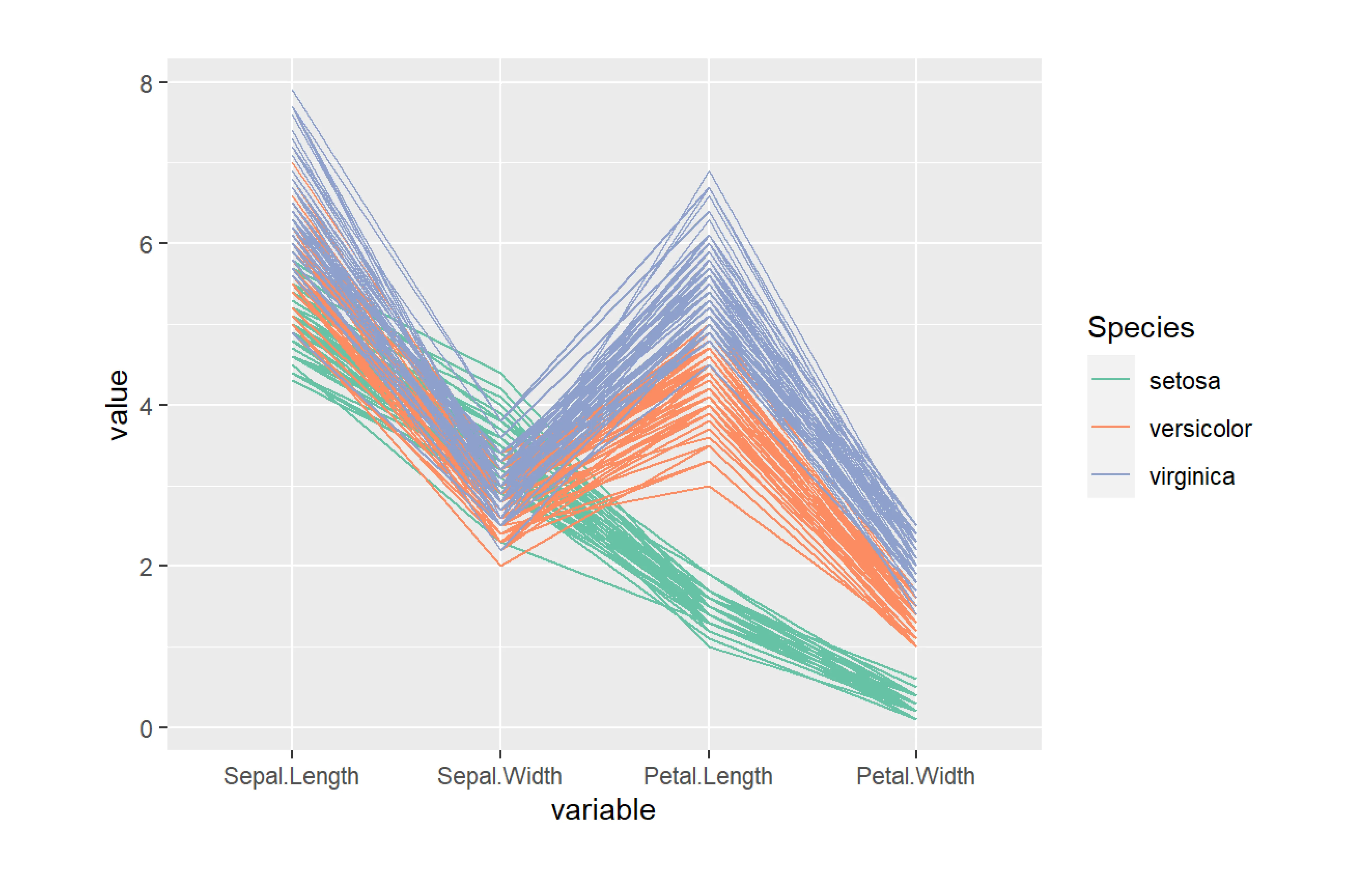
- parallel coordinate charts to study the features of samples for several completely different quantitative variables
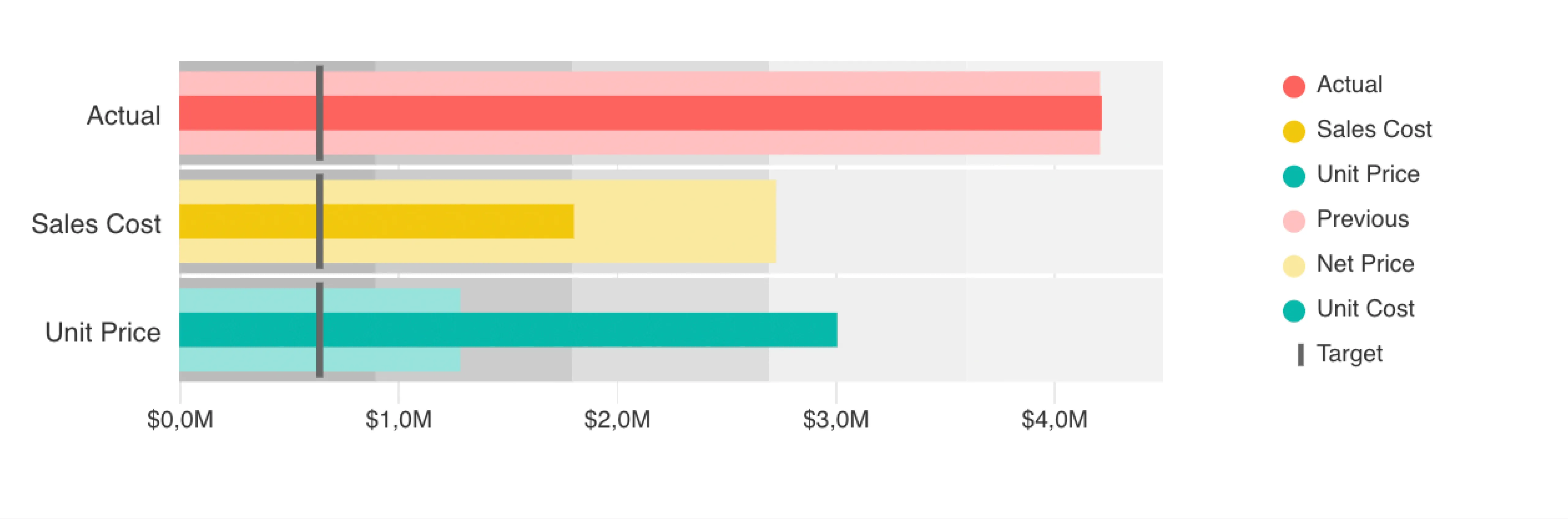
- bullet charts to compare forecasts to actual data and assess how a quantitative measure relates to qualitative ranges
Here are some tips for this category
- Always start the chart with the x-axis value of zero to give more context for comparison.
- Avoid using several pie charts to demonstrate changes over time (comparing the size disparity between each pie slice is challenging). Instead, use bar charts to illustrate changes over time or distinctions across several groups.
- Don’t include too many groups in your charts not to make it look unreliable (usually it’s optimal to compare up to five categories).
- When plotting the bubble chart, take care to space out the bubbles; if that’s impossible, display overlapping bubbles by adjusting the opacity or blending mode.
Relationship
Relationship charts display how various elements connect together.
For example, the price for software may depend on how many people will use it, and how many advanced features you want to access.
price = f (number of users, number of advanced features)
It’s difficult to discover these links when looking at a dataset as a collection of numbers. But it becomes much easier to notice these relations with the help of a decent visualization, without engaging in sophisticated statistical analysis.
To explore the relationship between data sets you may use
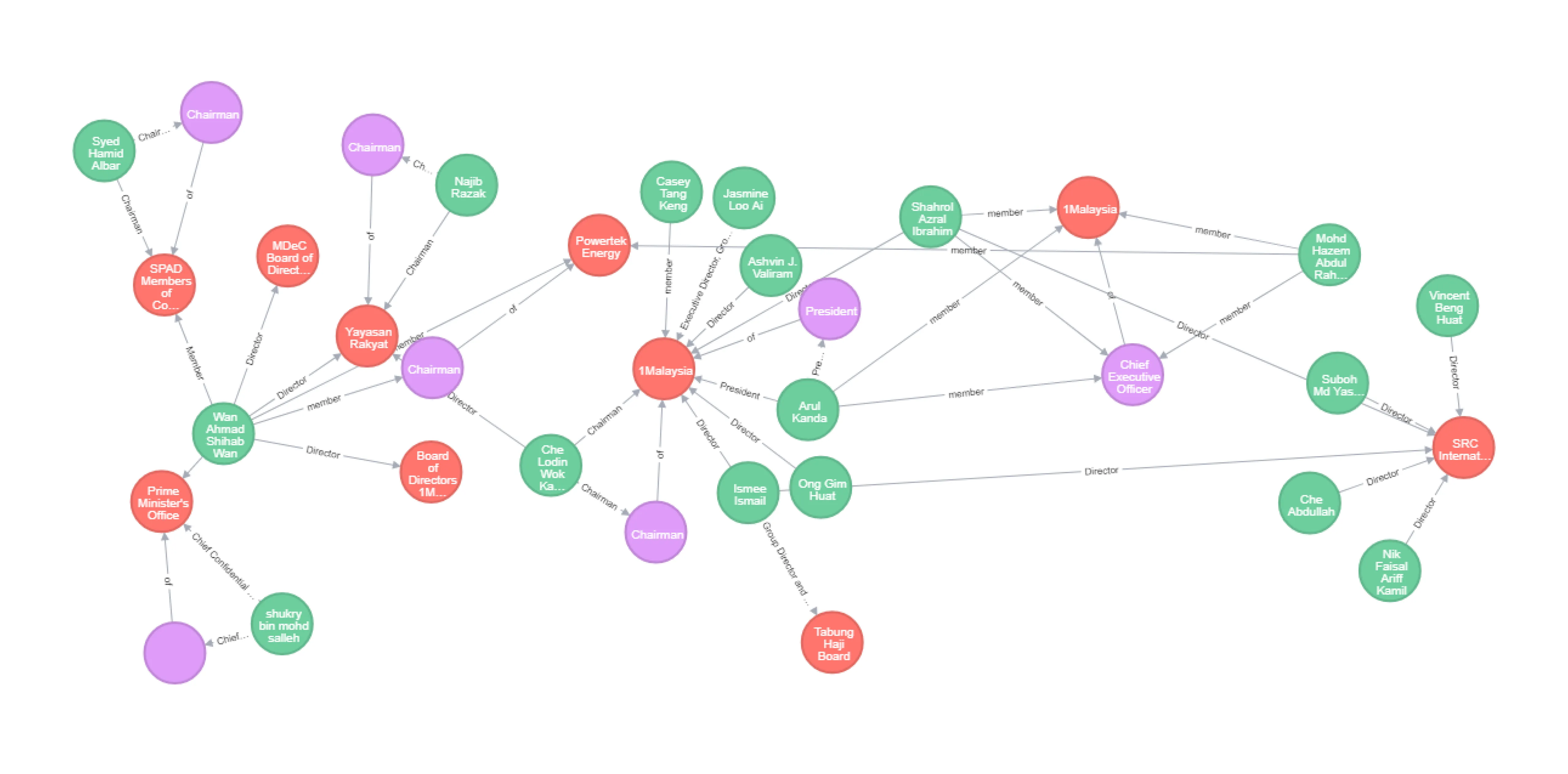
- Network charts to interpret the network's structure by analyzing any node clustering, the degree of connectivity between nodes, or the arrangement of the diagram's architecture.
- Venn diagrams to show the connections between groups of elements (such as similarities and differences), make predictions, consider the reasoning behind some concepts, and then illustrate the relationships for visual communication.
Here’s a tip on visualizing relationships:
Don’t use icons alone to represent key information on charts’ nodes, accompany them with labels to make data look clearer for the viewer.
Ranking
Ranking charts arrange data in a particular order. Human brains immediately identify rank when it’s visualized. Thus, with the help of ranking data charts, you can create compelling stories for your viewers.
Among the most widely-used charts to display the order are
- Bar charts
- Column charts
- Parallel coordinate charts
Here are several tips for visualizing ranking data
- Unless there is a natural order to the data (like age or time), a bar chart should always be rated by value.
- Your legend's items should be arranged in the same chronological sequence as your chart.
- Avoid using increments like 0, 2, 7, 14, 50 on your axes. Use 0, 5, 10, 15, 20 instead.
Dashboards
In some cases, to better communicate a story you may need to visualize data with a collection of several charts, known as dashboards.
Good dashboard design should clearly communicate the business’ key goals and metrics, be easy to navigate, and not be cluttered with too many data indicators.
Here are several tips along with dashboard design examples:
- To make the dashboard readable, organize the data on the dashboard into three groups based on significance in descending order. The most important indicators should be listed first, followed by trends that explain the foregoing insights, and finally, list specifics that allow for a better understanding of the problem.

- Use color, position, size, and visual weight to create a hierarchy when displaying a focal point
- Display from five to nine elements on a dashboard to keep the viewer focused and the interface light.
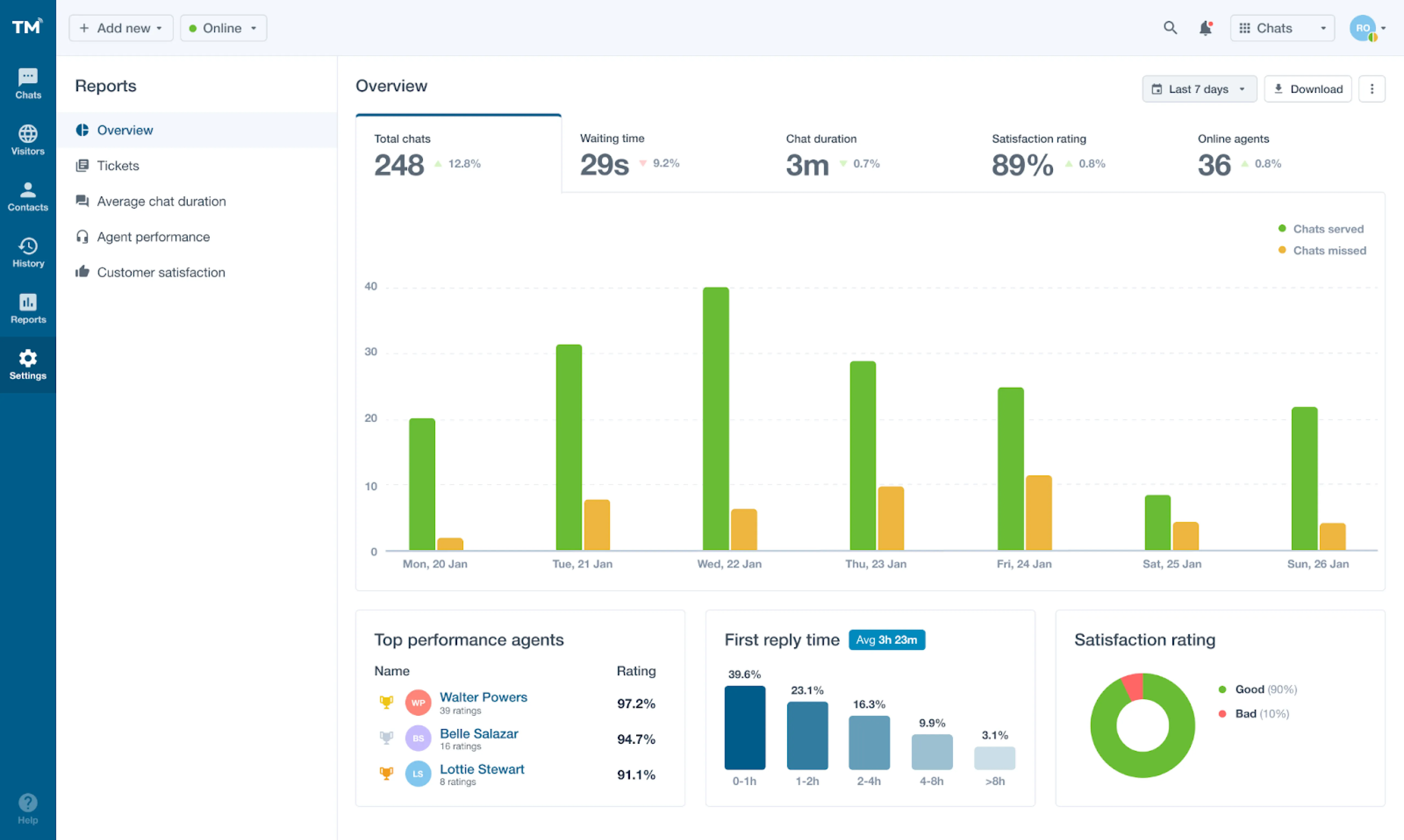
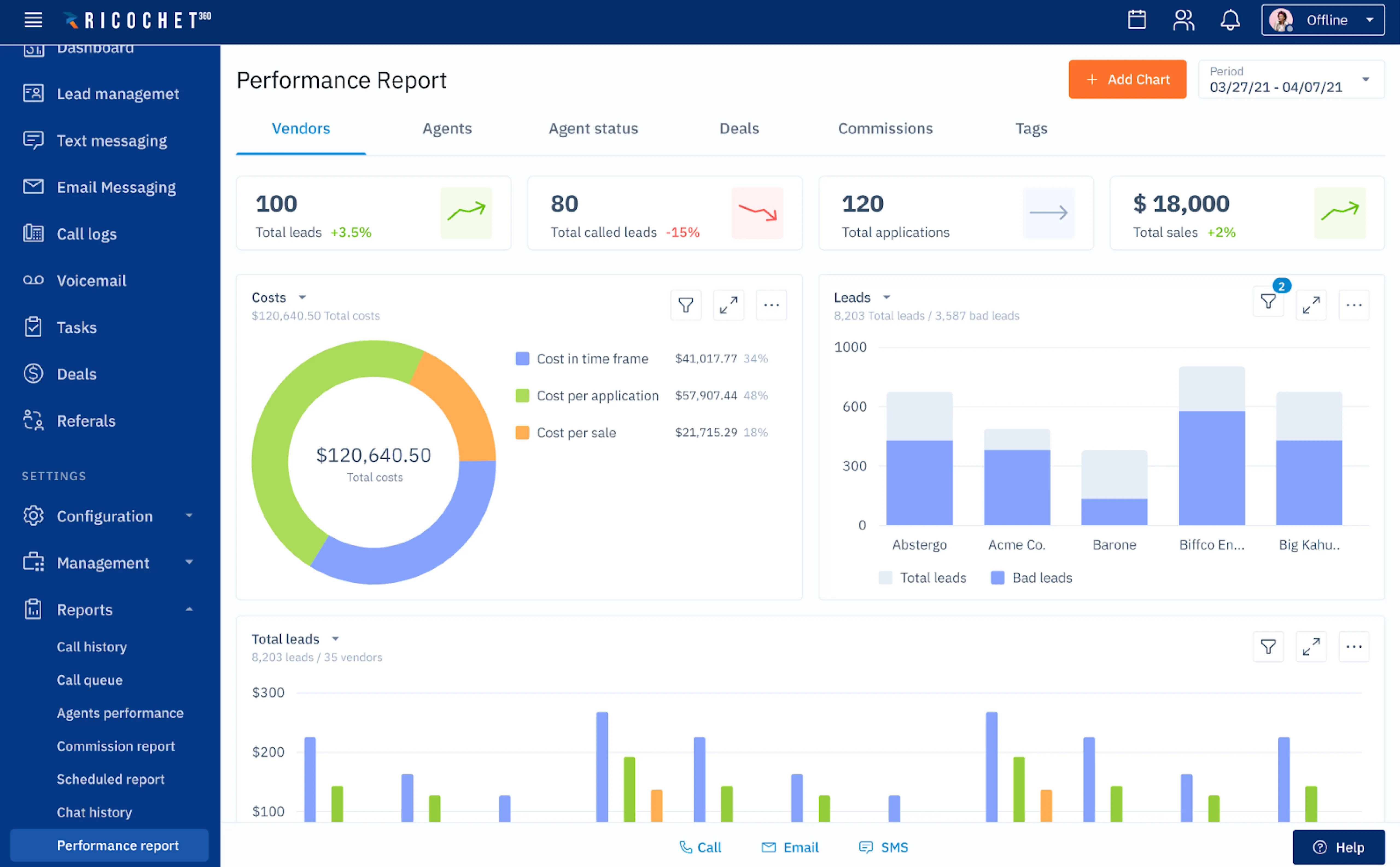
Okay, that’s all for data visualization design principles. Now, to see how data visualization design works in practice, we’d like to share with you our approach to data visualization using our three case studies.
Our solutions to data visualization problems
Working with complex data-heavy products is exciting, yet challenging. Each such project has its own unique issue you have to solve in order to eventually get a simple and user-friendly design.
In this section, you’ll find three data visualization design examples from our projects, with the challenges we had to overcome described.
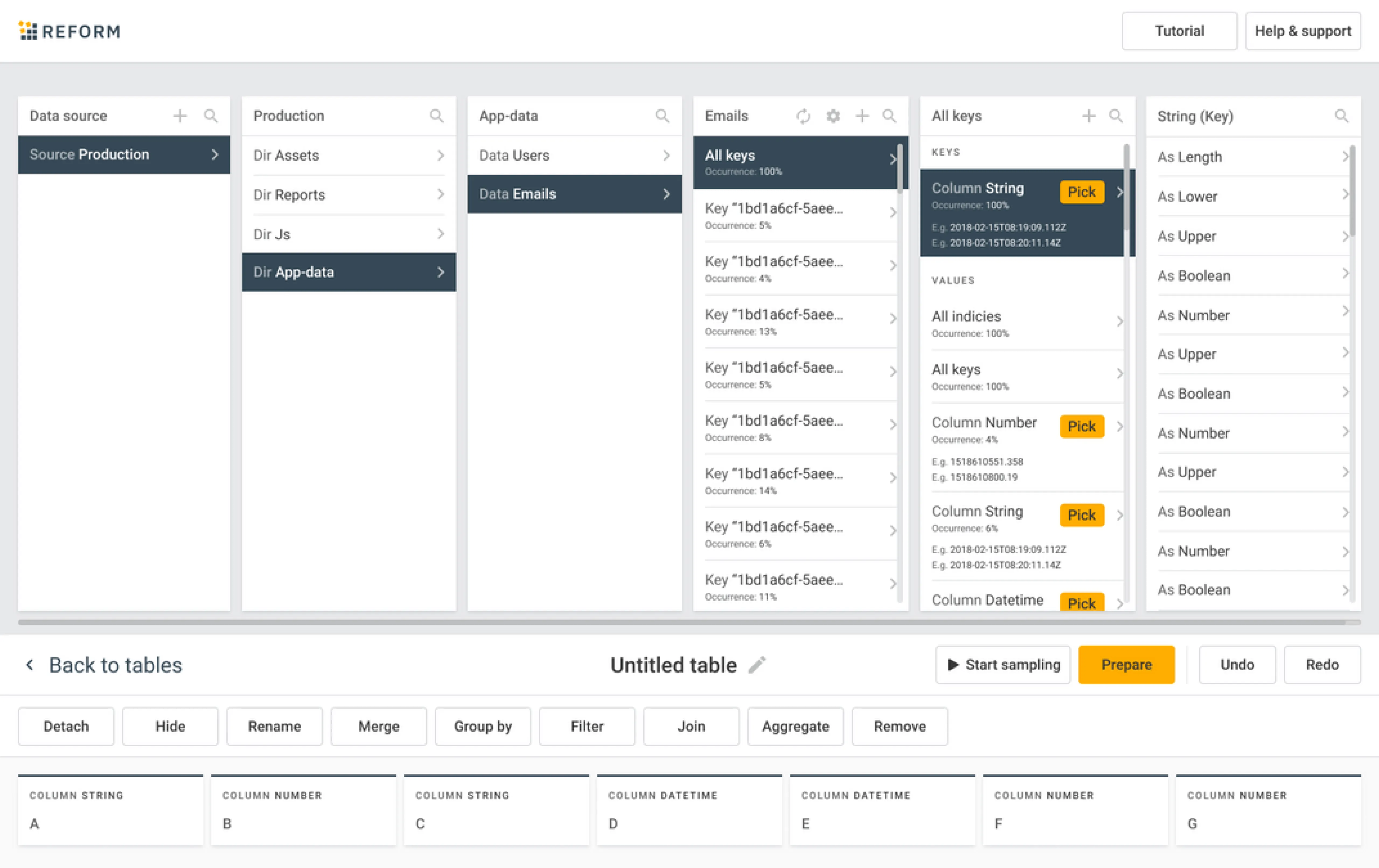
Using a card-based UI to present data
SlamData is a no-code data preparation platform that allows business teams and data engineers quickly and easily access API data of any size and structure and convert it into analytics-ready tables.
Eleken’s task was to create the user interface from scratch for a SlamData’s product — Reform. And as there were no similar solutions on the market, it was quite challenging to find an appropriate format to visualize the app’s functionality.
We decided to present data using a card-based user interface. Now, after the user uploads the data from their CRM or marketing platform into the app, Reform will present it via clear point-and-click UI cards.
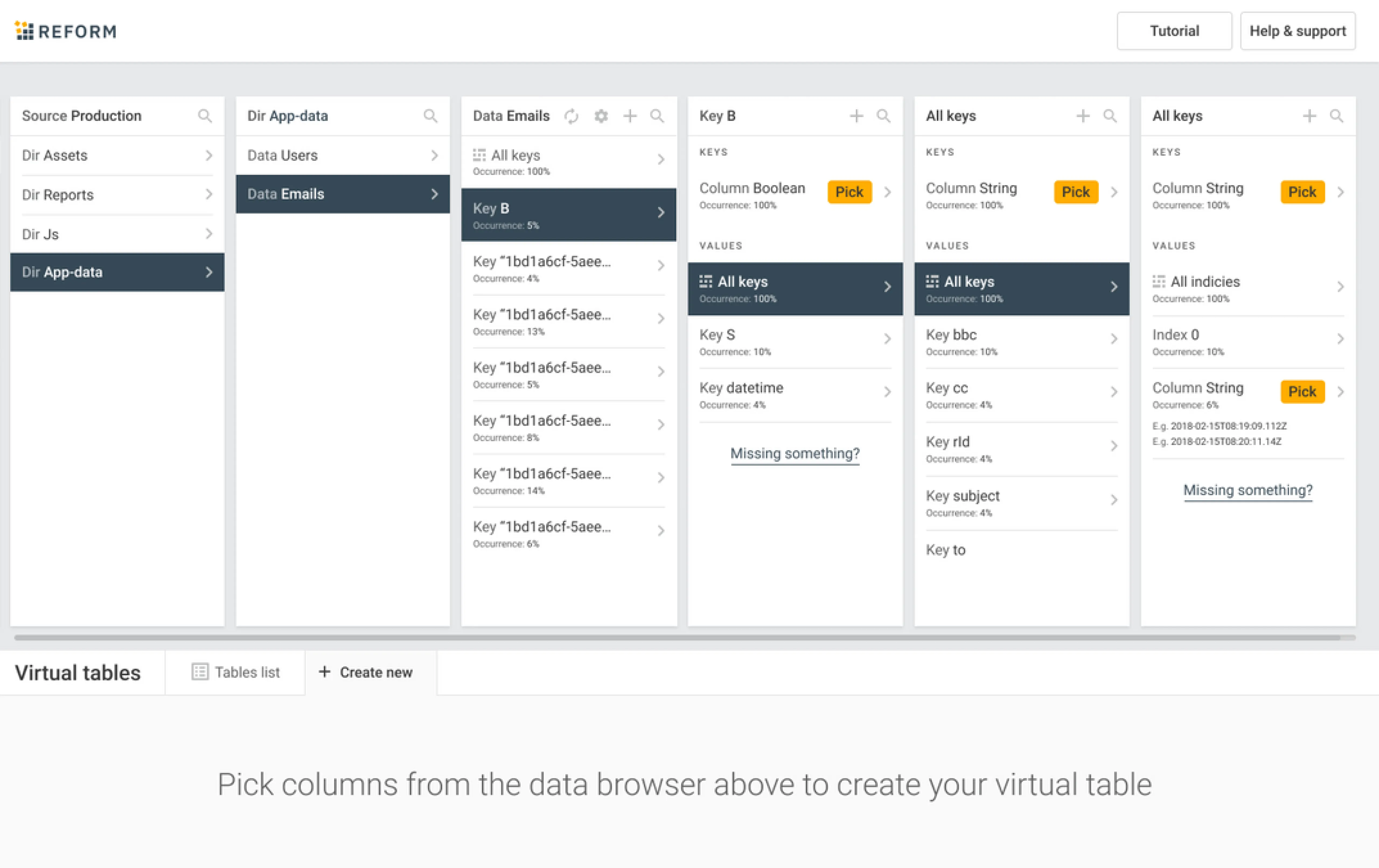
We chose this format because
- Cards allow to group related information and present it in small bites that are easy to understand for the user.
- They are highly adaptive and look well on all screen sizes.
- Reform allows users to manipulate data in the table (merge, group, filter) and UI cards serve great to encourage clients to interact with the product.
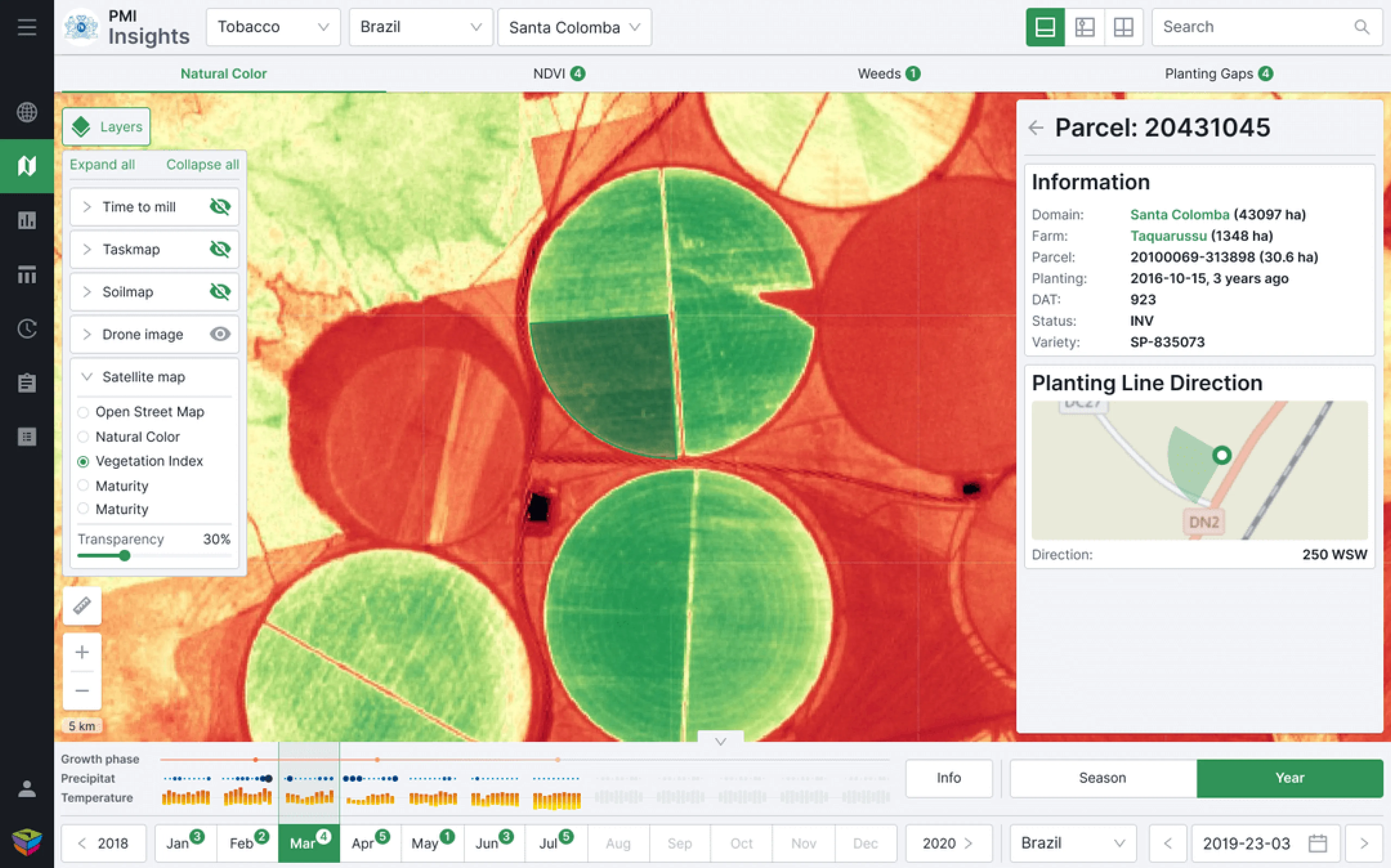
Visualizing the impact of viruses or drought on the plants in real-time
At the time Gamaya came to Eleken, they were working on their data visualization platform for farmers to help them monitor fields and analyze specific agronomic issues like nutrient deficiencies, pests, and weed infestations. They already had a prototype of their solution but wanted to improve it with a high-quality UI/UX design.
Here’re several design solutions we made to help Gamaya users handle the needed visualized information comfortably.
Using layers to present data from different sources
Gamaya provides information to users about their crops from two different data sources: drones (the app analyses the drone's photos and put them together in the right order) and open-source NASA remote sensing satellite data.
To let users select from which source they want to see the data, we added Layers to the app’s UI. Now, farmers can monitor the various stages of plant growth and see how viruses or drought are affecting the plants in real time.
Using red color to indicate planting gaps
We decided to highlight the planting gaps in red on the drone’s images. Such a simple design principle of data visualization as a color change made the comprehension of gaps almost instant.
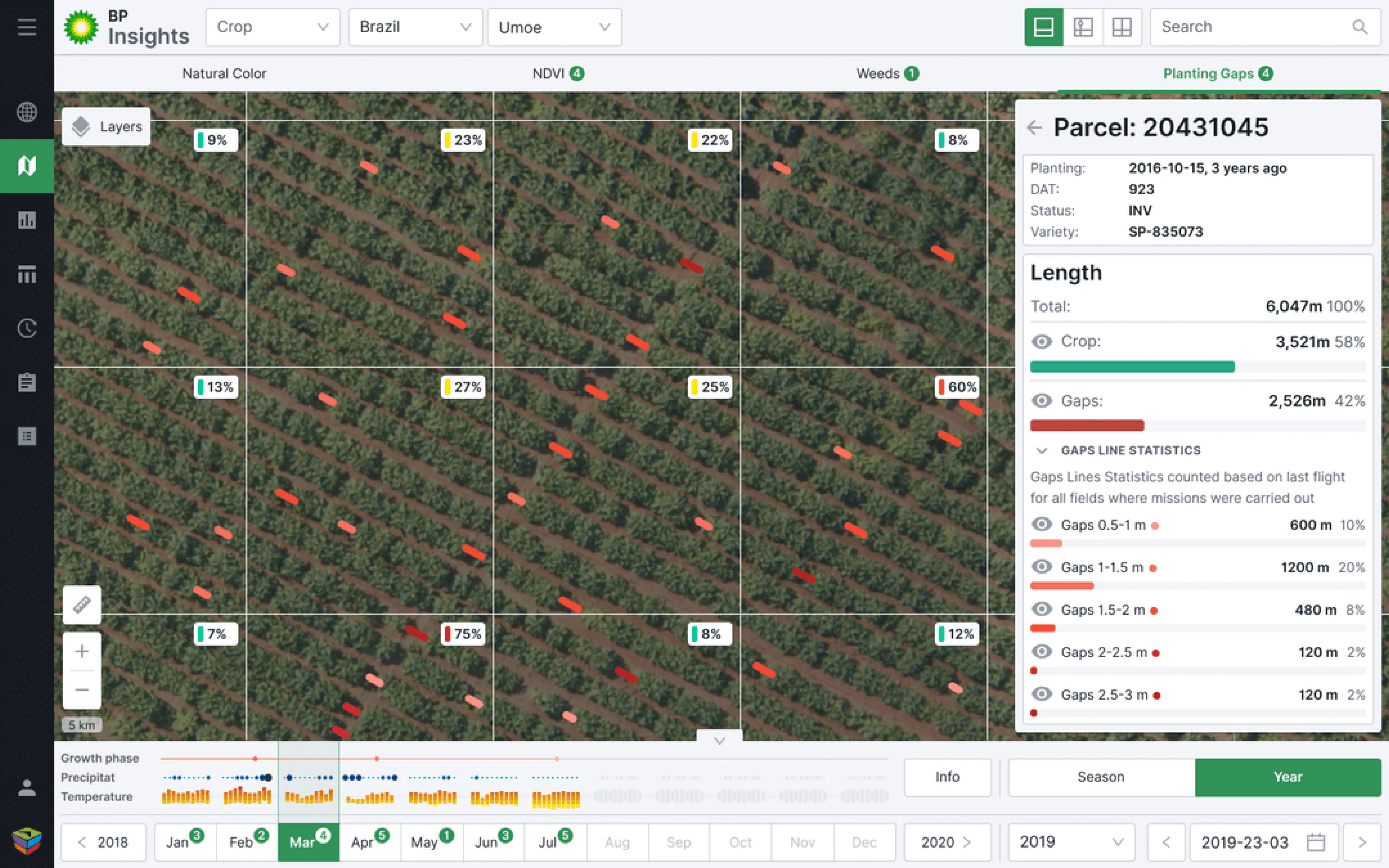
Using tables as an alternative method of data display
For better data comprehension we decided to create another option besides the map and drone photos. Users can also use tables to track data across different fields in various locations.

Finally, we'd like to mention that in order to simplify the work of developers, and in general speed up the development process, we used ready-made components from the Ant design system.
Improving the graph editor’s interface to make graph visualization easy for users
Cylynx is a fraud detection software that translates graph data into valuable insights. With its help, users can upload data and edit its visualization by changing the mapping, hiding some sets of data, linking data sets together, and displaying data in different shapes and colors.
Eleken was hired to design a fully-fledged MVP based on the Cylynx demo version. And one of the challenges we were working on was the confusing interface of the graph editor (customers use it to manipulate the data they import).
In Cylynx’s demo, the interface consisted of four tabs that were each equally significant but autonomous. This way, when the user took a certain action to modify data, they didn’t see the parameters they selected in the previous tab, and that was very confusing.
The solution we found was to divide the graph editor into three tabs, each with its own purpose:
- Data to work with is a tab for uploading information and choosing the one you want to edit.
- Styles&filters tab allows to visually change the graph, and limit what data the user wants to display
- View tab lets users leave comments and observe the graph without editing it

Now the editor’s functions don’t overlap each other, and users can easily view all of Cylynx's tools and understand how they work.
Wrapping up
Nathan Yao, a data visualization expert, says in his book Data Points that good visualization is “a representation of data that helps you see what you would otherwise have been blind to if you looked only at the naked source.”
And that’s true, good data visualization should encourage the user to explore the information and give them a deep understanding of what they see.
Still, data visualization isn’t a piece of cake, and having an experienced design team by your side can be very useful when working with complex data-intensive products.
Share the details of your project so we could provide you with the best expert for the job. Tell us about your app!