As a UI/UX design agency, we work with startups all the time and our experience shows that often mockups work better than any words and increase your chances for investment. Just one quick example – our client Datawisp received great reviews from both users and investors after our redesign. As a result, they closed a $3.6M seed round.
Seeing is believing when it comes to startup pitches. That's why we picked up 19 pitch deck examples that gained great investments at different levels and analyzed what made them stand out. As well, at the end of the article, you’ll find tips together with a template that will help you create the best pitch deck design.
But before we start with the best pitch deck examples , let's go through the basics.
What is a pitch deck?
A pitch deck is a concise and visually appealing presentation that introduces a startup idea or project to potential investors or partners. Logically, its main goal is to capture interest, show the key elements of product-market fit, include financial projections, and ensure that the team can execute its vision (which ideally leads to investment or partnership).
For a pitch deck to achieve its purpose, it must guide the investor through three key stages:
- Understanding: The investor should clearly understand what your project is about and what you’re offering.
- Interest: The investor should see the project’s potential, including the problem being solved, the market fit, and the strength of the team. This stage is where they envision a possible return, ideally seeing a path to a 10x return within 3–5 years.
- Belief: The final stage is about trust — investors need to believe in your team’s ability to deliver on what’s promised. This is often emotional and shaped by how well you pitch, respond to questions, and communicate confidence.
A strong deck doesn’t just explain a business idea — it builds momentum around it.
What should your pitch deck include?
Some of the important elements for successful startups' pitch may include:
- Title slide: Who you are, what your startup does, and whom it serves.
- Problem slide: The critical issue your product addresses, including its scale and urgency.
- Solution slide: A brief look at your offering and its unique approach to solving the problem.
- Product slide: Showcase how the product works, perhaps with a demo or screenshots.
- Why now: Explain the current market opportunity or trends driving the need for your solution.
- Traction: Early achievements or customer milestones to show market validation.
- Business model: How the startup generates revenue.
- Market size: Illustrate the potential market to highlight growth opportunities.
- Go-to-market strategy: Your plan for acquiring and retaining customers.
- Competition: How you stand out against other players in the space.
- Team: Key members and why they’re right for this venture.
- Financials: Projections or metrics indicating future growth potential.
- Ask: The funding amount sought and how it will be used to achieve milestones.
However, it’s not necessary to include all the above-mentioned things.
When building a startup deck for pitching investors, you want them to understand immediately why you're awesome. So, your presentation should be straight and quick. The best ones turn a dense business plan into a focused narrative investors can absorb in minutes.
So, your presentation should be straight and quick. Keeping this information in mind, here's a list of good slide deck examples of companies that successfully raised a round.
Seed round pitch deck samples
A seed round in investments is the initial round of funding for a startup, aimed at securing enough capital to develop the idea into a functional product or service. This pre-seed stage often involves raising smaller amounts of money compared to later rounds. Let's see what kind of startup pitch decks managed to succeed here.
1. EquityBee ($6.6m)
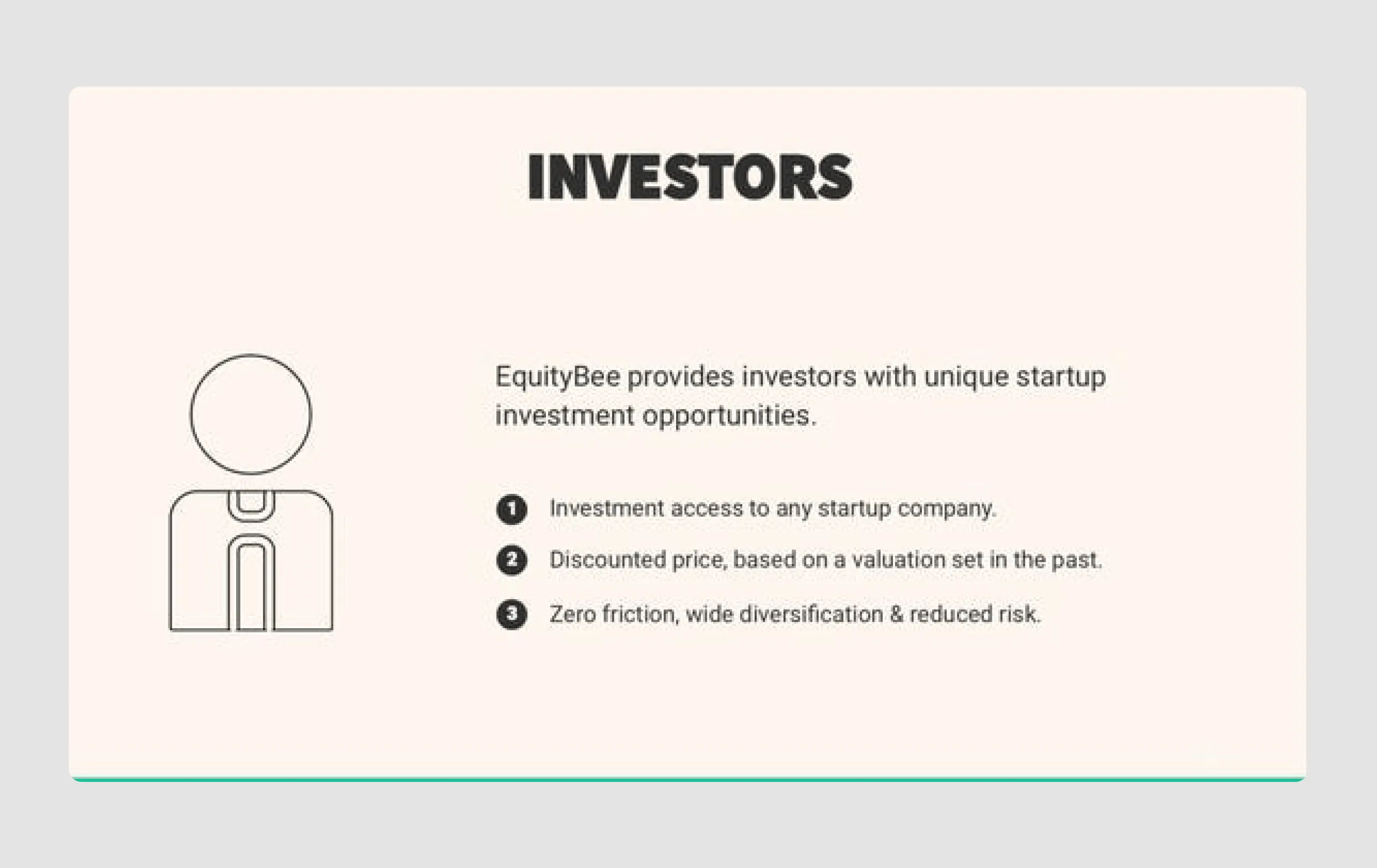
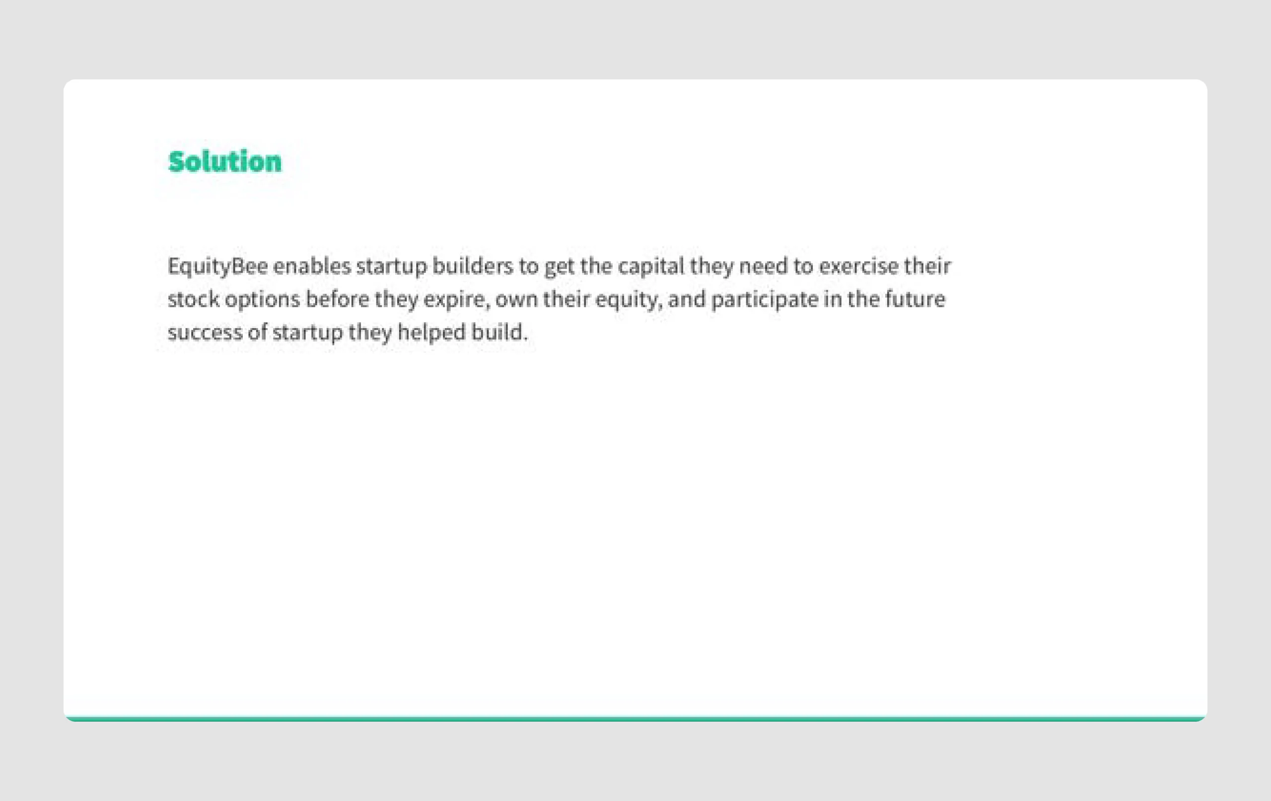
EquityBee is a platform that helps startup employees access the funds they need to exercise their stock options before they expire. The company connects employees with investors who provide the necessary financing, allowing employees to unlock the potential value of their equity. In 2020, EquityBee raised $6.6 million from investors to support its growth and expand operations into the U.S.
Content strengths
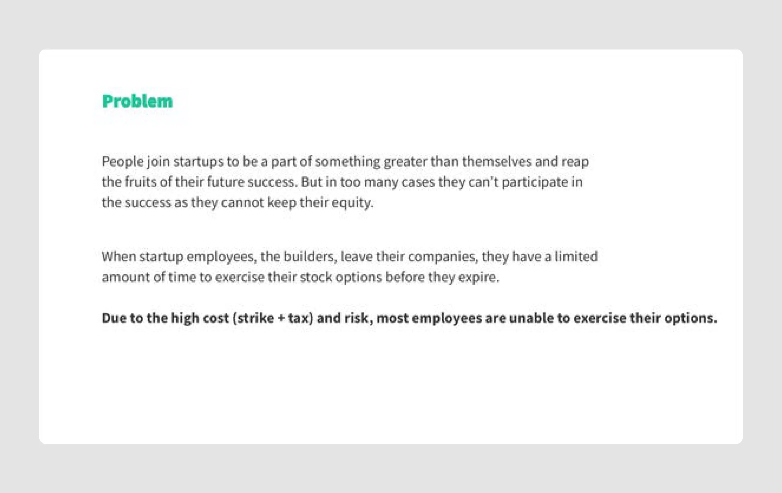
- Clear problem definition: The deck effectively defines the problem — employees lack funds to exercise stock options — making it easy for investors to understand the need for EquityBee's solution.
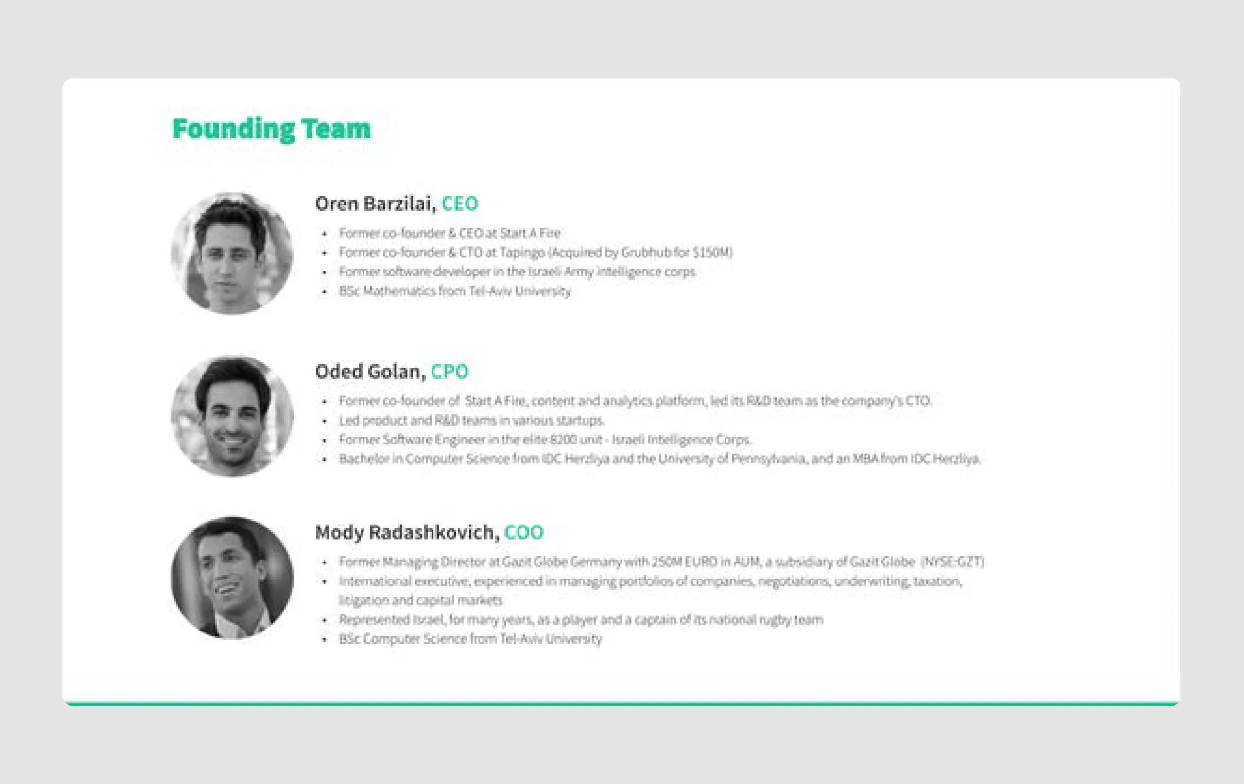
- Structured storytelling: The pitch progresses logically, starting from the problem to the solution, team, market opportunity, and growth history. This structure makes the information easy to digest.
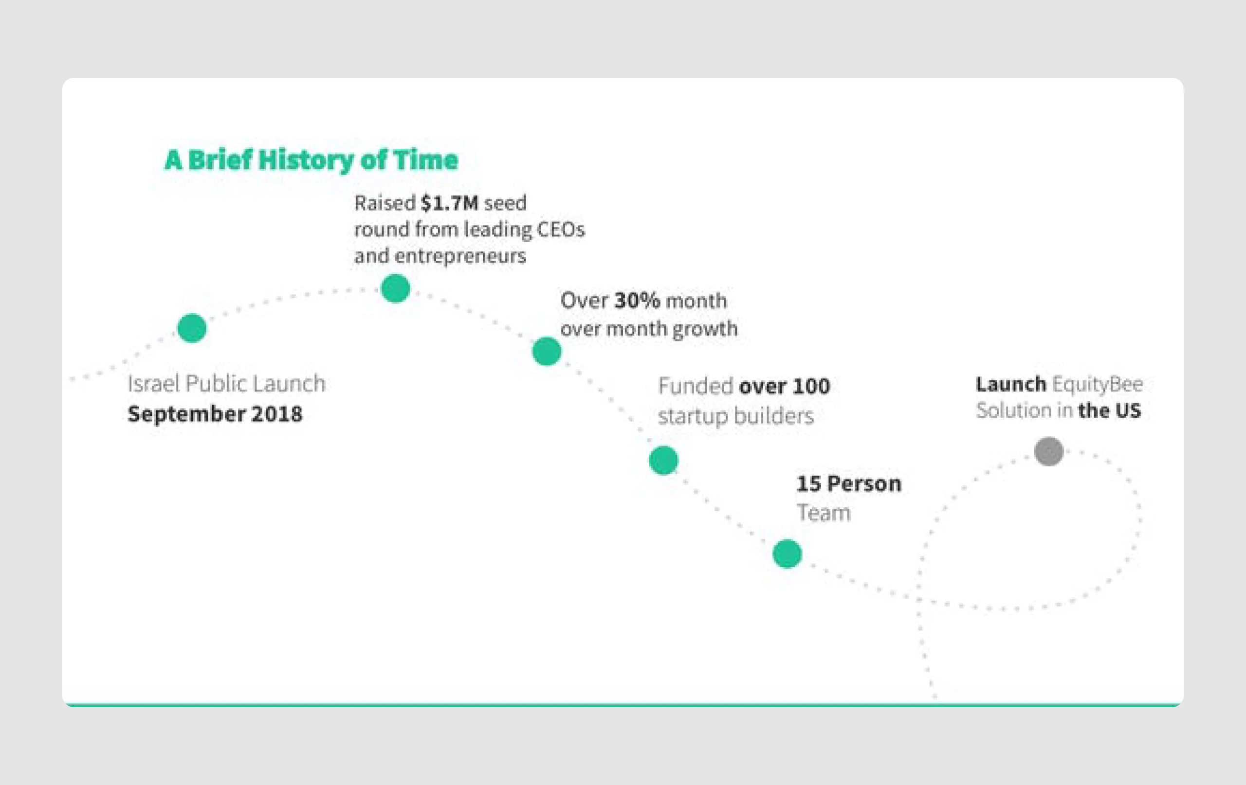
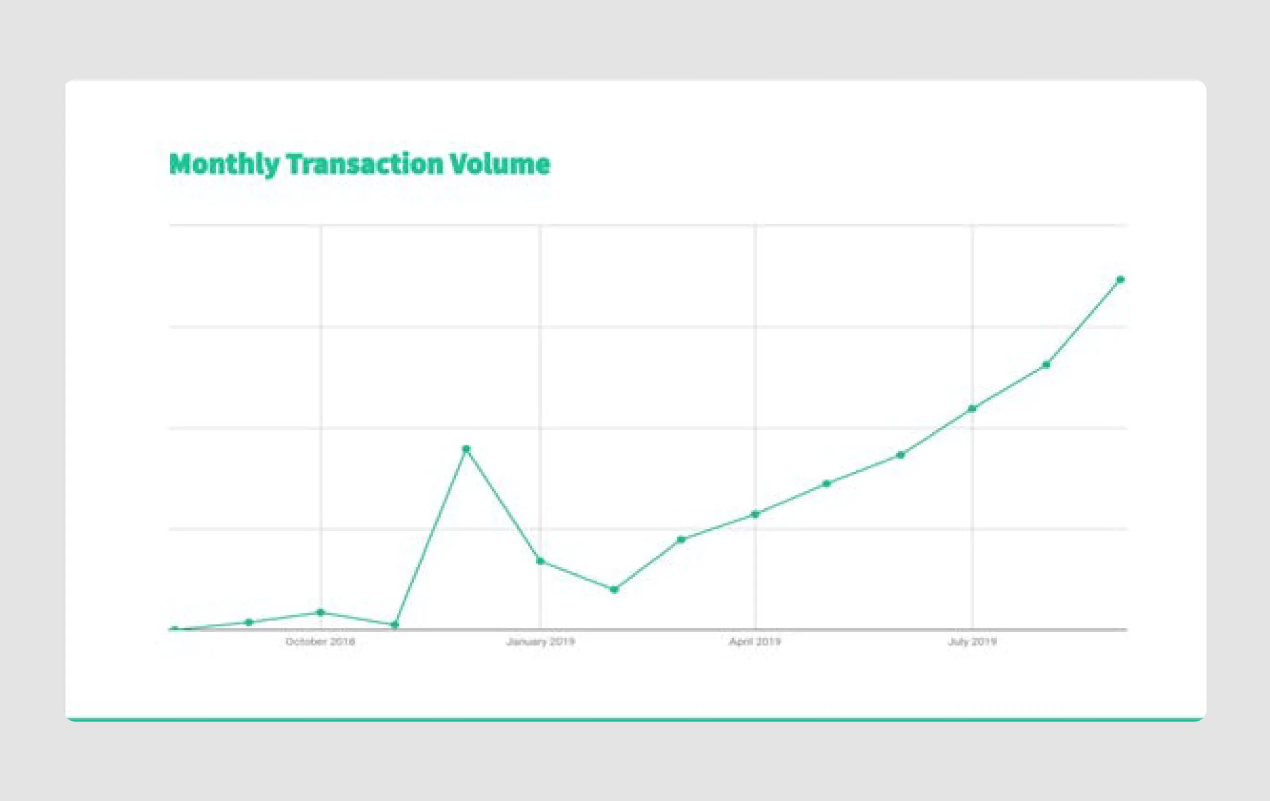
- Traction and growth metrics: Metrics like "over 100 startup builders funded" and a graph of transaction volume growth build credibility and demonstrate momentum.
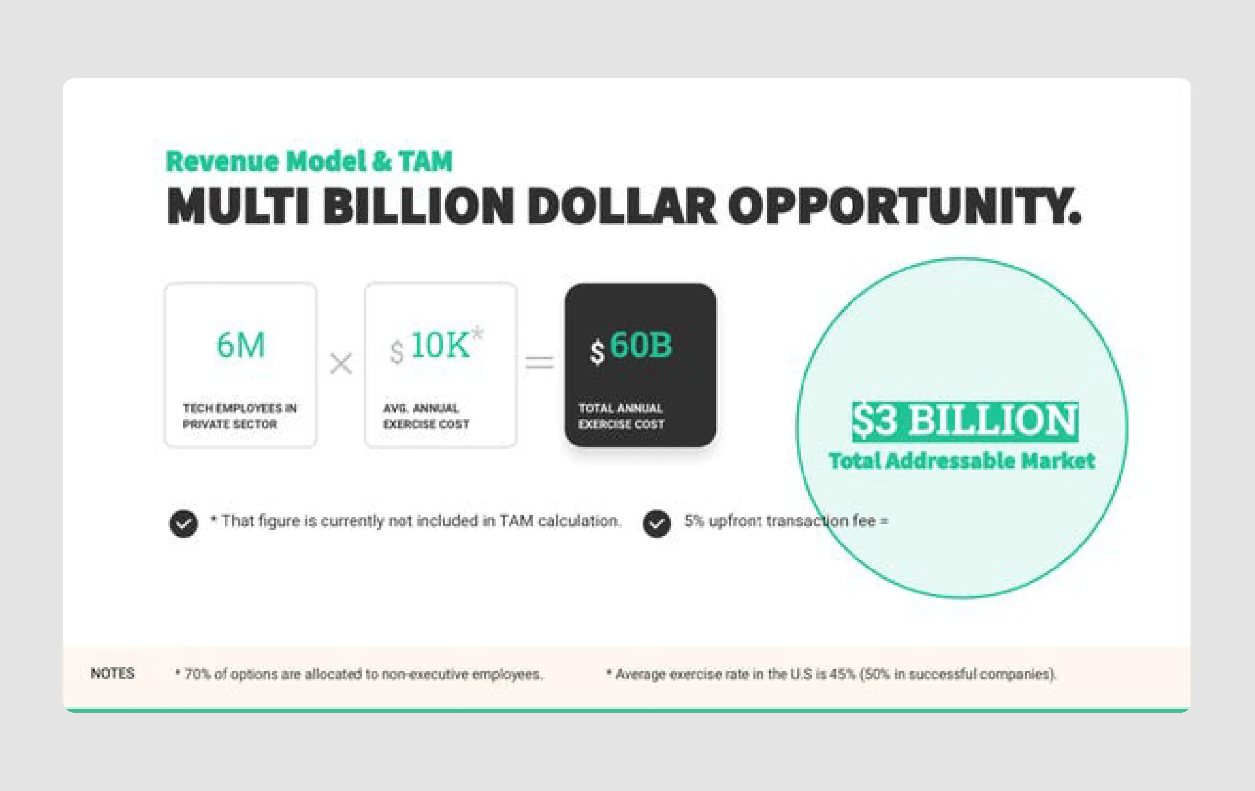
- Revenue model and market size: Clearly outlines the total addressable market and revenue potential, showing a large market opportunity that is crucial for investor appeal.
Design strengths
- Consistent, clean design: The minimalist design and consistent use of colors and fonts give the deck a polished look, keeping focus on the information without distractions.
- Visuals for key points: Use of icons, graphs, and a timeline effectively highlights key points (such as growth trajectory and market opportunity) and makes complex information more accessible.
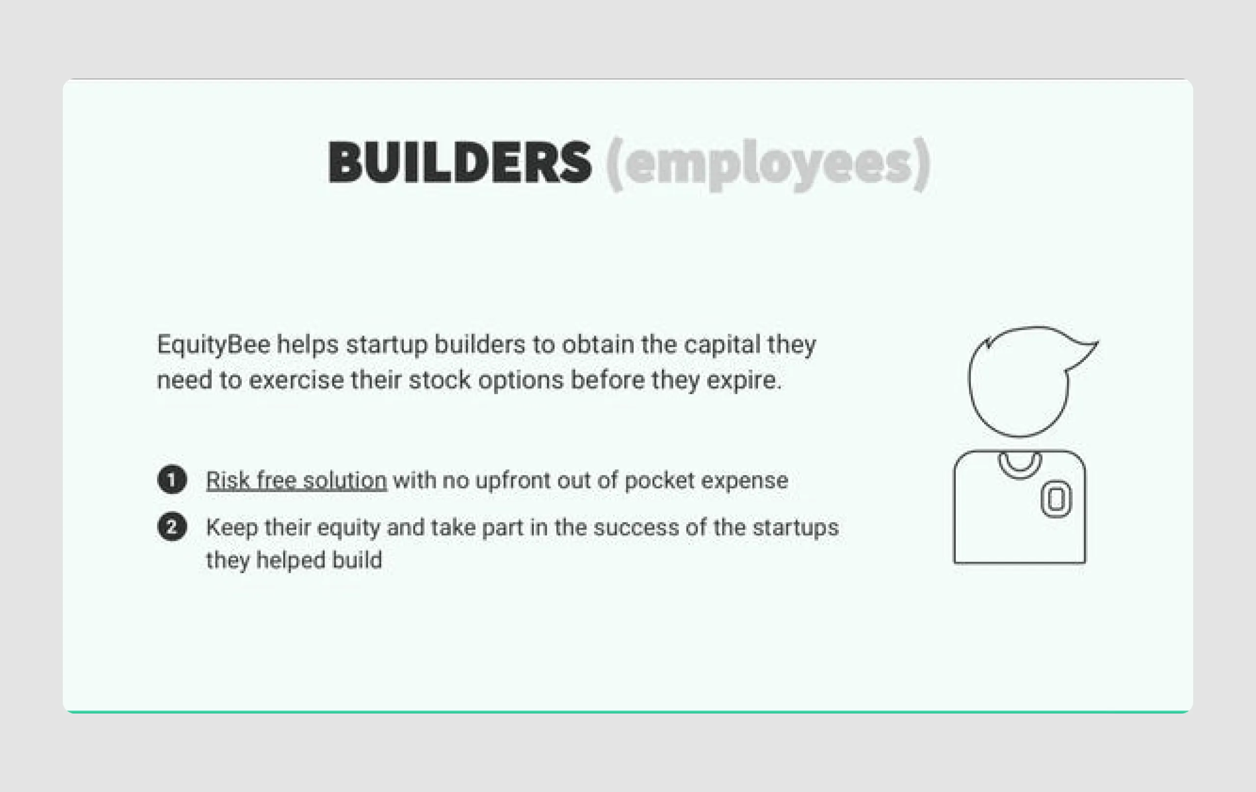
- Emphasis on key messages: Bolded or highlighted text (e.g., "risk-free solution") draws attention to critical elements, ensuring that the most important points stand out.
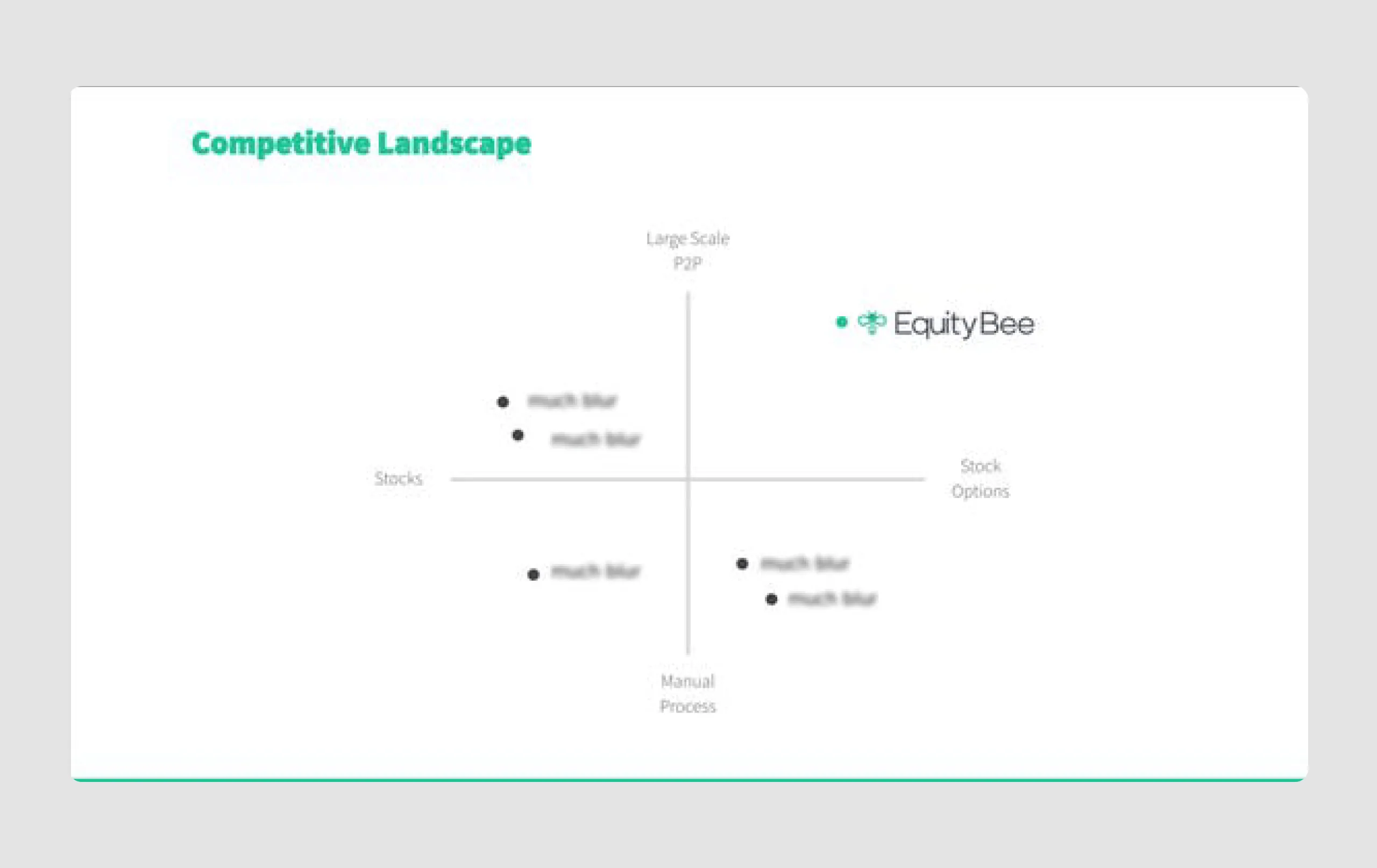
- Competitive landscape visualization: The quadrant chart for competition is simple yet effective, clearly positioning EquityBee within the market.
So, our first investor pitch deck example was effective because of its clear messaging, logical flow, and professional design, all of which create a compelling case for investment. The presentation balances detailed information with visual simplicity, aligning well with best practices for pitch decks.
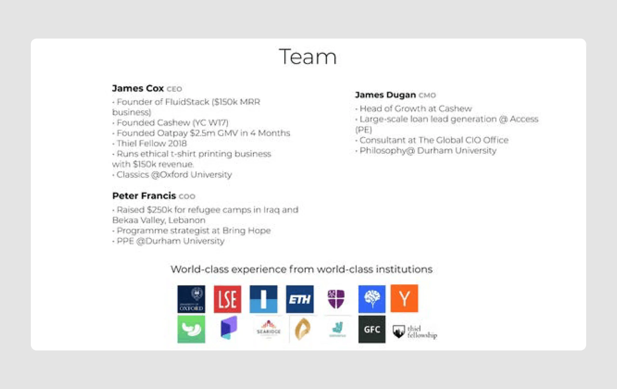
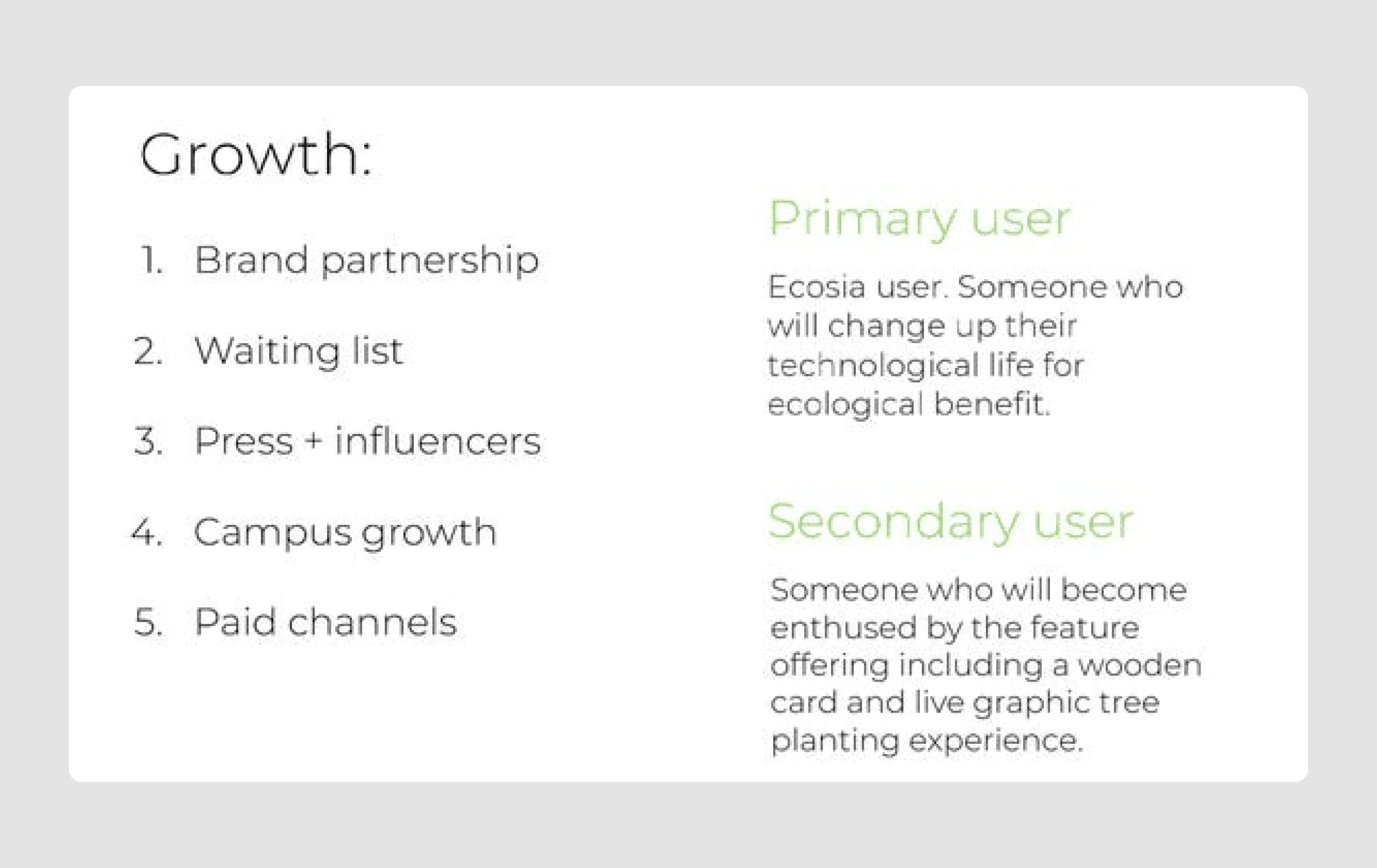
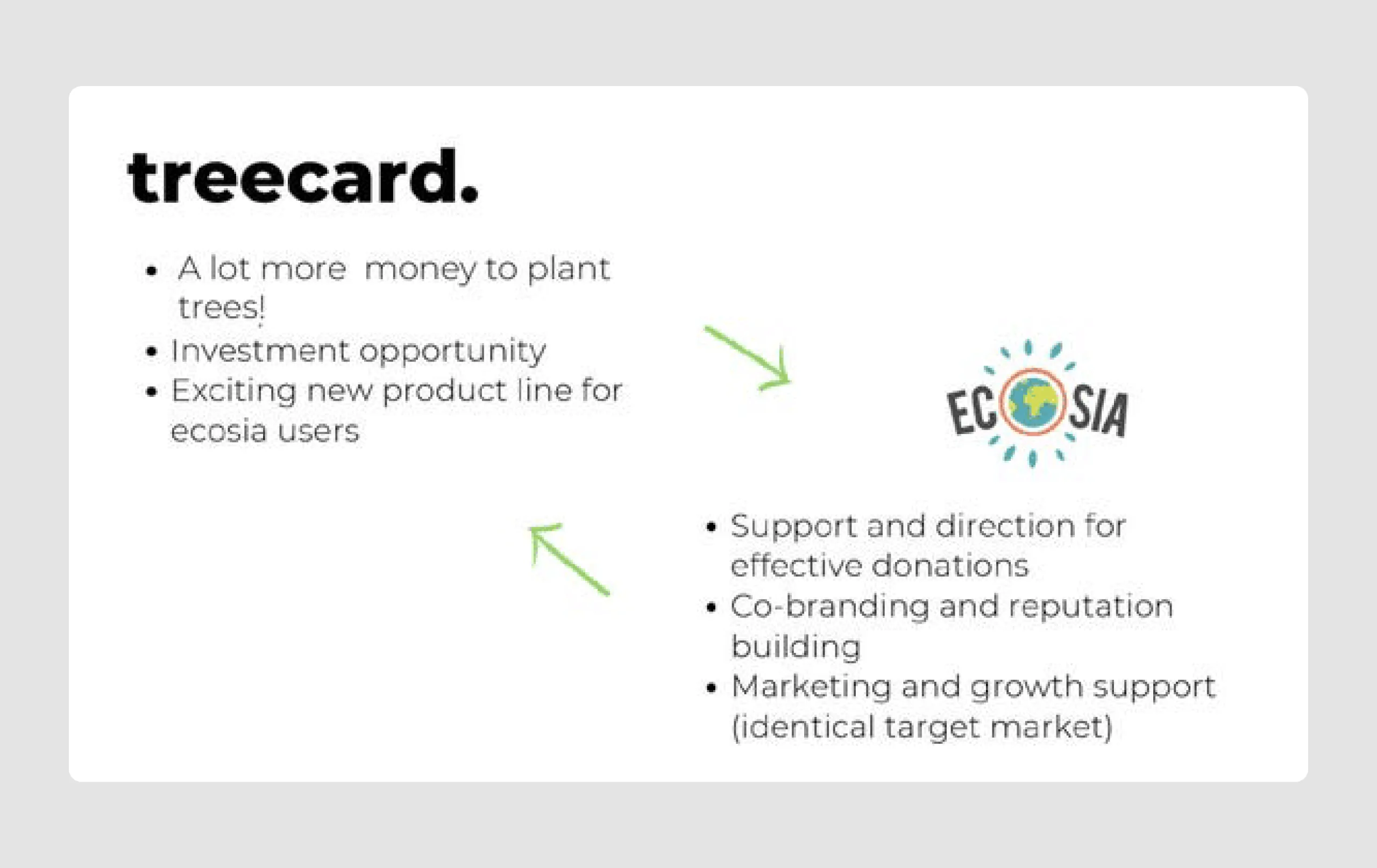
2. TreeCard ($1m)
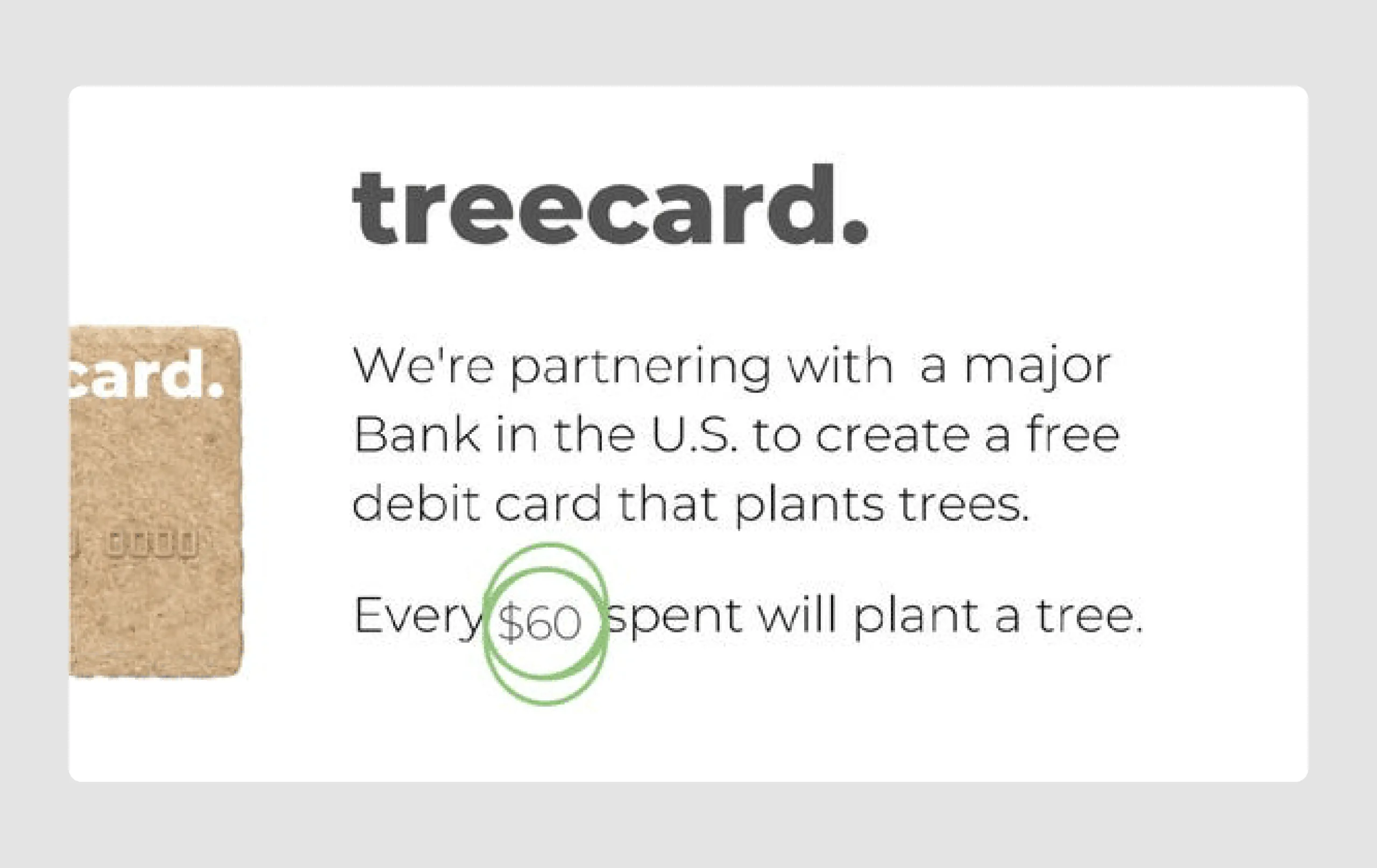
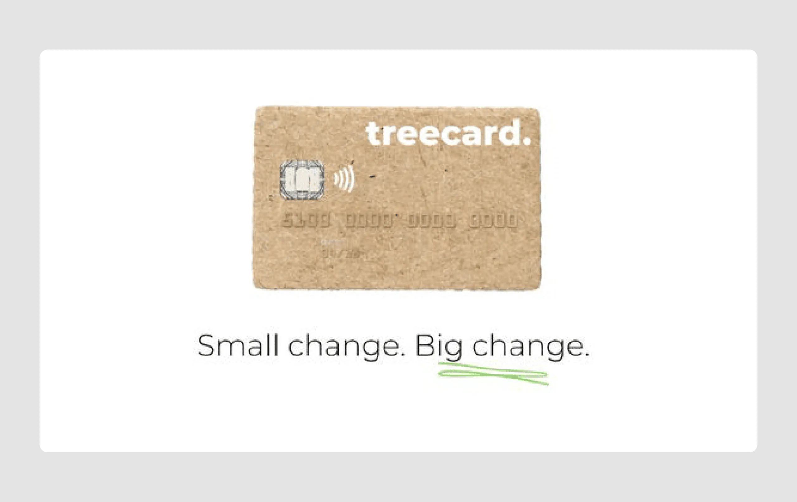
TreeCard is a green finance platform that enables consumers to spend, save, and invest in an eco-friendly way. Their idea, which attracted investment, is a wooden debit card that funds reforestation projects through interchange fees.
Content strengths
- Clear mission statement: The deck opens with a strong tagline, “Small change. Big change,” which concisely communicates TreeCard's mission of creating a positive environmental impact.
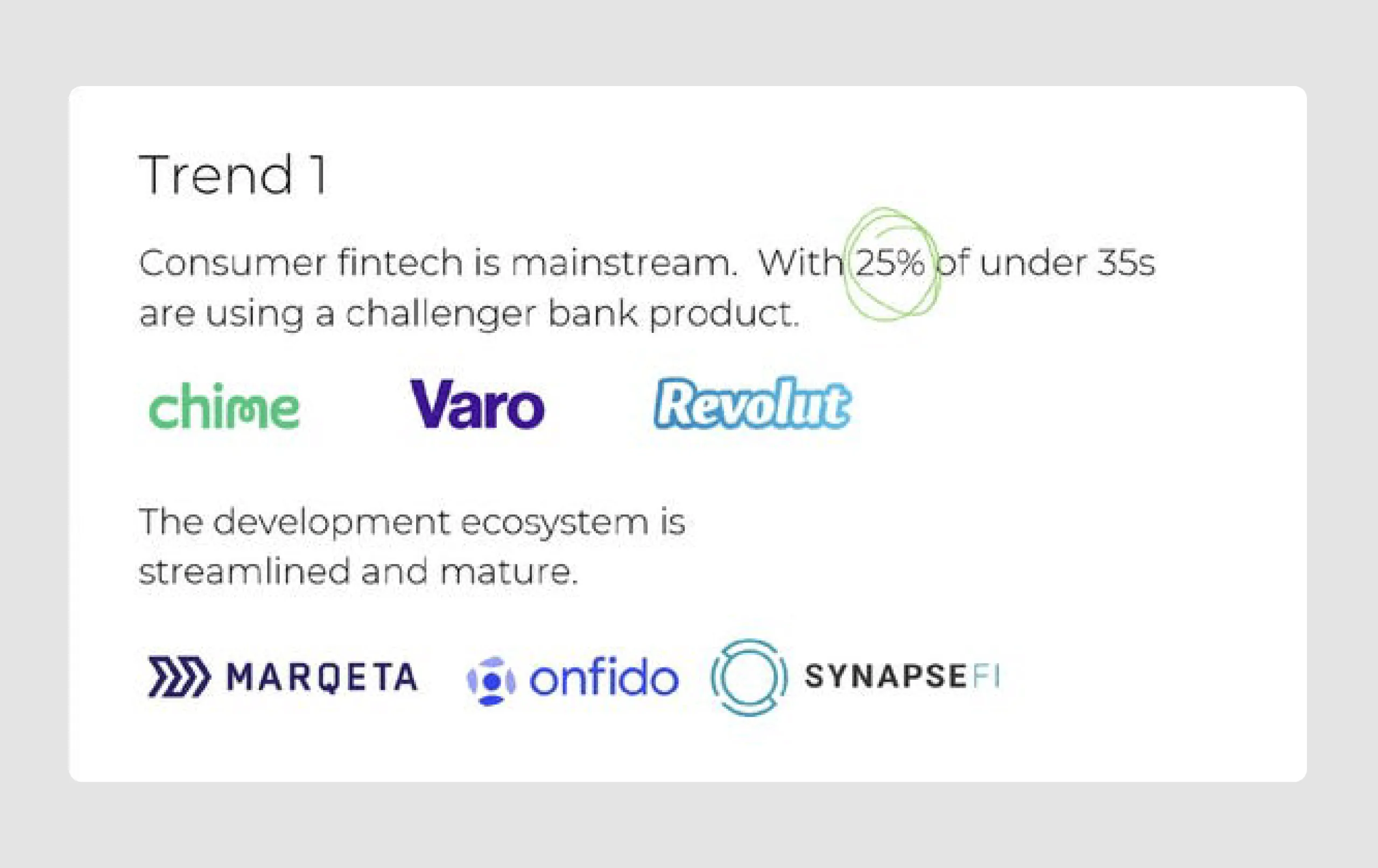
- Market trends: The deck includes relevant market trends (consumer fintech adoption and environmental concern), showing both demand and alignment with current values, which strengthens the case for TreeCard.
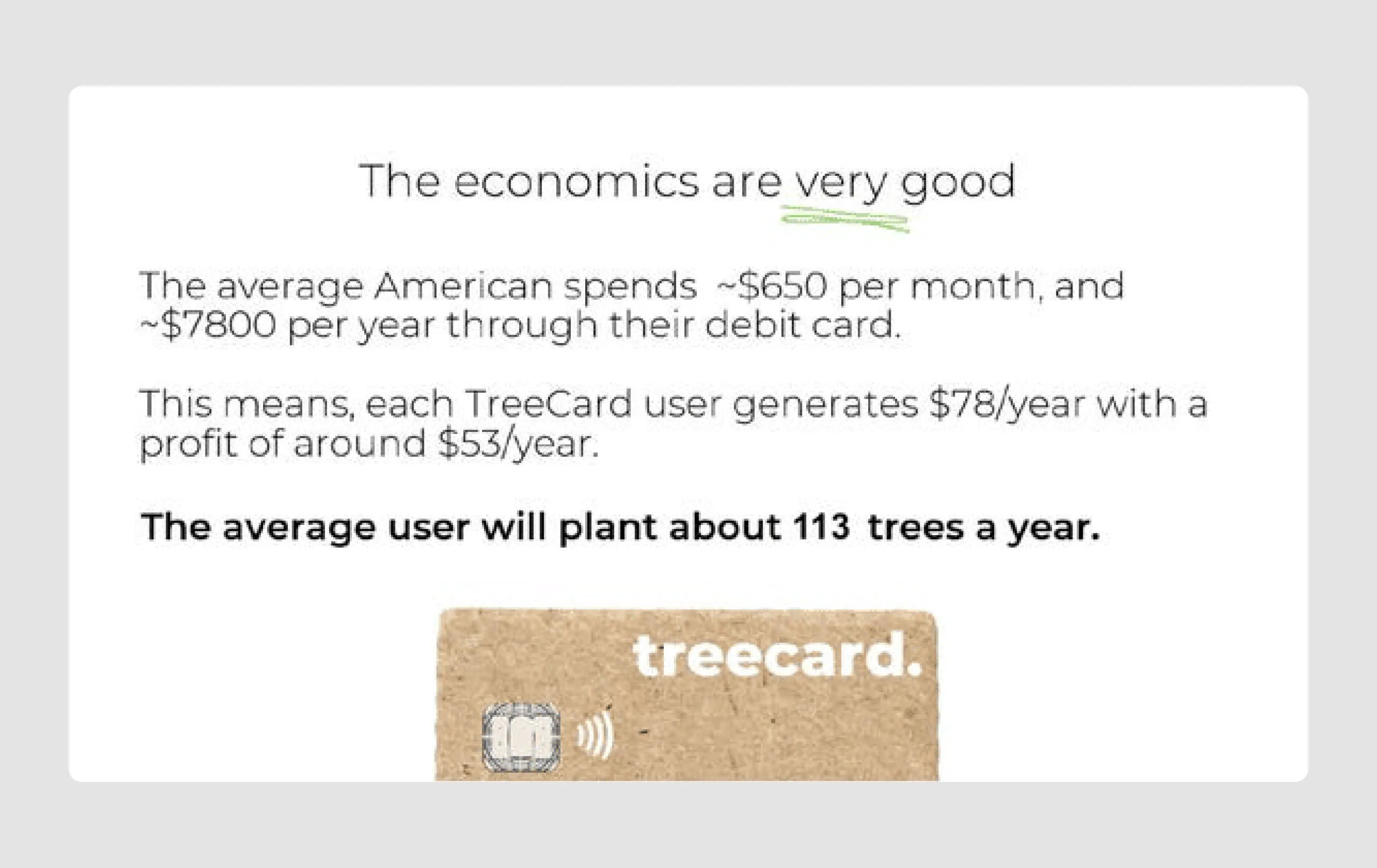
- Compelling economics: The projected financial impact is clearly outlined, showing both user profitability and environmental contribution, making it appealing to investors looking for a sustainable model.
Design strengths
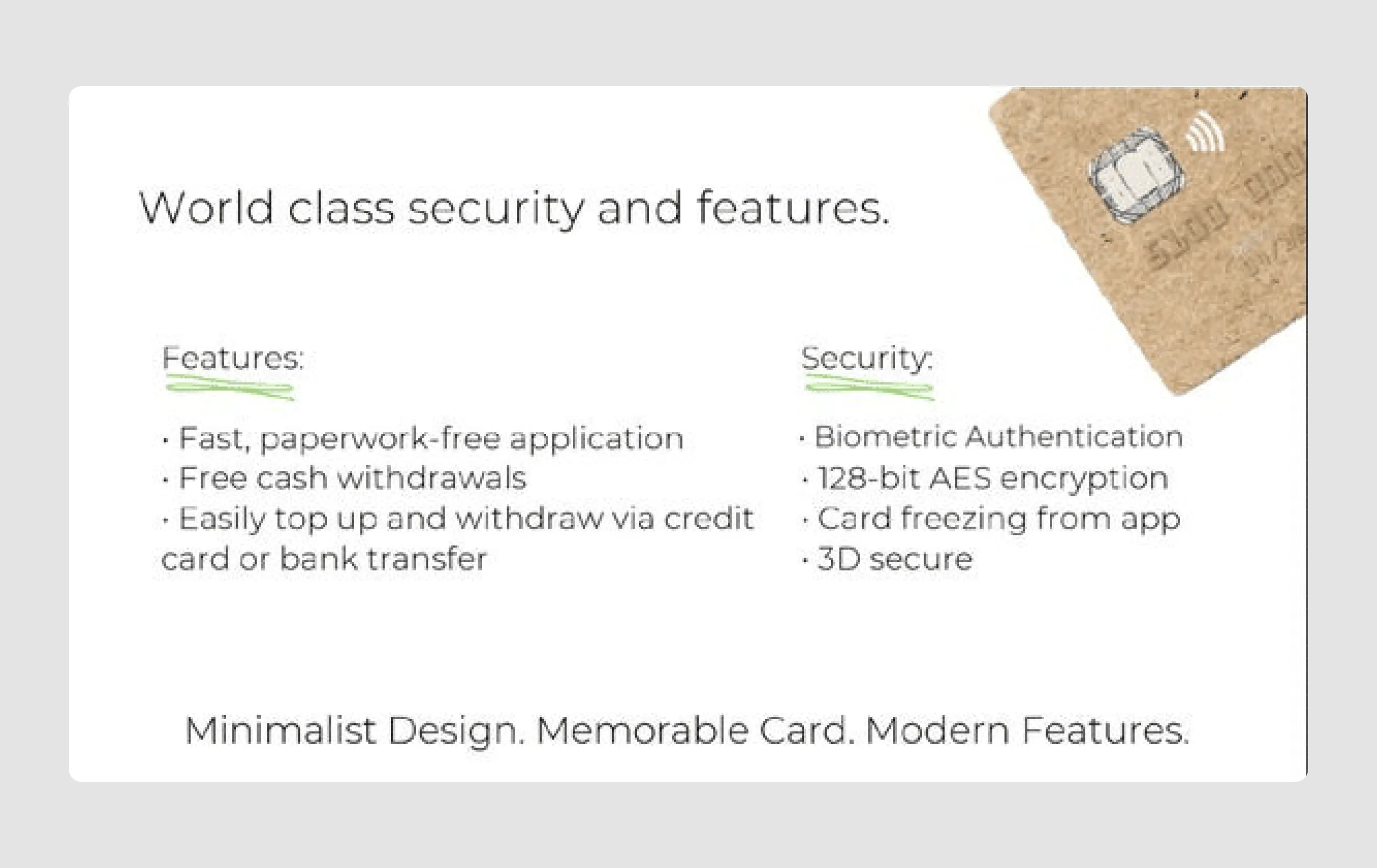
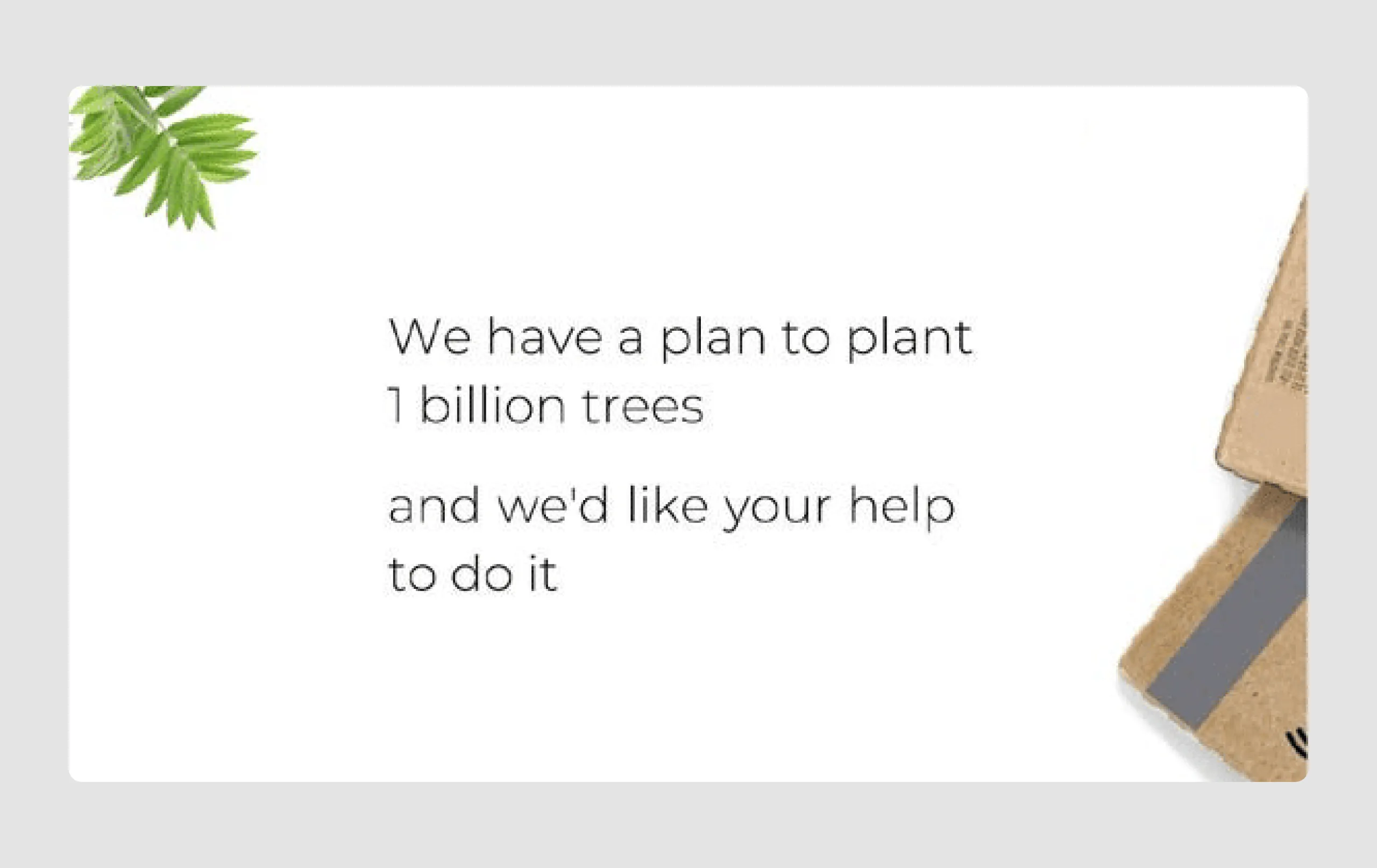
- Minimalist and eco-friendly design: The visual design is minimalist and reflects the product’s sustainability mission. The use of earthy tones and subtle green accents reinforces the eco-conscious brand identity.
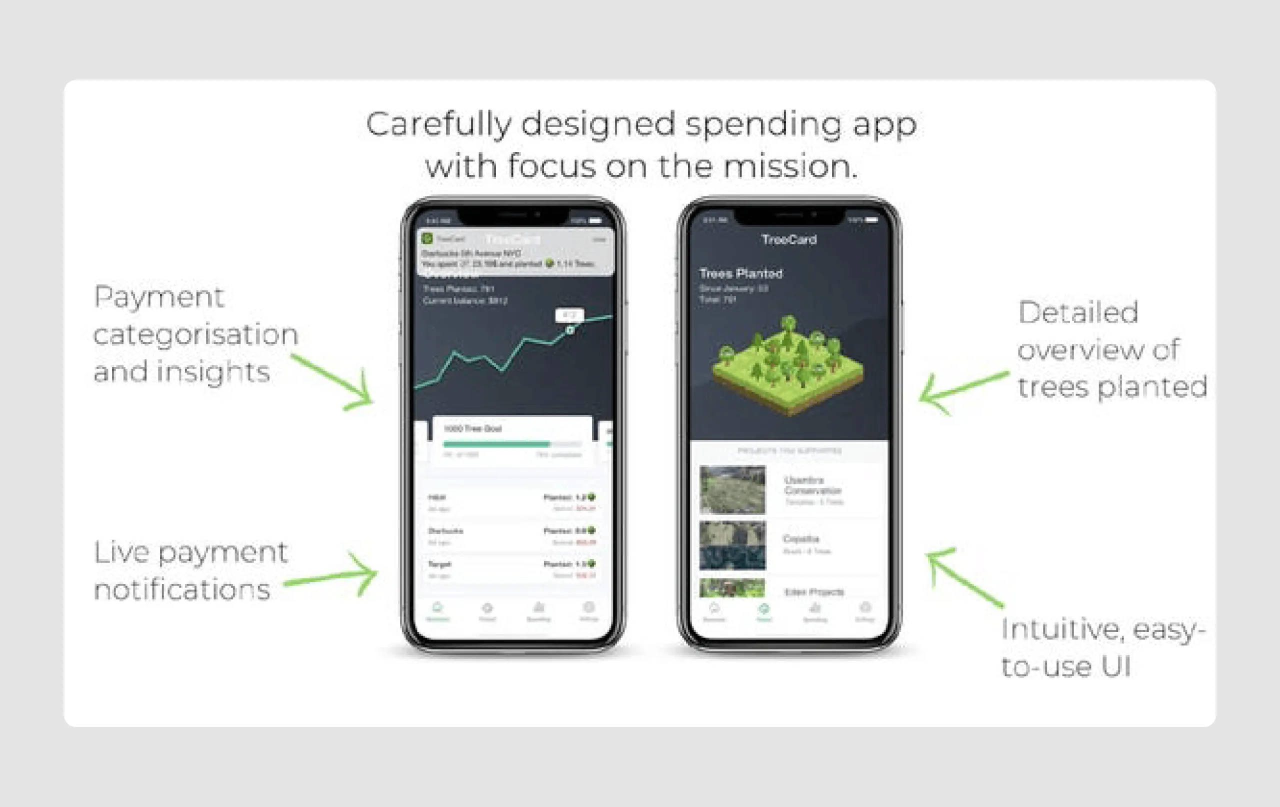
- Engaging visuals: The deck uses icons, logos of fintech and environmental organizations, and product mockups effectively, making it visually appealing and informative without overwhelming text.
- Highlighted key metrics: Important figures, like “every $60 spent will plant a tree,” are circled or bolded, drawing immediate attention to impactful data.
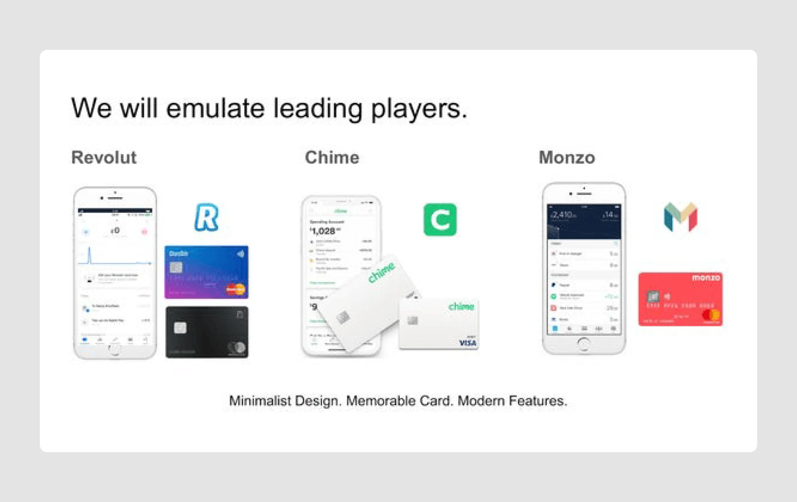
- Competitive positioning: The pitch deck presentation compares TreeCard to established players (Chime, Revolut, Monzo), positioning TreeCard within the fintech space while highlighting its unique environmental angle.
Overall, the TreeCard pitch deck stands out for its clear, mission-driven narrative, visually aligned design, and emphasis on both economic viability and environmental impact, creating a compelling presentation and genuinely strong case for investment.
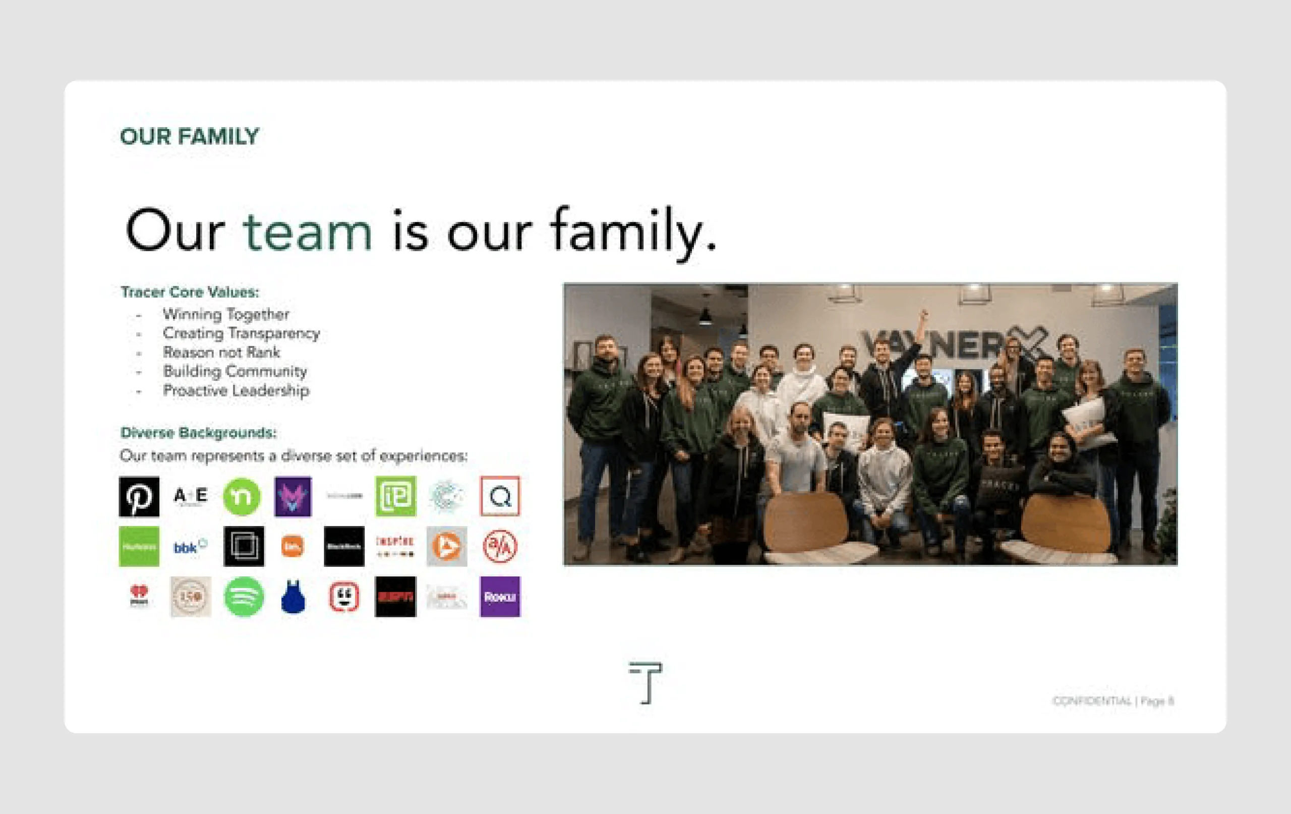
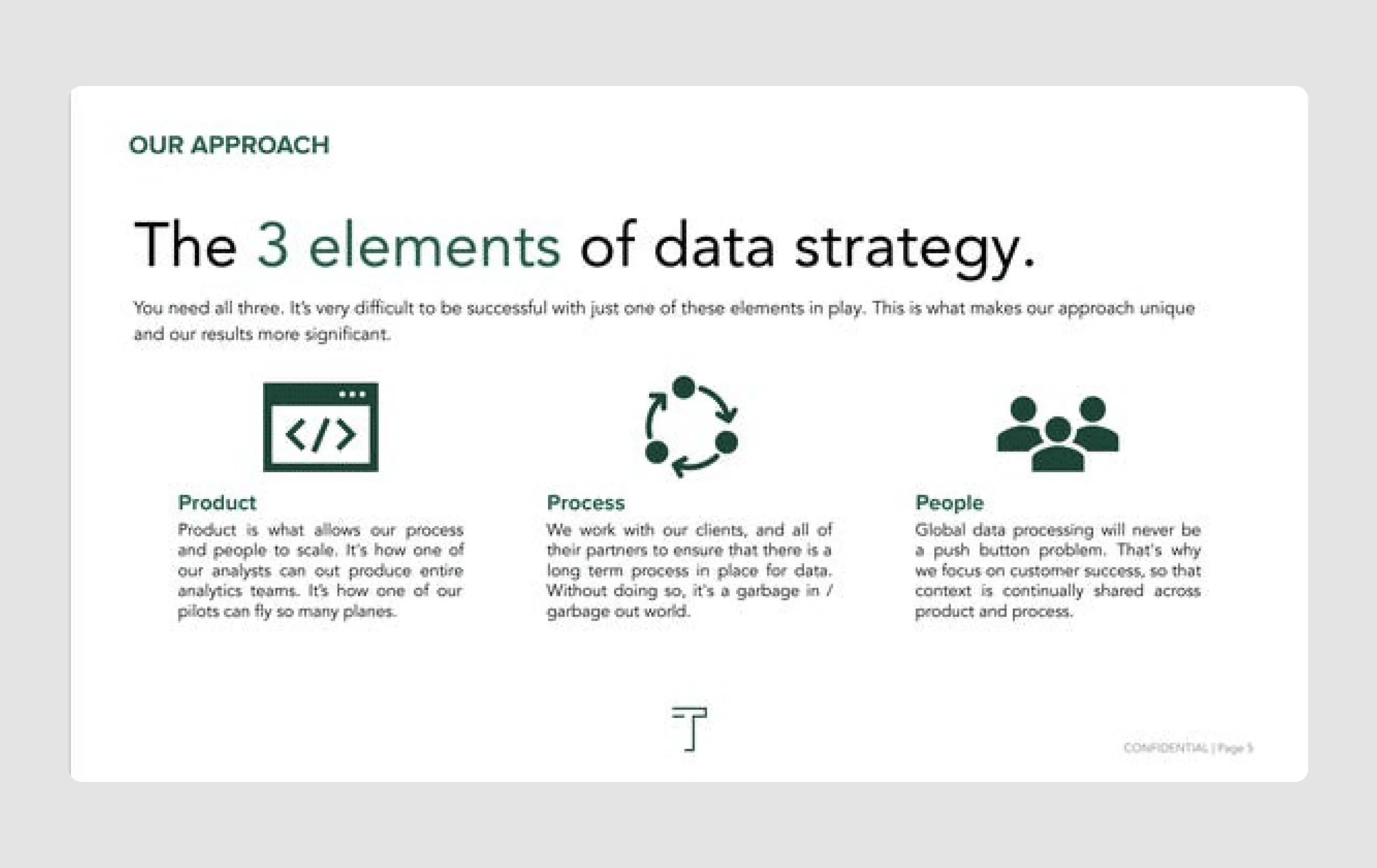
3. Tracer ($10m)
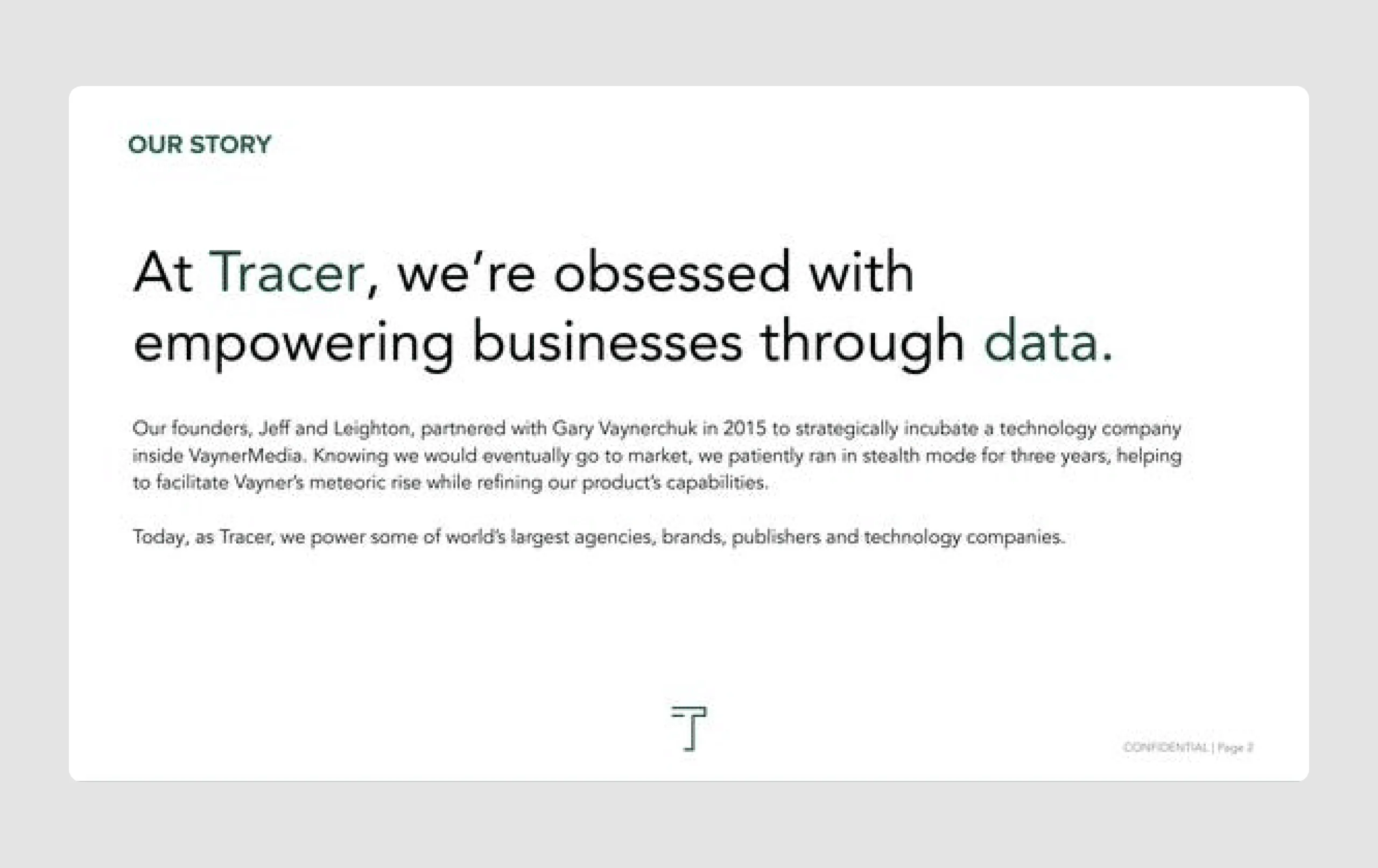
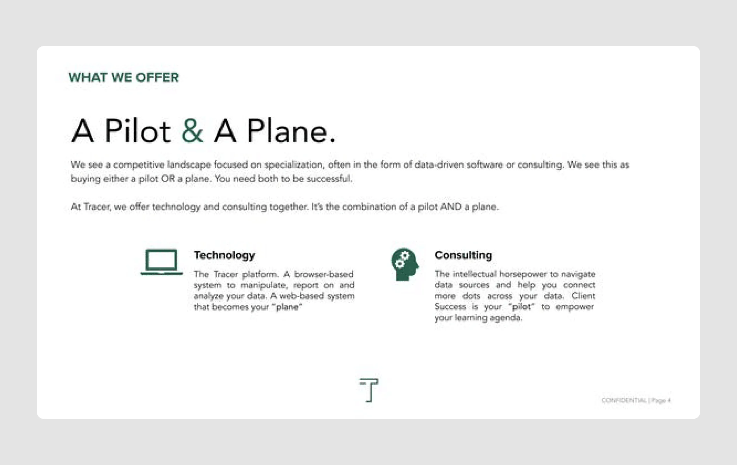
Tracer is a data analytics platform that automatically collects and organizes non-personally identifiable data for businesses. Initially incubated within Gary Vaynerchuk’s VaynerMedia, Tracer combines its software with free consulting to help clients manage and understand their data.
Content strengths
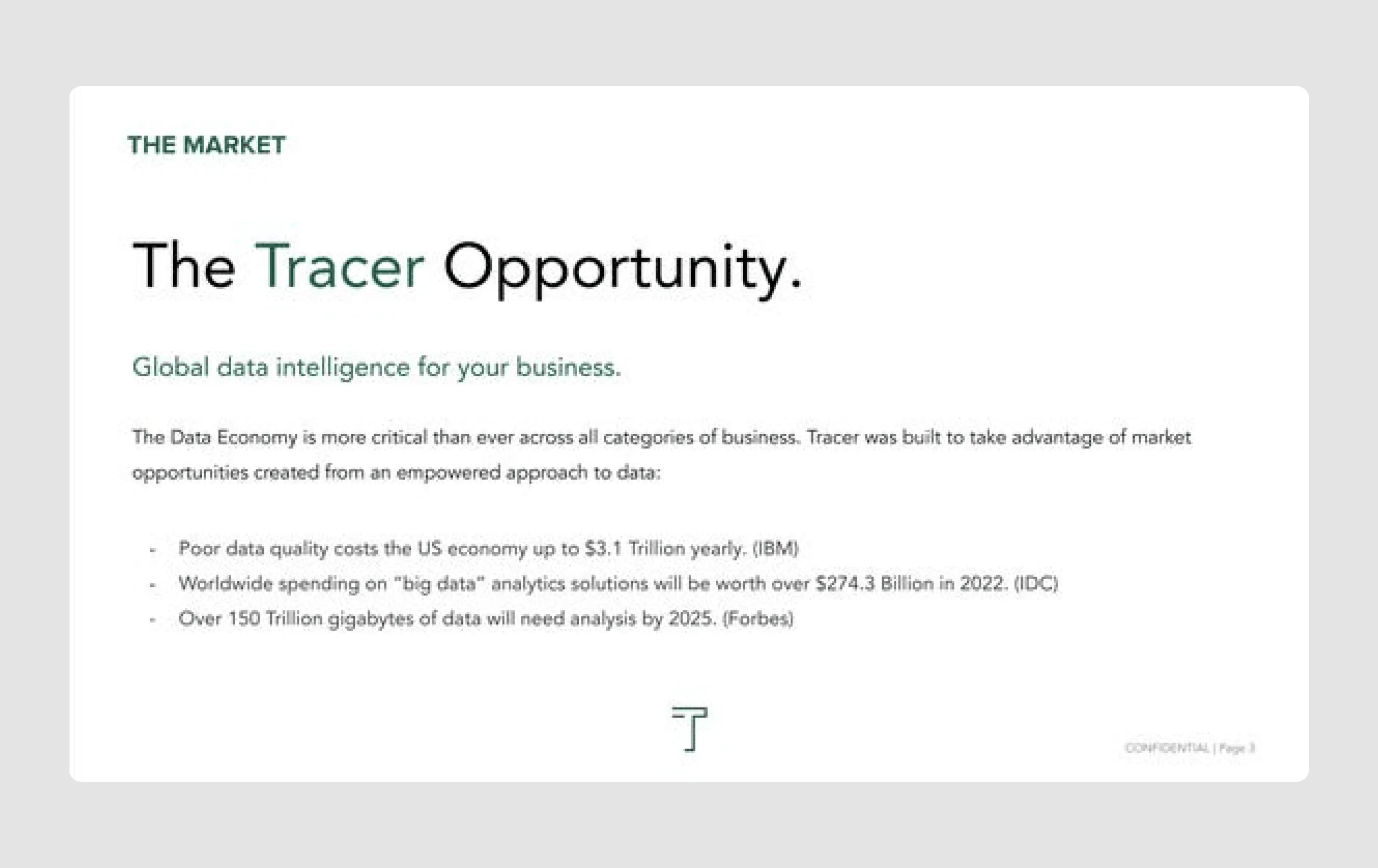
- Strong market validation: It highlights key market statistics on the economic impact of poor data quality, showing the urgency and scale of the problem Tracer addresses. By the way, we've got a great article on how to validate your idea with no funding.
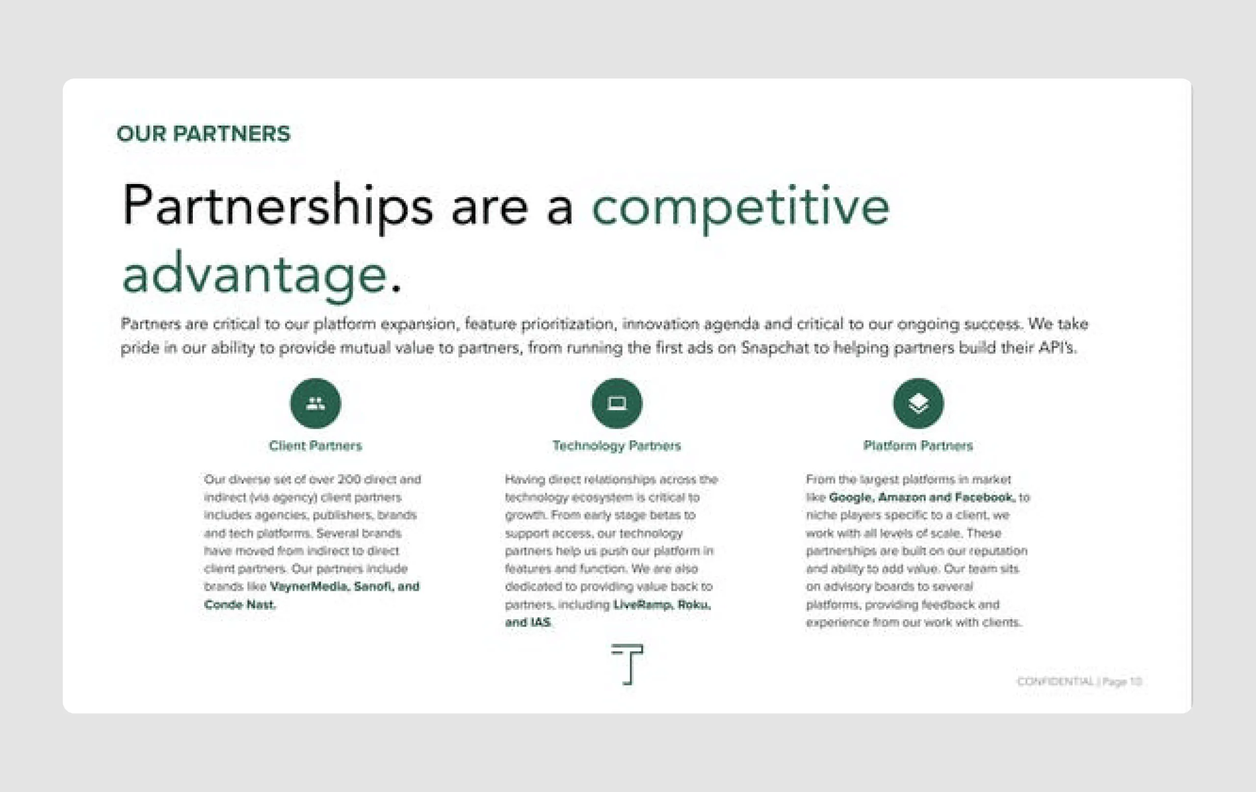
- Strategic partnerships: Emphasizes partnerships with high-profile companies (e.g., Google, Facebook), adding credibility and illustrating Tracer’s network strength.
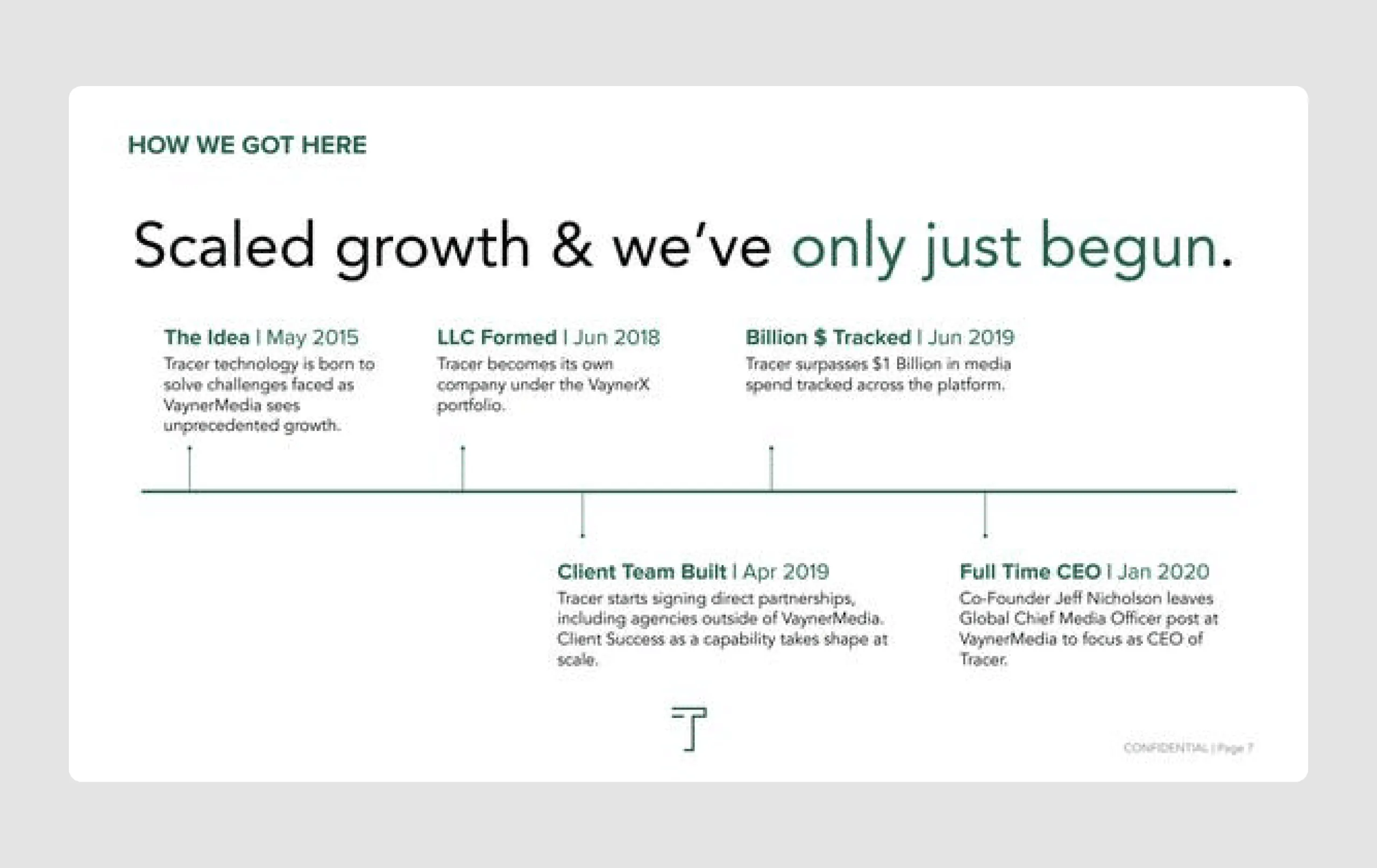
- Growth milestones: A timeline of Tracer's development shows a clear growth trajectory, providing confidence in the company's progress and scalability.
Design strengths
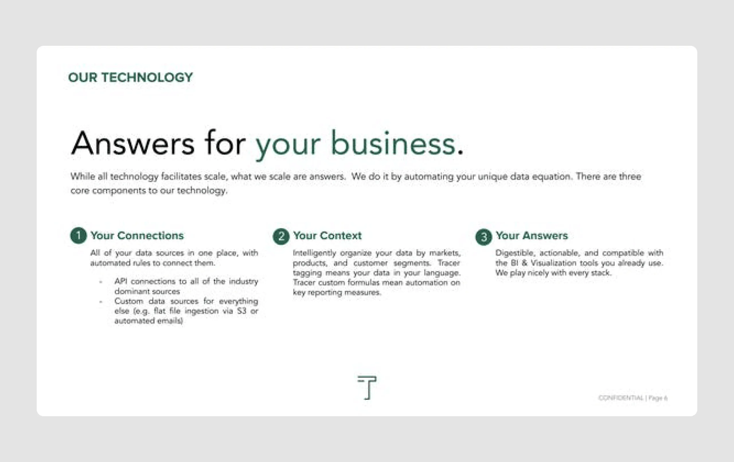
- Clean and professional design: The clean layout and consistent color scheme create a polished, professional look, keeping the focus on the content.
- Effective use of typography: Emphasizing keywords (like "data" and "opportunity") helps to reinforce Tracer's data-driven mission.
- Clear section dividers: Each slide has distinct headers and well-organized content, making the pitch easy to follow and visually digestible.
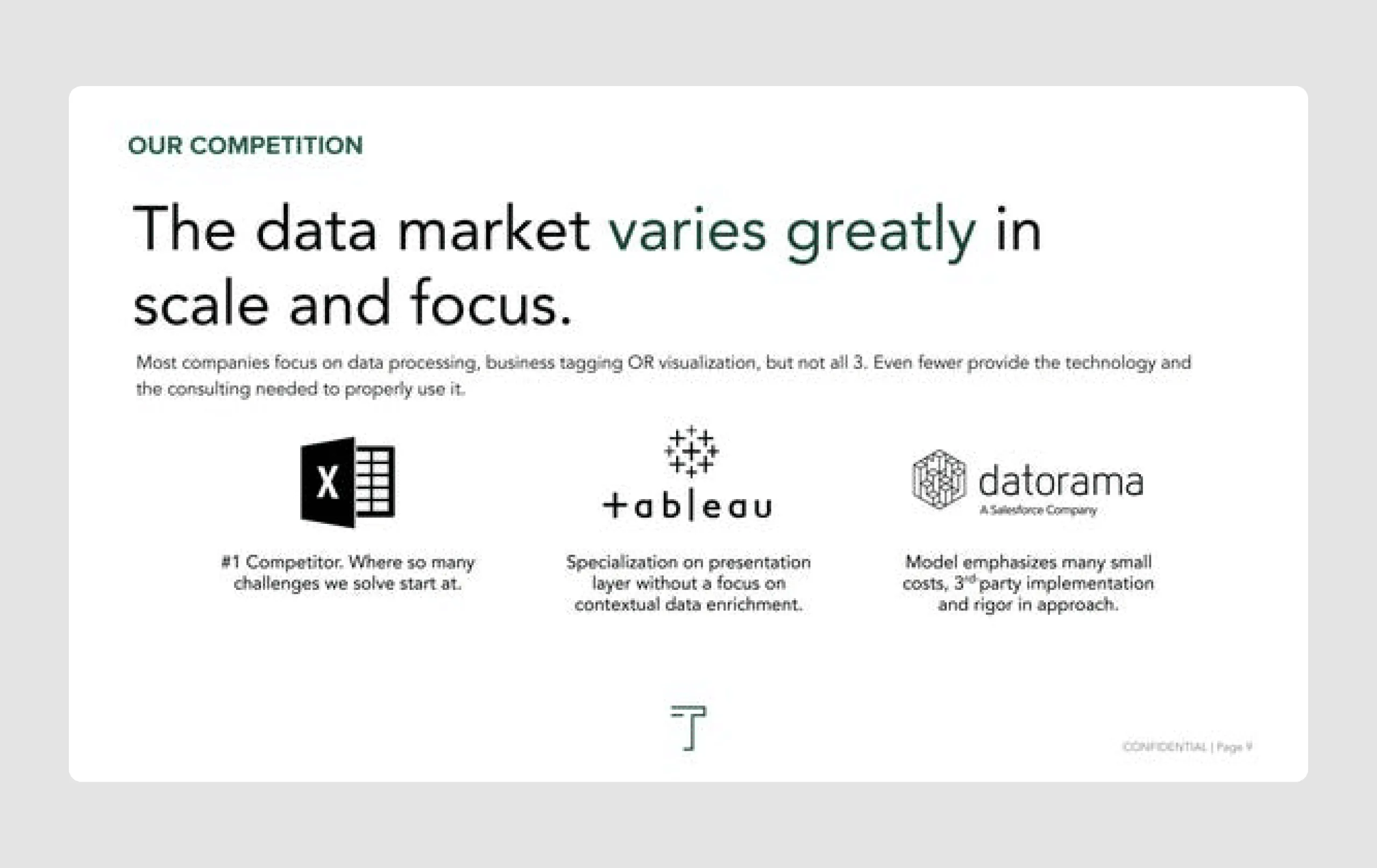
- Use of logos for credibility: The display of partner and competitor logos reinforces Tracer's place in the market and its competitive advantages.
So, the Tracer pitch deck excels in delivering a concise, data-driven narrative with a clean and structured design, which effectively supports their mission and unique approach. The professional tone, combined with a clear focus on growth and partnerships, makes it a strong pitch for investors, and one of the more inspiring pitch deck examples in this list.
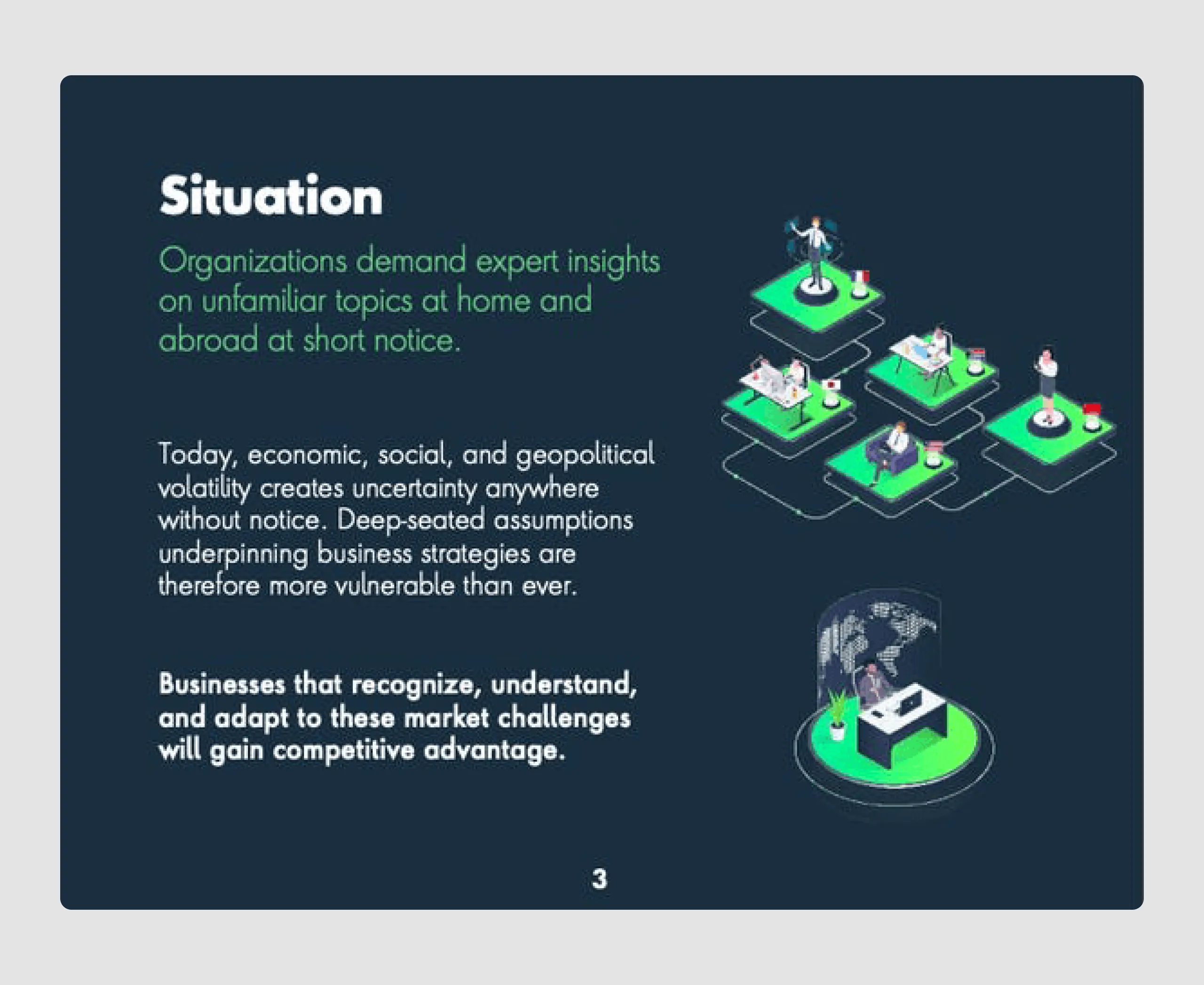
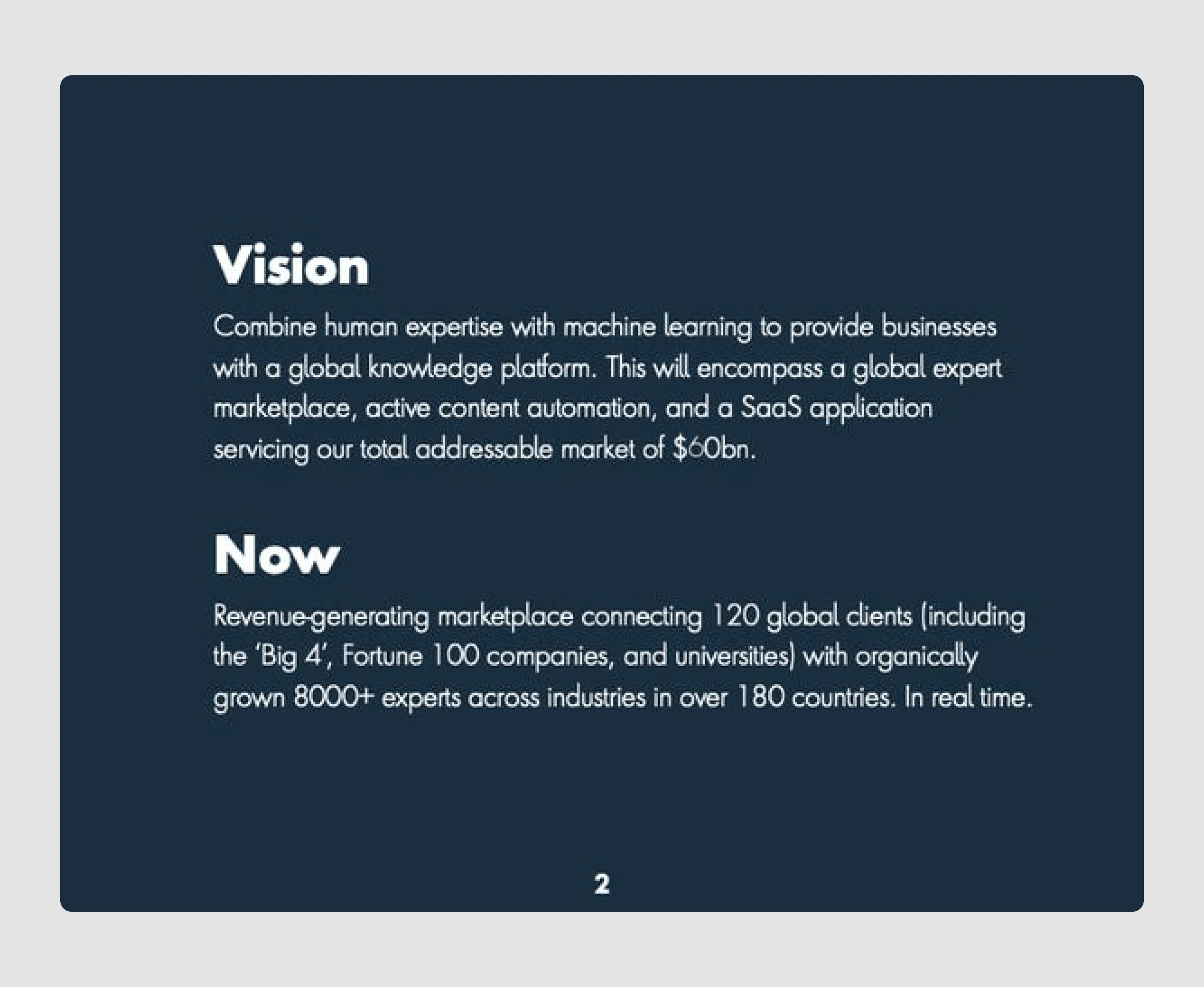
4. GlobalWonks ($2m)
GlobalWonks is an insights software company that provides real-time expert knowledge to enterprises, enabling them to easily access customized insights from specialists worldwide. GlobalWonks raised $2 million to expand its technology, driven by the rising demand for remote expertise in a post-COVID world.
Content strengths
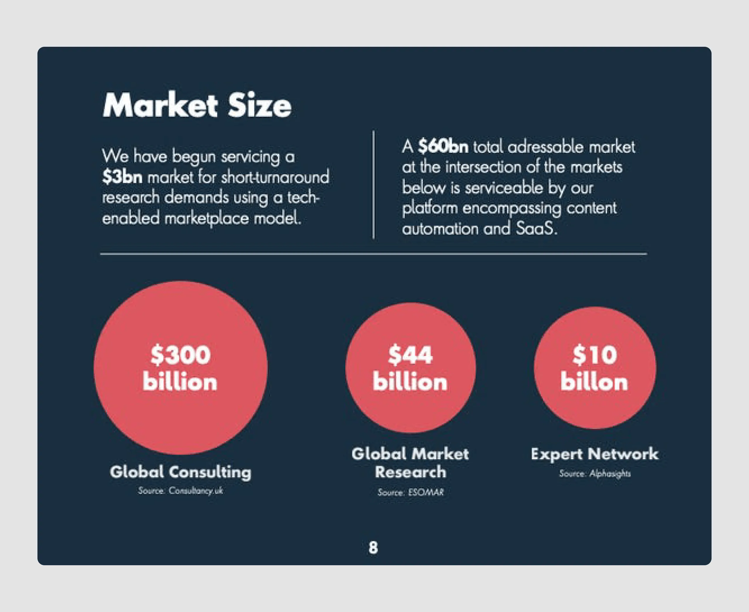
- Strong market validation: The deck includes a substantial total addressable market (TAM) of $60 billion, which shows a large market potential and opportunity for growth.
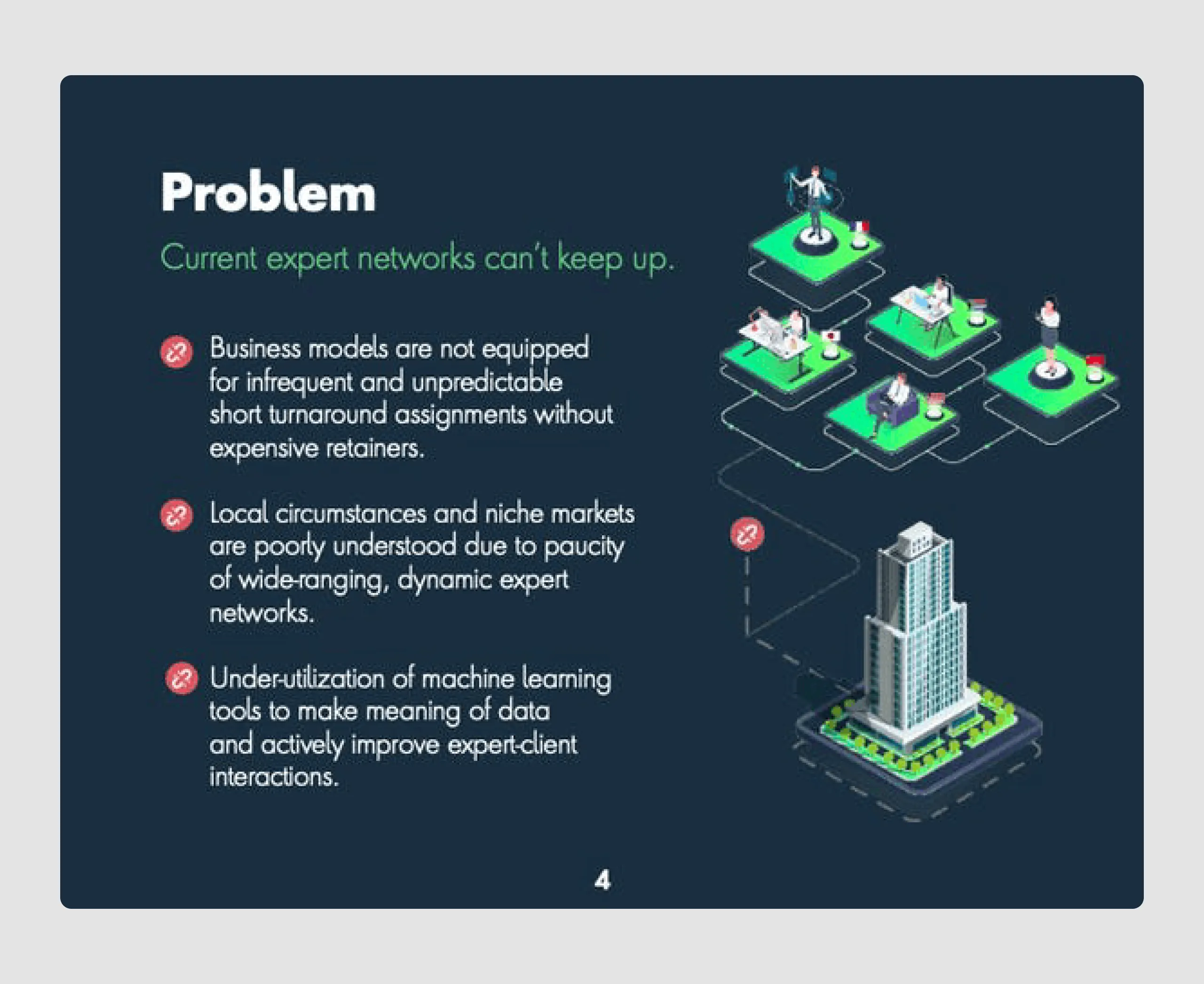
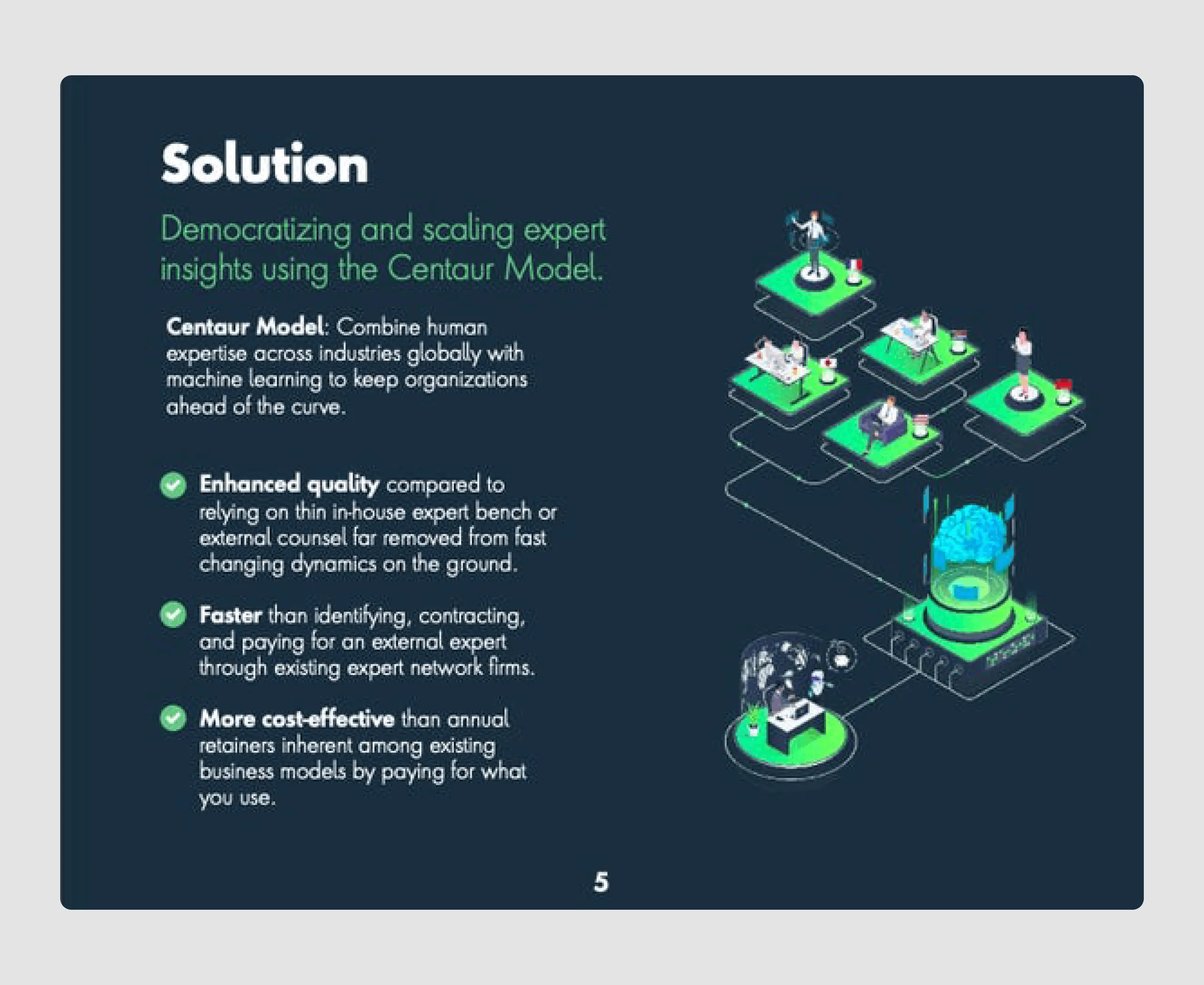
- Problem-solution fit: It clearly explains the limitations of current expert networks and presents GlobalWonks' Centaur Model as a unique solution that combines human expertise with machine learning.
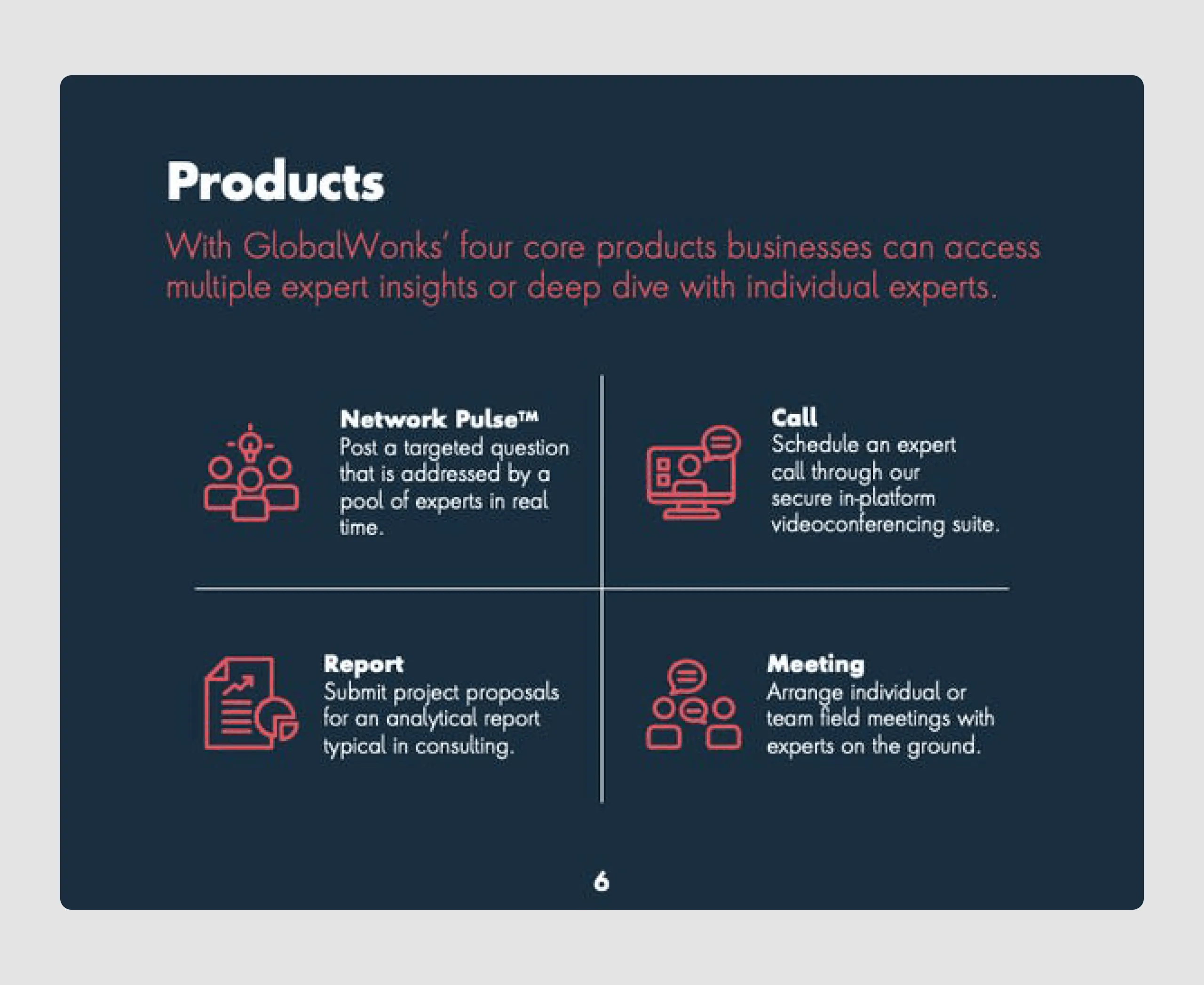
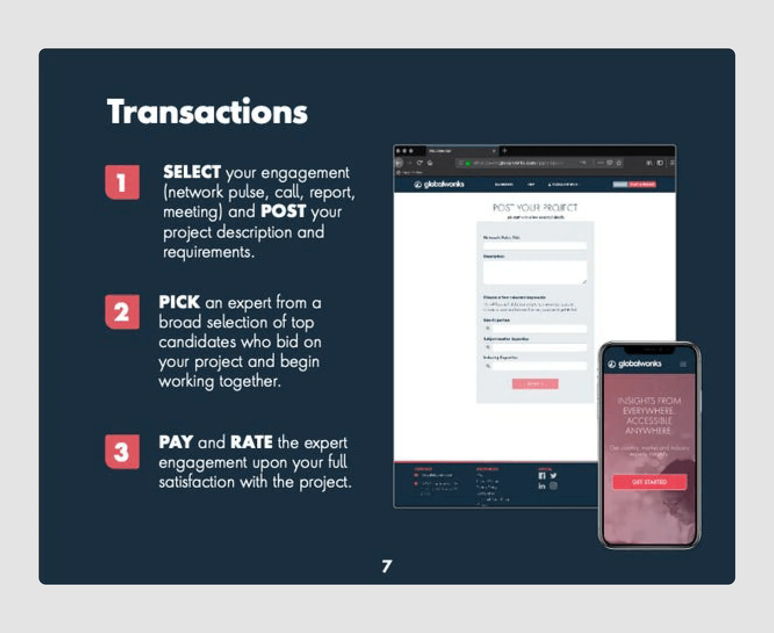
- Product details and engagement model: By outlining its four main products (Network Pulse, Call, Report, Meeting) and a simple engagement process, it gives investors a clear understanding of its offerings and user experience.
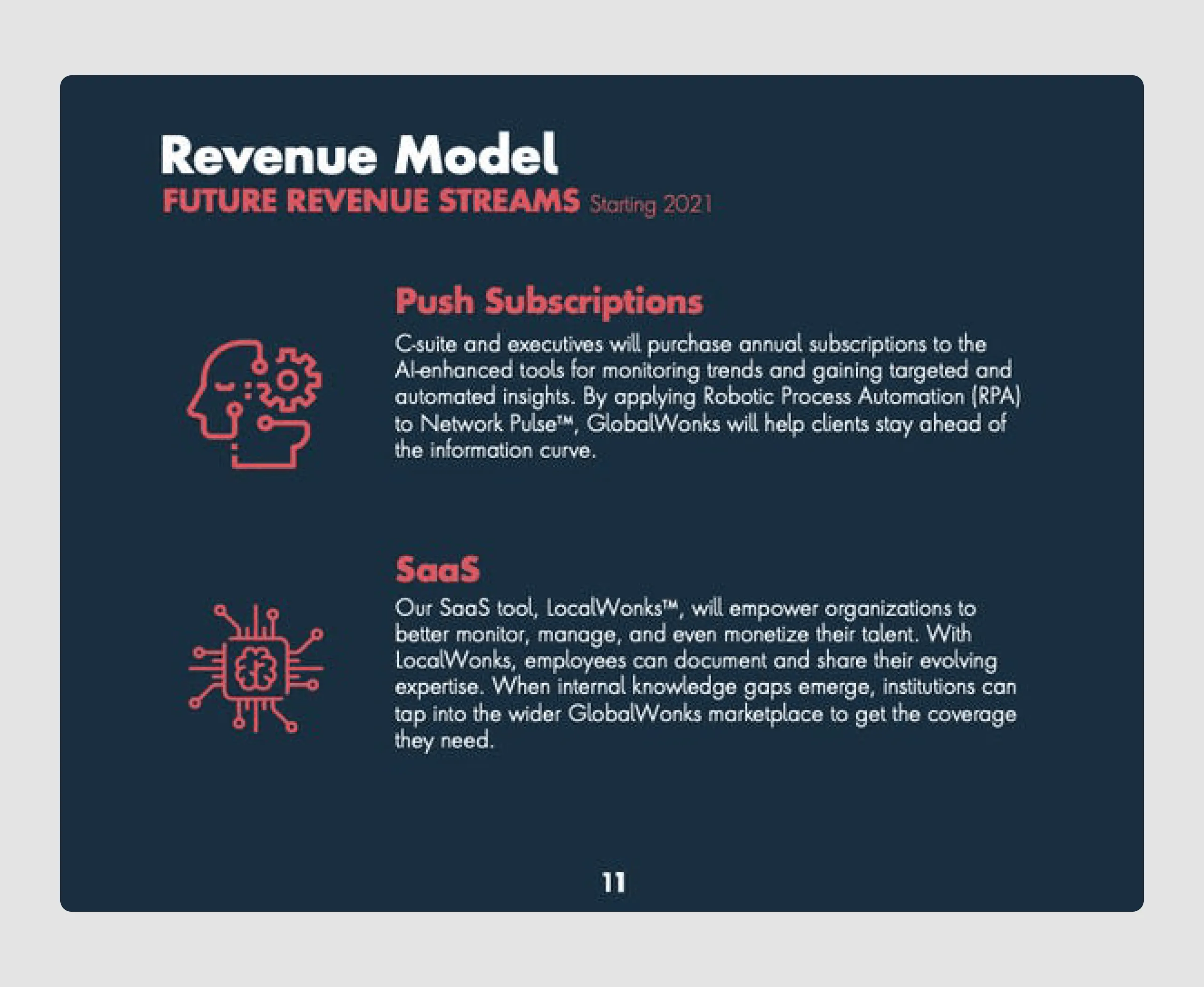
- Revenue Model: The deck explains two clear revenue streams (Push Subscriptions and SaaS), highlighting potential for scalability.
Design strengths
- Consistent and professional design: The dark blue theme with white text creates a polished, professional look, aligning with GlobalWonks’ brand as a premium expert network.
- Visual simplicity: Key information is presented in bullet points, icons, and clean layouts, making it easy for readers to digest complex ideas.
- Effective use visuals: Icons and simple illustrations help explain the Centaur Model and the types of products GlobalWonks offers, which aids in understanding the company’s unique approach.
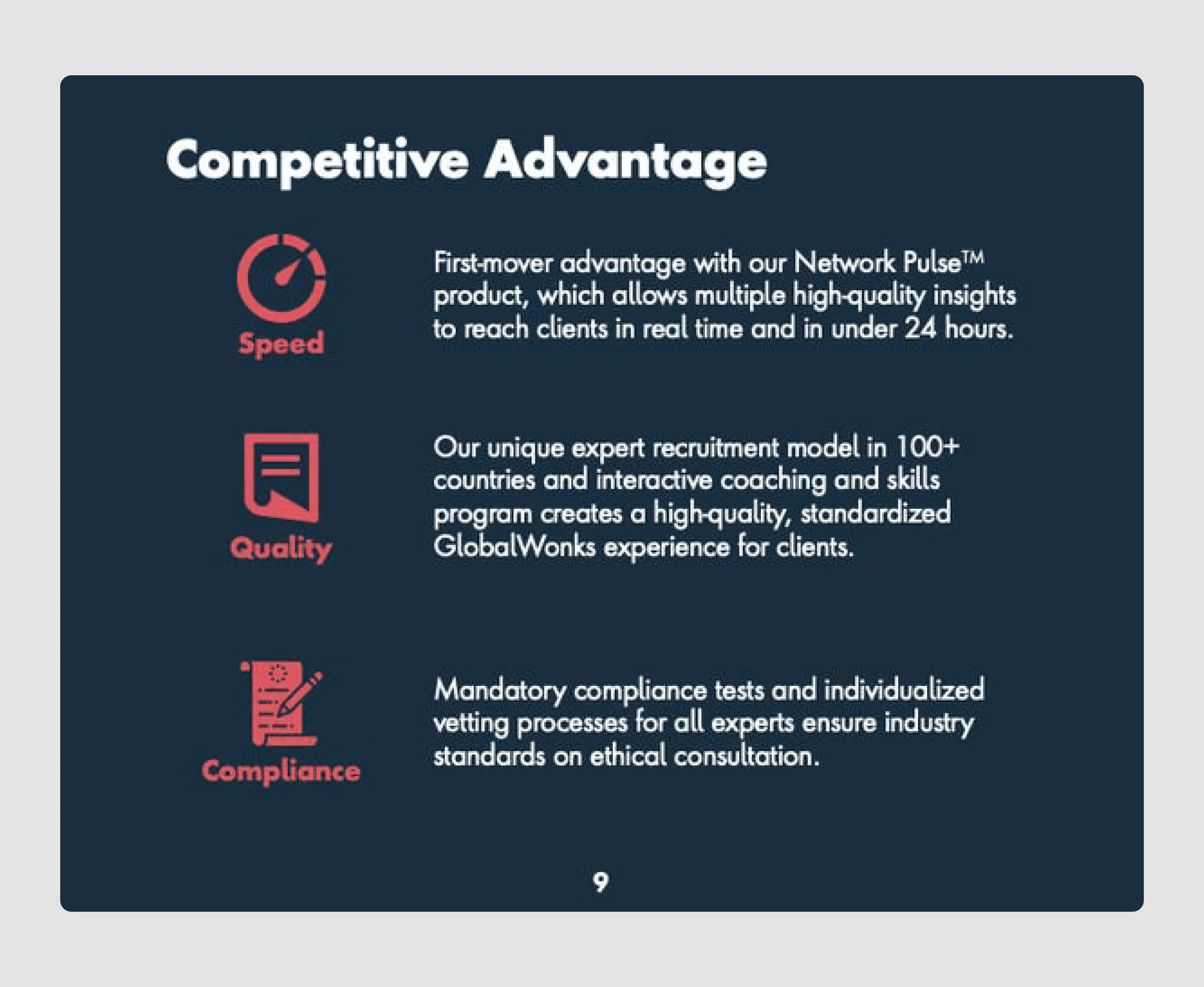
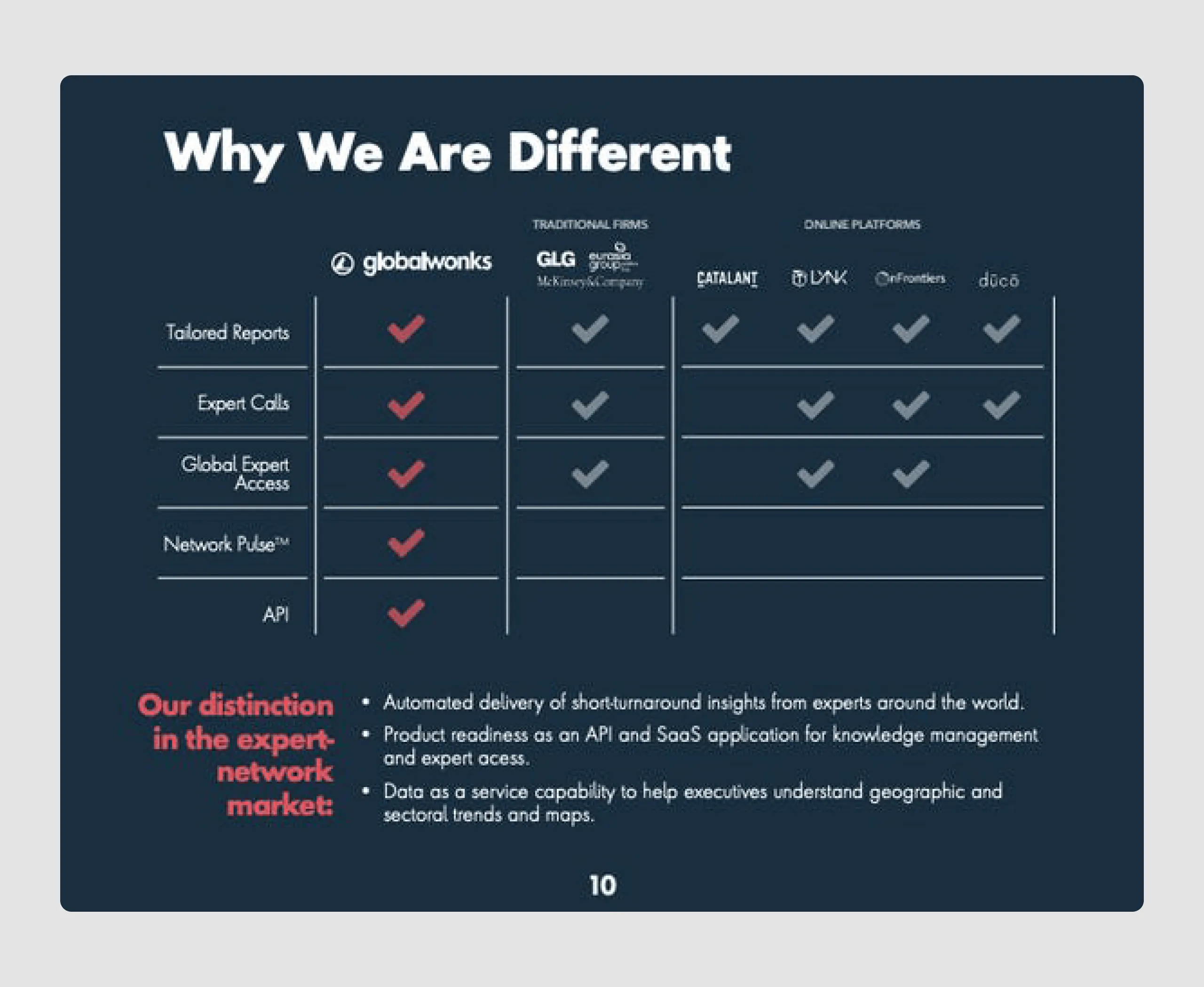
- Competitive advantage and differentiation: The competitive analysis slide effectively contrasts GlobalWonks with competitors, showcasing how it stands out with unique offerings like Network Pulse and API access.
Overall, the GlobalWonks pitch deck excels in presenting a clear, data-driven story with a well-organized and visually cohesive design. The emphasis on real-time access, product diversity, and market potential makes it an attractive proposition for venture capital firms and investors. It also does a good job of clarifying the product's key features without overcrowding the slides.
5. Apheris ($4,5m)
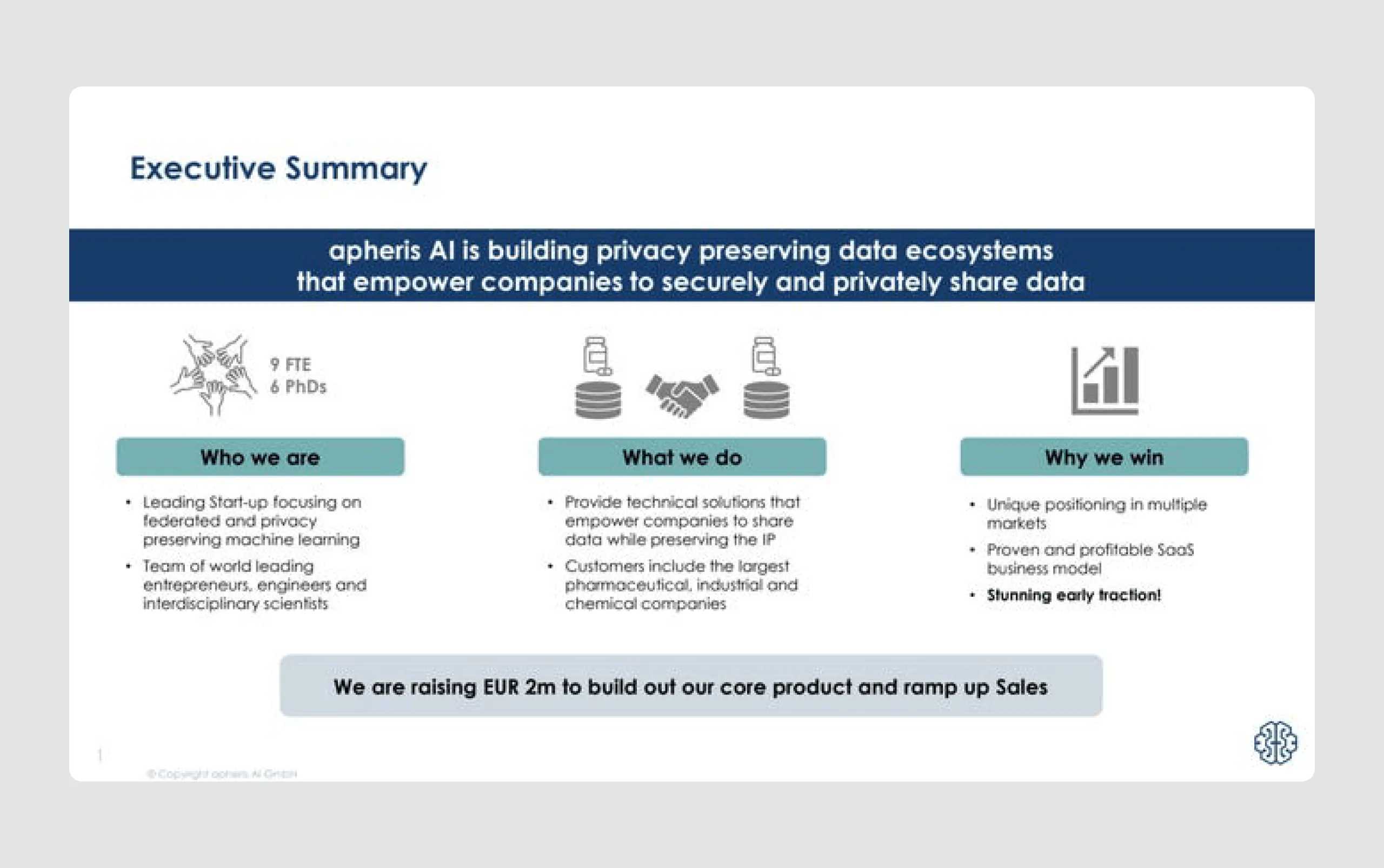
Apheris AI is a SaaS company that enables companies to analyze decentralized datasets without compromising data privacy. Backed by prominent investors, including Twitter's chair Patrick Pichette, Apheris raised $3 million to advance its technology, supporting industries like pharmaceuticals and telecommunications in securely unlocking data insights.
Content strengths
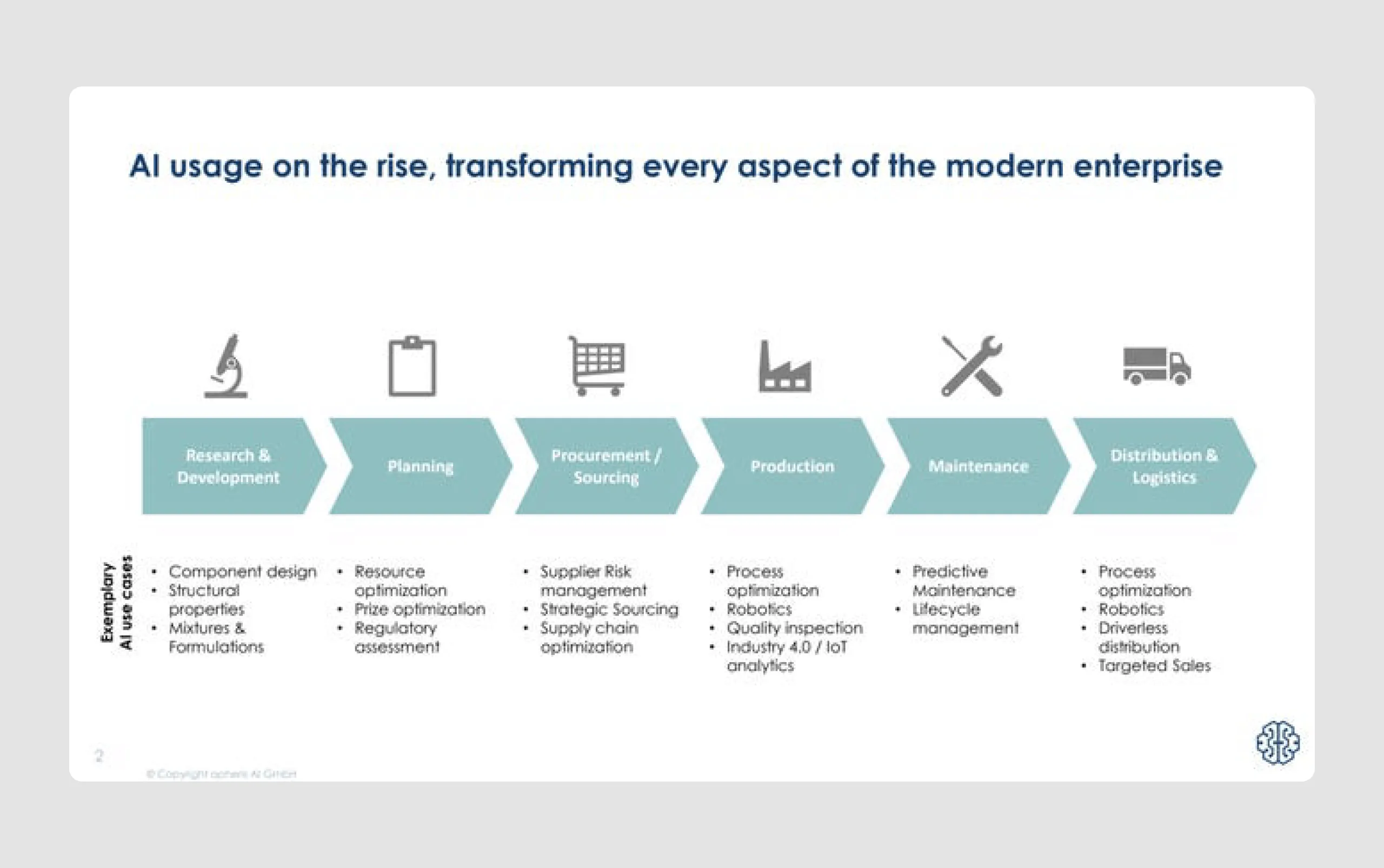
- Strong market relevance: It showcases the rising importance of AI in modern enterprises and emphasizes the need for large and diverse datasets, positioning Apheris as a critical enabler in this space.
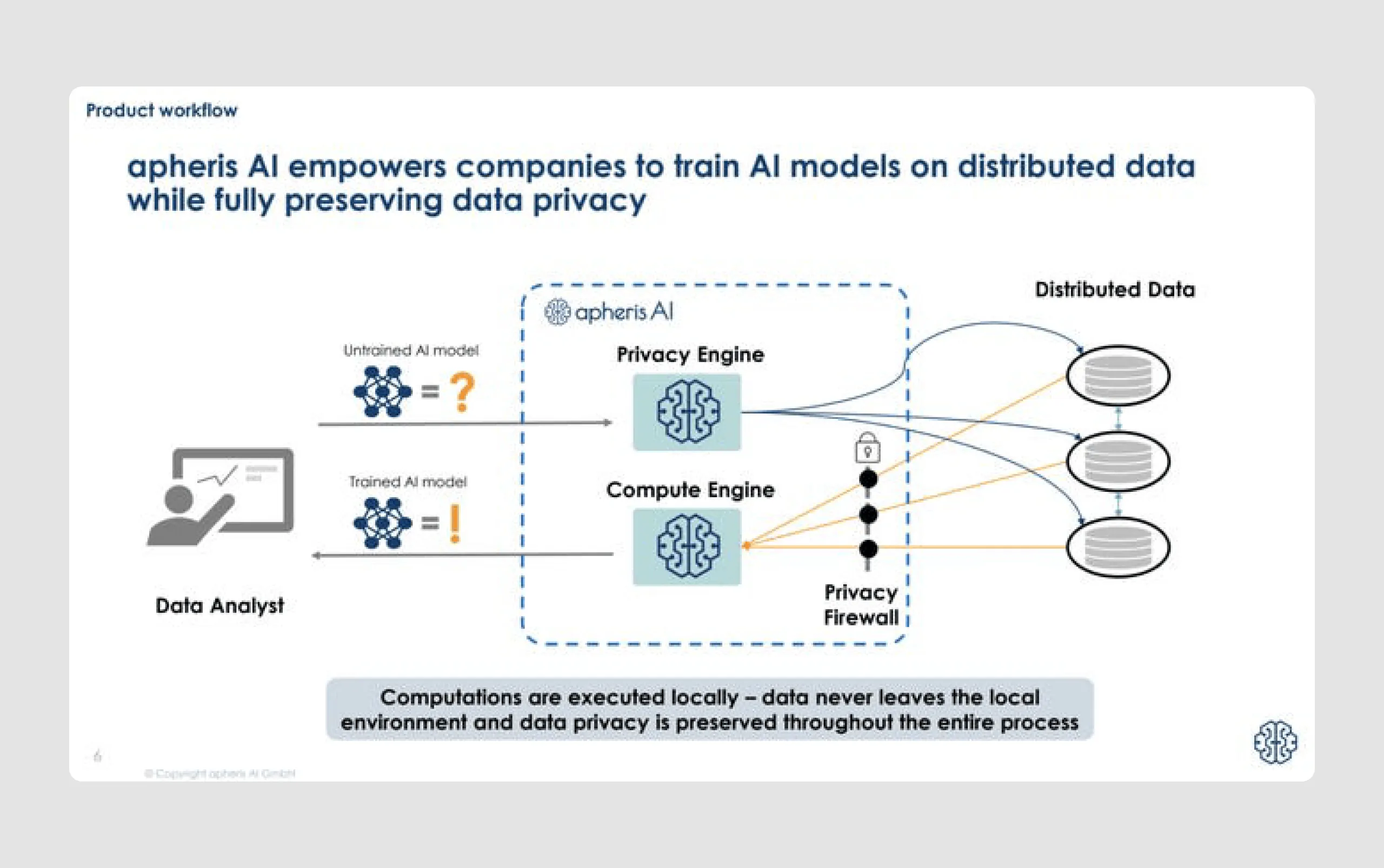
- Innovative technology explained simply: The product workflow slide explains how Apheris’ technology works (Privacy Engine and Compute Engine), making complex processes understandable and demonstrating the company’s technical strength.
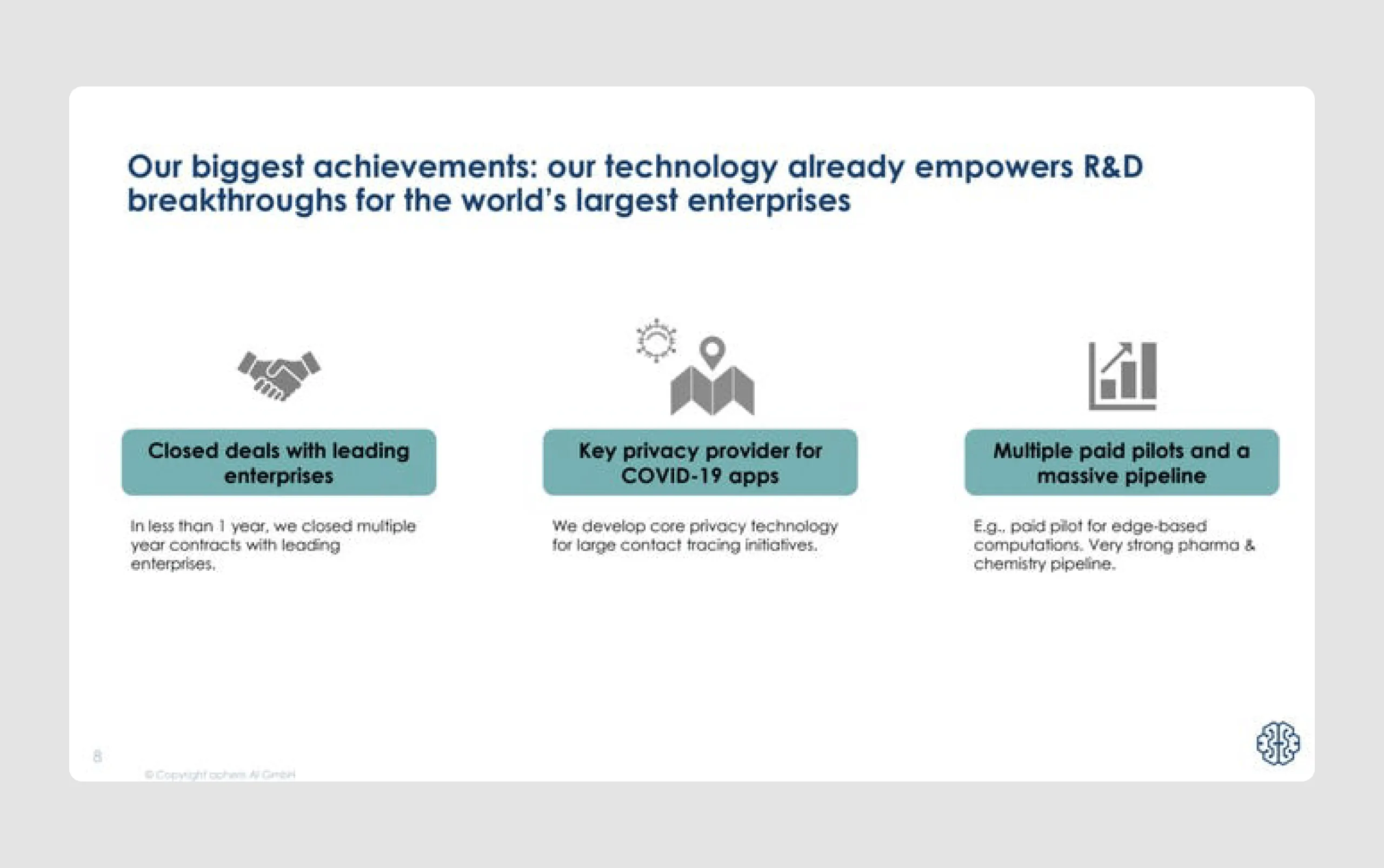
- Evidence of traction: The deck mentions early achievements, like closed deals with top enterprises and partnerships in COVID-19 contact tracing, which provides proof of product-market fit.
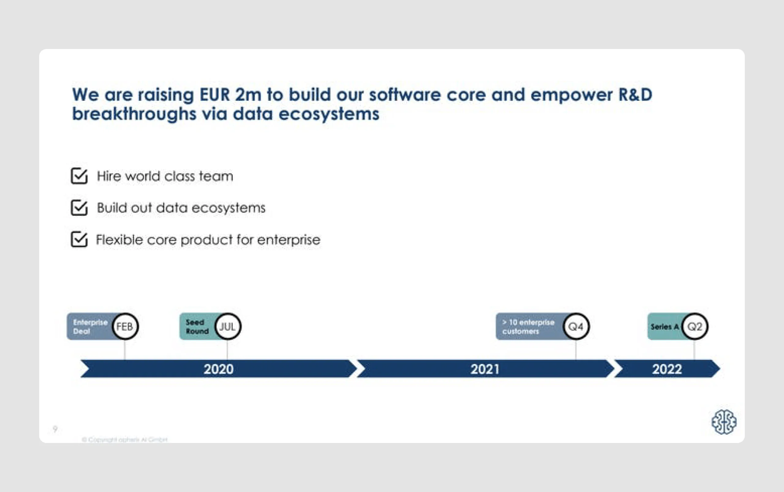
- Clear roadmap and funding needs: A straightforward roadmap shows Apheris' growth plan, with specific goals for team expansion, product development, and future funding rounds, giving investors insight into their progress and vision.
Design strengths
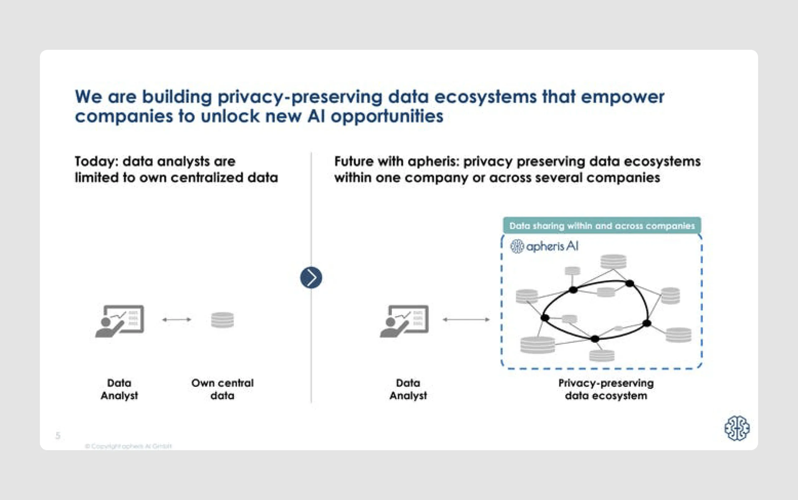
- Effective use of graphics and flow diagrams: Diagrams effectively illustrate how Apheris AI facilitates secure data sharing and distributed AI model training, making technical concepts accessible.
- Balanced text and visuals: Key points are summarized in bullet points with complementary visuals, creating a visually digestible format that enhances readability.
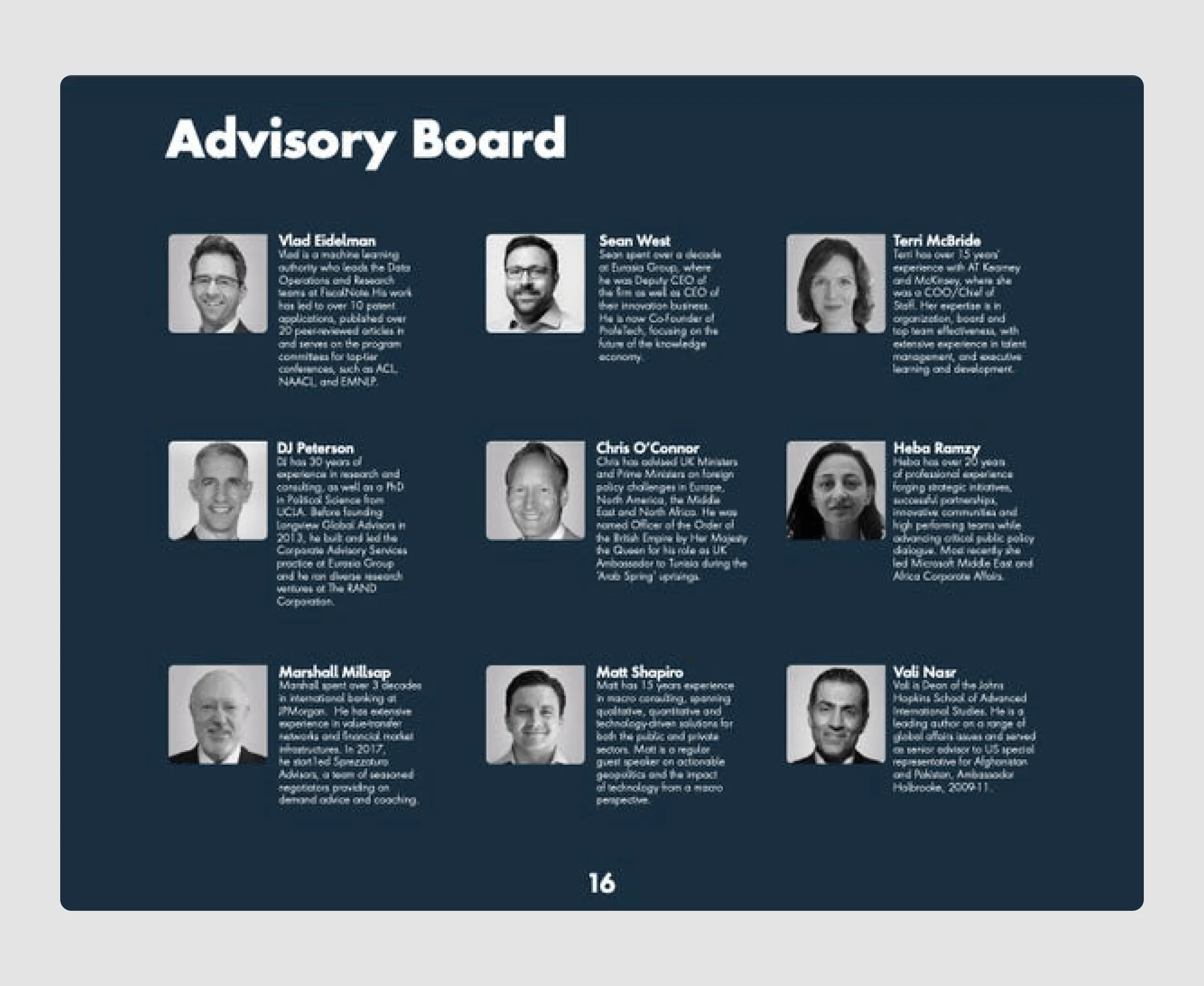
- Highlighting key accomplishments and team expertise: The achievements slide and core team members section emphasize the founders' relevant backgrounds and accomplishments, adding credibility and showing the company's strong foundation.
- Strong call to action: The funding ask is clearly stated, with details on how the investment will be used to support growth and product development, guiding investors on the next steps.
The pitch is well-aligned with investor expectations, highlighting a timely market need, innovative technology, and clear growth potential. And most importantly, it shows a solid grasp of what investors need to understand fast.
Series-A pitch deck examples
A Series A round is the first significant round of venture capital funding for a startup after seed funding. In this stage, companies aim to secure investment to scale their product, expand their customer base, and start generating steady revenue Series A investors are typically looking for companies with a proven business strategy, some revenue or traction, and a strong plan for growth.
So, let's move to the next set of pitch decks for startups and highlight each company.
6. Mine ($9.5m)
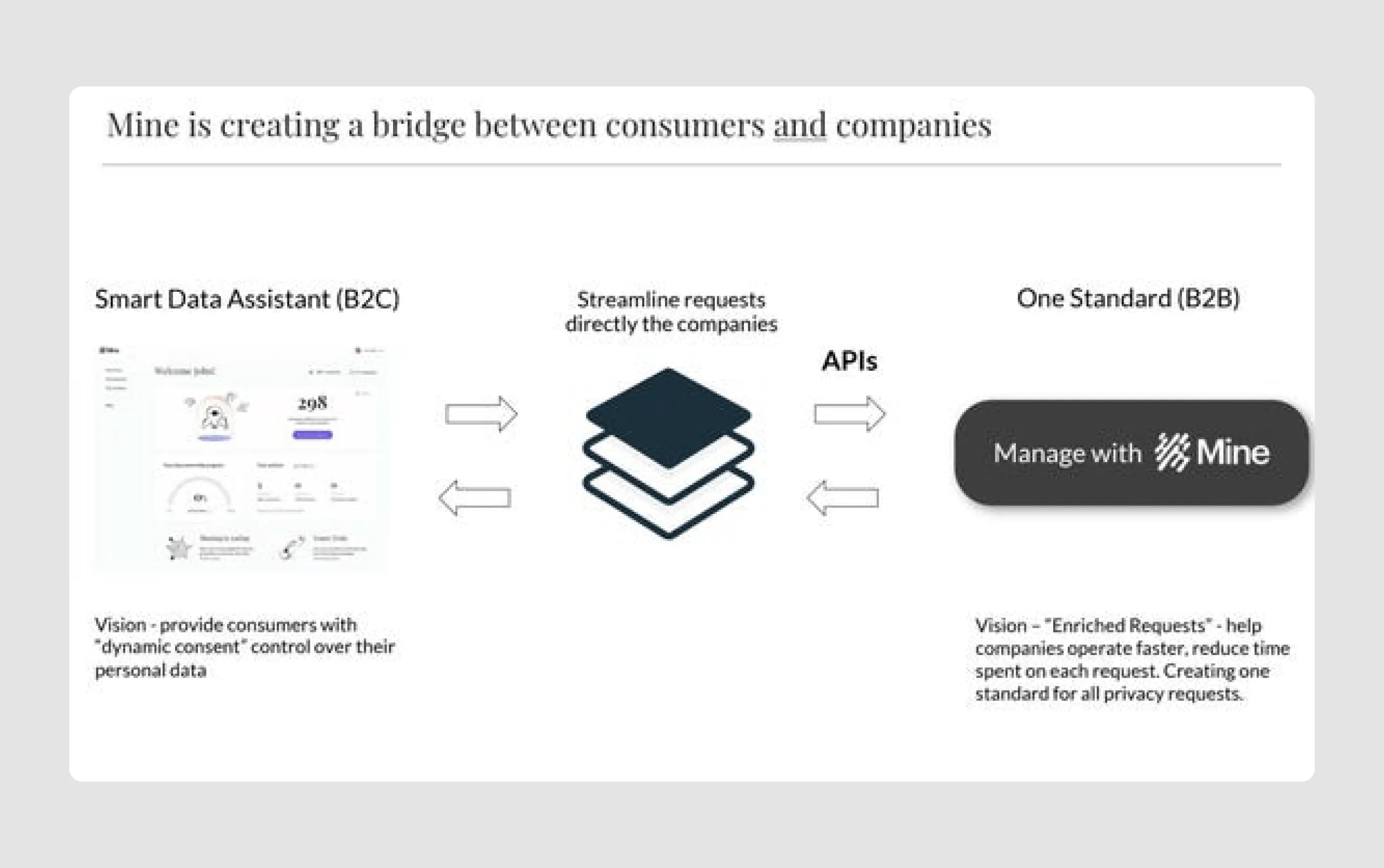
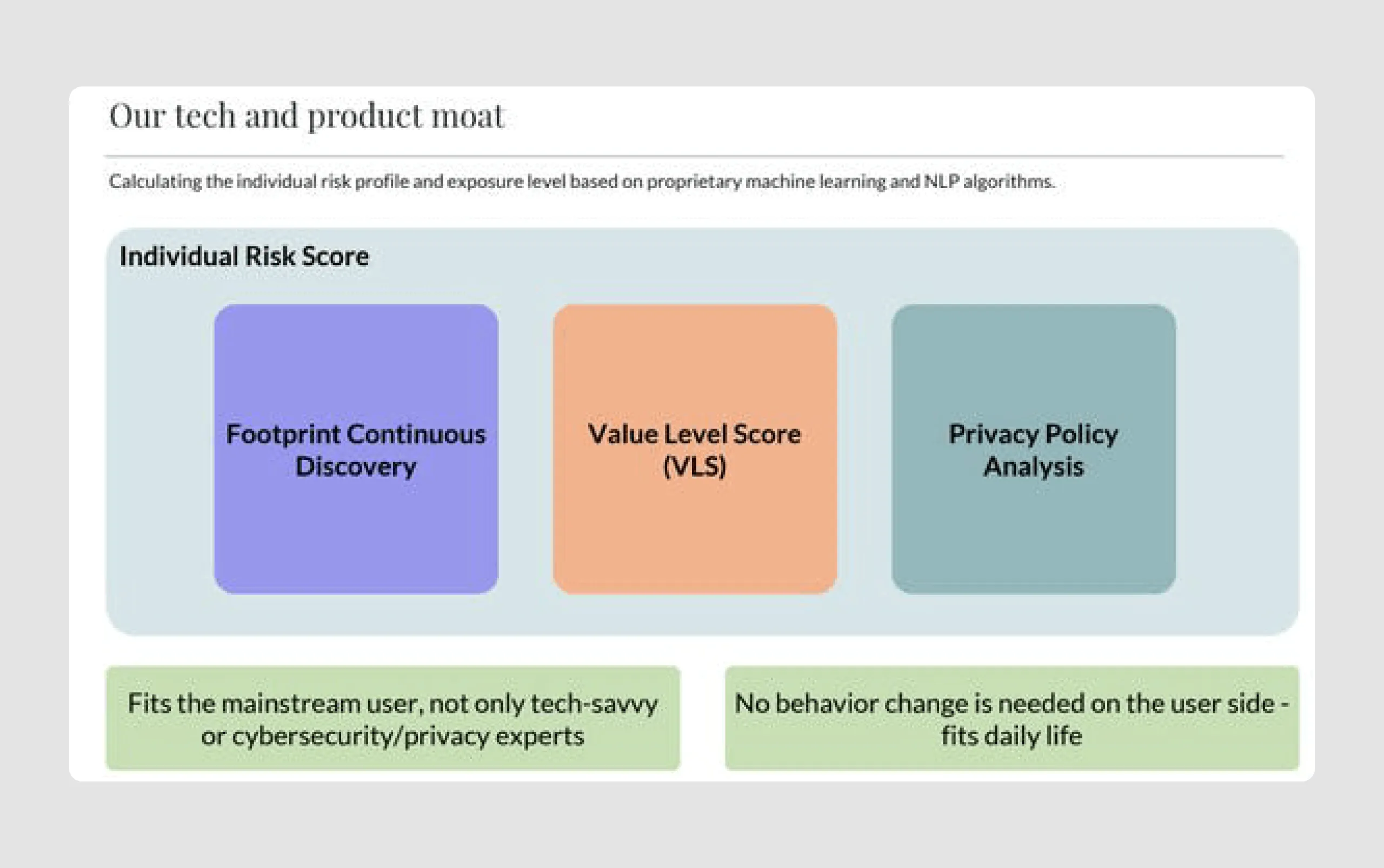
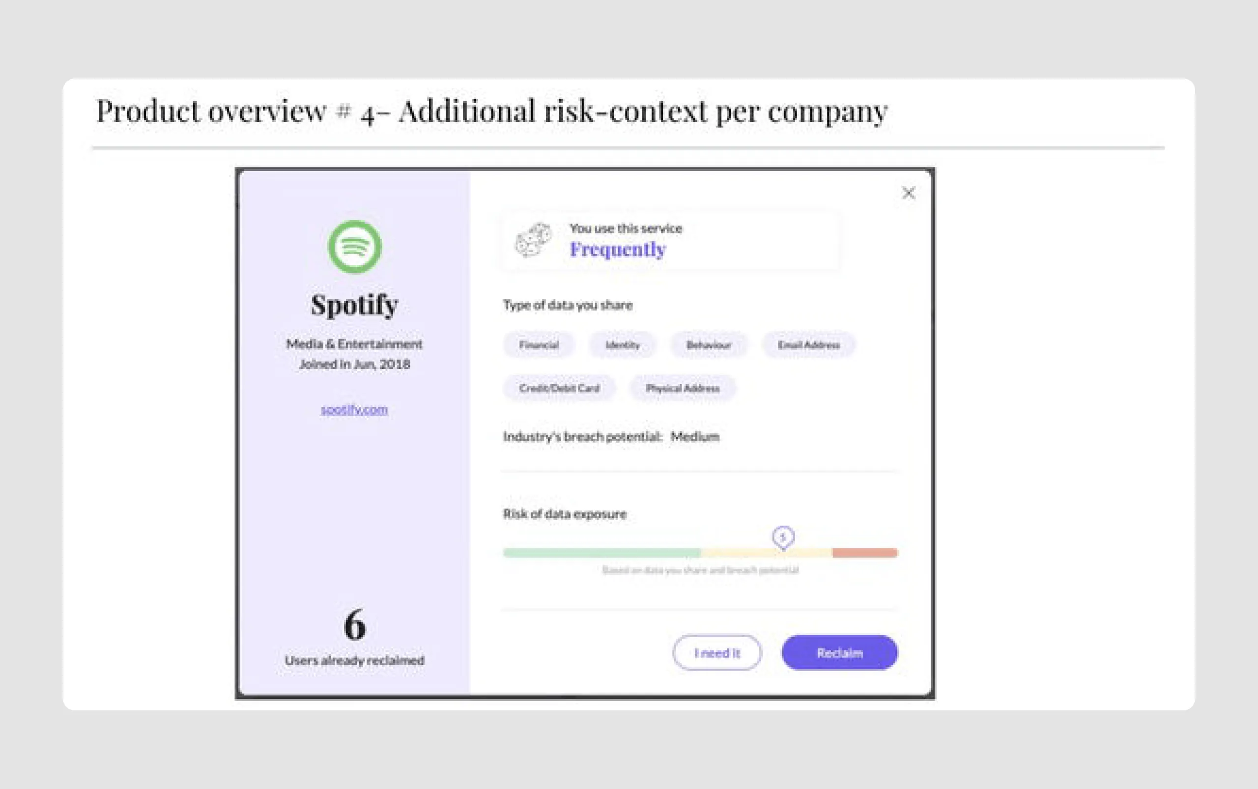
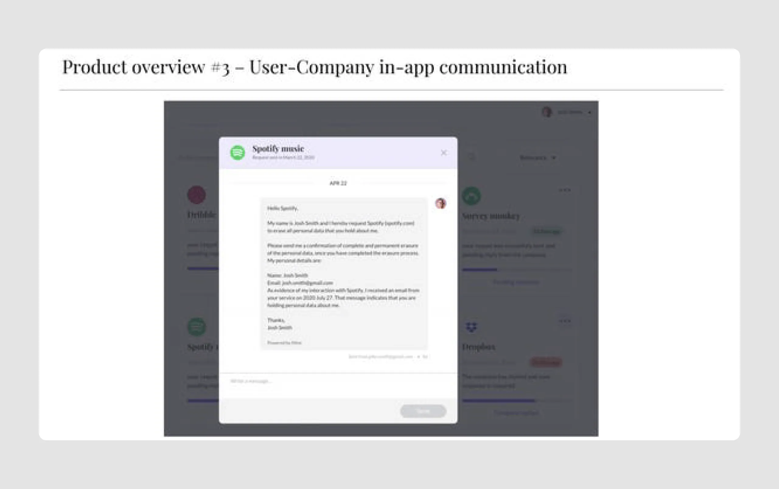
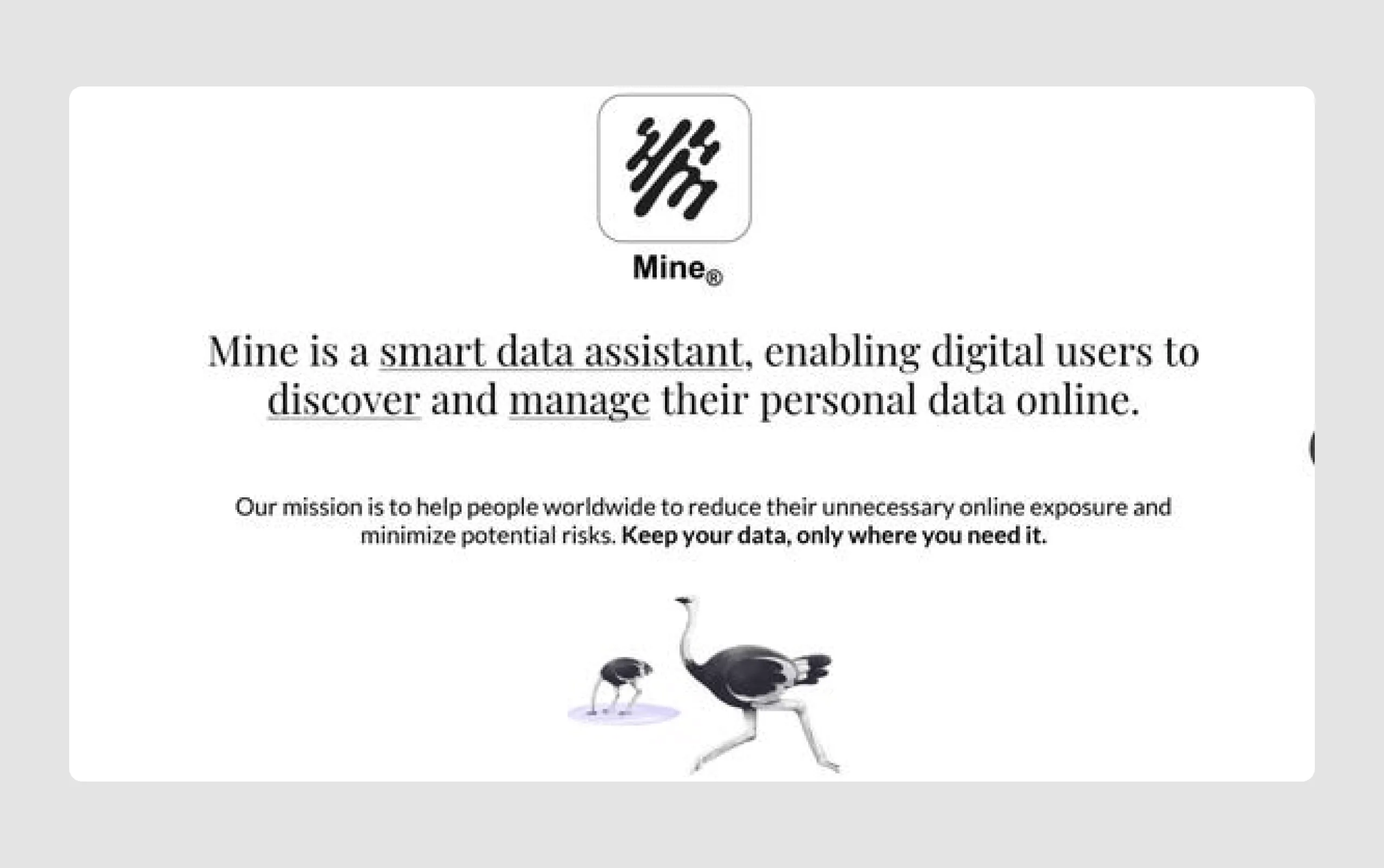
Mine is a privacy-focused startup that provides a smart data assistant, enabling users to discover and control which companies hold their personal information. The idea, which attracted $9.5 million in Series A funding from investors like Google’s Gradient Ventures, addresses growing privacy concerns by helping users manage their online exposure and reduce data risks.
Strengths in content
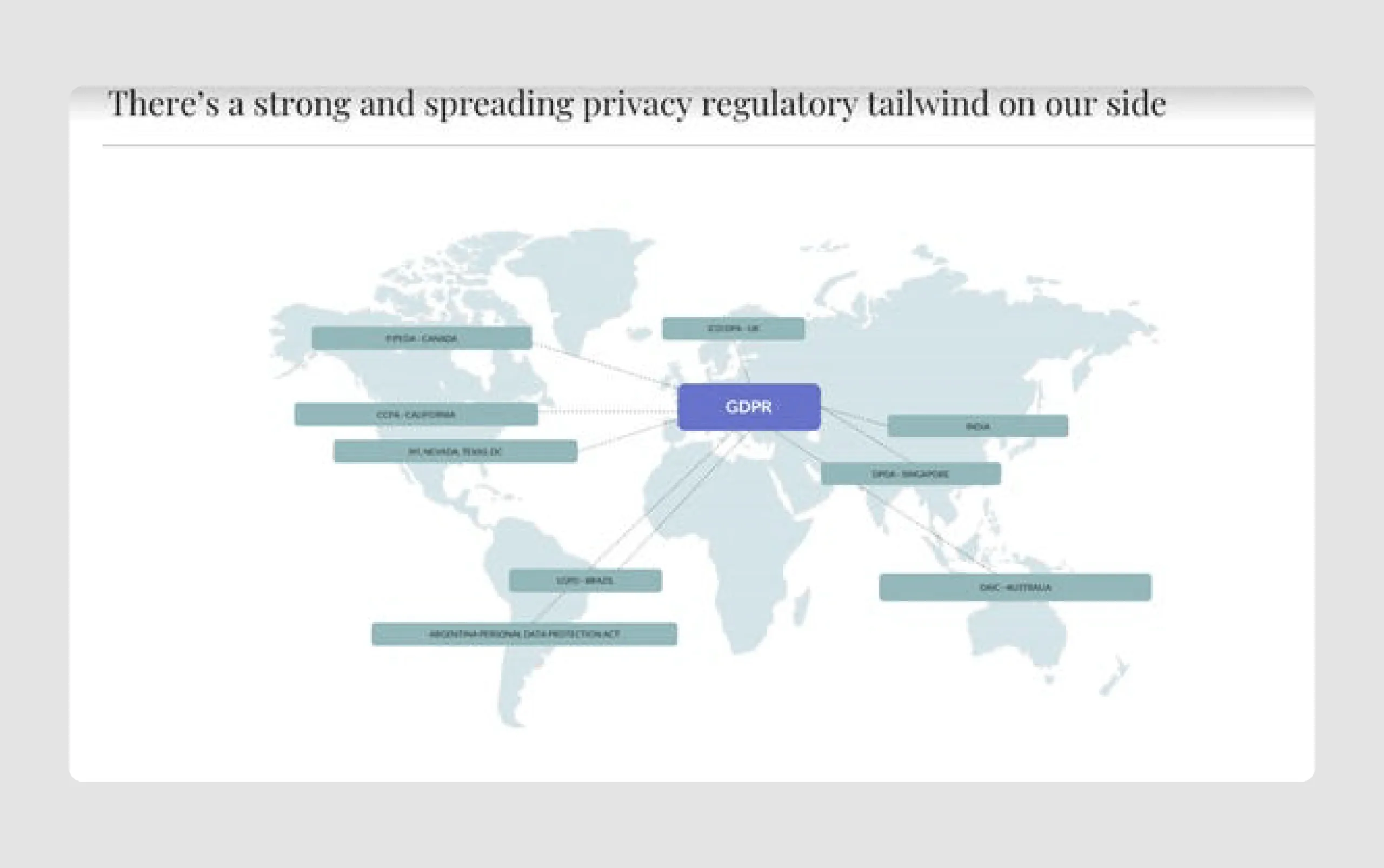
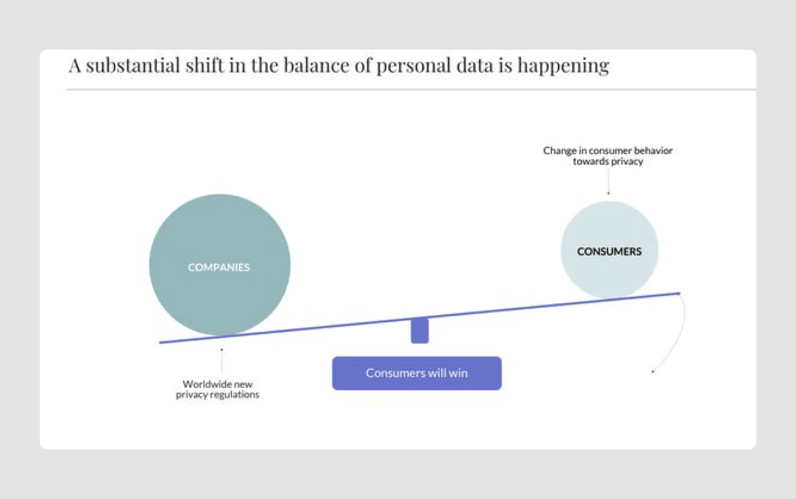
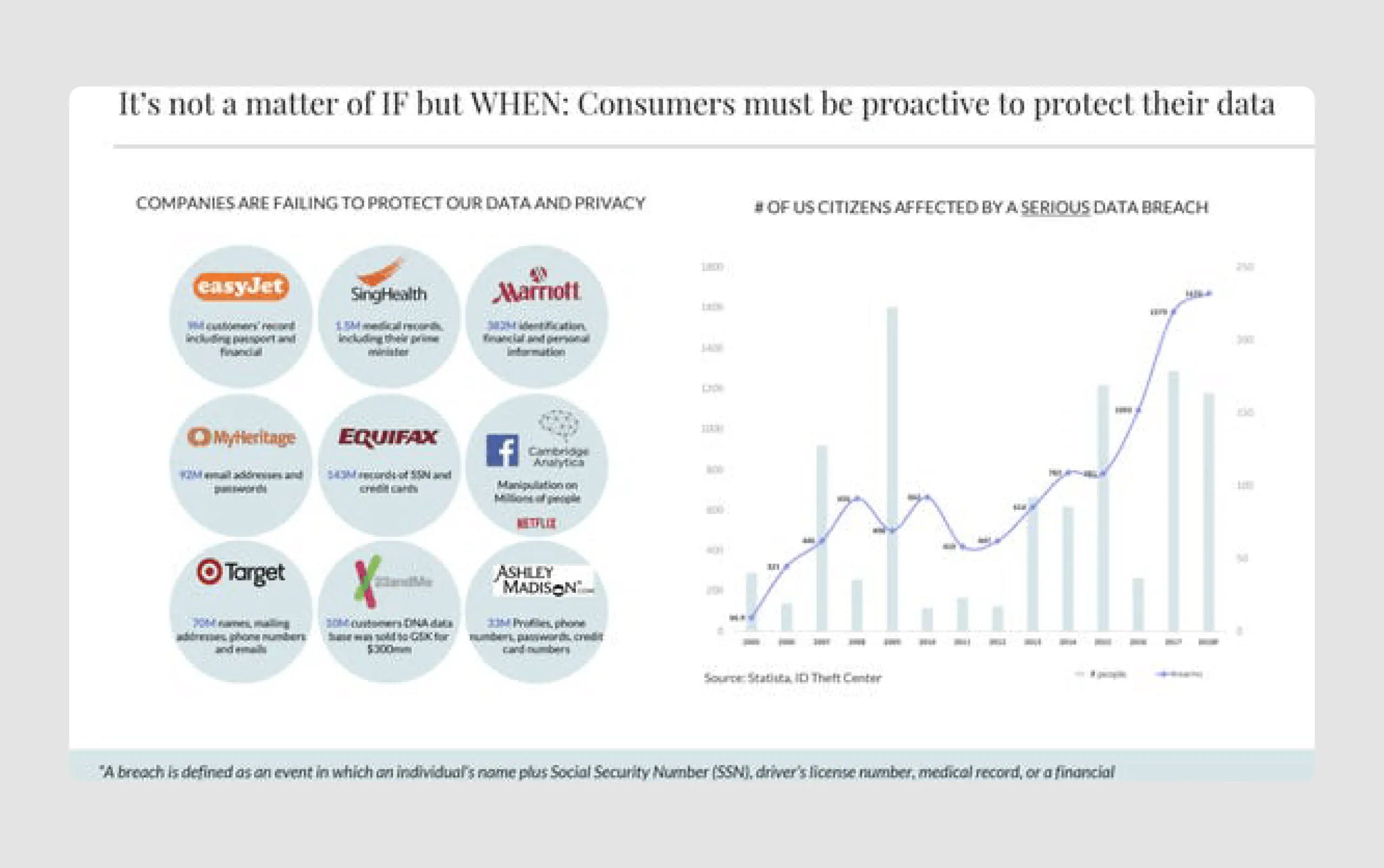
- Market context and urgency: By highlighting the increase in data breaches and regulatory support for data privacy (GDPR), Mine underscores the urgency of data ownership and privacy, making a strong case for why Mine’s solution is relevant and necessary.
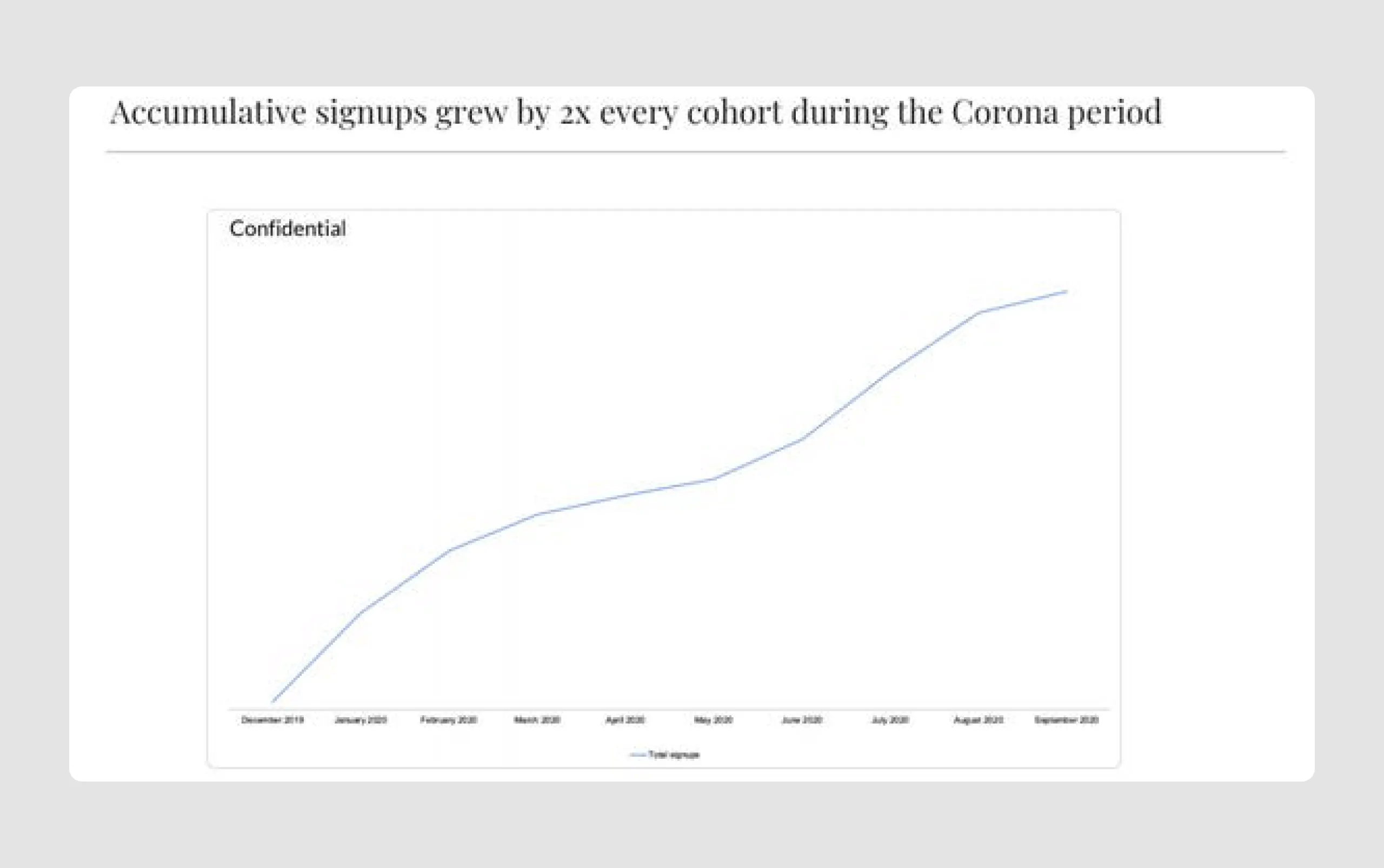
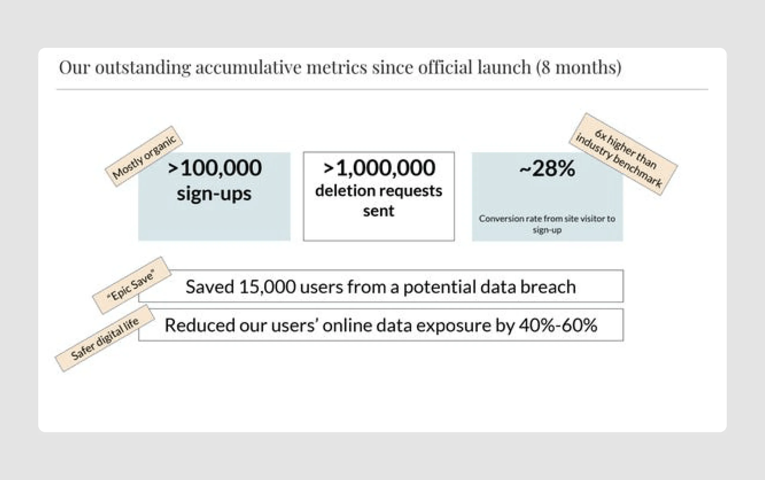
- Strong traction and growth metrics: The deck provides compelling user metrics, showing rapid growth in sign-ups and high rates of user engagement. These indicators suggest strong market validation and traction, which is a positive signal for potential investors.
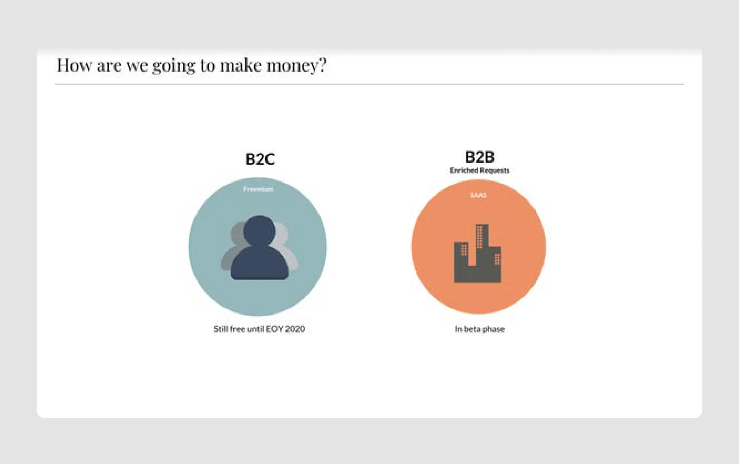
- Revenue model clarity: Mine clearly distinguishes its B2C and B2B monetization strategies, detailing both freemium and SaaS plans. This gives investors confidence in the company's planned path to revenue generation.
Strengths in design
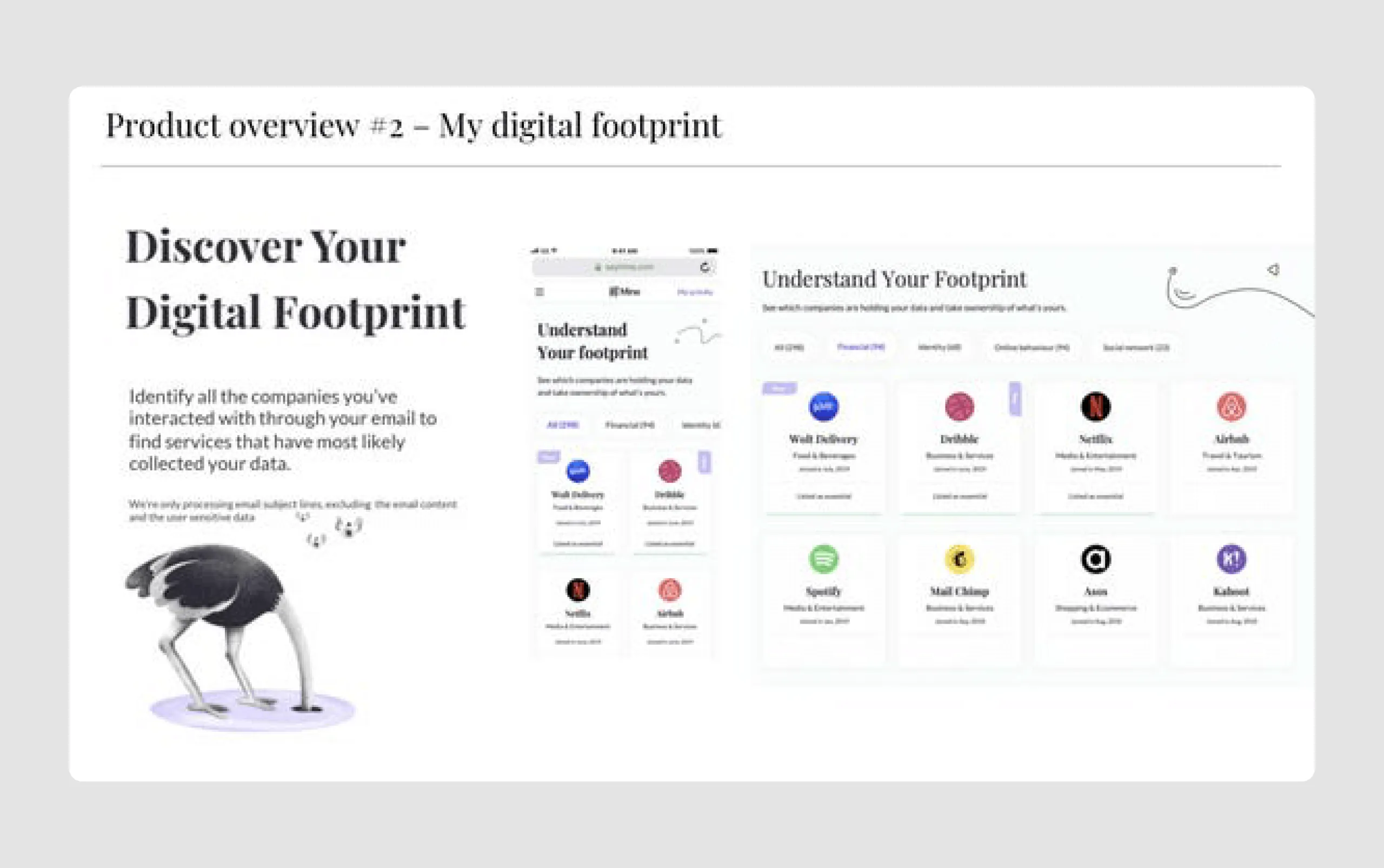
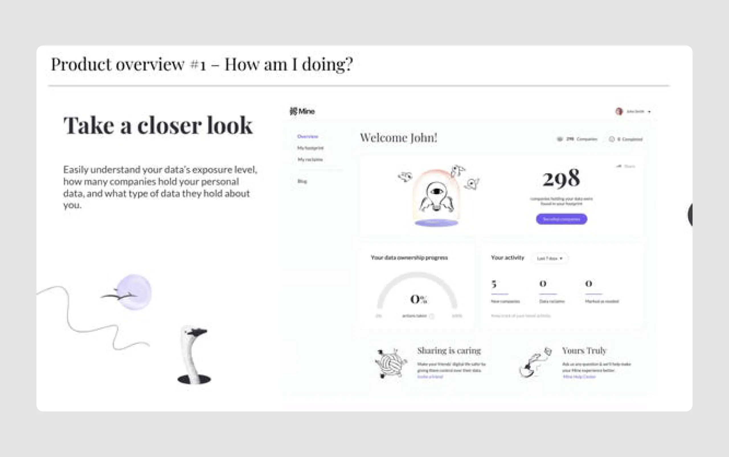
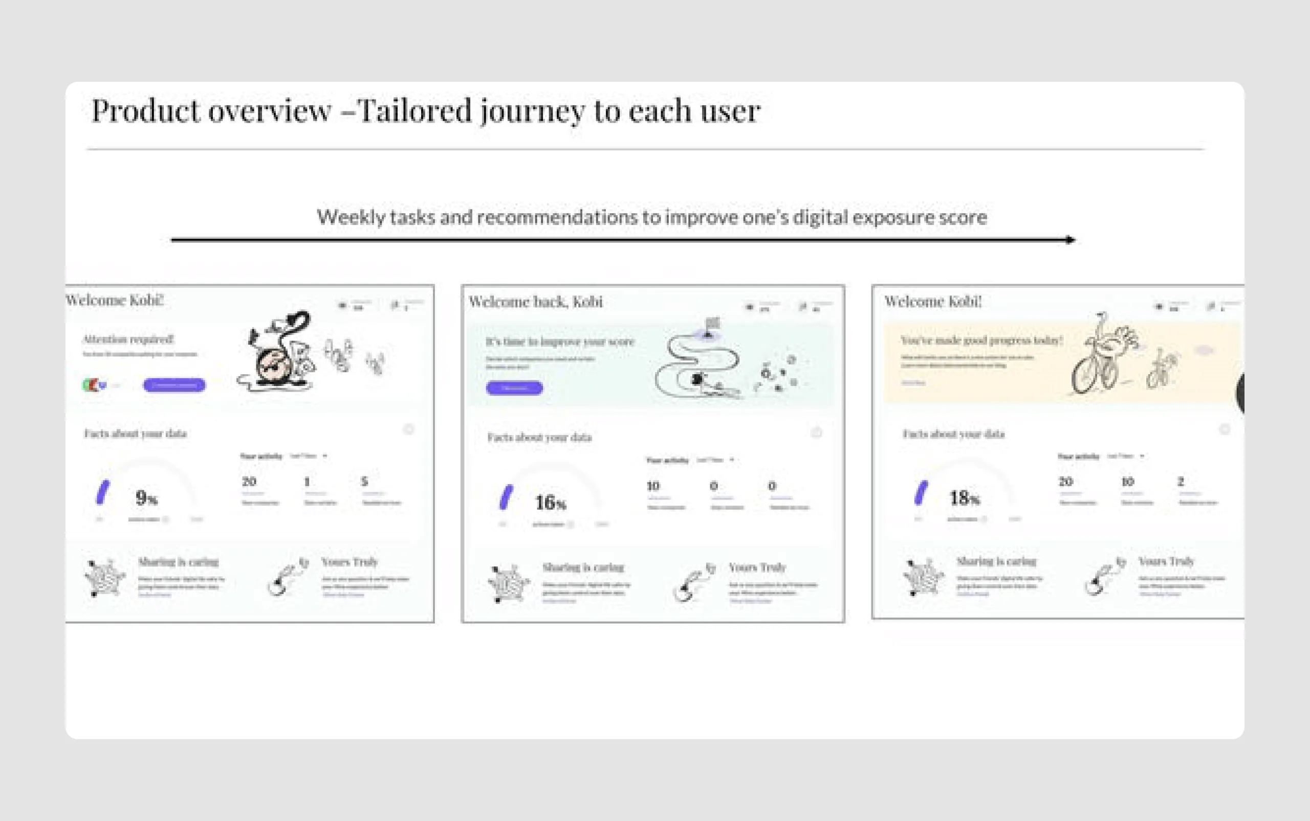
- Engaging visuals and illustrations: The use of clean illustrations (like the ostrich motif) adds a unique touch that makes the deck visually appealing. It also reflects Mine’s friendly, accessible approach to data privacy, enhancing brand identity.
- Effective use of visual data: Graphs, charts, and infographics are used effectively to convey data-driven insights, like privacy trends and data breach statistics. This helps create a compelling narrative without overwhelming text.
- Well-structured flow: The presentation follows a logical structure, starting with the problem (data privacy concerns), leading into the solution (Mine’s product), and culminating in traction, business model, and future growth potential. This logical flow makes the pitch easy to follow.
- Call to action: The final slide with a simple call-to-action (“Questions?”) encourages engagement, making the pitch memorable and actionable for investors and potential partners.
In general, Mine’s pitch deck combines a strong visual identity with a well-crafted narrative around data privacy, user empowerment, and technological innovation.
7. Thinknum ($11.6m)
Thinknum is a web platform that provides data-driven investment insights by tracking information from company websites. Their innovative approach to investment research attracted investments by offering a valuable tool for generating actionable financial insights.
We added Thinknum’s pitch presentation example to show that there’s always place for creativity. Of course, it’s not an ordinary example that we suggest everyone to follow, still don’t be afraid to be creative if you see sense in it.
Content strengths
- Engagement through storytelling: The deck’s format as a comic book captures attention and makes complex financial concepts more accessible. The characters, dialogue, and plot engage viewers by personifying financial challenges and solutions.
- Memorable characters & theme: Characters like "God's Worker" and "Old Titan" create a narrative that resonates with those in finance, where the search for "alpha" (outperformance) is a well-known challenge. The memorable comic theme differentiates Thinknum from traditional data providers.
- Highlighting pain points: The deck subtly addresses the limitations of high-frequency trading (HFT) firms eroding "alpha" and presents Thinknum as a solution for data-driven insights that enable investors to find untapped data sources and stay ahead.
Design strengths
- Unique visual format: The comic-book style with vibrant colors and dramatic scenes is visually appealing and unexpected in the finance sector, which typically uses conservative visuals. This style makes the presentation stand out and be memorable.
- Clear illustrations: Each page’s visual elements (e.g., characters, cityscapes) are well-designed and clearly depict the story, keeping the audience’s focus on the plot. The high-quality illustrations effectively communicate the brand’s ambition and vision.
- Innovative use of symbols: Incorporating symbols like "α" (alpha) ties back to the financial industry's core objective of outperforming the market, reinforcing Thinknum's value proposition without relying on traditional financial language.
The "Quest for Alpha" pitch deck is a reminder that an original deck can work when the format reinforces the message rather than distracting from it. The deck is strong in both content and design due to its engaging storytelling, unique comic-book style, and strategic use of finance-related symbols and characters. This creative approach not only explains Thinknum's value proposition effectively but also makes the deck memorable, increasing the likelihood of capturing investors' attention
8. Brightside ($24m)
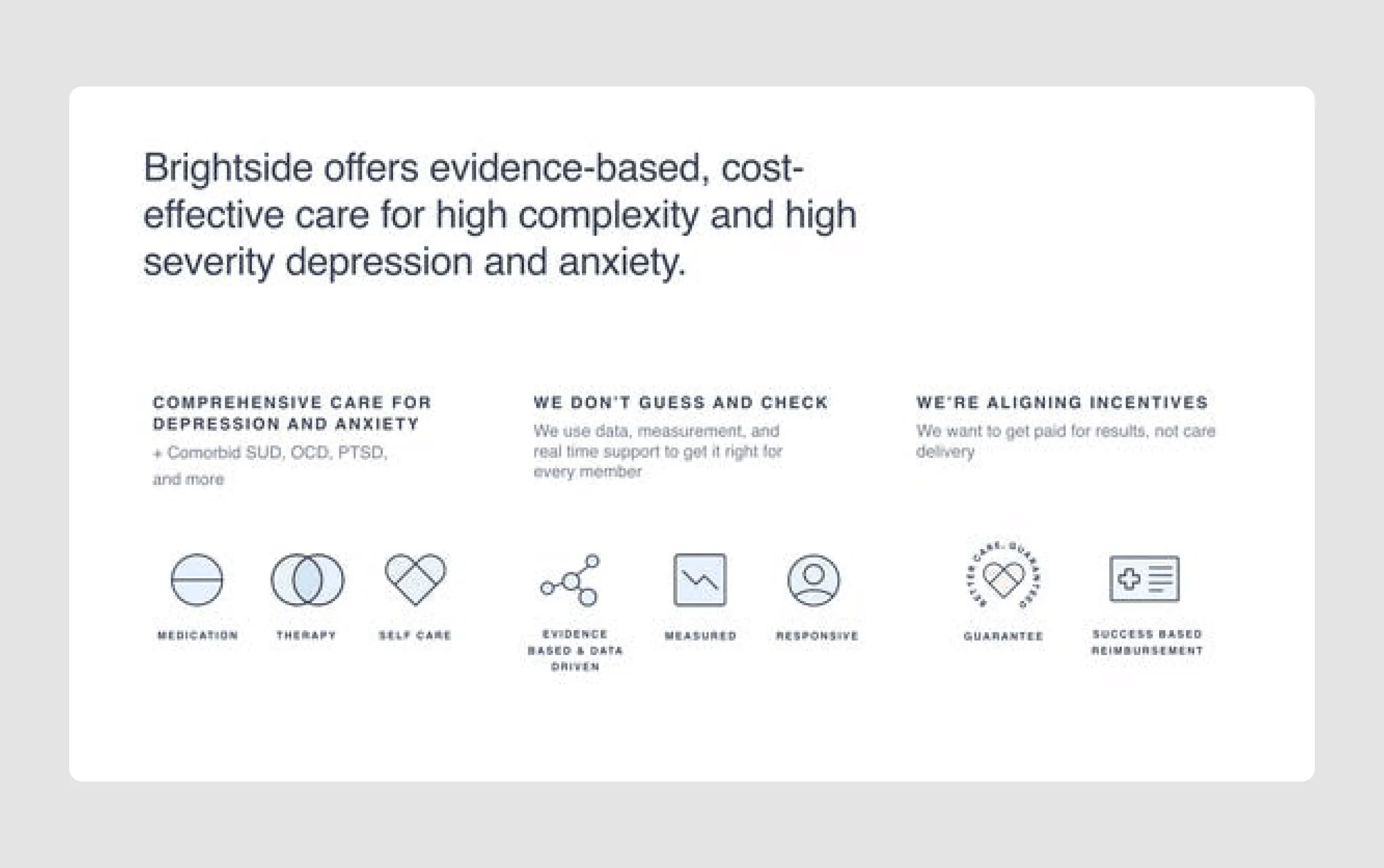
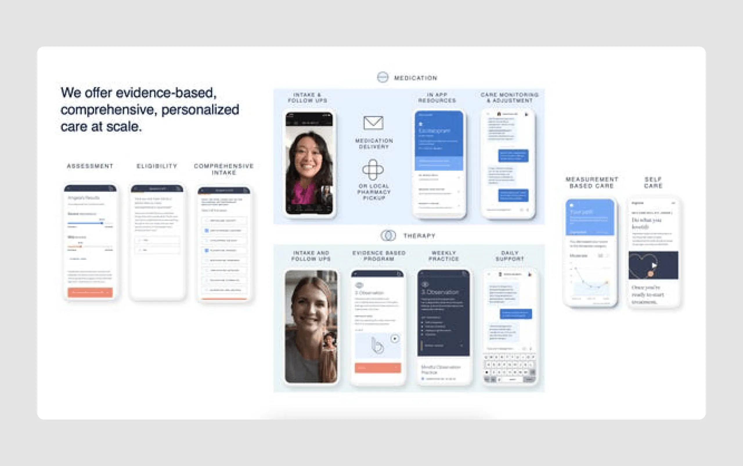
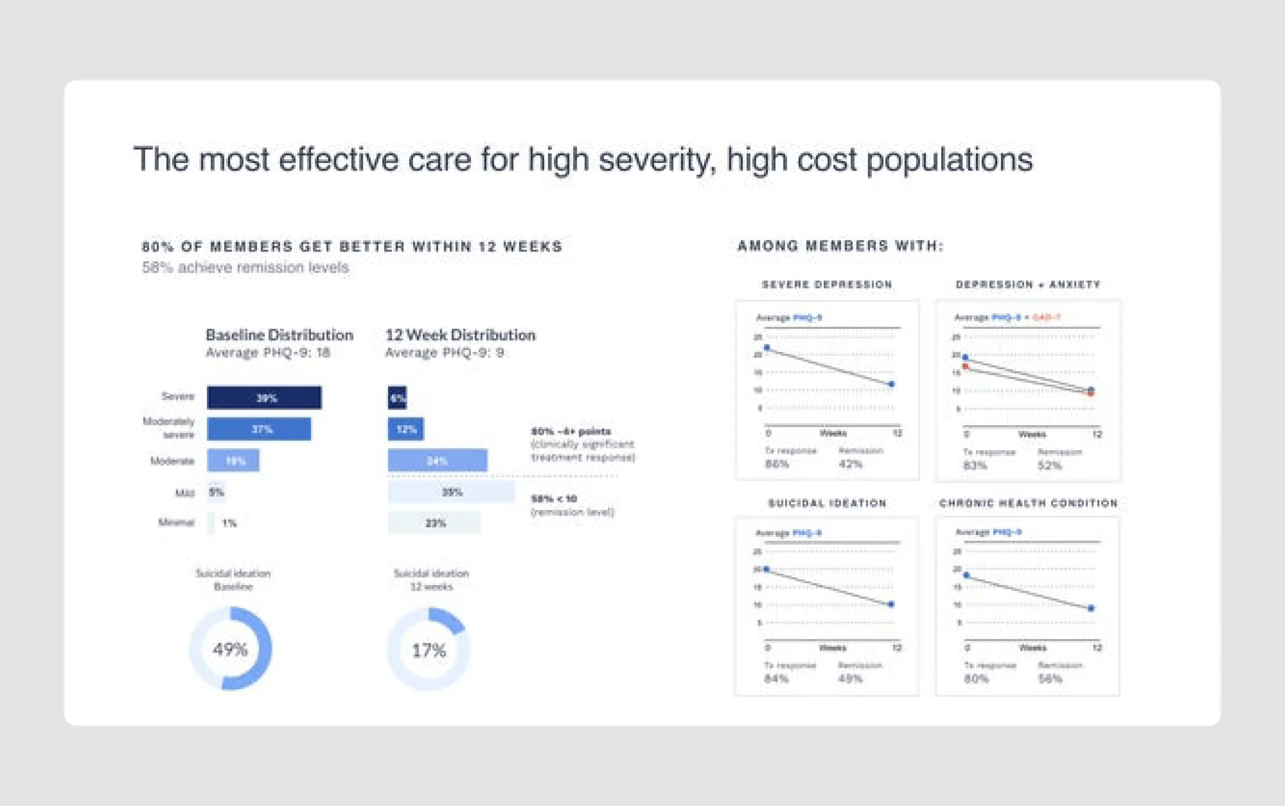
Brightside Health is a mental health company focused on providing affordable, virtual care for depression and anxiety. Their $24 million Series A funding was aimed to support further clinical studies and enhance the effectiveness of their virtual treatment platform.
Content strengths
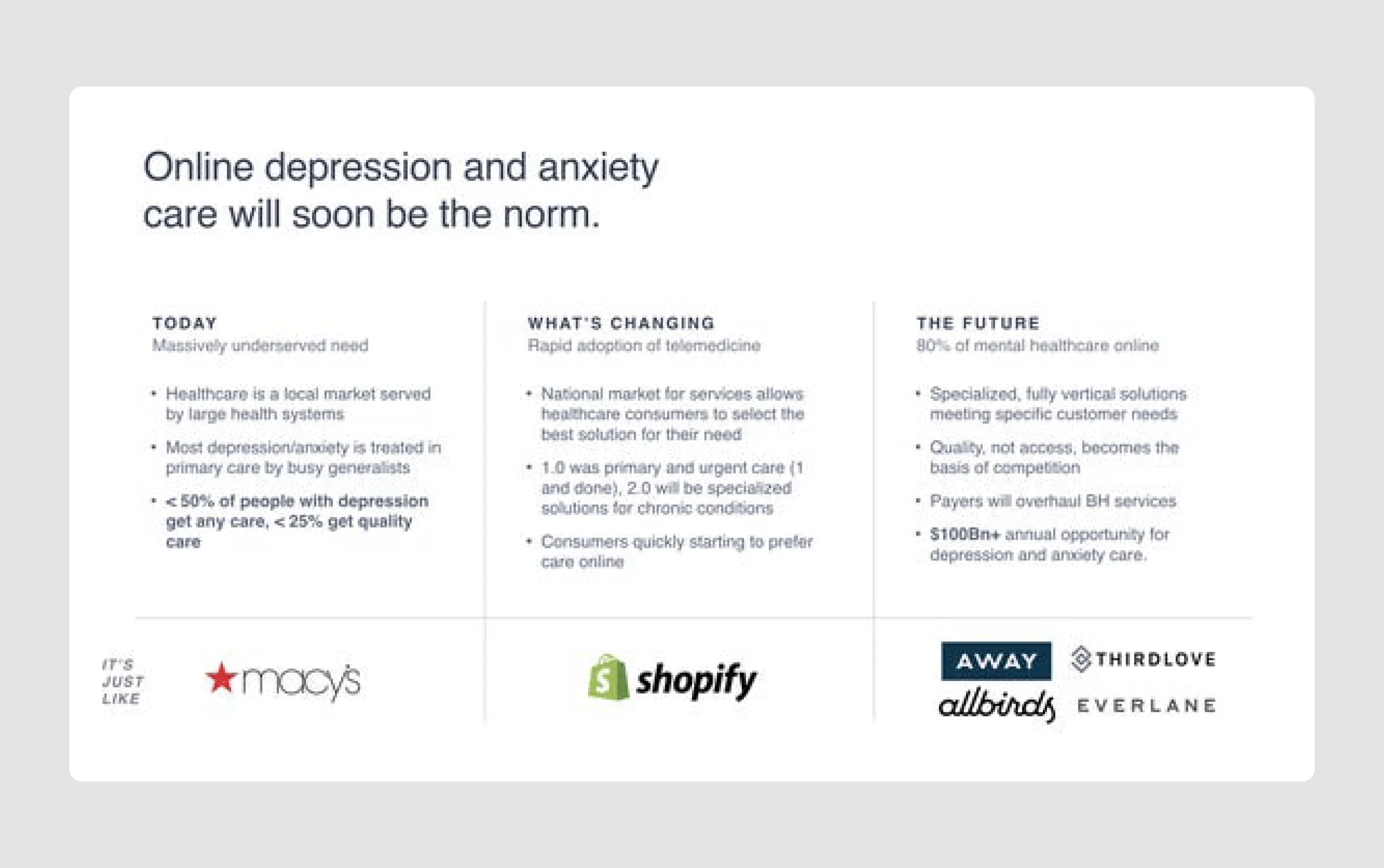
- Market opportunity: The deck clearly outlines the market gap in mental health services, emphasizing the current unmet need for accessible mental health care, especially post-COVID.
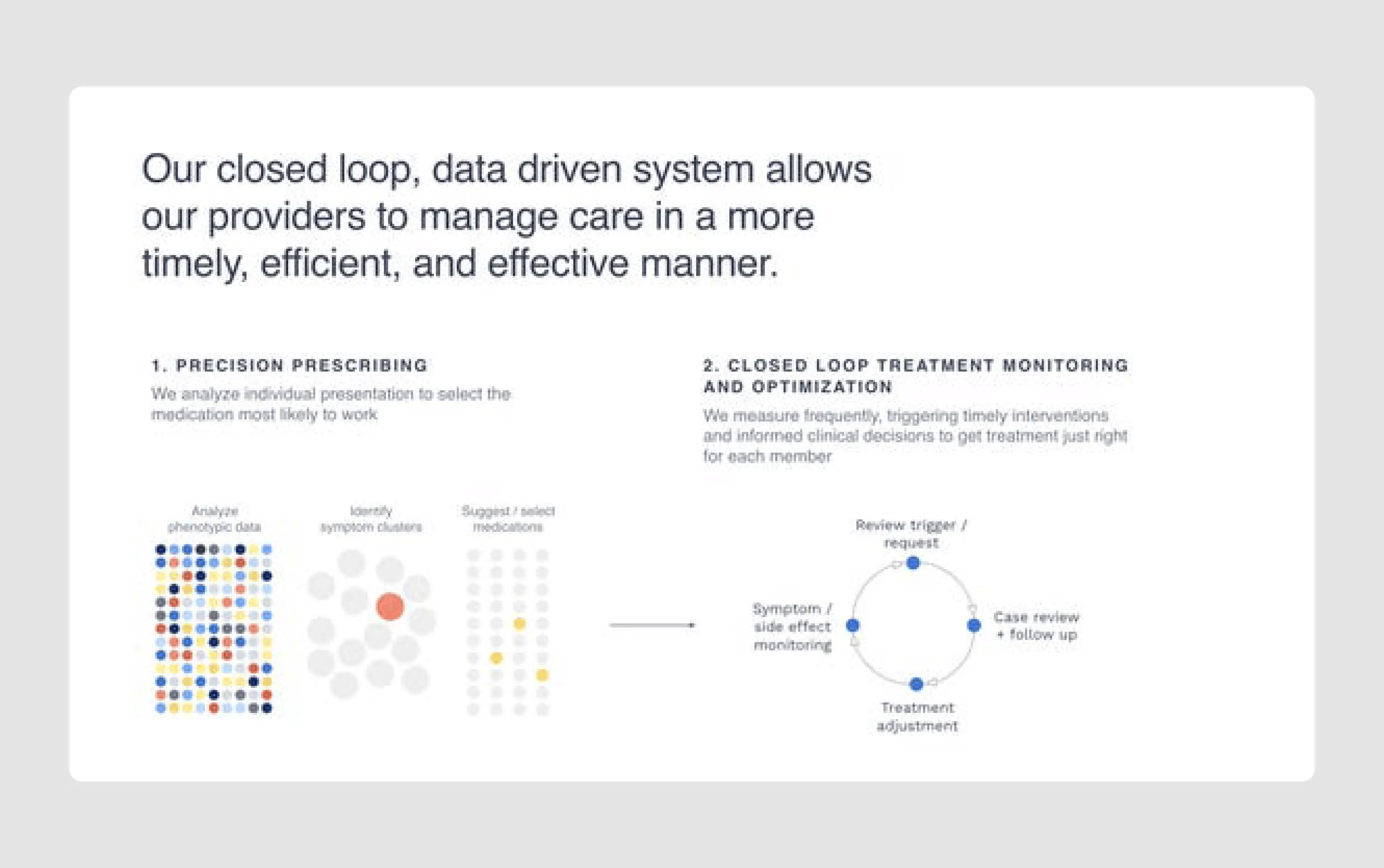
- Data-driven results: Quantitative metrics demonstrating clinical outcomes (e.g., improvement in PHQ-9 scores, suicidal ideation reduction) show the effectiveness of their solution, which is crucial for validating impact in healthcare.
- Future outlook: The deck addresses potential scalability, the growth of online mental health care, and the company's ambitions to become a significant player in a large, underserved market.
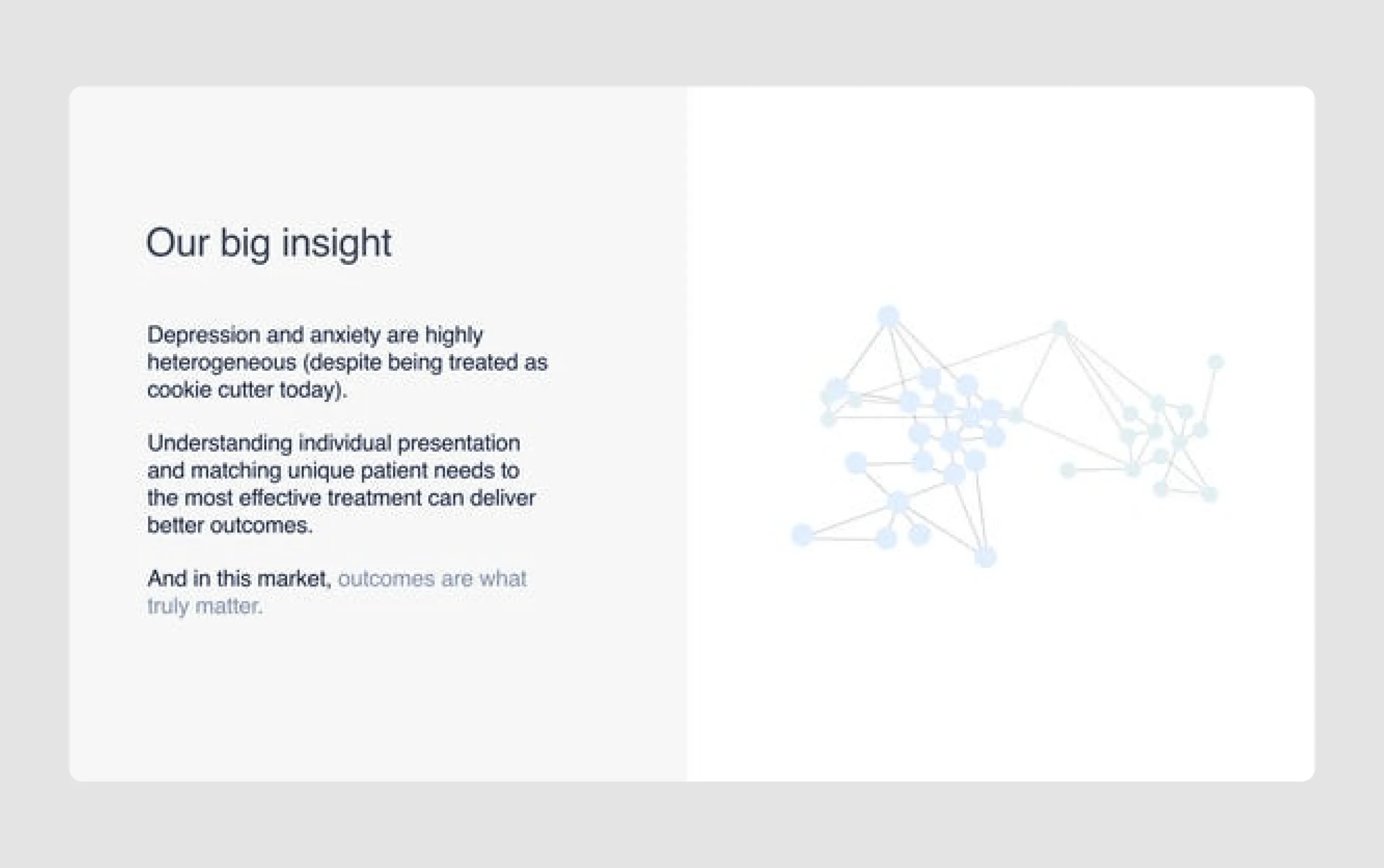
- Stronger investor resonance: Its narrative is especially persuasive because it connects outcomes, urgency, and empathy into a compelling story.
Design strengths
- Professional and clean design: The minimalistic design with ample white space, clean fonts, and structured layouts enhances readability and professionalism.
- Visual data presentation: Data is displayed effectively with charts and visuals, making complex information easy to understand at a glance.
- Consistent branding: The color scheme and fonts are consistent throughout, adding to the cohesiveness and making it visually appealing.
- Illustrations and icons: Simple illustrations and icons help break up text-heavy slides, making the content more engaging without overwhelming the viewer.
This pitch deck effectively communicates Brightside’s mission, market need, solution, team strength, and impact, backed by strong visuals and a professional design.
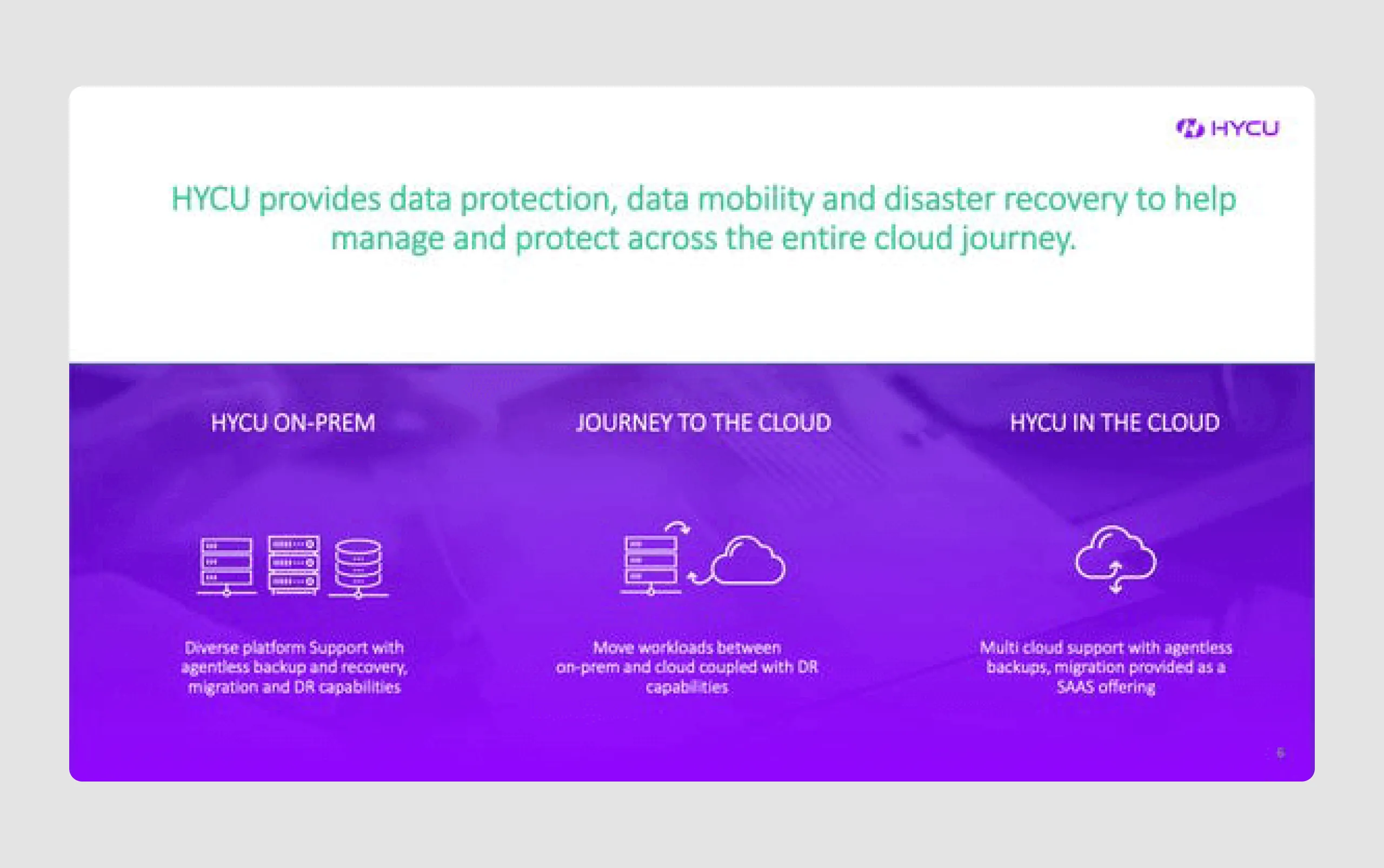
9. HYCU ($87.5m)
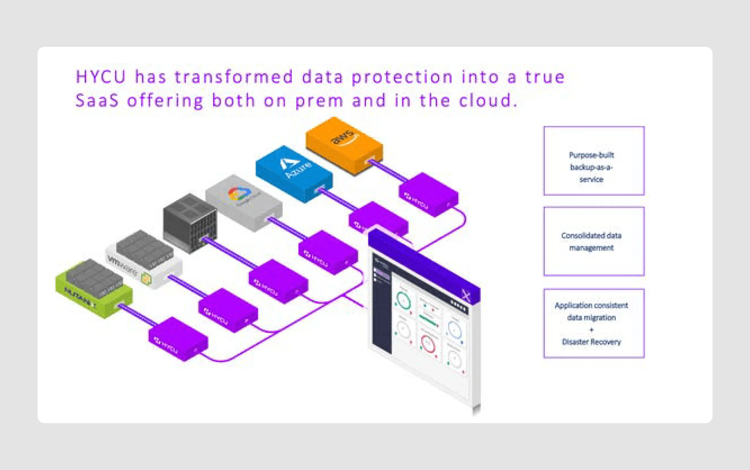
HYCU is a Boston-based startup that provides cloud-native backup and recovery software, specifically designed for multi-cloud environments. With the recent rise in cloud adoption and data security needs, HYCU's model resonated with investors, leading to their first funding round of $87.5 million led by Bain Capital and ACrew Capital. This funding aims to help HYCU grow further and compete with established players like Veritas, Veeam, and Rubrik.
Content strengths
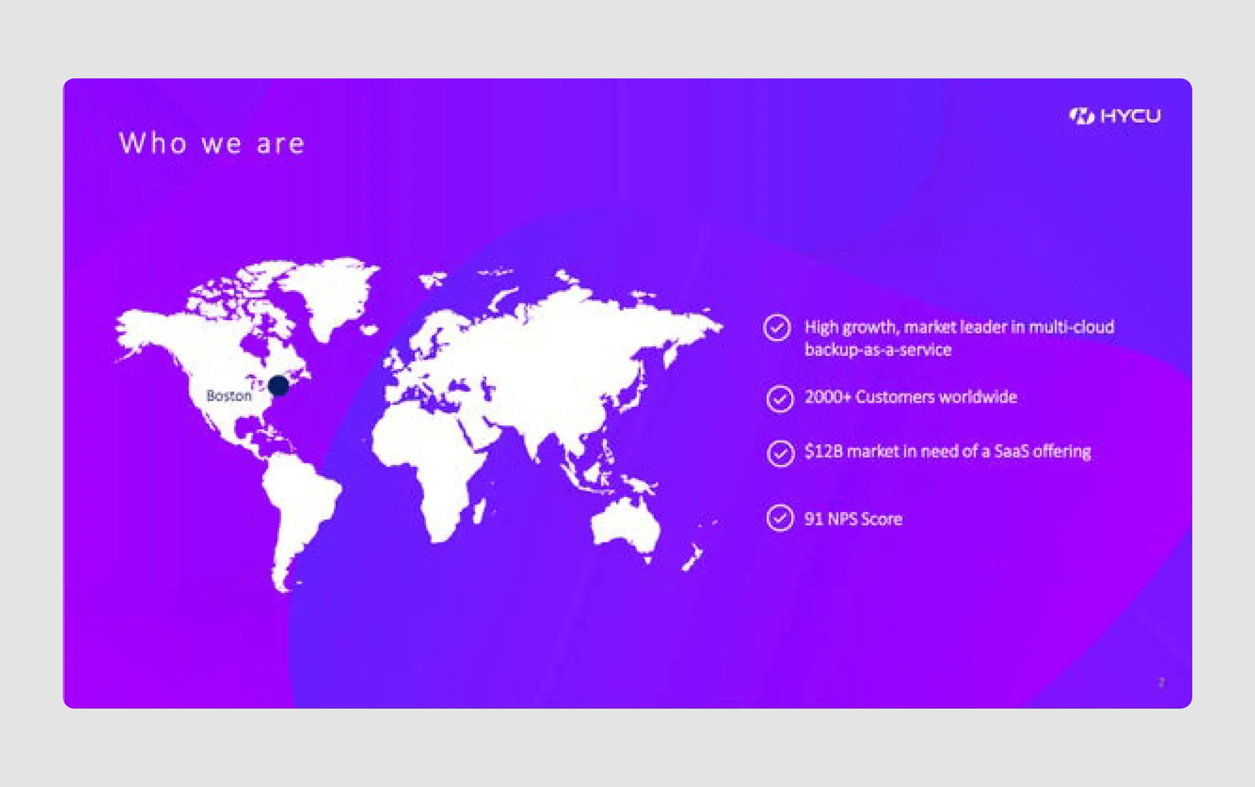
- Clear market leader positioning: The slides highlight HYCU’s position as a high-growth market leader in multi-cloud backup-as-a-service with over 2000 customers, building immediate credibility.
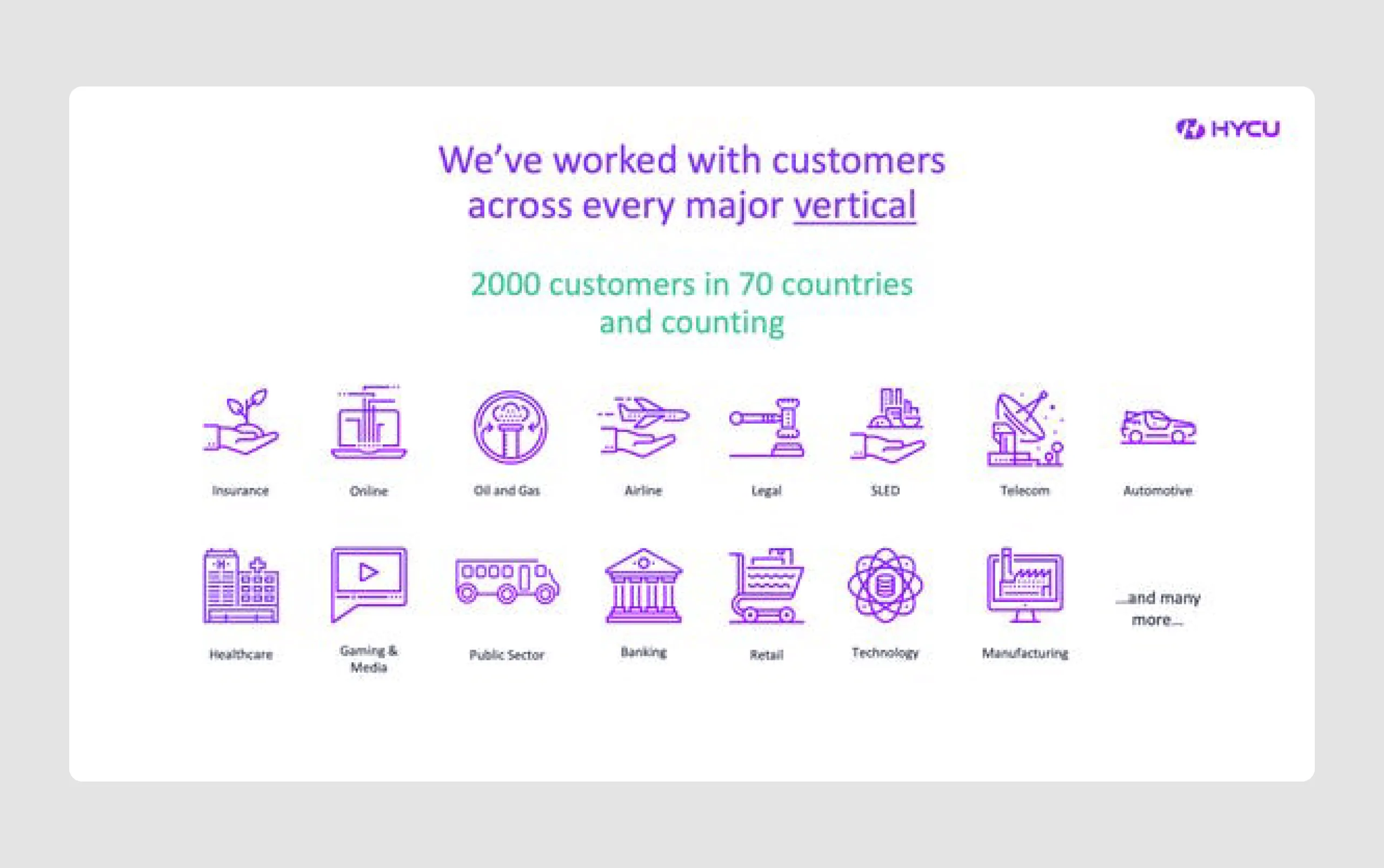
- Broad customer reach: Mentioning 2000 customers in 70 countries and showcasing diverse industry sectors demonstrates widespread adoption and trust in HYCU's solution.
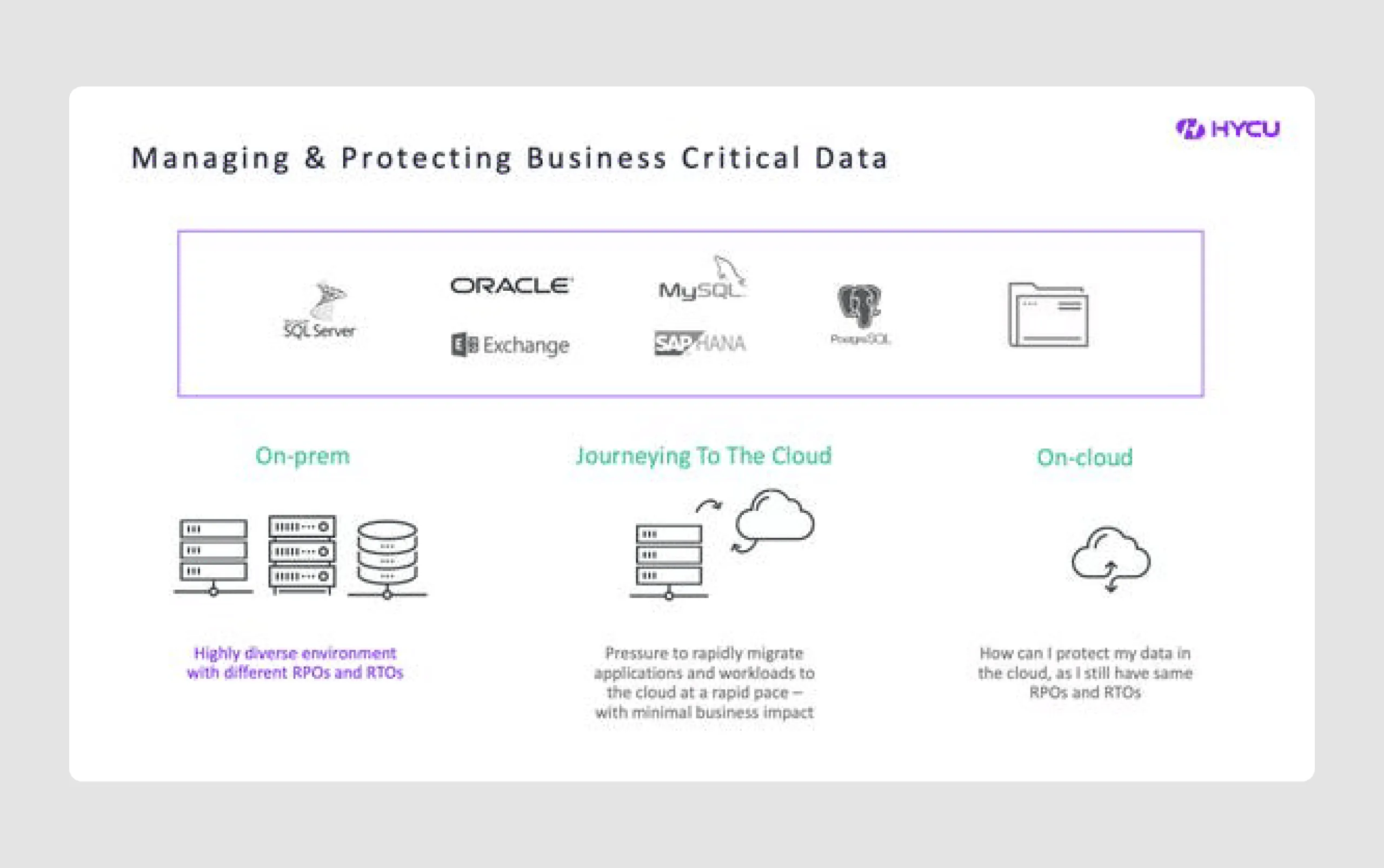
- Strategic solution overview: The presentation clearly outlines HYCU’s unique SaaS approach to data protection across on-prem, transitioning, and on-cloud stages, emphasizing adaptability.
- Product demonstration: Visuals of the platform’s interface in action lend credibility to the product’s capabilities, emphasizing ease of use and intuitive design, aligning with their "consumer-like" experience.
- Backing by notable investors: Mentioning investments from top firms like Bain Capital provides additional validation and trustworthiness to prospective stakeholders.
Design strengths
- Global map visualization: The map showing their global customer base effectively conveys HYCU's extensive reach in a quick, digestible visual.
- Industry Icons: Icons representing various industries add clarity to the verticals they serve, making it easy for viewers to quickly recognize the sectors without reading too much text.
- Clean and modern layout: The slides have ample white space and a modern, uncluttered design that enhances readability and keeps the viewer’s attention on key points.
- Data visualization: Visual elements like graphs and charts are used effectively to quantify and demonstrate traction, such as the number of customers and NPS score, adding credibility.
HYCU's slide deck effectively combines strategic content with a professional media kit and modern design to communicate the company's unique solution, market traction, and growth potential. And it also does a strong job of surfacing unique selling points without overexplaining them.
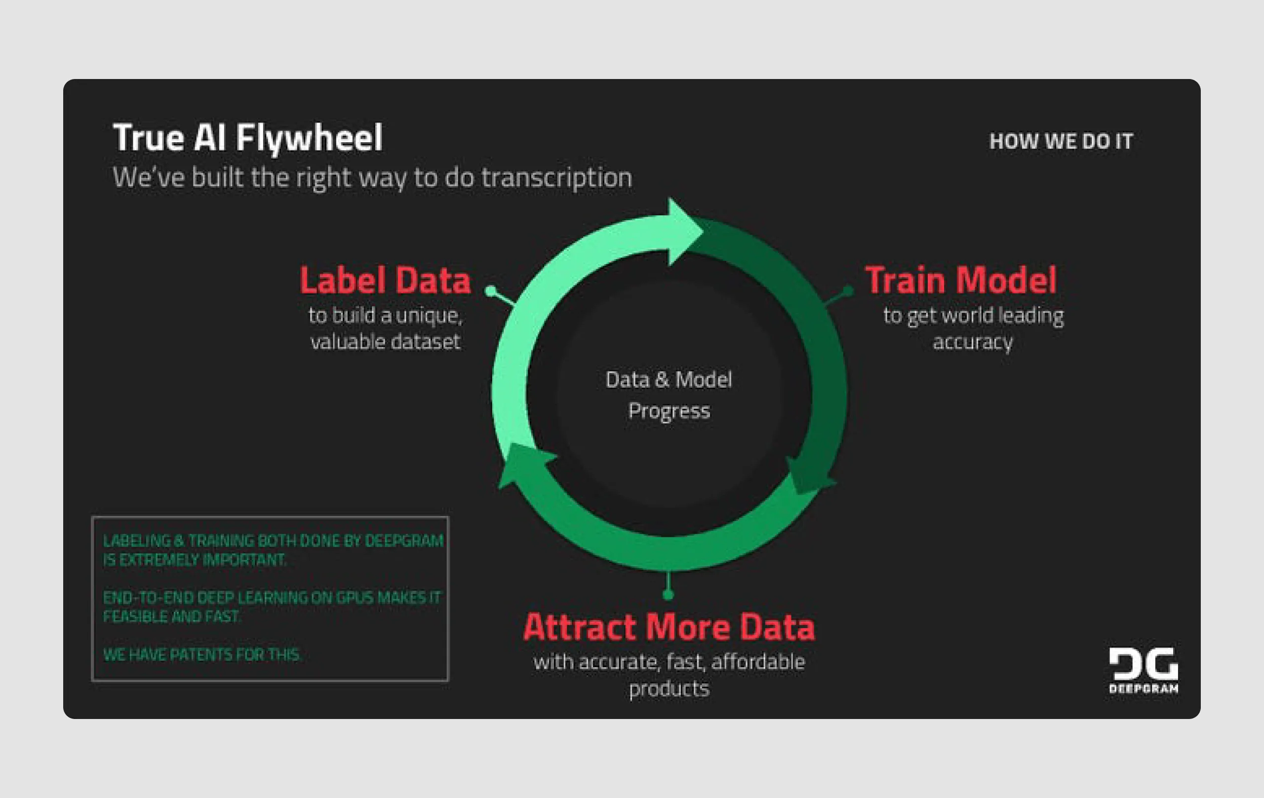
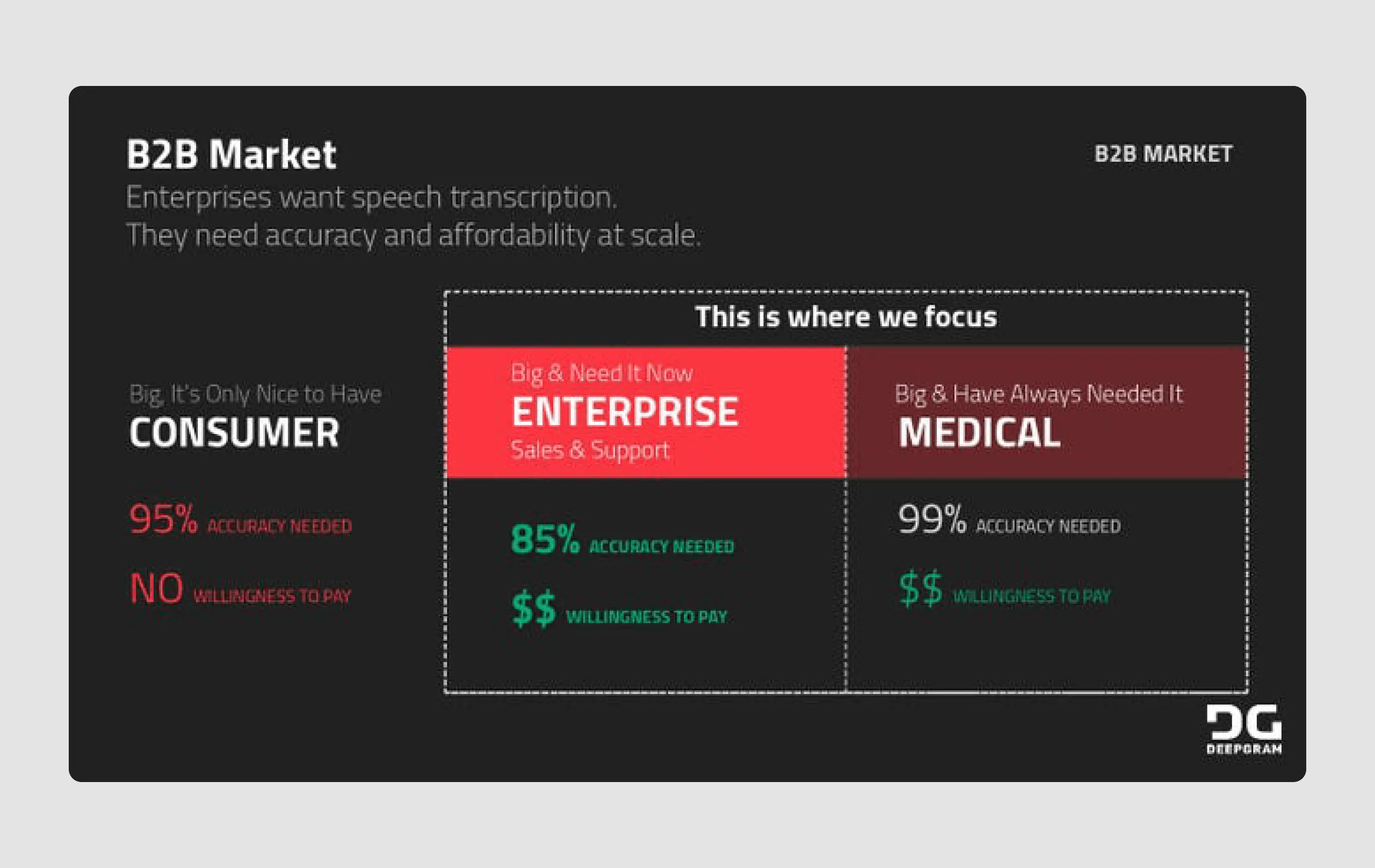
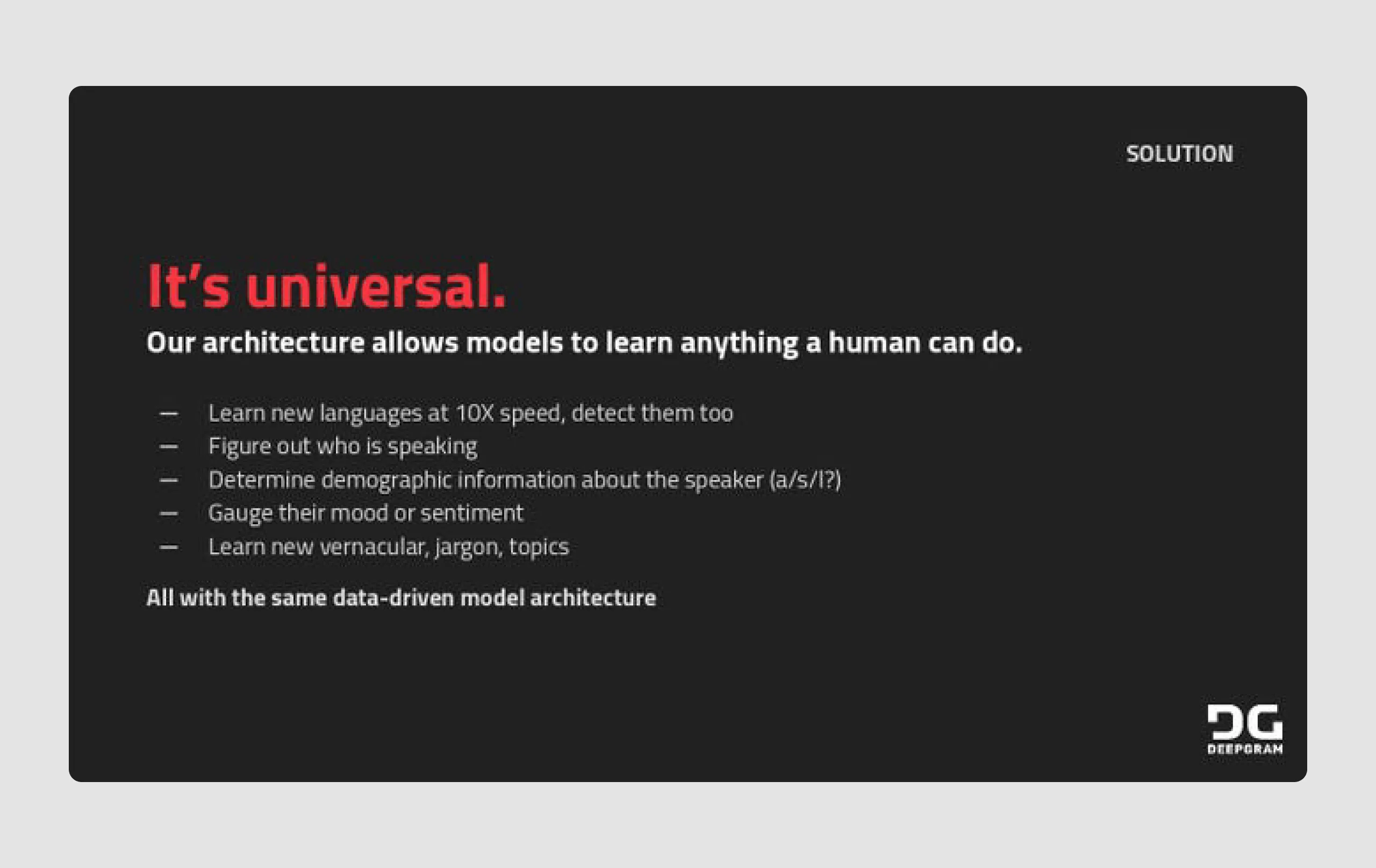
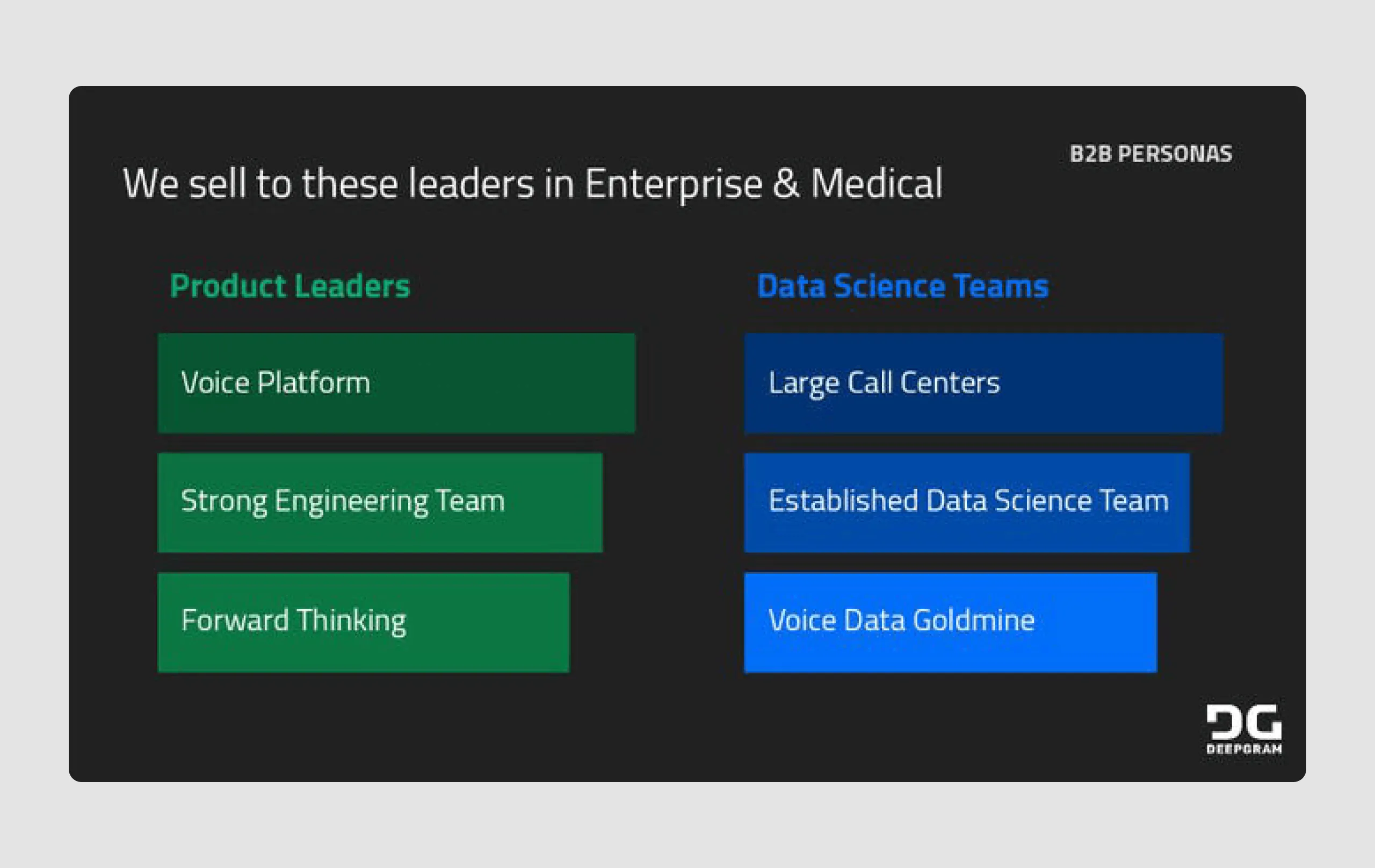
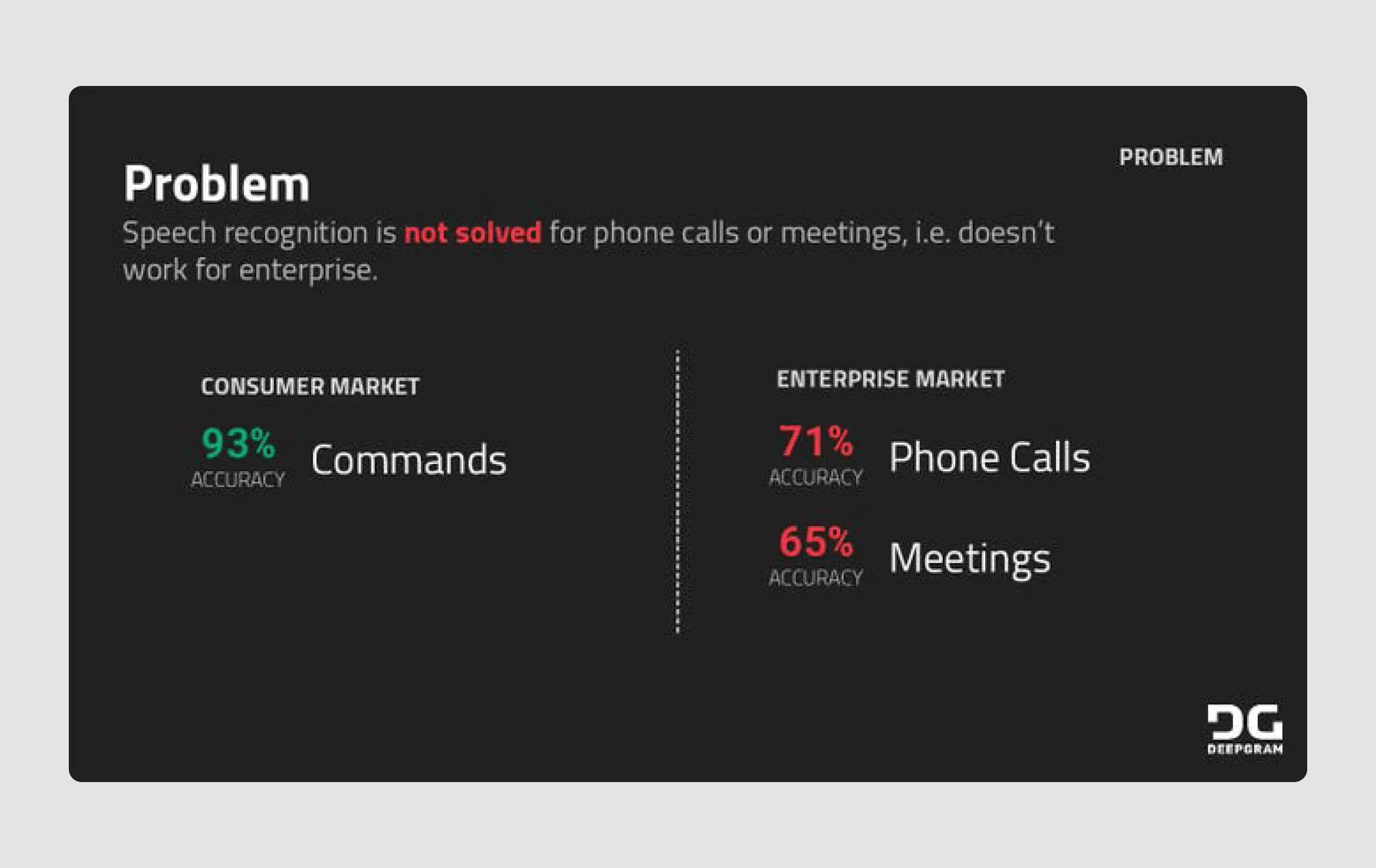
10. Deepgram ($12m)
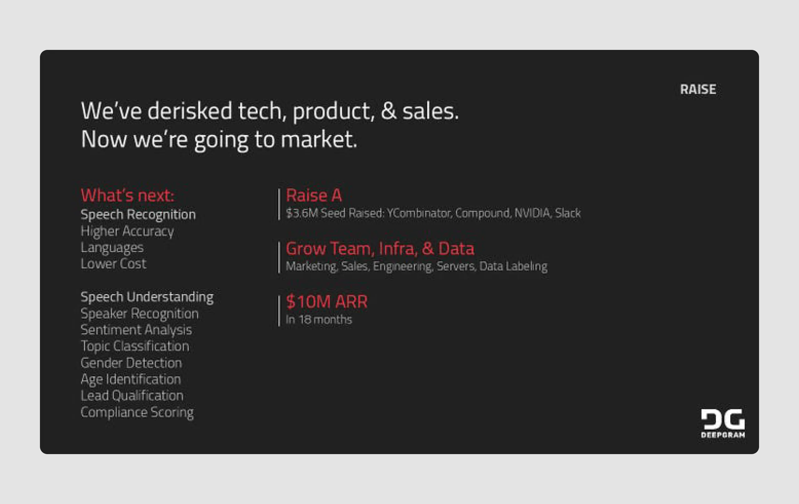
Deepgram is a startup that provides enterprise-level automatic speech transcription and analysis, leveraging advanced AI to transcribe and analyze spoken language. Deepgram’s focus on high-accuracy transcription and its unique origin story captured investor interest, leading to funding for further development.
Strengths in content
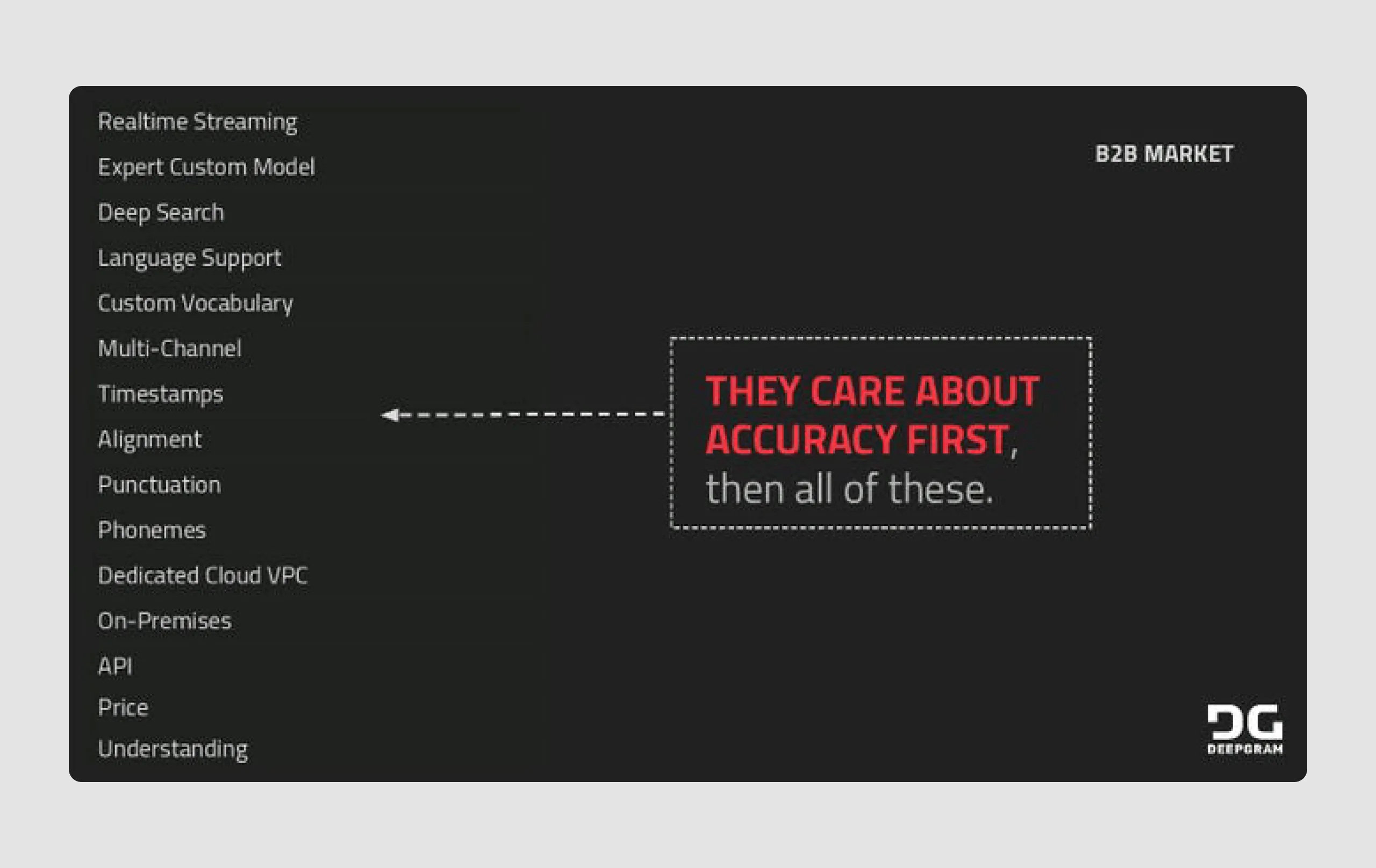
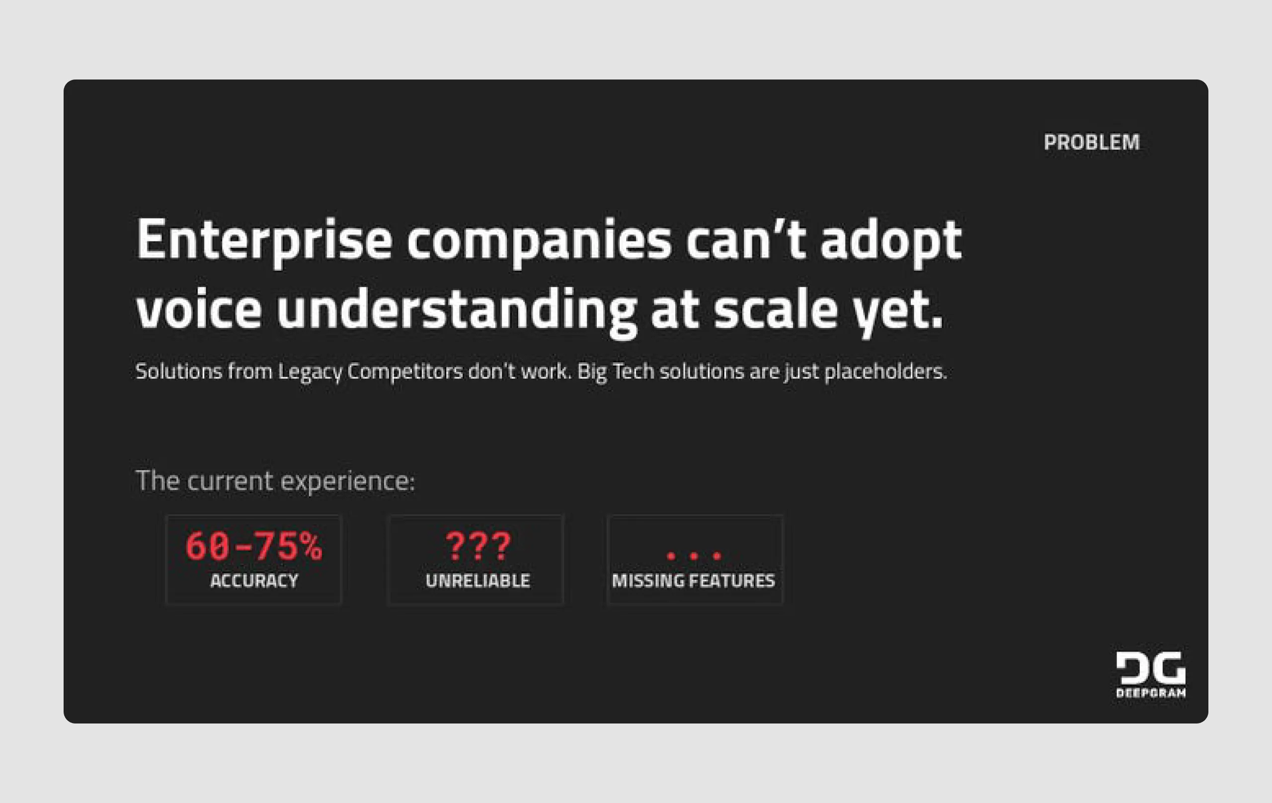
- Clear problem statement: The presentation highlights a specific gap in current speech recognition technology, especially in the enterprise market, making it easy to understand the need for their solution.
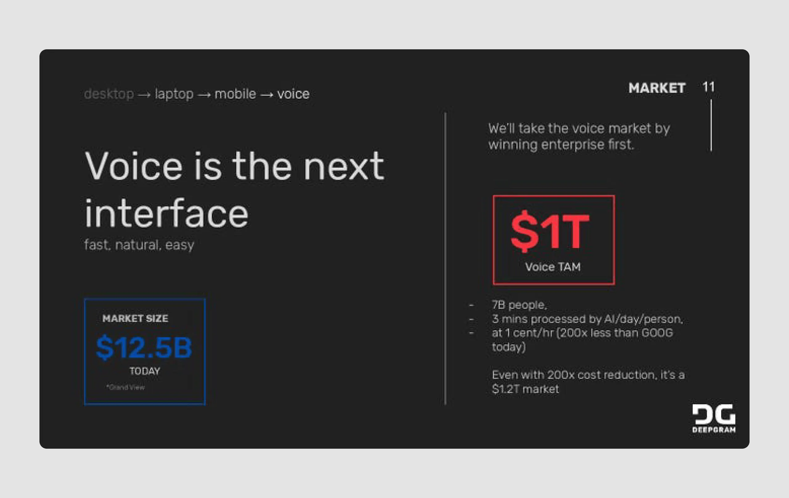
- Solid market potential: The market slide effectively conveys the TAM (Total Addressable Market) of $1T, emphasizing the vast potential of the voice recognition industry.
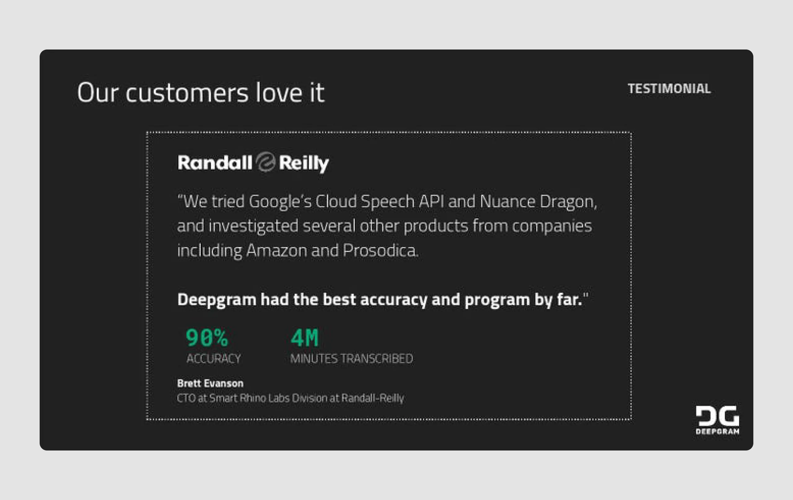
- Testimonials: Including real customer testimonials validates the solution’s effectiveness and builds credibility.
Strengths in design
- Consistent branding: The deck uses a cohesive color scheme with black, red, and white, reinforcing the brand’s identity and making the content visually memorable.
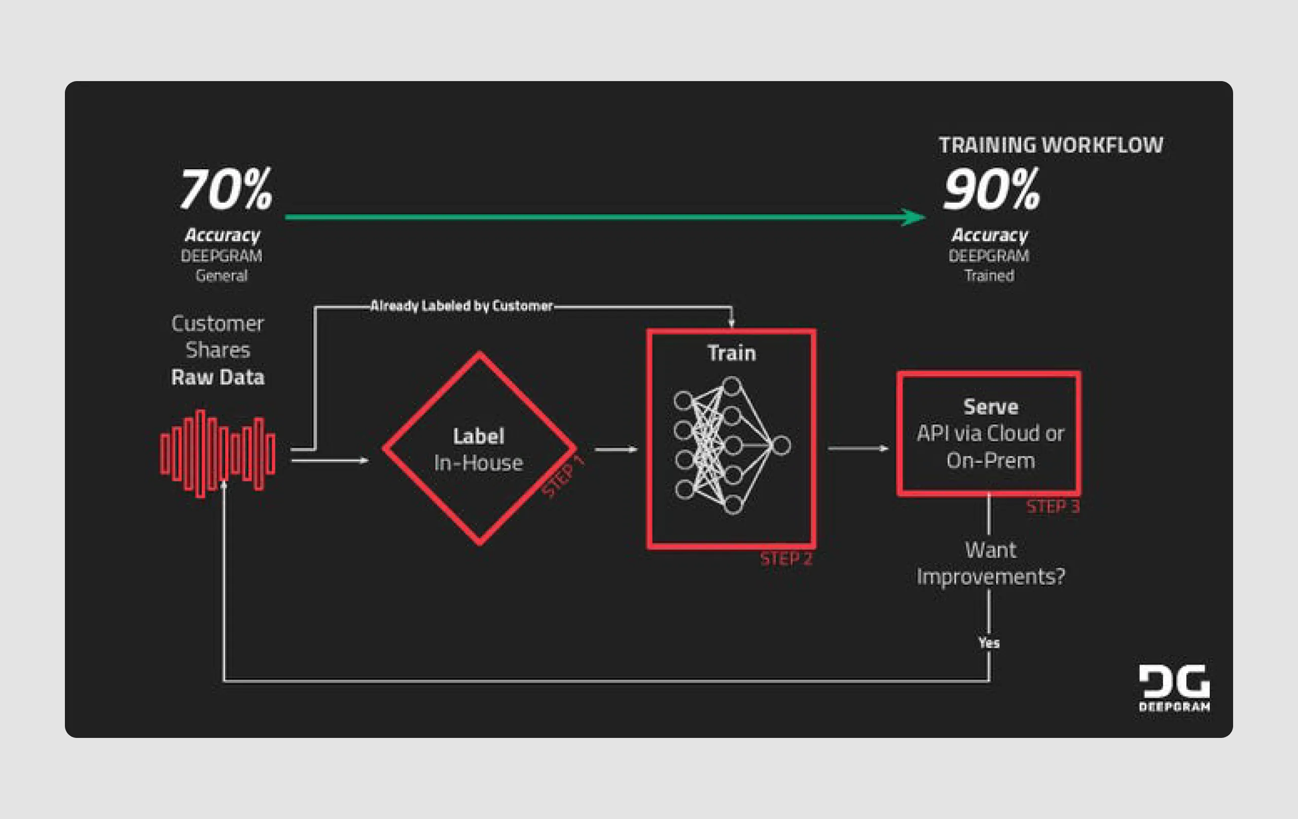
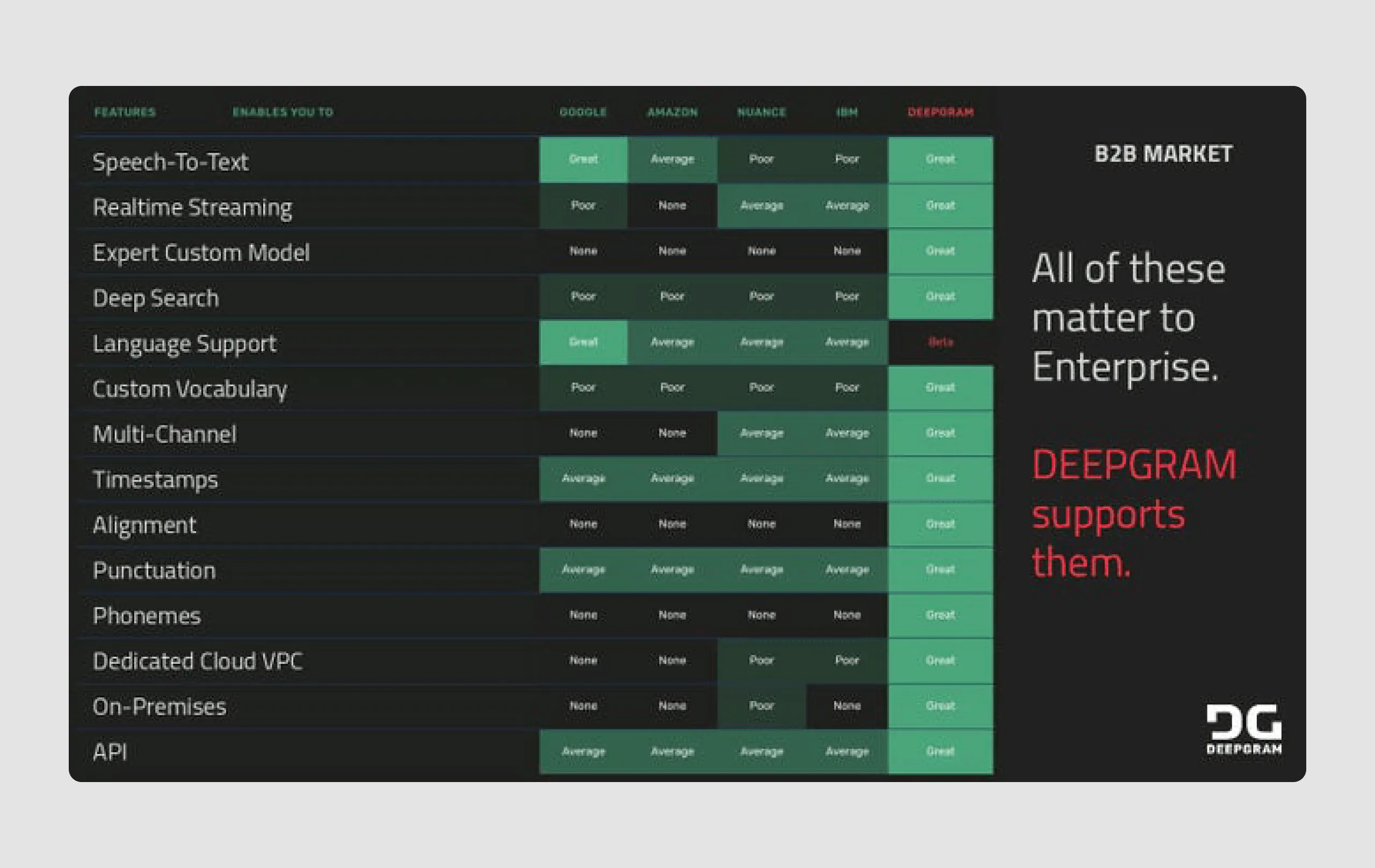
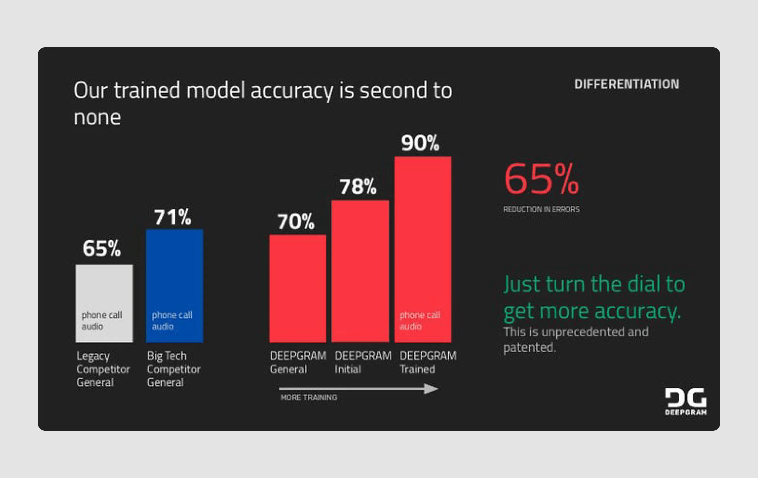
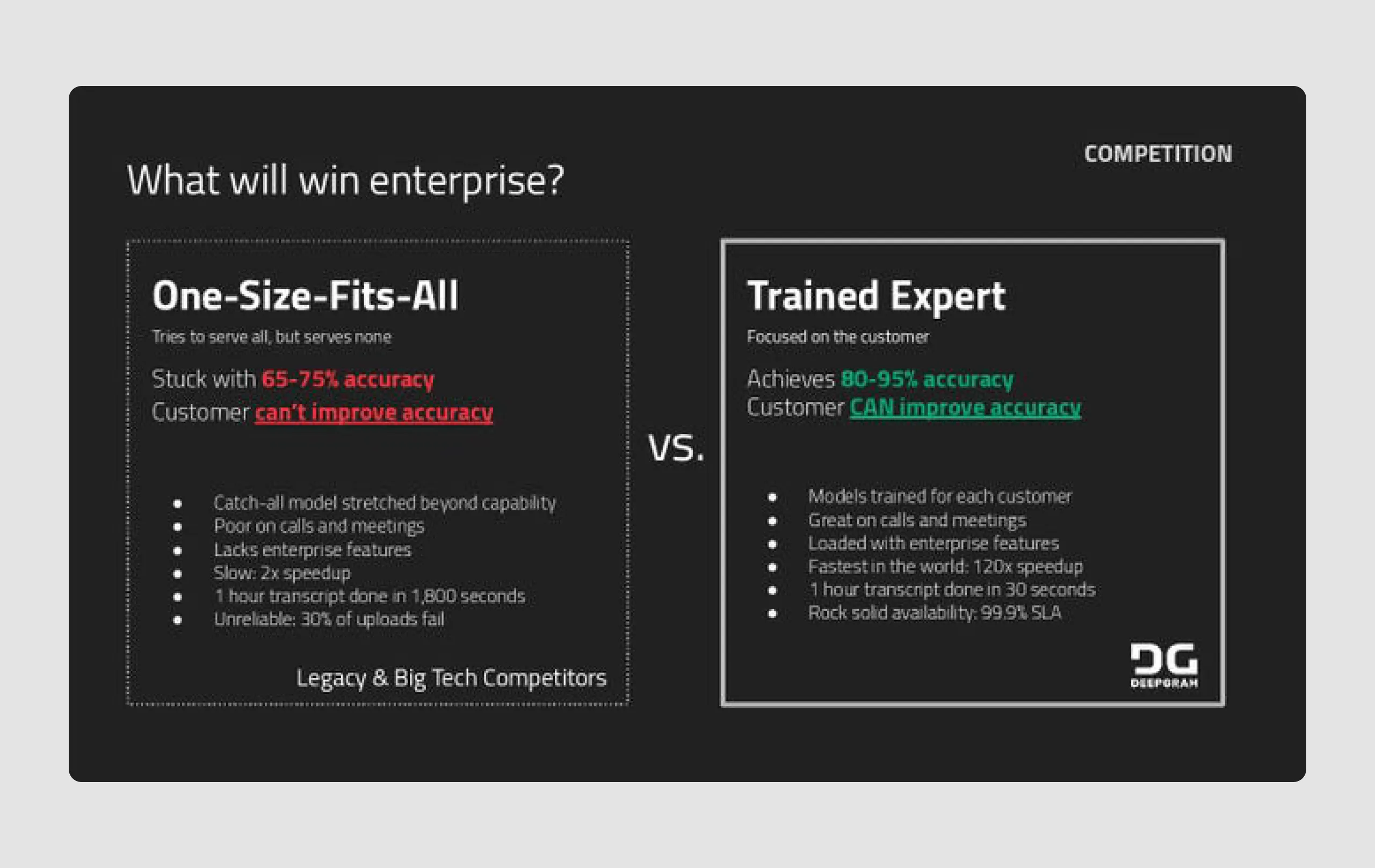
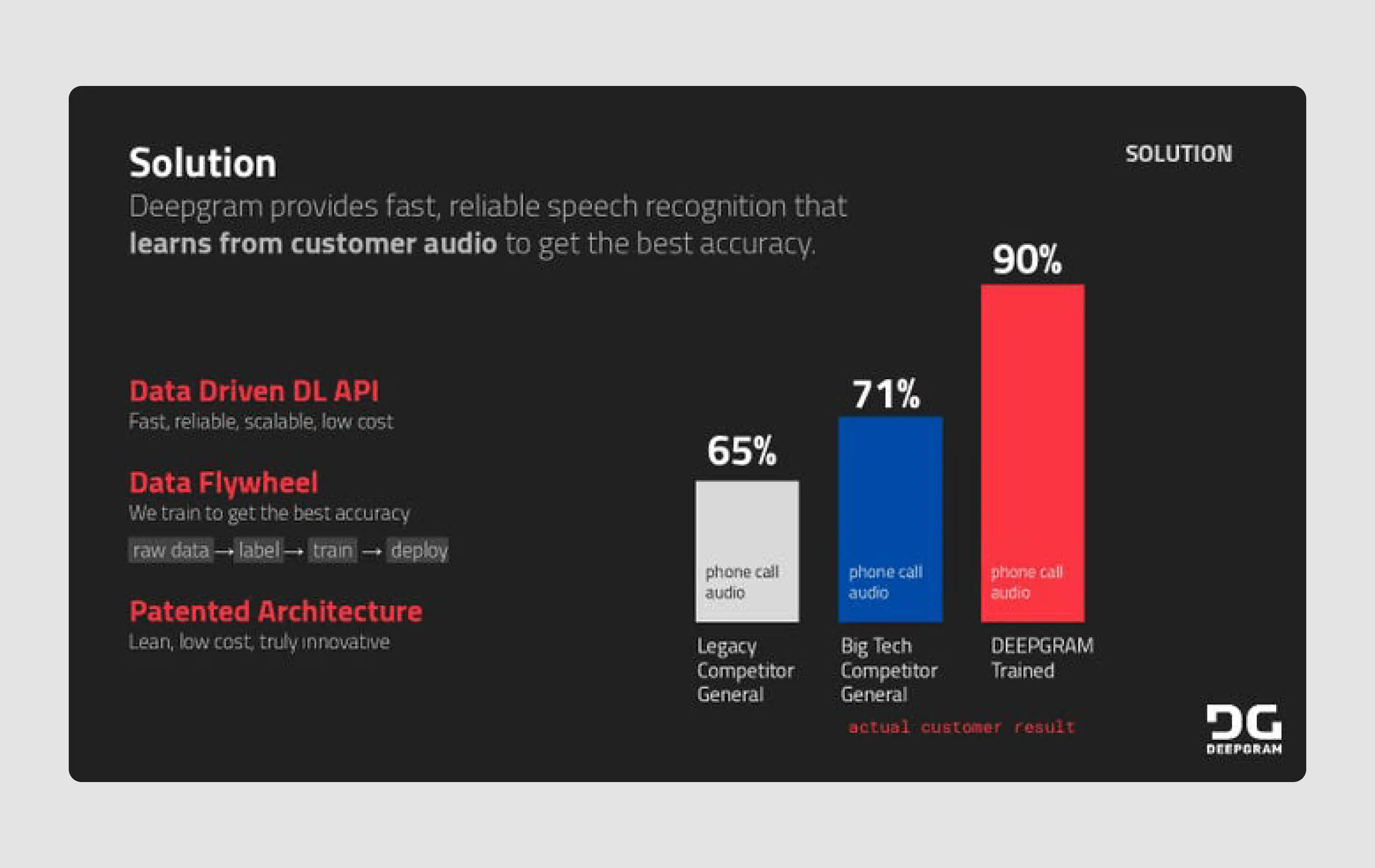
- Data-driven visuals: Charts and graphics are used effectively to convey data points like accuracy rates, competitive comparisons, and market size, enhancing clarity.
- Effective use of typography: Key points are bolded and color-coded (e.g., red for emphasis), drawing attention to critical information without overwhelming the viewer.
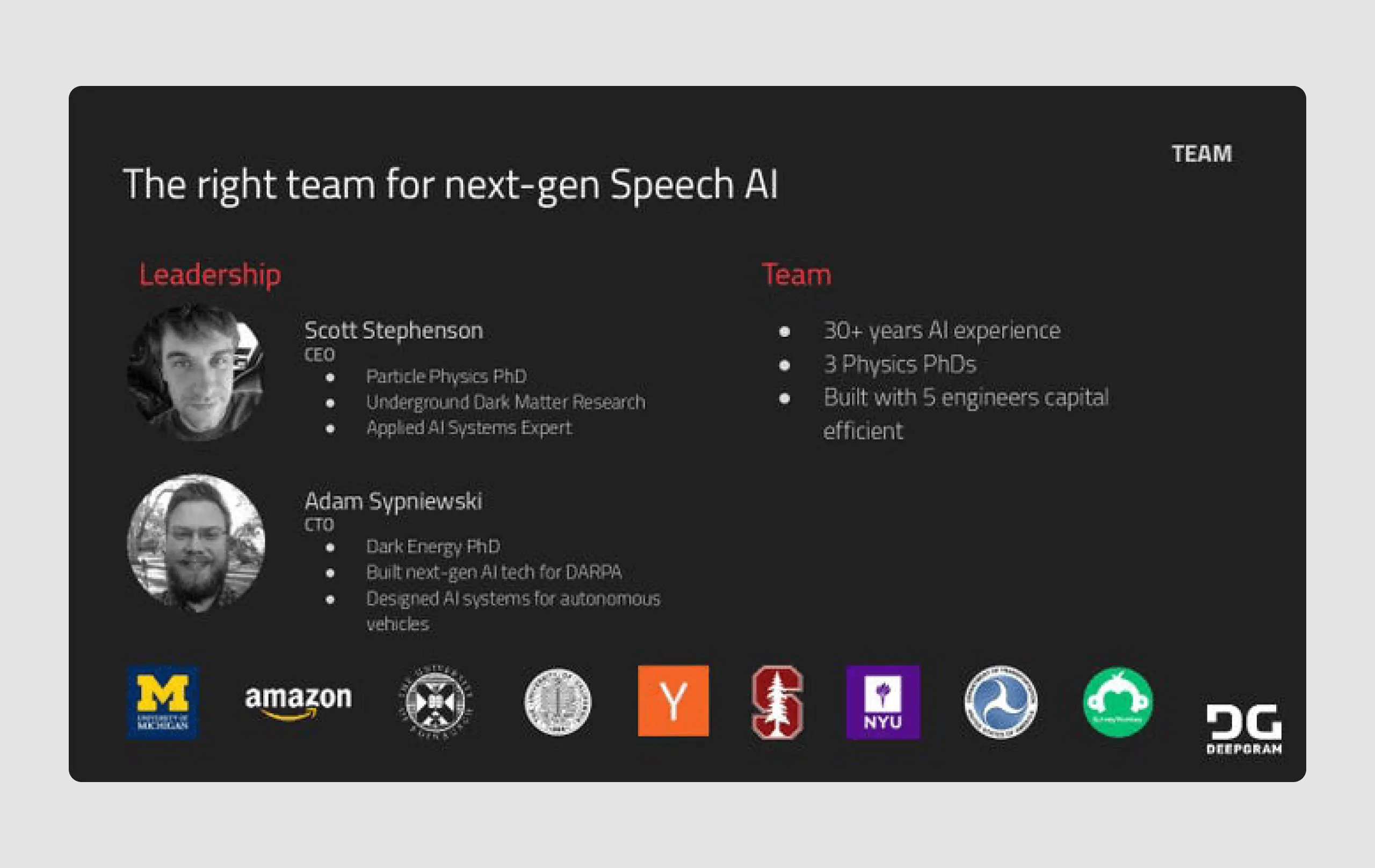
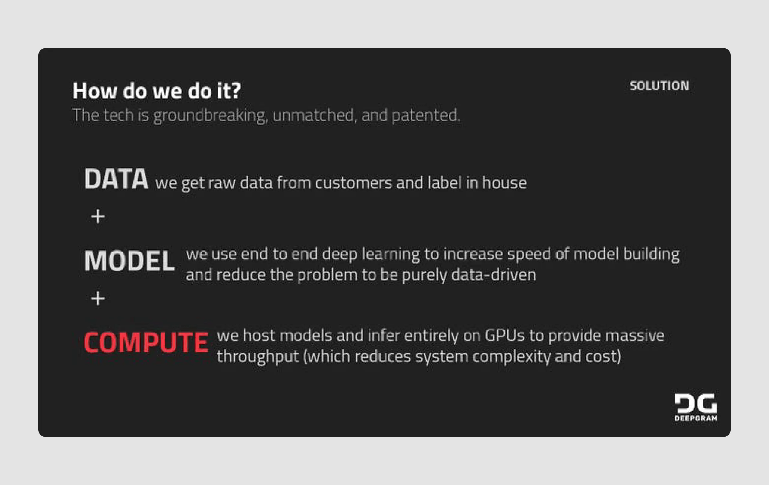
- Logical flow: The deck follows a logical narrative from problem identification, solution, and differentiation to market and testimonials, creating a compelling storyline for investors.
Deepgram’s pitch deck combines clear messaging, a focused design, and strong data visuals, which effectively communicate their unique value proposition and market potential to investors.
Series-B business pitch examples
A Series B round typically occurs once a company has demonstrated some level of success, product-market fit, and revenue growth. The primary purpose of a Series B round in venture capital is to help a startup expand beyond early-stage activities and scale the business.
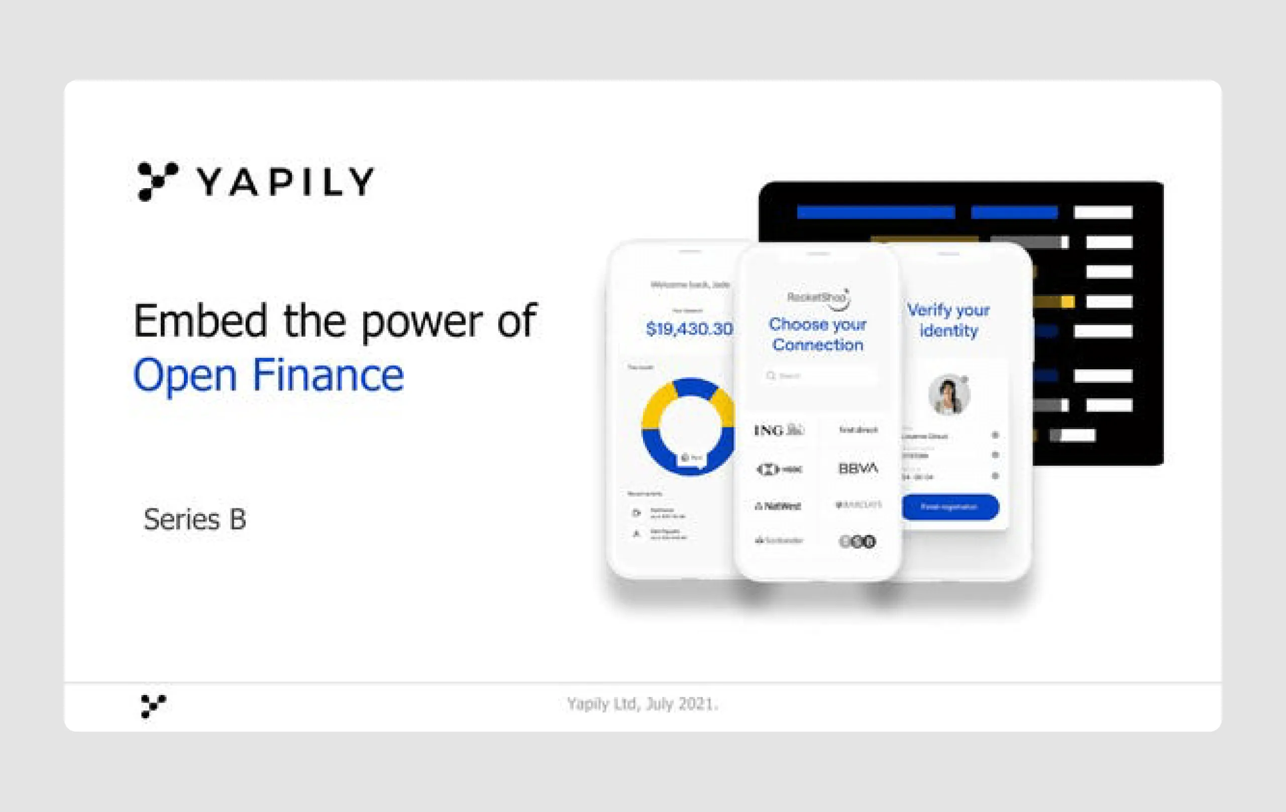
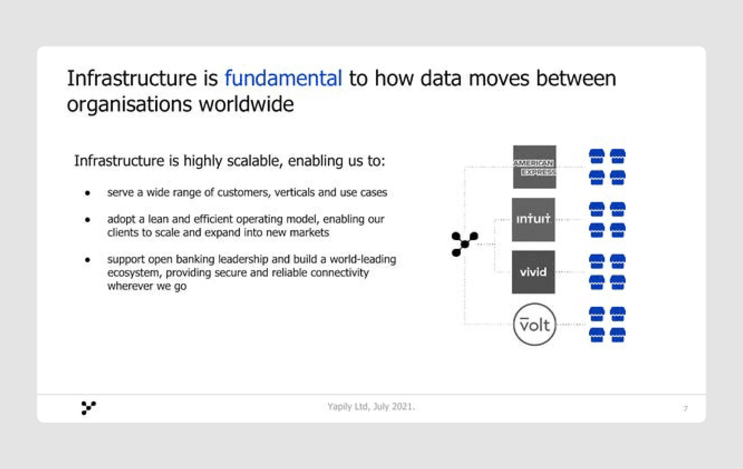
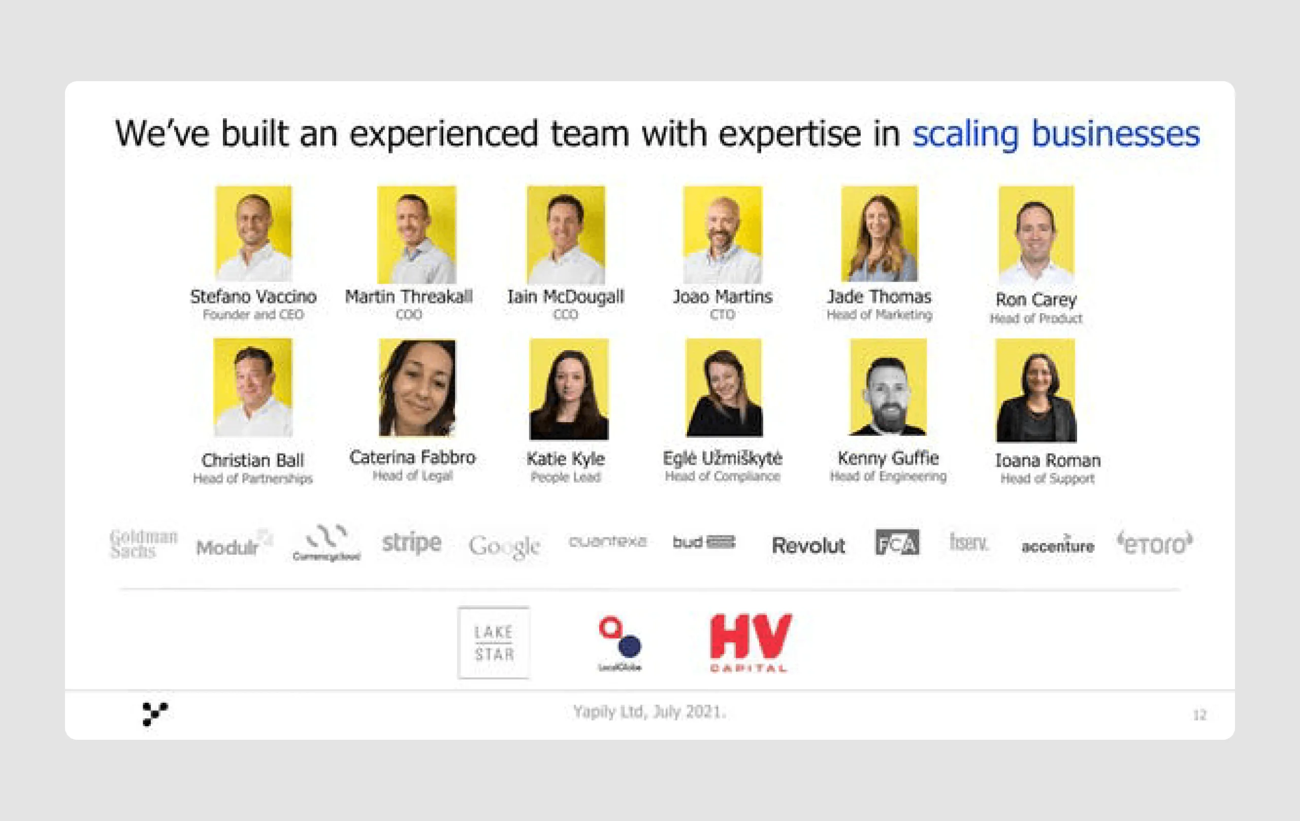
11. Yapily ($51m)
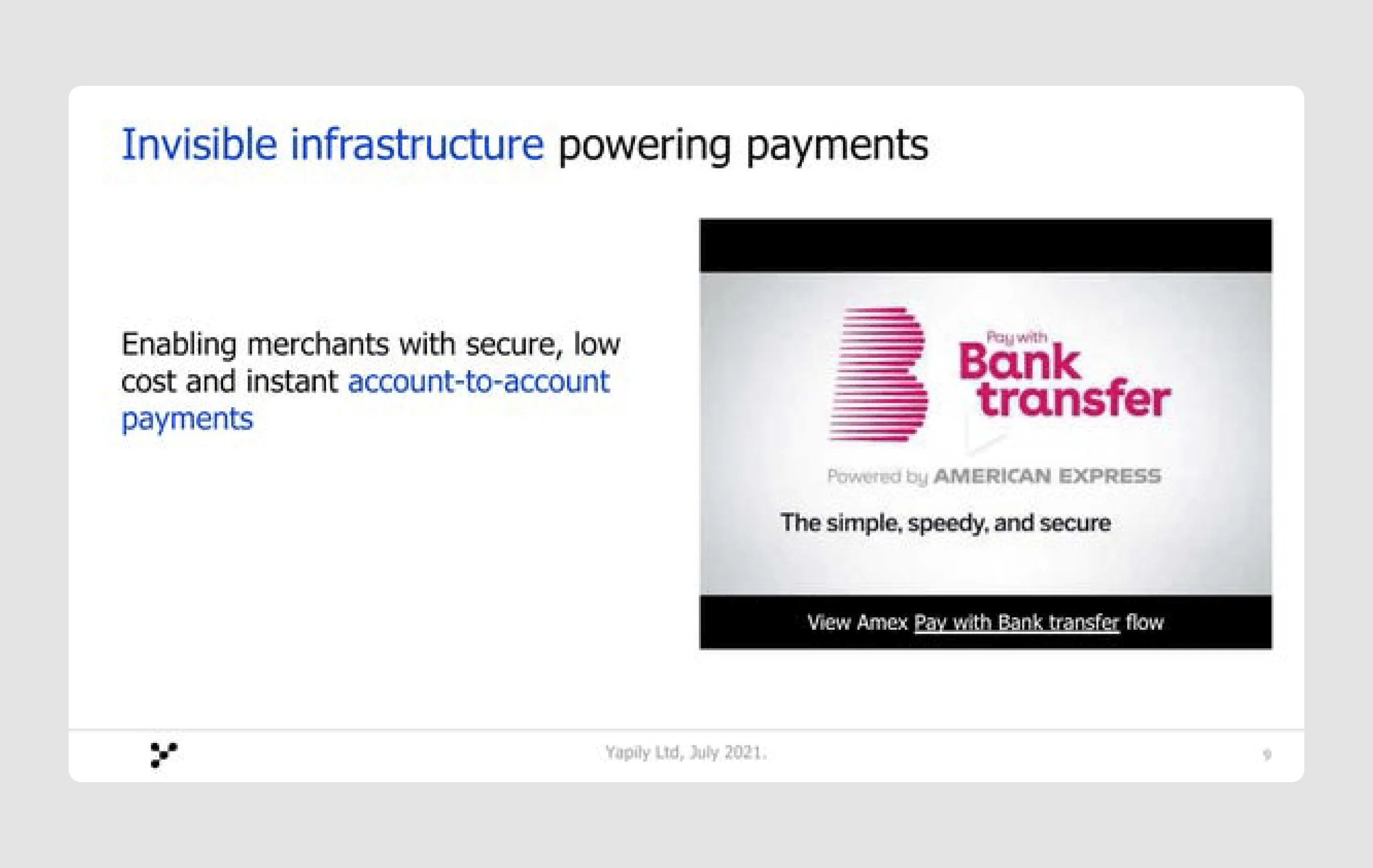
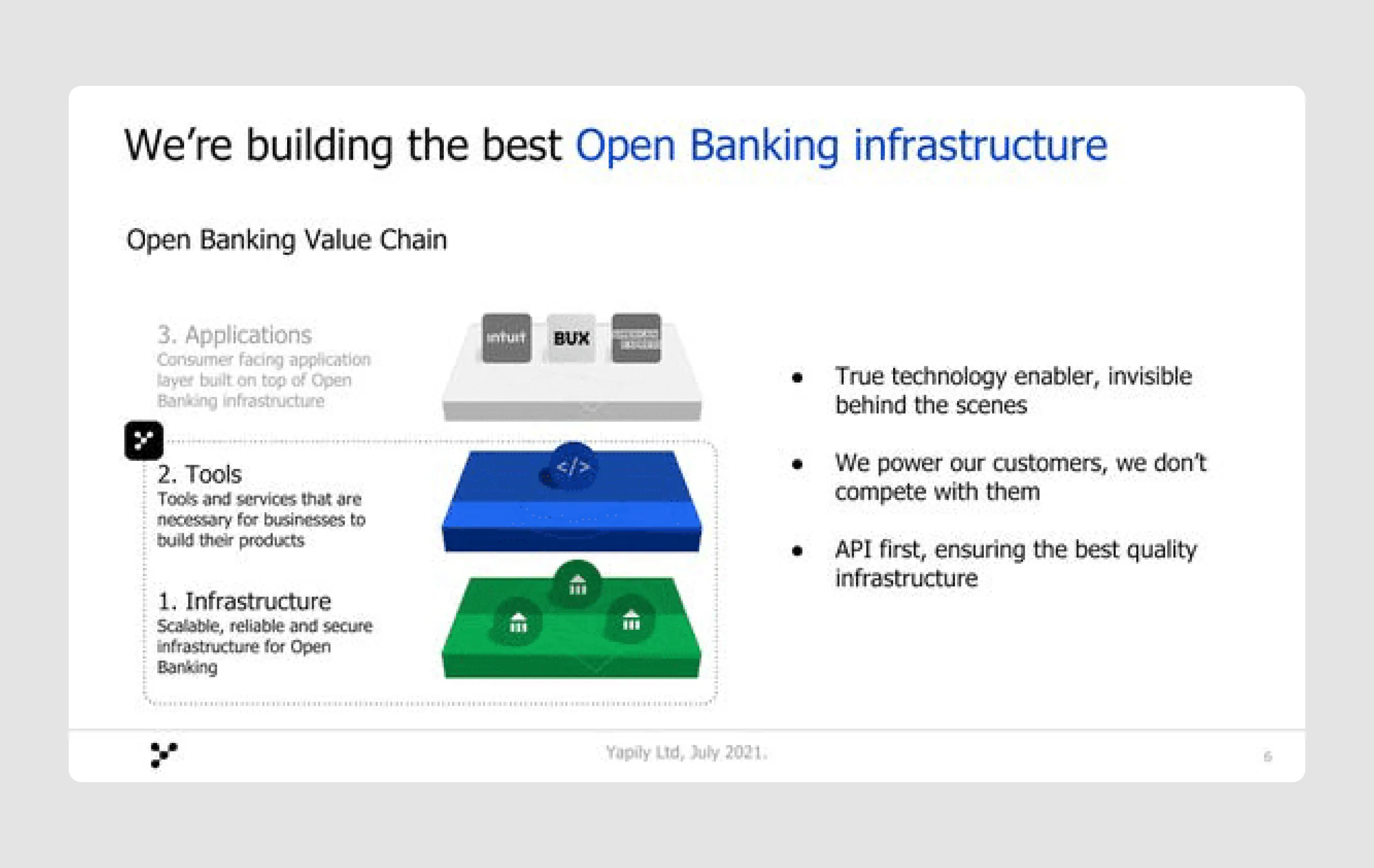
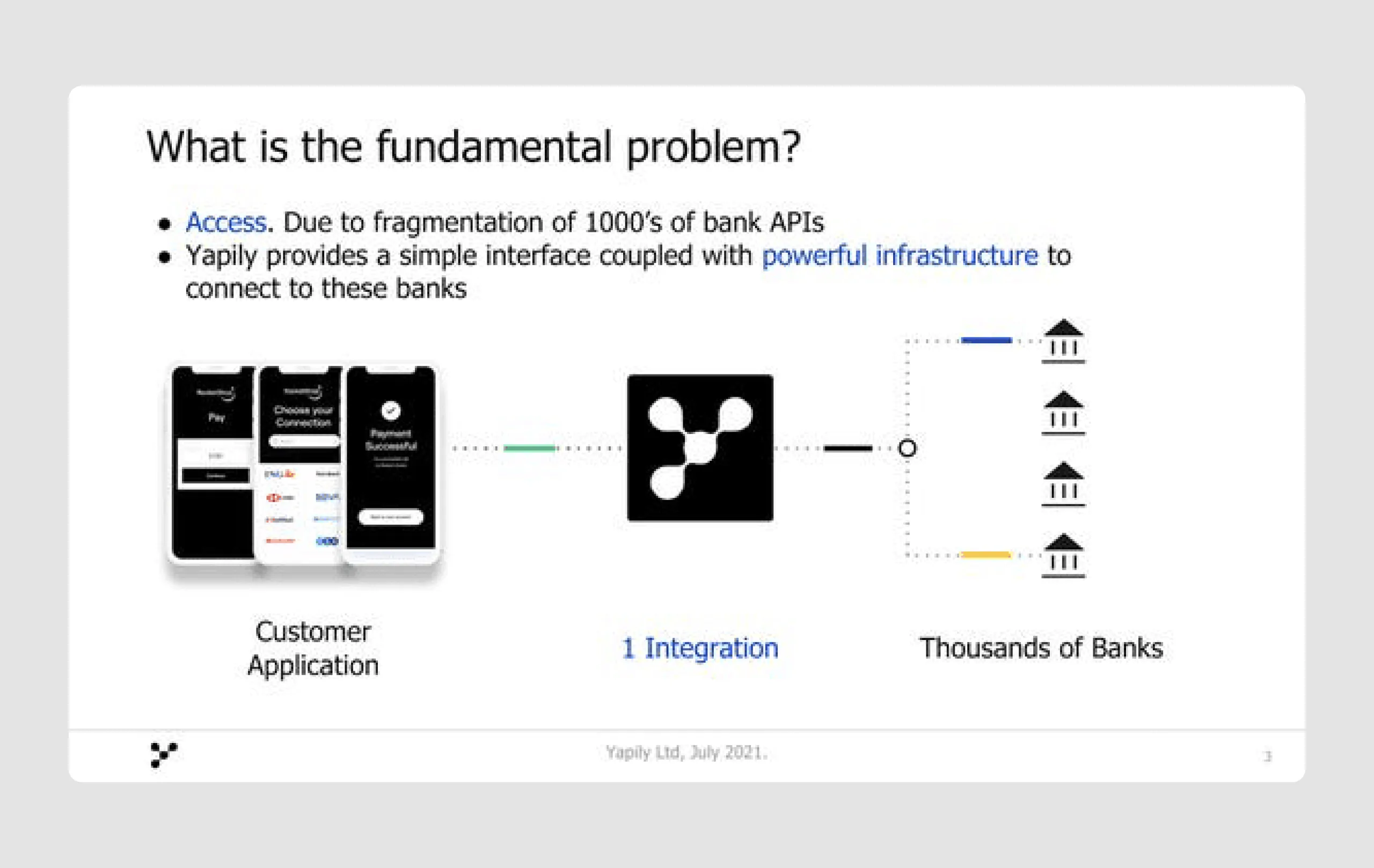
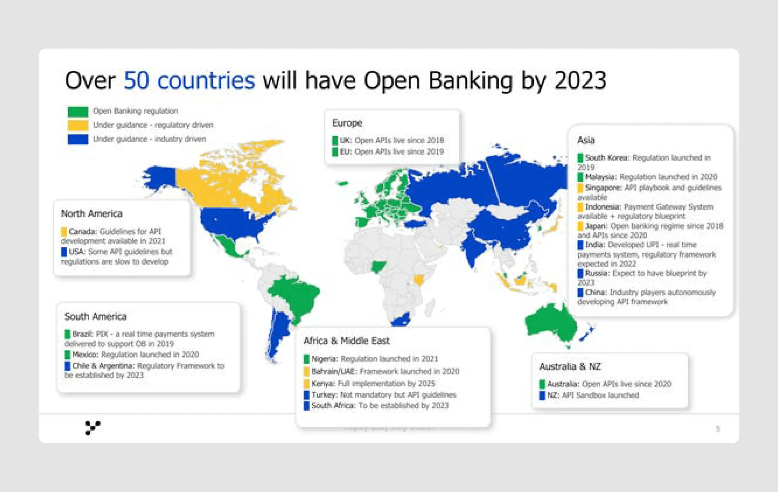
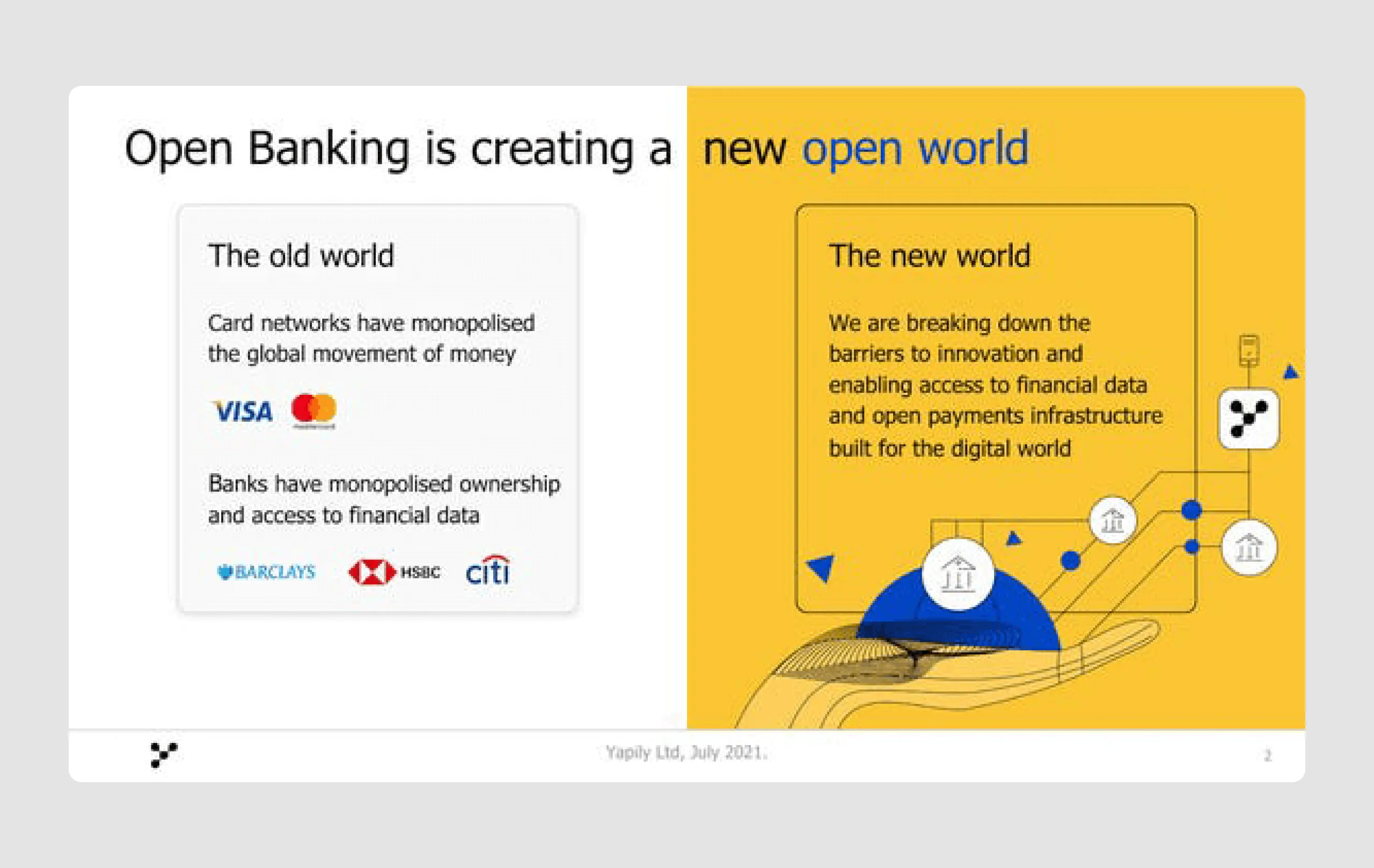
Yapily is a fintech company focused on enabling open banking through a secure API, allowing businesses to access financial data and payment infrastructure directly from banks. In 2021 they raised $51 million in Series B funding to expand into new European and Latin American markets, aiming to support more businesses as open banking becomes essential for competitiveness.
Strengths in content
- Solid market potential: The deck highlights the rapid growth and global adoption of open banking, including expansion forecasts across multiple regions. This showcases the expansive and growing market opportunity, which Yapily is well-positioned to capture.
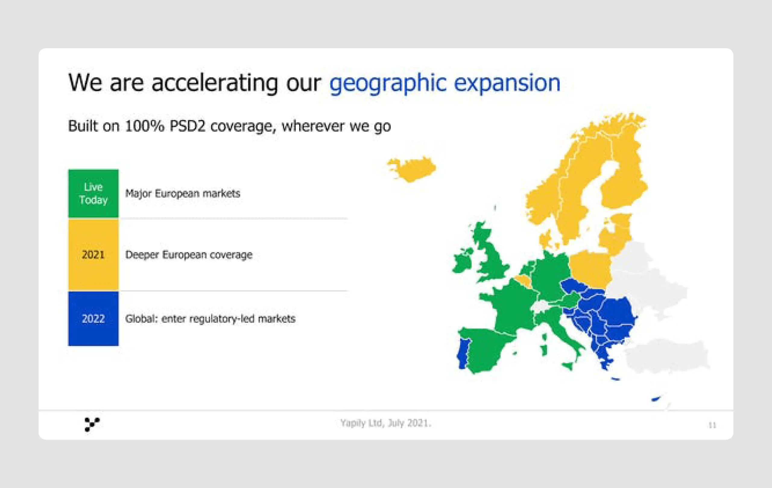
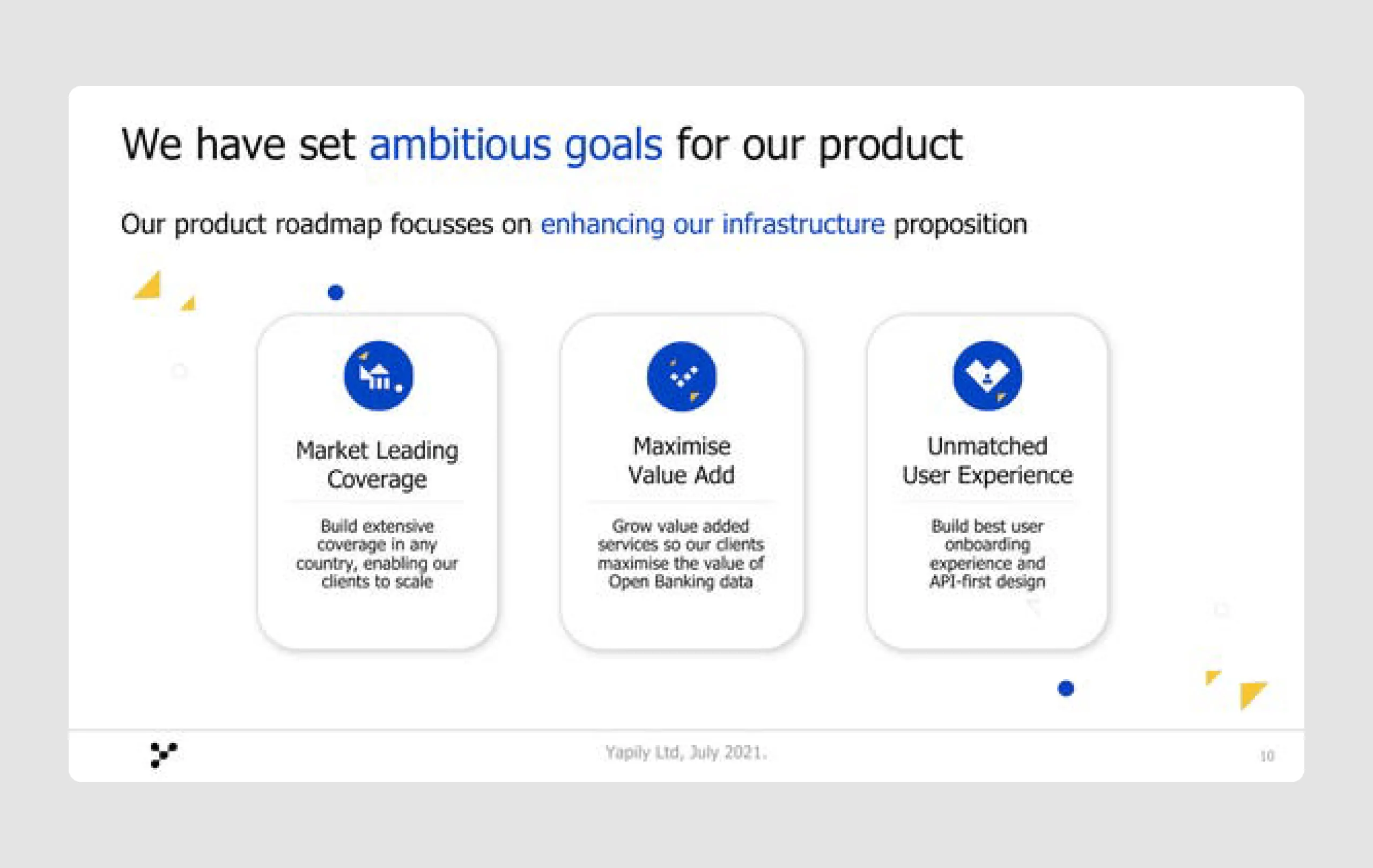
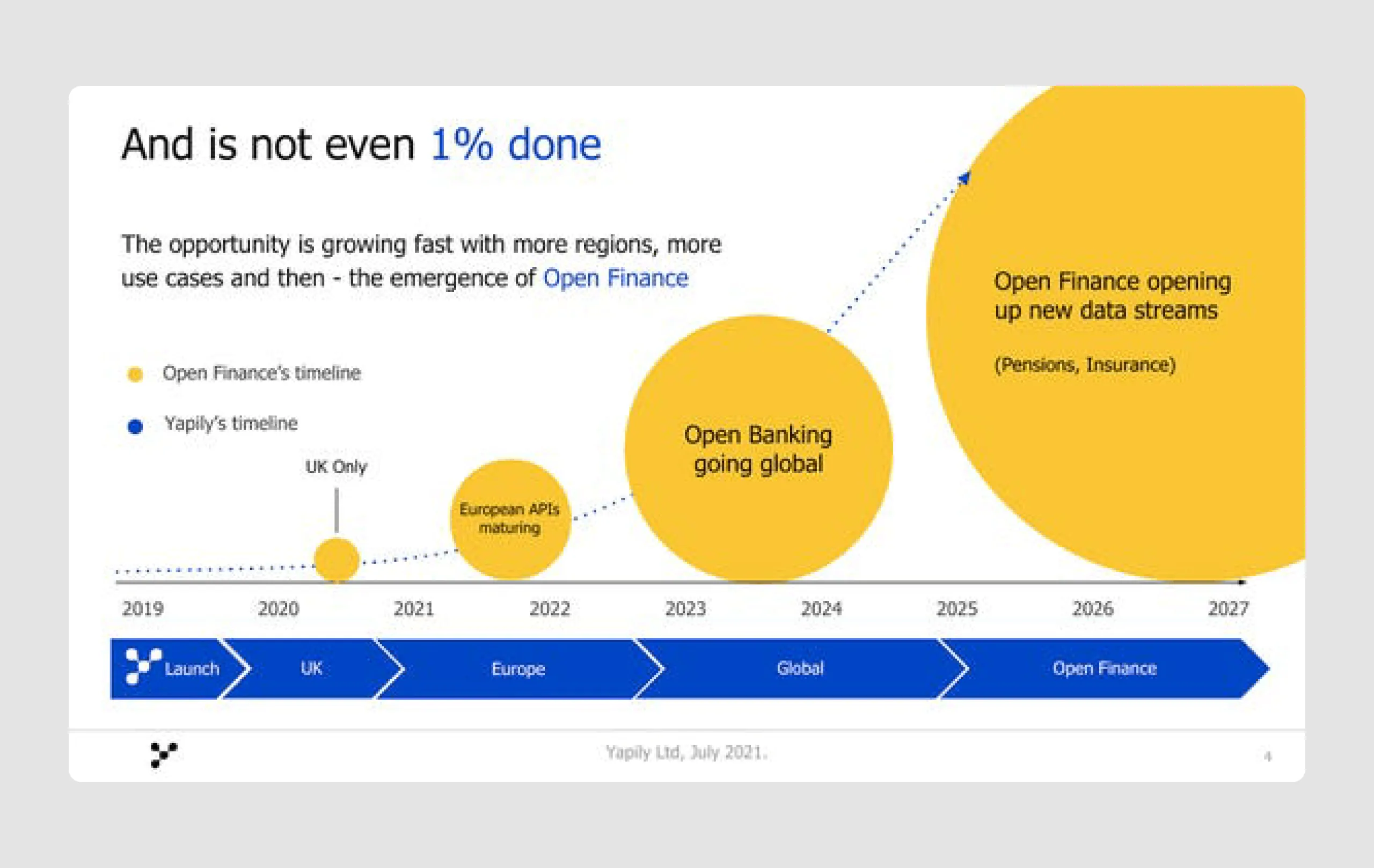
- Roadmap and expansion goals: Yapily presents ambitious goals with detailed geographic and feature-based expansion plans. The deck clearly communicates its intent to scale globally and penetrate key markets, like Europe and Latin America, aligning with investor expectations for growth potential.
- Customer validation and use cases: Mentioning prominent clients such as GoCardless and referencing real-world applications strengthens Yapily’s credibility and demonstrates proven demand for its solution.
Strengths in design
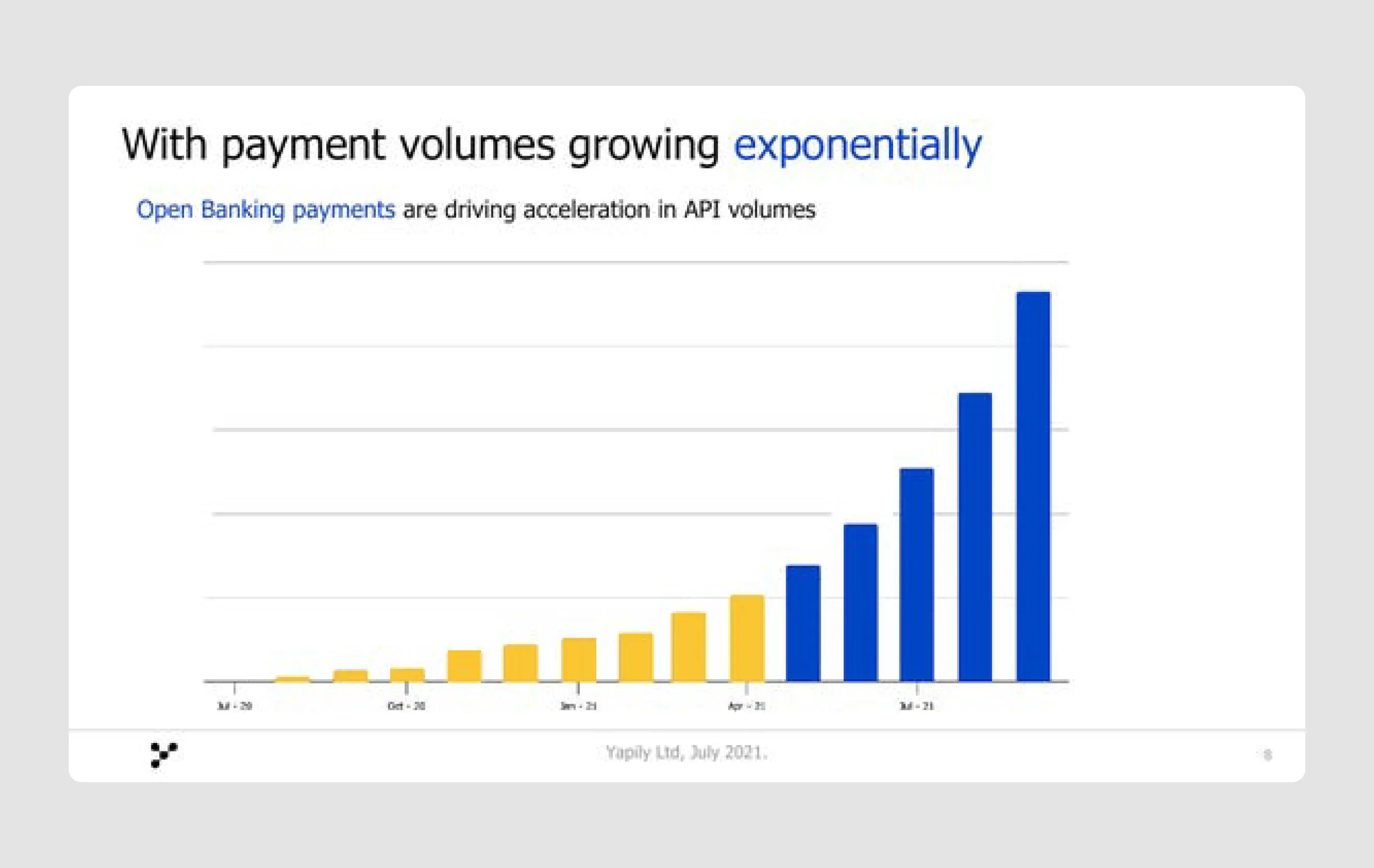
- Informative visuals: The presentation makes effective use of maps, timelines, and growth charts, which visually depict the global expansion of open banking, Yapily’s progress, and projected market growth. This makes complex information easy to understand.
- Effective use of typography: Key points and phrases are bolded and color-highlighted, which draws attention to important information without causing visual strain.
Yapily’s pitch deck combines a clear problem statement, a differentiated solution, and a structured growth roadmap. The design is clean, visually appealing, and strategically uses charts and visuals to make the case for Yapily's place in the open finance landscape, all of which spark interest and effectively position the company as a compelling investment opportunity.
12. SuperMetrics ($50m)
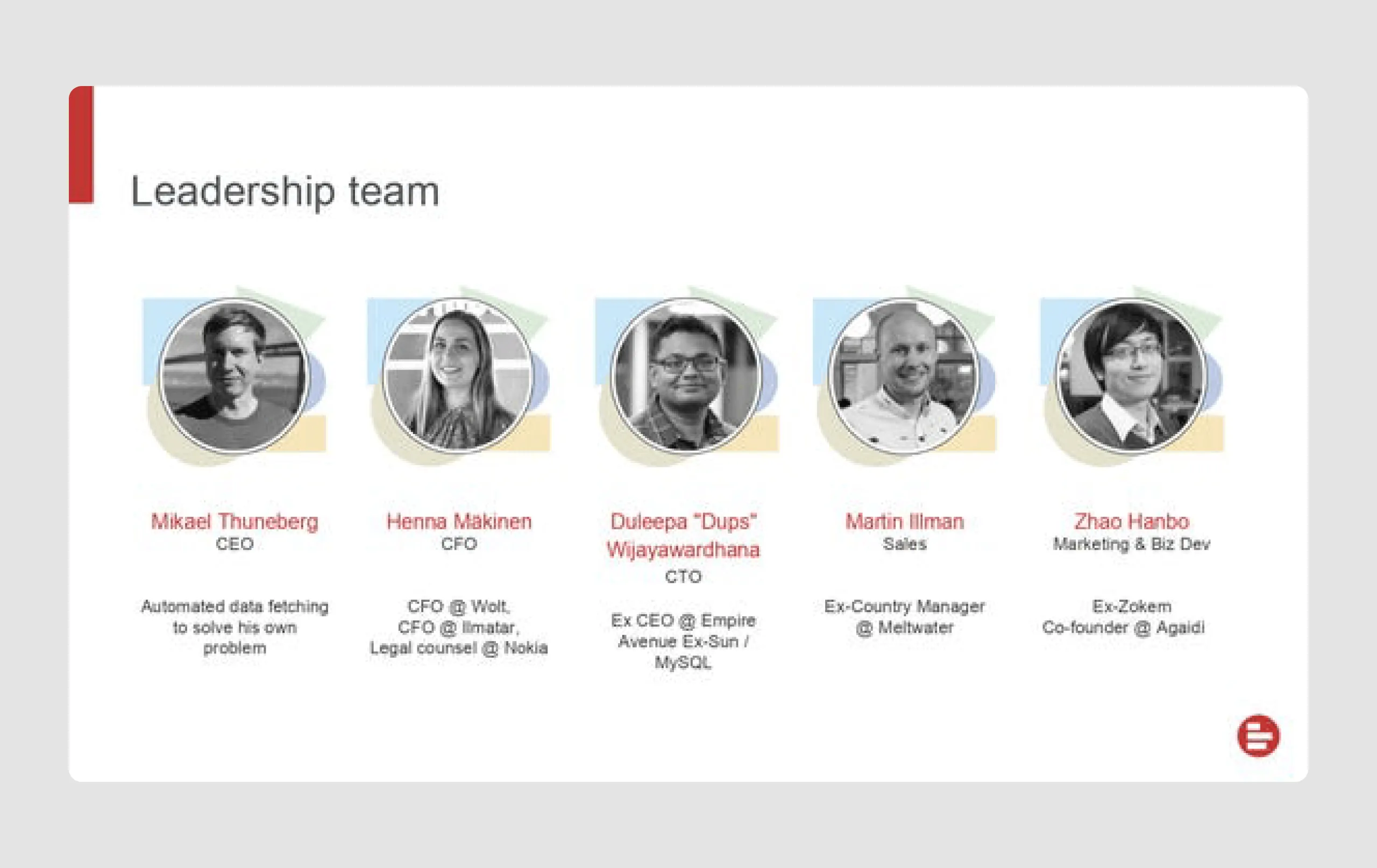
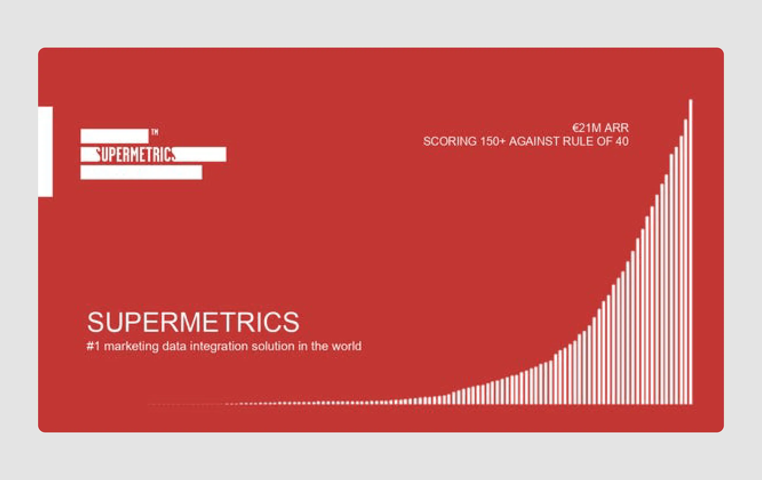
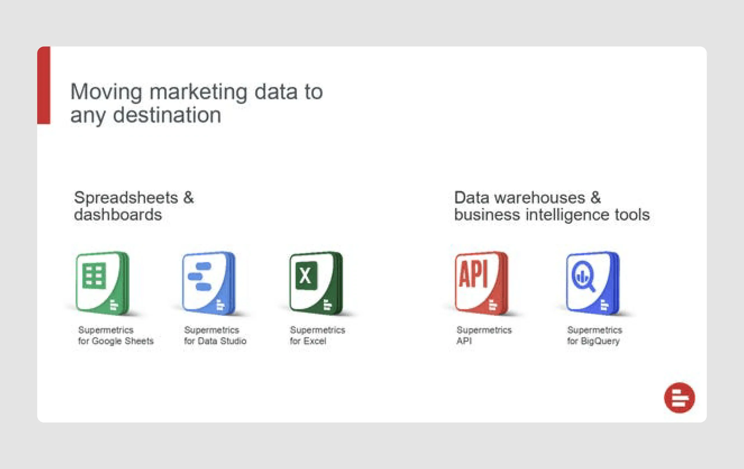
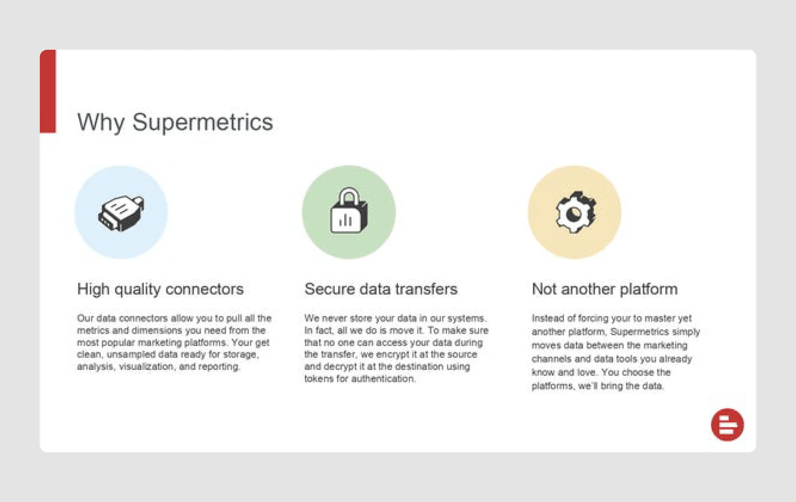
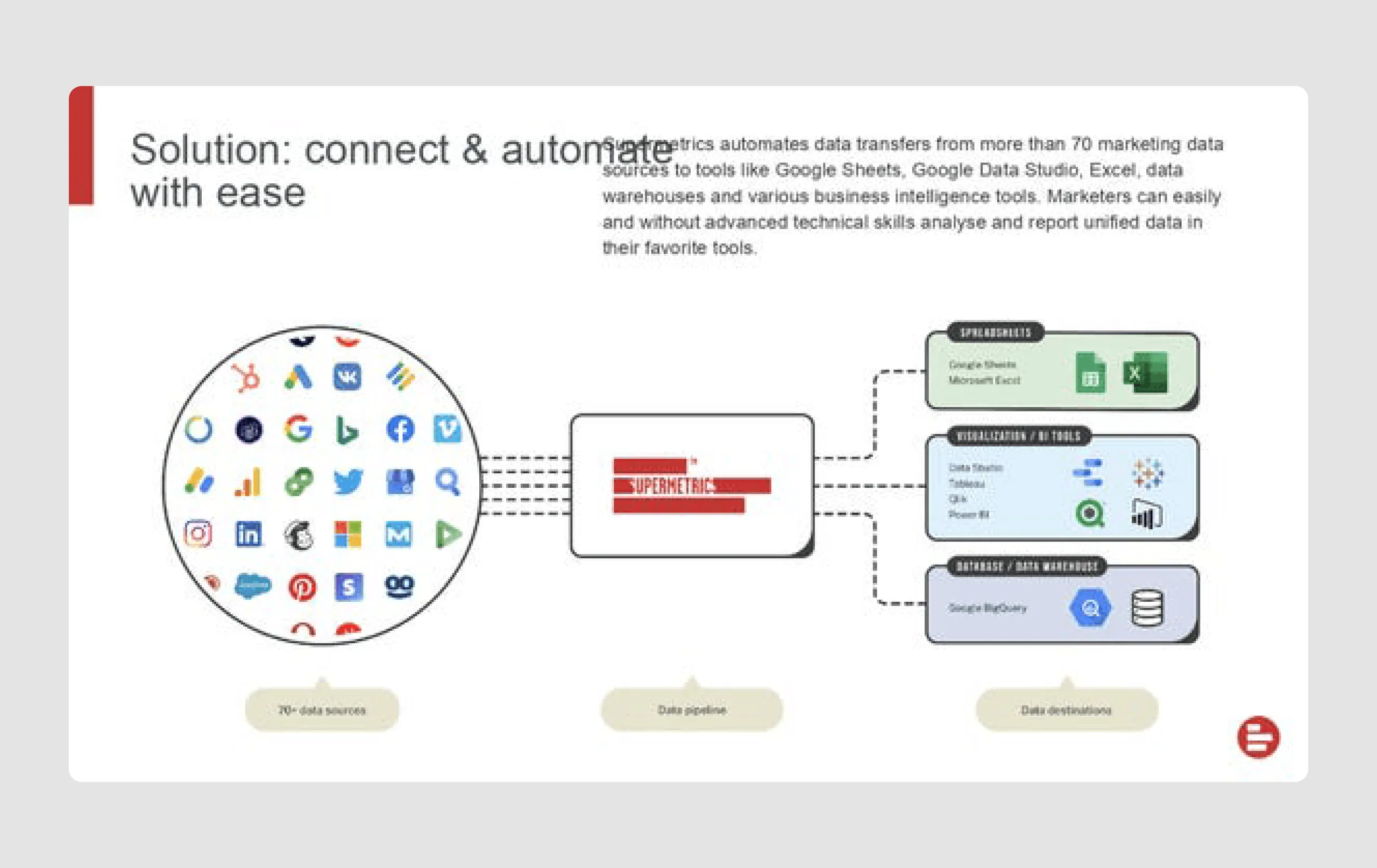
Supermetrics is a SaaS company that provides automation tools for marketing data collection and reporting. The company raised nearly $50 million by appealing to investors with its scalable solution for simplifying data management in a rapidly growing data analytics market.
Strengths in content
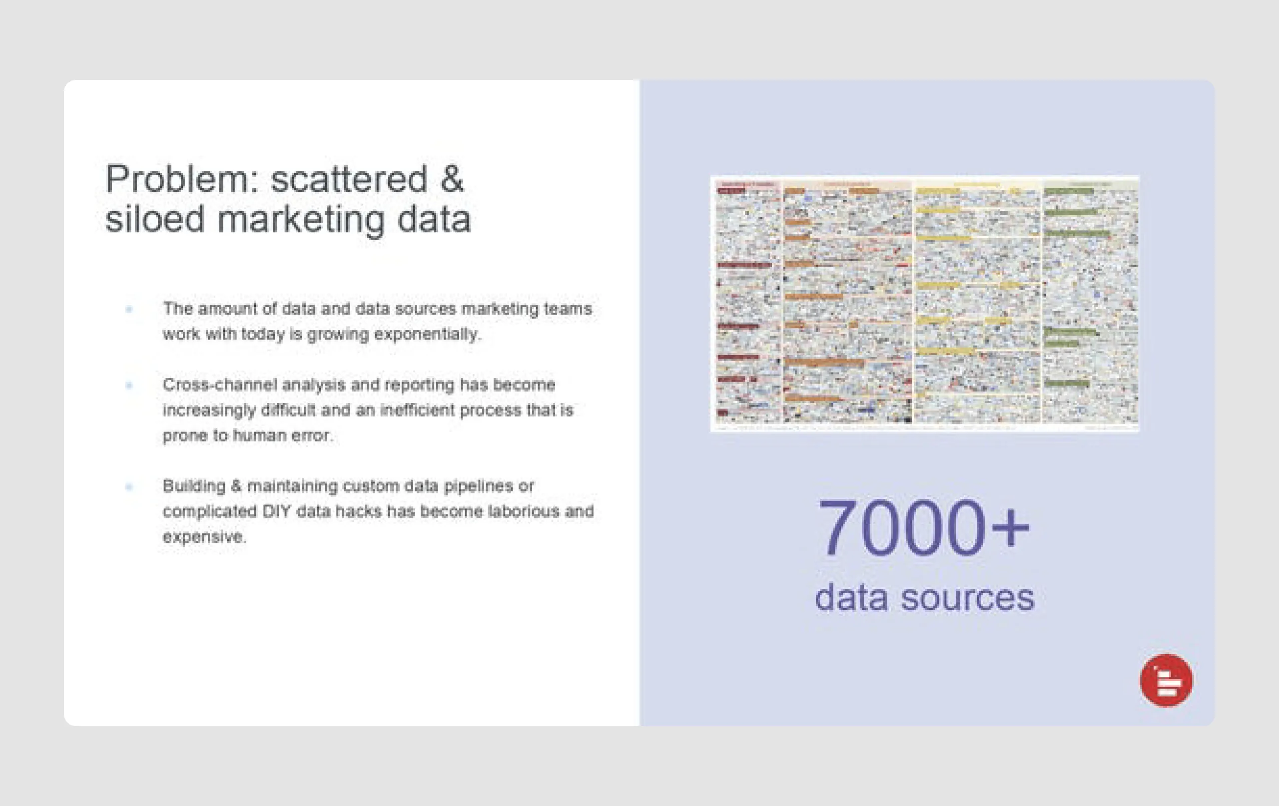
- Clear problem definition: The deck clearly presents the pain points of marketing teams dealing with scattered and siloed data, highlighting the need for efficient data integration.
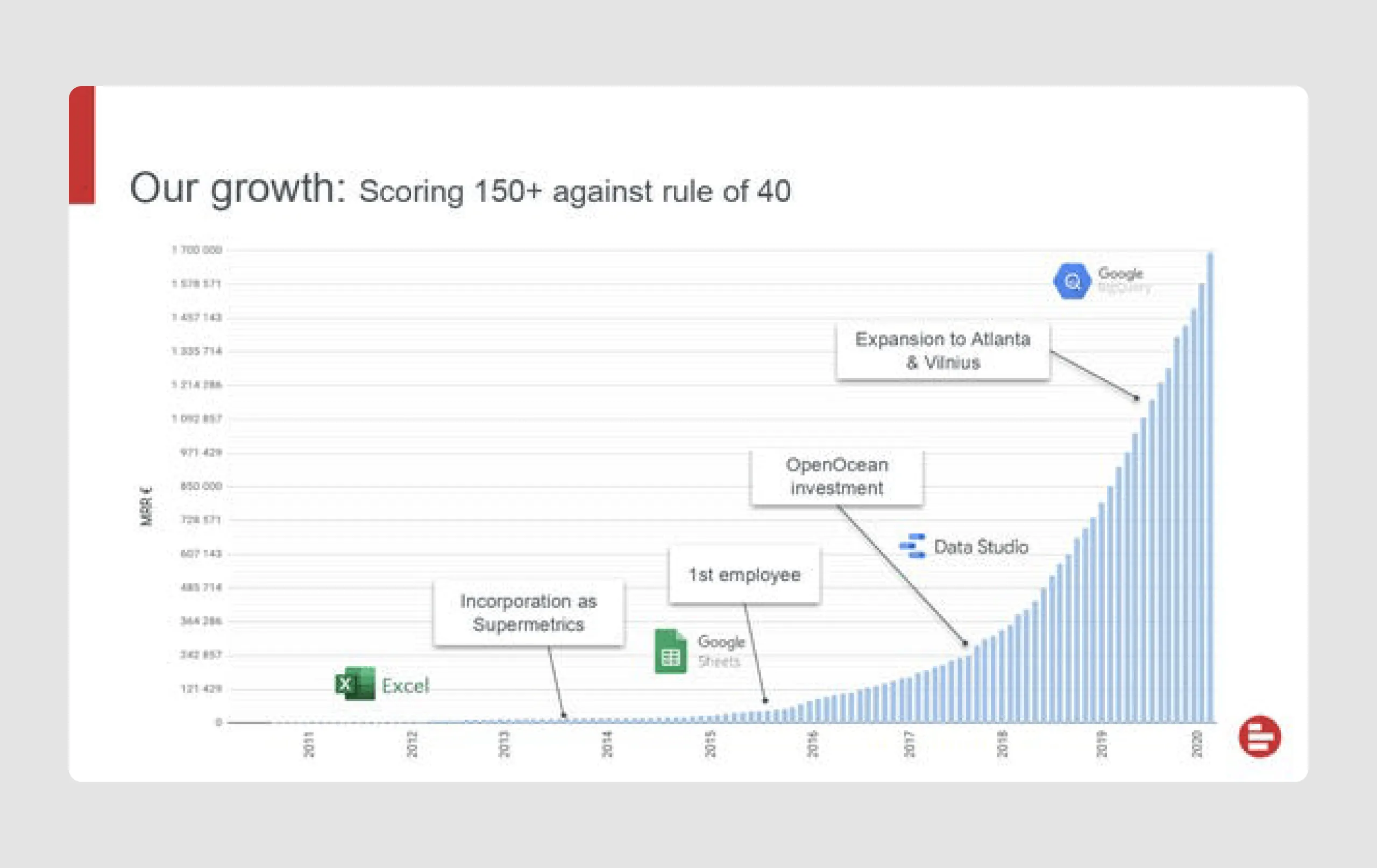
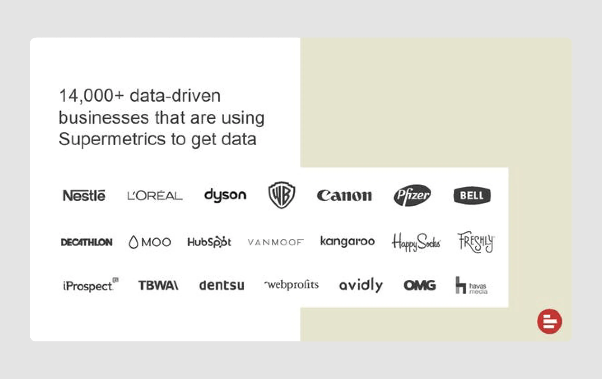
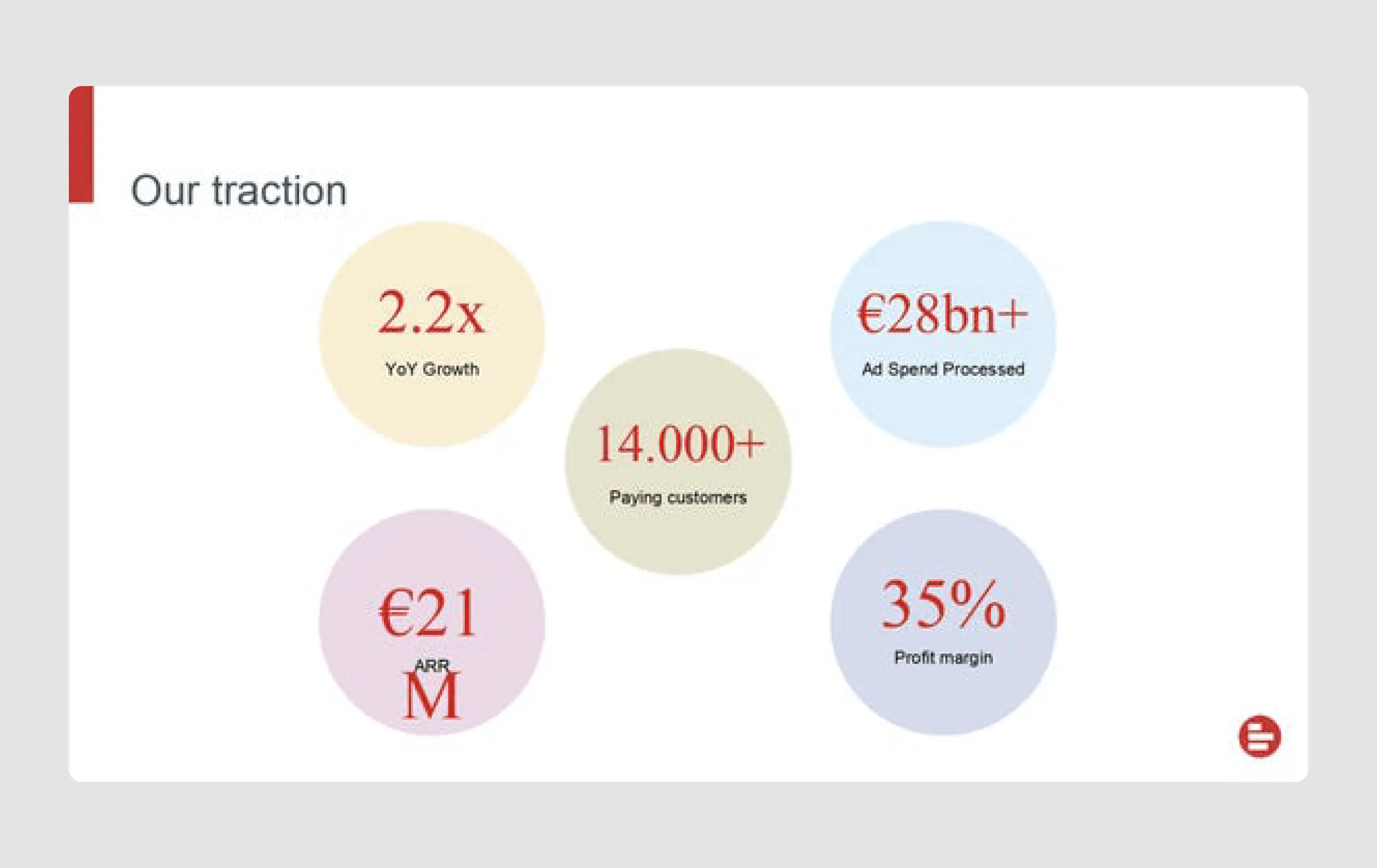
- Impressive traction metrics: Statistics like 14,000+ paying customers and 2.2x YoY growth emphasize the company's success and appeal to investors. For those interested in learning more about the key SaaS metrics that drive business growth, there are several insightful resources available.
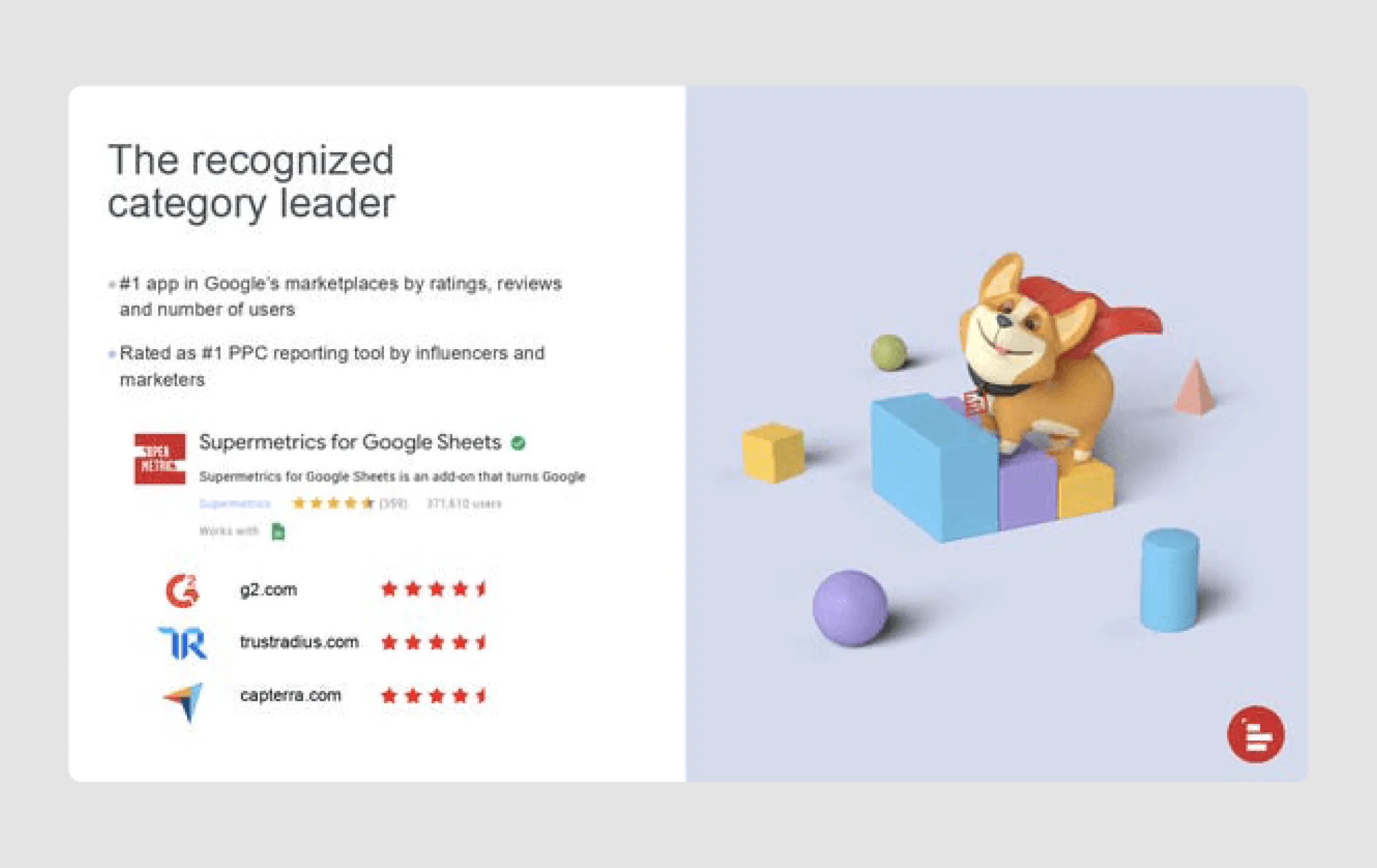
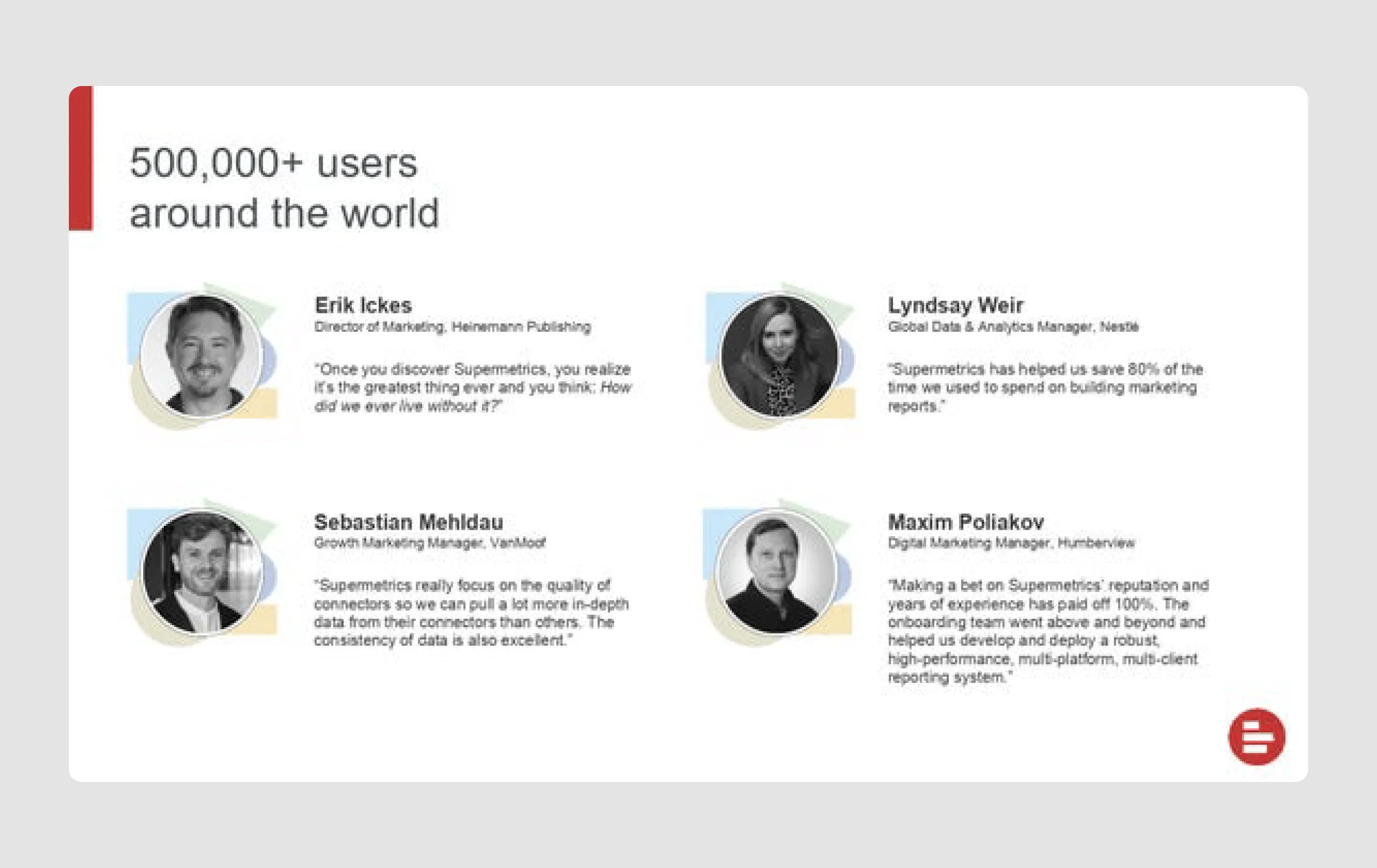
- User testimonials: At Series-B level it’s important to include testimonials. Supermetrics shows reviews from well-known brands, building credibility and demonstrating usefulness in real-world applications.
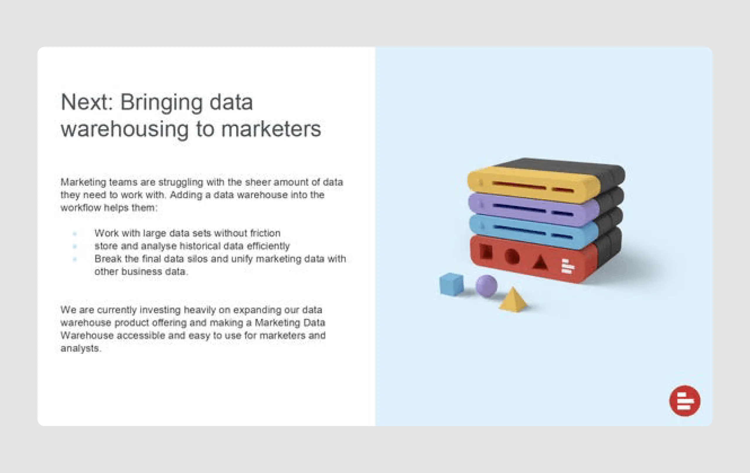
- Future product vision: Outlining plans to expand data warehousing shows a forward-thinking approach, appealing to investors looking for scalability potential.
Strengths in design
- Consistent branding and color scheme: The presentation’s red and white color scheme creates a cohesive look, enhancing brand identity and making the content visually engaging.
- Data visualization: Use of graphs, icons, and charts effectively conveys complex information, such as growth trajectories and market reach, in an easy-to-understand way.
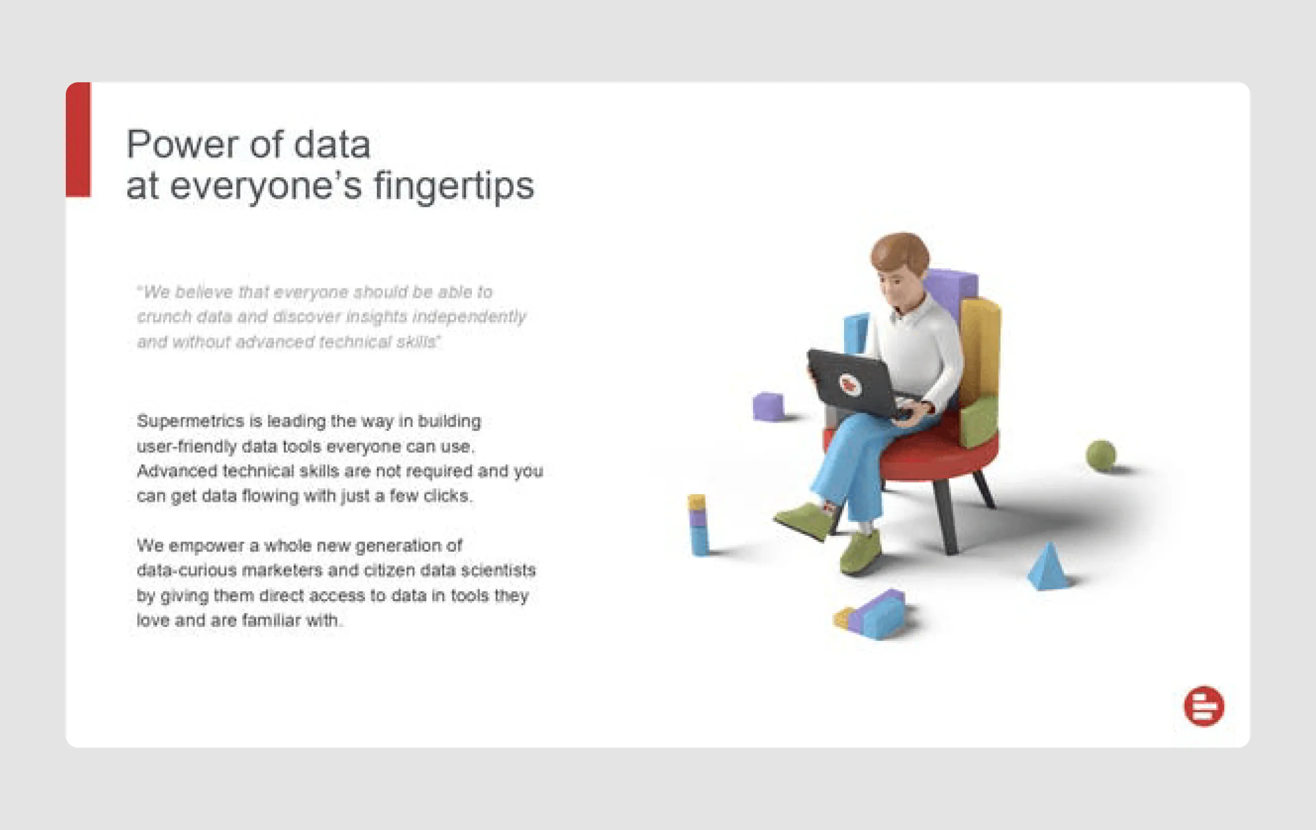
- Engaging visual elements: Custom illustrations and icons add visual interest, making the deck appear polished and professional while also being memorable.
- Clear callouts for key metrics: Highlighting key growth metrics (e.g., ARR, profit margin) in bold and colorful graphics makes these important figures stand out.
- Testimonials with faces: Using customer testimonials with images adds a human touch, making the feedback more relatable and impactful.
Supermetrics' pitch deck combines clear messaging, an aesthetically pleasing design, and strong market validation to present a compelling case for investment.
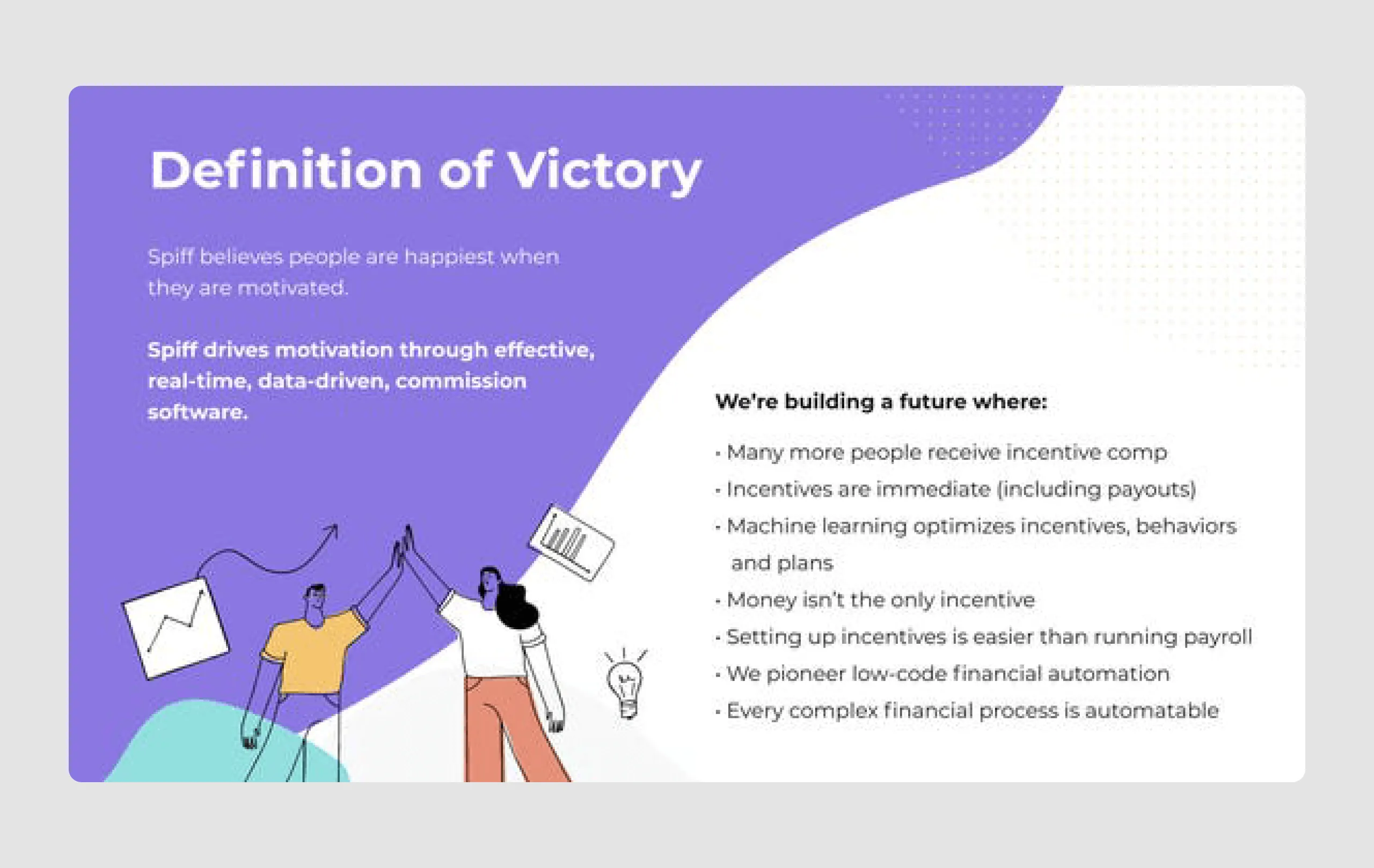
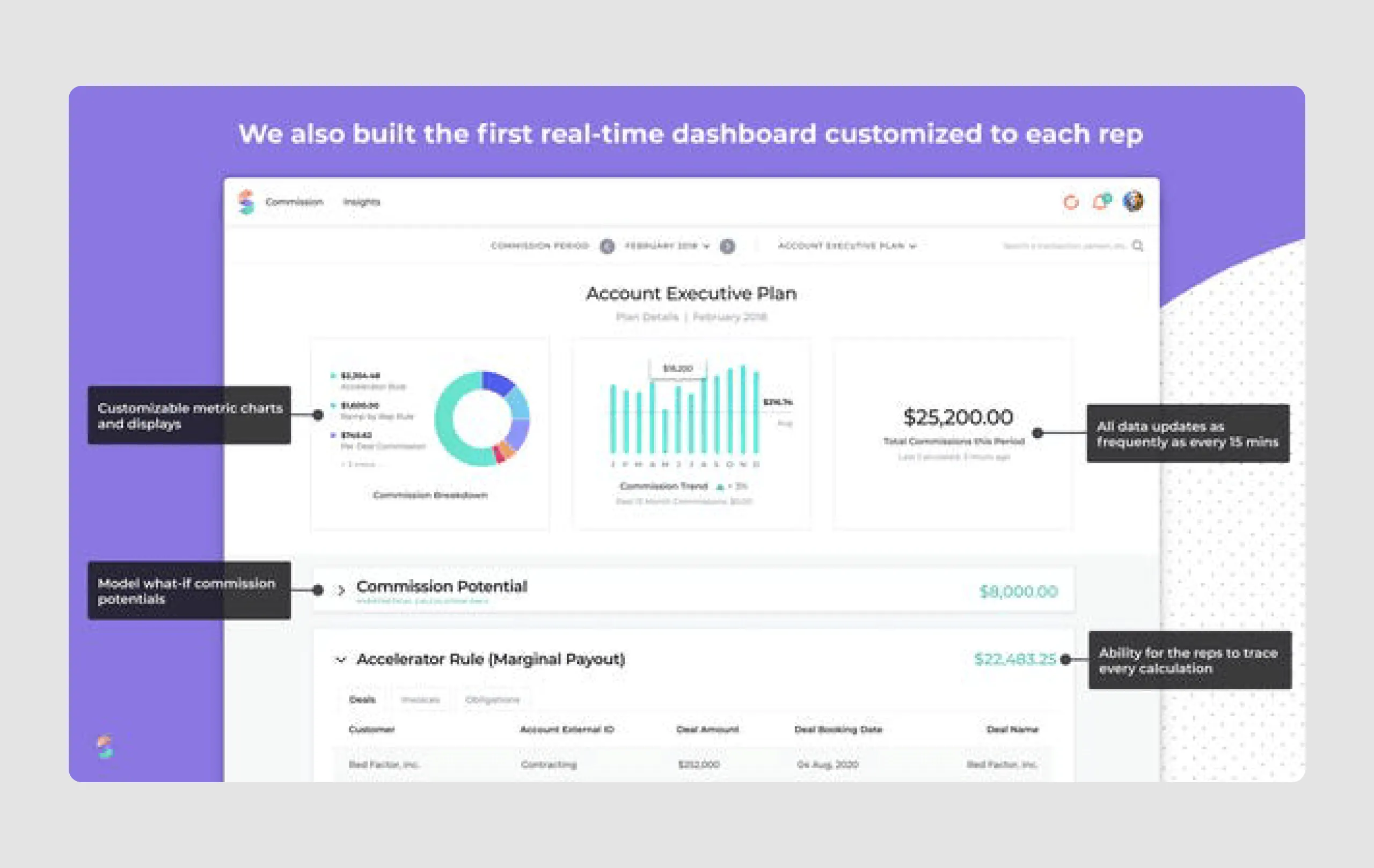
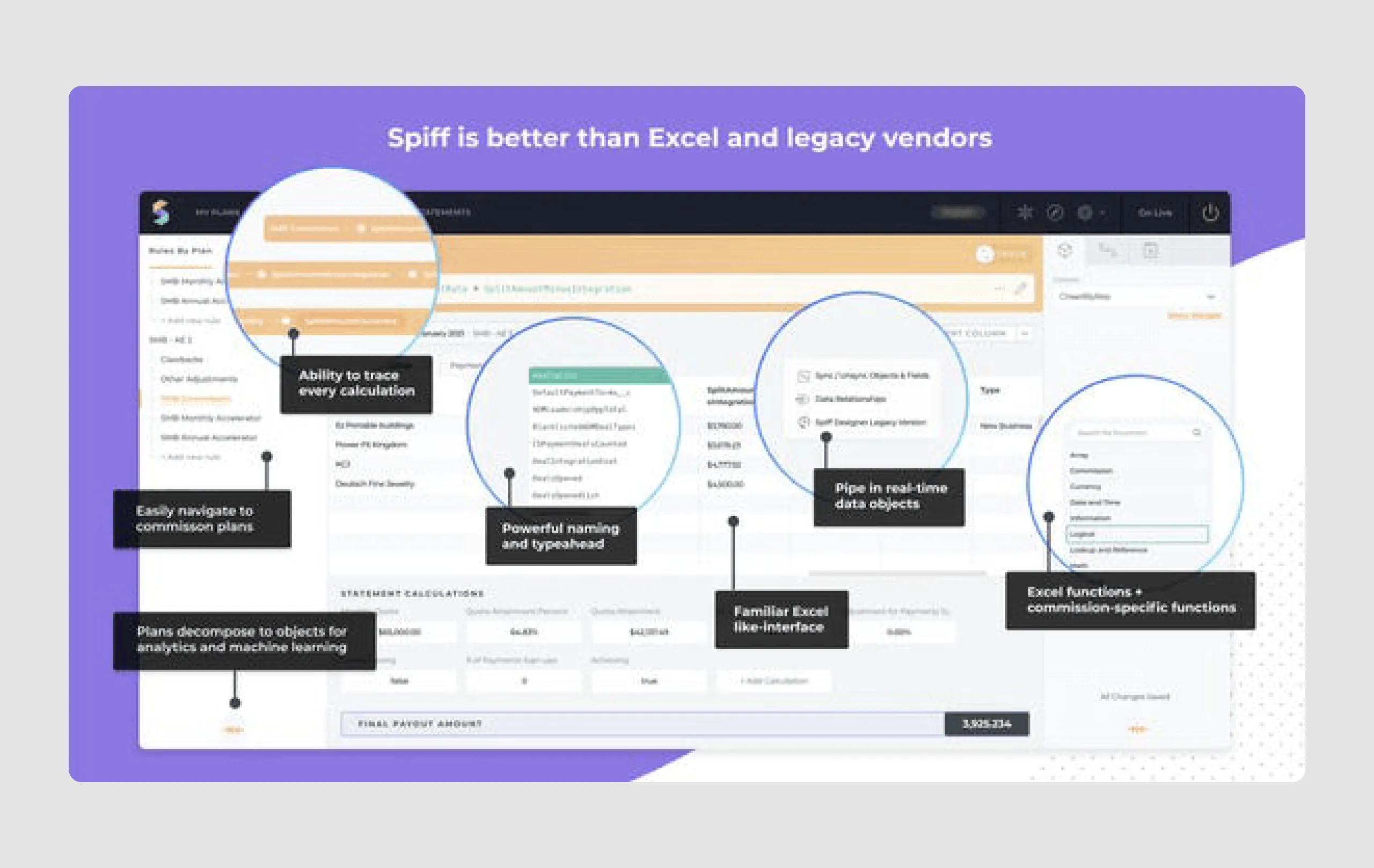
13. Spiff ($46m)
Spiff is a software platform that automates commission calculations for sales teams, providing real-time, error-free payouts and improving transparency and trust between finance and sales departments. The platform connects with various systems like ERP, payroll, and payments, automating the process and reducing disputes over commissions. This innovation led to significant investor interest.
Strengths in content
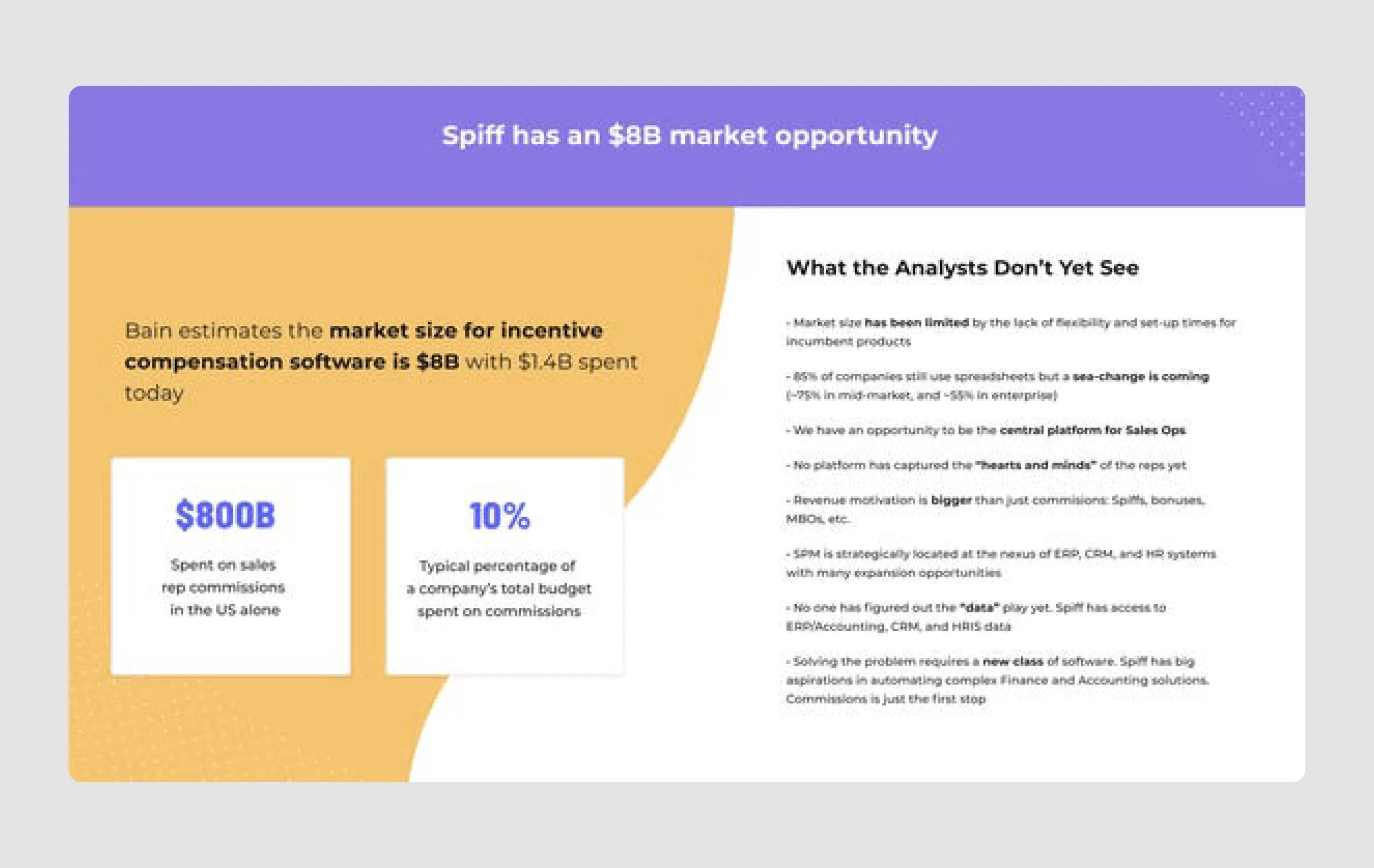
- Market potential: Highlighting the $8 billion market for incentive compensation software underscores the growth potential and the sizable opportunity Spiff is addressing.
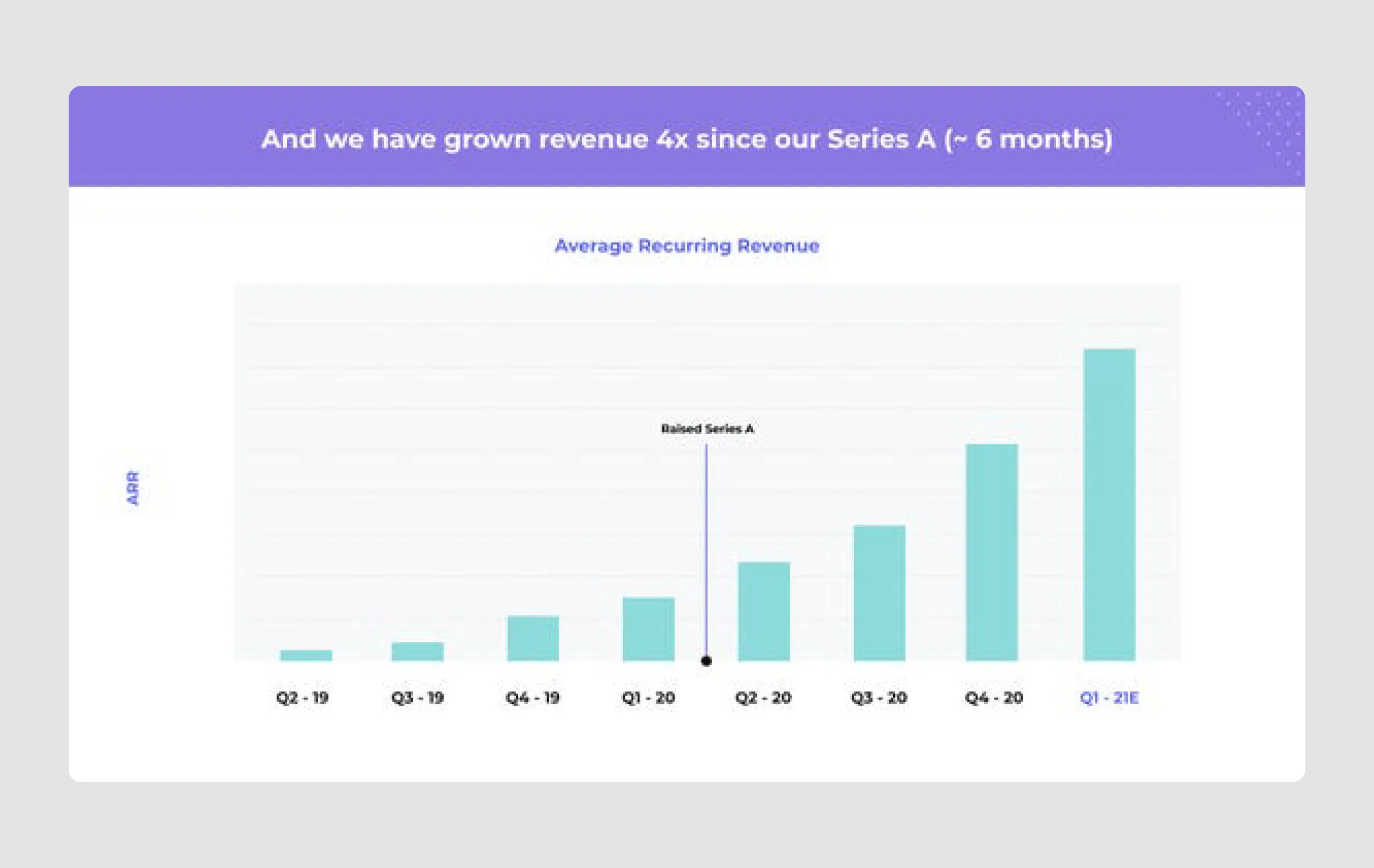
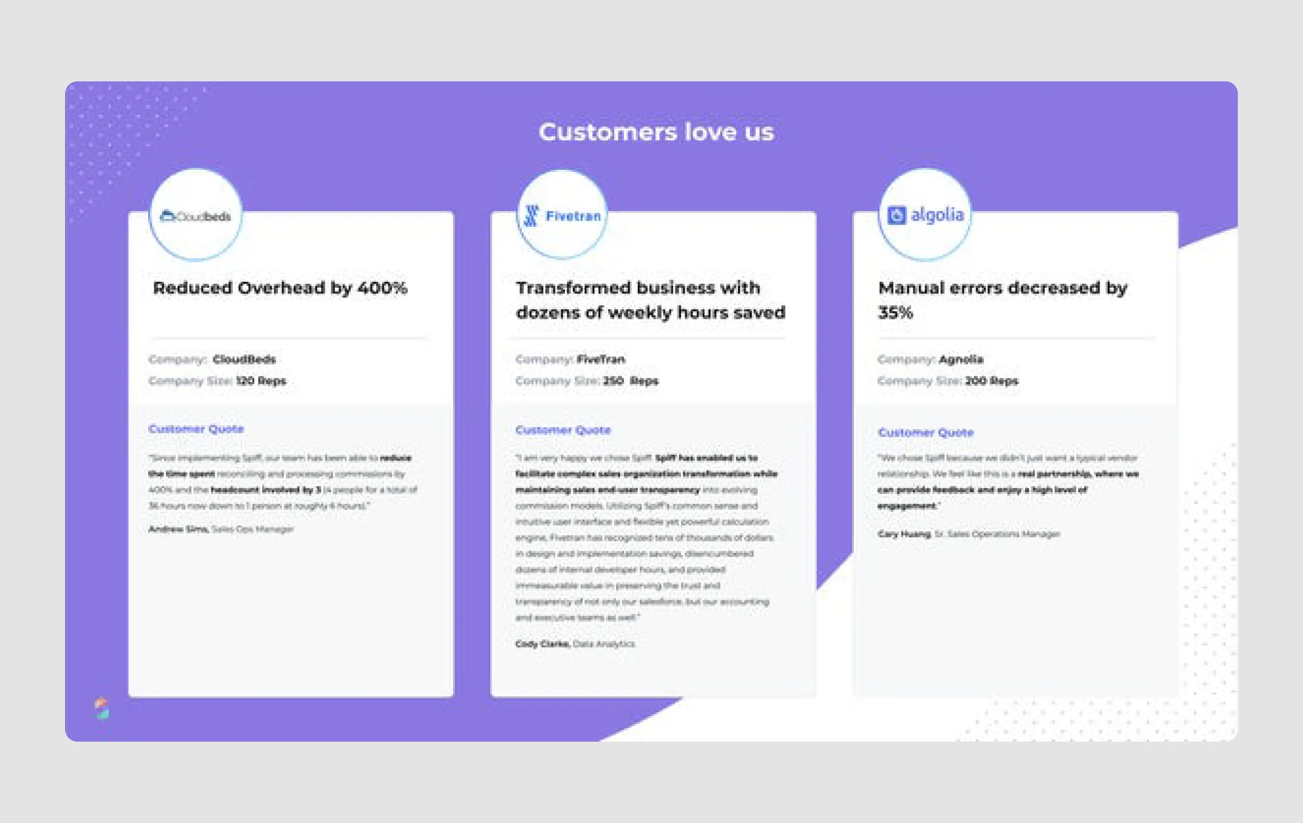
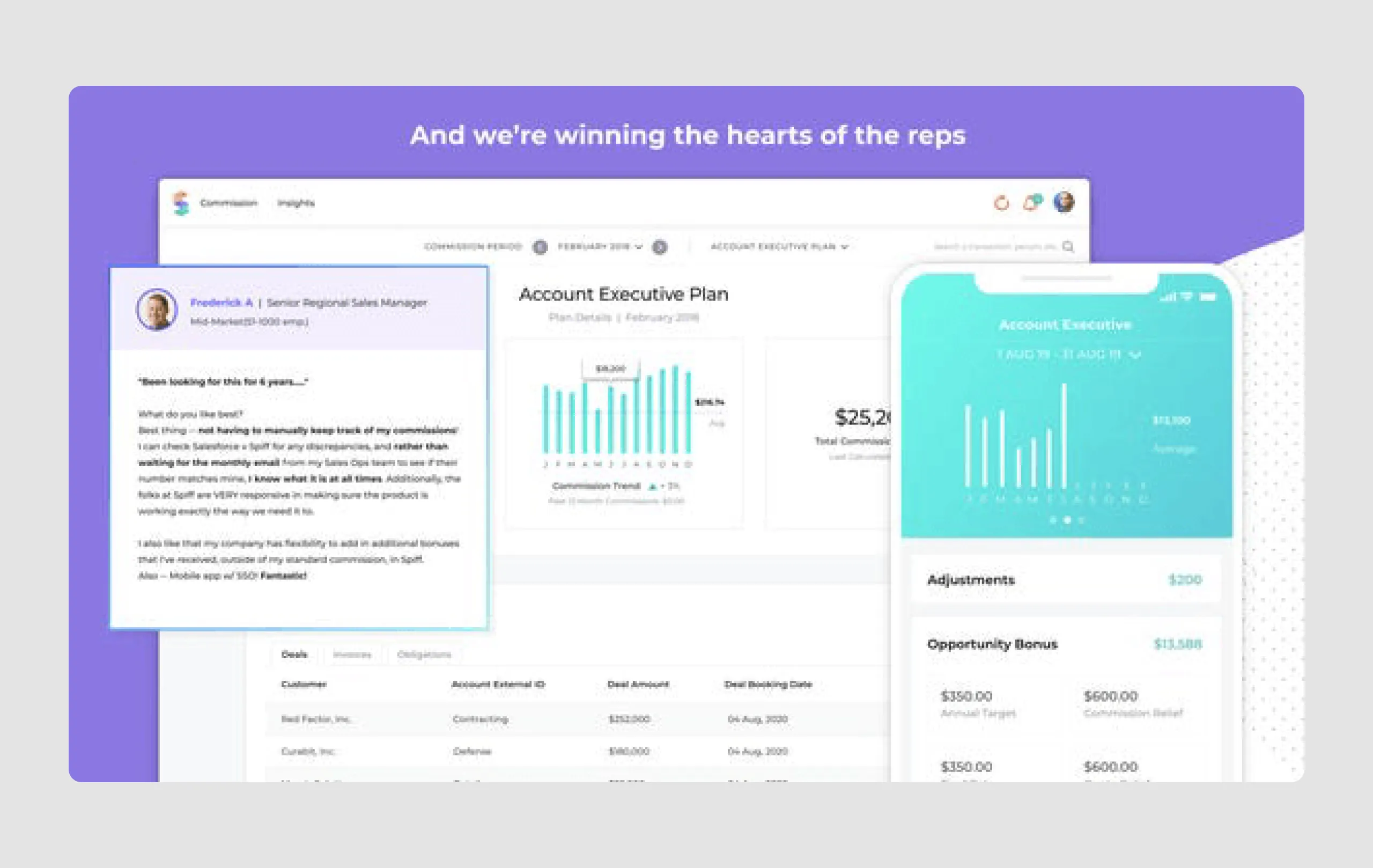
- Customer testimonials and traction: Featuring testimonials from customers and showing metrics like a 4x revenue growth since Series A bolsters Spiff’s credibility and showcases user satisfaction and rapid growth.
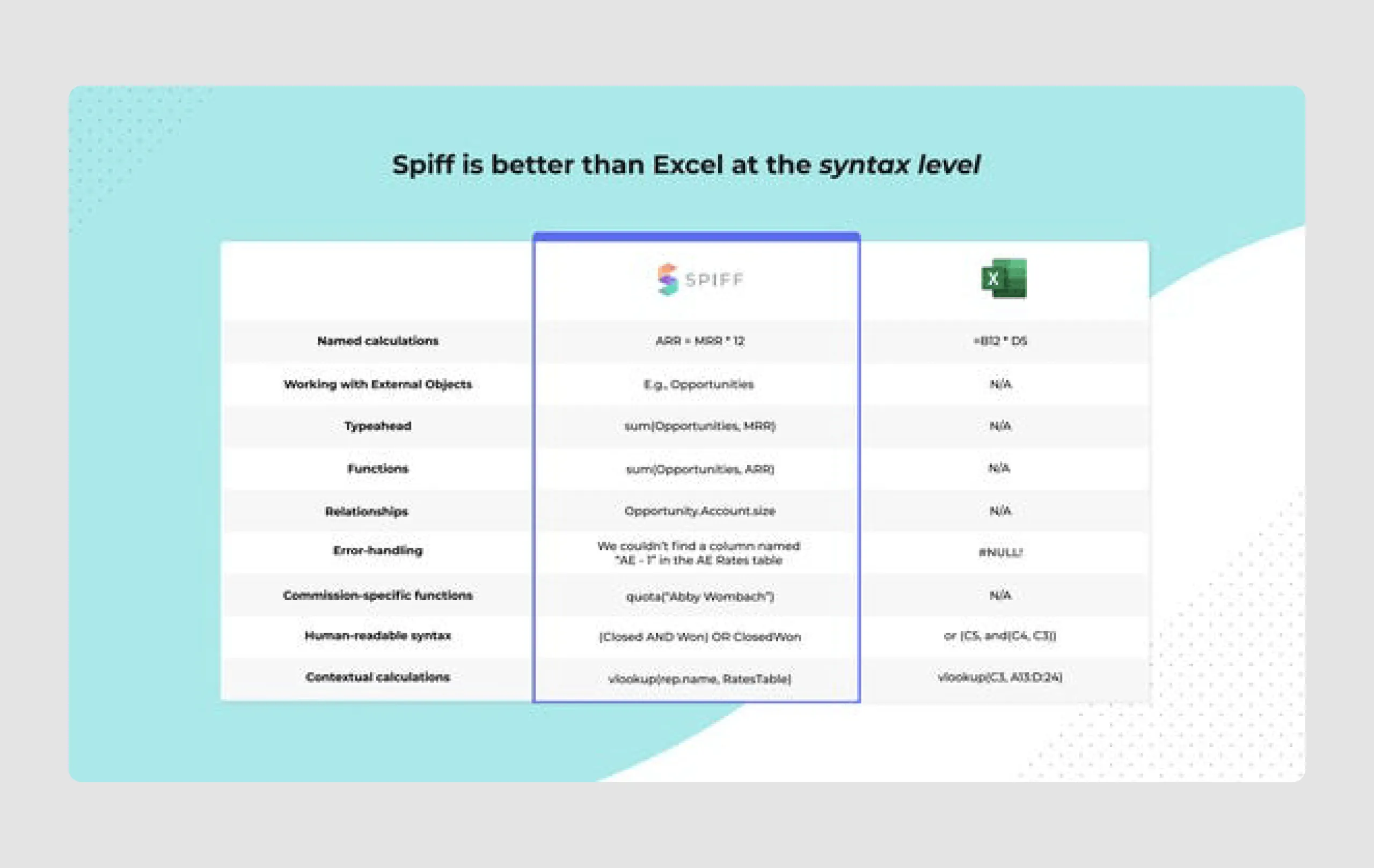
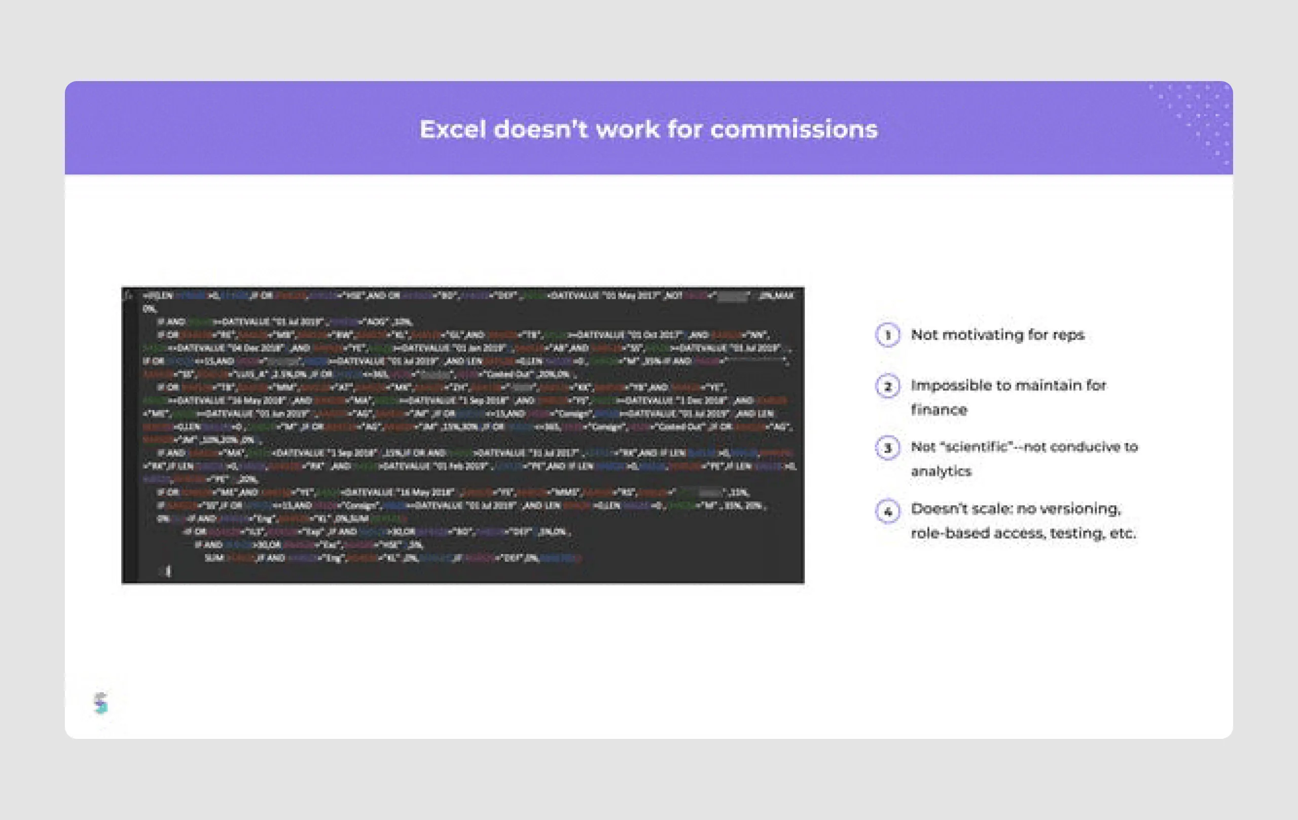
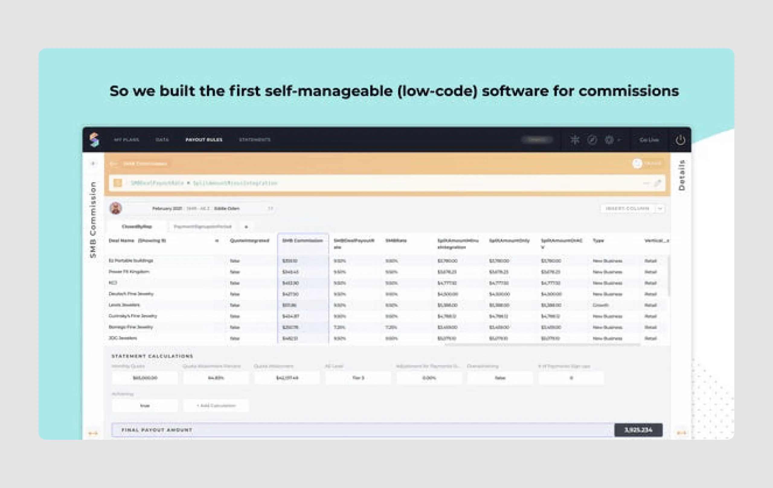
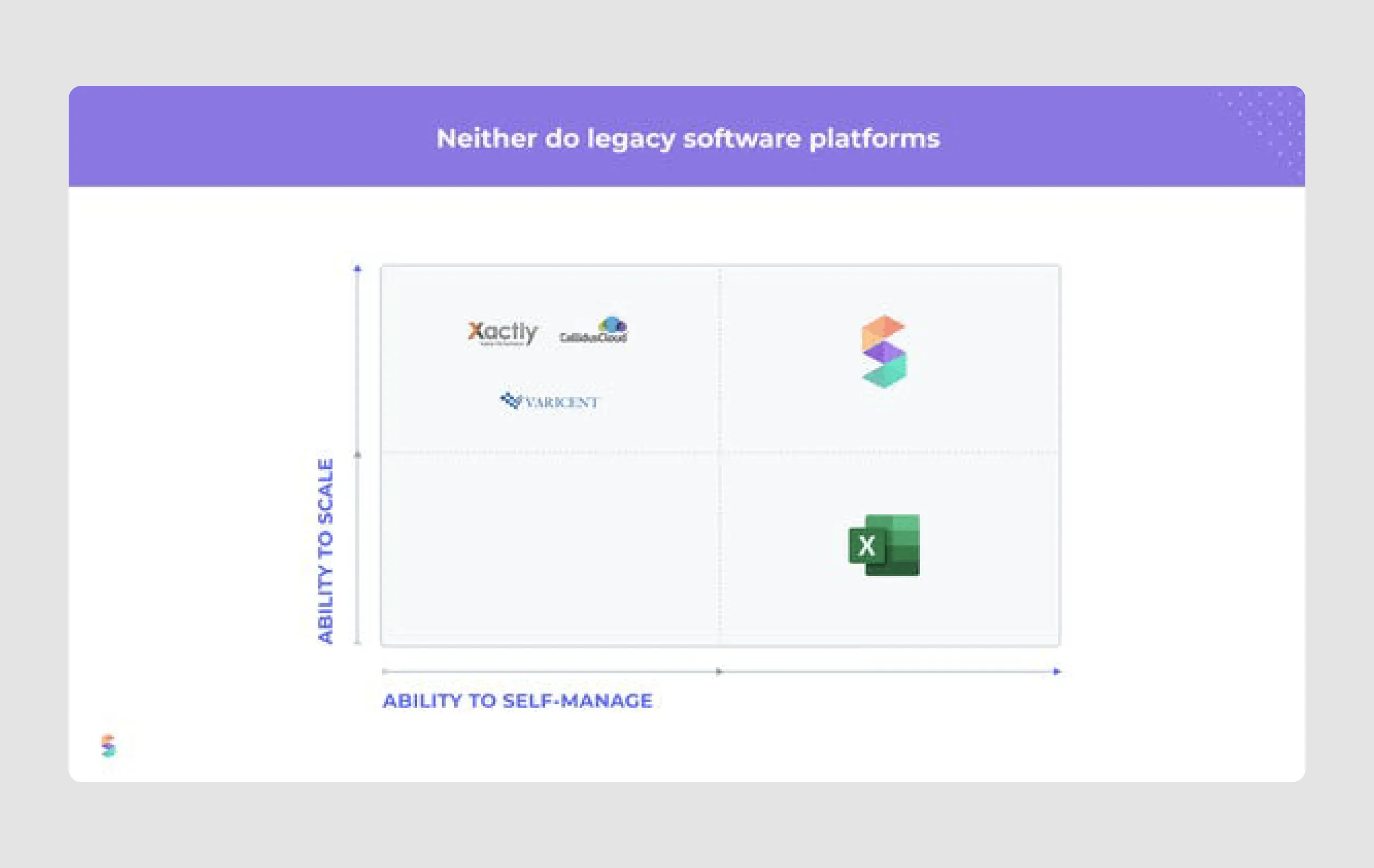
- Competitive advantage: The deck highlights Spiff's unique position as a low-code, scalable, and self-manageable tool compared to Excel and legacy platforms, emphasizing its superior flexibility and user-friendliness.
Strengths in design
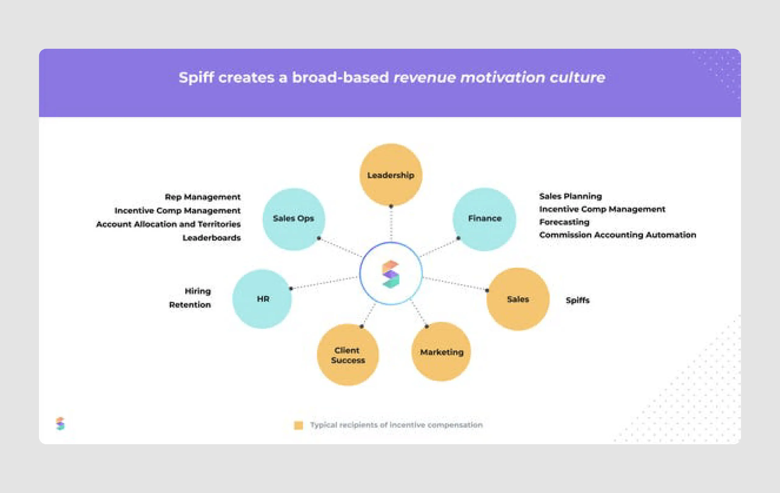
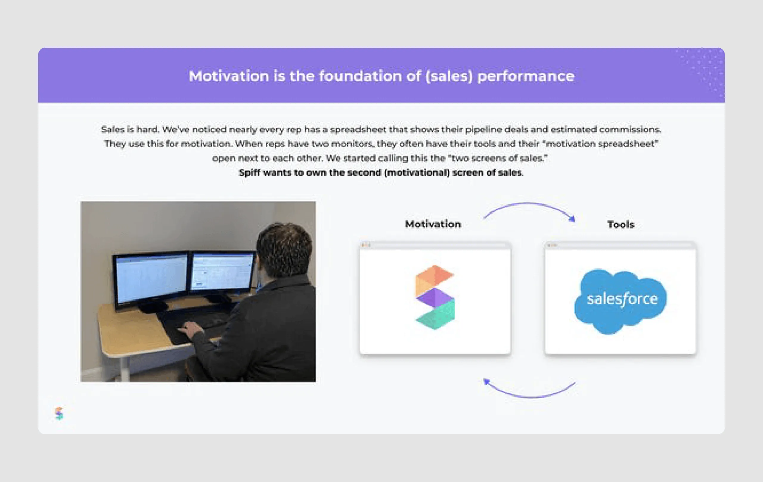
- Engaging visuals: The deck utilizes engaging illustrations and simple infographics, which help to explain complex ideas visually, keeping the viewer's attention.
- Short theses: Most slides contain one short sentence per slide that speaks the main idea the rest are visuals. This way, it’s easier to comprehend information without feeling overwhelmed.
- Highlighting key information: Important data points, such as revenue growth, customer impact metrics, and the $8 billion market opportunity, are emphasized through typography and color, ensuring they stand out. For reference and inspiration, explore these sales deck examples to see best practices in action.
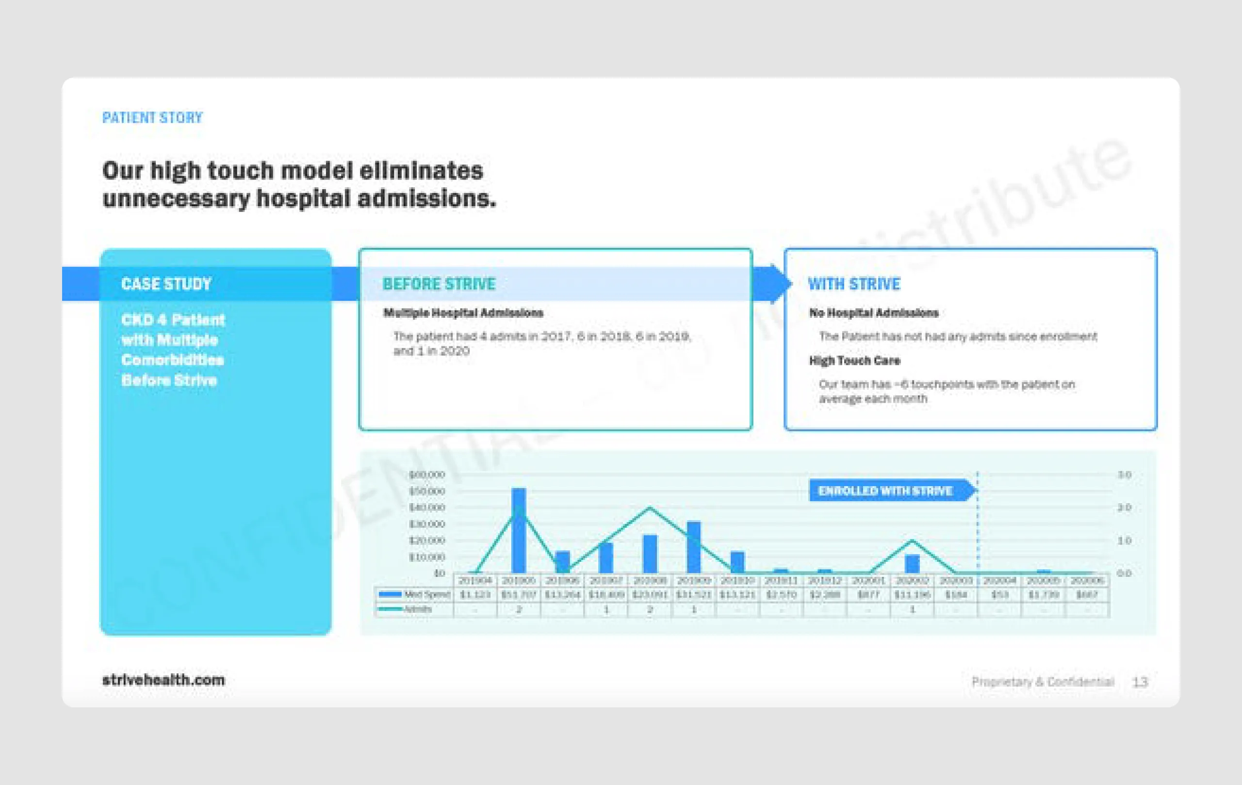
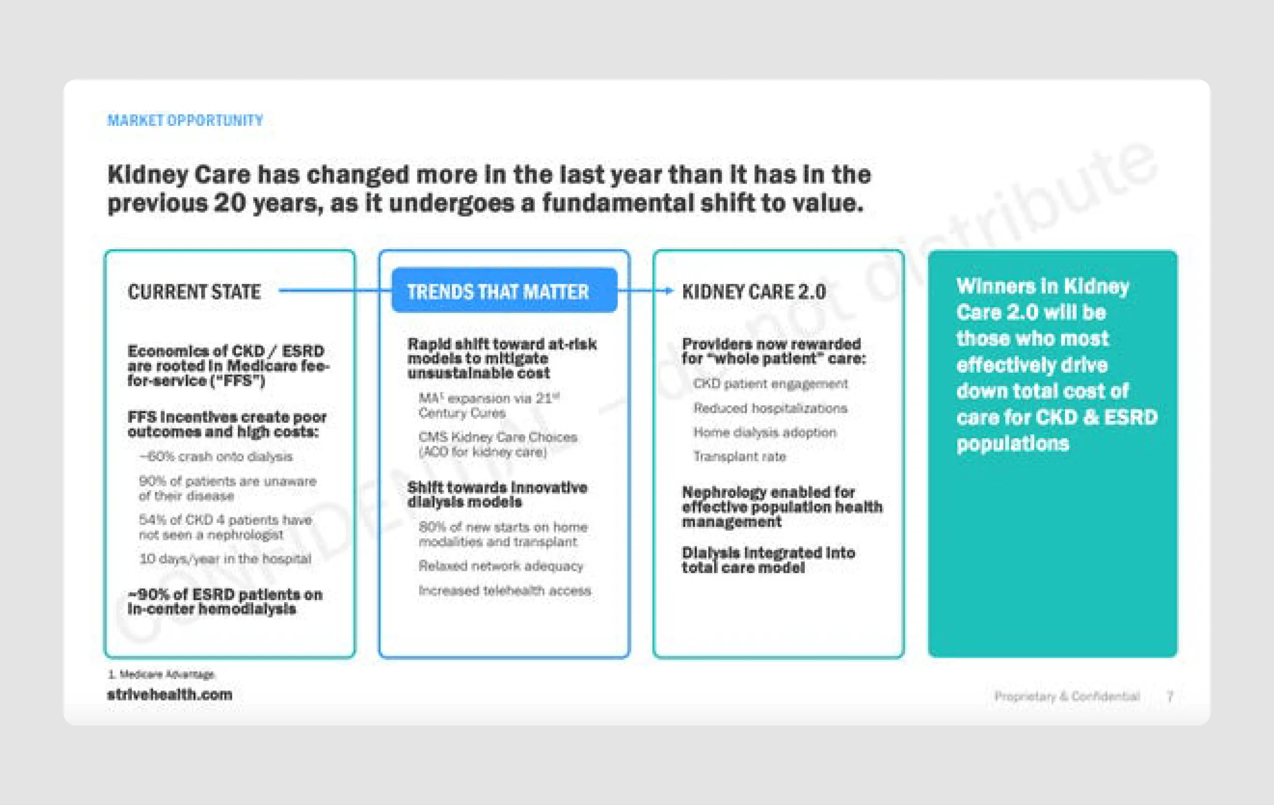
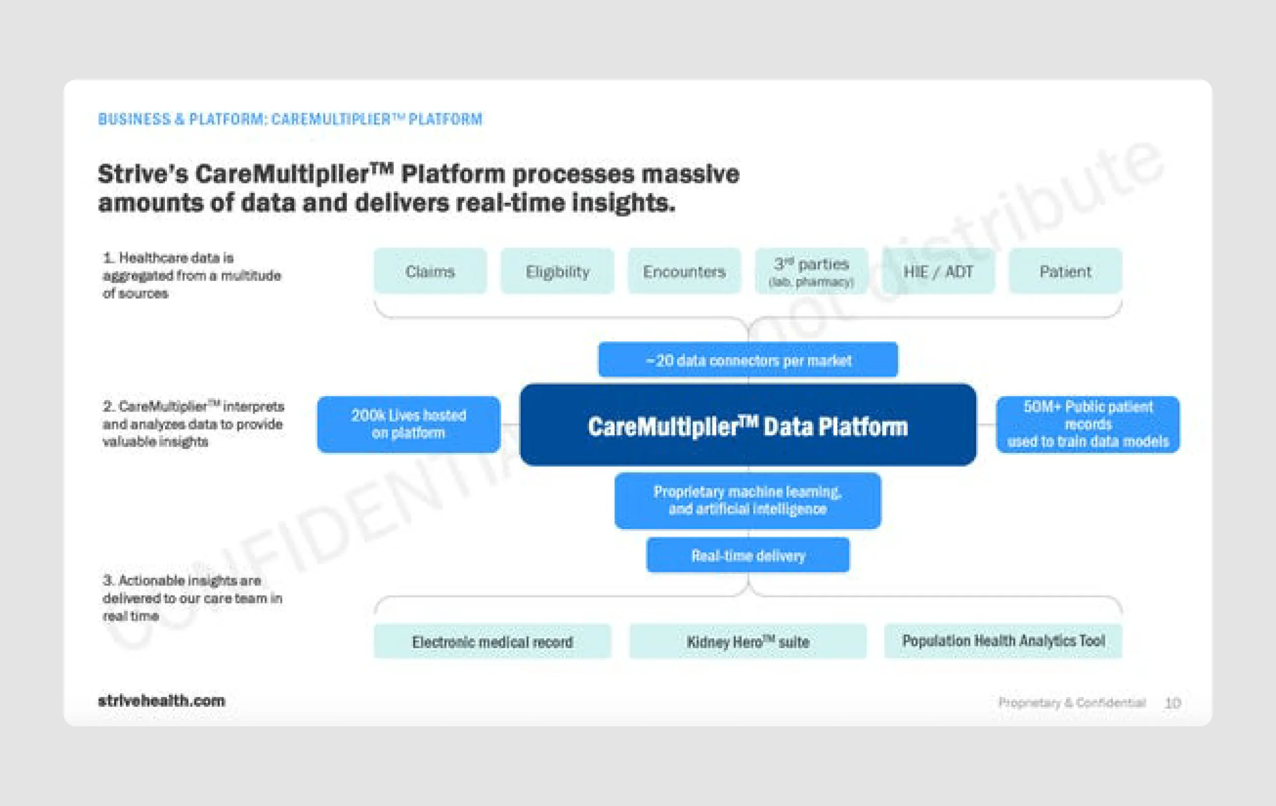
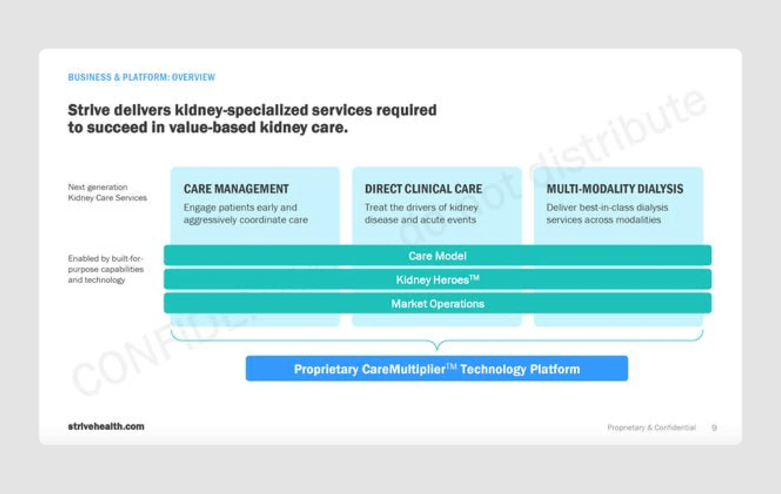
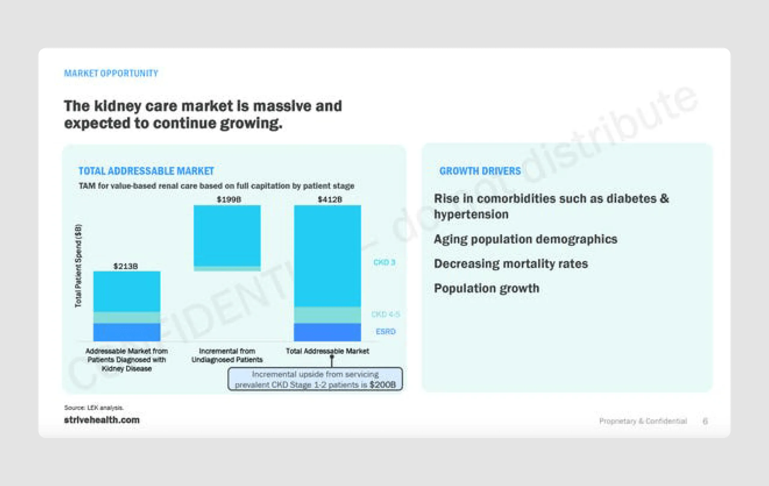
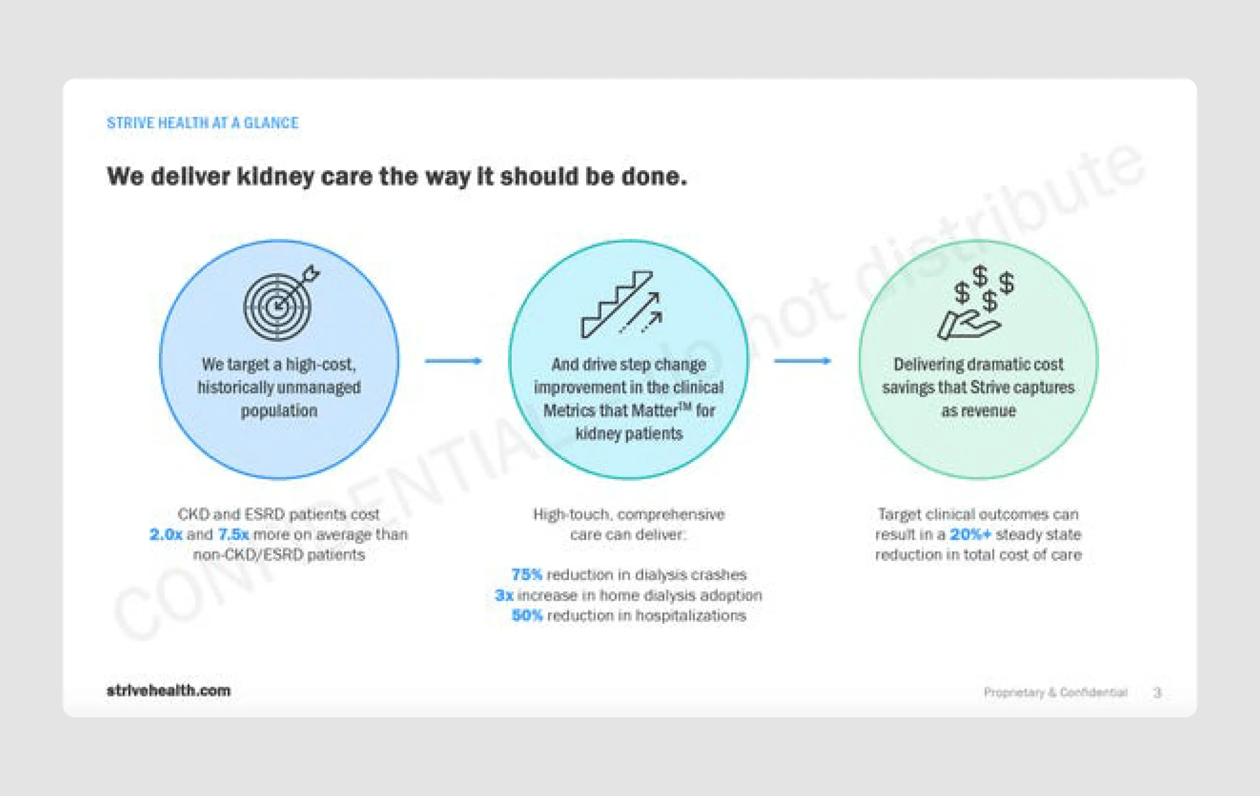
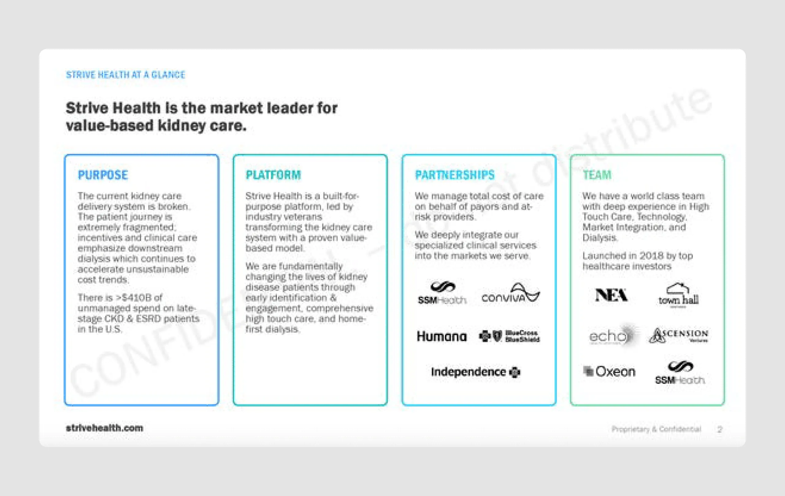
14. Strive Health ($140m)
Strive Health is a healthcare startup focused on transforming kidney care. They raised $140 million in Series B funding, led by CapitalG, due to its innovative approach of combining personalized healthcare with advanced technology. The funding will support Strive’s expansion into new states, increase partnerships with insurers and health providers, and enhance its data-driven care model, positioning it as a strong competitor to traditional dialysis providers.
Strengths in content
- Market opportunity: The slides provide a well-supported TAM (Total Addressable Market), showing a significant growth opportunity for value-based kidney care, making the investment appeal clear.
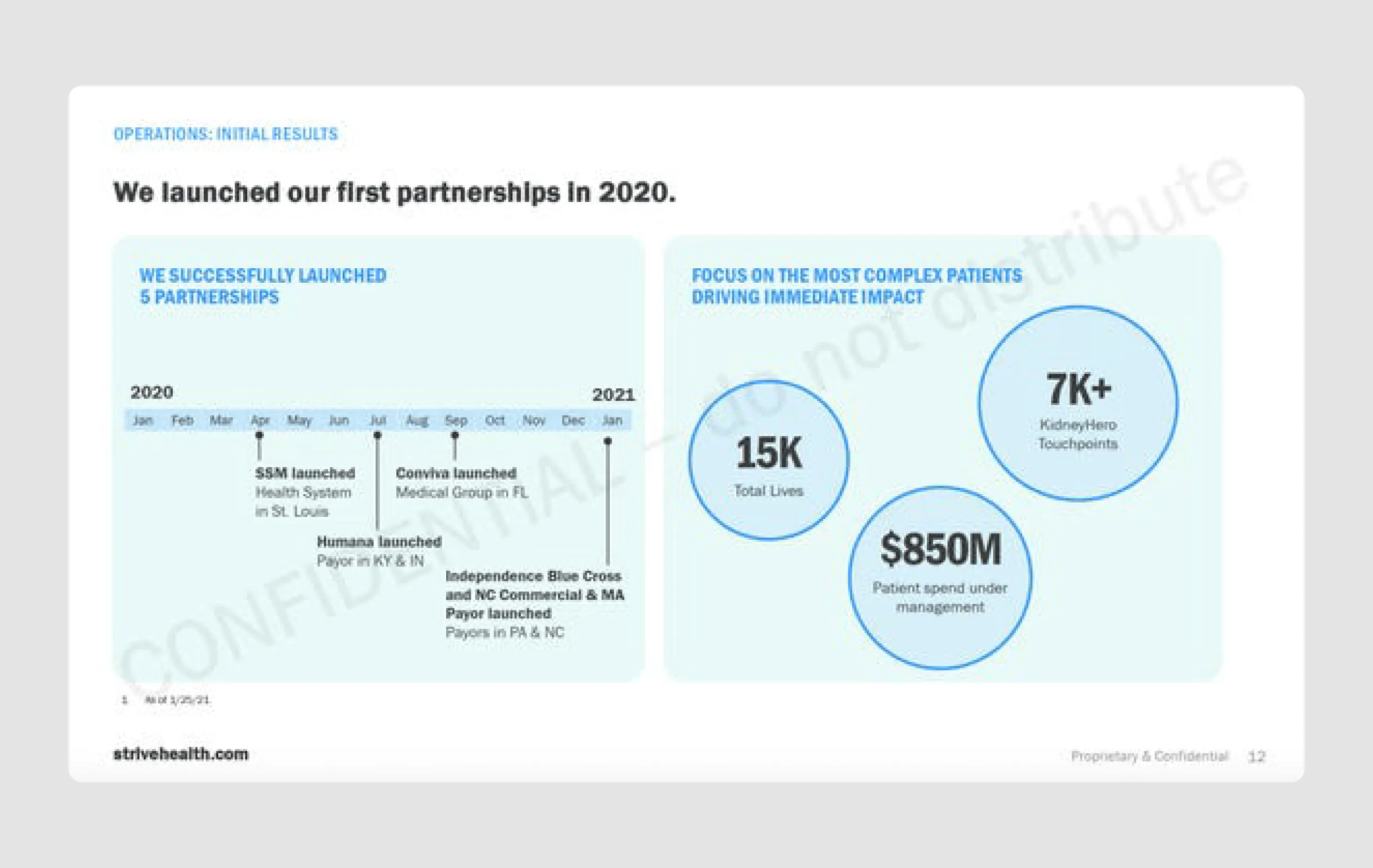
- Strong results and impact: The presentation includes impactful metrics, such as the reduction in hospital admissions and high patient touchpoints, which demonstrate the real-world success of their model.
- Experienced leadership: The management team slide highlights relevant industry experience, building credibility and trust in Strive's ability to execute its strategy.
Strengths in design
- Consistent branding and color scheme: The use of a calming blue and green palette aligns with healthcare themes, creating a professional and trustworthy appearance.
- Data-driven visuals: Charts and graphs are used effectively to showcase market opportunity, patient outcomes, and operational success, providing visual reinforcement of data points.
- Highlighting key metrics: Key figures (e.g., $850M patient spend, 15K total lives) are emphasized with larger fonts and strategic placement, ensuring they stand out to viewers.
The Strive Health pitch deck is a well-crafted presentation with strong content and design. It combines clear, data-backed arguments with a visually cohesive design, and makes a lasting impression by staying focused and credible.
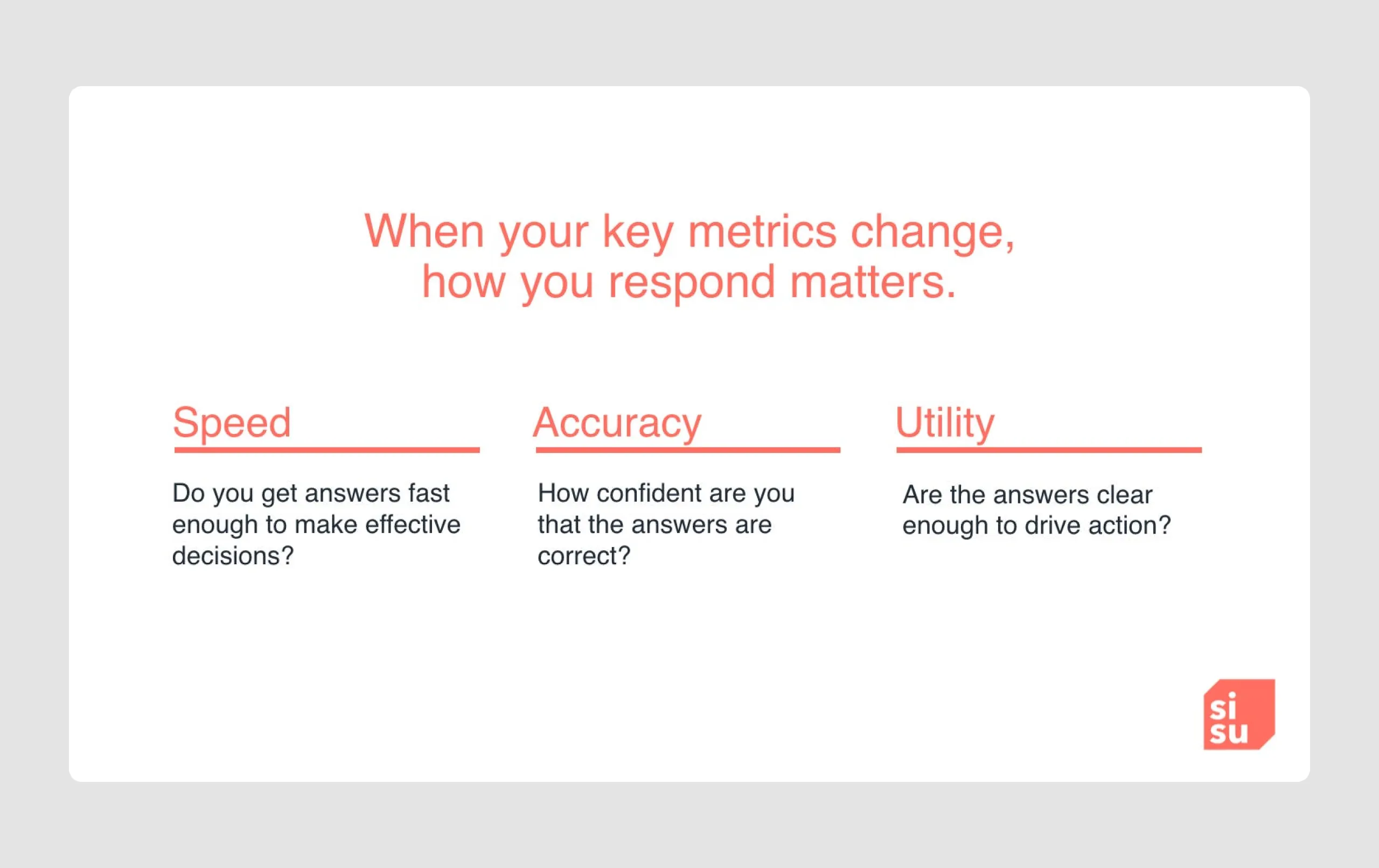
15. Sisu ($52.5)
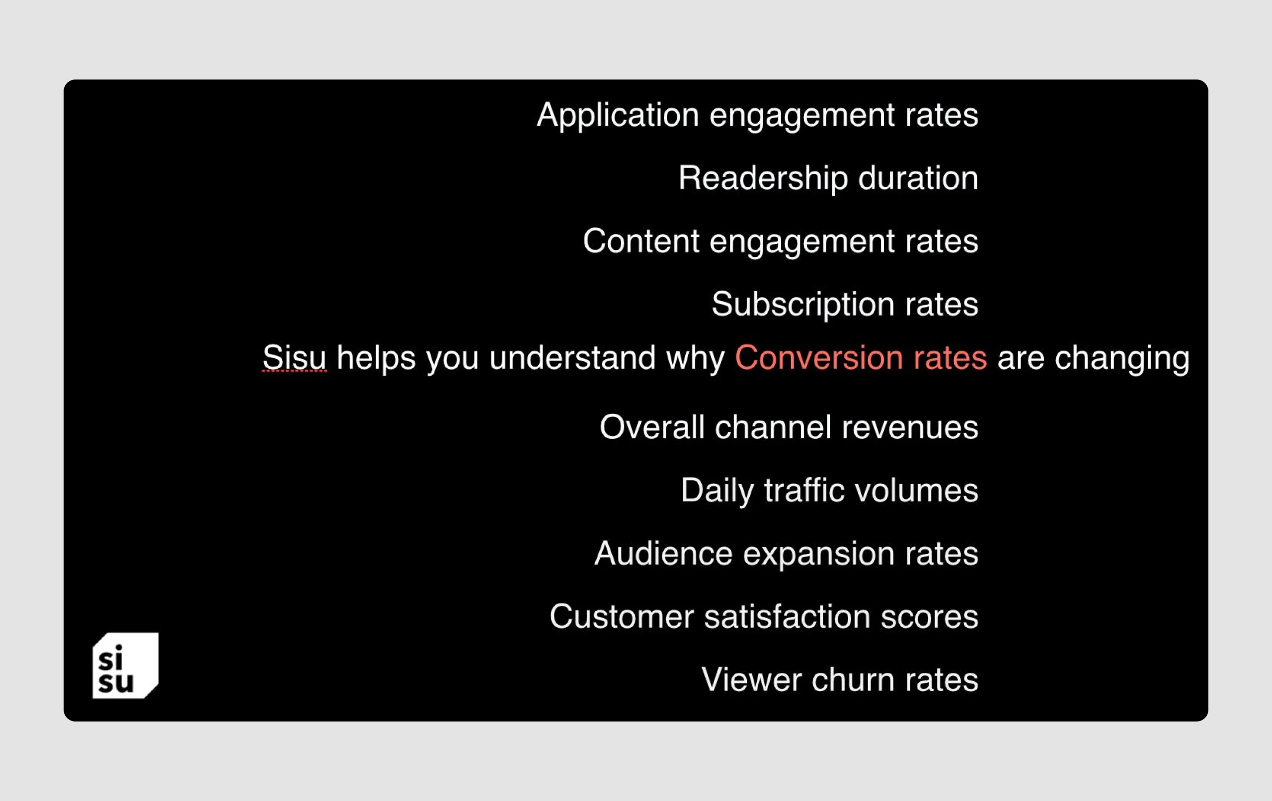
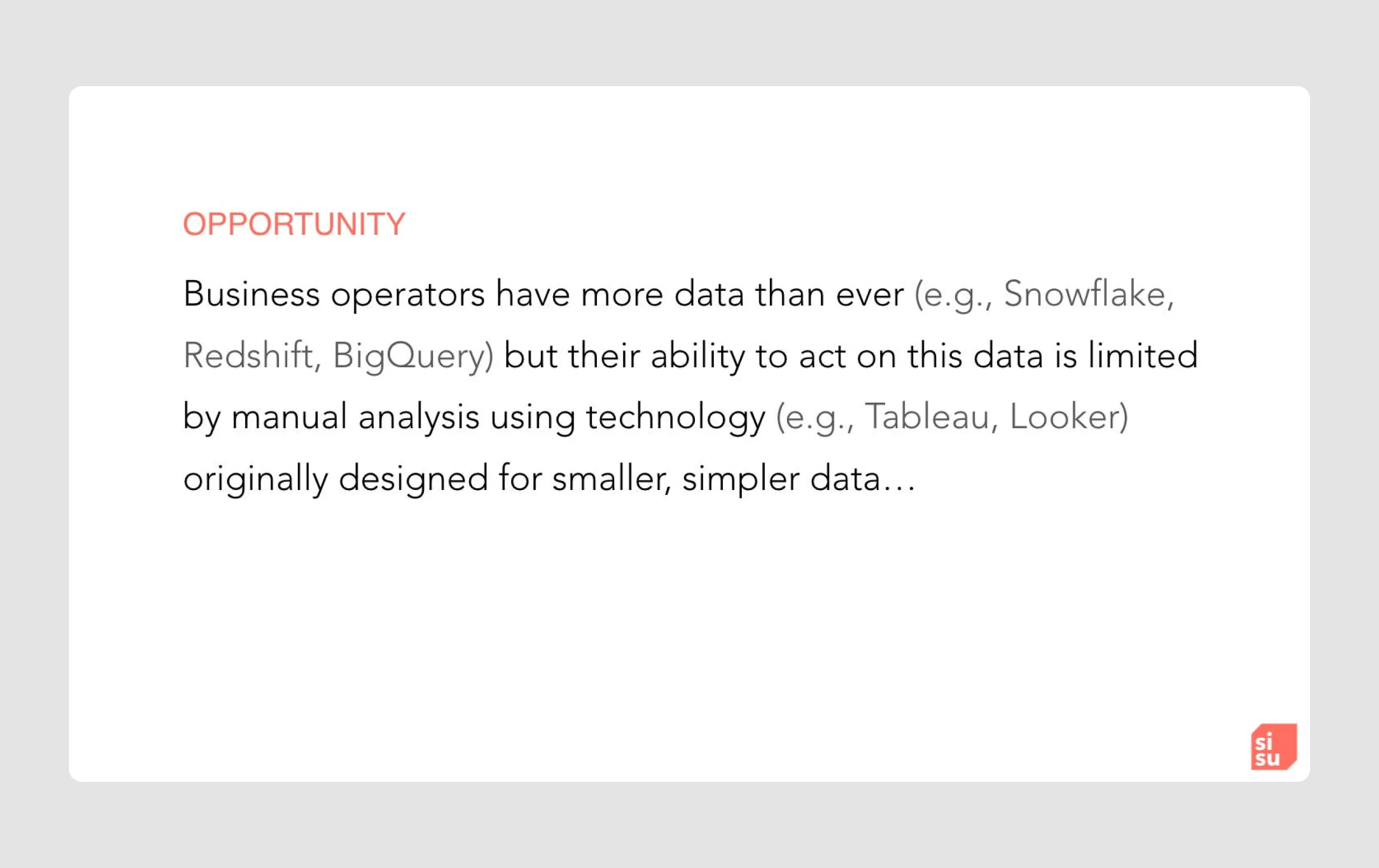
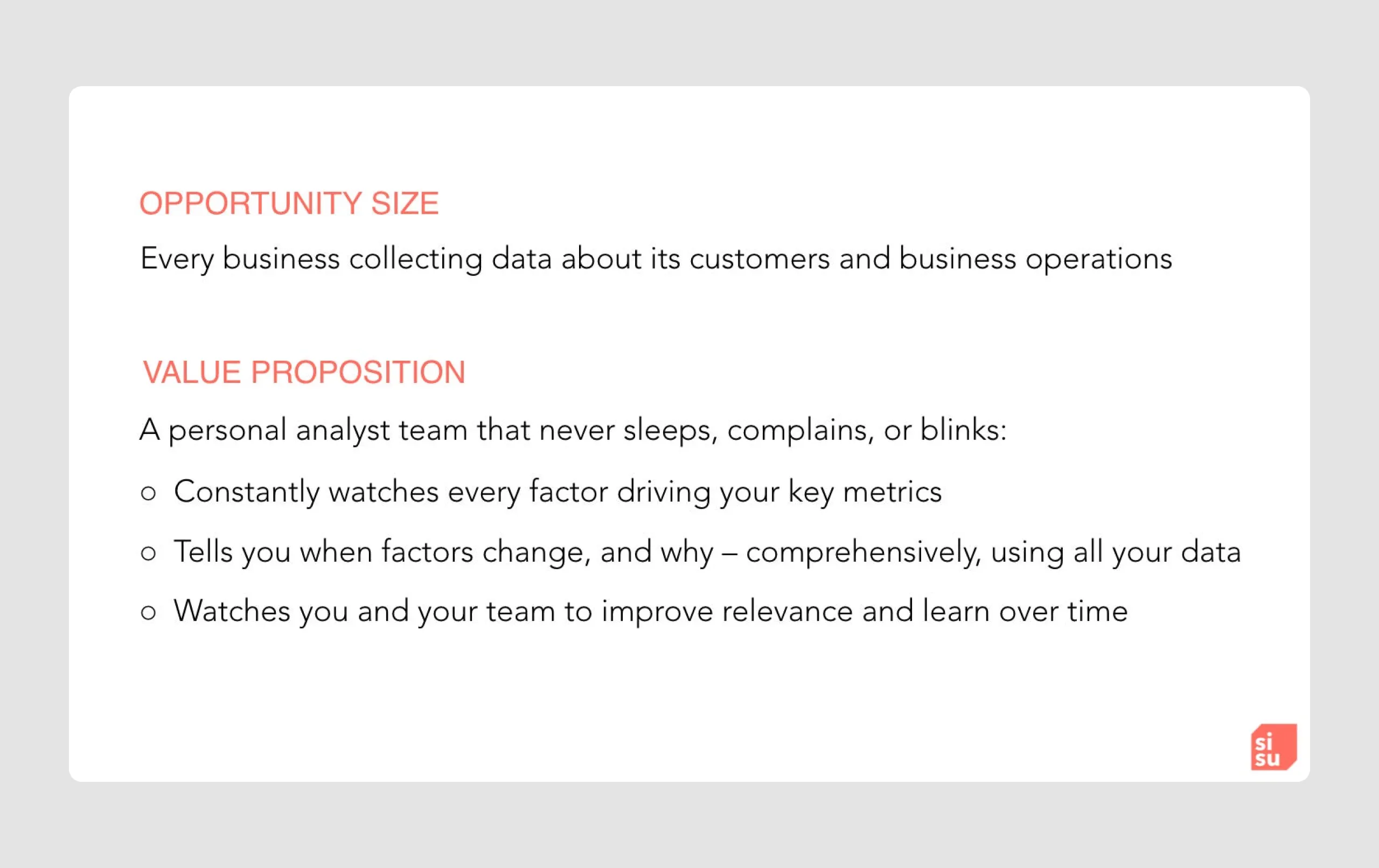
Sisu is a cloud-based diagnostic platform that uses AI and machine learning to help companies quickly analyze large volumes of structured data and extract actionable insights. Its unique approach and focus on helping enterprises tackle complex data challenges attracted significant investment from NEA and Andreessen Horowitz.
Strengths in content
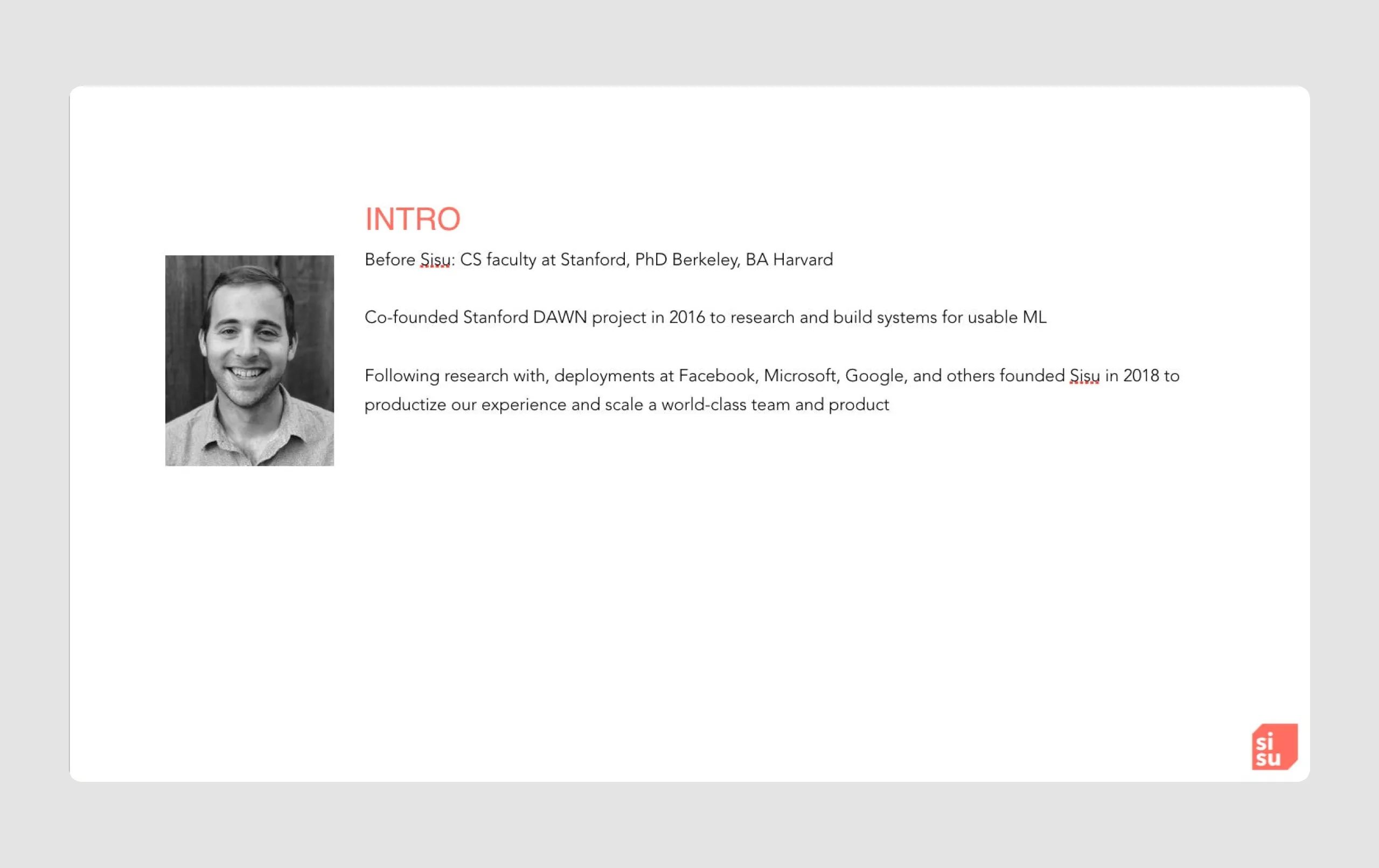
- Credibility through origin story: Sisu's foundation as a Stanford research project and its application at tech giants like Facebook, Google, and Microsoft adds credibility, reinforcing its expertise and reliability in handling large data.
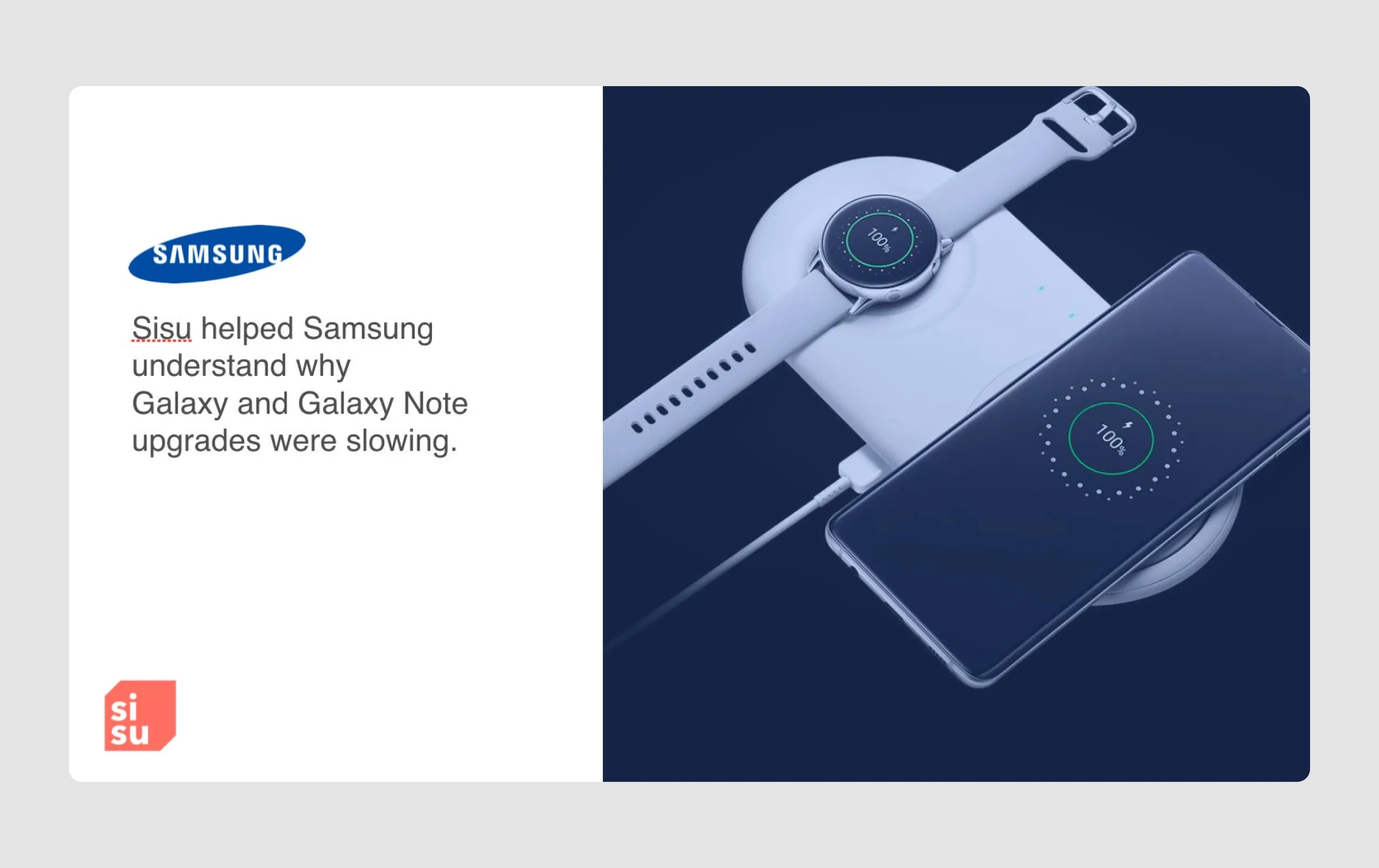
- Use of real-world examples: Case studies with Samsung and Upwork demonstrate Sisu’s practical applications and value in driving actionable insights, which helps investors see real-world relevance and effectiveness.
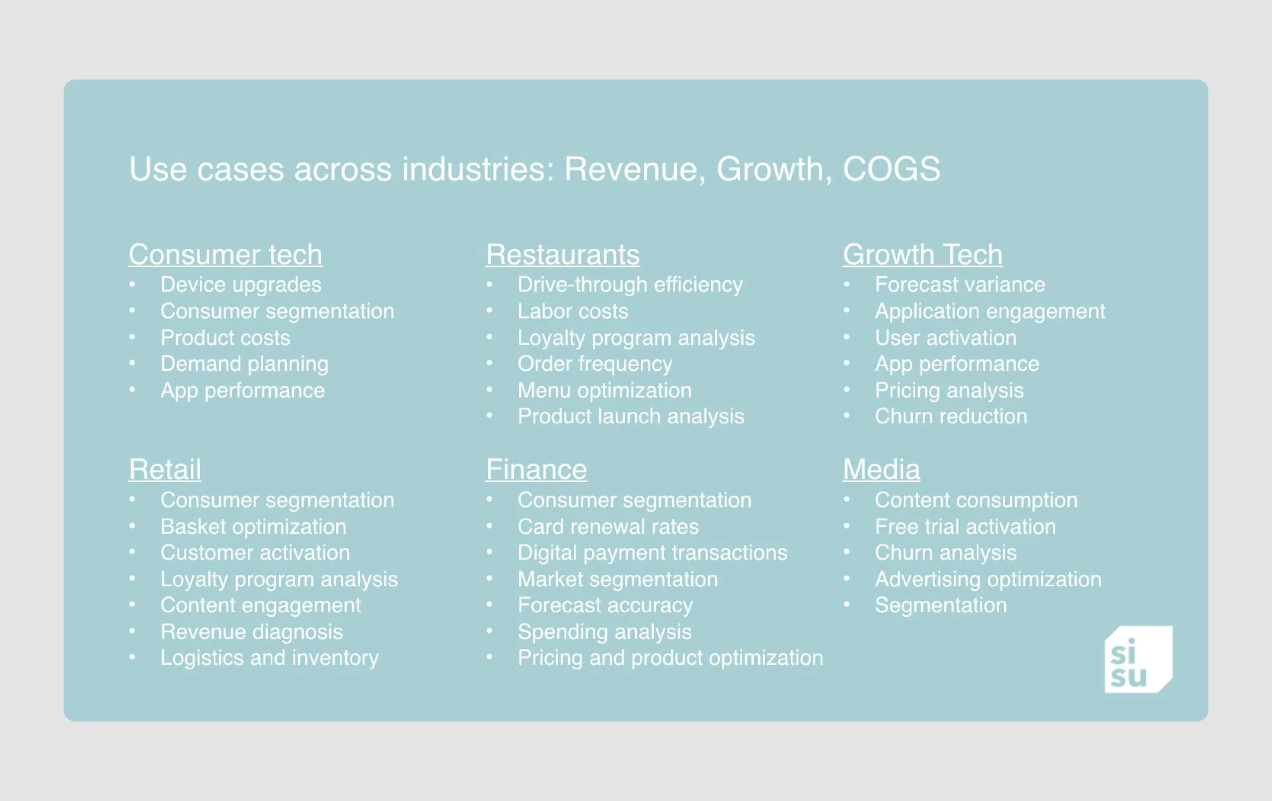
- Scalable market opportunity: Emphasis on the increasing need for diagnostic analytics across industries highlights Sisu's broad market potential, aligning with investor interests in scalability.
Strengths in design
- Minimalist design: The deck maintains a clean, uncluttered look with lots of white space, making the information easy to follow and visually appealing.
- Consistent branding: The use of Sisu’s logo and brand colors (mainly coral and white) across slides creates a cohesive look, reinforcing brand identity.
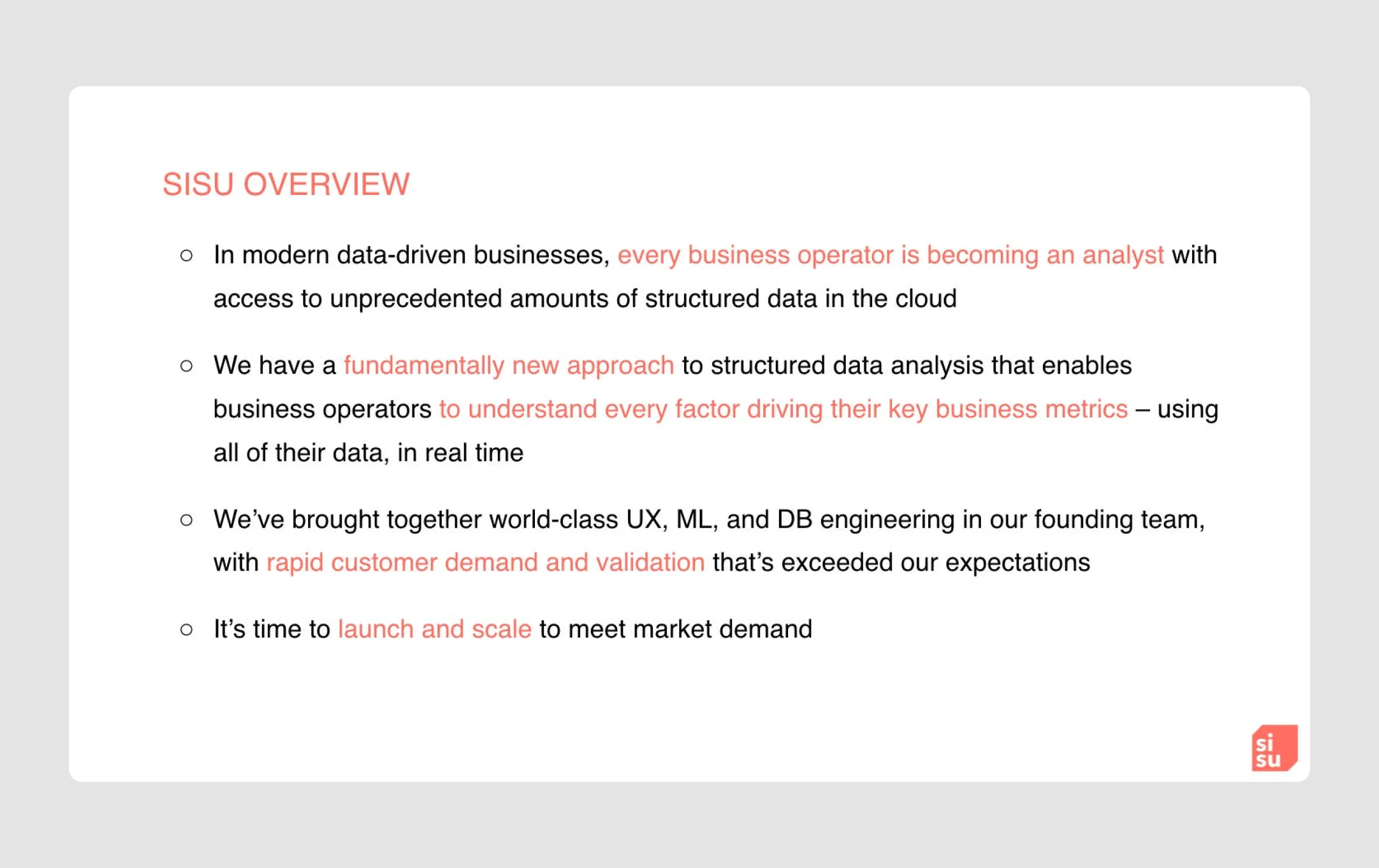
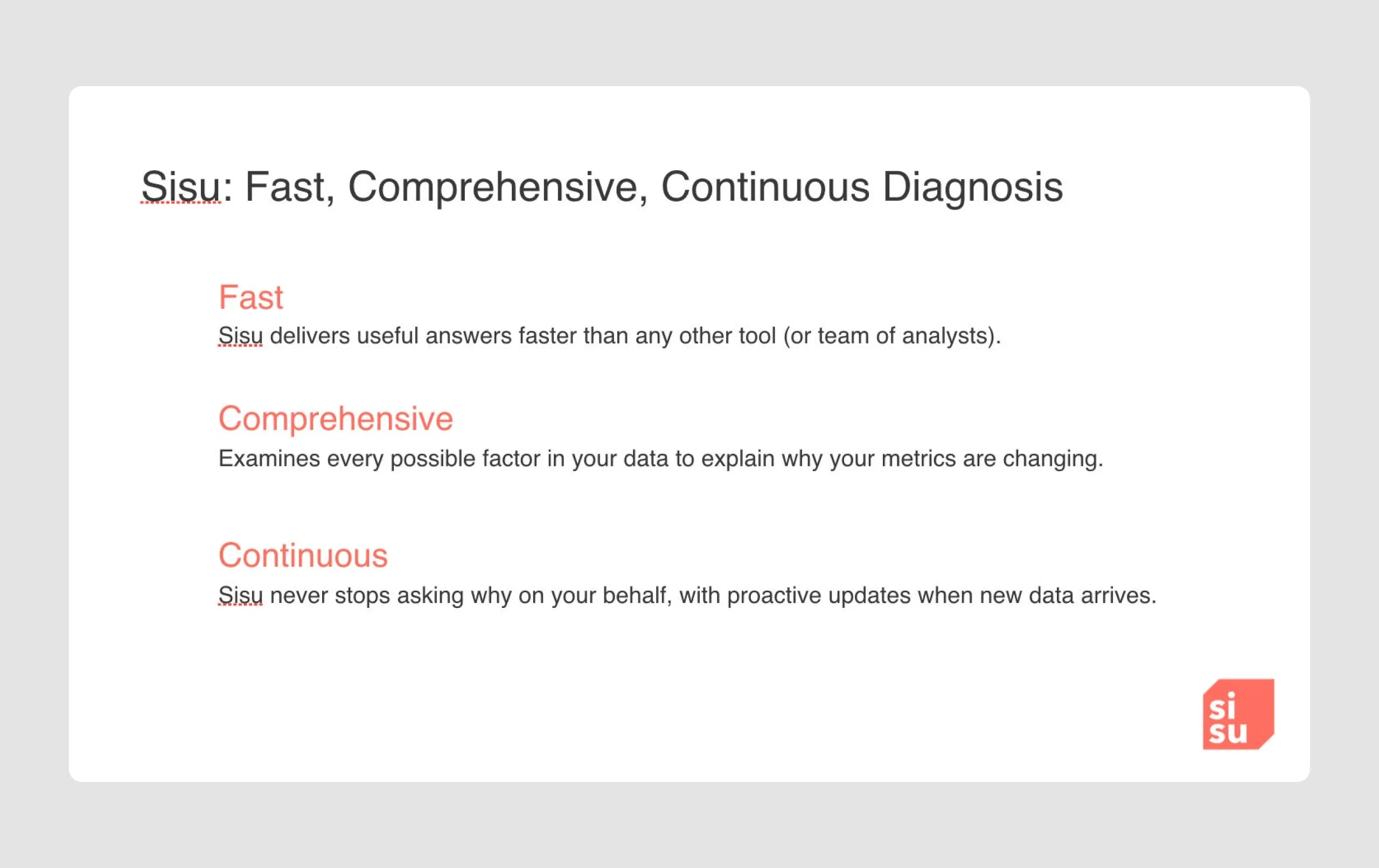
- Emphasis on key points: Large, bold headers and isolated text sections for essential points (e.g., “Fast, Comprehensive, Continuous Diagnosis”) ensure that critical messages stand out clearly.
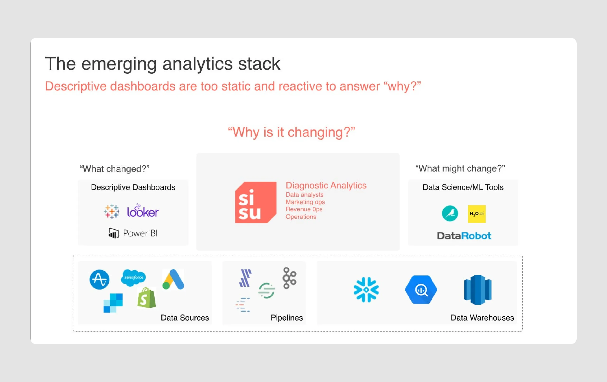
- Clear diagrams and icons: The diagrams and icons used are simple but informative, such as the emerging analytics stack, which contrasts descriptive analytics and diagnostic analytics clearly.
- Strong use of case studies: The integration of specific client stories with images of well-known companies (Samsung, Upwork) makes the deck relatable and reinforces credibility.
Overall, the Sisu pitch deck succeeds in articulating a compelling value proposition backed by real-world applications and a clean, professional design, making it easy for investors to grasp the potential impact of the product.
Series-C pitch deck samples
A Series C round is a late-stage financing round for startups and growing companies that have already proven their business model, achieved significant milestones, and demonstrated the potential for continued growth and profitability. At this stage, companies typically seek larger investments to scale their operations, expand into new markets, launch new products, or even prepare for an IPO (Initial Public Offering) or traction slide acquisition.
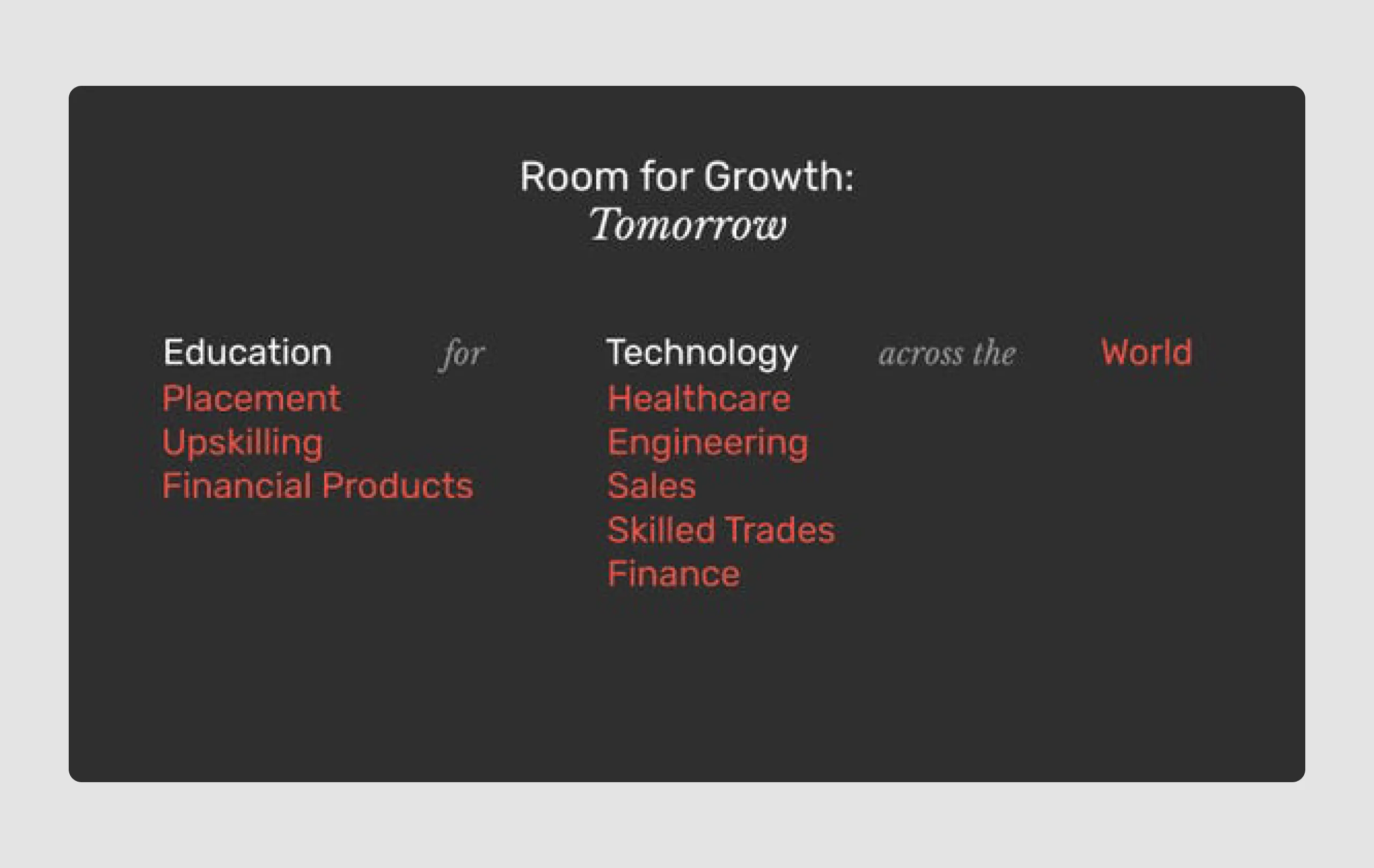
16. Lambda school ($74m)
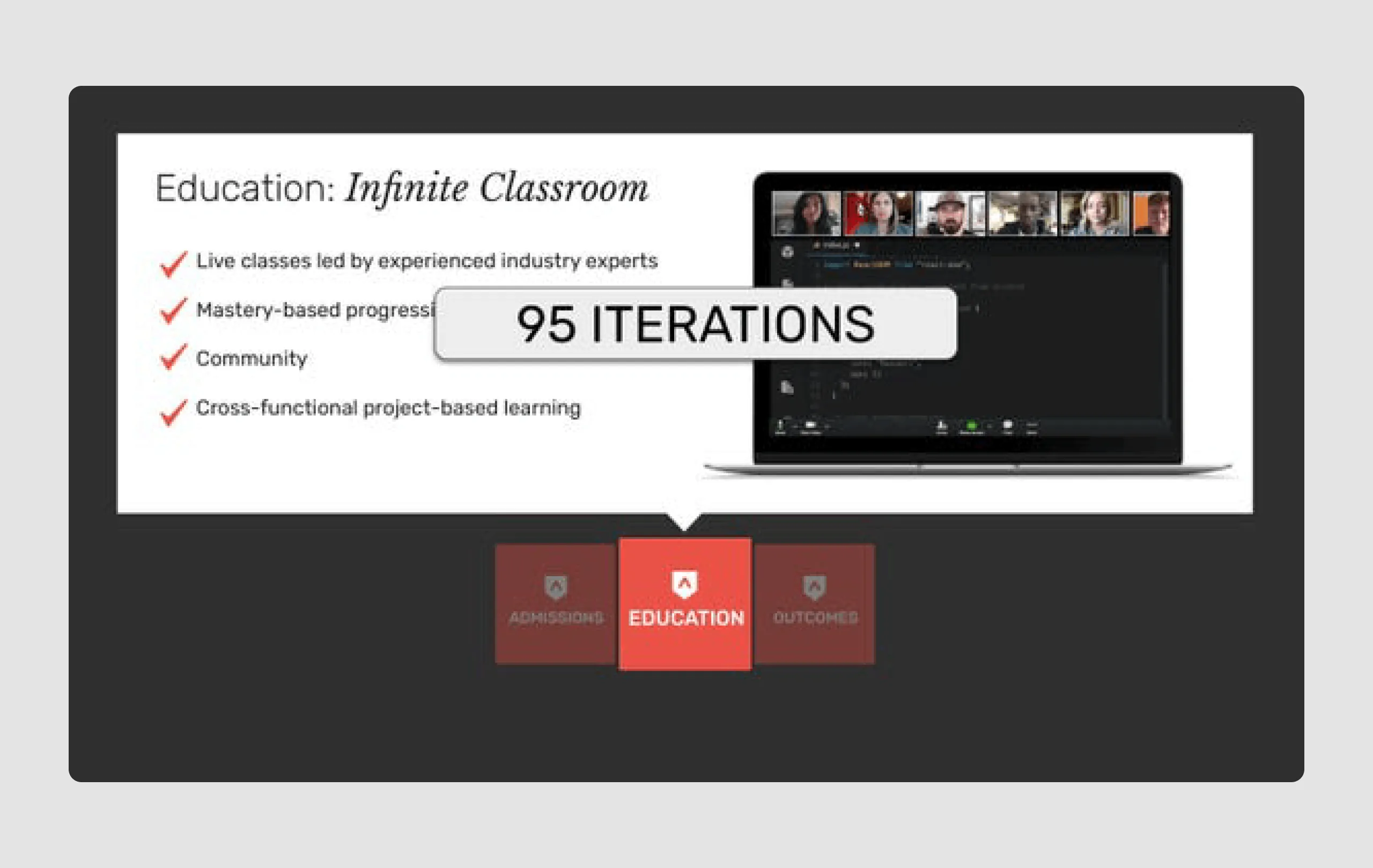
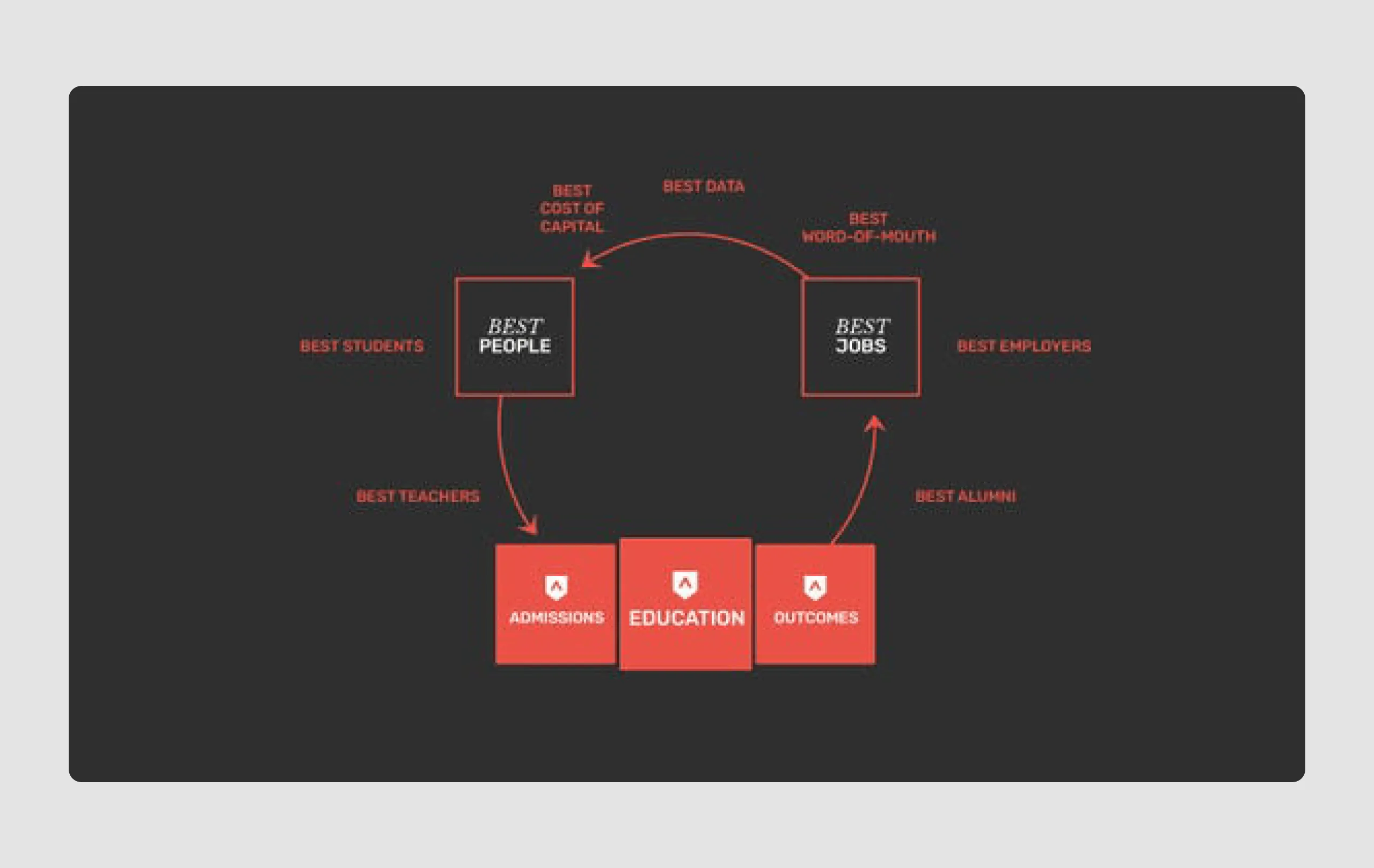
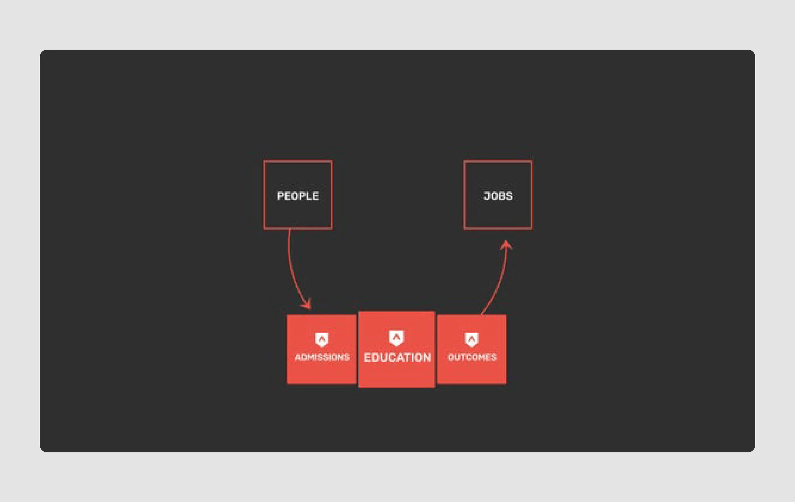
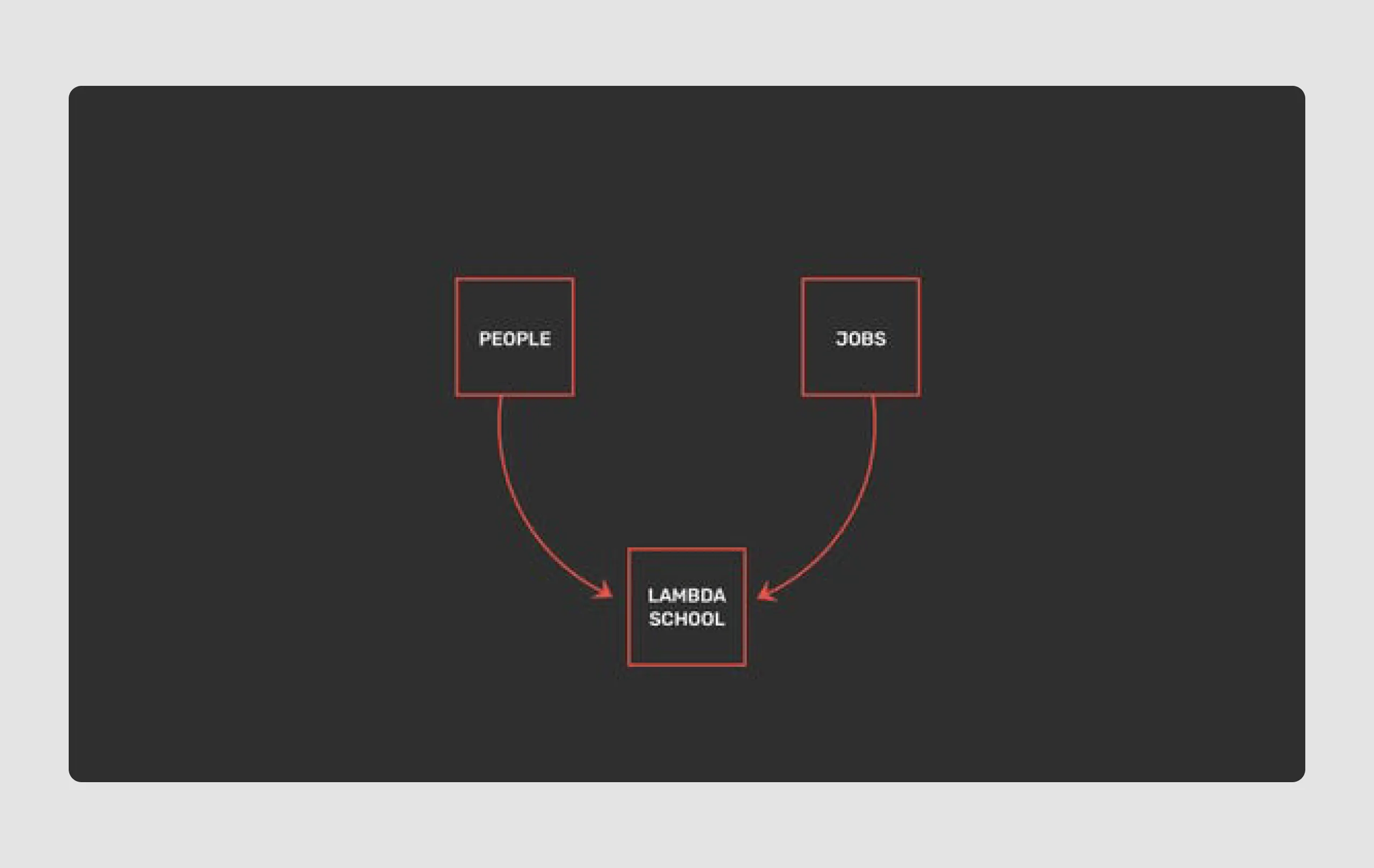
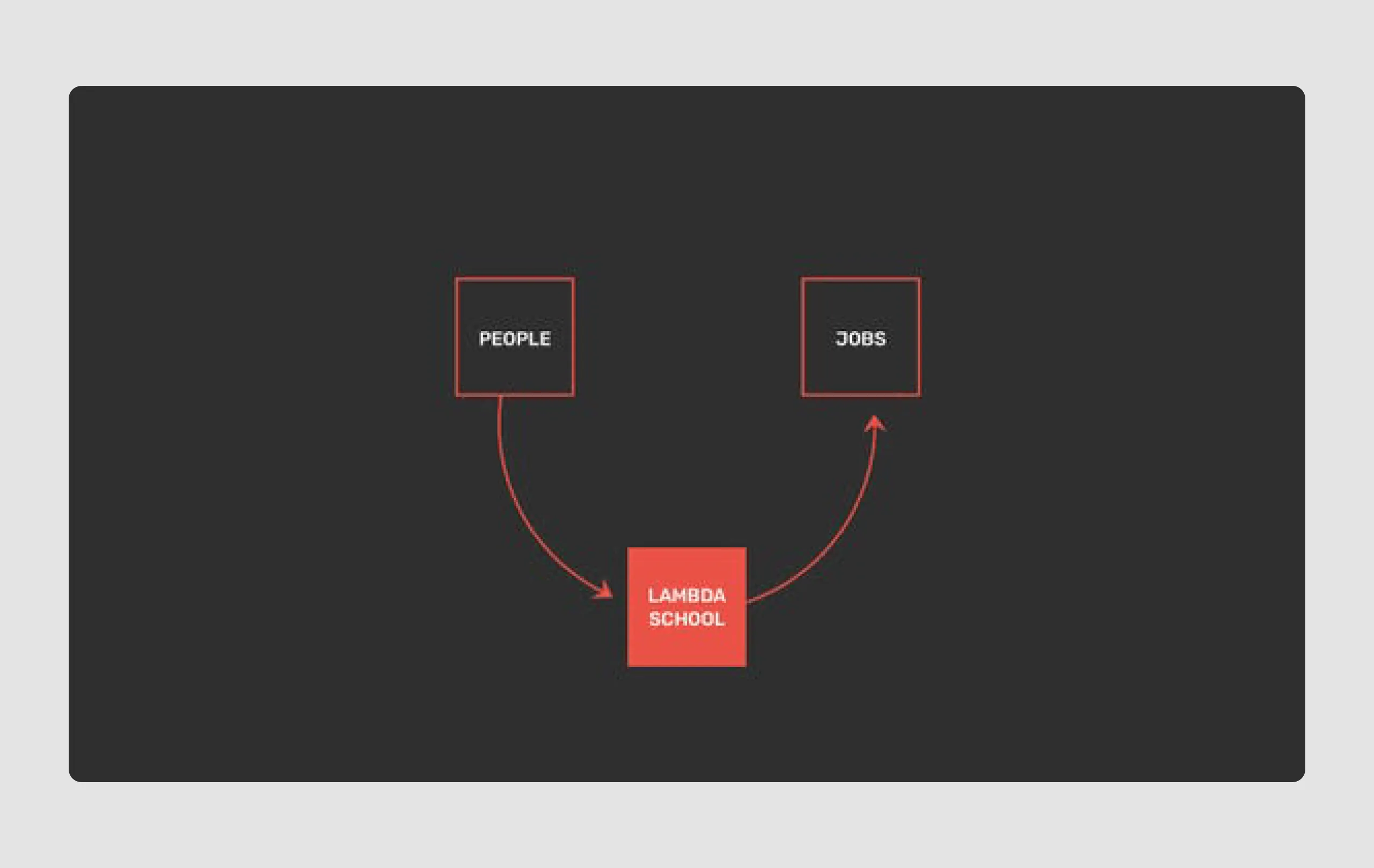
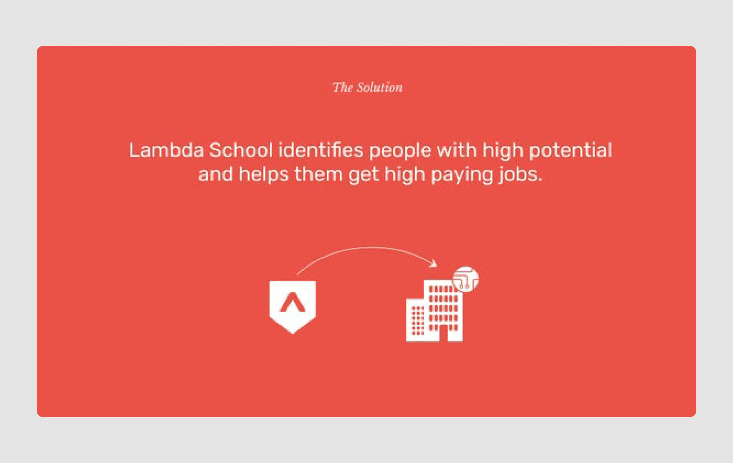
Lambda School aims to make high-demand skills accessible to underutilized talent without the financial burden typical of traditional education. They raised a $74 million Series C funding led by Gigafund. The company's long-term viability hinges on achieving a "90-90" metric: 90% of students graduating and 90% of graduates finding jobs within six months.
Content strengths
- Data-driven outcomes: Highlighting statistics like "90-90" goals (90% graduation and job placement rates) provides measurable targets, which is attractive to investors.
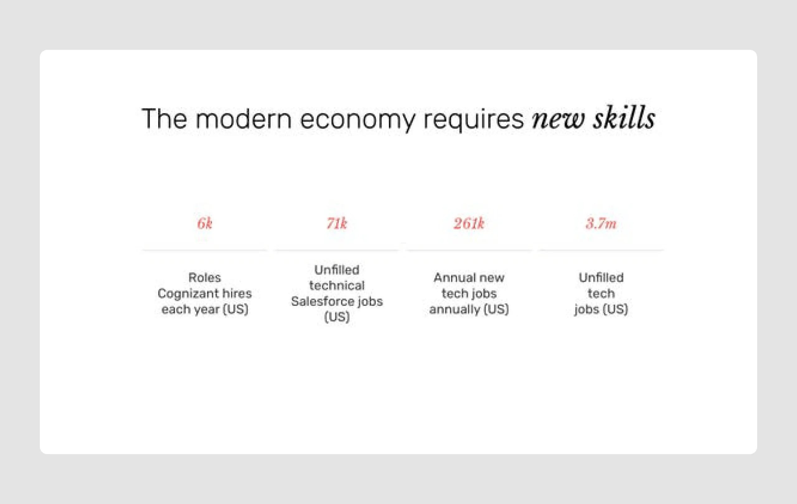
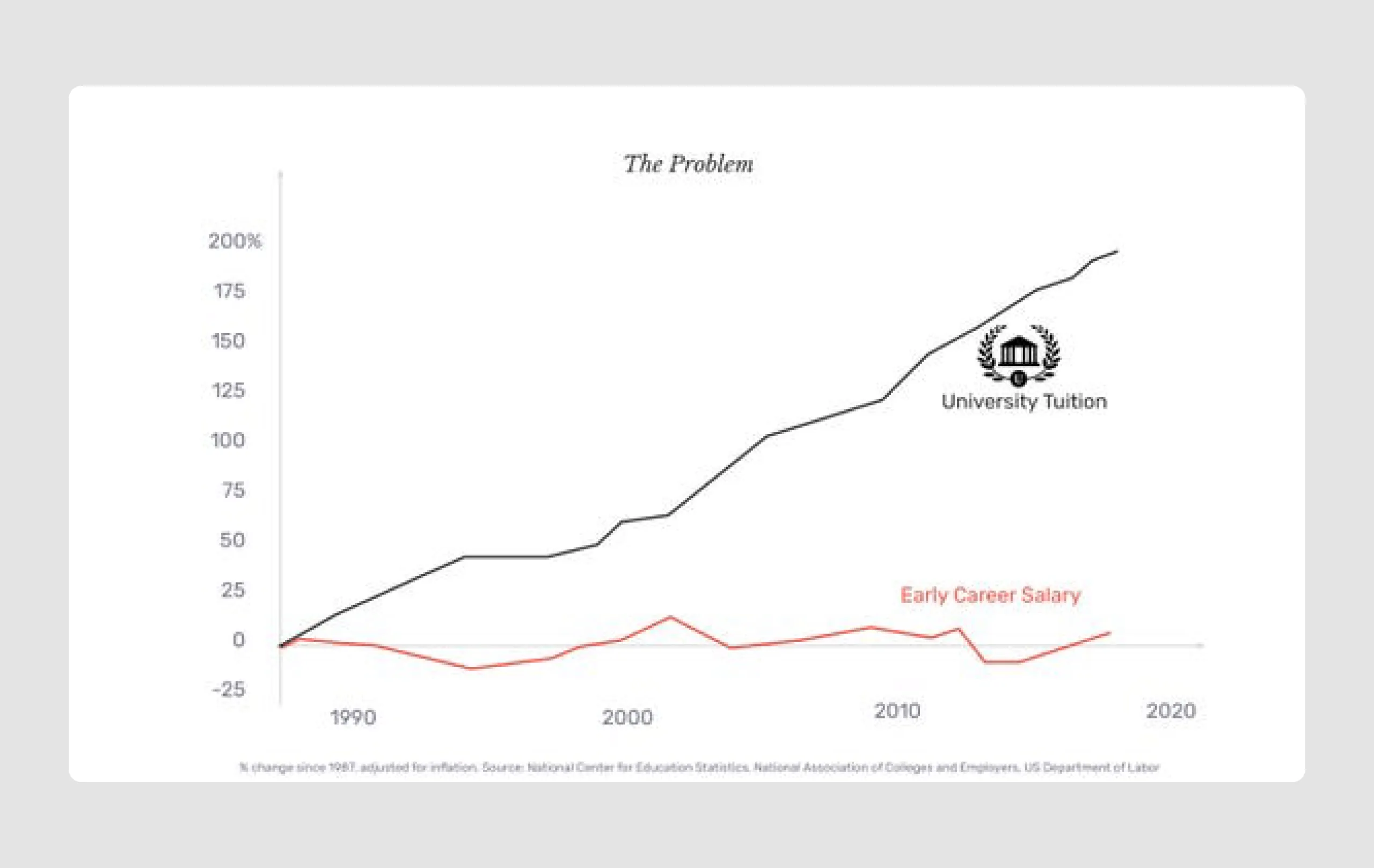
- Market need: By presenting figures on unfilled tech roles and salary growth, the deck illustrates a clear demand for tech talent, reinforcing Lambda’s potential market.
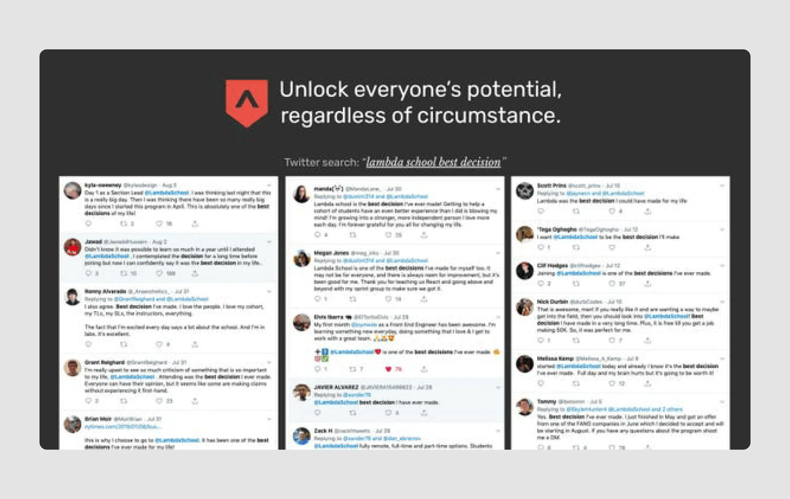
- Strong investor backing: Mentioning top investors like Gigafund and Y Combinator adds credibility and showcases confidence from reputable sources.
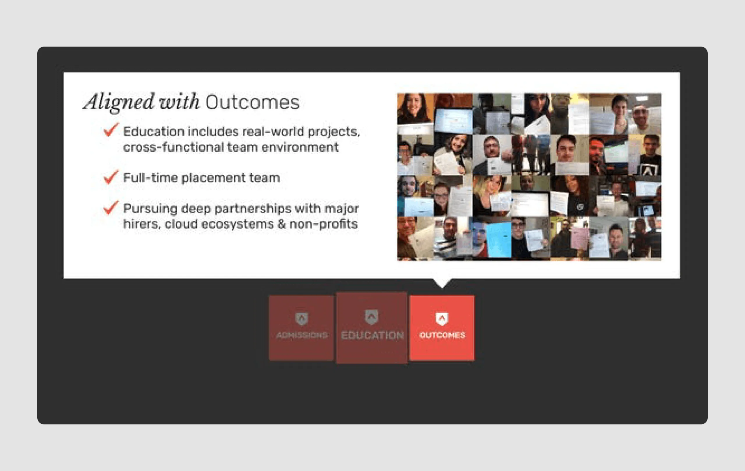
- Student success stories: Testimonials and real-world case studies provide evidence of effectiveness, showing the program's transformative impact on students' careers.
Design strengths
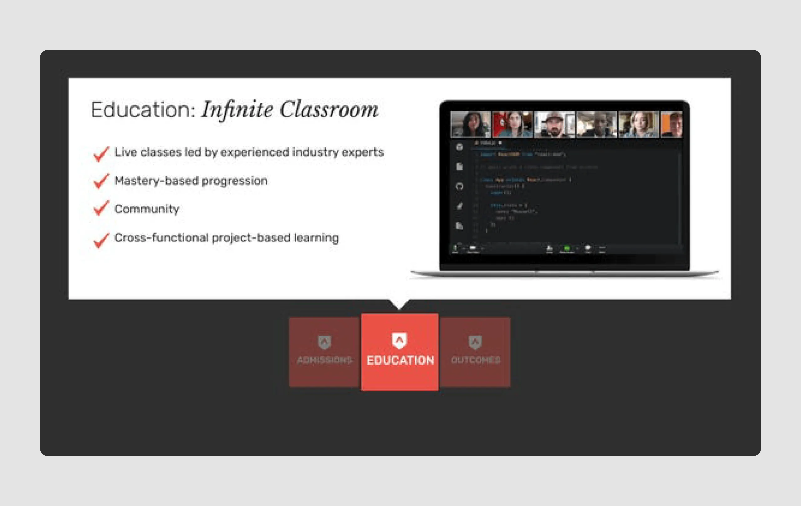
- Consistent branding: The Lambda logo and color scheme (red, black, and white) are used consistently, creating a cohesive and professional look.
- Minimalistic and focused: Slides are uncluttered, with bold text and simple icons, making each point easy to grasp at a glance.
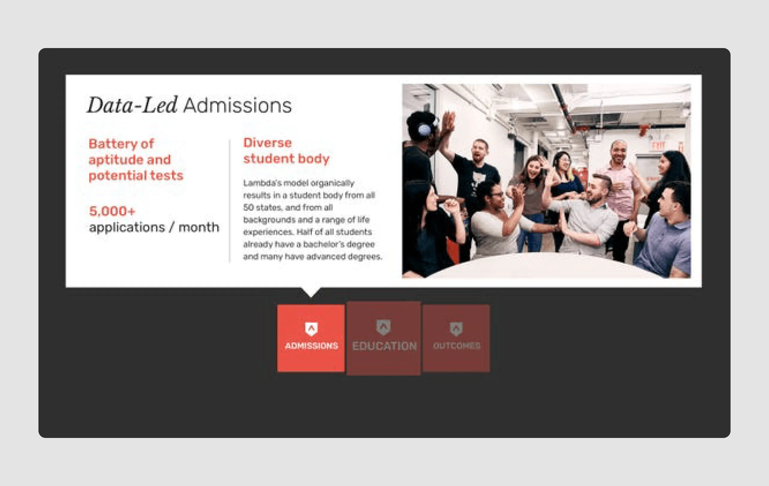
- Engaging imagery: High-quality images of diverse, engaged students give a personal touch and reinforce Lambda’s commitment to inclusivity.
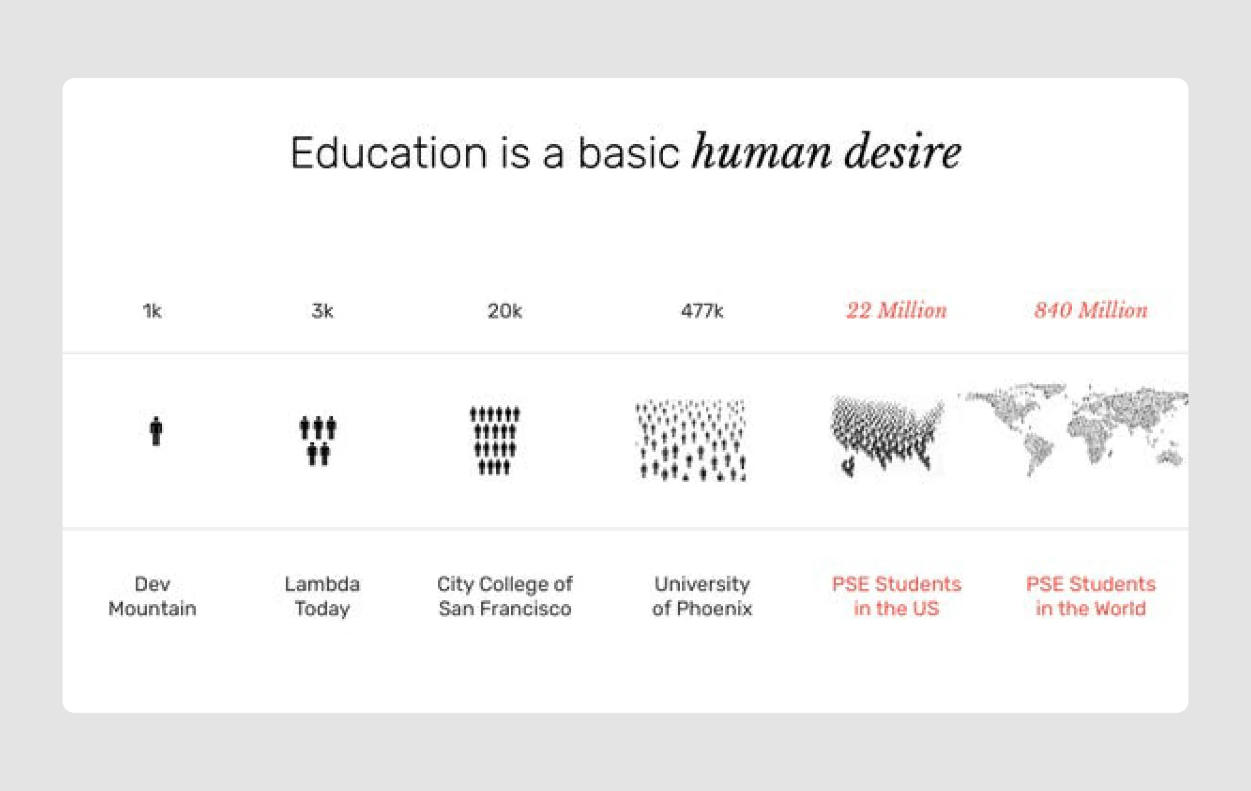
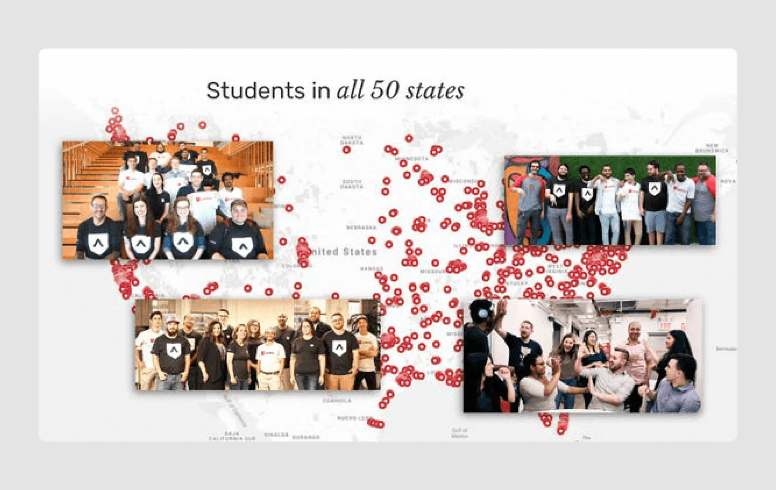
- Graphical data representation: The tuition vs. salary graph and U.S. map with student distribution provide visual proof of the problem and Lambda’s reach, adding to the narrative effectively.
Overall, the deck successfully combines a compelling social impact narrative with clear business metrics, presented in a visually appealing and straightforward design. And it also frames the expected outcomes clearly, which matters a lot at later funding stages.
17. Replicated ($50m)
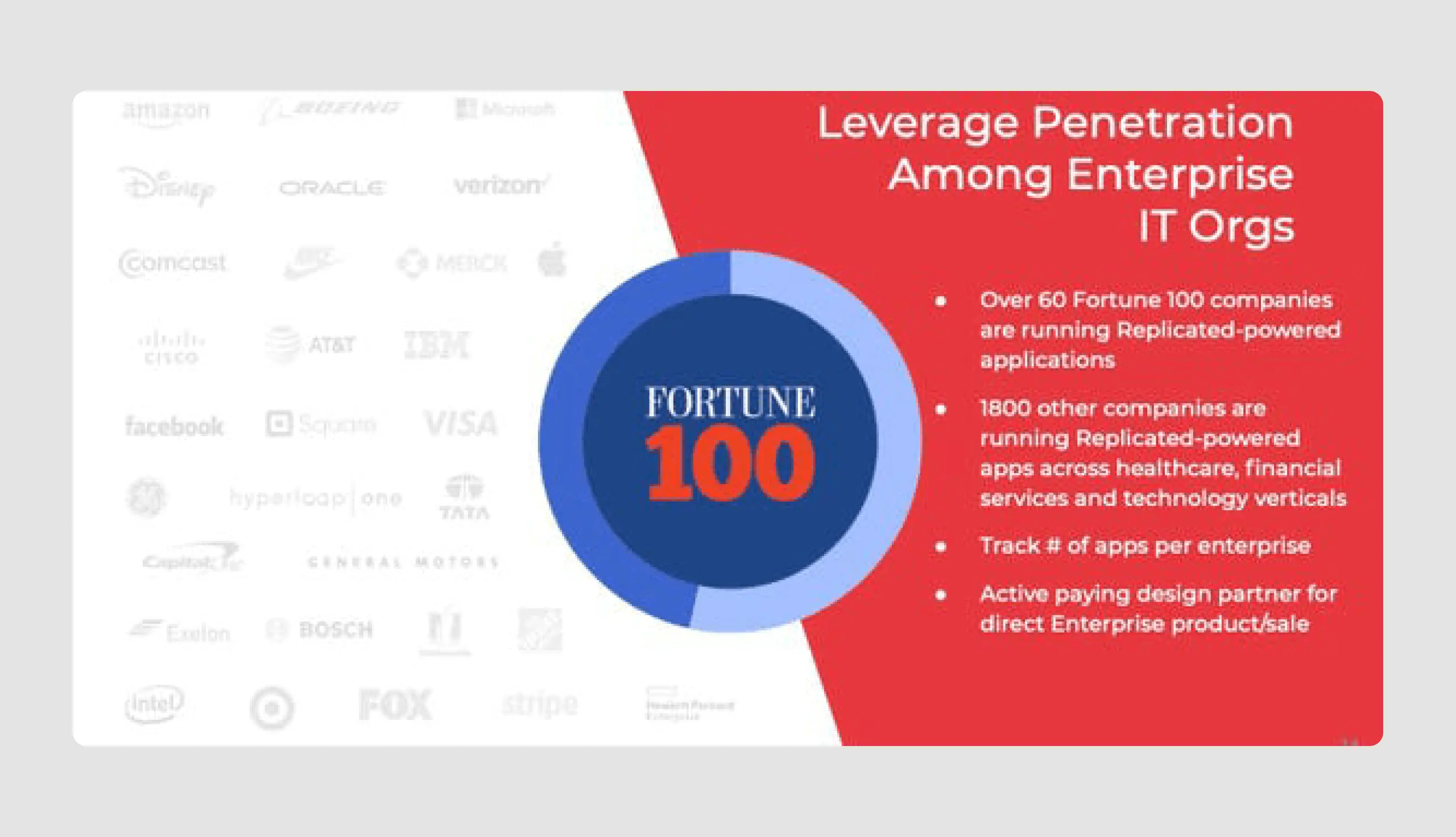
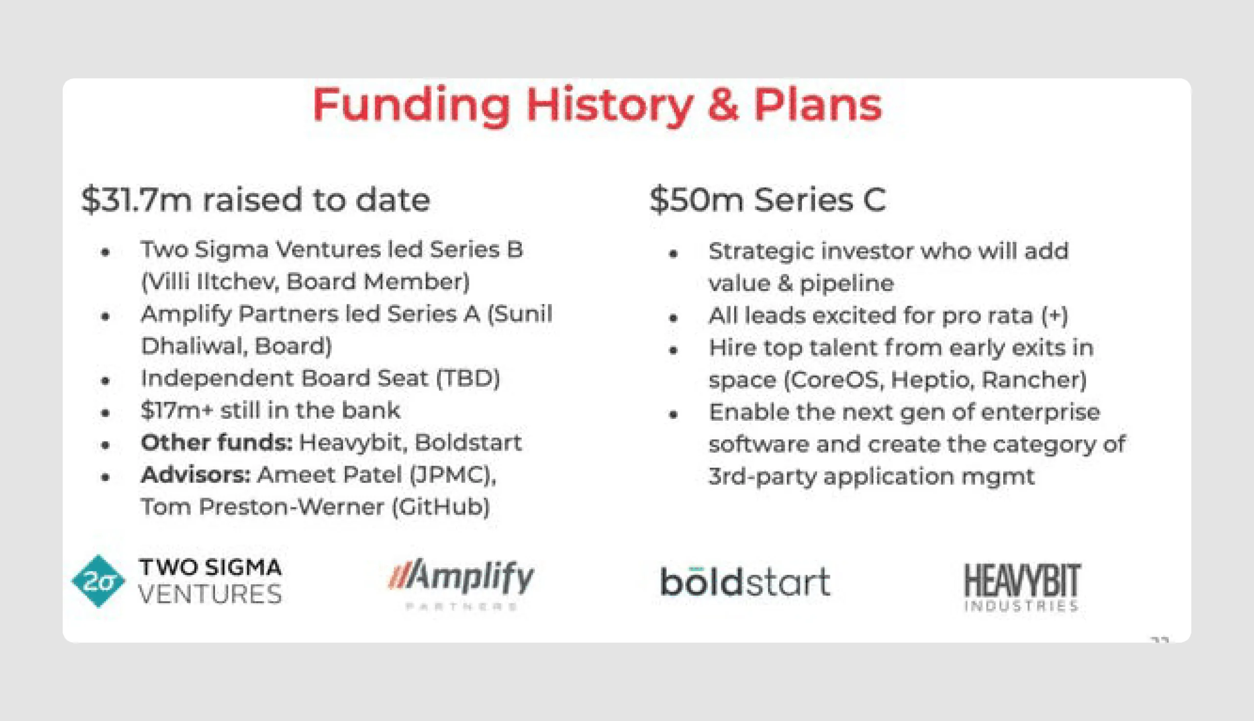
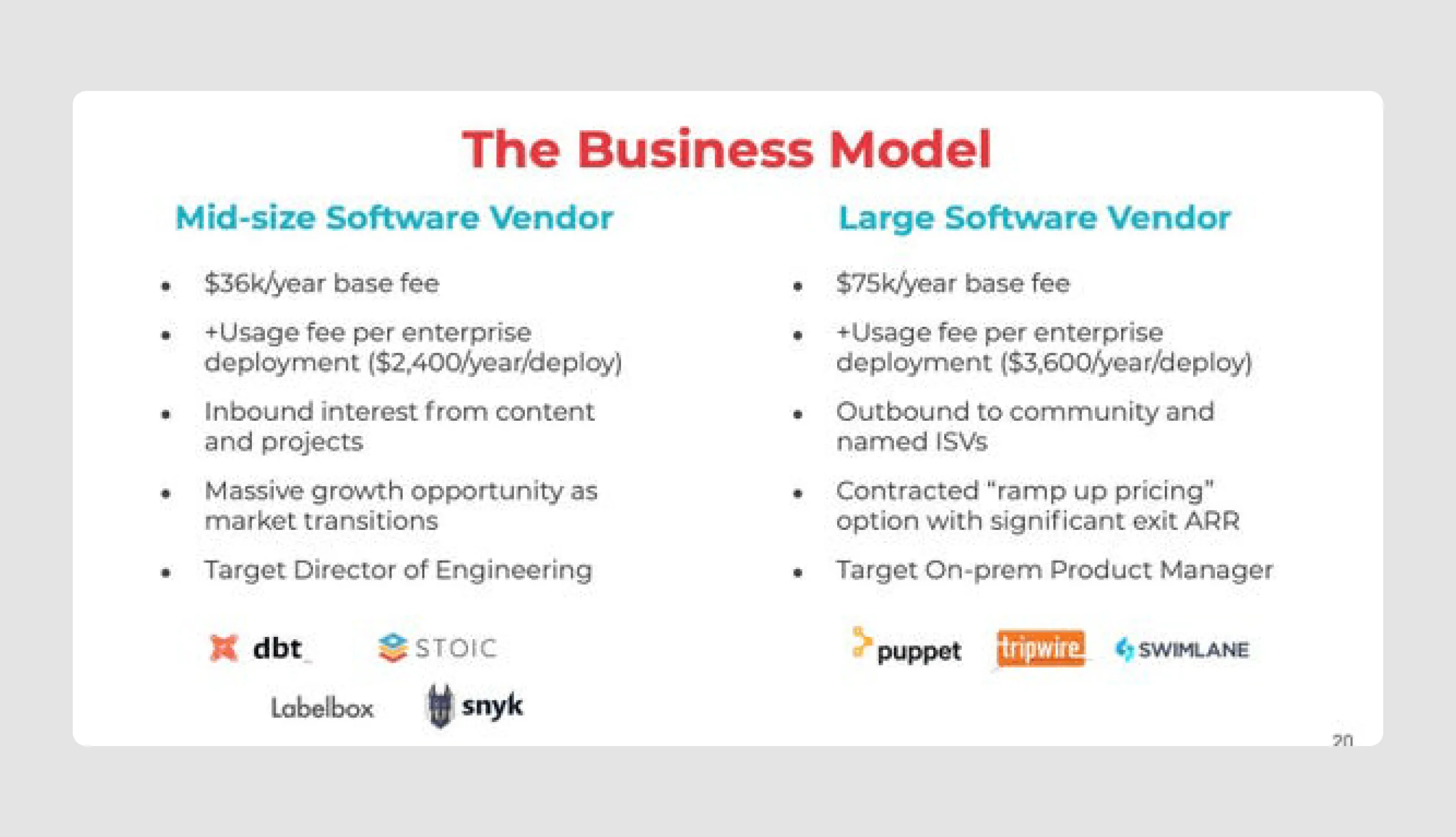
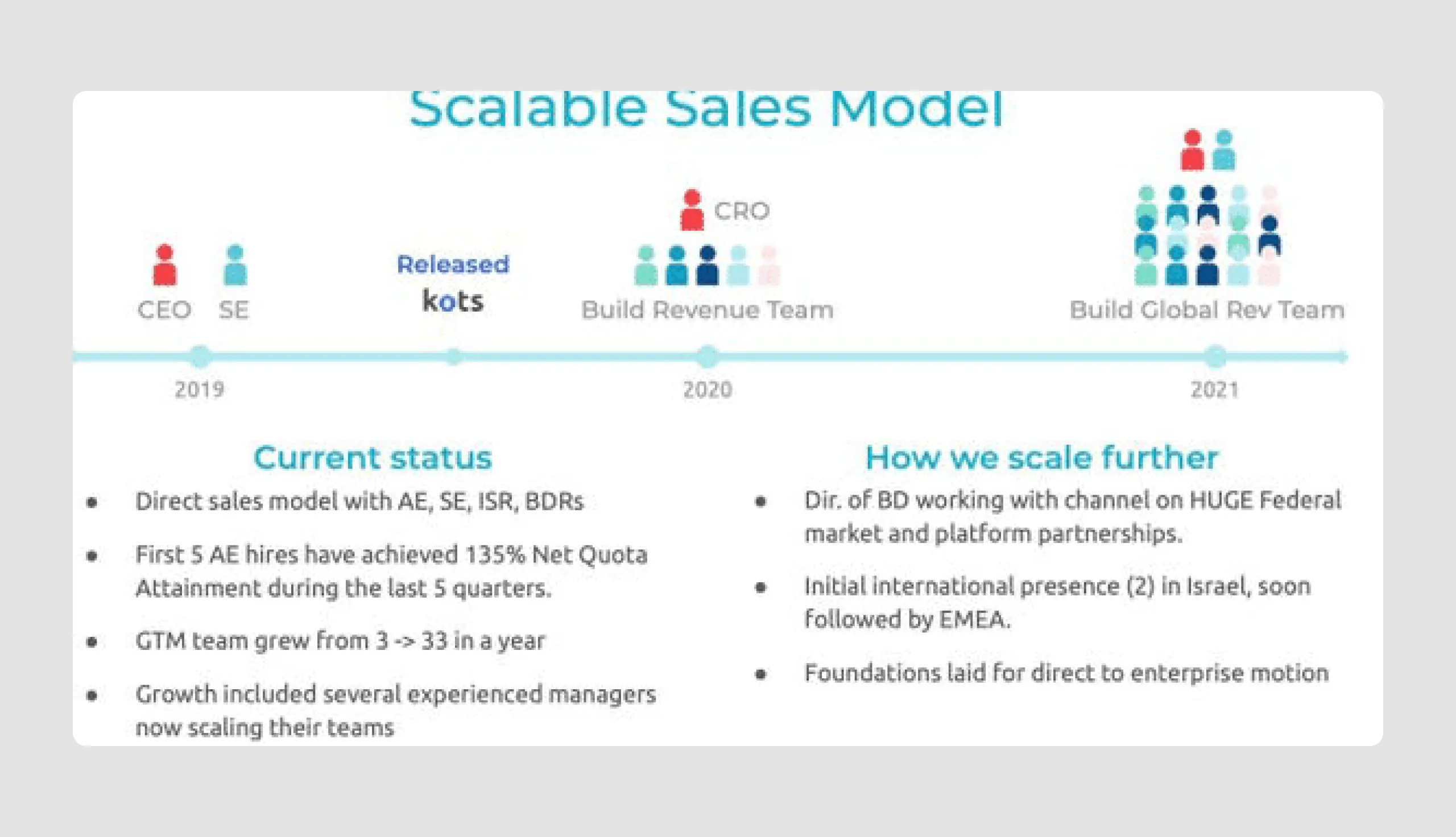
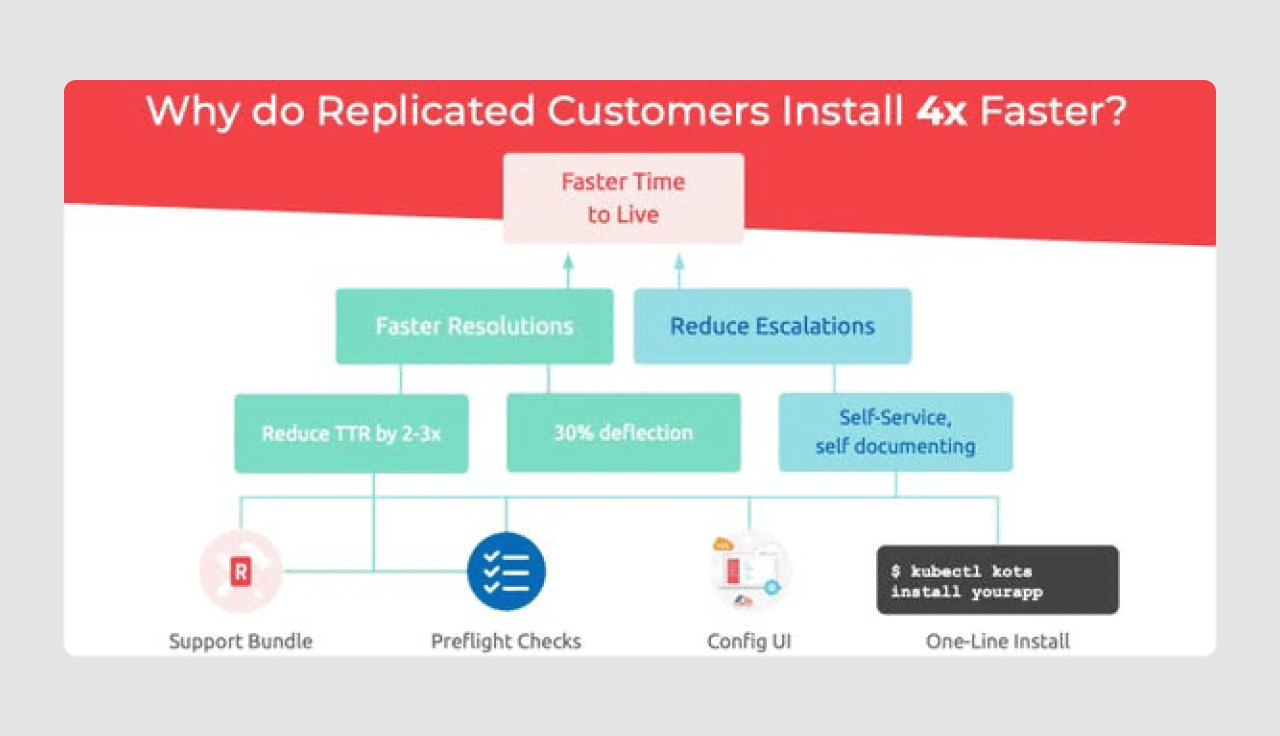
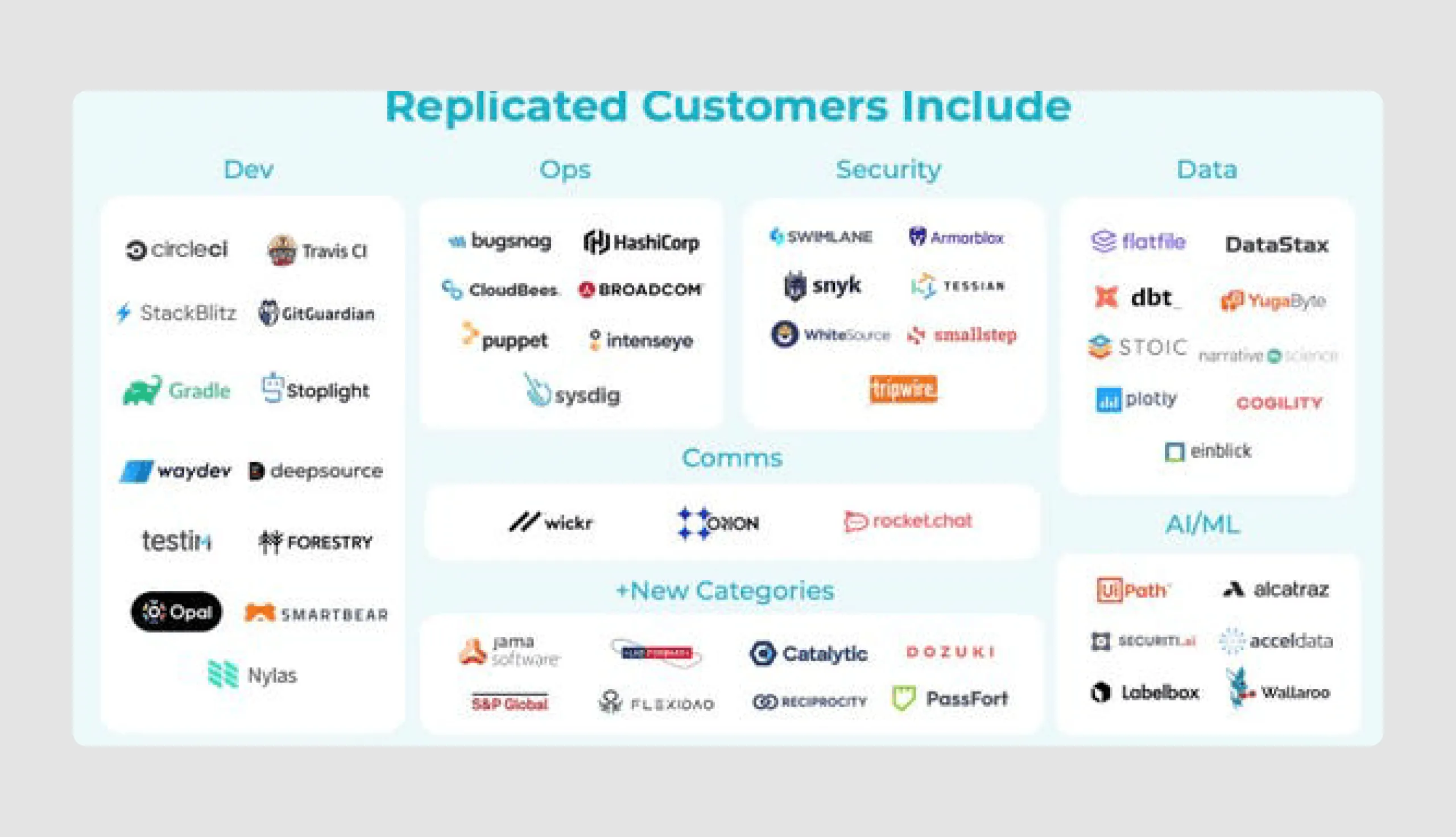
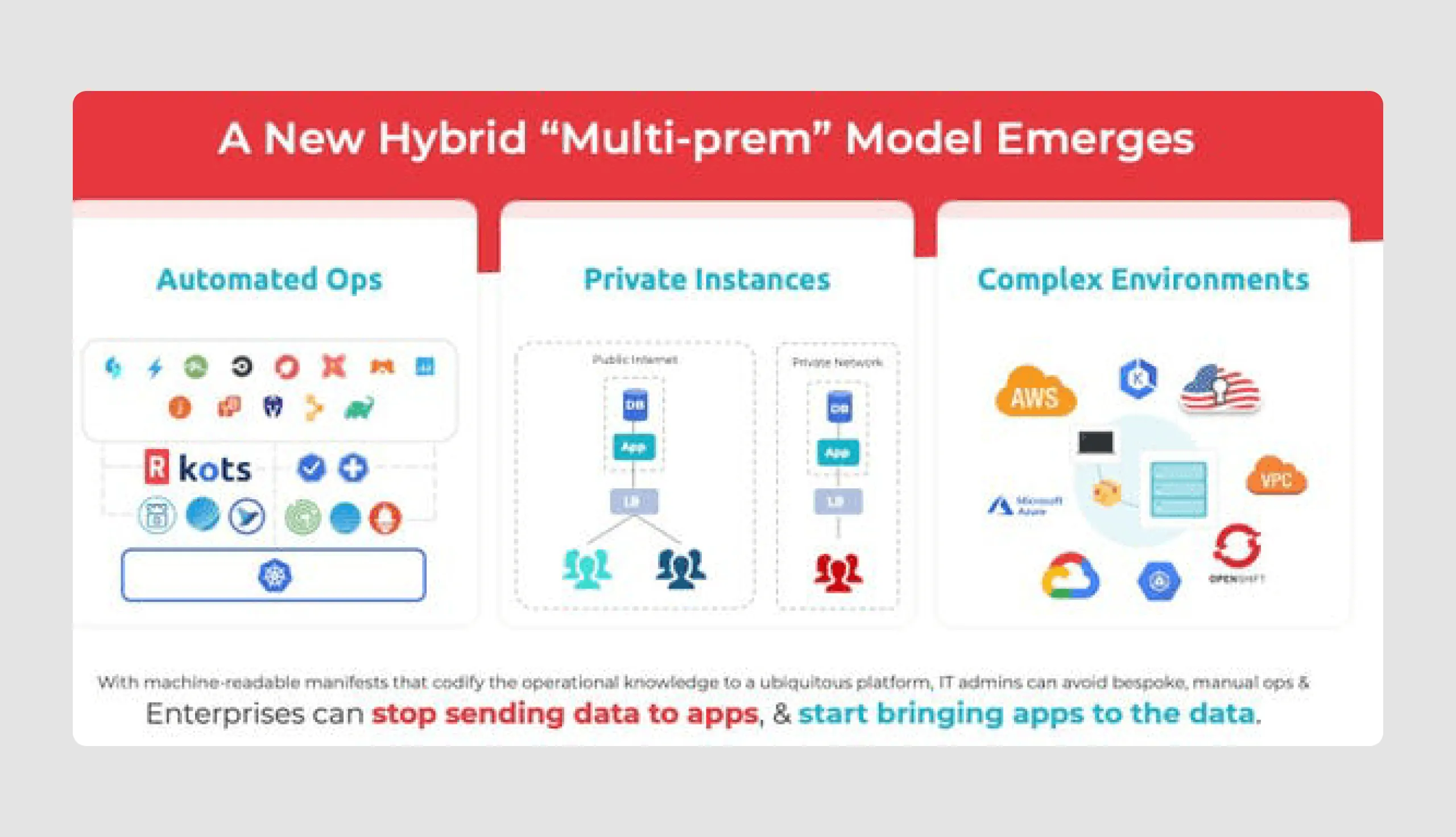
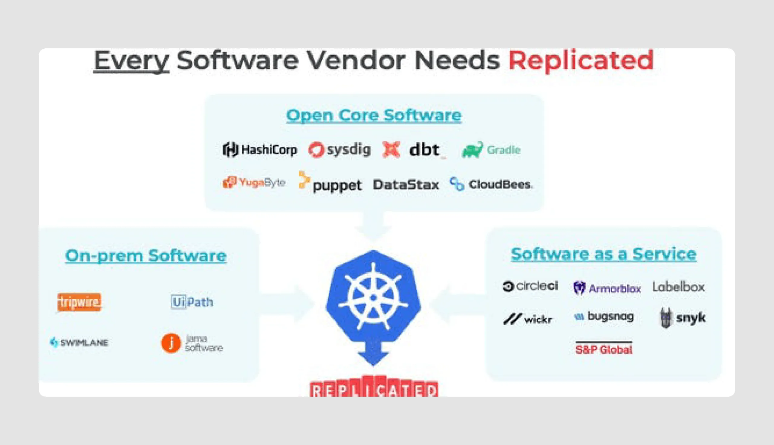
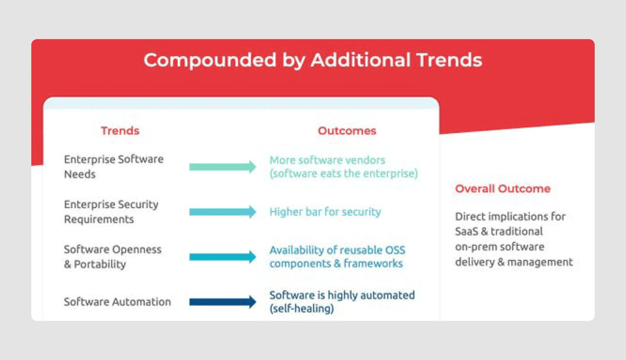
Replicated’s idea, which attracted investment, is to offer tools that enable SaaS vendors to transport and integrate apps safely across various host environments, such as AWS GovCloud and VMware's Vsphere. The $50 million Series C funding, led by Blue Owl Capital, will support Replicated’s growth through expanded engineering, sales, and marketing efforts.
Content strengths
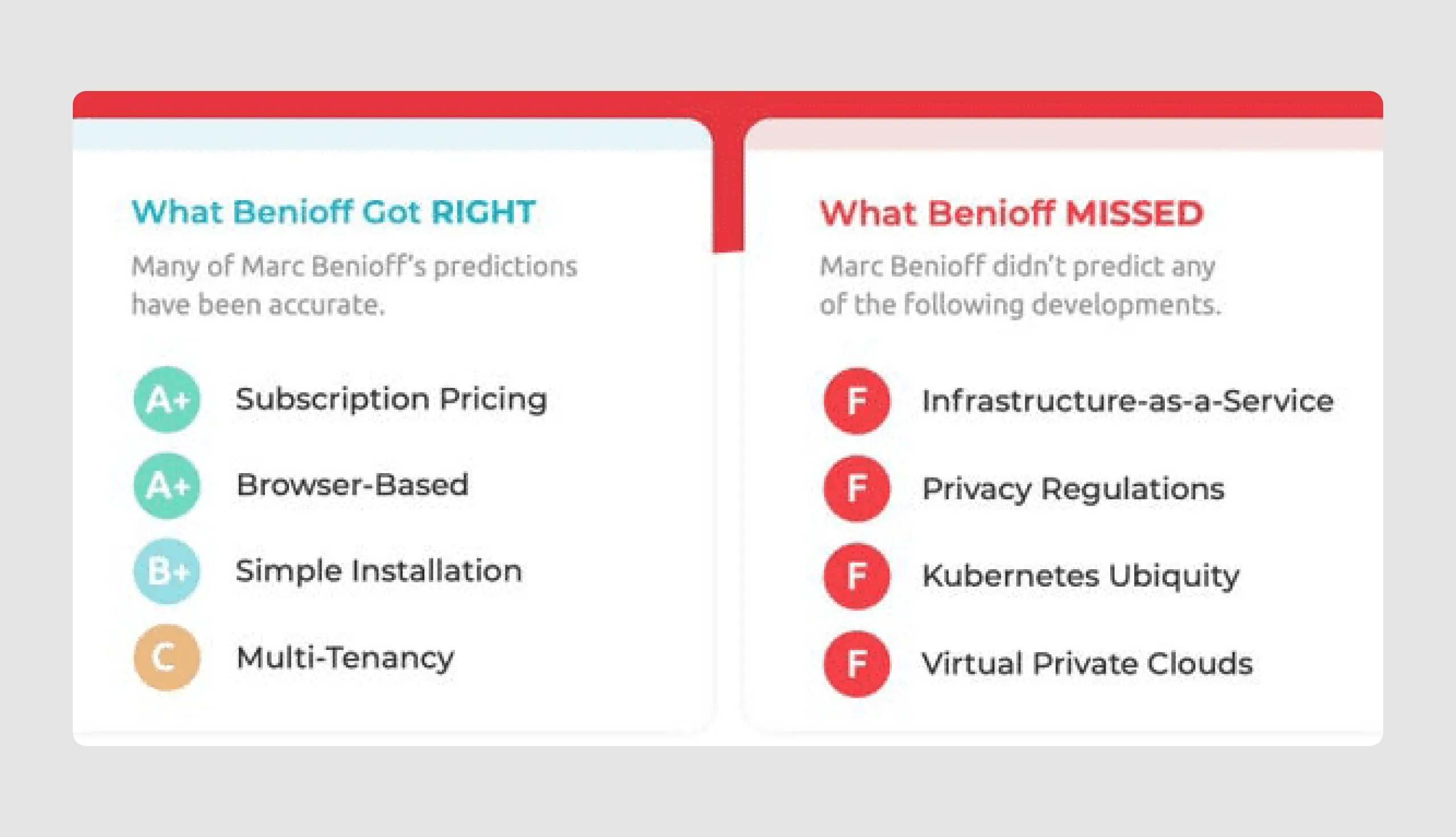
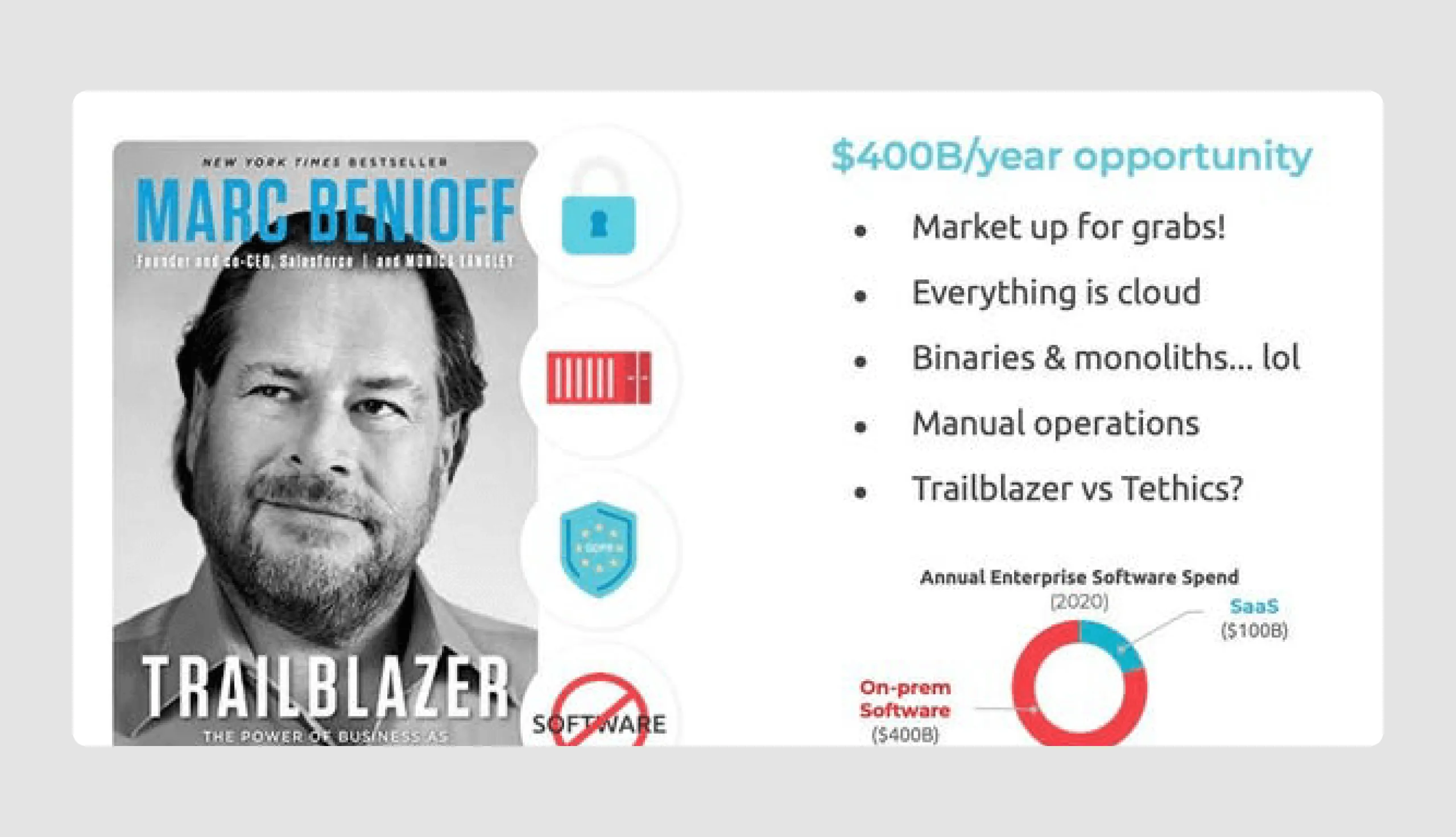
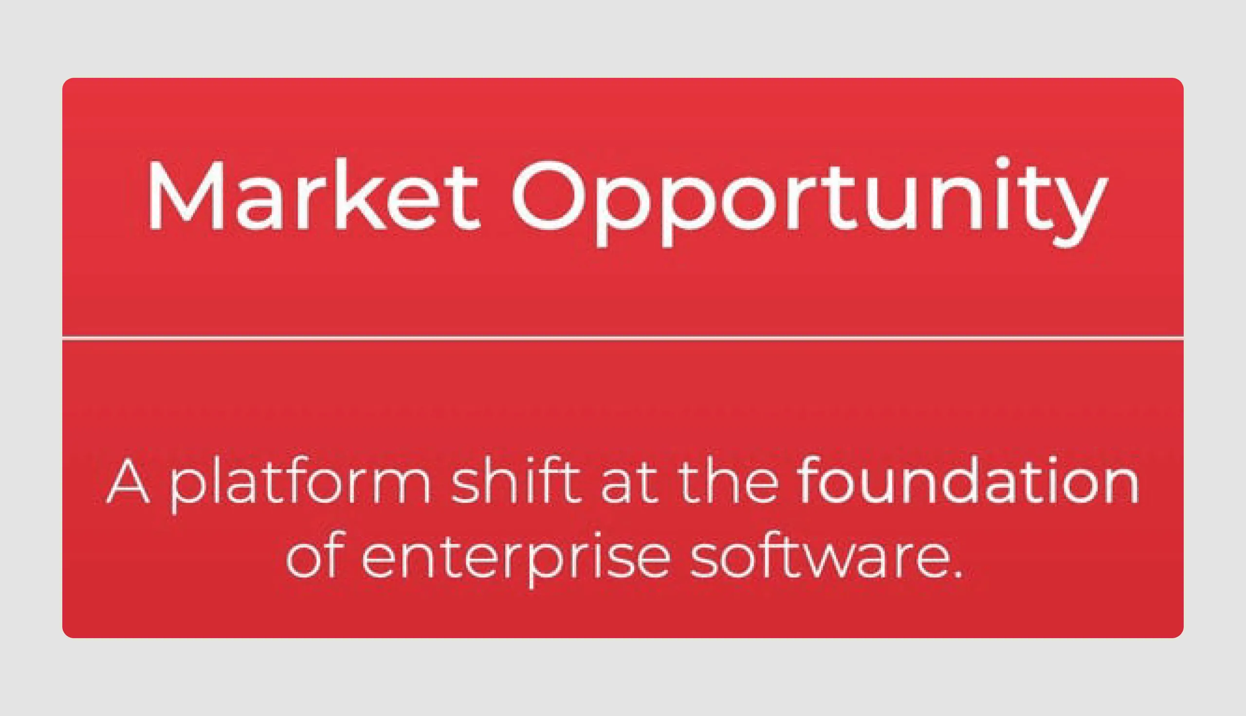
- Target market opportunity: The “Market Opportunity” slides highlight a $400 billion opportunity with a clear breakdown of where the current market gaps lie, using industry insights to build a convincing case.
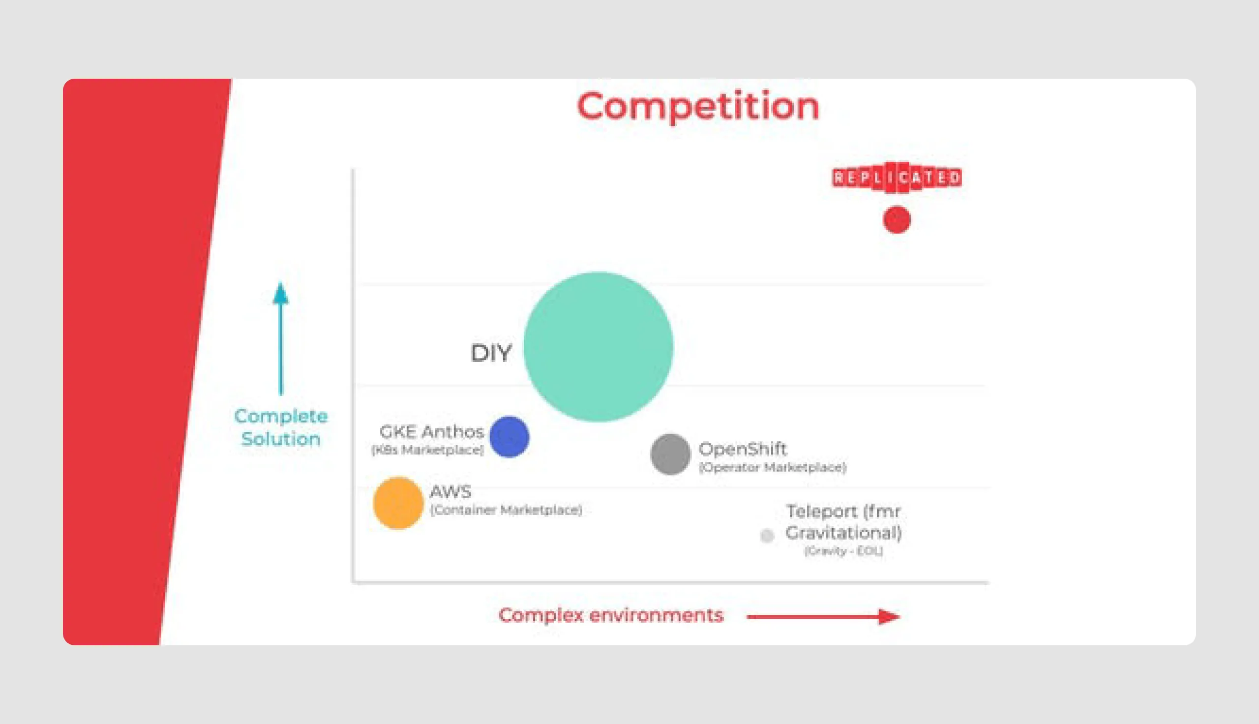
- Engaging competitive analysis: The deck uses a simple matrix to showcase Replicated’s unique position in the market, setting it apart from competitors by demonstrating its comprehensive and flexible solution.
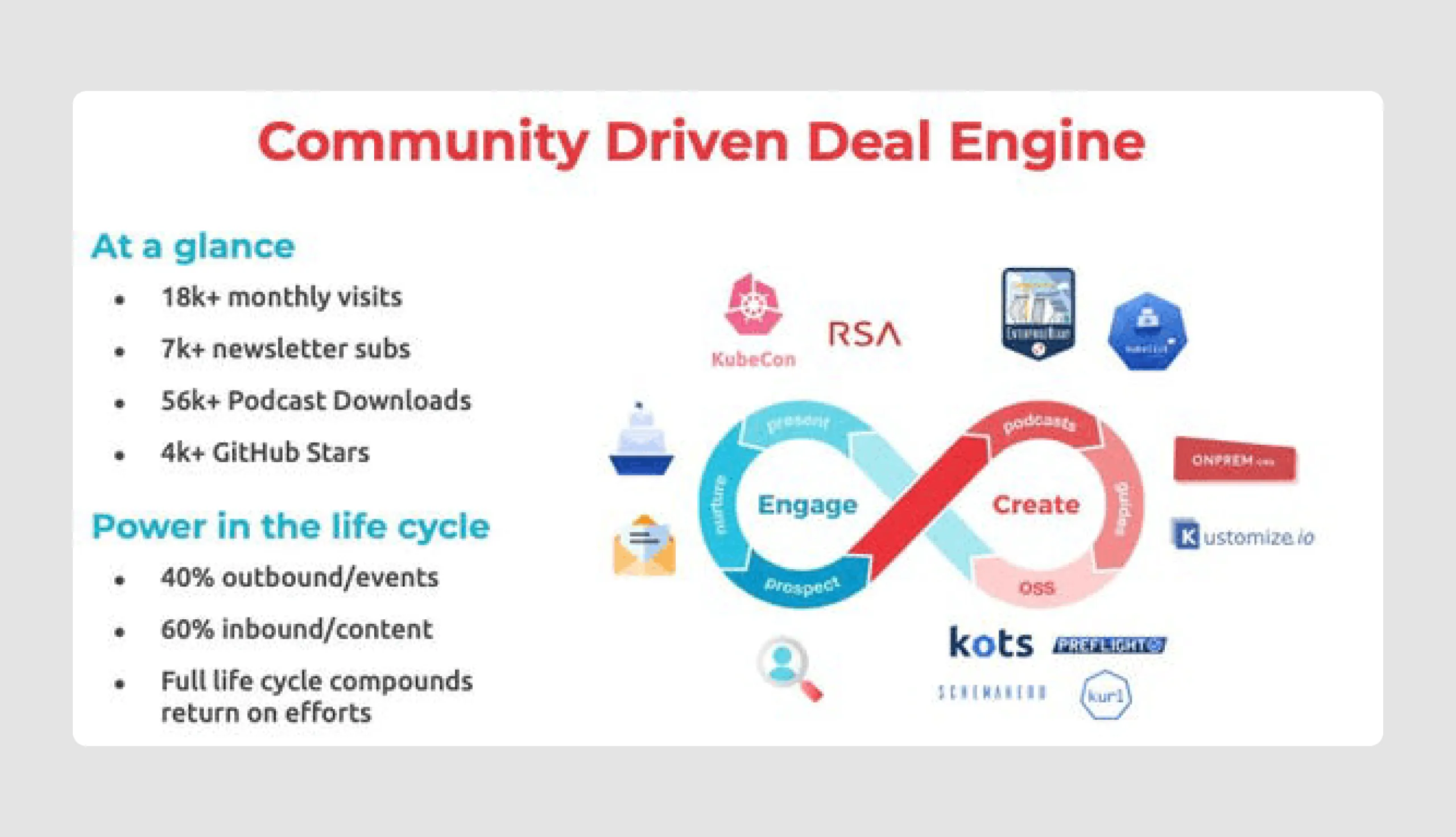
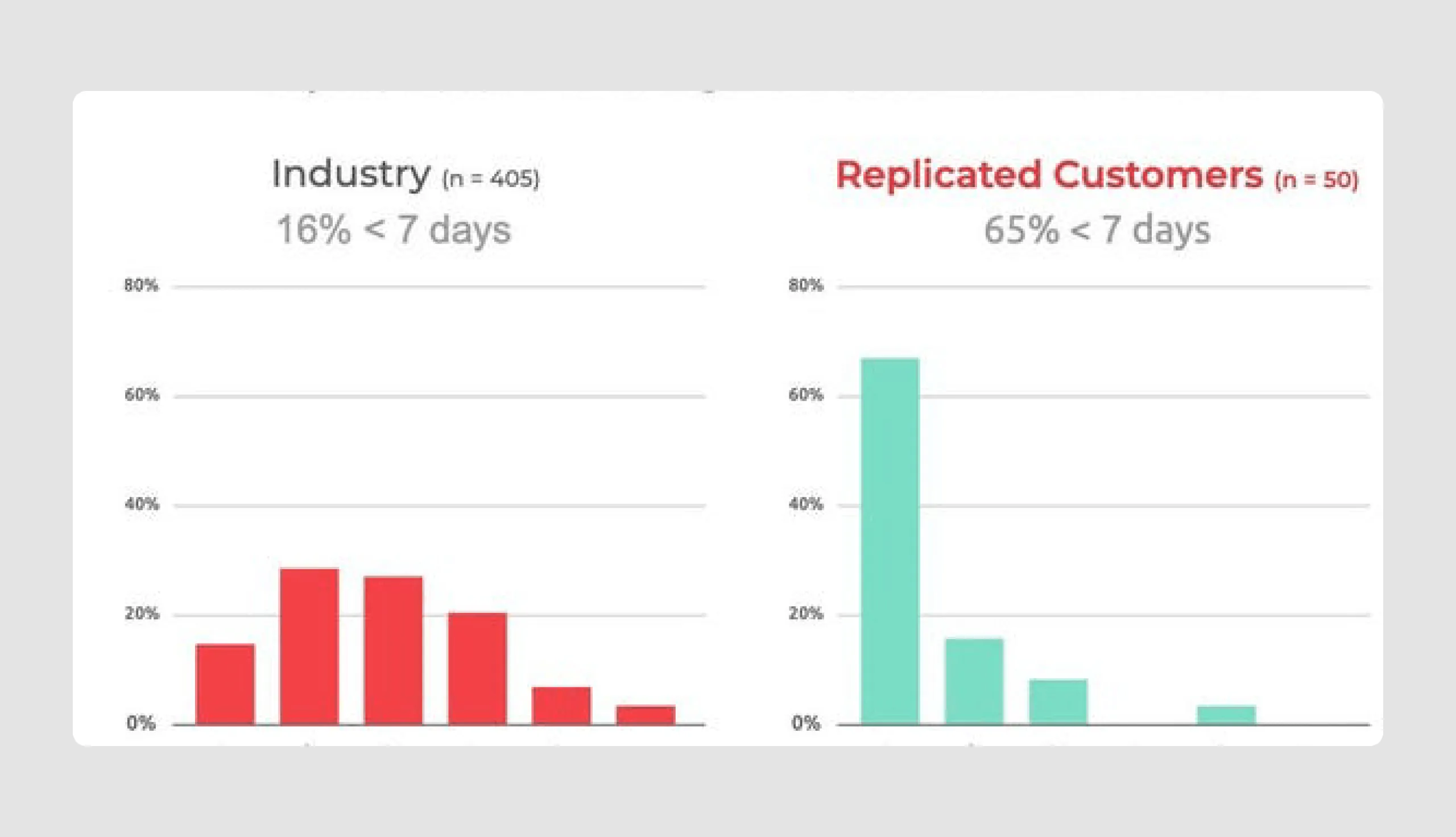
- Community & adoption strategy: Replicated presents a strong go-to-market strategy with community-driven growth metrics (such as GitHub stars and newsletter subscribers), demonstrating product interest and engagement.
- Future vision with funding goals: Their funding history and plans slide gives a clear outline of how the raised capital will be used, focusing on talent acquisition and product growth, which reassures investors of strategic scaling.
Design strengths
- Concise & visual-friendly: Each slide is visually engaging with minimal text and effective icons, ensuring easy readability and focus on key messages.
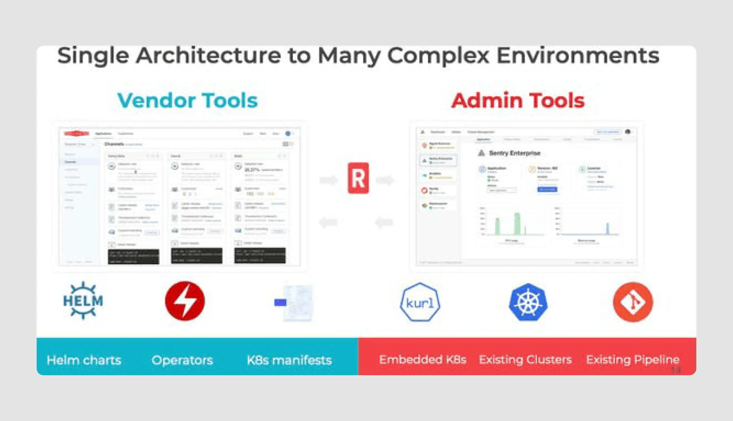
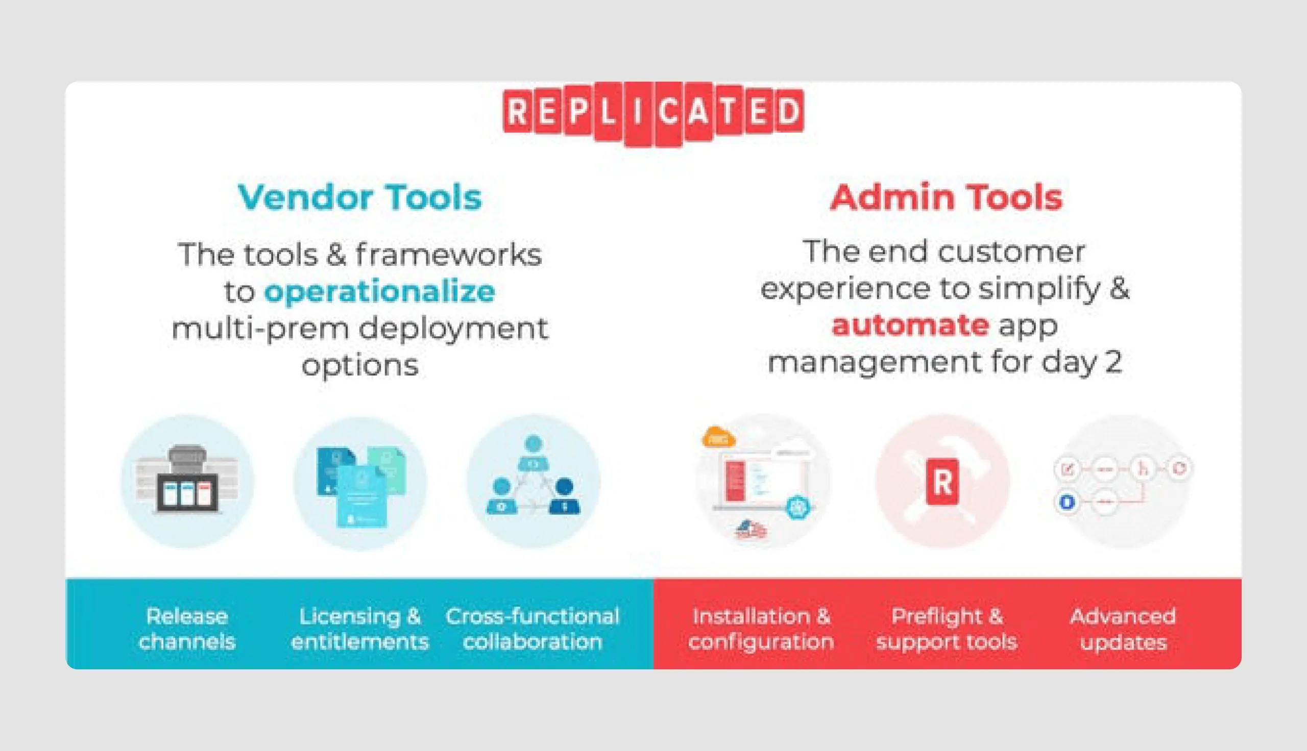
- Strategic use of diagrams and icons: Diagrams and icons, especially on the tools and features slides, clarify complex processes, improving audience understanding.
This slide deck successfully balances informative content with design, making it visually appealing and straightforward for investors who want to raise money.
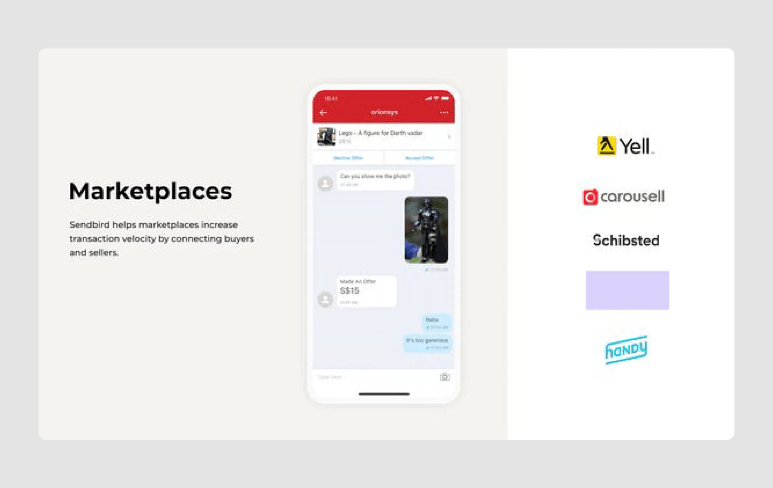
18. Sendbird ($100m)
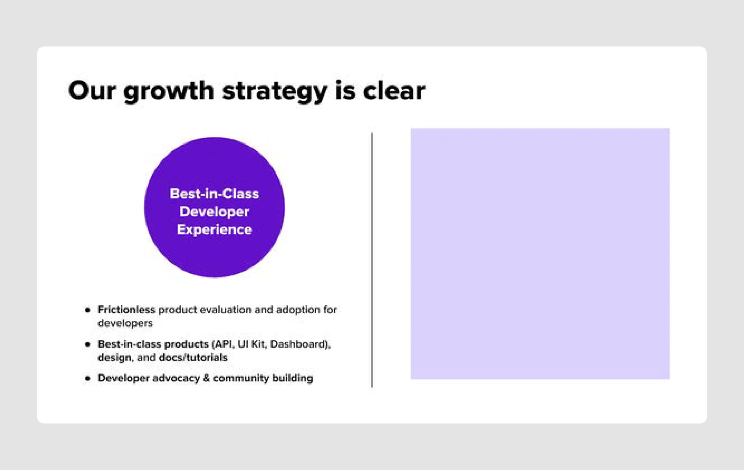
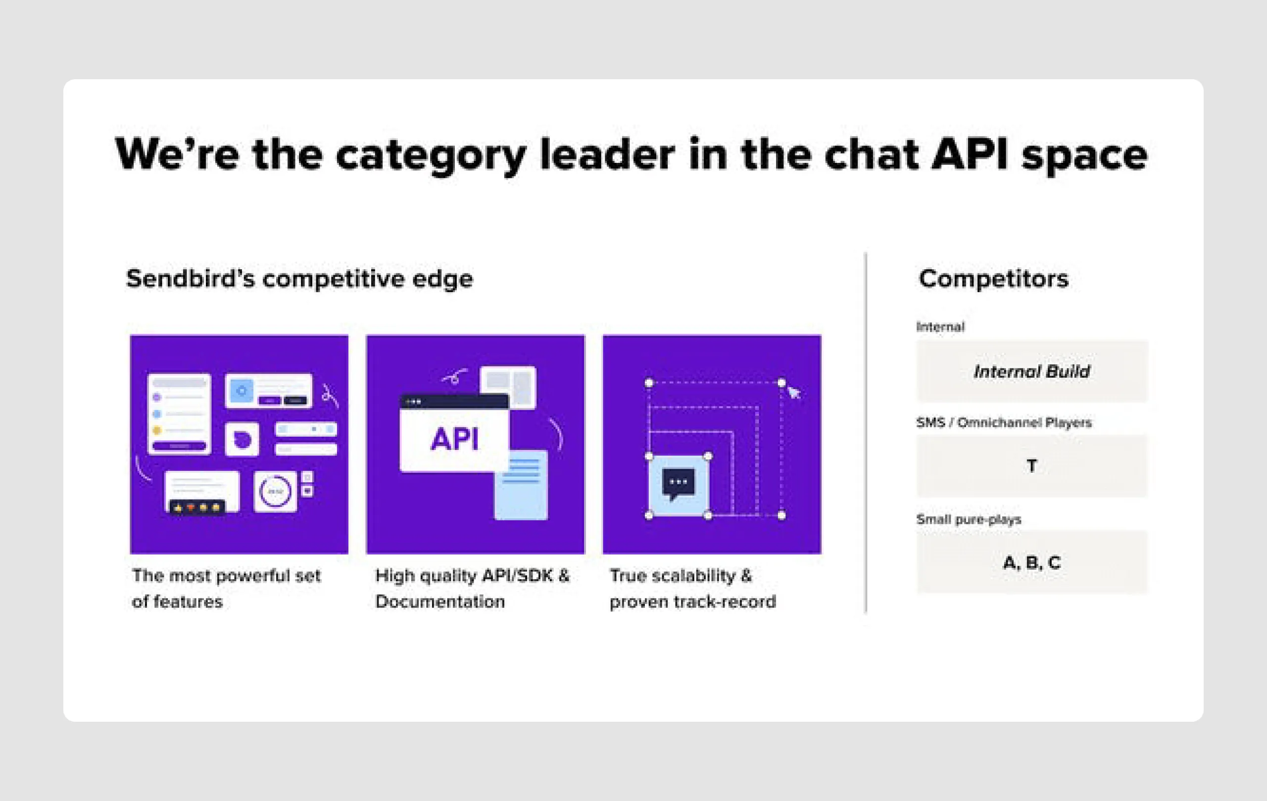
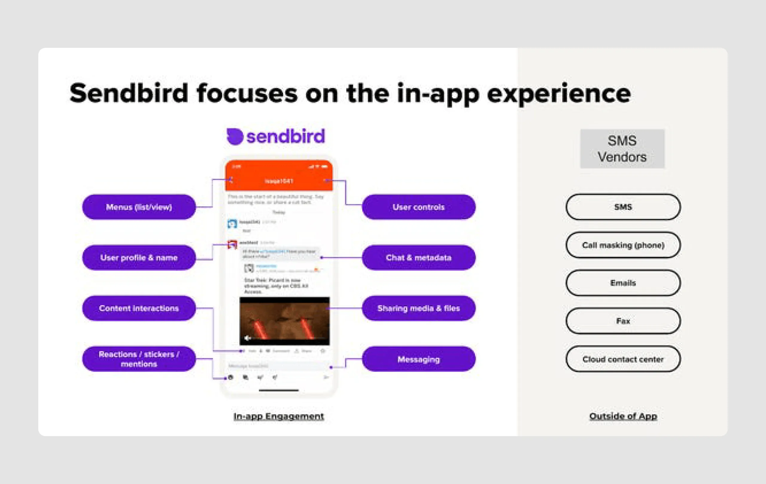
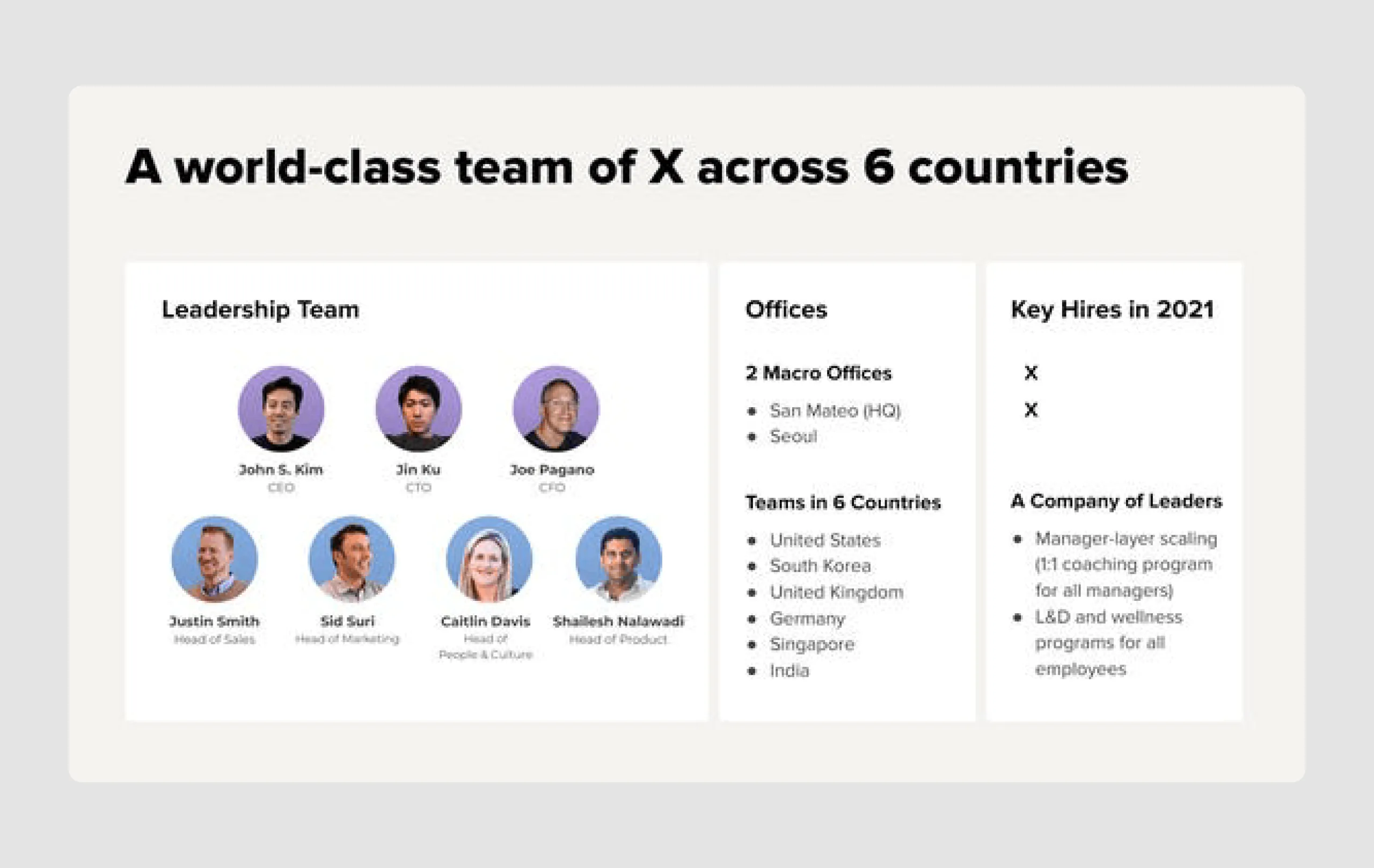
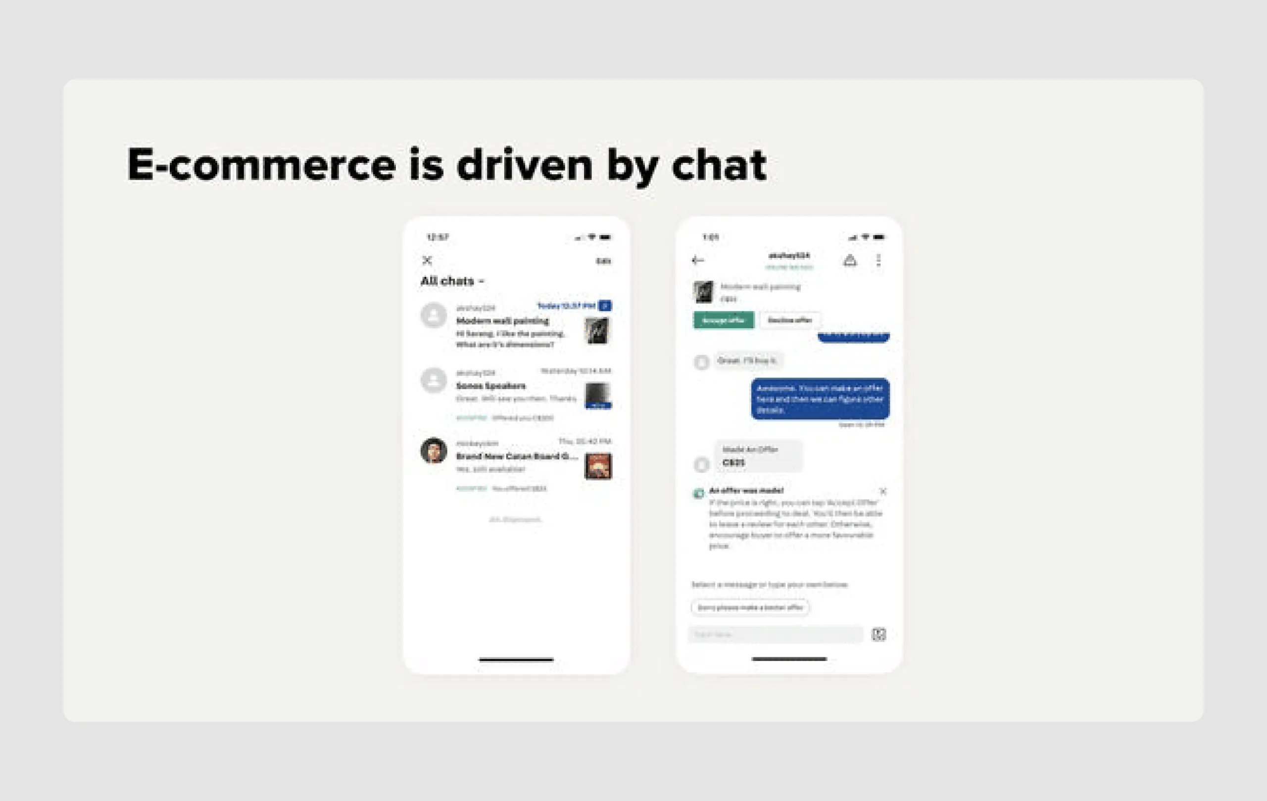
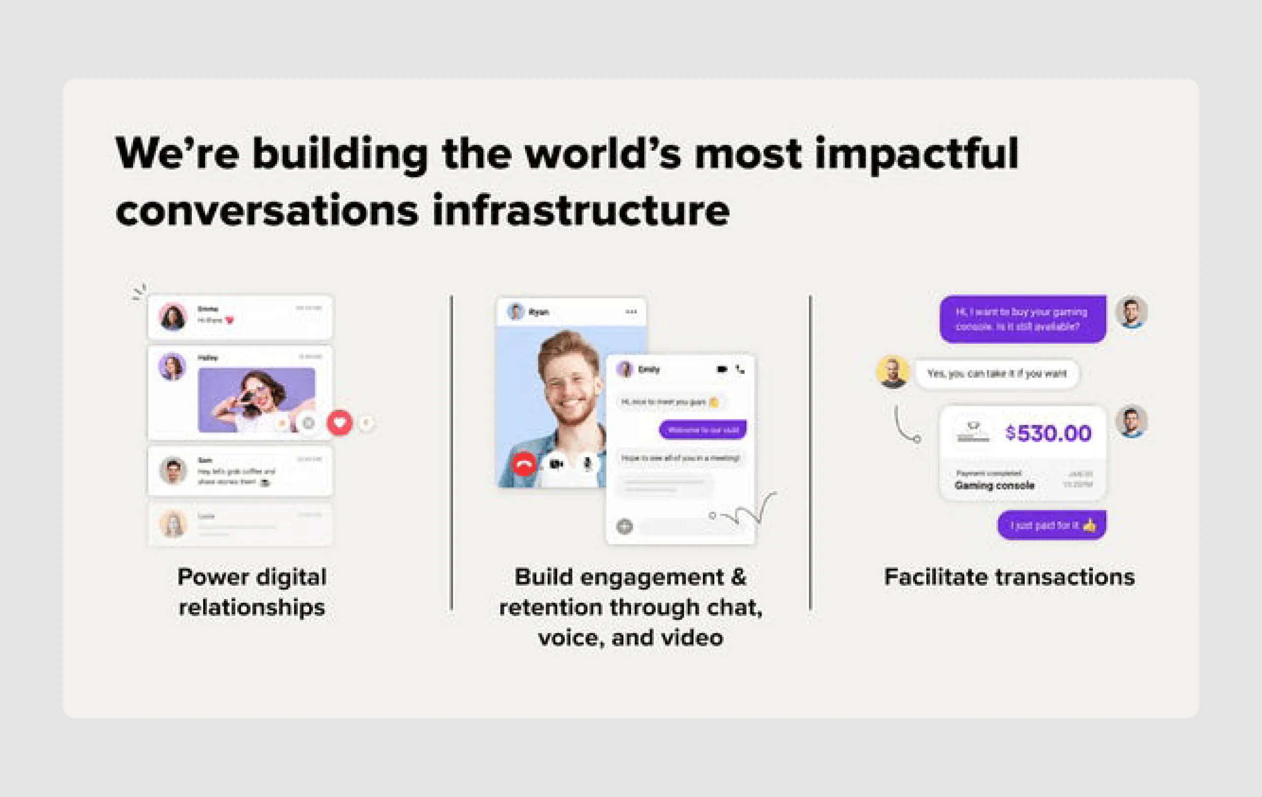
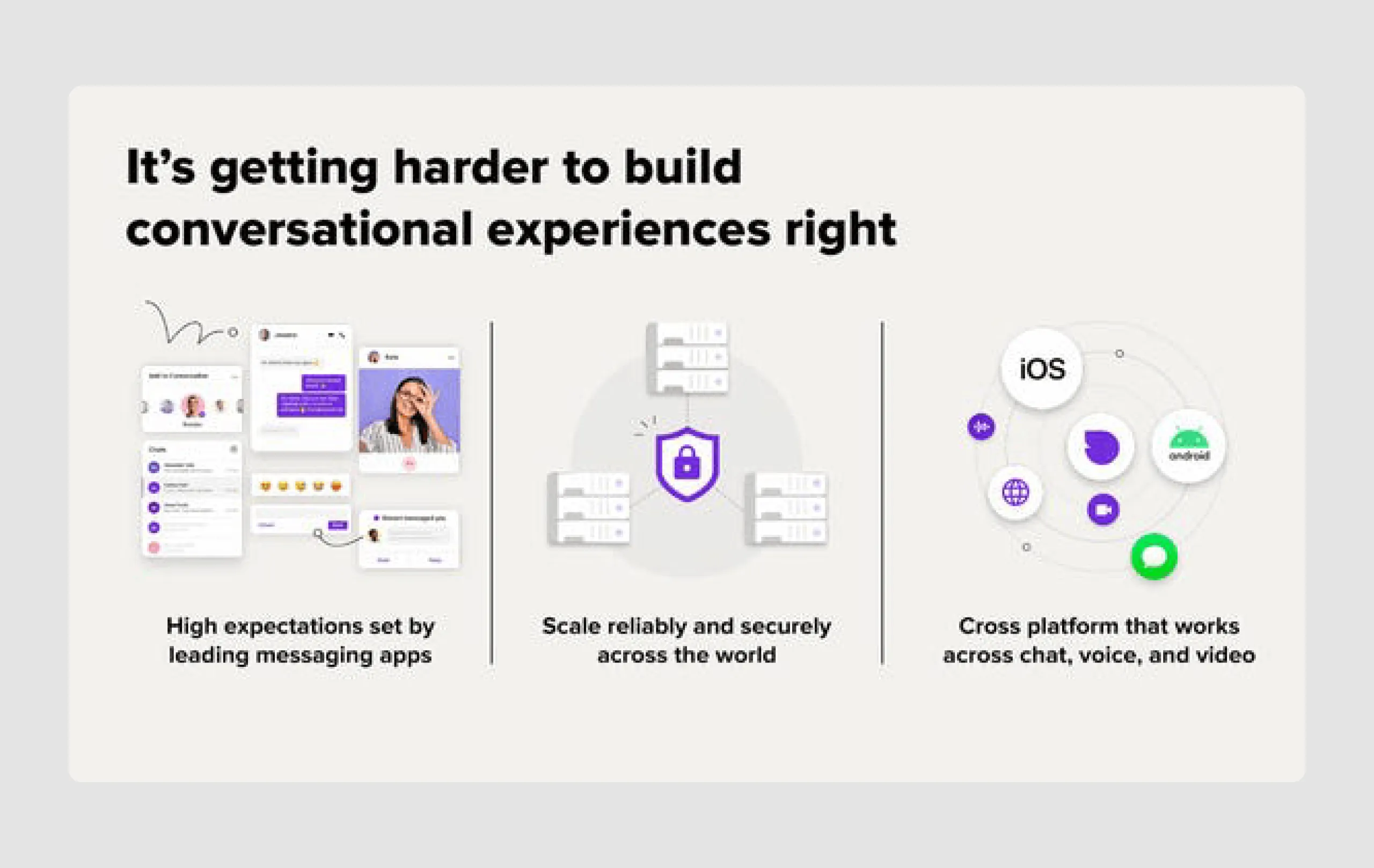
Sendbird is a messaging-as-a-service API provider that enables in-app chat, voice, and video messaging for mobile apps and websites. The goal of investment gained was to enhance their product, expand the team, and invest in R&D to maintain their position as a top choice for brands seeking authentic, real-time customer communication solutions.
Content strengths
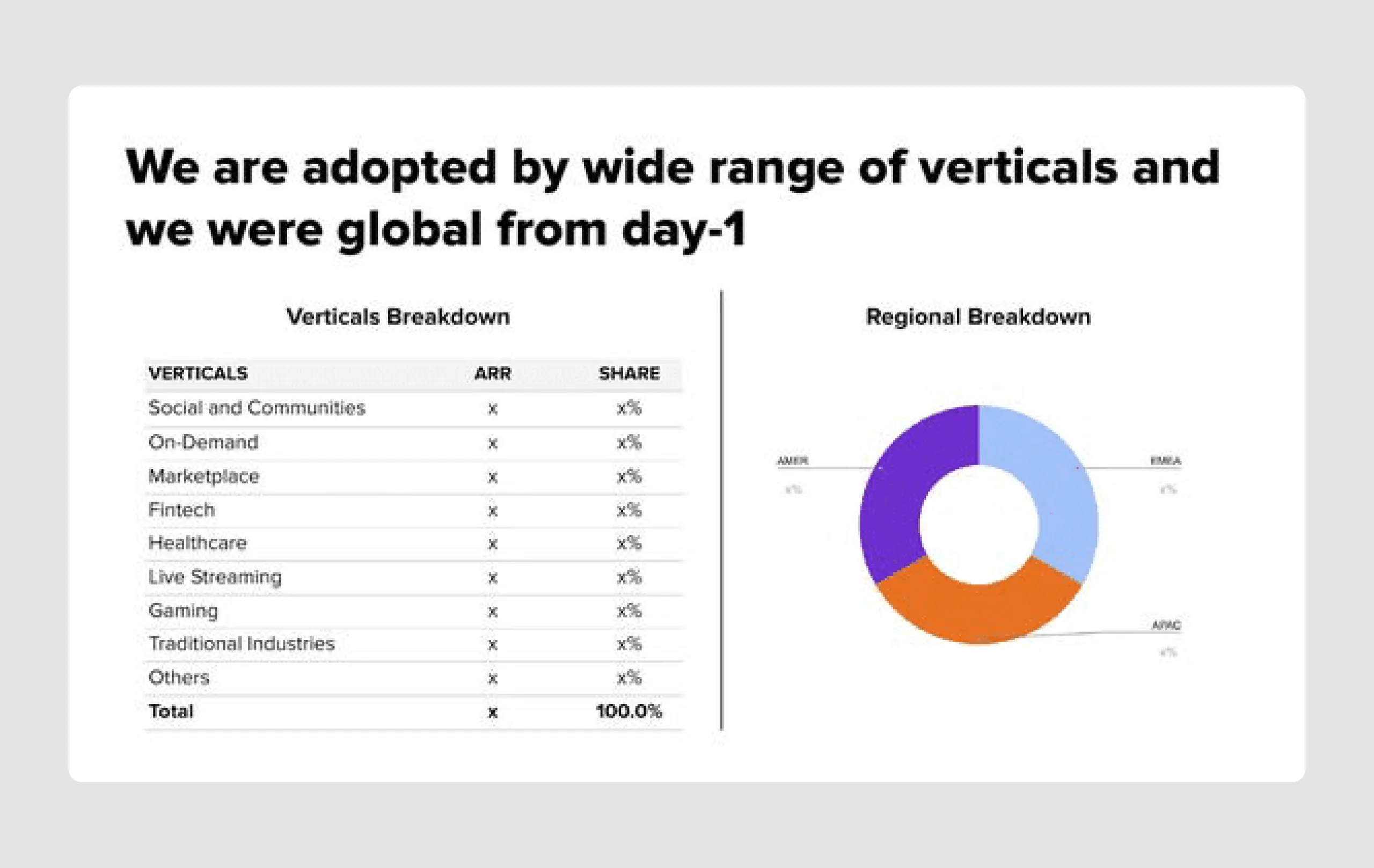
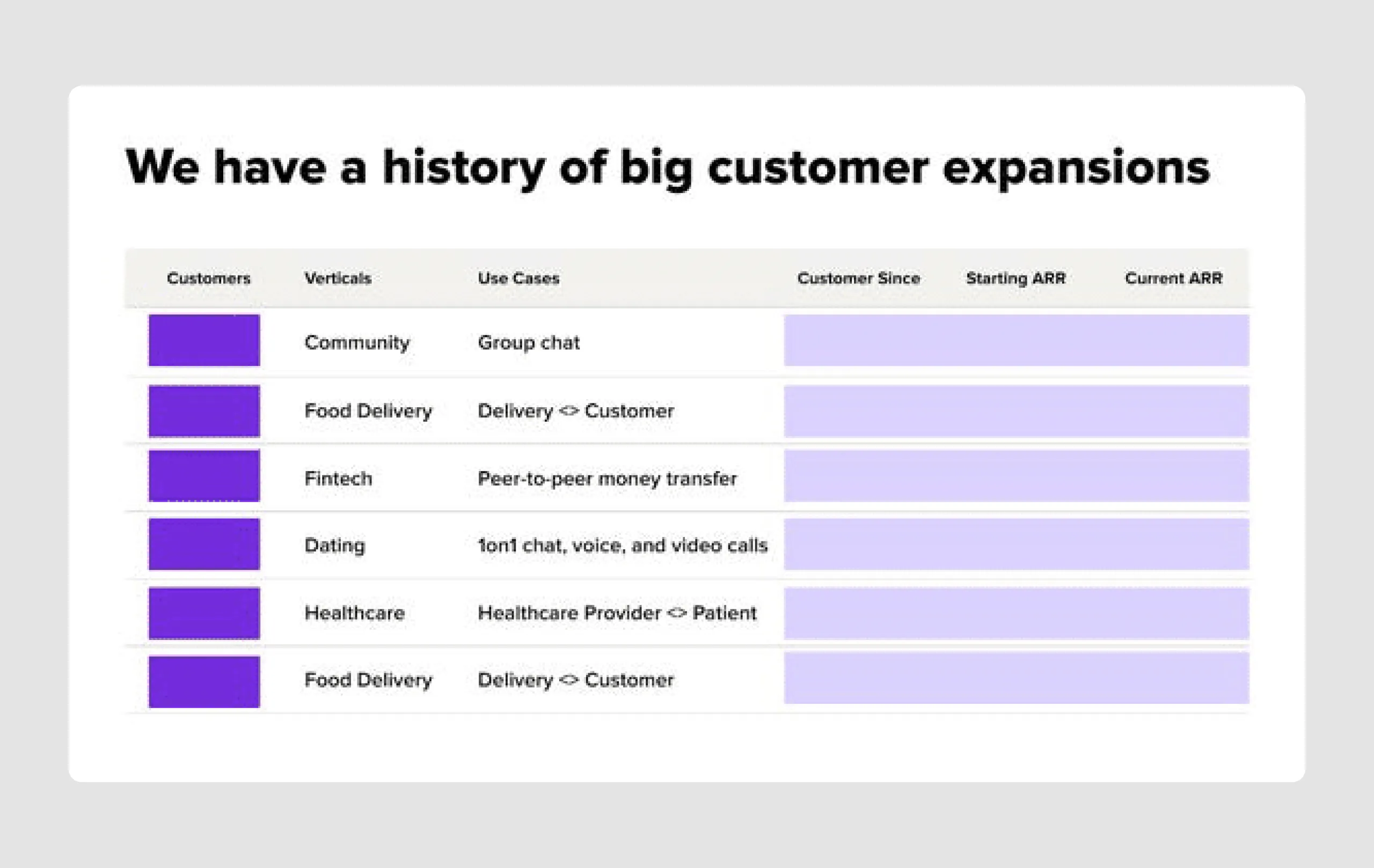
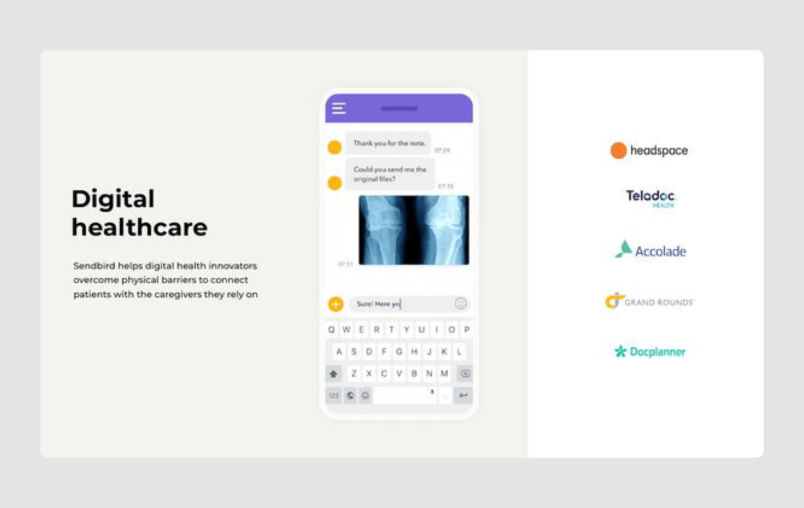
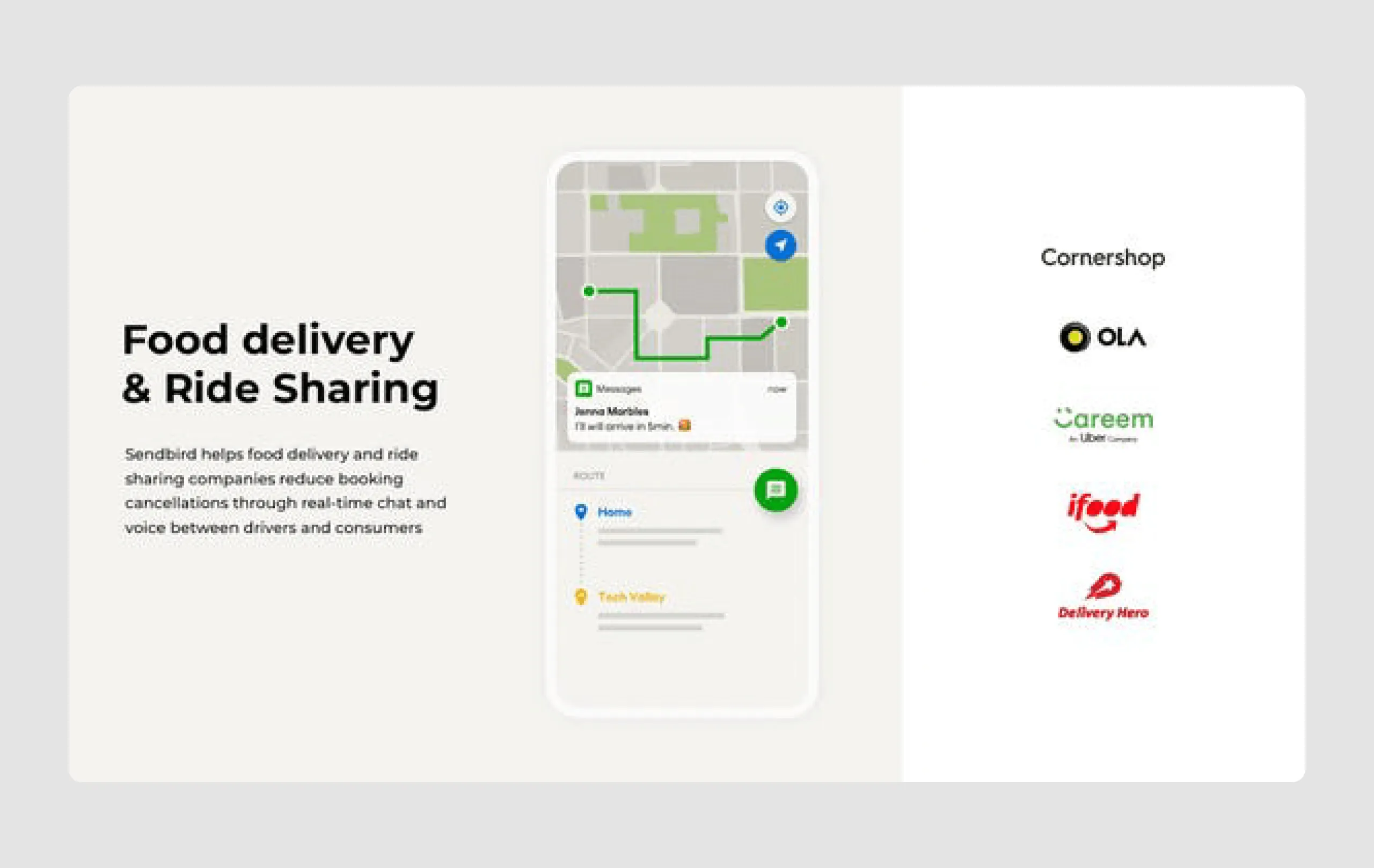
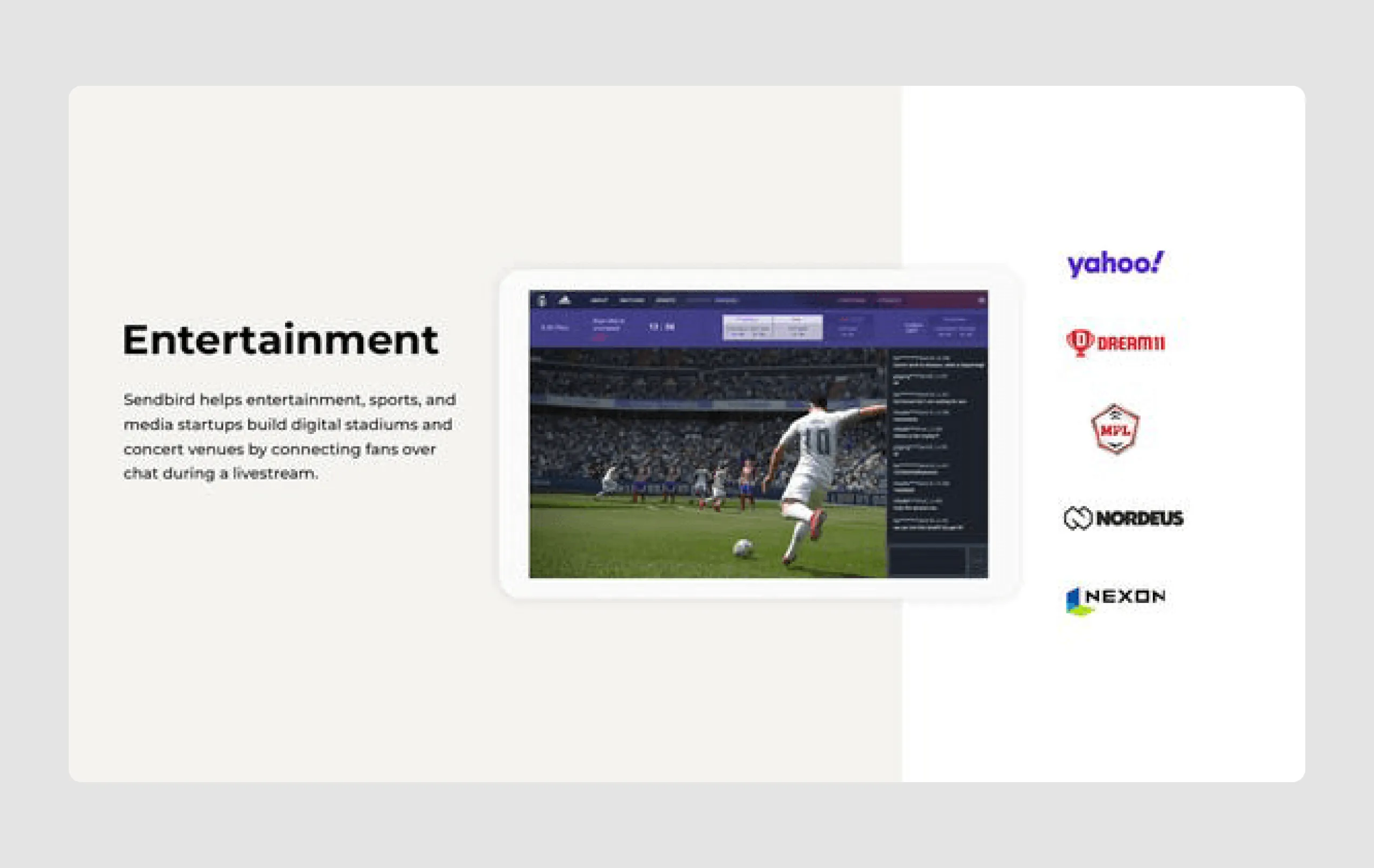
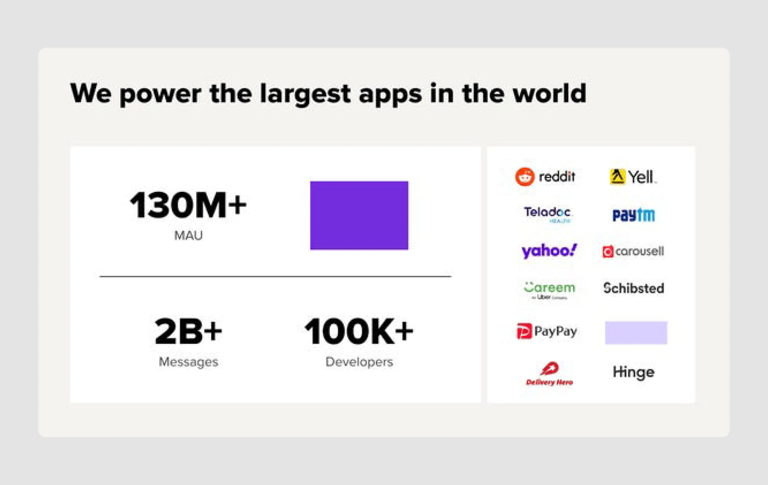
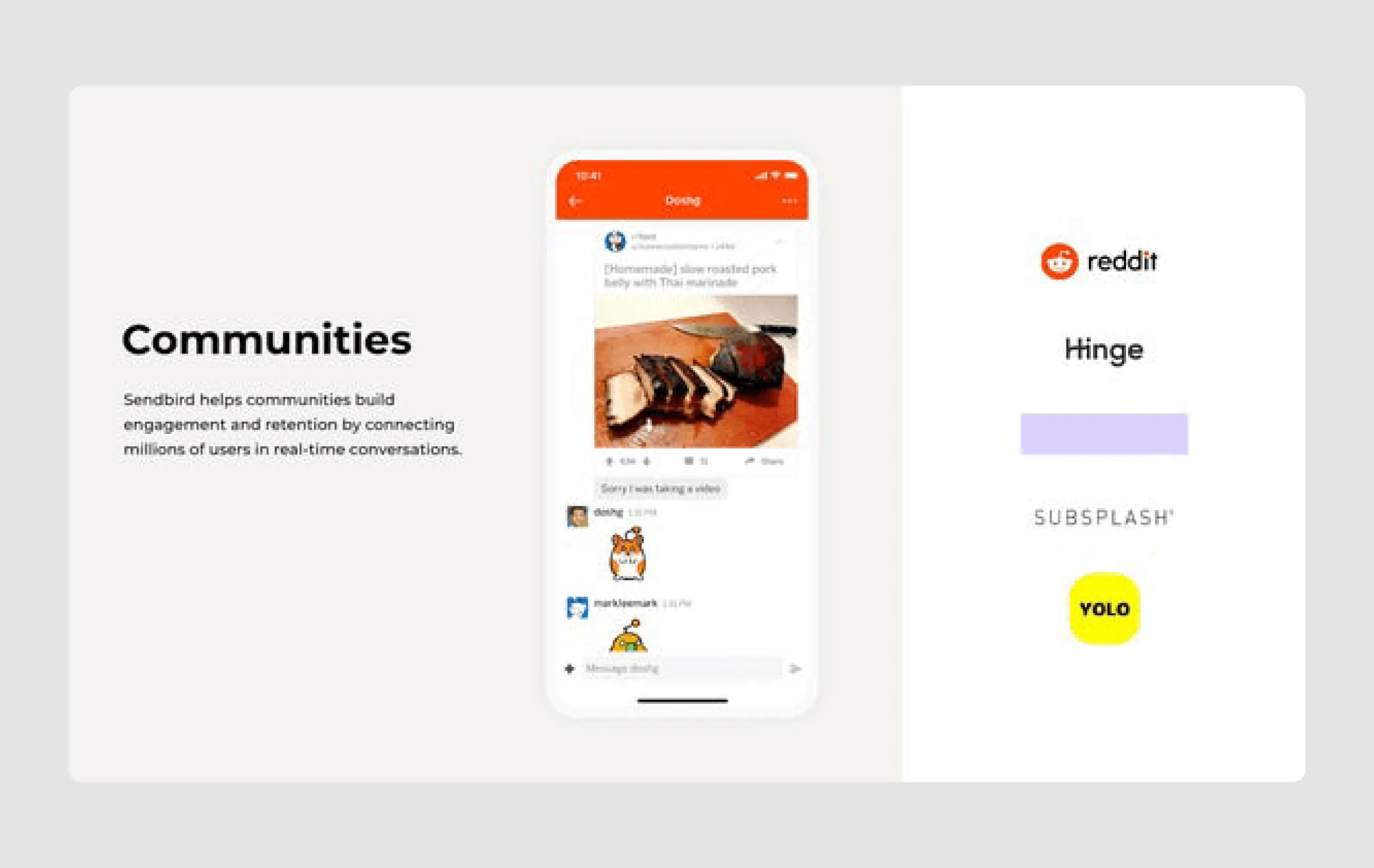
- Strong customer base: The deck features an impressive list of well-known clients, reinforcing Sendbird’s credibility and industry acceptance. It indicates Sendbird’s scalability and trustworthiness.
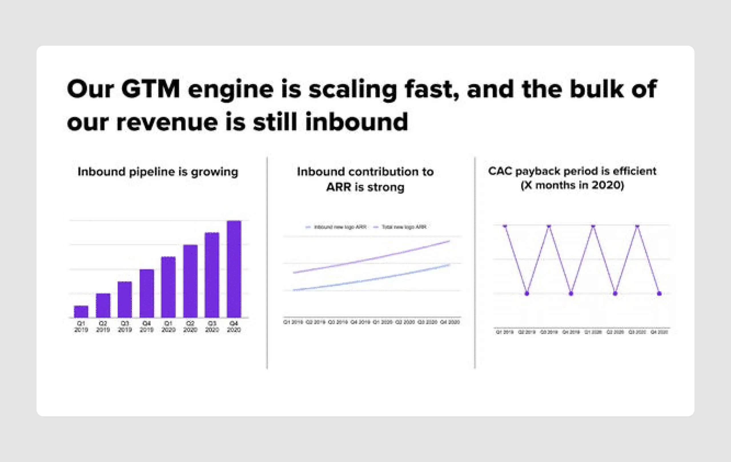
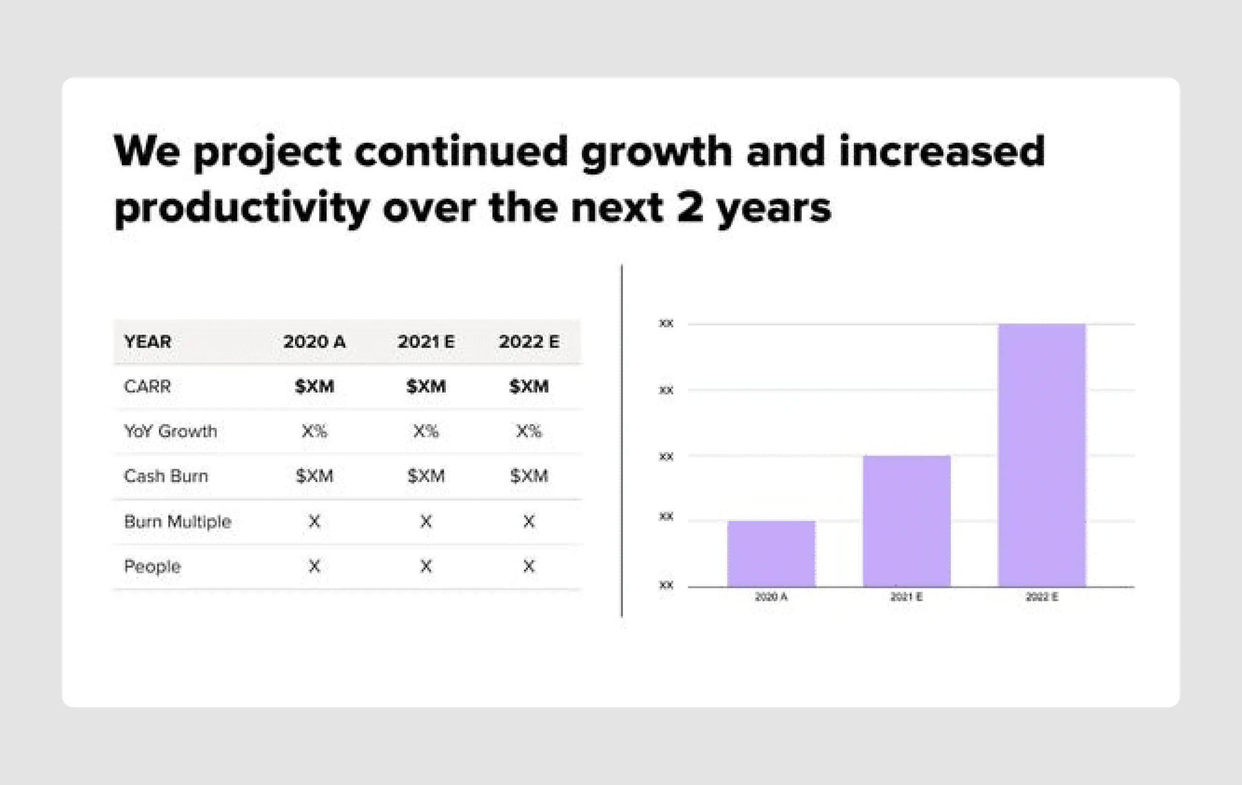
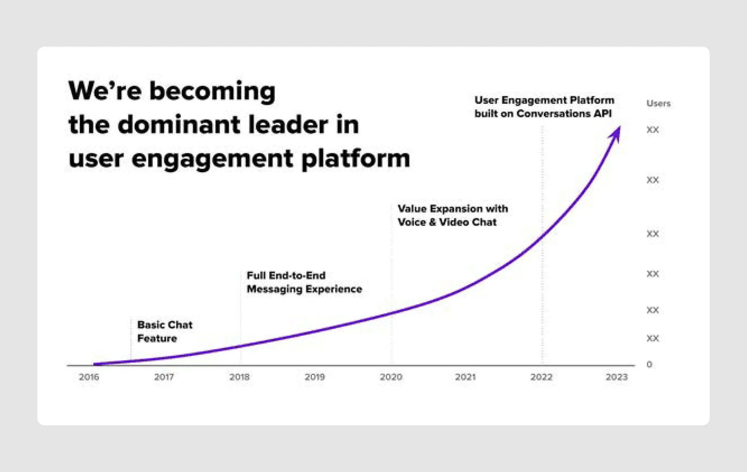
- Revenue and growth metrics: Detailed growth metrics, including monthly active users, message volume, and developer engagement, are presented effectively, demonstrating traction and market validation.
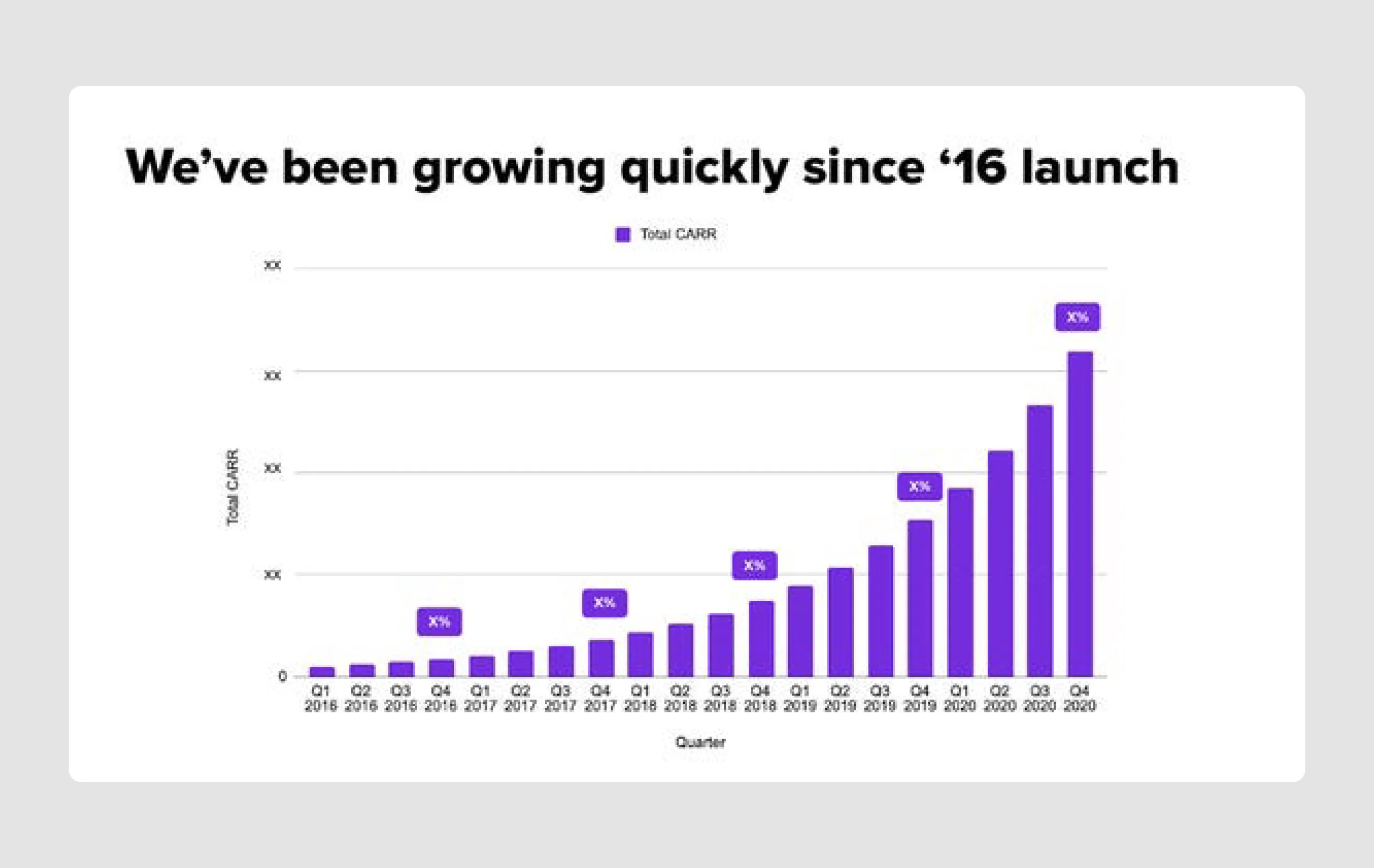
- Financial transparency: Information on CARR (Committed Annual Recurring Revenue) and customer acquisition metrics provides transparency and reassures investors of Sendbird's financial health and growth potential.
Design strengths
- Effective use of visuals: The deck uses charts, graphs, and icons effectively to illustrate data and concepts, making complex information easier to understand.
- Use of social proof: Featuring logos of high-profile clients and clear examples of use cases builds trust and illustrates real-world applications.
- Clear headers and subheadings: Each slide is topped with a straightforward title that guides the reader, making the deck easy to navigate and comprehend quickly.
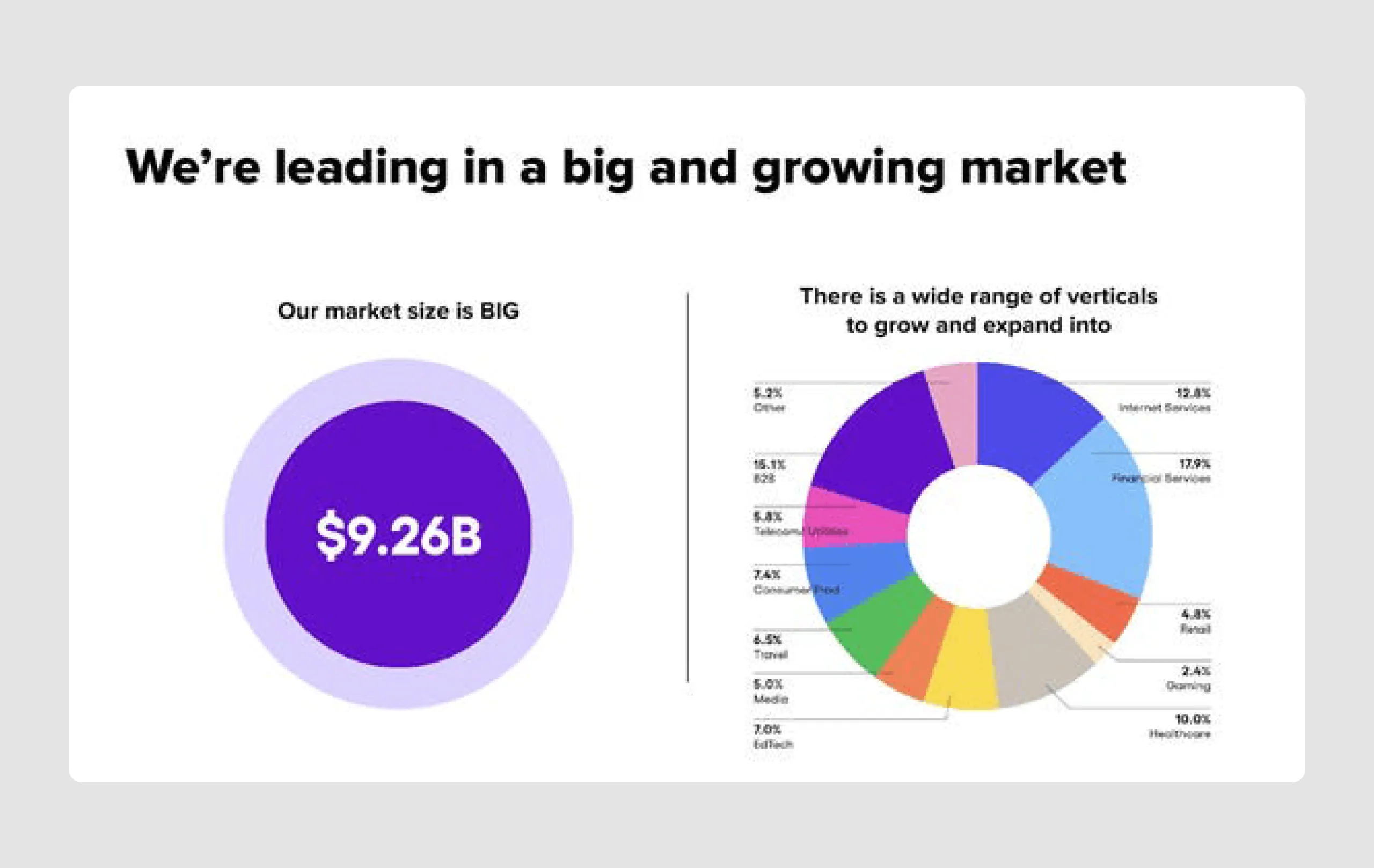
- High-impact statements: The design draws attention to important figures and milestones, like "$9.26B market" and "130M+ MAU," creating a sense of momentum and scale.
Overall, this successful pitch deck is strong due to its clear messaging, visual appeal, and the strategic presentation of data and growth potential. It’s also a good reminder that many decks win not because they’re quite flashy, but because they’re just simply well-structured and skillfully designed.
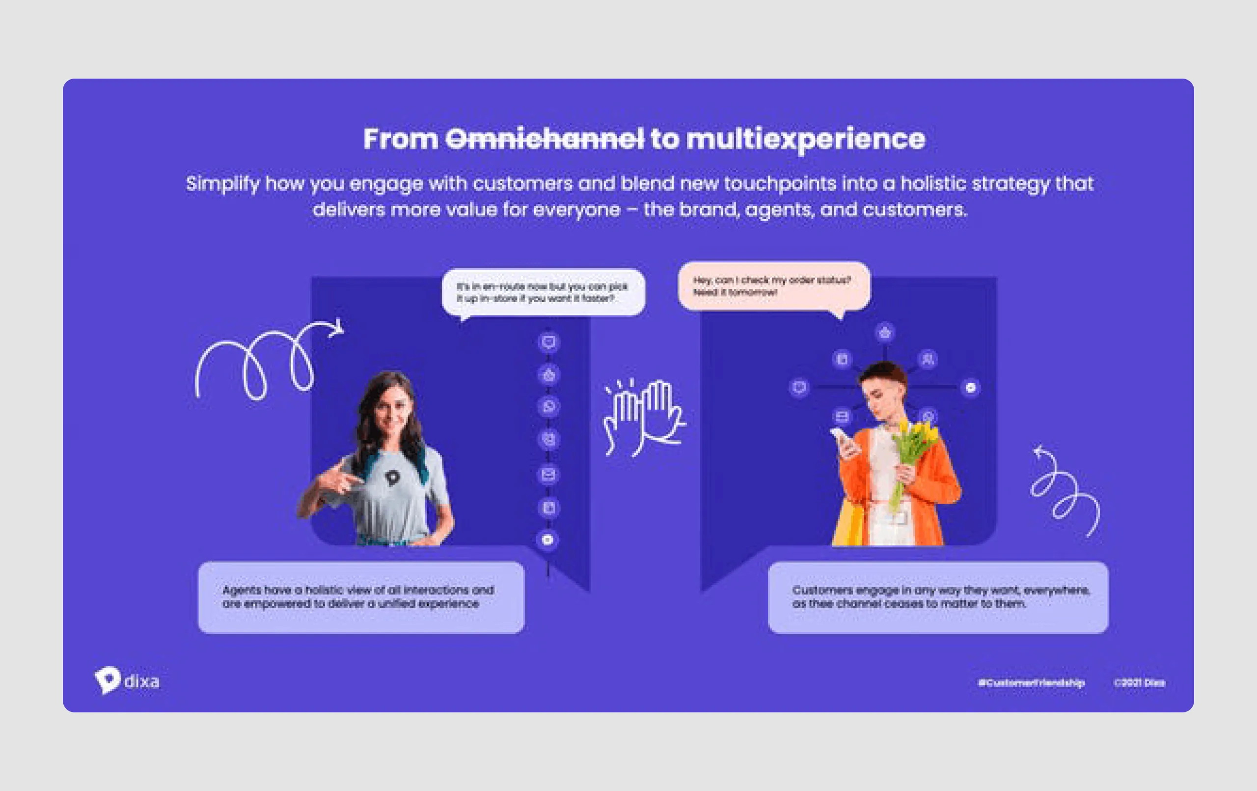
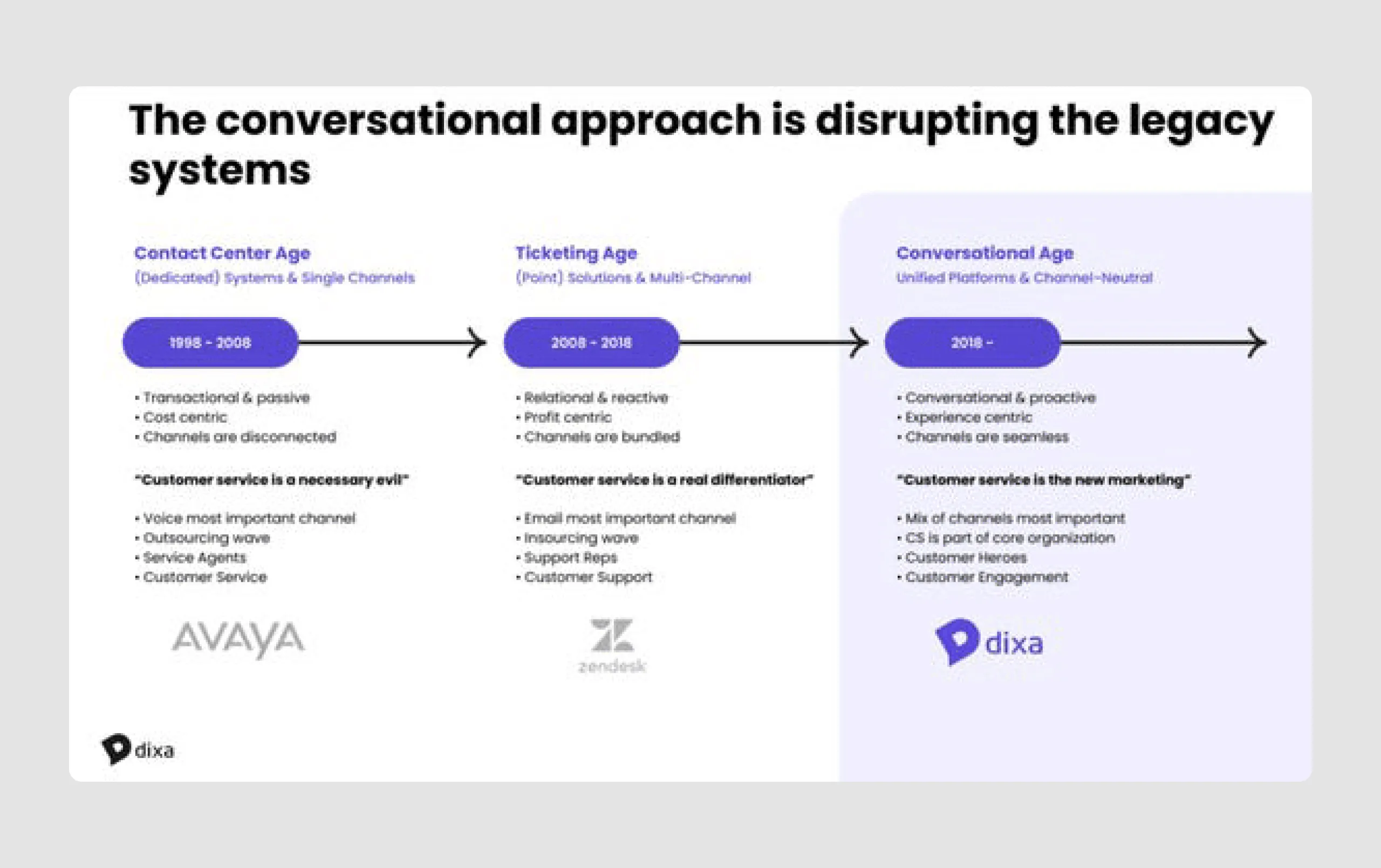
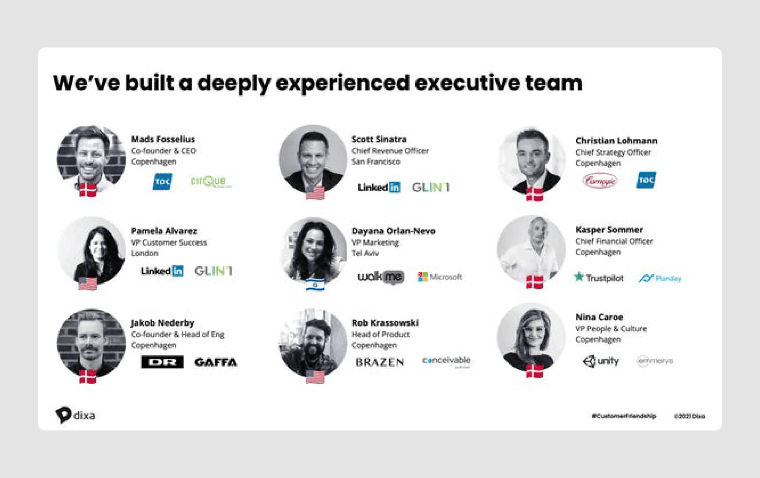
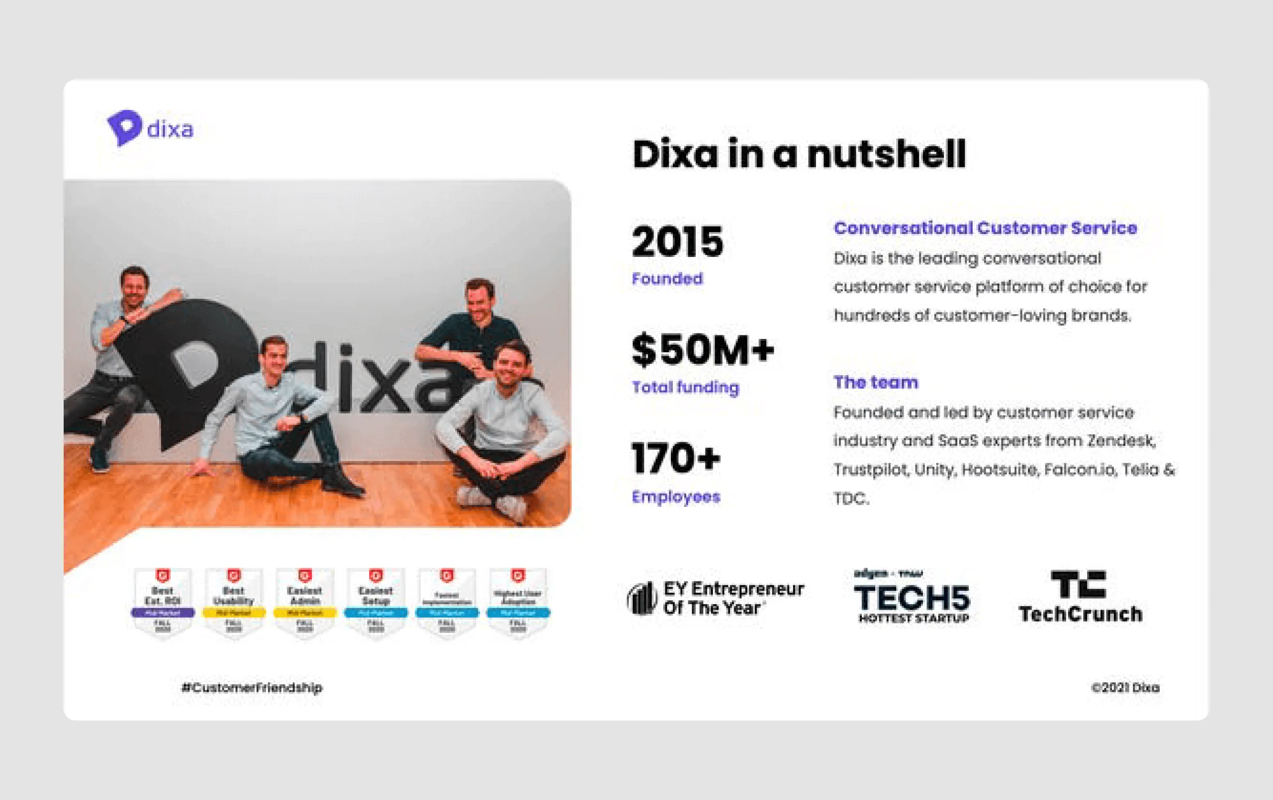
19. Dixa ($105m)
Dixa is a customer service platform designed to improve customer-agent interactions by unifying all communication channels (like email, chat, phone, and messaging) and customer data into one system. The raised funding was aimed to help expand Dixa’s global presence, enhance product development, and grow the engineering team, especially after acquiring the AI customer service tool Elevio.
Content strengths
- Customer testimonials and case studies: Real-life examples, like Rapha, demonstrate the platform’s impact, with metrics (e.g., +14% customer experience lift, +22% retention boost) adding credibility to Dixa’s claims.
- Experienced leadership team: The deck highlights a diverse and seasoned executive team with backgrounds in SaaS, tech, and customer service, adding confidence in the company's ability to scale.
- Scalable growth strategy: Plans to improve agent experience and streamline operations are presented, showing a focus on sustainable growth by empowering the team and enhancing service quality.
Design strengths
- Consistent branding: The deck maintains a cohesive visual identity with a calming, professional color scheme (primarily purple), reflecting Dixa’s brand personality as customer-focused and innovative.
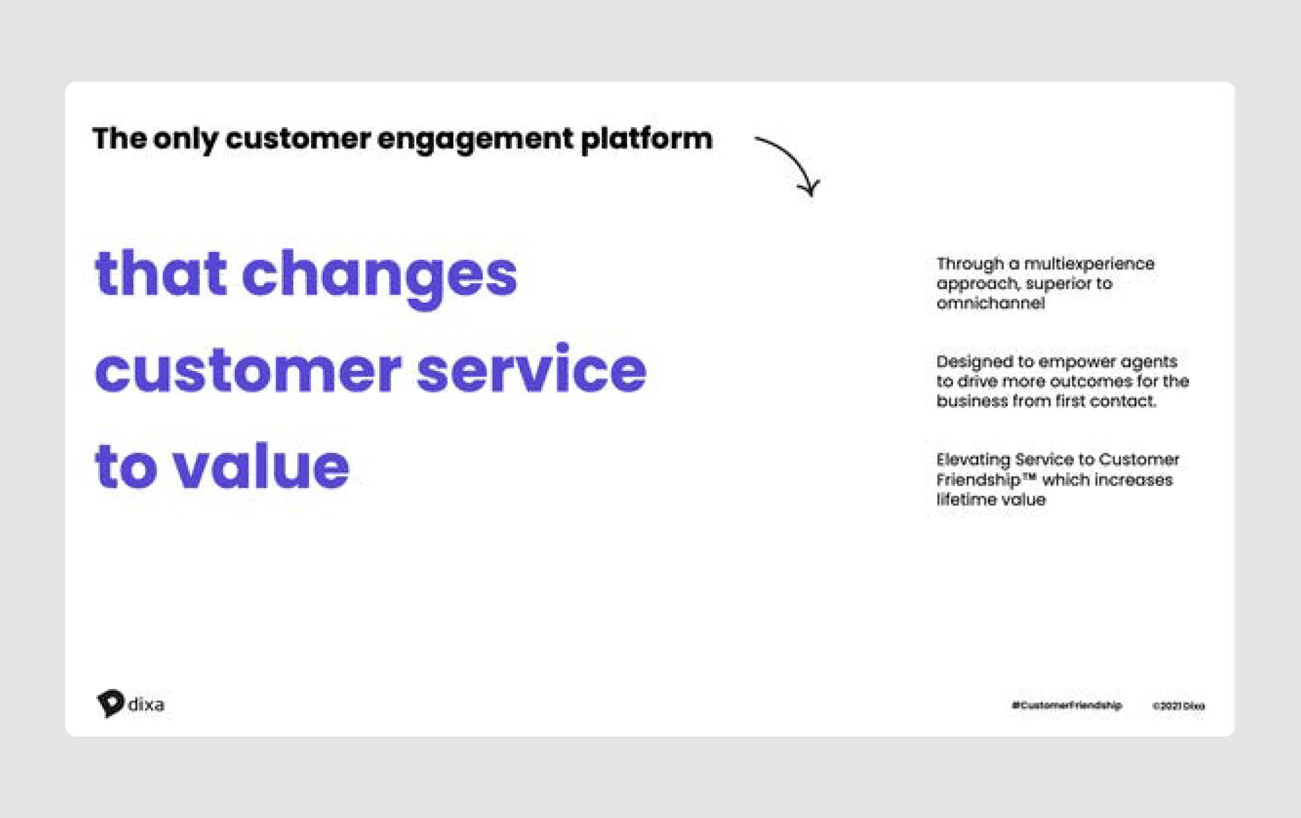
- Engaging visuals: It uses minimal text with well-placed visuals and icons to emphasize key points, making the information easily digestible and visually appealing.
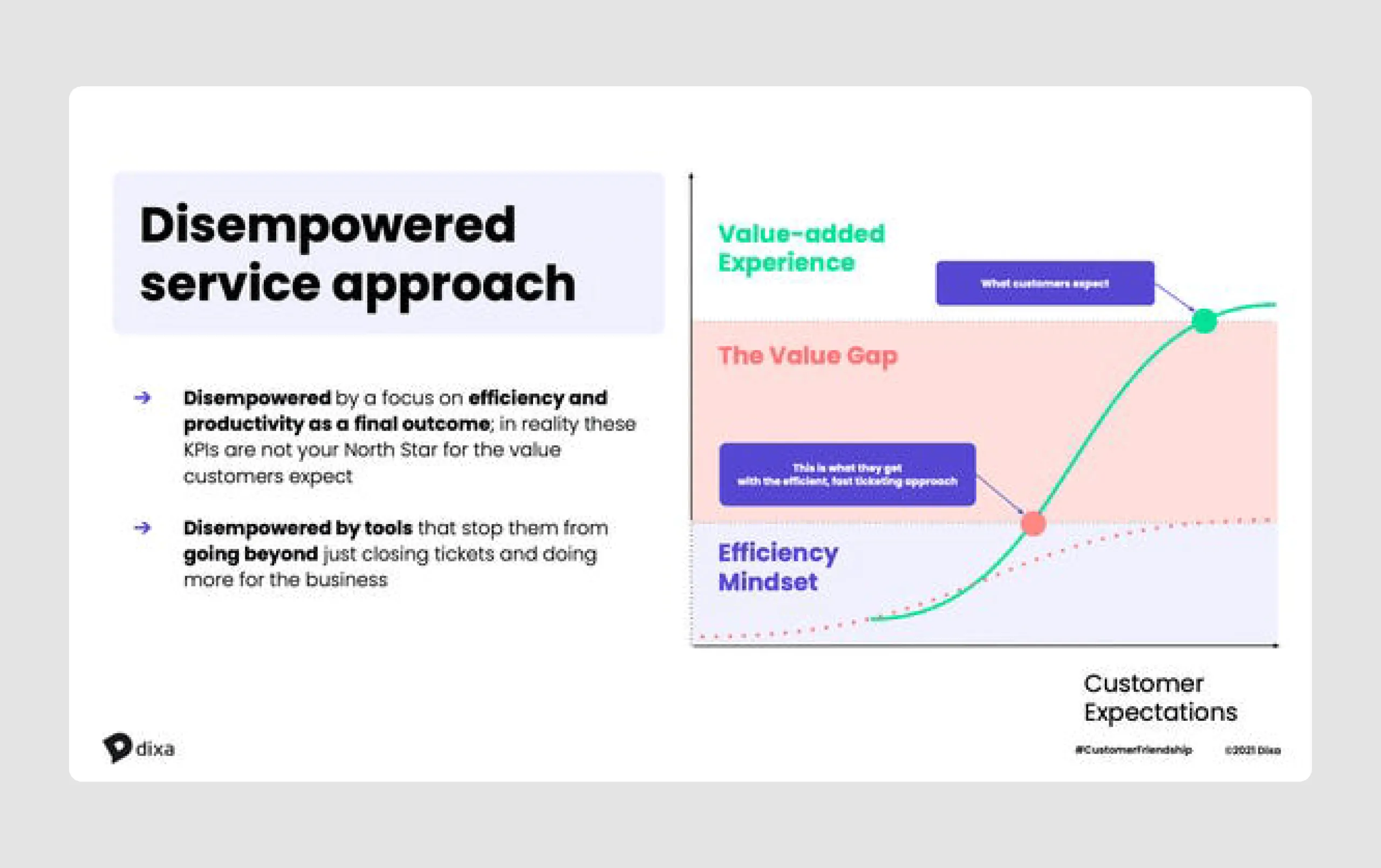
- Impactful use of data: The deck integrates visual data, like growth charts and market size, to substantiate its claims without overwhelming the viewer, adding credibility and enhancing clarity.
The Dixa pitch deck engages the viewer by showcasing Dixa’s unique position and growth potential, supported by compelling visuals and user-centric content. This approach likely contributed to securing their Series C funding.
Pitch deck tips (+ template)
After looking through these startup effective pitch deck examples, you've seen many inspiring elements to use; however, they also contain mistakes that you should avoid. So, to help you create a strong design that will save time , we've put together tips based on our design experience and YCombinator's advice.
1. Keep your points focused on your company.
- Limit your deck to 5-7 key points you want investors to remember.
- Avoid trying to cover every detail; stick to memorable, impactful ideas.
A clear structure will help you attract potential investors without making them work to understand your pitch.
2. Make the slides legible.
- Use large, bold fonts with high contrast to the background.
- Place key text at the top for visibility, especially for larger audiences.
- Avoid clutter that makes text hard to read.
Your FIRST SLIDES should already set expectations and make the deck feel easy to follow.
3. Make simplicity your main priority.
- Each slide should communicate only one idea.
- Limit your deck to around 7-10 slides if possible.
- Avoid text-heavy slides; aim for brevity.
Because when you create a pitch deck, every slide should reasonably earn its place.
4. Ensure obviousness throughout the presentation slides.
- Test slides by showing them to someone unfamiliar with your pitch: if they can't understand it at a glance, simplify further.
- Highlight key takeaways directly on charts or visuals to eliminate guesswork.
- Avoid complex diagrams or overly detailed visuals that require extra interpretation.
A well-crafted pitch deck feels obvious in the best possible way.
5. Avoid common distractions.
- Skip unnecessary text, lengthy explanations, excessive branding, and animations.
- Keep humor minimal; it's the content, not the style, that should impress.
- Reserve complexity only to highlight a problem (e.g., a challenging industry landscape).
The goal isn’t to turn your deck into a flashy sales pitch, but to make a convincing case – from cover slide till the closing one.
6. Follow the overall rule of thumb.
Legible, simple, obvious. Stick to these principles to keep investors focused on your message, not your slides.
Bonus point
If you need a faster start, customizable templates can save time, but they still need to be tailored to your story.
Here's a link to Figma with a pitch deck template you can download and edit to fit your specific case. Feel free to use it.
Following these steps ensures your investor presentation is clear, engaging, and memorable for investors. Still, remember that a great pitch deck needs to be backed by a strong product. While your presentation matters, investors think beyond stunning visuals and ultimately invest in the solution you're building. Eleken can help you create an MVP design that will impress advisors, investors, and customers alike.








































%2520cover.png)


