Great Power Influence
The MVP design concept for a data science product for defense and intelligence services
Nowadays, when everyone on Twitter is a geopolitics expert, the value of real knowledge gets higher. And thanks to big data and machine learning, it becomes easier to get unbiased information.
That’s the niche that our client was tapping into. It is not aimed at average Twitter experts, but can be used on higher levels. Just imagine an app that gives you answers to questions like “Do Russia-Ukraine relations tell us anything about China and Taiwan?”.


Great Power Influence product is a data science-powered, web-based application for the US defense enterprise and intelligence community
The clients came to us with just an idea, and the design concept was built from scratch. The task was to create an interface that would demonstrate how a pair of states interact along the DIME (Diplomatic, Informational, Military, and Economic) vectors of influence.
One designer was working on the project for two months with almost unlimited freedom in terms of visual style. The clients wanted the design to be modern, clean, and simple, or, as they say, “dumb enough for a general to understand”.
Understanding complex data- and tech-heavy products
Grasping the technology behind the product was the biggest challenge for us. Geopolitics and defense is not a very common object among our SaaS clients, while understanding the product is the key to good UI/UX design.
We were lucky, because the client was ready for regular calls, where they explained all the essential information.
This is what we call a perfect designer-client collaboration: when the designer gets to talk with different team members, and not just the product owner.
From the client’s side, there were also researchers and engineers on the meetings. They explained to the designer all the theory behind the product.
Deep Q-learning, DDPG, Proximal Policy Optimization, Dimensionality Reduction/ Preprocessing, Gaussian Mixtures… These are just some of the terms from the FigJam board where we were brainstorming about the information architecture of the product.
From there, we went on with the fundamentals of the application: the site map. The application was split into sections, which were global, diplomatic, informational, military, economic, and also the block of user pages such as setting, help, and so on.

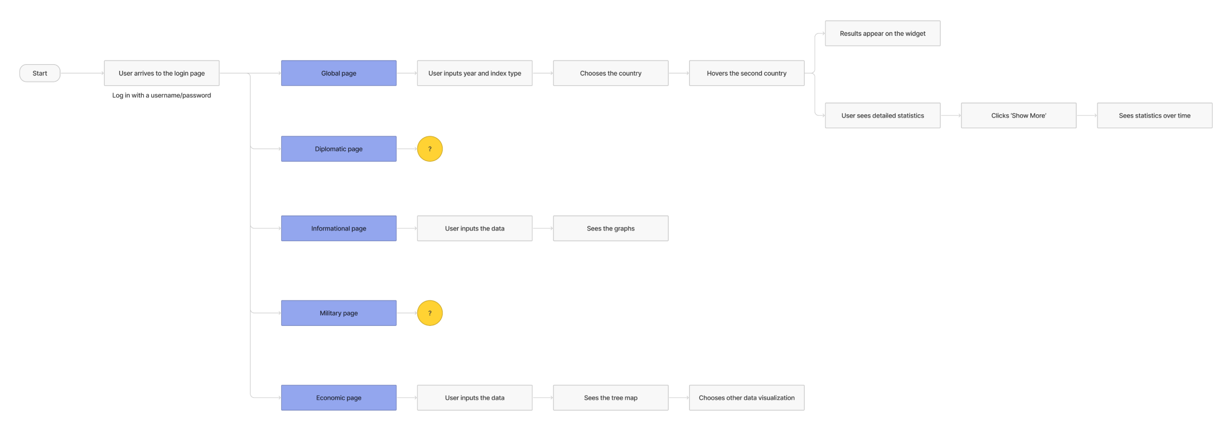
Next, we started working on the user flow. Clients already knew their users' profiles well, so, for the first user flow, people go from login to Global page and then look at statistics of influence between two countries.
Highlighting the most important
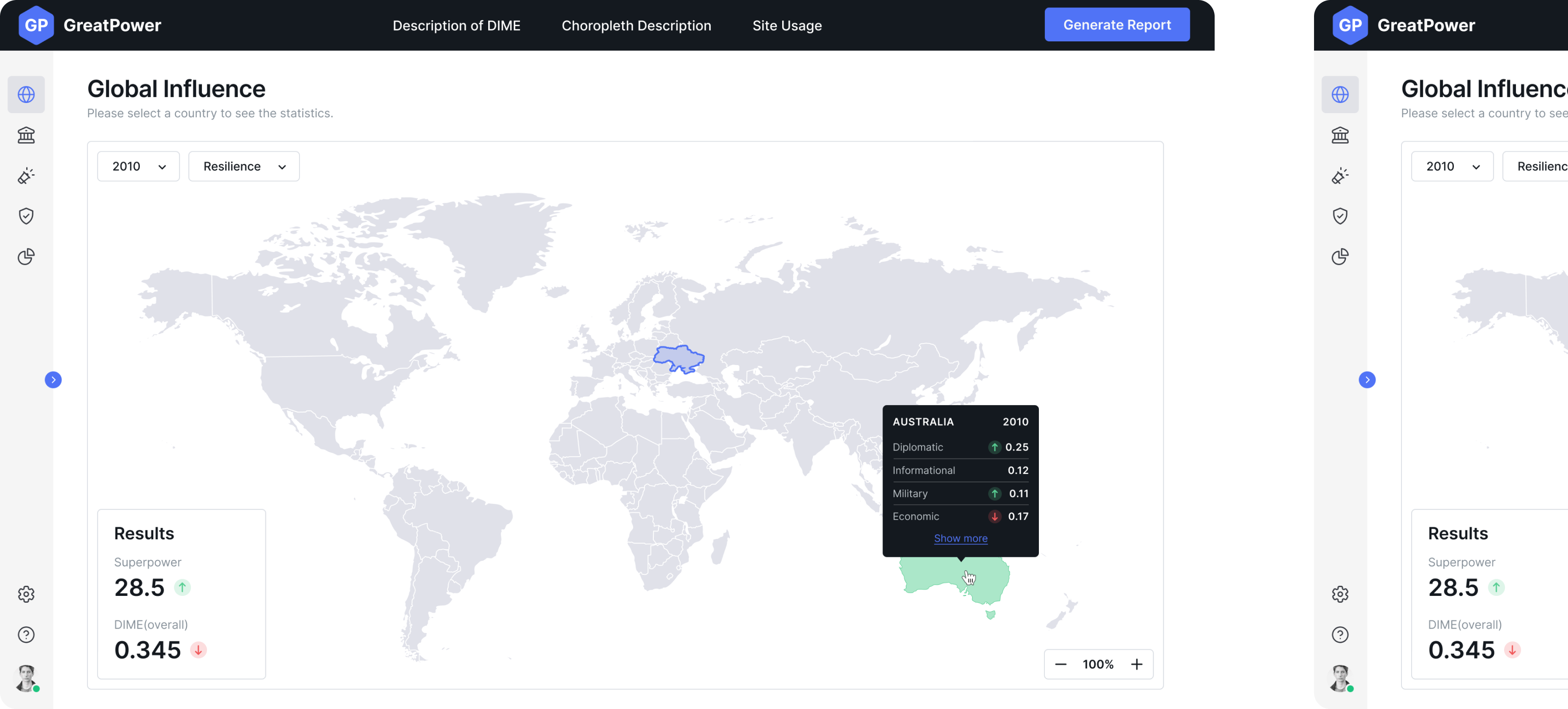
The basic start screen shows a grey monochrome map. The countries of interest get a colourful highlight. Only the two most important numbers are shown on the side. Additionally, two filters are available to adjust the dataset.
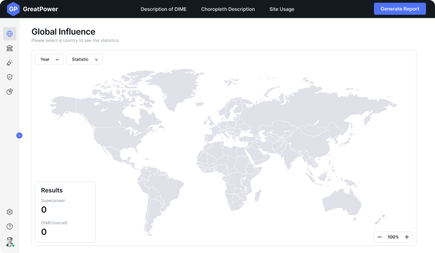
To learn more details, the user has to click on a country or one of the icons on the left bar. When they hover over it, they can see the meaning behind each icon. When folded, the names are hidden to save space for the big map.
Green and red arrows are used to draw attention to growth or decline dynamics in certain indicators.
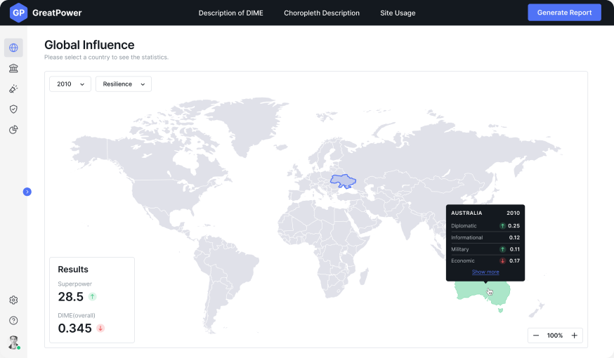
Walkthrough
Client wanted us to make a small onboarding in a form of a walkthrough that would get users started. It had to be based on a key user story: an expert preparing a presentation on Russia-Ukraine political dynamics for their boss.
We used pop-up messages that engage users. When you ask users to make an action instead of just showing how the app works, they learn faster.
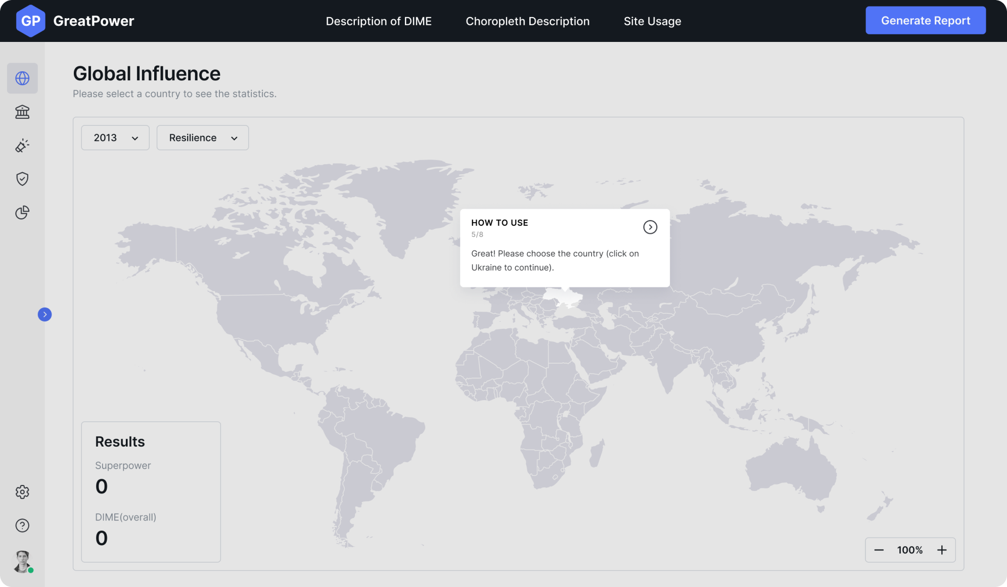
It is important to make the walkthrough as short as possible. Users often get frustrated by long onboarding sequences that can’t be skipped. That’s why we added numbers for each pop-up so that users know how far they are until the finish.
Data visualization
Even though defense niche is new to us, we had been working with a number of data-heavy products before. So we know some tricks that help users to easily make sense of a large amount of numbers.
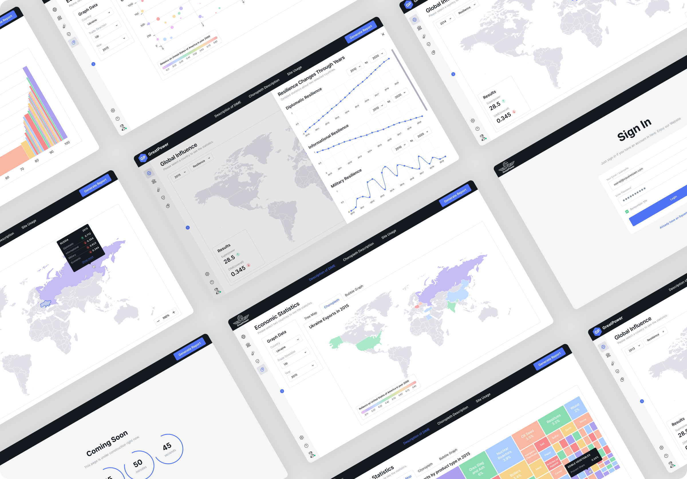
To make data comfortable to use for different people, we made three different types of visualizations for economic statistics:

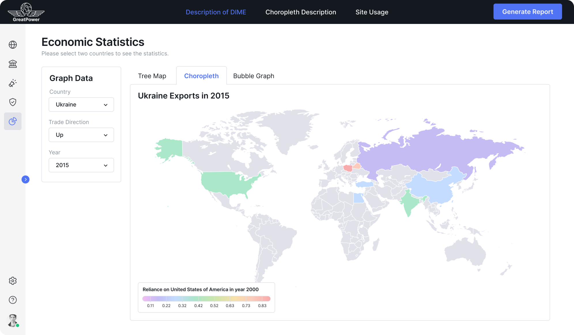
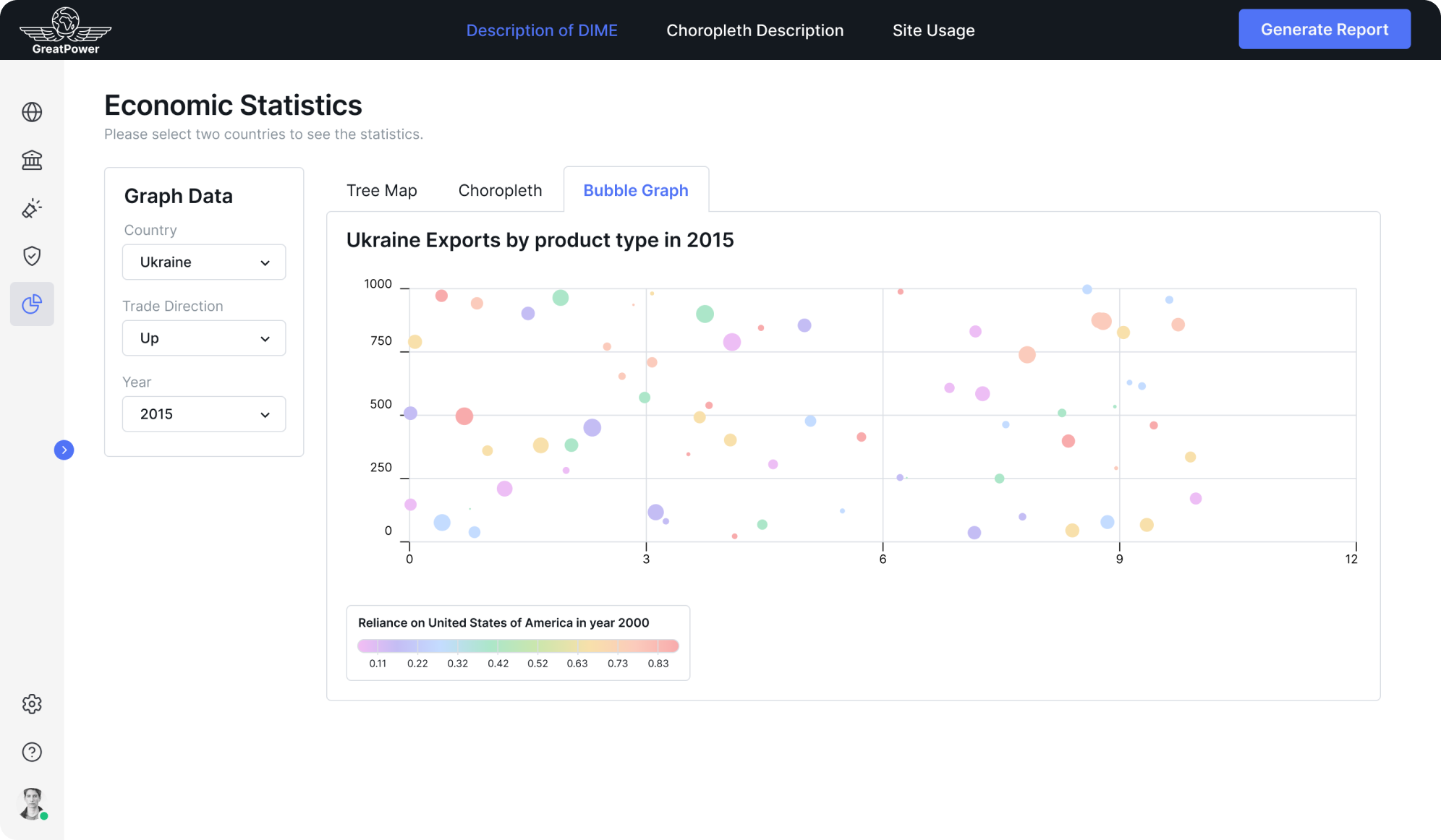
As the number of export items is big, it wouldn’t make sense to assign a different color to each of them: they would be hard to recognize.
Using gradation of the same color, as often seen on choropleth maps, would have the same effect. That is why a limited palette of pastel colors was chosen: they are easily distinguishable and don’t have strong associations with particular items, as clean bright colors do.
The same palette is used throughout the app. Here is a bar chart on the Informational statistics page.

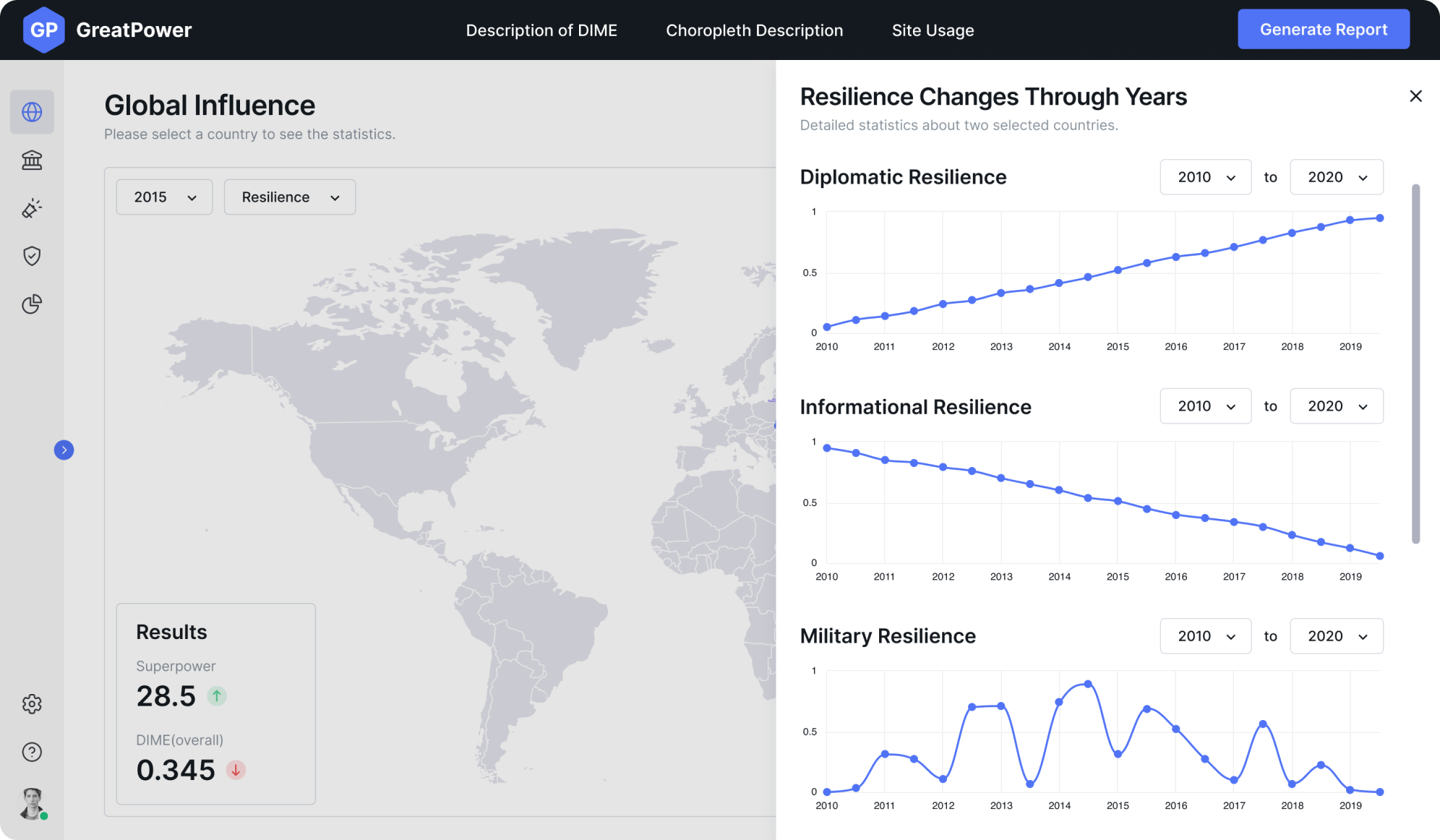
At the same time, we wanted to keep pages less colorful whenever it was not needed. There are also minimal one-color graphs that are not less informative and draw the attention to the dynamics of the indicator over time.
Results
In two months, the work was done. The client got a full set of design assets that are essential for the start:
- Site map
- User flows
- All the main menu sections
- Onboarding walkthrough
- 5 different data visualization screens
- Sign in, error, “under construction” pages
- Logo
- Design system
This MVP was a great experience for us, and the clients got the design delivered just the way they wanted: modern, clean, and simple.
