

Are you aiming to hit that revenue milestone but struggling to create YOUR own SaaS website? Being a UI/UX design agency with unprecedented expertise — 9+ years of designing for SaaS companies, we've analyzed thirty best SaaS websites, making between $1M and $10M in revenue, to uncover the powerful strategies that can turn your site into a revenue-generating machine.
So, what exactly will you get with all these SaaS examples, except a great dose of inspiration? We've analyzed each B2B website, using the SWOT framework to identify their strengths and areas for improvement, and presented this information both concisely and in detail.
But before we proceed, we should ask: What's the big deal about SaaS home pages?
The importance of a landing page for SaaS success
Imagine you're trying to sell lemonade on a busy street. Your landing page is like your lemonade stand – it's the first thing potential customers see. Just as a colorful, eye-catching stand with a clear menu would attract more people, a good SaaS website grabs visitors' attention and tells them exactly what your SaaS product does.
In 2026, applying SaaS landing page best practices is even more critical because the market is no longer just about features—it's about immediate proof and personalization. Here's why it's so important:
- First impressions count. It's your chance to make potential customers say "Wow, this looks cool!"
- Explains your product. It quickly shows what problem your software solves, like "Never lose track of your tasks again!"
- Convinces people to try. A great landing page persuades visitors to sign up for a free trial or buy your product.
- Boosts conversions. A well-designed page turns more visitors into paying customers, like a friendly smile sells more lemonade.
To make all of the above-mentioned benefits true for your B2B site, it has to have a clear headline, simple explanations in easy-to-understand language, an intuitive design, straightforward navigation, and clear CTAs. And in the next sections, we’ll take a closer look at real-life SaaS web design examples that get it right.
1. Reflect
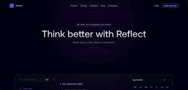
- Startup description: AI-powered note-taking app that helps users capture, organize, and securely store thoughts, ideas, and information across devices.
- Year founded: 2021
- What’s to steal/what works well: beautiful futuristic animations
- Areas for improvement: work on main CTA button
Strengths
- Elegant and futuristic design: the dark theme with glowing, neon accent gives the page a modern, tech-forward feel, which aligns well with the product's focus on AI and innovation.
- Video of product onboarding: right below the main title that communicates the value proposition visitors can view Reflect onboarding showing how the product’s real look in action.
- Structured content layout: information is presented in clear sections with icons and brief descriptions, making it easy to scan and digest.
- Visual Appeal: The use of animated visuals and futuristic graphics enhances engagement and creates a memorable aesthetic experience that stands out among SaaS landing pages.
Weaknesses
- Heavy use of dark theme: while the design is visually striking, the heavy use of dark tones and neon may make it difficult for some users to read comfortably, especially in bright environments.
- Lack of CTA in hero section. This fact might reduce immediate engagement from users who are ready to act, as the hero section is usually the first point of interaction. Most visitors expect to see a clear action (e.g., "Start Free Trial," "Get Started") right away, and the absence of this could lead to missed conversion opportunities.
- Information density: although the visual design is compelling, some users might benefit from a slightly more detailed explanation of certain features. For example, terms like "networked notes" and "frictionless search" could be accompanied by brief tooltips or examples to ensure instant comprehension for first-time visitors.
Reflect's home page successfully communicates its futuristic, AI-powered capabilities with a sleek and modern design. However, introducing interactive elements, a more detailed explanation of the platform's features, and case studies would greatly improve customer engagement and understanding.
2. Lindy AI
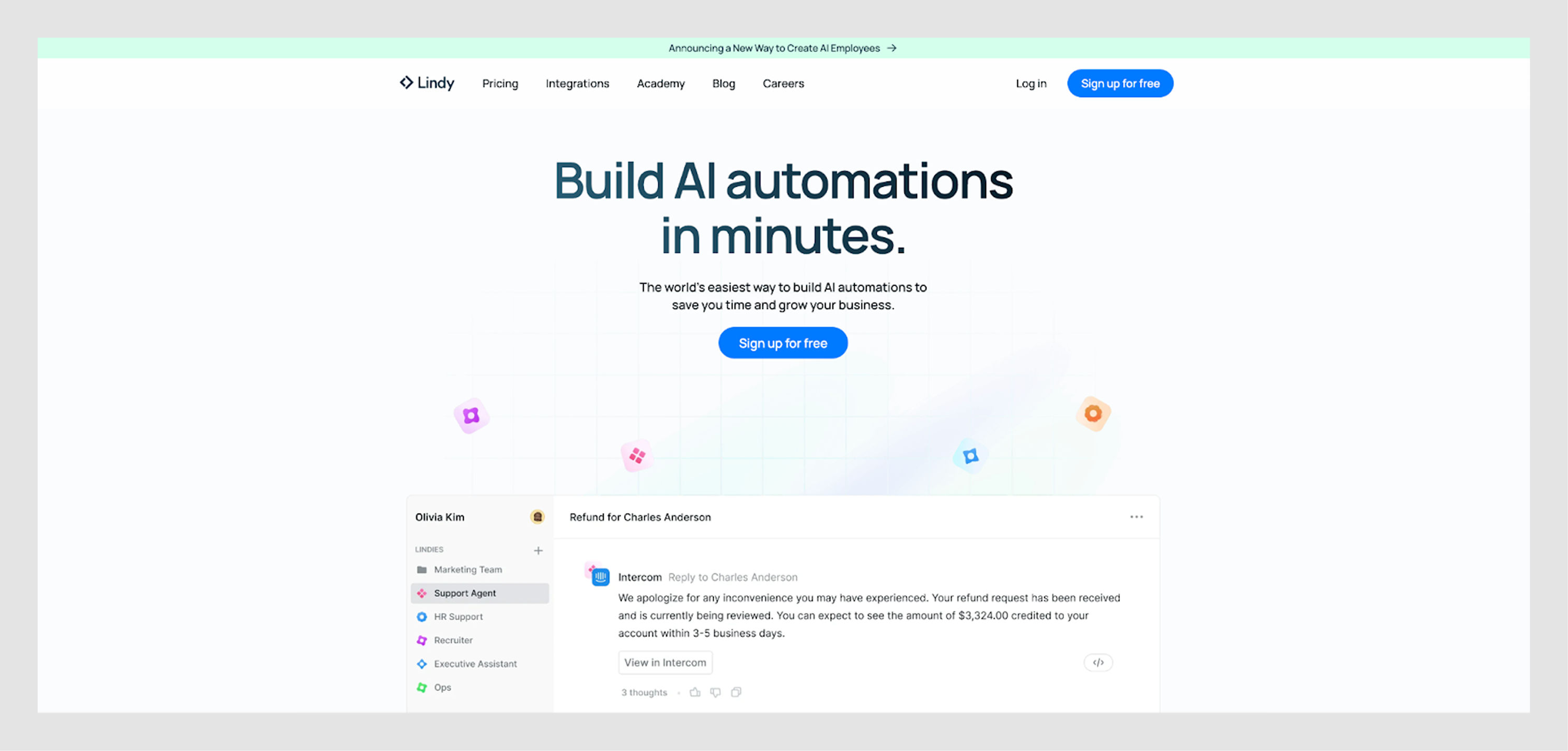
- Startup description: platform that enables users to build AI-powered automations without coding
- Year founded: 2020
- What’s to steal/what works well: clean UI, readable content
- Areas for improvement: add engaging elements and user testimonials
Strengths
- Clear value proposition: The SaaS homepage immediately communicates the core benefit: "Build AI automations in minutes." It's concise and impactful.
- Clean and modern UI: The design is clean with ample white space, making the content easy to read. The use of color is subtle, enhancing the professional tone.
- Feature highlights: The page clearly explains the product’s capabilities, including integrations and automation features. This helps users quickly understand how Lindy AI works.
- Integration display: Showing over 3,000+ integrations builds credibility and showcases flexibility for various use cases.
- Human touch: mention of keeping “a human in the loop” is reassuring, as it balances automation with human oversight.
Weaknesses
- Limited visual hierarchy: some sections, like the integrations and event-based triggers, could benefit from stronger visual separation to guide the user’s eye more effectively.
- Lack of engaging elements: while the site boasts a clean design and appealing color palette, it lacks dynamic content such as product demos or animations.
- Minimal social proof: there's no visible customer testimonials, case studies, or logos of notable customers, which might reduce trust for first-time visitors.
In summary, Lindy AI's homepage has a solid foundation with a strong value proposition and clean design, but can improve through stronger visual hierarchy, more social proof, and interactive elements to engage users further.
3. Incard
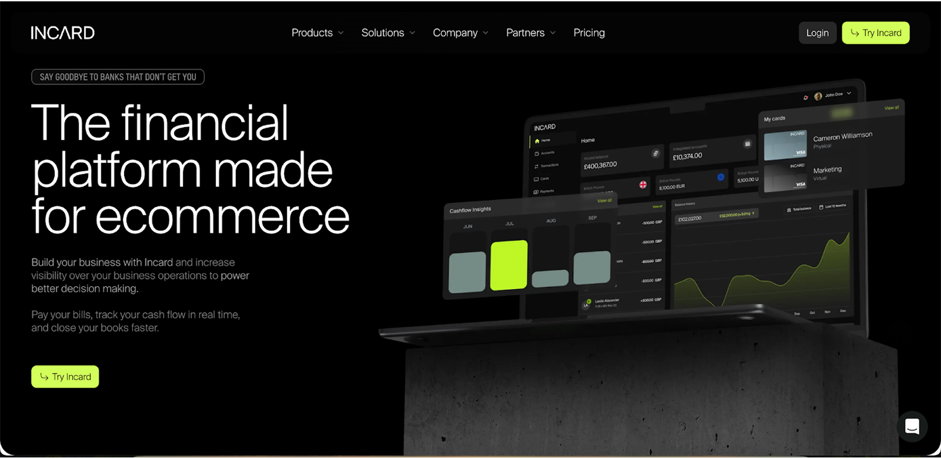
- Startup description: financial platform designed to help ecommerce entrepreneurs manage their finances, streamline payments, and optimize online advertising
- Year founded: 2020
- What’s to steal/what works well: nice design with interesting accents
- Areas for improvement: get rid of overwhelming information
Strengths
- Clear niche focus: the tagline, “The financial platform made for ecommerce,” clearly defines the target audience and the product’s focus, which helps attract the right users.
- Professional design: black-and-white color scheme with subtle green accents conveys a modern, premium feel. It’s visually appealing and easy to navigate.
- Comprehensive feature display: the page showcases key features such as business accounts, analytics, and advertising cards, making the offering well-rounded and informative.
- Social proof: including testimonials and images of real users helps build trust, especially with entrepreneurs and business owners who are looking for proven solutions.
Weaknesses
- Lack of strong CTA focus: the call-to-action buttons could stand out more. The primary CTA (“Try Incard”) blends into the design and may not be as attention-grabbing as it should be.
- Overwhelming Information: some sections, like the feature comparisons and integrations, are text-heavy, which could overwhelm users, particularly those skimming the page. More concise messaging would improve scannability.
- Limited visual differentiation: while the design is clean, there’s a lack of strong visual breaks between sections. More contrast or distinct section designs would help users quickly digest the information.
Incard’s website is visually sleek, professional, and tailored to its ecommerce audience, but there are opportunities to enhance the user journey with stronger CTAs, better benefit-driven messaging, and more detailed user stories. More interaction and clearer distinctions between content sections could also further improve user engagement.
4. Voltage
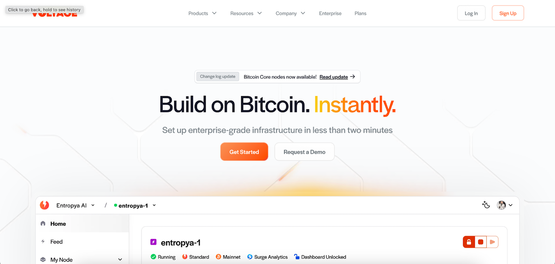
- Startup description: a user-friendly platform that provides scalable Bitcoin and Lightning Network infrastructure for developers to build blockchain-based applications.
- Year founded: 2020
- What’s to steal/what works well: nice design with interesting accents
- Areas for improvement: get rid of overwhelming information
Strengths
- Clear value proposition: the headline “Build on Bitcoin, instantly” communicates the core offering immediately, making it clear what the platform provides and who it is for.
- Developer-focused features: the layout effectively showcases key technical tools like APIs, nodes, and payment integrations. In 2026, Voltage has further solidified its position among the best SaaS companies in the crypto space by launching Voltage Credit, a first-of-its-kind revolving line of credit that allows enterprises to settle payments instantly without needing to hold Bitcoin on their balance sheets.
- Strong call-to-action: the "Get Started" button and other CTAs are well-placed, clear, and easy to find, encouraging user engagement.
Weaknesses
- Complex jargon for newcomers: the technical language may overwhelm non-developers or users unfamiliar with the blockchain ecosystem, potentially limiting the broader appeal.
- Overloaded visuals: some sections feel cluttered with too much information, making it harder for users to digest the content quickly. The dense text could benefit from more whitespace or concise messaging.
- Limited social proof: while the platform highlights features and functionality, it lacks sufficient testimonials, case studies, or well-known brand logos to strengthen credibility.
Voltage's homepage does an excellent job of targeting its core audience (developers and Bitcoin enthusiasts) with relevant features and CTAs. However, simplifying the website copy for a broader audience, adding more social proof, implementing clean typography, and improving content scannability could enhance user experience and broaden its appeal.
5. Circleback
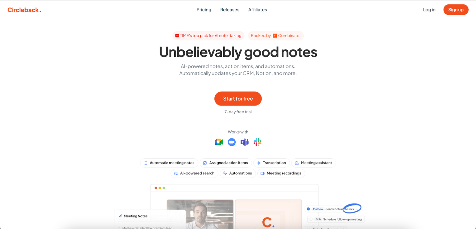
- Startup description: AI-powered tool that organizes meeting notes, action items, and automates follow-ups to enhance productivity.
- Year founded: 2023
- What’s to steal/what works well: clean design
- Areas for improvement: add visual engagement
Strengths
- Clear value proposition: the tagline “Unbelievably good notes” is great – its concise yet informative. It immediately tells users what to expect and is followed by a prominent CTA.
- Nice use of white space: the generous use of white space allows the information to be easily comprehended, gives the page a clean, modern look, and lets the content "breathe," improving readability and overall user experience.
- Visual explanation of features the combination of text and visuals throughout the page effectively explains key features, making it easier for users to understand the benefits at a glance.
- Trust signals: the logos of well-known companies (like Deloitte and Y Combinator) and customer testimonials are prominently placed and build credibility and trust.
Weaknesses
- Limited visual engagement: although the page has clean visuals, it could benefit from more interactive elements like demo videos or live previews of the product in action to further engage visitors.
- Repetitive layout: Some sections have a similar format and could use more visual variety to maintain user interest and attention throughout the page.
Circleback's site does a decent job of showing they know what they're doing. But its design elements are a bit... flat. They could spice things up with some cool interactive bits and real-world examples of how people use their product. Right now, it's all static pictures and text. If they threw in some lively stories or demos, it'd probably grab people's attention better and turn more visitors into actual customers.
6. Clay
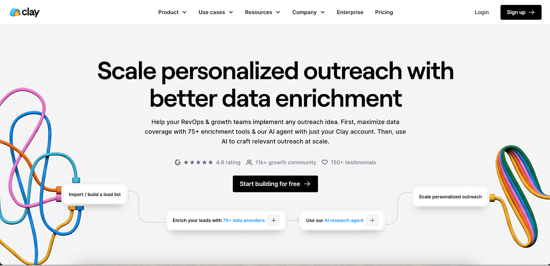
- Startup description: data enrichment platform that helps businesses scale personalized outreach
- Year founded: 2017
- What’s to steal/what works well: visual hierarchy, illustrations style
- Areas for improvement: get rid of overwhelming information
Strengths
- Clear value proposition: The headline clearly communicates the product’s benefit—personalized outreach through data enrichment. It’s straightforward and immediately conveys the value.
- Effective visual hierarchy: The use of large fonts, bold colors, and clear sections breaks the page into digestible parts, guiding the user’s eye to important areas such as the call-to-action (CTA).
- Strong social proof: Prominent logos of well-known companies and testimonials from satisfied customers enhance trust and credibility.
- Interactive element for data integration info: The site highlights connections to over 75+ data providersusing very creative and engaging table.
Weaknesses
- The page is text-heavy: starting with the hero section and scrolling down to specific blocks, the site seems overwhelmed with information.
- Horizontal scroll in “How it works” block: its quite long and visitors can’t skipp it making the experience a bit annoying.
Clay's website does a good job showing what they're all about. They've got those fancy customer logos and nice comments to prove they're legit. But the homepage is information overload. They could trim it down a bit or maybe use those little dropdowns to hide some of it. That way, people won't feel like they're reading a novel when they visit. It'd make the site easier to read and keep people interested.
7. Evervault
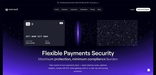
- Startup description: secure, developer-friendly encryption solutions to protect sensitive payment data while minimizing compliance burdens for businesses
- Year founded: 2019
- What’s to steal/what works well: visual design that connects well with value proposition the product offers
- Areas for improvement: get rid of overwhelming information
Strengths
- Striking visual design: a dark theme with vibrant accents creates a modern and tech-forward aesthetic. This can be particularly appealing to tech-savvy users and businesses looking for cutting-edge solutions.
- Clear communication of value proposition: the messaging, "Flexible Payments Security," clearly articulates the core offering — providing security solutions with minimal compliance burdens. This is effectively emphasized right at the beginning of the page.
- Strong CTA: The “Talk to an Expert” button is prominently placed, encouraging direct engagement and potentially accelerating the sales process.
- Trust indicators: featuring logos of well-known companies and partnerships, like Visa and Stripe, lends credibility and trust, showcasing Evervault as a reliable partner in payment security.
Weaknesses
- Text density: some sections of the page contain dense blocks of text which might be overwhelming for users, potentially reducing readability and engagement.
- Navigation clarity: while the main navigation is visible, the differentiation between sections could be more distinct to enhance user flow and ease of finding information.
- Lack of immediate demonstrations: There are no immediate demos or interactive elements that show the platform in action.
The home page of Evervault presents a strong foundation with its cutting-edge design key elements and clarity in value proposition, but could benefit from more interactive components and better navigation to improve user experience.
8. Krepling
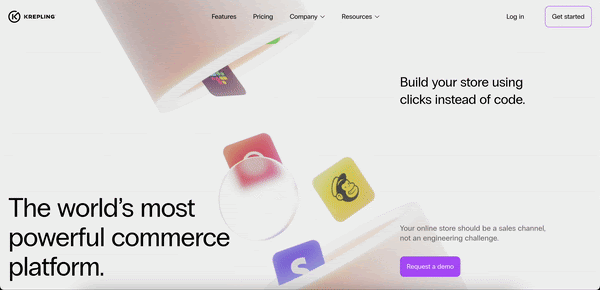
- Startup description: no-code commerce platform that enables businesses to build, manage, and scale online stores without technical expertise.
- Year founded: 2020
- What’s to steal/what works well: engaging and aesthetic design
- Areas for improvement: enhance the visual clarity of product features
Strengths
- Good balance of text and visuals: The layout successfully directs the user's attention, with larger, bold text for the main value propositions and supporting visuals reinforcing the points.
- Effective use of negative space: The design uses negative space effectively, creating an open, breathable layout that enhances content readability while having a lot of animated elements.
- Strong value proposition. All titles strongly connect with the product's unique selling points.
Weaknesses
- No strong CTA focus. “Request a demo” CTA could have more sufficient color contrast and prominence on the page.
- Generic Imagery: The visuals used, especially in the hero section, are somewhat abstract and don't give viewers a clear understanding of what their store could look like if they used Krepling.
- Navigation Overload: While navigation is functional, it could be simplified by reducing some dropdowns and condensing content into clearer paths for users.
Krepling's homepage looks neat, and it's easy to use. The animations are cool, and they've got plenty of breathing room. But they could use some more product screenshots to show they're the real deal in this crowded market. A quick video showing how to set up a store with Krepling would be beneficial as well. Way more fun than just reading about it or looking at still pictures.
9. Attio
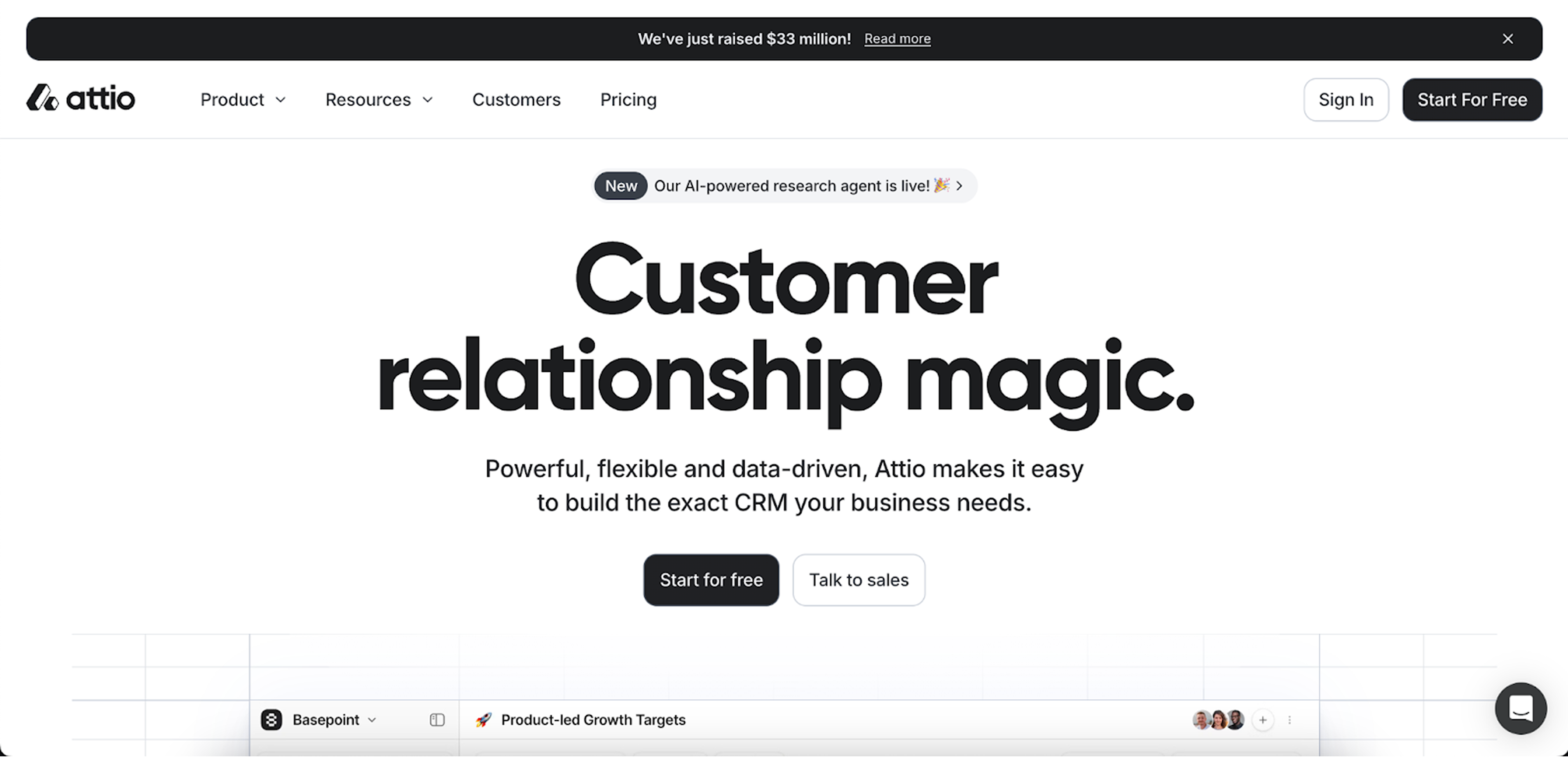
- Startup description: customizable CRM platform designed to help teams effortlessly manage relationships and workflows with ease.
- Year founded: 2019
- What’s to steal/what works well: minimalistic design with effective use of white space
- Areas for improvement: visual hierarchy in CTA.
Strengths
- Minimalistic and clean design: The homepage employs a clean, minimalistic design with effective use of white space, which makes it easy for users to focus on important elements.
- Clear messaging: The main value proposition is quickly visible in the hero section with concise and to-the-point copy, explaining Attio's core value. Relevant customer testimonials throughout the page support this straightforward communication.
- User-centric navigation: The navigation is simple and intuitive, making it easy for users to find key sections like features, pricing, and company information.
- High-quality visuals: The use of images, mockups, and icons is of high quality, visually engaging, and consistent with the brand’s design style.
Weaknesses
- Weak visual hierarchy in CTA: Although the CTAs are present, they don't stand out enough due to color contrast and size. Especially when we talk about pricing page, all the plans are visually almost the same.
Attio's homepage offers a clean, minimalistic design with strong messaging, making it user-friendly and easy to navigate. However, the site could benefit from a stronger focus on CTA prominence.
10. Revenuecat
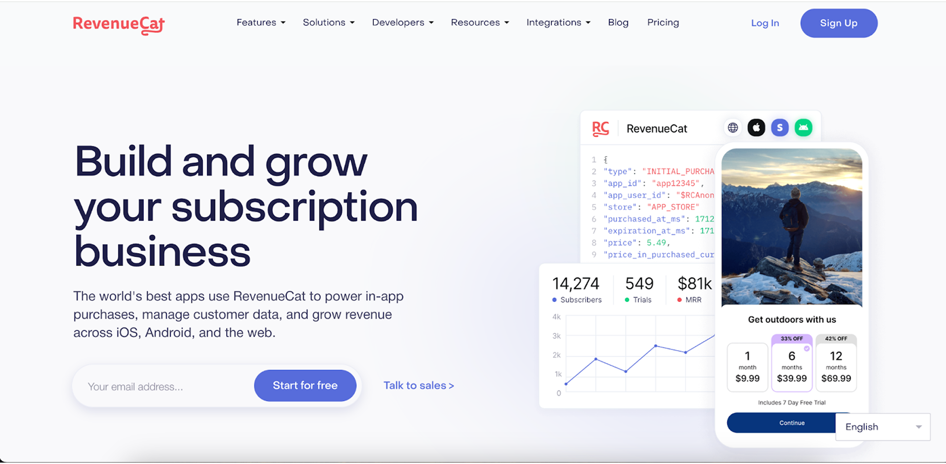
- Startup description: platform that helps businesses manage in-app subscriptions, track customer data, and grow revenue across iOS, Android, and web platforms
- Year founded: 2017
- What’s to steal/what works well: the use of trust signal such as testimonials, case studies, well-known client logos.
- Areas for improvement: complex navigation menu
Strengths
- Clear and concise value proposition: the headlines quickly communicates the key value — helping businesses grow their subscription model across platforms.
- Trust signals: the page features well-known client logos like Notion and Goodnotes, adding credibility.
- User-centric layout: different sections are clearly dedicated to specific teams like engineering, marketing, and product, making the content highly relatable.
- Case studies and testimonials: case studies and customer testimonials such as Pixery, with quantifiable outcomes, strengthens the brand’s authority.
Weaknesses
- Limited visual engagement: the website could benefit from more dynamic elements, such as videos or motion graphics, as well as some more detailed mockups that represent the product.
- Overloaded dropdown navigation: the top navigation bar has numerous dropdown options that can overwhelm first-time users. Simplification or consolidation could improve the browsing experience.
- Visual hierarchy: the layout, while clear, could have a more distinct visual hierarchy, particularly in the “Solutions for Every Team” section, where the cards for each team have similar visual weight, making it harder to prioritize information.
RevenueCat's homepage does a solid job showing how they help businesses boost their subscription game across different platforms. They've got the big-name clients to prove it, and their content speaks to different teams pretty well. But they could spice things up a bit. The pictures could be more eye-catching, the menu's a bit stuffed, and they could make it clearer what's most important on the page. A little tidying up would go a long way.
11. Recall
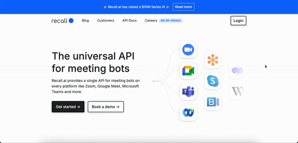
- Startup description: provides a universal API for meeting bots across multiple platforms, enabling seamless access to meeting data, video, and transcription.
- Year founded: 2020
- What’s to steal/what works well: clear, easy-to-comprehend design
- Areas for improvement: add pricing information
Strengths
- Value proposition supported by text and visual: the headline immediately communicates the core offering — an API for meeting bots across multiple platforms — and a visual support the text properly providing users with a quick understanding of the service.
- Trust signals: the use of logos from well-known clients like Grain, Krisp, and Supernormal reinforces credibility.
- Clear, easy-to-comprehend design: the use of white space, fonts, and visuals creates a clean, uncluttered layout, so that viewers can easily read and content and navigate on the site.
- Organized features section: Features like platform support, transcription data, and metadata are well-organized, helping users easily grasp the product’s capabilities.
Weaknesses
- Limited visual engagement: While the layout is clean, it lacks dynamic elements or what is more important graphics such as demos or animated workflows that show how Recall AI’s platform works in practice.
- Missing pricing information: customers usually want to see how much a product costs. Even if Recall needs to talk to customers before giving a exact price, they should have a pricing page with something like basic price ranges, list of features, explanation why they need to talk to sales for a full quote.
Recall AI's homepage nails it when it comes to explaining what they do. They've laid out their cool features nicely, especially for the tech crowd. But it could use a bit more pizzazz - maybe some flashier stuff to catch the eye. Oh, and they really need to throw in some price info. Even a ballpark figure would help folks know if it's in their budget.
12. Safebase
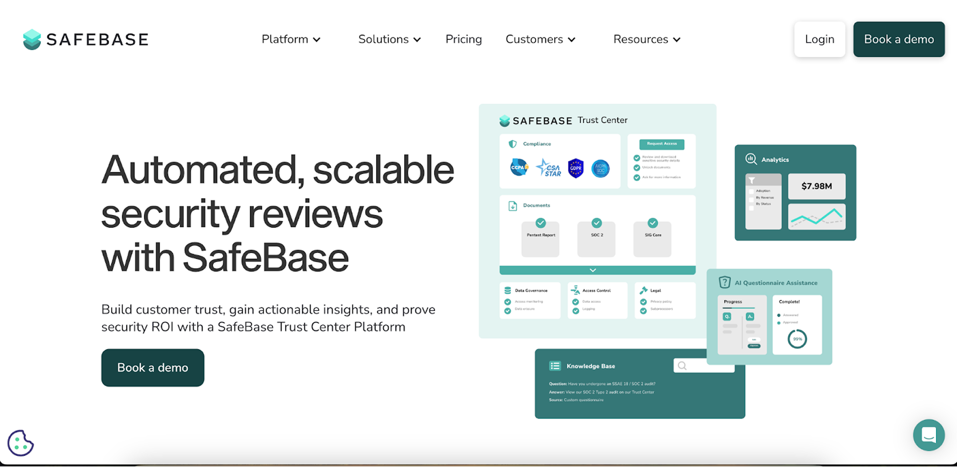
- Startup description: platform that automates and streamlines security reviews to help companies build customer trust.
- Year founded: 2022
- What’s to steal/what works well: signs of credibility
- Areas for improvement: more visual diversity
Strengths
- Credibility: high-profile logos such as OpenAI, LinkedIn, and GitLab plus engaging block with quotes from their representatives immediately establish credibility and trust.
- Visual design: Clean layout with modern, minimalistic elements that enhance readability and focus on the content.
- Effective use of testimonials: the rotating customer testimonials section reinforces trust with real-life customer validation.
- Strong emphasis on features: Clear communication of key features (AI Questionnaire Assistance, integrations, analytics) is well-placed and easy to digest.
Weaknesses
- Limited visual diversity: though there is a video that showcases Safebase in action, the design is somewhat repetitive in layout, which could become monotonous as users scroll down. More variation in how information is presented would improve engagement.
- Weak visual hierarchy in feature sections: some feature sections blend together visually, which could benefit from more distinct separation or dynamic elements to guide the user’s attention.
In summary, SafeBase has quite a typical but good quality SaaS website that presents a strong and trustworthy design, focusing on scalability and security, but it is a bit boring. Adding more visual engagement and stronger CTA focus could guide user interaction more effectively.
13. Recurrency
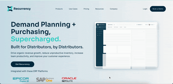
- Startup description: AI-powered ERP automation platform designed to optimize demand planning, purchasing, and sales for distributors.
- Year founded: 2018
- What’s to steal/what works well: navigation
- Areas for improvement: hero section
Strengths
- Intuitive layout: the site breaks down its product offerings and solutions clearly with dedicated sections for sales, customer service, and other functions, making it easy for users to find relevant information.
- Effective use of data and metrics: there are numerous performance statistics (e.g., response time, resolution time) including ROI calculator that allows visitors to learn how much revenue their business can gain using their SaaS platform.
- Intuitive and well-designed navigation: top navigation is clear, informative and not overloaded with options.
Weaknesses
- Overloaded hero section: title that communicates the value proposition consists of three hierarchical levels plus the CTA right under which Recurrecny put platforms integrated with it.
This example of a SaaS website looks good and shows off what they do pretty well. They've got some cool stuff like performance stats and an ROI calculator, which really sells their value. It's easy to get around the site, too. But the top part's a bit messy - too much text and things crammed in there. They could tidy that up to make it clearer.
14. Retell AI
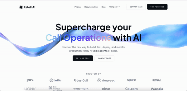
- Startup description: platform that provides scalable Bitcoin and Lightning Network infrastructure for developers to build blockchain-based applications.
- Year founded: 2023
- What’s to steal/what works well: nice design with interesting accents
- Areas for improvement: get rid of overwhelming information
Strengths
- Live product demo: interactive “get a call” feature showcases the product’s capabilities in real time.
- Modern, animated design: the hero section uses a colorful animated wave to grab attention and signal innovation.
- Clear user journey: step-by-step “How It Works” section makes onboarding process easy to understand.
- Enterprise-ready messaging: strong emphasis on scalability, compliance, and multilingual support.
- Trust signals: customer logos, testimonials, and performance metrics (e.g. 99.99% uptime, 4x efficiency).
Weaknesses
- Content repetition: similar layouts and card designs make sections blur together visually.
- Overloaded with info: some parts (e.g., feature blocks and compliance section) feel text-heavy.
- Weak product visuals: lacks dashboard or UI screenshots to show what using the tool actually looks like.
- Basic FAQ: Q&A section is minimal and doesn’t fully address potential buyer concerns.
15. Deepnote
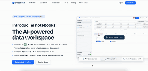
- Startup description: Collaborative data notebook platform enhanced with AI, supporting code, dashboards, and team workflows.
- Year founded: 2019
- What’s to steal / what works well: seamless AI integration, wide data source support, developer-friendly design
- Areas for improvement: more visual focus on product benefits, fewer redundant sections
Strengths
- Strong AI positioning: emphasizes GPT-4o-powered workflows and no-code/low-code options from the start.
- Clear personas: copy speaks directly to data analysts and scientists with tailored value props.
- Flexible tooling: supports Python, SQL, R with auto-complete, debugging, and refactoring.
- Team collaboration: in-browser comments, version control, and sharing are front and center.
- Credibility & social proof: logos (e.g., Soundcloud, Webflow), testimonials, and university adoption boost trust.
Weaknesses
- Overloaded layout: many horizontal sections with similar card structures feel repetitive.
Visual clutter: abundance of tags, features, and integrations creates slight decision fatigue. - No pricing preview: users are nudged to book a demo or sign up without knowing plan costs.
- Generic CTA repetition: “Get started – it’s free” is overused without variation in context or value-driven copy.
Deepnote's homepage clearly targets technical data professionals, illustrating the platform's focus on AI-powered tools and collaboration features within a polished product experience. It stands out with strong trust signals and broad integration support.
However, the overall visual layout could benefit from a more user-friendly interface with better hierarchy and fewer content redundancies. A more streamlined structure and value-differentiated CTAs would help improve engagement and conversion.
16. Leena AI
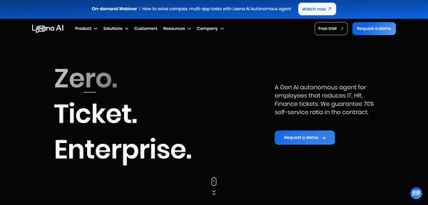
- Startup description: Agentic AI platform that automates enterprise workflows in HR, IT, Finance, and Procurement through autonomous agents.
- Year founded: 2018
- What’s to steal / what works well: bold hero message with animated typography, enterprise positioning, strong security/trust signals
- Areas for improvement: more contextual visuals, reduce CTA friction
Strengths
- Impactful hero section: bold typography with animation grabs attention immediately.
- Enterprise-grade positioning: copy focuses on ticket reduction and automation, clearly targeting large companies.
- High trust credibility: strong lineup of Fortune 500 clients and multiple security certifications displayed.
- Clear use case automation: examples of tasks (e.g., SAP ticket creation, policy responses) make value tangible.
- Broad integrations: logos from ServiceNow, SAP, Salesforce, etc. reinforce interoperability.
Weaknesses
- Overly abstract visuals: interface visuals are simplified and generic, missing product depth.
- Repetitive CTA logic: both "Request a demo" and "Free trial" are frequent but lack differentiated messaging.
- Flat customer story section: the testimonial block lacks variation or dynamic interaction.
- Visual imbalance: large dark hero section vs. white mid-page sections creates contrast without clear narrative flow.
Leena AI’s homepage makes a powerful first impression with a bold, animated statement and clear enterprise intent. It’s strong in establishing trust through brand associations and compliance standards, but the product itself remains under-visualized.
17. Gather
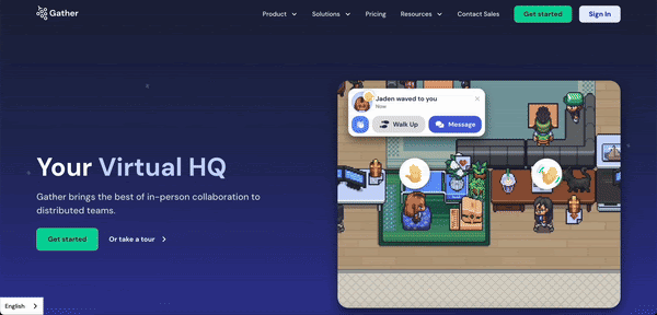
- Startup description: Virtual office platform that recreates the spontaneity of in-person work for distributed teams using a gamified, customizable environment.
- Year founded: 2020
- What’s to steal / what works well: charming pixel-art visuals, animated team interactions, nostalgia-driven UI
- Areas for improvement: more emphasis on practical value, clearer distinction between use cases
Strengths
- Engaging visual identity: pixel-art design is fun, memorable, and sets Gather apart from typical B2B SaaS.
- Animated hero section: immediately shows the product in action with video + chat hybrid interface.
- Nostalgic interaction model: simulates hallway chats and desk proximity for casual collaboration.
- Focused on culture: strong emphasis on team bonding, spontaneous meetings, and human connection.
- Testimonials with visuals: user feedback paired with screenshots makes customer stories relatable.
Weaknesses
- Light on technical features: homepage focuses more on the vibe than practical use-case depth.
- Overly playful for enterprise: retro visuals might feel unserious for large or regulated companies.
- Limited CTA diversity: "Get started" is repeated without tailoring for different user types.
- Minimal value quantification: lacks hard metrics or business outcomes (e.g., ROI, productivity gains)
Gather’s homepage is playful, inviting, and refreshingly different from the typical SaaS mold. It’s ideal for startups and culture-focused teams looking to enhance remote collaboration. However, to appeal to more mature or enterprise buyers, the site could benefit from clearer value-driven messaging and stronger proof of workplace impact. Bridging fun with function would elevate the platform’s perceived credibility.
18. Skiff
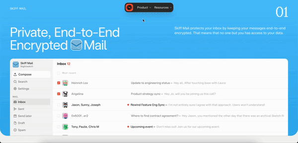
- Startup description: A privacy-first productivity suite offering encrypted email, docs, calendars, and file storage, all end-to-end encrypted and decentralized.
- Year founded: 2020
- What’s to steal / what works well: bold visual segmentation by product, clear E2E encryption message, cohesive modular UI
- Areas for improvement: better homepage storytelling, less repetition across sections
Strengths
- Modular product reveal: top nav elegantly previews all four encrypted tools in one dropdown.
- Cohesive visual system: color-coded sections and consistent UI across SaaS products reinforce suite feel.
- Strong encryption message: "Private, End-to-End Encrypted" is front and center on every page.
- Pixel iconography + avatars: adds personality and playfulness without sacrificing clarity.
- Advanced features shown visually: e.g. IPFS storage, decentralized collaboration, calendar syncing.
Weaknesses
- Redundant messaging: each product section starts with the same E2E encryption phrasing.
- No product-level value prop: pages don't explain why users need encrypted docs vs. email vs. calendar.
- Minimal outcome framing: no customer stories, ROI, or benefits beyond "privacy."
- Weak CTA visibility: there’s no bold, persistent CTA or clear funnel on the homepage.
- Tech-forward tone: privacy and encryption language may alienate less technical users.
Skiff's homepage is sleek, minimal, and consistent, showcasing a futuristic workspace for privacy-conscious teams. While the design elements are cohesive and technically sound, the site misses emotional resonance and practical framing. To drive broader adoption, Skiff could benefit from clearer product storytelling, stronger outcome language, and a more guided homepage journey.
19. Rive
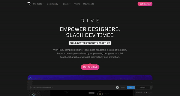
- Startup description: A real-time design tool for building interactive graphics that run seamlessly in apps, games, and websites using open-source runtimes and renderers.
- Year founded: 2020
- What’s to steal / what works well: highly immersive animated storytelling, technical transparency (open-source stack), strong dev-centric appeal
- Areas for improvement: onboarding accessibility for non-technical users, clearer funneling, less overload in visual density
Strengths
- Clear technical pipeline narrative: The homepage explains Rive's full pipeline, from editor to renderer, in one visual stream. It's rare to see a dev tool so clearly walk users through what happens from design to deployment.
- Live product showcase: From the animated pink car in the hero to the state machine UI preview mid-page, nearly every section demonstrates actual product use—no fake UI or marketing fluff.
- Real-time feel through animation: Animation is not just decorative but functional, conveying the product’s core value with energy and fluidity. It differentiates Rive from static alternatives like Figma or Lottie.
- Developer credibility: Logos of Google, Dropbox, Samsung, and endorsements from industry figures like Joey Korenman build legitimacy in the motion/UX space.
- Open-source transparency: Highlighting that the runtime, renderer, and file format are open source speaks directly to developers and increases adoption trust.
- Platform reach: Visual iconography for Web, iOS, macOS, Android, Unity, Flutter, C++, and more reinforces Rive’s versatility and makes clear it’s production-ready.
Weaknesses
- Intense visual density: Every section includes a moving part or visual pop, which can fatigue the eye and make the hierarchy harder to scan.
- Technical language dominates: While Rive appeals strongly to technical users, it does little to help less experienced designers understand its advantages or get started easily.
- No primary call-to-action hierarchy: The “Get Started” button appears multiple times but isn’t persistently fixed or elevated through scroll—meaning new users could easily miss the path to conversion.
- Overwhelming navigation: With "Products," "Community," "Learn," "Downloads," and deep nested items, the site lacks a linear, simplified onboarding flow. It’s easy to get lost.
- Limited benefit framing: There’s little emotional storytelling or outcomes-based content (e.g. speed of implementation, team velocity, time saved vs. other tools).
Rive’s homepage excels as a real-time portfolio of what’s possible when design meets interactivity. It delivers on its core promise, “design, build, and ship interactive UIs”, with polish and power. That said, to broaden appeal beyond power users and devs, Rive could introduce more structured storytelling, elevate its CTA, and add softer onboarding cues for designers and product teams.
20. Slite
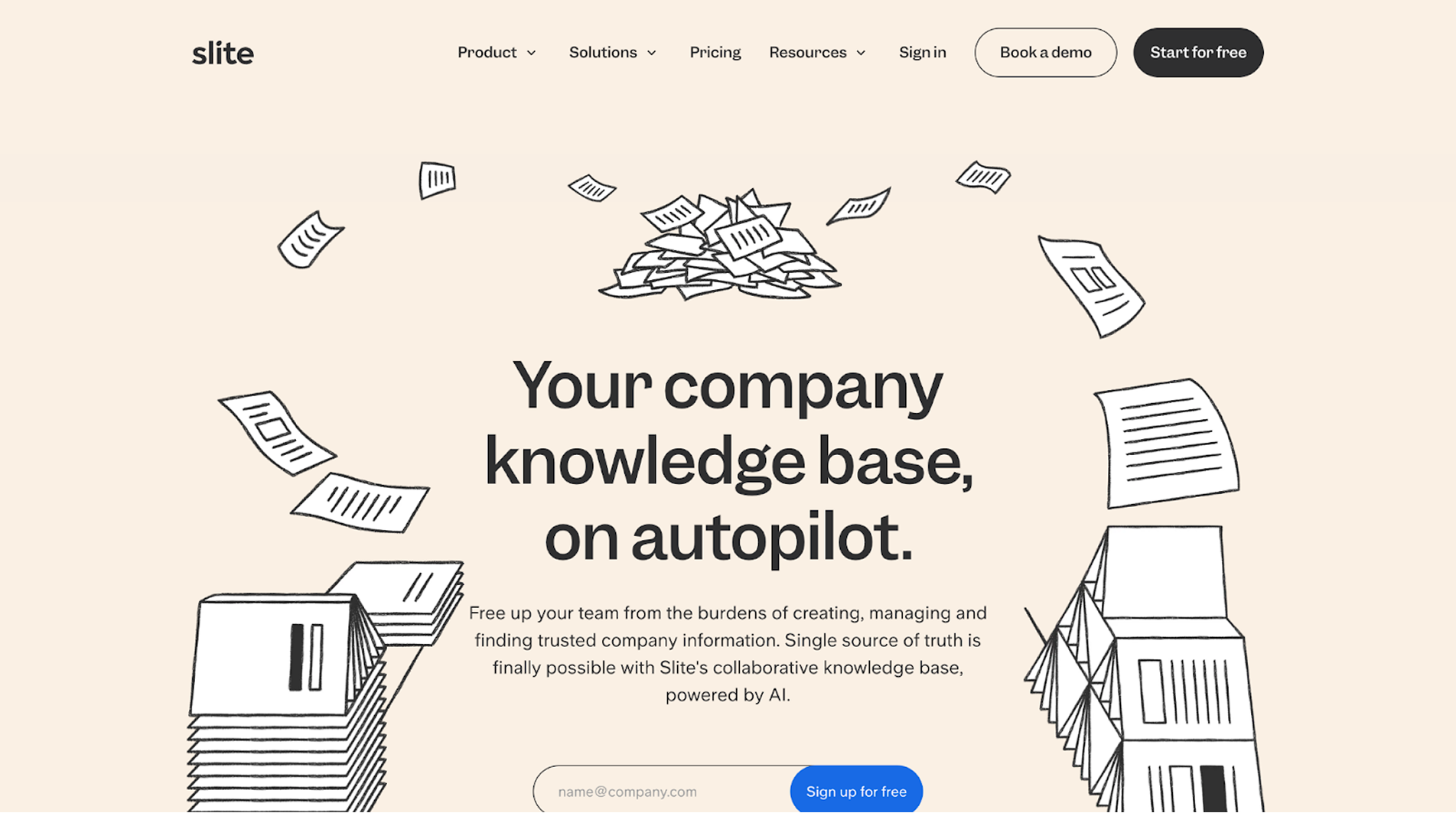
- Startup description: A collaborative knowledge base and documentation platform designed to help fast-moving teams create, share, and find internal information easily, with a focus on usability and AI-enhanced search.
- Year founded: 2016
- What’s to steal / what works well: playful editorial tone, visual proof of product use, high social proof, balance of personality and clarity
- Areas for improvement: product differentiation from competitors, CTA hierarchy and color contrast, homepage scannability
Strengths
- Relatable headline voice: Hero copy (“The knowledge base even Maryam in Support wants to use”) is casual, human, and attention-grabbing.
- Strong visual validation: Uses screenshots with real-looking documents and testimonials to build trust without overwhelming with interface complexity.
- Customer-centric storytelling: Pull quotes are front and center, showing user value clearly and in context.
- Illustration + UI integration: Hand-drawn visual metaphors blend smoothly with product UI, creating a coherent brand style.
- Benefit framing over feature lists: Copy emphasizes impact (“no fluff,” “answers you never have to second-guess”) instead of technical descriptions.
- AI differentiator placement: Promotes its “Super” AI search assistant right after showing problems it solves, timely and well-sequenced.
Weaknesses
- Weak product breakdown: It’s unclear what individual tools exist beyond the general “knowledge base”, little modular explanation.
- Soft CTAs and contrast: “Get Slite free” and “Book a demo” buttons often lack bold color contrast, making them blend into neutral backgrounds.
- Repetitive structure: Many testimonials and sections repeat the same point, ease of use, without layering in new dimensions like ROI, integrations, or enterprise readiness.
- Generic visuals in some parts: Iconography is minimalist but at times too abstract to explain new AI functionality or workspace organization clearly.
Slite’s homepage excels in tone and trust. It feels human, clean, and low-friction—ideal for teams overwhelmed by heavy docs tools. However, its simplicity sometimes comes at the cost of clarity. To push adoption further, Slite could elevate its product narrative with more modular explanations, stronger CTA visibility, and sharper visual hierarchy.
21. Shiftx
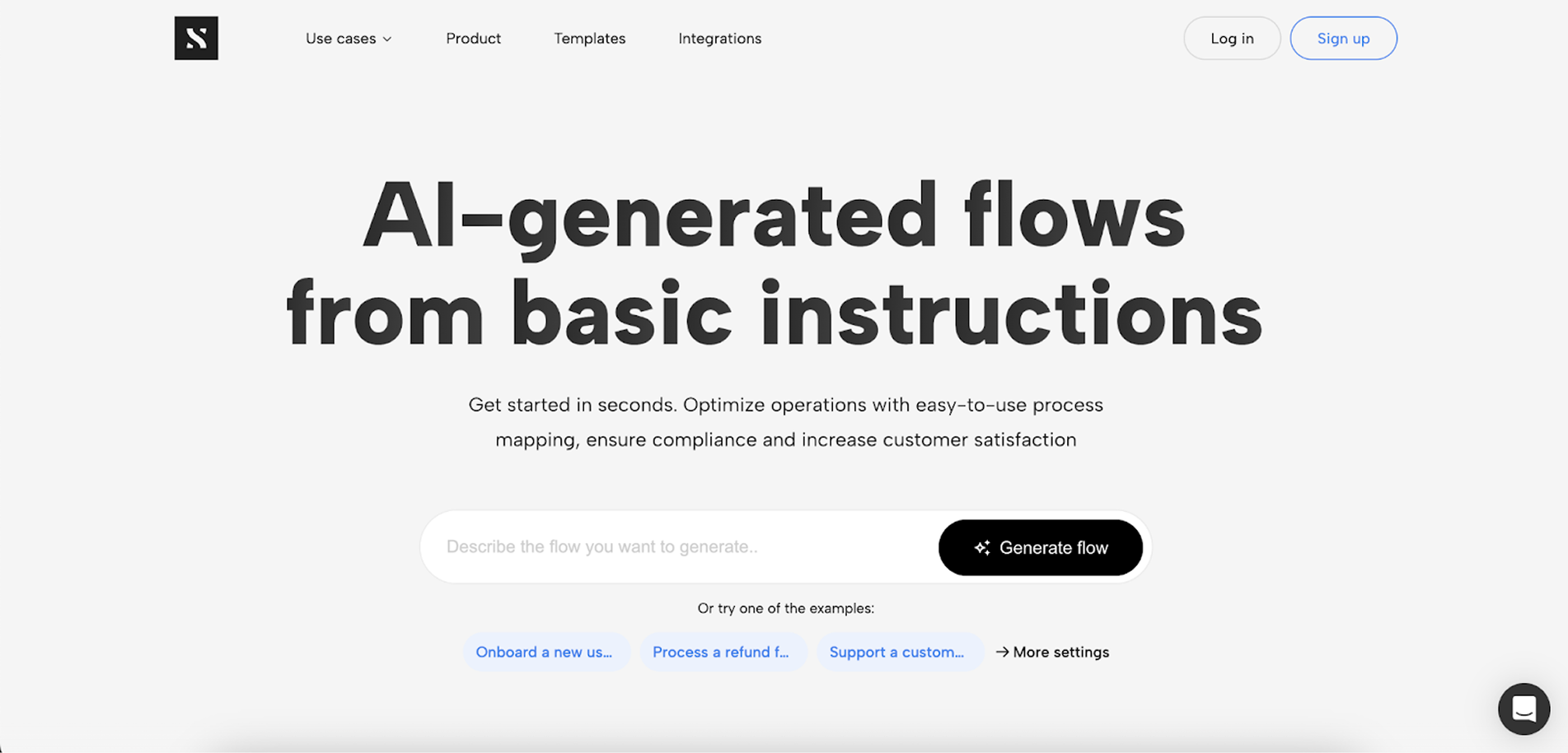
- Startup description: A collaborative platform for process mapping that helps teams visualize workflows, optimize operations, and align cross-functional knowledge, without the need for technical training.
- Year founded: 2018
- What’s to steal / what works well: clean layout with great UI previews, strong simplicity-first messaging, minimal friction to get started
- Areas for improvement: overly generic headline, missing strong product value differentiation, weak storytelling hierarchy
Strengths
- Simple, approachable hero: Headline (“Process mapping for everyone”) and subhead convey accessibility, no jargon, no fluff.
- Interactive UI preview upfront: The above-the-fold screenshot offers immediate clarity about the product’s purpose and interface.
- Strong feature clarity: Each feature is presented in plain language with supportive icons, easy to scan and understand.
- Use-case mapping by role: The “Built for future-minded people” section segments audience types in a helpful, clear way.
- No-code appeal: Repeated emphasis on simplicity and “no training required” gives confidence to less technical users.
- Subtle animation with clean UI colors: Visuals feel light, modern, and non-distracting, enhancing focus on the tool’s capabilities.
Weaknesses
- Generic headline: “Process mapping for everyone” lacks distinctiveness many tools could say the same.
- Minimal storytelling flow: The homepage reads more like a feature checklist than a persuasive narrative. No emotional or business outcomes are highlighted.
- No clear CTA hierarchy: “Get started for free” and “Learn more” compete for attention; the primary CTA doesn't stand out visually.
- Underused testimonials: Only one customer quote is featured, and it's visually small compared to the rest of the content.
- No social proof section: While logos are shown, there’s no expanded testimonial area or in-depth customer story to deepen trust.
- Lack of product segmentation: Unlike Notion or Slite, there’s no multi-product narrative, feels like a single-use tool even if it isn’t.
ShiftX delivers a focused, accessible homepage that prioritizes usability and team alignment through polished visuals and plain-spoken copy. While the bold typography and minimalism make the site easy to digest, the lack of emotional pull and outcome-oriented storytelling may limit appeal for teams seeking more than just clarity. To increase engagement, ShiftX could strengthen its CTA hierarchy, incorporate richer user narratives, and elevate the strategic value of process mapping beyond simplicity.
22. Popupsmart
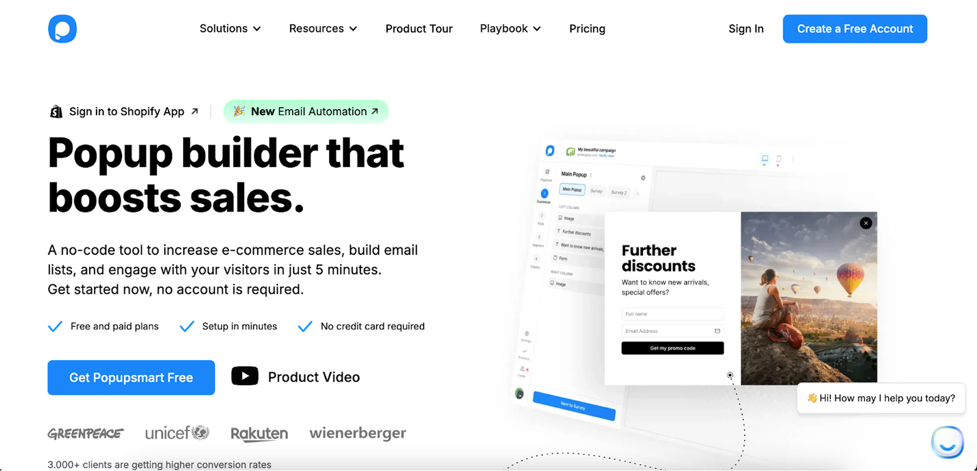
- Startup description: No-code popup builder to drive e-commerce sales, collect emails, and boost engagement.
- Year founded: 2018
- What’s to steal / what works well: clean UI, strong social proof, clear no-code positioning
- Areas for improvement: main CTA is difficult to distinguish, some visual clutter
Strengths
- Clear value prop: bold, benefit-driven headline explains purpose right away
- Visual onboarding: screenshots and tooltips walk users through key steps
- Trust elements: customer logos, testimonials, and Capterra ratings build credibility
Weaknesses
- CTA visibility: main button gets lost because of visual priority and long copy.
- Visual noise: overuse of icons, tooltips, and floating elements in some sections
- No pricing snapshot: plan details are hidden deeper in the site
Popupsmart’s homepage is fast to scan and conversion-focused, but could benefit from stronger CTA contrast and a simpler visual structure in key areas.
23. Abyssale
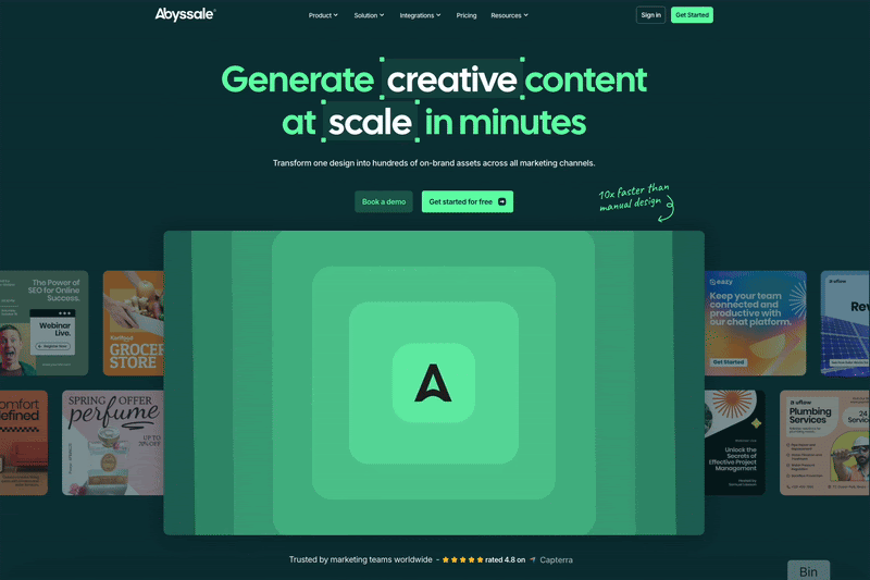
- Startup description: Creative automation platform that lets teams generate visual content at scale—fast, on-brand, and AI-assisted.
- Year founded: 2020
- What’s to steal / what works well: clear messaging on speed and automation, visual storytelling, dynamic demo previews
- Areas for improvement: visual density in some sections, more streamlined CTA flow
Strengths
- Bold headline messaging: communicates scale, speed, and automation clearly (“Generate creative content at scale”).
- AI-powered productivity: messaging highlights real impact (e.g., “10x faster than manual design”).
- Collaborative features: approvals, version control, and feedback loops are shown visually.
- Customer success stories: grounded in real use cases (Bagelstein, MyJobGlasses, DeinDeal).
- Comprehensive feature showcase: well-designed module grid surfaces product depth effectively.
Weaknesses
- Busy mid-sections: feature visuals + icons + reviews all in one spot feels cluttered.
- CTA inconsistency: too many similar “Get started” and “Book a demo” buttons across sections dilute urgency.
- Green-heavy palette: while consistent, the monochrome dark green may feel visually monotonous over long scrolls.
- Some jargon risk: terms like “Neptune Gen-1 Alpha” might confuse non-technical users.
Abyssale's homepage delivers a confident pitch on speed and scalability for creative teams. It's visually sharp and filled with functionality, but could benefit from more pacing, clearer conversion flow, and less visual crowding to make the core message land faster.
24. Surge
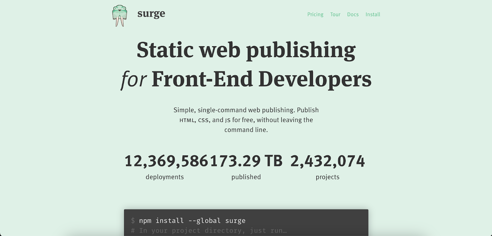
Startup description: Surge is a simple web publishing platform that lets front-end developers deploy static sites instantly from the command line.
Year founded: 2015
What’s to steal / what works well: use of code snippets, clear value proposition
Areas for improvement: lack of product visuals.
Strengths
- Clear value proposition: The headline directly targets front-end developers with a simple, benefit-focused message.
- Minimalist design: Clean layout and generous whitespace keep the focus on core content without distractions.
- Effective use of code snippets: Terminal commands shown in context help developers quickly grasp how to get started.
- Social proof: Prominent testimonials from recognizable names reinforce credibility and usefulness.
- Developer-friendly tone: Consistent messaging style tailored to the target audience of tech-savvy users.
Weaknesses
- Lack of product visuals: While code snippets are present, there's minimal visual context showing how the product looks or behaves in use.
- Text-heavy blocks: Some sections (e.g., plugin/tool integrations) rely too much on text and icons without hierarchy or visual breaks.
- Limited feature overview: The benefits of using Surge are implied rather than explicitly listed in a scannable or comparative format.
- Low interactivity: The site could benefit from animated walkthroughs or interactive demos to better illustrate key flows.
25. Claude
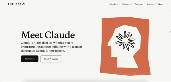
- Startup description: AI assistant developed by Anthropic, designed to assist with tasks like advanced reasoning, coding, and multilingual processing.
- Year founded: 2023
- What’s to steal/what works well: clear layout and the use of illustrations
- Areas for improvement: add interactive elements or product animations
Strengths
- Clear and minimalist layout: The design uses a clean, modern look with ample negative space, making the information easy to digest.
- Clear brand identity: consistent use of color scheme and typography reinforces brand identity throughout the page.
- Highlight of key capabilities: The section explaining Claude’s capabilities (e.g., Advanced reasoning, Vision analysis) is concise and visually supported by simple icons, making it easy for users to grasp the main features.
- Trust and security messaging: The "Why Claude?" section strongly emphasizes security and reliability, which is crucial for attracting enterprise clients.
- Mobile-friendly access: The section about "Take Claude with you" encourages users to utilize the mobile app, enhancing accessibility.
Weaknesses
- Limited above-the-fold content: the hero section could benefit from more engaging content or a clearer value proposition to immediately capture user interest.
- Text-heavy sections: Some areas, particularly in the "Why Claude?" section, contain dense text and links to other Claude’s resources that may overwhelm users or discourage reading.
- Limited interactivity: The page lacks interactive elements that could demonstrate Claude's capabilities directly to users.
Opportunities
- Expand content with case studies: Though you can read detailed case studies on a separate page, integrating client testimonials or use cases on the home page could enhance trust and showcase product versatility.
- Interactive demos: Incorporating interactive demos or AI-powered chatbot experiences on the home page could better demonstrate the product’s value directly to visitors.
- Enhanced visual storytelling: Adding product animation or a short introductory video about Claude’s features could improve user engagement and comprehension.
While Claude’s home page has a solid, clean design with a professional focus, adding more dynamic elements could increase engagement and conversion.
26. Vagon
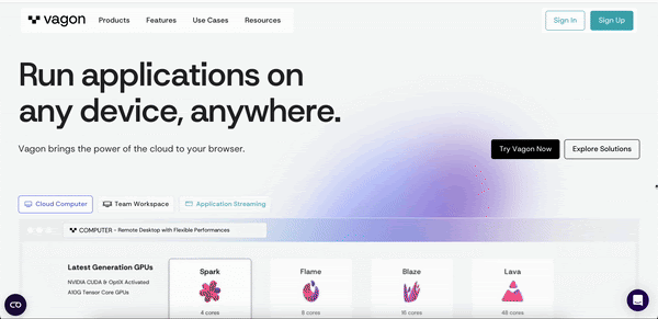
- Startup description: Cloud platform that provides high-performance virtual desktops and scalable application streaming for creatives, developers, and teams.
- Year founded: 2019
- What’s to steal / what works well: Polished design with strong visual hierarchy and trust-building testimonials.
- Areas for improvement: Could simplify message hierarchy and reduce text redundancy in sections.
Strengths
- Clear value proposition: The homepage communicates the product's core benefit, running apps from any device, within seconds.
- Tailored features for creators: Dedicated workspaces, 4K streaming, and GPU-enabled setups cater directly to creative professionals.
- Effective visual storytelling: Strong use of product visuals, icons, and screenshots supports clarity and UX.
- Trust elements: Client logos, partner badges, and user testimonials provide strong social proof.
Weaknesses
- Repetitive benefit messaging: Similar feature points (e.g. performance, streaming) are echoed across multiple sections, making the content feel bloated.
- Minimal navigation cues: Product tour or interactive demos could improve comprehension for new visitors.
Vagon’s landing page effectively communicates a complex product with sleek visuals and user-centric language. While the experience is visually engaging and trust-enhancing, trimming back the content and improving interactivity could streamline the user journey even more.
27. Contractbook
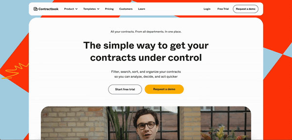
- Startup description: Contractbook is a contract lifecycle management platform that helps teams manage, track, and finalize contracts in a centralized, dynamic workspace.
- Year founded: 2015
- What’s to steal / what works well: Bold, playful branding with clear CTAs and trust-building visuals (G2 ratings, customer logos).
- Areas for improvement: Reduce visual overload from too many illustration styles and saturated colors.
Strengths
- Strong value prop clarity: The hero copy clearly communicates benefits ("control your contracts with confidence & ease").
- Visual engagement: The use of video thumbnails and animated icons adds interactivity and keeps the page dynamic.
- Trust-building elements: Includes ratings, testimonials, compliance badges (SOC2, GDPR, eIDAS), and customer logos to build credibility.
- Feature transparency: Explains core functionalities (import & extract, deadline reminders, secure signatures) in plain, actionable language.
- Conversion-oriented layout: Frequent CTAs with multiple demo/trial buttons encourage user action throughout the page.
Weaknesses
- Too many competing colors: Saturated accent colors (blue, red, yellow) fight for attention and reduce visual hierarchy.
- Style inconsistency: Illustrations, videos, and animations mix visual styles, slightly undermining cohesion.
Contractbook delivers a vibrant, user-focused landing page with clear messaging and trust-building elements. While the design is engaging, it could benefit from more visual consistency and refined hierarchy to reduce cognitive load.
28. Arcade
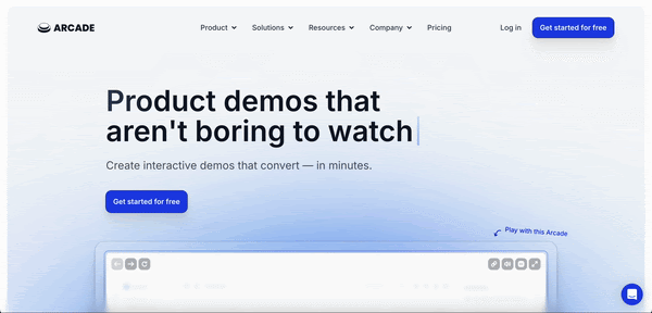
- Startup description: Arcade is a no-code platform for creating interactive product demos that are more engaging than traditional video demos, designed to boost conversion and accelerate onboarding across marketing, sales, and customer success teams.
- Year founded: 2021
- What’s to steal / what works well: Letting users “play” with the product in the hero section is a standout conversion tactic.
- Areas for improvement: Add transparent pricing tiers and technical FAQs to address buyer concerns early.
Strengths
- Clear value proposition: Communicates benefit ("Product demos that aren't boring") in an immediate and catchy way.
- Quantifiable benefits: Emphasizes performance metrics (e.g., 7.2x engagement, 6-min median publish time, 10x faster than video).
- Interactive preview: Live Arcade demo on the homepage invites users to try before signing up.
- Modern Visuals: Light, minimalistic UI with smooth gradients creates a polished, SaaS-native experience.
Weaknesses
- Overuse of superlatives: Frequent emphasis on big numbers (e.g., 10x, 7.2x) may feel overstated without deeper proof.
Arcade’s modern design and measurable benefits cater well to the PLG crowd. The strongest feature is its interactive preview, while the biggest gap is a lack of technical details or depth for more advanced users.
29. Rewind
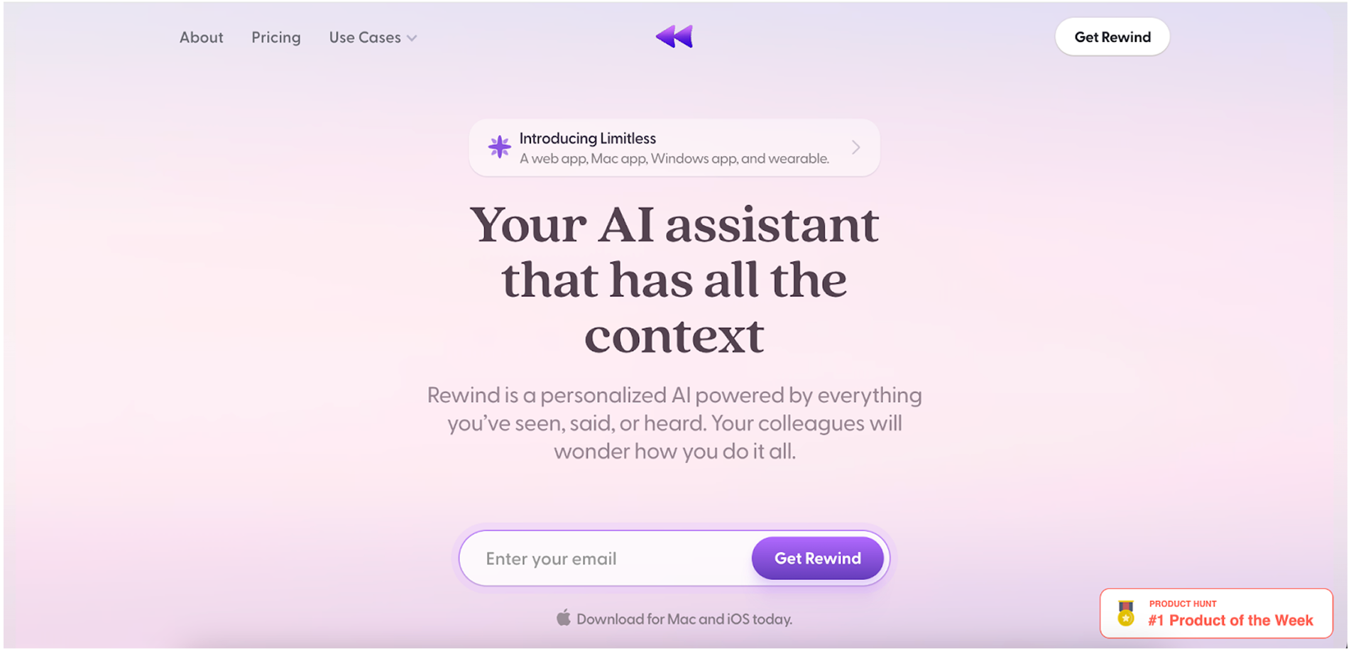
- Startup description: Rewind is a personalized AI assistant designed to capture and store everything you see, hear, or say on your device.
- Year founded: 2020
- What’s to steal/what works well: Emotionally resonant messaging and privacy-first positioning make Rewind feel both powerful and trustworthy.
- Areas for improvement: Replace technical jargon with benefit-driven language and expand on team or enterprise use cases.
Strengths
- Powerful product positioning: Messaging like “Your AI assistant that has all the context” instantly communicates the product's core value in a human, emotional way.
- Emphasis on privacy: Strong differentiation by highlighting local data storage, no cloud integration, and user-controlled recording.
- Beautiful, serene UI: Soft pastel gradients, minimalist layouts, and rounded type give a calm, trustworthy feeling.
- Real-life testimonials from credible figures: Endorsements from people like Marc Andreessen, Alexis Ohanian, and Sam Altman build huge social proof.
- Clear feature structure: Complex functionality (e.g. recording, summarizing, backup) is broken down into simple value propositions like “Avoid losing work” or “Get peace of mind.”
- Trust-driven microcopy: Every block speaks to user pains, note-taking fatigue, forgetting, multitasking overload, without sounding too techy.
Weaknesses
- Could simplify some technical language: Phrases like “compression & transcription” might be better communicated through benefits, not mechanisms.
- Too product-centric at times: While the assistant is personal, the site occasionally forgets to show broader use cases like team workflows or business integrations.
Rewind nails its emotional pitch: helping users overcome cognitive overload with a personal AI that respects their privacy. Its biggest strengths lie in privacy-forward messaging, calming design, and high-impact testimonials. Minor usability improvements in content hierarchy and technical phrasing would make it even more approachable for mainstream adoption.
30. Gitbook
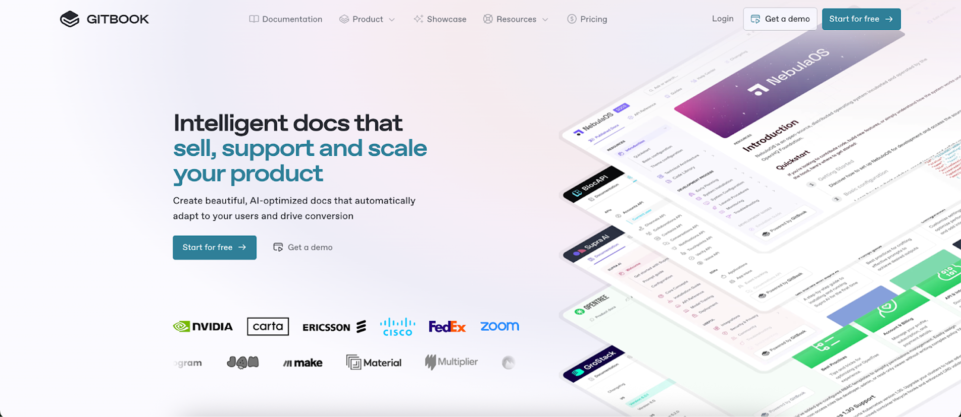
- Startup description: GitBook is a modern documentation platform that helps teams create, manage, and share internal and external docs with ease.
- Year Founded: 2014
- What’s to Steal / What Works Well: AI-optimized documentation that adapts to user behavior adds real value to conversion and onboarding.
- Areas for Improvement: Hero section feels crowded with overlapping gradients and floating docs UI — a cleaner layout would better highlight the product.
Strengths
- Smart personalization: Adapts documentation dynamically to user context (recent activity, pricing tier, feature flags).
- Modern UI & editor: Clean WYSIWYG interface and GitHub/GitLab sync make collaborative doc creation seamless.
- Versatility: Combines product docs, API references, changelogs, and help centers into a single structured experience.
- Developer-friendly: Git-based versioning plus Markdown support caters well to technical teams.
Weaknesses
- Complexity risk: The breadth of features might overwhelm new users or non-technical teams at first.
- Heavy visual stacking: The layered doc cards in the hero section visually compete for attention and can feel cluttered.
- AI features unclear: While promising, the AI capabilities (like “Ask AI”) aren’t demoed interactively, leaving value potential vague.
GitBook’s website design is clean, modern, and developer-focused, effectively showcasing product features through modular visuals, interactive previews, and trust signals like customer logos. Its structured layout and polished typography support clarity, though dense feature blocks could benefit from slightly more breathing room for improved scannability.
What we’ve learned from the best B2B sites
Designing high-converting B2B sites isn’t about copying the flashiest hero section or packing in every trendy animation, it’s about clarity, focus, and aligning with your users’ goals. The best-performing SaaS sites in this roundup don’t just look good; they communicate value instantly, guide users through tailored journeys, and reinforce trust at every scroll.
From clear value propositions to interactive demos, from crisp CTAs to strong social proof, these $1M+ startups show what works in real life, not just in design theory. And more importantly, they highlight where even great websites can stumble: overloaded content, weak CTA hierarchy, or unclear product storytelling.
If you're building a SaaS website design (or improving what you've got), take inspiration from these real-world examples, but don't stop there. When you learn from SaaS websites that lead the market, the key takeaway is that success comes from testing and iterating based on how your specific audience interacts with your page.
For more actionable strategies for designing pages that not only look good but convert, check out our article on SaaS landing page best practices.


