


Oh, landing pages! The little sales magnets that work for you day and night, seven days a week, fishing your perfect leads from the world wide web.
Landing pages have the potential to make the audience hunger for your product, to build them in lines as new Apple releases do. But more often they go no further than handing out flyers near the subway so that people ignore their offer and rush away.
Even though we instantly feel the difference between a boring landing page and a magnetic one, formulating this difference is no easier than explaining the gap between printed fliers and Apple’s marketing strategy.
So we applied for professional assistance in this challenging job. We asked our designers from Eleken agency to point us out to great SaaS landing pages, and explain what makes them outstanding.
Here we have the list of the best SaaS landing page examples according to Eleken’s designers — Daria, Kseniya, Maksym, and Ilya. That’s saying something considering these people make SaaS landing pages for a living.
Let’s take a quick dose of landing page design best practices.
Visual language for visual people, by Miro

Miro is a collaboration whiteboard for distributed teams, and their landing page is noted by Daria as a best practice, for a variety of reasons.
Use case presentation that doesn’t make you lift a finger
“I like the way they show the use cases and automatically switch between them,” Daria says when considering the page.
It is supposed to be a “how it works” part, explaining six different ways to use the app. Sounds like six blocks of text expecting users to figure everything out on their own.

But the company doesn’t tell how the app can work, it just makes the use case presentation that shows it working in six screenshots, obvious at a glance.
The secret of never boring but consistent brand identity
The real reason Daria loves this design isn't superficial; it's because of the look— “the site is never boring to scroll because on each page some unusual little tricks are used,” she explains, and what is more important, “those tricks are perfectly suited for Miro, it makes the landing page look awesome.”
This effect of consistent brand identity is achieved by a set of shapes that Miro developed in line with its key values — spatiality, fluidity, agility, and distribution.

On its landing page, Miro features their shapes as photo frames, background elements and illustration patterns, creating a consistent visual language out of those details.
Digital whiteboard users are people who prefer visuals to express their ideas. I’m pretty sure they enjoy discovering those little visual touches appearing as you drill into the web page.

Putting the app in the center (in a gentle way)
Software products’ landing pages usually show interfaces on a specific device like a phone or laptop, and this approach can hardly capture your imagination.
Miro shows the product in a different way. As Daria remarked, “they incorporated app interface elements into the landing page.”
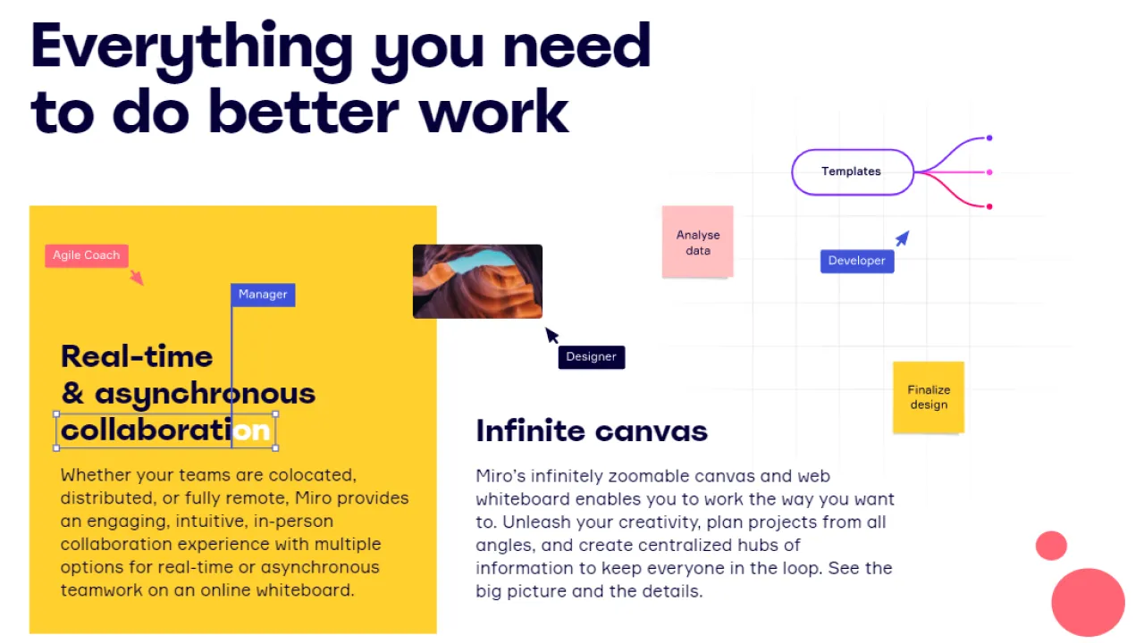
The pointers and the stickers you see above are the elements of the whiteboard that suddenly became a part of a new product landing page design.
The team introduces their brilliant app to viewers literally on every step they go, but in a gentle way. As the app interface elements are organically included into the website design system, you don’t feel like you're being sold the app.
Figma’s recipe on how to steal designers’ hearts

Figma is a browser-based UI and UX design application that enables the entire team's design process to happen in one online tool. Kseniya uses Figma in her everyday design tasks and names its landing page as her favorite. And here’s why.
The best font for landing page chosen to grab the attention
As you open the page, you see how a team designs together the headline “Where teams design together.” Looking at that charming header animation, Kseniya appreciates the "large typography," and "the interesting font."
She also notes the effect the typefaces and the animation had on hers: "It makes you feel that the design was made for designers. Once you open the page, you’re hooked and want to explore it further."
Figma added a pinch of an oddity to their typography to reach that catchy effect. As Tori Hinn, Creative Director at Figma explains, they “wanted to achieve a seamless flex between nonconforming and reserved.”

For oddities is the Whyte Inctrap font, that references ink traps in design history. In the good old days, when people were using metal plates for printing, ink traps were cut in those plates to create a place for the ink to pool.
Thus, the typeface becomes an eye-catching illustrative element that highlights the part of the type’s design that is usually invisible.
Best landing page call to action is the landing page itself
In design, there’s a tendency to share a thing only when it’s complete and perfect. Figma, by contrast, wanted its illustrations to feel like they’re still in process.
The illustrations on the landing page have at least one element being manipulated or edited. Therefore, Figma also incorporates app interface elements into the landing page, just like Miro does.
Tori Hinn says they “wanted to highlight the work that goes into making — often messy, imperfect, changing all the time just like people are.” And it worked.
"The site feels bold, it speaks your language," Kseniya says when considering the page overall. "It’s kind of waiting for experiments" she explains, "and thus, all the design embodies a call to action — like, let’s open Figma and start creating whatever.”
Feels like a good alternative to vague, impersonal, and frankly, a little bit domineering “Click here” or “Buy Now” clichés.
Perfect B2B SaaS landing pages example from PandaDoc

PandaDoc is automating the way B2B companies create proposals, close contracts, and get paid. This landing page was chosen for us by Maksym.
The siren call for busy people
This member in our list of great product landing pages may seem simple and plain at first, especially after the previous two landing page design examples with vibrant colors and bold designs — all because this site was made with the thought of a completely different audience.
PandaDoc speaks to B2B people buried in work and immediately recognizes its potential customers’ pain point: the overcomplicated process of having deals done. They answer this with a calm and confident design that simply states how they can help — by automating every stage of the deal cycle.
The credible look of this page is being established thanks to "the logical site structure" and “strong value proposition,” Maksym explains.
The call to action is clear, and the benefits are immediately visible before you even scroll down.
How to build brand authority
Maksym notes “the catchy visual style that benefits from the mix of photos and illustrations” and “pastel tones that look great when they're mixed.”
Another remarkable feat in PandaDocs design refers to client audio testimonials, that provide prospective customers with the face, voice, enthusiasm and personality of existing customers.
All those important for trustability details are unavailable through plain text, and more expressive video testimonials are usually submitted in poor quality and look inconsistent on a page. The PandaDoc’s audio gets the best of both text and video format.

How to show value proposition: learning from Pipe
Pipe’s landing page was provided by Ilya, the founder of Eleken. Ilya pays more attention to the business dimension of the website rather than to the visual design — a good chance for us to look at our landing page best practices examples from another angle.

“Pipe presents a novel investing option for SaaS,” Ilya explains.
They trade your monthly subscriptions to investors. As if all their customers converted into annual plans overnight, you get money for annual subscriptions upfront, paying to Pipe a small present of the annual subscription. That’s a good deal for you — usually you spend more on discounts trying to push subscribers to annual plans.
That’s not an easy concept to explain, yet not impossible. Ilya notes that “Pipe is doing a great job illustrating their value” with both copywriting and visuals.
In the animation below, you can see an example of such an illustration. The company shows the difference between a barely visible cash flow you’ve got without Pipe and a forceful wave of money you gain as soon as you adopt their solution.

Learn how to reposition your brand with Intercom
Another example from Ilya — he pointed to Intercom’s landing page as his second favorite. He is impressed by the way Intercom uses its website to reposition itself in customers’ minds from one-trick pony app to multifunctional toolkit: “Intercom is known as an expensive chat app, and it seeks to show that the app can do much more than that.”

This expressive message you see above jumps out at you from the very beginning with no chances to be misunderstood. As you click on a feature among the words in blue, Intercom shows you how it works via the animation on the right. And again, the maximum effect is reached with minimum words.
How to design a great landing page
If you like the way we talk about top SaaS landing pages, you may also like the way we design them. But first, let’s summarize good landing page design tips we’ve learned today:
- Сut the crap if you can do it — you don’t always need a bunch of words to explain complex ideas. Proved by Pipe, Intercom and PandaDoc.
- We need to maintain a consistent brand image to establish a clear identity. But we don’t need to do it in a boring way. Develop flexible visual identity instead of rigid brand guidelines, following the example of Miro.
- If you get tired from smartphone screens looking at you from every second SaaS landing page, there’s a native way to show your app interface — learn from Figma and Miro.
- To grab users’ attention, don’t make the page too smooth and clean — add a bit of oddity like Figma does with its typography.
- To turn all your landing into a call to action, make users feel like they are already using your app. If they like the experience, your product-led growth will start even sooner than they try the product.
- Appealing to busy B2B people, be straightforward and show the value proposition without making them scroll.


