


When working on a new website, finding inspiring website design ideas can make all the difference. Whether you're a designer refining your craft, a startup founder looking for fresh ideas, or a product manager searching for UI/UX best practices, seeing great design in action helps spark creativity.
This collection of best website design examples is not just another random list. It's a handpicked selection curated over the past year by Dmytro Shkliaruk and Darina Silchenko, senior UI/UX designers and UI mentors at Eleken. Though at Eleken, we mostly design complex web apps and SaaS products rather than standalone marketing websites. But that’s exactly why we pay so much attention to great website design: the same principles that make these sites clear, engaging, and high-converting are the ones we apply to dashboards, onboarding flows, and in-app experiences.
This collection reflects that product-designer perspective on web design. The examples showcase outstanding web design principles, innovative layouts, and UX strategies that make a real impact. From bold typography choices to seamless interactive elements, these websites offer valuable insights for anyone aiming to create best website design that will be both beautiful and functional.
In this article, we'll explore a variety of well-designed websites, from minimalist interfaces, to immersive storytelling, to high-converting landing pages, and experimental interactive experiences. Each web design example comes with a brief explanation of what makes a good website design, so you can walk away with actionable ideas for your next project.
Let's dive in.
1. UNITED24 Rebuild Map

Why this design stands out
- Dark UI with high contrast
The website uses a dark-themed map with neon green highlights, creating a visually striking contrast. This aesthetic not only enhances readability but also makes key data points stand out. - Data visualization for transparency
Instead of static content, the site dynamically maps reconstruction projects across Ukraine. Site visitors can easily switch between map view and list view, making navigation intuitive. - Minimalist yet informative UI
The interface is clean and functional, with essential information presented upfront. The UI elements, such as the donation button and project filters, are easy to access without overwhelming the user. - Strategic branding
The UNITED24 logo is bold and placed prominently, reinforcing trust and credibility. The presence of real-time statistics on donations strengthens transparency and engagement. - Mobile-friendly and responsive
The interactive elements are well-optimized for different screen sizes, ensuring a smooth experience across desktop and mobile devices.
Takeaway for designers
This website is a perfect example of data-driven design that balances aesthetically pleasing look with functionality. If you're working on an interactive platform that involves maps, donations, or social initiatives, UNITED24 Rebuild Map is an excellent reference.
2. HeyFriends!

Why this design stands out
- Bold, engaging typography
The homepage headline uses a large, heavy sans-serif font that instantly grabs attention. The word "effortless" is highlighted with a subtle hand-drawn circle, making the message more relatable and dynamic. - Friendly and playful aesthetic
The site embraces hand-drawn elements and organic shapes, reinforcing a sense of creativity and approachability. This is especially effective for a service aimed at content creators. - Clever use of whitespace
The clean, minimal background ensures that every design element stands out, making the content easy to scan and digest. - Effective call-to-action buttons
The contrast between the primary and secondary CTA buttons ("Get Started Now!" in dark green and "View Pricing" in a soft outline) helps guide the user’s next step without overwhelming them. - Illustrative storytelling
The homepage uses a playful, hand-drawn illustration of a person overwhelmed with video production tasks. This visual immediately resonates with the audience’s pain points, making the brand’s value proposition clear.
Takeaway for designers
HeyFriends! is one of the great website design examples to showcase how visual storytelling, bold typography design, and interactive elements can create an inviting user experience. If you're designing for creator-focused platforms, this site demonstrates how to combine playfulness with clarity for maximum impact.
3. Abetka UA

Why this design stands out
- Typographic storytelling
This website is a visual tribute to Ukrainian identity through typography. The bold, geometric custom typeface not only serves an aesthetic function but also acts as an interactive element that draws the target audience into the cultural and historical significance of the letters. - Engaging interactive elements
Each letter is paired with historical and cultural figures, adding an educational storytelling layer to the design. The floating, draggable letter cards create a museum-like experience, making learning about typography and history more engaging. - Striking color contrast
The deep blue background combined with black, white, and yellow highlights ensures that text and images pop, maintaining high readability and a visually cohesive theme. - Minimalist yet bold layout
The homepage embraces a grid-based design with ample whitespace, allowing the oversized typography and imagery to take center stage without feeling cluttered. - Cultural immersion through design
The project is more than just a typography showcase – it’s a historical and artistic exploration. By integrating Ukrainian history into the visual experience, it successfully blends graphic design with cultural storytelling.
Takeaway for designers
Abetka UA is one of the best website examples with a typography-driven approach. It shows how typefaces can be more than just fonts – they can be interactive, educational, and deeply meaningful. If you're designing a thematic, history-based, or cultural project, this site is a fantastic reference for balancing education with aesthetics.
4. B-Egg Farm

Why this design stands out
- Branded, product-first aesthetic
The homepage immediately showcases the product packaging, which seamlessly integrates with the web design. The dripping egg yolk motif extends from the packaging onto the website layout, reinforcing brand identity. - Creative typography choices
The site plays with two distinct typefaces:- Bold, uppercase sans-serif for clarity and strong messaging.
- Handwritten script for an artisanal, organic feel.
This mix conveys a sense of modernity with a handcrafted touch, making the product feel both innovative and personal.
- Engaging visual textures
The cutout text effect (with food imagery inside the typography) adds depth and a tactile feel, making the design more immersive. - Playful illustrations
The black-and-white hand-drawn chicken illustrations add a humorous, friendly touch, balancing the professional layout with a fun personality. - Well-structured information hierarchy
Despite its creative website elements, this example keeps essential details (like product benefits and storage conditions) clearly structured and easy to read. Icons, bullet points, and highlights ensure smooth navigation.
Takeaway for designers
B-Egg Farm belongs to the cool website designs where product branding and web design can work together to create a cohesive experience. If you're designing an e-commerce or food-related website, this site demonstrates how to use packaging as a design theme, playful typography, and engaging visuals to build a strong brand presence.
5. Ellipsus

Why this design stands out
- Elegant, editorial typography
The site’s use of a serif font with high contrast and delicate curves immediately evokes a sense of craftsmanship and creativity—perfect for a writing-focused tool. The contrast between the classic typography and modern UI elements gives it a premium, sophisticated look. - Dark mode hero section
The homepage greets visitors with a dark background and glowing white serif text, creating a high-end, cinematic feel. This contrast draws site visitors in while reinforcing focus and clarity, much like a well-structured piece of writing. - Handwritten annotation effects
Throughout the site, elements like underlines, circles, and highlights mimic a writer’s editing marks, making the design feel personal, crafted, and intuitive. - Illustrative storytelling
The soft hand-drawn elements, such as floating paper cranes and sketched book stacks, add a sense of warmth and creativity while subtly reinforcing the theme of writing as an art form. - Intentional whitespace and hierarchy
The spacious, well-structured layout makes it easy to digest information, mirroring the balance between form and function—just like good writing.
Takeaway for designers
Ellipsus is an excellent reference for typography-driven website designs that blends editorial aesthetics with interactive elements. If you're working on a creative tool, writing app, or artistic brand, this site shows how to combine classic and modern design elements for a unique, engaging experience.
6. Mona Sans & Hubot Sans (GitHub)

Why this design stands out
- Cinematic typography-driven hero section
The homepage features massive, bold text that commands attention. The stacked type with gradient lighting gives the page a 3D cinematic effect, making it feel futuristic and high-impact. - Strong brand integration
The design leans into GitHub’s futuristic branding, with their signature Mona the Octocat and Hubot characters in a dynamic, glowing composition. The imagery makes the page feel more than just a typography showcase—it’s an experience. - Dark mode aesthetic with neon contrast
The deep blue gradient background and glowing highlights create a high-tech, immersive feel, reinforcing the modern and adaptable nature of the fonts. - Seamless blend of typography and visuals
The fonts themselves are the stars of the show—their weight, style, and versatility are demonstrated right in the design, making the site both functional and promotional. - Subtle yet effective interactivity
The page includes scroll-based animations and dynamic lighting effects, giving it a polished, high-production-value feel while keeping the user experience smooth and intuitive.
Takeaway for designers
This is yet another excellent example of web design inspiration, showing that typography-focused branding pages can be made visually compelling. If you're looking for examples of websites for a product launch, a tech brand, or a font showcase, this site shows how to merge strong branding, bold type, and futuristic visuals into a cohesive storytelling experience.
7. Apple Siri

Why this design stands out
- Minimalist, product-first design
Apple’s signature clean, white background allows the vibrant product visuals and typography to stand out. The lack of distractions ensures an immediate focus on Siri’s branding and integration across Apple devices. - Gradient-rich typography for branding
The word "Siri" uses a fluid gradient that mirrors the color scheme of Siri’s interface, creating a strong visual connection between branding and functionality. - Seamless product ecosystem display
Instead of showing Siri as a standalone service, the page integrates it within iPhones, Apple Watches, AirPods, and Apple TV remotes, reinforcing Apple's ecosystem-based user experience. - Dynamic layout and fluid animations
The scrolling experience is smooth and interactive, with subtle motion effects that make the visuals feel alive and responsive, mirroring Apple's hardware and software synergy. - Cohesive brand identity
The page aligns perfectly with Apple’s broader design language—sharp typography, high-end product imagery, and intuitive interaction patterns. Everything feels premium, polished, and effortless.
Takeaway for designers
Apple Siri's page is one of the top website designs when it comes to minimalist UX/UI design that emphasizes brand consistency, simplicity, and interactivity. If you're designing a product-focused home page, this site is a perfect reference for letting visuals and typography do the storytelling without unnecessary clutter.
8. Overrrides

Why this design stands out
- Retro-futuristic hacker aesthetic
The site embraces a low-tech, early-internet aesthetic, with a black terminal-style interface, neon pixelated fonts, and an overall cyberpunk vibe that feels both nostalgic and modern. - Interactive component showcase
Instead of just displaying its offerings, Overrrides lets users interact with different Framer components. Elements like hover effects, keyboard inputs, and right-click triggers showcase the functional capabilities of the library in real time. - Bold, high-contrast typography
The use of bright yellow monospaced text on a black background mimics an old-school command-line interface, reinforcing the developer-centric appeal. - Dynamic, modular grid layout
The page is structured like a dashboard, making it easy to navigate different features while keeping a playful, experimental feel. - Nostalgic VHS-style animations
The intro video, with its 80s VHS distortion effect, adds an extra layer of personality, setting the tone for a fun, tech-savvy, and slightly rebellious brand identity.
Takeaway for designers
Overrrides is one of the great website designs for leaning into niche aesthetics while maintaining functionality and usability. If you’re designing a developer tool, UI component library, or an interactive showcase, this site proves that embracing a unique visual theme can create an unforgettable user experience.
9. Mode

Why this design stands out
- Retro-modern typography
The website features a playful, slightly irregular serif font, which gives it a human, approachable feel. Combined with its large size and unconventional layout, the typography grabs attention while maintaining readability. - Vibrant color palette
The use of deep greens and neon lime accents creates a bold yet sophisticated contrast. The bright elements help direct focus to key messaging, making the site visually engaging. - Modular layout with organic shapes
Instead of rigid sections, the page utilizes soft-rounded boxes and speech-bubble-like containers, creating a more fluid and dynamic reading experience. - Balanced use of visuals and data
The design seamlessly integrates photography, charts, and typography, reinforcing Mode’s identity as a business intelligence platform that’s both analytical and user-friendly. - Well-structured call-to-actions (CTAs)
The "Try for free" button in bright green contrasts perfectly with the darker background, ensuring it's highly visible and encourages interaction.
Takeaway for designers
Mode's site belongs to good web design examples when it comes to making a data-heavy SaaS platform feel fresh and engaging. If you're creating a SaaS application design, working for B2B tech, or analytics, this site proves that bold typography, vibrant contrast, and fluid layouts can break the mold of traditional enterprise design.
10. Lusion

Why this design stands out
- High-end, immersive 3D visuals
Lusion’s website feels like an interactive digital art piece. The use of real-time 3D elements, fluid animations, and dynamic lighting effects makes the experience highly engaging and visually striking. - Minimalist UI with futuristic elegance
The soft gray background paired with bold black typography and subtle shadows gives the site a sleek, modern aesthetic. Despite its complexity, the design feels clean and spacious. - Seamless scrolling experience
The smooth page transitions and micro-interactions create a feeling of depth and motion, guiding users effortlessly through the content. - Typography that complements the visuals
The site uses a modern sans-serif typeface, which is both sharp and legible, ensuring that the text doesn’t compete with the highly dynamic 3D elements. - Strong emphasis on visual storytelling
Instead of overwhelming users with text, Lusion lets its featured work speak for itself, using large, immersive visuals to showcase their expertise.
Takeaway for designers
Lusion is a benchmark for interactive webpage designs. If you're working on a portfolio, creative agency site, or experience-driven brand, this is a prime example of how to merge cutting-edge web technologies with sleek design for an unforgettable user journey.
11. The Message to Ukraine (Obys Agency)

Why this design stands out
- Experimental typography as storytelling
The site’s expressive, kinetic typography combines multiple font styles in an artistic, almost handwritten manner. This blends personal expression with structured content, making the text feel alive and emotional. - Split-screen layout for immersive browsing
The website is divided into two interactive sections:- The left side features dynamic text that morphs and shifts.
- The right side presents historical images and information about Ukrainian cities, culture, and population statistics.
This dual experience allows users to read and visually explore simultaneously.
- Vintage-inspired visual storytelling
The grainy, textured images with sepia-tone overlays give the site a historical document feel, reinforcing its role as a tribute to Ukraine’s heritage. - Fluid interactions and parallax effects
The design responds to mouse movement and scrolling, making each transition feel seamless and intuitive. The staggered appearance of text and images enhances the narrative-driven experience. - Elegant use of negative space
Despite its bold typography and visuals, the site maintains a minimalist, airy layout, ensuring readability and ease of navigation.
Takeaway for designers
This site belongs to stunning web pages designs that use typography and layout to evoke emotion and tell a story. If you're working on historical, artistic, or cultural projects, it demonstrates how design can transcend functionality to become an immersive experience.
12. DIKO

Why this design stands out
- Maximalist and chaotic in the best way
DIKO’s website is a bold, energetic explosion of color, typography, and motion. It rejects minimalism in favor of an intentionally messy, rebellious aesthetic. - Oversized typography with personality
The use of gigantic, hand-drawn style text creates an almost zine-like punk energy. The typography interacts with elements dynamically, making the site feel alive and unpredictable. - Interactive and unconventional navigation
- The homepage features a giant "DIKO" that moves and distorts as users scroll.
- Flies crawl across the screen, adding an unpolished, raw feel.
- Instead of traditional menus, navigation elements are scattered across the screen, blending into the design.
- Mixed media aesthetic
- Retro-style grainy videos
- Brutalist 3D elements
- Glitchy, distorted images
- Flashing neon and grid-like patterns
This collage of textures and styles feels more like an experimental art project than a typical brand agency website.
- Defies corporate norms
DIKO’s site is a statement against sterile, cookie-cutter web design. The use of offbeat humor, clashing elements, and unexpected details reinforces its anti-establishment personality.
Takeaway for designers
DIKO proves that "ugly" design can be beautiful if executed with intention. If you're working on a brand with a rebellious, artistic, or countercultural identity, this is a perfect example of how to turn chaos into an experience.
13. Ventriloc

Why this design stands out
- A sophisticated, data-driven aesthetic
- Instead of the typical sterile, high-tech look, Ventriloc uses rich, earthy tones with elegant typography.
- Deep brown and vibrant orange create a sense of warmth, reliability, and premium service.
- Typography that blends authority with refinement
- A mix of bold serif fonts for emphasis and modern sans-serif text for clarity.
- The serif typography in the hero section gives a high-end, editorial feel, making data consulting seem less transactional and more strategic.
- Interactive dashboard-style visuals
- Instead of static numbers, dynamic charts and analytics are woven into the design.
- The Visits Report section feels like a real-time analytics dashboard, reinforcing the brand’s data-driven expertise.
- The background uses curved lines that subtly suggest movement and data flow.
- Minimalist navigation with strong CTAs
- A no-clutter header, keeping user attention on the content.
- Clear, well-placed CTAs like "Let’s work together" and "Contact us" guide visitors seamlessly.
- Subtle hover effects and microinteractions enhance engagement without distractions.
- A structured layout that feels premium
- The site avoids traditional grid layouts in favor of a flowing, organic composition.
- Reports and data visualizations blend into the content instead of feeling like external widgets.
- A balance between aesthetic appeal and business credibility makes it stand out in the analytics space.
Takeaway for designers
Ventriloc proves that data-heavy websites don’t have to be cold and technical. Through careful typography choices, warm color palettes, and an integrated data presentation, it creates an experience that is both trustworthy and visually engaging.
14. You Can Be Anything (TFTL Agency)
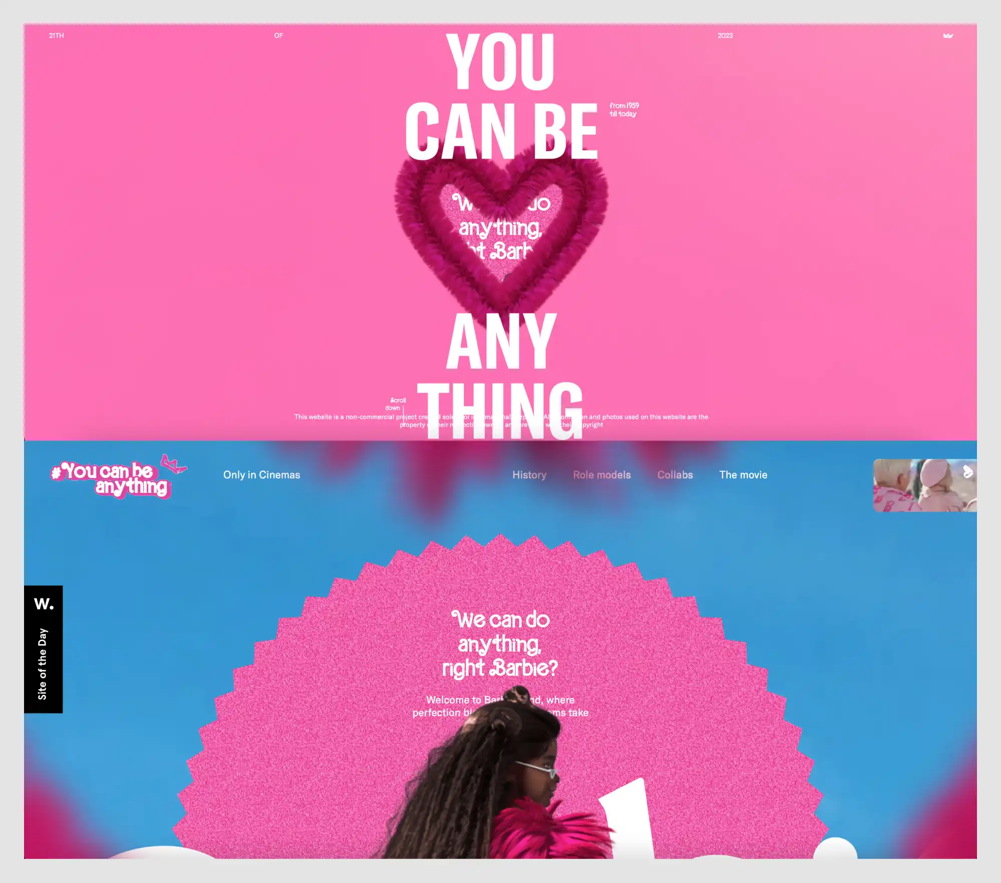
Why this design stands out
- Fully embraces Barbiecore aesthetics
- The entire website is an explosion of pink, glitter, and femininity, reflecting Barbie’s legacy and cultural impact.
- The playful, maximalist design mirrors the toy brand’s identity while modernizing it for the web.
- Immersive, interactive 3D elements
- The homepage features a fluffy, textured heart pulsating with animated text inside it.
- As users scroll, elements move dynamically, maintaining a lively, engaging experience.
- Typography that breaks conventions
- Bold, oversized sans-serif text interacts with the environment, sometimes stretching, rotating, or bending.
- Text is occasionally pixelated or glitched, adding a retro-digital feel.
- Blending nostalgia with digital innovation
- References Barbie’s history from 1959 to today, blending past and present.
- The site design feels both like an old-school toy commercial and a modern interactive experience.
- Dynamic scrolling experience
- Sections feel like a digital scrapbook, with layered text, textures, and animated transitions.
- As users move through the site, different Barbie dolls and thematic elements appear in motion.
- A masterclass in brand consistency
- Every detail, from the motion effects to the color palette, is meticulously aligned with Barbie’s universe.
- The use of sparkle textures, bubblegum gradients, and handwritten-style fonts ties everything together.
Takeaway for designers
This site proves that a strong brand identity can translate seamlessly into web design. It’s a perfect example of how to create an immersive, nostalgic-yet-modern experience that fully embodies the essence of a brand.
15. GRIDS (Obys Agency)

Why this design stands out:
- Educational and experimental approach to design
- The site serves as an educational tool, showcasing different types of grids in web design.
- Users can toggle between grid structures and "crazy mode" for a more dynamic experience.
- Highly structured yet chaotic layout
- The design itself embodies the principles it teaches, using exaggerated typography and extreme grid compositions.
- Text and images deliberately break grids, illustrating the balance between structure and creativity.
- Minimalist yet striking color scheme
- Uses a bold yellow and black palette, with an option to switch to grayscale.
- High contrast ensures clarity while maintaining an experimental aesthetic.
- Interactive learning experience
- Users can see grids in action, reinforcing the importance of composition in design.
- The "Crazy Mode" distorts elements to demonstrate what happens when grids are ignored.
- Typography as a design element
- Huge, overlapping letters emphasize the power of grids in structuring content.
- Deliberate distortions and misalignments illustrate how grids can be manipulated for effect.
Takeaway for designers:
GRIDS is both a functional tool and an artistic statement, proving that structure and chaos can coexist beautifully. It’s a must-visit for anyone interested in advanced layout techniques.
16. Depo Studio

Why this design stands out:
- Modular, grid-based layout
- The homepage is structured like a collage of tiles, each containing different elements.
- As users scroll, tiles shift dynamically, creating a flexible, interactive experience.
- Minimalist yet high-impact typography
- The design leans heavily on bold, sans-serif typography with carefully chosen color highlights.
- Strategic use of blue and black text on white backgrounds makes key words pop.
- Clean, brutalist-inspired aesthetics
- The site embraces a raw, grid-based approach that prioritizes function over decoration.
- Simple geometric elements and solid color blocks reinforce a utilitarian yet stylish feel.
- Playful use of error states and interactive elements
- Even the 404 page is incorporated into the aesthetic, with a bright pink tile featuring handwritten-style typography.
- Hover effects, movement-based interactions, and an unconventional menu layout make browsing engaging.
- Balanced contrast of corporate and experimental
- The website maintains a balance between structured professionalism and creative expression.
- This makes it appealing to both business clients and experimental designers looking for design inspiration.
Takeaway for designers:
Depo Studio showcases how a grid-based layout can feel dynamic rather than rigid. By mixing clean design with unexpected movement and interactions, it demonstrates how minimalism can still be playful and engaging.
17. Rebellion
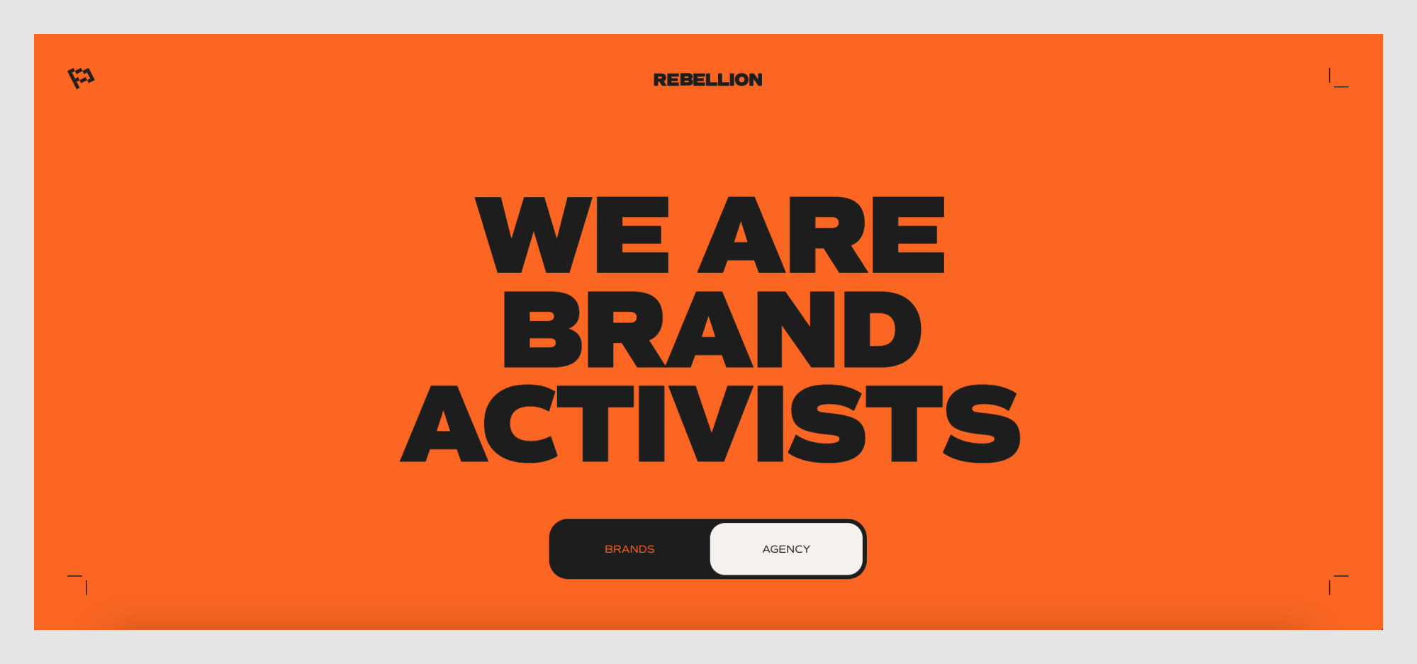
Why this design stands out:
- High-impact color scheme
- A striking orange background dominates the homepage, instantly grabbing attention.
- Black and white elements contrast sharply, reinforcing a bold, no-nonsense brand identity.
- Massive, statement-making typography
- The oversized, all-caps sans-serif type makes a loud, confident impression.
- Words like "BRAND ACTIVISTS" reinforce the agency’s rebellious, disruptive positioning.
- Minimal but strong visual hierarchy
- The homepage is stripped down to essentials, ensuring focus on the message.
- A simple, bold toggle (BRANDS | AGENCY) lets users choose their experience, making navigation effortless.
- Subtle yet effective interactive elements
- Small animated details, like the corner brackets, create a dynamic feel.
- The toggle button feels like a physical switch, adding a sense of engagement.
- A visual identity that aligns with the brand’s ethos
- The aggressive, activist-style branding is reinforced through its bold, unapologetic design.
- Everything about the website conveys energy, movement, and defiance.
Takeaway for designers:
Rebellion’s site proves that minimalism doesn’t have to be quiet. By combining high-impact color, bold typography, and a clear brand identity, it creates an experience that feels both powerful and intentional. If you're designing for a brand with a disruptive, activist-driven ethos, this is a perfect reference.
18. Fabric
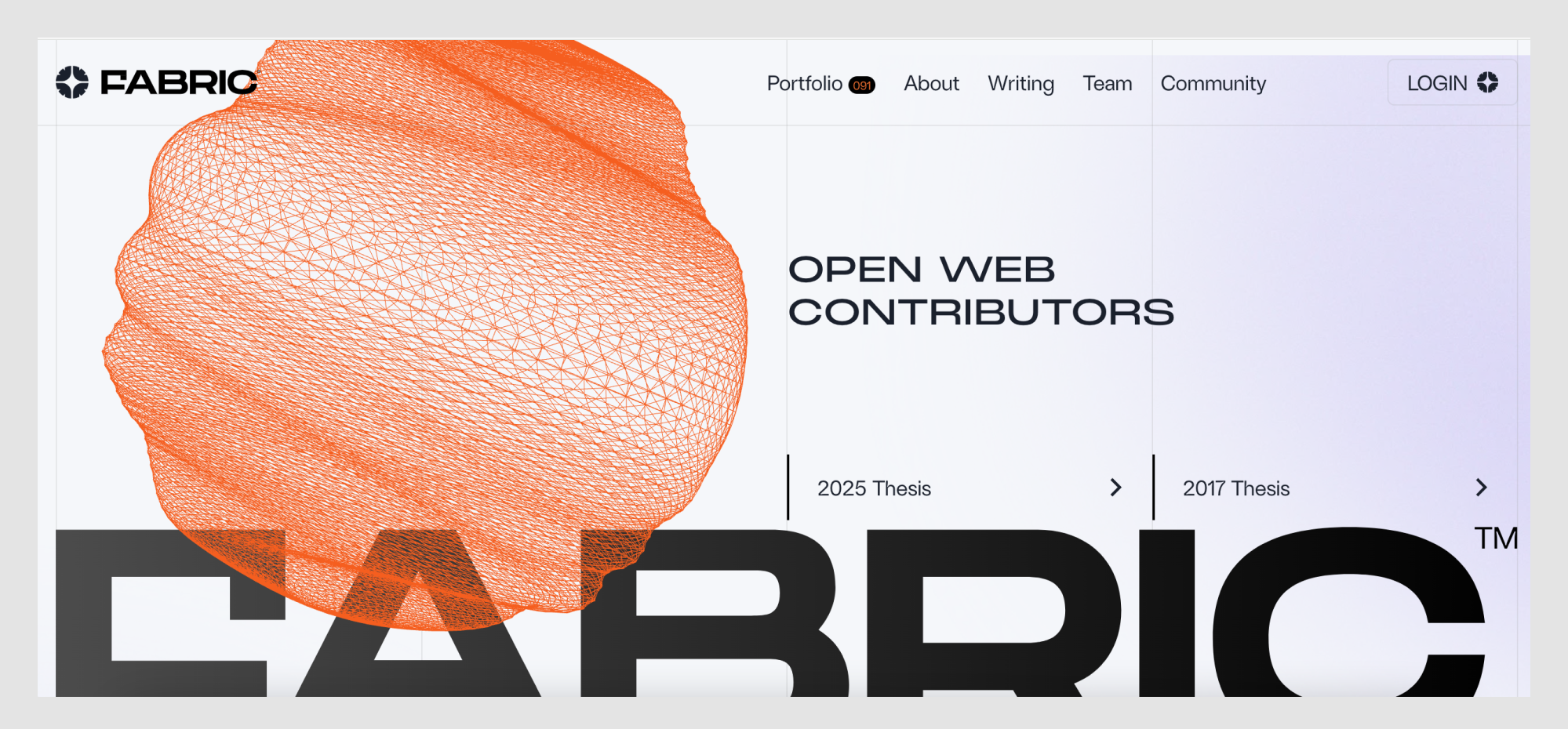
Why this design stands out:
- Striking generative design elements
- A dynamic, wireframe-like 3D shape dominates the homepage, reinforcing Fabric’s focus on innovation.
- The orange mesh structure feels organic yet tech-forward, symbolizing interconnectedness and web evolution.
- Strong typographic hierarchy
- The mix of extra-large, bold sans-serif text and sleek, futuristic fonts creates contrast and clarity.
- The word “FABRIC” partially fades behind elements, adding a layered, immersive effect.
- Minimal but sophisticated navigation
- The menu is clean, with a subtle but effective use of micro-interactions.
- The structured layout prioritizes content accessibility while maintaining a high-end aesthetic.
- Subtle use of gradients and motion
- Light gradients and interactive animations give the site a smooth, polished feel.
- Scrolling effects reinforce a sense of depth without overwhelming the experience.
- A perfect fusion of tech and art
- The entire design balances futuristic tech aesthetics with artistic composition, making it feel both functional and inspiring.
- The blend of hard geometric structures and fluid navigation mirrors the venture capital firm’s vision of an evolving, decentralized web.
Takeaway for designers:
Fabric's website is a masterclass in balancing bold visual identity with functional and good UX. If you're working on a site for a tech-driven or innovation-focused brand, this is a great example of how to blend interactivity, motion, and structured content into a seamless experience.
19. Hydra

Why this design stands out:
- Playful yet technical branding
- The homepage features a meme-worthy duck character wearing sunglasses, instantly setting a lighthearted but confident tone.
- The blend of ancient architecture and modern tech references adds a layer of unexpected contrast.
- Bold, high-contrast color scheme
- The vibrant orange background dominates the design, ensuring strong brand recognition.
- Black outlines and simple typography create a retro, almost print-like aesthetic.
- Minimalist yet quirky typography
- A straightforward sans-serif font keeps things clean, while the inclusion of emojis and speech bubbles makes it more conversational.
- The layout embraces white space, making the text easy to scan while still feeling bold.
- Memes and gamification as engagement tools
- The speech bubble from the duck (“apps that fly 🦆🚀”) makes the content fun and shareable.
- Small gaming-inspired icons in the navigation reinforce the playful theme while subtly hinting at Hydra's capabilities.
- Clever use of microcopy and interaction cues
- The email sign-up field is framed as an essential entry point to “build faster apps,” giving a clear value proposition.
- The banner at the top ("DuckDB-Powered Postgres takes flight!") leans into the duck theme while keeping things informative.
Takeaway for designers:
Hydra is an excellent example of how branding can be both technical and humorous without feeling unprofessional. If you're designing for a developer-focused or SaaS product, embracing a unique, personality-driven aesthetic can help differentiate the brand while keeping engagement high.
For more examples of SaaS landing pages, check out this post!
20. StoryMakers Project

Why this design stands out:
- Vibrant, collage-inspired visuals
- The design mixes photography, cut-out elements, and hand-drawn shapes, creating a playful and dynamic aesthetic.
- Bright, contrasting colors (pink, orange, teal, and purple) enhance visual interest and engagement.
- Layered storytelling approach
- The website reflects the theme of storytelling with overlapping images, patterns, and typography that feel like a modern scrapbook.
- The use of black-and-white photography combined with bold color accents adds depth and contrast.
- Bold typography with personality
- Large, blocky text in high-contrast colors ensures readability while maintaining a sense of fun.
- The combination of uppercase and lowercase typography emphasizes key points while keeping the tone approachable.
- Structured information hierarchy
- The design uses clearly separated sections with color-coded blocks to guide users through course details.
- Numbered elements (“4 блоки навчання” and “12 відеоуроків”) make the content feel digestible and easy to navigate.
- Engaging and interactive elements
- The design invites users to explore with visually compelling graphics and an intuitive layout.
- The mixed-media aesthetic keeps the experience dynamic, encouraging engagement with the course offerings.
Takeaway for designers:
StoryMakers Project demonstrates how to create a visually engaging and story-driven website that feels both artistic and informative. By incorporating layered visuals, bold typography, and structured content, designers can make educational platforms feel exciting and immersive.
21. Auxility

Why this design stands out:
- Dark, futuristic aesthetic
- The deep black background contrasts with neon-like gradients in green, purple, and yellow.
- The lighting effects create an almost sci-fi atmosphere, making the site feel modern and high-tech.
- Typography with dynamic contrast
- The mix of bold, futuristic fonts and lighter, minimal text gives the site a clean but innovative look.
- The use of soft glows and shadow effects makes the text stand out.
- Subtle but effective motion design
- Floating 3D shapes add depth without overwhelming the experience.
- The background gradients and light beams shift slightly as users scroll, reinforcing the feeling of modern efficiency.
- Strategic call-to-action placement
- "Let's talk" buttons appear in multiple places with a neon glow, guiding the user toward engagement.
- Each section introduces a key service or industry (fintech, healthcare) with a clear CTA.
- Strong industry positioning
- The site communicates credibility through tech-driven visuals, data-focused copy, and a structured service breakdown.
- It appeals directly to fintech and healthcare industries, making its niche expertise clear.
Takeaway for designers:
Auxility's website is an excellent reference for those designing for B2B tech, fintech, or AI-driven companies. The dark UI with glowing neon highlights creates an ultra-modern look while keeping readability and usability at the core. If you’re designing for high-tech or research-driven industries, using a combination of dark aesthetics, subtle motion, and bold typography can create a sense of authority and innovation.
22. SEBTO

Why this design stands out:
- Minimalist, high-contrast aesthetic
- The website uses a black-and-white foundation with sharp accents of orange for key elements.
- The stark contrast enhances readability and creates a strong editorial feel.
- Magazine-like layout
- SEBTO's design mimics a modern online magazine, with a focus on well-structured typography and negative space.
- The layout prioritizes text-driven content, reinforcing the site's journalistic identity.
- Collage-style visuals
- The imagery combines vintage-style cutouts with contemporary digital graphics, making the site feel bold and unconventional.
- This mixed-media approach adds depth to the brand's identity, balancing nostalgia with modernity.
- Elegant typography with personality
- The use of serif fonts for headlines contrasts with sans-serif body text, creating a refined yet accessible reading experience.
- The orange headlines break up the monochrome design, drawing attention to featured content.
- Community-driven interaction
- The prominent Patreon button encourages user engagement and support, reinforcing its independent media status.
- A structured content approach ensures users can quickly navigate between articles, special projects, and podcasts.
Takeaway for designers:
SEBTO demonstrates how an independent media platform can use a bold yet minimalist design to establish credibility. The careful balance of strong typography, high contrast, and collage-style visuals makes it a great reference for editorial websites. If you're designing for journalism, cultural projects, or independent media, this structured yet expressive approach is worth studying.
23. Pebble Life

Why this design stands out:
- Cinematic first impression
- The homepage features a high-resolution, full-screen video showcasing the Pebble trailer in scenic landscapes.
- The immersive visuals immediately communicate the product’s luxury and innovation.
- Minimalist yet bold typography
- Oversized, modern sans-serif typography gives the site a sleek, futuristic feel.
- The text interacts with images dynamically, sometimes being overlaid or partially obscured for depth.
- Fluid and engaging scrolling experience
- Smooth, parallax-like transitions guide users through the product story.
- Animated elements make the experience feel more interactive without overwhelming the design.
- Nature-meets-technology aesthetic
- A neutral, earthy color palette complements the high-tech black glass elements of the trailer.
- This combination reinforces the brand’s mission of blending outdoor adventure with smart technology.
- Intuitive call-to-action placement
- The "Build" button in the top right encourages users to explore customization options seamlessly.
- Scroll prompts and interactive previews keep the experience engaging and action-driven.
Takeaway for designers:
Pebble Life is a masterclass in blending product storytelling with high-end visuals. If you’re working on a luxury or tech product, you can take inspiration here or partner with one of the leading UX agencies to bring that story to life in a seamless digital experience.
24. Can't Unsee

Why this design stands out:
- Gamified approach to design education
- The website is structured as an interactive game where users spot UI inconsistencies.
- A progress bar and coin counter add an element of challenge and engagement.
- Retro gaming aesthetic
- The neon, glitchy text logo evokes classic arcade games.
- Pixel-style typography and bright, contrasting colors reinforce the nostalgic vibe.
- Simple yet effective UI
- Dark background allows the game elements to stand out.
- Clean card layout ensures the visual comparisons remain the focal point.
- Fun yet educational concept
- Helps designers train their eye for detail in an entertaining format.
- Reinforces the importance of pixel-perfect UI execution.
- Microinteractions for enhanced engagement
- The interface includes subtle animations when users make selections.
- Immediate feedback keeps players engaged and learning.
Takeaway for designers:
Can’t Unsee turns UX/UI learning into an addictive game. If you’re designing an educational tool, consider how gamification and interactive feedback can create engagement, or borrow insights from a UX research agency that specializes in usability testing.
25. MORAL

Why this design stands out:
- Editorial-style typography. The oversized, high-contrast serif typeface gives the site the feel of a high-end fashion magazine rather than a typical skincare brand.
- Cinematic product presentation. The full-screen imagery, close-ups of dewy skin, and artistic compositions make the product feel aspirational.
- Minimalist yet impactful layout. The site embraces negative space, allowing each element—text, images, and product shots—to breathe.
- Playful text integration. Small circular cutouts in the typography reveal product images and skin textures, making the layout dynamic.
- Soft, natural color palette. Cream, black, and muted green tones reinforce the brand’s organic yet luxurious positioning.
Takeaway for designers:
MORAL’s website is an example of how typography can serve as the primary design element. It proves that a bold serif typeface, when paired with clean layouts and high-end imagery, can create a luxury brand experience. If you're designing for beauty, wellness, or fashion, consider letting typography lead the visual identity.
26. прапор.укр (prapor.ukr)

Why this design stands out:
- Bold and authoritative color presentation
The website establishes an official, almost governmental tone with its strong use of Pantone-certified blue and yellow, the official colors of the Ukrainian flag. - Minimalistic yet informative layout
Instead of overwhelming users with text, the site keeps information concise and to the point, reinforcing the credibility of the presented color standards. - Engaging interactivity
Users can copy HEX and CMYK values directly, ensuring practical use for designers, government institutions, and organizations needing accurate flag colors. - A patriotic and culturally significant theme
The website ties its visuals to real-world examples of Ukrainian flags in use, reinforcing its importance.
Takeaway for designers:
A well-designed informational website doesn’t need complexity—it needs clarity. This project proves that even a single-purpose website can be visually appealing and functionally impactful when executed with precision.
27. Fluent

Why this design stands out:
- Elegant dark mode interface
The dark background with glowing blue and green gradients creates a futuristic, calming atmosphere—ideal for a medical tech product focused on reducing doctor burnout. - Conversational UI approach
The interface mimics a doctor-patient chat, making it instantly relatable and intuitive for healthcare professionals. The floating text bubbles reinforce the concept of natural speech transcription. - Strong call-to-action with a clear value proposition
"It’s time to look up" is a compelling message, emphasizing how Fluent helps doctors focus on patients instead of taking notes. - Smooth integration of AI-driven content
The way Fluent showcases an AI-generated medical summary gives users an immediate sense of the tool’s capabilities. The “Copy” button adds practicality.
Takeaway for designers:
Medical tech design should balance professionalism with approachability. Fluent achieves this by blending a sleek aesthetic with human-centric UI elements, ensuring usability while evoking trust.
28. Umbrel

Why this design stands out:
- Futuristic dark mode UI
The dark aesthetic with neon purple accents gives Umbrel a sleek, cutting-edge feel, reinforcing its positioning as a modern, privacy-focused alternative to mainstream cloud storage. - Typography-driven impact
The bold tagline, "Your cloud. In your home." makes a powerful statement, with the gradient effect on "home" emphasizing its core value proposition—local, private storage. - Blurred-glass effect for contrast
The card design with soft blur (on the left panel) mimics real-life UI elements, creating an almost "OS-like" feel that makes the website experience more immersive. - Well-integrated product showcase
The split-screen layout effectively presents both the announcement for UmbrelOS 1.4 and a direct preview of its file management system, keeping users engaged.
Takeaway for designers:
Minimalist, high-contrast dark mode designs can be incredibly effective when paired with strong typography and accent colors. Umbrel successfully balances a futuristic, tech-driven aesthetic with user-friendly UI elements.
29. Dumy

Why this design stands out
- Playful visual identity
The website embraces a bold and whimsical aesthetic, with a hand-drawn blue cat illustration serving as a central visual element. This adds personality and makes the site feel friendly and unique. - Experimental typography
The oversized Cyrillic text interacts dynamically with the design, blending into the background while still maintaining readability. The use of pink and black type enhances contrast and adds a modern twist. - Layered, collage-like compositions
The combination of large text, illustrations, and colored backgrounds creates a scrapbook-inspired aesthetic, reinforcing the brand’s creativity and artistic approach. - Vibrant, unexpected color choices
Instead of traditional muted tones, the site uses bold, high-contrast hues like electric blue, pastel pink, and bright yellow. These colors enhance the site's playful and unconventional feel. - Minimalist layout with interactive storytelling
Despite its visually rich elements, the site maintains a clean, easy-to-navigate structure. The transitions and hover effects make exploring the content engaging without feeling overwhelming.
Takeaway for designers
Dumy is an excellent example of how a brand can embrace quirky, unconventional design while maintaining clarity and usability. If you're working on a creative agency or cultural project, this site proves that playful visuals, bold typography, and interactive elements can create an engaging, memorable experience.
30. Enpower Trading

Why this design stands out:
- Subtle, dynamic background texture
The website uses a soft, fog-like texture in the background, giving it a refined, futuristic feel while maintaining readability. The subtle motion effect adds depth and elegance. - High-contrast typography
The bold black typography against the neutral background creates a striking visual impact, ensuring clarity while making a strong statement. - Minimalist but engaging UI
The interface is clean and structured, with intuitive navigation and a well-balanced content layout. Elements are neatly spaced, creating a sense of order and professionalism. - Interactive data visualization
The site incorporates animated graphs and charts that dynamically present energy usage trends. These visual elements help make complex data digestible and engaging. - Monochrome meets selective color
The design predominantly features a monochrome aesthetic with occasional pops of color (such as orange highlights), reinforcing a high-tech, data-driven identity.
Takeaway for designers:
Enpower Trading’s website demonstrates how energy and finance-related platforms can balance functionality with visual appeal. The combination of restrained typography, subtle animations, and interactive charts makes the design both professional and engaging. This site is a strong reference for anyone working on data-heavy interfaces that need to remain accessible and visually appealing.
31. Flayks

Why this design stands out:
- Bold, oversized typography
The site utilizes massive, high-impact letters that dominate the screen, creating a strong visual hierarchy and an ultra-modern aesthetic. - Unconventional color palette
Deep green, coral pink, and glossy aqua blue create a striking contrast, making the design feel fresh, daring, and highly memorable. - Layered, interactive elements
The overlapping images, dynamic text, and motion effects make the site feel alive, engaging visitors with a sense of movement and depth. - Experimental branding
The combination of playful, fluid typography and edgy, bold sans-serif fonts reflects a contemporary, rebellious approach to digital identity. - Cinematic photography integration
Large, high-energy images blend seamlessly into the layout, reinforcing the site's creative, editorial-like feel while keeping users visually engaged.
Takeaway for designers:
Flayks demonstrates how pushing boundaries with typography, layering, and unexpected color choices can create a visually unforgettable experience. This site is a prime reference for designers looking to craft a portfolio or brand identity that feels dynamic, stylish, and artistically bold.
32. The Web Can Do What!?

Why this design stands out:
- Immersive card-based storytelling
The website presents information through interactive 3D cards, making content consumption feel playful and dynamic. - Bold, primary color palette
A striking mix of blue, yellow, and red enhances visual impact while maintaining a recognizable Google aesthetic. - Smooth and engaging animations
Each interaction flows seamlessly with transitions that reinforce the concept of a fluid, interactive web experience. - Layered depth and motion effects
The use of shadows, perspective shifts, and floating elements creates a sense of depth, making the content feel more tangible. - Encourages exploration with intuitive navigation
Users can progress through the experience by flipping cards, tapping buttons, and triggering animations, making the learning process feel intuitive and engaging.
Takeaway for designers:
The Web Can Do What!? is a masterclass in using interactivity and motion to enhance storytelling. It demonstrates how designers can use card-based layouts, dynamic transitions, and vibrant colors to create an engaging, educational web experience that feels both fun and functional.
33. Crew by Tubik Studio

Why this design stands out:
- Hand-drawn, expressive illustrations
The site features bold, exaggerated character illustrations with high-contrast colors and dynamic compositions, creating a strong visual identity. - Playful animation and interactivity
Users are welcomed with an animated "Enter" button, setting the tone for an engaging and immersive experience. Elements like characters and text shift subtly as the user navigates. - Vibrant and unconventional color palette
The website avoids traditional corporate colors, instead opting for punchy, high-contrast combinations of red, yellow, blue, and pink, reinforcing its artistic identity. - Creative typography and hierarchy
The use of bold, high-contrast sans-serif type ensures readability while maintaining a strong, expressive presence. The layout mixes structured and freeform elements, making the design feel fresh and dynamic. - Seamless navigation through storytelling
Rather than relying on a standard menu, the site encourages exploration through scrolling interactions that unfold different team members' profiles in a visually engaging way.
Takeaway for designers:
Crew by Tubik Studio is a great example of how a digital agency can use illustration, animation, and non-traditional design elements to create a unique, memorable brand experience. This approach is perfect for creative industries looking to stand out with a fun, personality-driven website.
34. SaveDay

Why this design stands out:
- Bold typography for impact
The homepage features extra-large, high-contrast typography that grabs attention instantly. The black text on a white background enhances readability and visual clarity. - Minimalist UI with strong hierarchy
The design embraces white space, making the content feel structured and easy to navigate. The clear hierarchy ensures users quickly understand the product's value proposition. - Seamless Chrome integration
The interface is optimized for Chrome users, with direct installation buttons, reinforcing its function as a browser extension. - Grid-based visual storytelling
The interface showcases a Pinterest-like grid for saving and organizing bookmarks, making the experience feel intuitive and familiar to users. - Strategic use of color and branding
Yellow and black accents highlight key CTAs, guiding users toward the installation process while maintaining a modern and polished aesthetic.
Takeaway for designers:
SaveDay's is a well-designed website that shows how to communicate a product's purpose through bold design choices. The combination of large typography, a clean grid layout, and a focused color scheme enhances usability while keeping the interface visually engaging. Designers working on SaaS tools or extensions can take inspiration from its streamlined approach to onboarding and user engagement.
35. Adidas Arena

Why this design stands out:
- Dynamic typography and layout
The site uses oversized, high-impact typography that interacts with other elements, creating a bold and immersive experience. The mix of outlined and filled text adds depth and energy. - Collage-style visual composition
Elements like tilted images, layered graphics, and floating text blocks mimic a digital collage, reinforcing the urban and sporty aesthetic of Adidas Arena. - Technical and editorial contrast
The combination of hand-drawn wireframe illustrations and high-quality sports photography bridges the gap between technical architecture and real-world excitement. - Interactive navigation and micro-animations
Scroll prompts, hover effects, and subtle animations guide users through the experience while maintaining engagement. The interface feels fluid and responsive. - Branded color and bold CTA integration
The use of Adidas' black-and-white brand identity is enhanced by striking orange CTA buttons, ensuring clear user direction without disrupting the design harmony.
Takeaway for designers:
Adidas Arena blends energetic branding with technical precision, creating an engaging digital experience that shows how popular web design companies can use motion, interaction, and visual storytelling in experiential projects. The mix of structured layouts with collage-like elements makes it ideal for sports-related websites. Designers can draw ideas from its strong typography, layered visuals, and dynamic interaction cues to create compelling, immersive digital storytelling.
36. Metadrop

Why this design stands out:
- Futuristic and high-contrast aesthetic
The site employs a dark mode interface with neon-inspired gradients, creating a sleek and modern look that aligns with the Web3 and crypto space. - Dynamic track-based UI
The homepage features animated, racing-style progress bars that visually represent different crypto projects, reinforcing the platform’s gamified and competitive nature. - Interactive elements and live engagement
Real-time user interactions are displayed on the homepage, with avatars and transaction data moving across the screen, making the experience feel lively and community-driven. - Minimal yet bold typography
The clean, sans-serif typography contrasts sharply against the dark background, ensuring clarity and readability while maintaining a futuristic aesthetic. - Seamless onboarding and engagement CTAs
The UI encourages immediate interaction with clear CTAs like “Launch a Coin” and “Connect,” making it easy for users to engage with the platform right away.
Takeaway for designers:
Metadrop is a strong example of how motion design and real-time interactivity can enhance user engagement. The combination of neon gradients, dynamic progress bars, and live user activity creates an immersive and visually compelling experience. Designers working on fintech, gaming, or crypto projects can take inspiration from its high-energy interface and interactive storytelling.
37. Teenage Engineering

Why this design stands out:
- Minimalist, high-tech aesthetic
The website embraces a sleek, dark-themed interface with clean typography and a focus on negative space, creating a futuristic and refined look. - Highly structured yet playful layout
The navigation is visually distinct, using outlined icons and neatly arranged text, making it easy to explore while maintaining a unique design language. - Striking product presentation
Products are showcased with high-quality imagery, subtle animations, and interactive elements, reinforcing the brand’s dedication to innovation and detail. - Multilingual and globally accessible
The site incorporates multiple languages seamlessly within the interface, ensuring accessibility for an international audience while keeping the design uncluttered. - Iconography-driven navigation
Instead of traditional dropdowns, the menu uses minimal icons and wireframe-style illustrations, aligning with the brand’s futuristic and engineering-focused aesthetic.
Takeaway for designers:
Teenage Engineering’s website is an excellent example of how minimalism can be both functional and visually compelling. By balancing structured layouts, bold typography, and a strong brand identity, it creates an immersive, high-tech experience. Designers working on product-focused or futuristic brands can take inspiration from its clean UI, intuitive navigation, and engaging product storytelling.
38. Art+Tech Report

Why this design stands out:
- Bold, futuristic typography
The site employs a combination of blocky sans-serif and elegant serif typefaces, creating a striking contrast that reflects the blend of art and technology. - Dynamic, modular layout
The grid-based structure with floating elements adds a sense of movement, making the design feel dynamic and engaging without overwhelming the user. - Monochromatic blue aesthetic
A single, vibrant blue color dominates the design, reinforcing the futuristic and digital theme while ensuring visual consistency. - Interactive elements with depth
Buttons, text, and content blocks have subtle shadows and layering effects, creating an illusion of depth and enhancing user interaction. - Minimalist but high-impact UI
Despite its bold visuals, the site remains clean and navigable, proving that experimental design can still maintain usability.
Takeaway for designers:
Art+Tech Report showcases how a bold, monochromatic approach combined with creative typography and an interactive layout can create a memorable experience. Designers looking to craft digital-first, futuristic interfaces can draw inspiration from its structured yet fluid aesthetic.
39. Endless Tools

Why this design stands out:
- Sleek dark mode aesthetic
The high-contrast black background enhances the vibrancy of the showcased 3D elements, making the interface feel premium and immersive. - Realistic 3D interface presentation
The website mimics the experience of using the tool itself, displaying a rendered workspace with floating UI elements that create an engaging and interactive feel. - Minimalist, high-impact typography
The use of clean sans-serif type, paired with bold headings and generous whitespace, ensures clarity and effortless readability. - Subtle lighting effects
A soft light glare effect across the top of the interface enhances realism, giving the design a polished and tactile appearance. - Interactive feel without overwhelming animations
The site remains highly interactive, but transitions and hover effects are smooth, avoiding excessive motion that could distract from the core content.
Takeaway for designers:
Endless Tools demonstrates how a well-crafted dark theme combined with interactive, UI-focused design can create an engaging experience. This approach is ideal for digital tools, software showcases, and futuristic web projects.
40. Ethnocare

Why this design stands out:
- High-contrast, bold typography
The oversized, capitalized text creates a strong visual hierarchy and ensures readability against the dark background. - Dynamic 3D product visualization
The floating and rotating 3D model of the product adds depth and interactivity, making the design feel more immersive. - Minimalist dark mode aesthetic
The sleek black background with bright white and cyan typography enhances contrast and creates a modern, premium feel. - Subtle motion effects
The text and product animation guide the user's focus naturally, improving engagement without overwhelming the interface. - Clear product storytelling
The page uses concise, impactful messaging to communicate the product’s value, focusing on its key innovation: the air expansion system.
Takeaway for designers:
Ethnocare's website is a great example of how high-contrast design, interactive 3D elements, and minimalist aesthetics can work together to create a memorable and engaging product showcase. If you're designing for a high-tech or premium brand, this approach demonstrates how to balance sophistication with usability.
41. Appwrite

Why this design stands out:
- Modern dark UI with gradient highlights
The dark background with pink and white gradients creates a sleek, futuristic feel while maintaining readability. - Bold, engaging typography
The large, high-contrast headline with subtle underlines adds emphasis and guides user attention to key messages. - Clear, developer-focused messaging
The site instantly communicates its value proposition—helping developers build backends quickly—without unnecessary distractions. - Strong call-to-action buttons
The prominent "Get started" button in vibrant pink contrasts well against the dark background, making it easy to locate and click. - Open-source credibility
The GitHub star count (45K+ stars) is prominently displayed, reinforcing community trust and adoption.
Takeaway for designers:
Appwrite's design is a great example of how a developer-focused platform can use a dark UI, clear messaging, and strong CTAs to create a compelling home page. If you're designing for a tech audience, consider using bold typography, a clean grid, and high-contrast buttons to improve engagement.
42. Artbruno

Why this design stands out:
- Minimalist and structured layout
The design follows a clean grid system with well-defined content blocks, making it easy to navigate. - Neutral color palette with soft contrasts
The use of white, gray, and beige tones creates a calm and elegant atmosphere, complementing the brand’s interior design focus. - Typography hierarchy for clarity
The large, bold headlines contrast well with the lighter body text, ensuring readability and visual appeal. - Engaging imagery showcasing real interiors
High-quality images of modern, stylish interiors help establish trust and showcase the company’s design expertise. - Intuitive navigation with clear call-to-actions
The structured sections, such as "Кухні" (Kitchens) and "Дизайн інтер’єру" (Interior Design), make it easy for users to find relevant information.
Takeaway for designers:
Artbruno's website demonstrates an excellent job of how a clean, structured layout combined with high-quality imagery can enhance brand credibility. If you're designing for an interior design or furniture studio, consider using soft color schemes, grid-based layouts, and clear navigation to create an inviting and user-friendly experience.
43. Flying Papers

Why this design stands out:
- Bold typography for a strong brand identity
- The site uses massive, impactful fonts that dominate the screen, creating a unique and recognizable presence.
- Playful branding with illustrated characters
- Custom cartoon-style characters add personality and make the site feel fun and engaging.
- Dynamic, interactive elements
- Smooth animations and scrolling transitions keep users engaged and encourage exploration.
- Vibrant color scheme
- The combination of bold yellows, purples, and reds enhances the energetic and youthful aesthetic.
- Seamless user experience
- Even the age verification screen is visually integrated into the branding, maintaining consistency throughout the journey.
Takeaway for designers:
Flying Papers’ website showcases how oversized typography, strong color contrasts, and animated elements can create an immersive, playful experience. If you're designing a brand with a bold and unconventional identity, consider using exaggerated fonts, interactive visuals, and character-driven storytelling to make a lasting impression.
44. Arrow Dynamics

Why this design stands out:
- Futuristic, tech-inspired aesthetic
- The dark UI, neon green accents, and sleek typography create a high-tech, cyberpunk feel.
- Highly interactive elements
- The website mimics an instrument panel with functional buttons, dials, and meters, reinforcing the product’s dynamic nature.
- Custom animation-driven experience
- Smooth micro-interactions and motion effects enhance the experience, making the site feel fluid and engaging.
- Typography contrast for readability
- The combination of serif and sans-serif fonts adds a refined, modern touch while maintaining clarity.
- Gamified navigation
- The interface invites exploration with interactive components that make the browsing experience playful and intuitive.
Takeaway for designers:
Arrow Dynamics’ website demonstrates how a futuristic design, immersive interactivity, and bold typography can create a visually stunning and engaging experience. If you're designing for a tech or creative audience, consider using dark themes, micro-interactions, and experimental UI elements to make the experience feel more immersive.
45. Pinnacle Design Lab

Why this design stands out:
- Industrial, tech-forward aesthetic
- The dark, textured background combined with a monospaced, mechanical-looking typeface evokes a futuristic, cyber-industrial vibe.
- High-contrast typography for impact
- The bold, uppercase letters in icy blue and orange create a striking visual hierarchy, ensuring key messages stand out.
- Grid-based layout with a structured feel
- The fine gridlines subtly reinforce a sense of precision, aligning with the brand’s streamlined design approach.
- Minimal yet powerful call-to-action
- A simple button, "Find Your Plan," is placed strategically in a light color for contrast, making it easy to locate and click.
- Tech-style UI elements for a futuristic feel
- Boxed navigation, outlined buttons, and subtle animations contribute to an immersive, digital dashboard-like experience.
Takeaway for designers:
Pinnacle Design Lab showcases how a dark, industrial-inspired UI can create a high-tech, authoritative brand presence. If you're designing for a SaaS, tech, or engineering-focused brand, consider using structured layouts, high-contrast typography, and subtle gridlines to communicate precision and innovation.
46. Kovalska

Why this design stands out:
- Bold and striking typography
- The large, uppercase red text creates a strong brand presence, immediately drawing attention.
- The mix of italic and bold styles in the text sections adds dynamism to the layout.
- Minimalist yet impactful color scheme
- The use of red, black, and white ensures a high contrast, reinforcing the brand’s identity and making content easy to read.
- Dynamic and unconventional text layout
- The angled, staggered text blocks create a sense of movement and excitement, making the site feel more engaging and energetic.
- Strong brand identity
- Kovalska’s distinctive logo and branding are seamlessly integrated into the design, reinforcing the company’s authority and credibility.
- Modern and bold aesthetic
- The website embraces a clean but daring design approach, avoiding unnecessary elements while keeping the visuals striking.
Takeaway for designers:
Kovalska’s website is a great example of how a minimalist color palette combined with bold typography can create a memorable and high-impact design. If you're working on a brand-focused website, consider using large-scale typography, high contrast colors, and a structured but dynamic text arrangement to make a lasting impression.
47. Tiny Wins

Why this design stands out:
- High-impact black-and-white contrast
- The predominantly black background with stark white text creates a bold, high-end look.
- Minimal yet playful design elements
- Subtle pops of pink, hand-drawn icons, and smooth animations add a fun, creative feel.
- Strong focus on case studies
- The homepage quickly highlights projects for major brands, showing credibility through work rather than excessive copy.
- Refined typography and hierarchy
- A mix of bold sans-serif headlines and smaller, elegant subtext ensures a clean and readable experience.
- Smooth scrolling interactions
- Fluid animations and micro-interactions make navigating the site feel effortless and engaging.
Takeaway for designers:
Tiny Wins demonstrates how a creative agency can balance minimalism with personality. If you're building a portfolio or agency site, consider using a monochrome palette with selective accent colors, refined typography, and strategic animations to create a high-end, polished experience.
48. Gemnote

Why this design stands out:
- Editorial-style typography
- The use of high-contrast serif fonts creates a premium, magazine-like feel, enhancing the brand’s upscale positioning.
- Unique organic image frames
- The irregular, wavy cutouts around images add a playful, handcrafted touch, making the visuals feel dynamic.
- Grid-based yet asymmetrical layout
- While the site follows a structured grid, the varied image sizes and placements create a more fluid and engaging experience.
- Subtle vintage aesthetic
- The combination of cream backgrounds, serif text, and slightly textured images gives the site a nostalgic yet modern appeal.
- Product-forward storytelling
- The layout showcases high-quality merchandise in lifestyle contexts, reinforcing the brand’s focus on premium, well-designed products.
Takeaway for designers:
Gemnote’s site demonstrates how an e-commerce platform can elevate its brand identity through typography, framing, and layout. If you’re designing for a product-based brand, consider blending editorial-style design with organic visuals to create a refined yet engaging experience.
49. Stripe Press

Why this design stands out:
- Immersive 3D book showcase
The homepage features floating, rotating book covers that respond to scrolling, creating an interactive, tactile experience. - Dark, cinematic aesthetic
The black background with minimal UI allows the vibrant book covers to take center stage, evoking a premium, gallery-like feel. - Elegant editorial typography
A mix of classic serif fonts for book descriptions and sleek sans-serifs for navigation enhances readability while reinforcing a literary, high-end brand image. - Vertical navigation with progress indicators
A left-aligned timeline-style menu provides a smooth, intuitive browsing experience while subtly guiding users through the catalog. - Color-coded book sections
Each book page features a unique background color matching the book cover, reinforcing strong branding and creating visual cohesion.
Takeaway for designers:
Stripe Press demonstrates how digital interfaces can mimic real-world interactions, making an online bookstore feel as engaging as a physical one. If you’re designing an editorial or e-commerce experience, consider integrating dynamic visuals, minimalist navigation, and immersive scrolling interactions to create a premium and intuitive browsing experience.
50. Pitch
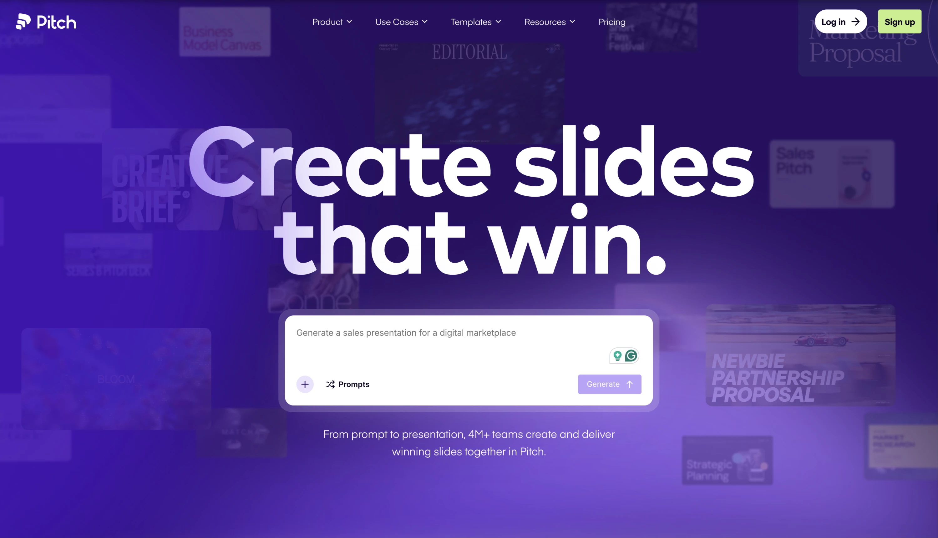
Why this design stands out
- The website is an argument for the product
Instead of explaining what the product can do, Pitch lets the experience speak for itself. The scroll flow, slide-like layouts, and transitions mirror the feeling of building a presentation inside the platform. By the time you reach the CTA, you’ve essentially gone through a presentation yourself.
- Scroll-driven storytelling as a core UX principle
Pitch uses scroll as a narrative tool. Each section unfolds like a well-structured deck — one idea at a time — with smooth transitions and layered visuals creating momentum without overwhelming the user.
- A vibrant color palette that earns its boldness
While most SaaS websites rely on safe blues and grays, Pitch embraces vibrant purple gradients and rich color. The palette gives the brand energy and personality, while clean layouts keep the experience easy to follow.
- Animation as craft, not decoration
Nothing moves just for decoration. Every animation helps guide attention, reinforce hierarchy, or support the story the page is telling, making the experience feel polished and intentional.
- A tone that matches the audience
The copy is concise, confident, and free of corporate jargon. Combined with precise typography and generous spacing, the brand feels professional without losing its sense of creativity and playfulness.
Takeaway for designers
Pitch is one of the best examples of a SaaS website that practices what it preaches. The homepage doesn't just market a presentation tool; it is one, structured, paced, and designed with the same principles the product is built on. If you're designing for a creative or productivity SaaS, this site is a masterclass in making the marketing experience feel like a preview of the product experience rather than a separate layer on top of it.
Final thoughts on web design
Great web design is more than aesthetics — it’s about crafting immersive experiences that engage users, communicate brand identity, and, of course, enhance usability. That’s why top UI/UX design agencies focus equally on bold visuals and accessibility, ensuring every detail supports both brand and user. If you need even more examples of responsive and high-converting websites, check out this article.
And if you're looking to elevate not only your SaaS website but the product behind it, Eleken can help. We’re a product design agency focused on web apps and SaaS since 2015, so we think about marketing pages, sign-up flows, and in-app UX as one continuous experience. Drop us a line to see how our designers can turn that experience into a competitive advantage — starting from $3,799/month for a part-time UI/UX designer or $5,999/month for a dedicated full-time professional.


.png)


