

Toggle switches are a widely used UI toggle component, but they are also one of the most frequently misused. While they seem simple—allowing users to switch between two states like ON/OFF or ENABLE/DISABLE—poor design choices often lead to confusion and frustration.

At their core, toggle switch UI elements are best suited for actions that take effect immediately and can be easily reversed. A good example is enabling Dark Mode or turning notifications on and off. However, many designers make the mistake of using toggles for actions that require confirmation, such as deleting an account or saving changes. These scenarios can cause uncertainty, leading users to second-guess their actions or make unintended changes.
Despite their simplicity, toggle UX issues frequently arise. Some common mistakes include unclear states, poor placement, and using toggles for actions that require additional steps. In this guide, we’ll explore the best practices for toggle switch design, break down common pitfalls, and discuss better alternatives for cases where toggles aren’t the best choice. If you're interested in broader UX design patterns, check out our guide on UX patterns.
Toggle switch design guidelines: UX Rules and UI Design Inspiration

Toggle switch UI elements should be intuitive and easy to use, but poor design choices often lead to confusion. Creating effective toggle buttons requires careful design, user testing, and iterative improvements to enhance both functionality and user experience. A creative combination of icons, text, and colors can significantly improve toggle UX and visual harmony. To ensure clarity and usability, follow these best practices when designing toggles.
Use toggles only for instant, reversible actions and immediate results

Toggles UI components are ideal for settings that take effect immediately without requiring further user confirmation. For example, they work well for enabling or disabling notifications, switching to Dark Mode, or muting sounds. However, they should not be used for actions that require saving, confirmation, or multiple steps. A toggle for “Save changes” or “Delete account” can cause uncertainty, as users may not realize the consequences of their action. In these cases, buttons with confirmation prompts are a better choice.
Always provide clear toggle labels

A common mistake in toggle UI design is leaving the switch unlabeled, forcing users to guess its function. Adding explicit labels, such as “ON / OFF” or “Enabled / Disabled,” removes ambiguity and makes the toggle’s purpose immediately clear. A label like “Dark Mode: ON / OFF” leaves no room for misinterpretation, ensuring users know exactly what they are changing.
Use high-contrast colors to differentiate states

A well-designed UI toggle switch should make it easy to distinguish between its ON and OFF states. Low-contrast colors, such as light gray vs. slightly darker gray, can make it difficult for users to tell if a setting is active. Instead, use clear visual differences—such as a bright blue or green for the ON state and a neutral gray for OFF. In some cases, adding small icons (like a checkmark for ON and an X for OFF) can further enhance clarity.
Ensure the toggle UI is large enough to tap

On mobile interfaces, small touch targets can be frustrating to use. A toggle switch UX should be large enough to tap comfortably, with a minimum recommended size of 44x44 pixels. Additionally, while the visible toggle should remain appropriately sized within the UI, the actual tappable area can be expanded to improve accessibility without affecting aesthetics.
If you're designing interactive input elements, our guides on input fields and filter UX cover best practices for improving usability.
Follow platform-specific conventions

Toggle button UX varies across platforms, and users develop expectations based on their device. On iOS, a toggle in the ON position moves to the right, while on Android, placement may vary depending on system settings. Designing platform-specific toggles ensures consistency and prevents users from struggling with an unfamiliar interaction pattern.
Accessibility considerations for toggle switches
Designing toggle switches with accessibility in mind ensures that every user, including those with disabilities, can interact with your UI components confidently and intuitively. Accessible toggle buttons not only improve usability but also expand your app or website’s reach, making a big impact on overall user satisfaction.
Here’s how to make your toggle switches accessible and effective:
- Use contrasting color for clarity: Make sure your toggle switch stands out against its background by using a contrasting color scheme. Aim for a minimum contrast ratio of 4.5:1 so users with visual impairments can easily determine the current state. For example, a bright green for “on” and a neutral gray for “off” helps everyone, including colorblind users, quickly identify the toggle’s status.
- Provide clear text labels: Always pair your toggle button with direct, descriptive text labels that indicate both the current value and what will happen when the toggle is flipped. This is especially important for users relying on screen readers, as it allows them to understand the toggle’s function and state without visual cues. For instance, “Notifications: Enabled/Disabled” is much clearer than an unlabeled switch.
- Set and indicate a default value: Every toggle switch should have a clear default value, visually indicated so users know the current state at a glance. This helps prevent confusion, especially when users revisit settings pages or interact with long forms.
- Reserve toggles for mutually exclusive options: Use toggle switches only for two mutually exclusive options, such as turning airplane mode on or off. Avoid using toggles for settings that aren’t binary, as this can confuse users about what the toggle actually controls.
- Ensure immediate effect: A toggle switch should apply its new value instantly, without requiring a submit button or extra confirmation. This immediate effect provides direct feedback and reinforces the toggle’s purpose as a control for system functionalities that change right away.
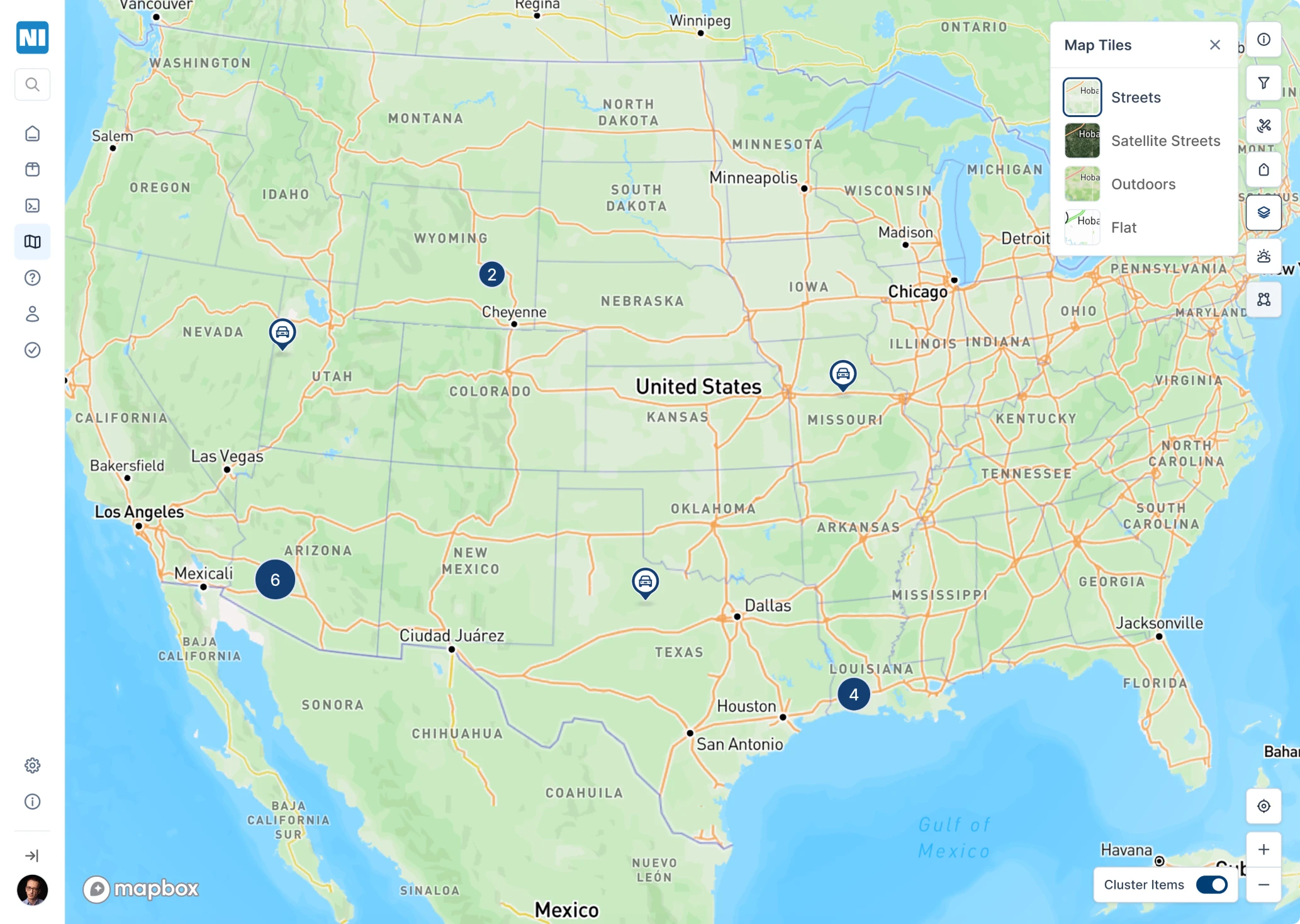
At Eleken, we faced this exact challenge while designing a map page with a clustering feature for Network Innovations. Technically, the “best practice” solution was automated clustering: terminals would group dynamically when users zoomed out and split when zooming in. But the client’s users were already used to a manual clustering toggle at the bottom of the map.
Instead of forcing a more “standard” approach, we kept the toggle and refined the interaction to make it feel intentional and polished, because accessibility and usability are also about aligning with user expectations and mental models.
- Keep toggles separate from form fields requiring submission: When designing forms, don’t mix toggle switches with other form fields that need a submit button. This can make it unclear when changes take effect. For long forms, consider using a single checkbox or moving toggles to a dedicated settings page for clarity.
- Design for easy interaction: Make your toggle button large enough to tap or click easily, at least 44x44 pixels, so users on mobile devices or with limited dexterity can interact with the switch without frustration.
- Follow platform-specific guidelines: On iOS, use the standard toggle switch style with clear “on” and “off” states. On Android, ensure your switch is visually distinct and consider adding a tooltip for extra context. Consistency with platform conventions helps users feel at home in your app.
- Maintain UI design consistency: Your toggle switches should match the style and behavior of other UI components in your app or website. Consistent design language across all elements makes the interface more intuitive and reduces cognitive load for users.
- Provide user feedback: When a user interacts with a toggle, give immediate visual feedback, such as a color change or animation, to confirm the new state. For critical settings, consider a brief confirmation message to reassure users that their action was successful.
- Test with real users and assistive tools: Evaluate your toggle switches using screen readers, keyboard-only navigation, and other accessibility tools. Testing with users who have disabilities can reveal issues you might miss and ensure your toggle UI is truly inclusive.
These accessibility guidelines can help designers create toggle switches that are not only visually appealing but also intuitive and usable for everyone. Accessible toggle buttons and switches are a small UI element with a big impact, helping all users interact with your app or site’s system functionalities with confidence and ease.
However, even when accessibility basics are covered, many products still stumble over common toggle design mistakes that can undermine clarity and usability.
Common toggle UI design mistakes (and how to fix them)
Even experienced designers sometimes misuse toggle switch UI elements, leading to unclear states, unexpected behaviors, or frustrating user experiences. Below are some of the most common mistakes and how to avoid them.
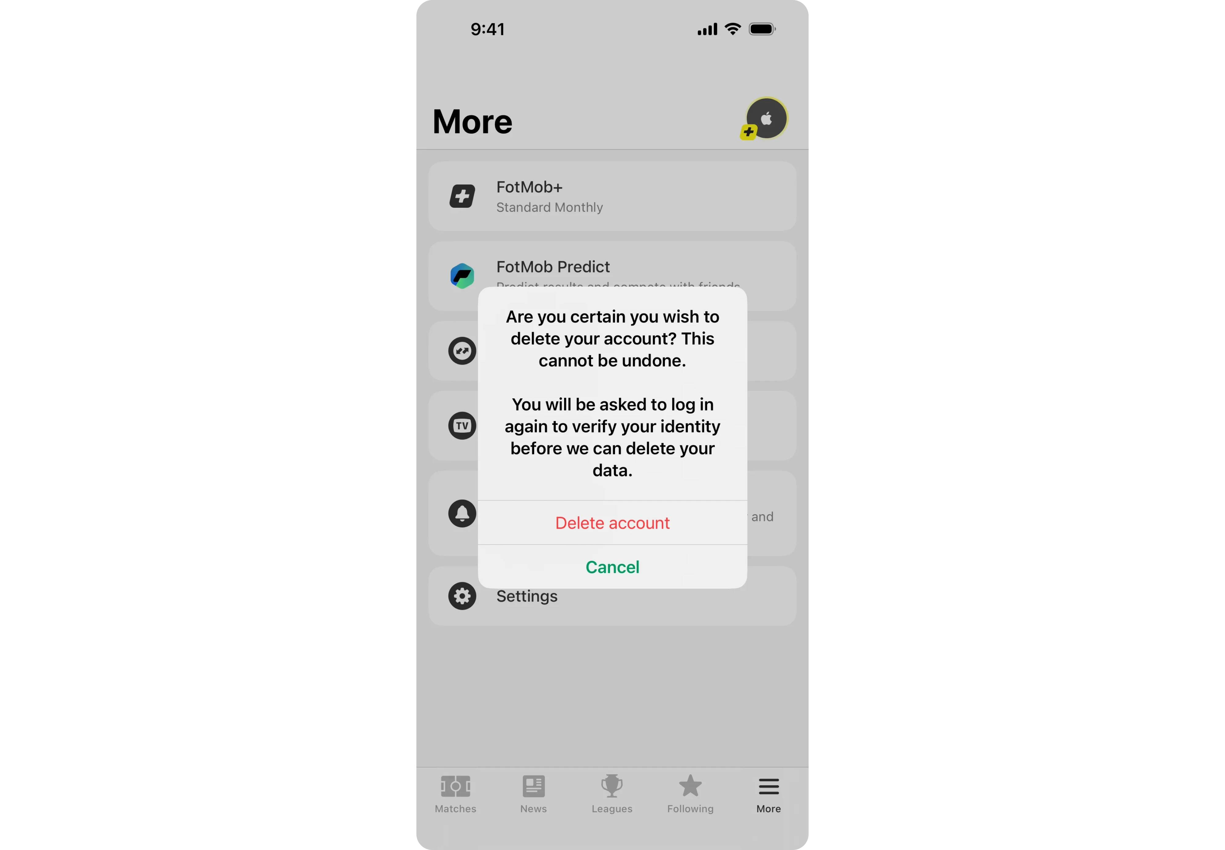
Using toggles for actions that require confirmation
A UI toggle is meant for instant changes, but some designers use it for actions that require confirmation—like deleting an account or submitting a form. This can lead to unintended consequences, as users might toggle a setting without realizing the impact.
Fix: For irreversible actions, use a button instead, paired with a confirmation dialog. For example, instead of a toggle UI for “Delete account,” a red button with a confirmation prompt ensures users understand the action before proceeding.
Making toggles look like buttons
Some UI designs blur the distinction between buttons and toggles UI, leading users to expect one behavior but experience another. If a toggle looks too similar to a standard button, users may assume they need to "click" it rather than switch between two states.
For cases where interactive multi-step workflows are required instead of toggles, check out our article on Wizard UI.

Fix: Keep toggle switch design visually distinct. Toggles should resemble sliders or switches rather than standard buttons. If an action requires a user to press and confirm, it should be a button, not a toggle.
Failing to indicate the current state clearly
A toggle button UX should immediately communicate whether a setting is ON or OFF. When designers use low-contrast colors, unclear labels, or ambiguous positioning, users may not know which state the toggle is in. Using strong contrast, icons, and appropriate placement within the interface can help.
If you're working on broader UI layouts, our guide on grid layout can help you structure designs effectively.
Fix: Use toggle UI design best practices like clear contrast and explicit labels. The ON state should be visibly different from the OFF state, ideally using strong colors (e.g., green for ON, gray for OFF). Labels such as “Enabled” and “Disabled” further reduce ambiguity.

By avoiding these common pitfalls, you can design toggle UX solutions that are intuitive and effective. In the next section, we’ll explore better alternatives for cases where toggles aren’t the best fit.
Alternatives to toggle switches
While toggle switch UI elements are useful for simple ON/OFF settings, they aren’t always the best choice. In many cases, a different UI component can provide better clarity and usability. Here are some alternatives to consider.
Checkboxes for settings that require saving

If a setting doesn’t take effect immediately and requires user confirmation, a toggle UI isn’t the right choice. A checkbox paired with a Save button is a better solution because it allows users to review their selections before committing.
Example: Instead of a UI toggle switch for “Receive email notifications,” use a single checkbox with a Save Changes button to make the selection explicit.
Radio buttons for multiple exclusive options

Toggles UI are designed for binary choices, but when users need to pick from more than two options, radio buttons work better. They clearly present all choices at once, reducing the chance of confusion. If you need inspiration for designing forms, our article on form design provides practical examples.
For example, instead of a toggle switch UX for switching between “Basic” and “Premium” modes, use radio buttons so both options are visible at the same time.
Buttons for irreversible actions

Toggle button UX works best for reversible settings. If an action can’t be undone, a button is a better choice because it allows for an extra confirmation step.
Example: Instead of a toggle switch design for “Delete account,” use a red button with a confirmation dialog to prevent accidental actions.
Sliders for adjustable settings

When users need to adjust a new value along a range—such as volume or brightness—a toggle UI design is too limiting. A slider allows for precise control and better reflects the nature of the adjustment. If you’re interested in exploring other UI elements, our collection of screen design examples showcases effective UI patterns in real-world applications.
Example: Instead of a toggle design for “Brightness: Low/High,” use a slider that lets users fine-tune the setting.
By choosing the right UI element for the task, designers can create interfaces that are clearer and more user-friendly. If you're not sure if your interface has the right UI, conducting user experience audit may help.
In the next section, we’ll summarize key takeaways and best practices.
Final thoughts
A well-designed toggle UX ensures clarity, immediate feedback, and an intuitive experience. However, many designers misuse toggles in ways that lead to confusion and frustration.
To create better toggle switch UI elements, remember these key takeaways:
- Use toggle UI design only for instant, reversible actions, such as enabling Dark Mode or toggling notifications.
- Always include clear labels to prevent ambiguity about what the UI toggle switch controls.
- Ensure strong visual contrast so users can easily distinguish ON and OFF states.
- Follow platform-specific conventions to match user expectations.
- Consider alternatives when a toggle switch design isn’t the best fit—checkboxes for settings that require saving, radio buttons for multiple options, buttons for irreversible actions, and sliders for adjustable settings.
Getting toggle switch UX right requires attention to small details that have a big impact on usability. At Eleken, our designers specialize in intuitive toggle button UX patterns that enhance user experiences. If you need help designing seamless and user-friendly interfaces, get in touch with us — we’d love to bring your vision to life.


.png)


