UI sliders are one of the most versatile UI components in modern design. From adjusting volume and setting price filters to tweaking color gradients and selecting time ranges, sliders offer users a quick, intuitive way to interact with digital products. But while they seem simple on the surface, designing an effective slider UI requires a deep understanding of user behavior, context, and accessibility.
What is a slider UI?
A slider UI is an interactive control that lets users select a value or range of values by moving a handle along a track. It’s a core component in many applications—used for everything from media playback and price filtering to data visualization and design tools.
Why are sliders important?
When designed well, sliders can:
- Increase efficiency — users can make quick adjustments without typing or clicking multiple times.
- Improve precision — real-time feedback ensures users select the exact value they need.
- Enhance interactivity — sliders add dynamic elements that engage users and improve UX.
But poorly designed sliders? They can frustrate users, leading to mistakes, misclicks, and higher bounce rates.
Where are sliders used?
You’ve likely encountered sliders in dozens of everyday tools:
- Price filters on eCommerce sites (Airbnb, Amazon). For more info on filter UX, check this article.
- Volume and brightness controls (Spotify, macOS)
- Time and date selectors (Google Calendar, Fitbit)
- Design adjustments in creative tools (Figma, Photoshop)
- Data visualizations and analytics dashboards
This guide dives into 40 real-world slider UI design examples that nail the balance between form and function. We’ll explore single-value sliders, range selectors, color pickers, time-based sliders, and more—breaking down what makes each design work and highlighting best practices along the way.
Whether you’re building a SaaS dashboard, a mobile app, or a design tool, these examples will inspire your next slider design.
Ready to dive in? Let’s explore the most effective sliders and the design strategies behind them.
Single-value sliders
Single-value slider designs allow users to adjust a single parameter by dragging a handle along a linear path. They’re the go-to choice for controls like volume, brightness, font size, or progress bars—offering quick adjustments with minimal effort.
But here’s the catch: a poorly designed single-value slider can lead to user frustration, inaccurate selections, or even app abandonment.
For more inspiration on how sliders fit into broader UX patterns, explore our guide.
Best practices for single-value sliders
- Provide real-time feedback
→ Always show the current value (as a number, icon, or percentage) so users know what they’re adjusting. - Ensure a smooth drag experience
→ Sliders should respond seamlessly to clicks, taps, and drags, whether on desktop or mobile. - Use logical min/max values
→ Avoid extreme ranges that make precise selection difficult. Consider step-based increments for consistency. - Design for touch-friendliness
→ Make the handle at least 44px wide to ensure good slider UX, easy grabbing, especially on mobile.
10 inspiring single-value slider UI examples
Amplitude — Pricing Slider

- Why it works:
→ The UI slider simplifies complex pricing structures by letting users visually adjust the number of Monthly Tracked Users (MTUs) and instantly see the corresponding cost. This creates a transparent pricing experience, reducing friction during decision-making. - Design highlight:
→ The slider displays real-time price updates across three key data points—MTUs, cost per MTU, and total monthly price—helping users immediately understand how changes impact their bill.
→ The highlighted range (up to 100k) keeps common selections in focus, while still allowing for expansion up to 300k+, catering to both small and large businesses. - UX bonus:
→ The “Pay Annually” toggle adds another layer of interactivity, enabling users to compare pricing models directly without leaving the page.
Pro tip: “When designing pricing calculators sliders UI, always show the direct impact of user input—real-time cost visibility builds trust and reduces cognitive load.”
Cohere Playground — Temperature Slider

- Why it works:
→ The “Randomness” (Temperature) slider offers users a simple, intuitive way to control the AI’s creativity level. Lower values yield more deterministic outputs, while higher values introduce greater variability. This puts complex AI fine-tuning into a format that even non-technical users can grasp. - Design highlight:
→ The color-filled slider bar visually represents the randomness scale, with the deepening purple tone subtly reinforcing that higher values lead to more unpredictable results.
→ The addition of a numeric value beneath the slider ensures that users can replicate specific settings, which is critical for AI experimentation. - UX bonus:
→ Coupled with the Seed input field, the slider empowers users to experiment while still maintaining control—perfect for users testing repeatability in AI outputs.
Pro tip: “For advanced settings like AI fine-tuning, pair UX sliders with exact numeric inputs—this allows for both intuitive adjustments and precise control.”
Frame.io — Playback Speed Slider
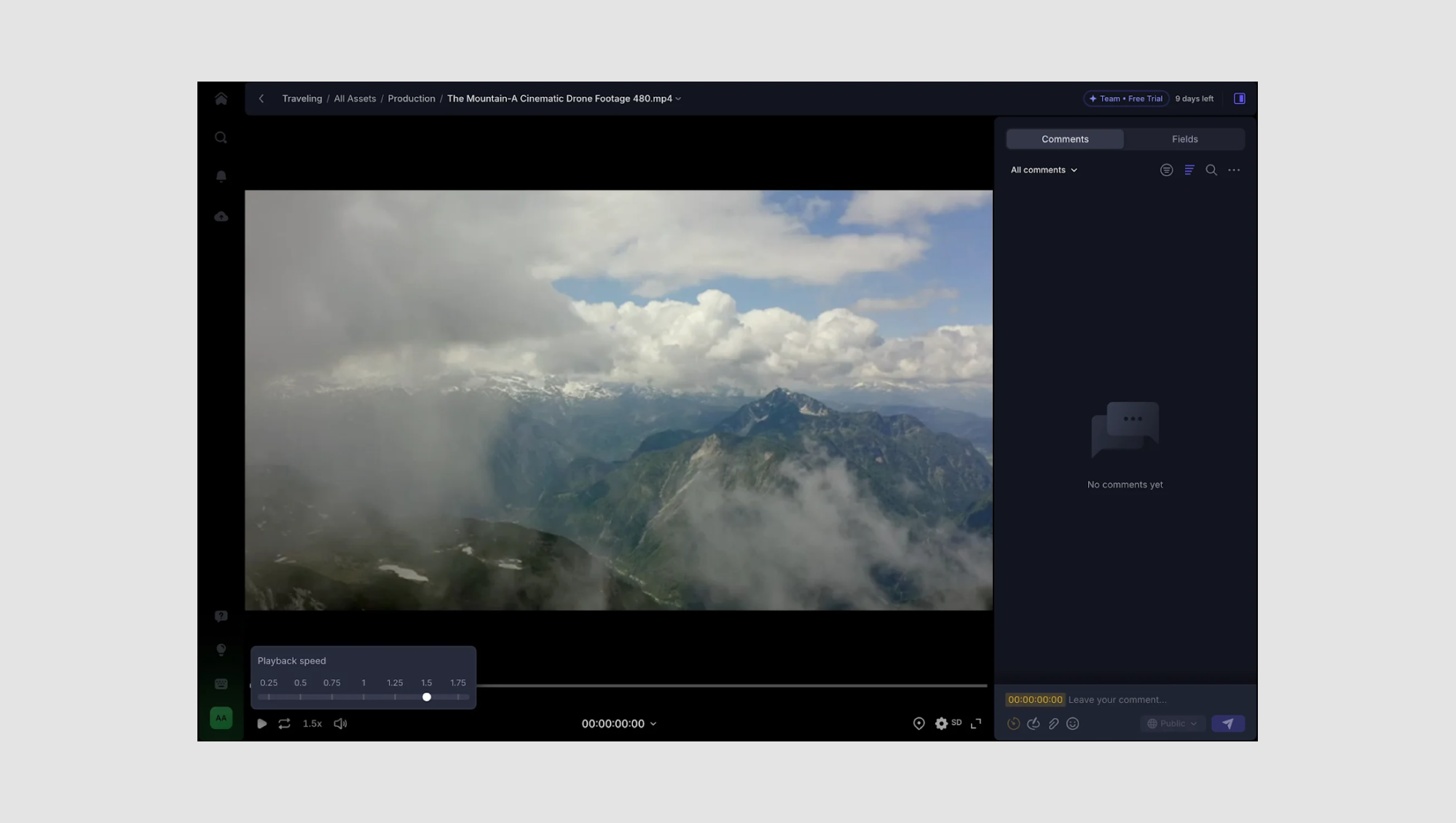
- Why it works:
→ The playback speed slider lets users adjust video speed with precision—crucial for creative professionals who need to review footage quickly or analyze specific frames. Its minimalist design blends into the interface without disrupting the viewer’s focus. - Design highlight:
→ The slider includes clearly marked speed intervals (from 0.25x to 1.75x), enabling users to slow down or speed up playback effortlessly. The highlighted handle shows the current speed, giving users immediate visual feedback.
→ The subtle pop-up box for the slider avoids cluttering the video player but remains easily accessible. - UX bonus:
→ Combining the slider with a numeric playback speed indicator below ensures users always know the exact speed, even after closing the slider.
Pro tip: “In video players, speed sliders should balance precision with simplicity—let users adjust quickly without overloading them with options.”
Height — Status Color Picker Slider

- Why it works:
→ The color picker slider in Height gives users an effortless way to customize task status colors, enhancing visual organization across complex workflows. Instead of static color presets, the slider allows for nuanced selection, giving teams more control over how their boards look and feel. - Design highlight:
→ The horizontal gradient slider covers a full color spectrum, with the draggable handle snapping to key color points for quick selection while still allowing fine-tuning.
→ Live color previews update in real time, helping users immediately see how changes affect their task view. - UX bonus:
→ The slider sits inline within the status configuration panel, keeping the interaction lightweight and avoiding disruptive modals or pop-ups.
Pro tip: “For color pickers, pair broad-spectrum sliders with snap points—this balances creative freedom with ease of use.”
Hex — Data Visualization Opacity Slider

- Why it works:
→ The opacity slider in Hex gives users granular control over map layer visibility, allowing them to fine-tune data overlays without overwhelming the base map. This is crucial in data-heavy visualizations where clarity and precision are key. - Design highlight:
→ The slider runs from 0% to 100% opacity, with the numeric value displayed at the end—ensuring users know exactly how transparent their data layer is.
→ Real-time adjustments mean users see changes directly on the map, enhancing feedback loops and reducing trial-and-error. - UX bonus:
→ The slider integrates seamlessly into the sidebar settings, keeping tools easily accessible without cluttering the main workspace.
Pro tip: “In data visualization tools, sliders for opacity, size, or scale should always offer real-time previews—users need to see the impact instantly.”
Spotify – Podcast Speed Slider

- Why it works:
→ Spotify’s speed control slider offers a simple yet effective way for users to customize podcast playback speed. The linear layout makes it easy to scan and select from common speed options, catering to both casual listeners and power users who prefer faster playback. - Design highlight:
→ The highlighted green marker at 1.5x gives immediate feedback on the current playback speed.
→ Clear increment markers (from 1.0x to 2.0x) offer precise control, while the speed range supports varied listening preferences.
→ Quick-select preset buttons below the slider allow for fast adjustments without dragging the slider, streamlining the process. - UX bonus:
→ Real-time feedback—as users adjust the speed, the podcast continues playing, letting them instantly hear the change.
→ The use of Spotify’s iconic green for key elements keeps the design on-brand while guiding user attention.
Pro tip: “In media players, always pair sliders with preset options. This balances quick access with granular control, enhancing the user experience.”
Riverside — Playback Pace Slider

- Why it works:
→ The pace adjustment slider in Riverside lets users fine-tune the speed of their video content, offering an easy way to control pacing for different platforms—whether it's a laid-back YouTube tutorial or a snappy TikTok clip. The design simplifies complex editing functions into a single intuitive control. - Design highlight:
→ The slider clearly ranges from “Original” to “Super fast”, giving users visual anchors for their edits. By pairing this with descriptive labels like “Natural” for optimal pacing, Riverside helps users make informed decisions even without deep editing experience.
→ The “Removes 2 pauses (16.0s)” indicator provides context on how changes affect the overall timeline—bridging the gap between the slider and real editing impact. - UX bonus:
→ The “Apply” button ensures users can preview adjustments before committing, promoting a non-destructive editing workflow.
Pro tip: “When sliders adjust time-based elements, include real-time impact summaries—users want to know exactly what’s changing.”
Teachable — Revenue Estimator Sliders

- Why it works:
→ Teachable uses simple range sliders to help users quickly estimate potential course revenue based on the number of students and course price. This approach turns a potentially overwhelming calculation into a lightweight, interactive experience. - Design highlight:
→ The real-time value bubbles above the sliders give users instant feedback as they adjust inputs, removing any guesswork.
→ The use of clear min/max values (0–1,000) anchors user expectations, while the consistent visual design ties both sliders together as a cohesive tool. - UX bonus:
→ The bold “Next” button guides users forward, making it clear there’s more to the process, while the simplicity of the sliders lowers the entry barrier for new course creators.
Pro tip: “For calculators and estimators, use real-time sliders paired with value indicators—this keeps users engaged and informed without cognitive overload.”
Zapier — Task Volume Pricing Slider

- Why it works:
→ Zapier uses a task volume slider to personalize pricing based on user needs, helping prospects quickly see which plan fits their workflow size. By allowing users to select exact task volumes, it bridges the gap between generic pricing tiers and customized solutions. - Design highlight:
→ The slider is anchored with key task milestones (100, 2K, 10K, 100K, 1M, etc.), guiding users to common usage points while still supporting precise adjustments.
→ The dynamic task count above the slider updates in real-time, giving users immediate clarity on their selection. - UX bonus:
→ As users adjust the slider, the pricing plans below react accordingly—highlighting the most suitable tier based on the selected task volume. This creates a more interactive and informative pricing experience.
Pro tip: “In tiered pricing models, use sliders to help users self-select plans—visualizing cost based on usage builds trust and reduces decision friction.”
Zoom Whiteboard — Border Thickness Slider

- Why it works:
→ Zoom’s border thickness slider in its Whiteboard tool offers users a simple, intuitive way to adjust line weight when annotating or creating diagrams. It streamlines the design process, helping users emphasize specific elements without needing complex settings. - Design highlight:
→ The slider sits directly within the contextual styling menu, enabling quick adjustments without navigating away from the whiteboard. The minimal interface ensures users can see changes in real time as they adjust the thickness.
→ Visual stroke previews next to the slider help users understand the difference between line weights before making a selection. - UX bonus:
→ The pairing of border style options (solid, dashed, dotted) directly below the slider lets users adjust multiple style elements in one flow, reducing clicks and improving efficiency.
Pro tip: “In collaborative tools, sliders for styling (like border thickness or opacity) should update live—instant feedback is key in real-time environments.”
Range sliders (min/max selection)
Range sliders allow users to select a minimum and maximum value within a set range—perfect for tasks like filtering prices, selecting time frames, or defining budgets. Unlike single-value sliders, range sliders require dual handles for added flexibility, but they also introduce potential usability challenges, like overlapping handles or unclear feedback.
To see how range sliders complement broader List UI design in SaaS dashboards, check out our detailed breakdown.
Best practices for range UX sliders
- Use dual handles for flexibility
→ Let users set both starting and ending points clearly. - Ensure easy handle-grabbing
→ Handles should be touch-friendly (minimum 44px) and distinguishable. - Display dynamic labels
→ Show real-time value updates as users drag the handles. - Prevent handle overlap
→ Implement snapping or spacing logic to avoid handles stacking on top of each other. - Add visual cues for selected ranges
→ Use color fills, gradients, or shading to highlight the active selection.
10 inspiring range UX slider examples
Airbnb — Price Range Filter

- Why it works:
→ Airbnb uses a dual-handle slider that lets users set a minimum and maximum price when searching for accommodations. The real-time price updates above each handle provide instant clarity. - Design highlight:
→ The active range is highlighted with a bold color fill, making it easy for users to see their selected range at a glance. - UX bonus:
→ The slider snaps to common price increments, helping users avoid awkward price points like $317 or $842.
Cake Equity — Equity Range Slider

- Why it works:
→ Cake Equity uses a range slider to visually represent typical equity percentages for different roles and funding stages. Users can see the average equity range and the median value at a glance, making complex compensation data easy to digest. - Design highlight:
→ The highlighted median marker (in bright lime green) draws immediate attention, helping users quickly identify the standard equity offering.
→ Clear numeric labels at both ends of the range (0.19%–1.63%) provide precise context, while the shaded bar gives users a sense of where they fall within the average. - UX bonus:
→ Integrated dropdowns allow users to filter by role and funding stage (e.g., Executive, Seed, Engineering), updating the range dynamically without page reloads—creating a seamless, data-driven experience.
Pro tip: “In data-heavy sliders, always highlight key benchmarks—users want to know where they stand in relation to the norm.”
Google Maps — Hotel Price Range Slider

- Why it works:
→ Google Maps integrates a price range slider directly into its hotel search, allowing users to instantly filter accommodations based on budget. The slider’s dual handles make it simple to define a min-max price range, while real-time map updates ensure users immediately see matching results. - Design highlight:
→ The live price tags on the map dynamically adjust as users move the slider, giving immediate visual feedback on available options.
→ The slider’s clean design, with clear numeric endpoints ($0 – $437+), simplifies the filtering process, making it intuitive for users at a glance. - UX bonus:
→ The “Update results when map moves” toggle below the slider offers more control, letting users decide whether they want real-time updates or prefer a static search area.
Pro tip: “In location-based filters, pair range sliders with live map updates—this keeps users engaged and reinforces spatial context.”
Grab — Rewards Points Range Slider

- Why it works:
→ Grab’s rewards points range slider lets users filter redeemable rewards based on the number of points they have, helping them zero in on options that match their balance. The simple dual-handle design makes adjusting the range intuitive, even on mobile. - Design highlight:
→ A color gradient fill between the handles visually highlights the selected range, while clear numeric labels (0 – 10,084 points) help users understand their filtering limits.
→ The “Only show rewards I can redeem” checkbox adds an extra layer of personalization, allowing users to quickly filter out unattainable rewards. - UX bonus:
→ The sticky “Apply” button at the bottom ensures users can confirm their selection easily, streamlining the filtering process on mobile devices.
Pro tip: “In loyalty programs, range sliders help users focus on achievable rewards—pair them with filters like ‘only show redeemable’ for maximum efficiency.”
Hopper — Flexible Travel Date & Duration Sliders

- Why it works:
→ Hopper uses dual range sliders to help users plan flexible trips by selecting both a date range and a trip duration. This setup simplifies planning for travelers who want to find the best deals without locking in exact dates, making the booking process more adaptable. - Design highlight:
→ The top slider lets users select a time window (February – July) with an overlaid bar graph showing price trends, helping users align travel dates with lower costs.
→ The bottom slider refines the trip duration, from short weekend getaways to longer trips (up to 9 days), allowing for precise filtering based on travel preferences. - UX bonus:
→ Large, touch-friendly handles make the sliders mobile-optimized, while the “Choose” button provides a clear next step after filtering.
Pro tip: “For travel apps, combining sliders with data visuals (like price graphs) helps users make smarter, budget-conscious decisions.”
Google Classroom — Student Count Range Slider

- Why it works:
→ Google Classroom uses a range slider to help users filter school districts by student population size, making it easier for educators and administrators to find comparable reference districts. The slider allows for precise adjustments, ensuring users can target specific district sizes relevant to their needs. - Design highlight:
→ The selected range (e.g., 55,600 – 115,000 students) is displayed prominently above the slider, offering instant clarity.
→ The slider’s placement within a dropdown-style filter keeps the interface clean while still allowing users to make detailed adjustments when needed. - UX bonus:
→ The interactive map updates in real time as users adjust the range, visually reflecting which districts meet the selected criteria—bridging the gap between data and geography.
Pro tip: “When filtering map-based data, use range sliders to create dynamic search experiences—real-time map updates help users instantly see results in context.”
Bumble & Hinge — Age Range Sliders

- Why they work:
→ Both Bumble and Hinge use age range sliders to help users filter potential matches based on age preferences—an essential feature in dating apps. The dual-handle sliders make it simple to set minimum and maximum age limits, giving users control over their dating pool while keeping the experience intuitive. - Design highlights:
- Bumble integrates its age range slider within a broader “Date filters” menu, where users can also filter by gender preferences and distance. The yellow-themed slider aligns with Bumble’s branding, and the toggle (“See people 2 years either side if I run out”) adds flexibility, expanding the pool when matches run low.
- Hinge takes a more focused approach with a minimalist “Age Range” screen, using a clean purple slider that allows users to fine-tune their preferences. The standout feature? The “This is a dealbreaker” checkbox, giving users the option to mark age as a non-negotiable preference, affecting how the algorithm prioritizes matches.
- UX bonuses:
- Bumble’s inclusive filters (e.g., gender preferences and distance) are all accessible in one place, creating a cohesive filtering experience.
- Hinge’s dealbreaker option empowers users to customize how strictly their filters impact match results, adding a layer of personalization.
Pro tip: “In dating apps, sliders should balance precision and flexibility—letting users define hard limits while still offering options for broader discovery.”
SeatGeek — Ticket Price Range Slider

- Why it works:
→ SeatGeek’s price range slider makes it effortless for users to filter event tickets based on their budget. By allowing users to set both minimum and maximum price points, it empowers them to find tickets that fit their exact spending limits without sifting through irrelevant listings. - Design highlight:
→ The slider features an overlaid price distribution graph, giving users a visual sense of where most ticket prices fall—helping them spot deals or avoid overpriced options.
→ Real-time updates display the filtered price range ($99–$250) along with the average price ($256), providing valuable context during the search process. - UX bonus:
→ The “Show prices with fees” toggle adds transparency, helping users avoid surprise charges at checkout, while the “View X listings” button dynamically updates to reflect filtered results.
Pro tip: “Pairing sliders with data visuals (like price distributions) gives users deeper insights and encourages smarter purchasing decisions.”
Uniswap — Liquidity Range Slider

- Why it works:
→ Uniswap’s liquidity range slider allows users to define the exact price range within which they want to provide liquidity for ETH/USDC trading pairs. By giving users control over minimum and maximum price points, it helps optimize returns and manage risk in decentralized finance (DeFi) pools. - Design highlight:
→ The slider visually displays the current market price alongside user-defined upper and lower bounds, with a shaded area indicating the active liquidity range.
→ Numeric markers on the slider show precise percentages (e.g., -0.10% and 0.10%), helping users fine-tune their price limits with clarity. - UX bonus:
→ The integration of zoom controls lets users view more granular details or step back for a broader perspective, while real-time updates on deposit amounts ensure full transparency before committing assets.
Pro tip: “In financial tools, range sliders should combine visual aids with exact figures—users need both clarity and precision when managing assets.”
Fitbit — Body Fat Percentage Goal Slider

- Why it works:
→ Fitbit’s goal-setting slider simplifies selecting a body fat percentage target, turning a complex health metric into a user-friendly interaction. The large central number and the clean, minimalist layout ensure users focus on the key data without distractions. - Design highlight:
→ The scrollable ruler-style slider gives users fine control over their selection, while the pink arrow acts as a clear focal point for the chosen value.
→ Contextual guidance (“The normal range for body fat is 20–31%”) helps users set realistic goals based on health standards. - UX bonus:
→ The “Save” button remains sticky at the bottom, ensuring users can easily confirm their goal once selected, improving usability on mobile devices.
Pro tip: “For health-tracking apps, use visual cues and contextual tips in sliders—this helps users make informed choices without leaving the interface.”
UX sliders for color & visual adjustments
Color and visual adjustment sliders are essential in design tools, image editors, and any platform that offers customization. From tweaking brightness and contrast to fine-tuning color gradients and opacity, these sliders give users the power to make precise, real-time changes with minimal friction.
What sets these sliders apart is their reliance on visual feedback—users expect to see immediate results with every adjustment. Whether it's shifting hues, controlling transparency, or adjusting exposure, the goal is to make the process feel intuitive and responsive.
For a closer look at how these elements enhance Screen design, explore our curated examples.
Best practices for color & visual UI sliders
- Use clear visual cues
→ Integrate color gradients, spectrum bars, or preview thumbnails directly into the slider to help users anticipate changes before they commit. - Incorporate live previews
→ Ensure that every adjustment reflects instantly on the design or image. This immediate feedback loop enhances control and reduces guesswork. - Consider multi-axis sliders for complex adjustments
→ For features like color pickers or 3D lighting adjustments, multi-dimensional sliders (e.g., hue/saturation/value) give users deeper control. - Allow fine-tuned adjustments with keyboard input
→ Let users make precise edits using arrow keys or input fields alongside the slider—ideal for designers who need pixel-perfect accuracy. - Use intuitive color models (HSV, RGB, CMYK)
→ Tailor the color slider experience based on the user’s needs. Designers might prefer CMYK for print, while web developers lean toward RGB or HEX codes. - Highlight active changes
→ Use bold outlines or dynamic labels to indicate which value is being adjusted, helping users stay oriented during complex edits.
10 inspiring examples for color and visual adjustments UI sliders
Adobe Photoshop — Color Picker Slider

- Why it works:
→ Adobe Photoshop’s Color Picker offers a multi-axis color selection tool that gives users full control over hue, saturation, and brightness. The intuitive design allows for both broad color exploration and fine-tuned precision, making it a go-to for designers and digital artists. - Design highlight:
→ The vertical hue slider lets users scroll through the color spectrum, while the two-dimensional gradient box controls saturation (horizontal) and brightness (vertical).
→ Multiple color models are available—HSB, RGB, Lab, CMYK, and HEX—giving users the flexibility to work in the format that best suits their needs. - UX bonus:
→ A live preview displays the “new” vs. “current” color side-by-side, helping users instantly see the impact of their adjustments before applying them.
→ The “Only Web Colors” checkbox is a handy feature for web designers who need to stick to browser-safe colors.
Pro tip: “For color pickers, offering multiple color models (HSB, RGB, CMYK) ensures the tool serves both digital and print designers effectively.”
Figma — Color Wheel & Palette Generator

- Why it works:
→ Figma’s Color Wheel offers an intuitive way to explore hues, saturation, and brightness while helping users build harmonious color palettes. The circular slider design simplifies complex color theory, making it accessible for both beginners and pros. - Design highlight:
→ The interactive color wheel allows users to drag handles around the spectrum, instantly updating the color selection. The horizontal brightness slider below fine-tunes lightness and darkness, offering another layer of control.
→ Real-time HEX, RGB, HSL, and HSV values update as users adjust the wheel, providing multiple ways to work with color codes. - UX bonus:
→ Users can pick palette types (e.g., Complementary, Split, Monochromatic) with a single click, and the color combinations auto-adjust on the wheel—perfect for generating on-brand color schemes fast.
→ A live preview of the generated palette ensures users can see color relationships in context before applying them to their designs.
Pro tip: “For color palette builders, visualizing harmony (like complementary or triadic schemes) helps users make design-forward choices effortlessly.”
Procreate — Brush Studio Sliders

- Why it works:
→ Procreate’s Brush Studio offers fine-grained control over brush dynamics, allowing artists to customize everything from pressure sensitivity to opacity and tapering. The sliders are designed to make real-time adjustments feel fluid, empowering users to craft brushes that perfectly match their drawing style. - Design highlight:
→ Each setting—Size, Opacity, Pressure, and Tip—features its own dedicated slider, letting users tweak individual properties without affecting others. The Pressure Taper and Touch Taper sliders use dual handles for start and end points, enabling precise tapering effects.
→ The live preview canvas at the top lets users instantly see how changes affect brush strokes, reducing guesswork and speeding up experimentation. - UX bonus:
→ The “Tip Animation” toggle adds dynamic effects, giving brushes more personality and depth.
→ Sliders use subtle gradients and markers to show intensity, helping users visualize changes at a glance.
Pro tip: “In creative tools, real-time previews and multi-handle sliders give artists the control they need without breaking their flow.”
Canva — Color Wheel & Palette Generator

- Why it works:
→ Canva’s Color Wheel is designed to make color theory simple and accessible for everyone—from beginners to seasoned designers. It helps users create harmonious color palettes by using established color rules like Analogous, Complementary, and Triadic combinations. - Design highlight:
→ The interactive circular color wheel allows users to drag multiple handles around the spectrum, with real-time updates reflecting in the selected color swatch.
→ The dropdown for “Choose a color combination” auto-adjusts the color wheel handles based on traditional color harmony rules, instantly generating palettes like Analogous or Complementary. - UX bonus:
→ Each color in the generated palette comes with its HEX code, making it easy to copy and use across different design tools.
→ The “Create a graphic” and “Export palette” buttons streamline the workflow, letting users immediately apply their color schemes or download them for later use.
Pro tip: “In beginner-friendly design tools, pre-built color harmony options reduce guesswork and help users create professional-grade palettes effortlessly.”
Jitter — Gradient & Color Fill Sliders

- Why it works:
→ Jitter’s Gradient Editor offers an intuitive approach to creating complex fills, whether users want a solid color, linear gradient, or radial gradient. The sliders provide fine control over color positioning, blending, and transparency—crucial for crafting dynamic backgrounds and UI elements. - Design highlight:
→ The gradient selector features multi-handle sliders that allow users to control multiple color stops, adjusting hue, brightness, and opacity for each stop.
→ The integration of a color picker with a hue slider and opacity control streamlines the process of fine-tuning colors without needing external tools. - UX bonus:
→ Real-time updates on the canvas let users instantly see how gradient changes affect the design, eliminating the need for constant previews.
→ The fill mode toggle (Solid, Linear, Radial) makes it easy to switch between different gradient types, promoting creative experimentation.
Pro tip: “For gradient editors, multi-handle sliders with opacity controls are key to enabling complex visual effects without complicating the interface.”
Snapchat — Bitmoji Customization Sliders

- Why it works:
→ Snapchat’s Bitmoji Editor uses simple sliders to let users fine-tune facial features like eye size, nose shape, and mouth width, making the avatar creation process both fun and user-friendly. The minimalist interface ensures even casual users can create highly personalized Bitmojis without feeling overwhelmed. - Design highlight:
→ The Eye Size slider is placed front and center, paired with intuitive minus and plus icons to clearly indicate the scale of adjustment.
→ A live preview of the Bitmoji updates in real-time as users move the slider, allowing for instant visual feedback without the need to confirm changes. - UX bonus:
→ The horizontal slider is optimized for thumb-friendly control, perfect for mobile users.
→ The undo/redo buttons make it easy to experiment without fear of making permanent mistakes, encouraging playful customization.
Pro tip: “In avatar editors, real-time feedback combined with simple sliders makes complex customizations feel effortless and approachable.”
Craft — RGB Color Sliders

- Why it works:
→ Craft’s color picker blends precision and simplicity by offering RGB sliders that allow users to fine-tune color values. This setup appeals to both casual users and designers who need exact color control without diving into complex color wheels. - Design highlight:
→ The interface splits between Grid and Sliders modes, letting users quickly switch between pre-made palettes and granular customization.
→ The Red, Green, and Blue sliders use vibrant gradient bars that visually represent the color spectrum, making it intuitive to adjust tones. - UX bonus:
→ Users can directly edit the HEX code or the RGB values for pixel-perfect color matching.
→ The live preview updates instantly as sliders are moved, ensuring users can see how each tweak affects the overall color in real time.
Pro tip: “For color tools, dual input methods—like sliders and HEX fields—give users flexibility while ensuring accuracy.”
VSCO and Instagram – Photo Filter Adjustment

- Why it works:
→ This slider allows users to fine-tune the intensity of photo filters, giving them control over the visual impact without overwhelming the editing process. It focuses on subtle adjustments, which is key for maintaining natural aesthetics. - Design highlight:
→ The minimalist slider showcases a single adjustment bar paired with a numerical value, giving clear feedback on filter strength.
→ The dropdown lets users quickly swap between different filter presets while maintaining the same intuitive control layout. - UX bonus:
→ The real-time preview helps users instantly see how the changes affect their image, encouraging experimentation.
→ The clean interface keeps users focused on the photo, avoiding clutter while still providing all necessary controls.
Pro tip: “Subtlety is key in photo editing sliders—small adjustments can make a big impact while keeping the user experience smooth.”
Unfold – Image Rotation Slider

- Why it works:
→ This slider lets users rotate images with precision using a degree-based scale (from -15° to +15°). It’s simple yet powerful, making it ideal for quick edits or perfecting alignments without overcomplicating the UI. - Design highlight:
→ The central vertical line marks 0°, helping users visually align their image to a straight axis.
→ Tick marks and degree values provide a clear scale, allowing for both subtle and more dramatic rotations.
→ The curved arrow icon offers a quick reset for instant re-centering. - UX bonus:
→ Users can see changes live as they adjust, eliminating the need for trial and error.
→ The wide slider promotes fine-tuned control, while the “Cancel” and “Done” buttons provide clear navigation through the edit process.
Pro tip: “When designing rotation sliders, always provide a reset option and a visible center mark—users love the safety net.”
Canva – Font Size Slider

- Why it works:
→ Canva’s font size slider offers a fluid, real-time adjustment of text size, making it ideal for both quick tweaks and precise edits. Users can visually see the size change on their design as they slide, ensuring perfect fit and aesthetics. - Design highlight:
→ The slider is paired with a numerical input (45), giving users the option to type in an exact font size if needed.
→ A vivid purple progress bar acts as a visual guide for the font size scale, enhancing clarity.
→ Direct access to Font, Text styles, Color, and Formatting below the slider allows for multi-step edits without leaving the interface. - UX bonus:
→ Live previews prevent the guesswork—users can instantly see how text fits within their design.
→ The slider’s simplicity appeals to beginners, while the manual input box offers precision for more advanced users.
Pro tip: “Always offer both drag-to-scale sliders and numeric input fields in design tools—this caters to users who prefer speed and those who value precision.”
Time & duration sliders
Time and duration sliders are essential for any interface involving media playback, scheduling, or data analysis. These sliders transform complex timelines into simple, intuitive controls, allowing users to effortlessly scrub through videos, adjust schedules, or analyze time-based data.
Whether it’s skipping to the best part of a video, fine-tuning an animation timeline, or setting precise event durations, a well-designed time slider strikes the perfect balance between speed and accuracy.
Learn how Wizard UI patterns help structure complex multi-step processes, including timeline management.
Best practices for time-based sliders:
- Ensure precise control with drag-and-drop handles
→ Use intuitive handles and snapping points for keyframes or timestamps. - Allow keyboard input for accurate time entry
→ Combine sliders with manual time inputs (e.g., “00:03:15”) for exact positioning. - Use color coding to indicate different time segments
→ Visually separate scenes, chapters, or data clusters with colors or markers. - Integrate playback feedback
→ Real-time updates (like audio waveforms or video previews) enhance interactivity. - Prioritize granular control for long timelines
→ Implement zoom-in features or finer increments for complex timelines.
10 inspiring examples for time-based sliders
Headway – Daily Time Goal Selector

- Why it works:
→ Headway’s vertical time picker offers an intuitive scroll mechanism that mimics native iOS pickers, making it instantly familiar to users. This format allows for quick selection while also encouraging users to commit to achievable daily goals. - Design highlight:
→ The highlighted number (10 min) uses bold, bright blue text to draw focus, guiding users toward the selection.
→ A contextual tooltip (“25 book summaries a month”) shows the broader impact of the user’s choice, subtly motivating them.
→ The “Continue” button remains prominent and fixed, ensuring easy progression without scrolling away. - UX bonus:
→ The scroll wheel limits options to a manageable range, reducing decision fatigue while still offering flexibility.
→ By visually connecting minutes to monthly achievements, the app boosts user engagement and commitment.
💡 Pro tip: “Use real-life context to motivate user choices—linking time commitments to clear outcomes (like books read) makes goals feel more tangible and rewarding.”
Instagram – Music Clip Duration Slider
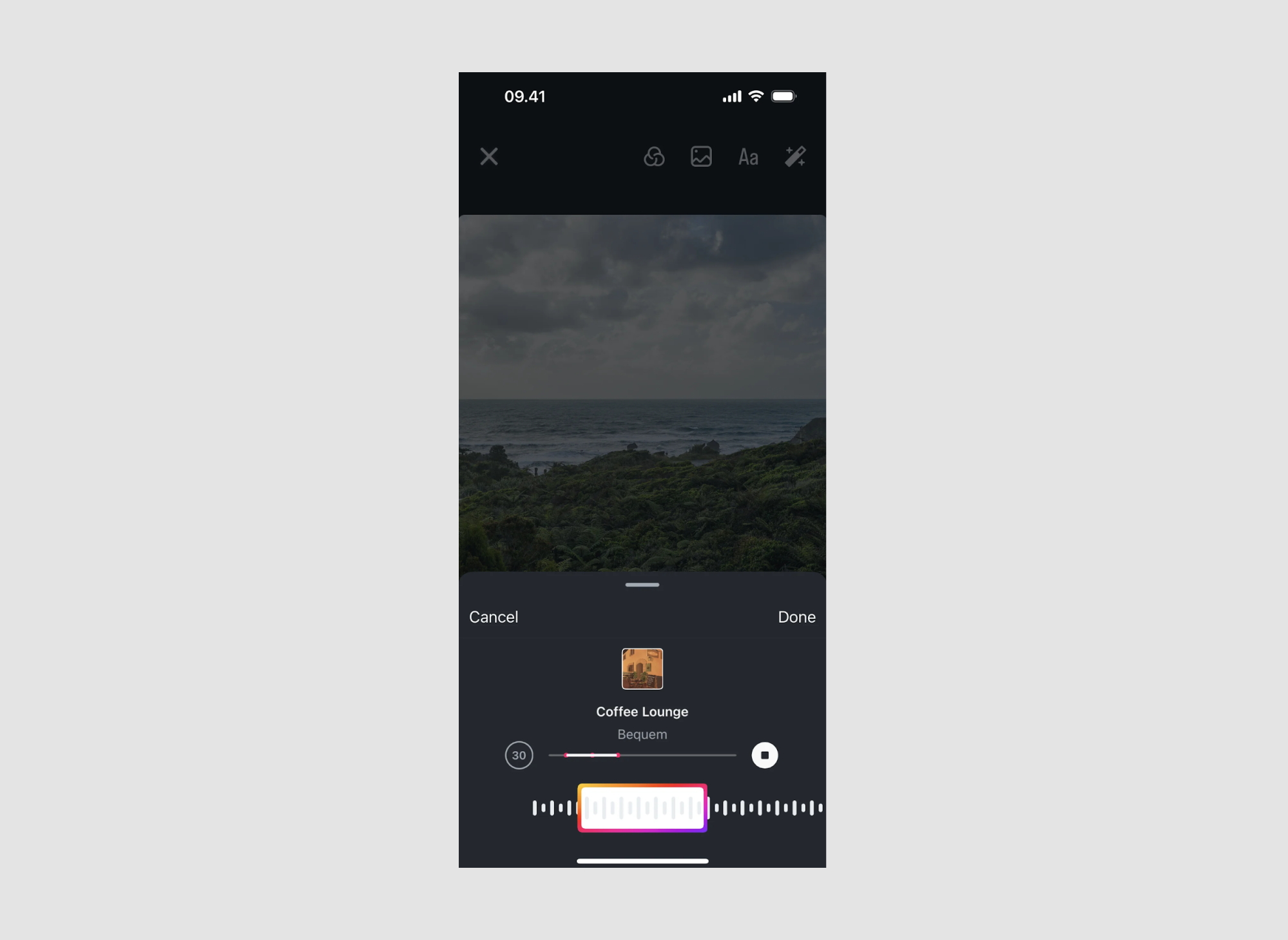
- Why it works:
→ Instagram’s music slider lets users easily trim audio clips for Reels or Stories, offering both precision and simplicity. The waveform visualization gives users a sense of the track’s flow, helping them select the perfect snippet. - Design highlight:
→ The waveform background provides visual cues on the song’s intensity and beats, making it easier to align audio with video moments.
→ The highlighted selection box (framed in Instagram’s signature gradient) clearly marks the chosen clip duration.
→ A simple circular handle lets users slide the clip to different parts of the track effortlessly. - UX bonus:
→ The minimalist design focuses attention on the music clip without overwhelming users with complex editing tools.
→ Real-time audio previews as users slide the selector help ensure they capture the exact part of the song they want.
Pro tip: “In time-based sliders, combine visual cues (like waveforms) with live previews—this empowers users to make quicker, more accurate edits.”
Numo – Task Duration Slider

- Why it works:
→ Numo’s duration slider turns a simple task scheduler into an engaging experience. The large, interactive slider allows users to quickly set time blocks for tasks while keeping the interface clean and user-friendly. - Design highlight:
→ The bold blue slider knob grabs attention and invites interaction, while the surrounding gradient provides a subtle visual cue of the selected duration.
→ The exact time range is clearly displayed (“Ends at 08:50”), offering users instant feedback on when their task will finish.
→ Directional arrows around the time help indicate adjustability, making it obvious that users can increase or decrease the task length. - UX bonus:
→ The minimalist approach keeps the user focused solely on setting the duration without any distractions.
→ Users can easily adjust task timing in seconds, perfect for time-blocking workflows or simple daily planning.
Pro tip: “Highlight the selected time in large, readable fonts and show end times in schedulers—this reduces cognitive load and prevents user errors.”
Airbnb — Flexible Date Slider

- Why it works:
→ Airbnb transforms the traditional date picker into an engaging circular slider, helping users select a broad time range (like "6 months") rather than fixed dates. This design caters perfectly to users with flexible plans, making the search process feel simpler and more intuitive. - Design highlight:
→ The radial gradient fill gives users an immediate visual cue of their selected time span, while the bold central number keeps the focus on the key data—how many months.
→ Smooth transitions between Dates, Months, and Flexible modes offer multiple ways to search, without overwhelming users. - UX bonus:
→ The color shift as users expand the timeline adds subtle feedback, while the start and end dates below the slider auto-update, giving users clarity on their exact range.
Pro tip: “When users are selecting ranges (like time or budget), radial sliders can feel more natural and playful—ideal for travel, lifestyle, and creative platforms.”
Pillow – Sleep Session Time Slider

- Why it works:
→ Pillow’s sleep session slider gives users a precise and intuitive way to edit their sleep data. By combining visual cues with time selectors, users can fine-tune their sleep sessions effortlessly while also seeing how it affects their overall sleep quality. - Design highlight:
→ The color-coded sleep stages (Awake, REM, Light Sleep, Deep Sleep) provide a quick visual breakdown, helping users understand their sleep patterns at a glance.
→ Dual handles on the timeline enable easy selection of specific time ranges, with exact start and end times displayed below for clarity.
→ A clear “Selected” time indicator updates in real time as the user adjusts the range, showing the total duration chosen. - UX bonus:
→ The option to mark segments as “Awake” or “Asleep” adds flexibility for users to correct tracking inaccuracies.
→ The vibrant color palette helps distinguish sleep phases easily, aiding in quick analysis.
Pro tip: “When visualizing time-based data, use color coding and real-time feedback to help users make accurate adjustments without overcomplicating the interface.”
adidas Running – Workout Duration & Weather Selector

- Why it works:
→ adidas Running combines a clean interface with smart time and weather selectors, giving runners full control over their workout details. The setup is minimal yet functional, making it easy for users to log precise data about their runs. - Design highlight:
→ The time duration of the run is displayed prominently at the top (00:32:16), offering users an at-a-glance summary of their workout.
→ A scrollable temperature slider lets users fine-tune the weather conditions (set to 28°C here), enhancing post-run analytics.
→ The icon-based weather selector (e.g., sunny, rainy, snowy) simplifies choosing the right condition with a single tap. - UX bonus:
→ Adding subjective inputs like "Good" mood and trail type gives users a more personal and complete workout log.
→ The “Add a note” section encourages users to include extra context, like how they felt or unique conditions during the run.
Pro tip: “When logging fitness activities, allow for both objective data (like time and weather) and subjective notes to give users a richer history of their workouts.”
MyDyson – Circular Timer Slider

- Why it works:
→ MyDyson’s circular timer is intuitive and mirrors the classic analog clock, making it instantly familiar. Users can easily adjust the duration with a simple swipe, making it ideal for time-based controls like appliance timers. - Design highlight:
→ The circular scale spans up to 9 hours, giving users flexibility for both short and extended durations.
→ A prominent purple highlight visually tracks the selected time, while the center displays the exact time (45 minutes) in large, legible text.
→ Simple “Cancel” and “Set” buttons reduce friction, ensuring a fast and straightforward experience. - UX bonus:
→ The use of color progression (from dark to light purple) helps users quickly gauge how much time they’ve selected without focusing on the numbers.
→ The minimalist black-and-purple theme creates a distraction-free interface, perfect for focus-driven tasks.
Pro tip: “Circular sliders are great for time selection—they offer more granular control and feel more natural for users adjusting durations.”
Strava – Route Length Slider
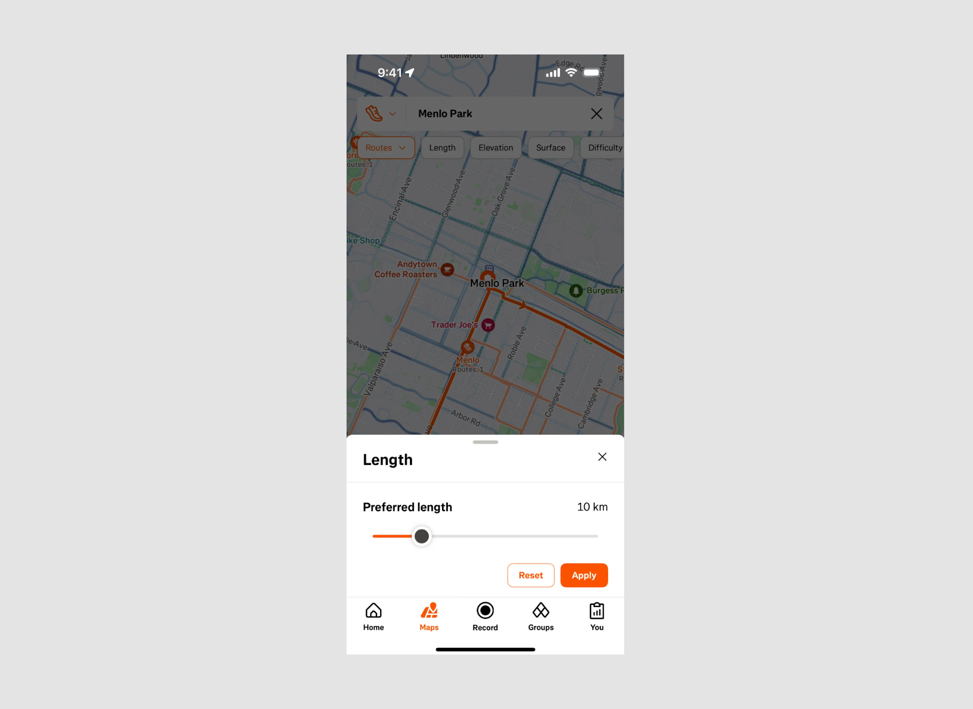
- Why it works:
→ Strava’s route length slider provides users with a fast and intuitive way to filter routes based on their preferred distance. By instantly updating route suggestions on the map, it helps runners and cyclists plan activities that match their fitness goals or time constraints. - Design highlight:
→ The bold orange progress bar gives clear visual feedback on the selected length, tying into Strava’s signature color palette.
→ A numerical display (10 km) next to the slider shows the exact distance, ensuring users know the precise route length without guesswork.
→ The “Reset” and “Apply” buttons allow for quick changes, encouraging users to experiment with different distances. - UX bonus:
→ The integration with the live map enables users to see route adjustments in real time as they modify the distance, enhancing interactivity.
→ The simple horizontal slider reduces cognitive load, making it easy even for new users to navigate and plan routes.
Pro tip: “When designing location-based sliders, always combine visual feedback (like live maps) with numerical data to cater to both intuitive and detail-focused users.”
Waking Up – Meditation Timer Slider

- Why it works:
→ Waking Up’s meditation timer slider transforms a basic time selection into an engaging and calming experience. Its vertical bar graph layout subtly reinforces the idea of balance and progress—perfectly aligned with meditation practices. - Design highlight:
→ The gradient blue bars create a visually soothing effect while indicating time increments, with the selected time (10 minutes) prominently displayed at the top.
→ The “Begin” button is clearly highlighted in blue, guiding users smoothly into their meditation session.
→ Supporting information, like “Timer finishes at 4:12 PM”, helps users stay mindful of their schedule without disrupting focus. - UX bonus:
→ The slider’s symmetrical design makes adjusting the timer intuitive, enhancing user engagement without overcomplicating the interface.
→ The option to add an Interval Bell below allows for customization, catering to both novice and experienced meditators.
Pro tip: “In mindfulness apps, design sliders that evoke calm—use gentle gradients, minimal text, and fluid interactions to keep users focused on the experience.”
Toggl Track – Time Duration Slider

- Why it works:
→ Toggl Track’s circular time slider makes setting durations feel natural and visual—similar to using a clock. This aligns with users’ intuitive understanding of time, simplifying the process of tracking tasks. - Design highlight:
→ The bold purple arc shows the selected time span (45 minutes) at a glance, with clear start and end times (8:00 AM – 8:45 AM) listed below.
→ Users can fine-tune time entries using the “Edit time” option or manually adjust the start/stop points on the dial.
→ The addition of tags, billable status, and task names directly within the same screen enhances workflow efficiency. - UX bonus:
→ The slider supports quick visual adjustments while still allowing precise edits through the time fields—catering to both casual users and those who need exact time logs.
→ The color-coded timeline provides instant clarity on duration without needing to read numbers.
Pro tip: “When designing time-tracking tools, use visual elements like dials or arcs to make duration feel tangible—especially for users who prefer visual cues over numerical input.”
Best practices for designing sliders
- Use real-time feedback: Always provide live previews or immediate updates as users adjust sliders (e.g., color changes, time updates, etc.).
- Combine visual & numeric inputs: Offer both sliders and precise input fields—this caters to both casual users and those needing exact values.
- Ensure accessibility: Make sliders keyboard-navigable and include visual indicators for colorblind users (like patterns or text labels).
- Use clear visual cues: Color gradients, markers, and dynamic highlights help users understand the scale and context of adjustments.
- Optimize for mobile & desktop: Ensure touch targets are large enough for mobile users and allow fine-tuning with keyboard or mouse on desktop. In mobile-heavy contexts, consider patterns like Card UI to simplify navigation and improve content organization.
Common mistakes to avoid
- Lack of context: Sliders without labels, scales, or previews can leave users confused about the impact of their adjustments.
- Overloading with options: Too many sliders on one screen can overwhelm users. Group related controls and use tabs or collapsible menus when necessary.
- Ignoring accessibility: Small touchpoints, lack of keyboard support, or poor color contrast make sliders hard to use for many users.
- No undo or reset: Users should always have the option to revert changes easily (e.g., a “Reset” button or an undo feature).
- Inconsistent interactions: Keep slider behaviors predictable across the app—like consistent snapping points or similar drag speeds.
Final thoughts
Sliders are powerful tools that help users make precise adjustments in a simple, intuitive way. Whether it’s fine-tuning a photo’s brightness, selecting a time frame, or customizing a color palette, well-designed sliders create seamless, frustration-free experiences. Want more examples of dynamic UIs? Dive into our guides on Conversational UI and Chatbot UI to see how interaction design can boost user engagement.
By following best practices—like providing real-time feedback, ensuring accessibility, and offering both visual and numeric inputs—you can design sliders that not only look good but also feel effortless to use. At the same time, avoiding common pitfalls like inconsistent interactions or overloaded interfaces keeps your users engaged and in control.
In short: when designed thoughtfully, sliders can turn complexity into clarity.
Loved these slider examples and want your product to have the same level of polish? At Eleken, we don’t just follow best practices—we design interfaces that users actually love using.
Whether you need sleek UI components, complex product flows, or a full UX revamp, our team of experienced designers is ready to dive in. Let’s talk about your project!


.png)