

Checkboxes are deceptively simple, but get them wrong, and you’ll create confusion rather than clarity. FinancesOnline's statistics revealed that 67% of users abandon forms because they’re too complex or confusing, and poorly designed checkboxes are a major contributor.
At Eleken, we design forms, settings pages, and multi-step flows that use checkboxes correctly, intuitively, accessibly, and without frustration.

In this guide, we’ll discuss the best practices for checkbox design we follow, explore when to choose a checkbox over a radio button or toggle switch, and highlight common mistakes. But first, let’s focus on the basics.
Checkbox basics: What are checkboxes, and when do you use them?
A checkbox is a UI element that allows users to select one or more options from a set of choices. Unlike radio buttons for single selections, checkboxes let users choose as many options as they like. But as simple as they seem, a poorly placed checkbox can throw the whole experience off.
Here is when to use checkboxes:
- Selecting multiple options: This is perfect for situations where users can select more than one option, like “Select your interests” or “Choose your preferred contact method.”

- Independent actions: Use checkboxes when each option acts independently. For example, "Receive notifications" or "Subscribe to our newsletter" are great user onboarding UX patterns.
- Binary choices with no immediate action: Checkboxes work well for settings that don't require an immediate response. Think of selecting preferences or options saved and changed later, not toggled instantly.
A checkbox for a “Yes” or “No” question? That’s a UX trap. It creates ambiguity where clarity is key. So, when NOT to use checkboxes:
- Single-option selection: Don't use a checkbox if the user can only choose one option. Instead, use radio buttons like in the example below.

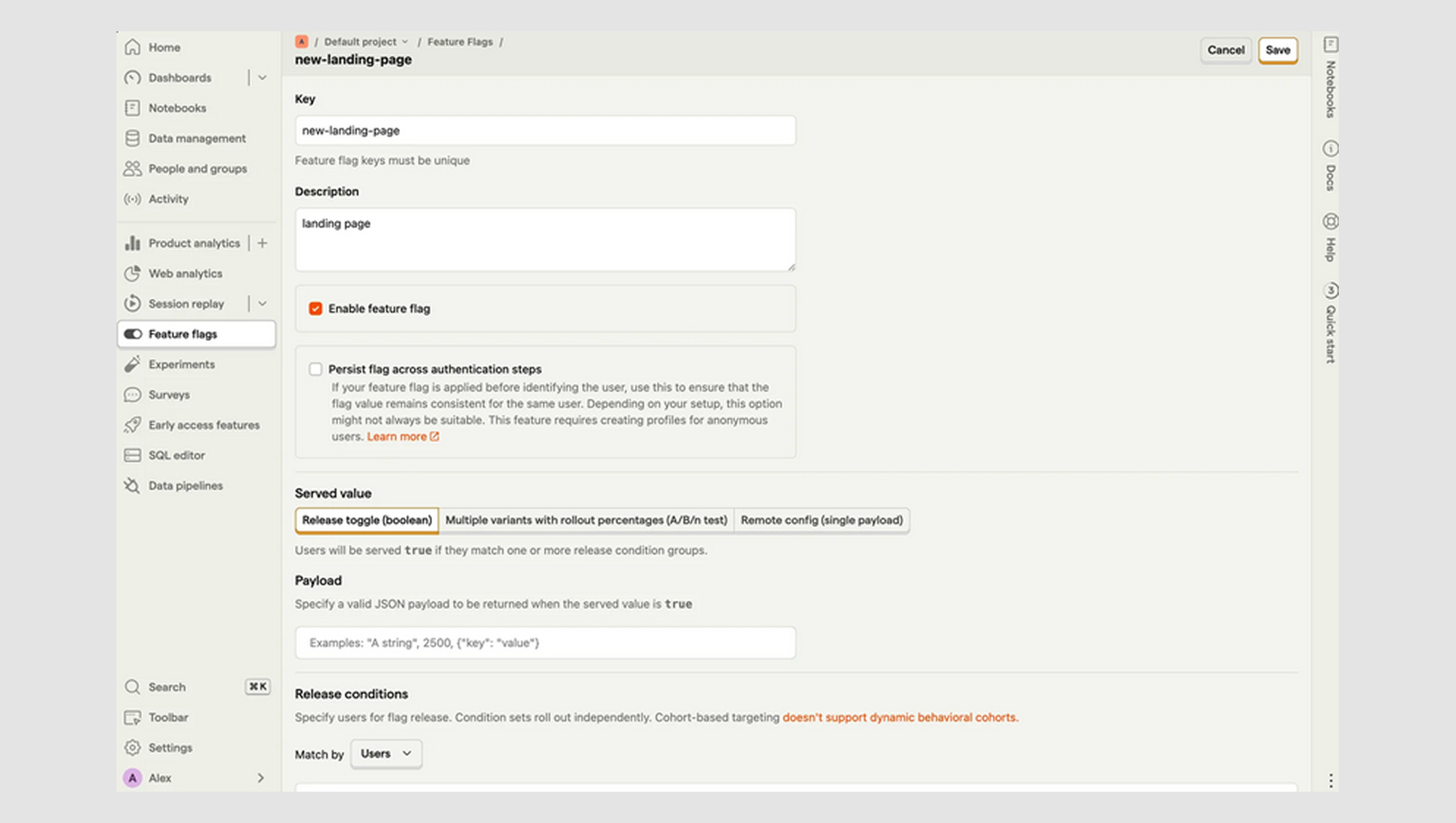
- Immediate action required: When you need an action to happen right away, toggle switches are a better fit. A checkbox that requires confirmation is clunky for actions like turning on Bluetooth or enabling dark mode.
Three Types of Checkbox Use Cases
Not all checkboxes are created equal. They might look the same (square, clickable, slightly smug), but their context changes everything. Let’s break down the three main types you’ll run into and how to use them without accidentally triggering a usability nightmare.
1. Standalone checkbox
Think of this as the checkbox equivalent of flying solo. It lives on its own, tied to a single action. You’ve probably met this one in the wild:
- “Subscribe to newsletter.”
- “I agree to the terms and conditions.”
- “Remember me.”
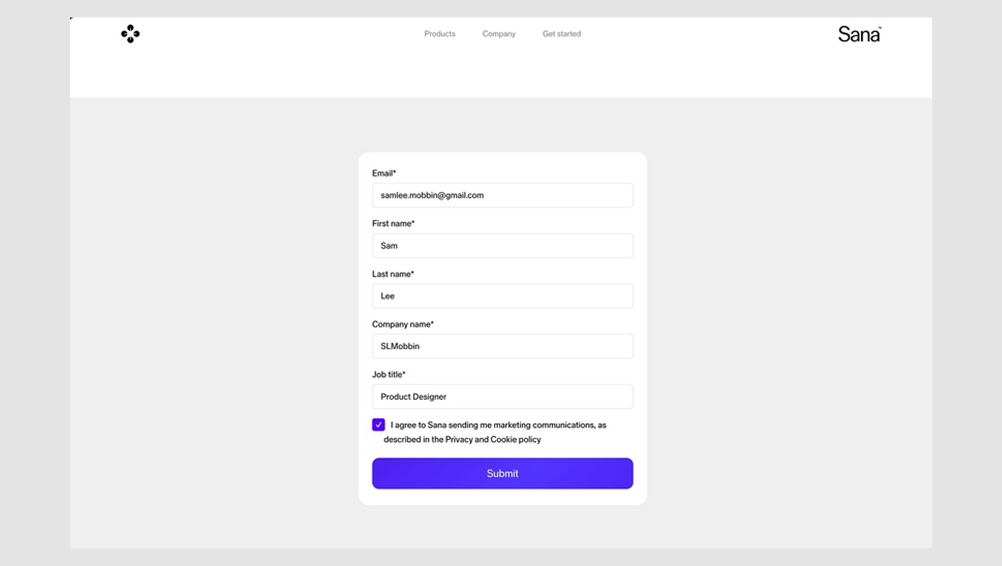
This type is straightforward: one box, one decision. And it works best when the action doesn’t depend on any other choices around it. Make sure the label is crystal clear (vagueness kills UX), and yes, make the whole label clickable. No one wants to pixel-hunt the actual box.
Pro tip: If you’re using a standalone checkbox for a critical legal action like agreeing to terms, don’t pre-check it. It’s shady, and users notice.
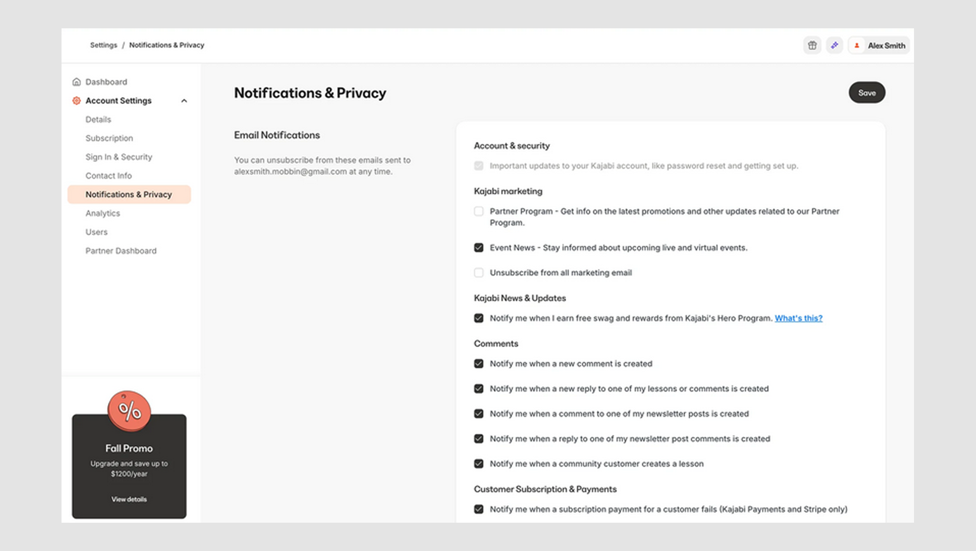
2. Checkbox list
Now, we’re entering the buffet zone. Checkbox lists are great when users can pick as many options as they want. This setup is ideal for:
- Preference selection (“Select your interests”).
- Notification settings.
- Filter UX and UI search results (hello, e-commerce faceted filters).
The key here is flexibility. Users aren’t locked into a single decision; they can pick what best suits them.
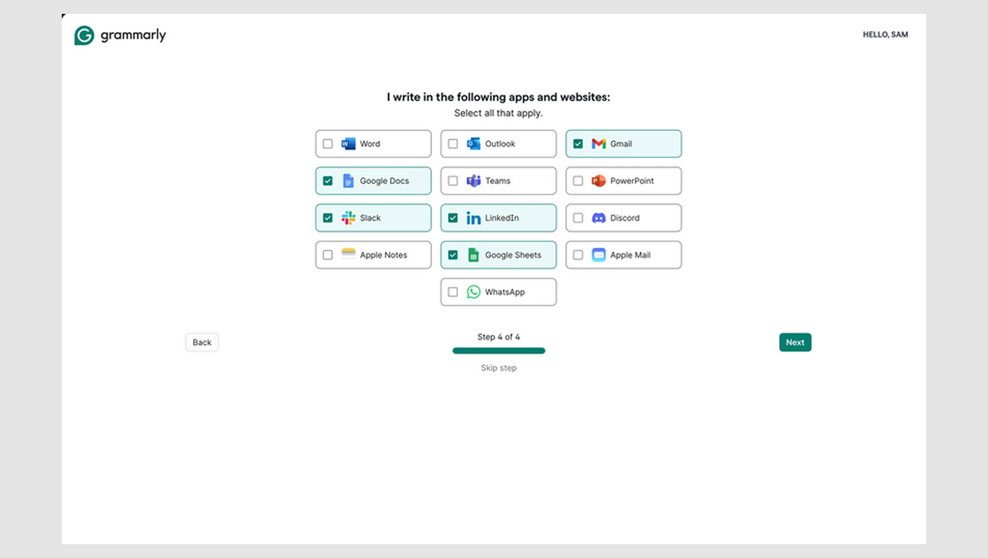
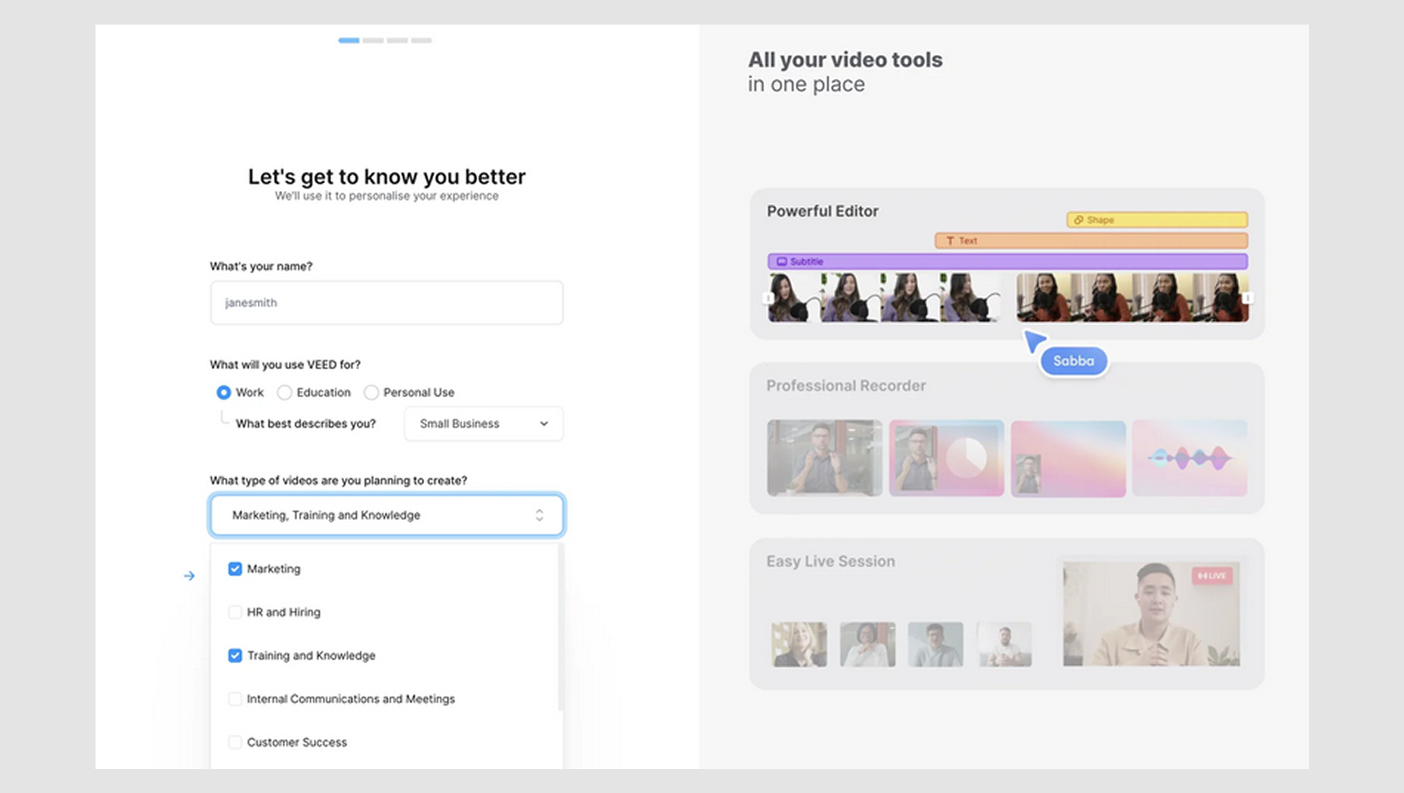
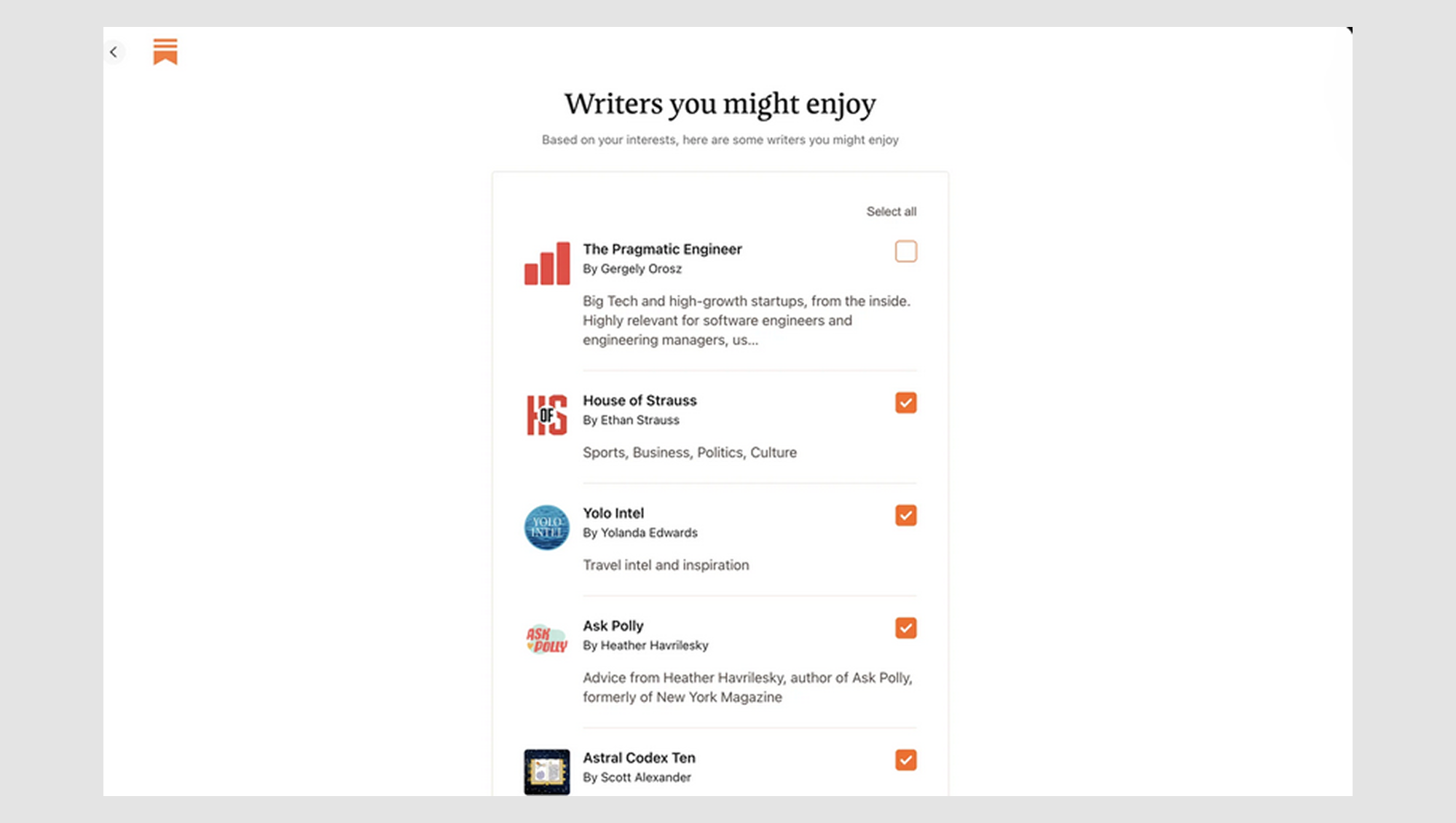
For example, Grammarly lets users choose which apps they write in (Google Docs, Slack, Word, etc.) so they can tailor their experience. That’s a textbook checkbox list.
Just remember, if your list UI design starts to feel like a scroll marathon, consider progressive disclosure or grouping. You’re designing an interface, not a tax form.
3. Nested checkboxes (parent-child relationships)
This is where things get fancy and occasionally tricky. Nested checkboxes are used when you have grouped items and want to give users control over the group and its individual items. Think of:
- “Select all” UX with sub-options
- Folder permission settings
- Multi-level settings panels
A classic case:
- Select all UI
- Custom
- Note
- Phone call
- Meeting
- Chat
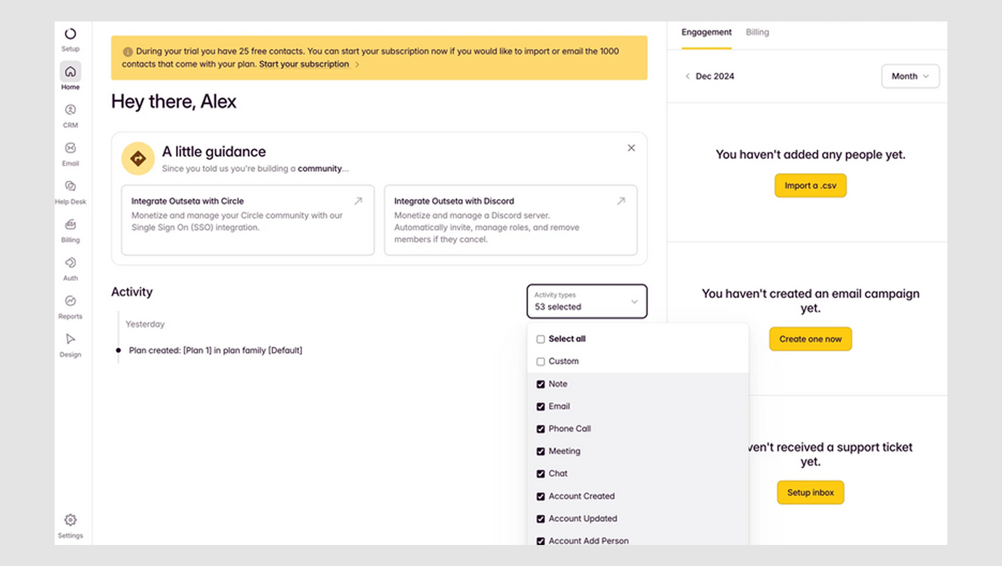
Here, the parent checkbox controls the group. If you check it, everything inside checks too. If you only select a few sub-options, the parent should go indeterminate (the mysterious “partly checked” state designers love, and users never notice).
Mistake to avoid: Don’t fake this interaction. If the parent checkbox doesn’t control the child's options or doesn’t reflect their true status, users will feel misled. And yes, rage-clicking is a very real thing.
If you're looking for a way to manage these interactions more effectively, grid layout design might be the solution you need. It offers a more structured, organized way to lay out options, reducing confusion and improving clarity.
So, what makes a checkbox… a checkbox? Let’s break it down.
The core checkbox components
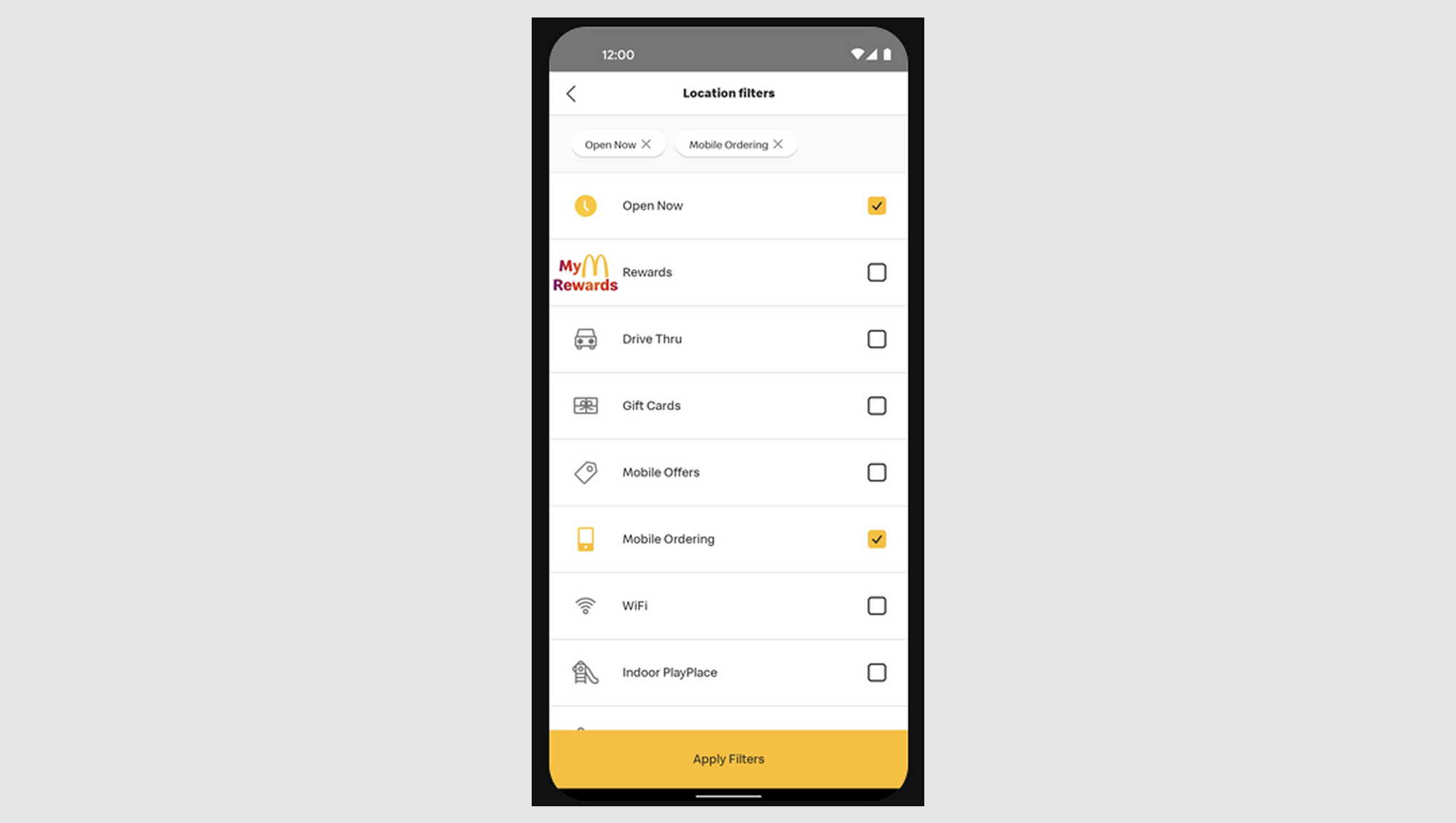
At first glance, a checkbox might seem like a square box, but more is happening under the hood. A well-designed checkbox has three core components contributing to its functionality and clarity:
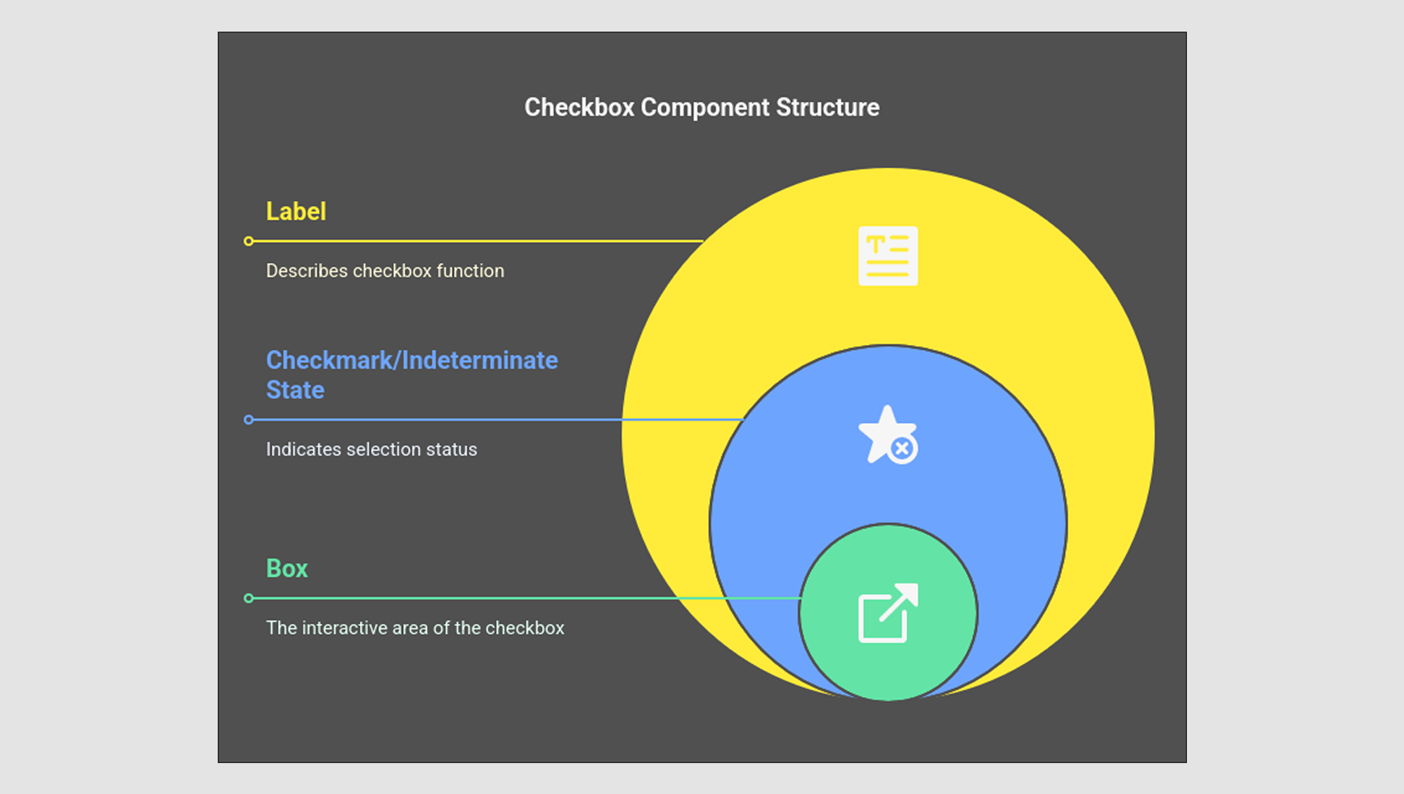
- The box is the square area that the user interacts with. It should be large enough (at least 44x44px for mobile) to make clicking or tapping easy. Any smaller users will likely miss it, leading to frustration.
- The checkmark / indeterminate state: This part shows the selection state. When checked, the box displays a checkmark (✓), indicating the selected option. However, things get trickier with the indeterminate state when some options are selected but not all (often seen in nested checkboxes). A dashed or filled-in box represents this state, signaling to users that there are multiple checkbox UI design choices, but not all are selected.
- The label: The text that describes what the UI checkbox does. It should be short, clear, and clickable (meaning the user can click the label to toggle the checkbox). The label’s clarity directly impacts user experience. For example, "Subscribe to our newsletter" is better than a vague “Options” label.
Now that we’ve explained what a checkbox is made of, let’s discuss how it behaves. We’ll walk you through the key checkbox states (with real-world examples) so you’re not just throwing boxes on a form and hoping for the best.
Checkbox states with examples
Checkboxes have multiple states, each crucial in guiding users through their interactions. Knowing these states and when to use them can make your checkboxes clearer and more functional.
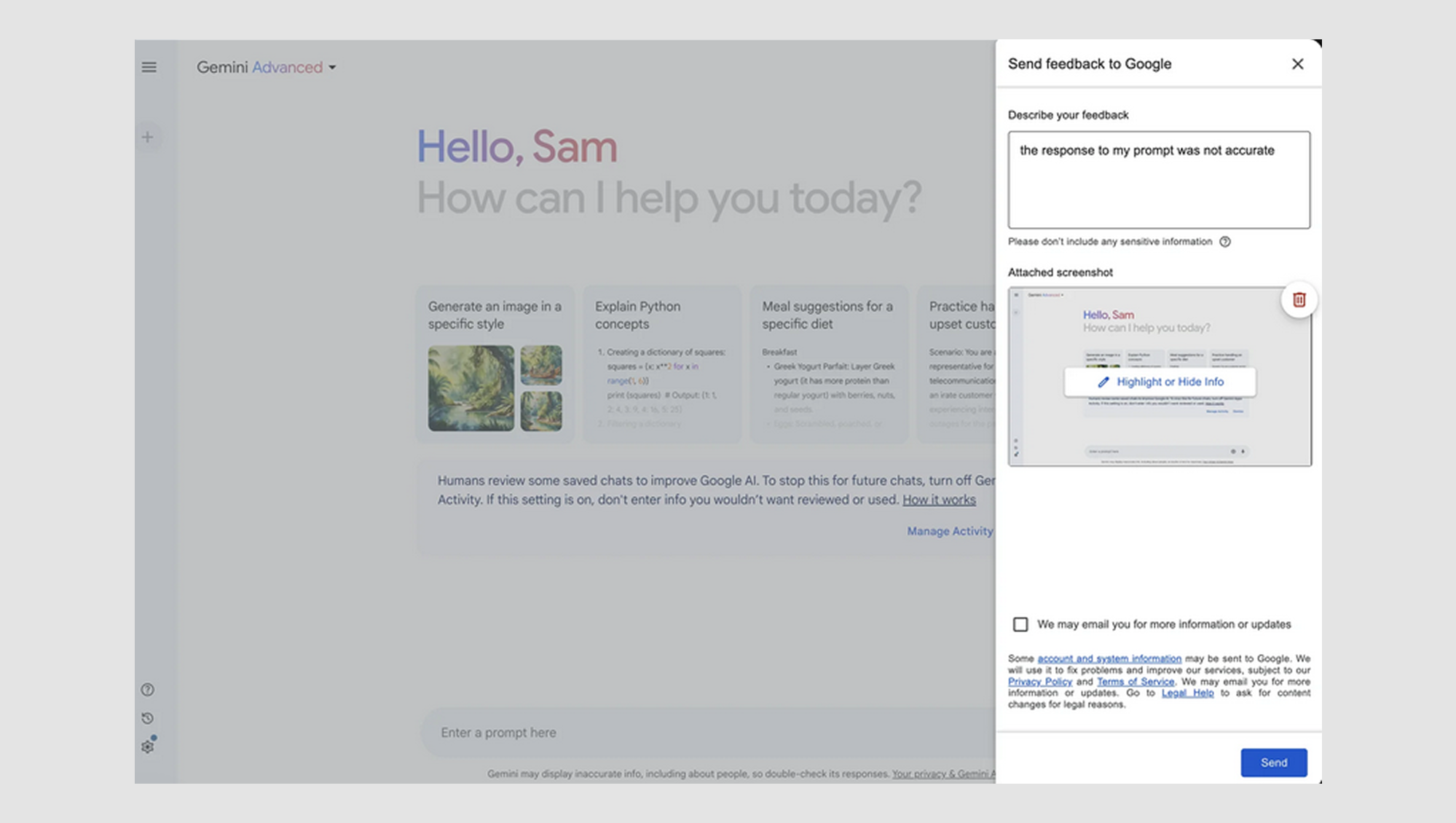
1. Unchecked (default)
This is the checkbox's initial state. It's blank, showing that no action has been taken yet. This state is used when the user hasn't selected an option yet.
- Example: “We may email you for more information or updates.” The box is unchecked by default, signaling the user has not opted in.
2. Checked (selected)
When the checkbox is clicked or tapped, it becomes checked, indicating that the user has selected the option. It's the most straightforward state.
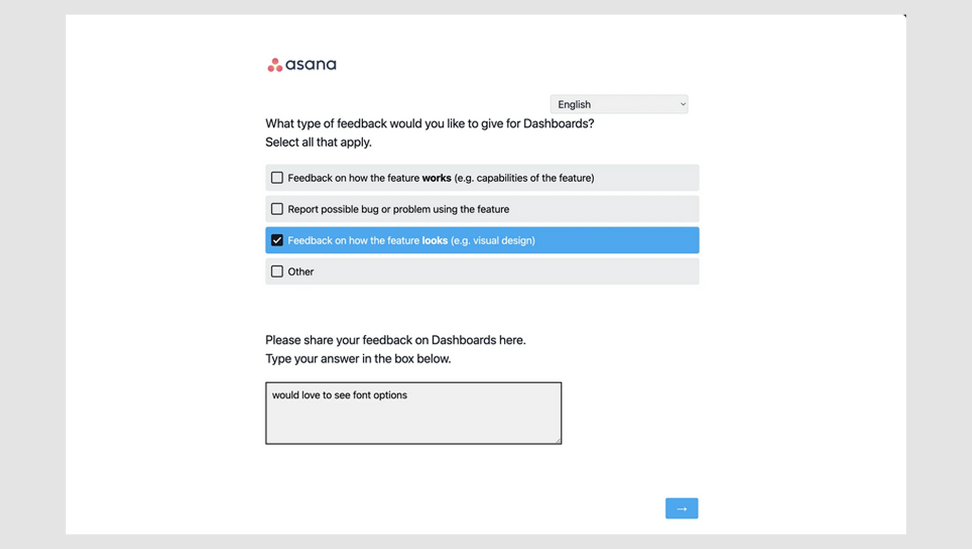
- Example: “Feedback on how the feature looks” — a checkmark appears once the user clicks the checkbox, confirming their choice.
3. Indeterminate (partially selected)
This state is often used for nested checkboxes. It shows that some, but not all, sub-options under a parent option are selected. A dashed or filled-in box represents this state.
- Example: "All results". If the user selects some but not all, the "All results" checkbox may appear indeterminate ([-]) to reflect this partial selection.

4. Disabled
A disabled checkbox is grayed out, indicating that the option cannot be selected or modified. This is useful when options are unavailable due to other settings or conditions.
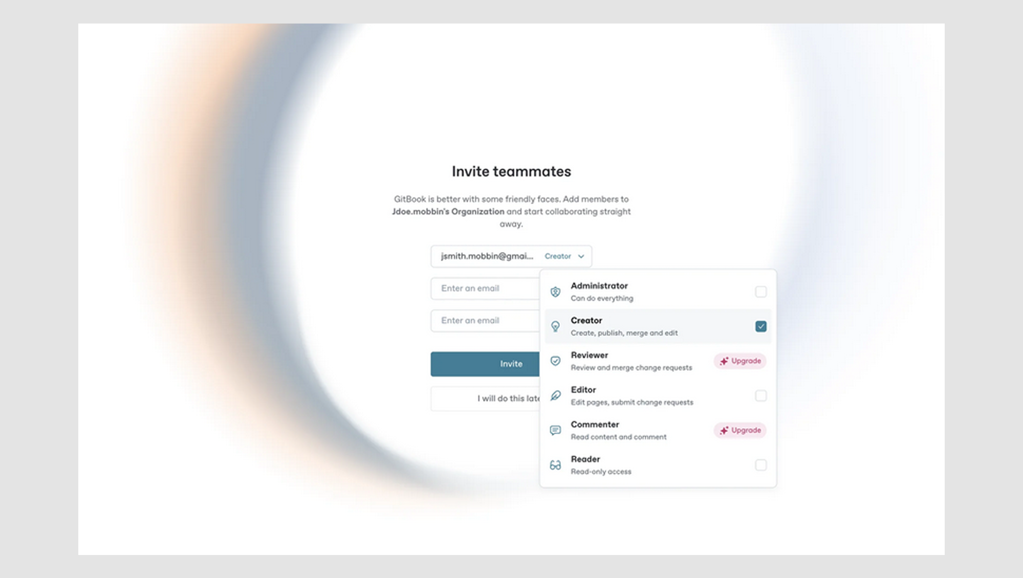
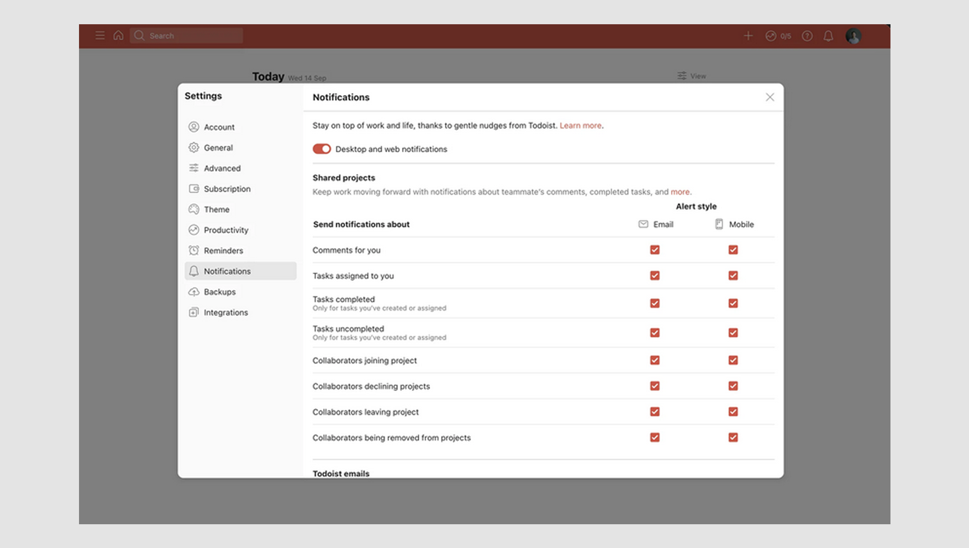
- Example: If a user has not upgraded the plan, the "Reviewer" and “Commentator" checkboxes might be disabled, indicating that they can’t select this option until they meet the requirements.
5. Hover / Focus
This state is triggered when a user hovers over or focuses on the checkbox (using the keyboard). It’s a subtle visual cue that lets users know the checkbox is interactive.
- Example: A soft glow or border change appears when the user hovers over the checkbox, signaling it's clickable.
Now comes the tricky part. When should you use a checkbox UI, a toggle, or a radio button?
Checkbox vs. toggle vs. radio button: which one should you use?
A common pitfall in UI design is using the wrong input field design element for the job. Let’s break down when to use checkboxes, toggles, and radio buttons so you don’t make that mistake.
Checkbox vs. radio buttons
Checkboxes are great when users need options. They’re built for flexibility, letting people choose as many items as they want from a list. Whether “Select your favorite colors” or “Choose the services you’re interested in,” each choice is independent. There is no pressure, no commitment. Check as many (or as few) as you like.
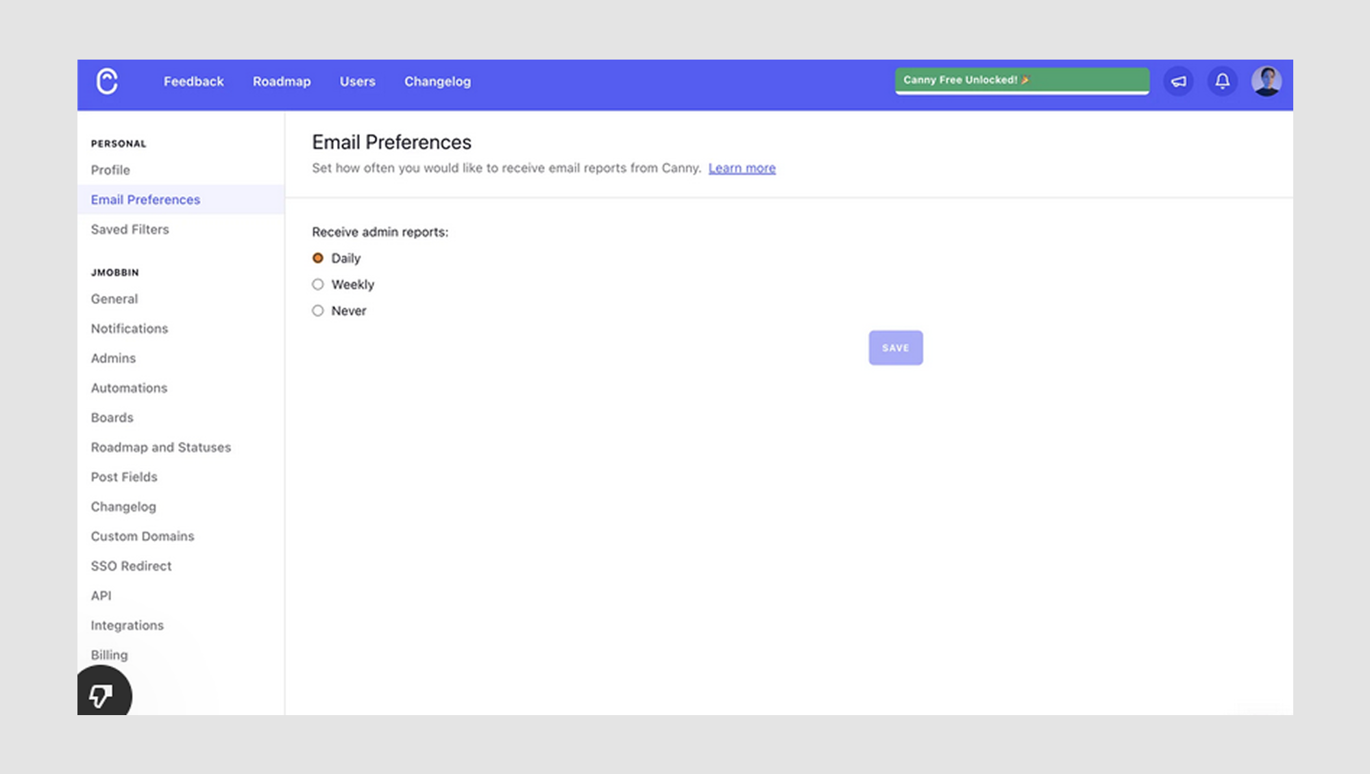
On the other hand, radio buttons are more of a one-and-done deal. They’re perfect when only one option makes sense, like asking, “What’s your preferred payment method?” The user gets one shot: Credit Card, PayPal, or Bank Transfer. No indecision allowed.
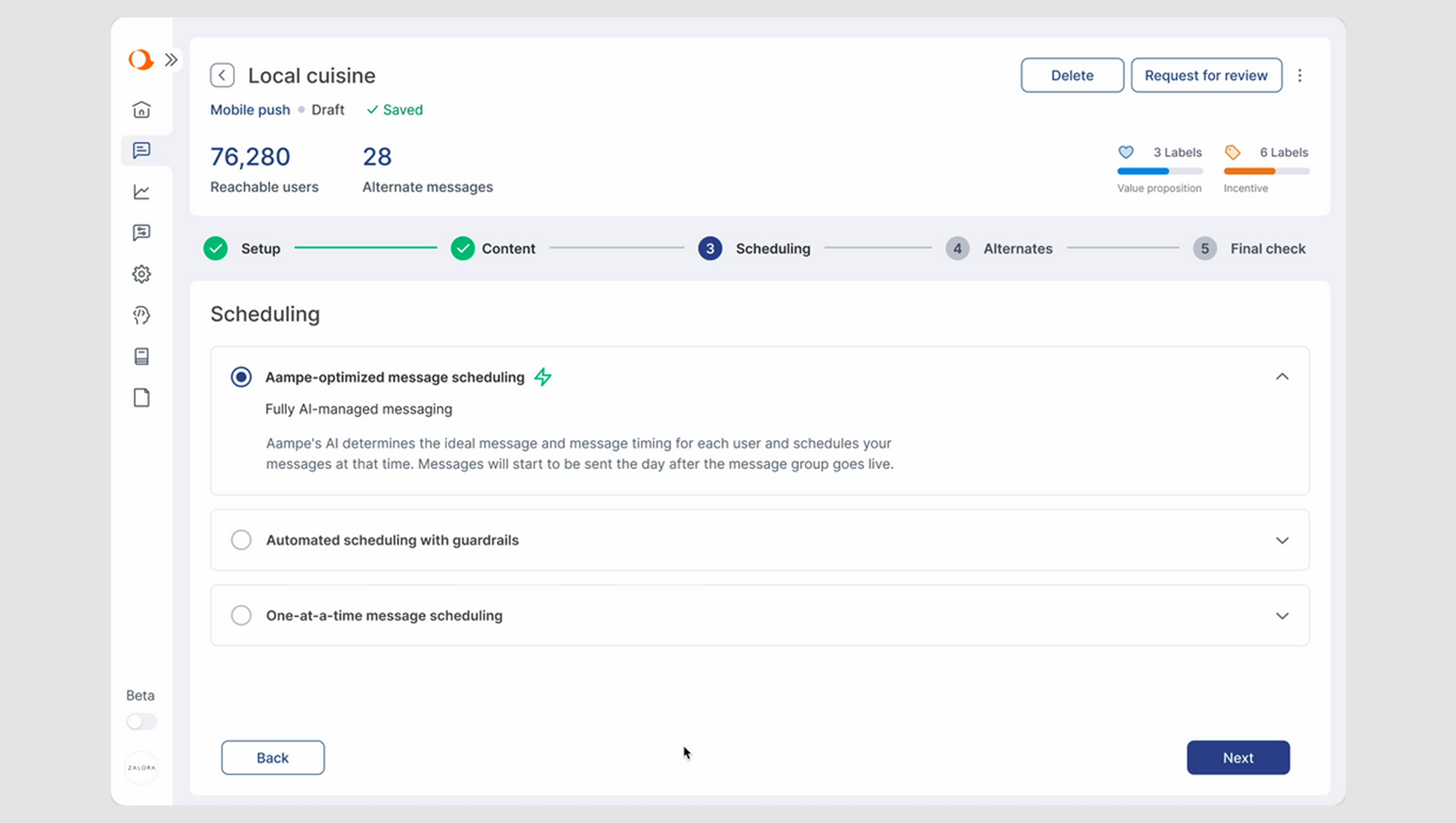
While redesigning the main menu for Aampe, an AI-driven startup, we faced a checkbox-vs-radio dilemma in their scheduling interaction. Users needed to choose a single personalization strategy, but checkboxes made it feel like multiple selections were possible. We replaced the checkboxes with radio buttons, creating a clear, single-choice flow. The result? A smoother, more intuitive user experience with no confusion or frustration.
Checkbox vs. toggle
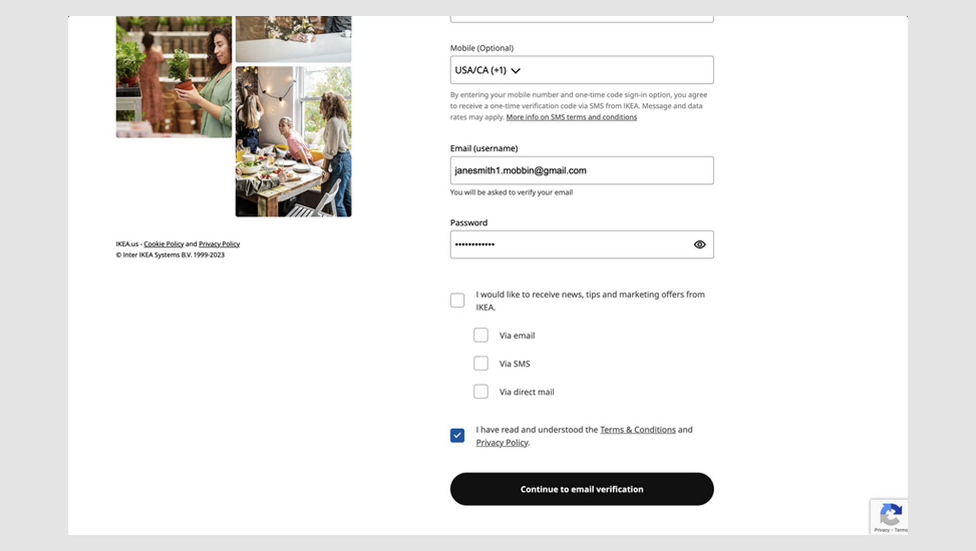
Checkboxes are great for static decisions. Users can select things now but confirm later. Think preferences, newsletter signups, or optional add-ons. They’re a perfect fit when there’s no immediate consequence to the choice.
Example: “I would like to receive news, tips, and marketing offers from IKEA.” The user checks the box, but the action doesn’t happen until they submit the form.
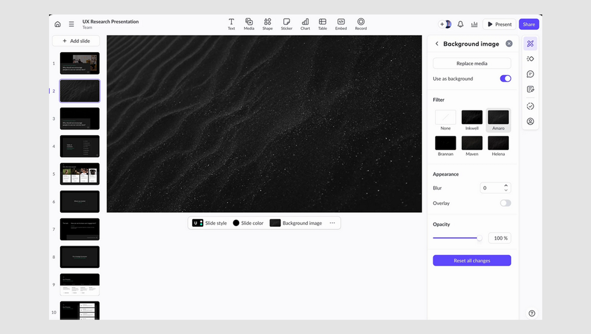
Toggle UX, on the other hand, is built for real-time actions. The moment you flip a toggle, something changes instantly. It’s ideal for system settings, features you want to turn on or off, or anything where immediate feedback matters.
Example: “Use as background.” The second the toggle flips, the UI switches themes. There is no need for a "Save" button.
But sometimes, UIs present us with a special challenge: a situation in which checkboxes, radio buttons, and toggles all make sense in the same interface.
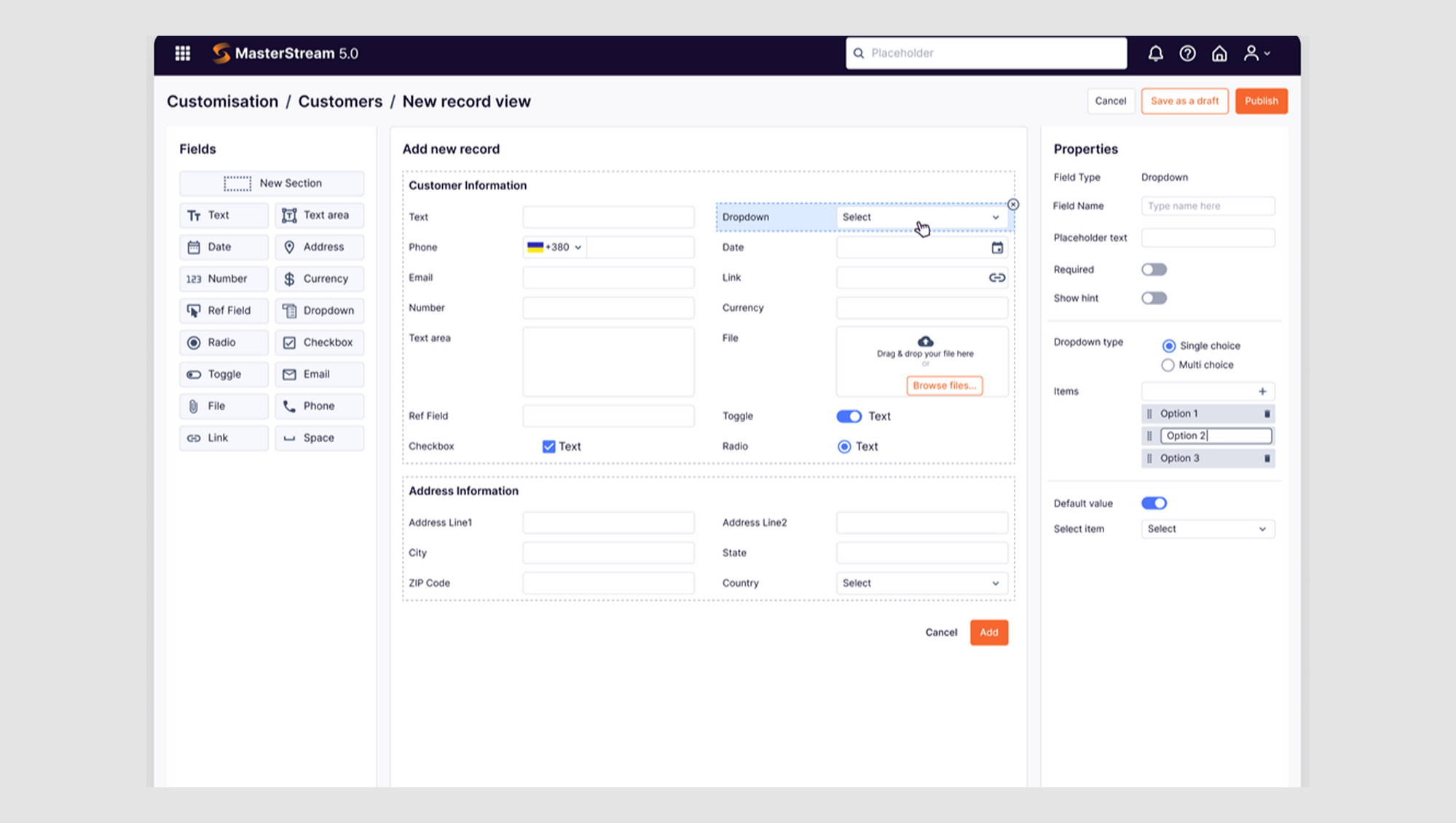
We used many UX design patterns while working with Data Streams, a product with advanced tools for managing and visualizing data. On their new record creation page, users can drag elements into a custom layout from the left panel. Each component has its own properties, and here’s where we introduced toggles, checkboxes, and radio buttons.
Some properties were either/or choices perfect for radio buttons. Others needed to be switched on or off with immediate effect, enter toggles and ticks. As a result, a smooth, intuitive interface where the form design behaves exactly how users expect, with no second-guessing required.
Checkbox UI design best practices: how to make them intuitive
Designing checkboxes may seem like a small detail, but it greatly impacts usability. Here are some best practices to ensure your checkboxes are intuitive, accessible, and easy to interact with.
Visibility and clickability
If users can’t see or tap your checkbox, it doesn’t matter how well it’s coded; it’s broken. Let’s talk about the little design choices that make a big difference:
- Size matters.
Tiny checkboxes are the silent killers of mobile UX. The recommended minimum size is 44x44px, and for good reason. Anything smaller turns clicking into precision surgery, especially for users with larger fingers or motor impairments. If people are missing your checkbox, it’s not their fault. It’s your hitbox.
- Clickable label.
Always, always make the label clickable, not just the box. It’s one of those small details that saves users from unnecessary frustration, especially on mobile, where even a millimeter off can result in nothing happening. If a user taps the label and nothing responds, that’s a micro-fail in UX. And they add up.
- High contrast.
Low-contrast checkboxes look sleek in mockups but become invisible in real life. Make sure your checkbox stands out against its background, whether it’s a white one on a dark UI or a black one on light. Clarity matters. High contrast is necessary for users in dark mode with poor lighting or with visual impairments.
Want to dive deeper into making UX more accessible? This video is a great place to start:
Default states and pre-selection rules
Checkboxes shouldn’t keep secrets. A well-designed default state sets expectations and builds trust. Here’s how to handle them right:
- Pre-selected checkboxes.
If most users are likely to choose a certain option, giving them a head start is okay — pre-select that checkbox. You’ll often see this in sign-up flows where “Subscribe” is already checked. It’s a subtle nudge, and it works.
But don’t pre-select checkboxes for actions that require explicit consent. Like agreeing to terms and conditions. That checkbox should always be blank until the user actively says, “Yes, I’m in.” Anything else feels sneaky.
- Show default states clearly.
An empty checkbox isn’t always as obvious as you think, especially if your design makes it hard to tell the difference between checked and unchecked. Use clear visual indicators, and when it makes sense, spell things out. A label like “None selected” or “Select all/ Deselect all” UX or a subtle prompt can go a long way.
Avoiding checkbox clutter
A few checkboxes? Helpful. A wall of checkboxes? Overwhelming. If your interface looks like a game of Minesweeper, it’s time to clean things up.
- Progressive disclosure.
Don’t show everything at once. Consider using progressive disclosure if your list of checkboxes is longer than a CVS receipt. Let users reveal more options only when they need them. A simple “Show more” link or a collapsible section does wonders. Better yet, pair it with an “All” option at the top so users can skip the clickathon if they already know what they want.
- Group options logically.
Checkboxes work better in organized clusters. Instead of dropping them all into one endless scroll, group them under clear, helpful labels like “Notification Preferences,” “Languages,” or “Payment Methods.” Users will find what they need faster and feel more in control.
- Use a “Select all” UI option.
This little UX gem saves time and builds goodwill. If most users will likely choose everything in a list, give them a shortcut. A “Select all” checkbox at the top, synced with individual options, makes things efficient, and when done right, it plays beautifully with indeterminate states for nested checkboxes.
Common UX mistakes and how to fix them
Even the most seasoned designers can make mistakes when working with checkboxes. Here are some of the most common issues and how to fix them to help you create a smoother user experience.
Mistake #1: Using checkboxes for single-choice questions
Bad UX: Using checkboxes when the user should only select one option.
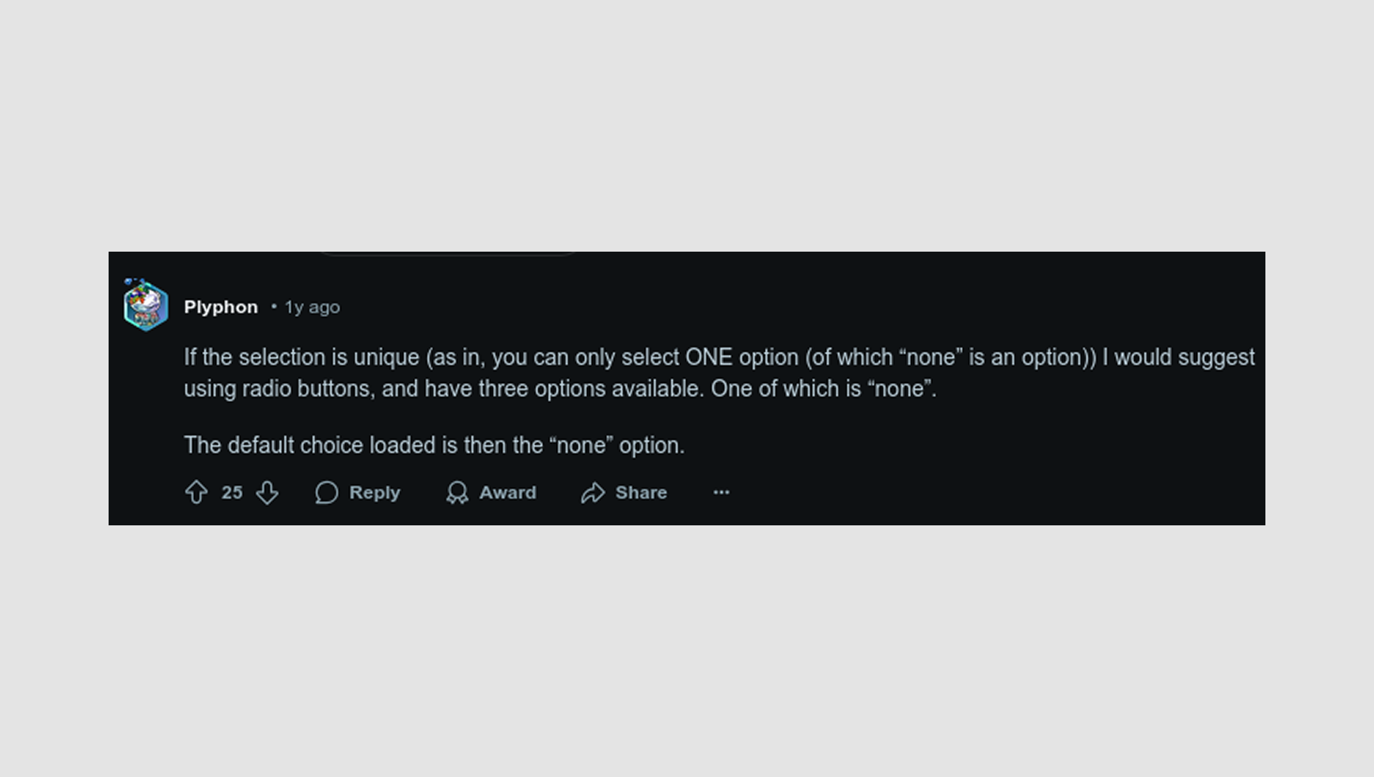
Fix: The Reddit user explains, “If the selection is unique (as in, you can only select ONE option (of which “none” is an option)), I would suggest using radio buttons, and have three options available. One of which is “none”.
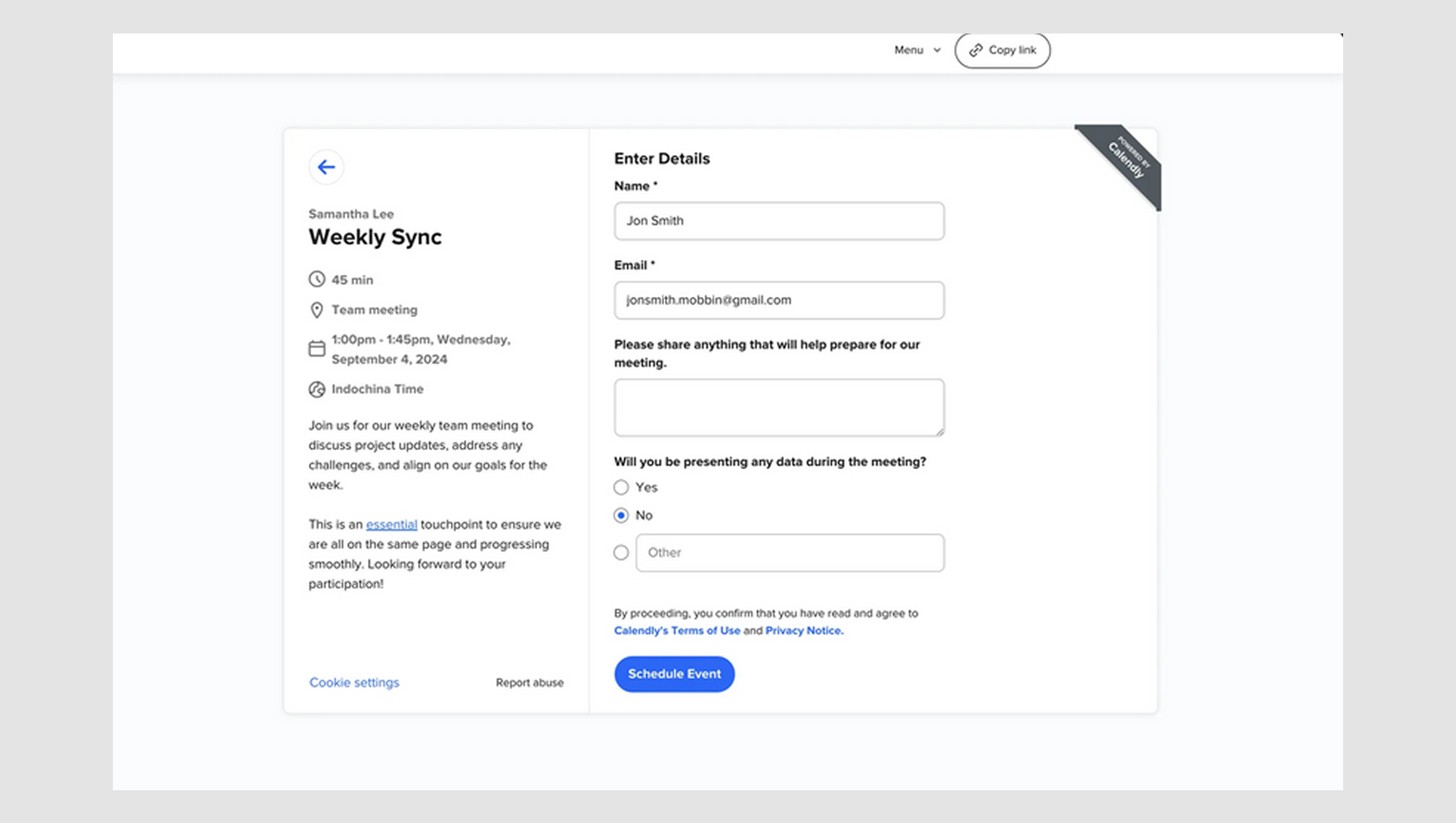
Radio buttons are built for single selections. For example, if you ask, "Will you be presenting any data during the meeting?" and offer options like "Yes" and "No," radio buttons make it clear that users can only choose one option.
Mistake #2: Checkboxes that trigger modals
Bad UX: Using checkboxes that trigger a pop-up modal when checked is a classic usability blunder. Imagine a checkbox that says “Repeat task,” but checking it opens a modal with many additional options. It’s confusing and interrupts the flow. As one Reddit user put it, “It’s bad UX.”
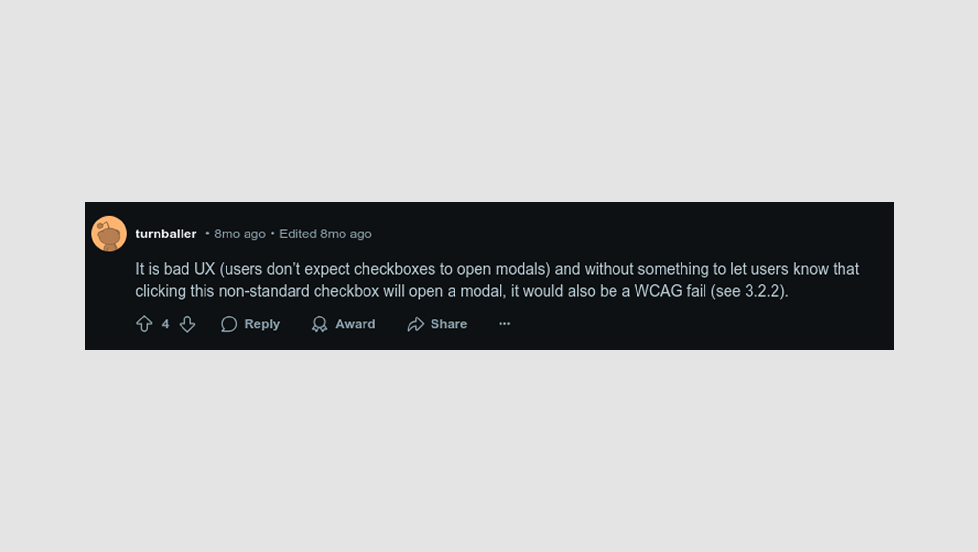
Fix: Instead of triggering a modal, show additional options inline using wizard UI or check out effective card UI examples. If the user checks the box, reveal the related options right there on the screen. This keeps users engaged, reduces frustration, and creates a more seamless conversational UI.
Mistake #3: No “None” option for required selections
Bad UX: Forcing users to choose between two checkboxes, like "Enable-Feature A" and "Enable-Feature B," without offering an option to skip both can be problematic.
One Reddit user shared a scenario where they had a list of 20 selections, all with the same two-option format. While they didn’t want to hide options under dropdowns, adding a "None" option to the radio buttons seemed redundant and cluttered the interface.
However, others argued that the "None" option is a good choice, as it prevents users from being forced into a decision they may not want to make.
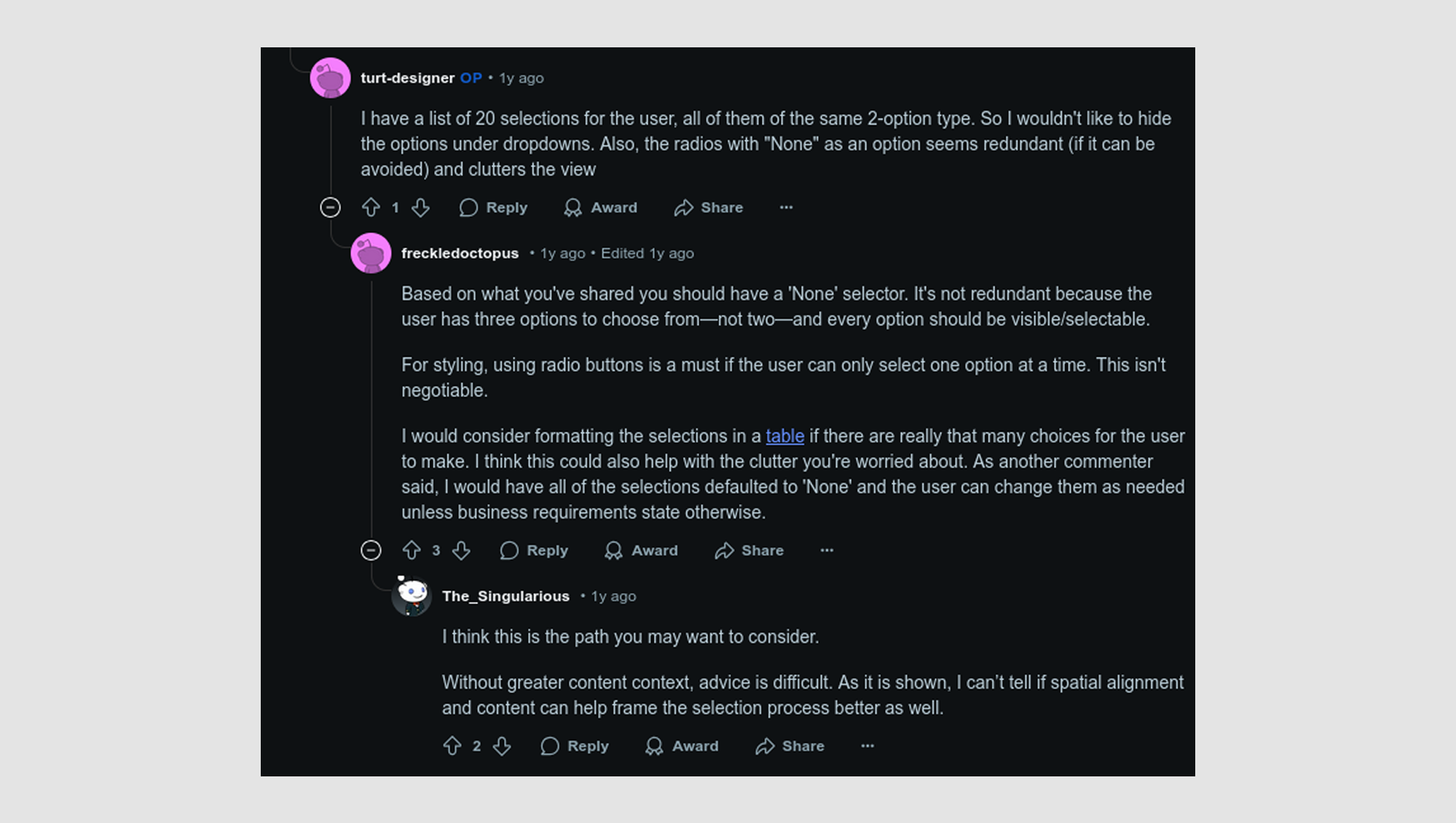
Fix: If the user must choose one option, use radio buttons with an option for “Never” or “None.” This allows users to skip selecting, especially if the options are optional.
Mistake #4: Checkbox hitbox too small
Bad UX: A checkbox too small for users to click comfortably is a common problem, especially on mobile devices, where users need larger targets to tap.
Fix: Ensure the checkbox has a minimum clickable area of 44x44px (according to mobile design guidelines). This way, users will have no trouble interacting with the checkbox, even on smaller screen design examples.
Wrapping up
Checkboxes might not get much attention, but they quietly shape users' interactions with your product.
We’ve walked through what makes for great checkbox UX, from choosing the right states to avoiding common UX design traps to knowing when a toggle or radio button is better. These aren’t just nice-to-haves; they’re small decisions that add up to a seamless experience.
So, the next time you design a checkbox, remember that simplicity wins, clarity matters, and function should always guide form.
And if you ever need a second set of eyes, the team at Eleken is always here to help make your checkboxes (and everything around them) work smarter.


.png)


.png)