.png)

Time pickers are deceptive. They look simple: just pick a time, right? But then come the dropdowns: one for hours, another for minutes, a third for AM/PM… and suddenly you’re wrestling with a form design that should’ve taken two seconds. It’s no surprise that clunky time pickers frustrate users and quietly tank conversions.
At Eleken, we’ve seen firsthand how a tiny detail like this can throw off the entire experience. We’ve redesigned enough interfaces to know that something as simple as picking a time can become a user's breaking point when the UX gets in the way.
So let’s fix it. We’ll show you the patterns that work, the common pitfalls to avoid, and the future-forward ideas shaping better time pickers, stuff we wish every designer knew.
The core UX principles of time pickers
Designing a time picker isn’t just about slapping some dropdowns or a clock face on the screen. To make it effective, you need to consider a few core UX principles that influence how users interact with time selection.
Mental models of time selection
People have a natural sense of how time works, and that shapes their expectations when interacting with a time picker. For instance, if someone’s booking an appointment, they’ll assume the time is shown in their local time zone, unless it’s clearly stated otherwise.
No one thinks, “Hmm, is this in UTC?” They expect the interface to reflect their context or intelligently adapt to the recipient’s time zone, as shown in the example below.
.png)
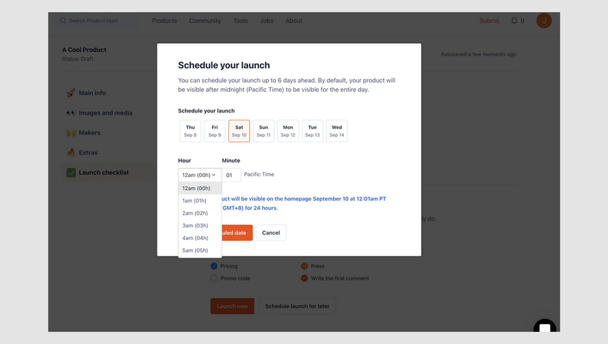
Users also expect a “Now” option when selecting a time. If they’re scheduling an event, meeting, or picking up the order, they want to see the current time or the next available slot. If your picker defaults to a time hours later, it breaks their mental model.
.png)
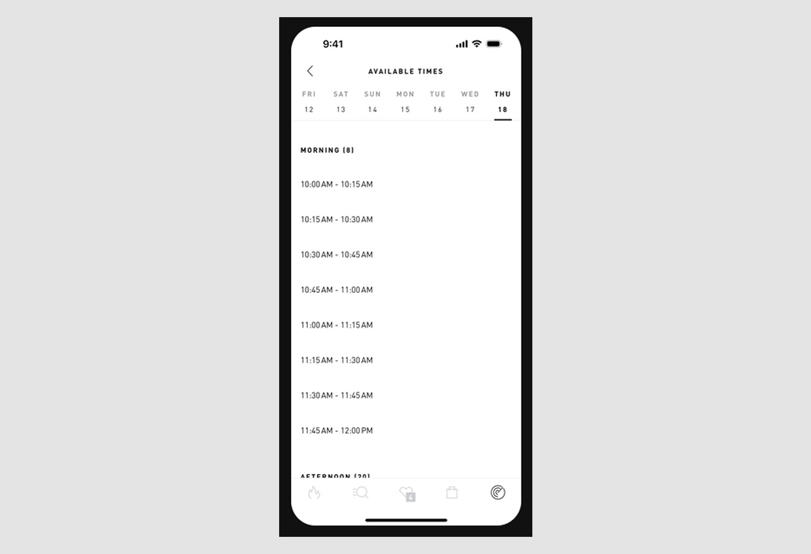
Additionally, users tend to expect time pickers to offer common intervals, like 15 or 30 minutes. Offering arbitrary time increments or allowing users to pick a time down to the second can feel overly complicated and unnatural.
.png)
Efficiency
Efficiency is about minimizing the steps users need to take to select a time, without compromising clarity. The goal is to make the process seamless and fast while giving users control.
For example, pre-selecting a default time, like noon or evening, with the next available slot, saves users time, eliminating the need to decide on a starting point. This small touch reduces confusion and helps users move forward quickly.
Similarly, in many flight and hotel booking systems, auto-selecting the next available time slot saves users from scrolling through endless options—a common issue with the list UI design pattern. Instead of forcing users to hunt for the right time, the system intelligently suggests the best available slot based on real-time availability.
.png)
Clarity and accessibility
A good time picker should be instantly understandable, with no manual required. If users have to stop and ask, “Wait, is this 6 AM or 6 PM?” or “What date format is this using?” That’s a red flag.
Clarity means eliminating ambiguity in how time is displayed and selected. Accessibility ensures everyone can interact with it, regardless of how they navigate or perceive the interface.
Let’s start with AM/PM confusion. If you use a 12-hour format, make the distinction obvious. Use clear AM/PM toggles, not subtle dropdowns or tiny indicators users can miss. Better yet, offer a 24-hour format, especially for global audiences.

Then, there’s clarity regarding the date UI design format. MM/DD/YYYY vs. DD/MM/YYYY is a classic UX trap. If your product serves an international audience, don’t assume one format is universal. Use a localized format based on the user’s location or display the month as a word (e.g., “1 Apr”) to avoid confusion.
.png)
On the accessibility side, make sure your time picker is fully keyboard-navigable. Users should be able to tab through elements, use arrow keys to adjust time, and activate selections with Enter or Space.
Also, don’t forget screen reader support; label fields properly so screen readers announce things clearly, like “Start time: 3 PM” instead of just “Edit text.”
For color accessibility, never rely on color alone to indicate a selected state. Always pair color with a visual indicator like a checkmark, bold text, or label change, so users with visual impairments know what’s selected.
.png)
And if you want to learn more about how to design accessible UX, watch this video:
Platform consistency
A time picker should feel like it belongs on the platform it’s being used on, whether it’s iOS, Android, or the web. Users have come to expect certain behaviors from native time pickers, and when your app deviates too far from these expectations, it can create confusion and slow their interactions.
If your app follows a specific design system like Material Design or Apple’s Human Interface Guidelines, your time picker should align with those guidelines. That means using consistent layouts, colors, typography, and animation styles. When components behave the way users expect, they don’t have to relearn how to interact with them, making your product feel like a seamless part of the platform.
For example, iOS users are used to the native spinner-style time picker, where they scroll through hours, minutes, and AM/PM. Straying too far from that familiar pattern without a good reason can lead to confusion or frustration.

However, the design may lean more towards a numeric input style with a popup calendar or a straightforward time dropdown on Android. When designing for these platforms, respect these native conventions to make the experience feel intuitive.

Use cases matter
Context is everything. A time picker for booking a doctor’s appointment shouldn’t look or behave the same as one for tracking hours on a job. Understand the user's intent and design around it.
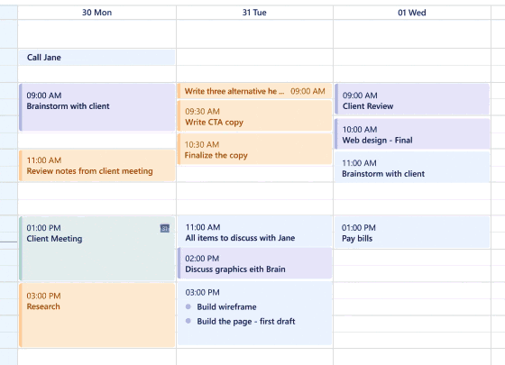
Take healthcare scheduling, for example. When designing for Populate, a healthcare startup, the Eleken team created a streamlined calendar system tailored for doctors. They didn’t need a typical time picker. They needed a way to quickly view available slots, schedule appointments, and manage their day. We designed a clean, intuitive interface that combined available times, appointment overviews, and a compact list of upcoming bookings within one screen.

Now contrast that with scheduling fitness classes. Here, users may need to reserve multiple sessions, say, strength training on Tuesday, outdoor running on Wednesday, and stretching on Friday. The time picker must support recurring scheduling and flexible time ranges, often across several days. A standard dropdown won’t cut it.

The time picker in a project management tool could have an even more specific use case. Here, users need to select working hours within a strict time range picker—say, from 9:00 AM to 6:00 PM.

But sometimes it’s about managing a schedule holistically. That was the case with PrimePro, a mobile app for on-demand contractors. Instead of jumping between separate views to set availability, log hours, and track jobs, users needed one seamless interface. We designed a smart calendar that brought it together: users could schedule jobs, set their availability, view upcoming tasks, and adjust hours, all within a single, intuitive flow.

Now that we’ve seen how different use cases shape the design of time pickers, let’s look at the UX design patterns that make them intuitive, efficient, and easy to use.
Time picker UX patterns (with pros and cons)
Time pickers come in all shapes and sizes. Each pattern has its advantages and drawbacks. Let’s break down the most common ones and evaluate when to use or avoid each.
- Dropdown menus are ideal for applications with common, standard intervals (e.g., booking systems with fixed time slots).
- Sliders/steppers are perfect for mobile-first experiences or when choosing a time range (like picking a time window).

- Clock face (material UI, iOS-style spinners) іs great for simple time selection UI where visual feedback is more important than precision, such as in mobile apps for casual use.

- Text input with smart autocomplete is best for advanced users who are familiar with time formats and need speed (e.g., scheduling software).
.png)
- Voice and AI-based time selection is an emerging trend, useful in apps that already use voice control or AI assistants (e.g., smart home apps or meeting schedulers).
Why most time pickers fail (and how to fix them)
Even the most well-intentioned time pickers can miss the mark. Here's why they often fail and, more importantly, how to fix them.
AM/PM confusion
Many users struggle with AM/PM selection. It’s easy to get confused about morning or evening, especially in 12-hour formats.
One Reddit user shared the experience designing a clock face with an AM/PM switch that flipped midnight to noon when toggled. The intention was to show times like 1 PM, 2 PM, etc.
Instead, it created ambiguity about whether times referred to day or night. As the user put it, “I agree, it’s a bit confusing.”

The Redditor was experimenting with a time picker that also conveyed the day of the week and month, something you might see in a wizard UI or conversational UI, where multiple inputs are collected in a flowing, step-by-step experience.
But even with good intentions, designs like these can create friction, especially when time selection gets tucked into complex user onboarding UX patterns. Users don’t always expect to make precise time choices during onboarding.
The fix: To avoid this confusion, consider switching to the 24-hour format or providing clear AM/PM indicators.

Time zone hell
Daylight saving time shifts, different time zones, and manual adjustments create headaches.
For example, if a user books an appointment in one time zone but views it in another, things can quickly fall apart. As one Reddit user explained, “ It works perfectly fine if the user/business timezone is the same as the server timezone…”
However, once Redditor switched to storing ISO date strings, simple slot checks like [‘10:00 AM’, ‘11:00 AM’] became difficult queries just to compare time ranges.

What used to be a simple array of time slots turned into complex date math just to compare bookings. This is a common issue when designing filter UX and UI components, including date ranges or time windows.
The fix: Build automatic time zone detection based on user location and make it clear when a time zone change occurs. In apps with chatbot UI examples, guide users through time zone confirmation to prevent surprise schedule shifts.
If users are booking across time zones, provide a dropdown or option to select time zones explicitly.

The birthday problem
Scrolling endlessly through a calendar to select a birthdate is tedious. You know, when you’re trying to set a birth year from 2005, you have to scroll through the decades.
As one Reddit user shared, “Mini-calendar datepickers are for date close to some know date. Practically always a day few days in the future, such as an appointment date. Birthday of the user is decades in the past, so it needs another solution, such as writable date field”.

The fix: Use a more efficient date picker UX. Users can directly input the year, month, and day rather than scrolling. Whether it's part of a card UI element or a grid layout design, reducing friction here helps users stay focused on the bigger picture.

The mobile experience is often terrible
Small tap targets, hard-to-navigate menus, and awkward scrolling. Mobile time pickers often create a poor experience.
As one Reddit user put it, “...Date/Time UIs are notoriously bad. Even default ones on mobile devices, both Android and iOS, have major issues.
Having a "date picker" is perfectly fine, as having a calendar-like layout helps avoiding mistakes. But for a "time picker" nothing beats entering 4 digits with a numeric keypad.”

The fix: Prioritize large tap targets and simplify and make the interface intuitive. Mobile users should be able to interact with the date and time picker UI easily through scrolling, tapping, or even gesture-based selections.

Best practices for designing a better time picker
Designing a time picker that users enjoy can feel tricky. But with the right strategies, it’s achievable. Here are some best practices to ensure your time picker stands out.
Input methods that work
A good time picker doesn’t force users into one way of doing things. It offers options. Some users prefer to type in the exact time, while others feel more comfortable selecting from a visual interface. The best designs accommodate both.
A hybrid approach when combining manual input field design with a visual picker strikes the right balance between speed and flexibility.
That’s why flight booking apps often pair a calendar-based picker with editable time fields. Users can tap to select a time or enter it directly, depending on what’s faster or more natural for them.

Mobile vs. desktop considerations
When designing for mobile, make sure tap targets are large enough for users to interact easily. Gesture-based inputs like scrolling through hours with a swipe can feel natural and intuitive.

On desktop, users expect more precision and speed. They might prefer to type in the time directly, use keyboard shortcuts (like arrow keys to tweak hours and minutes), or navigate with a mouse. But even with these added capabilities, simplicity is still essential. A cluttered or overly complex interface can be just as frustrating on a large screen as on a small one.

Error prevention and validation
Good time pickers actively prevent errors. One simple but essential rule: don’t let users select impossible times, like an end time that’s earlier than the start time. Built-in validation like this prevents frustration and cuts down on support requests.
Another smart move is to use autocomplete and intelligent suggestions. When a user starts typing “5,” the system can suggest “5:00 PM” automatically, removing the need to remember the exact format.
Better yet, if certain time slots are available (say in a booking app), you can prioritize those in the suggestions. This speeds up the selection process and guides users toward valid choices, reducing errors and decision fatigue.
Accessibility and inclusivity
A well-designed time picker should work for everyone, including users with disabilities or those using assistive technologies.
Start with keyboard navigation. Users should be able to move through the time picker UI using only their keyboard, whether by tabbing between fields or using arrow keys to adjust values.
Color accessibility is another critical factor. Never rely on color alone to indicate selection or availability. Instead, use clear text labels, icons, or patterns to ensure that users with color blindness or those in high-contrast mode can still understand the interface.
And don’t forget about screen reader support. Every element in the time picker, from hours and minutes to AM/PM toggles, should have descriptive labels, so users relying on screen readers can navigate and interact confidently.

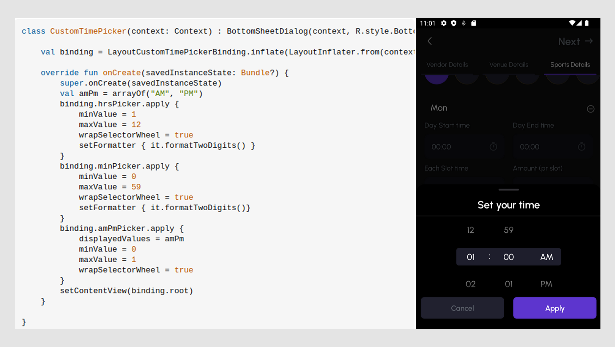
Custom time pickers vs. using component libraries
When deciding between building a custom time picker or using a pre-built component library, weighing the pros and cons of each is important. Let’s explore when one option might be better than the other.

When a library component makes sense
If you're racing the clock and need something that works now, a pre-built component from a design library like MUI, Ant Design, or Material Design can be a lifesaver. These tools are quick, reliable, and usually consistent.

Here is why to use a library time picker:
- Speed. You can plug and play without reinventing the wheel. Need to ship this week? Use the wheel.
- Consistency across the app. Libraries help you keep all your time input UI elements looking like they belong to the same family, maintaining a cohesive design.
- Cross-browser support. These components have been tested through the gauntlet across all the weird little quirks of modern browsers, so you don’t have to lose sleep over Safari’s mysterious scroll behavior.
But beware:
- Customization headaches. Want to change that AM/PM toggle UX that users keep tripping over? Good luck. Many libraries don't love being customized, and some just outright rebel.
- Accessibility roulette. Not all libraries prioritize accessibility equally. Some work great with screen readers and keyboard navigation, but others… not so much.
When to go custom (and why it might be worth the extra time)
Now, if your app has unique scheduling flows, users need to book recurring slots, see overlapping availabilities, or manage multi-timezone coordination, a custom time picker might be the way to go.
Yes, it takes longer and requires more work. But if you’re building something your users interact with daily, the picker is the product. You don’t want them cursing your UI every time they schedule a meeting.
Here is why to go custom:
- Your app is not generic. If your UX needs are specific, your time picker should be, too. Custom design lets you tailor the flow exactly to your users.
- Better mobile experience. You can design gesture-friendly, thumb-loving interactions that feel right on the smaller screen design examples.
- Accessibility control. Want full control over ARIA roles, focus states, and keyboard support? Custom’s your best bet.
But the tradeoffs include
- Development time. It’s not just drag-and-drop. You’ll need time to build, test, and bug-fix across devices and browsers.
- Consistency risk. If your picker is designed in isolation, it might stick out like a sore thumb next to your other components, unless you’re thoughtful about aligning with your design system.
With that said, use a library when you need something fast, functional, and familiar. Go custom when you want precision, polish, and product fit. And if you take the custom route, design with future needs and trends in mind.
Future trends: AI and smarter time pickers
The world of time picker design isn’t standing still. As technology evolves, so do user expectations and the tools we use to design interactions. Here’s a look at where time pickers are headed, with some exciting future trends.
- Predictive defaults
AI is already starting to make its way into time-pickers. Imagine a time-picker that knows your habits, like how you prefer to book meetings or when you're most likely to schedule your next event.
Predictive defaults can save users time by auto-selecting an optimal time based on past behavior or contextual cues (like “the next available slot”).
Example: A scheduling app might learn that you prefer afternoon meetings and auto-suggest times in that window; no manual input is needed.
A great example is our work with Privado Dining, where managing large party bookings involved far more than simply picking a time.
To ease the load on event managers, we designed an AI-powered assistant from scratch. It automates routine tasks, suggests optimal time slots, and alerts users to schedule changes, making the entire booking process faster, more intelligent, and more intuitive.

- Natural language input
Think about asking your app, “Pick a time in the afternoon,” and the time picker immediately understands it as 2 PM. Natural language processing (NLP) is the next frontier in making time pickers feel even more seamless.
Users don’t have to fiddle with dropdowns or clocks. They can simply speak or type naturally, and the app will respond with the appropriate time selector UI.
Example: Voice assistants (like Siri or Google Assistant) already use NLP for scheduling. Soon, more apps could integrate this into their time picker experiences for smoother interactions.
We explored this potential with our client, Populate where time-saving was a necessity. To make that possible, we combined smart technologies like speech-to-text dictation, AI-powered templates, natural language processing, and auto-populate features.
But tech alone wasn’t enough. It took careful UX design to make it all feel seamless. We re-evaluated every interaction, reduced unnecessary steps, and added helpful onboarding hints for new users. For example, when detailed notes were unavoidable, speech-to-text allowed doctors to speak naturally, eliminating tedious typing and speeding up their workflow.

- Smart time constraints
Imagine a system that lets users select a time range and suggests the best available times within that range. AI will soon be able to provide optimal time slots based on user preferences, historical data, and even the app’s scheduling patterns.
It removes the guesswork for users and improves efficiency by suggesting times that work best for everyone involved.
Example: In a collaborative scheduling app, the system might suggest times that accommodate all team members' preferences and availability, reducing the back-and-forth of finding a suitable slot.
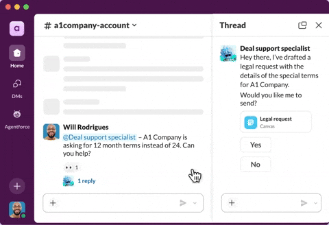
For instance, Slack is experimenting with AI-powered scheduling to reduce meeting friction. Its AI support agent helps schedule the meeting and select the right time.
Final thoughts
A smooth, intuitive time picker quietly makes everything easier. A clunky, confusing one? That kind of thing leads to frustrated users, missed appointments, and plenty of abandoned tasks.
The good news is that fixing time pickers doesn’t have to be complicated. A few smart design decisions and following the core principles discussed above can help you design time pickers that feel as natural as picking up the phone to schedule a call.
The future of time pickers looks bright, with trends like AI-powered suggestions and natural language input that will make interactions even smarter. Eleken is always here to help you navigate these trends and design time pickers that elevate your product.


.png)