

Sitemaps don’t get much love in UX discussions. They’re not shiny. They don’t scroll, animate, or dazzle in presentations.
But at Eleken, we’ve learned they’re one of the most underrated tools in product design, especially when dealing with dozens or hundreds of screens.
They help us bring order to chaos. Every screen has a place, and every connection makes sense. Nothing floats in space waiting to be discovered at the handoff stage.
In this guide, you’ll learn what a UX sitemap is, when to use one, how to build it properly, and how we use them to keep fast-moving projects structured and sane.
What is a sitemap in UX?
A UX sitemap is a diagram that lays out the full structure of a website or app. It maps every screen, shows how they connect, and defines how users move through the product.
Here’s what it includes:
- Core screens like dashboards, settings, and login are the backbone of your primary navigation.
- Supporting pages and flows that live deeper in the structure but keep the experience running smoothly.
- Orphan screens, broken logic, and features users technically have but can’t access. Sitemaps catch these before they become headaches.
In short, it’s the product’s skeleton with just a clean structure. You might also ask, “What is the purpose of the sitemap? Does anyone make it anymore?”
One Reddit user raised the same question, and the most common reply was “All the time.”

Sitemaps are still a critical part of modern UX work, especially for complex products that need a clear, scalable structure. They can help:
- Visualize navigation before you design: You can see the whole product flow without guesswork before sketching a single wireframe.
- Prevent scope creep and UX debt: Spot duplicates, missing screens, and confusing pathways early on.
- Align your team: Designers, PMs, developers, everyone sees the same picture.
- Boost SEO and accessibility: Good structure helps users, screen readers, and search engines. Win-win.
Now that you know why a sitemap UX matters, we’ll focus on the types and when to use each.
Different types of UX sitemaps with examples
UX sitemaps aren’t all the same. Your chosen structure depends on product type, content volume, and user journeys. Let’s take a look at common types and UX sitemap examples.
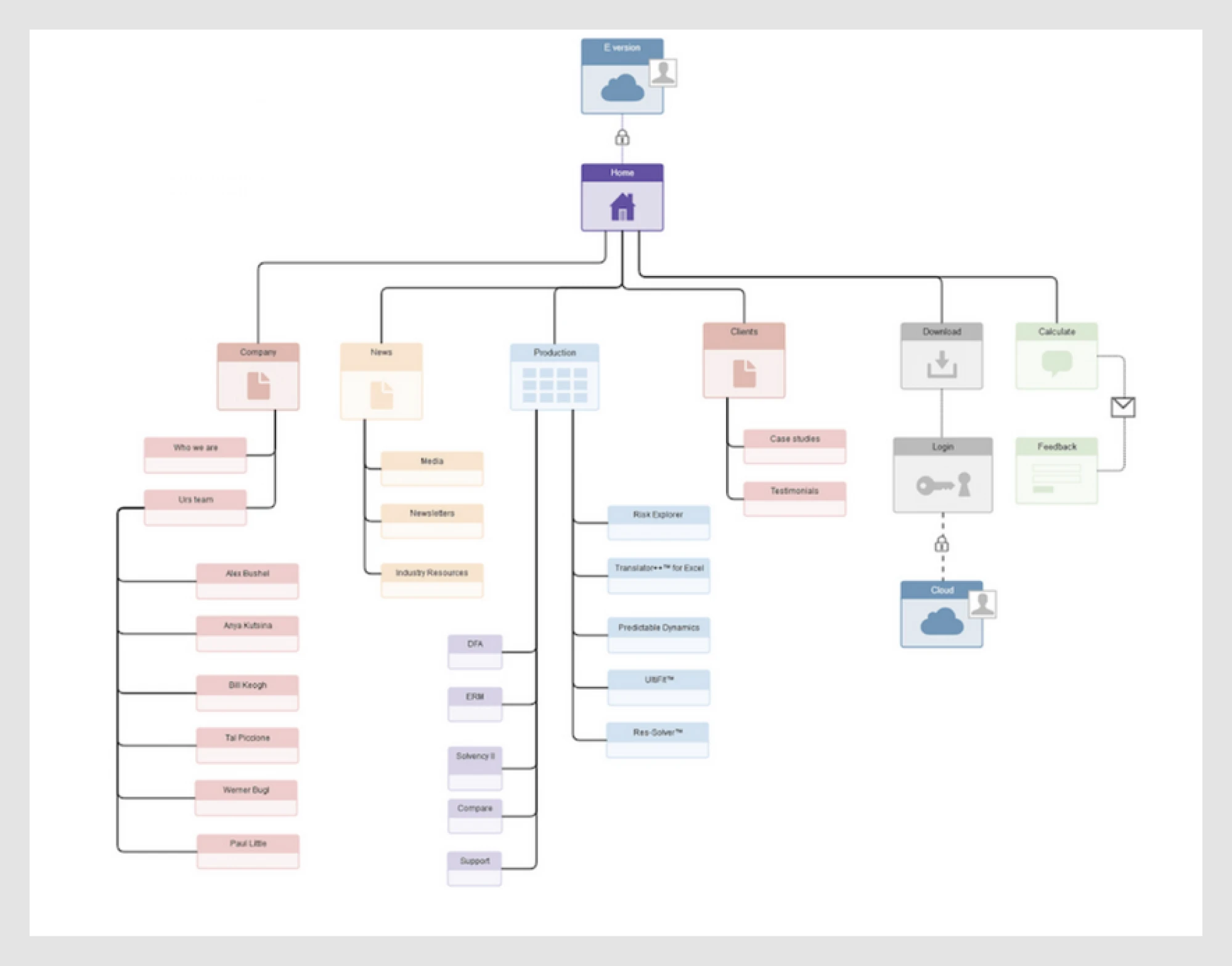
- A traditional website sitemap is perfect for corporate websites, agency portfolios, or any site where most pages are a click or two away from the homepage.
Think: Content-heavy sites, service pages, static navigation.
Sitemap example UX structure:
Home → About → Services → Case Studies → Contact
The Adobe sitemap is a clear sitemap UX example of how structure helps teams understand what content exists and how to organize it around user needs. It offers a bird’s-eye view of the site, guiding decisions on navigation, content grouping, and user flow, all essential for creating an experience that makes sense from the visitor’s perspective.
Sites like Adobe use structured categories and subcategories with well-designed list layouts, a key part of intuitive list UI design.
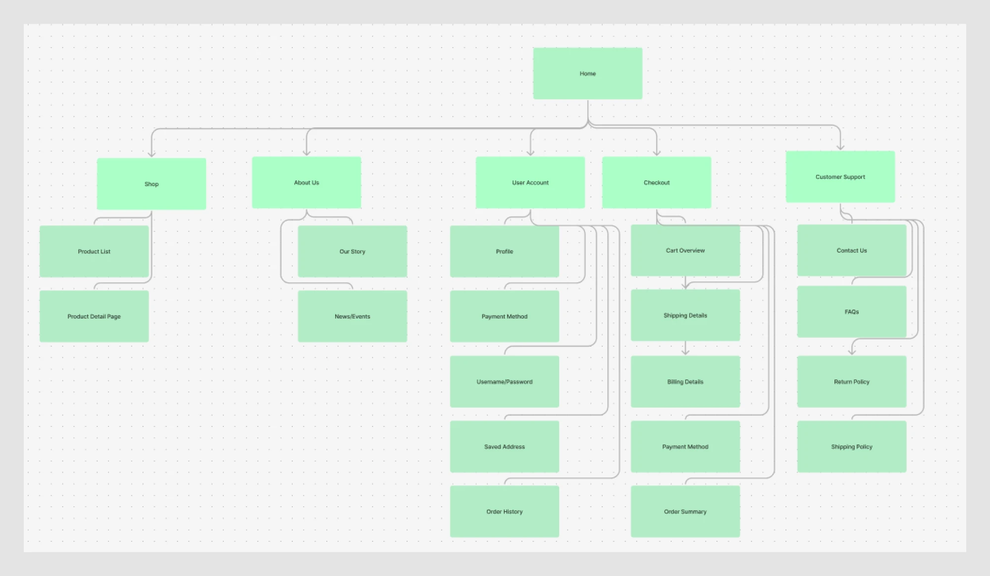
- An e-commerce sitemap is great when inventory is massive and discoverability matters.
Think: Categories, filters, and deep product pages.
Sitemap example UX structure:
Home → Shop → About us → User account → Checkout → Customer Support
A classic example of site mapping ux at scale is Amazon’s category-based sitemap. With thousands of products across dozens of departments, Amazon relies on a deep, hierarchical structure that helps users drill down from broad categories (like Electronics, Home, or Kitchen) into increasingly specific filters: brand, price, ratings, and beyond.
Amazon’s sitemap supports extensive product categories with filtering capabilities, which is a textbook case of filter UX and UI.
This sitemap organizes content and drives discoverability. The layered navigation ensures that users never feel lost, even when exploring a massive inventory:

- A hybrid website + web app sitemap is your choice if you need to balance storytelling on the site with functionality in the app.
Think: SaaS platforms with both marketing and product sections.
Sitemap example UX structure:
Home → Pricing → Blog → Dashboard → Reports → Settings → Profile
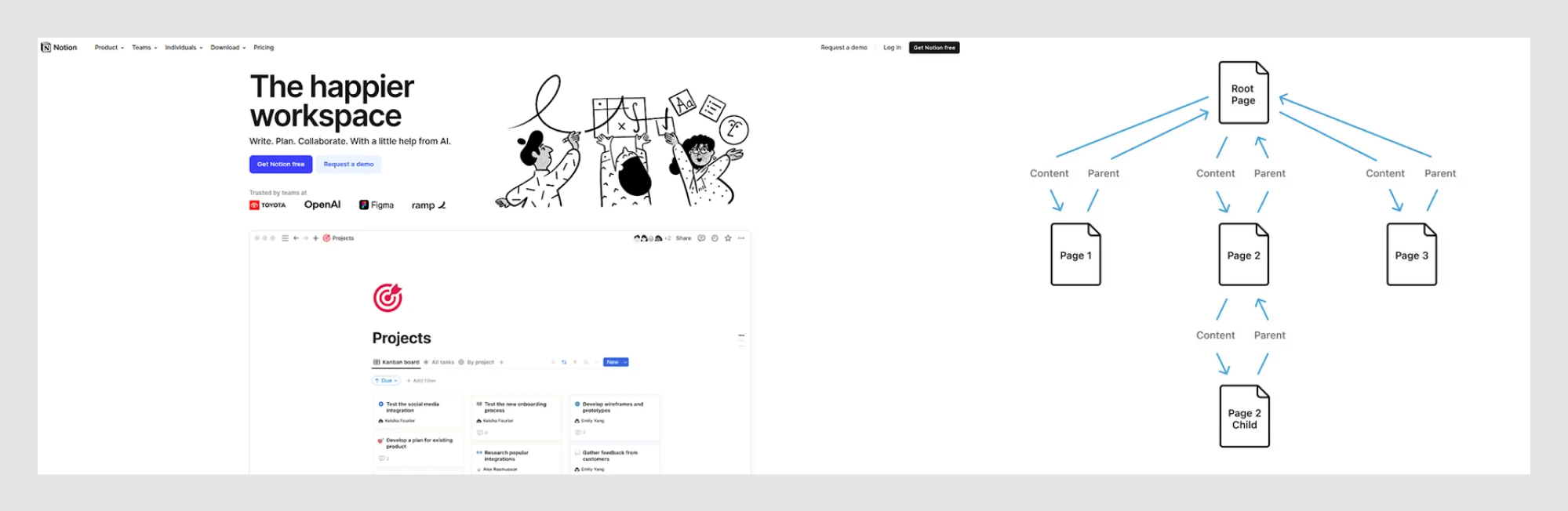
Many SaaS dashboards also use block-based layouts with modular components, often leveraging card UI examples. Let’s look at Notion, one of the more interesting sitemap ux examples. Its web app is built on blocks, where every text snippet, image, list, or page is a flexible, movable unit. Like digital LEGOs, these blocks let users build their own structure, piece by piece.
What feels simple on the surface is actually a tightly structured system beneath, a tree of parent-child relationships that manages both content organization and permissions. Notion’s sitemap reflects how each screen supports modular editing, a concept explored in detail in our screen design examples.
Not every product needs a complex UI sitemap, but choosing the right type early can save you hours of cleanup. And don’t forget accessibility. Your structure impacts how people navigate, not just how it looks. Watch this video to learn how to make your sitemap UX more inclusive.
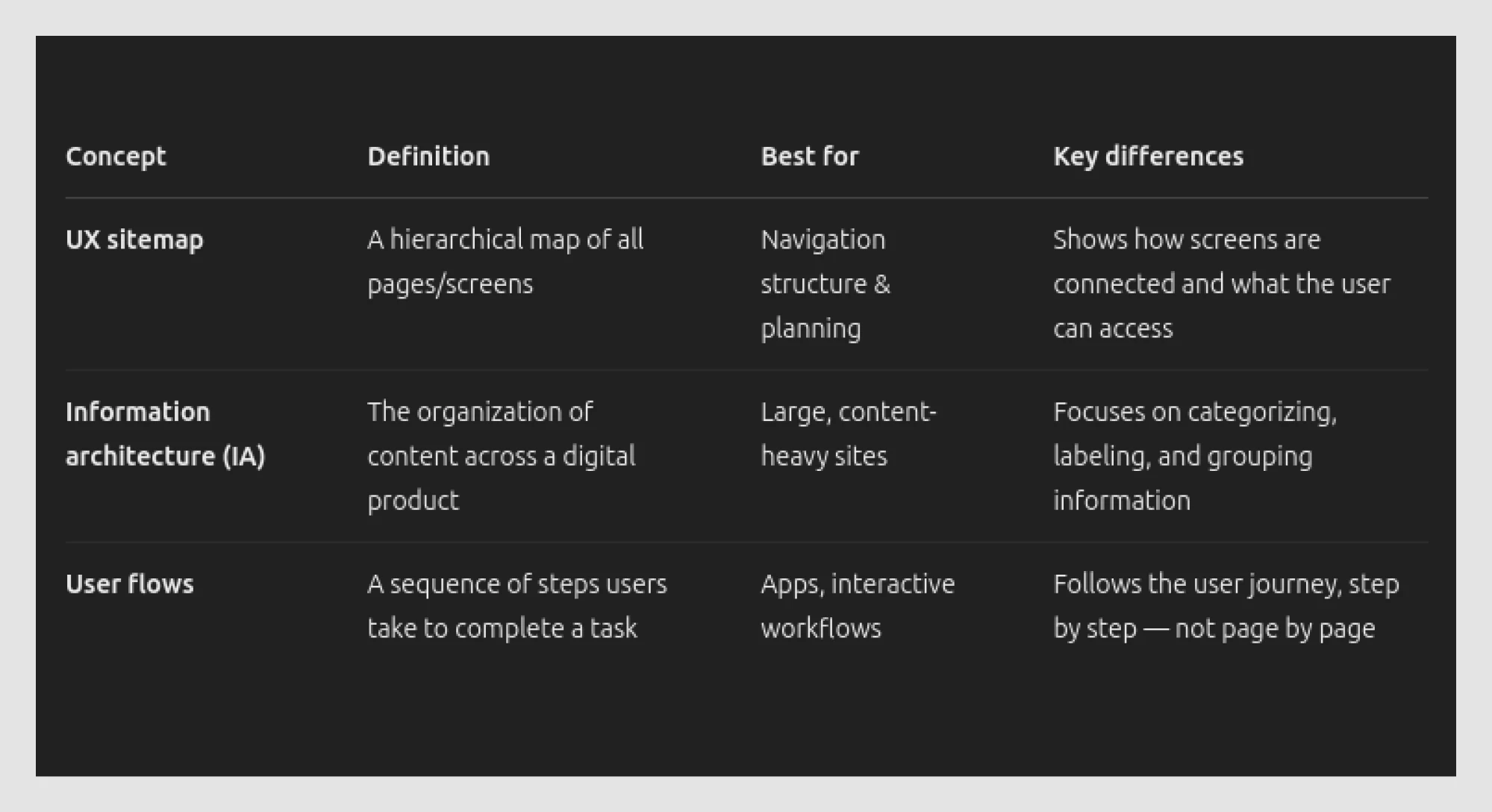
UX sitemaps vs. information architecture vs. user flows
These terms get tossed around a lot. Sometimes even interchangeably. But they each solve a different problem. And knowing when to use what can save you from a messy product and many eye rolls in team meetings.
Let’s break it down further.
- A UX design sitemap shows the overall skeleton, the framework of how everything connects. It’s perfect for mapping access, understanding scope, and spotting gaps early.
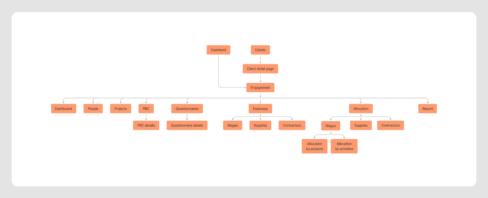
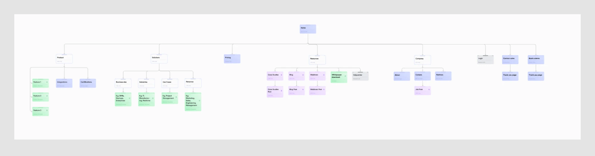
At Eleken, we also use sitemaps in our trainee onboarding process. The one below is a great example from a training exercise.
- Information architecture (IA) digs deeper into how you label things and where content lives. It helps you decide if something belongs under “Resources” or “Support.”
For our client Data Streams, we approached IA by starting with real user scenarios. We built user flows for each case, broke them down into individual pages, and used those to create a brand-new data structure from scratch.
We treated the IA as a guide, helping teams move smoothly from old designs to new ones.

- User flows are about goals, tracking what users do, like logging in, searching, or checking out.
For our client Drenchwords, we used user flows to make the structure and navigation intuitive. Our designer started by organizing all the key sections, then grouped them into meaningful segments and connected them to create a seamless experience.
In workflows where users complete multi-step tasks, a wizard UI can help guide them more clearly than traditional navigation.
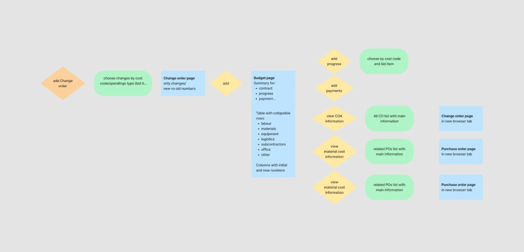
With that said, sitemap UX, information architecture, and user flows are related, but not interchangeable. In practice, you’ll often use all three together. That’s exactly what we did while working on Great Power Influence, a data science-powered web app built around complex geopolitical modeling.
To design the product correctly, our team had to explore some heavy topics: deep Q-learning, DDPG, Proximal Policy Optimization, Dimensionality Reduction, Gaussian Mixtures… yep, that was just one FigJam board.
We started with the big picture: mapping out the information architecture. The app was divided into thematic domains: global, diplomatic, informational, military, and economic. Supporting sections like user settings, help, and onboarding were grouped separately.
Next came the sitemap UX design. It helped us turn abstract data flows into a navigable structure, ensuring nothing was left floating, and every section had a home.
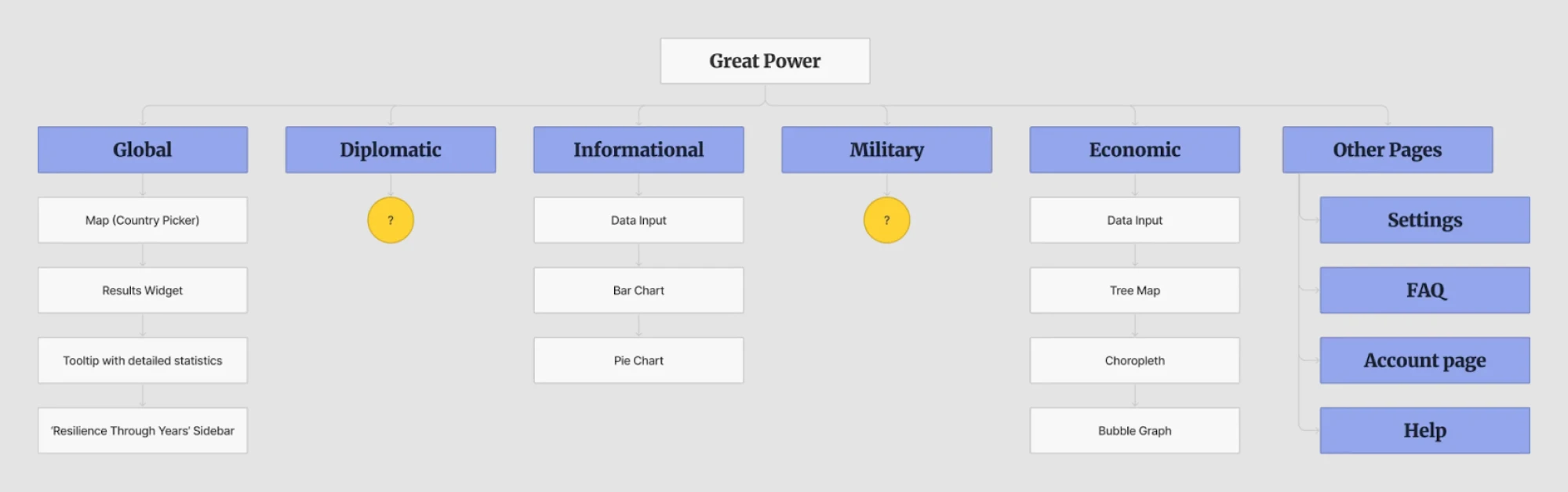
Finally, we mapped the user flows. The client knew their audience well, so we could outline a typical journey: logging in, heading to the Global section, and analyzing influence dynamics between two countries. The journey was clean, efficient, and grounded in real user goals.
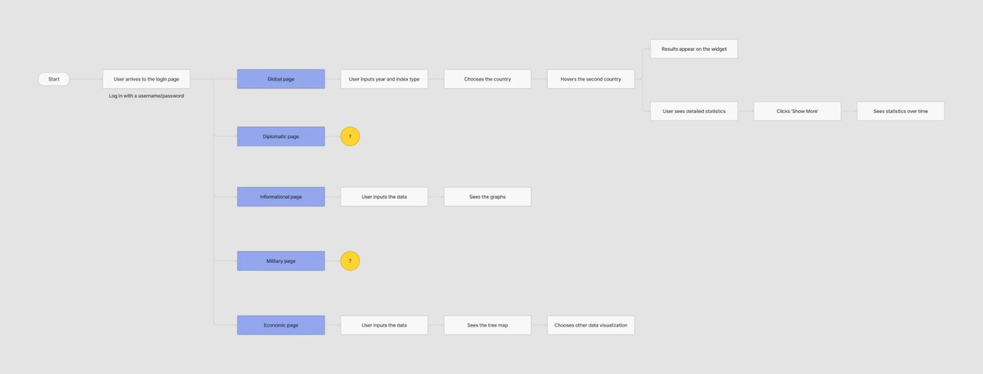
All three layers worked together to shape the design system from day one and helped the client walk away with a complete, ready-to-go UX foundation. Sitemaps help surface complex input paths that may require thoughtful form design and optimized input field design.
To make things even clearer, here’s a comparison matrix of these three core concepts:
So now that we’ve covered what a sitemap is and how it’s different from IA or user flows, let’s talk about building one.
The modern UX sitemap workflow: How to make them without wasting time
You might assume creating a sitemap means drowning in sticky notes, second-guessing every screen, and asking “Wait, where does this page go again?” every 15 minutes.
But it doesn’t have to be a mess. Follow the steps below to build your sitemap faster.
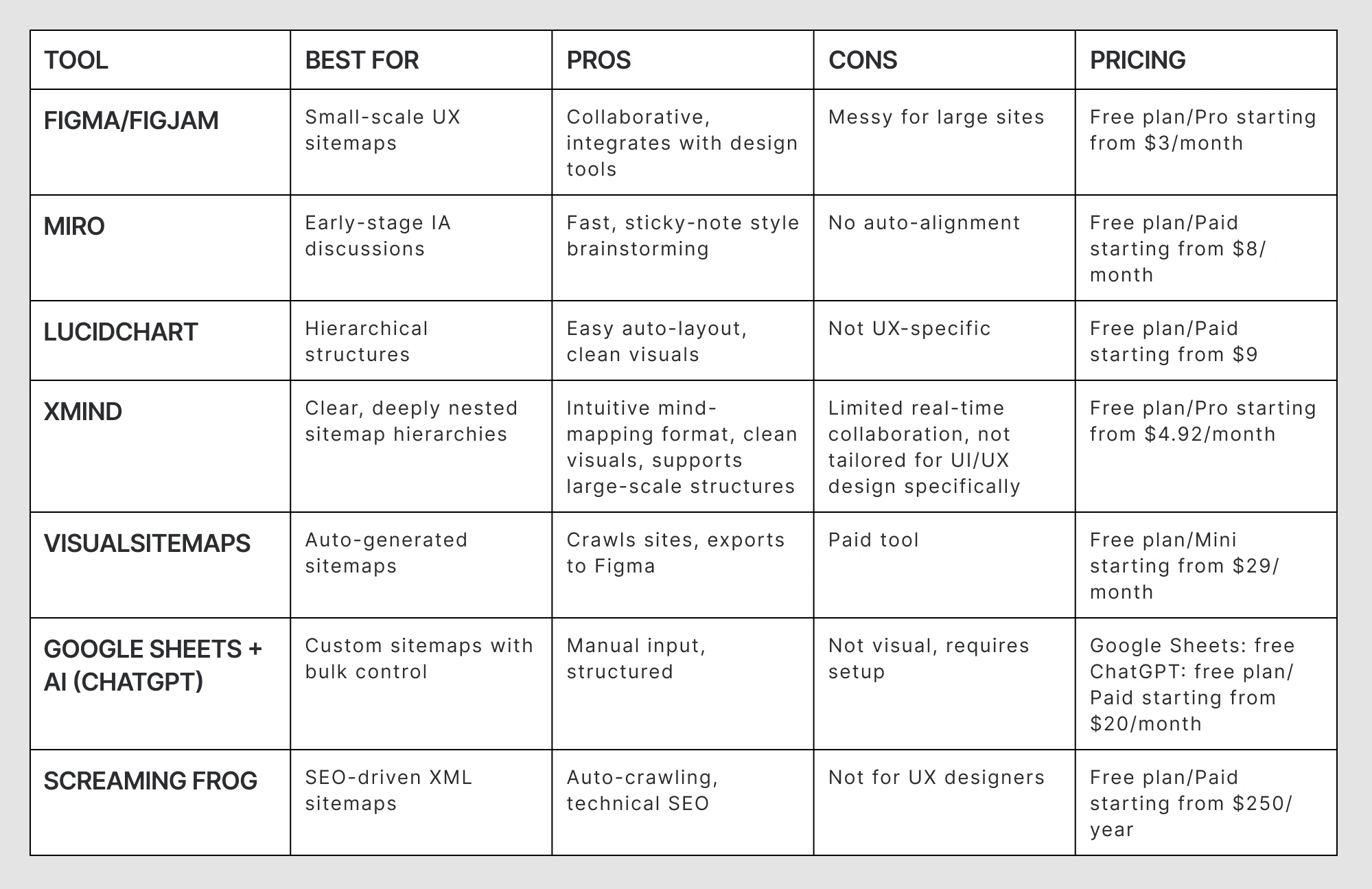
Step 1: Choose the right tool for your needs
Some tools are perfect for free-form brainstorming, while others are great for creating polished diagrams or automatically mapping an existing site.
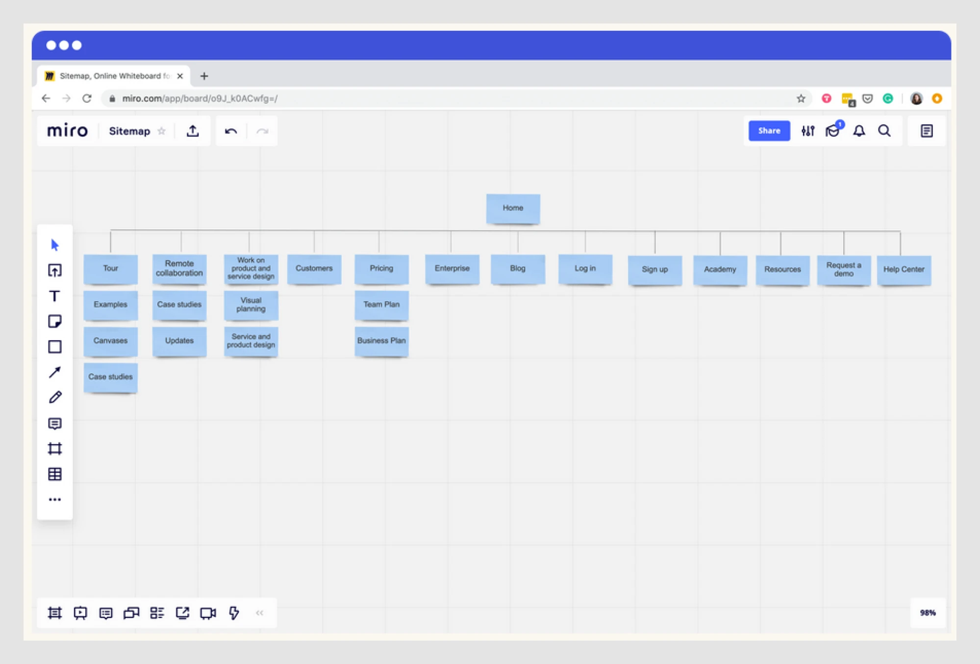
At Eleken, we usually kick things off with Miro or Figma for quick collaboration. Once the project grows and the structure becomes more complex, we switch to something more structured like XMind or VisualSitemaps. Lucidchart and XMind help us visualize clean hierarchies, much like how you’d map a grid layout design.
Here’s a quick overview of what each tool does best:
- Figma / FigJam: Ideal for low-fidelity sitemaps that live alongside wireframes. Great for quick iterations with design teams.
- Miro: A flexible whiteboard for team workshops and early IA thinking. Easy to use when you're still exploring ideas.
- Lucidchart: Clean, structured, and perfect for presenting a finalized sitemap. Especially useful in handoff or client-facing scenarios.
- XMind: If you’re building a deeply nested sitemap with clear hierarchies, XMind’s mind-mapping structure works beautifully.
- VisualSitemaps: Automatically crawls live websites to generate visual sitemaps. Great for redesign projects or audits.
- Google Sheets + AI (like ChatGPT): Great for large-scale sitemap planning. Fast for bulk editing and custom structure logic.
- Screaming Frog: Built for SEO pros, it crawls entire websites and generates technical sitemaps. It is best for audits and dev teams.
The table below summarizes and compares these tools to help you choose the best fit:
Step 2: Define your sitemap structure
You don’t need to overthink this, but you do need to pick a layout that fits your product. Here are the ones to consider:
- Flat sitemap: Perfect for small websites or lean e-commerce. A few clicks from the homepage lead to the goal.
- Deep sitemap: Better for SaaS or enterprise apps with complex permissions or workflows. “Planning user journeys from login to first action? That’s where user onboarding UX patterns come into play.
- Hybrid: Combine both. Flat for marketing sections, deep for app flows.
Step 3: Align with information architecture
A great sitemap reflects how users think. IA organizes meaning. If your categories don’t make sense to users, the whole structure falls apart.
That’s why we validate sitemaps early using, for instance, card sorting and tree testing. These lightweight methods reveal how real people expect content to be organized.
How do we use card sorting at Eleken? We select ~50 items that represent core content. Users group them in a way that feels logical to them. Afterward, we ask:
- Why did you group these this way?
- What was unclear or hard to place?
The answers show how users mentally model your product.
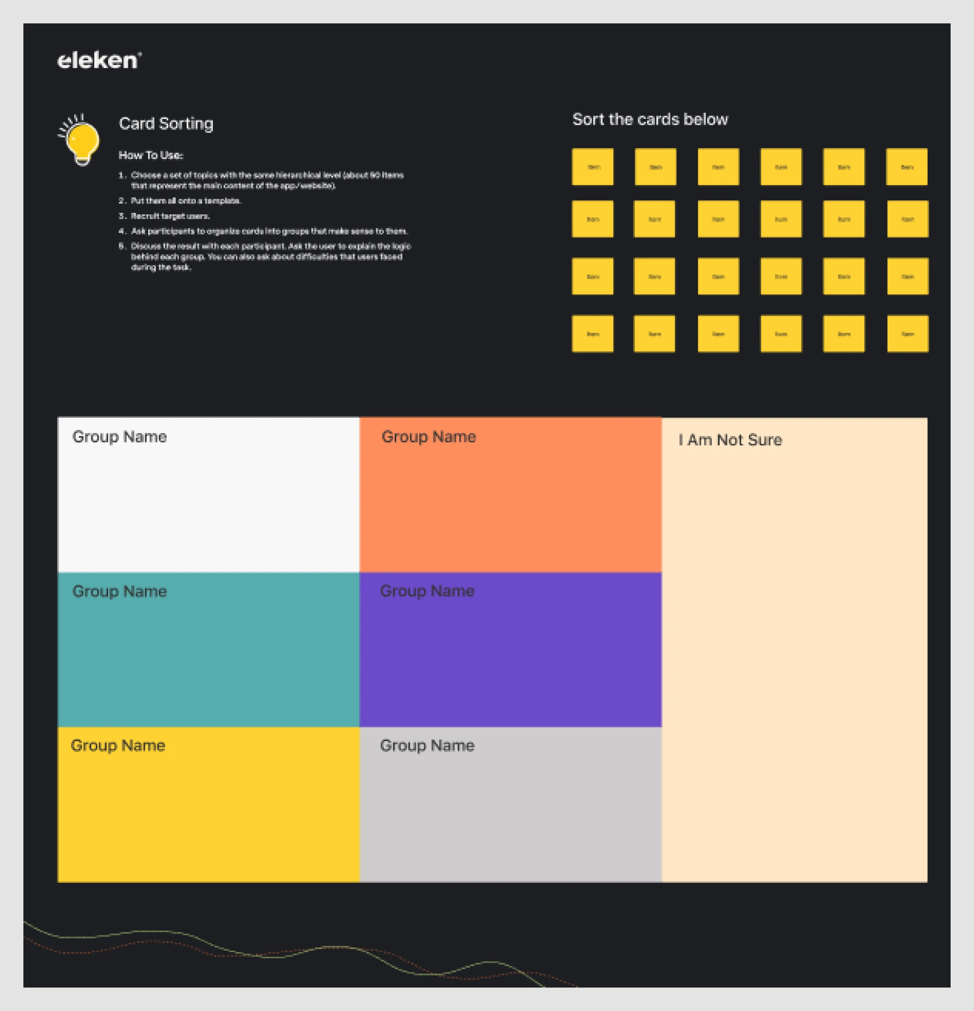
Tree testing flips the script. Instead of creating groups, users navigate your draft sitemap to find something. It helps spot confusing labels or broken logic quickly before any UI is built, saving you from a messy redesign later.

Step 4: Automate what you can, manually refine the rest
You don’t need to start from scratch. Tools like VisualSitemaps can crawl an existing site and automatically generate a visual structure. Or if you’ve got a list of screens, plug them into ChatGPT or Google Sheets to build a quick outline that is fast, flexible, and perfect for early drafts.
During manual refinement, don’t forget to include subtle controls like toggles, which can dramatically shape user experience. Learn more about toggle UX.
Screaming Frog, for example, can auto-generate a sitemap by crawling your current site. Even better, if your live site and staging environment share the same URL structure, Screaming Frog lets you map one against the other. You can compare both versions side by side, spot broken links and structural changes, and flag potential SEO issues before anything goes live.
.gif)
Once that’s done, refine it manually and walk through the flows to remove duplicates, clarify dead ends, and ensure alignment with user goals.
Common mistakes and how to avoid them
You’ve mapped the structure, picked your tools, and are ready to go. But even with a solid plan, things can still go sideways. Let’s look at some common sitemap mistakes and how to avoid them.
- Mistake #1: Treating a sitemap as just a list of pages
Too often, designers treat sitemaps like simple to-do lists tailored to their own workflows. But it’s not just about “What pages do we need?” It’s about how users get to them.
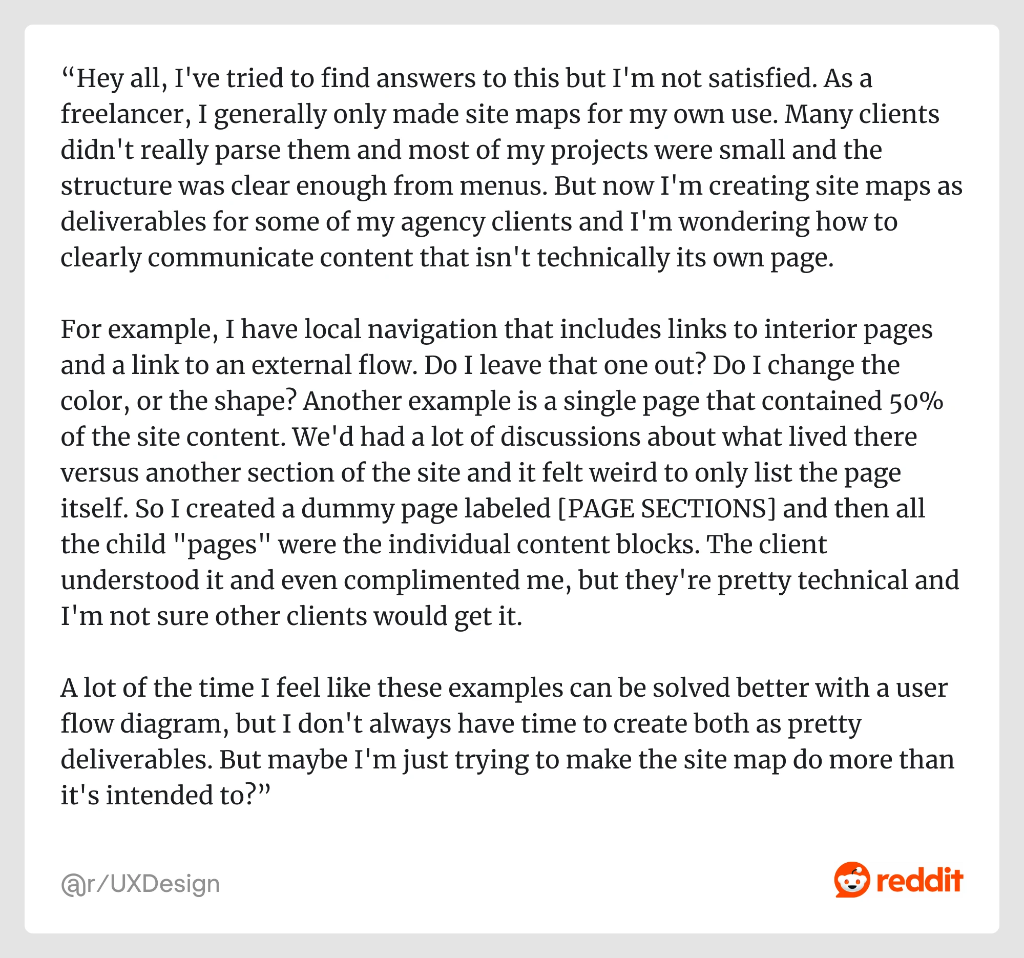
One Redditor put it well, “As a freelancer, I generally only made site maps for my own use. Many clients didn't really parse them and most of my projects were small and the structure was clear enough from menus. But now I'm creating site maps as deliverables for some of my agency clients and I'm wondering how to clearly communicate content that isn't technically its own page… The client understood it and even complimented me, but they're pretty technical and I'm not sure other clients would get it.”
In this case, a sitemap becomes a navigation map communicating how users experience the product, not just what’s technically “a page.”
What to do instead:
Use your sitemap to reflect real navigation UX design patterns. Think through access points. Ask, “Can a user reach this from the main nav?” or “Would this make sense to someone new to the product?”
- Mistake #2: Not updating your sitemap
You build a clean, thoughtful sitemap. Everyone nods in approval. Then, the real work begins: designs evolve, features ship, priorities shift… and the sitemap quietly collects dust.
If you're redesigning a product, your sitemap should reflect that, just like you'd revisit your UX audit. Otherwise, it's just another outdated deliverable no one looks at.
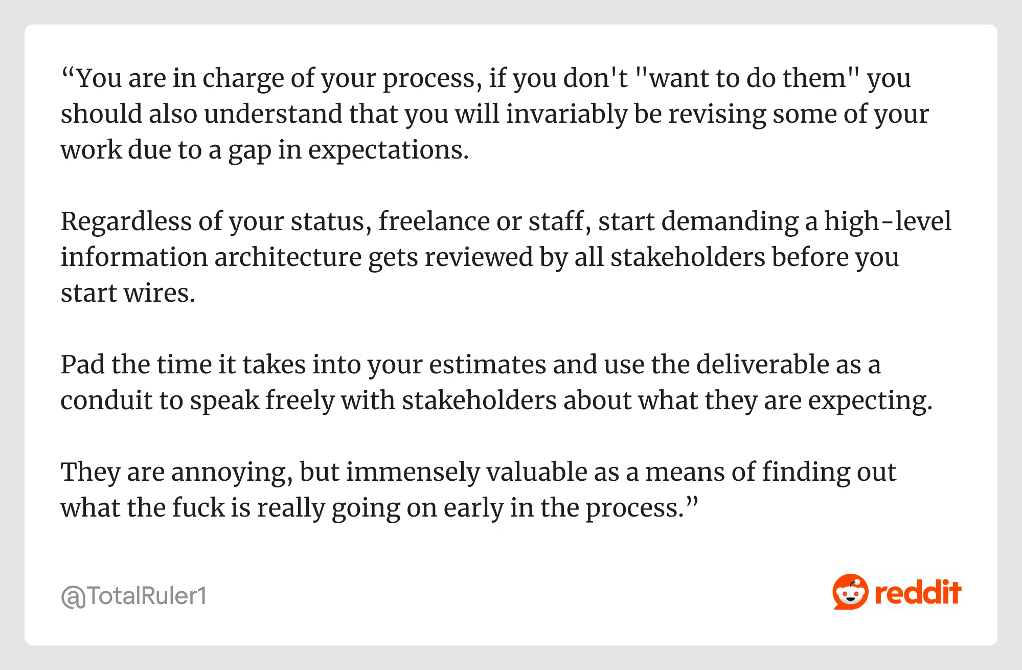
One Redditor summed it up perfectly, “You are in charge of your process, if you don't "want to do them" you should also understand that you will invariably be revising some of your work due to a gap in expectations.
Regardless of your status, freelance or staff, start demanding a high-level information architecture gets reviewed by all stakeholders before you start wires.”
What to do instead:
Treat your sitemap as a living document. Update it as flows change, new screens are added, or product logic evolves. And don’t do it in a silo. Bring stakeholders into the loop early and often. A quick review session can surface misalignments before they turn into rework.
- Mistake #3: Messy sitemaps without user validation
A sitemap might make perfect sense to your team, but will it make sense to your users?
As one Redditor commented, “No one does it anymore and it causes such a mess. A lost art.”
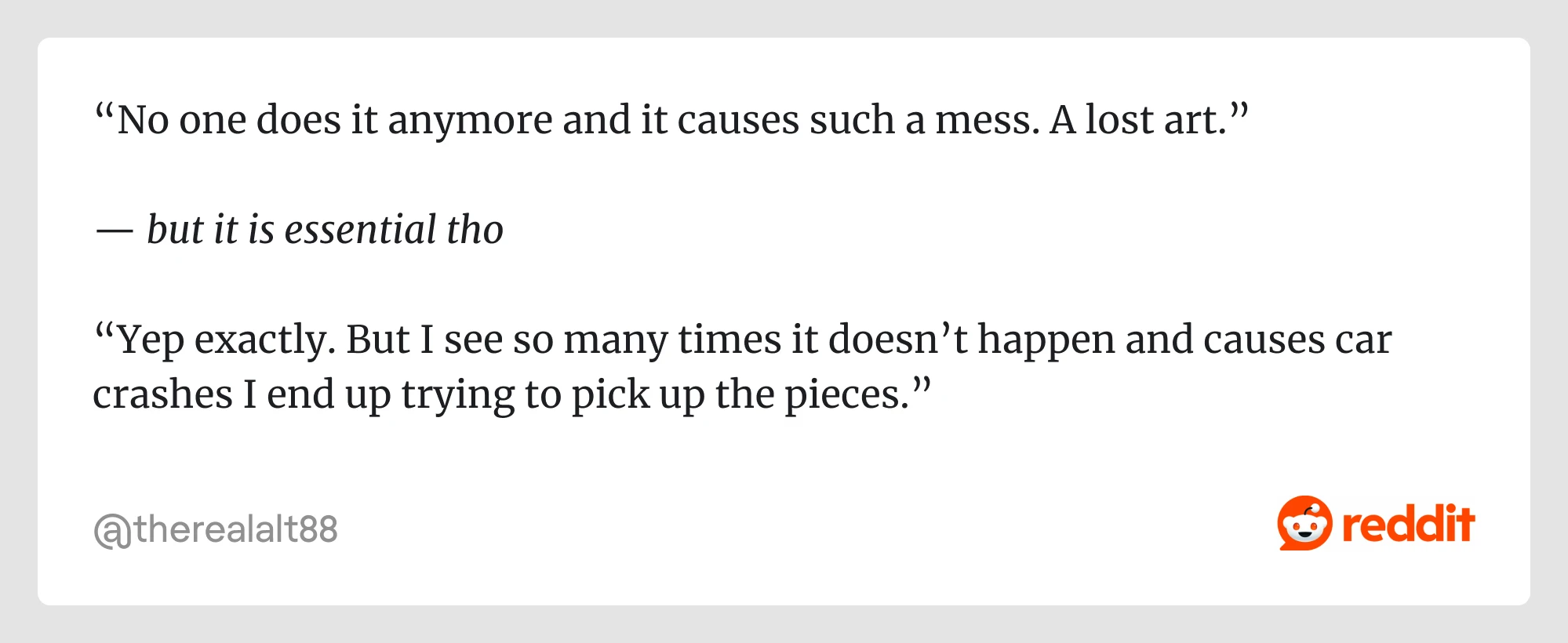
That’s a misconception. As one Redditor pointed out, sitemaps are still essential to the UX process. However, without user validation, even a well-organized sitemap can lead to a confusing product.
What to do instead:
Run quick validation tests like tree testing or first-click testing. They don’t take much time but reveal whether users can find what they want. If they get lost, it’s better to find out before anything gets built. Structure matters more than ever if your app includes conversational elements or bots. Check out these chatbot UI examples and conversational UI strategies for inspiration.
Wrapping up
Sitemaps aren’t flashy. They don’t win design awards. But they’re one of the best-kept secrets behind clean navigation, happy teams, and scalable UX.
If you’re working on a complex product and want to get the structure right from the start or clean it up after things have gone a bit sideways, a solid UX sitemap is the way forward.
And if you’d like a team that does this kind of work every day? Contact us.


