

In the realm of SaaS, data complexity is a given. Most enterprise applications are filled with diverse, user-generated content – think sprawling customer databases, multi-tiered organizational hierarchies, and intricate workflow states. As these data points multiply, users can quickly become overwhelmed. This is where an effective filter UI becomes not just useful, but essential.
As a UI/UX design agency who's spent years designing for SaaS products, we've learned that while using a well-designed filter interface might seem simple and logical to the end-user, creating one is far from easy. It's a complex task that requires careful thought and planning, especially when filters appear across dashboard design examples, form design flows, or even chatbot UI interactions. But here's the good news: we can learn a lot from existing examples.
In this article, we're going to analyze more than 19 SaaS filter examples of different types and purposes. But before we do this, let's learn what filtering means in SaaS and what the challenges of designing them are.
What filtering is, and where do we find it
Filtering is a data processing technique used to selectively include or exclude information based on specific criteria or conditions. It allows users to refine and organize large sets of data by applying one or more rules, resulting in a subset of information that meets the defined parameters, as commonly demonstrated in card UI examples where filters help users narrow down visible content without overwhelming the interface.
Now, let’s break this down into simpler terms:
- Filtering is about choosing what you want to see or use from a larger set of information.
- It works by applying rules or conditions to your data.
- These rules act like a sieve, letting through only the information that matches what you're looking for.
- The end result is a smaller, more focused set of data that's easier to work with and understand.
In essence, filtering helps you focus on the information that's most relevant or important to a user at any given moment. Filters UI are literally everywhere! But when it comes to the SaaS industry, they most commonly can be found in
- Data – tables, graphs, and dashboards. For example, when you're looking at data for a specific time period or focusing on particular metrics, you're applying filters. In these cases, users aren't searching for a single item, but rather isolating a specific data set to make information more digestible on tables, graphs, or dashboards, often supported by accordion UI, list UI design, and other patterns seen across strong screen design examples. This approach helps users identify trends and find answers to their questions more easily.
- Audience/Segment creation. In a Customer Relationship Management (CRM) software, sales teams use filtering to sort leads by location, industry, or potential value. Here filtering helps identify a group from the entire audience that meets specific criteria. This targeted approach enables more personalized marketing strategies and efficient resource allocation.

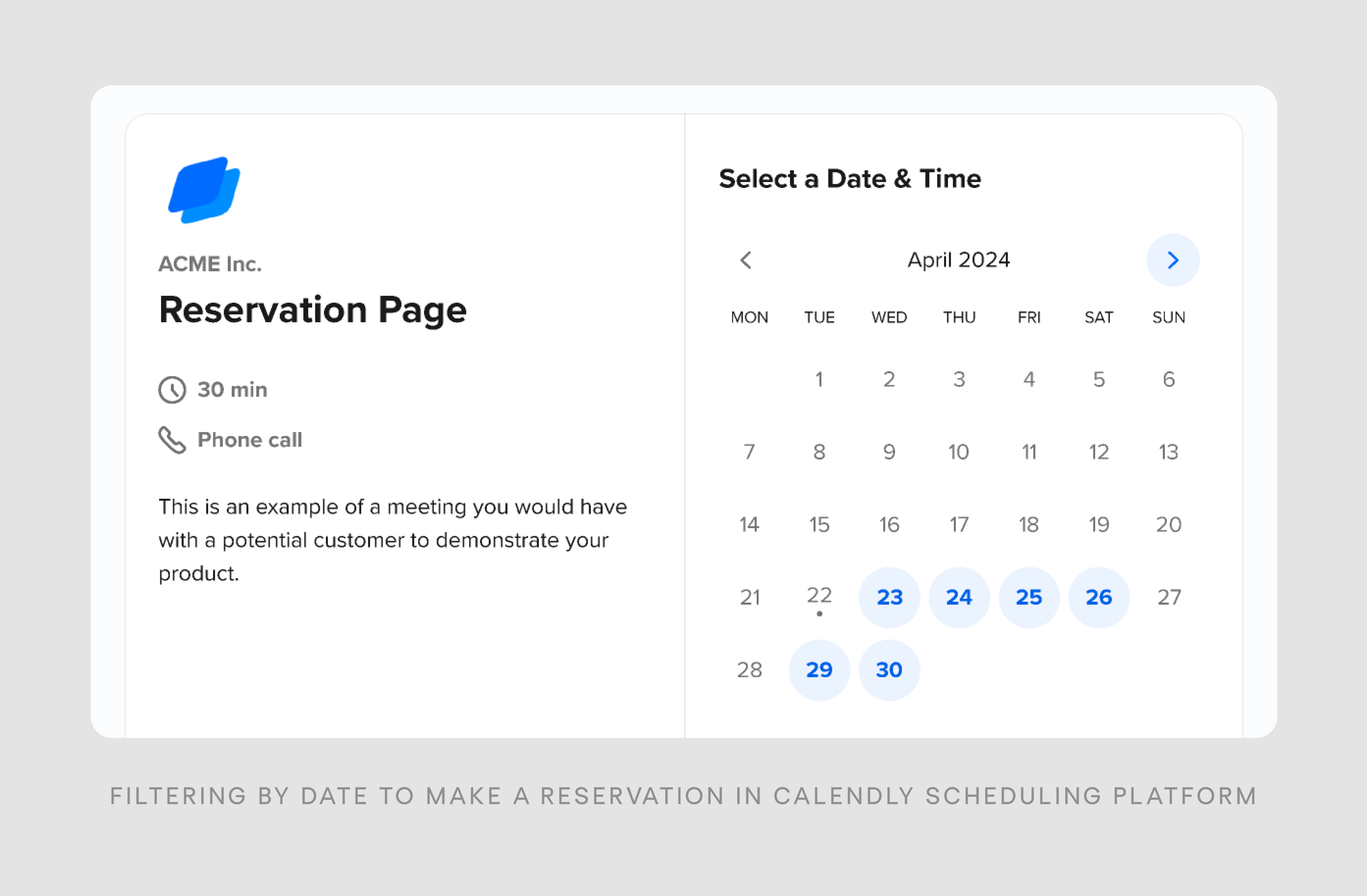
- Booking and Reservation Systems. In SaaS platforms for travel, hospitality, or event management, filters are crucial for finding the right options. Users can filter by date, location, price range, amenities, or capacity to narrow down choices when booking flights, hotel rooms, or event spaces, using patterns like slider UI for price ranges, radio button design for quick option selection, or modal UX to focus attention on filtering without leaving the booking flow.
I believe, besides discussing a definition, it’s also crucial to clarify what filtering is not. Filtering is not the same as sorting, and it's important to understand the difference.
Filtering means hiding or removing elements that don't meet specific criteria. For example, if you start with 100 elements:
- After sorting, you'll still have all 100 elements, just in a different order.
- After filtering, you might end up with only 10 elements that match your criteria. And you still can sort your filtered results, giving users the best of both worlds.
Confusing these two functions in design can lead to poor user experience. If users expect to filter out unwanted items but instead find everything just rearranged, they may become frustrated and struggle to find what they need. Similarly, if they're looking to reorder items but instead see some disappear, it can be disorienting.
Types of filter UI design
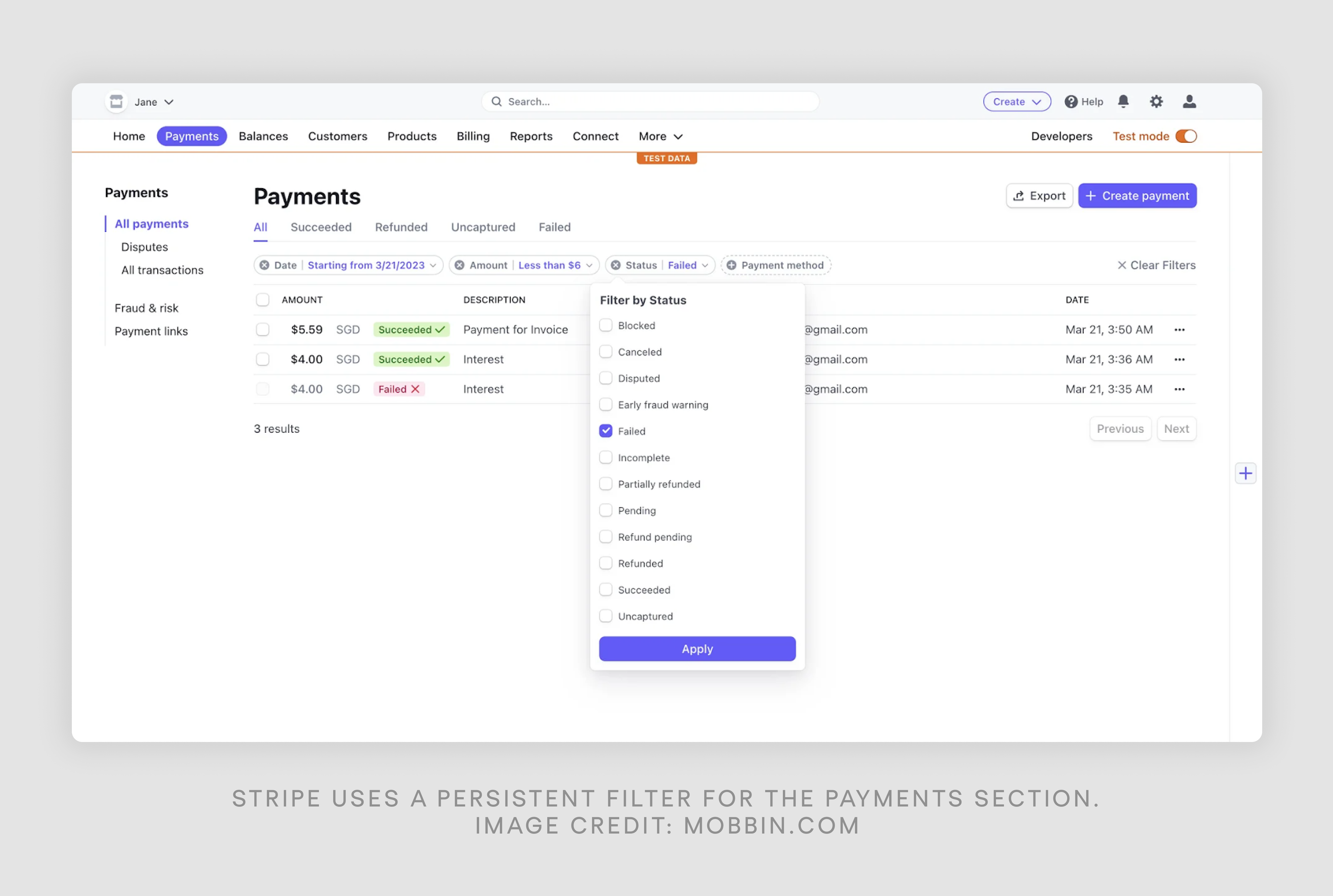
- Persistent filters
Persistent filters are displayed together, typically above or to the left of the main content area. This approach ensures that all filtering options are always visible to users, providing immediate access. However, it comes with the drawback of occupying significant screen space, which can be problematic on smaller displays or when there are numerous filter options.
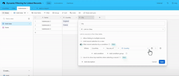
- Dynamic filters
Dynamic filters adapt based on user selections. As a user chooses one filter, it affects the options available in subsequent filters. This design reduces complexity by showing only relevant options and can guide users through a logical filtering process. However, it may inadvertently hide potentially useful filter combinations.
Below is a simple example of Airtable, a low-code tool for building apps, using dynamic filtering. Depending on the country the user chooses, they will see different relevant cities.
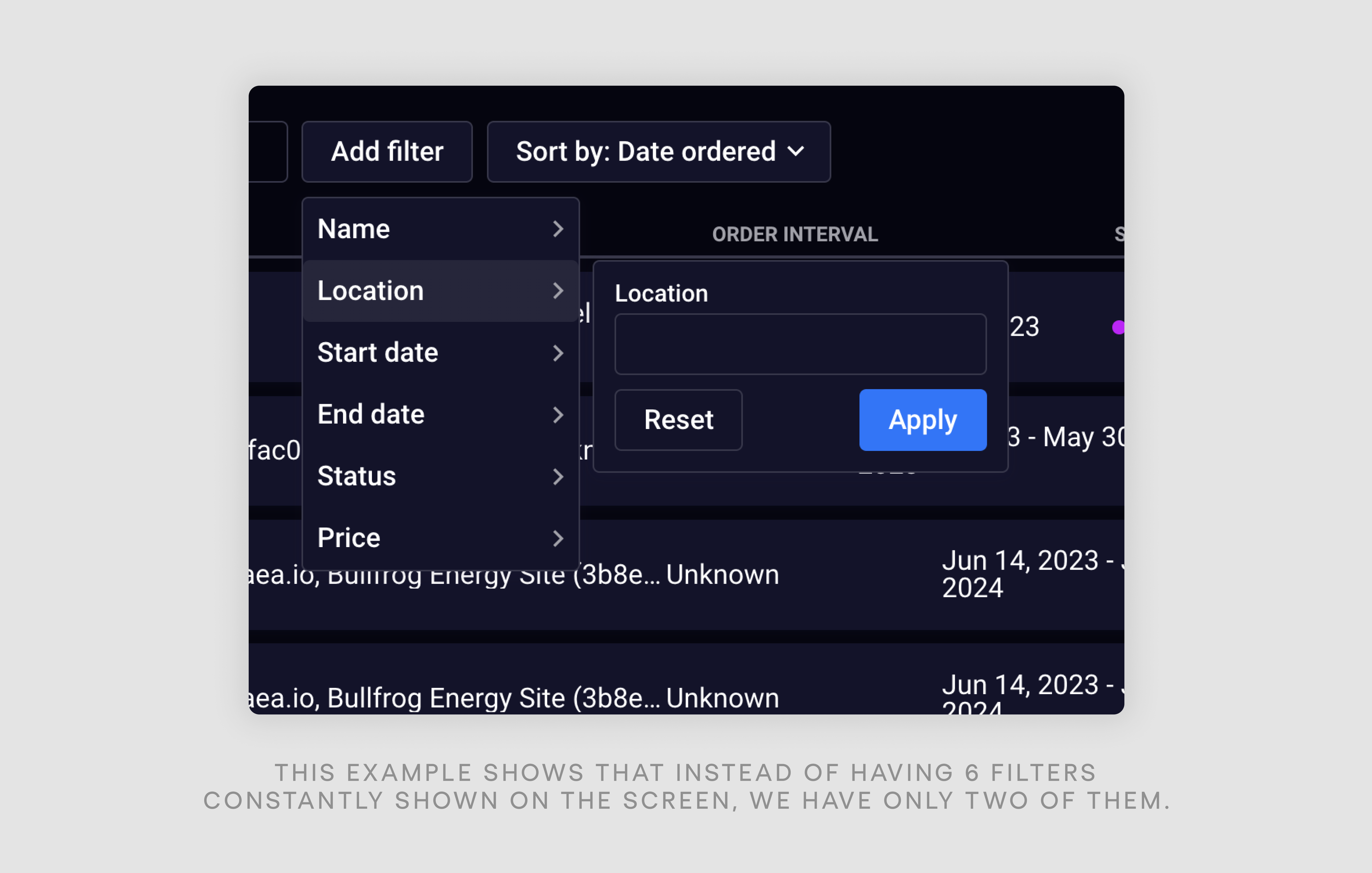
- Collapsible filters
Collapsible filters UI can be hidden or expanded, often within a filtering sidebar, but not necessarily. This design saves space while still providing access to all filters when needed. For example, for a data-heavy SaaS product, DataStreams, our designers at Eleken chose a collapsible vertical list of filters so that they could fit all the information on one screen.

It's crucial to always indicate when filters are active, even when hidden. A common best practice is to keep frequently used filters always visible while grouping less common ones under a "More filters" button, especially in interfaces that combine input field design, map UI design, or carousel UI elements where context can easily be lost. This approach allows users to focus on content when filters are not needed, but it does require an extra step to access hidden filters.
- Context Filters UI
Context filters start with no visible filter options. Instead, users can add filters as needed through an "Add filters" button. This design minimizes initial interface clutter and allows users to customize their filtering experience. However, it may not be intuitive for users who expect to see filter options immediately.
Golden rule of filtering: Only allow filtering by data that is displayed on the screen. For instance, if only the name and date of an object are shown, you cannot offer filtering by description.
Designed doesn’t mean developed
The final point I want to make concerning general information about UX filter design is that it’s crucial to understand that what works in a design tool might not translate perfectly to the final product. Clear communication with developers is essential to avoid unexpected outcomes, especially when filters rely on interaction patterns like tabs UX, stepper UI examples, or popup UI that behave differently in production.
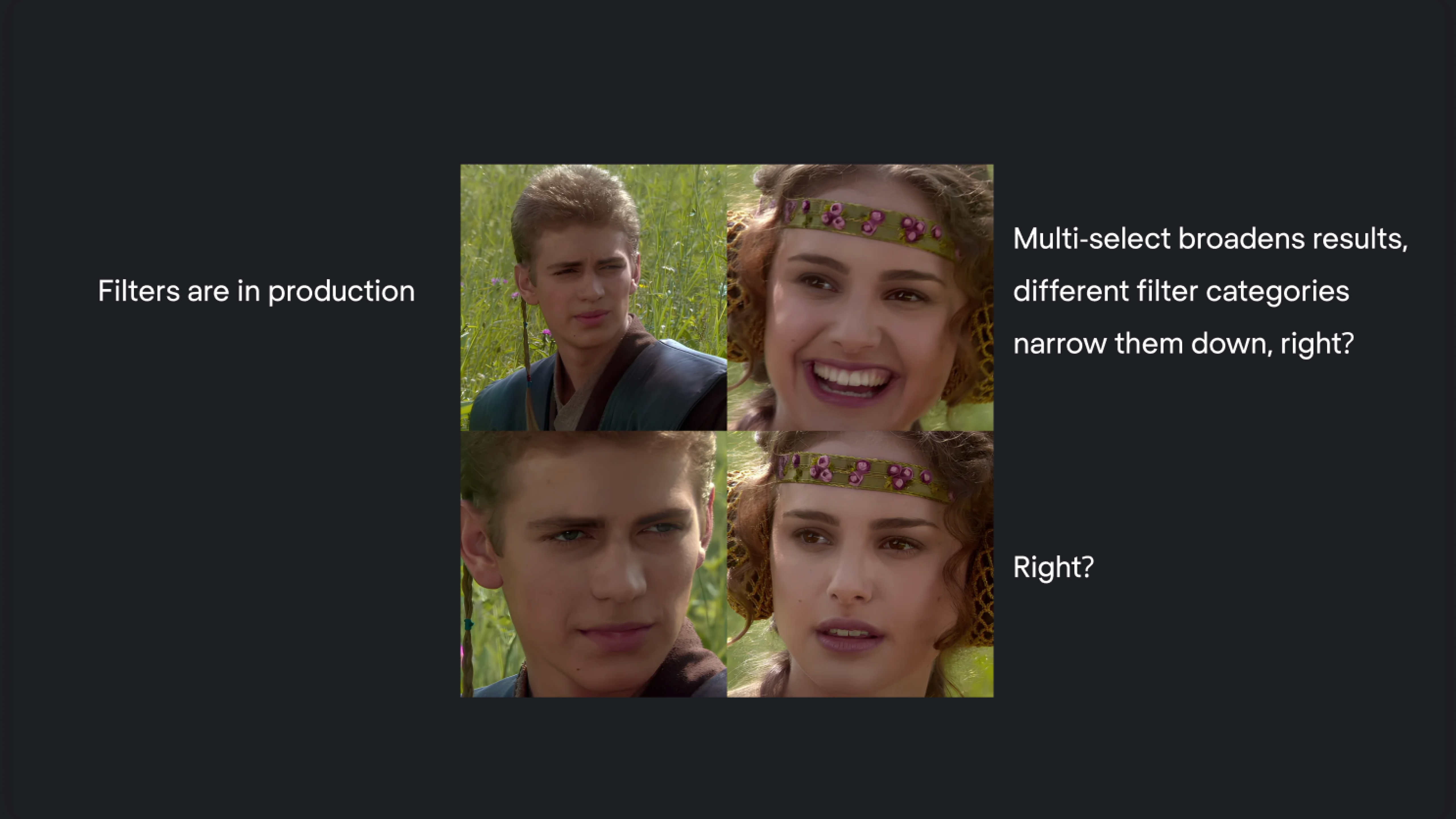
For instance:
- Multi-select filters might seem like they'd broaden search results, but they could actually lead to "no results found" if too many options are selected, a common issue with checkbox UX or toggle UX when logic isn’t clearly defined.
- Different filter categories might appear to narrow results but could instead show broad, seemingly random results that match any of the selected filters, which often happens with time picker UX or layered filter states not properly synced.
To prevent these issues:
- Discuss technical limitations with developers early in the process.
- Clearly explain your intended user experience.
- Be open to adjusting your design based on technical feedback.
Remember, filters only succeed with close collaboration between designers and developers, who work as intended and meet the desired filters of users.
Key decisions in filter design
Let's face it: most people don’t really know what they're looking for. We want to help users stumble upon exactly what they need, even if they're not sure what that is, and make the whole process feel like a breeze. Sounds not that simple, right? That’s why when creating filter UIs, we face many uncertanties, and depending on the specific case, the solutions may differ.
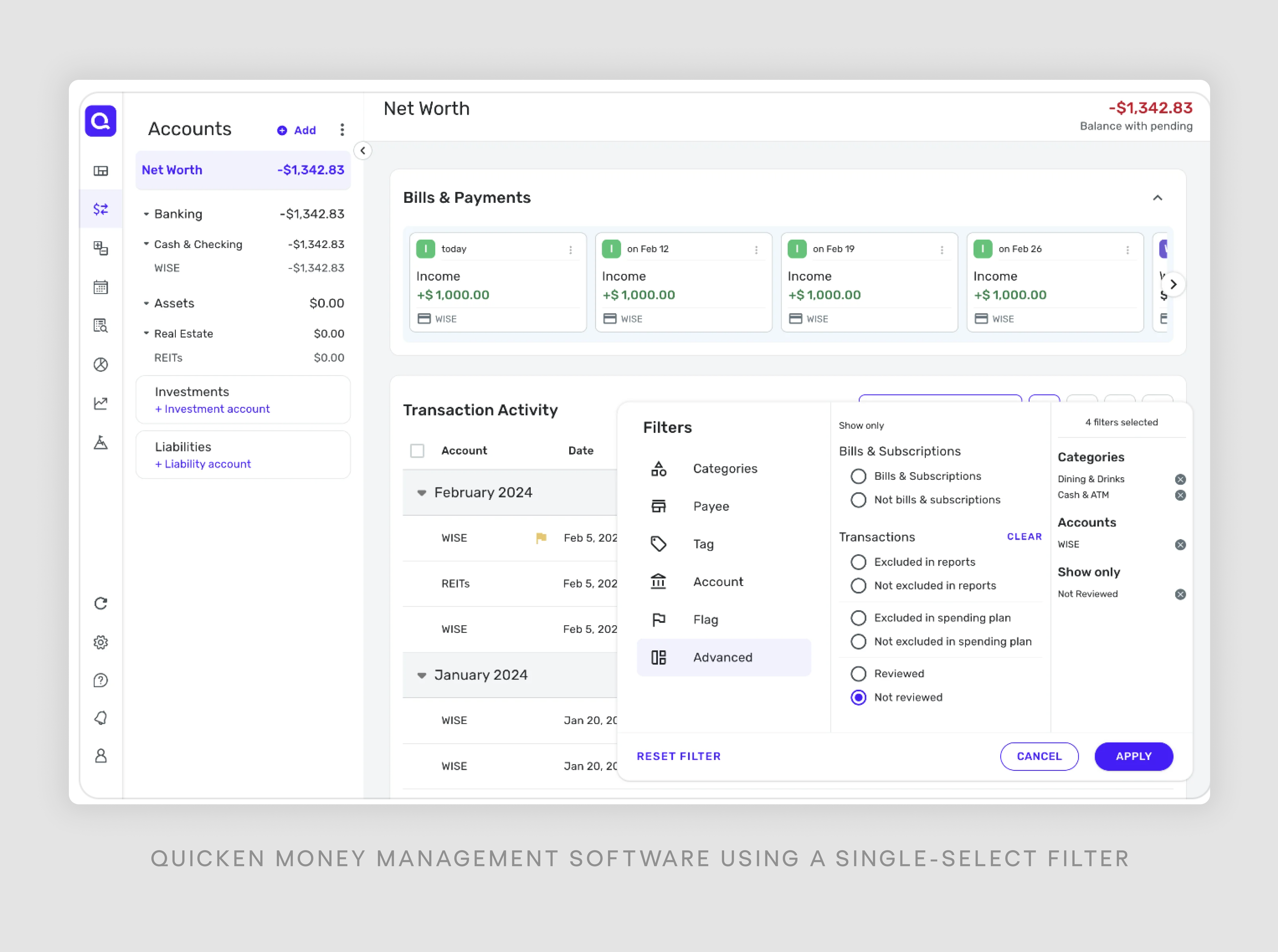
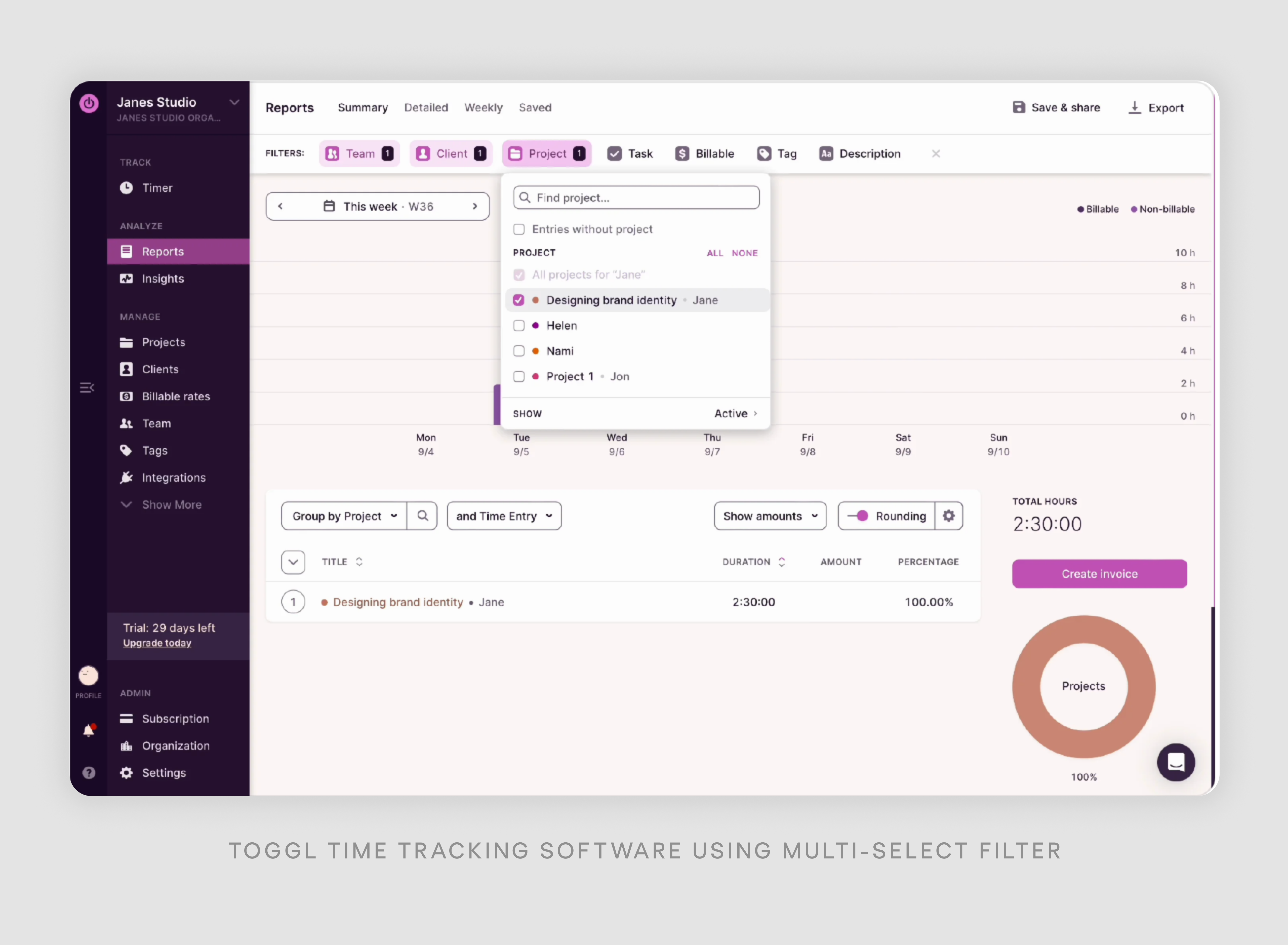
Multiselect or single?
- For simple tables with few filter categories, single-select is often best. It keeps things straightforward and prevents users from creating complex queries that might yield no results, which is especially important in table design UX, where clear states and predictable outcomes help avoid confusing empty state UX scenarios.
- For more advanced users or when dealing with large datasets, multi-select can offer more precise filtering options, especially in interfaces that combine drag and drop UI, calendar UI, or structured contact form design where users expect greater control. The key is to match the filter type to your users' needs and the complexity of your data.
Apply button or loading straight ahead?
- Instant loading is generally preferred as it provides immediate feedback and feels more responsive. Users can see results change in real time as they adjust filters, creating a smooth, interactive experience.
- However, if your app struggles with speed, add an "Apply" button to give users control over when to trigger searches. This prevents frustration from frequent loading delays and allows users to set multiple filters before searching. Consider adding a debounce function for instant loading to prevent excessive server requests.

Locate the filter top, side, or hide it in the modal?
- Top filters: Best for a few important filters. Easily accessible and visible, ideal for frequently used options. Doesn't take up much screen space.
- Side section: Great for many filters (checkboxes, toggles, etc.). Can be expandable/collapsible, keeping the main content area clean while providing easy access to detailed options. However, when using side section, ensure all page elements are affected by these filters.
- Modal: Suitable for complex or rarely used filters. Keeps interface uncluttered while providing advanced options when needed. Good for occasional, in-depth filtering.
Selected filters placement?
Displaying active filters is crucial for user clarity and control. Here are key considerations:
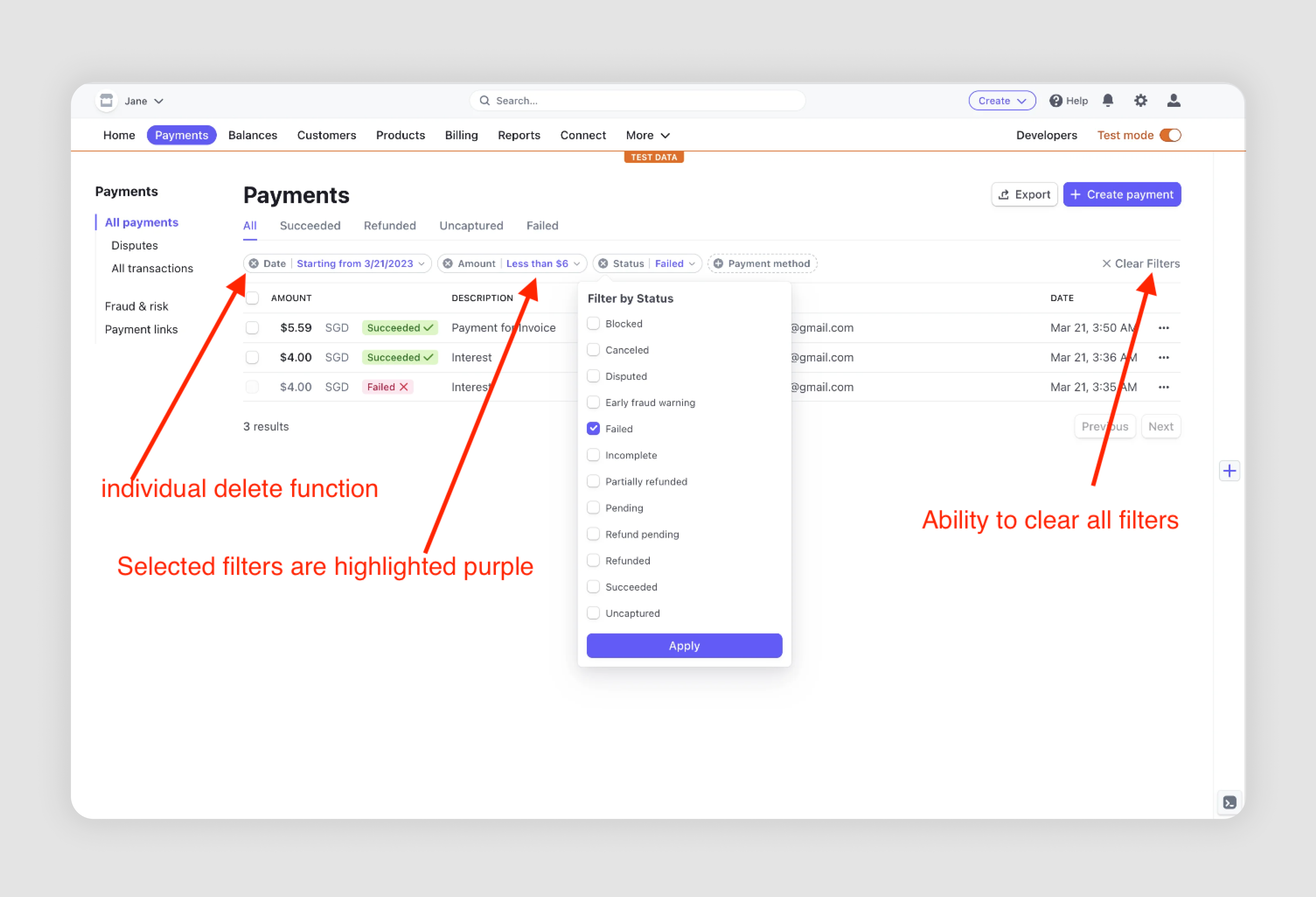
- Visibility: Place selected filters prominently, often as chips near the filter controls or above search results.
- Clear options: Provide both "clear all" and individual delete functions for easy modification.
- Location: Consider placing them above results for maximum visibility and easy access.
- Purpose: Clearly displayed active filters help users understand their current view and quickly adjust their selections.
Collapsed or expanded by default?
It depends on the amount of space we've got.
- Evaluate the layout to determine if there's room for expanded filters without overwhelming the interface.
- Expand frequently used filters by default
- Collapse rarely used filters
This approach balances quick access to common filters with the option to access more specific filters when needed. Consider using analytics to determine which filters are most commonly used and prioritize these in your default view.
The best filter design UI often comes from understanding your specific users and use cases. Don't be afraid to test different approaches and iterate based on user feedback and behavior.
Design principles of filter UX
While our previous discussion explored context-dependent filter choices, this section focuses on universal design principles that should guide filters UX across all scenarios. Many of them we’ve already discussed briefly
- Separate filter elements. Make filters distinct from other UI components. Some SaaS companies integrate them into columns, which is more common for sorting functions. Making filters a separate element improves clarity and usability.
- Clear filter status. Ensure users can instantly see if a filter is applied. Use visual cues like color changes or icons to indicate active filters, making the interface more intuitive.
- Show option and result counts. Display the number of available options and potential results on the "Apply" button. This helps users anticipate outcomes and avoid overly narrow searches.
- Include "Clear all/Reset" option. Provide an easy way for users to start over. This feature is especially useful when dealing with multiple complex filters.
- Visible "Apply" button. Keep the "Apply" button easily accessible, especially on mobile devices. Consider making it sticky for long filter lists to prevent users from losing their place.
- Persistent filter groups. Don't automatically collapse filter groups after selection. This allows users to easily review and modify their choices without repeatedly expanding categories.
- Stable layout during filtering. Avoid layout shifts when applying filters. Maintain a consistent interface to prevent user disorientation and accidental clicks.
- Clear button labels. Use precise language like "Cancel" and "Apply" instead of ambiguous terms like "Close". This reduces confusion and improves user confidence.
- Group filters when necessary. Organize filters into logical categories, especially for interfaces with many options. Consider highlighting popular filters for quick access.
Examples of common filter elements
As mentioned at the beginning of this article, to create an effective filter UI, you should explore how other products cope with similar tasks that you have. Let's uncover widely used UX design patterns for SaaS filter design and provide filter UI design examples.
Dropdown with options
UX dropdowns are pretty handy for showing a bunch of options without taking up too much space. You just click, and all your choices pop up in a neat little menu — a classic drop down menu UI moment. Picking one thing or grabing a few - it's up to your user. They're great for categorical information like product types, places, or different parts of a company.
Linear issue-tracking app uses dropdown to filter issues with a great variety of categories. They also visually divide all categories into four blocks with a thin grey line.
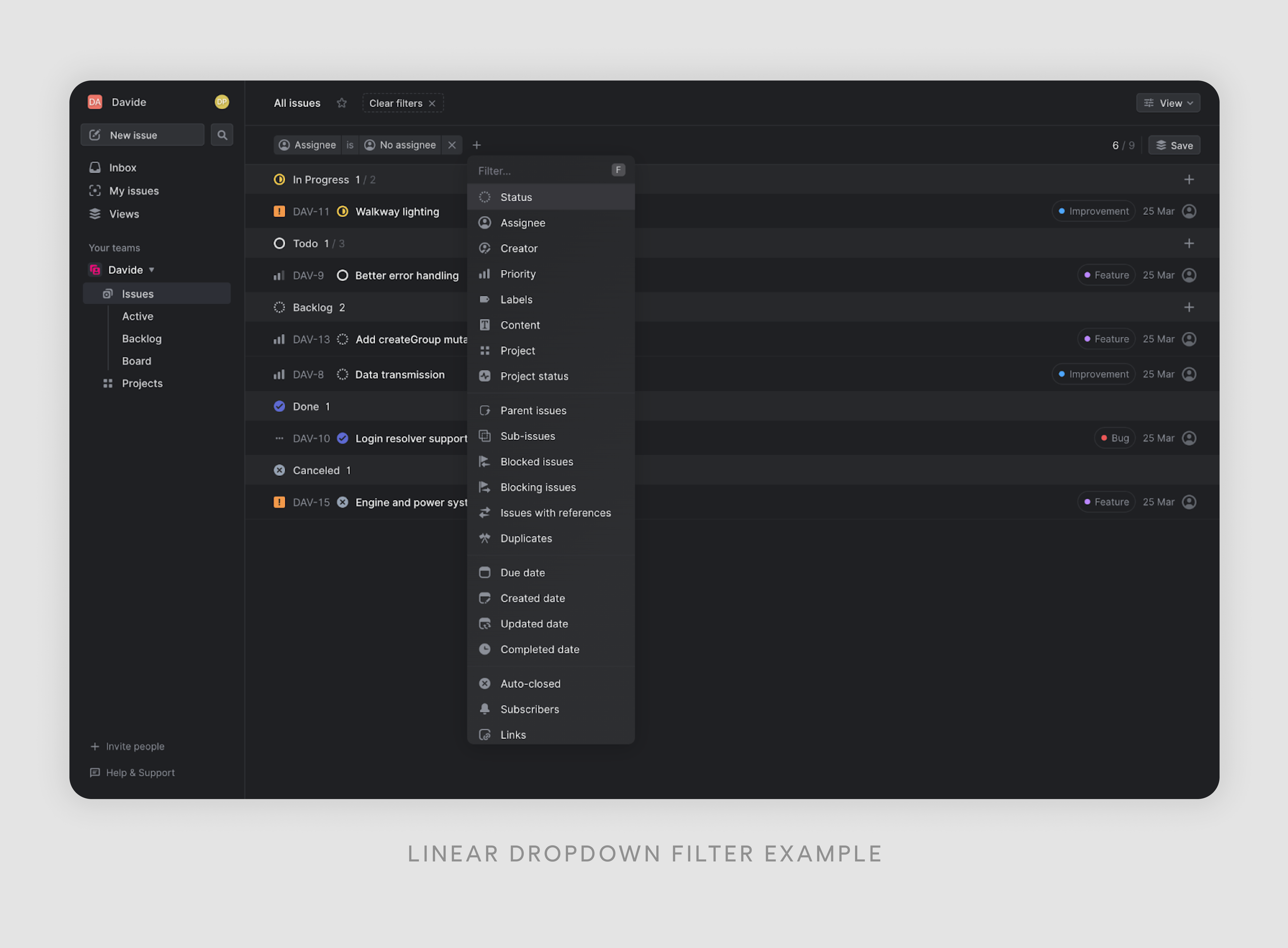
The filter division has the following logic:
- Primary issue attributes: status, assignee, creator, priority, labels, content, project, and project status. This group contains the most fundamental and frequently used attributes of an issue. These are typically the core properties that define an issue's current state, ownership, and classification, similar to how key fields are surfaced in profile page design to give users a quick, meaningful snapshot at a glance.
- Issue relationships: parent-issue, sub-issues, blocked issues, blocking issues, issues with references, duplicates. This block focuses on the relationships between different issues. It helps users understand the hierarchy and dependencies among issues, which is crucial for project management and workflow optimization.
- Time-based filters: due date, created date, updated date, completed date. These filters are all related to timestamps, allowing users to filter issues based on various time-related criteria. This is useful for tracking progress, deadlines, and historical data.
- Additional metadata: auto closed, subscribers, links. This final group seems to contain miscellaneous filters that don't fit neatly into the other categories but still provide valuable filtering options for specific use cases.
By the way, we’ve got a great article where we analyze the phenomenal success of the Linear app.
Radio-buttons
Radio buttons provide users with mutually exclusive options in a compact format. They're ideal for scenarios where only one choice from a set of options is allowed. For example, in an email management platform, radio button UI can let users filter messages by importance: "High," "Medium," or "Low." This format is effective when users need to make a single, clear selection from a limited number of choices.
Below in the Intercom filter example, radio buttons are used to provide a set of mutually exclusive options for refining the "Country" filter.
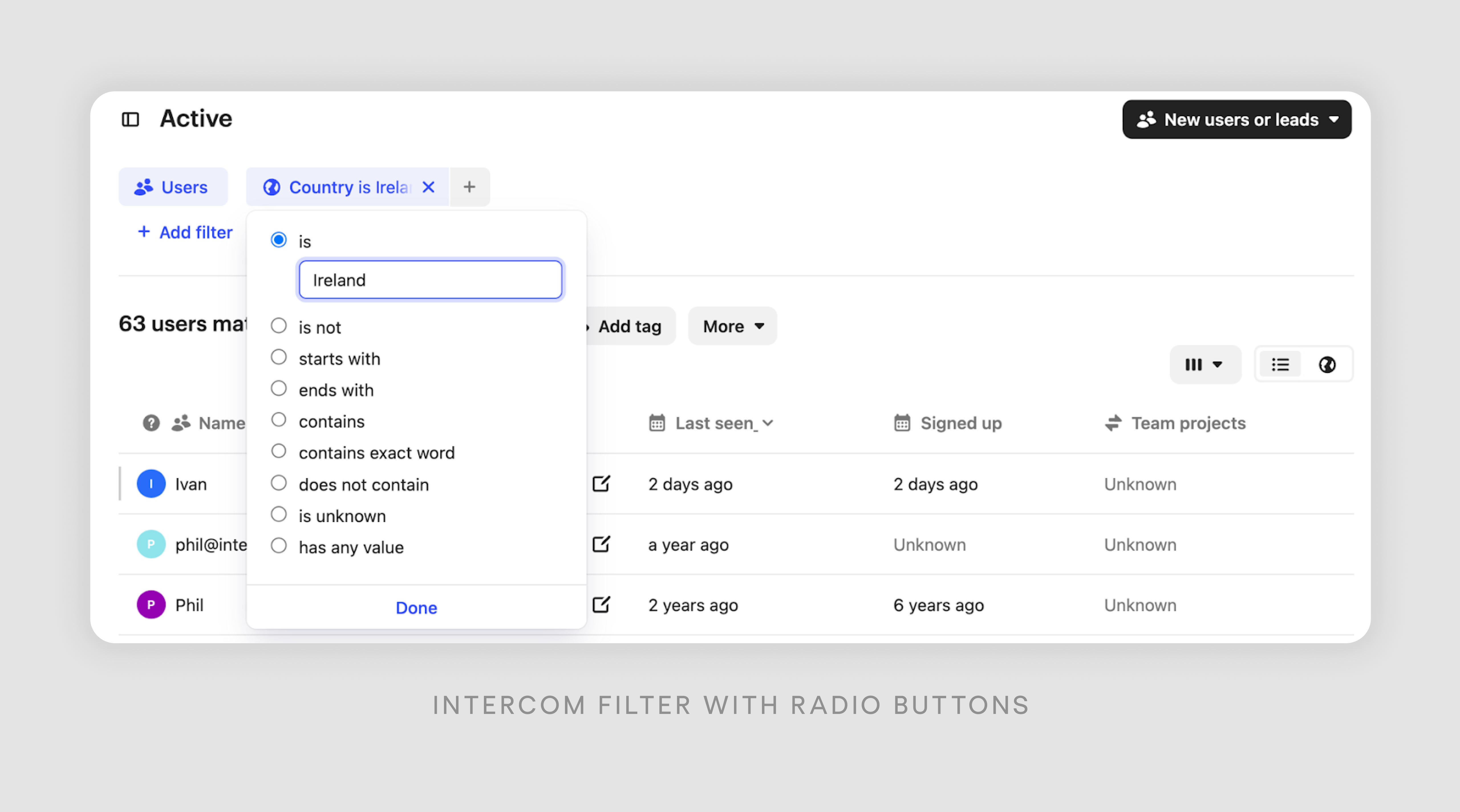
1. The main filter is set to "Country is Ireland".
2. The radio buttons offer different ways to modify this filter:
- is
- is not
- starts with
- ends with
- contains
- contains exact word
- does not contain
- is unknown
- has any value
3. These options allow users to fine-tune their search based on how they want to match the country name. Only one option can be selected at a time, which is why radio buttons are used instead of checkboxes.
4. The currently selected option is "is", meaning it will show users exactly matching "Ireland".
This design allows for precise control over the filtering criteria while keeping the interface clean and easy to understand. Users can quickly switch between different matching methods without having to type in new commands or learn complex syntax.
Checkboxes
Multi-select magic: that's what checkbox filters bring to the table. These nifty little squares let users tick off as many options as they fancy, all at once. They're a real game-changer when you're dealing with data that has many conditions or categories.
In the Laserfocus example below, checkboxes are used in the "Field Groups" section to allow users to select which fields they want to display or include in their view.
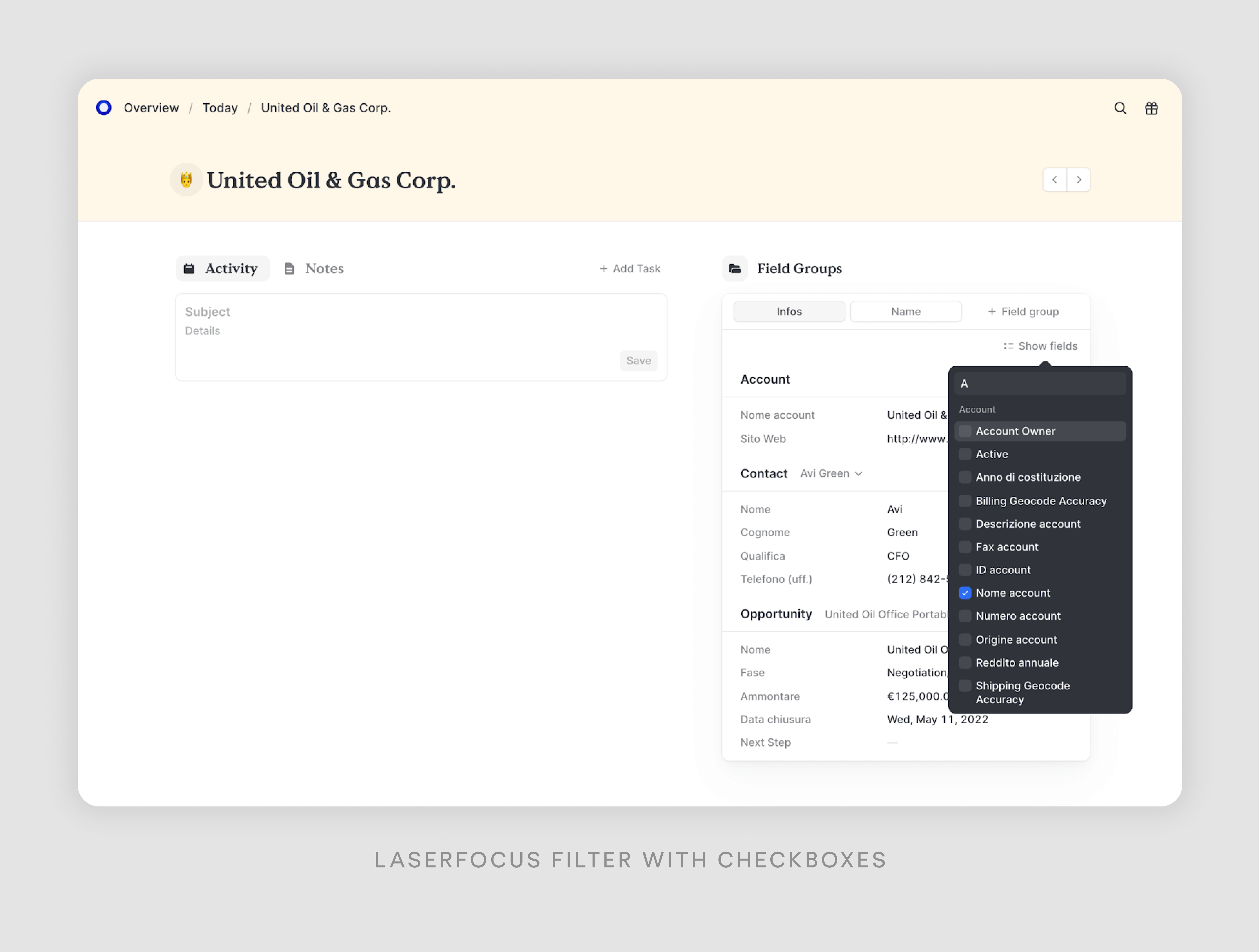
The checkboxes appear in a dropdown menu under "Show fields". Each checkbox UX represents a different field and allows for a flexible, customizable interface where users can choose exactly which pieces of information they want to see without having to reset the entire view.
Toggles
Toggle UX offers users a simple choice between two options. They're useful for tasks like switching between light and dark themes in applications or filtering data based on a single attribute. For example, in a project management SaaS, these filters can quickly show tasks that are either completed or pending. Their simplicity makes them effective for various applications where users need to make quick, either-or choices.
Let’s take a look at AgoraPulse example, a social media management software.
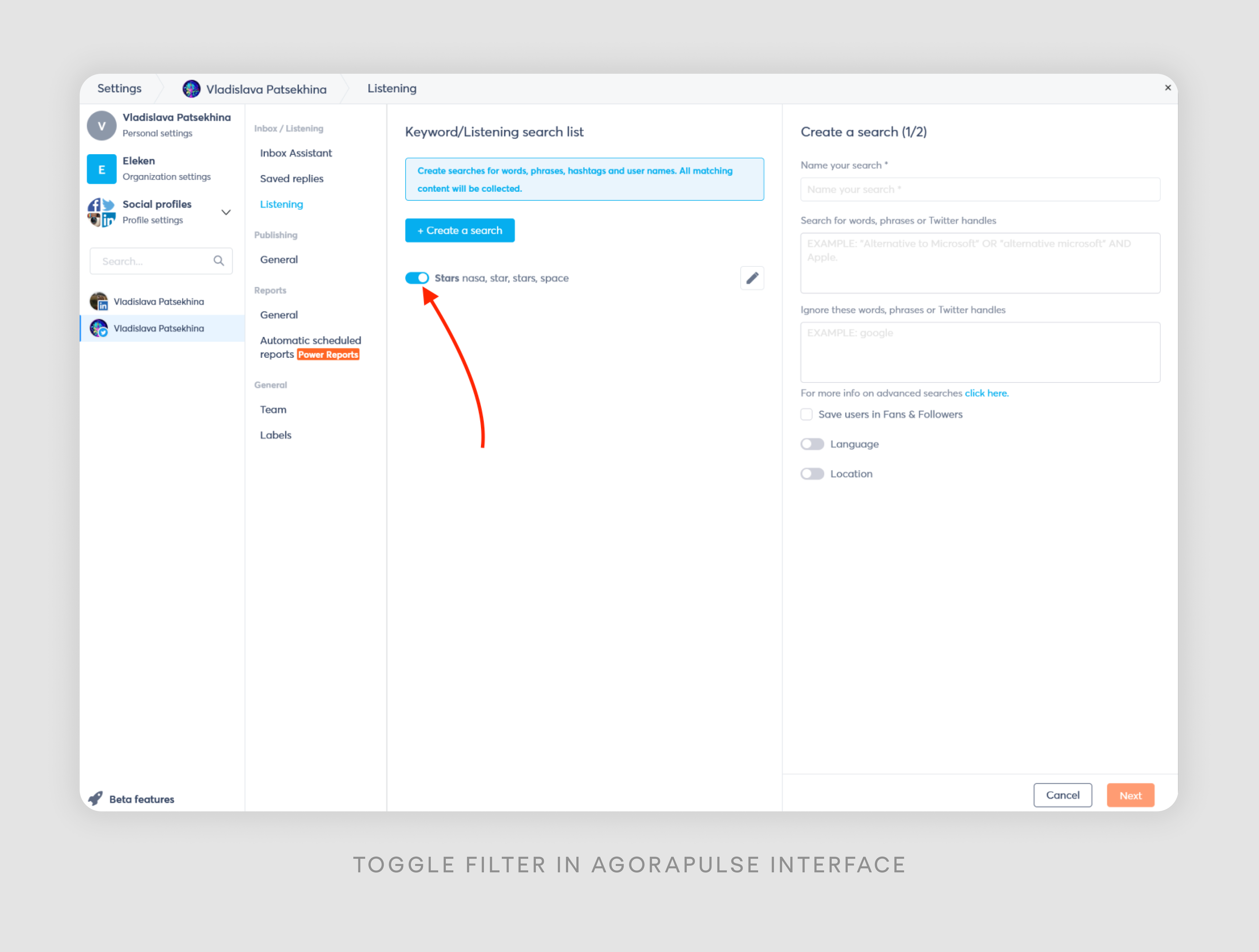
The toggle filter in this image is used for a quick and easy way to activate or deactivate specific search criteria or settings. In this specific example, the toggle is used for the search term "Stars nasa, star, stars, space". This allows the user to quickly enable or disable this particular search without having to delete or re-enter the terms.
I think AgoraPulse chose this type of filter because
- Toggles provide a simple on/off mechanism that's easy to understand and use.
- Users can quickly see whether a setting is active or not.
- Toggles take up minimal space while still being easily interactive.
- Each search term or setting can be toggled independently.
- It fits well with the overall design of the interface.
Range sliders
Range selectors are like those cool sliding bars you can play with. They let you narrow down numbers between two points. Just grab the little handles and slide them around to set your max and min values. Super handy when you're trying to find stuff within a certain price range or pick dates.
The example I’m going to provide here is rather generic but perfectly explains the use of range slider. It’s a typical filter in an apartment booking app.
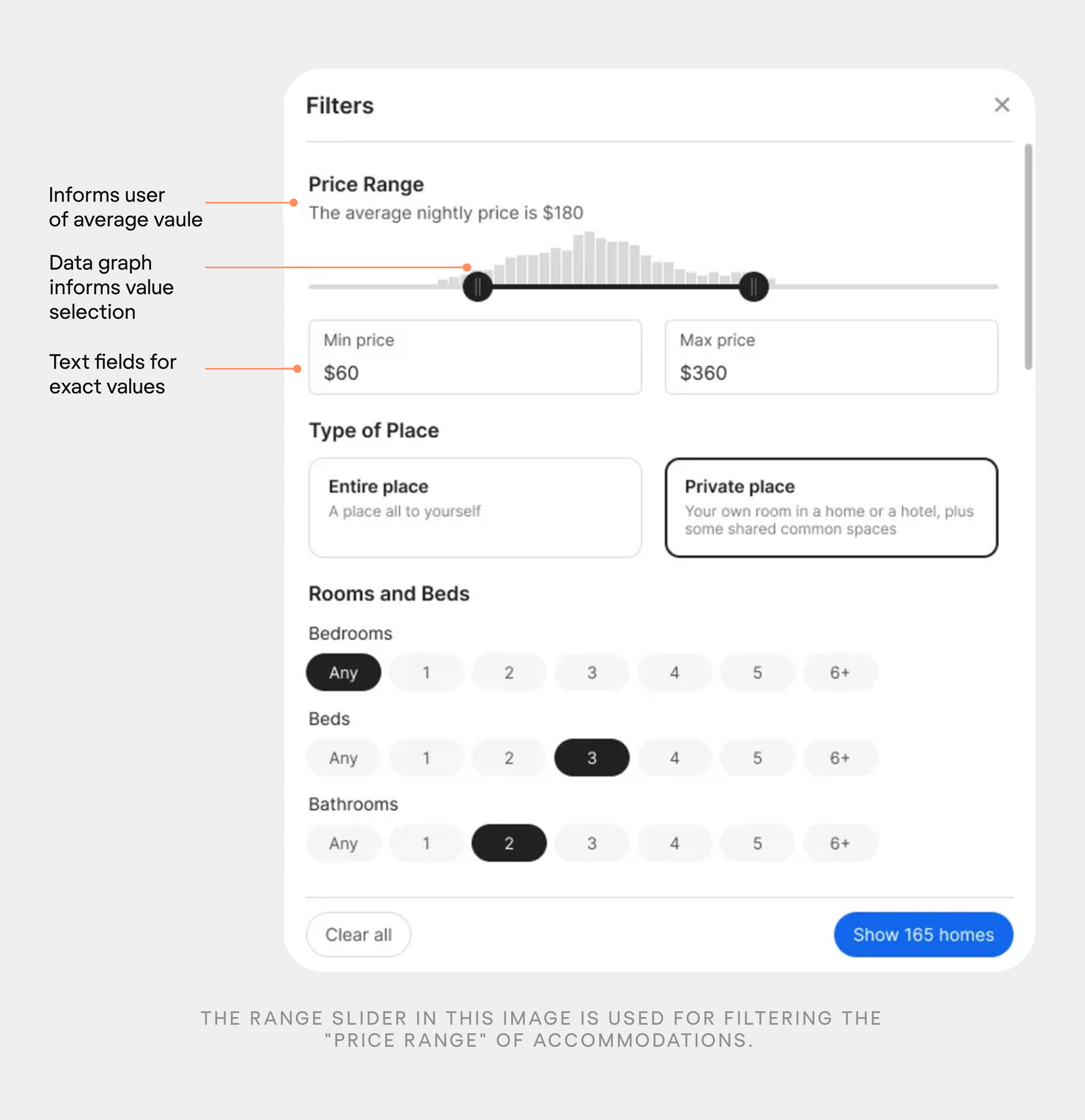
The range slider in this image is used for filtering the "Price Range" of accommodations.
- The slider allows users to set both minimum and maximum price values.
- Above the slider, there's a graph showing the distribution of prices. This helps users understand where most properties fall within the price filter.
- The text "The average nightly price is $180" provides context for users to make informed decisions.
- Below the slider, there are fields showing the exact "Min price" ($60) and "Max price" ($360). Users can also directly input values here for precise control. Because sometimes it may be annoying to drag the handle to the exact number you need.
The range slider combines visual intuitiveness with precise control, making it an effective tool for filtering numerical ranges like prices in this accommodation booking interface.
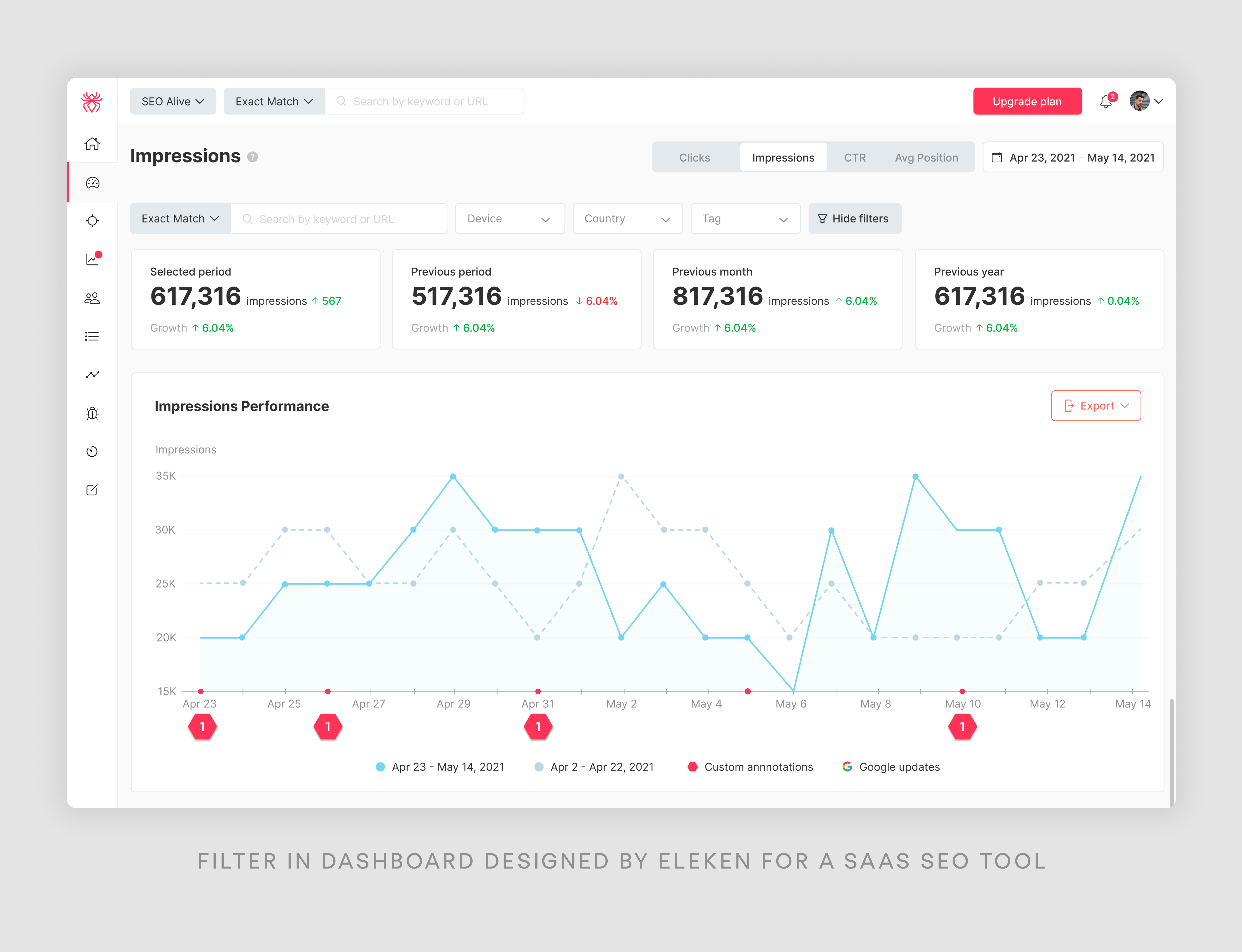
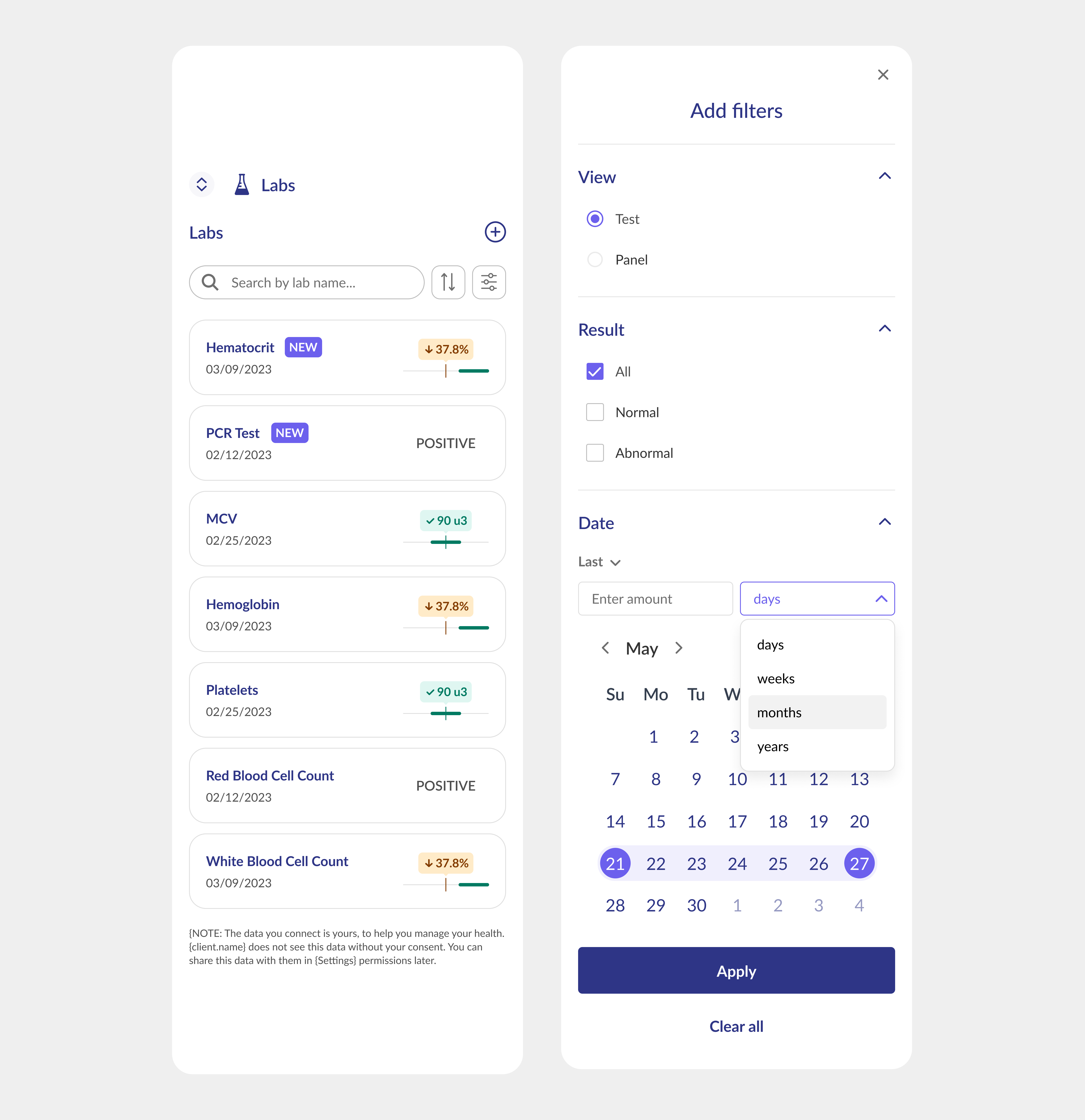
Date picker
They allow users to focus on specific time periods, whether reviewing statistics from the previous week or conducting year-over-year comparisons. Essentially, they provide a chronological perspective on your data, essential for anyone who needs to perform time-based analyses. Date and time picker UX facilitates the identification of trends and the generation of detailed reports, serving as an invaluable asset for chronological data examination.
Our next example was designed by Eleken for a B.well healthcare company. The filter bar is located on the Labs page, the one that contains all users' lab test results, providing updates on new results and keeping a history of previous ones. So, of course, it's important to filter medical information by date in this case.
Chips
Chips are particularly useful for applying and displaying active filters. It provide a visually appealing way to show and manage active filters. So, let’s see this case in use in an example of Eleken another project – TendrX, a freight tendering platform.
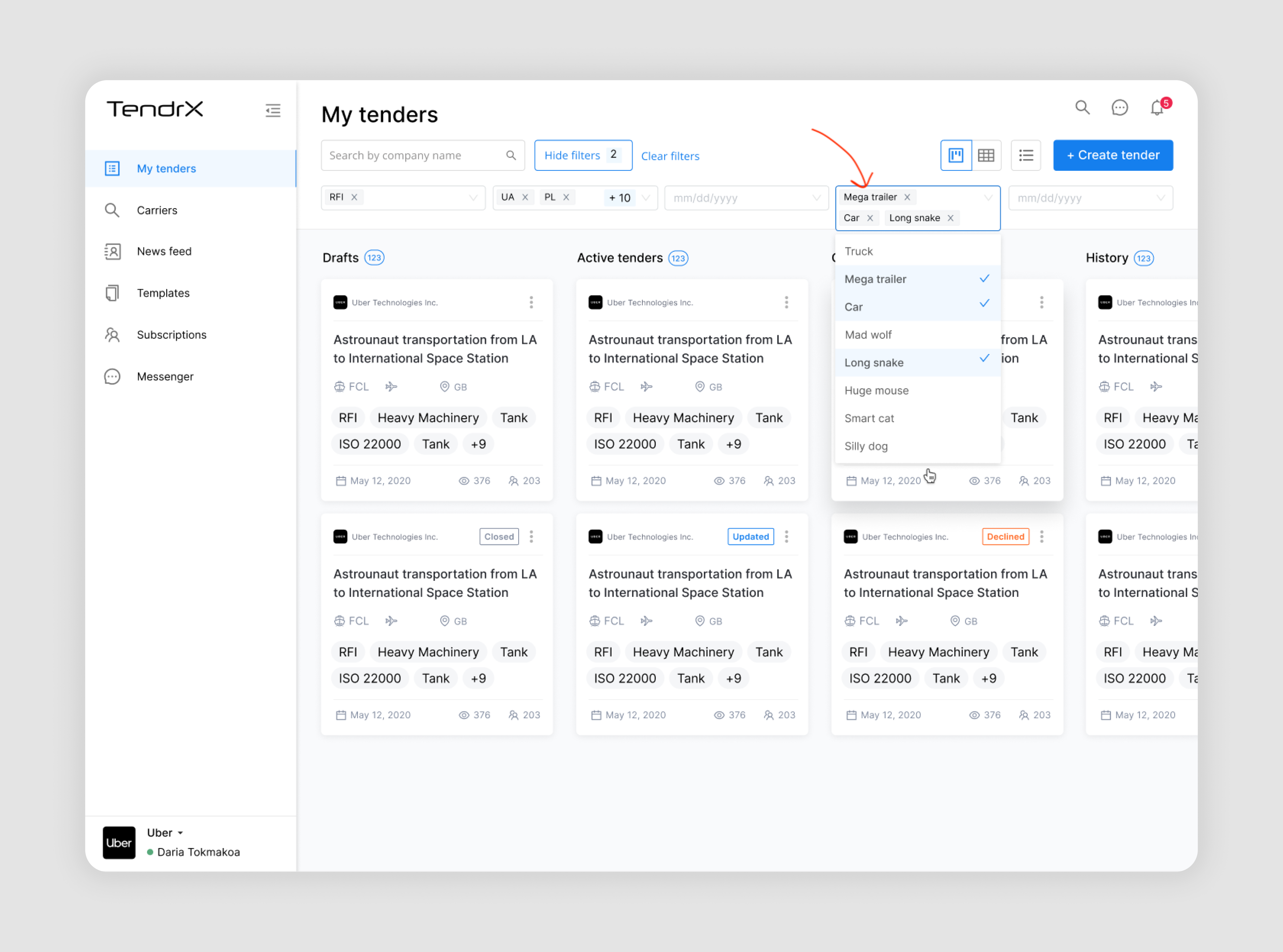
In this Tendrx interface, chips are used as an interactive and visual way to display and manage active filters.
- Each active filter is displayed as a small, contained "chip" near the top of the screen.
- As well, it’s important to mention that each chip has an "x" next to it, allowing users to quickly remove individual filters without going through the full filter menu.
- Users can see multiple active filters at once (e.g., "Mega trailer", "Car", "Long snake").
- Related filters are grouped together in a single chip (e.g., "RFI", "UA x PL").
This way, users get a clear, at-a-glance view of all currently applied filters. Chips take up minimal space while still being easily readable and interactive.
Cards/blocks
The card or block filter interface offers a more visual approach to filtering, often combining images with text. They're excellent for content-rich applications. For example, card filters might display meal types like "Breakfast," "Lunch," or "Dinner" with representative images. This format is engaging and intuitive, especially when visual cues can aid in decision-making.
Though, cards are not used that often in filter UI design, here’s an interesting example from a Ukrainian web app LUN that helps people choose a suitable property.
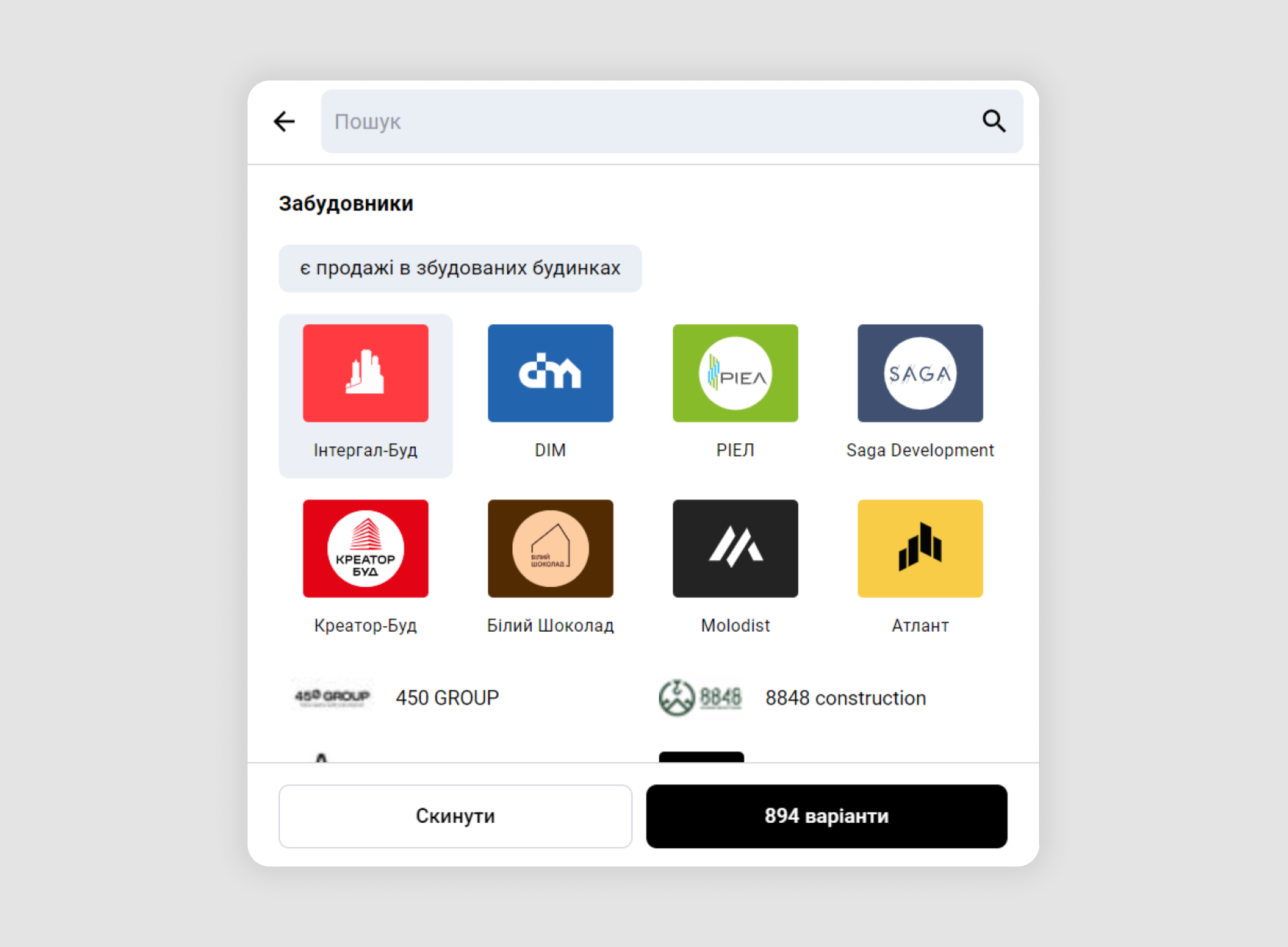
In this example, cards represent property developers. The developers’ logos are prominently displayed on each card, making it easier for users to identify them even if they don't remember the exact name.
Complex filter UI design examples
Complex filters combine multiple criteria to provide users with precise and flexible search options. These advanced filtering techniques allow for more nuanced data exploration, helping users find exactly what they need in large datasets. So, if you have a data-heavy or very “technical” product, you’ll probably need to know about common types of complex filters as well.
“And” condition
The "And" condition narrows down search results by requiring all selected criteria to be met. This filter type is useful for precise, focused searches. In a job search, an "And" filter might allow users to find positions that are both "Full-time" AND "Remote" AND in the "Tech industry." This ensures that all results match every specified criterion, providing highly targeted results.
Here’s an example if “And” condition filter by Airtable to narrow the search criteria.
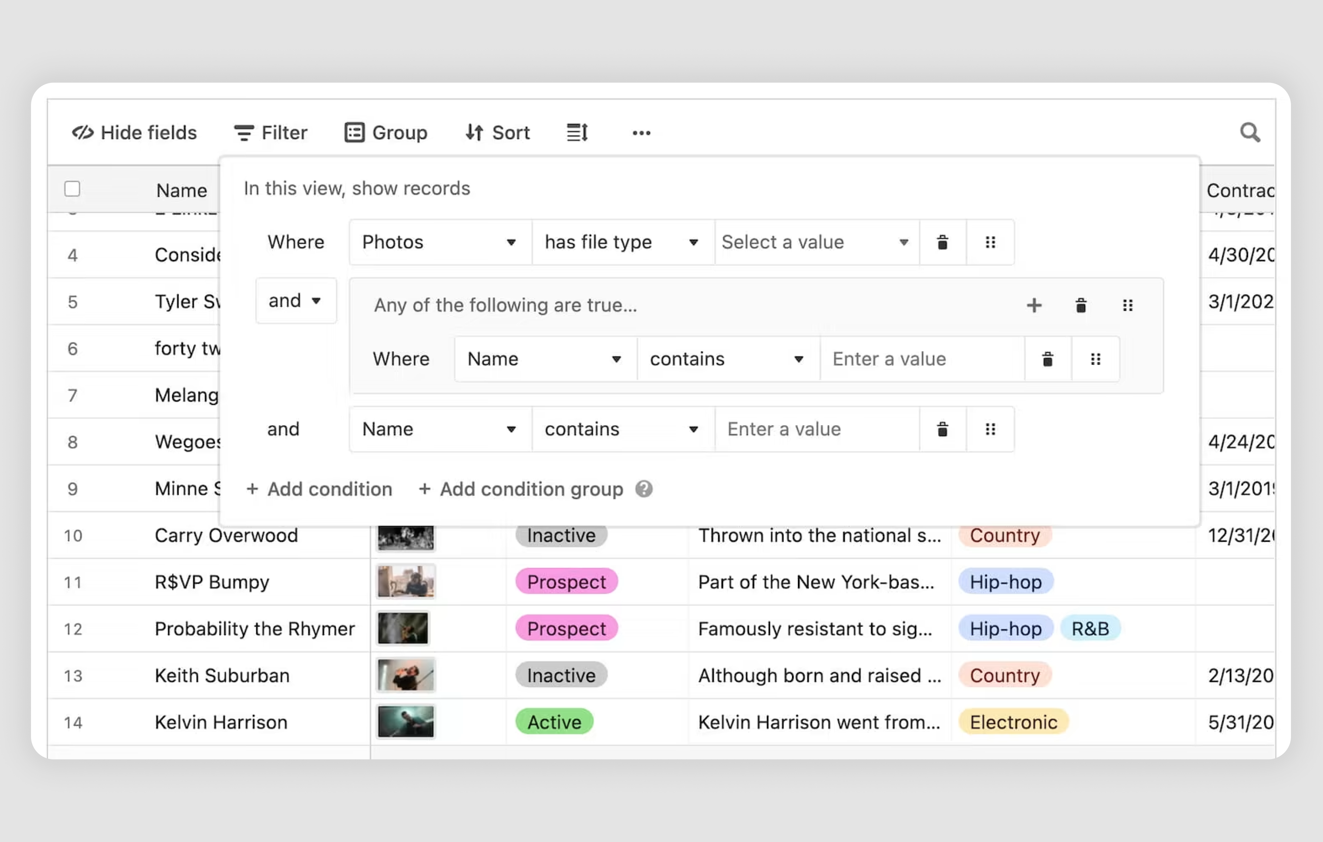
With this filter, we can go for the following scenario:
Find records where:
- The "Photos" field has a specific file type (e.g., JPEG).
- The "Name" field contains either "John" or "Jane".
This setup ensures that records meet both the main condition and at least one of the sub-conditions in Group 1, making the search criteria precise and effective.
“Or” condition
The "Or" condition broadens search results by including items that meet any of the selected criteria. This filter type is helpful when users want to explore various options. In an e-learning platform, an "Or" filter could let users find courses that are either "Beginner level" OR "Intermediate level" OR about "Data Science." This expands the range of results, offering more diverse options.
In the following advanced search interface, the "OR" condition is used in Group 2 to broaden the search criteria.
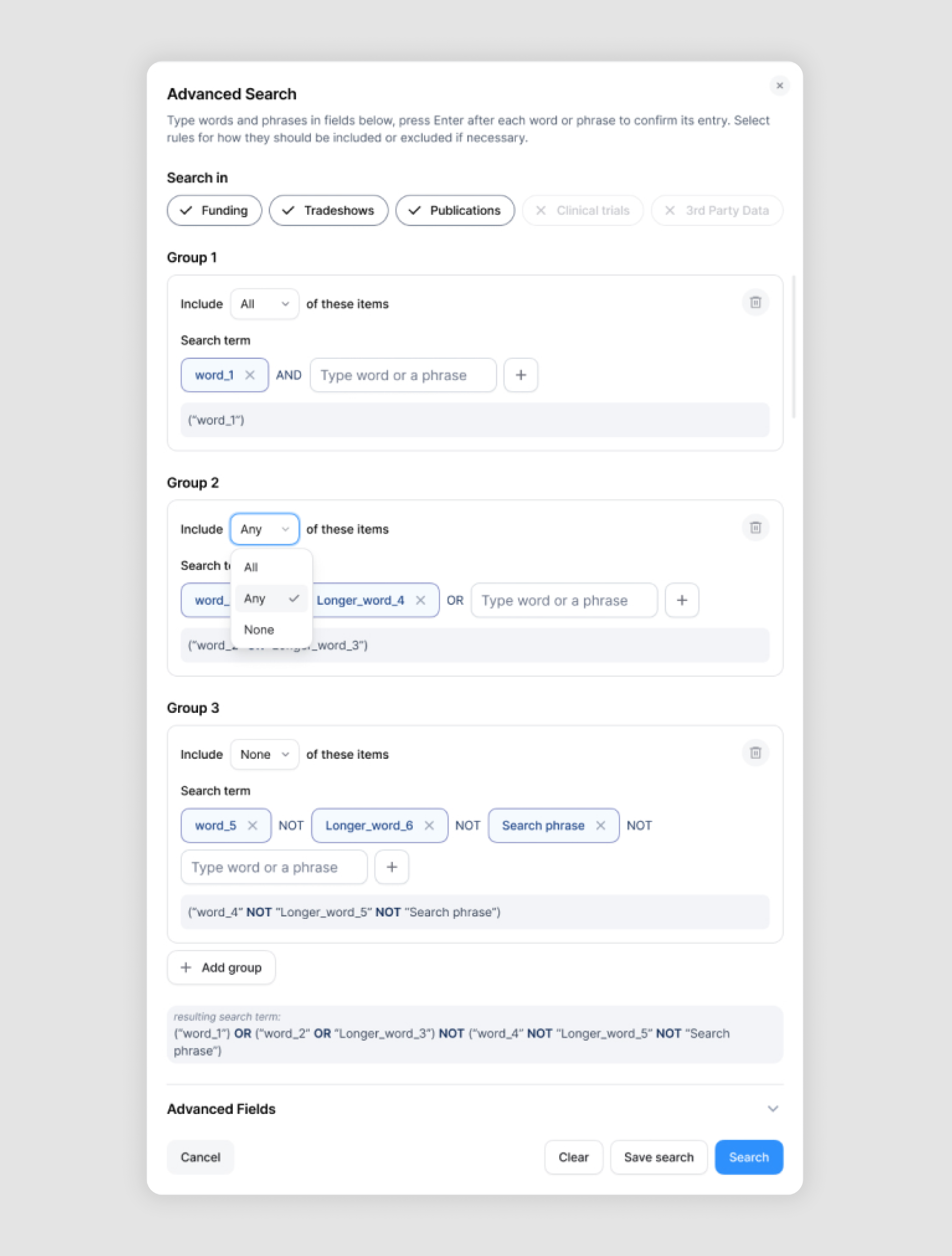
Here's how it's being applied:
- In Group 2, we see two search terms: "word_" and "Longer_word_4" connected by an "OR" operator.
- The "OR" condition means that the search will return results that contain either "word_" OR "Longer_word_4" (or both). This is in contrast to an "AND" condition, which would require both terms to be present.
- The dropdown menu for Group 2 is set to "Any", which aligns with the OR logic - it's looking for any of the specified terms rather than requiring all of them.
The reason why I love this example is also that in the resulting search term at the bottom of the image, we can see how this OR condition is represented: ("word_2" OR "Longer_word_3"). This design decision is effective as it summarises the complex filter helping users to ensure they entered all the information correctly.
Combination of “And + Or”
This advanced filtering approach combines "And" and "Or" conditions, allowing for more nuanced and flexible searches. It's particularly useful in complex databases or when users need very specific results. In a real estate SaaS platform, a combined filter might look for properties that are ("Apartment" OR "Townhouse") AND ("2+ bedrooms") AND ("Under $300,000" OR "300,000-$400,000"). This combination allows users to set both strict requirements and flexible options within the same search, resulting in highly customized results that meet their specific needs while still providing some variety.
And here’s our example in use:
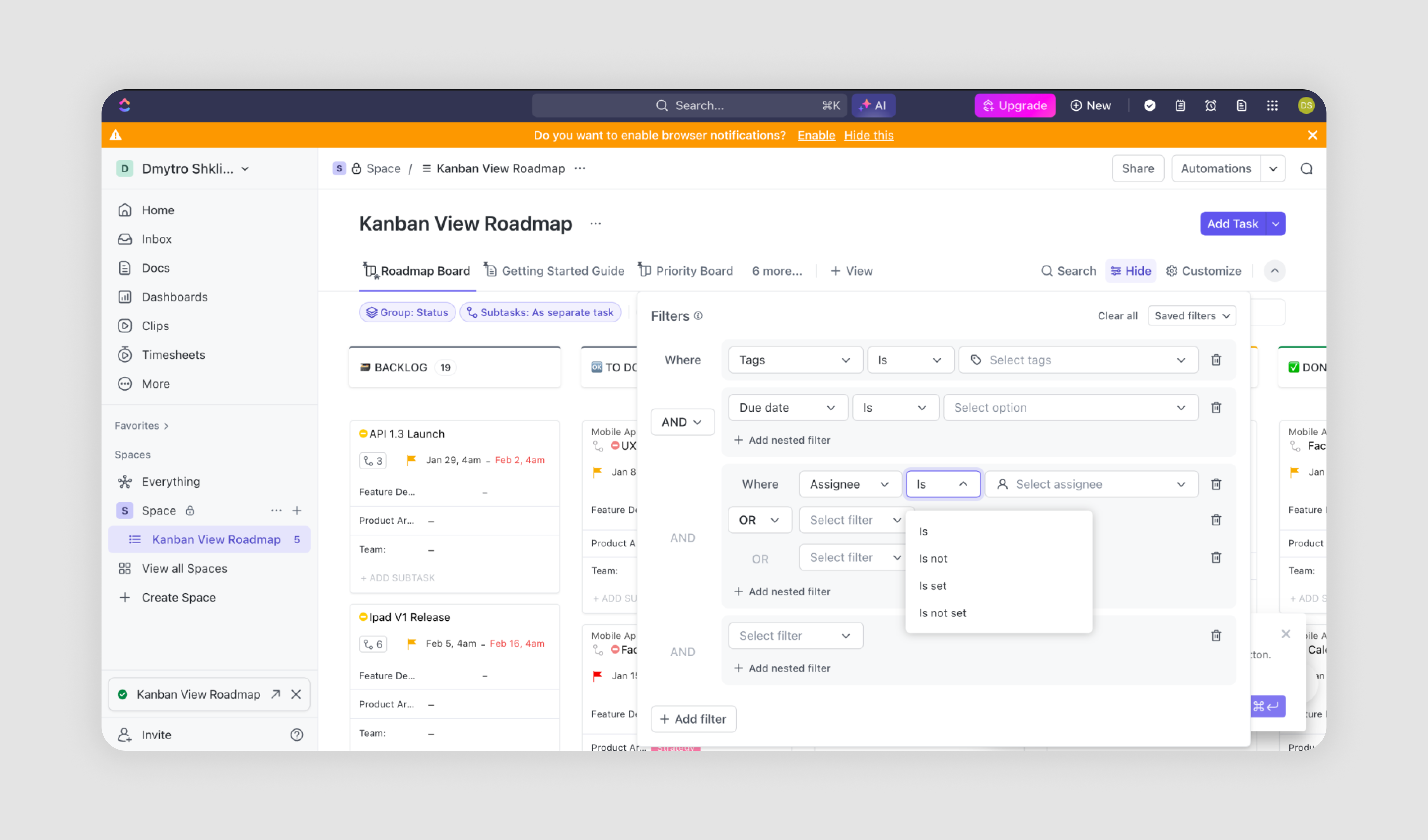
In this Kanban View Roadmap interface, we can see the combined use of "AND" and "OR" conditions in the filter section. This combination allows for more complex and flexible filtering of tasks. Let's break it down:
1. The first filter condition uses "AND":
- This is set to filter by "Tags" (although no specific tag is selected in the image)
- Below this, there's another "AND" condition for "Due date" (also with no specific date selected)
2. After these "AND" conditions, we see an "OR" condition:
- This "OR" condition is applied to "Assignee" filters
- The dropdown for the comparison is set to "Is", but no specific assignee is selected
3. The combination of "AND" + "OR":
- The "AND" conditions at the top must all be true for any item to be shown
- The "OR" condition that follows allows for multiple possibilities within the Assignee field
4. How it works together:
- Items will be shown if they match ALL of the "AND" conditions (in this case, specific tags and due dates, once selected)
- AND THEN, the items must also match ANY of the "OR" conditions related to assignees
This structure allows users to create sophisticated filters. For example, you could set it up to show:
- All tasks with a specific tag AND a specific due date range
- AND which are assigned to either Person A OR Person B OR have no assignee
Conditions inside a complex filter
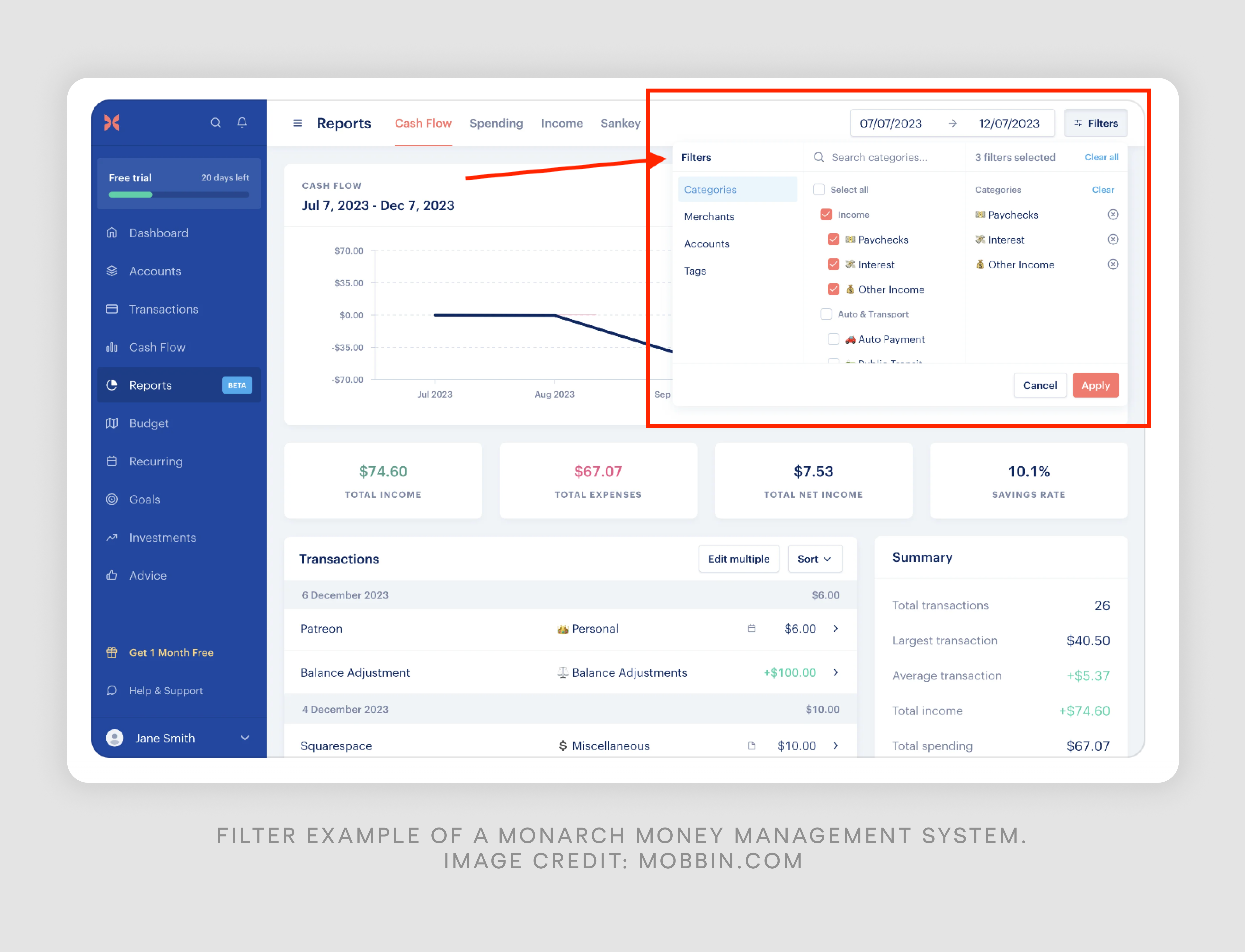
Complex filters can incorporate various specific conditions to refine searches further. These conditions allow for precise data manipulation:
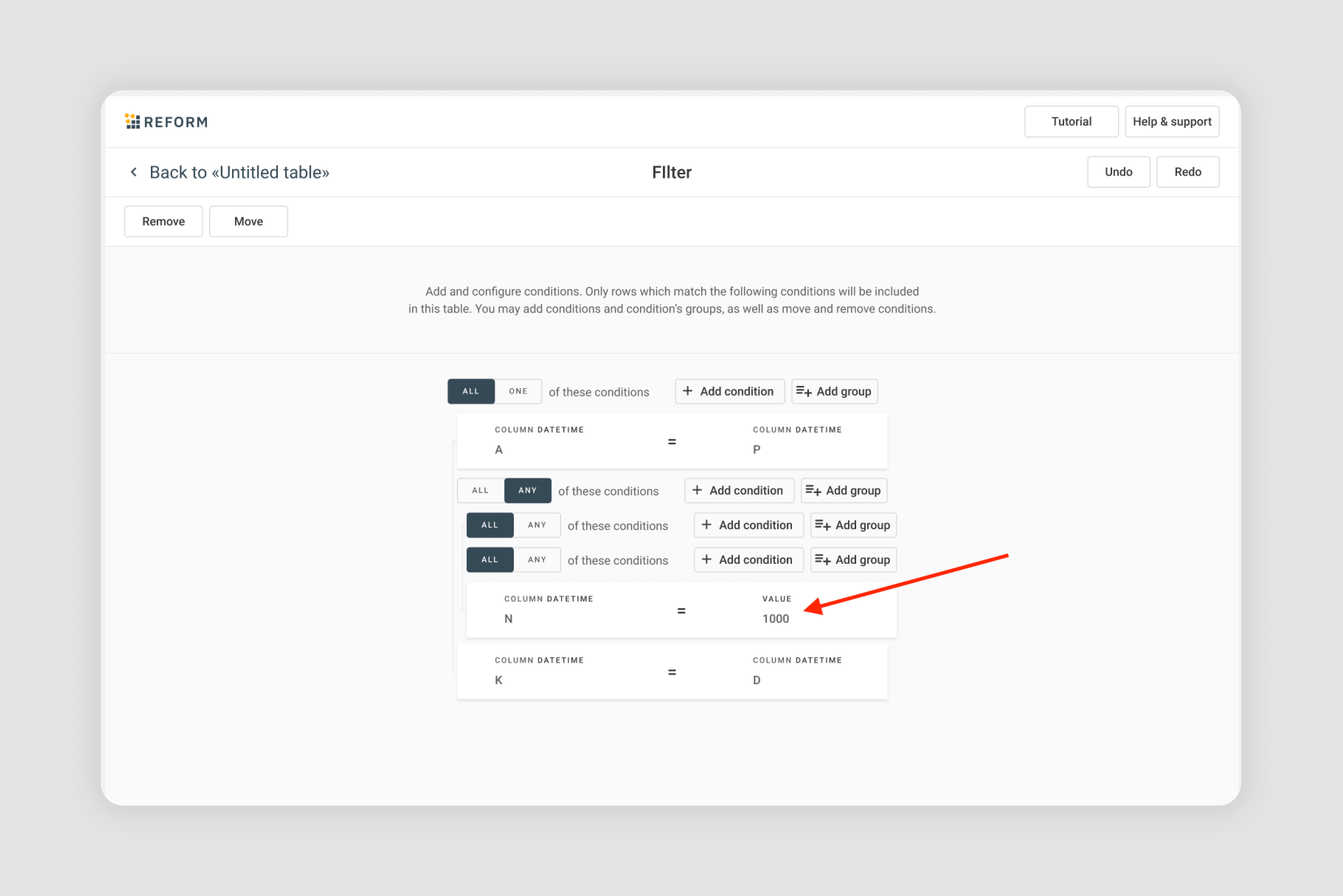
1. Equals/Not Equals: Matches or excludes exact values.
Example from Precog data preparation solution designed by Eleken: Show entries where column N equals 1000.
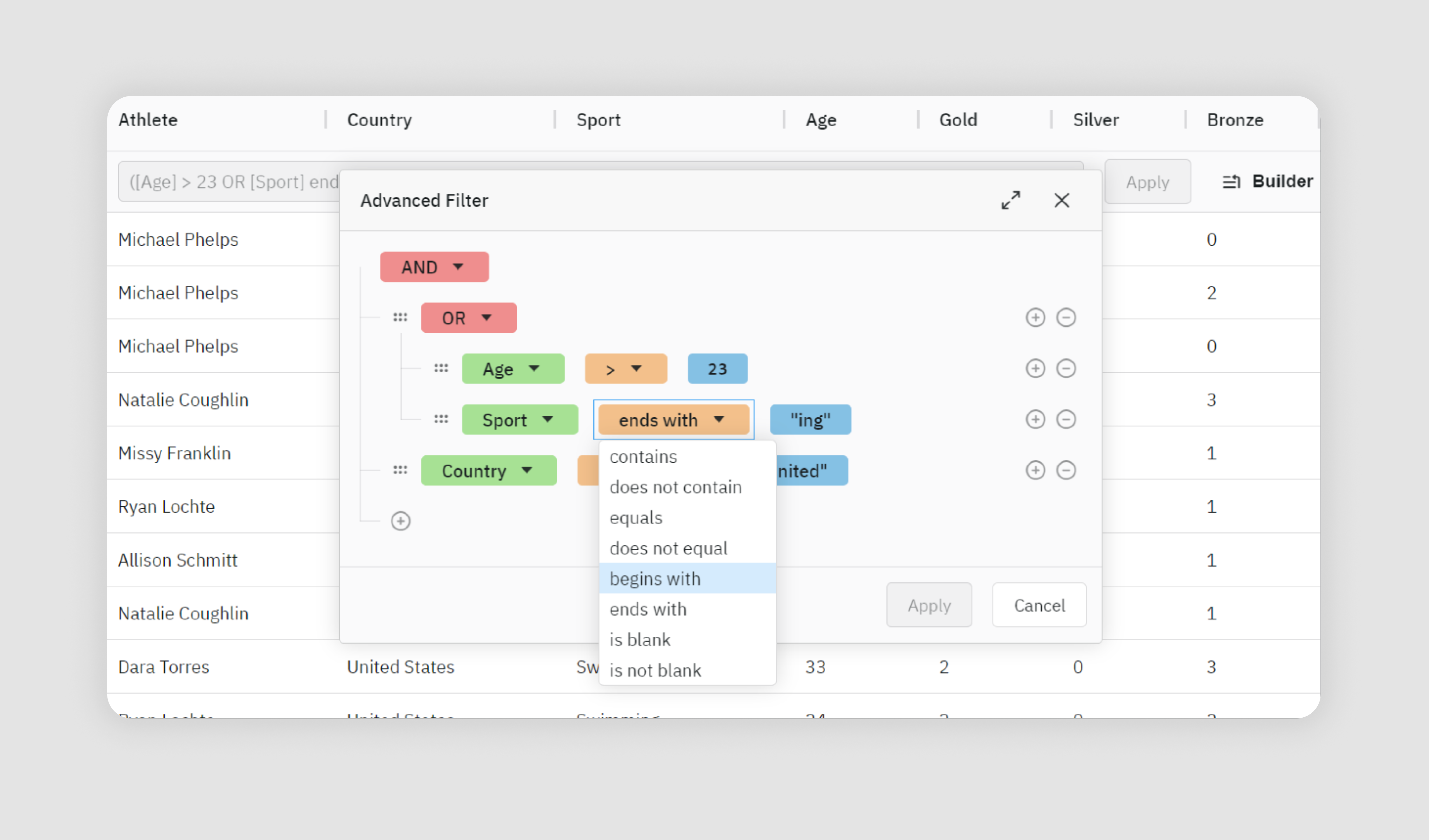
2. Greater than/Less than: Filters based on numerical comparisons.
Example from ag-grid: Display athlete older (greater than) 23 years.
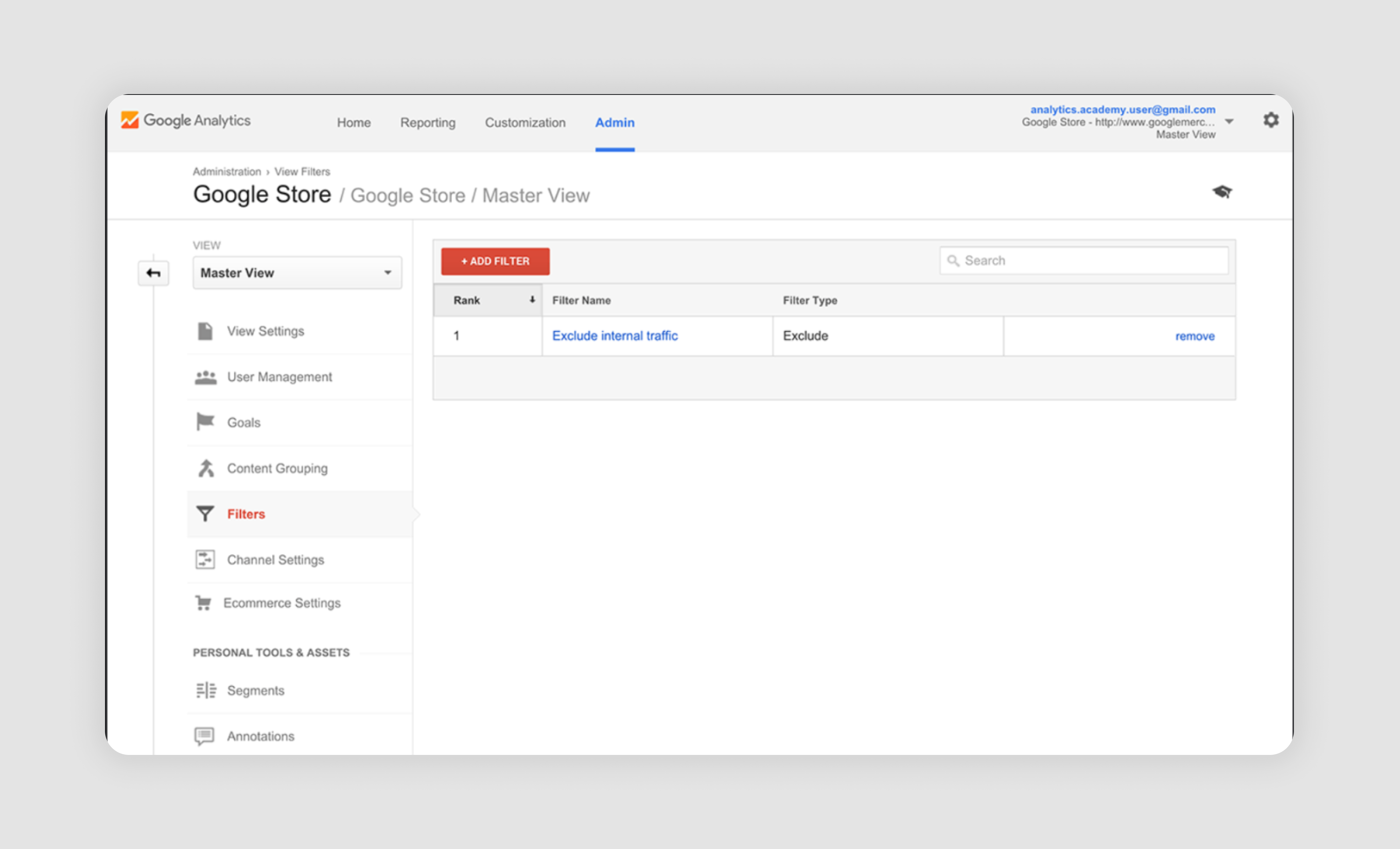
3. Includes/Excludes: Searches for the presence or absence of specific elements.
Example from Google Analytics: Show report excluding internal traffic. This example also shows UX best practices of saving filters so that users don’t have to create one from scratch every time.
4. Range of numbers: Allows selection within a specific numerical span.
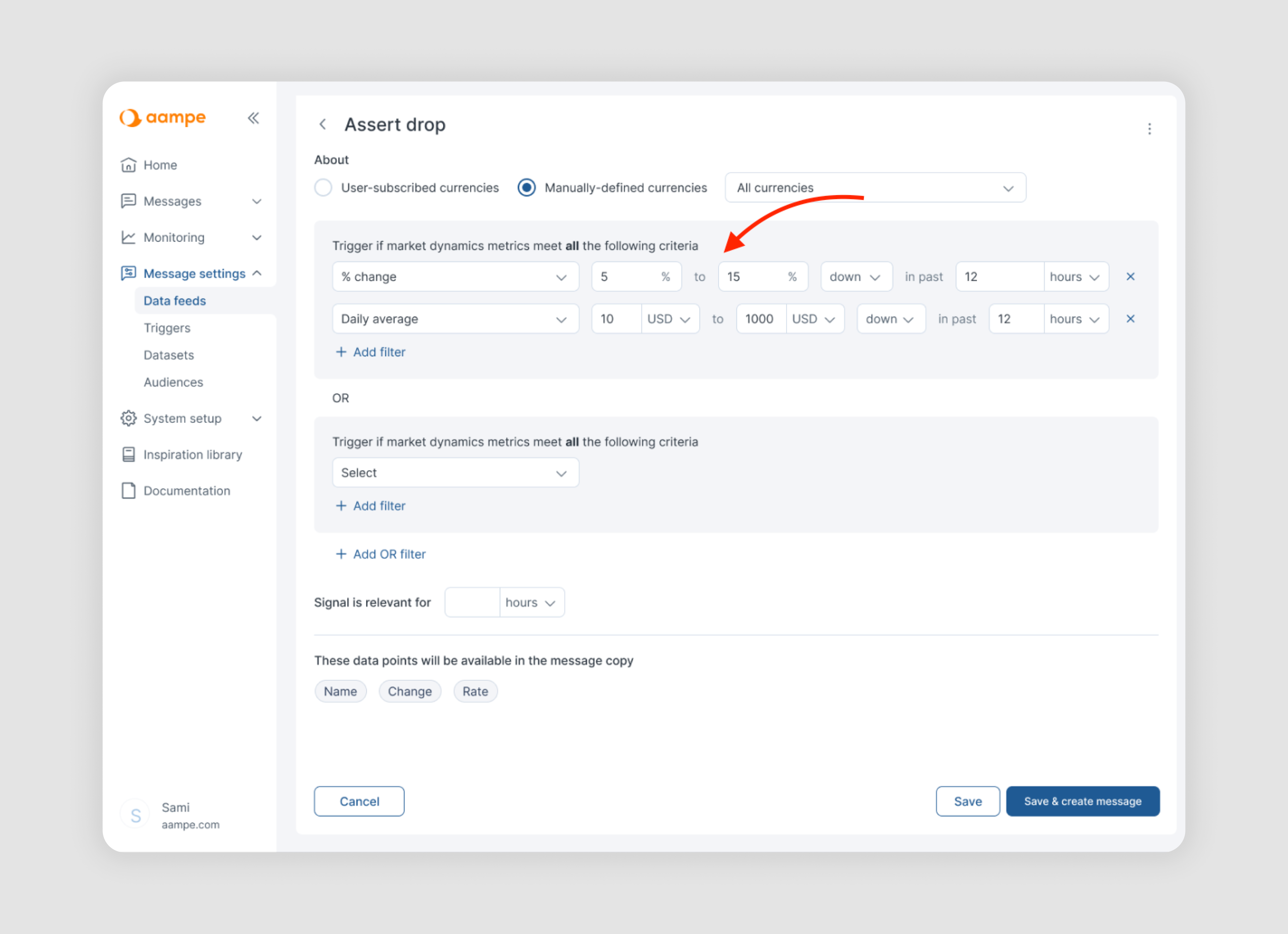
Example from Aampe designed by Eleken: Trigger if market dynamics metrics met from 5 to 15 % change in the past 12 hours.
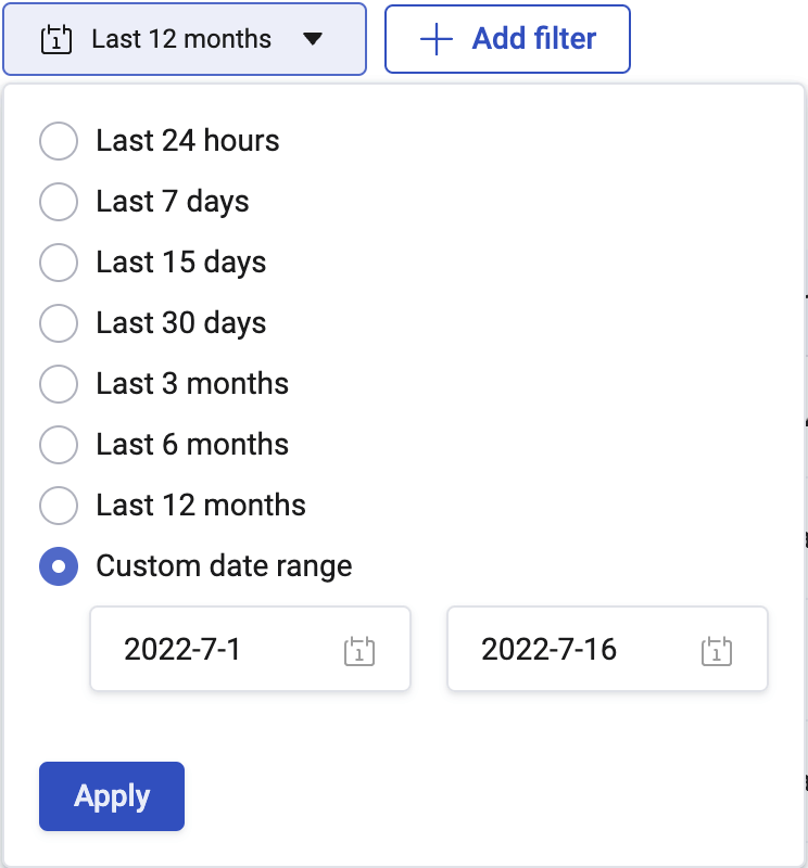
5. Time range: Filters based on dates or times.
Example from HotJar: Show data change between July 1st, 2022 and July 16th, 2022.
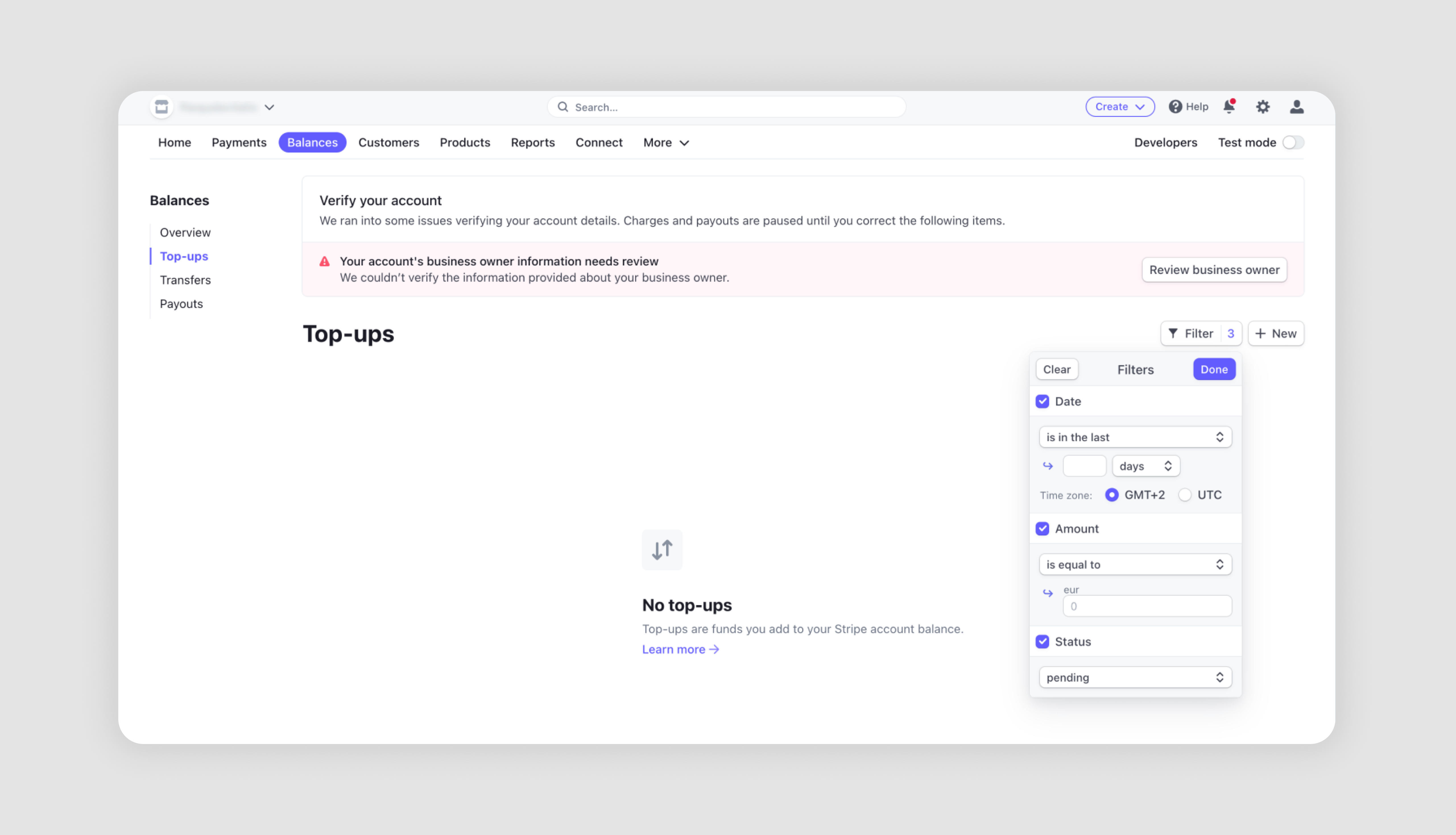
6. Location/timezone: Filters data based on geographical or time zone criteria.
Example from Stripe: Filter transactions that occurred in the last 7 days and in the GMT+2 time zone.
AI filter
AI filters uses machine learning algorithms to enhance search capabilities. They work on text requests. In practice, AI filters can transform a simple search into a smart, context-aware experience, helping users find what they need more efficiently, even when they're unsure of the exact filtering criteria to use.
Here’s an AI filter example by GrowthLoop, marketing technology platform.

This tool uses AI to help businesses create targeted audience segments for marketing campaigns.
- Conversation Interface: The left side shows a chat-like interface where users can interact with the AI. The AI asks questions to understand the user's goals and target audience.
- Goal Setting: The user stated their goal is to target "Winback Customers," specifically looking to re-engage customers likely to make a purchase in the next 30 days in their highest value markets.
- AI-Generated Audiences: Based on the user's input, the AI has generated four audience segments, shown on the right side of the image.
- Audience Details: Each segment includes a brief description of the target group and the number of customers in that segment.
- Customization: Users can preview each segment for more details or potentially refine the criteria.
Final thoughts on filter UI
That wraps up our overview of filter design best practices. If the variety of filter UX options feels overwhelming, you’re not alone. At Eleken, we help SaaS teams design filtering systems that are clear, scalable, and tailored to their users’ needs. Reach out to us for a free consultation, and let’s create a user experience that makes complex data easy to navigate.


.png)