You’ve likely heard that it takes just a few seconds for a user to leave an app. But what stands behind this disappointing churn trend? One of the most common reasons is poor onboarding. And for SaaS products, this problem is really critical. Even if your UX solutions are stunning, you won’t manage to communicate your product’s value without a proper introduction. But how to ensure a clear and engaging onboarding experience?
Luckily, you don’t need to reinvent the wheel here. There are several best practices, also known as user onboarding UX patterns. Product teams can adopt these techniques to retain potential customers when they get to know the app’s interface.
We at Eleken regularly turn to the UX patterns when designing SaaS products for our clients. In this article, we will introduce the most effective approaches to user onboarding.
What is onboarding UX?
Before diving into the most common and effective onboarding UX patterns, let’s start with a definition and explain why onboarding user experience is a must for every SaaS product.
User onboarding UX is the in-app experience that provides new customers with guidelines, instructions, and tips on how to use a product. It introduces the app’s core features, explains navigation, reveals the meaning of UI elements, and, most importantly, communicates your product’s value to new users. This flow is supposed to cover the most critical elements of your app. As a result, people instantly recognize why your product is beneficial and how they can use according to their needs.
The choice of onboarding method depends on your audience and specific needs your product should cover. That is where user onboarding UX patterns come in handy.
What are user onboarding UX patterns?
User onboarding UX patterns are UX design methods that allow for creating specific onboarding experiences for a certain context. For instance, tooltips may help users pay attention to particular interface features. Another common example is a welcome screen. It greets new users and provides a more personalized onboarding experience.
There is no one-size-fits-all solution when it comes to user onboarding. However, regardless of the chosen methodology, an effective product walkthrough is paramount. Let’s look at the most compelling reasons for paying extra attention to this aspect when designing a SaaS product.
Why user onboarding UX is crucial for SaaS products
As you already know, user onboarding teaches new users how to use your app or platform, and persuades them your product can address their pains. Here are the most significant benefits of UX patterns for SaaS onboarding:
- Aha moment delivery. When new users start their journey through your app, they need immediate insight into its value. Otherwise, they will likely leave. An effective UX onboarding pattern will help users quickly realize: “Aha! So that’s how it works!” or “Aha! It really helps!”. This is what we call an aha moment. To understand this concept better, feel free to look at some aha moment examples.
- Higher retention and minimized churn. Good user onboarding UX is the most effective way to prevent churn and increase retention. Streamlined sign-up process and frictionless onboarding experience quickly introduce your product without letting a user feel bored or confused.
- In-app education and product adoption. Onboarding new users is just a part of a larger goal. Various UX patterns can help your existing customers keep up with the product’s changes and updates. Hints, tooltips, hotspots, and progress bars allow people to quickly grasp new features, get used to them, and dive deeper into the app’s capabilities.
- Converting free trial users into paid customers. Conversion is one of the essential SaaS metrics. And the onboarding experience is a bridge that connect users from a free trial with a paid subscription. Wyzowl reports that 63% of customers consider user onboarding an important factor when deciding whether to subscribe to a product or service.
Main types of onboarding UX patterns
Over the years of practice, the Eleken team has implemented many different approaches to creating effective user onboarding UX. Among all the existing methods, we find the following onboarding UX patterns the most beneficial.
1. Welcome screens
The initial welcome message to a new customer can play a key role in the user onboarding experience, making it more personalized, friendly, and encouraging. Such a message should be simple and precise, saying “Hello!” or “Welcome!” to a user. At the same time, we often empower it with a call to action (CTA) button or progress bar to show that it’s only the beginning of an exciting product walkthrough. For example, Airbnb does the same thing and welcomes users at the signup to later guide them through the following steps with the help of a small talk.

Dropbox, in turn, offers new users to dive into the product and learn how it works immediately. The welcoming message is followed by a CTA, encouraging you to upload the first file and try how this service works.

Another type of welcoming message is a modal window, which doesn’t take the entire screen. Users can still see the main screen of the app in the background, so they know that their interactions with the product are about to begin. In particular, this approach is applied in all Google suite apps.

Note that welcome screens are often combined with other onboarding patterns, such as progress bars and persona-based segmentation, which we talk about later on.
Benefits of welcome screens:
✅Provide a more personalized onboarding experience
✅Help to launch client-product interactions
✅Can be combined with other onboarding UX patterns
2. Product tours
A product tour is a brief guide that explains the app interface, features, navigation specifics, and capabilities. Its primary goal is to introduce a product to customers without overwhelming and defocusing them. That is why good product tours consist of just a few hints, hotspots, or tooltips (more than five is usually too much). Besides, it’s critical to allow users to skip the tour if they’re already familiar with the product or want to learn how it works later.
In any SaaS onboarding case study, you will find that the most effective tours are those that focus on "learning by doing" rather than passive clicking. This approach significantly improves the results of customer training, as users retain information better when they interact with the interface immediately.
Here’s an example of a product tour in Slack. This messaging app for businesses explains the main features and interface components. It also allows users to opt out of the offered tips.

Another excellent example is Handprinter’s product tour, created by Eleken. We redesigned this app, and one of our primary goals was to improve the user onboarding experience. Handprinter is a unique startup that helps people track their positive impact on the planet. The app has rich functionality, so we had to introduce it clearly and precisely. The product tour below explains how to understand labels, color indicators, abbreviations, and icons on action cards.

Benefits of product tours:
✅Instantly communicate the product’s value
✅Concisely explain the app’s interface and functionality
✅Introduce updates and new features
3. Checklists
A checklist is an onboarding UX pattern that visualizes what a user should do to complete a specific flow or achieve a certain goal. This method is suitable for complex, multi-step processes that require special attention and might be unclear for newcomers.
A checklist helps users remember all necessary steps and keep an eye on every action they take. As a result, instead of feeling lost, people will be motivated to move on and get satisfied with marking tasks as completed.
For example, here’s how a user onboarding checklist in the Acorn app for investing spare change engages users and encourages them to continue their multi-step registration.

Benefits of checklists:
✅Help remember in-app processes and comprehend UX flow
✅Encourage users to complete tasks
4. Tooltips
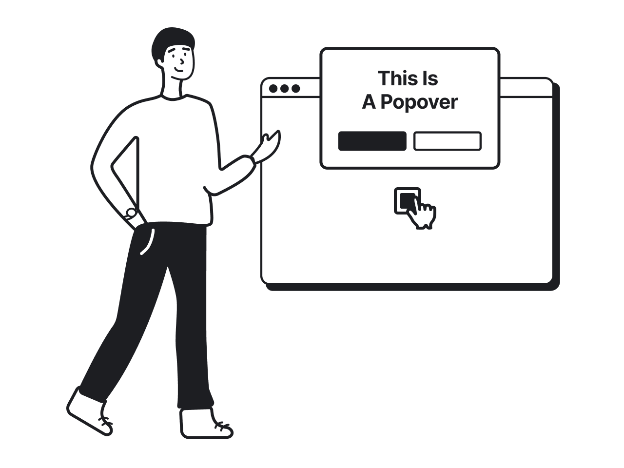
A tooltip is an in-app pop-up that appears when a user clicks or hovers over a certain element in an app. Most commonly, tooltips are applied to draw people’s attention to an interface feature that should be explained.
However, note that many users skip tooltips. So it’s better to communicate the key information with the help of another, more prominent UX pattern, or include it in the product tour.
Here’s how the Asana project management platform clarifies how to customize a task with the help of a tooltip.

Benefits of tooltips:
✅Quickly explain specific UI features and elements
✅Provide additional learning after a product tour
✅Can be used at any onboarding stage
5. Hotspots
Hotspots are bright dots that appear on certain interface elements and provide hints without pulling users out of their onboarding context. Similar to tooltips, this onboarding UX pattern highlights a specific component of the application’s UI and helps new users learn how to navigate through the app. At the same time, hotspots are less distractive than tooltips. They can be used to clarify product’s secondary features and extra capabilities.
One of the best user onboarding tips for using hotspots is to reserve them for "non-critical" discovery. Since they require the user to hover or click to see the content, they are perfect for teaching advanced shortcuts or hidden settings that aren't necessary for the initial "Aha! moment" but add long-term value.
For instance, Typeform provides new users with several hotspots all around the interface to help users learn the product’s features without unnecessary haste and interruption.

Benefits of hotspots:
✅Do not distract users from their workflows
✅Draw attention to important interface features
✅Unlike tooltips and pop-ups, do not overwhelm users
6. Progress bars
Most users prefer to see the results of their actions around the corner. And that is where progress bars can help. During a product walkthrough, you can visualize users’ progress and encourage people to keep their attention on their current tasks. Progress bars eliminate the risk of churn, since users are more involved and motivated to finish the onboarding process.
Even several small dots at the top of the screen can handle this task. When designing Alacrity, a mobile app for tracking productivity, the Eleken team created a simple onboarding process UX design with a progress bar. It lets users see how many steps are left to complete the product tour and start using the app.

Benefits of progress bars:
✅Encourages users to complete the onboarding process
✅Visualizes onboarding stages and goals
7. Persona-based segmentation
In many cases, a one-size-fits-all onboarding experience doesn’t work. If your app includes several products, or your target audience can be divided into several groups, it’s better to ensure customization and provide a more personalized onboarding flow.
Persona-based UX pattern, also known as contextual onboarding, allows adjustment of the onboarding process UX to individual user needs. This is a critical touchpoint in the SaaS customer journey, as it ensures the user feels the product is built specifically for them from minute one. After filling out the signup form, a person takes a micro-survey with a couple of options to choose from. For example, users may specify what they will use the app for and answer a few extra questions (but not too many). Then, depending on their choices, users get a more relevant onboarding experience without unnecessary actions causing friction.
For example, when working on Habstash, an app for navigating savings to buy a house, the Eleken team created a micro-survey right after the signup. With its help, new users instantly provide information about their purchasing goals, financial situation, preferred location, and more. Then, they get a targeted plan adapted to their answers.

Benefits of persona-based segmentation:
✅Ensures a more personalized onboarding experience
✅Enhances user engagement
✅Makes the further product walkthrough more relevant to specific user needs
By analyzing how different personas interact with these initial steps, teams gain a deeper level of understanding SaaS engagement, allowing them to refine the user journey in real-time.
How to combine user onboarding UX patterns
Using only one pattern is mostly insufficient to ensure a frictionless onboarding experience. Product teams normally turn to several techniques to make in-app walkthroughs as effective as possible. A common strategy is to trigger specific SaaS email templates based on the user's progress within these patterns, ensuring they receive the right guidance at the right time.
For example, when working on the PicaSaaS product, an automated solution for small SaaS businesses that allows clients to build their platforms cheaper and faster, we ensured several onboarding best practices, including the following ones:
- Sign-up form as a dedicated page
- Checklist
- Progress bar
- Tooltips

Initially, the idea was to create a comprehensive onboarding flow, allowing users to set up all product’s functions and options at once. But later, we decided to streamline their experience. So, we provided a custom onboarding process, where users get small step-by-step guides when choosing a particular feature or visiting a page for the first time.

Such design decision smoothened user experience and resulted in a convenient introduction to the PicaSaaS platform. To dive deeper into the topic, study more of our SaaS onboarding examples!
The bottom line
Your product should look and function great on every step of the user journey. And user onboarding is your biggest chance to make a good first impression and quickly communicate your value proposition to your users. Without relevant UX onboarding customers get lost and frustrated and might churn early.
When chosen and designed properly, onboarding patterns play a vital role in increasing retention, reducing churn, and enhancing conversions. Eleken designers select patterns based on comprehensive UX research, sticking to the product’s specifics and users’ core needs. When working with onboarding flows, we strive to make them as relevant, clear, and engaging as possible.
And if you’re looking for UX professionals to define and implement the right onboarding patterns for your product, we are ready to help. Our design agency has rich experience in providing effective UX solutions for projects of any kind and complexity. Contact us!


