TL;DR
Forms are everywhere, from registration to checkout to feedback, but too often they frustrate users and kill conversions. This guide walks through 42 real-world form design examples, showing what works (and what doesn’t) so you can create forms that are simple, accessible, and user-friendly. If you want smoother user flows and higher completion rates, these best practices are your shortcut.
Nobody likes filling out forms – yet every digital product needs them. Forms play a crucial role in converting visitors into users, customers, or leads. Whether it's a registration form, checkout page, or a feedback form, each form’s design directly impacts the user experience. At Eleken, when we deal with redesigns, forms are often the thing that matter a lot for improving UX and reducing the churn rates. So, how do you design the forms in a way that doesn't scare off your users and makes the process of filling them as smooth as possible? Let's take a look at some form examples with explanations!
What is a Form?
A form is a structured set of input fields that allow users to input information, essential for everything from signing up and making purchases to leaving feedback. Interactive forms are a core communication point in digital products, acting as bridges between users and the actions they want to complete.
Key components of a form:

- Input fields: spaces where users type text, select options, or upload files.
- Labels: clear descriptors indicating what information to enter in each field.
- Validation messages: alerts that guide users in correcting errors in real-time.
- CTA buttons, such as "Submit" or "Sign Up."
- Progress indicators (for multi-step forms): visual cues showing users where they are in the process.
- Help text: optional guidance to clarify field requirements and simplify user input.
What Makes a Good Form?
A well-designed form prioritizes user experience and minimizes friction. When you design forms, it's important to align with users' mental models and established conventions to ensure the interface feels familiar and intuitive. Here are three key principles:
- Simplicity: keep forms concise by only asking for essential information. Simple UI design helps reduce friction in the form filling process, which reduces user fatigue and increases completion rates.
- Guidance: offer clear labels, inline validation, and intuitive help text. Real-time feedback and thoughtful design can create an enjoyable experience for users, helping them avoid mistakes and proceed confidently.
- Accessibility: ensure compatibility with screen readers and keyboard navigation to make forms usable for everyone.
Leveraging best practices in UI design helps ensure forms are intuitive and user-friendly, supporting a smooth and effective form filling process.
While these principles outline what makes a form effective in theory, designers in the field often run into real-world challenges and trade-offs. To capture that perspective, here are some insights from the UX community on what works and what doesn’t when it comes to form design.
Community Insights on Form Design
UX designers on Reddit frequently discuss the challenges of creating forms that are both user-friendly and practical. Here are some of the strongest perspectives:
- Breaking up long forms
Many designers emphasized that splitting complex inputs into smaller steps makes forms more digestible.
"Split forms up into steps, it’s usually easier in general for cognitive load and a lot more digestible."
— u/ChonkaM0nka, r/UXDesign
Others added nuance, noting that wizards work better for occasional users, while frequent users may prefer flat layouts.
- Accessibility as a non-negotiable
Accessibility advocates stressed that labels, validation, and clear instructions are essential—even when designers resist clutter.
"Users don’t read the minds of the designers, and they desperately need well-written instructions and labels. It’s not done until it’s accessible. Period."
— u/kirabug37, r/UXDesign
- Focusing on user goals, not just data entry
Designers in regulated industries like banking and pharma pointed out that users rarely want to “fill out forms”—they want to achieve something bigger. The form should get them there as quickly as possible. One UXer advised reframing forms so users act as reviewers rather than data scribes, through autofill, uploads, or integrations. - Progressive disclosure and patterns
For complex, layered forms, designers discussed using patterns like TurboTax’s step-based flow or government systems. These approaches balance conditional logic with clarity, though opinions differ on whether power users tolerate added clicks. - Learning from experts and systems
Designers recommended resources like Adam Silver’s work on form design, Caroline Jarrett’s research, and design systems from Gov.uk or the US Digital Service. The consensus: leverage proven patterns instead of starting from scratch.
These community perspectives highlight the tension between usability, accessibility, and real-world constraints. With that context in mind, let’s look at specific types of forms and see how good design principles come to life in practice.
Types of Forms and Form Design Examples
Let's take a look at various form types, best practices, and examples.
Registration form

The registration UX forms are the entry points for new users to join a platform or service. It’s often the first interaction users have with a product, making it crucial to create a smooth and inviting experience. Registration forms should feel quick and straightforward, minimizing any hesitation that could lead to drop-offs and often ensuring the smooth onboarding.
Best practices:
- Keep minimal fields and collect only essential information to streamline the process.
- Progressive disclosure: gradually reveal additional fields if needed, reducing initial complexity.
- Error prevention and recovery: offer real-time input validation and clear error messages to guide users.
- Use a single-column layout for input fields. This format simplifies the visual flow, guiding users naturally from one field to the next and reducing cognitive load.
- For forms with optional fields, indicate optional fields explicitly rather than marking required fields, making the essential fields stand out naturally.
A simple and quite typical registration form from Udemy. They only ask for the necessary info and the labels work as placeholders.

An elegant example of a registration form by Teampay:

BlueApron's registration page – quite a typical example of a form requiring minimum information, at least for the first step.

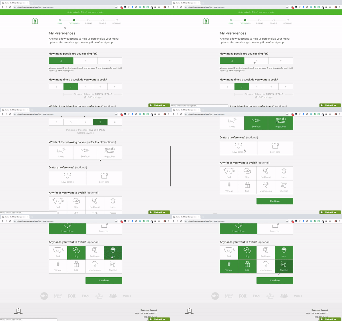
Home Chef's lengthy registration form:
HubSpot's lengthy registration and onboarding process is also broken down into separate steps:


Checkout form
A checkout form is where conversions happen, so its design must eliminate any friction that could lead to abandoned carts. A structured, step-by-step layout helps users focus on each detail, from shipping to payment, without feeling overwhelmed.
Best practices:
- Single-step focus: design each screen to handle only one piece of information, improving focus.
- Provide auto-fill for address and payment details to save time.
- Guest checkout option: allow purchases without forcing users to create accounts, reducing barriers.
- Implement trust indicators (like security badges, privacy notices) near payment fields. This can ease users’ concerns about data security and improve form completion rates.
- Add a review order summary at the final step. This allows users to confirm their selections before submitting, reducing the likelihood of order cancellations.
A typical simple one-page checkout form from Udemy. Take note of the visible yet unobtrusive Cancel button.

Another one-screen checkout page from Infinite CBD with the common two-columns form layout examples:

Samsung only shows the fields you need at the moment. Until you choose a payment option, they won't show you the other fields. They also offer a guest checkout not insisting on signing in.

Bed Bath and Beyond offers a three-step checkout form, and the steps are indicated clearly. You also actually get incentive for signing up or in at the top of the page.

Happy Socks is a good example of a checkout form not taking up a separate page but being presented as a sidebar:

Flight booking form
Flight booking forms tend to be complex, as they require multiple details like destination, dates, and passenger information. A well-designed flight booking form should help users input all required information with minimal effort and make selecting options (like seat preferences) easy.
Best practices:
- ARIA attributes for accessibility: enable screen readers to interpret form elements, enhancing accessibility.
- Use intuitive date pickers and passenger selectors to guide users.
- Progressive disclosure: show additional options (e.g., seat selection) only when needed, keeping the form organized.
- Use conditional logic to display relevant fields based on previous user selections. For instance, display seat selection only after choosing the number of passengers, keeping the form cleaner and more manageable.
- Include tooltips for complex fields (e.g., fare types or travel insurance options) so users can access explanations without leaving the form.
Complex form by SunExpress Airways broken down into separate, clearly indicated steps:


An example by Thai Airways. The calendar is opened as a pop-up. Once you click find flights, the new window is opened automatically.


Login form
Login form designs are deceptively simple; they need to work flawlessly to allow easy access while safeguarding user data. A good login form reduces barriers to entry without sacrificing security.
Best practices:
- Social login options: offer quick sign-in options through popular platforms like Google or Facebook.
- Clear error messaging: provide specific guidance on correcting issues like incorrect passwords.
- ‘Remember me’ option: help returning users by letting them stay logged in on their devices.
- For password form design UX, offer a “show password” toggle to help users check for typos, especially useful on mobile devices where input errors are more common.
- Limit the number of failed login attempts before suggesting password recovery. This saves users frustration and offers a helpful alternative if they’re struggling.
Pitch's login vs login with email only pages:


An example of login form with socials from WeTransfer:

Zoom's login + verification:


Zendesk's page offers either login (emphasized) or create a new account:


Zapier's example with login and parole relegated to separate screens:


An inbox form
Inbox website form examples are about letting the users to select and organize multiple items, often requiring bulk actions like deleting, archiving, or labeling. They’re common in applications handling communication or task management.
Best practices:
- Allow users to select multiple items at once for faster processing.
- Provide accessible menus that adapt to the user’s selections and screen size.
- Feedback on actions: confirm actions like delete or archive to prevent accidental data loss.
- Provide keyboard shortcuts for power users, such as pressing “A” to select all or “D” to delete selected items. This can speed up navigation for users who frequently manage inbox content.
- Use color coding or icons for different actions, like archiving or flagging, to visually differentiate options and enhance user familiarity with the form.
One of the most obvious and famous form UI examples from Gmail:

Inbox for tasks by Todoist:

Apple Calendar and Reminders events inbox:


HRMS PeopleForce tasks inbox:

Search form
Search form UI helps users find specific information quickly. They’re a core element of many platforms, especially when users need to search through vast datasets or complex catalogs.
Best practices:
- Autocomplete suggestions: assist users by suggesting relevant queries as they type.
- Always visible: make the search bar readily accessible, ideally available on every page.
- Mobile-friendly design: adapt the search bar for mobile screens with larger input fields and simplified functionality.
- Enable voice search for mobile users, especially on complex platforms where typing can be cumbersome. This feature is particularly valuable for accessibility and improves search convenience.
- Add a search history or recently searched items dropdown. This can be useful for users who often repeat similar searches and want quick access to prior queries.
Google's advanced search form UX design:

A search web form example by Todoist:

Trello's advanced search form:

DuckDuckGo's autofill:

Ahrefs' search form:

Filter form
Filter forms help users refine large sets of search results, essential for e-commerce, content libraries, and more. A well-designed filter form should be easy to navigate and offer precise options.
Best practices:
- Collapsible categories: group filters into expandable sections to save space.
- Dynamic updates: show filtered results instantly as users adjust filters.
- Clear reset option: offer a reset button to let users start over easily if they overfilter.
- Consider sticky filter options on mobile, so users don’t lose sight of their choices while scrolling through results. This enhances usability by keeping essential actions within reach.
- Add “fewer results” alerts if too many filters narrow the search excessively, prompting users to expand their criteria instead of leaving the page frustrated.
Amazon's filter system is quite robust and adapted to each specific search, as it should be:

A SaaS SEO tool filters:

Calendly's filtering by date:

Stripe's filtering:

DataStream's collapsible filters designed by Eleken:

Here you can see more results for SaaS filter UX examples.
Upload form
Upload forms allow users to add files or images to a system, often with a drag-and-drop feature. They’re common in applications for file sharing, document management, and content creation.
Best practices:
- Drag-and-drop: offer a simple drag-and-drop option alongside standard upload buttons.
- Progress indicators: display upload progress in real-time to manage user expectations.
- Accessibility: ensure compatibility with keyboard navigation and screen readers.
- Add a thumbnail preview for uploaded files, especially images, so users can confirm uploads at a glance.
- Set file size and type limits upfront to manage expectations, providing clear error messages if a file doesn’t meet criteria to avoid frustration.
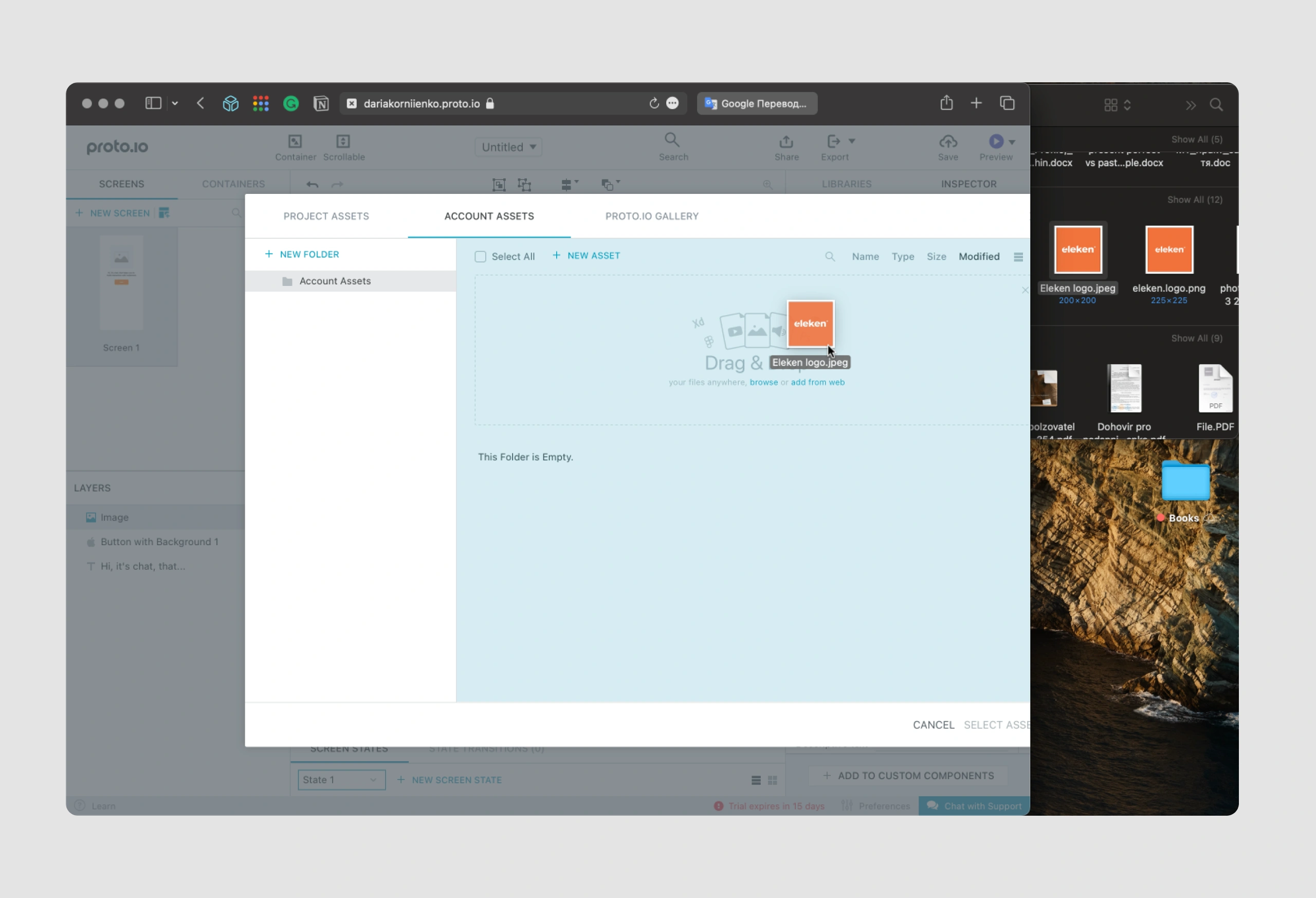
Let's take a look at web form examples for uploading:
MeisterTask:

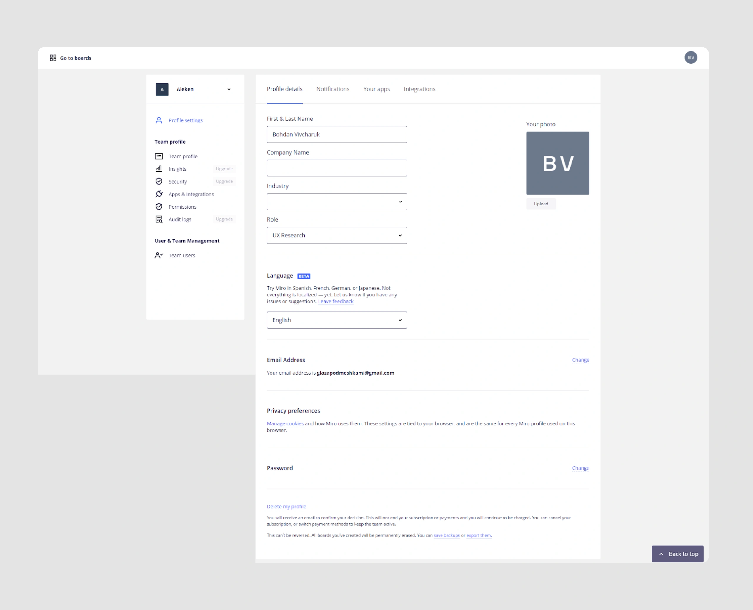
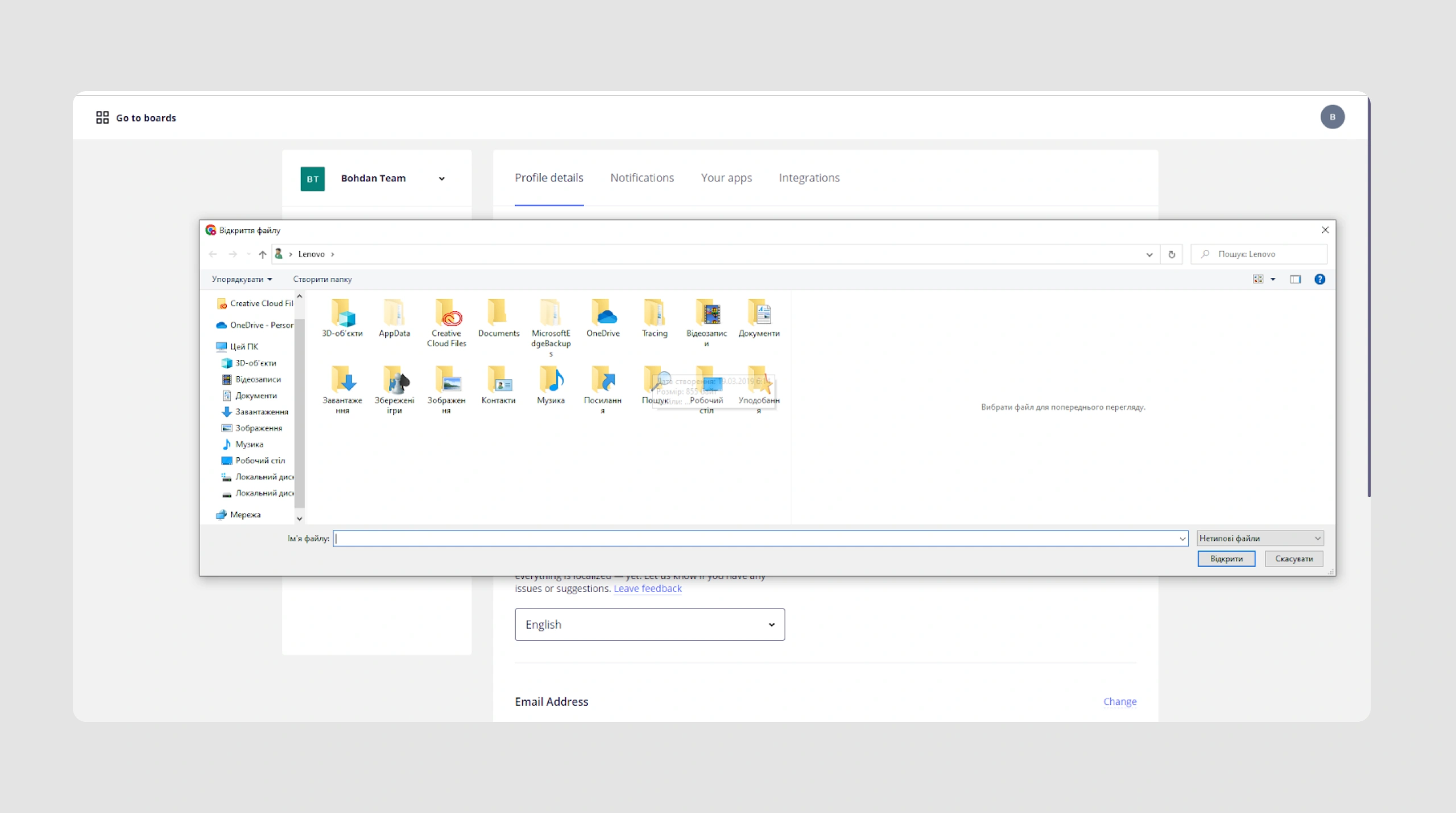
Miro:
MailChimp:

Linktree:


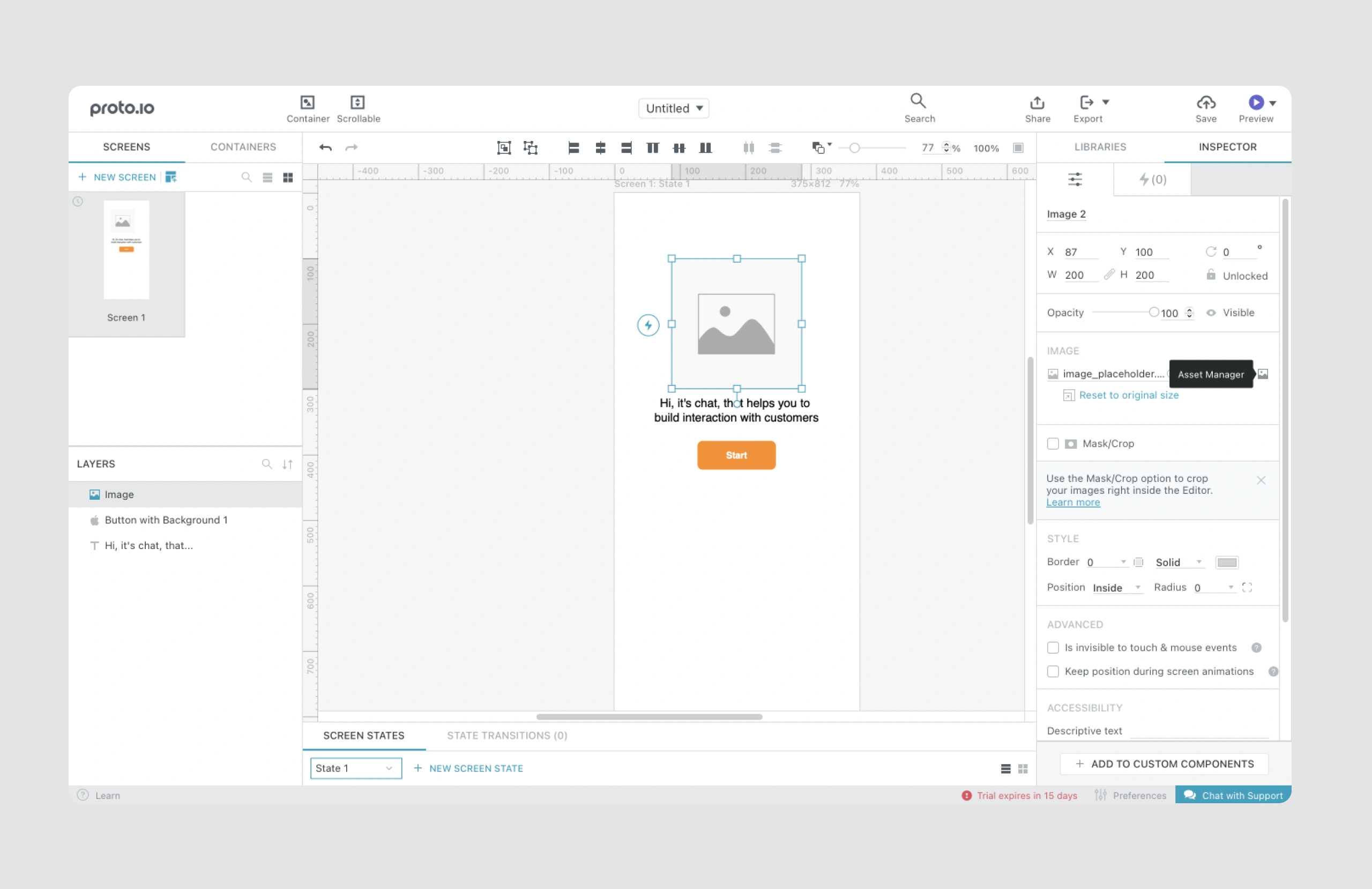
Proto.io:
Other long and complex forms
Some forms are extensive and may take significant time to complete, such as application forms or detailed surveys. Designing these forms well involves breaking them into digestible parts to prevent user fatigue.
Best practices:
- Multi-step layout: divide content into sections with a progress bar for easy navigation.
- Save and return: allow users to save progress and return later if they need more time.
- Smart defaults: use data from prior interactions (when available) to pre-fill fields and save time.
- Use progressive loading to load sections only as users navigate to them, reducing initial load time and creating a smoother experience.
- Provide a completion percentage alongside the progress bar to give users a clear sense of their progress, helping them estimate remaining time more accurately.
"Add a new lead" form in Ricochet360
The original "Add a new lead" screen in Ricochet360, a sales management tool, presented some user experience issues, notably around undefined data entry formats. Users were frequently confused by the lack of clear format guidelines, especially for phone numbers, and the screen lacked visual indicators for required fields, leading to incomplete submissions.

Original version of the screen
To address these, we:
- Added tooltips to each field, clarifying the expected input format and reducing user error.
- Standardized data formats, ensuring users would see an error message for invalid phone numbers, streamlining the data entry process.
- Marked required fields with asterisks, making it immediately obvious which fields were necessary.

These changes, achieved within hours, produced immediate improvements in form completion rates and reduced user frustration.
Beyond these quick fixes, we undertook a structural reorganization of Ricochet360’s user flows. By breaking down the form into core elements, we could redesign screens to follow a logical flow, making tasks simpler and quicker to complete. This restructuring revealed a few key hypotheses:
- Reducing field overload: with more than 30 fields in a single form, users often felt overwhelmed. We identified rarely used fields and suggested hiding them by default, allowing users to access them only if needed.
- Grouping related fields and organizing them by related categories helped reduce visual clutter and enabled users to process information faster.
- Since adding a new lead is often a subtask, we turned the form into a popup, allowing users to complete it without leaving their primary workflow.

By implementing these strategies, Eleken shortened the learning curve for Ricochet360’s users, providing a form that’s both efficient and intuitive.
Data Streams: drag-and-drop dashboard and a new record page
Eleken's redesign for Data Streams focused on enhancing form usability in a complex data management environment. Recognizing the need for global competitiveness, we revamped form functionality to make customization easy and intuitive. One major improvement was a drag-and-drop dashboard, allowing users to arrange data fields and visualizations according to their preferences, creating a workspace tailored to their needs. (For more information on dashboard design check this article.)


On the new record page, we introduced a modular form setup where users could drag elements from a panel to build personalized configurations, simplifying complex data input tasks. Additionally, the Browse screen was optimized to consolidate information—navigation, filters, and key data points—onto a single screen, reducing the need for excessive page navigation. This efficient layout and form customization positioned Data Streams as a more user-friendly tool, aligning it with international standards for usability in data management products.

IDCore's long mobile-friendly forms
Eleken’s redesign of IDCore focused on simplifying compliance forms for vendors and real estate managers in the real estate industry. Originally, vendors needed to manually fill out extensive forms, which was time-consuming and daunting. To streamline this, we introduced photo or document upload options, allowing users to bypass manual entry when possible. For cases requiring manual input, we broke down lengthy forms into bite-sized steps, displaying a maximum of three fields per screen with a progress bar at the top.


This progressive format made the forms feel manageable and less overwhelming. Additionally, we enabled cross-device functionality, allowing users to switch between mobile and desktop without losing progress, enhancing flexibility and user convenience.

These adjustments simplified the onboarding process for vendors and improved navigation for managers, making compliance verification much easier and more intuitive.
Final Thoughts
Forms are vital for the smooth UX and the success of your product. We hope these examples of forms will help in your practice. And if you’re not sure how to do it? Eleken deals with the forms all the time, from designing them from scratch to redesigns. So, if you’re looking for a design partner to ensure your forms are not scaring off your users, get in touch with us!




.png)


.png)

