The beauty of using a SaaS app is that you never know, when you close the app in the evening, how this app will surprise you the next morning.
Our latest weekly meeting at Eleken started in a shiny new Google Meet interface that has instantly refined the agenda from discussing tasks to discussing new bars and buttons.
It has been a year since we all shifted to online communication and video meetings, and now everyone has a story of a quarantine conference that went hilariously wrong. Just for the record — one out of 10 has now seen a colleague partially or fully naked thanks to the new ways of working.
Looks like Google Meet feels in some way responsible for our ragged peace of mind, poisoned by the year of remote work. Because their redesign is a response to the most common complaints coming from home offices. This is product design trial thinking applied at scale: listening to what real users complain about and building the next version around those answers.
"Hey, sorry, I'm back. I meant to unmute myself"
We don’t know who told Google that it was a good idea to put a hang-up button just in between the audio and video mute buttons (and make all three look exactly the same). I'm guessing it was a double agent for Zoom because there were no other interface features more annoying. It's a perfect case of design and friction in the wrong place — the kind of small, repeatable mistake that erodes trust one accidental hang-up at a time, and exactly the pattern that explains why Skype failed: not one big disaster, but years of avoidable frustrations that nobody fixed.

Now let’s appreciate the updated bottom bar wherein you won't accidentally hang up when trying to unmute yourself!
The end call button became bright red and moved on the right, away from the camera and mic buttons. I’ve found a few people on Twitter saying new buttons are anxiously small and close to each other, but overall this change was met with applause.
It's a simple fix, but it illustrates something that teams trying to make design like Stripe often underestimate: the most impactful design decisions are rarely the most visible ones. The secrets of bad design hide in exactly these overlooked control layouts — and the Adobe buys Figma situation raises a real concern that the careful, user-driven thinking behind fixes like this one could get lost under the weight of corporate priorities.
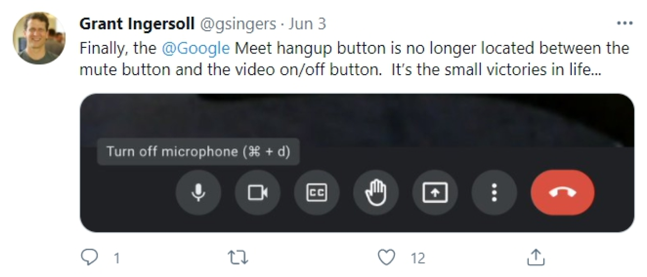
Also, you don’t have to move your eyes back and forth between the upper and lower bars anymore. All the controls are now being moved to the bar at the bottom of the screen.

The interface structure has improved. The elements are grouped by purpose. In the center are actions that relate to the call; on the right side are general and additional settings. All the content has become more holistic, even colors work better now — a dark interface helps to focus on the meeting making tiles stand out.
Maksym, UI/UX designer at Eleken
“Sorry, it’s the garbage truck driving by”
What usually ruins the working climate of remote meetings is surprisingly unorthodox background activities.
For a long time already, Zoom has had a bunch of features to camouflage your cluttered/embarrassing/illegal background noises and images. Google Meet now extends the range of its cloaking technologies to compete with Zoom on an equal footing.
The app now adjusts the light automatically, so that participants can see a bright picture of you even if you’re speaking from a dark cave.
Another promising feature is AI-powered autozoom, which is going to position you squarely in front of your camera even if you’re dropping out of frame.
Features like these are what separate good UX examples from examples of bad UX in video calling: the difference between a tool that quietly solves your problems and one that makes you manage them yourself. It's also a reminder that good UI bad UX is a real risk here — a polished interface means nothing if the core experience of being seen and heard clearly isn't solved first.
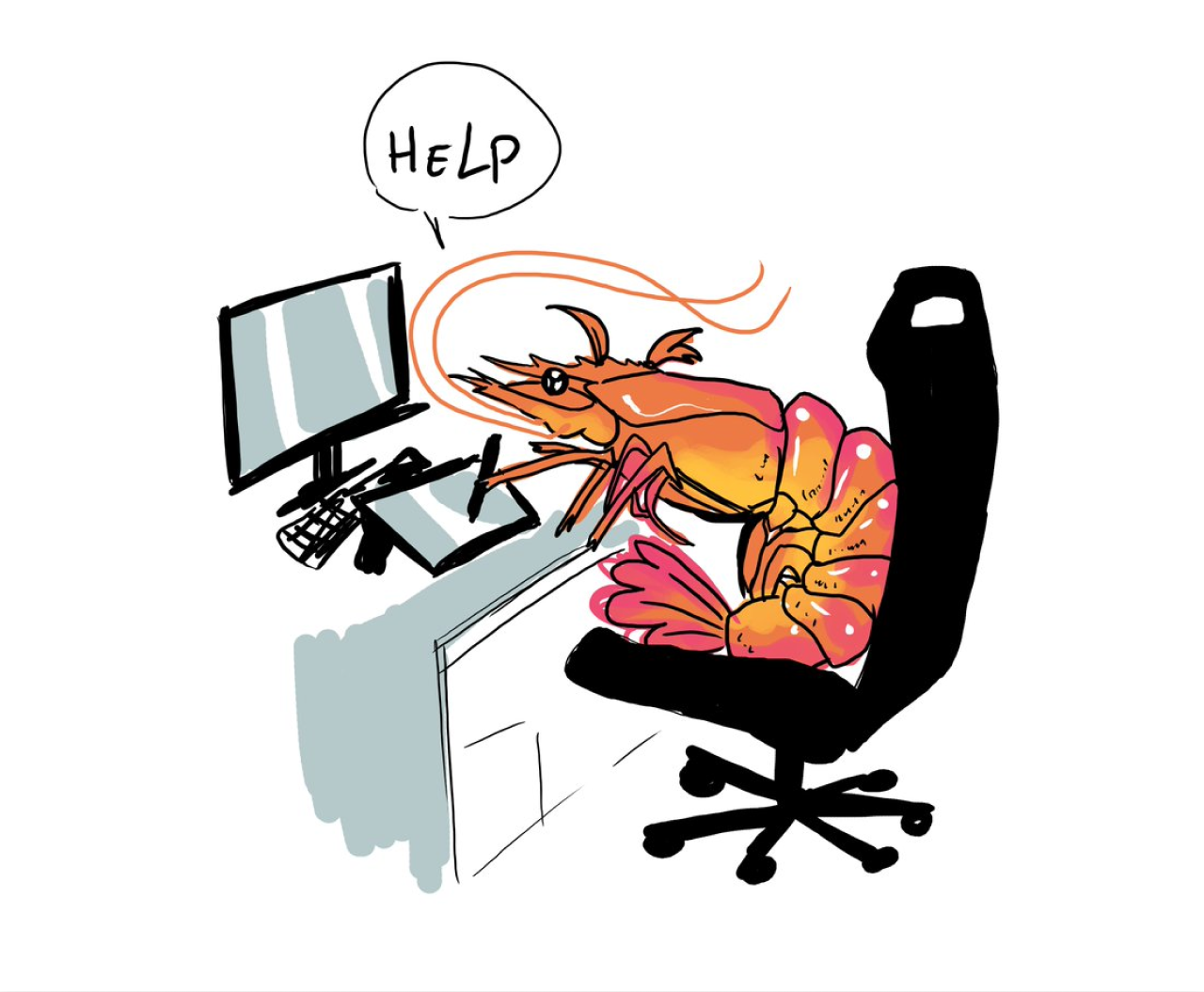
Love it. Now when it’s your third meeting today and you slide down the chair
being curled like a shrimp, Google camera will slide down with you.
Daria, UI/UX designer at Eleken
Video background replacement — I haven’t seen them yet in my updated version, but in its press release, Google promised us an opportunity to turn our messy room into a natural-looking classroom, a party, or a forest.
“Let me know when you can see my screen”
With the new Google Meet, you can finally see what you're presenting, so you know if they can see your screen without asking. The new feature also helps to avoid that awkward moment when all the team is waiting for somebody forgetful to stop screen sharing when the presentation is over. Removing that kind of low-stakes confusion is a textbook Linear app UX analysis lesson: the best UX improvements aren't dramatic, they just quietly eliminate the moments that make people feel slightly stupid.
Another helpful change in a screen sharing mode is that you can unpin your presentation to view it as a tile in the grid or a floating picture. You still can’t interact with content in the meeting window, but the ability to view the participants in addition to your own screen sounds promising. Small friction points like these are also part of why products fail to replace incumbents even when they're technically superior — and the Twitter redesign is a good reminder that reorganizing existing features without fixing the underlying frustrations rarely earns the goodwill teams hope for.
It's cool that you can share your screen with any collaborative tool being opened to work together and still see the faces of colleagues — feels almost like working side by side in a good old office.
Daria, UI/UX designer at Eleken
"Do we have everyone here?"
Now it is more convenient to control what you see during the call.
No need to guess who just joined — the re-designed participant tiles help to see everyone, up to 49 people, if you zoom out in your browser.
The updated app also gives you more control over self-view. If you prefer not to see yourself, you can minimize or even hide your own tile. Looks like this feature has a lot of fans.
This kind of thoughtful control over personal experience is exactly what the power of UX looks like in practice — small options that make a big difference to the people who need them. It's the same philosophy behind the best features in any Cron app review or the Gmail redesign: not more functionality, just more respect for how different people use the same tool.
In Zoom, you can hide your self-view, and I always do it. Your own face distracts attention from what people tell you. So I love that Google added a similar option.
Daria, UI/UX designer at Eleken
So what can we say about the Google Meet’s refresh?
Jen Aprahamian, Product Manager at Twitch, summarises the popular sentiment: well done, Google. We at Eleken agree with her.

Google updated its conferencing service to keep it competitive with services like Zoom, and refreshed its UI, giving it a neat look. Looks like everything worked out, but we all need to use it just a bit longer to see if there are any drawbacks.
Nice to have a free tool for calls that is no worse than its paid analogs. Actually, Google Meet won't be a free tool for very long now, but that's a story for another day. Now, let’s get back to work.
And if Google’s redesign inspired you to update your own app, remember that you can discuss your ideas with one little design agency that is very good at this sort of thing.