Just so you know, your redesign might not get all the applause you're expecting.
There’s a particular tiny little part of the human brain called the amygdala that is responsible for resisting redesigns. It reacts to unexpected changes as a danger and releases stress hormones into your body. So unless your redesign makes your Facebook feed chronological by default or introduces something that makes people say "FINALLY", they will hate it.
But we are here to help. At Eleken, SaaS product redesign services are among our most common, so we have redesigned dozens of SaaS apps over the last seven years. We’ve watched how other companies, big and small, implement redesigns, learned from their mistakes and now are willing to share this knowledge with you so you can avoid such pitfalls in the future.
Mistake #1: focusing on competitors
The tech market can be quite intimidating with all these startups popping up like mushrooms after rain and quickly becoming unicorns. In 2022, there were almost 900 unicorn startups worldwide and their total value exceeded $3.5 trillion. So even if you have a strong and steadily growing SaaS product, the competition still might feel a bit disturbing.
Still, it doesn’t mean that you have to turn your product into a Frankenstein, adding as many features from your competitors as possible. This is exactly what happened with Skype in 2017 when Microsoft decided to make the app more “competitive” and appealing to the audience.

The new redesign made Skype much more colorful and introduced Stories, making the app look and feel more like Snapchat. Other new features included bots and add-ins and were obviously inspired by Facebook Messenger.
Did the audience like it? Not really. A year after, Microsoft had to roll back the redesign, ditching most of the updates. Turned out that people valued their good old Skype for free chats, phone, and video calls, and didn’t use new features much.
What can we learn from this? Focusing too much on competitors might result and implementing unnecessary features instead of improving what can become better is not the best strategy to follow. So even if you find a feature everyone likes in Snapchat, Instagram, whatever, it doesn’t necessarily mean your audience could use it in your app.
Furthermore, sometimes being different can become one of your biggest advantages. This is just the case of one of our clients, Gridle — a CRM system for freelancers and small agencies. Instead of copying what their competitors do, they decided to focus on what helps them stand out, which was targeting small businesses and offering a very simple CRM user experience. In collaboration with Eleken Gridle managed to redesign their system and find their loyal audience that didn’t like complicated CRM systems.

Mistake #2: lack of communication
Remember that part when we told you people dislike changes? Well, it’s still possible to soften the blow of audience reaction by:
- introducing new features to end users before implementing them;
- explaining why you decide to implement them;
- telling how these features would improve the user experience.
On the other hand, lack of communication can result in misunderstanding, user disappointment, and, consequently, decreased engagement. One of the most prominent examples of that is Twitter and its infamous design updates.
Instead of presenting the long-awaited editing button, Twitter decided to surprise users with a new custom font, a high contrast color scheme, and new button colors. High contrast was probably the worst idea, since the high contrast is quite harmful for users, especially the ones who suffer from chronic migraines. This is a clear example of what can happen when you don’t talk to end-users and think you know what they want better.

After learning from Twitter's mistake, we at Eleken focused on communication when introducing a brand new feature to the student engagement app. While the app itself was a great solution, its workspace lacked navigation tips. Introducing a new feature, a complex dashboard, could potentially add to the user confusion, so we decided to use tooltips to explain the updates to the audience – and it worked well!
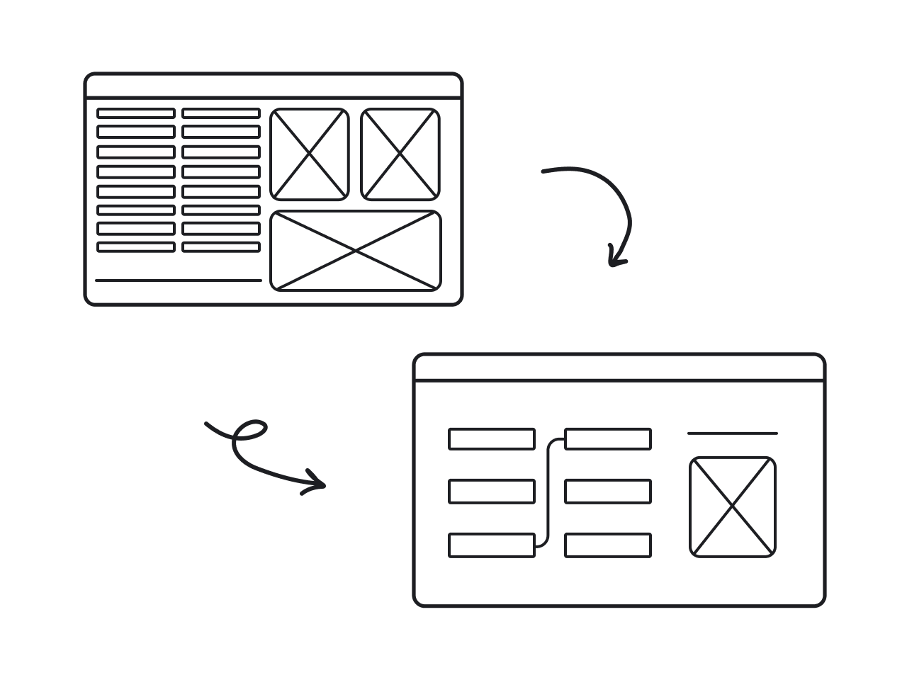
Mistake #3: not planning for scalability
It’s hard to predict if your SaaS product will succeed when you launch it. Still, you have to plan it with success in mind to know what to add to your MVP once your project starts growing.
When you don’t plan for scalability right from the start, it could become difficult to add new features, optimize user flows, and improve UI, especially if you don’t have the budget for that in the near future. For instance, Instagram wasn’t prepared to face such rapid growth, crossing the mark of 100,000 users after only six days after release. This resulted in performance issues that could potentially be avoided.
At Eleken, we faced the same issue when working with Acadeum, an eLearning app for students and educational institutions. When Acadeum turned to us, they already had two versions of the app, one for students, and one for the college admins. As they were focusing on two target audiences at once and were scaling quickly, the number of support tickets kept increasing, and so the improvements in the design had to be made.
The student app has been already fixed and updated by the company in-house designer. However, they needed someone from the outside to redesign the admin app while maintaining the same look and feel the student app had, improve the questionable user flows and deliver an updated app within three months. This was a challenge that we were willing to take and the result left both us and our client deeply satisfied.

Mistake #4: redesign-resource misalignment
Sometimes it’s simply impossible to resist the temptation to make your solution more modern and add some bells and whistles during the redesign to make the solution look more impressive. After all, developers can implement it in any case, right?

Not quite. Most often developers have to write custom code to implement certain design decisions. Depending on the decisions, this could be quite easy and affordable in some cases, and complex and costly in others.

While this might not seem like a problem to companies with enough financial and technical resources to spare, it might become a burden to startups and small companies that don’t have such big budgets and teams.
But even in this case, a smart redesign approach can save the day. When we faced a similar situation with Gamaya’s redesign, we decided to give up custom elements to make the solution more budget-friendly for the client. Instead, we used ready-made components. This didn’t make Gamaya less appealing to the target audience, but helped the client to optimize resources.

Mistake #5: not testing with end users
What is the simplest way to find out if people like your redesign? Ask them to try it. Testing not only helps to identify issues and bugs before the improved version is released but also helps understand if your users will find it easy to use.
This is what Dropbox neglected when they were updating their Plans page. Here how it looked after the update:

As you can see, Dropbox added some color and a cute illustration. It seemed that nothing could go wrong. But users’ reaction proved different. After a short period of time Dropbox noticed that several of its performance metrics dropped and changes in design were behind this drop.

In the end, it seems that the color choice negatively affected the page’s performance, so the team had to redesign.
And here’s an example that proves that user testing is worth it. One of our clients, SEO Crawl, treated testing very seriously and showed each redesigned screen to their customers. This helped validate the improvements and ensure user satisfaction. Although people usually dislike massive redesigns that make a product less familiar, in this case SEO Crawl gained a fresh, more modern look that received very good feedback from users.


Don't forget who you're redesigning for
Even though people are biologically wired to resist changes, there still are ways to overcome this phenomenon. All the mistakes described above lead to one clear conclusion: if you redesign without talking to end users, it's not worth it. So, find out what irritates your audience in the existing version of a product. What is okay but not good enough? Do they want these brand new features that you plan on introducing or not?
Addressing users' triggers and pains will help you overcome the initial redesign resistance. Because while people dislike changes, they also like when their problems are solved.
Eleken can make your redesign experience more productive and definitely less intimidating. Contact us for a free consultation and let’s make people's lives better together!