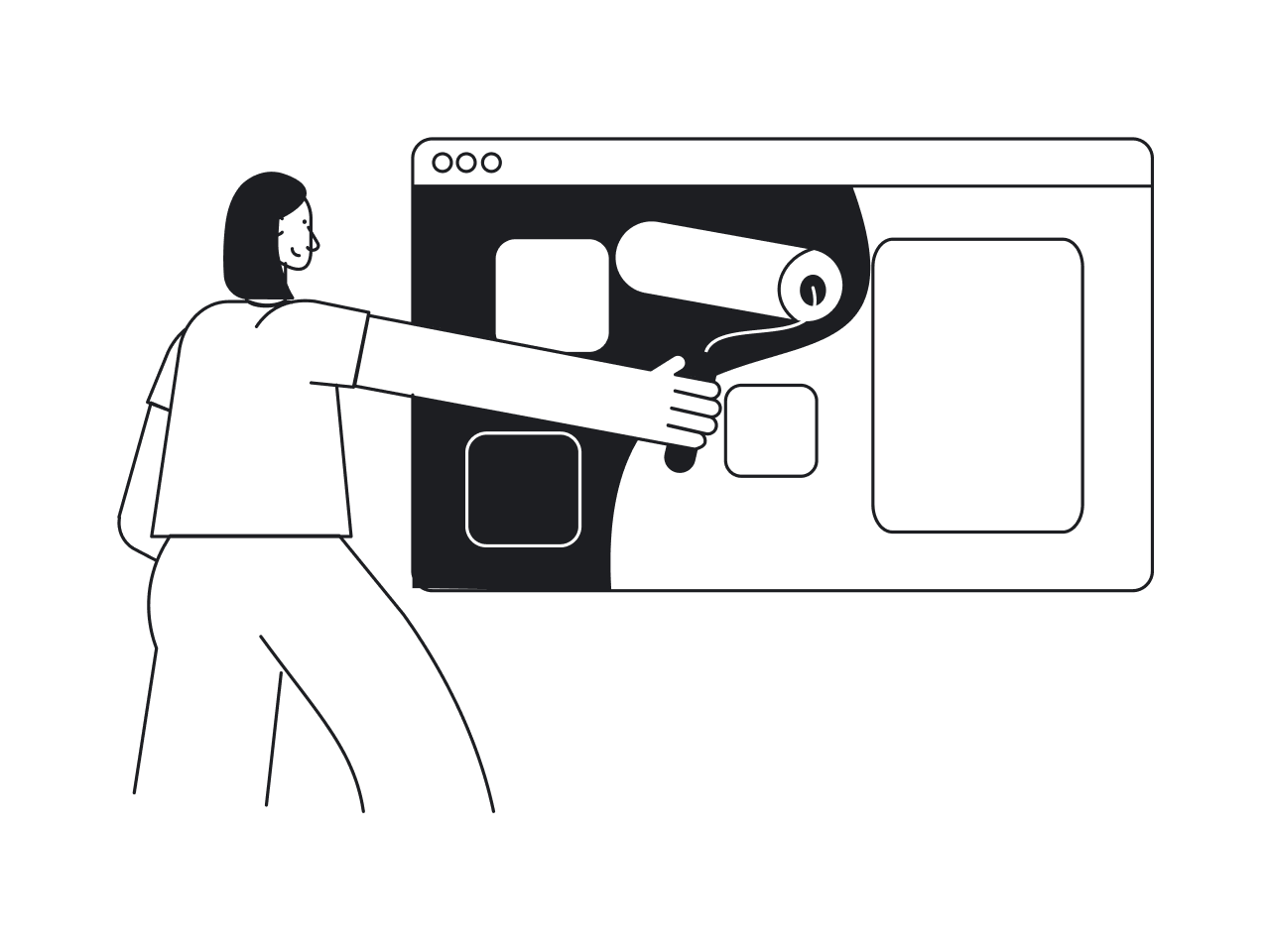
The first question you have to ask if you decided to change something in your UI/UX is not “How to redesign an app?” but “What is the purpose of doing a redesign?” The redesign is a bit controversial: some entrepreneurs think of it as a magic pill that will save them from all their troubles, while users often painfully perceive any changes in the application interface that they got used to.
As a design agency, we had a chance to refine more than one application. And from our experience, we can say that in some cases changing the design really makes wonders.
For example, when we were working on Gridle, a client experience platform, we had to not only refresh the UI but also improve the way clients interact with the app. Researching Gridle’s customers allowed us to identify their needs and pain points and as a result create a more professional, up-to-date, and usable application that users are excited about.
At the same time, there were many cases when we refused our clients to redesign their app, as it was not the solution to their problem. So, how to understand if you need a redesign and how to do it in a proper way?
In this article, we are going to discuss not only the redesign itself as a process, but we will also explain how to understand if you need changes in your UI/UX.
Reasons for the app redesign
The functionality of the application, its loading time, and stable work are for sure essential for a successful product. Still, the first thing a user pays attention to when launching your app is what it looks like.
According to Toptal, 94 % of first impressions are design-related. And in many cases, if the user doesn’t have a strong initial interest in the application, poor design can easily make them give up on your product.
Now, that you understand how powerful the design can be let’s talk about situations when you may need to consider redesigning your application.
Outdated aesthetics
Modernization is a natural stage in the life of any brand, as it allows a company to reach a qualitatively new level. Any kind of interface will sooner or later require updating. This is inevitable in the context of constantly changing trends and users’ tastes. Over time, even the most successful UI that once looked stylish and modern will seem outdated.
Do you remember Flash menus?

Or using Flat graphics where you can’t figure out where the button to click is.

Of course, it is not necessary to follow every new trend in UX/UI design or develop an interface from scratch, but it is definitely worth updating the application periodically to meet modern standards.
To get some fresh ideas, take a look at how top companies design their app’s UI's.
Negative customer reviews
What do your mobile app users complain about? Bad app ratings, reviews from clients with complaints, and negative feedback to customer support mean you need to change the design of your apps. Still, there is a positive aspect in such a situation as well. If you have feedback from users (even negative), it’s easier to understand what component/feature of your app doesn’t work properly and what you need to improve.

Complex interface
This reason for refining the application is quite common as products very often become too complex especially over time when you add new features and the interface becomes cluttered. It is especially relevant for SaaS apps that are usually quite complex as they perform a lot of functions. To ensure a smooth user experience and avoid complexity cloud software interface should look and feel as simple as possible.
When Uber added new service offerings it appeared that the screen was too small to display all options together and users used to choose the wrong product. The solution to this issue was to first ask clients about their destination (add “Where to? section”) and only then show the pricing, the route, and other pop-ups.

Rebranding
Sometimes holding onto an old image just doesn't make sense. And it may be not only that the design is outdated - a fresh look and a powerful advertising campaign can give a brand a second life. It evokes the interest of existing customers and helps to find a new audience.
Though Airbnb was a successful platform, over time their brand didn’t fit their new product vision. In 2014 Airbnb decided to define its clear brand identity so that people would understand its core values and principles. During the redesign, they changed the logo, changed typography, and even introduced the color they called Rausch. As a result, with the help of design, they positioned their product as understandable, approachable, and appealing to their customers.

Didn’t find any situation that would correspond with your use case? Maybe you just don’t need a redesign.
When the redesign is not a solution
If you as a product owner understand what problems you want to fix/what user behavior you want to change by rethinking the UI/UX of your application then redesign can be helpful.
In case you want to:
- make it pop
- add cool animations
- turn the application into a piece of art
- just make it cool
- change the design into something outstanding, and so on.
… then it’s better to spend some more time on research and think about what exactly you want to achieve.
It is important to understand that you cannot do a redesign for the sake of a redesign. If changing the look and feel of an application does not give the end-user absolutely anything new or useful, then it is definitely not worth doing.
And finally, as paradoxical as it may sound, redesign is not a designer's task. Rather, it is far from only their task. A complete redesign of applications (as well as the development of an interface from scratch) involves the participation of a whole team of specialists - a designer, marketer, business analyst, etc. That’s why changing the visuals or color scheme of the app alone probably won’t help you.
If you still think that your product needs changes read further to learn the redesign process steps.
Steps for the app redesign
In this section, we are going to discuss stages of a redesign as we define them in Eleken. Basically, when we have this type of collaboration, we divide the redesign process into two broad stages: UX audit and redesign process itself. Those stages in their turn are divided into smaller steps. You may see them in the scheme below.

Though, we’ve just mentioned that there are two main steps in the redesign process, when refining the UI/UX of the application, the first and probably the most important pre-stage for you as a product owner would be to define the reason for a redesign.
Define the goal
The first step in designing or redesigning a product is defining what you want to get as the final result.
We’ve already discussed a possible situation in which you may want to revamp the product.
Still, to correctly define the objective pay attention to the following points:
- Are there any issues with your UI or UX that you know for sure? When answering this question remember that “I don’t like the look of my product” is not the reason. Analyze your app, but remember that you are not the customer and your feelings alone are not enough to correctly define your clients’ pain points.
- Have you analyzed the drop-off rate? Building a user journey map will help you understand at what point users have troubles and stop interacting with your application
- Do you know what users think about your product? Monitor reviews that users leave your app, ask for feedback, and talk with your clients to understand exactly what the app lacks.
During this stage always collect the evidence to support each of your decisions. Once you’ve defined the goal, you should bear it in mind throughout the whole redesign process.
UX audit
The main purpose of any application is to solve a problem of its target audience. To quickly and effectively fulfill this goal an app has to be usable, with a consistent and intuitive layout and appealing look. By conducting a UX audit you will gather all the needed information to identify the drawbacks of your existing design and understand what interface elements you need to improve to make your product more effective and successful.
The results of the audit are usually presented in the form of a report with a detailed description of the app's problems. It can be an empathy map, customer journey map, or similar.
UX audit is a ready-made guide to improving the user experience. In our another article, we have touched upon most essential steps of how to conduct a UX audit so go check it out if you'd like to learn more details.
Still, in simple terms, UX audit allows one to:
- identify UX problems based on human factors principles
- understand the way people use different product features as well as identify what functions of competitor’s products they find the most useful
- find out the preferences, needs, and behavior patterns of the target audience
- determine the critical requirements your audience has to your product
- understand the strengths and weaknesses of your product and get ideas for improving the design
Check UX audit examples as well and let’s move to the next step.
Redesign process
After the UX audit service is completed, we can move to the redesign process itself to organize all the insights into the effective design solution.
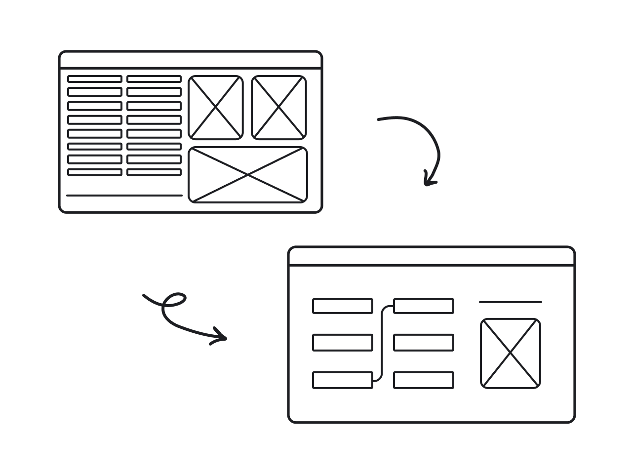
The redesign often includes restructuring the existing design into a unified system. This includes typography, colors, icons, illustrations (if any), elements style, and relation logic between them. In some cases, it may also involve a complete rethinking of whole screens or even chunks of the product, including removal of some elements, renaming or rewriting complete pages, and much more.
Visual solutions for all screens of the product
During the process of redesign, a designer will:
- create a wireframe that presents all of the most important interface elements and describes how they should interact with each other.

- build a dynamic prototype of the application to sufficiently evaluate the appearance of the application and the logic of interaction between elements.

- test the prototype to identify gaps and potential for improvement until the application can finally be sent to developers.
UI kit
UI Kit is a set of all the elements on which your product's UI is built (UI elements). In fact, this is the visualization of each of the elements at any stage of the user's contact with the interface.
User interface kit is used to simplify, unify and integrate large projects. It allows you not only to quickly and efficiently create each next app component based on the sample of the previous ones, but it is also the main design document of the project, which is used by designers, and developers at every stage of work on a project.
Below you can see an example of a UI kit that we created for our client HandPrinter.

Test and monitor the feedback
The essential stage of any design process is testing. Once you’ve got a new visual solution for your app it’s time to show it to your audience and see their reaction. After all, you’ve come through this whole process to make your product better, easier, and more effective for your clients.
A redesign is not your final destination, it’s a process. Therefore, never stop testing and improving your product.
Summing up
There are examples when companies do a redesign only to give a new look to their app. Such an approach usually leads only to the time and money spendings and the core problem of the app remains unsolved.
If you do decide to redesign your application, you should think carefully about how to improve not only the appearance (UI) but also the feel of the application (UX).
To avoid all risks a redesign can bring and improve the app in the right way, you need to choose a reliable design partner.
In case after reading this article you know for sure your app needs a redesign and you need some help cleaning up the entire UI/UX, our team will gladly help you create an app that would better serve your customers and help you reach business goals. Drop us a line and we will gladly answer all your questions.


