


As a team of SaaS product designers at Eleken, it’s part of our job to stay informed about the latest UI trends. We regularly search for cool design ideas and share them with our colleagues through Slack. Now, we've decided to extend this knowledge beyond our team and compile a curated list of web design homepage examples for a wider audience.
Before we dive in, let’s figure out what criteria our designer used to analyze user behavior in the homepage examples you’ll find further in the article.
What makes a great homepage design?
We've identified several critical factors that can make or break a homepage's effectiveness. These criteria not only guided our selection process but also serve as valuable benchmarks for anyone looking to create or improve their own homepage layout.
- Information architecture: evaluating how content is organized and how easily users can find information, with a strong focus on mobile UX design.
- Visual design: assessing aesthetic appeal, use of color, typography, and imagery to create an engaging experience, often explored and refined through Adobe XD design.
- Responsiveness: checking how well the design adapts to different screen sizes and devices to maintain a user friendly design.
Now, let’s move to the first website example.
1. Postscript
.gif)
Postscript is a platform that helps businesses grow their audience and increase revenue through personalized SMS marketing at scale.
- Information architecture: clear, intuitive content organization. The navigation is easy to use, but two CTAs (*Start Free Trial*, *Book a Demo*) could overwhelm users. A single CTA might be more effective.
- Visual design: modern and visually appealing. Strong contrast, clean typography, social proof via brand logos adds credibility. What we wanted to pay special attention to is animation in the hero section. It does an excellent job of adding dynamism and creates a sense of interactivity. It's well-paced and doesn't distract from the key messaging.
- Responsiveness: the simple layout and clear CTAs ensure mobile-friendly usability.
2. Gaiia

Gaiia is an all-in-one platform that simplifies billing, operations, and automation for Internet Service Providers (ISPs).
- Information architecture: the content is well-organized, with a clear value proposition, “The simplest platform to run your ISP,” placed prominently. The CTA (Request a Demo) is distinct and centrally positioned, guiding new visitors to take immediate action. The navigation bar is minimal, with essential categories like Products, Stories, and Blog. This simplicity avoids overwhelming users.
- Visual design: the design is clean and modern with nice colorful accents. Also, pay attention to the stylish icon designs in “An all-in-one solution section”. The bold typography of the headline is clear and emphasizes the simplicity of the platform. Finally, we can’t help but mention the dashboard screenshot helps illustrate the product visually, showing real-world usage and functionality.
- Responsiveness: Gaiia’s website design works great on mobile as well; all blocks scroll smoothly, and the CTAs are big enough to be able to be clicked comfortably.
3. Lago

Lago is an open-source, scalable billing platform that helps businesses manage metering, usage-based billing, and automation at any stage of growth.
- Information architecture: the layout of the homepage organizes different elements clearly, starting with a prominent value proposition (“Welcome to the future of billing”), followed by key features like real-time usage metering, user testimonials and more. CTAs (Book a demo and Deploy Open Source) are centrally positioned, making it easy for users to take action. However, we’d recommend adding one more “Book a demo” CTA at the end of the homepage.
The top navigation is simple and uncluttered, with essential links like Product, Developers, and Customers, making it easy for users to find what they need quickly.
- Visual design: the first impression is the home page design is minimalistic and professional but lacks some dynamics. However, there are a lot of interactive design elements that work great on this layout, like product features that you can click on as if it’s a real app screen, company details that appear as you hover over company logos that work with Lago, and more (try to explore yourself).
- Responsiveness: All the interactive elements look not that effective in the mobile version of a website homepage, some images are a bit blurry. Still, in general, every element on the homepage works as it should. By the way, the mobile version has a CTA at the end of the page.
4. Exa.ai

Exa.ai is an AI-powered search engine that provides precise, relevant data from across the web using advanced embeddings for AI applications.
- Information architecture: the flow of information is logical, starting with an introduction, followed by benefits, specific features, and ending with real-world use cases. The top navigation menu is simple and functional with clear sections and interesting icons that correspond to the overall web page design. However, some blocks need more attention, as they feel overwhelming and cluttered, like “Only the data you need, no clickbait”.
- Visual design: CTAs, images, icons, and everything else on this homepage are kept in the same style, which effectively supports the technical nature of the platform. However, as was already mentioned, some blocks are overwhelming and miss a good hierarchy of text sizes which together with too many color accents, fail to guide the user's attention.
- Responsiveness: the mobile version feels less cluttered and is responsive. Still, there are too many elements with horizontal scroll.
5. Doppler

Doppler is a platform that securely manages, orchestrates, and scales secrets management for developers and teams, helping them handle sensitive data efficiently.
- Information architecture: the homepage delivers a strong, immediate value proposition ("Centralized Secrets Management Without the Chaos") followed by supportive subtext and a prominent CTA (Start For Free). Information flows logically, which helps guide users through the page. The navigation bar is clear and offers direct access to key areas like Platform, Solutions, and Customers.
- Visual design: the design is visually appealing and has a futuristic vibe, with a dark theme complemented by vibrant purple, orange, and green accents. These bold colors highlight key areas, such as CTAs and interactive elements, making them stand out against the background and connect users with key actions. The typography is clear and bold, and the font size and hierarchy are well-balanced, making the content easy to scan. And, of course, all the imagery fits perfectly into the overall homepage design.
- Responsiveness: all the main sections are preserved in the mobile version as they look on the desktop, the site loads fast and all the elements function properly.
6. Flutterflow

FlutterFlow is a low-code platform that enables developers to build and launch custom apps quickly using a visual interface.
- Information architecture: the page flows well, leading users from the value statement to product features, social proof (trusted by companies like Google and IBM), a breakdown of its key functionalities, and user feedback. All the blocks of information are logically grouped and visually distinctive. Except for the top navigation menu, which is concise and well-structured, there is also a side menu that guides the viewer through the main product’s features, which we think is a practical decision.
- Visual design: we love the dark theme with purple accents, which aligns well with its developer-focused audience. There’s a good balance of text, visuals, and animations that make the page engaging but not oversaturated. The typography is bold and clean. It highlights important sections with enough contrast to make the content easily scannable. The hierarchy is well-established, guiding users’ attention from the headline to specific features and CTAs.
- Responsiveness: the mobile version design looks much simpler. It has bigger chunks of text and fewer visuals, which makes it feel a bit heavy. While users can still easily find and read the content, there's one big problem: important trust-building elements are missing. You won't find customer reviews or the list of companies that use their product, which are usually helpful in showing that a business is reliable. Despite these issues, the content is still organized in a way that makes sense and is easy to follow.
7. AssemblyAI

AssemblyAI provides state-of-the-art speech-to-text and audio intelligence APIs, allowing developers to integrate powerful voice recognition and transcription into their applications.
- Information architecture: AssemblyAI's homepage is structured specifically to appeal to developers, starting with the core value proposition. The structure flows well, from high-level benefits to more granular API capabilities, ensuring both business users and technical developers can find what they need.
- Visual design: with the help of visual design, Assembly effectively break up its content into smaller, easy-to-read sections.
The hero section is uncluttered, which enhances the effectiveness of the main CTA, but the overall design is text-heavy (even images contain a lot of text). So, the homepage could benefit from more dynamic visuals or micro-animations to create a stronger first impression and engage users better. - Responsiveness: the mobile version looks and feels much cleaner regarding text and visuals. The CTA buttons are easy to spot and large enough to tap comfortably. In general, the homepage works smoothly on mobile devices.
8. Pythagora

Pythagora is an AI-powered development tool that helps developers build apps from scratch by simply talking to it, enabling code writing, debugging, and deployment through conversational commands.
- Information architecture: Pythagora uses storytelling approach as a perfect example of guiding users through content naturally. Starting with an engaging headline, followed by a clear explanation of what Pythagora does, they immediately support this with examples for better understanding. Then smoothly transition to product features and technical capabilities. This logical flow keeps visitors interested and encourages them to explore further.
- Visual design: The dark-themed design, with purple and neon accents plus bold typography, grabs attention and gives the homepage a futuristic and tech-centric feel, which aligns well with the developer audience. All the visuals on the page complement the content and make the user experience more engaging.
- Responsiveness: During our analysis, the entire layout of the Pythagora mobile version appears misaligned, shifting to one side, and the hamburger menu isn't functioning properly. Whether these are temporary glitches or permanent issues, the current mobile website fails to provide a responsive experience.
9. Nash

Nash offers a platform that manages, orchestrates, and scales last-mile delivery logistics for companies, optimizing their delivery operations.
- Information architecture: the overall structure of the page is clear and direct. Users have quick access to important actions, and the structure moves seamlessly from the value proposition to trust-building elements and a breakdown of workflow optimization, making it easy for users to understand what the platform offers. However, there’s a block with industries that can benefit from Nash with a horizontal scroll. It’s not critical, but content that requires horizontal scrolling might go unnoticed by users and can increase the cognitive load.
The top navigation bar is minimal, with clear access to useful.
- Visual design: Nash has a clean, modern aesthetic with a great use of negative space, which enhances readability and user focus on key elements. The light color palette with lime green accents for CTA buttons that stand out against the white background draw the user’s eye to important actions.
The typography is well-chosen — the content is easy to scan and the whole look seem consistent.
The page uses minimal imagery, relying instead on client logos and a visual workflow illustration. Still, in Nash's case, the restrained use of graphics is an excellent example of clarity and focus which makes the page feel purposeful.
- Responsiveness: the clean layout and ample white space adapts well to mobile devices. The site remains accessible on smaller screens without overwhelming users.
The horizontal scroll section works effectively on mobile, showcasing one industry at a time. However, the "Solutions for every stakeholder of the delivery journey" section feels overwhelming with too much text. Adding animations or visuals would help break up the content and make it more engaging.
10. Ashbyhq

Ashbyhq is an all-in-one recruiting platform designed to streamline hiring processes for businesses of all sizes, from startups to large enterprises.
- Information architecture: Ashby’s homepage is well-organized. It quickly conveys the purpose of the product as an all-in-one recruiting platform and introduces features like platform capabilities, client logos for trust, and customer testimonials. The navigation bar is well-labeled. However, they could make it a bit more concise by putting Blog category into Resources.
- Visual design: The design is clean and uses the white space wisely. Purple highlights create a cohesive visual theme, making important buttons stand out. Clear headlines are easy to read, however, the body text lacks contrast.
One design issue we noticed is the placement of feature icons directly below the company logos. These elements visually blend together, making it difficult to distinguish between the social proof section and the features overview. This placement creates visual clutter in an otherwise clean layout.
- Responsiveness: The design scale well to different screen sizes, with bold CTAs and product descriptions remaining readable and accessible on mobile devices. The clean layout and minimal text ensure that the site remains navigable and user-friendly across both desktop and mobile experiences.
11. Raycast

Raycast is a powerful productivity tool that serves as an extendable launcher, helping users streamline tasks, automate workflows, and navigate their computer more efficiently.
- Information architecture: The homepage organizes content logically. However, Raycast takes an unconventional approach. While most homepages use big, bold headlines or different blocks of colors to separate content blocks, this homepage divides the information with negative space. Still, as the whole page has a dark theme, it looks somewhat unusual.
- Visual design: the dark, high-contrast colour design with bold red and black visuals creates a strong visual impact and some sense of mystery. The imagery feels dynamic and futuristic, which matches the product’s core offering of speeding up workflows. However, the intensity of the color scheme may tire users over time.
The fonts work well. However, the contrast between headings and body text is slightly aggressive, making it not accessible. - Responsiveness: The layout and content scale down effectively for smaller screens, but accessibility issues remain unsolved.
12. Getfluently

Getfluently is an AI-driven English learning app that provides personalized feedback on real-life speech to help users improve their language skills based on their specific needs.
- Information architecture: The content is logically structured, moving from benefits and product features to testimonials and supported platforms. It’s really easy to understand tGetfluently's offerings and how to get started. However, there’s no navigation menu at all, which limits user navigation options and might frustrate visitors looking for specific information or wanting to explore different sections of the website.
- Visual design: The dark-themed design, with contrasting blue and green highlights, is visually appealing. The use of icons and AI-generated reports adds visual interest and clarity. What grabs attention a lot are large, bold headings, which are definitely easy to read, and huge CTA buttons.
- Responsiveness: The layout and content are well-suited for mobile devices, with large buttons and a streamlined design.
13. Beacons

Beacons is an all-in-one platform that helps creators build businesses by offering tools like link-in-bio, media kits, email marketing, and brand outreach, powered by AI.
- Information architecture: the content is organized effectively, clearly highlighting key features like link-in-bio, email marketing, invoicing, and media kits, making it easy for creators to find relevant information.
- Visual design: We'd describe Beacons' UI style as bold and vibrant. Large typography and imagery of creators create an engaging and modern appeal. While some sections might appear cluttered with dense text and visual elements, potentially affecting readability, this busy aesthetic works perfectly for their target audience of content creators.
- Responsiveness: in general, the design adapts well across screen sizes. The use of large buttons and simplified layouts for mobile makes it user-friendly on smaller devices. However, the section that demonstrates projects made with Beacons is blurry and not responsive at all.
14. Lattice

Lattice is an HR platform that helps businesses manage performance reviews, employee engagement, goal setting, and real-time feedback to enhance productivity and team alignment.
- Information architecture: as for the structure of the page, it has clear hierarchy that guides users through product features, benefits, and testimonials. Navigation is also straightforward.
However, in some sections, shortening the text information of changing its typography might enhance scannability.
- Visual design: The website looks polished with its matching colors and smooth gradients, while consistent font choices keep everything looking neat. Small animations scattered across the page make browsing more engaging. However, the hero section tries to do too much at once – there's too much text, too many color highlights, and too many images competing for attention. It’s better to direct all user’s attention to the main CTA.
- Responsiveness: The hero section looks better on mobile but still doesn't show users where to click first. The important parts of the website work well on phone screens, but the action buttons should be bigger to make them easier to tap.
15. Harmonic

Harmonic is a startup discovery engine that provides venture capital firms with insights and data to find promising startups, monitor trends, and make data-driven investment decisions.
- Information architecture: Harmonic home page is really easy to navigate. Starting with logically structured content and clear flow and ending with a sticky navigation menu that stays with the user but doesn’t prevent them from exploring the page.
- Visual design: the UI is all about being simple, clean, well-structured and easy to comprehend. The use of white space, a minimal color palette (red, green, and gray), and clean typography enhance readability. The design feels modern and professional, and the balance between text and visuals is well-maintained.
- Responsiveness: the layout adjusts seamlessly to different screen sizes, maintaining readability and usability.
16. Zeabur

Zeabur is a platform that simplifies and automates application deployment and scaling for developers, allowing them to manage coding projects efficiently without configuration hassles.
- Information architecture: information on the page is divided into logical sections that are easy to scan. They flow logically, from high-level value propositions to specific features, making it intuitive to understand what Zeabur offers.
- Visual design: a trendy combination of dark theme, gradient background, and bold typography is what makes this page stand out. There are also engaging animations as visitors scroll between sections. We also like the way content blocks create a clear visual hierarchy, making the information easy to understand.
- Responsiveness: The layout appears to be responsive, content elements (like buttons, text, and visuals) resize appropriately, and animations are reproduced smoothly.
17. Multiplier

Multiplier is a global employment platform that helps businesses hire, onboard, and manage international teams, offering payroll, compliance, and HR solutions across 150+ countries.
- Information architecture: everything about Multiplier’s homepage IA is clear: its content hierarchy, pathways to other pages on the website, and categorization of content. The visitor can quickly understand where they are and how they can get to the needed place.
- Visual design: overall, the UI design gives a welcoming and friendly atmosphere with its bright color palette and a great use of white space. The minimalistic style keeps the user’s attention on the key messages. Plus, the use of product images and human faces helps create a connection and shows diversity. Iconography is used effectively to highlight features and break up text-heavy sections.
- Responsiveness: the design appears to be well-optimized for various screen sizes, with large buttons and clear CTAs that translate well to mobile and tablet formats. You can pay special attention to how Multiplier designed their extensive top navigation menu to properly display each subsection.
18. Prozora Network

Prozora is a cost-efficient, real-time payment network designed for Ukrainians and Ukrainian businesses to receive and send funds instantly.
- Information architecture: the site follows a clear standard structure, with a minimalist navigation bar, allowing users to quickly explore sections relevant to banks, partners, or information about the company.
- Visual design: Prozora has aesthetic appeal with a cool-toned gradient background that feels approachable and trustworthy. The choice of typography is also great; the text is readable, and large headings effectively divide content blocks. As for the imagery, there is a subtle use of it, focusing on diagrams and icons rather than traditional photography, which suits the fintech industry well.
- Responsiveness: in general, the layout remains intact without cutting off important elements on smaller screens. However, the mobile version feels a bit text-heavy and lacks visuals or some engaging elements.
19. Continue.dev

Continue.dev is an open-source AI code assistant that enhances developer productivity by offering custom autocomplete and chat features directly within IDEs like VS Code and JetBrains.
- Information architecture: the site has a clear focus on developers and their needs and a logically structured narrative. Key features (AI code assistant, integrations with VS Code and JetBrains) are highlighted prominently.
- Visual design: light and clean design, together with smooth gradients, translucent textures, and soft lighting effects, create special aesthetics and a sense of cutting-edge technology. The typography is also clear, and headings have an appropriate hierarchy to guide users through the content. The animation makes the experience even better, from seamless section transitions to the glassmorphic animated sphere.
- Responsiveness: though the layout adapts well, ensuring usability on mobile and desktop, there’s no animation in the mobile version, so the homepage loses its special aesthetics.
20. Aboardhr

AboardHR is an employee onboarding and HR management software designed to enhance workplace engagement and streamline HR tasks.
- Information architecture: the homepage effectively organizes content into clearly defined sections (employees, absence management, HR essentials). The headings are concise, and content is placed into small blocks. So, the overall page is easy to navigate and doesn’t overwhelm the user.
- Visual design: UI is friendly and playful which aligns with the brand's tone ("Bring joy to your workplace"). The use of soft colors, emojis, and illustrations makes it approachable. Clean typography and contrast between headings and body text make it easy to read and scan.
- Responsiveness: text, buttons, animations, all interactive elements remain functional and easy to use on mobile devices. The page loads smoothly.
21. Dante AI

Dante AI is a platform that enables businesses to create and deploy AI-powered chatbots quickly and efficiently.
- Information architecture: the layout is simple and hierarchical, making the essential information easy to find. Clear headings guide users through the content, helping them understand features and benefits quickly. An interesting decision here is that Dante AI didn’t place a traditional hero section CTA button. Instead, they use a sticky navigation menu with a prominent "Start for free" button that follows users as they scroll, remaining visible throughout the homepage.
- Visual design: as you may have noticed, dark UI and purple accents are quite popular for tech products, especially Ai-powered. Well, it’s a current UI/UX trend but it does manage to create a professional and modern look. The use of fonts and their sizes is effective and readable, except for the fact that there are a lot of sentences with low contrast.
- Responsiveness: the site maintains readability and functionality on both mobile and desktop views.
22. Lempire

Lempire is a suite of SaaS tools designed to help businesses grow by enhancing their email outreach, scheduling, and personal branding efforts.
- Information architecture: the homepage clearly organizes different product offerings in a modular structure.
- Visual Design: the unique thing about Lempire’s UI is its interactive elements in each block of content. Interesting animations, visuals, and slider designs for certain sections make you want explore the page.
- Responsiveness: though many companies decide to omit interesting, engaging elements in their mobile versions, Lempire homepage maintains all core elements such as icons, CTAs, and navigation, and animation in a user-friendly way.
23. Making Today

Making Today is a productivity platform that gathers work tools in one place to help users stay organized and reduce tab fatigue.
- Information architecture: the content is well-structured and divided into logical blocks with a clear focus on the core value proposition: "Get Organized.". While the sticky top navigation menu is minimal, it overlaps some content during scrolling, which may impact user experience. Additionally, there's very little homepage copy on the product, so the user may leave the homepage without their questions answered.
- Visual design: what to pay attention to in Making Today’s design is definitely their use of visuals and animations. Together with minimalist design and lots of white space, the homepage has aesthetically pleasing and engaging vibe.
One more thing to mention here a dynamic CTA using bold text that changes between "Making Today Fun/Easy/Worth It" at the end of the page. While this fits the overall design, it doesn't look clickable enough, which might confuse some users.
- Responsiveness: content remains legible and accessible, with key CTAs remaining visible across devices. The navigation is hidden in the hamburger menu but lacks contrast. Most animations that impressed us at the desktop version are absent on mobile. Still, the overall functionality remains solid.
24. Campsite

Campsite is a team communication platform that replaces noisy chats with focused, organized posts to facilitate thoughtful collaboration and deep work.
- Information architecture: what we like about the structure here is the way Campsite supports their key product features with real user feedback. As well, the "Common questions" section adds clarity and enhances user trust.
- Visual Design: this is a good example of minimalist design using a strong color contrast to draw visitor's attention to important elements, like CTAs. The typography is clean and legible, with appropriate font sizes for different sections.
- Responsiveness: the minimalist design with simple layout and lots of white space scales well across different devices. No problems here.
25. Scaleup Finance

Scaleup Finance is a financial management platform that helps founders, CEOs, and finance teams streamline their financial operations through automated reporting, budgeting, and expert CFO services.
- Information architecture: everything is well-organized at Scaleup’s homepage. There’s a good balance and hierarchy between the use of text, visuals, and white space – just as you expect from finance app.
- Visual design: the first thing that comes to mind when visiting this homepage is “it’s professional.” The use of green and black provides a subtle but effective emphasis on key elements. Fonts are clean, and readable. The product mockup together with context-related images creates a polished, complete look.
- Responsiveness: the design stays clean and functional across different screen sizes. Icons and buttons are touch-friendly, and the layout is mobile-optimized without feeling cluttered.
26. Ramp

Ramp Travel is a platform that simplifies business travel management, from booking to expense tracking, with policy enforcement and automation.
- Information architecture: well-organized layout, starting with a clear product introduction with video presentation, leading users through key features, and ending with calls to action.
- Visual design: one more great example of a clean and polished UI with a strong focus on readability due to the minimalistic color palette. The contrast between the white background and the use of black and bright yellow highlights makes the homepage visually appealing. As well, Ramp has an effective use of imagery (like hotel maps) to contextualize the product.
- Responsiveness: the design appears adaptable for various screen sizes, ensuring a seamless experience on desktop and mobile devices. Except for the footer, on mobile version it looks too cluttered and requires restructuring.
27. Hiro

Hiro is a Web3 development platform that helps developers build and deploy Bitcoin apps using Stacks, a Bitcoin layer 2 solution.
- Information architecture: the page is fairly organized, focusing on key features and tools that Hiro offers. Content flows logically, with a strong emphasis on developers and relevant tools. Sections in navigation menu like “Tools & Infrastructure,” “Build,” and “Resources” help users quickly locate essential information.
- Visual design: the whole UI starting with the dark theme and ending with the fonts choice is created to fit with the developer-focused, technical audience. It gives the platform a modern and technical vibe, which is well-suited for Web3 developers.
- Responsiveness: the homepage maintains structure, usability and aesthetics on smaller screens.
28. Zixflow

Zixflow is an AI-driven platform that automates customer engagement across email, SMS, and WhatsApp, helping businesses manage the entire customer journey.
- Information architecture: Zixflow’s homepage has everything the visitor may need to learn more about the product: clear value proposition, prominent CTA buttons, well-structured feature descriptions, blocks that enhance credibility and customers’ testimonials. The page is easy to scan though and quick to locate the needed information.
- Visual design: the UI is clean with a consistent color scheme but at the same time there’re a lot if colorful accents in icons and imagery that support the content well, making the platform feel not only professional but friendly.
- Responsiveness: the text content and CTAs adapts perfectly across different screen sizes. However, some of the images are a bit blurry and hard to see the details.
29. Jimo

Jimo is a no-code platform that helps businesses create personalized in-product experiences to improve user onboarding, engagement, and retention.
- Information architecture: there’s a clear and structured layout: key actions such as "Try for free" and "Book a demo" are prominent, supporting conversion, the navigation is intuitive, each section of the page leads the user progressively through features reinforcing the product's value.
- Visual design: we like the way Jimo integrated imagery of their platform into UI. It helps users visualize the product. The interface feels friendly with rounded elements, contributing to an inviting user experience.
- Responsiveness: the layout remains readable, and buttons are accessible on mobile, ensuring a smooth experience across devices. However, the loading time of certain animated visuals could be better.
30. Payhawk

Payhawk is a spend management platform that helps businesses manage expenses, payments, and financial processes with real-time visibility and automation.
- Information architecture: the homepage is structured logically, with a clear hierarchy: key product benefits are highlighted at the top, followed by more detailed feature breakdowns. However, the page is too text-heavy which may create a cognitive load for the viewer.
- Visual design: the use of green as the primary color creates a cohesive look. Typography is clean, but some headers could be more differentiated from body text for better scannability. Imagery and illustrations effectively visualize features but could be better integrated with the textual content to guide the user’s attention.
- Responsiveness: in general, design adapts well to different screen sizes, ensuring that important content remains visible and accessible. But the same as with webversion, the UI is too text-heavy. They could either improve the situation though the spacing or by reducing text.
31. Humble
Humble is an AI-powered platform that builds custom manufacturing software in 24 hours.
- Information architecture: the homepage immediately delivers a strong, niche-focused value proposition. The headline is bold and clear, while the supporting text highlights both the problem and solution. The main CTA (Start my 24h Build) is prominent, though the additional Book a Call slightly splits attention. Navigation is minimal and focused.
- Visual design: the design combines clean layout with expressive visuals. The illustrated factory worker reinforces the industrial context, while orange accents guide attention to key elements. Animated jars add subtle movement, and the framed product UI creates a tactile, industrial feel.
- Responsiveness: the clear hierarchy and simple layout suggest good mobile adaptability, though animations may require optimization.
32. Reducto
Reducto is a platform that turns unstructured documents like PDFs, images, and spreadsheets into clean, structured data using advanced OCR and vision-language models.
- Information architecture: the homepage clearly communicates its value, focusing on accuracy, scalability, and real-world applications. The structure flows logically from problem to solution, supported by explanations of how the system works and credibility signals like enterprise adoption. CTAs are well-placed and guide users toward exploring the product.
- Visual design: the design feels clean and product-focused without being overly technical. Structured sections and interface previews help explain complex functionality, while subtle visuals support understanding. Consistent typography keeps everything easy to scan.
- Responsiveness: the modular layout suggests solid adaptability across devices, especially for content-heavy sections.
33. Linktree
Linktree is a platform that helps creators and businesses share, sell, and grow by centralizing everything they do in one place.
- Information architecture: the homepage is highly conversion-focused, with a clear and accessible value proposition. The structure highlights different use cases, making it easy for various audiences (creators, brands, businesses) to quickly see relevance. CTAs are prominent and repeated throughout the page, encouraging immediate action.
- Visual design: the design is bold and expressive, tailored to a creative audience. Large typography, vibrant colors, and real product examples create an engaging and dynamic feel. While the layout can feel visually busy, it aligns well with the expectations of digital-first users.
- Responsiveness: the design translates well to mobile, with large, touch-friendly elements and simplified layouts. Content blocks stack logically, maintaining clarity and making it easy for users to navigate and interact without friction.
34. Haven
Haven is a platform that simplifies home financing by connecting homeowners and mortgage providers through an intuitive digital experience.
- Information architecture: the homepage clearly communicates the problem of complex home financing and positions Haven as a simple, modern solution. The structure flows logically from pain points to product value, making it easy for users to relate and understand the offering. CTAs are visible and guide users toward getting started or learning more.
- Visual design: the design feels clean and approachable, which fits the financial context. Soft colors, simple layouts, and supportive visuals help make complex topics feel more understandable. The balance between text and visuals keeps the page informative without overwhelming the user.
- Responsiveness: the layout adapts well across screen sizes, maintaining readability and usability. Content blocks stack clearly, and interactive elements remain easy to access on mobile devices.
35. Toggl Track
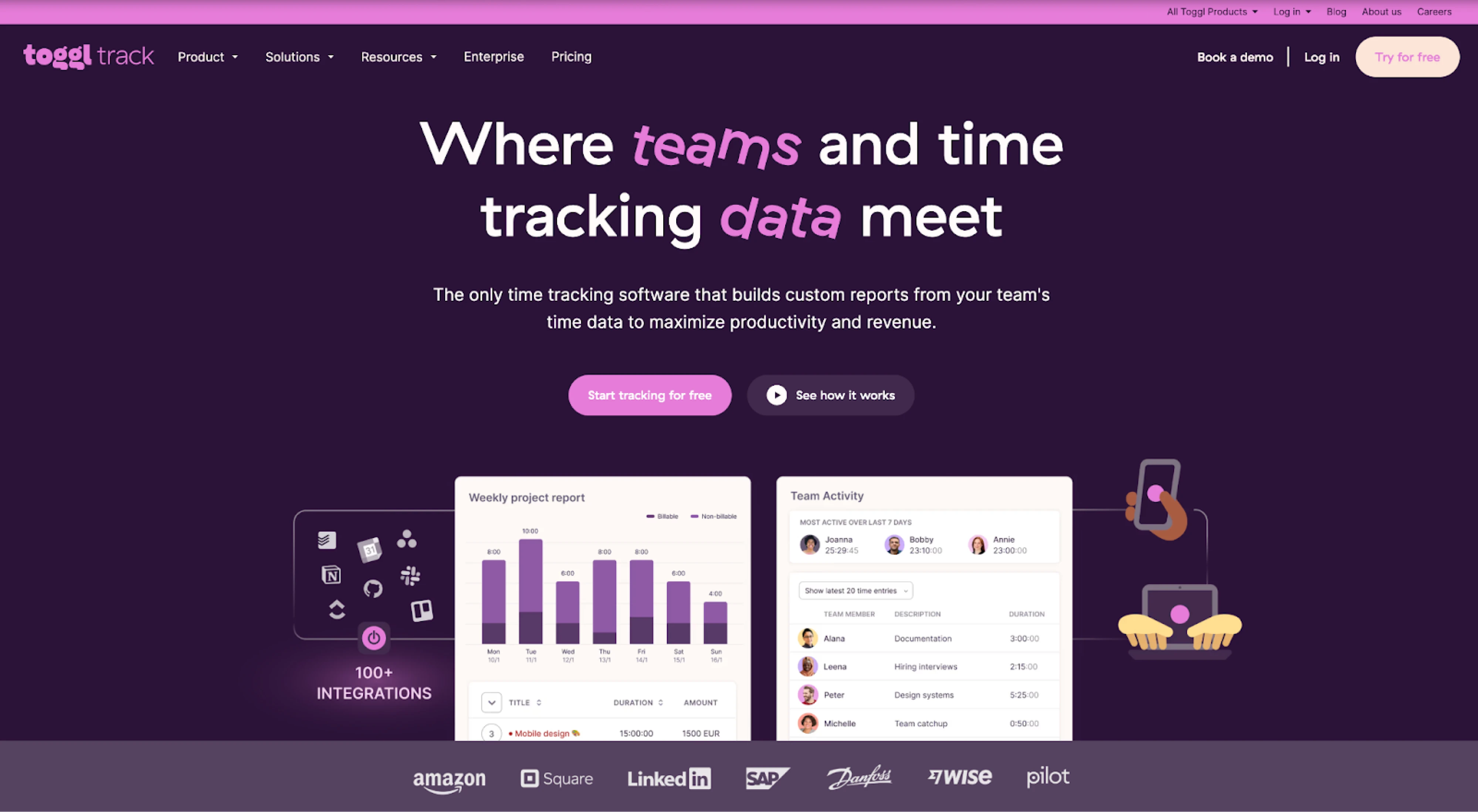
Toggl is a platform that offers a collection of productivity tools to help teams track time, stay focused, and improve performance.
- Information architecture: the homepage clearly communicates the product’s core value with a strong, benefit-driven headline. The structure moves from value proposition to features and integrations, making it easy for users to understand how the product fits into their workflow. CTAs (Start tracking for free, See how it works) are prominent and well-balanced.
- Visual design: the bold purple palette creates a strong brand identity, while large typography highlights key messaging. Product visuals are integrated into the hero section, helping users quickly grasp functionality. Playful illustrations add personality without distraction.
- Responsiveness: the clean, structured layout allows elements to stack naturally on smaller screens while maintaining clarity and usability.
Lessons from the best homepage designs
We've reached the end of our curated list of 35 inspiring homepage design examples. What key elements can we distill that make these homepages stand out that you could apply to your own site?
- Clear value proposition: The best homepages communicate their unique value quickly and clearly. Whether it's Postscript's "SMS marketing at scale" or Gaiia's "simplest platform to run your ISP," each site immediately tells visitors what they offer.
- Information architecture that makes sense: Easy-to-use menus and logical content flow guide users effortlessly.
- Engaging visuals: From Exa.ai's futuristic imagery to Flutterflow's vibrant illustrations, captivating visuals create memorable first impressions.
- Effective CTAs: Prominent, well-placed call-to-action buttons drive user engagement. Most homepages feature clear CTAs like "Start Free Trial" or "Book a Demo."
- Social proof: Many homepages incorporate customer logos, testimonials, or user statistics to build trust and credibility.
- Responsive design: All top homepages ensure a seamless experience across devices, adapting layouts and functionality for mobile users.
- Interactive elements: Subtle animations and interactive features, like Lago's clickable product features, enhance user engagement without overwhelming the core message.


.png)


