.webp)

You don’t need a hundred reasons to delete an app. Just one frustrating moment is enough. A clunky sign-up flow, confusing navigation, a laggy screen — that’s all it takes for users to swipe up and move on for good.
Now flip the script.
Think about the apps that just work. The ones that feel effortless. They guide you, respond instantly, and somehow know exactly what you need. That’s great mobile UX — and it’s invisible until it’s not.
In this article, we’re not going to give you vague principles or textbook definitions. Instead, we’ll show you 50+ best app examples and explain how they solve real UX problems so you can walk away with a practical takeaway.
What is mobile UX design, and why does it matter
Mobile UX design is what turns an app from something people download into something they depend on. It’s the invisible layer that makes a product seem intuitive, effortless — like it just gets you. When done right, users never stop to think about how it works. They just swipe, tap, scroll, and somehow, everything falls into place.
But deliver bad UX, and you’ll lose the audience before they finish onboarding. Mobile users are unforgiving. They’re distracted, impatient, and always one awkward flow away from deleting your app. By following the psychology laws behind UI UX design, and adapting to tiny screens and busy thumbs, good UX will keep everything clear, responsive, and human.
If you want to see how we approach this at Eleken, don’t hesitate to watch our video. There, we break down our strategy to design SaaS products people want to use.
Effective mobile UX design patterns examples
The best apps don’t try to reinvent how users scroll, tap, or navigate. They build on familiar UX design patterns and polish them to perfection. To give you a clear picture of what we’re talking about, in the following sections, we’ll look at mobile application examples that do more than look good — they solve problems.
Pleasant onboarding experiences
Headspace
From the very first screen, Headspace onboarding sets the emotional tone with soft colors, friendly illustrations, and focused, comforting copy. Rather than rushing into features, it creates space for users to breathe and explore.
.webp)
PrimePro
When we worked on PrimePro, we knew the target users had no time for bloated onboarding. So we stripped it down to the essentials. New users are guided through a five-step job creation process that gets them to their first task fast.
.webp)
Fabulous
Fabulous app uses onboarding as the start of a story, not a checklist. Users are immersed in a guided journey with motivational prompts, goal setting, and affirming microcopy.
.webp)
Notion
Among app design examples, Notion doesn’t explain how the app works. It asks a few smart questions and instantly generates a tailored workspace. This removes the “blank page anxiety” and helps users feel like they’re accomplishing something right away.
.webp)
Blinkist
Blinkist is built for people who want to learn on the go. The onboarding reflects that same ethos. From the start, users are asked just a few simple questions about their interests, then immediately dropped into a personalized content feed.
.webp)
Navigation done right
Nworx
Nworx has a lot going on under the hood, and to make all of that usable on mobile, our Eleken team designed a compact side navigation. Paired with a clear content hierarchy and thoughtful transitions, the interface helps users move between sections.
.webp)
b.well
When we worked on the UX for b.well, our biggest challenge was making all features approachable. The solution was a bottom-tab navigation system that gently introduces features over time through progressive onboarding.
.webp)
Asana
On mobile, Asana uses tabbed navigation and contextual drawers that scale gracefully with complexity. This work management tool relies on a progressive disclosure approach, keeping things clean without limiting power.
.webp)
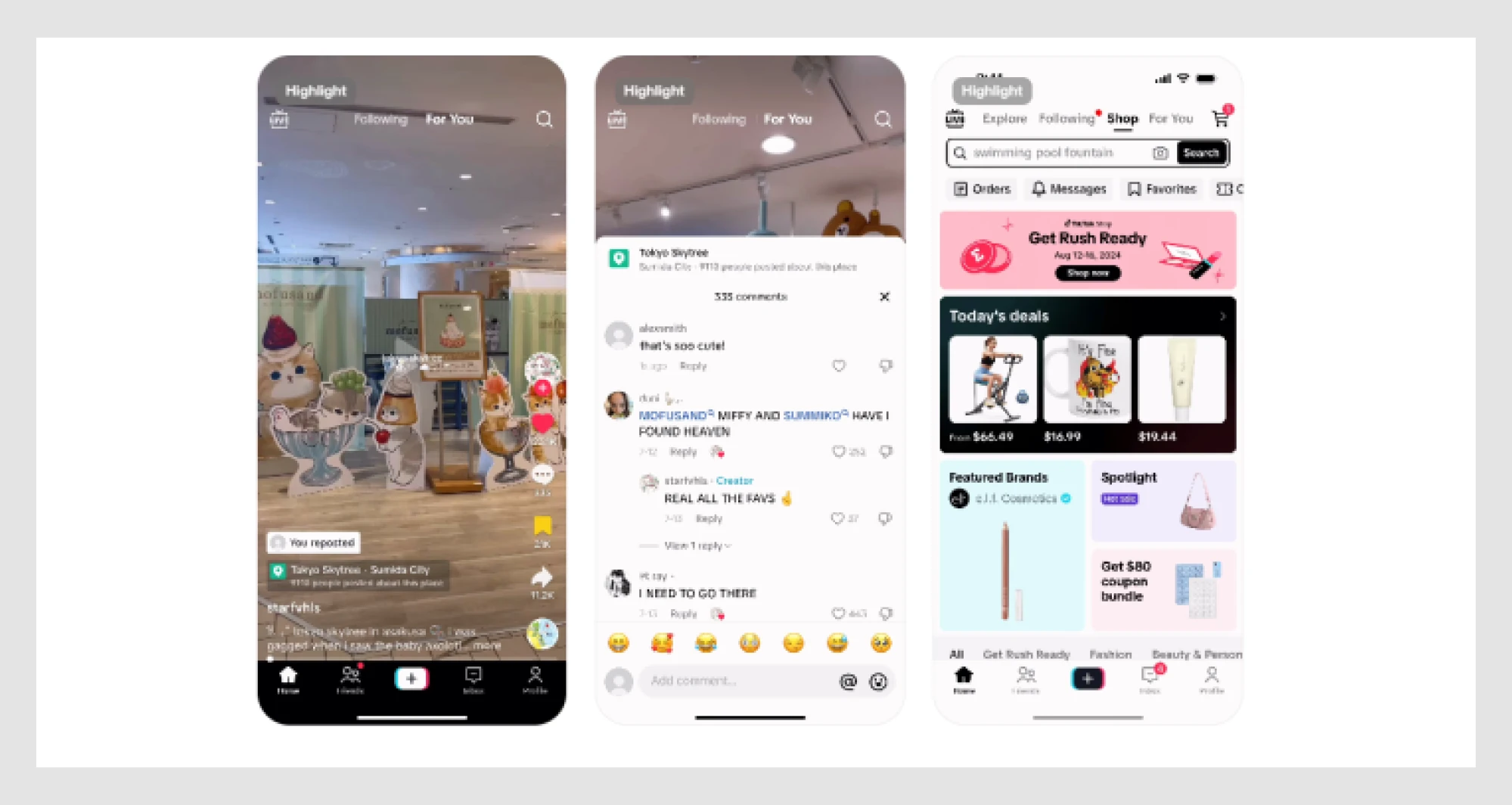
Pinterest has a modern mobile app design built for endless exploration. Navigation fades into the background as content takes over, while infinite scrolling and smooth transitions make the experience flow as a continuous discovery loop.
.gif)
Microinteractions that delight
Calm
Everything about Calm is designed to lower your pulse. Animations are gentle, screen transitions glide softly, and ambient sounds play with perfect timing, leading to a deeper emotional impact.

LinkedIn micro-tooltips, soft loaders, and light animations give the app just enough personality to feel human. When someone connects with you or endorses a skill, the pop-ups and confetti-like animations provide positive reinforcement.

Telegram
Telegram message delivery is snappy, animations are crisp, and touch responses come with subtle bounce effects. Premium users can even add animated emoji statuses to their profiles, gaining a more expressive app interface.

Tinder
As one of the good app design examples, Tinder is known for its iconic card-swipe mechanic. The motion is fluid, the feedback is instant, and the reward (a match) comes with a satisfying animation that keeps you engaged.

Hinge
Hinge uses interactive reactions, small flourishes, messages, and profile elements to make the experience a little more alive. For example, the “like” animation sends a floating heart across the screen, emotionally charging the user.

Fast and smooth performance
Apple Wallet
Apple Wallet succeeds by being almost invisible. When users tap to pay or scan a pass, the app responds instantly, with subtle animations that confirm the interaction without delay.

JobCall
In our work on JobCall, we focused on optimizing content delivery: reducing visual clutter, enlarging interactive elements, and streamlining key workflows. Everything was designed to get users where they need to go with minimal friction.

Cash App
In Cash App, every key flow, from sending funds to viewing transaction history, happens without lag. Even subtle transitions between screens are designed for speed, reassuring users that everything works as expected.

Linear
Designed for technical users, the Linear app focuses on smooth flows, lean visuals, and immediate state changes. It’s one of the cleanest mobile user interface examples with tight transitions and focused interactions.

Smart personalization and AI-driven UX
Google Assistant
Google Assistant is a blend of voice interaction and intelligent automation. Its interface adapts based on context, showing quick replies, suggestions, or voice-only interactions depending on what the user needs.

Spotify DJ
Spotify DJ uses AI to curate music in real-time, introducing tracks with a surprisingly warm voice. The interface combines playlist control with casual commentary, bridging the gap between algorithmic recommendations and a human DJ vibe.

Cleo
Cleo reimagines personal finance with an AI chatbot that sounds more like your witty friend than a budgeting tool. It gives spending insights, savings tips, and even roasts you when you splurge too much.

Snapchat’s My AI
Snapchat’s My AI brings conversational UX into a casual, highly personalized chat experience. Integrated directly into the messaging flow, it responds to user prompts with friendly, context-aware suggestions.

Replika
As a conversational AI companion, Replika adapts based on your inputs and mood, responding with empathy and contextual memory. The chat-based UI focuses on emotional support, reinforcing a sense of continuity and connection.

Accessibility-first design
Apple Health
Apple Health features clean typography, a spacious layout, and color-coded visuals that scale beautifully across devices and accessibility settings. VoiceOver support and system-wide voice control make it highly navigable for every user.

Be My Eyes
Be My Eyes is one of the most powerful mobile app examples built entirely around accessibility. The interface is stripped down to just what’s needed: voice-driven prompts, large buttons, and fast access to help.

Microsoft Soundscape
Soundscape uses spatial audio to help users with low or no vision navigate the world. Instead of giving visual directions, it creates a 3D sound map that lets users hear the orientation of places around them.

Duolingo
With just a setting toggle, Duolingo increases text visibility and color contrast without losing its signature style. The mode works seamlessly with dark mode and adaptive font sizes, improving usability across age groups and visual abilities.

Best UX design examples by industry
A fun fact is that what works for a wellness app might fall flat in fintech. Every industry has its own rules, rhythms, and audience expectations, where the final screen design may change completely. Let’s see what “good UX” really means when the stakes, goals, and users all change.
E-commerce & marketplaces
Amazon
Amazon’s success lies in how effortless the checkout flow is. Features like one-click purchasing, persistent cart state across devices, and stored payment options strip away friction and reduce decision fatigue.

Etsy
As a marketplace for handmade and vintage items, Etsy focuses on curating an experience. Personalized feeds, intelligent search filters, and thematic collections help users stumble onto things they didn’t know they were looking for.

Zara
Out of the mobile app design examples, Zara feels more like browsing a digital fashion magazine than scrolling through a catalog. High-end visuals, minimalist UI, and an editorial-style product flow help turn shopping into a story.

Fintech & banking
Revolut
Revolut’s modular layout, crisp typography, and clean iconography create a clear visual hierarchy that builds trust from the first tap. There’s even a touch of gamification in how goals and rewards are presented, keeping users engaged.

Robinhood
By stripping away traditional financial jargon and replacing it with clean visualizations, simplified charts, and swipeable onboarding flows, Robinhood makes complex systems instantly understandable.

Venmo
The Venmo interface leverages simple gestures, emojis, and lightweight UI elements. The social feed of payments gives everyday transactions context, turning what could be a dry utility into something more human.

Creative & design tools
Figma
Figma mobile version keeps the experience intact with gesture-based navigation, contextual menus, and touch-first commenting. It’s a standout among app UI examples, reimagining interactions for smaller screens and shorter attention spans.

Canva
Canva interface uses clear icons, drag-and-drop gestures, and prebuilt templates to empower users to create polished visuals. There’s little to no learning curve, and every tool is surfaced at the right moment.

Adobe Express
Adobe Express UX is optimized for short creative tasks, including resizing a photo, making a social post, or creating a quick promo video. Toolsets are simplified, options are pre-grouped, and smart templates reduce decision-making.

Health & fitness
Strava
Strava is turning solo workouts into shared experiences. The app’s clean interface makes it easy to log runs, rides, or swims, while route maps, leaderboards, and community challenges help users push themselves a bit further.

MyFitnessPal
Logging every calorie sounds tedious, but MyFitnessPal makes it almost frictionless. The barcode scanner, autocomplete suggestions, and a massive food database help users enter meals in seconds.

Sleep Cycle
Moving beyond raw numbers, Sleep Cycle lets users see clean graphs, smart insights, and friendly recommendations. The alarm wakes you up at the lightest sleep phase, turning the entire experience into a supportive one.

Media & content platforms
Spotify
Spotify offers smart search suggestions, Discover Weekly, and Daily Mix playlists, where every interaction is rooted in relevance. Transitions are smooth, visuals are clean, and the focus always stays on what’s playing or about to play.

Apple News
Apple News blends editorial-style design with native system components, making everything look consistent, trustworthy, and instantly usable. From Today’s Highlights to personalized sections, the interface respects the medium and the user’s context.

Netflix
Netflix is built with a smart row structure that organizes content by theme, mood, or behavior. Auto-play previews give users just enough to make a decision, while skip buttons, continue-watch prompts, and personalized picks keep the momentum going.

Travel & navigation
Google Maps
Google Maps has become the default for getting from A to B. With real-time traffic updates, predictive routing, and intuitive visual guidance, the app balances a huge amount of data without overwhelming users.

Airbnb
Airbnb combines utility and inspiration in its booking flow. The use of large visuals, dynamic search filters, and conversational UI elements makes searching for a place feel more like planning an experience.

Uber
Uber’s interface constantly predicts and prepares for the user’s next action thanks to auto-filled pickup locations, estimated arrival times, and upfront pricing. The UI is clean and minimal, giving enough context to take the next steps.

Gaming & social apps
TikTok
TikTok auto-play interface delivers content the second you open the app, while full-screen video and vertical swipe navigation make interaction effortless. There’s no need to search or choose — just react and continue.
Discord
Discord messaging platform scales from one-on-one chats to massive server communities. The mobile app mirrors that versatility with a layered interface: swipeable panels, collapsible menus, and quick-reply interactions create a casual vibe.

Twitch
Twitch interface brings users straight into live content, with real-time chat, viewer reactions, and quick access to stream controls. Whether you’re watching or streaming, every part of the UX reinforces presence.

Emerging trends in mobile UX you can’t miss
Mobile UX is never static. As user expectations evolve, so do the design principles and technologies that shape how we interact with apps. The truth is that what felt cutting-edge a year ago might already be the new baseline. So you don’t fall behind, in this final section, we’ll look ahead at emerging trends.
1. Invisible UX is the new ideal
Some of the best mobile UX design examples are the ones you barely notice. That’s not a flaw — it’s the goal. Invisible UX happens when an app integrates into a user’s flow to remove friction instead of drawing attention to itself. There are no popups, learning curves, unnecessary UI layers, just clear intent, and well-timed automation.
Waze is one of them. As you drive, the app silently recalculates routes, flags hazards, updates traffic in real time, and eve tweaks your ETA without asking for input. Its interface design is clean and context-aware, surfacing only what matters at the moment: the next turn, a speed warning, or a change in direction.

🚀 Key takeaway for designers
Great app UI design ideas don’t always come from adding features — they often come from getting out of the user’s way.
2. AI-powered personalization is mainstream
Personalization is an expected option in today’s interfaces. Users want homepage designs that update in real time, tailored recommendations, and interfaces that adapt based on interactions. For a mobile app designer, this means creating dynamic layouts and content that shifts based on what people have clicked, watched, or ignored.
YouTube is a perfect example of this in action. Its homepage is fully adaptive, shaped in real time by history, session time, subscriptions, and even video types you almost watched. As you scroll, the algorithm rearranges suggestions, adjusts thumbnail previews, and dynamically loads new sections.

🚀 Key takeaway for designers
If you want to personalize, don’t stop at content. Let behavior influence layout, flow, and visibility to make the interface seem like it’s thinking with the user.
3. Motion design = modern, human UX
Motion in mobile app designs acts as a tool for communication. Thoughtful animation helps users understand what just happened, what’s changing, and what to expect next. It adds rhythm to interactions, smoothes transitions, and gives digital products a sense of physicality. When done well, motion design doesn’t distract — it directs.
Instagram nails this balance. When you double-tap to like a post, the heart pops with a satisfying bounce. Swiping between Stories includes a fluid slide and progress animation, making navigation continuous. Even the transition from feed to Reels has a gentle snap, reflecting the motion role in the app’s UX design system.

🚀 Key takeaway for designers
Use motion to clarify state changes, reinforce actions, and support user orientation, especially in content-heavy or fast-scrolling experiences.
4. Voice and chat-based interfaces are gaining traction
Touchscreens aren’t the only way users want to interact anymore. Voice and chat-based interfaces make UX more natural, conversational, and accessible. For many products, especially in high-speed or hands-free scenarios, this shift opens new doors for utility and connection.
The ChatGPT app is a standout here. With voice input baked into the mobile experience, users can speak their queries and get context-aware, conversational responses in seconds. There’s no need to tap through menus or search bars — the interface becomes a dialogue.

🚀 Key takeaway for designers
This kind of approach is especially valuable in UX design for startups, where simplifying complexity is often the key to faster adoption.
Now it’s your move
If there’s one thing this list proves, it’s that great mobile UX examples don’t follow a single rulebook. They adapt, listen, disappear when necessary, and speak up when it matters. So, steal the good stuff from this article. When designing a mobile app of your own, remember: clarity, empathy, and rhythm go a long way. And once you’re ready to bring in expert help, we’re just a message away.


.webp)
