A well-designed wizard UI can transform complex, multi-step tasks into a smooth, guided experience for users. By breaking down processes into manageable steps, wizard UIs are invaluable for onboarding, setup, and data entry flows. At Eleken, we specialize in creating intuitive, user-centered interfaces that simplify these tasks and enhance overall user satisfaction. In this guide, we’ll walk through what makes a great wizard UI, including best practices, real-world examples, and actionable tips to help you design seamless, effective user flows.
What is Wizard UI?
A Wizard UI is a design pattern that breaks down complex processes into sequential, manageable steps, helping users move smoothly from start to finish. Unlike single-page forms or lists, wizards guide users through each step individually, simplifying actions that could otherwise feel overwhelming. This approach is particularly valuable for tasks that are lengthy, intricate, or require specific inputs at various stages.
Key Elements of Wizard UI
- Step-by-step progression: the core of wizard UI lies in its stepwise structure. Each stage of the process is presented individually, with clear navigation to move forward or backward.
- Progress indicators: wizards typically use progress indicators, such as numbered steps or a progress bar, to show users where they are in the process. This reassures users and builds confidence as they complete each step.
- User-friendly navigation: buttons like “Next,” “Back,” or “Finish” are essential in wizard UIs, allowing users to control their pace and revisit previous steps if needed.
- Error handling: clear feedback on errors (such as missing information) at each step is vital to reduce frustration and guide users toward a successful completion.
Benefits of Using Wizard UI
The Wizard UI pattern is designed with user experience in mind, offering several distinct benefits:
- Reduces user overwhelm: by segmenting tasks into smaller steps, users are less likely to feel overwhelmed, making it more likely that they’ll complete the process.
- Improves accuracy: because users input information in stages, they are less likely to make errors, enhancing data accuracy.
- Enhances task flow: wizards guide users in a logical, purposeful way, which is particularly useful for multi-part onboarding flows, registration forms, or checkout processes.
In essence, wizard UIs excel in scenarios where users need extra guidance and a structured flow to achieve a task.
Advantages and Disadvantages of Wizard UI
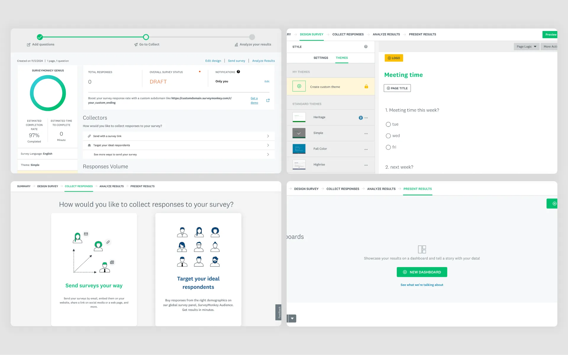
When to Use Wizard UI
A well-designed Wizard UI can be highly effective, but it’s essential to use it in the right contexts. Here are some ideal scenarios for applying the wizard pattern:
- Onboarding new users: wizards are highly effective in user onboarding, where users are guided step-by-step through setting up a profile, customizing preferences, or learning key features of a product.
- Complex forms and data collection: for processes that require extensive data input, like tax filings or job applications, a wizard can break down lengthy forms into bite-sized sections, improving user retention.
- Multi-stage tasks: scenarios like multi-step checkouts or account registration often benefit from a wizard, as it organizes complex tasks into a logical sequence.
Advantages of Wizard UI
- Improves user flow and completion rates: by segmenting information, wizard UIs reduce cognitive load and make completion easier, especially for tasks that could otherwise feel daunting.
- Enhances user satisfaction: the stepwise design builds a sense of accomplishment as users complete each stage, reinforcing their commitment to finishing the task.
- Reduces errors and enhances data quality: when users enter information in stages, they are less prone to mistakes. Moreover, validation at each step allows for immediate corrections, enhancing overall data quality.
- Encourages commitment: the step-by-step structure keeps users engaged by offering clear markers of progress, which helps prevent drop-offs in the middle of long processes.
Disadvantages of Wizard UI
While the Wizard UI pattern is helpful, it may not suit every context. Here are some scenarios where it might not be the best fit:
- May feel slow for short tasks for shorter or simpler tasks, as users may not need stepwise guidance to complete the action. In these cases, a single-page form may be more effective.
- Implementing wizard UIs can be more complex from a development perspective, especially when there’s a need for state management, input validation, and navigation control across multiple steps.
- If not designed carefully, wizards can make tasks feel drawn out, leading users to abandon the process. Ensuring steps are minimal and navigation is clear is crucial to avoid this pitfall.
Alternatives to Wizard UI
When a wizard doesn’t fit, other UI patterns can provide a streamlined experience:
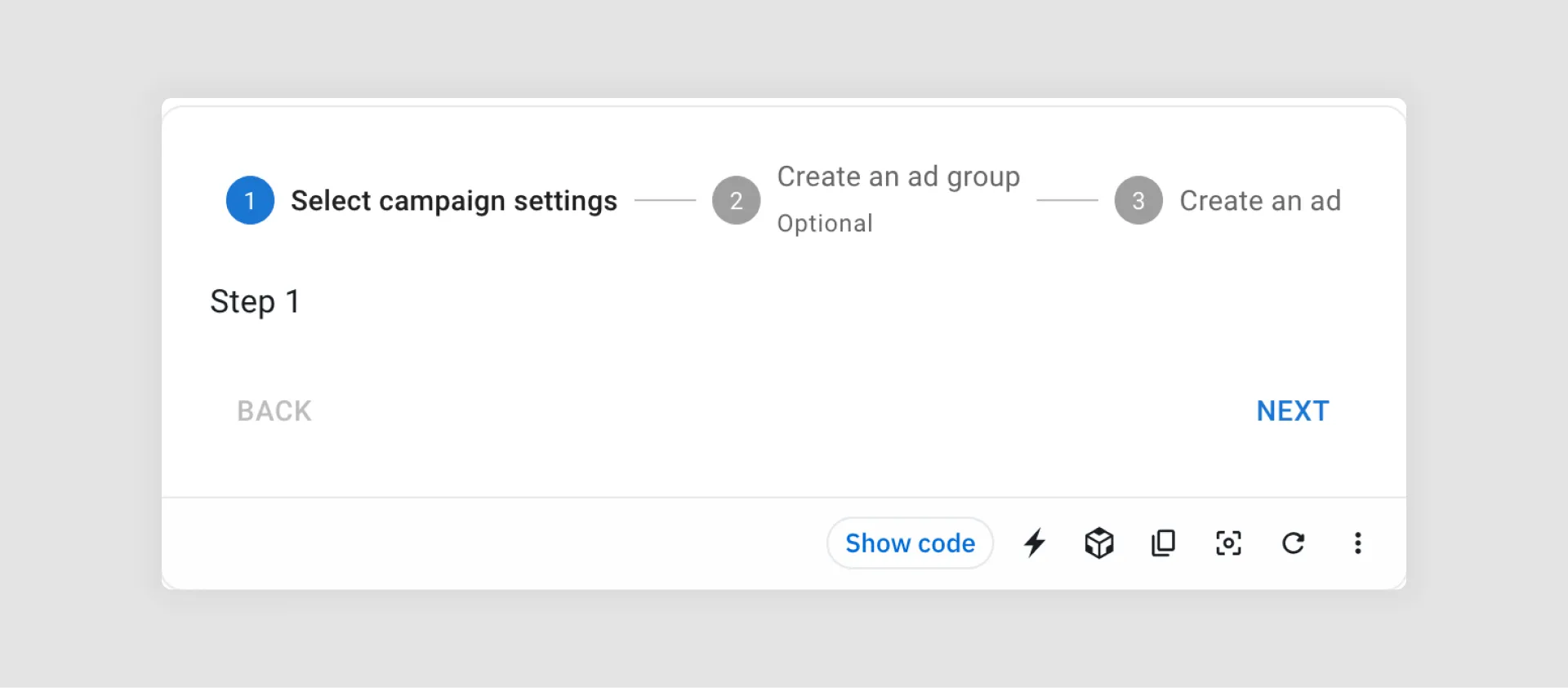
Steppers: similar to wizards but typically shorter, steppers present steps horizontally at the top of the page, making them ideal for three to five steps that don’t require heavy data input.
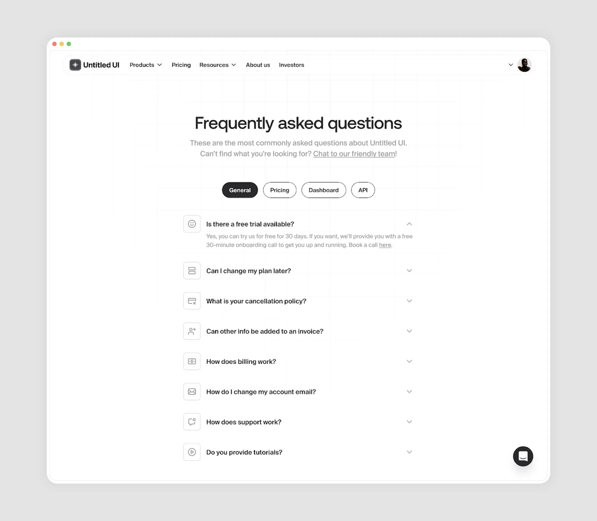
Accordion forms: this pattern allows users to expand and collapse sections as needed. Accordion forms work well for forms with various optional sections that users may not need to complete.
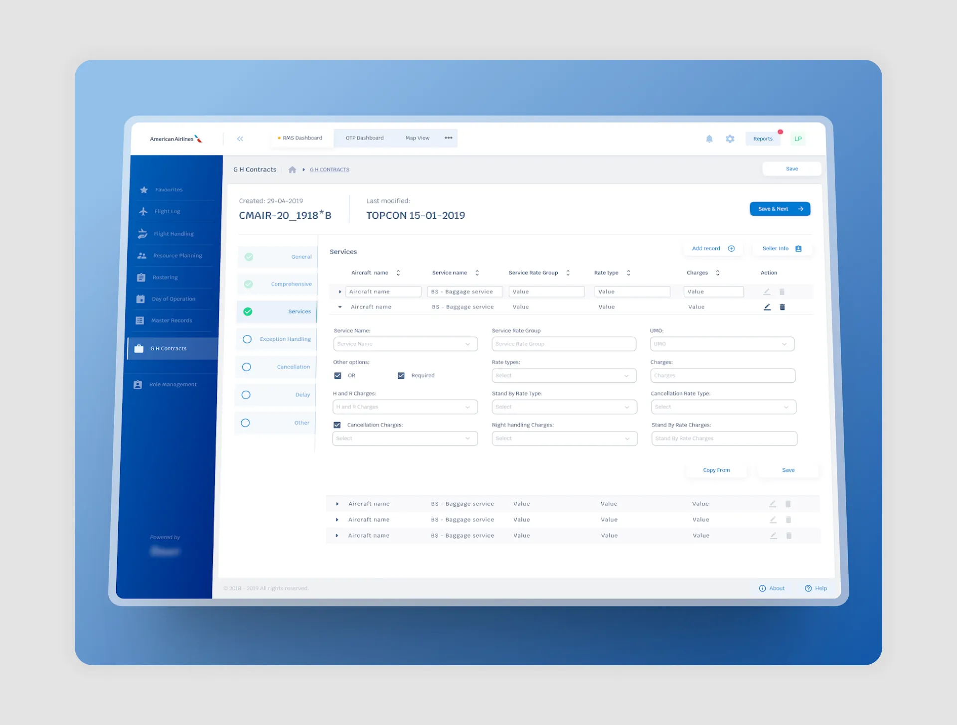
Single-page forms: for simple or straightforward tasks, single-page forms allow users to enter data quickly without additional navigation.
Selecting the right UI approach depends on both the task complexity and user needs.
Examples of Wizard Design (+ Best Practices)
To better understand how to effectively implement wizard UIs, let’s explore some standout examples and best practices. By analyzing these cases, we can see how thoughtful design can transform complex user tasks into smooth, guided experiences.
Mailchimp’s Account Setup Wizard
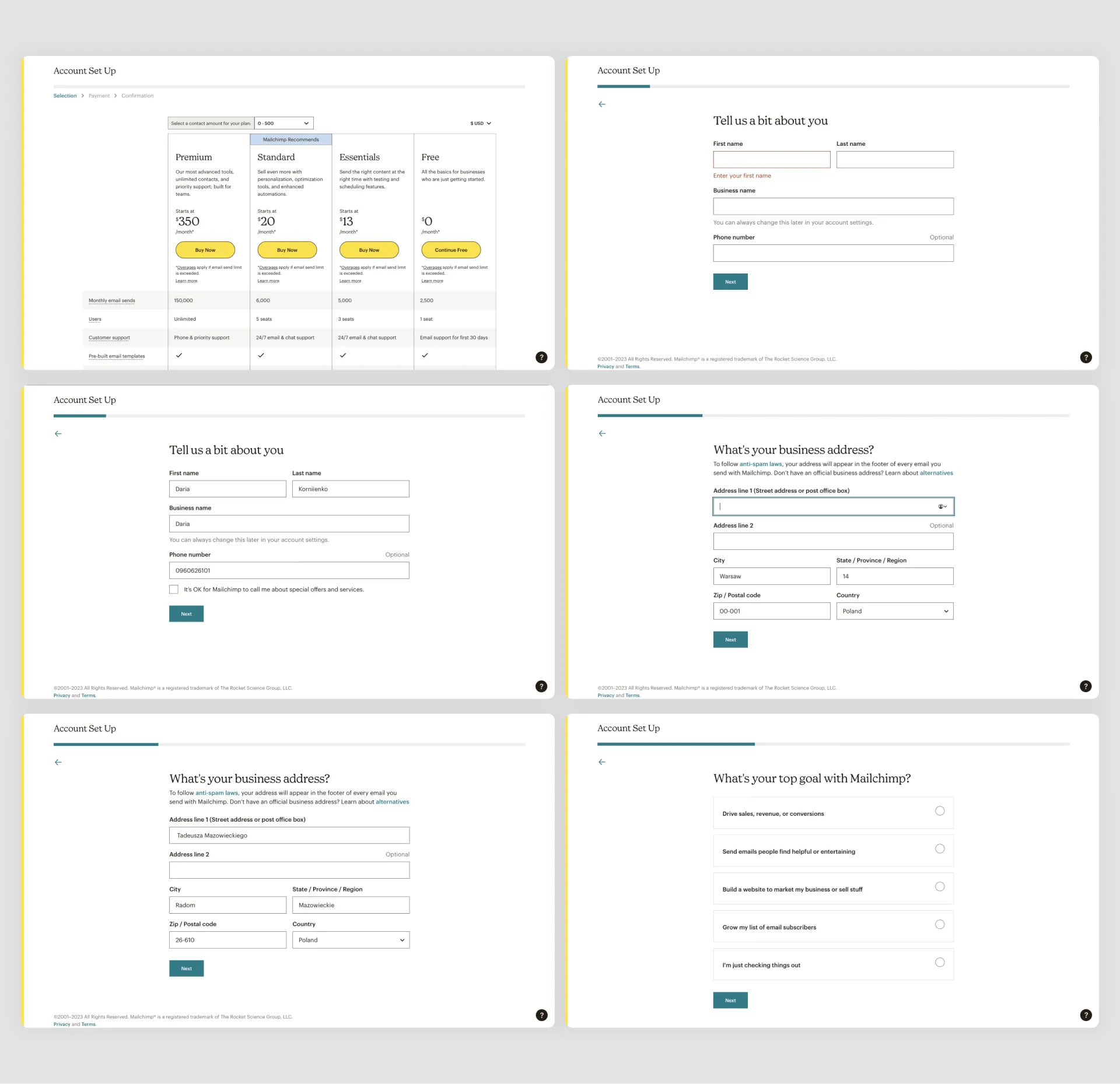
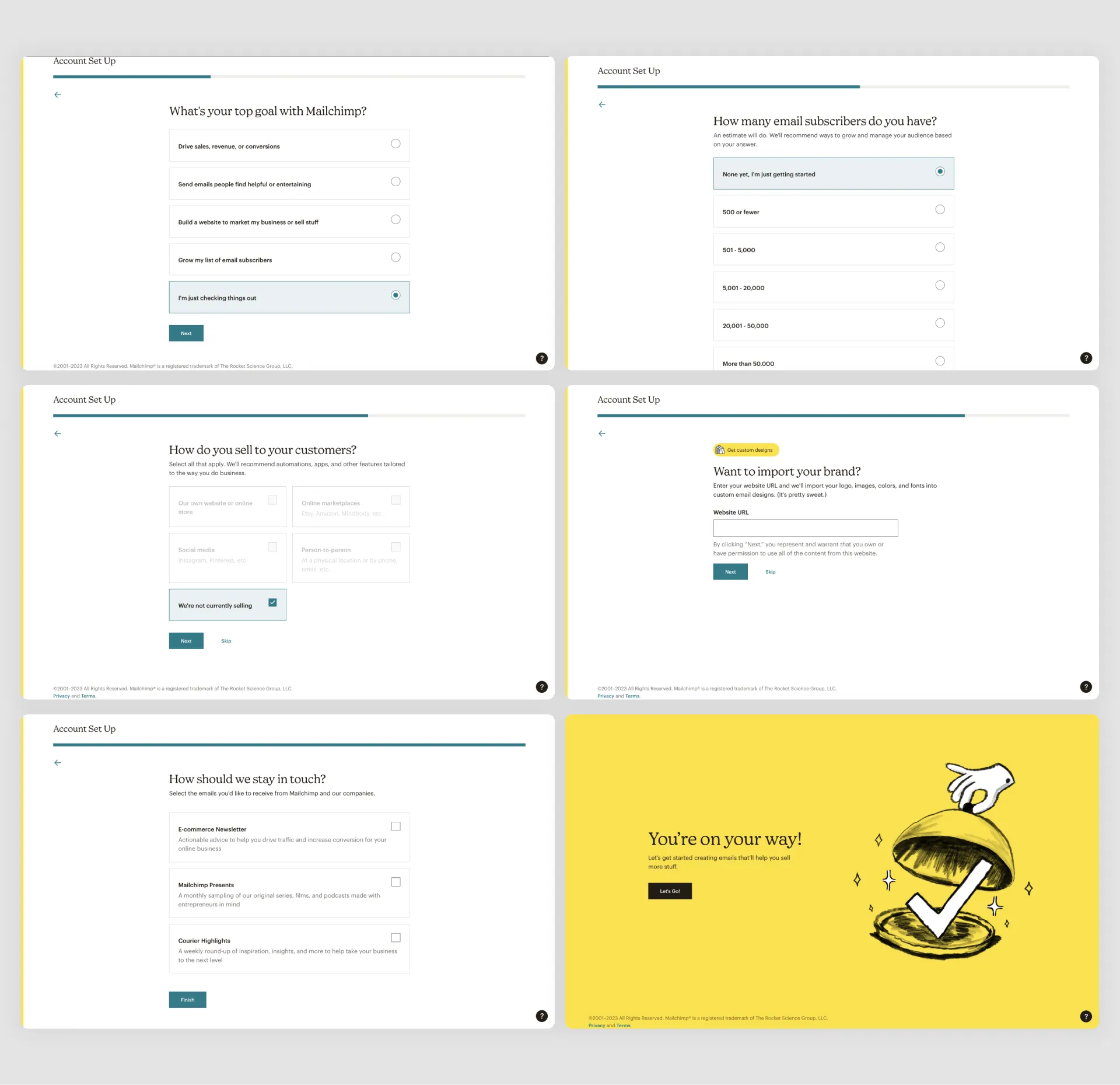
Mailchimp’s account setup wizard is a great example of a streamlined onboarding experience, designed to help new users get started with minimal friction. Given that Mailchimp serves users with varied tech backgrounds, the wizard breaks down the setup process into simple, guided steps that are easy to follow.
Best Practices:
- Clear, Concise Steps: Mailchimp divides setup into bite-sized steps like entering basic information, setting up audience preferences, and connecting integrations. This structure avoids overwhelming new users while covering essential setup tasks.
- Visual Progress Indicator: A progress bar shows users their current step and how close they are to finishing, which encourages them to complete the setup.
- Personalization Options: Mailchimp allows users to tailor their accounts based on specific business needs, like e-commerce or content marketing, ensuring that the setup feels relevant and valuable.
- Guidance with Tooltips and Tips: Throughout the setup, Mailchimp offers small tooltips and brief explanations to clarify options and features, helping users make the most of each setting.
Mailchimp’s thoughtful design makes the initial setup smooth and user-friendly, supporting new users in tailoring the platform to their goals from the outset.
Upwork’s Profile Setup Wizard
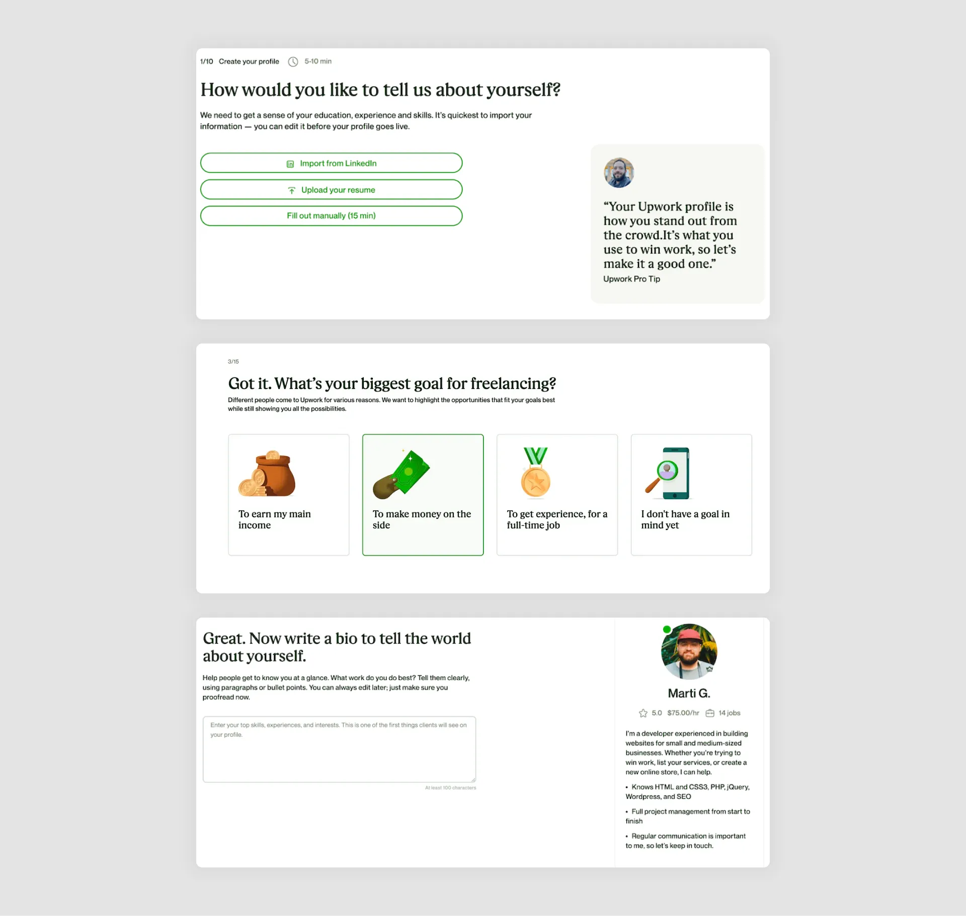
Upwork’s onboarding wizard for new freelancers is a stellar example of guiding users through a comprehensive process step-by-step. Given the need for freelancers to create detailed profiles that showcase their skills, experience, and availability, Upwork’s wizard carefully divides the setup into logical, manageable sections.
Best Practices:
- Logical Flow with Clearly Defined Steps: Upwork’s wizard organizes profile creation into essential categories—such as personal information, skills, work experience, and portfolio. This approach makes the process feel natural and logical, helping users to stay on track.
- Progress Tracking and Step Highlights: A progress bar at the top of the interface shows users how far they’ve come and what remains, building momentum as they complete each section.
- Contextual Help and Tips: Upwork provides tips and examples in each section to help users present their skills effectively. For example, when filling out the “Skills” section, users are shown popular skills to select from, simplifying choices and improving profile quality.
- Preview Option: Upwork allows freelancers to preview their profiles as they go, so they can see how their information appears to potential clients. This preview feature reinforces accuracy and motivates users to complete the setup.

Airbnb’s Host Onboarding Wizard
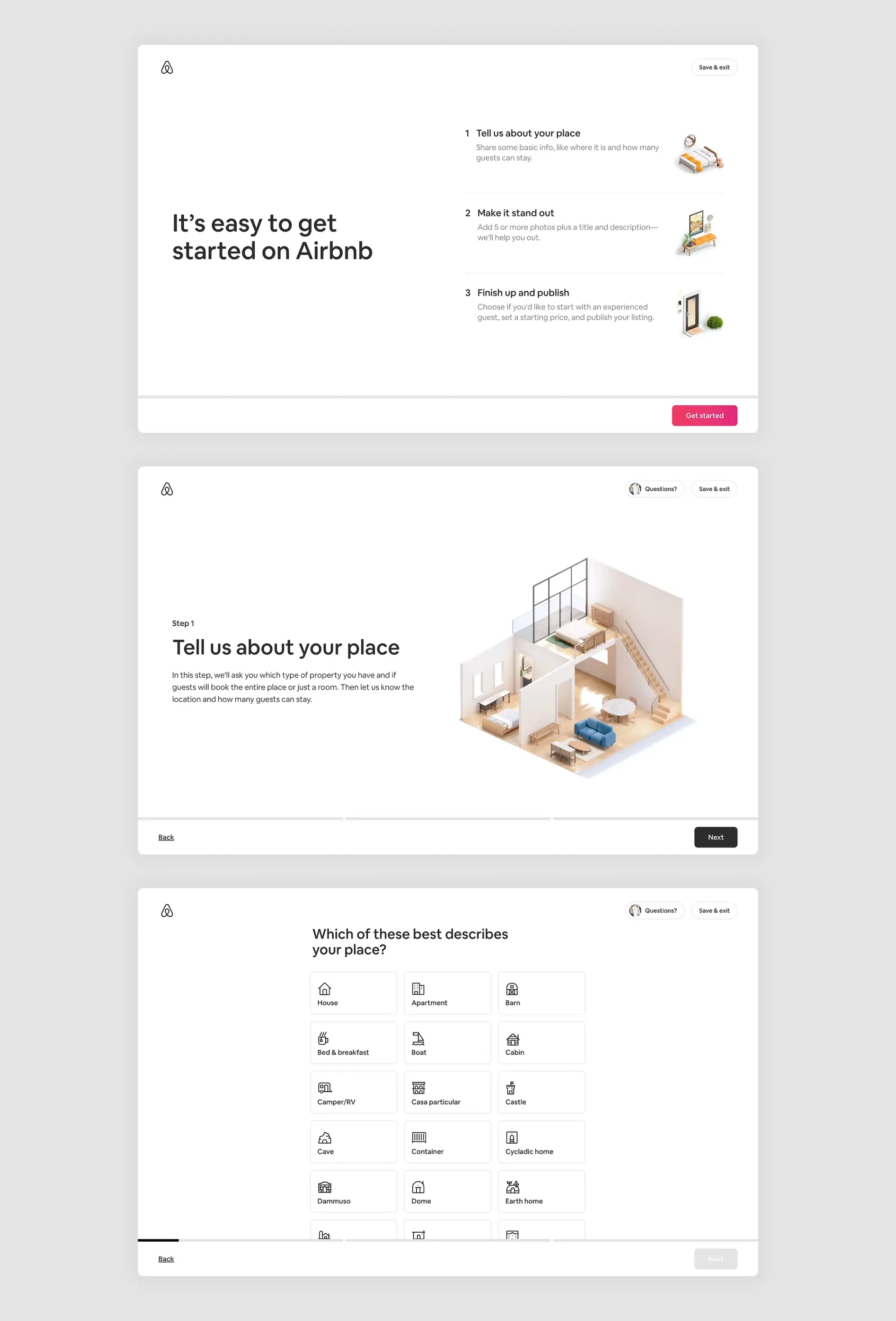
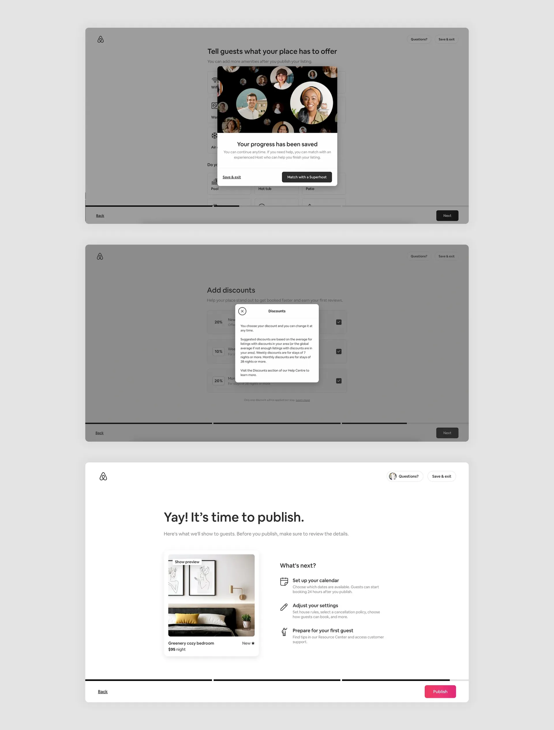
Airbnb’s onboarding process for new hosts is a standout example of a wizard UI that simplifies a multi-step setup while building user confidence. Given the complexity of setting up a listing—from providing property details to pricing and availability—Airbnb’s wizard breaks down each part of the process, guiding hosts step-by-step.
Best Practices:
- Step-by-Step Structure with Visual Progress: Airbnb’s setup process guides hosts through clear, sequential steps, such as adding property photos, setting pricing, and choosing availability options. A progress bar shows hosts how much they’ve completed, which helps them feel accomplished with each step.
- Guidance with In-Context Examples and Tips: To help hosts make effective decisions, Airbnb provides tooltips, sample photos, and pricing suggestions based on similar listings. For example, when setting up pricing, hosts see comparable rates for similar properties, making it easier to make informed choices.
- Real-Time Preview: Airbnb offers a real-time preview, allowing hosts to see how their listing will appear to guests as they add details. This feature reassures users and encourages accuracy, enhancing the listing’s quality.
- Interactive Features for Personalization: Airbnb’s wizard is highly interactive, asking hosts questions to tailor options based on property type, location, and guest capacity. This personalization ensures the setup feels relevant and customized.
Duolingo’s Onboarding Wizard
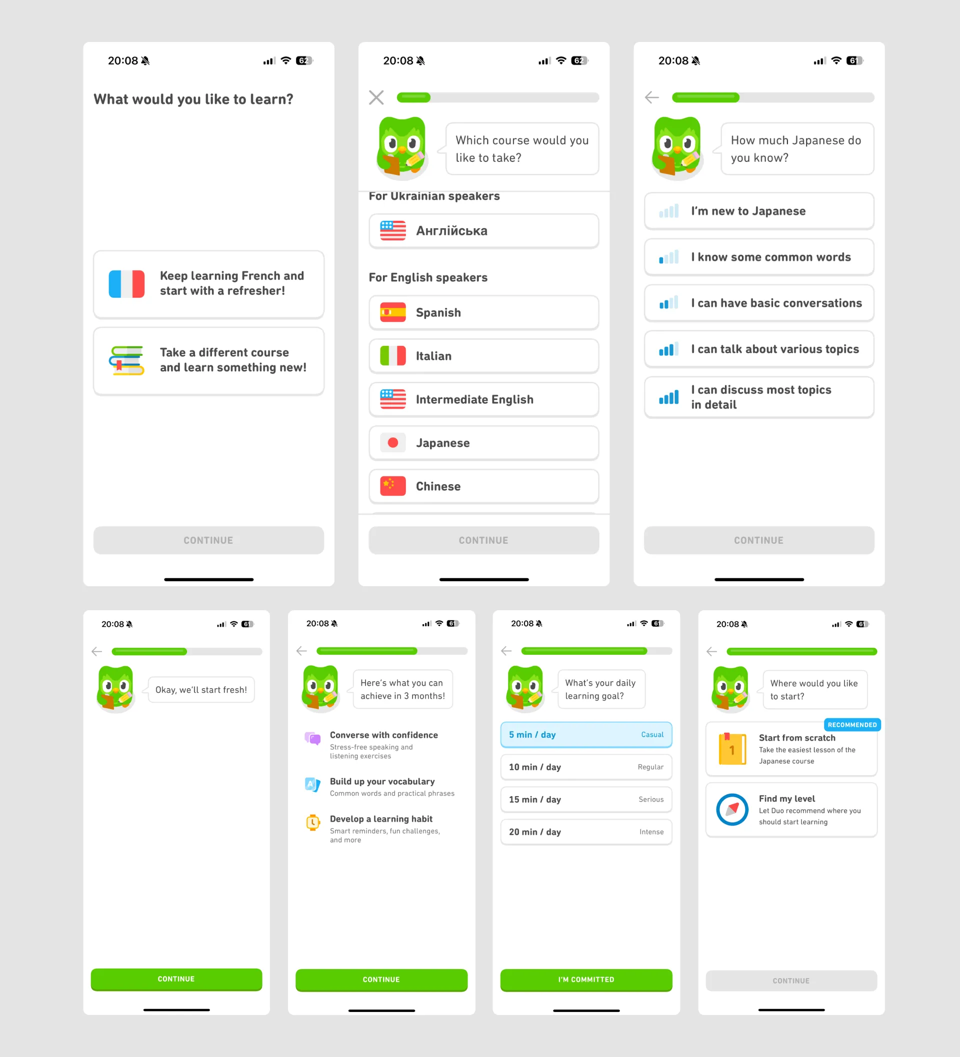
Duolingo’s onboarding process for new users is a perfect example of a wizard UI that is engaging, straightforward, and tailored to individual learning goals. Since Duolingo caters to users with diverse language goals and skill levels, its setup wizard gathers essential information to customize each user’s experience from the start.
Best Practices:
- Personalized Path Selection: Duolingo’s wizard begins by asking users about their language goals (e.g., casual practice, school, travel), current proficiency, and daily practice commitment. This information personalizes the learning experience, helping users feel that the app meets their unique needs.
- Gamified Progress and Visual Appeal: True to Duolingo’s engaging, gamified style, each onboarding step uses colorful visuals, fun animations, and clear indicators of progress. This keeps users motivated and excited to complete the setup.
- Clear, Simple Choices: Duolingo limits options at each step, asking only one question or offering a few choices at a time. This simplicity reduces overwhelm and keeps the setup moving quickly.
- Goal Setting and Immediate Engagement: At the end of the setup, Duolingo prompts users to set a daily practice goal and jump straight into their first lesson. This immediate engagement reinforces commitment and quickly integrates users into the learning flow.
How to Make Wizard UIs Work for Your Project

1. Map Out the User Journey First
Before designing your wizard, understand the entire user journey. Identify key steps, pain points, and areas where users may need extra guidance. This initial mapping will help you determine which steps need simplification, where validations or help tips may be necessary, and how many steps the process should ideally have.
Tip: Use journey mapping tools or simple sketches to outline each step. Keep in mind the sequence of information users need, as well as their expectations at each point.
2. Prioritize Essential Steps Only
One common pitfall of wizard UI design is including too many steps, which can lead to user fatigue or drop-offs. Evaluate each step’s importance to the end goal and remove any non-essential steps or fields. If certain data is optional or can be completed later, consider leaving it out of the primary flow.
Tip: Conduct usability testing with a few early users to identify which steps might feel redundant or confusing. Simplify based on their feedback for a streamlined experience.
3. Incorporate Progress Indicators and Visual Cues
A clear progress indicator is essential in wizard UIs. Whether you choose a numbered step indicator, progress bar, or another form of visual feedback, users need to understand where they are in the journey and how many steps remain. This reassures them that they’re making progress and encourages them to complete the process.
Tip: For long processes, break the wizard into distinct sections (e.g., “Personal Info,” “Preferences,” “Confirmation”), with each section having its own steps. This chunking can help users feel they’re advancing in stages rather than facing one lengthy flow.
4. Offer Clear, Actionable Error Messages
Errors are inevitable, especially in multi-step processes. Make error messages clear and actionable, so users know exactly what went wrong and how to fix it. Avoid vague statements like “Invalid input”—instead, specify the issue (e.g., “Please enter a valid email address”). Additionally, highlight errors directly at the step where they occur rather than delaying feedback until users try to submit.
Tip: Use inline error validation to inform users of issues immediately, preventing frustration and reducing the chance of abandonment.
5. Allow for Backward Navigation
Backward navigation is vital in wizard UIs, as users may want to double-check or modify previously entered information. Ensure that users can easily move back to previous steps without losing progress. For complex processes, autosave any data that’s already been entered so users can safely navigate between steps.
Tip: Test the flow to confirm that returning to a previous step doesn’t reset user data or lead to confusion. Smooth backward navigation can enhance user trust and prevent frustration.
6. Personalize the Experience When Possible
Personalization in wizard UIs can improve engagement by making the experience feel tailored to each user. If your wizard serves various user segments (such as different customer types or skill levels), consider adapting the sequence or content of steps based on their profile.
Tip: Use conditional logic to show or hide certain steps based on previous inputs. For instance, if a user indicates they’re familiar with your service, you could offer a shorter onboarding flow.
7. Optimize for Mobile Devices
For mobile-first audiences, the wizard UI should be optimized to accommodate small screens. This may mean fewer steps per page, larger tap targets, and streamlined navigation. Aim for a mobile experience that’s just as seamless as on desktop, or even more so.
Tip: Utilize touch-friendly elements like swipe navigation and ensure that each step fits comfortably on mobile screens, reducing the need for horizontal scrolling.
8. Provide an Exit Option with Progress Save
Not all users will complete the wizard in one go. Providing an exit or “Save for Later” option with progress tracking enables users to pick up where they left off. This is especially useful for lengthy processes, as it respects the user’s time and availability.
Tip: Inform users that they can resume their progress at any point, and consider sending a follow-up reminder if they haven’t completed the process.
9. Conduct User Testing and Iterate Based on Feedback
A great wizard UI is often the result of rigorous testing and iteration. Conduct user testing to gather feedback on any pain points, confusing steps, or common issues. Use this feedback to refine and improve the experience. Regular updates and optimizations will ensure the wizard remains effective and relevant as your product evolves.
Tip: Keep an eye on metrics like drop-off rates at each step and completion times to identify areas for improvement.
Pitfalls to Avoid in Wizard UI
While wizard UIs can greatly enhance user experience when implemented effectively, certain common mistakes can lead to user frustration or even abandonment. Here are some pitfalls to watch out for and avoid in your wizard UI design.
1. Overcomplicating the Process
One of the primary goals of a wizard UI is to simplify complex tasks. However, a common mistake is adding too many steps or details that aren’t crucial to the task. Overcomplicating the wizard by including non-essential fields or steps can make the process feel long and tedious, leading users to abandon it midway.
How to Avoid: Limit each step to the most critical information, and remove any optional fields or steps that could clutter the experience. Test the flow with real users to identify steps that feel unnecessary.
2. Lack of Clear Navigation
In wizard UIs, intuitive navigation is key. Users should always understand how to move forward, go back, or exit the process without losing their progress. Poorly designed navigation—such as hidden or unlabeled buttons—can confuse users and make them hesitate to proceed.
How to Avoid: Ensure that navigation buttons like “Next,” “Back,” and “Finish” are visible and clearly labeled. Use a consistent layout for these buttons across all steps.
3. Forcing a Linear Flow Without Flexibility
A fully linear flow can sometimes frustrate users who may want to skip certain steps, or complete the process in an order that better suits their needs. Forcing users to follow a strict order without options to adjust or skip steps may make the process feel rigid.
How to Avoid: For longer wizards, allow users to see an overview of steps and select any completed steps to revisit them. If some steps can be optional, provide skip options to offer more flexibility.
4. No Progress Indicator
A lack of a progress indicator leaves users in the dark about how much of the process remains. This uncertainty can lead to frustration, especially for multi-step wizards that require a longer time commitment.
How to Avoid: Always include a progress bar, numbered steps, or section titles to show users where they are in the journey. This provides a sense of control and accomplishment as they move through each step.
5. Inadequate Error Handling
Nothing frustrates users more than vague or misleading error messages, particularly in a wizard UI where they must proceed step-by-step. If users encounter an error, they should know what caused it and how to correct it without needing to redo multiple steps.
How to Avoid: Implement clear, actionable error messages that indicate the exact problem and provide guidance on how to fix it. Show errors as soon as they occur, ideally through inline validation, so users don’t have to wait until they try to submit a step.
6. Failure to Save Progress
When users can’t save their progress in a long wizard flow, any disruption (like losing internet connection or accidentally closing the window) can result in data loss. This not only frustrates users but may prevent them from completing the task at all.
How to Avoid: For longer processes, ensure progress is saved at each step or allow users to save manually and return later. Let users know that they won’t lose their progress if they need to leave and come back.
7. Not Optimizing for Mobile
Mobile users often encounter extra challenges with wizard UIs, including small buttons, difficult navigation, and limited screen space. If a wizard UI is only optimized for desktop, mobile users may find it difficult to complete the process, leading to high drop-off rates.
How to Avoid: Design the wizard with a mobile-first approach. Use large tap targets, responsive layouts, and minimal on-screen information to ensure each step is easily manageable on a mobile device.
8. Skipping Usability Testing
Even a well-thought-out wizard UI design can present unexpected issues without real user feedback. Skipping usability testing means you miss out on insights that could highlight potential friction points or errors that only emerge with actual users.
How to Avoid: Conduct usability testing with a diverse user group to uncover any pain points. Observe how users interact with each step, note where they hesitate or struggle, and iterate the design based on their feedback.
Let’s Bring Your Wizard UI Vision to Life
Whether you need a straightforward onboarding flow, a detailed multi-step form, or a robust setup process for a complex application, Eleken can help. With our expertise in user-centered design, we’ll help you create a wizard UI that not only looks great but also empowers users to complete their tasks effortlessly.
Ready to transform your user flows? Contact Eleken to learn more about our design services and how we can help your product shine.


.webp)
